Transcripts
1. Welcome to the Winterland: Winter has always felt
a little magical to me that quiet moment when
the air feels colder, the winds feel softer and
everything seems to slow down. Hi, I'm Masi Taparia, a chartered accountant,
a watercolor, and a gouache artist, a creative business
entrepreneur, and a mom to a toddler. For so many of us, snowfall
lives on our wish list. And honestly, it's on mine, too. That feeling of watching
fresh snow cover, everything in white,
the calm it brings, the stillness, the beauty. Even if we haven't
experienced it in real life, it's something we
all dream about. And in this class, we are
going to paint that feeling. This course is all about creating magical winter
landscapes with watercolors. Think about soft skies,
gentle transitions, and those beautiful texture with snow that bring the
winter magic to life. In this class,
we'll be exploring the snow texture in
a very natural way, especially using the
salt technique to create the naturally
covered snow effect into our watercolor
winter landscapes. Absolutely new to
watercolors and worried how you will follow
along with me in this class. Don't worry. I've
got you covered. Before we dive into the
class project for day one, I'm going to give you a good
insight about watercolors, covering all the
basic techniques and how watercolors work, which will help you join into the class projects with ease and follow along and paint with us step by step through each
of the class projects. I will also be giving you a complete material guide about what materials
I'm going to be using for this class and
what materials you can begin with if you are
absolutely new to watercolors. Honestly, this class
isn't about perfection. It's about slowing down, enjoying the
process, and letting watercolors create
magic in its own way. It's about capturing the
quiet beauty of winter, the cold winds, the fresh and the calm that comes
with this season. So if winter inspires you, if snowfall has
always been a dream, or if you simply want to
paint something soft, peaceful, and magical,
this class is for you. So without a further ado, go, grab your magical wands, your paints, and a
little bit of salt, and let's paint those
winter magic together.
2. Your Snow Toolkit: So before we move on to the first painting of this
winter painting challenge, let me guide you through the
materials that you would be needing to complete this
beautiful winter snow challenge. And for that, the snow kit that basically you will
be needing is here. First of all, you would be
needing a watercolor paper. I recommend using 300
GSM, 100% cotton paper. It can either be rough
grain or cold pressed. I don't recommend using hot
press for this specific class because we are going
to be playing along with a lot of
texture techniques. So to get the textures and the blooms coming in
for the snow paintings, I recommend using
either a rough grain or a cold pressed paper. I am personally using
this rough grain paper. Now, this paper is of the
size 12 inch by nine inch, and I'm going to be painting two paintings onto this
huge size like this, marking out the two spots and
then painting side by side, two paintings each time. Next up is going to be, of course, a watercolor set. I have my own customized
watercolor palette that I will be using
for this class. Almost all of the colors
that I'll be using are going to be from
this palette itself. In case if I'm using any
other color apart from these, of course, I will keep guiding you and sharing them
with you as well. And here's the swatch card of the colors that are
into this palette with the brand names that
I have squeezed out. So that's about the
watercolor set. You can just have a
basic 12 color set, and I'll keep guiding you
with the color mixes as well. Next up is going to be
a set of good brushes. I'm going to be using in
mostly natural hair brushes. These three, of course, are
like the permanent ones, and then of course, some
detailer brushes as well. So you just need a good
set of round brush and a detailer brush to go
ahead with this class. Since we are painting snow, white quash is a must to add in the snow details,
opaque details. White watercolors will
not stay out that opaque, so it's very important to have a white quash or to add in the bright
opaque snow details, a mixing palette if you need it. Then you need in a jar of
water for each painting, some basic stationary
pencil eraser. You need masking tape to tape
down your paper if you are someone who wishes to go
ahead with clean edges. I will be using these masking
tape to tape down my paper, each paper into two
parts for two paintings. And then, of course, you
need some paper towels or rough cloth for dabbing, creating in shadows, lifting colors, cleaning your brushes. And apart from these, you would be ding in table salt because we are going
to be going ahead and creating in a lot of snow texture using in
the salt method as well. So this is all about
the materials that you need for this snow class. So go ahead, grab all of them, and I will see you guys into the next lesson of this class.
3. Basics of Watercolors: So now before we dive into the class projects for each day, let me guide you with the
very basics of watercolors, understanding what
watercolor medium is and how it works
in different ways. Just a little inside. So the first way to watercolors
is a wet on wet layer. So for the wet on wet layer, you basically have a
layer of water first. And onto this wet
layer of water, you go ahead with wet paints. So I've just added in a layer
of wet or basically water. And now onto this wet layer, you go ahead with paints. So you can pick up any
paint of your choice. I'm just picking up the
paints s on my palette, and you just go ahead with wet paints on top
of a wet background. This is called the
wet on wet technique, and this helps you in getting smooth blends
between the colors, and the wetness of
the paper plays quite an important role
while capturing in, you know, the softness
of watercolors. So it's very important that you, you know, understand how
important your paper should be. So first is a basic wet on
wet layer that I taught you. Now, next is a wet on dry. So basically, your paper is dry, and onto this dry paper, you just go ahead
with wet paints. I'm just randomly again picking up the paints that are
on my palette here. And the paper is dry. On top of it, I go
ahead with wet paints. And you will notice
that this will dry out quickly and this
will take time to dry. But apart from that, the most important
thing that happens is that when you want blends
between the colors, this techniques
works better while creating in the smooth
gradient skies. And this technique is a little difficult because the
pans dry out quickly. So when you want beautiful
gradient skies like this, you need to work wet on wet
so that the water flow can create its magic and make the
blends go smooth and easy. So let me show you blending of two colors on a wet on wet layer and on a
wet on dry layer. So here you have a wet layer. That's a layer of water. And onto this, let's go ahead and randomly blend
in two colors. So I'm just picking
up a blue color. And next I will pick
up a pink color. You can pick up any colors of your choice and try
the blending exercise. Make sure that the colors are
not complimentary colors. Otherwise, they will
give you muddy tones. If you're an absolute bigner, you need to understand the catch of blending of these paints. Now here you can
see how beautifully both colors have blended getting in that
smooth transition. Now let's do the same blending without using in the
water layer first. So just going ahead
with wet paint. And now I will go ahead with a wet layer
of the pink color. You see the blending
becomes difficult. Plus, you need to run multiple times and it may even dry out. You see the unevenness
in the drying here, this extra stroke, and here
it is a beautiful transition. Of course, here I use the colors in a little diluted consistency, so the color variation, but here you can see
with the blending, this sharp line
that has come in at the blue area here, see, because the blue had
already dried out and here, if you see the drying
is still even, everything is evenly wet. So that is why
when you are going ahead with smooth blending
of skies or backgrounds, it's important to go ahead
with the wet on wet layer. And when you are going ahead with a simple detailing part, you use the wet on dry
method because you can see the uneven drying that happens
with the wet on dry layer. That's about the basics of a
wet on wet and wet on dry. Let me just quickly
name it for you. So this is wet on wet. And this is wet on dry. This was about the two things. Now we are going to understand
what is a gradient wash. So gradient wash
is basically going to be you begin
with a wet layer. And as the word
suggests, gradient. You need to create different
tonal values of the color, pick up any color
of your choice that you want to study this with and begin from the top or
bottom where you want the darker values and
moving from the top, just keep on blending it with the help of
water till the base. So you will see the top
has the darker values, and as you're moving
towards the bottom side, it turns lighter, creating in
the gradient of the color, going ahead with another layer. I only add the color at the
top and moving downwards, I'm only blending it
with the base water, and you will see the gradient, the top is dark and
moving downwards, the color has lightened naturally because
of the wet layer. This is called a gradient wash, wherein you just work with the value of one
color and create in the tonal variation of that color with
the help of water, and you just have
the darker values either at the top or bottom, and alternatively, you have
the lighter values moving in, creating in the gradient. So that's about a
gradient wash. Next up that we are going to learn is going to be a
variegated wash. So variegated wash will basically be a wash
with two colors. So this that we did is
actually a variegated wash. Let's go ahead with a different
set of two colors here. Go ahead with a layer
of water first. So I have the pink at the top, sorry, the blue at the top. And at the bottom now, I want to go ahead
with the yellow color. But blue and yellow when mixed together creates
a green color. So I will begin with the yellow. And as soon as I reach
closer to the blue, I will leave a little white gap, and I will just go ahead, clean my brush and use a damp
brush and run over here. So you will see both
these colors have blended naturally without
forming in green color. Otherwise, if you just
see the same color, that's the blue that I used, and let's pick up the yellow. All right. And now
here at this point, if I blend these two, you will see the green color
that is being formed. Can you see the green
that is formed here, and in this case, we've
maintained the whiteness. The variegated wash is basically
a wash with two colors. But along with that, I'm
trying to explain you when you blend in two colors which
create a complimentary color, like the primary color, blue and yellow mixed together creates a
green color like this. But when you go ahead
leaving in a little gap, it creates in that
smooth transition without forming in the
complimentary color. Another way to get this
blend is you can use in color that goes
well with both colors. So say a pink color
when mixed in with blue will give you a purple and when mixed in with yellow, will give you the
reddish orange tone. So in between, you can use
the pink color for blending. Alright? So I've
just gone ahead with a layer of water
at the top again, going ahead with the blue. At the bottom, I will
go with the yellow. And now in between
to blend these two, I'm going to go ahead
and use in a pink color. You can use carmine, scarlet, permanent rose,
any pink that you wish. And moving from the yellow from the lighter spot
towards the blue, Now you see when the blue and the pink are
meeting to each other, they are creating in a
transitional light purple tone, and the yellow and
the pink together are creating in this beautiful lightish orangish red hue here. If you darken up the
color of the pink base, you will understand it better. You see the purple
color and the orangish, reddish color
that's formed here. So this way, you can use a transitional color that
I call while bending in. So while creating in this, you can use either
the whitespace method or use a transitional color. So in this case, we use the
transitional color pink to create a harmony between the blue and the
yellow into the sky. Of course, there are different
ways of adding in this, leaving in white spaces, creating in the cloud spots, but I'm just teaching you the basic blending how you
can go ahead with. So this is about the very
basics of watercolor, the wet on wet technique
or gradient wash or varigated wash, and how you use the white
space for blending, or either how you use
a transitional color, which I call the
transitional color method, a color which works
in harmony with the other colors of the
sky to create a smooth, easy transition into your sky. Now another important technique
perspective to this class majorly is going to be a little bit of the
dry brush texture. So coming into the
dry brush texture, it's basically texture
used to create in depth into the snow spaces onto the mountains
creating in the texture. For that, you see, I have picked up pure pigment onto my
brush without much water. So your brush should be dry, damp and your pigment
should also be or, you know, with very less water. And you see you drag your brush, and you get this texture. Now, my paper is a
rough green paper, so it's cooperating more with the dry brush texture
or detailing. So the dry brush
texture works best with a cold press and
a rough green paper. Onto a hot press paper, it is a little tricky to
get the textures or more. Most important thing when
working with a drybush texture, your brush shouldn't
have any water. Your pigment should be almost
equal to a dry pigment. You pick up the
pigment, you hold your brush at an
angle of a 45 degree, and you drag in whichever direction you
want the movement of the dry brush texture
to be so you see this is used for creating in the snow texture
onto the mountains, into the snow field, and a little dry brush
texture onto the cottages. So this is how you can use
the dry brush texture. If you're using an
expensive brush to create this dry
brush texture, make sure you quickly clean up your brush and get it back to shape so that you do not ruin
the bristles of your brush. Alright, that is about the
first basics of picolors. Now in the next
lesson, we'll study a little more things
about pertaining to this class or some important techniques or little texts and trips
that may help you.
4. Exploring the Salt Texture: Now the next important
thing before we dive into the class projects
in this class, we are going to be
using the table salt to create in the snow
textures into our painting. So understanding how
the salt texture works is very important. Like here, you see
in this project, the snow effect
onto the tree we've created using in
the salt texture. So it's very important because the texture will play a
different role every time, depending on the
wetness of your paper, how you sprinkle the salt, the size of the salt particles, and the placements on how
you sprinkle them onto. So let's begin experimenting and understanding about
this important thing for this class project. So first, I'm going ahead
with a wet layer of water. And onto this, I will
go ahead with pains. I'm using in the
Pain's gray color. All right. Now, let me give
you a close view first. So here you can see this is a very fine layer of
wet paint that we have. It's not too wet
and it's not dried, and it's just a very shiny, easy layer that we have here. So now you see onto
this wet layer, we'll just go ahead and
sprinkle in the salt. Now, by the time this one
dries out completely, I'll go ahead with
an extra wet layer, so I will pick up extra water, and I will go ahead
with the same color. You can see the extra water effect with
the paint as well. Alright. And onto
this extra wet layer, I will go ahead and
drop in the salt now. You can see the extra water
already on the edges. Now I will just go ahead
and sprinkle up the salt. And we'll wait for
this as bell to dry. And another thing
what we'll do is we'll go ahead with
a little dry layer. So I will go with
very less water into the background and
little pigment. All right. This is a very
dry layer that I've created. It's not completely wet and
not completely dried either, and on top of it now, I will just go ahead and sprinkle up a little
bit of the salt. All right. Now we'll wait
for this as well to dry. Apart from this,
we'll just create in a perfect wet layer that
we had created earlier. Now onto this perfectly
wet layer also, when I go ahead
and put up salt at a spot together like
this as a block of salt, the texture that will come in will be different as
compared to the sprinkles. Now here, I've added in some salt blocks and just going to splatter
a little as well. All right. Now we'll wait for all of these to dry and then see how the salt texture works differently with
each of the method. So now everything is completely
dried and I have not frinsed off the salt yet to show you how the
salt has reacted. In this case, you
can already see the beautiful snowy
bloom that has come in. Here, the salt dissolved itself completely because
of the excess water that we had on the paper. So there is no texture
and all the salt has almost vanished away with
barely any salt remaining. In this one, you
can see the salt is almost dried
as we had put in, and it's completely
white because the space was dried,
there is no texture. In this case, if you see, where you add it in the blooms, you may have got such a
huge patch like this. And in the rest of the spaces, when I rinse it off completely, you will see these natural
booms because onto this one, I had added patches as well as sprinkled a little as well. So now let me quickly rinse it off and show you the textures. So now let's have a close
look at the textures. This is the perfect snowy
texture that has come in. Here completely,
there is no texture. You will just see some fine dots and all the salt
had melted away. In this one, there is very
little texture that has come in because of the
wetness of the paper. I was not too wet, so you will see the texture is very less. In this one, if you see, you have got a mixed
texture effect. You've got some small blooms
because of the sparkles, and wherever you had put in patches of the salt
or blocks of salt, you will see the texture there is like a block
that has come in. So when you play along
with the salt texture to create the snow effect
into your painting, this is the method
that works best. And if you use bigger
blocks of salt, as in the particles
of salt are bigger, it will create a different
texture altogether. So this works the best. This will not give you
any snowy texture. This will give you very
limited to almost no texture, as you can see, and this one is a combination
which, of course, you can use if you want to
create in bigger patches of the snowy effect onto your pine trees or
into your snowscapes. So this is about how
we'll be working in with the salt texture
for the paintings. And this is one of the
techniques that we are going to be using in this class,
exploring a lot. And along with this, we'll be painting a lot of wet
on wet this time, adding in the
details wet on wet. So as we progress with
each class project, I will keep guiding you with the details about that project, the techniques to that
class, the thumbnel, how we are breaking
down the project, and moving with
that class project.
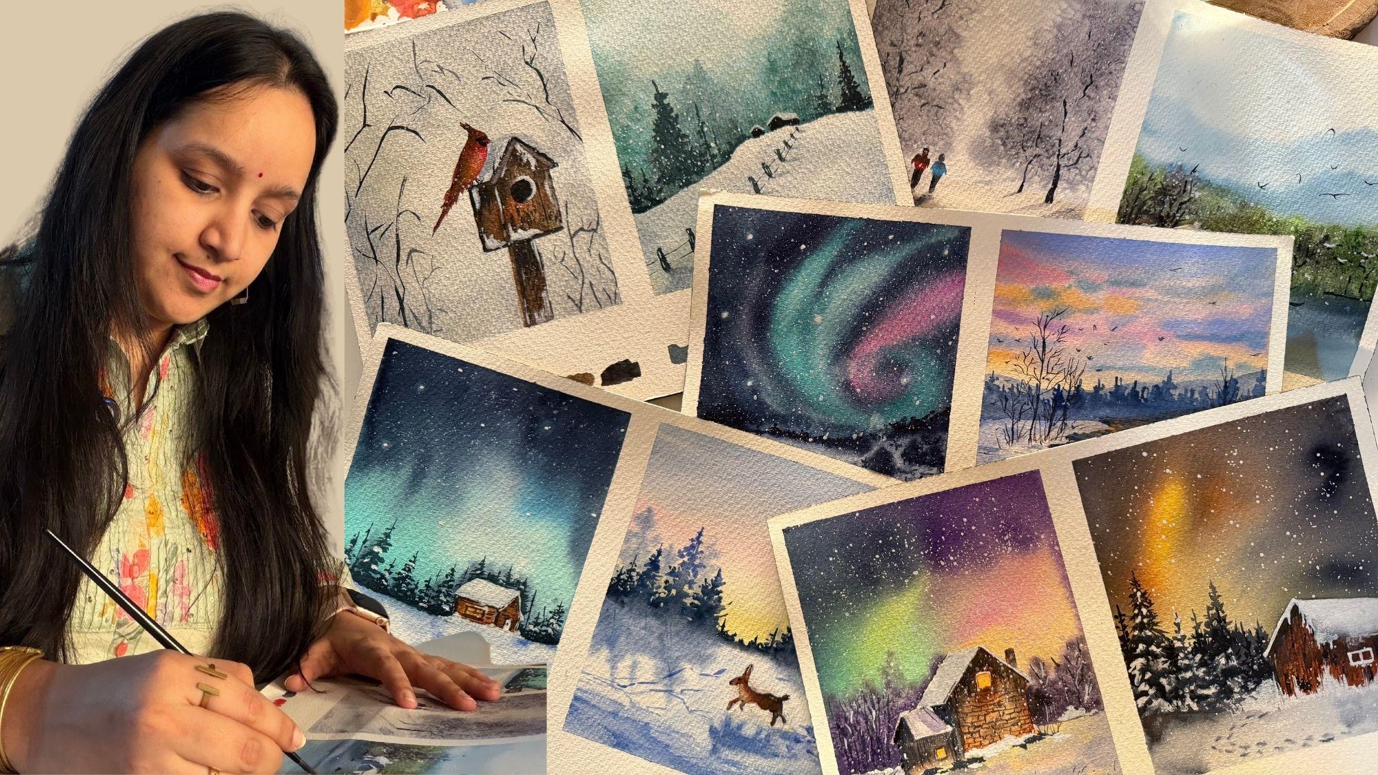
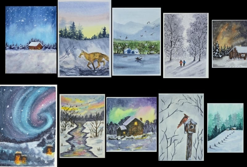
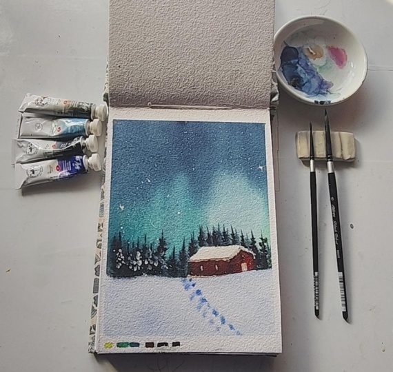
5. Project 1 - Northern Light - Thumbnail & Color Study: So let's begin with the
thumbnail for our class project for day one before we move
on to the final painting. So this is what our painting for day one is
going to look like. So basically, I am using an approximately
a five size paper of which the bottom
I'm keeping for the um colors watching now giving you a rough outline of what the project is
going to look like. So this is going to be
our painting space of which 30% is going
to be the snow area, and the top is going to be the Northern lights
that we'll be painting. And onto the horizon line here, we are going to have
a small cottage. And across this entire space, we are going to have in
the pine trees coming in, and then we'll be having
in the snow splatters. So we'll first begin
painting the wet on wet sky. For the sky, we'll be using
the wet on wet technique. And then we'll be painting
the details of the snow, which are going to be, again, very simple and easy quick ones. Then we'll be adding the details into the cottage
and the pine trees, and then the snow splatters, along with some glowing stars into our Northern
lights like these. Now, if you notice
in the background, we also have some
soft pine trees from behind of these detailed
ones that we've added in. And we've created the
footprint effect, wet on wet onto the snow
space into the cabin. We have a simple snow
covered cabin roof, and here we have little
light detail going on, which is the yellow
and the orange, and the rest of the cabin is
brown and white detailing. Alright. So now the
most important thing here is you need to understand the wet
on wet movement of the colors into the sky here. You see the softness and the glow that is
maintained here. That's because of
the water magic, the water control that we
have while painting the sky. So the colors now that I'm
going to use are going to be for the sky first. So for the sky, I'm going to
use in the bal creen color. Next I'm going to
use a little bit of the Prussian blue color. You see here this little
light blue highlight. You can even use Cerlean blue, peacock blue or a
sky blue color. I'm going to be using the
Pushian blue color to get in this little light
blue glowing effect. And lastly, for the darkness, I'm going to use indigo
with paints gray. So now, along with guiding
you with the colors, I will quickly even
watch them for you. So first one here is
the cobal green color. Now, in case if you do
not have this green, you can simply create
a color like this by mixing in green, blue and white. Now, of course,
the color tones in your palette will
make a difference depending on which
greens you have. But in case if you have a
good emerald green color, mix it with a little bit of
the Prussian blue or serlean blue and add in white
gouache because bal green hue is a
little pastel color, which is more opaque
as you can see. It's covered the white
space completely. So that's about how you can
create a cobalcreen color. Now, the three colors
that we're using in the Northern sky is cobaltreen
Prussian blue indigo. If you want, you can even
use paints gray mixed in with blue if you don't
have an indigo color. Then for the snow area here, I'm going to be using in the ultramarine blue color
in a very light consistency. All right. So the
ultramarine blue color for the snow and
for the footprints. But in a very light
watery consistency. So it's going to be like
you just pick up water and just pick up that hue of the
ultramarine color like this. You see, it's covering
just like a white space. And while this is little wet, you pick up the ultramarine
color and you will just add in the snow
foot the foot effect. But see, the wetness of the paper here, again,
will play a role. You don't want the
paper to be too wet, neither the paint on your
brush for the footprints. So you just add in like this. And if you want, you
can just dab it a little to create it and
turn it into a lighter one. So that's about the snow space. Now, into the cabin,
I'm going to use in the naples yellow
for the light. Then we're going to
use in a little bit of the orange to give the
warmness to the light. And the rest of the cabin, we are going to cover
it up in brown tones. So I'm going to be using in
the brown tones of light red, burn sienna, and then use pains gray to create
in a darker brown. And for the pine trees, I'm going to use
in the pains gray. Alright, so we are going to
use in the pains gray for the pine tree here in
the darker consistency. So that's about the
colors that you will be using in for
this class project. Now, let me quickly
show you the color mix as well for the covalt
green in case if, you know, many of you may not
be having the same color. So let's begin with a
simple practice exercise. So I'm going to
first begin in with a very basic green that may
be in everyone's palette. That's the sap green color. So just picking up
a little bit of the sap green. All right. And now I'm going
to pick up, again, another blue which is available
in almost every palette, the Cerlean blue
color. All right. Now, when I have a mix
of these two colors, let's just watch and see how
this color has turned out. So you see it's turned
out into a pretty green, which looks like
the darker color of the cobaltreen color. Now to this color mix itself, I'm just going to go ahead, pick up this white
quash and add in. Can you see the color,
how it changes into a beautiful pastel
bal green color. And now swatch this color here, and you have your
cobalcreen color ready. You can add in
more white to turn it into a much
lighter consistency. You see, let me swatch
it just closer next to these and you can see how the color is
almost a similar tone. Of course, you can
vary the proportion. You can add on a
little more white to get much lighter
consistency for. So you see just a
little more white, and you can get in good
tonal variations as well. So that's how you can
use basic colors. I use sap green, serlean blue, and whiteqah to get in this cobaltreen color without using a direct
cobalcreen as well. So that is how color mixing
makes a lot of difference. Same way for indigo. Let's pick up the
Crucian blue color and pick up the
pains gray color. Of course, Pain's
grave has to be in a little more consistency
ratio basically than what the
Prussian blue will be because you want a
beautiful dark blue color, and just watch it
closer to the indigo. You see? A similar indigo color. Of course, you can
add in more water, get in a lighter tonal value
of the same color again. You see, a lighter indigo shade. So that is how you can
mix in your colors from your own palette
and use them as well. You don't always
need a huge palette or all the ready
colors available. Color mixing is very important. You need to go experiment with different ratios of proportions. So here, if you see, you can even mix your indigo color
from a basic palette. You can mix the cobaltrene
colour from a basic palette. Of course, you need white gh
for mixing a lot of pastel shades easily because
pastel colors are usually opaque
as you can see. So to get that opacity as it is, you need to use white wash. White watercolors will not
give you that opaque look. So that's about the colors, the basics about what
you will be needing. Now coming into the
pine trees shape. So you can just go ahead and learn to add in
simple pine trees. I'm just using the color
mix that we have here. You just begin in with a
simple center stem or branch, and you just move
on criss cross, a little diagonal and you see how the pine
tree is taking shape. The entire, you know, logic here has to
be that at the end, it needs to take up
this triangular shape. So you begin with
smaller length foliage at the top and moving downwards, you increase the
length of the foliage, and you will see how beautifully the pine
tree has come in. And the same way, you
can just add in some very, less foliage trees. So just some simple, very, less branch details, you see. This is also a pine tree. This is also a pine tree, and just a simple stem with just very less
foliage as well, is also a pine tree. So you need to use a mix of all different ones to create
in that natural effect. Now, another thing is understanding the
wet on wet control. So let me just put in
a layer of water here. Now, into the bottom of our sky closer to the
horizon line here, we are going to have
in a good layer of the cobalten color. Alright? Now, while this
layer is wet in the sky, we are going to create in the background misty
pinetree effect. So for that, you need to pick up the paint's gray color or the indigo color in a consistency such that you
don't have excess water, so it has to be more of
paint, less of water. This area shouldn't
be extra wet. It's like a medium wet tone, and you just begin dropping
in simple strokes like these. You see how they are just retaining the space in
which I'm adding them, but having the soft blend with the cobalt green
in the background. So that is very
important to understand. Now, if you would
have excess water, let me show you that as well. So let's create another
background here, picking up some cobald green. So now this space, you
can see it's extra wet. Along with the wetness, I'm picking up extra wet paint. Alright. You see this paint
is very liquid and watery, and I begin to drop it in
the shape of pine trees. You will see it's moved completely and covered
up the cobalcrene color, and it's not retaining the strokes that
we had added here. And here it has
just become a blend of two colors, no
shape, nothing. So that is why water control
and the water on your brush, while adding the details wet on wet is very important
to understand. Now this is still wet. So on this wet
thing, if you want, you can still pick up little
medium to dry paint and add in more depth by adding in another wet
on wet layer like this. Now, I'm adding it
in such a way that the previous layer is
still visible at spots. Again, you see here
how the shapes are retaining their place but having the soft blend into
the background. So that is why water control plays a very important role when adding details wet
on wet so that you have the crisp looking
details coming in. So that's about how this
class project is going to be, the color theory, the outline
of the class project, the basic understanding
of wet on wet. Now, as we move further, we'll go ahead and paint this painting together
step by step. I will again guide you
with all the colors as we begin painting
the final project. So let's move on to the
next lesson and begin painting this class project
for day one together.
6. Project 1 - Northern Light - Part 1: So let's begin in with our first class project into
this winter painting class. And we're just going to begin with a good simple
Northern Light and a snow feel with a small cabin that
we'll be painting. So at the bottom here, I'm just marking out
the rough snow space. And at the top here, I will just give
in a small cabin. So you can either
go ahead paint in a red cabin or a brown
cabin as you wish, and we'll just be giving in simple snow effect onto
the roof of the cabin. So just adding in the roof and then we'll just be giving in the simple light
effect on the inside. All right. So inside
in the cabin, we'll show the
glowing light effect. And at the top here, we'll just give in
simple snow effect. And then we'll be giving
in the dimensions. And across here,
we'll just add in some background pine
trees and a few detailed one and a
simple snow space here. So we'll begin in with the sky, which is going to be a
pretty simple Northern sky. So the colors that
I'm going to be using is going to be
the Kobal green hue. This is from Mgelomssion
that I'll be using, and I'll be using a little of the indigo along with
the peacock blue colour. Now, in case if you don't
have a peacock blue, you can use a serian
blue, Prussian blue, you know, any tone of a color which is like a medium to dark tone
of blue is fine. So I'm going to be using
in the cobaltreen hue and the indigo here. So I'll first begin in wetting
in the sky completely, and then we'll go ahead with
the wet on wet details. So first begin in
with a good layer of water into your sky, make sure that it's evenly wet. And as I told you, we'll be painting two
paintings on this because it's a bigger size
paper that I'm using, so I've divided it
into two equal parts. Now, I'm just going ahead, adding in a layer of water. Now, I'm going to
leave the house space blank and not going to add
in the layer of water there. In the rest of the space, just go ahead and leave the snow space also
blank for now. Make sure in the roof you don't take any colors because
we are going to just leave it white and give it a little snow effect
later on. All right. And in the rest of the space, I've added in a good
layer of water. So I've added in
the layer of water. Now I'll begin in with the
cobalt green color first, and we're going to paint a very simple Northern sky effect. So from the bottom space, I'm going to be pulling out
this cobalt green color towards the top side. Now, across the cabin that you're adding,
go ahead carefully. And now from the top, I'm going to pick up
the indigo color and the peock blue color and given little lighter
blue prints first. So first, I'll begin with a little hint of
the peacock blue. And now I'll just pick
up the indigo color. So my indigo is
from white Knights, and the peacock blue
was from Shinan PWC and the Kobal green was
from a Michelomsion. Of course, you can go ahead
and use in any brand. It's not necessary to stick
to the brands that I use. It's just about the
color preference or the choices that you pick up
according to your liking. Now I'm going ahead
with another layer of the cobaltren color in a little watery consistency,
as you can see, and I'm tilting my bow towards the top space
so that the colors bleed into each other and have that Northern Light effect. But make sure it does not move just in one
direction completely. So I'm altering
between the top and the downflow of the
panes. You see? I'm just pulling out some
strokes from the top. Towards the top space, I really want a good bold indigo effect. You see when the colors are in a good liquidy consistency, they flow and create
their own effect. And on the right side here, you can see how I have a good glowing spot also
because of the light or tints. Now, from this space, I'm
just going to lift up this excess water flow. You see this little peacock blue hint that's
coming in there, and now I'm just going to pick up a little drop of water and drop it here and let it
create a good glowing spot. But it has to be well blending, so I'm just going to
quickly rotate in. So just about the cave in space, I want this glowing
spot to come in. So slowly and gradually, you will see how the
pins are flowing, creating in that glow and
the soft blend as well. Alright, so that
is it for the sky. But while the sky is still wet, what I'm going to be doing
is I'm going to pick up a little indigo color in a medium consistency and
using a smaller size brush, just going to add in some background pine trees effect on the horizon line here. Now, while doing this, make sure your paint is in a
medium consistency, and plus, make sure that you
don't pick up excess water. Otherwise, the paints
will spread out. So you need to maintain the consistency of
the paint as well. You see, adding in some simple random
pine tree effects as a background blurry effect. And then in the
foreground, we'll add in some detailed pine trees. Water control A will be very important when you add
these details here. Now into the snow space as well, what I'll do is I'll quickly go ahead with a layer of water. You see how the colors
from the sky is just bleeding and giving in that
beautiful blending effect. And for the snow space now, I'm just going to pick up
a little ultramarine blue. Just created little
snow piles randomly. You he at the top, just
giving in little of the shadow effect while
this is still wet? And now just creating in some step effect using the
same ultramarine blue. So just using the tip and
creating in some, you know, the snow steps that have
been locked into the snow, simple detail. And that is it. Now we'll wait for this
much to dry completely. Then we'll go ahead with
the details into the cabin and the details into the cabin that we'll be painting on the top
of the cabin as well. And one last thing using in
the little indigo color. Over the cabin as well, just giving it a little of the background pine tree effect. And while doing this itself, I will define the top
of the cabin well. So you see the back
of the cabin has been defined. So, that is it. Let's wait for this to dry completely. Then
we'll move further. And then at the bottom here, we'll go ahead and see
whether we do colours watching or you want to write in a note if you're
sending it to someone. But I'll be going ahead with a good colours
watching out here.
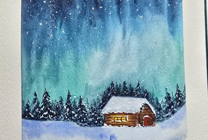
7. Project 1 - Northern Light - Part 2: So now everything is
completely dried and we'll begin adding in the
details into this cabin here. So first for the roof, I'm just going to begin in with
a layer of water. And to show in the snow, I will just be using a
little hint of the indigo. So just adding in
this layer of water into the top roof
area of the cabin. And now I'll just pick up indigo color and pull
it out from the edges. So you see this will act in
as the snow on the cabin. So just on the edges, drop in this indigo color. This will define your
roof and the snow space. Make sure that the
indigo is of a very, very, very light consistency. Now, I did not mark out the window
space and the door area. So this will be the entry
to this cabin here. And here I will just put in a huge one window
scene. All right. Now into this, what I'm going to do is into this area here, we'll just go ahead with
little tones of the yellow and the orange color to
show in the light. And I'm pulling out
that orange a little on the outside as well to show the light falling onto the rest of the cabin,
as well, right? And then into the cabin, we'll add in the brown color. But that we'll add in once our snow area dries completely. Otherwise, the brown color
will begin to bleed in there. Now, this cabin space here, we leave white the door, or you can just add in a very small indigo color layer just like the roof here as well. All right, just a small tint. Now, by the time this dries out, let's quickly add in the
detailed pine trees. For that, I'm going to use
in a mix of the indigo and the pains gray color and a little hint of green
in between as well. You can use any darker
color that you wish to need not stick to the
colors that I use in, but I'm going to pick up
majorly the indigo color and just vary it a little here and there
with different tints. And we're just going
to go ahead and add in some detailed pine trees
onto the horizon line. So you see just pulling out timble foilage Same way, we're just going to
go ahead and add in a few of them onto
the horizon line. Now, you can just vary the height and the kind
of trees that you add in. Somewhere you can just go ahead, add in very little
fooliage detail. Somewhere you can go ahead
with some detailed foliage. In between, you can just
add in some, you know, very dried kind of pinerey
effect like this. Alright. So just vary as per your liking. Need not stick to
anything specific or, you know, just one
way of doing it. On top of the roof,
I will add later on once the roof
completely dries out. By the time, I will
just quickly add into the left side here. You see how I'm just pulling out the simple foilage effect. It's very important to vary the height of the pine
trees that you add in so that you get in
that natural effect and vary the foliage as well. So that it looks
natural, realistic. And you will just see I'm
just dabbing my brush very randomly to create
in this foliage effect. See how I'm just
moving in crisscross, and it gives in
this simple detail. Now, it's very important that you vary the heights throughout, so keep that in mind when you're adding
in the pine trees. You see how loose and
easy it is to add in these pine tree foliage detail, and it looks so realistic when you just let
it go loose and, you know, not focus a
lot while adding in. That makes it more
realistic and natural. And that's actually
the beauty of nature. Nothing is same, nothing is, you know, seen same
to each of the eyes. Every two eye sees
things differently. Now in between, I
will just add in some very dried
kind of pine tree. So, you know, basically
just the center and very just dabbing in the foliage
here and there randomly. And now my roof is also dried. So on top of the roof as well, I will just take in
some pine trees. All right. So just a simple fooliage
that we've added in. So now, this is
dried completely, and we are going to go ahead and first add in the
details into the cabin. For that, now I'm
going to go ahead with a reddish brown colour. You can pick up any brown tone that's available
in your palette, and you can use a burn tumble or you can use a
bun sienna color and just begin
adding in the roof details the cabin
details, basically. I'm using here the
light red colour. Which is a brownish red color. And into the rest of the
spaces now in the cabin, I'm going ahead,
adding in this color. And while I add this, I'm going to use
in the darker tint by either using
in a vende brown, or you can mix in a
little of the paints, create to your light red, and just onto the edges, create in the shadow effect
while the paint is still wet. So you see how I'm building
in the depth across the main spaces and creating
in those three D effect, giving those darker hints. Now into this space as well, I'm force going to be going ahead with this light red color. All right. And in the center, again, to blend everything well, I'm just going to be picking up a very light
hint of the yellow in a very light consistency and blending it with the brown. So you see, we've got that
glowing effect coming in, but we still have
the browns as well, and all of the blending
has happened well. Now, after this dries out, we'll define the window much
more better and deeper. Till then, I will quickly pick
up the vindic brown color, which is a dark brown colour
and define in more details. So you see, I'm just
distinguishing the front part of the cabin from the
front view here. So now, even this is completely dried and I've picked up
the paints gray color. And just using the pointed edge, I'm going to be adding
in the details, add in these details very
swiftly and creating little, you know, details
onto the cabin, giving in some
lines and textures, very little, not much to add in. So you see just simple details, defining in more of the
cabin that we've added in. And now, lastly, using
the white quash, we'll just add in some details. So I'll just pick up
some white quash. And give in some snow
details on the cabin. Make sure you pick up
the white quash in a good thick
consistency so that you get in that bold
effect after drying. So just onto the window, giving in that
little snow effect, and even in the roof, giving in that little
highlighting effect, right? And towards the
bottom here as well. I will just quickly
go ahead and show a little of the snow
collected towards, you know, the bottom
of this cabin. All right. Simple details that we've added in. Now at the top. I'm just going to go ahead, splatter in some stars. Make sure this also
your white quash is in a good consistency so that you get a good
layer of these stars. Now, if you want, you
can just, you know, turn a few of these stars into glowing spots by blending them into the background and then
add in the depth to these. So these big dots
that have toned out, I'm just turning them into
the background damp star. So you see just creating in the dull background using these, and then I will just add in some glowing star
effect to these. Not going to add much of these
just a few here and there, since I have some big splatters. So the background
has to be very dull. And now to the center of these, I will just pick
up the white uh in a thick consistency and
drop in the center. And you will see automatically these stars have
that cling effect. Now, somewhere
randomly, I'm just dropping in some
bigger star detail. And lastly, if you want, you can just use in a little
hint of the white and add a little snow onto a
few of the pine trees. Just some snow collected onto some branches
of the pine trees. You need not add it to all of them just randomly somewhere. At some spots, you can show some snow onto the pine trees. So basically, just using
in the white gouah add in the foolise effect with the white gouah and that will act in as the snow
on the pine tree. Alright, so just little snow that I've added in,
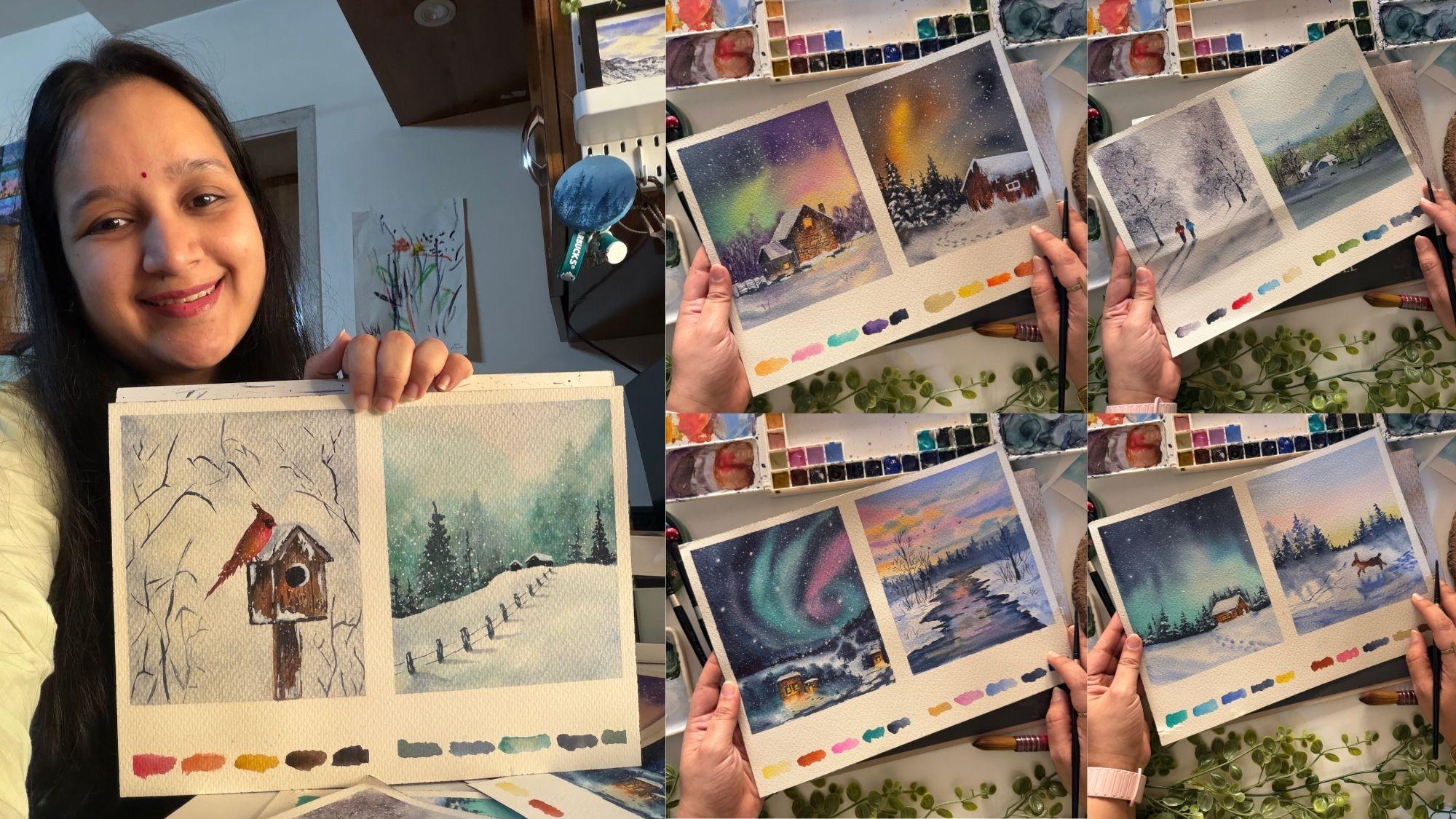
not much of it. And that is it. We are ready
with our first painting. And now before I peel
off the masking tape, I will quickly go ahead, pick up the colors that we used and create simple
swatches like this. You can go in any order and
add the color swatches. It's not necessary to stick to the pattern
that I'm doing. You can even create in your own different pattern
if you wish to, and you can add in more colours All right. So that is it for
the first painting of this winter class. I'll see you guys into
the next painting, and then we'll peel
off the masking tape and tear off the two
paintings apart. Thank you so much
for joining me into this class and painting
along with me. I will see you guys
into the next painting.
8. Project 2 - Snow Forest - Thumbnail & Color Study: So let us do a quick
thumbnail study of our class project
for day two. We are going to be painting this simple snowy
winter landscape with, you know, this running
reindeer or the fox, whatever you want
to consider it as. So this simple silhouette
that we'll be adding, then simple snow texture and the reflection to the pine trees and to the fox or the
reindeer, as well. So that's what our class
project is going to be about. So let's begin in
understanding first the colors that we'll
be using in, right? So let's begin in with our
thumbnail for the painting. It's going to be the
same size that we went ahead for the
Project one. All right. Now, this time, almost
at the center line, we are going to have
in the horizon line. Now here we'll be having
in the simple silo head. Now the siloed, you can go ahead with any other siloed
if you wish to. It's not necessary to have
the same one as mine. I have just gone ahead with a very rough random
slow head. All right. So the silhouet here. Now at the top, we are going
to have in the pine trees. All right, of different
heights throughout. And then we are going to
add the reflection to this. Now, understanding
the reflection, how we are going to add it. So if you want to consider the light source
from this point, say, the light is
coming from this, so all of the shadows
will fall diagonally moving towards the
bottom left side. But if you want to consider that the sunlight is falling here. So light is coming
from this source, your object is here. So all of your shadows
will be moving diagonally like this. All right. So we are going to consider
light from this source for our project and all of
our reflections, if you see. The shadows are moving diagonally towards the
bottom, right side. And then for the animal
silhouet the reflection, we're just going to add in
like a simple silhouette, which is, you know, following a similar shape
outline at the base. So here will be the shadow for the fox or the reindeer
that you consider. That's about the basic study about the light source and how we are going
to go ahead with. Now marking out the colors that we are going
to be using in. So first, for the sky, the colors that we
are going to be considering is going
to be a pastel yellow. I have a ready naples
yellow in my palette, so that is the color that
I'll be going ahead with. Now, in case if you don't
have a naples yellow, you can simply mix in white to your permanent yellow light and get a beautiful
pastel yellow. Next, for the pink, I will be using in the
permanent rose color. You can use permanent
rose, bright opera, carmine, scarlet, whichever pink is
available in your palette. And then for the sky, you can either use
ultramarine blue, you can go ahead and use in a little hint of
the Cylean blue, Pecock blue, whichever
blue you wish to. So, you have all the choices to go ahead with for the blue. Now, one important thing
here to understand is when you blend the yellow
and the blue together, you get a green color. That is the reason we're using
this transition color pink to make the color blend
go smoothly into our sky. Now for the pine trees, we are going to go ahead with the ultramarine
blue color first. So we'll first form in
a very light layer with the ultramarine
blue color and then begin adding in the depth
with the darker tint. So I've just marked a
very dark tint first. So you see, we'll be using
it in a lighter consistency. And then using in
the indigo color, or you can use Prussian blue. You can just drop in some depth to your pine trees as well. So for the pine
trees, the two colors that we'll be using
is going to be a good ultramarine blue for creating in
some snowy effect. And to give in the
depth and the darkness, we'll be using in the
indigo color. All right. So these are the two colors that we'll be using in
for the pine trees. Now, in the pine trees, also, if you see
in the background, we have the soft pine trees, just as in the
previous class project also we had same way
in this one as well. In the background, we
are going to have in some detailed looking
pine trees wet on wet. So I'll teach you that
as well how to add them. Now, into the snow space, we are going to have
in the lighter values with the ultramarine
blue coming in. The shadows will also be
with the ultramarine blue. The shadows for the
pine trees will be with the ultramarine blue with a little bit of the
indigo again like this. And then you can just
go ahead and add in some wet on dry
textures of the snow. I will be using this
dabbing method a lot to create the shadows
light and easy like these. So that's about the color
for the snow sky pine trees. Now for this silhouette detail, I'm going to be using
the lighter tint of Petersburg Ochre first. Now, if you don't
have a Petersburg ocher, it's completely okay. You can just mix in
a little hint of yellow ocher to your white and get a similar looking
lighter tint. Then I will be using in
the light red color. You can go ahead using a Bonsiena and then a little
bit of the ndeg brown color. You can use any darker brown, not necessarily by the
same name and then using in the pain's gray color to create the darker highlights. So these are the four
colors that we will be using for the animal Siluhet. So that's about the
color theory that we've studied everything that
we'll be needing color wise. Now, let's go ahead and understand one
important technique, how we'll be going ahead
with the pine trees. So first, I'm picking up a very light watery
consistency of the ultramarine blue
and just beginning in with a simple pine
tree silhouette. You see this silhouette is wet. I'm just dragging my
brush left and right. All right. Now into
this, while this is wet, I will pick up a
little darker hint of the Prussian blue color first and just drop in
some darker highlights at spots and then pick up the darker hint of
indigo color and same way, just creating some
darker highlights. So this way, you
will see a tree will have three different color
variations of the foliage, creating in the shadow
effect naturally, creating in the
lighter snow looking filiage and creating
in these bottom depth. All right. And then
we'll be adding in some detailed pine trees using
the darker color directly. Like just go ahead with the
dark color and just you see. Just very loosely, I'm moving left to right and the
tree is formed naturally. So we are going to be
using in the blend of these two techniques
for creating the pine trees into
this class project. Now, the important thing about the background pine
trees that I was talking, so let's quickly just
add in a layer of the yellow color. Okay. This layer is wet. Now
I'm going to pick up a little pink color hint as well and just going to blend
in with the yellow. Now, while this is still wet, I'm going to go ahead and add in some detailed
looking pine trees. So using the
ultramarine blue color. Now, important thing
that you need to keep in mind is the wetness
of the paint. So in first half, I'm adding it with a little
extra wet paint. So I have a very wet consistency
of the ultramarine blue, and let's begin adding in. You see how the color is
spreading out completely. It's not trying to retain
the shape of the pine tree. And now I will pick up the ultramarine blue
with very less water, and my background is still wet. You see the dispersion is so less and just going to go ahead, add in some foilage detail. You see how the tree
shape is retained. If you go ahead with little
more or less of the water, so I just dapt it
onto this and you see this retains the shape
much, much, much better. So one was extra wet, one was a little wet, and then more dabbing. So if as you keep on removing more of the
water from your brush, you will have very less pigment, and then you just go
ahead and you will see you get the softness
because of the wet background, but you retain the shape of the siloed that
you're trying to add in. So that's very, very important
when it comes to you know, working wet on wet, creating in the soft background details. If the paint will be extra wet, you see the dispersion
that has caused and just given us a blot
of color instead of giving us this soft
looking background pine trees that we need in this
painting at the background. So that's about the
background pine trees, the detailed pine trees, the
three colour tonal variation to build in the depth
into the pine trees. Then the other thing for
this class project will be using this layer on layer, wet on dry to create
in the snow depth. It's simply layer on layer that we'll be working with the
ultra green blue color. For the shadows, also, you will have a wet snow layer consider this as a snow layer, and wet on wet, you
will be adding in these similar looking pine tree. Basically, the
height that you have at the top here, accordingly, you will maintain the length of the silo heat here as well, and we are going to
work wet on wet. So when you are working
with the shadows as well, you need to keep the
water consistency at this level so that when
you add in the shadows, they retain the shape in which you're adding them and still look in as a reflection, having that soft blend
into the snow area. So that's about how we are going to be going ahead
with the detailed pine trees, the snow, the silhouette, the shadows, the sky, the blending and everything
about this class project. I hope I've covered
everything, and it's easy. This time, the color palette is also easy, easily available. If you don't have ultimin blue, you can simply use
whichever light blue is available in your palette. If you do not have a
permanent rose color, as I told you, you can use
carmine, scarlet, opera pink, whichever you know, color of a pink tone
available in your palette, not necessary at all to
have the same shade, okay? Now you see when this
tree has dried out, this is looking like the
snow deposited on the tree, and the darker
values are looking as the real foliage of the tree. After this dries out also, you can add in more
depth to this. So now this tree is
completely dried out. Now again, you can go ahead with some detailed foliage and add
in more depth to your tree. So that's how you
can just go ahead, build in your pine trees for the snow caped look. You see? Just pulling out
simple this also, you can go ahead with two
to three tonal variations of the color or not necessary to just
directly move on with the dark color or move
on with a light color. And I love dabbing a
little so that it looks little well blended with
the rest of the tree. So that's about the pine tree, the snow easy snow caped ones. Of course, there is
a lot detailed one that you can paint as well. But here, I've just shown you a very simple big no
friendly type to begin with. And when you keep on
practicing these, you will automatically keep on developing your style and your
depth into the pine trees. So with these, let's move
on into the project for day two and paint this
beautiful painting together.
9. Project 2 - Snow Forest - Part 1: Hello, everyone. Welcome back to the next painting of this
winter Series painting. And for today's class project, I've just marked out
a small silhouette. Almost across the
center space I'm going to be having in the
horizon line as well. So the top, we are going to have a pretty simple pastel sky. We'll give in some pinetree
details on the horizon line. This is going to be a
snow space where we'll add in this fox and the
reflection to the fox, as well. So that is what this class
project is going to look like. So we'll begin in
with the sky first. Now, of course, you can go
ahead with your own slow head. As per your choice, that
is the reason I marked out the silo hit first
because it would be very difficult for me to
go ahead with the outlines on camera because it takes me
time to sketch out things. And that is the reason
I've just created in this small sketch of a
jumping kind of a fox. Alright. So that's about
the pencil sketch. You can take your
time, create in this because then we'll be adding the shadow to this accordingly. So here is the fox. Alright. So I'm showing the light
effect coming in from here. So accordingly,
we'll just create a very rough shadow
to this using in the blue colour that we'll be using and adding the
shadow here to this fox. And to the pine trees as well, we'll be adding in the
shadows accordingly. So basically, from the pine
trees, we'll be showing in, like, the or let's consider all of the light
falling in from here. So all of the
shadows will fall in towards the bottom diagonally, moving from top left
to bottom right. This is the light source, basically, here is
your pine tree, so the reflection
will be like this diagonally moving
towards the bottom side. So we are going to begin
with the sky first, alright? So for the sky, let's go ahead with a layer of
water completely. You can even go ahead and add in the reindeers if you
wish to or create in, like, you know, the horse
carriage type of a detail here. It's absolutely your wish, what silhouet you wish
to go ahead with. I just wanted to
challenge myself, and that is the reason
I've gone ahead with the animal silhouet here. Alright? So I've added in a
layer of water into the sky. For the sky, as I told you, we'll be going ahead with
very light pastel sky. So I've first added in a little layer of the yellow
closer to the horizon line. Now, after the yellow, I'm just going to be
picking up a little of the pinkish color. So you can go ahead with
any pink of your choice. I have picked up the
permanent rose color. And towards the top, I'm going to be picking
up a little of the ultra green blue mixed in with a little
hint of the pickup blue, but both you see in a
very light consistency. So maintaining in the pastels. So when you need to use the colors in a
pastel consistency, you can just use the color in
a good pottery consistency, and you see we've just got
a simple layer of paint, which is giving in
that pastel effect. You can use any tone of pink. Basically, the pink
creates a good transition from yellow to the
blue that we are using in and acts in as a good transitional tone for both the colors with the blue, as well as with the yellow, and just a very simple washed
sky that we've created. Now, while this is still wet, we are going to go ahead, add in some background pine trees. For that, this time,
I'm going to use in the ultramarine
blue color itself in a light liquidity consistency and just give in some wet
on wet pine tree details. It's not necessary
that you need to have the trees on the
entire horizon line. You can skip some spaces in between and let them be blank. So for the background
trees, you can see, I'm just going ahead with a very rough sillohad.
This is wet on wet. So you will see that
the foliage is, you know, retaining little shape and giving in a soft blend
with the background. The key here is
the water control by adding in this blue layer. Only then you will get
in that, you know, detailed look of the foliage, as well as having that
soft blend with the sky. So for that, while picking up
the ultramarine blue color, you need to make sure it
is not excessively wet. Otherwise, it will just spread and create a patch of the blue instead of giving
you this finery effect in the background. So that is about the sky. Now, we'll wait for this
to try and then move on to the snow space and create
in the details there. So now my sky is
completely dried, and I'm going to go ahead with the detailed pine tree first before we move on
to the snow space. So I'm picking up the
same um green blue mixing in a little hint of the endico. And now I'm just going
to go ahead on top of these and add in some
detailed pine trees. And then we'll move
on to the snow space, creating the shadows,
the details. You will say I'm not going ahead with much detailed foliage. So first, I'm just adding in
a few of these pine trees. And now, while these
are still wet, I'll just pick up
a little hint of the indigo and drop
in some darker tints. Okay. So you see, while
this is still wet, you just add in one more
layer using in a darker tint, and it gives in so
much more depth and texture to your trees. So now you see closely, and you can see how
the two colors are creating in the depth. And vile trees like,
you know, semi wet, you just go ahead
with this dark layer and create in this
texture detail, pull out some sharp
edges, wet on dry. Given the depth so basically here, you see, you don't
have to follow the shape of the shadow or the length of the shadow trees that we've created
in the background. Basically, let
them be the blurry background trees and you can create the trees of different
heights in the foreground, which will act in as
the closest pine tree, and they will act in as the
background f of pine trees. Same way, just quickly
going to go ahead here. You're also at first
going to go ahead with a little bit of the light ultramarine nose trees and then, you know, use in
the depth technique and add in details
with the indigo color. Once this will be
a semi dry state, I will go ahead with
the tuft You see, again, I'm not following the length of the
background trees. Let those background
trees also be visible, so you need to skip
the same length. Only then those background
soft flurry trees will be visible in
the far off details. And now picking up the indigo, I will just drop in
some darker highlights. You see pulling out some
very detailed sharp foliage and giving in that depth effect. All right, so we
are done with the pine trees on the horizon nine. I just given a little detail. Now we move on to
the snow space. And for the snow space, I'm going to go ahead with a
layer of water completely. Now, you can decide
your, you know, motion of light or the
source of light, basically, if you want to go in from the left edge or the right edge. I am considering the light falling in from
the left top side, and accordingly, while
this space is wet, I will go ahead and
add in the shadows. For that, I'll pick up the ultramarine blue color and first begin adding in
the shadows to these trees, a little diagonal moving
towards the bottom left space. The, you know, shadow
to a few of the trees, not necessary to add all of the details and all of
the trees in the shadow. You can just let a
few of the shadows be bold and the
rest of the shadows just be there like a
blue color effect. I'll just pick up a
little of the indigo now and add in here. You see the simple shadow wet on wet that we're adding in. Same way this side as well. Now, you will see that my trees at the top were still wet. That is the reason a little of the color may flow
from the top as well. Now, this side, the shadow
has turned out too dark, so I will quickly just lift
up a little of the color. And at the top, later
on if we feel the need, we will go ahead given more of the depth on
the horizon line. But for now, we'll just let
these shadows be there. And into the rest of
the snow space as well, I'll just pick up
a very light hint of the ultramarine blue and just add in the snow effect. Basically, I did a mistake. I should have first
actually added in this layer of the
ultramarine blue. Now into the shadow,
I'm going to be using in toothpick and
given little strokes, just a few strokes
here and there. Make sure that these
strokes will turn out permanent and given
that texture detail. And I'm just dabbing in a little of the paint
and picking up, creating in that, you
know, shadow effect. So you see, I'm just dabbing
my brush and lifting up a little of the darker tints, creating in that
lighter shadow effect. Now, while the snow
area is still wet, just going to go ahead
with the ultramarine blue, creating in some darkness, now space at the bottom, just as we did in our
previous painting. Right? Now, while
this is still wet, I will quickly add in a rough shadow to this
reindeer that we are adding in and using in a mix of the
ultramarine and the indigo. So basically, the shadow to this also will
be somewhere here. So just a similar shape
that you have at the top, but it will be in
the reverse way. So you see a very rough outline. But in the reverse angle, so here's the yours and your
I've added in the year. This is going to
act in as the face, the two legs, the two back
legs, the tail, right. So this has become a little or, you know, it's
spreading out a little. So what I'll quickly
do is dam dam damp, blended, or you can even use
in this cloth or a tissue. And now, again, I'll
pick up the color with a little less
watery consistency. So you see how the
consistency of the paints makes a
difference bet on wet. And I'll again go ahead and
now the pins are too dark. Creating a damp layer
of water first. And now the shadow looks better. All right. Now when you add in the final detail here
to this reindeer, you'll see the shadow
effect much better. Of course, the shadow
does not have to be the exact same shape. It's, of course, the shadow
that we're creating, so it can just be
rough and simple. Now, once this dries out, we'll add in the detail to the actual reindeer
that we're adding in and a little
more snow detail. Oh
10. Project 2 - Snow Forest - Part 2: So now for the first
layer of the reindeer, I'm going to be going ahead
with this Petersburg cher. This is like a pastel
or sand color. So I'm just going to
begin in with this color and create in the
entire outline first. Now, make sure this space
is completely dried. So you see towards the leg
space, this area is wet. All right. Now, I'll wait for
this layer to dry completely and then
add further detail. Now I've picked up
the light red color, and I will begin adding in the next layer in such
a way that we have this light layer of the
Pettersburg occur at the bottom of this reindeer creating in that highlighting. So you see how in the
legs just on the edges, I'm adding this color. This area still seems to be wet. So I just completely tapped it so that now the
shapes are retained. You see how with watercolors, it's very important for
the paper to be dried completely before you begin
adding in the silhouette. Now, I'll again,
pick up a little of the Pettersburg
hawker because you see at the base here where I wanted that
Petersburg ocher look, everything got
completely covered up. So quickly just adding in
little of the Pettersburg ocho. You can simply add in a yellow ocher mixed in with white if you don't have this
exact same shade. As I always say, you don't
really need all the colors. It's about just mixing in your own colors and
getting in right. Now, I'll use the
vende brown color and define in more depth. So now at the top space, I'm adding in the vende brown. See how carefully just I'm giving in the outline
with the Dako hints. Now, I'll just pick up
a little pains gray. Make sure not with
excess water and just drop a little
at the top here, and you will see how it
blends in with the color, giving in more of
that three D effect. See wet on wet, how
the details come in. Quickly pick up a little more of the Petersburg
hawker, drop in here. Now, I'll wait for
this to dry before we add in the final detail here. Till then, I will just
quickly pick up a little of the ultramarine and just use it in a very fine
liquidy consistency and given some
fine, snow details. Again, this is too dark, so quickly using water blending in. You see, just some dry brush and bold spaces, creating
in the snow. Just some simple snow effect. And turning this shadow
one lay or darker. So this will act in like a little sharp or shadow
here now, you can see. Now, I'll wait for this to dry completely and then add
in the final detail. Till then I will quickly create in the colors
here at the base. So this time, I'll pick
up the light red color. Let's pick up a pink color tone. I'll pick up the indium. You see I drop the water. I'll have to again correct
up this space now. Picking up the
Petters per walker. And the ultramarblue color or let's pick up the
vende Crum this time. So I just corrected up
this entire space here, which, you know, the
water off had fallen out. So I just gave in the
darker depths again. And using in the white quash, I just defined this
bottom space again, wherein the Brown had
spread up completely. Now using in this
black technical pen, I'm just going to be adding in just a little detail
into the face here, just a simple I and a
simple nose ski tail. That is it. And if
you want just given a fine outline at certain spots, creating in a little
more of the depth. I know this is not the best to endure that you may have seen, but I am also learning. I am not at adding in
human or creatures, and that's what I want
to challenge myself. Every class is actually
kind of a challenge to myself first to
improve, to grow. And then to teach a head
further, of course. But sometimes I just like
letting my raw faults, my raw awnings also be here. And now just going to use in a little more of
the altimineblue, add in some more darker
details of the snow. Just some snow cracks. See? So taker details. And then adding in some raw
textures along with it. Creating in the snow bed. Just a little splatter
there at the back. So that is it. We are ready with our first two painting
of this series. Let's peel off the masking
tape and see a final painting. Make sure to peel
off the masking tape once your edges are completely dried and peel it off against the paper like this. Mm. It's so satisfying and beautiful to see
your paintings come to life as soon as you begin
peeling off these tapes. And now in the center, I had used a thin tape to create that equal edge once I tear
off these paintings later on. So here's the first two painting from the sinter painting series. I hope you guys enjoyed
painting these, and I will see you guys soon into the next
painting of the series.
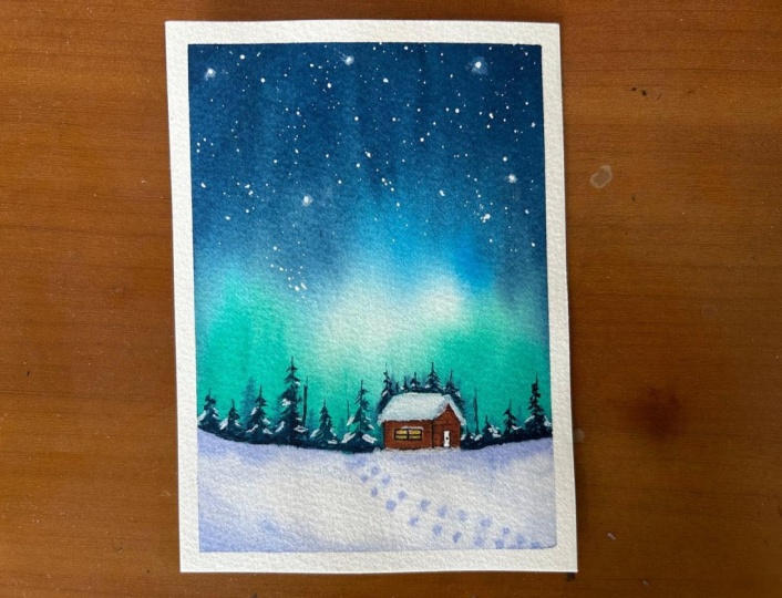
11. Project 3 - Aurora - Thumbnail & Color Study: So before we dive into the
class project for day three, let's go ahead and do the
thumbnail and the color study. So for the Class Project three, we are going to be painting
again Northern Light. This time, it's going to be giving in beautiful
curvy strokes. For the first class project, it was a simple blend. And for this class project, you see, there's movement
into the Northern lights, and at the base here, we are going to have
in the snow space and some cottages that
we'll be adding in. For this class project,
we'll be adding in a lot of wet on wet into
the snow space here. And here, we'll just give
in a small mountain range. That's about how the placement of our Northern Light
is going to be. Now, first thing, we'll go ahead with the colors watching, the colors that we'll be using. So for the Northern sky, the colors that
we'll be using is going to be a shade of pink. You can use permanent
rose, bright Opera, or you can go ahead use in scarlet or any pastel
pink that you wish to. Any pink of your choice you
want, you can go ahead with. Next, will be the
cobaltrin color. In class Project one, I have already shown
you the mix of the cobalt green using in different tonal
values of sap green, plus serlem blue plus
white and how it beautifully gives you different
tones of cobalt green. So we've already discussed that. So you can go ahead and
watch the color study of Class Project one if you want to mix in the
cobalt green color. Next up, here is
the indigo color. For the sky and a little bit of the Prussian blue color
that I will be using. You can go ahead and
use in any blue, Prussian blue, cedulne blue, just giving in little
blue highlights to get in more light and
glow into our sky. Then for the snow space, we are majorly going to be working around with
the indigo color. For the mountains as well, it is going to be indigo. But of course, in different
tonal variations, very light consistencies,
giving in the snow effect, some dry brush detail. If you observe our snow space, we have this little snowy
mountain space coming up here. We have tiny pine
trees in between. We have some dry brush
texture to show in the ground in between
the snow cape. So these light spaces are basically acting in as the snow. Now for the cottages, the roof will be
with white quash showing in snow caped cottages. And for the color
of the cottages, to show the light effect, I'm going to use in
the naples yellow, and then I'm going to use in the orange color to
give in the warm, just as we did for Class
Project one, same way. And then I'm going to
shift into the browns. Uh, and lastly, we
are going to use in little hint of the pains gray to give in more of the shadow
and the depth detail. So this is about the
colors that we'll be using in for the cottages. So we've understood where what
elements are going to be. Now, again, for the sky, we are going to be
going ahead wet on wet. For this space as well, we'll
be working a lot wet on wet with water control
to get in these details. We've already, you know, understood the water control in day one and class project
for day two as well. So same water control will play a role here while adding
in these pine trees. For these, we'll be going in
with these swirl motions, and our brush will
just be moving. Instead of just
moving in straight, our brush will be
moving like this in circular motions to get in these beautiful strokes
into Northern sky. And then with the white gouache, we'll drizzle up the snow. So that's about the
simple basic color study. And this class project is
very simple, very basic. And we'll even be showing this light effect
of the cottages falling on the snow space. So wet on wet while you are adding in these
indigo spaces, you will drop in the yellow
into the snow area as well so that it has that glowing spot for the
light of the cottages. As we keep on proceeding
with the project, you'll be able to understand
more step by step why things are being placed at
particular spots. That's about the basic
thumbnail and color study for Class Project three. Now let's dive into
the class project and see how this painting
turns out step by step.
12. Project 3 - Aurora - Part 1: Hello, everyone. Welcome back to the next painting of this
winter painting challenge. And today for, um,
Today's painting, we are going to be going ahead with another beautiful
Northern Light. And for the Northern lights, I'll just quickly go ahead
with the simple pencil sketch. So basically, it's going to
be a very soft and soft, you know, details that
we'll be adding in. Just that here, I'll mark
out a front looking cottage. So in the first painting
of this challenge, we had gone ahead with the
side view of the cottage. This time, it's like this front cottage that we'll be adding and adding in the beautiful
glowing light effect from between the cottage, and I'll just add another
smaller one closer to this. All right. And I'll just quickly add one more small cottage
on this edge, as well. All of these cottage,
you can see, I'm just adding the
front view look. That is the simplest, you know, detail for
these cottages here. Now, just consider Horizon
line for your basic, you know, details that
you have to add in. So at the top, here,
we'll be creating in the glowing Northern
Light effect, right. Now, across this entire
space of these two cottages, here we'll be having in the
dark range of pine trees, given in soft and soft, wet on wet when we
add in the snow area. And here later on,
we'll just add in a small snowy mountain
kind of range, a very small range like
this, soft and soft. So basically, when our
sky will be a little wet, we add in this
little detail here. And here, we'll just creating some background tiny
looking pine trees. And here, we'll just
give in then, you know, some dry brush details
along with the snow. So this is going to
be a Northern light, a snowy mountain
range, three cottages, and a good range of
soft pine trees and detailed pine trees around
these cottages, as well. And from these cottages, we'll show the yellow
light emitting in, and we'll show the effect of it, as well, falling
into this Snow area. So that is how our composition is going to be for
this painting. Now for the Northern lights, we are going to be using in
three colors, basically. So the first one that I'll be
using is this cobalt green. Next will be indigo. I will be using in a little hint of the
Prussian blue this time to give in a good
transition between indigo, Prussian blue and cobalt green to create that
transitional effect. And I will be using
a little bit of the permanent rose color mixed in with a little bit
of the bright opera. You can even use in any
good pastel pink color. Like if you have a pink peony, you can use a pink
peony or you can use, um, pink color with a
little hint of white. So you basically need a little pink glowing light effect
that we'll be adding here, and we'll paint the
night sky here first. So let's begin in
with the night sky and then move on to the
rest of the details. So the main colours
basically that you'll be using for this painting is
going to be the bright opera, cobaltrene, Prussian
blue, and the indico. And then for the lights
and the cottages, yellow, orange, and the browns. So now I'm going to begin
in with the sky first, so I'll begin in with a layer of water to create in
our Northern sky. I'm going to leave little
hints of white le blending so that we have
that glowing spots and the glowing light
effect, as well. Now, whenever you paint
in Northern lights, have a good layer of water because the glow and the
blends of the Northern lights is because of the wetness
of the paints and how you make them softly blend
into each other. So that's where all the magic of the Northern lights will lie. That's the blending
of the pigments and how you have that
softness coming in. So make sure you go ahead with a good even layer of water. Now first, pinging in with
this cobaltreen color, you can even use a turquoise
green or a turquoise blue mixed in with white if you don't specifically
have the same color. Now, whenever you paint
in Northern lights, another important
tip to begin in with lighter colour tones
because for blending in, you will be kneading in
layers to get in the depth. Now I'm just going to clean
my brush and in between run in a layer of water to
keep the space white. Now I'll shift into the blue. So for the blue first, I'll pick up a little hint of
the Crucian blue. And this side, I'll first
pick up the pink color. Same way here as well. I will just drop little
highlights of the pink. And now moving on to
the indigo color. So this is just the first
layer that I've added. Now I'm going to go ahead, add in the same layers again to build in the depth
into this noun light, and I'll quickly shift
into a medium size brush so that I can add more
of crisp details now. So now, wherever you've
laid down your colours and you know where which
color effect has to come in, you just go ahead with
a layer of paint again. And you see now the paints
are turning more bold. Now I'll shift into
the pink color again. So as I told you for the pink, you can pick up any pastel
pink of your choice. After every stroke that you give closer to
the indigo color, make sure to clean your brush because a little
indigo from the edges, of course, gets lifted up again. Now, you will see as I'm
adding in these paints, I'm even going ahead
and creating in the flow that is in
these circular motions, making the flow from top right, sorry, from top right to the bottom right in
circular motions. See how the glow in the
Northern Light is coming in? So you need to keep moving
between the colors that you're using to get in all
of the blends and the flows. So you see how, again, you just need a little
hint of the colors to get in that glowing effect
coming in perfectly fine. See, I'm just getting in all
of my strokes like these, moving in circular motions, creating in the
blends, the flow. Now, see, each of your paintings will be
different because of the flow, how the colors flow. So you not always need to compare how your
painting has moved as compared to someone else because the flow of the paper
the flow of the paints, the wetness of the paper, everything will be different
in everyone's layout. So that is a reason every
Northern Light will look different on every
different person's outcome, depending on the kind of strokes that you
may have followed, the wetness of the paper, the choice of
paints, the strokes of the brush that you
may have followed. So all of these make a choice. And plus, you see
watercolors are completely unpredictable and you can at
times not control the flow, how things will be. So you just need to let
go of that and, you know, let your creation be your
voice and your style. And that will give it the
beauty of the Northern lights. And You see, it has taken me a few layers
with the same colors, but just getting
in that, you know, direction flow and
glow into the light. Now, lastly, I'll just
pick up a little bit of the white wash and
I'll just dilute it and add it in between this
cobalt green color to get that glow effect there. So you see that bright
effect that is coming in. So that is it. Now we are
ready with our sky almost. Now we need to wait
for the sky to dry completely and then move ahead
further with the details. So I'll wait for the sky to dry, and then we'll move
ahead further. Here as well, I will just
give in some lighter strokes, creating in a little
light effect. Now, of course, you
can always go ahead, use in the darker
tones to blend in this lighting effect
that you're giving in. So you see just little of that glow and blend
happening in. Little white effect again. I'm just dropping in
some white paint. Now, let's wait for
it to dry completely. Then we move ahead further. Now, till the time
the sky dries out, I'll just add in the
light effect into our cottages that
we've added in. For that, I'm going to
be going ahead with the yellow color into
the entire cottage. And then we'll use
in owns to blend in. I'll pick up a little
hint of the orange. M so I'm using the
omeilon color. You can, of course, use in any orange that's
there in your palette, but not too dark, giving in that
yellowish warm effect, and now using in the
light red color. I will go ahead and just begin putting in this
color from the edges. And once this will dry out, we'll give in the details to the windows of
these cottages. But wet on wet,
we've just loosely created in the outline
to the cottage. Okay. To this one, I have added the brown first, and now I will just
quickly add in the yellow. So there's no specific
way that you first need to go ahead with
the yellow or brown, but it's always easier to move from lighter to
the darker tones. And now I will just use a
little hint of the paints gray, mix into this brown that
I already have here. You can even use a
vended crown directly. And from the edges, just use the tip of your brush. And while this is still wet, just define it perfectly. So that will act in as the perfect undershadow to
the roof and the edges. See? Dropping in
very light effect. So when you do this, define your roof also well. So under the roof line, give a good layer so you will see that it
will act in as the shadow. Again, I'll just pick up the
yellow color and drop it a little So I'm using the naples yellow, so it is a very
bright pastel yellow. So even when I overlay, I get a good opaque
effect. You can see. And now what I will do is, while this is wet, I will just pick
up little yellow and create that light effect
into the snow as well. You see, letting that
light effect come on the snow so that now
when we add the snow, we'll just quickly be, you know, easier for us to
just give in the details, dropping in little of the
light red color that I use, that is the brownish red colour. Very little across the
yellow, as you can see. Alright. Now we'll wait
for all of these to dry completely and then move ahead further with the
next layer of details.
13. Project 3 - Aurora - Part 2: So now everything is completely
dried and I'm going to go ahead with the rest of the
details in the bottom area. So there I'm first going
to be beginning in with a medium tone consistency
of the indico color. And I will just go ahead and
add in this light layer. Connecting it towards
the left end here. And now into the
rest of the space, I'm going to go ahead
with a layer of water. Now, closer to the cottages,
be a little careful. You need to let the
roof be empty even now because the roof is
basically the snow space, which we will just depict it with a light layer
of the indico. So just across the
rest of the space, given this light layer of water to give in some
snow color details. To this, we'll connect
to the top here, and you will see how the
colors get in that soft flow. So basically connecting in that ice looking mountain
with the base of the snow All right. And over the yellow, also, I'm just running
in my brush damp so that it blends in with this water space that
we are adding now. And now I'll just pick up little hint of the cobalt
green color first, drop in randomly at certain
spots for the snow. Same way, pick up little indigo, drop in very lightly
for the snow space. Now, while this
space is still wet, I'm just going to be adding
in some darker details. You see just defining in some darker details
onto this space. Now, again, the wetness of the paper will be very important to keep the blend with
the snow space right. Now, across this
cottage space here, I'm just going to be picking up this cobal green color in
a good dark consistency. And while this area is wet, we are going to
drop in this color. And next, we'll just drop in loosely the indigo
color as well like this. So pick up the indigo also in a bold consistency,
not much of water. So I'm adding it in such
a way such that we have the indigo color also and the cobalt green
color also visible. Now, if you want, you
can just randomly add it in the shape of simple
pine trees as well. All right. So here you see the
water was excess, so it's completely covered
up with the indigo color. So I will just pick up
a little of this cobalt green color here and drop in. You see how the yellow is
blending into the snow space, creating in that glowing effect of the cottage light
falling in the snow. So it's very important
that you go ahead, blend in the snow space with
the cottage space lighting. Same way across this
cottage as well, I will just drop in
little hint of the indico randomly just creating in some darker details
into the snow. Basically, some land that may still be visible
uncovered by the snow. Now using the indigo in
a thicker consistency, and we are going to go ahead creating some simple
pine trees lose effect because everything
is still wet into that wet space only we are going ahead and adding
in these details, giving in that soft glow. So you see now when you do this, the water control will play a very major role because if
you will have excess water, the pine trees will lose its
shape and will not retain the shape and just spread as a color completely,
which we don't want. We want to retain the shape, giving in that softness as well. Just some small
tiny details here. Same way into this entire
space that we have here. We'll just go ahead and add
in some loose pine tree. Again, make sure that your
paper is not too wet, not completely dry, either. Plus, your paint
is not extra wet and you give in the
strokes loosely. Now, into the cottage, we are still left to add
in a lot of details. We'll do that once all
of these things dry out, and then we'll give in the
details into the cottage. But while this
area is still wet, you can either use a pin like this or a
toothpick and create in little textures in the
pine tree as well. So when this is wet,
you can do this. And once this will dry out, you will see the effect of these strokes that you've given. So be very mindful of how
you put these strokes because they will be visible once this area dries
out completely. Same way here as well. Just pulling out
little branches in the center and just one or
two strokes like these. So this will create
in some textures. Now the cottages are
also completely dried, inside the cottage,
let's quickly go ahead and create in
that window effect. So for that now, I will just pick up the
yellow color again. And create in the window
outline with the yellow first. Now, if you don't have
this pastel naples yellow, you can just mix
in white wash to your yellow and use a pastel
yellow so that you can get in this opaque look even on the darker brown tones
that we already have. Then once this will dry out, we'll give in the
outline as well to this. And then we'll just
be left to add in the snow details
into this painting, which will get
everything together. So first time picking
up a dark brown color. So just some rough outlines. You see, I'm not
taking it complete. It's just simple details
that you are adding in. So you don't need to give
in all of the details. And now I will just create in some brick details to
the cottage as well, using the same brown color. So giving in some horizontal
and vertical lines to act in as the bricks. Same way to this one as well. You can even darken up
some bricks like this. Now, using the indigo color
like a water consistency. So completely water just
with that hint of indigo, adding the snow
effect to the roofs. So it's a highlight
of the indigo color. Now, adding small chimney
details to the roof as well. Now using in the indigo color, just give in some dry
details of pine trees. So when everything
is completely dried, add in some detailed
pine trees onto the dried snow space, and some loose branches
here and there to give in that
detail and precision. So for this, make sure that your space is completely dried and just give in some
detailed pinetree effect, some small loose
branches here and there. See I'm just giving in some loose detailed
pine tree effect. So you can select
your spots randomly. It's not necessary that
you need to place them exactly at the placement that
I may have gone ahead with. Your placement can vary, your style can vary. And as I always say, that's
the beauty of painting. Give it your own touch, your own style, your own
variations as you may wish to. I just randomly dropping
in some textures. And now let's go to the final detail that's
using in the white quash. For this, make sure you use the white quash in a
good thick consistency, pick up fresh color so that
it's beautiful and bright. And now from a little distance, just go ahead and
splatter in the snow. Now, make sure you keep
it a little distant because as I told you, if you will splatter
it from close, you know, the spots will
be bigger, you see. So keep it distant. Oh what I'll do is you can see this area
is getting in the paint, so I will just cover
up the space as well. Onto the entire painting, go ahead, add in
the snow splatters. Of course, as you always know, these white splatters
are going to be everywhere around you on your hands and your table, your rest of the spaces. So cover up as many
spaces as you can, or if you're okay to just
give it a clean rub later on. You see, even at
the bottom space, I'm showing in this
snowfall effect. Now, these two tiny dots that
have turned out too big, you can quickly lift them up or blend them using
in a damp brush. Of course, if you want,
you can even give in a little of the
glowing star effect, but I don't want to do that. Or maybe I'll see
moving further. Now, lastly, let's quickly create in the grid for
this painting here. So this time, I'll just begin
in with the yellow first. The light red color. The pink highlight you can choose the colors
of your choice that you want to add in if you're
creating in a grid like this, not necessary to follow
the same color tones, and you can even create more
color tones as you wish. Now, lastly, picking up the pains gray color and make sure you use
a pointed tip brush. I am just defining
in my cottages, giving in the darker depth
spots to the window panes. And I will just go ahead with
a few glowing star spots. So I've added the dots. Now I will quickly go
ahead and relend these. I'm now using in the white
cash in a bold consistency. Just drop into the
center of these spots. You're just filling in some
more opaque star details. And So that is it for our painting for today. I hope you guys enjoyed painting this little
different kind of loose and a little
detailed snow space, giving in those darker hints, creating in that
Northern Light effect. And we'll peel off the masking tape once we
are done with the painting for day four and then we'll peel off the masking tape
and see this grid aspell. Thank you so much
for joining me into this class and painting
along with me. I will see you guys soon into the next painting of
this winter challenge. And till then, happy painting.
14. Project 4 - Winter Sunset - Thumbnail & Color Study: Hello, everyone. Welcome back to Project four of this
ten day winter magic. For Project four,
we are painting this beautiful sunset pastel
sky for the winter theme. We have snow caped around
this water body space, and we have a
beautiful pastel sky. So let's just create a
simple thumbnail first. So here's a simple thumbnail of the painting that we
are going to be doing. Approximately in
the center space, it's going to be a horizon line. Here we are going to have
a rough water body space. You can mark out as per your
choice snow area, snow area. And this is going to be
the sky into the sky, we are going to have a
background mountain. And in front of this
background mountain, we are going to be giving in
loose pine trees as well. And then in the snow spaces, we'll be giving in the
dried tree effect. That's how our um or, you know, thumbnail looks like, and we'll be having in
simple bird silhouettes into a sky after
everything is done. Now, first, we'll go ahead
and do the color study. So for the colors,
you can see we are working around
with pastel colors. So the pastel colors
that I will be using is first one is this,
John Brilliant one. This is a beautiful
peach skin tone. Next, what I will be
using is the pink peony, which is a pastel pink color. I will be using a little hint
of the naples yellow, next, I will be using in a little
bit of the lilac color, which is a pastel purple, and I will be using in
this royal blue color. And I will also be using a little bit of the blue
mixed in with the royal blue. So you can pick up any blue, cerulin blue or Peock blue
whichever blue you want, we'll be mixing it with a little bit of the
royal blue to get in some darker cloud
strokes like these. Alright. So for that, we'll be mixing in
this normal blue with the royal blue color. So that's about the
colors for the sky. Now, the same colors that
we are using in the sky, we are going to use in
this water body space, that if you see on the
edge of these water body, we are using in a
darker color to show the shadow and the
three D effect of this water body space. So for that, we'll be using the indigo color on
the edge here while it is wet on wet and create in this dark bold shadow
effect on both sides. For the mountain range, also, we are going to go ahead with a very light washed
layer of the indigo. And in front of this, the
pine tree will be with one tone darker
consistency of the indigo that we use for the
mountain space, right? And for the snow space, we are going to use in
the ultramarine blue color in a very light, watery consistency and
creating in the snow effect. And then for these
dried branches effect, we are going to go ahead with the Pain's gray color and
give in these details. So that's all the
colors that you need. Now, if you do not have
the pastel colors, you can form in your own color. For John Brilliant,
you can simply go ahead and mix in a
little bit of orange, yellow and white, and you
will get a similar tone. Let me go ahead
and maybe show you one or two color mixes to
make it easy for you as well. So let's create a similar
John Brilliant color. I am picking up the basic
orange color in my palette, and I am picking up a little bit of the
permanent yellow deep color. And now to this mix out here, so I have the two
colors mixed here. I'm just going to be
adding in a little bit of the whiteqh All right. And now, let me watch
it close to this. You see, it's almost
a similar tone. Of course, I can adjust a little bit more hue of the orange, and it will be more similar
to the previous one then. So I just added a little
hint of the orange, and you see we've got
an exact same match. So the colors that I used was orange, permanent yellow deep. Alright. And I added
in white quash, and we got the pastel
John Brilliant color by mixing in our base colors. For the pink, you can pick up any pink and
just add in white. For yellow, pick up
a light yellow tone, like a permanent yellow light or a permanent yellow deep
and add in white gouah. For the lilac color, let's go ahead and mix
in our lilac as well. So for the lilac color, I'm going to pick up
the clear violet first. So picking up a little bit
of the clear violet color. And if you see the lilac has
a little bit of a pink tone. So I will just pick up
the permanent rose color a little. All right. So I've picked up
the two colors, and now I will pick up white quash and mix these
two colors together. Now, white guash has turned
out to be a little excess. So to this, I will quickly add in a little hint of
the violet again. You see, it's about a bit
of a trial and error and experimentations
with the ratios that you will have to do to
get in the perfect shape. Now again, the color
seems a little dark, so just a little hint of white. All right. And you see we've
got our past lilac color. Let's watch it close to this. Now, if you adjust it
with a little extra pink, you will automatically
get in this. So let me just add in a little bit more of
the pink color. All right, added little pink. You see? This way, you need to keep on adjusting the ratio of the color mixes. You need to identify what days colors are there in
those pastel tones, and then accordingly,
you need to adjust the ratio proportions and get your color mixes right. It may take you two to three trials to get the
color tones right, but my point here is you don't need all the colors
readily in your palette. You can mix in and form your
own colors and use them. Same way for the
royal blue color. You can mix in serene
blue peacock blue with a little bit of
ultramarine and white. So again, let me do
that as well for you. So I am using the
serlee blue color first, the serleon blue, a little bit of the
ultramarine blue, and I will just pick up a
bit of the white quash. Now, this royal blue
color, if you notice, it has a little bit of a
bluish purple as well. So I've picked up a
little bit of the purple. You see, you need to
adjust the ratios at certain spots and understand what color needs to go in more. So I identified in
the royal blue color. It is the purple
and the blue tint. And you see we've got a
simple royal blue color just by mixing in
our base colors. So the colors that we have
mixed in for this is, we mixed in permanent yellow deep plus orange, plus white. You, we mixed in clear violet, plus permanent rose plus white. For the royal blue, we mixed in serlean blue, plus clear violet, plus a little bit,
very little hint of the ultramarine
blue plus white, and we've got these shades. Basically, you can form in your own pastel shades by
very basic palette as well, and you don't need so many
colors readily available. So this is about the
pastel color study that we've done and
understood the pastel shades. Now, before we dive
into the class project, I will just quickly
run you through. We'll first be painting
the wet on wet sky. Then we'll be adding in
this water body space. So for the water body space, we'll first add in this outline
like a wet on wet layer, go ahead with the same colors to show a reflection
of the sky colors. And then on the edges,
while it is wet, we'll be dropping in the
indigo color to create the depth and the
shadows on the edges. Then we'll be adding in the wet on dry snow spaces using
in the altamdin blue. And you see in the snow spaces, we'll just be giving in
some dry brush texture. And then we'll be adding in these final branches
and the birds. So that's how our class project is going to be moving
forward from here. So now let's go
ahead and dive into the part one of this painting, and let's paint this together. We've already
discussed the wet on wet water control
multiple times. Same thing will
apply here as well, while adding in
the indigo color. And while creating these
fine trees as well, it's the water control, and the timing that you add in
will make the difference. So let's go ahead and dive into the painting together now.
15. Project 4 - Winter Sunset - Part 1: Hello, everyone. Welcome back to the next painting of this
winter painting challenge. And for today's painting, we are going to be going ahead
with another winter scape, which will be very
simple, easy, quick. So I'll just give
you a rough idea. So this is basically going to be our horizon line almost
in the center space. At the top, we are going
to build in a sky. And at the bottom here, we are roughly going to
create in a water flow area, and the sides of which both will be like
the snow space only. But this water space, I'm not giving it a definite
shape with the pencil. We are rather going to directly
first go ahead and create a natural looking water
space and then add in or snow details in the left and the
right edges out here. So that is how our
painting is going to be. So you just need a light horizon line space
that you need. All right. And we are going
to begin with the sky. For the sky, we are going
to be going ahead with, you know, beautiful
pastel tones. So just go ahead with a layer of water into the
entire sky first. Alright. Now first,
I'm going to be picking up this John
brilliant color, which is like a pastel
peach skin tone and add in a layer
of this color here. Closer to the horizon line, I'm leaving in a
little space for now, or rather you can just give
in a very light layer of this John brilliant
color because we'll be adding in a snowy
mountain there as well. Next for the pink, I'm
going to be using in the mix of the pink peony
and the shell pink color, which is, again, a
pastel pink color. Of course, you can
just mix in and create in your own
pastel shades as well. Need not necessarily
have the shades. Next picking up the
royal blue color and just going to give
in at the top here. You see a very light pastel
sky that we are building in. So for each of the colors, if you want to create in
your own pastel colors, you can just use the
base colors mix in with white gouache because
pastel colors are usually opaque
as you can see. And when you use the opacity of white gouache to create in, it gives you that
beautiful opacity that the pastel paints
should be having in. Now, while this is still wet, we are going to add in little cloud details to these as well. So we are going to use
in the same pastel tones that we used in for the sky. Or just that in a little
more darker consistency or maybe in a
thicker consistency, I've shifted into my flat
brush to begin creating in some simple cloud movements into the sky with these stones. If you want, if you
don't have, say, a John Brilliant
color that I used in, you could just simply go ahead and use in that pastel pink, as I told you, if you don't
have that shell pink color, you can just create
in that pastel pink. If you don't have this
pastel peach tone, you can just mix in orange, yellow and white and create
in that color as well. Alright, so as I told you again, you don't need to have
each of these shades. Since I have them,
I have built in my palette over the
years, so I'm using them. But as I told you
the color mixes, you can just simply go ahead
and use those color mixes. Now I'm just giving in
some simple cloud details into the sky using
in these colors. W so wet on wet, just go ahead, create in
some bold cloud details. I'm giving in some simple
smaller cloud details as I move towards the base. Now, I'm just picking
up a little hint of the Crucian blue and mixed it to the royal blue
colour to give in some darker cloud hints. At the top, I'm just adding in a little more of the
royal blue colour. All right. So that is
it for our sky space. We'll wait for the sky to dry completely and
then move further. So now my sky space closer to the horizon
line is completely dry, so we'll begin creating
in the water body space. Now for the water
body, as I told you, we are not going to
put in the colors, like, I'm not going to
first mark the outline, rather, begin with the
same colors that you use. That is the Sel pink color, the John Billion color,
all the pastel colors, basically that you used, and you create in
your own outline for the water body while adding
in this water space. Alright, so closer to the horizon line,
make the space short. And as you move towards
the bottom space, we'll, you know, just widen this up. So first, I'm going ahead with this Jo Brillant color as first we had the Jo Brilin
closer to the horizon line, then move on to the pink. You see, I'm creating a
very sharp curvy movement and flow for the water space. And now using in the royal blue color. All right. I'm just going to go ahead,
blend this completely. So now the remaining spaces
on both the edges will act in as the snow space
between this water body. This water body is
basically showing a reflection of the sky
that we've painted. So now I'm just going
to drop in some pink randomly at spots to show the reflection of the sky
colors falling in here. And you see I'm just
blending all of this in maintaining in
these sharp edges, giving in that shape and
flow to the water body. So now to give in
those cloud details, you can just drop in
each of these colors randomly on each other to
give in that cloud depth. You? Just creating a
reflection of the cloud. Now, while this is still wet, what I'm going to
do is I'm going to pick up a little of
the indigo color, and onto the edges, I'm going to drop it here to create in the
shadow wet on wet. So you see on the edges how this is acting as the shadow
to the water body. So just drop a little
while this is still wet. As I'm moving towards
the top space, I'm further reducing
the effect of this and just topping
in very little. Right? See? Just
dropping it on the edge. This will automatically create
in the rest of the space for the snow giving in
that breaking point and Now, if at any
spot you feel that the blending has
begun to dry out, you can just use a dam brush, blend in like this again. And using in this color itself, I will just create in some
water strokes as well. And at the base again, creating in the darker day. Okay. Now, just same
way going to pick up a little more
darker consistency of the indigo and just going
to run on the edge again, giving in that bold effect. So now your water space may have already
begun to dry out. It may be like a semi dry state. At this point, just given this dry brush effect
to create in more of, you know, shadow effect
into the water space. Plus the edges will create in that three D effect
for the water body area. Now, as I told you, each
one's water body shape can be different depending on the layout that you wish to give in. It can be different as you like and not necessarily
be the same. I just some simple dots to build in the depth
in the water space. So now the rest of the spaces are basically the snow space. Now, by the time this space
dries out completely, we are going to go
ahead and add in the mountain that we are going to have at
the horizon line. For that, I'm just
going to use in the indigo and a little hint of the royal blue in a very
light watery consistency. So a transparent mountain layer that we'll be adding here. So you see this much paint
has also turned out so dark. So now I'm just going to
use a damp brush and add in this color throughout. All right. While doing this, make sure you define the
horizon line well. Now, while this is wet, we are going to just create in little snow texture that is giving in some
darker folds and, you know, creating
in that flow of the mountain, some
darker highlights. And once this dries out, we'll give in a layer of the
fine trees as well later on. H. Now, into these rest of the spaces, we are quickly going
to just go ahead, pick up a little hint
of the ultramarine, drop a little and just cover up this
entire space with this light layer of the ultramarine blue color
across the water space, go carefully and add in this. You see how the snow
spaces come together here? Same way onto this side as well. Use the color in a very
light tint because you just basically need a hint of the color in
water, basically. See how we've created
in the snow effects. Now just use in
little darker hints, drop in at certain spots. Yeah. All right. Now, once this space
dries out completely, we'll give in the
layer of details on the horizon line and
then we'll add in some loose branches
and bods as well. To
16. Project 4 - Winter Sunset - Part 2: Now onto the horizon line, let's pick up a little of the ultramarine mixed
in with the indico. And we're just going to give in some loose pine tree details. And as you go ahead, just use a damp brush and
fill the rest of the space, creating in that
misty bottom space. Is he at the top a little
detail and towards the bottom, cating in that misty, flowy fat? All right. Just going
to quickly go here. In between, you
will see I'm just using in some filler strokes
like these, as well. Now, picking up the darker tint, I'm just going to drop in a little towards
the top spaces. What? So now everything
is completely dried. And for the last detail
of this painting, I'm going to pick up
the paint's gray color in a good bool consistency, and I'm using my lineup brush. We're just going to add in some dried tree details, right? So I'm just going to
begin adding in this. Now, make sure for
this you use in a lineup brush so that you
can get in the fine detail. You see how loosely I'm just
creating in these branches. Make sure to make
them look natural, giving in the curves and twists. Then from these ones, pull out for the lighter
and the smaller ones. So when you pull out
the thinner ones, make sure you use
a fine tip brush like this so that you can
give in these fine details. You see, for the thinner ones, I'm not even adding too much pressure because I
really want them to be light. Let them be overlapping
on each other so that's the beauty,
basically of them. Adding another one here. Of course, because of
the cold, you know, all of the foliage
may have dropped out. That is the reason
you're adding in these dried branches, basically. You can even use a little hint of the brown in between if you want to instead of only using
in the pains gray color. That's also perfectly okay. But just let these branches
be natural and realistic. I'll just use in a little brown from this side of my palette, which is already there and just add in a little brown
strokes as well in between. So here you see at the base, I'm just adding in some
dried grass detail. Same on this side as well. You see, I'm just
letting my brush dance, create in these dry grass
and using in the paint scray I'm just going to
pull out branches. The best part about
adding these is there's no specific pattern,
no specific way. You can just be loose free
and let the colors flow. I'm just going to use in a little bit of the
browns here as well, given some loose grass details. On other spots as well, you can just pull out
some loose dried grass. See? Lose just given in
some more details. And now before we just move
on to the final details, I'm going to pick up
this ultramarine and give in some darker
snow details. See, I'm dabbing them
a bit a bit, as well, so that it has that
little soft effect, but little of a bold
effect as well. See? Okay. Now, lastly, let's quickly add in just a few
birds into the sky. You can use a technical
pen for that as well, or just use in a
light consistency of the pain's gray color. See very tiny bods closer to this mean tree that
I'm adding in? I guess, these many trees, these many boards
fit perfectly fine. So that is it. Now, lastly, quickly just going to create in the color
grid at the bottom. So that is it. We are ready with our painting for today as well. I hope you guys enjoyed painting this different kind
of the water body that we worked around with. Let's peel off the masking tape and see the final painting. So here's a final grid from
day three and day four. I hope you guys enjoyed
painting this with me. I love the outcome of this one because this is usually not my style of painting whatever, but I loved experimenting and
I loved how it turned out. And I can't wait to experiment
more with this style loose and flowy and adding in the slow details in
such a simple format. I hope you guys enjoyed
painting these, and in case if you're
liking this class so far, make sure to drop a
review so that it can help me reach
maximum students. Every review matters. And if you have some points of improvement for me as well, you can feel free to
drop them, as well. It will help me also
improve as an artist altogether because art
is always learning. Thank you so much once
again for joining me into this class and
painting along with me.
17. Project 5 - Winter Landscape using Salt - Thumbnail & Color Study: Hello, everyone. Welcome
back to the Project five, where in words, we
are going to go ahead and study the thumbnail. The painting for Project five is this what we are
going to be painting a beautiful snow
landscape with a couple walking around into
the snow space and a beautiful snow caped tree. So for the snow caped tree, we are going to be exploring
with the salt texture. Now, I've discussed
this salt texture in detail in a specific lesson, so you can visit that lesson and understand the water
level of salt. And how your layer has to be wet and how salt reacts to
different layers of water. So you can study that to
get the perfect texture into these snow cape tree
using the salt method. Now coming in to the
simple thumbnail study and the color study
for this project. So we will be going ahead with the same size as we have been going ahead for the
previous four paintings. You we are going to have in the salt texture,
the salt texture. A simple snow space. You see, all of
this is soft blend, not distinguished by a
prominent horizon line. And here we will be
having in two humans and then the shadows to all of this that
we'll be adding in. So the colors that we
are going to be using, for the entire background, the two colors that we are going to be using is going to be the indigo color and
the pain's gray color. All right. And if you want, you can add in a little hint of the yellow occur in between. So this is the
color that we'll be using in for both
the tree spaces. For the sky, we'll
just be having a very light wash of
the pains gray color. And for this bottom snow
space as well, wet on wet. When we are adding in all
of the details at the top, we'll just be adding in a simple wet layer
like this, blended. And on the edges, we
will just be adding in some Daco depth for giving
in the snow details. Alright. This is how we
are going to be proceeding in with the basic, you know, study of the
Trees, the snow space. Now coming into the colors of these human figures, for one, we are going to be using
in a red color as a pop, and for one, we'll be
using in the blue color. So for the red, I'm going to be using in the
permanent red color. And for the blue, I will be using in the peacock blue color. Of course, you can
go ahead use in a Cerlean blue or
aprucian blue as well. And across these at the bottom, we are going to go ahead
with the pains gray only. And at the top, as well, a pains gray and just show in the highlights of the human
figures. A very rough figure. You see we are adding
in wet on wet. This is how we'll be adding. While the red and
the blue is wet, you will just define in
the face the bottom body. And once you are ready with the texture of snow
into the trees, we will go ahead, use
the pains gray color, and just add in branches. Just going ahead like
this and giving in branches in between the
snow on both sides. This is how we are
going to be adding in the trees and now coming
into the shadow part. So again, now this time,
we are going to consider our light sources from
this space here, right? So all of the shadows will fall downwards towards
the left side. So say for this tree, you will just use this color
in a light consistency, and I like using this
dabbing method to create the natural texture
of the shadows. So just add in the
color and dab. Same way for these
two human figures, also, we'll be adding
in the backward shadow. Then some small trees
that you will be adding, you can add in the shadows, and we'll be creating in some dry brush texture
in the snow spaces. So if you see a project
closely, first, we'll work on the
entire paper together, giving in the pains gray wash, then giving in the Taka
values at these two spots. Then adding in the snow texture, letting it dry completely, and then rid of the snow, then adding these
branches into the trees. These two human figures, shadows and the dry brush. So that is how our class
project is going to be simple, easy, and it's going to be, like, a very
beautiful one because the texture of the
snow is going to be different for everyone. And it's, of course,
a magical thing to just watch how the textures, um, unveil itself and how the textures will be
different around. All right. But the most important
thing before you dive into this
class project is go ahead and look into this lesson of the salt texture
because it's very, very, very important to know how salt will react to
different levels of water. Otherwise, you will
not get the texture right into your painting. So that's about it. I will see you guys into
the painting now.
18. Project 5 - Winter Landscape using Salt: Hello, everyone. Welcome back to the next painting of this
Winter painting challenge. And today we are
going to go ahead and play along creating in Snow, using in the salt for
creating in the textures. So I'm going to use in
simple table salt, alright. And we're going to create
in the snow texture using the Salt method this time. So let's begin in first with a simple study of where
things are going to be. So approximately this is
going to be a horizon line. So 60% is going to be the sky. The bottom will be
the snow space. And here we are going
to show the snow filled kind of the tree effect
using in the Salt method. And this is going
to be a simple sky. Then the simple snow. Then here we will be adding
in two human figures. So just the back of
the human figure. So just a simple body
that you can form in. Majorly I'll just
be going ahead with the pans directly
and doing this part. Alright? Not much of the details
that we'll be adding. And then we'll be adding in small shadows to both
of these human figures, diagonally moving towards
the bottom left side. So that's going to be our entire composition for this painting. Now for this painting, I'm going to go ahead one
more step further, and I'm going to be using in
this violet shadow color, which is like a
granulating color. So, you know, when it will
react even without the salt, it will create granulation. And with the salt, of course, the granulation and the
textures will be more. If you don't have the violet
shadow, it's perfectly okay. You can just simply use in your simple pains gray color
for the entire painting. But I will be using little
violet shadow just for creating in that granulation
along with the soft texture. So first, we'll begin
in with the sky now. For the sky, we'll
first just simply go ahead with the simple
layer of water. And after adding in
the layer of water, we'll just add a
very light layer of the pains grey color, like almost equal to just a simple wash
of the paints gray, which will just be of
a very light tone. All right. So I'm first pinning
in with the water layer. Now I'm going to add in
this layer of water into the entire space because
I'm going to add in the snow area also
wet on wet while we add in the sky
and everything. So we won't have a proper
prominent horizon line. It's majorly going to be a very soft and soft kind of
detail that we'll be adding. First begin in with
the pains gray color, a very light layer of the pains gray onto the entire space. Even for the snow, just
go ahead with, you know, a different proportion value different tonal values
of the pains gray color. This is turned to dark here. You see, I'm going with very loose random strokes this time. You don't have to worry much, just go ahead loosely
into the snow space, just create in some
darker snow spots. Now, I already know that I'll be adding in this
human figure here, so I'll just add a
small soft shadow while this area is wet. But I'm going to turn this
very light at the moment. You see, a very light
shadow I've added. We'll add the more
prominent shadow with the dry brush technique
on top of this. But for now, just add
it in simple details. Now let's go ahead, add in the violet shadow color, and I'm just going to create in simple tree like structure. And I'm using the color also in a very liquidy consistency,
as you can see. Now, in case if you don't
have the violet shadow color, I told you you can
just go ahead with one layer darker consistency
of the pains gray color. Add in these two huge tree like structures on
both the edges. Very roughly that I'm adding in, you can add in a little hint
of the pains grey along. So this is wet on wet
that you need to add in because we'll be adding
in the salt texture, and the salt texture
is added while, you know, your paints are wet. So go ahead with this layer of the paints on both the edges. And now we are going to go
ahead and sprinkle the salt. So just take up some salt now and just sprinkle it from afar. Now, make sure when
you sprinkle the salt, it is not too wet. That is your paper
is not too wet. Otherwise, you won't get that beautiful texture effect
of the snow on the trees. So I have mixed in a little hint of the violet shadow color, as I told you, and a little
bit of the pains gray. You can just go ahead with
the pains gray alone as well, and slowly just prinkle
salt from afar. And then we'll have
to wait for this to dry completely. You see? Make sure it's not excess
at a spot completely. You see, I'm just scattering
it around everywhere. And now I'll wait for
this to dry completely, and then we'll go ahead further. So now, as you can
see, the salt is completely dried out and
you can see the textures that have bloomed in and
there's no effect that has come into the foliage of the tree that we'll be creating. So I'll quickly
go ahead and just rinse off all of the
salt and then be back. So now after rinsing
off the salt, you can see how beautiful the salt texture has turned out creating
that snow effect. Now, into this,
we'll just be adding it in some detailed
or branch look, and we'll let this, you know, soft texture tree be there. Of course, we could
have built in a little more texture
with the salt. But of course, with
every um once layout, the texture is
unpredictable because where the salt splatters and how it comes out
will be different. I could have gone ahead with
a little more salt splatter, but I was fearful
that, you know, I didn't want to cover up
the entire s piece also. But whatever has come in, I'm happy with the result
of the salt texture. Now it's time to add
in more detail to this painting and get
everything together. So now let's go ahead and add in the details that we have to add in for the trees and
the human figures here. So first, I'll go ahead with the plains gray color in a
good thick bold consistency, and we'll just add in
the details to the tree. Basically, you just have to
add in some branches and the stem details and create in that tree
look altogether coming. So I'll just begin in with
the mean branch here. You see, I'm going in with a very rough shape so
that it looks realistic. And now from this, I'm
just going to leave in some random gap and pull out some small branches in between. So basically, you will
see that kind of, you know, the branches visible between the foliage
that we've created in. See? Make sure you use
a pointed tip brush to do this and just randomly add in a few
branches at the top as well. Same way onto this side as well, I will go ahead and add in
a few of these details. You see how in between randomly, I'm pulling out a few
branches visible. So you see, we've added in the tree details with
a simple technique. Now using the same
paints gray color in a little lighter consistency, like just like a
water consistency, quickly add in the shadow
effect to these trees as well. So you can just add in this and dap quickly so that
it turns light. So you see, even the shadow
of the trees is moving towards the bottom left side, just as we added in for
the human figures here. Same way for this one, as well. So since I want the
shadows to be light, I quickly tag it and you can see how the shadows
have acted here. Now, let's go ahead
with the human figures. So for the first human figure, I'm going to pick
up a red color. So I'll pick up the payroll red. You can go ahead with a maroon
or a red of your choice, and I'm first pinning
in with the top body. Now, you can let little
random white caps be there and just create
in a rough outline. All right. Now I'll pick
up the pains gray color. And while this is wet,
basically, these are, you know, you don't need to add in much of the
details to these. So just adding in
little pains gray. And so basically
in the head space, I've added in the
pains gray color, creating in the shoulder
outline and the hand. And the bottom body. So you see a simple human
figure that we've added in. Same way. The other one as well. For that, I will just
go ahead and use in a blue tone for the body. You see with the blue itself, just pulling out simple
hand strokes as well. And same way, I will just go ahead with the
pain's gray color, add in the head roughly and
the bottom body structure. And now, you see, we had already added in the soft
shadow to this already. This actually turned out
a little extra broad, but then now it's okay because
I cannot do much about it. But same as we added in
the shadow to the tree. Going to go ahead, pull out the shadow to these
human figures again. We already had a soft shadow. So this is just an
additional detail. So quickly add and
dab and you will see how beautiful the
shadow turns out this way. And then on top of it,
you can even go ahead, add in another layer with little dry brush stroke
to create in more depth. S. And now, if you want, just go ahead with
some dry brush strokes into the snow space as well. Anywhere where you feel that
the colors lay out darker, you can just quickly go ahead
with the tabbing technique and create in that beautiful
glowing effect as well. You just add in some branch detail before we
just wind up this painting. Make sure that these
branches are bold. And lastly, let's pick up our white quash and
splatter some snow. So for that, make
sure you pick up the white quash in a
good bold consistency. And as you know the
game of splatters, it's going to be everywhere. So you got to control
your splatters as well as if you want to
cover up your space close by. So just creating the snowfall
effect everywhere around. It will majorly be visible more onto the trees, basically, because the bottom
is already like a white space with just little hint of the
paint's gray color. So that's, of course,
not going to be having in much of the effect. Okay. So we've added
in the snow as well. Now, I'll quickly create in
the color gray at the base. This time, we've not
used much of the colors, basically, but whatever
we've used in. So first, is this violet shadow that I used in for
the tree space. Next, we used in the
pains gray color. Next, we used in a
little hint of the red. And lastly, a blue
color that we used in. Now to maintain the harmony, I actually need one more color, so I'll just watch a little hint of this
Pettersburg occur, which is like a white colour, but with a little
yellowish tint, so that can reflect like the
smoke tone that we used in. So that's about this painting. I hope you guys enjoyed
painting this with me. I will see you guys
into the next painting, and then we'll peel
off the masking tape and see our entire
grid together.
19. Project 6 - Country Side - Thumbnail & Color Study: Hello, everyone. Welcome to the sixth class project of this ten day window
painting challenge. And in today's class project, we will be creating this
beautiful atmospheric landscape wherein we'll be having
a water body space, these background
blurry mountains, creating in that winter
misty atmosphere. And in the background here, we have the greenery
details in which we'll be using a bit of
the salt texture. And then these two
small cabins out here, so beginning in with a
simple thumbnail study of the colors and the layout
of the class project. So we are going
to begin painting the entire space together wet on wet just as we did for
the previous project. Same way for this one, as well. We'll be beginning together, and we'll begin with the
sky as a major part. So our sky is going to occupy
almost 60% of the space. And then our bottom area
will be the water body area. But if you notice the water body and the sky does not have that sharp distinction
line as we are painting everything
wet on wet together. We'll begin with a wet on wet
layer on the entire space. And while it is semi wet, we'll add in the
background mountains, these background blurry
greenery details, and the water body space
as well, wet on wet. And once everything dries out, we'll add in the bold
detail of the branches, birds, and these two cabin and little rock details into
the sea area as well. So here we'll be
having in the cabin, your we'll be having in a boat, and here we'll just have in some simple branches peeking
out from the greenery space. And in the background,
we'll be having in two blurry mountain
atmospheric ranges. So for the colors
this time, firstly, to begin with the sky, I'm going to begin in with
the Prussian blue color. A very light watery layer of the Pushian blue is what
I'm going to be doing. So in a very light consistency,
the Prusian blue color, then the two mountain ranges will also be with the
Prussian blue color, but in a little one
tone darker consistency than what we use for the sky. And then the second
mountain range will be in the third darker
consistency range. So you see three colors, we'll be using three
tonal variations, beginning in with a very light
wash for the background, then moving on to
one tone darker for the first mountain range, and then moving to one
more further tone darker for the second mountain range. That's how our background is
going to be for the greens, you can go ahead
and use sap green, olive green, whichever green is available in your palette. I will be using in a
little bit of the hooker's green mixed in with a little bit of the
olive and the sap green. So these are the greens that I will be using for
the background. Then in front of it, I am going to be using in a
granulating color, which is the violet
shadow color in front of it only to
add in little or, you know, brown hints. If you do not have this
violet shadow color, it's absolutely okay. You can go ahead and use in a medium to dark tone of brown, such as a vindic brown. You see, it's giving
in the same effect as the violet shadow
color has given in. So you can either use
the brown color or purple or any granulating color to create in that muddy
effect out there. Then onto the spaces, we will be using a little
bit of the salt texture, if you can see closely, there is very little salt
texture that we've added in here in the background to create in that
misty effect again. For the water body
space, wet on wet, we'll first go ahead with a light layer of the
Crucian blue color. And then while this will be wet, we'll go ahead add in
indigo highlights. And while this will
further be wet, we'll just add in some more
depth with the indigo color, some wet on wet waves
and shadow details, you see, simple wet on wet
technique that we'll be using And this is how we'll be painting
the water body space. And then for the cabins, we'll be using in the
same Prussian blue and the indigo color for one
of them and one of them, and the white gouache for
adding in the snow detail. For the branches and the birds, we'll be using in the
paint's gray color. All right. For the birds
and for the branches, we'll be using in the
pain's gray color. And we'll be adding
little highlights with the white gouache onto
a few of the birds, as well. So that's about the
colors that you need for this project and how we are going
to be proceeding first with an entire
wet on wet layer, then adding in wet on
wet the mountain ranges, then adding in the greenery, wet on wet, then
the salt texture, and then the wet on write
details that we'll be adding. Now, again, the
important thing that you need to be careful
about is going to be the water control while adding
in the mountain ranges and the greenery spaces because if your background
will be too wet, these mountains will not retain their soft shape and if your
paint will also be too wet, they will spread
out completely into the entire sky and not retain the shape of the
mountain that you need. So it's very important to
make sure that you have a control over the water, the wetness of the background, and the water while adding
in these mountain ranges. So as we move further
into the class project, I will still keep on
guiding you step by step as to how to proceed
in with the painting. So in the next lesson, let's begin creating in this
class project together.
20. Project 6 - Country Side - Part 1 : Hi, everyone. Welcome back to the next painting of this
winter painting challenge. For this painting, I've mapped
out two small cabin here, which is not exactly
in the center, a little left line, and a small boat that
I've added here. I've not added the
details to the cabin. That will be directly
with our panes. Now, onto the cabin line, this is approximately going
to be our horizon line where our cabin or
the cottages end in. Alright, I'm giving a
very rough line because I don't really want it's all going to be a soft painting to geto. So the top, we are
just going to go ahead with a simple blue sky using in a very light Tustian
blue color wash. And, um, then we'll be adding
in some soft mountains. Then again, we'll be
creating in some simple, you know, foliage for the tree, very rough soft ones. And then we'll again be using in the salt texture this time as we used for
the last painting. So just going to use in a little salt texture
here as well. And we are going to have
a soft seascape as well, close to these cottages and a small boat along
with a rowing effect. And then we'll add in a few
birds into this painting. So that's how our layout is going to be for
this painting. So we have to begin in with
a lot of softens of details. Now, the only thing that
you can do is you can either cover this house area or the cottages area with masking fluid or masking tape or while adding in
the paints and water, you can just make sure that you don't add the paints there. So what I'm going to
be doing is I will be adding in the layer of
water into the entire space. But when I go ahead with
the colors in that area, I will be careful and add very light hints of
the blue only there, which will act in as the base to all of the details that
we'll be adding in. And we are going to paint everything in a
very soft manner, so we won't have to wait for the paper to be
always drying out completely because
we are going to be working in wet on wet, creating in the details
into this painting. So just beginning in with a good wet layer of water first, not too wet, but
not too dry either. Now, as I told you first, we're just going
to begin in with a light wash of the pollution
blue color in the sky. So just begin in with a very light Prusian blue
color and in the sea as well, give it a good layer of
this prussian blue color. As I told you in the cottage, I will be giving in
the light layer of the blue while adding
in this detail itself because this will act in as the snow details
on these cottages. Rest of the colors, I'll be very careful while adding in
close to that space. Now, while this is
wet into the sea, using in a smaller size brush, I will just move on
to a little hint of the indigo in a medium
consistency, but water control. And I will just begin defining this soft horizon line that
we have to maintain in. And while doing this itself, just add in little
wave movement. Now into the sky, using
the Prussian blue color, beginning with the first
layer of the mountain. Now, again, this is too dark. So I just cleaned up my brush, creating in that soft
background mountain effect. Go ahead with a light
color because we still have to add in one
more layer of the mountain. It will all have a
soft blended look with the painting because we are working wet on wet,
as you can see. Alright, so this is the
first background mountain that we've added
in, soft detail. Now, again, moving to the
sespace just going to go ahead, build in some more
darker details. You see? Lose adding in
some more wave details. Now moving on to the
next mountain range, of course, with this painting, you may have to
be a little quick because you can't let any
of the space dry out, but you need to wait for
it to, like, you know, be 50% dried so that
you can work on with the next layer and so on. So you see, my painting is not
completely dried anywhere, but it's at that point where
I get the soft blends, but the colours retain the space in which
I'm adding them. Now, along with
this, I'm going to be using in the
olive green color. You can use olive green, sap green, whichever green is
available in your palette. And I'm going to pick
up a little mix of the olive green and
the viridian green. And I'm going to
begin creating in the greenery details that I have to add in here
on both the sides. Now, as I told you,
close to the cottage, only the blue colors
that I add in, and then remaining colors, I will go ahead carefully. Now I'll pick up the
viridian green color or I'll rather pick up
the hooker's green color, which is in my palette
and just begin now, some spaces you can give
in little pine tree, like, details as well. Now, onto this side, I'm going to go ahead
with a little bit of the violet shadow
color that we used in the last painting and drop
that color here a bit. Now, again, water control will play a very important
role here as well. So you see I'm dropping
it in little tree shapes, and you have to be
a little quick with this because we have
to still go ahead and add in the salt texture
while this is still wet. So I'm just mixing
in a little bit of the violet shadow
along with my green. You see water control, how
it spread out quickly. Now, from the roof space, pick up the colors if the
colors are moving in. See, going ahead with the
darker violet shadow color. And again, we'll just pick up a little bit of the
hooker's green, add in some details. Now, all of this
is working fine, but you can see the
mess that is happening for me is this water body space, so I will quickly pick
up a light layer of water and blend all
of this in again. Because as I told you, we really want a good soft
effect this time. He's just adding in some
loose foliage detail. So I've used in the mix of the green and the violet shadow. And now, again, I will just pick up a little of the indigo. Now, I'll pick up the indigo in a little darker
consistency so that I can give that definite
look on the horizon line. But it will have a
soft blend because you can see the green and
the sea area again. Everything is wet, so So you see our horizon
line and this space has just been blended. For the cottages, I
will work around with the whites later on and
create in the depth. Now, by the time this
filage space is wet, quickly go ahead and drop in
little salt texture here. But this time, be careful
only in the filage space, not into the sea or
the mountain spaces because the paints will catch in the texture
there as well. Now, again, in this case, also, if anywhere anything
is looking dried out, you can quickly go ahead, drop in some paints
along with the salt. So at certain spots, the paper was beginning
to dried out. So I'm just adding in
this color effect again. And now again, I will quickly
drop in the salt texture. I'm just blending it
lightly with the top space because I really wanted
to have that soft edge. Now, we'll wait for this
much space to dry out and then move with the
next layer of details.
21. Project 6 - Country Side - Part 2: So now, as you can see, the salt texture has
dried completely. I will quickly just get rid of the salt or particles remaining. By the time this was drying, I had quickly given
in a whitewash to the cabin spaces that I'll be adding in because the
color had flown in there. Now I'll quickly just
rinse this off first. So now let's go ahead and add
in the details one by one. Firstly, I will pick up the same Prussian blue
colour and begin creating in the details of
the first cabin here that we had added
the pencil sketch for. So the front of the bin, I will add in with this
Prussian blue color here. And for the top space
to depict in the snow, I will just use a
very light layer of the indigo and
given the outline. And just using in
the damp brush now, I will blend it in words. So you see we put that snow
effect onto the cabin space. Same way even at the bottom, just going to give in little
wash of the indigo for now. Now, by the time this dries out, then we'll move on
to the next cabin. Till then let's pick up
the paint's gray color. And I'm just going to add in a few branch details this side, just as we added in
the previous painting. Same way, going to create in some branches moving in between this foiage that we've created. So see, I'm using the
pains gray color in a good cold consistency and creating in
the main branches. And then from there, just
pull out some small branches. For that, make sure you use either a detailer brush
or a pointed tip brush. You see, I'm just letting the strokes be natural
as much as possible. Now using in the
pain's gray color. Let's create in some small rocks as well into the water space. This little color that has bleeded, it's creating in that
natural soft blend basically what I needed in here. All right. So I'll just
let that be there and let this beauty
reflect on its own. Now this is dried completely. So first pick up
the indigo colour and let's add in the detail
into this cottage completely. So picking up the indigo, I will just highlight
the roof space. And to this cottage here, I will be filling
up the front space with this indigo color. My pencil sketch were
completely hidden because of the white layer
of paint that I had added. But since I know my outline, I am just following
that. All right. So for this cottage, I've added the front with this color, and I will just
define the roof of this cottage again using
in this dark hint. Just giving in some highlights and using the same indigo color, I will just define simple
doors and windows. Now you can follow
your own outline and detail for the cabin, not necessarily to
have the same right? Now, I will just use this
indigo color and create in fine lines into this first
cabin that we had added. You see little pictures. Now using in the white. Let's add in small
chimney on top as well. And given that snow look, Now, first, since I'm working
with the white right now, I will pick up the white
and add in a few words. I'll just pick up some
fresh white quash again. Oh, So using the white, add in these birds first. Then we'll add the highlights with the black into these birds. And now, lastly, we are left to add in that
rowing boat detail. So for that, again, moving on
to the paint's gray color, a very fine boat. A small circle and the body of the human figure and using
the tip of the brush, just a small hand and
the rowing boat stick. If you want for this detail, you can go ahead using
a technical pen. You see, I'm just adding
in that stick detail. Now, to add in the
reflection to this boat, use the same pains gray color
in a light consistency. Just create an inverted scene of the same thing that
you created at the top. At the moment, I know my
reflection is a little dark, but I will quickly
just go ahead, use a tissue or a rough
cloth and dab it. And you see the reflection, it has turned out so
beautiful and light. Now, just some final details
onto this side as well, going ahead with some
simple branches. Not much, but a little. And if your birds
are completely dry, pick up the pinks grey color, and just on the edges, we'll define the birds. So onto the left, right
wings and the bottom space, add highlight of the black. So basically the center is
maintained in the white color. All right. So we've added
in the boats, as well. Just adding in a layer of
the white paint again. Now, using the white into this second cabin
that we had added, let's create in some
texture of the snow. You see, not taking it across
fully, but just a little. Now, wherever you feel
that the lines were bold, blend it with the snow space, creating in the snow texture. Just adding little texture. And lastly, let's go ahead
with the snow splatters. I will shift into a
bigger size brush so that it gets done quickly. Using in the white
quash, just go ahead, splatter in the snow. That's it. Not much, little snow
that we've added in. And now I will just go ahead, pick up my technical pen, a waterproof pen, basically, and just define some
gold outline to this cabin so that
this stands out. Mm I'm going ahead
with the color grid. Firstly, picking up
the olive green color. Next, the hooker's green. Russian blue indigo. And lastly, the
pain's gray color. So one last thing before
peeling off the masking tape, I'm just adding in a few boards into the sky as
well for this one. Uh, I just was not liking
the boards layout your, so I just quickly thought, let's add in some
detailed boards at the top very randomly. All right. So that
is it. Just add it in some boards as well. And there's very limited
snow effect in this one, as you can see, because
the rest of the painting is already light
just as in this one. So you can see the snow effect coming in here only majorly. That is it. Let's peel off the masking tape and
see a fine painting. Make sure you begin peeling off the masking tape
against the paper. So if you see the
top of the sky so light that it's almost
mixing into the paper. So that's the lightness and the depth we created
in into this painting. And both of these painting, we've used the salt to create in the texture of the snow
and a little texture here. In this one, I feel the texture could have gone in
a little better, but since my paper
dried out quickly, that's the reason I've cut in very limited texture in this one since it was an entire wet on wet creation that
we were trying in. But nevertheless, you
see, as I told you, this class is a lot of
learning for me, as well, and unlearning a lot of or things that I used
to do previously. So I hope you guys enjoy
painting both of these with me. I will see you guys soon into the next painting of
this winter challenge. And if you're liking
this class so far, make sure to upload in
your class projects into the project section and
drop a review if you feel, you know, this class
is worth trying, and it may just motivate someone to go ahead
and try this class. And if you have a
constructive feedback for me, as well, I'm always
open to improvement. Thank you so much, once
again for joining me. See you guys into
the next painting.
22. Project 7 - The Cottage Night - Thumbnail & Color Study: Welcome back to the
Project seven of this ten day Winter
painting Landscape class. For today's class project, we are going to be painting
in this beautiful, soft Northern Light with
these bins in front of it. And for this, we are going
to first go ahead with the simple thumbnail study
and then move on with the color study and a few
basic techniques as needed. So first, laying out the
outline of our project, we are going to begin in with the same size as we've
been going on previously. The bottom will be the snow
space in front out here. You will be having in
two cabins and, um, then around this a little
bit of the foliage, like just last time and some soft background
details using in the snow texture and the beautiful Northern
light at the top. At the base here,
we'll be having a little bit of a fence moving
towards this small cap in, some rock spaces, and some loose branches in between
popping out from the snow. So that's what our project
is going to look like. Now, moving on to the colors. So for the Northern sky, we'll first see the
colors that we are going to be using so the first color that
we'll be using is going to be a little bit of
the cobalt green color. I've already
discussed the mix for the bal screen in
the previous class. That's the first class
project, basically. Then next, I'm going to be using in this
cadmium light green. So if you see this
glowing green light here, that's using in this
cadmium light color. Now, in case if you do not
have this cadmium light, we'll, you know, study a
color mix for that as well. Next tap, I'm going to be using in this John
Brilliant color, the color mix of which also
I've already discussed in the previous project and shown you how you can mix
this color on your own. Next up is going to be a little bit of the
shell pink color. I will show you a mix for the
shell pink color as well. Next up, we are going to
use in a little bit of the pink peony. Prussian blue. Prussian blue is
absolutely optional. You can directly move
on to Indigo as well. And then we are going to be
using in the violet color. That's a bright clear violet. So these are the colors
that we are going to be using into our
Northern sky this time. So we begin in with
the cobalt green, moving on to the
cadmium light green, then a little bit of
the John Brilliant and the shell pink and
the pink peony mix. At the top, we have the indigo, a little highlight of the
Prussian blue if needed, and then the violet color here. Then at the base closer
to the cottages, again, we are going to be going ahead with a little bit of the violet. And if you want,
you can either add indigo or this
violet shadow color, which is a granulating color. It's absolutely okay. If you do not have a
granulating color, you can just go ahead with
a mix of the violet and a little hint of the indigo
to give in the darker depth. So that is about these two spaces that we'll be adding in. Now coming into the
cottages, for the cottage, the colors that we'll
be using, firstly, to depict the light coming
out from the cottage, it's going to be
the naples yellow. With a hint of the orange. And then for the rest
of the cottage space, we are going to show
this light reflecting onto the walls of the
cottage as well here. So for that, I'll be using a little bit of this
Pettersburg ocher, which is a beautiful light tone. And then we'll be using
the tones of brown, which includes the Burn Siena, ndeg brown, and the
Pain's gray color. To depict the darker shadows of the house here
as you can see. All right. So that's
the color tone that we'll be using in
for the houses. For the snow, we are going to use the same
colors of the sky. You can see the snow area has a reflection of the
sky colors coming in. So basically, all
of these colors in a very watery light consistency. So first, like here,
we have these cottage. So to depict the cottage light falling onto the snow space, we'll be going ahead with the yellow and the
orange highlights. In a very light watery
consistency like this, it's basically water with just a little hint of the color, and then across, you can
just add in little violet, little pink highlights to depict the colors of the sky
falling out here as well. A little bit of the
indigo highlights in a very lighter consistency, you can even quickly dab and create textures into
the snow space. That is about the um, snow area. For the snow on top
of the cottage, it's going to be a very
light wash of the indigo, this is still dark,
very dark in fact. So it's going to be
like a light wash of the indigo with a little
hint of the violet. All right. You see
just little violet highlight wet on dry, and then just some pains gray strokes that
we'll be adding in. So that's about the color
of the entire painting. Now coming into a few of the color mixes for
this project as well. So let's go ahead and
form a few color mixes. So for the first one, we've already discussed
the Copaltrene mix in the first class project coming into the cadmium green light. This is from the brand PWC,
the shade that I've used. That is Shannan art, their professional
watercolor series. Now, to mix this, let's begin in with the
sap green color. Alright. So I will just pick up
a bit of the sap green. And to the sap green, so picking up the sap, sorry. I buy mistakenly picked up
the same color and mixed in. Alright, beginning in
with the sap green. Now, to the sap green, I'll go ahead, mix in
this space till yellow. So let's begin
adding little hints. Alright. I feel we'll need a little touch
of white because this cadmium green light is
basically a pastel tone. Alright? So I will just mix in a little hint of the white gouah
as well to this, adding in a little
more green and yellow. So now let's just
test this shade. So this is turned a
little extra pastel. So let's go ahead, add in just a little hint
of the sabcren again. Begin adding in
very light tones. All right. Now, let's watch
it here close to this color. You see we've got an
almost similar color tone. You can adjust in with
the help of yellow again. All right. So let's just watch by adjusting
with the yellow. You see how you can get
different tonal variations by adjusting the ratios of
the paints that you're using. So using in the basic
colors such as yellow, green and white, you can create in this pastel
light green color. For the pink peony color. You can just mix in any shade
of pink with white quash. Just you know, basically, pastel colors are more
opaque, as you can see. It covers the whiteness
of the paper. So that is by using
a white quash will give you an opaque
color consistency, and I prefer using a white quash for mixing in pastel colors
if you do not have one. For the shell pink color, you can just go ahead with
a little mix of the red, pink and white quash. So let's just go ahead and try mixing in
the shell pink color. So picking up a little
bit of the red. I am picking up the
permanent rose color from Wincor Newton. All right. And now to this mix, let's go ahead, add
in the white wash. Adding in little hint
of the red again. M. I guess we'll just go ahead with a
little tint of orange, and that should do our work. Okay, that's gone too orangy, but we are almost getting there. Yes. And now let's
watch this color and see closer to the shelpin. You see, we've got the same tone for the
shelpin color as well, and we mixed in orange, red, and a little hint of pink with the white wash and we
got the shelpin color. Of course, ratio and
proportions will be a trial for everyone because How you mix the colors, plus what color tones
you are mixing. Like say, I have
the payroll red, and I'm using the
pure orange from megalomsion and the permanent
rose from Windsor Newton. So say, instead of
this permanent rose, you may be using
scarlet or crimson. So accordingly, the proportion
and ratios will vary. And once you go ahead with different proportion
and variations, you will be able to understand it better what's
working best for you. So here we have
the mix of orange, red and rose plus white guash. And we've got the
shell pink color. Right? And here we mixed
in sap green plus yellow, plus white quash, and we got
the cadmium light green. For the pink peony, you can just go ahead
with any pink plus white. Crucian blue, you can just go ahead with any medium
to dark tone of blue. Indigo, I've already
shared a mix of mixing in blue with
black or pains gray. Violet is a ready color
or you can mix in pink and blue if you don't
have a violet in your palette. And rest of these colors are colors which are
readily available. We'll just go ahead with
one more color mix. That's the Petersburg ocher. So let me just quickly
go ahead with a mix of the so we've picked up yellow
ocher and two yellow ochre, go ahead, add in lot of white. And there you go. You've got a similar Pettersburg
ocher color. So let's just swatch it here. Alright. This is the
mix that we've created, and let's swatch the
original pigment color here as well. You see? It's the same color tune
that we've achieved. So it's basically yellow
occur in a pastel form. So you can just mix in yellow
ochre plus white quash. Again, white quash because pastel colors are
opaque and this is Petersburg Ochre
directly from the tube. So that's about the color
mixing for this project, and we've already discussed all of the colors that
you can mix and how. So now going ahead with the process that we
are going to follow. First, we'll be painting
in the Northern sky, using the wet on wet technique, adding the colors, letting
them have the soft blend. Your we'll be adding
in the violet and the violet shadow color with a little bit of
the salt texture. If you have a closer look, you have the little
salt texture coming in. Then we'll wait for
everything to dry. Then we'll go ahead with
these bins wet on wet. Then there's snow space, and then the wet on dry
details that we'll be adding. And lastly, the scatter off snow using in the white quash. So that's nothing new in
the technique section, what we've been following since the previous class projects. The main point here of focus was the colors that we're using, the color mixing that you can follow and form in
your own colors. So that's about
this class project. Now in the next lesson, let's go ahead and paint this beautiful
Northern sky together.
23. Project 7 - The Cottage Night - Part 1: Hello, everyone. Welcome back to the next painting of this
winter painting challenge. To begin in, I have given
in a cottage outline, and I have just marked the horizon line almost at the bottom of the cottage
space completely, and we are going to
paint a beautiful, colorful sky like Northern sky, but in a very simple
plain manner, the main details this time we'll be adding is
to the cottage. We'll be giving in, like,
brick details and everything. And this bottom area is
going to be the snow space, which will just have
the reflection of the sky colors
coming in the snow. So we're first going
to begin with the sky. So for the sky first, begin
in with a layer of water, avoid the cottages, the
roof space completely, and just go ahead
carefully closer to that space and
let it be all blank, and just go ahead with a layer of water
into the sky first. To see closer to the roof space, I'm going ahead quite carefully. Alright, going ahead
with the layer of water good even so that we can play along with
the wetness of the paper. Now, first, I'll begin in
with the Kobal green color. I am going to begin adding in this cobal green
color here first. It's going to be like
a simple Northern sky that we'll be
painting this time. Along with the bal green, I'm going to go ahead and use in a little bit of the me
green color as well. So just a little hint of this green colour to create
in that bright light effect. Then I'm going to use in
the Jon Brilliant color. Now, if you don't have
a John Brilliant color, you can just create a
good pastel orange with the help of a little hint of the pink and use
this color here. You see I'm using
the paints also in a good liquidy consistency so that they blend
and flow naturally. And next pick up a good
pastel pink color. You can use the
shell pink color, or you can use the pink peony or any other pastel pink that's available in your palette and just lay the colors
close to each other. Now, I'll just pick
up a little bit of the cobalkreen color,
place it at the top. Now on the left top side, I'm going to go ahead
with the indigo color. And in the remaining
spaces on the right side, I will go ahead with
the violet color. So I'll use the bright
crystal violet. See, little violet highlights. Now, at this point, if you see the blendings don't
seem to happen naturally. So just go ahead with
the same paints again as a second layer and just drop
them at the same spots, and then you will see
the colors bleed into each other naturally and
create in the soft blends. You see, I'm just dropping in the second layer
of the pigments. See the pigments are in a
little liquidity consistency. And now I'm just going
to tilt my paper in directions so that the colors bleed into each
other and have soft blends, but make sure not excessively
covering up the spaces. So at this side there is excess. I will quickly dab it off Now, at this point here,
you can still see that the blends are not happening
in smooth and soft. So you can pick up any color
that you wish the blends mix smoother and just
drop the colors again and you will see the
magic happening again. So you see the flow
control has to be such that you need to be
quite quick while tilting. So you will see the soft blends, but in the controlled
way such that each of the colors are still
visible separately. Now at this spot here, as you can see, I've
left the spaces. So there I'm going to go ahead. While this is still wet, I will quickly lift up the
excess colors from here first. And onto these both sides, I will go ahead with the
violet shadow color. So if you don't have
a violet shadow, you can just mix
in a little bit of the paints gray to your violet. And along with the
violet shadow, I'm using in a little bit of the bright clear violet
and just creating in little background
foliage detail wet on wet onto both the sides. Be very careful closer
to the cabin spaces, dropping a little at the
top of the cabin roof. Now, at the top, I'm
just blending out all in and creating in that
foliage kind of effect. See? Just using the tip
of the brush at the top. Now, I will just
use a little bit of the salt only at these
spots of the violet color. So go very carefully. You don't drop it
into the rest of your galaxy or
Northern lights just into these violet spots to create in the texture
of the trees naturally. You see I'm going very carefully so that I don't go
into the rest of our Northern sky or the
galaxy into these spots. All right. Now we'll wait for
this to dry completely and then we'll move
ahead further with the rest of the details
into this painting. Till then I will
just do one thing. I will paint the windows of these two cabins
that we've added. So for that, I'm going to begin in with the
yellow colour first. Just use a hint of
yellow in the center, and on the edge, use this bright orange color. I'm just lifting a little
of the orange so that we can have a little more of the yellow
touch in the center. So I'm using the naples yellow. You can use any
bright lemon yellow or bright yellow that is
available in your palett. Now we'll wait for
all of this to dry completely and
then move further.
24. Project 7 - The Cottage Night - Part 2: So now my sky is
not completely dry, but my cabin space here
is completely dry. So let's go ahead and paint in the details into the cabin because we'll have
to go one by one, adding in the details
here as well. So I'm going to go ahead
with the wet on dry. Now here, you can
simply just go ahead use in like I'm
using the Petersburg ocher using a litter
of the orange color to depict the effect of the light falling out here on
the cabin space, like this light reflecting
onto the wall of the cabin, and I'm going to use in
the light red color. And just going to go ahead, create a soft blend
between all of these. Now, the roof space,
go ahead carefully, leaving in that
fine white line for the snow at the roof
to depict in there. Now, closer to the window as well on the top and three sides, I'm leaving fine white line to define the
window much better. Now, I'm going to go ahead
and do some color lifting, so I will pick up
the yellow color, drop in at spots, giving the base outline. Now, at the top here, I want to drop in the
dark vende brown color. You can use the dark brown that may be available
in your palette. While this is wet, just drop in the darker highlights which create the shadow to the roof. So you see, if you
feel that your paper is something that will dry
out quickly, so first, you can go ahead with
a layer of water and then work wet on wet creating
in all of these details. Now, this side, I want the
light effect coming in, so I'm doing the color lifting and letting the
spot be light here. After the vendi brown, I will quickly pick
up a little bit of the paints gray as well. Whenever you pick
these darker colors to just add the shadow effect, make sure you don't pick up the colors in a too
liquidy consistency. Otherwise, they will
spread completely and cover up all of your
lighter spaces as well, and just drop it at the top, so you see
automatically it blends in while everything
is still wet. Just dropping in a
little more yellow and quickly doing in
the color lifting to create in this glowing spot here to show basically the light effect that
is falling in here. Now, from the shadow space
as well, if you want, you can just randomly
go ahead and do some color lifting so that the
shadow also looks natural. Just little, you see. Now
the shadow is maintained, but we still have
some glowing spots. Now, I will wait for
this space to add in after this area dries out
until then into this space, I will go ahead with a mix of the indigo and
the brown tones. So leave the roof empty
of this one as well, and closer to the window space, go carefully, using in a
little bit of the brown. Now, the same way as we added in the lighter tones
there for this one, I'm just going to put in little darker hints
of the indigo. Alright, so that is for our
cabin spaces first layer. Now we'll add in the brick
details into this one. And by then, what
we'll do is now we'll paint the snow
space of first layer. So for the snow space, what we are going to do is we
have the cabin lights here. So here, we'll give in little glowing effect of
the cabin lights. That's the yellow and
the orange color. And then we'll use
the same sky colors to just create that snow layer. So go ahead with a layer of water first so that it's easier to create in the snow effect because basically
in the snow space, we're just going to have in, like a layer of water with just little hints of the colors that
will drop in here. So first, using a light yellow closer to the house
spaces or the cabin, then a little hint
of the orange, very light effect to
show the light effect. And now I'm going
to go ahead with the John Brilliant color
a little very light. It's like you see a water
layer that you're adding in, a little pink
highlight this side. Now, the purple and
the indigo color. You see, simple snow space
that we are adding in. You see, I'm using the colors in a very light consistency
and just like in a water like consistency
and creating in the depth and the details. So it's very important
that you use the colors in a
transparent consistency. Now just using the
indigo randomly adding, you know, the highlights
on each of the sides, creating in the snow effect. And All right. Now, we will have to wait for, you know, part by part
things to dry out. So basically, both of
my cabin are dried out. So the center space of the cabin is what I
will be painting. And for that, again,
I will go ahead with the mix of the indigo
and the brown highlight. So begin in with
the indigo first. So you see for this detail, you need to make sure
that you go step by step, making sure the
spaces are dried, and now I will move
on to the brown. Now, at this point, of course, to you, it may seem
like a separate, you know, detail that you've
added in between and, you know, different
block altogether. But don't worry when we will
add in the brick details, all of this will take
shape and define everything more and much better. Going to go ahead, create in some color lifting and put
in some glowing effect. Now for the snow space of this cabin top here at the roof, I'm going to go ahead with a light wash of
the indigo color, and leaving the edges, I will just drop this
wash layer of the indigo. So I'm leaving the edges
white, as you can see. And if you feel, just go ahead, use this dabbing method
and you will see the realistic effect of
the snow that comes in. So I quickly added in
a layer, dabbed it, and you see the snow
effect on the cabin top. Same way onto this
other cabin here, I'm first going to go ahead with a light layer of the violet
color, very light layer. So you see, I'm almost
using a water consistency. And just going to dab it. And you see this roof is
overlapping this roof. So there I'm going
to go ahead with a little darker effect to show the shadow of this roof
also falling in here. Do you see this roof is
overlapping this one. So just giving in that
overlapping effect. Using the indigo color, just creating in the
highlights on the edges, giving in the depth effect. Now, using the indigo, creating in the
depth here as well. So you see this helps us
define the roofs in more depth Now, first, I'm going to
pick up a little hint of the pain's gray color and
using the dry brush stroke, going to add in some drybush at the top
of this cabin here. Very little only till the window space and just
little dry brush strokes. Now, let's shift on
to a detailer brush. So I'm going to use
a fine tip brush. So this is size 550. Let's quickly pick up some pains gray color and create it in a
diluted consistency. And now, using this
fine tip brush, let's begin adding
in the brick details into this cabin out here. So for the bricks now,
it's like, you know, you can just go
ahead randomly and just make sure there
is no excess pigment. So you see I'm going ahead
with very rough lines. You see, giving in
the pick details. In between, I'm just
giving in some brick, defining in some bigger picks. So same way, go ahead and keep on adding in
some simple bricks. In between add in some bigger blocks,
some smaller blocks. No brick needs to be of the
same shape or same length. You can keep on wearing as per your need or as per your style. Oh C, somewhere I'm giving the
bigger bricks aligned on the edges and
somewhere in the center. The whole key here is to use this fine tip brush so that it can help you
define the details. Now into this cabin, I will just give in
some simple textures. Not going ahead with the detailed brick look
onto this one, some simple highlight
and dry brush texture. Across the window pane, just define it well. Now on to the roofs,
just giving in some simple lines and textures. Define the roof
outline of the side. Now I'll again pick up a little
hint of the indigo color. Just creating in some
simple rock shapes in front of this cabin here. Using some browns, giving
in some dry brush, basically some dry grass
randomly here and there. Very tiny. Using
in a dark color, you can just give in
a small fence detail. You see, very crooked
and simple lines. Nothing in detail that
you need to worry about. Just a simple fence moving
towards this cottage out here. Now, a shadow to the rock
spaces that we've added. So just use the same color and create a little
darker depth underneath. Now, I will quickly first, you know, just remove the salt.
25. Project 7 - The Cottage Night - Part 3: Now using the paints gray, I've removed the salt first, and now I'm just going to add in some simple branch details here in between this
foolish texture that we created using
the Salt method. I'm loving how the
salt is giving in beautiful results into
these window paintings. A few on this side. And now, lastly, let's do the white gouache magic and create the final depth
into our painting. So picking up some
fresh white gouache. Defining in some roof
spaces, some snow. A small window out there. So snow collected in
front of the cabin. Little snow onto these
fence that we've added. Somewhere on the rocks. A little snow here and there. And now, lastly, let's go ahead and
splatter the snow effect. So I'm going ahead with a
good white layer or sorry, a white paint, or, you know, good, bold consistency,
and going to square ahead. Before I begin to splatter, I will cover up the space here. Alright, go on to
the entire painting, giving in the snow effect. So you've added the
snow detail as well, I will just pick up
a little hint of the brown and create a
small chimney here. Using dark brown to give
in the depth on the edges. Dropping in little
paints gray on the edge. And now let's go ahead
create in the color grid. Just dropped in a
little more snow. The bigger drops, I
will quickly tap them. So you see after drying, when you understand
that at certain spots, the snow effect is
dried out till, you can go ahead with the
next layer again like this. Now, let's quickly do
the colors watching, beginning in with
the John Brilliant. The pink color Coval green. Violet. And I will do
the indigo color last. So that is it for this painting. I hope you guys enjoyed
painting this with me today after we are done with the second painting of
this mood board layout, then we'll remove in
the masking tape and see the painting with
the clean edges. But I hope you guys enjoyed
painting this with me today. I will see you guys soon
into the next painting. Thank you so much for joining
me into this class and painting along with me through this printer painting challenge.
26. Project 8 - Galaxy Winter Landscape - Thumbnail & Color Study: Hello, everyone.
Welcome back to Project eight of this ten days
winter painting class. For today's class project, we are going to be creating this beautiful warm galaxy with a snow caped cabin and
some snowy pine trees, a bit of which is messed up
here, but I still like it. And then these little footprints moving into the cottage space. So let's go ahead for see the colors that we'll be
using in for this class. So for the galaxy, this time, we're going to be
using in the warm colors, and then we have a cottage here, alright on which we'll be adding in the snow
details, moving further. So fast for the galaxy, let's go ahead, see the colors. We're going to frost begin in with the beautiful
pastel yellow color to create the highlight and
the glow into the galaxy. Along with that, you'll see
a little bit of the orange, which is giving in that
warm glowing light effect. And then we'll move on
to the tones of brown. So you can use whichever
browns available with you. I'm going to be using in this little bit of
the light red color, a little bit of
the burnt sienna. And the vende frown. And then for the
darkest parts here, we are going to be using
in the Plains gray color. So these are the colors that
we're using into the sky. For the pine trees as well, we are going to be using in the Pain's gray color
here. All right. Now, we are even
going to be using in the Petersburg ocher into northern sky to create this little light effect from behind the pine trees
here happening. So I've already
discussed the mix of the Petersburg ocher in just
the previous class project. And next up, moving on
to the cottage space, we are going to go ahead with a little bit of the light
red color or you can pick up little orange as well and then move on to
different tones of browns. And then once this will dry out, we are going to go ahead and add in the dry
brush texture. For the top of the cottage, we are just going to go with a waterl layer of the
pain's gray color first. And then using the white wash, we'll show the dripping or
the snow collected effect. So you see, just
a very light wash of the Pains gray
for the snow space. At the bottom here
also, this time, we're just going to go ahead
with the Pains gray snow. And while this
will still be wet, we'll just go ahead, pick up the pains
gray color and add in small footprints coming
out from this cottage space. You need to do this while your
snow area is wet, alright. And if you want,
you can just use the dabbing method
as well to turn these footprints
into lighter effect giving in that beautiful
blended effect. So that's about the
footprints as well. And then once
everything is done, we'll use the white quash, add in all of these snow collected in front
of the cottage, dripping from the cottage roof, adding the snow effect onto these pine trees
using in the white quash, and then the splatter of
the snowfall as well. So that's about how we are
going to be going ahead. Now, one thing to discuss here
is the dry brush texture. For the dry brush texture, we've already discussed
in the basics. Your brush needs to be
completely water free. You just dab a little
bit on the color and you go onto a dry base and just move your brush in the direction of the dry
brush that you need. Alright, here we need them
in these vertical strokes. Alright. So just moving my
brush vertical like this. Same way, you can go ahead
with a darker color then. So I've picked up the
pains gray color, dab off the excess
pigment and water. And once this layer is dry, just go ahead on top of it in such a way that the previous
color is also visible, and the new color
that you've added, that's the pains gray
is also visible. In between, you can, of course, pick up some fresh paint, add in some bold
lines to give in more texture effect. You see? Just some beautiful bold
lines in between to create in good texture, detail, depth. That's what we have
done here as well, added in some bold
paints gray line in between to create in
more of the depth. So that's about how we'll be adding the texture
onto the cottage. Very simple. The only important
thing to keep in mind, your cottage should
be completely dried. You shouldn't have
water onto your brush, and after dabbing
onto the pigment, also dab it onto the paper towel or the cloths that
you're using and then go ahead and just move in the direction of the
texture that you needed. And we've already
discussed the footprints. The rest of the painting
is going to be simple. For the sky, we are going to go ahead with the wet
on wet technique. We are going to
use the paints in a good flowy
consistency and make the play of water flow here and create in all
of this softness. So you need to be really
quick as well as, since we'll be playing
around, you know, moving up taper, creating
these smooth soft blends. So you need to be plus, you need to be
vigilant about how your paints are flowing in
which direction because we want the glowing effect
coming from behind the pine trees and onto the
edges, we want the darkness. So we need to make
sure that, you know, the dark colors do not
cover up the entire spaces. So accordingly, you just
need to be a little careful and quick while playing
along with the sky space. It's going to be a quick, easy, simple one to follow along. So let's move to the part
one of this painting and start creating this galaxy
window painting together.
27. Project 8 - Galaxy Winter Landscape - Part 1: Hello, everyone. Welcome back to the next painting of this
winter painting challenge. And again, I have marked out a simple cabin outline
already and the horizon line. So this is going to
be the snow space. Now, this time, we are going
to paint in a galaxy kind of a situation here and
like a warm galaxy. And then here,
we'll be adding in some snow caped pinrey details. So for the galaxy, I'm
going to use in yellow, orange, brown and paint gray. That's what my galaxy
is going to look like. The cabin top is going to be, of course snow caped, and then the pine trees
with the snow caped look. That's what our outline and, you know, painting is
going to look like. I will just quickly
add in a little of the um outline that I missed adding here
for the snow cape look. Alright, so that is about it. I don't really need this
bold line at the moment, so I will just eradicate and
lighten up these as well. So first, we'll begin
with the galaxy. So for the galaxy, begin in with a good layer of
water because again, the flow of the pins is what
is going to do the magic. Now at this space here
where we are going to be adding in the
pine tree range, I will keep the space
light only so that I can have the pine trees snow
caped effect naturally. So while painting a galaxy, it's very important to have
a good wet layer so that the paints and the colors
can do its own magic. Beginning in with a layer
of the Pettersburg occur so that it can create
that lighter effect wherever we need in the galaxy. As I told you, this area, I want to maintain
it light only. Now next moving on to
the naples yellow color. So beginning in with the
naples yellow color here. Next, moving on to
the orange color. You see the colors are in such a flowy consistency and they're naturally
bleeding into each other. And now moving on to
the light red color, which is like a
reddish round color. So at this point, I know everything seems
like, What is this. But when we will make the colors flow and
bleed into each other, that's where the magic
will begin to happen. For now, just begin
dropping in the paints. And of course, it's not
at all necessary for you to have the same placement of the darker or
the lighter tones. Your galaxy can
have its own flow, its own flow of the colors
or the paints completely. Now I'll pick up the
paint's gray color and drop it at the edges. Um So I didn't want the pain screy to flow
towards the center a lot, so I quickly lifted up
the water from there. You see, you got to be careful. Now, I'll again
pick up the yellow. And the Pettersburg color again. And I will use the paints
gray color and drop a little here because these
will act in as the soft background
blurry pinetree effect. You see how the colours are actually bleeding now because of the second layer of
paints that we added in and created in that
soft blended effect. I love how beautiful the
blends have happened even without twisting my
paper in any directions. They've naturally gone ahead
and blended and created this beautiful galaxy effect
that I was looking for. And that's the magic
of watercolors. At times, you don't really
need to take any efforts. The colors, the water flow, the way you place your pigments or the wetness of the
paper does its own magic. You just need to sit and, like, watch how things happen. That's the beauty
of watercolors. At times I feel, and I'm loving how this galaxy
has turned out. Just keeping this
little glowing spot, lifting up the excess paint. So you see the edges are dark
and bold and in the center, you have that light effect. From the edge, I will just
dab the excess water, and you will see the
Pettersburg ocher doing its magic by flowing
in between the pigment. You can even use white if you don't have a Petersburg ocher. It's not necessary to have
the exact same shades as me. Go ahead, use the shades that's available in your
palette and create this beautiful Northern light or the galaxy effect
for this painting. Just dropped in a
little more yellow. So you see, when you
lift up pigments, it's necessary to make sure
that your brushes are clean, topping in some yellow
at the rooftop. Just keeping it a little tilted towards the right
side. Now, that is it. I will let all of
this dry completely, and then we move ahead further. So now my galaxy is
completely dried, and I'm going to go ahead,
begin with the next details. So using in the
light red colour, going in with a layer into the entire cottage
that we are adding And while this color is wet, quickly pick up the
paint's gray color and going to add in the darkness that will act in as the shadows. On this side, a very fine line. Going to pick up the little of the light red colour again. So that's for the first
layer of the cabin. Pretty simple. Not much
of the details to add in. We'll paint the roof with the snow details later on once the cabin dries
out till then, let's go ahead with
the pine trees here. So going ahead with the
paint's gray color. Let's begin adding
in some pine trees. I'll shift it to a
smaller size brush so that I can get
more precise control. And quickly blending this again into the space space here. Same way, adding in another very loose
background pine tree. Now, picking up the paints
gray in a bold consistency, I'm going to add the one
huge pine tree here, which will be like the snow capped detailed one
that we'll be adding. For now, I'm just adding in the details
with a pinks gray color. Once this dries out, we'll go ahead with the details of
the white quash as well. You see, very loosely just bringing out the foliage effect. Now, at the base here
to this one as well, I'm just going to cover it up completely with the
pains gray color. And while this huge
pine tree is wet, just take a layer
of the pains gray and add the rest of the water space and blend it
into the snow space here. Then the remaining area, it's like a water wash with just highlights
of the paints gray. Again, if you feel that the
pains gray color is dark, you can just tab in like this. Just picking up
the paint's gray, adding in the details
on this edge now. So you see these lighter
trees will act in as the background ones and
this foreground detail. Simple trees, simple
details in the front. Again, just going ahead with light laos of
the paints gray. And while this area is wet, let's just add in some
footprint effect as well. In a very light consistency. Just dabbing quickly a bit to
create the lighter effects.
28. Project 8 - Galaxy Winter Landscape - Part 2: Now into the top of
the roof as well, pick up the paint's gray color. And just going to drop in. And now using in the water, just spread it onto
the entire roof. Again, dabbing
technique at the top, because I just want
the darker effects on the bottom of the roof and the top, I want
it to be bright. Her I'll use the white quash. Now onto this cabin space here, we are going to go ahead
with the dry brush texture. So using in the mix of the brown and the
paint's gray color, or you can directly
use in a darker brown, just go ahead with
very simple dry brush. You see, simple dry brush
texture that we've added in. We'll wait for this first
layer to dry completely and then add in some more
details and textures. Till then, I've picked
up the white quash, and we're just
going to create in some snow details
now as the foliage. You see random shapes that I'm acting as the snow spots
onto these pine trees. And now you see why we
added this entire space as just a paint's gray
color layout because now these white spots are
defining up these space, giving in that snow effect. Now at the top, just drop
little snow effect on some of the foliage so that it
all looks well blended. Same way, you're as well
just going to go ahead with some snow details. Now, to give this snow effect a much more blended look,
what you will do is, while this snow area is wet, you quickly go ahead with a light hint of the
pains gray color. If this spot was
completely light, I would have gone
the other way round. That is, I would have begun in with the lighter spots first. But since we already had a
dark galaxy underneath lao, I had to begin with the
pains gray then white. And now just at
the base of these, I'm just dropping
in little pains gray so that it all has
a well blended look. You'll see a little
paints gray effect at the white creating in that
lightish gray colour tint. Now onto this side here, just going to show some snow collected close to
this cottage space. Now, again, onto this cottage, go ahead with one
more darker color, and we are going to add
in more of the dry brush. So this time, I'm using a smaller size brush so that we get in more precise details. You see the dry brush effect
is creating in the texture. For the dry brush, it's very important that you don't
have excess pigment, neither excess water
and with a damp brush, just given this detail. And now, using the darker color, just given some
darker details at spots to give in more of
the natural wooden effect. You see just some darker
spots that I'm dropping in. Now, let's go ahead with
the whitewash and add in the snow details into
the rest of our painting. Firstly, defining the roof. Now using a smaller size brush, pick up the white quash and just show some snow falling
like this from the roof. You see, giving it
the natural effect. So you don't have to take it
everywhere at certain spots, you can just drop little Now, S we just going to add in the snow collected
in front of this cabin. So using the white gouache, just given some white
highlights like this. You see? Make sure for this, you use the white quash because
only that will give you this opaque look on the brown
color because otherwise, white watercolors
will dry out dull. You see from the bottom
shown in the snow collected completely
at this cottage space. And also, we've added in the good layer of
the snow detail. Now going to pick up
the Pain's gray color. Just dropping in the
darker highlights again in between the
snow and sports. You just adding in some
darker pine trees. So if you go ahead and
see in your pine trees, you will have so many beautiful colorful layers of
different tones of the gray and paints
gray and the white, creating in all of the
snow and detailed effect. Okay, now we've
covered up the snow, the details and everything, and now it's the final
thing to splatter in the snow effect before that. Let's just quickly go ahead with a small window detail
using in the white quash. So even at the
window pane, bottom, giving in, you know, the rough droplets
of the snow effect. Now, lastly, let's
splatter in the snow. Now, of course,
if these platters go into your previous
painting as well, it's perfectly okay because even we have the
splatters there. Alright, we've added
the snow splatters. Now, let's go ahead with the last detail that's creating
in the color grid here. From the cabin space, I will just blend a little of the snow splatters. All right. So let's quickly
draw the color grid, beginning in with the
Pettersburg occur. As I always tell you, you can choose the
colours of your choice. And it's not necessary
to just stick to the colours that you may
have used in the painting. You can use contrasting
colors to create, you know, a beautiful effect into the painting
if you frame it. Next, I will use
the brown color. And lastly, the
pain's gray color. So here's a final
look at our grid from the two North and Sky
and the Galaxy kind of the paintings that we did for this winter painting class. I hope you guys enjoyed
painting both of these. I am absolutely loving how my paintings are turning
out for this class, and I'm experimenting and
learning so many new things. These class projects are taking almost 30 minutes
each class project. But then the details
that we are adding in are worth every minute that
we are spending out here. I hope you guys are enjoying painting these winter
scenes with me. I will see you guys soon into the next painting
of this series. Thank you so much, once again, to each one of you
for joining me into this class and painting
along with me. I'm always grateful for each and every student who's joined and learned
something from me. Thank you so much for
helping me grow always.
29. Project 9 - Bird House - Thumbnail & Color Study: So welcome to Class Project nine of this Winter Magic class. For Class Project nine, we
are going to be creating this beautiful bird house with a Robin Hood bird on top of it. Alright. Now, let's just understand the colors
that we'll be using. So we'll have the simple
outline of the bird house. You can go ahead with any
silhouette that you wish, and on top of the roof of this is where the
bird will be, right? So here we'll be having
the bird figure. And the rest of
this is going to be a very misty kind of
winter background. So for the background
colors first, I'm going to be using a very light layer of
the yellow ocher. It's going to be like a watery
layer just as I laid here. You can see the
yellow highlights. And then in the rest of
the background spaces, it's going to be
the paint's gray. So the entire background
will be painted using just these two colors
in a very misty way. Then these Details of the branches also
we'll be adding in using in the
Pain's gray color. Alright once everything is dried out in some different
tonal variations, coming to the bird,
for the bird, we'll begin in with lighter tone of the Petersburg ocher first, then moving to our
permanent red color. And for the highlights, we'll be using in the browns. So you can use in B Sienna, ndeg brown and a little hint
of the pain's gray as well. So that's the colors for the
birds that we'll be using. So if you closely observe the bird closer to
the belly space, we have the glowing spot, which is using the Petersburg
ocher and the brown tones. On the edge, we have
the red highlight. And at the top, we have
the brown highlights. You can use whichever shades of brown is available
in your palette. And for the lighter space, if you don't have a
Petersburg ocher, you can just lay
over yellow color first or pastel yellow and
go ahead with that as well. Coming to the bird
house, it's again going to be shades of brown. So I'm going to be using
in the light red color, the vente brown color, and the pains gray
color and mixing these colors as well in itself to create in different textures. So we'll begin in with
a light color base, and then you can see the
dry brush texture and the strokes that we'll be adding to create the wooden feel. That's how, um, we'll
be proceeding in. So just going through a quick
walk through of the class, we'll first have a
pencil sketch ready. The pencil sketch can
be of your choice. I am going ahead and I
will just have the pencil sketch ready into the painting as we begin in the next lesson. First, we'll paint the
entire background using in the color combination
of yellow Oca and paints gray in a
light watery layer. Then we'll go ahead, paint in the first layer
of the birdhouse, which will include
the first layering. Then we'll paint the birds. After that,
everything dries out. We'll be adding in the
texture onto the bird house, these dry branches into
the background sky. And then once everything
that also dries out, we'll be adding the
snow details on the bird house using
the white gouah. And for the bird, we'll begin
in with the lighter layers. We'll paint the entire
bird wet on wet. And then we'll be adding in this e and the big
detail simply. You can choose any reference
of the board house and the board that you
wish to if you want to go more simplified
or more detail. That's absolutely your choice. So that's about
this class project. Again, the dry brush texture we already discussed in
the previous painting, Day Class eight project, wherein we added the dry
brush texture into the bin. The same method we'll be using here as well into the
board house completely. So that's the same logic and the same
technique of drybush. And the color study
we've already done, the colors here are very
basic and simple available in your basic palette in case if
any color is not available, for the yellow ocher,
you can go ahead with a very light of yellow if you
don't have a yellow ochre. For the Petersburg ocher, I already told you
you can go ahead and use in a very light
wash of yellow. Red colour is a basic
color in the palette. For brown tones, you
may usually have a born sienna and a
dark brown color. So if you want to
create a lighter brown, then to the vende brown, you can go ahead
with little mix of orange or reddish tones to get a bone sienna or
a light red color. And for the darker browns, you can simply mix
in pains gray or indigo to your browns and
get the darker browns. And, of course, you need white
wash for the snow details. So that's about the basics
of this class project. Now in the next lesson, let's begin creating in this
painting together.
30. Project 9 - Bird House - Part 1: Hello, everyone. Welcome back to the second last painting of this Winter painting challenge. And I have marked out a
simple slogte already, which is a bird house and
a board on top of it. I've uploaded a picture
of this sketch that I've done into the
project section so that if you want
to follow along, you can refer to that, you know, outline of this entire
silhouette that I've done. Or you can choose your own bird house and the
bird, as well. Now for this painting,
we are going to paint a very snowy soft background, and then the main
detailing will be these silhtes that
we'll be painting in. So we're first going to begin
with the layer of water onto the entire paper to begin in painting
a soft background. And once that dries out, we'll begin adding
in the details into the rest of the space together. So first go ahead with a good even layer of water
onto the entire sheet. Make sure it's a good even
layer so that you can work wet on wet getting in
all of the details right. And we just need a very
soft, easy background. Now I'm just going
to go ahead with little pains gray color and
little indigo color mix. You see just onto the edges that I'm
dropping out this color. And now I'm going to
pick up a little bit of the yellow acre and drop it
a little between the blues. Now, while this is still wet, we'll quickly go ahead, add in some darker highlights. So I'll just pick
up the paints gray. And from the edges, just begin dropping in some darker highlights of
the color because remember, watercolors dry out
or tone lighter. So you need to maintain
in the tonal variations while adding in the details
so that after they dry out, they are bold and good. Now I'm just going to go ahead, splatter out some water for
the snow effect this time. We've previously used
in the salt method for creating in the snow
texture, and this time, you're just using in the
splatter of water to create in these blooms which will act in as the snowy space
into your painting. So go ahead with a lot
of these splatters. Make sure your brush does
not have excess water. Otherwise, you will get
in very bold splatters. You need kind of
controlled splatters so that you have those
small blooms coming in. You see, going ahead
with a good amount of splatters and then we'll wait for all of this
to dry out completely. All right. Now, we'll wait
for this to dry completely, and then we'll move
ahead further. Alright, so now my background
is completely tried, and we are going to
begin painting into the details of the bird house. So first, I'm going to begin painting the bottom
standofd for which I'm going to go ahead with the shade of light
red color first. You can pick up any medium
tone of brown that you have, and then we'll
build in the depth. So first, I'll just
go ahead with a layer of this brown into
the entire space. And then using the darker tones, I will create the, you know, three D effect into
this log as well. So basically, these are wooden bird house
that we are painting. So you can give it like
a little rough edge, and as well as you can go ahead with the wooden color
of your choices, and then we'll create
in some wet on dry textures as well to give
in that wooden details. And while this
color is still wet, I will just add in
some darker values on this side using in
the vindic brown color, mixed in with a little
bit of the pains gray. If you don't have a
vindic brown color, you can even directly mix in
pains gray to your brown and use it to create in
the tonal variations. So what I will do is I will go ahead, add
in the layer first. And then once this dries out, I'll go ahead with
a little bit of the lifting technique and
create in the lighter values. So that's about the bottom branch bottom that we've added. Now we'll go ahead with
this main treehouse here. So here as well, I will first begin in with the
yellow aqua color. Now, between the
top and the bottom, there is a fine line
that I've marked out. I will leave that cap for now so that the colors don't move
into each other and we have that definite spacing remaining in there
so that we can give in that definite
shapes as well. First up here, I'm
going ahead with the very light layer of the yellow ocher
color as the base, and now same way, we're just going to work in with browns and
build in the depth. And once this also will dry out, we'll add in the texture of the wooden details
to this as well. Now for the darker brown, again, I've picked up the
vindic brown color. You can go ahead with
whichever darker brown is available in your palette. So you see majorly
from the edges, I am picking up the darker
color and dropping in on the edges to define
the edge more precisely. And this is also giving
in the shadow and the depth effect to the bird house that
you're painting in. So wet on wet, we've added
in these details for now. Just going to go ahead,
blend in a little. Now, by the time these
two spots dry out, we'll go ahead paint
in the bird, as well. For the bird, I'm going to use in the beautiful red color, so I'm going to go ahead
with the painful red colour. Was going to go ahead and mark this entire board out with this beautiful
pyull red color. I will just leave the
face details blank and mark out the rest of the space with the
payroll red color. It's a beautiful, bright
red that I'm using. You can use scarlet
or permanent red, whichever red is available
in your palette. Now at the bottom in
the feather space, just giving in little
fine outlines as well. And now to add in
details to this, I will pick up the
light red color and begin dropping in little
light red details from the base So at this side here, we want to maintain the
brightness of the red color, and at the top edge here, we'll go ahead with
the darker details. So first went ahead with a little bit of the
light red color. You see at the top also here, just giving in that detail. And now I'm going to pick up a little paint
screen mixed in with the light red so that we get that harminous brown color and just go ahead and using
the tip of the brush, just add in these darker color highlights
at the top here. So you are adding all of these while your red base was wet, so you will see the colors blending into each
other beautifully, and all of the colors will
have a soft blended effect. Now, going ahead, doing a little color lifting to
create little bright spot. Alright. A very small bright
spot that I've added in. Now I'll just define the feather of the
bird here as well, more precisely and sharp. We'll give in the leg details of the bird after we are done adding in the details on
the roof of the cabin. Now, this space has
dried out here, so I'm going to go ahead, pick up a smaller size
flat crush and just dip it in water and do a
little lifting here. You see just on the left edge, I'm going ahead and doing a
little lifting technique. You see it's turned a
little lighter and now I'll pick up a good dark
mix of the paints gray with a little hint
of the brown and define this space here. But for that, first, make sure this entire
lifting space is dried out and now just go ahead. So I've added a darker color, and now I'll just use a dam brush and blend
it into this spot here. So you see if we've got
that lighter three D effect on the left edge and the darker
effect on the right side.
31. Project 9 - Bird House - Part 2: Now in the same way, we
are going to go ahead with a darker color that
is going to be the mix of the paints
gray and the brown, and we are going to add in the top details and the
dimensions here as well. So here as well, I will
just go ahead and now begin marking out the shape again
with a dark bold color. Just at the top,
I've added that in, and now just going to use a damp brush and give it a
soft edge, blend it all in. So so you see now this space has got a lighter tinge to it already because of the
look that we've created. Now, here also, I will
add in the darker color, but between both of this here, I will leave a fine line empty. You see a very
fine gap that I've left in there we'll be adding in a white color later on
and just blending it in. Just dropped in a
little paints gray. Now to the bird as well, the parts are completely dry. So I will just begin in
with the black color here. I will leave the beak
space empty for now. Once this flag dries out, I'll add in the beak
detail as well. Now using a very light spot of the indigo mixed in with a little hint
of the ultramarine, I will just add in a very light shadow of
snow onto the roof. All right, so a simple snow
effect that we've created. Now, once everything
is completely dry, let's go ahead with the
next layer of details. So now I will give in the
details at the base here, so I'm going to go ahead
with a good mix of a dark brown mixed in
with pains gray. And with the same color, giving an outline to
the second edge of the roof and going to go ahead with a very light
hint of the brown color, almost like a water layer and just add in into
this white space, blend in with the pains gray a little roof detail. Now, using the paints gray, let's mark out the bird hole. And now we are even
going to go ahead, give in some texture
that's a wooden texture. So I'm first going ahead with the pains gray color
texture since I have the pains gray paint on
my brush loaded already, and then I'll move on
to the brown colour to add in a little texture
with the browns, as well. And for the wooden texture, you just basically
need to go ahead with random strokes and just give in simple dry brush
texture along as well to create in
that wooden effect. Same way at the
base here as well, giving in little wooden texture with the pain scrave first. And since you see I'm
using a rough green paper, it's helping me
given these textures better because it glides
out more easily and smooth. Same way at the top, from here into the roof, I will just move out some
cracks, like, you know, basically some roof
space visible in between the snow that I'm
trying to show in here. And now seem way just going
to use in a little bit of the vended crown
colour and give in a little texture and strokes
with the brown as well. Make sure you use a
pointed tip brush to give in these details. I'm just going to give
in some fine lines. Now using in the red colour, quickly going to
add in the beak. And using in the indigo color, just going to create a
small shadow of the bird, very roughly onto the roof. So just from under
the birds space, gave a very rough patch, very light shade indigo and a very rough patch like this to show the
shadow of the bird. And another thing
I'm going to use in my technical pen to add in the details of the
leg to the bird. Okay. We're almost through
the painting, going to go ahead with
the last leg of details. For that, picking up
the pinscre color and just going to go ahead with some rough
branches into the background. You see, very loose
dry branches. Going to keep on pulling
out some loose branches. You see, I'm making
them go very loose and just very light, and I'm even going to lose
in a lighter consistency of the same paints gray color and add in some lighter
ones as well. So we're almost
through the painting, and now let's pick up the white quash and
do the snow magic. So I'm going to just pick
up some fresh white quash, and we are going to splatter
in the snow effect, and we'll even be adding in a little detailed snow
at certain spots. So you see the
major splatters are actually going to be
visible onto the board and the tree board house because rest of the space
is already very light. And now going to use in
the thick white quash and just going to create
in little details. Some snow collected
over the birdhouse? Is he just giving in
some bold strokes? Some snow dripping
from the roof. H. All right, so simple snow details that we've given in, and that is it. We are ready with our
beautiful Bird House painting for this winter painting. I will just go ahead with
a little paints gray. And lastly, let's go ahead quickly swatch out
a good color swatch. So beginning in with
the payroll red color, And going ahead with the browns? A. And lastly, going to us in the bende
brown and the pain screener. So that is it for today's
painting of the bird house. I hope you guys enjoyed painting this beautiful
bird house with me. I know it took us a
little long to add in the details plus layers on
layers for things to dry out, but it's definitely
worth it and to level up yourself as well and challenge yourself with a little
detail painting. And for the last painting of this painter painting challenge, we are going to go ahead with
a misty forest winter view, using in the granulating
watercolors. So in the next lesson, we'll paint the last
painting of this challenge, and I will see you guys
into the next painting now.
32. Project 10 - The Mist - Thumbnail & Color Study: So welcome to the
final class project of this ten day Winter magic, and we are going
to be creating in this beautiful misty
winter landscape. For this, this time, I'm going to be using
one granulating color from my latest set. So the granulating
color that I'm using is this PFL green. Now, let me tell you the
pigments that are there. It includes a yellow pigment, a red pigment, a green
pigment, and a black pigment. Alright, I will quickly just begin creating
in the thumbnail. So we have a snow bed here. On top of it, we'll
create two small bins, and in the rest of the space, we have the pine trees
in the background, you can see we have the
misty pinetree effect. Let me first quickly
swatch out this color for you. All right. This is the color
that I am using. It's a granulating color. So you can see the little
granulation effect of the tones that
have come in here. You can see the
underlying yellow that has separated
from the pigment, the different tonals
of the green. Now, I know not everybody may be having
a granulating color, and that's absolutely okay. We'll go ahead and try out some color mixing to get
some granulating tone. Or also you can see how the pigment is separating
into two tones, creating in the granulation. Now, if you want a
similar looking color, let's go ahead and try mixing in a little bit of color
mixing magic again. So I'm picking up a little bit of the ultramarine blue color, and I will pick up the
yellow ochre color. We'll just go ahead with
a little more altamin A little hint more
of the yellow ochre. And just going to pick up a little hint of
the satrine color, a little hint of the red color. Now, this has gone towards
a little extra brown tone. So I will just go with a
little more ultramarine. All right. Let's swatch
out this color and see. So if you see here, we've got
a dark green color for now, and the granulating color
here, you see the granulation. This color is almost
similar to this color. So what I will do is I will
just pick up a little bit of the hooker's green and mix it to this green
mix that we got. We just got one
tone lighter color. Now just adding in a little mix of the cobalt green
color to this. So closer to this, I will just lay a little
bit of the cobalt green. And you see we are getting
an almost similar tone. Of course, the granulation
may not be same, but you will get that same
two tone effect, at least. Alright, now to the
center of this, let me just drop in the
mix of the ultramarine and the yellow ochre. You see? So my point to say here is you don't really need
a granulating color. If you don't have one,
it's absolutely okay. So in the background,
you can just go ahead with different tonal
variations of the greens. Wet on wet, we'll be adding
in the misty pinetree effect. I will even be using
some basic greens from my palette as well. So you can see the different tonal variations of the greens. The most important
technique here will be the water control so that these background details
half the soft blend, still have those distinct views. And the rest of the details
are just with pains gray. This entire fence
is with pains gray. These cottages are
with pains gray and the white gouah doing
the snow magic. So the colors here is basically tones of
green and pains gray. I am using a granulating color and some basic other
greens from my palette, but you can simply mix in different greens with the
help of blue and yellow, or you can simply begin
with VaridanGreen, and just go ahead with
aridian green, emerald green, hookers green, or a basic
green mixed in with a little hint of blue to get this steel color kind of
a look in the background. Of course, the granulation will make a little
bit of difference, but that's absolutely okay. So the flow of our class we'll be creating this entire misty
background first, adding in all of
the miss detail. We'll be painting the snow
area using a green tone and a little bit of the wash of the paints gray at
the bottom, you can see. These fence detail, we'll be
adding wet on dry and then adding in soft shadows to the fence showing the light
is falling from this side. And then we'll be
adding in these wet on dry details of the pine
trees and the cottages, and then the last final
detail with a white wash. So that's how our class is designed for this final project. A simple layout,
simple color tones of greens and paints gray, all you need, and step by step through the
entire painting, I'll guide you
through every step. So I'll see you guys into
the next lesson now.
33. Project 10 - The Mist: Hello, everyone. Welcome back to the last painting of this
winter painting challenge. And today, we are going
to go ahead and use a simple granulating color
to create in a simple, misty kind of snow painting
that we'll be doing. So the bottom is going
to be the snow space. The top is going to be
a simple, misty sky, and we'll just be adding
in a misty range of pine trees in the soft pattern using in the granulating color. And this will be the snow
area where we'll add in a simple fence later on and
the shadow to that fence. So the granulating watercolor that I'm going to be using is from the brand HWC Holbin
Artist Watercolors, and the color that I'm
using is PFL green. Now, this has a
pigment, yellow, red, green, and blue, and the granulation
comes out beautifully. I have a swatch of eight, and you see, when I go
ahead with a lot of water, you can see the yellow
pigments separating the blue pigment separating
the green staying in there. So that's about, you know, granulation about this color. So it will give in that
beautiful misty effect that I need for the pine trees. Now, in case if you
do not have this, you can simply mix in a little bit of your
ultramarine with a yellow aqua color and get a granulating green color
and go ahead and use that. Now first for the sky, I'll just go ahead with
a good layer of water. So beginning in
with a good layer of water for our painting. I'll just begin in
with the sky first. We won't begin in with
the snow area for now. We'll let that be dry, and we'll add in
the snow details once everything in
the sky dries out. So just mark out this
snow space roughly. Now, into the sky,
I will just pick up a very light layer of the
indigo paints gray mix, which is on my palette, a very light you see
layer that I'm adding in. That also have given in a good gradient
from top to bottom. Now for the granulating
effect, at the bottom, I'm keeping the paper a little
extra wet and now I will just squeeze out a little bit of this granulating
color on my palette. Now for the first layer, I will begin with the color in a little light consistency. I'm using my size
eight round brush. I'm just adding in
simple light strokes. You see the granulation, the different colors
that are coming in, the blues and the
green separating and that little yellow
highlight that's coming in. Now I'm picking up the color in a little thicker consistency
and just going to go ahead with some more detailed
looking front trees. Again, I'm adding the
detailed looking trees in such a way such that I still have that background
layer of trees also visible. Now, for the granulation
magic to come in, you need to make sure that
your paper is, you know, wet because the
granulation magic only happens because of
the wetness of the paper. If your paper will be too dry, the granulation magic
will not happen. It's very important to have that wetness for the pigments to separate and
do its own magic. So, you see, I've
just gone ahead, added in some loose pine trees and letting the
granulation happen in. Now, I'm just using
little water and creating a little misty effect into the background
of the sky, as well. Now I'm going to pick
up the color again. And just going to go in with
some detailed pine trees. And along with this color, I'm going to pick up a little of the indigo and the
pains gray as well. You see, we are still
working wet on wet, so you can understand how important it is
for your paper to stay wet for a good
enough time for you to add in all of these
details wet on wet. And specifically, if you are using in the granulating
technique here, I would recommend for
this project at least use a 300 GSM, 100% cotton, either a cold pressed or a
rough pressed paper because granulation shows best
on a grainy paper, textured paper, rather
than a hot press surface. So my paper is a
rough textured paper, so you can see how beautifully the granulation has shown in. And along with the granulation, how I have even used little darker hints
at the base here. And I'm almost
done with the sky, some last pine trees on
the right edge here. Then, of course, once
everything dries out, we'll go ahead with some
lighter detailed pine trees in the foreground as well. Now, while this is wet, just going to
splatter little water and you will see more
of the granulations. So go ahead with a little
splatter of water. That's it. Now we'll wait for this to dry, then move further. So now once this is
completely dried, if you have a close look, you can see the granulation
that's happening. You can see the colors that have separated the yellow color
effect that you can see, then, sorry, the
blue colour tones that are coming in and the green tones that
are separating in. So there's a beautiful
granulating color. Now for the rest
of the painting, I'm going to go ahead
with the snow space. So going ahead with a
good layer of water here. And for the snow area, I'm going to go in with just little highlights
of the same color. So first, I'll pick up the mix of the indigo and
the pain screen. All right, a very light
layer to act in as the snow. And now I will just add in a little highlight with this
granulating color at spots. So whatever it is
left on my palate, just using a little bit
of that color only. Now, we'll wait for the
snow area as well to dry quickly and then go ahead
with the next details. But before this dries out, I'm just going ahead with
a little more indigo to create some darkness
into the snow area as well. All right. So now we'll wait
for this to dry, then go ahead with the
next layer of details. Now, using in a Tacodin color, I'm just going to
go ahead and add in a few of the
detailed pine trees. Using in a detail or brush. So I mixed in a very dark green with the help
of an indigo color, which is looking like
almost a black color, but it's not actually black. So you see now here you can see how beautiful green it is. See, I'm adding in a variety of these trees with some
detailed foliage, just some loose foliage, and some loose branches
as well in between. So you just need to alter with the kind of pine trees that
you're going to add in, and here I'm going to
add in a simple cabin. For that, I'm going to go ahead with the pains gray color. A small cabin silhouette. The roof I will add
in with the whiteqh later on for the snow
details to be there. And just adding another
one here, a simpler one. Okay. So we've added in two
simple cabins, as well. It's just creating in some light details and using the diving technique
to turn them lighter. And now going to go
ahead and use in the Pain's gray color and
add a simple fence detail. Moving towards the bottom, towards the cabin side. And you see as I'm moving
towards the cabin, these are turning shorter in length because of
the perspective. Like, these ones are
closest to your view. And as you are moving far
from your perspective point, these are turning
very tiny and small. And now quickly going to use the same color in a light watery consistency
and add the shadows to these if you want to take
help of a rough cloth or a tissue to dab off any excess or darker
highlights if you haven't using the paints grain almost like a
watery consistency. So I don't really need
the dabbing help here. So, you see, we've added
in simple shadows. Even the shadows are
huge, closer to our view. And as they're moving further, the shadows have
also turned smaller. And now I will use in
the 0.3 technical pen. Giving in the little. You can, of course, use in the pains gray color as
well to do this, as well. Now, I'll wait for
these details to dry completely and then add
in the final detail. So I just thought to level up this painting a little more. By the time these
details are drying out, I have picked up a green shade, whichever green you
wish to go ahead, use it in a little, very medium light consistency and just go ahead and, you know, add in, like, a soft background pine tree
and just soft details. And keep your tissue paper handy and dab this entire thing. Can you see a background
misty pine tree coming in? That's exactly
what I'm trying to build in a little more
mist into the painting. Again, in the foreground,
I added a little more and just went
ahead and dabbed in. So this way, you
can go ahead and level up and create more
depth into the painting. Now, I'm going to pick up
the white and using in the white I will go ahead and
add in the snow details. So first picking up the
white quash and just going to create in
some snow textures onto these wooden logs. Of course, for the wooden logs, you could go ahead and use
in the brown color as well, not compulsory to use
in the paints gray. I just wanted to keep it simple and not switch in
between more colors. So just adding in some
simple snow details. Now onto the roof. So you see a simple
roof snow covered. Same way to this as well. And now we are going to go ahead and splatter in the snow. Before that, I will just go ahead with the
paints gray color in a light watery consistency and just darken up the shadows a bit because at certain spots, the shadows have dried
out quite light. So you see, you can
just go ahead on top of the shadows again and
just make them more bold. And finally, white quash
and the snooze platters. Oh So that is it. So now before peeling
off the masking tape, I'm going to quickly go ahead watching the
colors that we've used. So beginning in with
this dark green that I created a little of
the indigo color. In the center, I will watch this granulating
color that I used. You see, whilst watching
the granulating color, I dropped in so much extra water so that after this dries out, even the granulation
effect is visible, I will go ahead with
the paints gray color. And this last green that I used. So make sure to peel off
the masking tape against the paper and once your painting
is completely dried out. With every peel that you do
as the white edges come in, the painting begins to have
its own charm altogether, and everything suddenly turns out to be more
beautiful, I feel. So that's a final grade for this filter painting challenge. I hope you guys enjoyed painting these two
paintings with me. I hope you guys also
got to learn a lot of new things because it was a lot of experimentation
for me as well, and I'm so happy
with learning in so many new techniques and
new text shoes coming in. Thank you so much,
once again for joining in and supporting
my Skillshare classes. If you like this class,
make sure to drop a review so that it can help
me reach the right audience. And in case if you have any feedback or suggestion
for improvements, I'm free to hear them
as well because they will help me improve
in my future classes. Thank you once again
for joining me into this class and painting
along with me.
 Umashree Taparia, Artist, Art Instructor, Entrepreneur