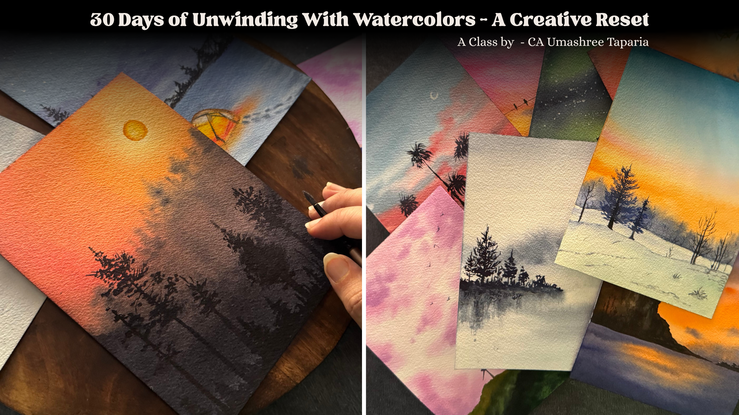
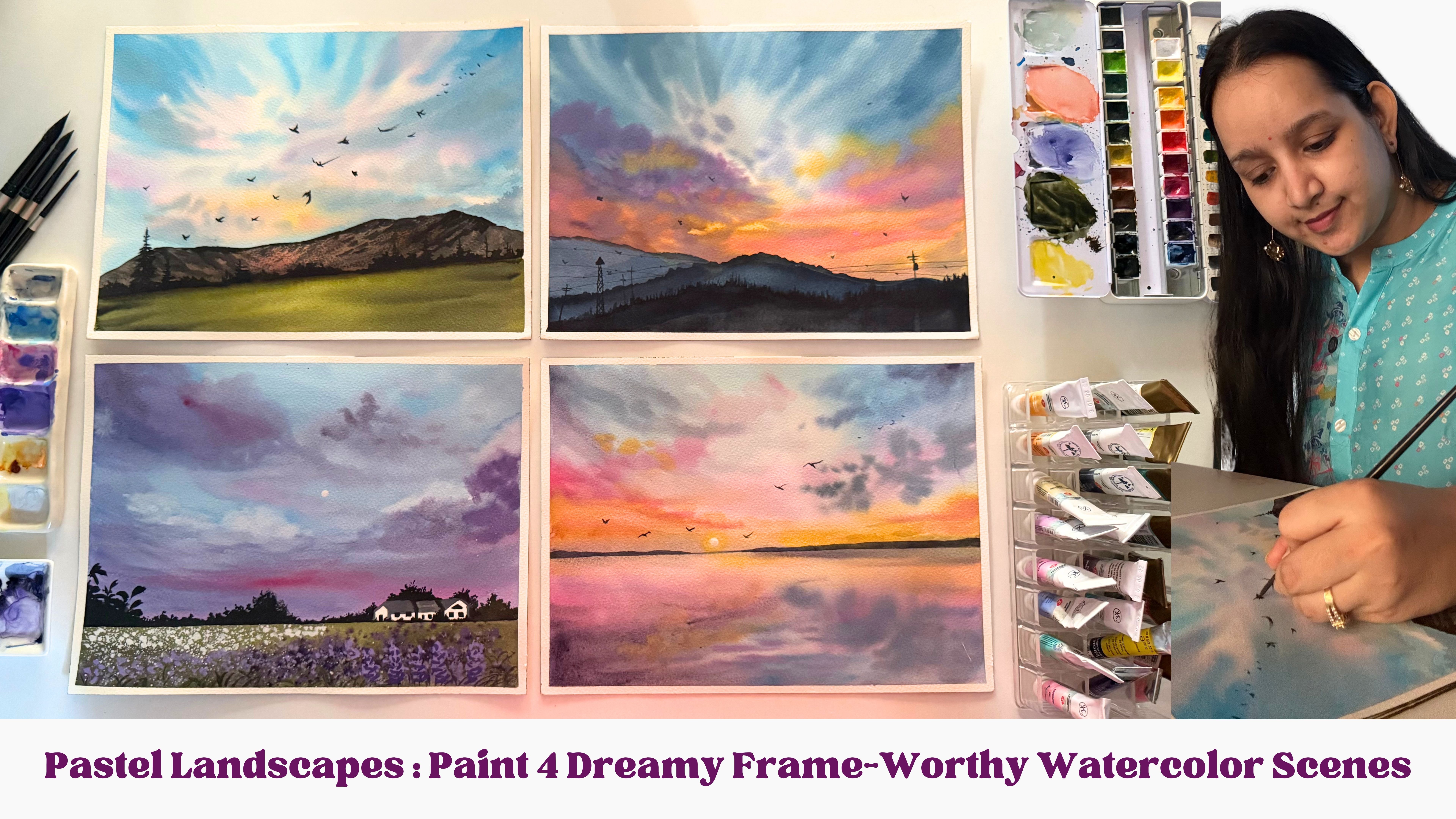
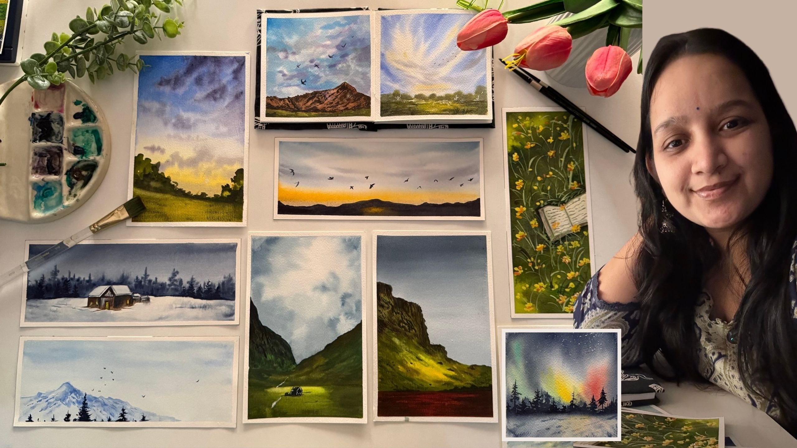
Transcripts
1. Intro: Have you ever noticed how watercolors have a way
of calming your mind, how the simple act of
watching pigment flow through water can
soften the whole day. Hi, everyone. I'm OmashiTapaa, a chartered accountant,
a watercolor, and a gouache artist, and a creative business
entrepreneur. And welcome to this 30 day Unwind with Watclour challenge. There's something
almost meditative about the way colors bloom, how they drift gently
across the paper, and how every unexpected blend creates a tiny moment of magic. It slows you down, it brings
you back to yourself, and it gives your heart
a quiet place to rest. This class is all about
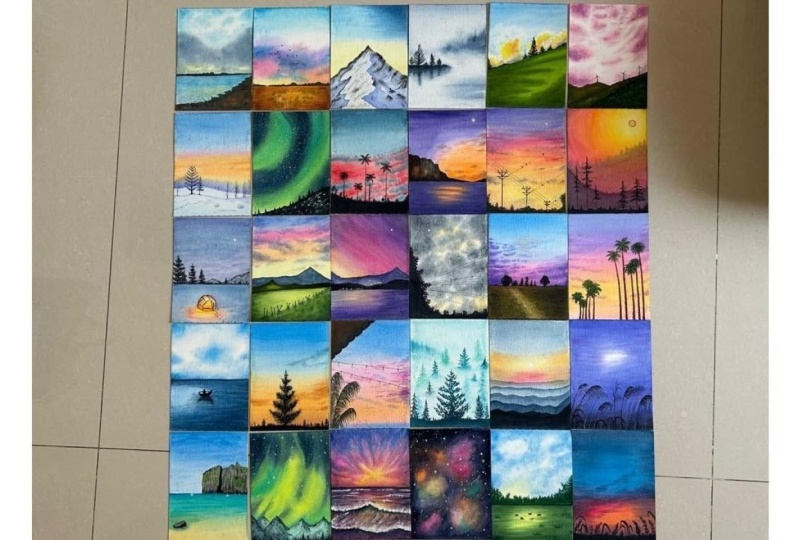
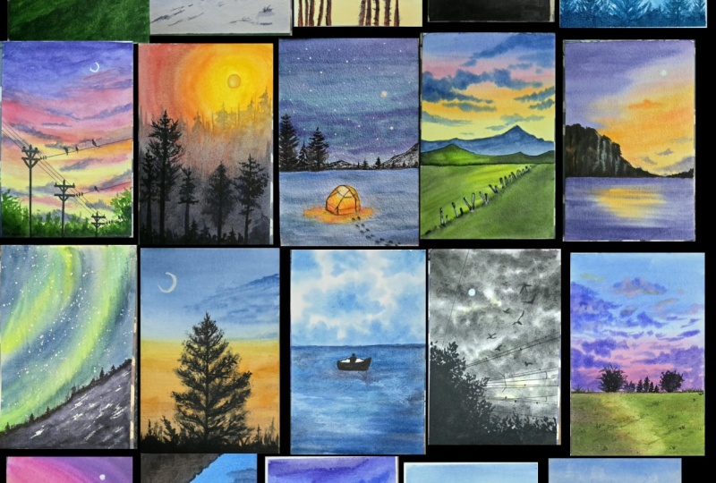
embracing that feeling. For the next 30 days, we'll paint together,
not to chase perfection, but to unwind, release, and find moments of
peace through art. Each day brings you a
small calming project, mostly under 20 minutes, a few stretching gently to 25 to 30 minutes designed to help you relax
into the flow of what colors. At the beginning
of every session, I'll share a simple
color palette so you know exactly what
shades to keep ready. After that, you are invited
to just follow along, breathe, and let the water guide your painting in its
own beautiful way. This class is meant to
be your daily ritual, a space where the
world slows down, your thoughts soften, and you reconnect with
the quiet inside you. Whether you are unwinding
after a long day, beginning your morning with
a moment of stillness, or simply carving out
time for yourself, these 30 days are here to support your peace
and creativity. I hope this journey
brings you rest, ease, and a little bit
of soul soothing magic. Let's unwind together one
brush stroke at a time. And with that, I'll see
you inside the class.
2. Materials: So before we tie
into the project, one of the unwinding challenge, let me guide you through the
art materials that I will be using for this 30 days
of unwinding challenge. First and foremost,
the watercolor paper. I will be using this
archis 300 GSM, 100% cotton, cold pressed paper. Now, this is a
block of 20 sheets. Each sheet is of the size
seven inch by ten inch. I will be cutting each
sheet into two equal halves like these and paint on
each of these sheets. I'm using 100% cotton paper. Hence it will support
for a more wet on wet um working with watercolors
and cold pressed. So it has this little
texture you can see. And if you use a rough green, it has more of the texture. Hot pressed paper
has a flat surface. For watercolors, the best
recommended is cold press, which gives you a
beautiful grainy texture and makes the pigments
stand out much better. Now, this time, I won't be using in any masking tape
for the paintings. So as you may have already seen, I'll be using the paper directly
without any clean edges. So for that, this
time, I will be using this wooden block on which I will be
laying down my paper, and I'm going to be using in a different technique that is wetting the back of my paper and laying it flat onto this, so it will get completely
stuck to this bore. And it will also help us
paint for a longer time, giving us a good
smooth finish on the edges as well without any
water seeping back through. And it will also save our
paper from crawling up or, you know, having those buckles
in between while painting. So at the end, you will
have finished look like this with clean edges and, you know, beautiful, um, finish on the edges as well without any use of
the masking tape. That's about the papers. Coming to the paints,
I'm going to be using this custom palette which I have made from different
brand paints that I own. And here's the color that
are there into this palette. So it has colors from Michomssion,
ShinanrtPfessional watercolors. It has Winsor Newton, it has white knights. So it's all from
different brands. All are professional
grade watercolors. I've noted down
the brand names in code words so that I
can refill them easily. I also have a color
swatch always in front of me so that I know
which color I'm picking up. So here I have the shades
of yellow, orange, pink, red violet, all the
shades of green, bottom here, all
the shades of blue. Here are the pastel colors, and here are the
shades of brown. Of course, I go ahead with
a lot of color mixing as well as we keep on painting
each class project, you can go ahead with a
basic set of 12 colors, and I will be guiding you through each of the
color mixes that you can follow for any shade that
I'm using in the painting. That's about the palette
that I will be using. Next, coming to the brushes. I have a lot of natural hair and synthetic hair
brushes as well. The most brushes that
I will be using is one is this silver
brush, italia brush. So this is perfect for giving in that entire background wash and painting the skies
as well quickly. Next up is going to
be this round brush, which has a good
fair pointed tip. And then you need
a detail or brush. I will be using this, this is a very generic
detail or brush that I have. But as soon as it's
dipped into water, it has a very fine tip, and it is perfect for adding in fine details
into your painting. So this is the brush that I'll be using for adding
in the details. Apart from that, I
will even be using in some other few smaller
round size brush. And if needed, you can keep some flat brush also handy if, um, you feel comfortable
working with a flat brush. So that's about the brushes. Natural hair brush works best for watercolors because
they retain a lot of water and help you work
longer with one stroke. But with that also comes the complexity that since they hold a lot of
water and pigment, you need to have more control while adding in the details. You need a simple pencil and an eraser for some
simple outlines. You will be needing in
some technical pens which are waterproof. Make sure that these are
bleed proof so that if you ever have to overdo any
colors on top of these, it will be easy for you
without any colors, you know, spreading
out here and there. For one of the class projects, we are going to go
the reverse way. As in your, we are first
going to begin in with the outline of the silo heat using in this waterproof pen, and then on top of it, we are going to create the
entire painting. So in case if you don't have
one, it's perfectly okay. You can go ahead the other way, which I discussed while painting this painting in
the coming days. That's about the basic
stationery that you need. Apart from that, you
need jar of water, one jar for cleaning
your brushes, and one jar of clean water for giving in the background washes and mixing in your paints. You either need a rough cloth or a tissue for cleaning your
brushes while painting, and you will also be kneading in tissues or the rough cloth
because we are going to be creating in a lot of cloud details into
your paintings by dabbing in some spaces, creating in beautiful,
soft cloud effects. So you need a paper towel
or a cloth towel handy. So that's about the supplies
you will be needing. It's all very basic a set of watercolor palette,
some watercolor papers, a few brushes, and some basic stationery and
a jar of clean water. You will notice in
most of my paintings, I'm only working with
these three brushes. That is the reason I've shared only these three
main brushes here. In fact, in a few
of the paintings, you will even see
I only work with one brush and the
painting throughout, even adding in the details
with a bigger brush like this. So that's something that you can challenge yourself
with to work with limited supplies
so that you know how to multi use your
supplies available with you. And for the color mixing,
I already told you, I'll be sharing in
the color palette before each class project. So before each of the paintings, you will be getting
in a color study of the colors that you need
for that class project. And I will be doing the colors watching and showing
you alternative colors also that you can use
in case if you do not have the specific
same shades. So that's about the
materials that you need. Go ahead, grab all
your supplies, and I'll see you guys into the first painting
of this challenge.
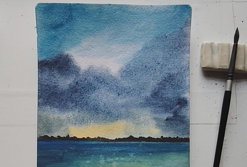
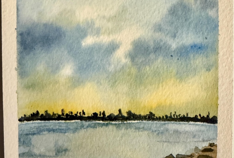
3. Day 1 - By the Sea: So welcome to the
Class Project one of these 30 days of unwinding
with Watercolor challenge. And this is the painting
that we'll be creating in today's class project before
we begin with the painting, let me give you a quick guide about the color tones
that I'll be using. First, for the sky, I'll be going ahead with
the naples yellow. It's a beautiful pastel yellow. You can simply mix in white
along with your yellow to get a pastel yellow if you do not
have a ready pastel yellow. Then for the top of the sky, you can either use serelin
blue or Pecock blue color, which are almost similar tones. So I'll be using a mix of the Cerlean blue along with a little hint
of the peock blue. If you see both the
colors close by, they are almost the same tones, that they are from
different brands, so a little pigment variation, but they're the same tones. So in case if you do
not have a Pecock blue, you can simply just go
ahead with the erlean blue. And to begin adding in
depth into the sky, I'll be going ahead with the
Prussian blue to give in the darker tones into the
sky, the clouds here. And then for further
darker effect, I'll be going ahead
with the indigo color. My indigo is from white knights, my most favorite
indigo till now. So that's about the sky
colors that we'll be using, shades of blue and yellow to
give that little sunset hue. For the sea, it's going to be the same colors of the sky
that we'll be using in. And for this sand space here, I'll first be using in
the light red color. Alright, you can use
a burned sienna color if you don't have such
a light red color. This is basically a reddish
brown color that I'm using. And then I'll be
going ahead with the paints gray for
the darker values. So pains gray for
the darker values in the field and on
the horizon line. Now, in case if you want, you can even use a little bit of the Vandic brown
color along with the brown here to give
in some darker depth. So you can use burn
Sienna light red color, or you can even use in
the vindic brown color. So here's the bon Siena. So you can use any tone of
brown that you wish to. And then we'll be building
in the darker depths, using the pains
gray, but you can see the browns also visible. So that's about the
colors that we'll be using for the
class project one. So go ahead, get
your palette ready, and let's begin painting in
this project for day one. So let's begin in with
our first painting. As I already discussed with you, I'm not going to be using
masking tape this time, so we are going to begin in
with the paint directly. And before that,
we'll just go ahead with a little wash of the water on the back of the
paper so that it helps keeping the
paper intact and will, you know, prevent the paper from wrapping up while
we are painting. So when you are painting
in without masking tape or if you're painting up on
larger sizes of the paper, and if you want your paper
to stay wet for enough time, go ahead with a good layer of water on the
back of the paper. This will prevent the
paper from curling up and give you an
ease of painting. This also helps the paper
to stick to the surface, and now we'll go
ahead on top of this. So first, I'll just mark
out a small horizon line. So say roughly, this is going to be our
horizon line space. And at the bottom here, we are going to have
in the simple water and the sand space coming in. So we'll begin in with the sky going ahead with
a layer of water. You will notice when you
wet the back of the paper, it will help your
painting stay wet for a little longer time and help you work wet
on wet much better. So just went ahead
with a layer of water, beginning in with
the paints now. First onto the horizon line, I will go ahead with
the yellow color. So I will pick up
a little bit of the yellow ochre this time
and not just a simple yellow. So going ahead with
a little hint of the yellow ochre on
the horizon line. At the top, I'm going
to go ahead with a little bit of the Cerlean blue mixed in with the pecock blue. You can simply choose
to go ahead with a Cerlean blue color and avoid the peacock blue if you do not have it
in your palette. They are almost similar shades just with a little
tonal variations. So you can use any whichever is available in your palette. I'm intentionally leaving
in these white spaces, and there I will go ahead
with a little mix of the indigo along with
the Prussian blue in a liquidy consistency
and just drop in some cloud detail closer to the horizon line
at the base here. You see how my
brush is moving in circular angles to create
in that cloud shape. Now, layering over
the yellow ocher in such a way that we have that beautiful sunset
highlight visible, and we still have that
horizon line depicting it. Dropping in some darker hints of the same makes of the indigo
and Prussian blue color. Creating in the smooth blend
here using in a damp brush. I just use the dabbing technique a bit to create in little, you know, dry details into
the cloud at the top here. Similarly in the center
space here as well, very random dabbing and you see the random cloud shapes
that you get in. For every dabbing, you know, the look will be different
for each one of us because of the method and the
way used to dab it out. So that is for the sky. We've got a simple
easy sky ready. We'll wait for the sky
to dry completely and then move on to the
bottom space further. So my sky is almost dried, and I will begin in
with the sea space. For the sea space, I will go ahead with the
Prussian blue color. I'm going ahead with
a wet on dry layer. That is, I've not
added any layer of water into the sea space. I'm going ahead with this color closer to the horizon line. I'm intentionally leaving in a little white cap on
the horizon line because there we'll be adding in the details on the
horizon line later on. Now mixing in a little hint of the Prussian blue into
the water as well. In the center here, I will just use a little hint
of the yellow ocher again to show the sunset
effect into the sea as well. And you see, for
the sea this time, I'm going in very loosely with just some loose textures
and just jabbing my brush. We've got a simple C movement. Now, into this, using
a smaller size brush, we'll quickly add in
some wet on wet details. So I'm shifting into
this smaller size brush. This is a size two brush using in the mix of the indigo
and the Prussian blue. Let's go ahead just create in some flow and wave
details into the water. You see, very random strokes. You can go ahead as
loosely as you wish to, and, you know, this
class is all about play, and it's simple, easy
to follow along, no pressure, no detailing, and no specific thing to follow. It's just your intuition where you want the
water to move, how you want it to move. So that's a simple water
space that we've added in. Now, into the water
space as well, I will quickly use this
and at certain spots, just do some simple dabbing. You see, this creates
so much more of a realistic water wave
detail coming in. So this is a simple
technique what you can use. And now we'll move on
to the sand space here. For that, I will first begin in with the Bonsiana color, again, wet on dry only because not much details to
add in wet on wet. So going ahead with a
wet layer of the paints, I will next move on to
the vindic brown color. Now, in case if you do not
have the darker brown hints, we've already discussed
the color mixing, so you can use the color mixing best
available in your palette and create these easy color
mixes for your landscape. And while this is wet, picking up a little hint of the indigo mixed in with
the paints gray color. And I will begin creating in some darker details
into the sand space. Moving on from the
edges in a way such that we still have
the browns visible. See into the water space. Once it is dried,
I'm just giving in simple dry movement of the sand, creating in some rock
kind of details. Just going with little
splatter as well, closer to this space. Make sure you do not go
into the water or the sky. It just has to be closer to the sand area that
you're adding in. Now, here as well, you can just go with simple dabbing to create
in some dry patches, giving in that, you know, realistic effect while drying, giving in that patchy
spaces into the sand area. Now, onto the horizon line, let's go ahead and add
in little details. So I'm going to keep it very simple on the horizon
line as well, but we'll just pick
up either an indigo or a Pain's gray
or a black color. You can even go ahead with browns and greens
if you wish to. I will keep it simple and we'll just add in simple detail. Easy to follow
along bush detail. You see, I'm going very slowly, peacefully, adding in tiny little details
on the horizon line. So make sure on the
horizon line you vary these bush details
that you're adding in. Just giving you a close or view. So that is it. We are ready with our first painting of this
watercolor challenge, and we created this
beautiful landscape in almost 12 minutes, and my paper is
still wet enough, and I can still work wet on
wet because and you can see, we are ready with our painting. My paper is still
wet at the back. That is the reason the
paper didn't wrap up, and now I will let it
to dry completely. I hope you guys enjoyed painting this quick and easy landscape for Project one of
this challenge. I will see you guys
into the next painting.
4. Day 2 - The Sky Story: Welcome to project two of the 30 days of unwinding
with watercolors challenge. Today, we are going
to be painting in this beautiful soft
pastel sky with a simple field and
some dry brush texture into the field to give in the muddy effect
and simple bird silhouette. So before we begin painting, let's quickly dive into the color palette for
today's class project. So the colors into the sky
first for the blue shade, I'll be going ahead with
the serle and blue color. Then you see the pastel
tones into the sky. Firstly, I'll be using
this naples yellow, which is a pastel yellow color. You can simply mix in white to form in your pastel yellow. I will be using the orange
as it is from my palette. My palette contains colors from different brands like
Mijello Mission, uh, White knights, Shenan
PWC, Winsor Newton. So next, I'll be using the permanent rose color
from Windsor Newton, which is a beautiful pink tone. You can use scarlet carmine, whichever pink available
in your palette. Next, I will be using in the violet mixed in with a
little bit of the lilac. So I have the violet color
and the lilac color. Now, in case if you don't
have the lilac color, you can simply just add white to your violet and get the
beautiful similar looking tone. And lastly, a little bit of indigo for the
darker highlights. So that's about the
colors for the sky, beautiful pastel tones
that are coming in. The pink is already
beautifully light, or orange will be mixed
in with the yellow, so it will automatically form in that little pastel effect. Or blue will be using
aztsF the violet, I already told you the mix with the lilac that
I'll be doing, but you can simply
use white to mix in. You can use whiteqh
or white watercolors, whichever suits you
because we don't need a lot of an opaque
consistency for this color. So even white watercolors
will do the job. Coming to the field space, there the colors that
we'll be needing is. First, we'll go ahead
with the orange color. So we'll be beginning in with the orange color to reflect
the sunlight effect. Then we'll be going ahead
with a light layer of the yellow ochre color to show that beautiful
golden artifect. Then you can just move on
to the shades of brown. I'll be playing along
with the light red color, vindic brown color to
give in the darker depth. Then to give in some
little green spots, I'll be using in the
sap green color. Along with the sap cream to
create some darker values, I will just be mixing it with Pains gray to create
darker values. In case if you have a
darker green color, you can simply use in that color or just
mix in Pains gray, and you see the dark green that gets formed automatically. Onto the Horizon nine for
the grass details, also, I'll be using sap creen
along with Pains gray mix. For the birds, we'll be
using the Pains gray. For the dry brush
texture, again, we'll be using in the
Pains gray color. So these are the colors
that we need in for the sky and these are the colors that we
need in for the field. So these are the
color tones that you need for class frijec to. Grab your color palette ready. Now, in case if you
don't have some shades, these are all basic
palette shades. But in case if you don't
have the violet color, you can simply mix in pink and blue to get a similar
violet looking tone. If you don't have
the light red color, you can use burned Sienna, or you can simply mix in red to your tones of brown
to get this lightish, reddish color, or
you can even mix in orange to your burn sienna color to get this light red color. You see, the orange and
the light red color are just this is more towards the early side and this
is more brighter side. So that's how you can just
mix in and use your colors. So once you have the
color palette ready, let's begin creating
in this class project for day two of this
unwinding challenge. So let's begin our project for this watercolor
painting challenge, and we'll begin in with the wetting up of the
back of the paper first. If you're following
the same process of wetting the back of the paper so that
your paper does not wrap up or curl up
while painting, plus giving you enough
time to work wet on wet. And if you're not
using a masking tape, I find this the best
way to, you know, paint the watercolor painting without the paper wrapping up. So just add a clean layer
of water on the back, and this will make your paper stick to the surface
that you're using in. I'm using a wooden board so
that it just taste perfectly. Now, I'll just mark out
the bottom space here. We'll begin with the sky. So going ahead with
the layer of color. Sorry, the layer of water first. So as discussed, we'll
be going ahead with beautiful sunset tones for
this class project as well. This class is more towards aiming on
completing paintings and under ten to 15 minutes
so that you can get into our daily practice with
just ten to 15 minutes, and these also act in as
good warm up exercises. So just going ahead with
a good layer of water. Moving on to the paints. So. Moving on to the paints, first, going ahead
with the blue color. I will use the erlean
blue into the sky. Next, moving on to the yellow
colour on the horizon line. So this time, I'm going to be using in the Naples
yellow color. A little bit of the orange. I'm using the permanent rose
color from Wincor Newton. You can use scarlet, carmine, permanent rose, whichever
pink in your palette. And now into the
space in between, I'm going to pick up
the violet color. Mix it in with a little
bit of the lavender color. If in case you don't
have a lavender color, you can just take help off a little hint of the
white to go ahead with this and just going to add in a loose cloud in between
the blue and the pink. Then pick up a little bit
of the violet as it is. Now, at the top here, I will just go ahead with a little bit of the dabbing
to give in some dry details. And now when I'm
adding in paints, you will see some
loose bold strokes. Again, you can dab in a bit
to give them some softness. So you see if we
get the light hint Now I'll pick up the
violet with a little hint of the pink or violet
with a little hint of the blue and just add in some cloud details with this mix of the
blue and the violet. See where I want the
smaller cloud details. I'm just using the tip of my brush to get
in these details. And you can see the softness
in the sky that we have. Go ahead with little dark pink. And lastly, just going to
pick up little bold orange. Very carefully lay the orange over the blues and the violets because you don't really want any sort of muddy
tones coming in. Just some little highlights. Again, little dab dap to
turn it little lighter. Now going to use in a
little hint of the indigo. I haven't cleaned
my brush on purpose because I just wanted that
little violet of my brush to mix in with the
indigo and given this soft dark violet
shadow kind of a color. Alright. Just some further cloud
details that we've added in. And you see now the
glow that we have here. So that is for the sky
a simple easy sky. Again, just 5 minutes and you're ready with
the beautiful sky. Now we'll wait for
the sky to dry out. But my horizon line
is almost dry, so I can begin with the
details in the base here. For that space, I'm
first going to go ahead with a layer
of orange this time. I'm following a very
different technique, what I usually wouldn't for a field that is beginning
in with an orange color, but I really want a good, bright sunny effect
falling into the field. Now into the orange, let's go ahead with the yellow
ocher, wet on wet. Moving on to the
light red color. You see the light red color, which is like a brownish
red, basically. I am just using in my brush from an angle and in a tilted way so that we get
in these little textures, maintaining the highlights
as well into the field. Now, just some simple dabbing
to turn lighter spaces. And we'll go ahead
with the green color. You can use sap
green, olive green. Just drop in some light green
spots into the field space. Basically, it's a
dry barren field with just very little of
the greeneries visible. Along with it, just going to pick up some darker
brown details as well. And I'm going to
drop the dark brown in a very limited space, not going to cover up, like, you know, the major
field with this color. Mixing in a little hint of
the paints gray to the brown. See in such a way that here, the sunset thing is maintained. So we have a simple
field as well ready. Now, again, on the horizon line, we'll be adding in the details
once everything dries out. But till then, just going to drop in some green
highlights more. So I'm picking up the green
in a very dry kind of a consistency without any water and just adding in
simple details. Wherever you want to
turn things lighter, a quick tab will help
you. So that is it. Let's wait for everything
to dry out here, and then we'll add
in the final details on the horizon line
for this painting. So now my horizon line space is completely dried and I'm
going to go ahead with the green color on the horizon line and create
in little details out here. So you can go ahead use in any greens that's
available in your palette. I will be going
ahead with a mix of the sap green and
then mixing it with little hints of the indigo or the pains gray
color to get in, you know, some darker values. So first, pigging in with the normal green,
that's the sap green. As I told you, you
are free to use whatever green is
available in your palette. All right, so it seems that there is inside
wetness of the paper, making sure everything
is completely dried. Yeah. Just as in the previous project, we created in the bush detail
using the pains gray color. This time we are just using
in the green color instead of the pains gray and just
going to go ahead, create in simple details. I'm taking help
of the pains gray between to create
the darker values. You see how I'm wearing
the lens throughout and not keeping them of
the same height? It's not necessary
always to cover up the entire horizon
line with the bush. You can leave little
gaps in between. So here I will just
leave this fine gap. All right. This side I've
added in a very fine detail. And now onto the field space, I will just add in some texture. So just picking up
a little bit of the ndeg brown and creating
in some dry brush texture. If it is a cold pressed
or a rough grain paper, these textures will
come out beautifully. In case if you're using
a hot grain paper, these textures will be very
difficult to come in because, you know, the texture
of the paper helps in getting these dry
brush texture much more smoother and giving
in that grassy effect. So the type of paper will make your dry texture very same way, just going to go ahead, use in some darker values. See? I'm using the
dabbing technique along with adding
in some details. Just some light darker
details that I've added in, and using the dabbing technique, I've tried to blend them
into the base as well. And lastly, now, we'll just
quickly add in a few words into aski before we see
our final painting. So for the birds, I'm using in the
paint's gray color. The simple flight of the bods that I'm adding in. To some of these, I will quickly dab in and tone them
little one tone lighter. And that is it. I won't
overdo anything here. And we are ready with
our second painting from this watercolor challenge. You can see another pretty
beautiful sunset sky in under 15 minutes. We've added in all
of the details, turning it into a
beautiful painting to hang up onto your walls. I hope you guys enjoyed
painting this with me. I will see you guys into
the next painting soon.
5. Day 3 - The Snow Mountains: Hello, everyone. Welcome
back to day three of the 30 days of Unwinding
with Watercolor Challenge. And today, we are
going to be painting this beautiful snow
caped mountain. This painting will stretch
approximately to 25 minutes, but you can see the
details that you get into the snow area of the mountain and how beautifully and
lively it turns out. Coming to the colors
that you need for this class project,
first is the yellow. I majorly use naples
yellow in my painting. It's a beautiful pastel yellow. If I ever want some
warmth of the yellow, I go ahead with the
permanent yellow deep. But for this painting, I'll
be using this naples yellow color closer to the mountains
to show the sunset effect. For the colors
into the sky next, I will be going ahead with the Prussian blue at the
top into the sky here. This is the entire sky with
the Prussian blue color. And then for building
in the depth, I'll be going ahead
with the indigo color. On the right of the sky here, you can see how beautifully
I have gone ahead, giving in that darker depth of the dark night sky coming in, and closer to the mountain, we have the sunset effect, the light of the
sunset from the left, falling onto the
mountain out here. Alright, so you will
see this space is light because the light is
flowing from the left edge. Now onto the mountain, the first color for the
first leo that I'll be using is going to be the
ultramarine blue to show the snow effect. So we'll be going with a
wash layer step by step, part by part into the mountains, dissecting the mountains
in different spots. You're showing the darker values and the darker values
and in the center, showing the sunlight effect, making the snow of
a very light color. Then for adding in some darker
depths into the mountain, again, we'll just be going
ahead with some indigos. So, um, we'll be picking
up the indigo color, and you can see just going
to be blending in with the ultimate in blue at spots to give in
some darker values. Into the mountain, we'll even be using a little
bit of the naples yellow to just show some very light warmth
of the sun falling in. And lastly, for the tribush
texture on the snow, we'll be using in the
pains gray color in a bold consistency. All right. So this is the colors that
you need some shades of blue, yellow for the sunset and
pains grey or black to give in that darker values for
the dry brush detail. Now, one important thing that
you need to understand for the dry brush
technique is going to be the water control
on your brush, which plays the major role when getting in the dry
brush texture, right? So I've picked up the brush. There is no water on my brush, dipping it at the tip, picking up the color in a very dry consistency and let you see how
this watch turns out. You can see the textures
that are coming in. These are the kind of textures we are going to be using to depict the rocky spaces of
the snow caped mountain. Of course, the flow of your brush determines
the texture flow. So here I moved my
brush horizontal. Now, if I move my
brush diagonally, you will see the textures
come in diagonally. From top left to bottom, right, the textures
come in accordingly. So this is the important
dry brush texture that you need to know to get in these beautiful rocky looks onto the snow
caped mountain. In between, we
will even be going ahead with some patches
of the paints gray. For that, you can just
dilute the paint, and you will see you
get the dry brush along with the
patch of the color. So that gives it
the natural effect. So here, if you see,
we have a patch first and the dry brush
following along naturally. So this is one important
thing that you need to know that is water control
for the dry brush texture. I hardly dip my brush in water, directly picked up
some dry pigment. If you feel that is
excess water or pigment, you can dab it onto
a paper towel or a cloth towel and get rid of the excess pins
and then go ahead. Second most important thing will be the flow of your brush, how you want the
textures to flow. So in this painting,
if you notice, all my textures are flowing from top right to the bottom left. So I need to move my brush
and hold it at an angle and move accordingly to get
the textures flowing in. And again, water
control is important when you want the dry brush
textures to come in right. So that is about the details and the basics for
this class pro check. Now, I will see you guys, and we'll begin painting the
final painting together. So let's begin in
with our project. I have marked out a very
rough mountain outline, and I have given in
little sections to the mountains so
that we can define the shadow areas and understand where the
values will be darker. So we are going to be
painting a simple sunset sky and then we'll be painting
a snow caped mountain. Now, this spot here that is one, two, three, four, and
this area here as well. All of these are going to have
the reflection of the sky basically so I have marked out a simple outline
for the mountain here, and we're going to be
painting a simple sunset sky. And for the details
of the mountain, I'm going to show this
huge space out here. As the light of the sunset
falling onto this area, making this space brighter, and the rest of the spaces
are going to be darker. So in this space, we are going to
show the reflection of the sunlight falling, making this space more brighter. And then onto the
entire mountain, we'll even be giving in
the dry brush texture. So first, we'll begin in
adding in the base values. So, beginning with the sky, we'll be going ahead
with a simple sunset. So let's begin with the layer of water first in the
back of the paper. All right, pigging in with
a clean layer of water. Now, into the front space, we'll first go ahead
painting in the sky. Let's just go ahead with a
layer of water into the sky. For the mountain
range, we'll add once our sky is
completely dried out. So going ahead very carefully closer to the mountain outline. Also make sure that
the pencil outline that you do for the mountain is very light because
these marks will become permanent once you
add in the layer of water. So just went ahead with a
good even layer of water. And now into the sky, I'll begin with a little hint of the yellowish orange color. Very little highlight
closer to the mountain, along with a little mix
of the naples yellow. And this side as well, we'll just give in the little
highlight of the sunset. Now, for the sky, I'm going to go ahead with the Prussian blue
color at the top. So at the top, the
values will be darker, and moving down, I will just blend it with
the layer of water. And as I reach closer
to the yellow, I will let the colors blend
naturally into each other. So I'll just go ahead
with one more layer. So you see, as I'm reaching
closer to the yellow space, I'm just lifting up my brush, letting the colors
blend naturally. Remember, watercolors
dry or tone lighter, so you go ahead with the layer
of the paints accordingly. Just running up a
layer of water. If little of the pins move into the mountain
space, it's okay. We'll cover them up as well. Go ahead with darker values of the flutianblue at the top. Majorly on the right side, I'm giving the darker
values because here we have the sunset effect
and this sunlight is falling onto this
mountain space. I'm only maintaining
the darker effect on the major right
side of the sky here. I picked up a little
bit of the indigo as well to give a little
more darker depth. If you want, you can further still darken it up at the top. So we are still working
wet on wet into the sky, giving in all of
the darker values. And again, you will
notice it's majorly on the right part of the sky that I've gone ahead with
the darker values. On the left, I've maintained
the sunset effect to show the values falling
onto the mountain as well. Now, I'll wait for everything
here to dry out completely. Now there is water seeping in from this edge here
into the painting. That is why making it
lighter on this edge. So I'm going ahead with another
layer to maintain that, you know, so that the
water does not seep and turn it into a
very light space. Okay. Now, we'll wait for the
sky to dry completely and then we'll move on into the rest of the details
of the mountain. Now, by the time my
sky is drying out, what I'm going to be doing is the area closer to the
horizon line is almost dry, so I will paint out this
lighter space as well with a very light So the area closer to the
mountain is almost dried out. So I will go ahead and paint out this lighter space first, and we'll have to wait
for that as well to dry. So for the lighter space, I will just pick up a little
touch of the naples yellow. Very little, you see, little highlight to show
the effect of this. And next I'm going to pick up the ultramarine
blue colour. For the snow space, but it's going to be a layer of water with just a
hint of the color, you see, we need
very light detail for this space out here. If it goes out into the other
spaces as well, it's okay. But maintain the lighter
details at this space because the rest of
the space will be of the darker color. All right? So just giving in
a very light wash, as you can see, of the
ultramarine blue color. I will just add in little
highlight of the yellow again. All right. So you
see, we just have that little yellow highlight of the sky falling in and the rest of the
space is covered up. Now we'll wait for this to
dry and then move on to the darker dips and then the dry brush technique
for this mountain space. Now, this space is
also completely dried. You can see we've given such
a light wash. Basically, it looks like clear water, but it has the hint of the ice color or the snow
color that we needed. Now, into the rest of the spaces where we have to add in
the darker highlights, we'll go ahead with the
ultramarine blue color. If you do not have
the ultramarine blue, you can go ahead with
a bluish gray color or a very light wash of the
indigo or Prussian blue, whichever suits
your color palette. And now into the
rest of the spaces, we'll go ahead given
the darker values.'s see going ahead with
a very rough outline. And here also, you will see
the indigo is not too sorry, the ultramarine blue is not
in a very dark consistency. It's in a medium
tone that I'm using in intentionally leaving in some white patches,
as you can see. Now, while this is wet
somewhere, I will just go ahead, drop in some more darker values so that you get in
different tonal variations. Defining this outline
in a very rough manner. Right? At the turning points, giving in more of the depth, wet on wet because of the turns, which gives in
more of the shadow on these turning points. So following the perspective. So you see, because my
back of the paper was wet, that is the reason
even when I've gone ahead with wet paints, I'm able to add in these
details wet on wet without adding in a layer
of water first. All right. So we're done adding in the
details onto this part. Now we'll move on
to the left side of the mountain and go ahead
with the same technique. So on the left part as well, I will just mix in
a little hint of the indigo as well to
my ultramarine blue, and we are going to
follow the same method. Again, make sure not excess
dark clear of the pain. Go ahead with a medium tone consistency so
that you can build the values wet on wet and
create in the details, giving in different
tonal variations. See very carefully. I've gone
ahead, added in the detail. And now just going to go ahead, pick up some darker
hints and create some further twists
and turns into the snow space of
the mountain just as we did on the right side. Now, if you see on
the right side here, the colors tried out very light. So while this is also wet, I'll just go ahead with some more darker value
details as well. In between going
with a little bit of the dabbing so that it
creates that natural texture. The only thing here is
that you need to work a bit quick while adding
in some details so that, you know, you get in
those turning points, the shadows, the light effect
all coming in together. Now moving on to
the small spaces that we have marked out. So See? Just dabbing a little bit
while things are wet, gives in more of
the texture layer. Now, this space out here has
dried out very light for me, so I will quickly just
pick up a water layer of the ultramarine blue
color and just go ahead, add in some values. See? This is adding in
the values to this space. And just dabbing in so that
we get in the lighter tones. It's okay if you
get some dry edges because that is adding into
the beauty of the space. I will just quickly add
in the details here. So you see,
ultramarine blue color in itself is a staining pigment. So when I picked it up in
a very bold consistency, it left a good stain and even the dabbing technique
didn't work out well. How randomly at this space, just adding in a few
darker highlights. I lighter dabbing to make it
look blended and seamless. You see, we're getting patterns. You're also adding in some more and just giving in simple dabs to make
it all look blended. Dab in with a very gentle hand
so that little color gets lifted and little is left onto the space that you're
adding them onto. You see? Simple technique. Just going to pick up a little
hint of the blue color. Now, we'll wait for
this space to dry out completely and then add
in the dry brush detail. For the dry brush technique now, we are going to go
ahead and begin adding in the texture details
onto the mountain space. So for that, let's go ahead. I have picked up the size two
round brush and I'm going ahead with the pain's gray
color without much of water. And we're just going
to begin adding in simple lines like these. Okay, that was a
slip of the brush, but we'll try to just
blend it in into the mountain space and get something meaningful out of
this stroke that happened. So you see, I'm just
going ahead with very light lines of
the pains gray color. All right. Simple textures. Most important thing here
is your paper should be completely dry to get in
these textures right. If your paper will be wet, you will not get in these
dry brush textures. In fact, you will just get patches of the
paint's gray color, making it look very weird. So just go ahead with
a very dry paper. The paints on your brush
should also not be too wet. And if you're using a rough green paper or
a cold pressed paper, these textures will turn
out more beautiful. Now, somewhere I'm
going to show in more textures that is
trying to show in that more of the mountain space on these darker spaces which are not having in the light
effect of the sun. So there's no fixed pattern basically to follow for
the dry brush technique. You can place the mountain look at the spaces that you wish to. It's not exactly
important to have the mountain visible on
the same spaces as mine. You can, you know, show the snow at
whatever place you wish. But you just need to
strike a balance so that it does not look
like an overdone space, or nor does it look like
an underdone space. So striking that
balance is important. Depending on how you are
trying to achieve it, whether you want to show
it more of the snow cape look or more of
the mountain look. So at the peak here, I've given in more of
the mountain look, as you can see, and in
the rest of the spaces, I've given in little of the
dry brush as well. All right. Same way, we are going
to go ahead onto this side as well and
add in little textures. I know this project
is going to take approximately around 20 minutes for us to complete
it, but that's okay. We just went ahead with a
little more detailed one, and I just didn't want to
skip any of the detail because of the time constraint of this class that
I had decided. But if you go ahead
quickly and do things, it can even be done
under 15 minutes. But since I'm discussing
every step in detail, it is taking up a bit of a time. So you're just giving
in the dry brush. Very roughly. Somewhere I'm going ahead with some strokes
of the pains gray color. Somewhere I'm giving in good
patches, somewhere very dry, somewhere some lighter
colour trokes now here, I'm giving in very dark space of the pains gray
as a patch area, giving in the depth
of the mountain. I We're almost through the project. It's only the tribush technique that we have to get it right, and then we are ready
with our painting. Now, if you see, I have
given all the tribush moving from the top right
to the bottom left. That is the flow of the
mountain that I have followed. You can even take it vice versa, that is from the top left
to the bottom right. Now, I'm just giving
in some small, you know, tip of the color
using in the paints gray. All right, we are almost
through the class project. I will just go ahead
with one last detail. That is, I will pick up a
little hint of the blue, that is the ultramarine blue and a little hint
of the indigo mix. And I just want to put
in some darker patches. Just creating in some more. This is kind of a glazing effect that we are giving on top
of the dry brush again. Just some spaces that
I want to really give in some more bold values. This just little uplifting that gives in more of the shape. Seem way onto the
left edge as well. We'll just go ahead. See? That is it now. Since I went ahead
with this layer, I'll just darken up little
of the dry brush again at spots so that they also look vibrant giving in that mountain look from
between these spaces. It's very important to use vibrant colors because
after drying out, if the colors don't say vibrant, I hope you guys enjoyed creating in the details
into the mountain. The sky was pretty
simple and quick, but the mountain detailing
took us a little time. The shape can go better or
different for everyone. But I hope you guys enjoyed painting this Snow
cape Mountain with me today. I will see you guys soon into the next painting of the series. Thank you so much
for joining me into this class and painting
along with me.
6. Day 4 - The Mist: Hello, everyone. Welcome back to the 30 days of unwinding
with Watercolor challenge. And today, we are going to be creating this beautiful
misty painting. You can see the mist that we'll be creating with the
plea of water and pigments and a
beautiful reflection C along with simple silhouette and a reflection to the
silhouette, as well. So this is going to be our
class project for today. And the colors that you
need for today's project are very simple and
easy, two colors. One being the indigo color. Using the indigo color, we are going to be creating in the entire mist into the sky, the top of the sky, the bottom of the sea. Everything will be just using
in this one color indigo, and then using in the
pains gray color, we are going to be creating
in the silead detail. If you do not have a Pains gray, you can use black,
neutral black, lamp black, whichever color available in your palette of
a darker tone light black. All right, so these
are the two colors that you need for
today's class project. Now, before we begin painting, I just want to give you
a little quick run. We are going to be painting this painting together
on a wet on wet surface, we'll begin with an
entire wet layer. We begin by adding in the first layer of the
sky and the sea together. Then we begin creating in the misty effect
slowly step by step, and we also add in the
waves detail, wet on wet. Both of these details
that we are going to be adding made with the
mist or the water, we need to be careful
about two things. That's the water control because we are working
on a wet surface. So water control will play a very important and vital role because depending on
the water control, your um, waves and the mist will have that effect of
realistic view coming in. If your paper will be too wet
and paints will be too wet, when you add in this wave, it will completely disperse and not retain the space in
which you're adding it. So it's very
important that while playing along with the
mist and the water space, you need to have the
perfect water control. For the mist, we are going to be playing along wet on wet. And with that, we'll
even be adding in small blooms of water to create these beautiful
blooms coming in. You can see the
sky and the sea is all connected through the mist out here on the right side. There is no harsh
line distinction that we'll be going ahead with. Coming to the silhouet part, we are going to be adding
in simple pine trees and bush structures and wet on wet, while our base will be wet, we'll add the reflection
to these first, and then at the end, once
everything dries out, we add in the siloet. And just to give a
little more detail, you can see in the reflection, I added a little dry
brush at the end to give in that more realistic and
bold effect to the reflection. So that is about how our class project
will be structured. The entire play will be on the wet on wet technique,
the water control, and your brass strokes
being loose and careful to get this entire
misty look together. The silhouette path is very simple when we add
it wet on dry. But the entire play of wet on wet technique is going to be the game changer
and the magic. And for every person, it may come out different because how you let
the water play, how you let your
paints consistency be will depend person to person, and that will create the
beautiful misty effect and uniqueness into
your painting. So with that, let's begin creating in this
project together now. So let's begin in with
our project for now. First, I'll begin in with the wetting of the
paper at the back. As discussed for this project, we are going ahead
with a very soft, misty landscape, and all of the details will be like wet on wet that
we'll be creating. And only after
everything dries out, we'll be going ahead with
some pine tree look. But rest of all of the details we'll be
working wet on wet. Alright? So just gone ahead
with a good layer of water. And now we are going
to just go ahead with a layer of water on the
front as well, completely. To create the mist,
you will need a paper towel or
a rough cloth so as to go ahead with
the dabbing technique creating in the
lighter soft details. Going ahead with an even
layer of water throughout, picking up the indigo color, going to begin in with
a very light wash. If you don't have an indigo, you can do the same
project with any blue. That's a Prussian
blue, serlean blue, or thalo blue color or
a picock blue color, whichever blue you wish to use, you can go ahead
with that color. Now, the top is the sky and
the bottom is the water, that is the reason at
the water space as well. I'm going ahead with
the darker values, and at the top, I went ahead
with the darker values. Now in the center here, we are going to have in
some misty bush detail. So while this is wet, we
are going to go ahead with a smaller size brush and just create some
wet on wet bush. For that, I will
just take up help off a little bit of the
paints gray as well. Now, when you're adding in
this detail wet on wet, it's very important
that you have the water control
while adding in this layer because if you
will have excess water, our paper is already wet
and it will all spread out. But right now, if you
see it's maintaining the shape in which
we are adding them, having that soft blend across. So just some simple bush
detail on the horizon line, and you're creating it more
in a light lighter way. Now, for this project, there is only one thing that you
need to be a little quick with is working in with the details because
it's all wet on wet. So just adding in some more
depth into the water space, creating the details of the waves moving on the
right side majorly. Now here, to give in
that misty foggy effect, I'm going to just
go ahead and take up water on my brush
and pull water towards the top space
and you can see the texture that's beginning to form in giving in
that foggy effect. Now I will pick up a little hint of the pains gray to give in some darker values, but not in a very
dark consistency, in a medium tone consistency, just add in some darker
values with the pains gray. See just giving in some
rough pinetree structures as well in the background. And again, I will just pick
up water, drop in here. And you see I'm dragging
the water towards the top space so that
at the bottom here, we have that mist coming in. The sky is very light. This wave details we've
added with the darker tones. So it's important again, while working wet on wet to maintain the
tonal variations, dropping in some
more of the indico just at the tip, you see, again, pick up some water, drop it in between to create
in that misty effect. Now I will pick up the
darker value and just create in some soft wet on wet
pine tree looks here. Again, water control will play a very important role while adding in this
detail as well. Now, onto this side here, we are going to be
having in the pine tree. For that, we'll
already be adding in the reflection while
this is still wet. Let's go ahead and add in the
reflection to that first. So first beginning
in with the indigo, I will create the rough space where we'll be having
in the pine tree. All right. On top of this, we'll have the pine
tree and at the bottom, I want to create the reflection. While my sea area is still wet, I will just go ahead
and create this detail. Picking up the dry
brush situation on my brush and just pulling out little strokes like these. We are not going ahead with
a detailed reflection, just going ahead
with rough shape outlines to act in
as the reflection. We are working wet on wet. You will see that the shape
takes all the soft blends. For this project, it's
very important that your paper has to stay
wet for good enough time. Now at the top here, just creating in the bed for the pine tree that
we'll be adding at the top. You will see how the colors
are automatically seeping in, giving in that soft blend. That's exactly what we need, pulling out very rough shape, picking up a bit of the
indigo along with a hint of the paint screen now and dropping in some
daco values as well, at the top space, not in the
reflection at the moment. So you see the softness
will come in automatically. And now into the reflection, just going to go ahead with
some dry brush texture. You see in between,
dabbed a little of it. Now at this pace here, you see everything it has
dried out very light. So I'll just quickly
go ahead with a little more of this wet on wet. Now giving in some darker
values just in the front of it. And at the bottom, tabbing and creating
in that misty effect. That is it for the background that we wanted to work up on. Now we'll wait for
everything to dry out, just adding in the
water to give it all the soft blend
and the foggy effect. All right. Now we'll wait for everything to
dry out completely, and then we'll go ahead with the details of the
pine tree here. Oh. So now everything
is completely dried, and we are going to
go ahead adding in the details of the snow here So now everything is completely dried
and we'll begin adding in the details
of the pine tree here. For that, I'm going to pick up the indigo color in a
good bold consistency. I have picked up my
pointed tip brush, which will help me given the
details of the pine tree. Alright? And we'll
just go ahead create in some very simple pine
trees at the top here. I'm pulling out the branches, and from that, giving in
some smaller foliage detail. You see, my brush is a
very fine pointed tip. It's basically a
calligraphy brush, which gives you this fine
tip and the detailing. So added in one of
this, and now same way, I'm going to go ahead
and just add in some detail along with it
into this base here as well. So this line, we'll be defining
in better at the bottom, going with little dabbing so that it looks blended
into the base as well. See at the top, I'm just going
with very rough outline. There's no specific shape
or pattern to follow along, but we just wanted to give it a blended look with the base. So at the bottom, you can either go
ahead with a little of the lifting technique or grabbing like this so
that it looks blended. And on the same go, I will even add in some
dry brush texture. All right? Not
much. Very little. And now we'll just go ahead, add in the next
set of pine trees. See, I'm pulling out the
branches towards the top, and then from that, I'm pulling out the smaller foliage detail. You can go ahead
with whatever shape of the pine tree you
are comfortable with, not necessarily to
follow the same shape or the same movement of the
foliage for the pine trees. Oh. Now, make sure about one thing. The reflections
that you've added. So here, my reflection
was taller. That is the reason at the
top, the pine tree also. I have maintained that
height in between, just giving in some dry brush. Now, here you see the foliage
the reflection is small, so I will just give in
some simple strokes to act in as the far off pine tree and just dabbing to act
in as the foliage. Quickly going ahead with the next few pine trees before
we see our final painting. You're just giving in
some simple bush detail. H Okay, so we've given in the
details of the pine trees and the reflection to which
was already added in. And we've just followed
a very simple technique. And you see, we've got our painting ready in
almost down to 15 minutes. Now, one last thing,
you can either pick up white quash or any
light pastel colors, so I'm picking up the Petersburg cha that's in my palette. You can even pick
up white quash or white gelpinO you can go ahead with some
lifting technique. I'm just going to add in little flow of the water
into the reflection spaces. So just going to given very
small strokes in between. They don't have to be too bold. That is the reason I'm
using the Pettersburg ocher and not the whitequah because
whitewuah will be like, you know, drying
out very opaque. And if you're using
whitewash, then you can just, you know, add them and add
little dabbing like this. So this is basically
giving the flow of water in between
the reflection. So that is it. We are ready with our painting for
day four as well. A simple misty painting
that we've created with some background blurry
fog effect that we did. I wish the details could
have been a little better, but nonetheless,
I'm still happy. The wet on wet water details, everything, all having in that misty effect and
the blended look, we can still fix this up and just give it all a
very soft blended effect. All right. And at the
top here as well, I just want to get rid
of this bold line. So just giving in a layer
of water and dabbing in, and we get rid of
that line as well. So same way, say, if
you want to get rid of any of the bold
lines of this, just go ahead with a layer of water and dab it all in quickly. So those two lines
also we've corrected. I love how simple this patch is, but adding all of the highlight and depth into the painting. So that is for our
class project four of this unwinding with
watercolors challenge. I hope you guys
enjoyed painting this, and I will see you guys
into the next lesson. If you're liking this class, make sure to drop a review
so that it can help me reach maximum students and help the right people
reach this class. Thank you once again
for joining in.
7. Day 5 - Day view: Hello, hello and welcome
back to day five of the 30 days of unwinding
with watercolor challenge. Today, we are going
to be creating this simple fluffy cloud with a little dry texture looking
clouds and a simple feel. And into the field, we'll be
working majorly on creating in these reflection to the trees which are
towards the left, not visible to our perspective, but we have the reflections
to them coming into our field space and creating in this simple
cloud and the sky. So let's begin in understanding the colors that you are
going to be using in. First and foremost, we'll begin with creating in
the cloud effect. We'll first begin
with the clouds, then move to the
rest of the sky. For the cloud, naples yellow. Then next, I'll be using an orange to create pastal
consistency of the orange, I will be taking help
of white goh and the same yellow color so that
the colors stay in harmony. Next, I'm going to be using in the Cerlean blue color to add the cloud details
at the bottom of the fluffy cloud and into the rest of the
sky here as well, it's going to be the
Cerlean blue color majorly. Next, I will be picking
up a little bit of the violet color and mixing
it with the serle blue color. So you see these little
bluish violet cloud effects into the sky that are there. That is going to be
using the mix of the Cerlene blue and the
bright clear violet. And that is how we are going
to be creating in our sky. Then we'll be using little
white gouache to give in just little
highlighting spots like these. That is about the sky. We first begin in with
our fluffy cloud, then add in the
rest of the cloud. We give in some intentional bold strokes into the
clouds this time. Coming to the field,
I will begin with a layer of the naples
yellow as a base layer. And on top of that, I will go ahead with my cadmium
light green color. The reason to go
ahead with this is to maintain the lighter
spaces into the field. So that is the two colors
that we begin with, and then you just need some
darker tones of green. So I will be taking help of
the sap green olive green. And I will be taking
help of pains gray to create in the darker greens for
both of these greens. You can go ahead with
the shade green, olive green, hookers green, whichever greens
in your palette. And you can even create
in the darker tones of the greens by just taking
help of the pains gray, brown or indigo color. Now into the field, when you
go ahead and begin painting, you will notice to create
these lighter spots, water control will be a very
important and vital role because if you add the
darker green strokes with a lot of water, they will cover up
the entire space, and then you need
to rigorously keep on moving ahead with
the lifting technique, putting in the lighter
strokes again. It took me multiple
attempts as well to go on lifting and creating in the lighter values
in the field stay there to show the
reflection perfectly. But nevertheless, I'm just guiding you and
giving you the tip in the beginning that
water control will play a very important role again into the field part
for this painting. And the rest of
the painting is a very simple, easy, quick run. We begin with the
fluffy cloud first, moving on to the
rest of the sky, maintaining beautiful
lighter tones of the blue with the help of water. Then we paint the base of
the field completely and then add in simple pine
trees on our horizon line. So that's how our class project
is structured for today. It will take us around
20 to 25 minutes to build in all of the
details step by step, especially working on
the field will take us a little time to get
those values right. So get your colors ready, and let's begin creating in this simple field
sunset effect today. So let's begin with
our painting now. So I'll begin with a
pencil sketch first. So I will mark out
the field space, which is going to be
at the bottom here. So this is going to
be a field area. On top here, I'm just
going to be marking out a very rough outline for the cotton candy clouds
that we'll be painting. A very rough idea as to
the layout of the clouds, you can go ahead with any
movement of the clouds as you wish to make it as much random
and realistic as possible. All right, so we have the
rough outline to the clouds. The top is going to
be a simple blue sky and the bottom we'll be
having in the field. We're showing the light effect
falling from this space, which will give in the shadow of the trees which are
not in our vision. It will give in the shadow of those trees here into
the field space, giving in the darker values. That we'll directly be adding
wet on wet with the panes. Let's begin in first by
wetting the back of our paper. And Now, I will begin adding in the details first into
this cloud space. I'm just going to go
ahead with a layer of water only into the cloud area, a very rough outline. And into the rest of
the sky at the top, I will add in the
layer of water. Closer to the cloud, I will
let the gap be there for now. So let's begin with
the cloud first. For the cloud, I'm going to begin with a little
hint of the Petersburg ocher moving on to the naples yellow. On the tips of the cloud, giving in the yellow, then moving on to a little
hint of the orange blending in with
the yellow you see. Now, I'm going to pick
up the blue color, that is the serlean blue
that I will be using. And to that, I'm going to
mix in a little hint of the violet color and very little of the
pains gray as well. So we get a bluish
violet grayish stone, and using that
we'll be adding in the cloud in front here. Most important, either have
a paper towel or a cloth in your hand to get in these
blends smooth and easy. Even if the little of
the cloud spaces already begin to dry out and you
get some dry strokes, it's perfectly okay
that will add on to the realistic effect of the clouds that we are
trying to paint in. So see, we've added a
small cloud detail. Now to add in more depth, I will pick up more
of the yellow color. Going ahead with one more layer of the mix of the blue
paints gray violet. And see the little dry strokes that you're getting at the top, that will add on to the shape and the flow
of the clouds further. The main part of this class project is basically
getting in this cloud, and then rest of
the details will simply fall into
place quite easily. Now I'm mixing in
a little bit of the orange and the
yellow together and just going to add little highlights at
the base with the blue. Same way, this space
is also dried out. On top of it, I'm adding in
some dry cloud details with the orange color and just
going to dab it swiftly. Now let's move on to
the top of the sky. Before that, I will just pick up the yellowish orange color
and add in little cloud here. Make sure you are
dabbing also from a very clean edge because that will also play a very
important role, basically, because if your paper towel or the cloth that
you're using will have some dirty paints that
will get laid over onto the wet spaces and
that will make it, you know, a very shabby
thing at the end. So it's important
that you maintain that cleanliness of the cloth or the paper towel
that you're using in. Now moving to the top Again, just going to go
ahead with a layer of water very carefully
closer to the cloud space. Now, moving on with the serle blue color mixed in with a little hint
of the ultramarine blue. So at the top, we want the darker values
and moving bottom, we're just going to create in the lighter
tonal variation. Now, closer to the cloud, you see, I'm running my brush, and we are going to go with the dab dab technique
so that it has a soft blended look and intentionally closer
to the cloud space, I'm even leaving in
some white caps, giving in that more
realistic effect. See, very simple strokes
closer to the cloud, which define the cloud
shape much better. Now at the top again, picking up the same mix and just going to drop in
some darker values. Again, on the right, I'm maintaining the darker
values towards the left, I will keep them a little
light because the light is falling from the left side
is what we are showing in. This Again, closer to the cloud, just dropping in
some darker values. Now, I'm just going to go ahead with a little more detail
into the sky first. So I'll just pick up
the yellow color. And onto the tips now, I'm just going to add in this bright layer
of the yellow again. This had a little hint
of the blue on my brush, which made it go S. Just
some highlighting points. I'm going to pick up a little
hint of the Cillian blue. And add in the cloud. And as I keep adding in, I'm just dabbing in. All right. So that is for the sky
and the cloud details. I will just pick in a smaller size brush and pick up the naples yellow
in a bold consistency. Just adding in some
smaller cloud details. Okay. Highlights. Now, we'll wait for everything to dry and then move to the field area. So let's move on to the
field space for that. I'll go ahead with
naples yellow. In the entire field, just go ahead with a
layer of this color. You can use any regular yellow as well if you don't
have a pastel yellow. You just need a
very bright color. You can even use a
cadmium green light, which I'm using now. You can directly use this
color, in fact, if you wish to. But since I wanted more
colors into my field, that is the reason I first went ahead with a layer
of the yellow color. Now I've created in the
lighter green highlights, and now we are just
going to go ahead and add in the darker green values. Now for adding the
darker green values, you have to be careful
about one thing that your paint shouldn't have
excess water and also that, you know, it shouldn't
be too dark as well. It has to be a medium tone
that we'll be using in. So I'm going ahead
with the sap green mixed in with a little bit
of the hookers green color. You can just use
in a basic green also that's available
in your palette or mix in a little of the viridian or the emerald
green if you wish to. Now when you're adding in
the darker green details, our base is wet. So onto the best weight, onto the wet base, you will be going ahead with a medium tone consistency of the paints that is not too thin and not too watery because
you want to maintain the softness yet given the darker shadow effect of the trees which
are on the left here, not visible to our view. All right. Very carefully such that it retains the shape
when you are adding them, and it still has
that soft blend. You will see I'm
leaving that fine gap in between both the shadows, and now I will even turn
the shadows a smaller I will just go ahead with a little lifting technique
between these two. Now I will pick up
these greens in a little more bold
consistency by just adding a little
hint of the pains gray, and I will just go ahead with another layer
on top of these. Again, your also water
control will be important. And these I will add in much less space as compared to the previous dark
green that we added. Basically just another value addition that we
are trying to do. If you want, you can add
in a little hint of brown to the green or indigo
or the pains gray, or any color of your
choice is fine. Again, I will just go ahead with a little lifting technique
between these two. Now, you see here, we have
the yellow highlights, and at the top, we have
the lighter green values. All right. So this will give
the shadows the softness, yet the shape will
be maintained. At the base, dropping
in more darker values. Mm. Again, one more layer
of the shadows, defining it much
more prominently. Now onto the horizon line, we'll just add in a
few pine tree details and we'll be ready with
this class project. For the pine trees,
I'm going to pick up the paints gray mixed
in with a green colour. You can mix in sap green, olive green, Huckas green
whichever you have. I will first begin with
a lighter value of the green and then move
to the darker values. Again, in between,
I will just go with the lifting techniques so that these paints don't
spread out much. Now, just going to add in
simple foolish detail. My space here is completely drying out, spreading
those shadows. So I'm quickly
using a dam brush, doing in some lifting technique, going to add in little
hint of the yellow again. And on top of it, I will
again just go ahead with dry paint and just get those
shadow to the trees again. So you see while things are wet, you can still correct them
and get the values right. So these are the kind
of shadows that I need, and they were
spreading out a lot. So I just redid that
entire space with the help of the
lighter color and now added the shadows
to the trees. Now again, I will just continue adding in the rest
of the pine trees. We're not going to
be adding in much of the pine trees onto
the entire space, but a few here and there. Now as I move towards the bottom space and towards
the right side foliage, I'm just darkening
up the colors. Now, let's quickly add
in the final pine trees, just a few small
ones here and there. For that, I'm using
a dark indigo color. You can use paints gray or black or a very dark
green color as well. We'll just add some small
bush detail on this side. And from this left side here, I'm going to show a few
pine trees peaking out. So just some foliage
of the pine tree. Basically just half of
the tree is visible. Is just some simple
details that we've added? Now one last thing is
I'm going to pick up the white wash and
using the white Koh, I'm just going to be creating in some details into the cloud. So picking up the white sh you see these pencil
marks that are visible? See how swiftly we could
turn them lighter. But I'm even going to add in some bold white
clouds from the back. If you're dabbing using
your finger also, be careful that your
finger does not have any sort of previous pains. Now, along with this, I will
just pick up little orange. See how with the help
of white and orange, I've just got rid of
that pencil mark. Using the white, adding
some highlights. Okay. That is it. We are ready with our painting for today's class
project, as well. I absolutely love. It took me two to three times to get the lighter values right, but I'm loving how
everything has turned out, how the shadows have turned out. I wish the yellow space could
have been more lighter. But nonetheless, I can
still see the differences and see the shadows of
the tree coming in. And I love how I could correct this cloud as well and get
the detail simple and right. I hope you guys enjoyed
painting this with me. I will see you guys into the
next lesson of this series. Thank you so much
for joining with me and unwinding
with watercolors.
8. Day 6 - Windmill View: Hello, everyone.
Welcome back to Day six after 30 days of
unwinding with what colors. And for today's class project, we are going to be
creating this simple, pretty pink, cloudy sky with
a simple windmill field. You see the colors
in the sky are just moving towards beautiful
pink sunset tone. So the two colors that I will
be using for this class, one is, um, violet pink color. So this is like a mix
of a violet pink color. Now, if you do not have this, you can simply use a pink tone, say carmine, scarlet, or
you can use permanent rose. And the next color that I will be using is the
bright clear violet. So for the first
layer of the clouds, I will be going ahead with a very light tone of
this pink violet color. Then as I move to the
second layer of clouds, I will be darkening
the color tone of the same pink violet color. And for the third layer
of darker clouds, I will be mixing
a little hint of the clear violet to
the pink violet color, and you can see these
dark clouds at the edge. They are going to be a mix of
these two colors together, and A Sky is just using
these two colors, leaving in the white caps for letting the natural
cloud effect be there. We are going to go ahead with a lot of dabbing
technique here as well to create in the cloud look that we've
achieved in this one. Coming to the
field, you will see the field has three
different color variations, a little lighter, a medium tone, and then this is
being the darkest, closest to our view. Same for the wind meal also, it is that this is going to
be the farthest wing meal. Automatically this is visible in a very light color
tone consistency, and these two turn
darker as they are visible much
closer to our view. So first, let's determine
the colors of the field. So you don't need to follow the same color pattern
for the field. You can choose the colors
from your palette. First, being the
yellow ocher color that I'm going to use in here, along with the yellow ochre, I will be giving in little
hints of the light red color, and with the light red, I will be going ahead
with the sap green color. This is the colors that
I will be using in the first layer of the
field here at the top. As we move downwards, we'll just move to the darker
tones of greens and browns. I'm going to take help of
the hooker's green color. Which is a beautiful green. And to darken up this green, I will be taking help of the
pains gray color as well. You can take help of Pains
gray or you can take help of indico to darken up your greens and get
darker green tones. So I'll be using Pains
gray and darkening up my green and then for
these wind meals as well, we are going to be using in
the pain's gray color in light to darker consistencies
with the help of water, creating in the
tonal variations. Coming to the greens, you can go ahead with whichever greens are
available in your palette, need not necessarily be a sap
green or a hooker's green. You can begin with a medium to light tone of green
and move to a darker green as you move towards the largest area of the field. For darkening up your greens, you can take help of brown, indigo, paints gray, whichever color is
available in your palette. Not necessarily
that the color tone of greens need to turn out same. They may all be different. And if you observe any nature, there are various tones of greens which we
can't even capture. So go ahead and, um, bring out your
basic color palette and mix up the colors
that are available. Even if you do not have
a light red color, it's perfectly okay. You can simply just mix
in a little hint of red and brown or you can directly use a little hint
of born Sienna. You see there are
very little hints of the browns that we need here, but you still need them to
give in that variations. So go ahead, grab
your color palette, and we'll begin creating in
this class project now for day six of the 30 days
of unwinding challenge. So let's begin in with
our painting now. We are going to go ahead with a layer of water
at the back first. In case if you're not
following this process, you can simply go ahead with the wet on wet
technique in the front. One thing that I've noticed
doing this technique of wetting the back of the paper is that even after my
paintings have dried out, they have not buckled
up or wrapped up and neither
curled up on edges, or they've stayed
intact, even on drying. And that's one of the
things that I always used to struggle
with because then I had to put them
under the bed or something so as to get
the paintings are, you know, not being
wrapped up or cold up. So let's begin with a
simple pencil sketch. Just going to add a
simple green field kind of a space here. On top of it, we'll be
giving in a few wind meals. And we'll be having in two
here as well, very light. I'm not going with
a pencil sketch, and a simple green
field that we'll be adding in with different
tonal variations. So just marking out
outlines so that we can have in different variations
coming in for the field. Okay? And the sky is going to be a pretty simple one that we are going
to go ahead with. So let's begin in with
the layer of water. Now, for the sky this time, I'm going to be using in
the red violet color, which is like a
pinkish violet stone. But in case if you
don't have that color, you can simply just
mix in pink and violet or just go ahead with a violet
sky or just a pink sky. So that's absolutely, you know, you have the choice of freedom
to choose for the sky, whichever color you wish to and I'm just going to go ahead
with the red violet color. My red violet color is
from a yellow mission. So this is the color that I'm talking about that
I'll be using. You can see it's a
pinkish violet tone, just going ahead with
a good layer of water, making sure it's
evenly wet throughout. And now just going to begin
with the red violet color. Along with it, I'm
just going to go with water on the
sides because we are going to leave in
white caps into the painting to act in
as the cloud spaces. So we're going to let
the natural white of the paper play the cloud part. So you see, for the first layer, I'm dropping the paints in a very light liquidy
consistency. Now, along with it, at spots, I will even go ahead with
the dabbing technique, which will give him
the natural effect. Now, I will shift to
a smaller size brush so that we can have more control over the clouds that we add now. Now picking up the same color, just one tone darker. Let's begin forming in
some cloud details. So just, you see, small cloud shapes that
we'll be putting in. You can mix in a little hint of the violet to the same color more to create some
tonal variations. I will do it as a last layer
for just some highlights. For now, just going with one tone darker of the
same base color that I've used in and creating in these darker
highlights into the sky. You see how very gently I'm
dropping in these tones, without much of
pressure or movements. You just need to drop
them in a way such that they retain the space
in which you're adding them, but they still have that
soft blend with each other, giving in that softness
into your sky. Now, if you feel
that your paper is beginning to dry up at any spot, you can just run a little
wetness of the brush. Now, to this color, I'm
mixing in a little hint of the bright clear violet to get just one tone
darker consistency. And on the edges, I will just create in some darker
values like these. Now, when you're adding this, it's very important that you
have the water control in the paint because if your
paints will be excessively wet, it will spread across the
entire space and you will lose the control over the previous lighter layers that
you've maintained in. So when you're
working wet on wet, the water control and
the paper wetness, all of this is very important
to be taken care of. You will see I'm
majorly adding in these darker highlights
onto the edges, only See where I want just
smaller highlights I'm using in the tip of the
brush, and that is it. We are ready with
our simple Sky. It took us 5 minutes, three to four layers of
different tonal variations. Now we'll wait for this
to dry completely, then move on to this
field space here. Now let's move on to the
first part of the field here. So in the first part, I'm
going to keep in a little of the brown highlights and some
lighter field highlights. So for that, I'm going to go ahead with the yellow
ocher layer first. I'm going ahead with
a wet on dry layer because there's not
much details that we'll be adding into
these fields here. So you can work layer by layer wet on dry
so that the paper also dries out quickly for
you to add in the details. Alright. I'll pick up a little hint of the
light red color as well. You can pick up burn Sienna, burn tumber any brown tones. There's no specification of the brown tones that
you need to follow, just dropping in
little highlights, and now moving on
to the green tones, I usually work with sap creen and olive
green for my greens. For lighter greens, I like using the cadmium yellow or
cadmium light green color. Now, when you're working
in with the green, you need to make
sure that your green does not have excess of water because otherwise
it will cover up these light spaces
of the yellow ocher that you're trying
to achieve in. So very carefully,
I'm just dropping it in such a way that we still have
the yellow ochre and the brown highlights. Now I will shift into a further smaller size brush so that we can get more
control over the detail, picking up a medium
to dark tone of green with the help of the
indigo color mixed to it. You can use Pains gray black to mix in the
darker green tones. As I always say,
you don't always need a lot of colors
in your palette. You can simply learn
a lot of color mixes with your base palette and create in different
tonal variations, different tones, and use
them into your paintings. So now using this darker green, I'm adding in
further highlights, but you will notice
this darker green has more of the pigment and less of the water so
that when we add them, they don't spread, but they retain the softness that
we need in the space here. While working wet on wet, I keep repeating this
that water control plays a very major role
because that will, you know, determine how
your paints will flow and which color will
retain its spaces. So it's very important that
you have good water control. Now while wet on wet, you can see I've just added in a few darker strokes
in such a way that they kind of create in little textures into
the field as well. Now we'll wait for
this layer to dry. By then I will paint
this front layer. So for that front layer again, I will just go ahead
with a green layer. So I'm picking up the
hooker's green this time and just going ahead
with a green layer. So as always, I begin
with a medium tone. If you want lighter
values here as well, you can begin with a
lighter tone first, but I don't need
much lighter values. So just going ahead with
a medium tone this time. And now, we'll begin adding
in the darker values. Again, to the
hooker screen also, I will just add a little
hint of the indigo or paints gray and just begin dropping in some darker
values at the base. Now, again, shifting into
a smaller size brush, creating in one more darker
value of the same color. And just as in the previous one, we gave in little
textures and movements, same way we are going
to do in here as well. So this layer you see
is extra wet right now, so that is the reason you
will see the paints are not retaining the space in which I'm adding them, and that's okay. I will go ahead
with another layer once it's a little
more dried out. Till then, what I'm
going to do is now I'm going to begin working
in the center layer as well. So basically, I don't want all the three layers to be quite separated from each other, and neither do I want them to, like, look blended
into each other. So you can work once your
layers are a little dried out. So in this layer as
well, at the top here, I will just give in little
lighter highlights. So just going ahead with
the yellow ocher here. I will just add little
light red colour hints. If you want, you can wait
for this layer to dry out a little and then
move to this layer first and then to
the last layer. That is also a personal choice. For this layer, I'm going to use the same colours that we
used as in the first layer. Now you may feel that all of the layers are blending
into each other. But when we will give
in some dry details, we'll separate each
of the layers again. So as I told you, we don't want too much of a highlighted
differentiation, but we want a
little distinction. So now at this line, you will see I'm
going ahead with a darker pain which will create that distinction
from the first space. I Now shifting into a
smaller size brush, picking up a little more
darker color value. At the top here,
I'm just creating a little uneven bush kind of
detail on the right side. Now, we'll wait for this
space to dry out like, you know, approximately a
little more than the 50% dry. And then we'll add
in some details. So now these spaces
have dried out much. So now I will just
begin creating in that differentiation between
the mountain spaces as well. So just using in
the darker hint of the green such that it
gives in that distinction, but still maintains that
soft blendness into this entire fieldspot now
into this bottom space, we are going to go ahead
with a Dako mix of the hooker's green or any
darker green that you wish to and just create in another differentiation
point here. So you see now you can see three different
variations of the field. Your field can be as
natural random as possible. Each stroke will
only and only add beauty to the field
because nature, everything is uneven,
everything is unpredictable. And no matter how you add them, what you add them in a way, they will only and only
given that beauty. So now using the pains gray, I'm adding in the
darker highlights in the last field here. Now, you can see we can see three different
field variations, but all of them still
have that soft blend and not a distinctive sharp differentiation
between each of them. Now I will just use a little
hint of the cadmium light green and add in
at this spot here. And on top of it, I will just go ahead with some
darker greens again. Creating in simple
flow textures. We're almost through the
painting, these last details, and then we'll move on to
the wind wheel details, dabbing, lifting up some colors, creating in some lighter values. Just picking up the color in a little bold consistency and going to add in some
values from the base. Now, into this base field here, I'm just going to sprinkle in a little bit of water using in this smaller size brush so that the splatters are
controlled only into the base area to give in little natural
blooming textures. You see how the
textures are coming in with the lighter values. So I just want them in
the base area here. Make sure your splatters
are very small. If you will add big
patches of the paints, you will not get this effect, so you really need to splatter
from a little distance and just into this bottom space that I want this natural
texture to come in. That is it. Now, we'll just go ahead quickly with the
wind meal details. So for the wind meal, I'm going
to pick up the violet mix along with the red violet
color that we used in the sky. And to that, I will just add in a little hint of
the paints gray. And first using it in a
very light consistency, I will create one windmill here, which is going to
look like a very far off light glory one. Now, as I add it, I will just dab in
to tone it lighter. Okay, so a very light one, dabbing it, blending it
into the clouds, basically. Now, one that I will be adding in between
these two will be a one ton darker color of the same previous color
combination that we used. You see, this is one ton
darker than the previous one. And now this one we are going to add in with a bold color. Now, in the front of each one, let's add in little
fine details. So here I will just
tab it so that it turns lighter and looks
settled into the sky. Now, while my field
is still wet, I'm just going to go ahead with this little darker colour hint and create a little
separation point here. In case if your field has dried out, you can
skip this part. Since my field is still wet, I'm just going ahead with this
little detail here again. And lastly, just a few birds
at the top in the sky. So at the top here. All right. And that is it. We are ready with our painting
for today's class project. So here's a final look at our painting from
today's class project. You can see the little
water splatters that we added has given such a
beautiful texture in here. I hope you guys enjoyed painting this easy
landscape with me. I will see you guys soon into the next painting of
this unwinding series. And thank you so much once
again for joining me. See you in the next lesson. Oh
9. Day 7 - Winterscape: Hello, everyone. Welcome
back to day seven of the 30 days of unwinding
with Watercolor challenge. I hope you guys have been enjoying the class
project so far. And for today's class project, we are going to be exploring a snowy landscape with a simple blend of
colors into the sky, simple light washes to
depict the snow and some detailed pine trees in the foreground to get the
entire painting together. Let's begin in noting down the colors that you
will be needing in. So beginning in
with the sky first. So at the top of the sky here, you can go ahead with
the tone of blue. I will be using in
aquamarine mist color. You can simply use in
erlean blue, Picock blue, or sky blue, whichever is
available in your palette. Up next, coming to the area of the sky closer
to the horizon line, I will be going ahead with a naples yellow first to give in the yellow wash. Then move to slight shades of orange
mixed in with naples yellow, and very little highlights
of the pink in between, so as to get the blend from the blue to the
yellow all smooth and fine because blue and yellow mixed together
may form green tones, and orange and blue mixed together may form
in muddy tones. So in order to avoid those, we're just going to use a very
light wash of the pink in between so that everything
looks moving together easily. So let me quickly watch
the sky colors first, beginning in with the
aquamarine mist color. This is a granulating
color from white knights, but does not show much
granulation very little. Hence, it feels perfect
to use in into the sky. Next up, I shared was
the naples yellow color. Up next to give in the
highlights of the orange, I'm going to pick up
the pure orange color, mix in with little
hints of the naples yellow, and get those shades. And for the pink, I'm
going to go in with a light clear of the
permanent rose color. Feel free to use whichever pink is available
in your palette, not necessary to have the
same name, same colour brand. Coming up next to create this background foggy effect of the snow pine tree effect, I'm going to be going ahead
with the ultramarine color. So the ultramarine color
in the background here, and then using in little
splattering technique of the water to create in that
little texture out here. And into the snow spaces, we're just going
to go with, like, a water wash of the aquamarine and the ultramarine blue color. The same two colors here, we are going to use them in a very light watery
consistency and given little textures to
form in the snow effect. And for the pine trees, finally, I'm going to go ahead
with the pains gray color and a very dark consistency
of the ultramarine blue to create in that beautiful
glowing effect into the pine trees
because of the snow covered on top of the foliage. So that is about the colors that you need for this class project. A simple tone of
blue works fine. You can go ahead
with serle blue, peacock blue, as I told you, if you do not have the same
aquamarine mist color, you can even go with the
turquoise blue color or if you have that, it is almost similar to
the aquamarine mist color. For the yellow, you can use
any pastel or a light yellow. Orange, as I already told
you, we'll be mixing in, so you can use a yellowish orange color if
readily available, a shade of pink, ultramarine
blue for the snow space, a little important color. But in case if you
do not have one, you can use lighter tones of the indigo color mixed in
with a little hint of the, serlee blue color to create
a similar looking effect. It won't be like an ultramarine, but it will give
you a good effect. And lastly, the paints gray for the darker highlights
of the branches. So these are the colors that you need for today's class project. Go ahead, get your
color palette ready, and we begin creating this beautiful, snowy
landscape together. So I'll see you guys
and we start painting. So let's begin with
our painting now. I'll begin in with our
simple pencil outline. So here at the bottom, we'll be having in our snow bed, and here we'll be having in another kind of curve
to our snow bed. From this curve,
we'll be adding in a few trees coming in and few branches
coming out as well. In the background here,
we are going to give in some soft background blurry
effect of the pine trees, far off, misty effect, and the sky that we'll
be painting first. So let's begin in with the sky. Before that, I'll just begin in with the wetting of
the back of my paper. All right, so I'm done with a
layer of water on the back. Now moving on to the sky, I'll begin with a layer of water into the entire sky first. Now, closer to the
horizon line in the sky, I won't be adding in much colors because there we are
going to give in those beautiful background
misty trees effect. At the top, I will begin in with the aquamarine mist color. This is a little
granulating color. You can use a turquoise blue or a simple Cerlean
blue, peacock blue. If you want, you can even go ahead use in Cobalt blue colour. Now I will move on to
the pastel orange color. So for that first,
I will pick up the yellowish orange color and just go ahead with a little
hint of the yellowish orange. And now I will pick up the orange color from
my palette to that, I will just mix in a little
bit of the naples yellow. You can even simply just go ahead and mix in
white to your orange, but I just preferred mixing
in the naples yellow. Now to create the smooth blend, I will just use a
little light hint of the pink on my brush. So you see very light
highlight of the pink that I'm adding and blending the
yellows, blues, and the orange. You get that little
transitional effect, which is very light, but makes your transition and
blending seamless. So I'm using the
permanent rose color. You can just go ahead use in
any pink that you wish to. Remember what colors
dry or tone lighter, so you accordingly lay down
the layer of the colors in such a way that after drying, they are vibrant and in the consistency that
you are looking for. So we are done
with a simple sky. I will just pick up a little mix of the orange and
the yellow again. And using the tip of my brush, I will just create in some
highlight blends into the sky. So so you see, just some simple strokes to add in more character to your sky. And that is for the simple sky that we
are going to paint in. Now, while this
area is still wet, let's quickly go ahead
with a little mix of the ultramarine along
with the indigo color. Indigo will be less,
ultramarine will be more. You can even use cobalt
blue if you don't have an ultramarine and just going to create in the wet
on wet background here. Now, water control
is very important. Because if you will
have excess water, these spaces will, you know, completely spread
across and will not retain the space in
what you're adding them. So I'm shifting into a smaller
size brush so that I can add in a little bit of
the details as well. So first, I'll just add
in the layer of paint. Defining the horizon line well. All right. Now while
this space is still wet, we are going to go ahead add in some blurry effects
in the background, like simple pinetree structures. So just go ahead with
simple strokes in between this blurry misty thing that you're trying to
create in the background. While you're doing this
also, water control on your brush will play
an important role. If you will have
excessively wet pigment, they will spread out
completely and not give you this soft background
tree effect. So you see, not everywhere that I'm adding
in the pine tree, somewhere I'm just pulling out some background glory strokes. Now, to give in little more
of the realistic effect, what I will be
doing is to these, I will just add in
little water splatters. You can even use the sand the salt texture to create
in more of the depth. I will just go with
little splatter of the water just in this bottom space where you've
added in the pine trees. So I'm going with a
very small size brush, as you can see, and trying to be
very controlled so that I don't move
into the sky space. And you see the little textures, blooms that are coming in. So again, the water control, the space in which you're
adding the blooms, do not move into the sky
because our sky is also still wet and they will also
have patches otherwise. So that is it. Now
we'll wait for this entire space to dry out, then move to the snow area. So now you can see the
textures that have come in because of the simple
blooms that we gave in. Now moving on to the first
layer of the snow bed. So for the first layer, I will just go
ahead with a layer of water onto the entire space. So paint both the snow bed spaces together for
the first layer. And you can either pick up the same aquamarine
mist color with just water or a little bit of the cobalt blue or
the ultramarine blue, and we just need a
wash of the color. So I'm picking up a mix of the ultramarine along
with a little bit of the aquamarine mist because my sky I had used in the
acumarne mist color. So you just need like, you know, layer of water with
just the hint of pigment. So now I'm just picking up a little tamarin towards
the top bed space. Now, while the top bed is wet, I will just go ahead creating little depth by giving in some darker hints of
the ultramarine blue. Okay. Now we'll wait
for this to dry, then paint this second bed layer again and then go ahead
with the tree details. So now this thing is completely dried and I will go
with the same color. That's the ultramarine
blue and a little hint of the acamarin mist and go ahead with the second
layer of the snow here. Now, this is actually
very dark at the moment, so I will quickly pick up water and lighten this up
in the entire space. I just need simple hint of the color to distinguish
the bed space, but I will quickly just go
with the dapping technique. This will automatically create
in some snowy textures and the lighter hints so
now you see you have two layers of the
snow bed that is being formed with
just a simple layer, and then quickly
dabbing it all in. So that is about how we just painted a quick second layer. Now it's time to go ahead and add in all of
the tree details. For that, I will begin in
with the indigo color first, not in a too dark consistency, or medium tone consistency, and going ahead with
a pointed tip brush, I will just begin adding
in some details of some dried kind of branches
in the background first. So these background details
that I'm adding in will be very little and delicate ones because we are not going to add much in the background here. And it's not necessary to add them throughout
the horizon line. You can just add in a few
randomly here and there. But make sure they are very light because they are far off, so they're not visible in that bold consistency that we'll be adding in
the foreground. So you will see I'm
just going with very random strokes and creating in some
simple highlights into the background trees
that we've added in. Again, if you anywhere feel that the colors are coming out dark, you can just simply just use the dabbing technique and
create in the lighter effect. So these are very little details that we'll be adding
in the background. If you notice, I've gone ahead
with very random details throughout nowhere or specific pattern that I've followed. Okay, so that is it for the
details on the horizon line. Now let's go ahead with
our main tree first. For that, I will begin in with the Pain's gray color in
a bold, dark consistency. Now, for the foliage effect, I will first begin in with
the ultramarine blue color. You can begin in with any lighter blue colour
that will act in as your little snow
collected foliage detail. So go ahead and paint your
tree with patience and you can go ahead with a simple
tree if you don't want to go ahead with such a
detailed foliage detail. It's not necessary to
follow the same silhouette. I'm pulling out
branches first from the main pains gray branch
stem that we added. And then from these branches,
I'm pulling out small, small foliage detail, giving in the depth and a detailed
pine tree here. And you can see the
ultramarine blue color is acting in as little snow and the snow is of this
color because of the skylight color or reflection that's
falling onto the snow. And then we'll just add in some darker shadow effects with the pains gray color into
this foliage as well. And at the top, we began in with the smaller length of the
foliage and moving down, you see, I'm just increasing
the length of the foilage. Now. On this street self first, I will pick up a little hint of the indigo color and drop
in some darker values from the center space into the ultramarine blue color
foliage that we've added. So I'm just dropping in the center closer
to the main stem, and you will see the color
is automatically moving into the branches of the
ultramarine blue that we've added and giving in the
darkness in the center and the light variations of
the foliage on the edges. All right. Now I'll just pick up a little of a darker tone, and we'll just be adding in some simple dried
branch effects as well. So we'll go ahead and add those. Make sure these
details are very fine, delicate into our
winter landscape. Same way here as well. Pulling out some fine
branches from these. Now, we'll just go ahead with a few more of these
dried branch details. Be careful about one thing
that is to vary the lengths of these throughout and not keep them of the same
length everywhere. Okay, we've given in some
dry details there as well. Now here, I will just go ahead with another small pine tree. But into this, the
foliage as well, I will be adding
very less limited. So for that, I'm going to go ahead with the ultramarine blue. You see, very simple foliage, leaving gaps in between that
I've added for this one. And now, while
this space is wet, pick up the darker hint, either a indigo or pains gray, just drop little darker
values in the center. Now, lastly, into the snow
space here somewhere, I'll just go ahead with some simple branches and
simple grass strokes. Very little and with a damp brush, I will just blend them into the piece of the snow giving in that softness effect as well. And using the indigo, I will just create
little texture into the snow space as well. Again, when you
need lighter ones, you can quickly dab
them in as well. You see, simple textures
that are coming in. Again, if you're going ahead
with this dabbing method, be careful of one thing that the cloth or the tissue that you use for
dabbing is clean. My cloth may look with a lot
of stain of the pigments, but it is washed thoroughly. So those pigments
have quite like, become a permanent one onto this cloth towel that I'm
using. So that is the reason. The paints are not
coming onto the paper, but they are there onto
the paper the cloth, basically that I'm using to clean my brush or
use for dabbing. So almost after every
two to three paintings, I wash my cloth and
keep it for drying. So that is the reason it's
a non staining one here. Does giving some darker ones? All right, so that is it. We
are ready with our painting. I hope you guys enjoyed painting this spina
landscape with me today. I loved how the tree
details have turned out. If you want, you can even add little white gouache
highlights on top of these two
main pine trees. But I will leave it
here because I'm not giving a snowfall effect, so I don't want to show a lot of snow onto the trees for now. But in case if you
wish to, that's another tip that you can follow. Thank you so much
for joining me into this unwinding with
Watercolurs class, and I'll see you guys
into the next painting. And if you're painting along, make sure to upload them
into the project section so that we can cheer up each
other onto each paintings. Thank you once again
for joining in. H
10. Day 8 - Northern Lights: Hello, everyone. Welcome
back to Day eight of the 30 days of unwinding
challenge with watercolors. And today, we are going
to be creating in the simple easy Northern Lights with simple sil heat,
as you can see, and we are going to
be playing along with the flow of pigment and water and creating very
much natural blends and this flow in the
Northern Lights. Before I move more into the
details of the techniques, let me quickly show you the
colors that I will be using. So the first color is going to be this cadmium
light green color. Now if you do not
have this color, you can choose to use yellow
color or you can mix in yellow along with green and
get this pastel green color. Next color is going to be the cobalt green color
that I will be using. Now, in case if you do not
have a cobalt green color, you can create a mix
of the cobalt green. I will quickly show
you the mix as well. Before that, the next color that you would be needing is indigo. Into the Northern sky. And lastly, for the
dry brush texture and the mountains you would be needing in the
pain's gray color. So these are the
four colors that you need for today's
class project, and then of course, you
need the white gouache for adding in the platters
into the Northern sky. Now, let me quickly show you a mix to the Coval green color. You can begin in with any green
and blue in your palette. All you will have to be doing
is adjusting the ratio of the green blue along with
the help of white quash. So cobalt green, as you see, is a beautiful pastel color, which is completely,
as you can see, a good opaque color covering up the
whiteness of the paper. So I will begin, say, with the sap green
color in my palette. All right, I'm beginning in
with the sap creen color, which is a very common color
in most of the palettes. And next to this, I will begin in with the
cerulin blue color, which is, again, a
very common color in most of the palettes. You can see just by mixing in the satrene and
the cerulin blue, we've almost come in to equal color of the cobalcrene
that we are working with. Now, just that you need it in a pastal consistency along
with the opacity to build in. So I will add in white
gouache to the same. Let's just pick up a
little more of the colors. I'm picking up the Cerlean blue along with green and white. If you have a ready
turquoise blue, you can choose to go ahead with the turquoise
blue color mixed in with white or a turquoise
green mixed in with white. You see, as I told you, you will have to keep on
adjusting a little bit of the ratios of the
green and the blue. And then with the help of white, we get a similar looking
cobal green color. You can just add
in more white to create it in for the
lighter consistency. I will just go ahead, add
in a little more white. We've got a beautiful
pastel cobal green color. When I watch it close, you can see it's
almost the same color. So you can form this color with your basic colors
in the palette. As I always tell you, you don't always need all the
colors readily. Same way for this,
as I told you, you can mix in yellow
along with sap green and take help of white to
create in the opacity. Whitequah does the job better instead of
white watercolors. So this is about the
colors that you need. We'll be going ahead
with the flow of water into the sky and creating in this entire Northern
sky lightning effect with the help of
water and brushes. And then we'll be adding in
the dry brush texture onto this snow caped mountain and creating in mini pine
trees on top of it. So let's begin creating
in this together now. So let's begin with our Northern Light painting
for today's class project, beginning in with wetting
the back of the paper. For the Northern Lights, as discussed the colors
that you will need is a medium yellowish
green color or greenish yellow,
cobalt green deco. If you don't have
a cobalt green, I've already shared the color
mix that you can go ahead with and moving ahead
for the mountain space, we'll be creating
in the details. The Northern Lights is
majorly going to be the wet on wet flow of the
colors that will happen in. I will just mark out a rough mountain space
at the bottom. So moving from the bottom, left, towards the top, right, giving in very curvy, uneven shape to the mountain. All right. And the top
is going to be non sky. Let's go ahead. For
the Northern Lights, it's very important the layer
of water that you add into the sky because it's going to be a play of water and paints. And if you are going ahead with the taping down
method of the edges, make sure you tape it
down on a movable surface that will help you
get the flow of the colors and create in
that natural Northern light. First, beginning in with the
cadmium green light color, which is a beautiful
pastel green. If a little of the paints
move into the mountain space, it's perfectly okay because the mountain is going to have
the major dark highlights. Now moving to the
cobalt green color. You see, giving in
flow to the color. For the Northern Lights
to dry out vibrant and, you know, very glowy, you need to make
sure your paints are really vibrant enough, the layers that you add in, moving to the indigo, You see, I've not
blended them because I will do the natural
blend of the colors. I don't want to make
my brush to the magic. I want the paints and the
water to do its magic. So I've laid down the colors. Now I will go with the same
layer of colors again. First is the yellow,
the cobalt green. And here also, again,
the light color. Thank you. Again,
the hint of indigo. Now, I will just begin
tilting my board, and you will see the
magic of watercolors. But you need to keep it tilting in all directions
quickly and swiftly, otherwise, in one
direction, if you leave it, it may create a
very uneven blind. Now moving from the top, giving in these flow here. Now I will just pick up
little indigo color. I wanted to flow towards
the downside here. See the excess water
pigment all coming out. Now, this space blends have turned out triol pretty for now. But this side, I will just go ahead with the darker
values of the cobalt green. Layering it over
the indigo as well. Now, here, I do not want to mess up with this
lighter green value, so just clean my brush
and running over Now, just going with some
natural strokes into the sky with the
cobalt green color majorly. You see, these
simple strokes that will beautifully create
in the textures. Now, one thing that I'm
going to be doing is I will quickly pick
up my fan brush in a driveway and just
pull out little strokes from this cobal green colour moving towards the top space. Make sure after that you clean your brush before you
use it anywhere else. Adding in little highlights
of the lighter green again. Same way for the indigo as
well. Just going to pull out. Now, after pulling out
this, again, at the top, I don't want those
sharp lines going ahead with a bold
layer of indigo. And just to make sure everything
is seamlessly blended, just some soft strokes again. So this side, I want majorly
very lighter effects. Just dropping little indigo highlights from the back here. You see? A simple
technique of a fan brush creating in those strokes
into the Northern Lights. Thank you. Just going ahead with
some more bold indigo. Again, till the time you are not done with
the layer of paints. Make sure you keep
tilting in direction so that the soft blend
still keeps happening. Just a final run through
over the indigo. Just pick up a little of the cobalt green colour
under the indigo. I am quite satisfied with how the blends
have happened here. Just once again,
a little run with the fanbush oh All right. Now I will wait for this to dry. I don't want to overdo it, and then we'll move to
the mountain space. So now everything is
completely dried, and what I'm going to do is I will just pick up
a very light layer of the cobalt green color and add it into this
mountain space. So this lighter value will
act in as the snow space, and then we'll
just go ahead with the darker details using in the browns and the
pain's gray color. So this is kind of the snow wash that we've given in here. If you want at spots, just go ahead with
some indigo highlights as well. All right. Now we'll again, wait for this snow layer to
dry completely. And then we'll just add
in the other details. Just giving in little more
darker depth so that these dry out, you know, perfectly. Now, by the time
this is drying out, let's pick up some white quash, and we'll go ahead and add in the snow details or the star details into
this Northern sky. I'm just going to pick up a good bowl layer
of the white quash. And I will begin splattering
it from the little distant. Oh. All right, that is it. Now a
few things to keep in mind. If you want, you can cover up the nearby space because you can see the splatters
move everywhere around. Make sure to use a
whiteqh or a white relic. Only then you will get in
these bold and opaque stars. Once they dry out, white
watercolors will dry out dull and will not give
you that opaque look. Another thing to keep in mind is add these before you go
adding in the details of the mountain space because otherwise the splatters will go in here and it would be
difficult for you to control. Now we'll wait for
everything to dry out and then add
the final details. So now everything is
completely dried. The snow area is also tried out, and we are going to go ahead with the details
in the mountain. So for the mountain,
I'm going to begin in with the
pains gray color. You can even use little hints of the wendic brown or
a tuck up brown. So I'm beginning
in with the pains gray and beginning at the
top, defining the outline. So now what we are
going to be basically doing is major of the mountain will be covered
up with this huge or, like, a huge rock and a mountain detail
with the darker hint. And in between, we will
leave in the gaps so that these lighter snow
spaces show up naturally. And you see I'm going ahead with a very natural rough outline
for the top of the mountain. Now at Tuten spots just
going to define some peaks. Now, as we keep on
moving downwards, we are going to go ahead
and fill the space, but in between, we will naturally randomly leave
in some gaps like these. You see this will act in
as the snow space there. See, I'm naturally leaving in some random white
caps in between. So these will act in as the snow collected on top
of the mountain. Now moving downwards here, I will first go with some
loose dry brush strokes. Now again, going with
this darker color only. So you can naturally select any random
spaces for the snow. You see I'm going very unintentionally
just moving across, leaving in the lighter values
of the Coval green and the indigo highlights that we
lived in as the snow space. So you will see I went ahead
with the dry brush texture, and now just adding in simple random
patches of the color, letting my brush
dance as it wants to. There's no specific or a fixed pattern to
follow that I'm leaving major of the bottom space
as the snow and at the top, I've covered it all up. Just defining the
outline much better. You see, as random, you will keep the top of the mountain. It will look more realistic. Okay. Almost through the
details on the mountain. You see very randomly now, just so that to make everything
look well connected, going to go ahead
with little textures and some darker values on
the snow spaces as well. So as I told for this space, there is no specific pattern or a specific way
to follow along. You can go with
whatever instinct you feel like wherever you
want to leave the snow spaces, wherever you want to add
in the mountain look. And now, lastly, I will just pick up my
pointed tip brush and using the paint's gray color itself in a good
bold consistency, I will just drop some small
tree like structures here. Not everywhere, in some spaces. Okay. Just some little details, adding to more of the So that is it. We are ready with our Northern Light painting
for today's class project. I hope you guys
enjoyed painting this. The main technique here
was painting in the sky. The details in the mountain
were easy or wash off the snow and then just some simple details with
the pains grey color. You could even go vice versa. That is, you could have
added in a complete layer of the paint screen the
entire mountain space and then used in white
quash to give in some dry brush snow detail
anyway that you prefer, right. So I hope you guys
enjoyed painting this simple Northern
sky with me today. I will see you guys
into the next painting of this unwinding
watercolor challenge. Thank you so much for joining
me into today's class.
11. Day 9 - The Palms: Hello, everyone.
Welcome back to Day nine of the 30 days of
unwinding with watercolor. And today we are going
to be creating in this simple landscape
with the palm tree views. Let's go ahead with the colors that you need for
today's class project. It's a pretty minimal
color painting that we are going to
be going ahead with. So the first color that
you need is a red tone. I'm going to be using in
this permanent red color. It's a beautiful bright
red, as you can see. Next up for the blue, I'm going to be mixing in the Cerleen blue along with a little bit
of the pains gray. So these are the two colors
that I will be mixing in. So you see the Cerle
blue and the pains gray. Now I'll show you a mix
of these two colors, what we are going to
be actually using in. So this is the color, a bluish
gray color that we will be using in different
tonal consistencies to create in the cloud details. Now, if you do not
have a paints gray, you can add a little
hint of black, or you can directly
choose to use the Prussian blue color with a little bit of the black
for the darker hints. So this is the
Prussian blue color. But I'm going to be mixing
in these two colors here, which is the mix of the Pains
gray and the cillin blue, and I will be using it in
different tonal variations. And then you would be
needing the pains gray color as it is for the
silhouette details. For that, I will be using
the pains gray color in the bold consistency for the
bottom and the palm trees, and then white uh for the moon. So this is about the
colors that you need. As I told you, a very
minimal color project. We'll be going ahead first with the red bright
spaces into the sky, moving on to a lighter mix
of these two colors and then darkening the colors as we begin adding in
the cloud details. And then once
everything dries out, we move on to the silhouette
part and then the moon. So this is about how this
class project will be flowing. I've already shared
the alternate color mixes that you can follow. If you do not have a Pains gray, you can take help
of a bit of black. Or if you want, you can choose directly to use a Prussian blue. And then you can take help of Indigo for darker
highlights or take help of pains gray to darken up your Prussian blue for
the darker highlights. That's about the colors that you need for today's class project, very simple, very minimal. So let's begin creating in
this painting together now. So let's begin with
our painting now. I'll begin with the wetting
of the paper on the backside. I'm going ahead with a
layer of clean water. Now, in the front side, I'm not going ahead with
any pencil sketch. We'll directly begin in with
the layer of paints because the silhouet is all going to be with the black
color as it is. So just let's go ahead
with a clean layer of water and paint a beautiful
bold, fierce sky. Oh. Make sure you have an even layer
of water throughout. First, beginning in with
the permanent red color. You can go ahead with scarlet, permanent red, any other red
tone that's in your palette. Now for the top space, I'm going to be mixing
in the Cerlean blue, along with the pain's gray color and get a good
grayish blue color. Right now I will just darken
up the top of the sky with some cloud strokes using
the same colour mix of the pains gray and
the Cerlean blue, mixing in more of the pains gray now to darken up
the color at the top. On the go, adding in some
clouds over the red spots. Now going to pick
up the red color again and just going to
give in more bold strokes. Whenever I want
smaller highlights, I just use the tip like this keeping my
brush at an angle, and easily, even with
a picker size brush, I can just add in
the bold strokes. And now, lastly, picking up the mix of the
paints gray and the blue, I will just create
little cloud details at the base here
on the red colour. So for this, I will just
keep another damp brush in my hand and just keep blending things
out, softening it up. M See, using the tip, dropping in some paints
to act in as soft clouds and water control is
very important when you do this because if you
will have excess water, they will not retain the shape
in which you add them and you want these clouds to retain the shape in which
you're adding them, yet have that soft
blend into the sky. Now I will just pick up a
little darker tint and you can either use an indigo as
well for this and just add in some more darker
highlights into this wet on wet. Again, water control will
play a very pivotal role. See very little pigment
that I'm dropping in here, giving in the darker values. And lastly, just
going to pick up the red color and just give in some darker values closer to these cloud spaces, giving in some darkness of the red color as
well into the clouds, overlapping over the blue
clouds that we added in. Very gently, run your brush. Don't apply much
of the pressure. Let the colors blend naturally. See? I want them to be well
blended into the red color. So just running very gently I'm even overlapping over the
blue spaces, if you notice. So that is creating a good
violet color as well, but giving in the soft blend of the clouds over
the red as well. Alright, so that
is it for our sky. We'll wait for it to dry. Then go ahead with
the iluhd space. So now my sky is completely dry, and we are going to begin
with the silhouette part. So for the silhouet, let's go ahead with the
pains gray color. You can use black,
neutral black, or a little mix
of the blacks and the browns to give in
a little more depth. I will just go ahead first with a layer of bold
pains gray color. Just adding more darker values, filling this entire space up. Remember, watercolors
dry or tone lighter. So you pick up a tone taker so that after drying also
it has that bold effect. Now on the entire top space, moving on to a
smaller size brush, we are going to go
ahead with some bush and some loose palm trees. So picking up the colour
in a bold consistency, I will first go ahead and
add in the palm trees. You see, giving in a
very natural shape to the bark of the tree. And now for the foliage, just going to be pulling
out very fine strokes. You don't really need
a lot of definition or details to these leaves
of the palm trees. You can just go ahead
with loose strokes. All right. Same way, we are going to be going ahead, adding in a few more. As I told you, for adding
the foliage effect, you can just go loose and easy. Adding another one here. And the foliage of this, I will give it overlapping to
this huge tree on the left. See we're creating
very quick trees, not much details and nothing, you know, a detailed technique or anything to follow along. And one last pine tree that
I will be adding in now. Sorry, the palm trees. Now, if you want anywhere, you can just redo any of the foliage if you want to just pull out any more details. And now onto the rest of
the horizon line space going ahead with the same
dark color paints gray, I will just create in
some simple bush detail. So you see at the
top, I'm just dabbing my brush in random shapes
and filling it up. In between, you
will see fine gaps that is showing the
back of the sky. That's the beauty of the
grass that you add in. There's some small far
off trees in between. Some grass strokes. Now, in between here, I will just pull out
some simple leaves. So you see, we are
giving the entire ground a beautiful blend and detail. From this left edge,
you're just pulling out some loose leaves coming
in from the left end. See? Just pulling out simple strokes and then dabbing
in the tip of my brush. Se simple details adding in so much of the delicacy
to the painting. And now, lastly, we
will just pick up some white quash and add a
small moon into our painting. So now using the
fresh white quash in a good fool consistency, I will just add a small moon
at the top of the sky here. Make sure for this you use the whitewash in a
good bold consistency. Otherwise, you will not get the opaque
effect to the moon. All right. So here's a final look at our painting from
today's class project, a simple landscape with
the palm tree silhouettes. And the palm trees also that we added were quite quick
in the easy ones, and we used other silhouettes on the rest of the bush
and the silohat space. I hope you guys enjoyed painting this minimal colour palette
project with me today. I will see you guys into the next painting of this series. Thank you so much
for joining me into this class and painting
along with me.
12. Day 10 - The Orange Sunset: Hello, everyone.
Welcome back to day ten of the 30 days of
unwinding with watercolor. And today, we are
going to go ahead this landscape painting. This is one of my favorite
from this 30 day challenge. You'll see the warmth
of the orange, the calmness of the violet, a simple mountain space, a simple moving water
wet on wet effect. That is how this
class project is, you know, going to flow. So let's begin in
determining the colors. As you can see, the bright
orange into the sky. I'm going to begin in
with the orange color. This is a clear orange
color that I will be using. Next up, as you can
see the violet tone, I will be using the bright
clear violet color. And then to this same color, I'm going to be mixing in a little bit of
the Prussian blue. So it's going to be a
mix of the blue and the Prussian blue and
the bright clear violet in almost equal consistency. I will just draw a
swat of that color. You see, for the darker values to get that little blue hint, I will be mixing in Prussian
blue to the same bright, clear violet to add in the cloud details, the
darker highlights. You see the glow we're
maintaining here for the moon. And the water is going to
be a reflection of the sky. So same three colors we'll be
using in the water as well. These are the three
colors that you will be needing. One is the orange. Second one is a
bright clear violet, and third is a mix of the Plucian blue along
with the violet. Now next coming up to
the mountain range, you see on the mountain as well, we are going to show
the little light effect of the moon falling here. So basically the
moonlight falling into the sky and then coming
onto the mountain, that's what we are
going to be doing. So first up to maintain
little brighter spot, I'm going to use this
Pettersburg ocher color, which is a pastel color. Now, in case if you do not
have this ready color, just go ahead with a little bit of yellow ocher with
a lot of white, and you'll get this
yellowish brown color. It's like a beige color or an off white color,
you can call it. So that's the Petersburg
ocher that I will be using. Next up, I'm going to go ahead with some orange
highlights here, as you can see in the
mountain as well. And then next, I'm going to be using in the shades of brown. So first up, I will be using this light red color and
then the ndic brown color. And lastly, the paints
gray color for adding in the darker values and
the dry brush texture. You can see the
dry brush texture, the darker values
at the bottom and top and on this side as well. So these are the colors
that you will be ding in first for the sky, we'll begin with
these three colors, orange violet and
the Prussian blue, build in the sky, wet on wet. Then we'll be going ahead
into the seascape as well, which is going to
be a wet on wet. Water control will
play a major role. You can see we've got the
wet waves effect coming in, but they all have a
soft blended look because of the water control. And also, we are
going to be using the same three colors as
we used into the sky. For the mountain, we'll
begin with the highlights of the Petersburg ocher
and the orange color, then move to the light red color and the vende crown color. And while everything
is still wet, we'll take help of
the pain's gray color and build the darker
edges on the spots. And then once
everything dries out, we given that little dry brush
texture that you can see. Even a little adds a lot of
character to your mountain. And then a simple glowing moon effect that
we'll be adding. So that's about
this class project, the colors, the flow,
and the process. You just need to keep
a few things in mind. Orange and violet mixed
together creates muddy tones. So blending of this,
you have to go very carefully so
that you do not get any muddy tones and to maintain the glowing
effect into the mountain. With that, let's begin
creating in this painting now. So let's begin with the
pencil sketch first. I will just mark the horizon line a little below
the center line, and on top here we'll be
having a huge rocky mountain. Right? Just trying to
give it a rough outline. Again, a small
mountain space here. The top will be a sky, the bottom will be the sea
and these small details, and then we'll add a
small slot highlight of the boat here if needed. We'll be beginning in
with the sky first and the sea as well with
the wet on wet layers. And in the sea as
well, we'll just be adding in some wet on wet
details for the waves. Our main detail and time consuming part
for this painting, we'll be creating the details
on the rocky mountain. So beginning in by wetting
the back of my paper first, Now, I will go ahead
with a layer of water into the entire sky space. If a little of the colors
go into the mountain, it's okay, but try to
avoid as much as possible. For the sky this time, we are going ahead with
a beautiful violet and orange blend of the sky. For that, I'm picking up the bright clear violet
from my palette, beginning at the top. Almost till the half of the sky we are going to be having
in this violet color. And a little from behind
this mountain space here, I want the violet highlight. To this, I will pick
up a little bit of the Prussian blue colour and
blend in with the violet. And run on top of it so that it gives that little
bluish hint as well. Now, into the rest
of the sky space, I'm going to be going ahead
with the orange color. I'm picking up the
orange from my palette, beginning from close
to the horizon line. Now remember, orange and violet when mixed together
will give you a muddy tone. Till the meeting point, I'm taking this orange
color, and for blending, I will just pick up a
little hint of pink and lay here so that the
transition looks smooth. See? It just makes
your transition easy. Now, picking up the violet, moving on the top, again, giving in some darker values from behind the mountain
towards the left. I picked up the
violet shadow color, which was just near my bright, clear violet by mistake. I will quickly lift up that violet shadow and lay it over with the
violet color again. Now, again, picking up a mix of the violet and the
Prussian blue color, I will just create
some highlights. Now, over the orange just
closer to the horizon line, I want to give in
little details of this color mix of the
blue and the violet, very little cloud highlights. Be very careful and
lay this color gently because if you will apply
in a lot of pressure, this color may become muddy, so you need to lay it with
a very soft, gentle brush. So just as I told you, very little cloud
kind of a highlight. Now I will pick up
the orange again. Make sure if you're
using the same brush, you clean it first
because if you lift up the orange with
a purple color brush, it will give you
those muddy strokes. Uh, very gently getting in some strokes over the
violet with the orange. You see I'm moving diagonal
towards the center, creating in that little blend. But again, I've
tried to make sure that we don't get
in any muddy tones. So my brush strokes have
been very gentle and soft. That is for our sky.
Now our water area is going to be a reflection
of the sky colors only. I will just go ahead and
paint in the water space now. Going ahead with
a layer of water, picking up the orange first. And then the same
violet and blue mix. Closer to the horizon line, be careful such that you don't run into the sky
or you can wait for your sky to first dry completely and then go
ahead with these details. Now onto the orange also, you will see I'm gently laying
down some violet strokes, giving in the water movement
and wet on wet wave details. So we started with a
center orange space and then just went ahead
with the violet color. Water control in which
plays a very important role because if you will
have excess water while laying the strokes
over the orange space, they will spread out completely
and create a muddy tone. Your brush strokes
need to be gentle, smooth, very delicate, you see. I'm keeping my hand
very loose, and, um giving these strokes
very quickly and swift or not applying much pressure or
pressing the brush much, just giving a smooth glide. Now using a little darker hint, giving in some darker
waves at the bottom. As I told you, we
are not going to be adding much
details in the waves. It's going to be
quick, wet on wet. Mixed in a little
bit of the paints gray to the same
blue and violet mix. See closer to the horizon line, the violet color that has
moved into the sky is blending with the
cloud of my sky, so that's perfectly okay. You see, wet on wet only we
worked onto the water space, giving in some wet
on wet waves in a controlled manner
so that we have complete control over
the flow of the waves. And that is for the
wet on wet details. Now we'll wait for
all of this to dry then move to the
mountain spaces. So now my sky and the sea
both are completely dried. So we'll begin with
the first layer into the mountain or the rock
because after that, we will have to be going ahead, adding in some wet
and dry details for which we'll have to wait
for the space to dry out. So I'm beginning in with
the Pettersburg ocher, which is a very light
pastel sand color. You can just go ahead and use in yellow ocher
mixed in with white, or you can create a lighter sand color
by mixing in brown, yellow and white quash. Now, next, I'm just
going to first go ahead, lay in some browns. Major details of the rock will be once this
space dries out, we'll be giving in the
dry brush texture. For now, just going to go ahead, form in a beautiful outline and bold detail into
this rock space. Now at the top here, you
will notice I'm trying to give it a rocky outline. And So here, I've maintained little glowing
spot to show the effect of this glowing sun sky
space falling in here. Of course, on top of
that, we'll be adding in some darker textures
and details later on. But for now, just maintaining that little glowing spot for the reflection of the sky falling onto the
mountain as well. Now onto the horizon line, going ahead, defining it. When? Make sure you're using this brown color in a very dark bold consistency so that you don't see the
whiteness of the paper, and even after drying out, it dries out bold and opaque. You see, I'm just giving
it such an uneven outline, creating these bumps
onto the mountains. Here, also, I've just gotten little color moving onto
the lighter spaces, but very controlled way. You see they are not spreading. They are yet letting the
highlighting spots be there. O h now I will pick
up a little bit of the pain's gray color and just add in some darker
values at the base. See, I'm just dropping in the color wet on
wet onto the brown. So automatically,
somewhere it will create the darker patches and somewhere the lighter brown
shades will be visible. While going ahead with
this gray color also, the entire thing will depend on how much water
control you have onto your brush because if you
will have excess water, it will cover up
the entire space and you will lose
the brown areas. So it's important to
have water control when working wet on
wet with watercolors. Same way on the edge
at the left here, just dropping in
some darker hints. Alright. You see, with every stroke, if your mountains will get defined much better at the top, let it be as much crooked
and natural as possible and just maintaining these
little highlighting spots to show the reflection
of the sky colours. And onto this side here, we had a small little bumpy bush or a mountain rock kind of spot. So just adding that For this, I'm directly using in
the paint's gray color only. So this has defined
our horizon line as well and given in the detail. Now we'll have to wait
for the mountain to dry and then go ahead with
the dry brush texture. By then I will pick
up some fresh white uh and just add in a small moon. For that, shifting into a
smaller size round brush, picking up fresh white uh without water so that
we get in a bold look. And I'm going to add in the moonlight also
towards the right side. So the moonlight is reflecting into the sky and from the sky, it's reflecting
onto the mountain. So I'm first adding
in a small space, and using in a damp brush, I will blend this
into the background and create a dull glowing
space for the moon. You see, using a damp brush
and running on the edges, giving in the blends
into the sky. Make sure the edges are very
well blended into the base. So just running on the
edge so that it has a soft inscribed
look into the sky. And once this spot dries out, just pick up some
fresh white gosh and just add to
the center of it, which will create the moon. So you see now you have the moon and the moonlight
surrounding the moon. Now we'll wait for this
mountain to dry and then add the dry brush detail
for our final painting. Is now you can see the
mountain space is completely dry and I will pick up some pains gray color and add in some die
brush texture now. Not much, just little texture details that
we'll be adding. For that, pick up the pains
green a bold consistency, dab all of the excess
pigment and water gently, and just begin slowly
creating in some textures. You may feel that this
space is already dark. How will the darker
colors still be visible? But if you pick up the pains green a good bold consistency, you will get in some textures and that's exactly
what we need in. You see on the lighter spaces, how the texture is
beautifully adding in and the highlighting spots are being maintained in such
a beautiful manner. Make sure when you're
adding this on top of the spaces where the
highlighting spots are there, you go in very gently and not add a lot of bold strokes there, go in very gently so that you
maintain that glowing spot. Now at the bottom here, I'm giving in bigger
patches of the pains gray to define in as
the darker spots. So picking up bold layer of the pains gray,
adding in here. You see the texture,
the details are adding in so much
character to the mountain. Now, I will just pick up a little hint of the
Pettersburg hawker. Now, Petersburg Hawker
is a pastel tone, so it's opaque color. And with this opaque color, I will just create
a few highlights. And you see I'm
dabbing it in so that it looks blended into
the mountain space. You see just some highlighting
spots that I'm adding in. This is adding so much more
depth to the painting. Now, make sure for this you pick up either a
pastel color like the Petersburg co or mix in white quash to create such
a pastel color so that it, you know, is visible even on the darker paints gray
tones that we've used. And just some highlights. Right? And that is it. We are ready with our painting. So here's a final painting
from today's class project. As I told you, the
difficult part would be just getting in the details and the color tones
on the mountain. We have the sky color and the moonlight reflection
coming on the mountain, a little texture with
the dry brush technique, and simple wet on
wet waves detail into the water space
and a simple sky. I hope you guys
enjoyed painting this. If you're liking this class, make sure to drop a review
so that it can help me and others also understand what's going up in the class. Thank you so much
for joining me into this class and painting
along with me. I will see you guys
into the next painting.
13. Day 11 - Cityview: Hello, everyone.
Welcome back to day 11 after 30 days of unwinding
with Watercolor challenge. And for today's class project, we are going to be creating in this simple cityscape view with the wire lines and the
Power pole details. First, moving to the sky, the colors that you will need. You can see it's a pretty
beautiful pastel and then, um or, you know,
bluish violet sunset. First up, we are going to be using in the pastel
yellow color. By now, you already know
the yellow in my palette is a beautiful pastel palette, which is naples yellow. Then we'll use the orange color
for some warm highlights. Moving on to the pink, I will be using the permanent rose color from Winsor Newton. If you do not have
the permanent rose, you can simply go ahead, use in scarlet, carmine or any other shade of
pink in your palette. Up next at the top in the sky, we are going to go ahead with
the bright clear violet, along with which I
will be mixing in the Prussian blue color to get the bluish violet highlights. So here it's going to be
a mix of the two colors, and the same mix I
will be using for adding in the cloud
details at the bottom. At the base here,
the foliage and the busch effect that
you see is a mix of different tones of
greens for which I will be using in the sap green, with the help of Pains gray, I will be darkening
up the colors. And alternatively,
one thing that I usually do is when I want
to mix in darker greens, you would usually
see on my palette, there is a lot of pains gray, indigo, blues, which
are on my palette. So I don't think much. I just mix in my greens
with this leftover indigo. So then also I get a
darker green highlight. If there is brown, I
mix it with brown, so I get that brownish
green or the tone. So there's no specific
dark green process that I follow of
mixing of color. Usually go with
whatever color is already on my palette
so that I don't have to waste that
excess color on my palette already
and use that itself. Coming to the other
details of this painting, we're going to use
the whitewash to add a small moon
at the top here. Now, for this class project, you are going to be needing either some technical pen
or waterproof marker. So say, I'm going to be
using in this technical pen. So it comes of different brands, UIBal microman many
different brands available. You can use any technical pen if you are following
the same process, which has to be waterproof, which is a very, very,
very important thing. So what we are going to be doing for this painting is we'll first build in our silhouet
with the help of a pen. So you see these crisp
lines which have come in, and all of the details, the silhouette details
so crisp and delicate. It's because I've used a
technical pen along with the help of a ruler and created in these
details out here. So we are going to first build this detail and
then paint the sky. So that is the reason if
you're following this process, it is very important for you
to have a technical pen. Only and only then will you get the effect same because if
it is not a waterproof pen, then the black ink
will begin to spread out and will create a
mess into your painting. So only and only if you are
having a waterproof pen, then follow the same process that I'll be doing
in the next minute. Or else, what you can do is
first paint the entire sky, then use a simple paints
gray or black color to paint in this silhouette
with the brush itself. But you see with the pen, you can use different size nips. I have used 0.1, 0.3, 0.5 and got in these
fine details altogether. So that is about the
color palette and the simple process that we
are going to be following. Now, let's begin
painting this together. So let's begin in with our painting for
today's class project. Before beginning to wet
the back of the paper, I'm going to be giving
in some details with this um black
permanent pen first. Now, make sure if you're using
a permanent pen like this, you are using a waterproof one. So I'm going to begin a
little reverse this time. So what I'm going to be
doing is I'll be adding in the silhouette detail first
with a waterproof black pen. In case if you do not
have a waterproof pen, make sure you don't go ahead
with these details before your final painting because then these ink may spread out. But since I have
a waterproof pen, I'm first marking
out the outline to the silhouette that we
wish to add in later on. So basically, a
simple city scape is what we'll be painting in. So just going ahead with
a simple sil hit outline. Now I'll go ahead with
another one here, which will be smaller. Make sure you're using
a waterproof pen because once we go ahead with
layers of water and paints, if it is not a waterproof pen, the black ink will spread throughout and create a
mess into your painting. So in case if you don't have a waterproof technical
pen like this, what you can do is you can
skip the silloud part for now. You can paint the
entire background first and then go ahead with the regular paints gray or black color and add
in these details. So that's the other way
that you can follow. Now, this last one far off, Now I will just pick up a smaller size pen
along with this, which is the NIP size three. I will just add in
some more details. Alright same way here as well. So Now next, I will go ahead add in the power lines connecting
all three of these. So first one beginning
in from the edge here. For this, make sure you
use a very fine tip pen. All right. So first
one we've added here. The second one moving
from the center spaces. And the last one from here. All right. And another one from this space here moving
towards the top here, from the bottom line here, top. Okay, now into this as well, we'll go ahead with
some more details. So just adding small
tower details, some details into
the lines here. You see simple dots to give in those details and the screw
detailing all of those. I'll just add a board here. So you see the simple
silhouette that I've added, you first begin in with a small semicircle or semi
oval actually at the top, add a small circle
and at the bottom, just add a little triangle shape to act in as the
feathers of the bid. And I'll just add
another one here. Okay. Now I will quickly fill in these spaces with a black
ink completely like this. You could even do one thing. After marking out the outline, you can leave these
spaces blank, paint the entire
sky, and then use paints gray or a black
color to fill these in. But I will use a technical
pen, which is waterproof. Hence I'm going ahead
with this technique. It is very, very important to make sure you use a pen with a waterproof ink only then
this technique will work out. So filling all of these spaces. You can even choose to fill these spaces after adding in
the paints with a pen also. That also works fine, but I chose to go ahead
first and fill these spaces. I've just shifted into
a bigger size pen so that the process can
be a little quicker. Now onto this one as well, I will quickly just
add a small bird. Now, this is first closest
to our perspective. So the birds that you add
onto these lines will be quite fine and smaller ones compared to the size at the top. Alright, so just
another two birds here. I fill this also quickly, and we are ready
with our silo here. Now let's begin in with our same technique that we
have been using so far, beginning to wet the
back of the paper first. Okay. Now, let's go ahead
with the entire sky. You see the magic of
the waterproof ink. There is no bleeding, no black
colour moving in anywhere. So gone ahead with a layer of water to paint our entire sky. Beginning in with the colors. I'm going to go
ahead with orangish, pinkish sky with little
hints of the violet. So first, I'm beginning in
with the yellow orange color. Moving on to the pure orange. Next, moving on to
the pink tones. I will begin in with the
permanent rose color. Now, I want the orange and the yellow highlights
to be quite less, so I'm just going to, you know, lay over the pink from the edges and create a blend
of these colours as well. Picking up the
violet for the top. To this, I will just add in a little hint of
the Prussian blue. You can mix in Prussian
blue, Cerlee blue. Now, picking up a little
hints of the pink again. At the bottom, we'll
still be adding in some silhouette
with the paints gray. That is some bush and
some trees detail. So for now, I'm
just going ahead, creating in a simple sunset sky. Now at the top, let's
go ahead with a mix of the violet and the blue
again, more of violet, less of the blue, and just going to add in some
cloudle structures at the top. Now moving to the pink, I'm adding in very small
cloud details with a violet, just using in the
tip of my brush. Again, the important
thing here will be the water control and the
wetness of the paper, the water on the paper, all of this will be
very important to have a controlled
layout of these clouds. You see, I'm just using
the tip of my brush and very gently dropping in the pans to form the
cloud highlights. Now, picking up a little
more of the blue, Just going to be dropping in some mini clouds at
the base here as well. You see how even with
such a bigger size brush, I'm able to achieve the
smaller details by using the brush at a
good tilted angle. A huge cloud here. Now, picking up a bit of the indigo to mix in with
the same violet mix, and at the top, just going to give in some more darker clouds. So you see the darker
color that I'm dropping is at much lesser
spaces as compared to the main colors that I dropped in so that we get the
color look of each colors. Now, at certain spots here, I'm just overlaying
the base colors so as to give these clouds a little subtle
and blended effect and blending them into the base. So that is for our sky as well. We'll wait for
everything to dry. You can see the black is
popping out so bright even despite all the layer
of the paints and the water. So that's the important
technique that is using a waterproof technical
pen to add in these silhouette details
before picking the painting. So let's wait for everything to dry and then move further. Now my base of the sky
is completely dried and we'll just go ahead with
the details of the bush. So for that, I'm first
going to be beginning in with a little hint
of a dark green mix. So I'm just picking
up some sap cream and adding in little hints of indigo to it to get a very dark shadow
green kind of a color. You can simply pick up instant dark green if you have one, and we'll just begin in adding
in simple details here. I've shifted into my fine
tip brush so that I can get in simple details of
the bush as well here. If you want, you can directly even use a pains gray color. But at the top, I'm
preferring to use in little green highlights,
and at the base, I will give in the dark
pains gray look so that I get good tonal variations
to the foliage detail. Just pulling out
some simple leaves. And And again, we'll pick up the
pains gray color, fill it at the bottom. Make sure both these colors or even if you're just going
ahead with a pains gray color, you use it in a good
bold consistency. Just pulling out
some detailed leaves using the tip of my brush, you can see the details
that have come out. Same way, we are
going to go ahead, fill in this bottom
space here as well. In between here, I
will just go ahead with a loose kind of pine tree. You see, not much of a detailed
one, some simple strokes. There's no fixed pattern
that I'm following here, just going with my instinct, whatever I wish to add
in into a slouhet here. So you can choose the placements of these siloeds
as per your wish and feel free to just play along with different
iluhed options. H Now across this larger pole, I'm giving in some
details that the pole is coming out from in between
these bush detail. At the bottom, moving with
the paints gray again. Now on this side as well, I will just go ahead add in some detailed leaf
kind of structures. Again, these also I'm
pulling out very randomly. I'll add up another
loose pine tree with very less foliage. No, just trying to vary
the lens throughout. Lastly, let's go ahead, add in a quick moon using in the white quash or a white elpin whatever
you prefer to use in. I'm using white quash, picking up fresh white quash. Just adding in a crescent moon. So that is it. We are ready with our painting
for today's class project, a simple sunset with
a simple silhouette, going the reverse method, adding the main
silo heead first, and then moving to the layer of water and the paints
and all the techniques. And if you noticed, I just use these two brushes for
the entire painting, adding in the smaller details or the details into the sky was everything through just
one painting or one brush. So sometimes it's
good to go ahead, challenge yourself
with limited supplies, limited colours and see how things can be used
in multiple ways. I hope you guys enjoyed
painting this with me. I will see you guys into the
next painting of the series. Thank you so much for joining me into this
unwinding challenge. I hope you guys are
enjoying it well. See you into the next one.
14. Day 12 - The Golden Hour: Ho. Hello, everyone. Welcome back to day 12 of the 30 days of
unwinding challenge. Today we are going
to be painting this beautiful
misty warm sunset. It is by far, one of my another favorite from this 30 days painting that
we are painting along. I absolutely love how
the glow out here, the warmness in the sky, and then the misty effect, the color tonal
variations, light, dark, and the dark silit
all of it coming in. I'm absolutely in love with how this painting
has turned out, and you can paint this
too with me step by step, and believe me, it's very, very, very easy to paint. All you need is a
little patience and a little water control
to create this easy, simple sunset painting in
just under 20 minutes. So let's first go ahead
and see the color tones. So as you can see in the sky, the color tones are all warm. So first, I'm going to be
using the naples yellow color. Next up, I'm going to be using a color called as Indian gold, which is from the brand white
Knights that I'm using. Let me just watch this
color for you and show you. So you see this is a
beautiful brownish color. It's on the tone of brown, but it is in the shade
of orange as well. So you can simply mix in
your orange along with burnt sienna to get
Indian gold color. This is perfect for
painting such warm sunsets. Next up, I'm going to use in a little bit of the
orange color as well. Then moving to the
bright red color to create this
brightness into the sky. And then up next,
I'm going to move in to the light red color, which is like a
brownish red color. Now, again, if you
don't have this color, you can simply mix in red
along with your brownish tone. So these two colors, if you see, the Indian gold
and the light red, they're almost similar tones, just that this has undertone of orange and this
has undertone of red, and both come into the
family of browns majorly. Up next, we are
going to be using a little bit of the vende
brown color as well. And then for the back silhouet, we are going to be
working only with one color that's the
paints gray color. But we'll be using different tonal variations of this color. So we'll be beginning in with
the sky first wet on wet. There will be no pencil sketch
that we'll be following. We'll begin with
a wet on wet sky. This time we are
going to be moving in circular motions and create
this beautiful effect. For the sun area, we'll let that space be white
while painting. If you want, you can use a masking tape to cover up and create a white
circle for the sun. But I'm going to go
without the masking tape, maintaining the whiteness
of the paper naturally. We'll begin with these shades, moving from light to the darker ones on the
edges, building in the sky. While the sky will
be around 50% wet, we'll go in with the first
layer of the mountains using a light tone consistency
of the pains gray color. Water control plays a
very important role at this step because if you
will have excess water, the pains gray will spread
out and will not retain these soft shapes of the
pines that we've added. For the next layer here
in the background, you can see we'll
be going ahead with the next medium tone of pain screy and
putting wet on wet, creating a misty
background range. And then once
everything dries out, we add in the sun
detail, wet on dry. You can see it's a bold
detail altogether. And then we add in these
detailed pine trees using in the pinscrey the
darkest consistency once everything dries up. So that's how this class
project is going to be flowing along with these colors that we've already listed. I've already shared the
alternate mixes, pastel yellow. You already know by
now the mix for red. I've shown you the mix for
the Indian gold color. Go ahead, mix in orange
with the born sienna. You'll get a similar
tone. Light red, mix in red and Bn sienna, you'll get a similar tone,
or you can even directly use Bern Siena if you don't have a light red color,
it's absolutely fine. So these are the
colors, and here's the painting that we'll
start creating now. So let's begin in
with our painting. I will begin in by just
wetting the back of the paper. So going ahead with clean
layer of water at the back, there is no pencil
sketch for this one. We are just going to go ahead
with the colors directly. And now moving to the front going ahead with a
complete layer of water. Now, in the right
side at the top here, you have already
seen the painting, we'll be having a sun here. So if you want, you can lay
a circular masking tape there and preserve the space
white or use masking fluid. I'm later on going
to be using in white gouache to
create in that spot. I'm not leaving any
spaces for now. But of course, while
adding in the paints, I'll try to maintain
a little lighter highlight around that space. First, pinning in with
the naples yellow. So I will maintain a lighter
naples yellow space here. Next, I'm moving on to
the Indian gold color. Now, this is a
beautiful, you know, sunset color which is like
an orangish, yellowish tone. You see I'm moving in circular
motions into the sky this time to create that glow
around the sunspace. Next, moving to
the orange color. You see, just around
the sun space, I'm trying to maintain
that lighter area, and across the space, I'm just going ahead
with the colors. Now I will move on to a
little reddish color. You see, gently, I'm moving all the colors with
each other so as to maintain that softness and the blend and maintaining that glowing space
for the sun there. Now, just going with one
more layer of the colors so that we get in a good bold sky. Remember what colors dry or tone lighter, so you work first only
with dark or bold colors. Now the red is more towards the left side and
towards the right side. I will just be a little
hinge on the edges. But you see the blending
between the red and the orange is a little sharp. So we'll just soften those up. That is the reason you need to keep on moving to and fro with the colors so as to get the
blends smooth and right. And on the edge, I
will just pick up a little bit of the pains
gray and the light red color. So just picking up
little pains gray, blending it with the red. And at the bottom, just going ahead with a layer
of this color for now. So you see at the
top, you've got a good circular flow
around the sun space, and then you've maintained
in the bottom space. So I've maintained the glowing
area for the sun as well, where I'll be adding the
details of the sun later on. That is for our simple easy sky. Just lightening up sorry, darkening up this
yellow spaces a little with a little
hint of the orange. Now, while this
thing is still wet, we are going to pick up
the pains gray color and going to be adding in some background pine tree
details across this space. So for that, going ahead with a layer of this light
pains gray color. Now, when you are
going ahead with this, a few things to keep in mind, water control on your brush. Your paper shouldn't
be extra wet. So if it is too wet, you can
wait for a few minutes for your paper to dry out and then
go ahead with this detail. Now at the bottom, I'm
giving in the layer of the pains gray and
blending it all in All right. And at the top of it, I'm going to be giving in some silhouette with the paints gray. So for that now, I will just go ahead with a smaller size brush, pick up the paints gray in
the same color consistency, and just add in some loose background soft
foliage of pine trees, some simple strokes like these. You see, it's all
looking well blended and retaining the shape
because my paper is not too wet and also I'm not picking up the paints in
an extra wet consistency. In between, you will
notice I'm using simple strokes to fill
in the spaces as well. Now using a little darker hint, I will just add some values while these things
are still wet. Remember, you have to
add all of the wet on wet so that the
softness is maintained. So you need to be
a little quick. Your paper needs to
support this entire wet on wet layering to build in
this background layer. From here, pulling out a
little of the blends into the bottom color so that all
of it looks well blended. Okay. So this is a background
layer that we've created. Now, in between
these, I will just go ahead with some
more detailed ones. Oh. So at the base here, just given in a medium
tone pains gray layer, not completely use the color in its darkest color
tone because we'll still be adding in
some more details wet on dry once
everything dries out. And at the top here, I'm just going ahead with
a very uneven bush layer. Not much of the
details to add in. And once everything dries out, we'll be adding in some
detailed trees into our sky, which will be wet on dry. So once everything dries out, we'll add in those detail. For now, we'll wait
for everything here to dry out and
then move further. So now everything is
completely dried and I will begin in with the
layer for the sun first. So picking up fresh white quash, I will just mark out the first
layer so that by the time it dries out and then if
we need another layer. So just picking up
fresh white quash and just going to
go ahead and mark out a small circle here for the sun in the glowing spot
that I've maintained. Now, while this
layer is still wet, I'm going to pick up the
beautiful yellowish orange color picking it up in a good
medium bold consistency. And I will just begin
adding it from the edge of this white circle
such that in the center, we'll blend it and
maintain the whiteness. And on the edges, we have the warmth of the sun coming in. And since we've already maintained the glowing
space at the back, so we have that beautiful
glowing effect, so, if needed, just run with a white in the
center and blend things in. And I will pick up
a little hint of the Indian gold color and
just add it at the bottom end at the top, just giving
a very fine outline. Blending it with the yellow. So you can see we've got
our beautiful sun space ready in the color of
the sky that we have. And we already have a
background glow to our sun. Now in the center, I will
just add in a little hint of the white again while this is wet and create
that little glow. All right. So we have our sunspot ready. Now let's go ahead with the details of the
trees at the pace. For that, we are
just going to be walking in with the
pains gray color. So for this detail
now, go ahead, pick up the pains gray in
a good pool consistency. And I will begin
in with at first. And just using the
tip of my brush, going to be adding
in simple foliage. You can even use another technique which I
will use in for the next tree and show you a simpler way if you don't want to go ahead
with this method. I'm pulling out branches and pulling out the small foliage. So just adding in
these small details into the tree,
giving in the depth All right. Just giving in some small details
at the bottom. That is it for the first tree. Now for the next tree, let me show you a
quick technique. For that, I will be using in this spilrowd brush
from the top here. First, I'll just begin
with the pains gray, mark out the main
stem for the tree. Now, using in this
spoiled round brush, just pick up the paints gray. I haven't dipped
my brush in water, directly picking up
medium consistency of the paint and just going
to go ahead and dab it. Make sure for this you pick up the paint in good
bold consistency. You see the dry brush
texture that I'm getting, which is creating the
foliage effect for the tree. Now on top of it.
Now on top of it, I will just go ahead
with some detailed one. Going up with another
huge one on this side. And we'll just go ahead
with some quick foliage. Mm. You see I'm going very randomly and just dabbing in
tip of my brush, giving in random detail, pulling out some branches, and giving in some
simple foliage detail. So go ahead with a mix
of different techniques. There's no specific
way to add them. It's on you how much
detail you wanted to look and how much loose and
crisp you wanted to look. You see, some of the
branches I pulled it moving towards
the bottom space, not all moving towards the top. Just giving in some dry brush, and that is it for this
tree here as well. So this one got a little spoiled because of the
wetness at the back. We'll correct it later
on once it dries out. By then now we'll just go ahead, add in some loose branches
with very less foliage. I see very quick, just
random left and right. Another one here. I'm not going with a straight line on purpose to give in
the beauty of nature. Just pulling out some
dried hands from this. And at the bottommost
layer here, just some pine
trees. Quick ones. Giving in some loose details. Just going to add in
some very fine twig kind of details in between
the foliage as well. Another one here, just adding
in a simple pine tree, creating in the simple
foliage effect. You see, I'm just moving
quick left and right, giving in the details, not going ahead with a
lot of detail technique, just simple movement of the brush to create in the
depth into the painting, and just going to be
pulling out simple foiage, creating in all of the
details at the pace here. Just pulling out simple details. So We're almost through
the painting. I will just pick
up a little hint of the green to
correct this one, mixing it with the paints gray. I will use the
dabbing technique, dab the space so that
it's completely dried. Just pulling out simple
detailed branch. You see how I could
correct this one as well? Because of an extra
layer of photo, it had become a little
messy, and that is it. We are ready with our painting. So here's our final
class project for today's Sunset painting. I love, love, love everything
about this class project. Love how the sky has
turned out so beautiful, the peeking out sun, the background misty
Olos that we've added, and the front detail
trees that we added. I hope you guys enjoyed
painting this with me. Make sure to keep uploading your class projects
if you're painting along so that it can help
others to be motivated to try, paint, and share with us. Let's keep the momentum high and see you guys into the next
painting of the series.
15. Day 13 - Snow Camping: Hello, everyone.
Welcome back to date 13 of the 30 days of unwinding
with Watercolor challenge. And for today's class project, we are going to be
creating this beautiful, cozy cabin in the
winter landscape. So let's go ahead with the
colors that you need first. In the sky, you can see it's a beautiful night sky coming in, and the colors that we will be using is going to
be Prussian blue. And along with the
Prussian blue, I will go ahead with
hints of indigo to create some darkness at
the top into the sky. And then to add in
the cloud highlights, I will be using
the violet color. So I will be using the
bright clear violet. So these are the three colors we'll be using into the sky, and the same three
colors we'll be using to put into the
snow space as well, wherein we'll have more
of the indigo to show the darker areas of the snow. Coming to the mountain,
you can see it's a very small light
blue wash mountain with some dry brush
texture in the background. And then the pine trees all using in the
paints gray color. Coming to the colors of this warm cabin that
we'll be painting, first, we'll be beginning
in with the yellow color. I'll be using the naples yellow. Then to add in the warmth, I will shift to the
orange and the red tones. So I will be using in
the orange color from my palette and the
payroll red color. Up next to add in more
warmth into the cabin, we'll go ahead with
the light red color. You can either choose to use the light red color
or you can go ahead with the Bn sienna
color, whichever you wish to. Up next, we'll be using the vindic brown color to
add in some darker values. And lastly, we'll be needing the pain's gray color
for the pine trees, for the highlights
into the cabin here. So up next last, we'll be using in the
pains gray color. I will just watch the Pain's
gray color here for you. Okay. So these are the colors that we need into this project. We'll also be using in a little highlight
of the pink color. You can either use
permanent rose, scarlet, carmine, whichever
pink you wish to. The only reason is to just add this little glue highlight
into the snow space. So basically, to
show the effect of the light from the cabin
falling onto the snow area. So because orange and the blues mixed together will directly
give you muddy tones. So in order to avoid
the muddy tones, we'll be taking help of the pink color so that we
can have in the, you know, transition between
the pink and the blue and the orange in the snow space going
smooth and easy. These footprints will be wet on wet using the indigo color. So we'll begin with
the sky first. Wet on wet, then move on to the snow space where we'll be adding the details
again, wet on wet. We'll leave the
cabin space empty. But while we paint the snow, we'll add the light glow
details into the snow as well. Then once everything dries out, we go ahead with the details
on the horizon line, the details into the cabin, and simple star and moon detail into our
beautiful winter night sky. So that's how this project
will be flowing along. It's a little lengthy project because adding the details
here will take you time, but it's an easy one
to go ahead with. So let's begin creating
this together now. We'll begin in with the
pencil sketch first, going ahead with a horizon line. On top of it here,
we'll be having then pine tree details. At the top, we'll be having
in a beautiful night sky. And our main focus of the
painting that is here, we'll be having in a
small camping tint, wherein we'll be giving in
a glowing light effect. Now into the tent, let's mark out some spaces which we have to show
in on the dark curves, basically the folds of
the tint and, you know, the wires of the
tent, basically, which are holding
the tent together that need a little
dark and definition. So these lines will be of the darker color that is
of a black or brown tone. All right, a few here and
there to show all of the wires inside the tint that are
holding the tent together. And these few fold
lines, these one, two, three, these will be of
little dark or orange shade. Having these will
help you, you know, add the colors also with
ease when you just add in. So the main wires
will be only like, one, two, three, four, and Sorry, and all of these thin lines will be the folds wherein we'll be
giving in the darker depths. In the snow space, here
will be showing the light falling in from the tent
reflecting onto the snow, and then rest of the snow
will be of a lighter color. And this side, I
will just give in a small mountain
range, snow caped one. So I'll be going
with a light layer and then adding in
dry brush texture. And here, we'll be having in lots of
pine trees coming in. Again, here, I will just give in a small connection to
this mountain range, and then we'll just add in
little pine trees around this. All right, now turning
it to the front. With the Prussian blue color. A bold, beautiful, dark sky. Along with the Prussian blue, I will now pick up
a little bit of the indico So the top of my sky is going
to be the darkest. Moving down, I'm creating a simple variegated
gradient wash. Onto the mountain, we
are going to add in the same blue color but maintain
the lighter effect only. Basically, the snow is blue colored because it is
reflecting the color of the sky and then
we'll be adding in the dry brush texture to define the texture on the mountain. Now into the sky,
I will just pick up a little bit of
the violet color, mix it to the same
blue mix here. Running with the mix of
the violet and the blue. Now, picking up Russian blue, mixing in a little
hint of the violet. And we are going to create in little cloud strokes
into the sky. First, I'm just
giving in a layer. And now using this color, let's create small
cloud details. For this, you need to be sure no excess water onto your
brush, no excess pigment. Your paper shouldn't be
excessively wet either. Just giving in
some simple curves majorly from closer to
the mountain space. All right, maintaining
the lighter tones in the mountain area, though. If any color seeps in, you can quickly just
gently lift it up. From behind the pine trees here, peeking in a little more
of the violet highlights. So at the top, you're
maintaining in the darkness of the
sky and at the bottom, giving in these little violet
highlights into arc sky. So that is for our sky. We're ready with our
simple easy sky. We'll wait for this
to dry completely and then move on to
our bottom space. Or rather what I'll do
is I'll move and paint the snow space as well so that all of this can
dry out together. So I will go ahead
with a layer of water. Into the snow area, leaving the tent camping
tent space completely blank. That is something
that you will have to be careful about, right? And in the rest of the space
closer to the horizon line, just be a little careful. If the colors move a
little here and there, it's okay because on the entire horizon line we'll be having the pine trees, so
that will get covered up. With the mountain
dry brush texture, things will get covered up. Now for the snow area as well, I will first begin in with
the ultramarine blue color. I picked up the
wrong sheade Okay, just going to lift it. Okay. And going ahead
with a layer of this Closer to the tent at the
bottom, leave the space empty. There we'll be
giving in the effect of the lights of
the tent coming in. Wet on wet right now itself. So in those spaces now, pick up a hint of the yellow
first, add it underneath. Picking up a little
bit of the orange. Very careful because
closer to the blue, you would not want
it. All right. So what you could do
is if you are not sure about adding in these
colors directly first, you can begin in with first the yellow and the orange tones and then move to the blue tones. I've picked up a little
pink laying it closer to the blue so that the blending
goes easy because orange, yellow mixed with blue
will give you muddy tones. So pink will be like
a blending color and given that little violet
highlights on the edges, which we already
have in the sky, so will be a perfect
color for blending. And you see we've just created the glow light effect
of the tint that we'll be adding across
the entire tint space, running with little
more bold colors because after drying, these will look very dull, and we want real bold effect. Picking up some pink. You can go ahead with any
pink from your palette, not necessarily to use
a bright opera colour. That's right, glowy
kind of a pink. That is the reason
I'm using that. You can use carmine scarlet. Any other pink in your palette. All right, we've created
in the glowing effect. Now we'll again move on with the ultramarine color and add
in some darker highlights. Into the snow space. Now I've picked up a little bit of the Prussian blue as well. The top of the tent area will be darker because of the
dark night color, but the bottom will be lighter
because of the glow of the tent light that is making this space go a little lighter as compared to
the rest of the space. I'm still working wet
on wet into this space, and very gently, I'm
moving over with some, uh, blue strokes over this glowing
effect so that it looks like that glow
coming on the sand and not a complete
separate light, right? So that is for the snow area. I will just go with
a little bit of the indigo now and add in at the top here to give more darker values because
once it dries out, you won't be able to
do much over here. And now, while
this is still wet, I'm going to be picking
up a smaller size brush. Just pick up some indigo in
a medium to dry consistency, tap off the excess pigment, and just show some footprints wet on wet, giving
in the footprints, moving towards the cabin space. Picking up some darker values, creating in some wet on wet, darker strokes into
the snow as well, majorly coming in
from the edges. And across this cabin, as well, giving in the
darker shadow effect. Blending it on the edges. All right. Now we'll wait
for everything to dry, then move ahead further. So now everything is
completely dried. We'll begin adding
in the details into the tent area first. So for the tent, I will go
ahead with the pastel yellow, which is my naples yellow color. Beginning at the top
with the naples yellow. If you don't have a naples
yellow, as I always say, you can just mix in white to your yellow and get a
beautiful light yellow color. Next color, I will be picking up a little bit of the
yellowish orange color. You can simply mix in
yellow and orange. So at the top, we maintain
the lighter spot, and moving downwards, we are
creating in the darkness. Moving to the orange now. Go very carefully, make sure that your
snow space was completely dry before you
move ahead with this. Now, this side here,
I will go ahead with the Indian
gold color a bit, which is like a
brownish orange color. You can simply even use burnt sienna or a
light red color. And towards the bottom space, I will go ahead with a little
hint of the red colour. I will blend it with the orange. You don't need such a bold red. It's gone too dark, so I'm quickly lifting up
and blending in, turning it lighter. You see? Go very carefully slowly take in all the time that you
need to build in this. Now, I will pick up the Indian gold color
in a bold consistency. Without much of water. You can pick up on CNI if you
don't have an Indian gold, and I will just mark a bold outline to the entire
tint giving it a definition. Make sure this color that
you pick for the outline is very dark and bool and does
not have excess water, but it is still creating
that soft plane. All right. So we've
got that highlight. If you want, you
can just soften up the edge at the spot so
that it looks well blended. And it has got that
definition as well. Now, while this
area is semi wet, I will pick up the dark color
tones of the orange first and given the fold details that we had added in. All right? One, two, you see how these folds will add
in so much more depth. You can use burnt sienna. Now, at the top, as well, to all of these lines also, I'm first going with
this light layer. Now, it's not necessary
for you to have the same silhouette for
the cam area as well. You can go with your choice of the shape or the silhouette of the camp space and
accordingly at the colors. Now picking up a little bit of the red in a bold consistency, adding it over the
bottom spaces here. Just dabbing and toning
it a bit lighter and then moving with
the darker color to show the fold effects. Now I will pick up a little
bit of the pains gray color. A few of the wires that are there holding
the tint together. I'm adding in this
fine pains gray line. Not to all of it,
just a few lines. And to some, I will add very little highlights
of this color, maintaining a little
of the brown spots, add in some, you know, the fold screw kind of
details to these as well. Right? So you see, we've
just gotten some fine, soft details along with
simple highlights. Now at the bottom also, just going in with
some fine lines. And this fine line, I will blend it in, tone it very light. Okay? So we have
that glowing area into the base of our camp. We have added in the details, and we've given
little fold details. It took us a good
five to 6 minutes to just add in these details, but it's absolutely worth it. Now let's move on to the
details at the top here. Now, let's begin adding in the texture into
the mountain first, using the pain's gray color. Just going to be adding in
some dry brush texture. I'm moving from the top right towards the bottom left
to create these textures. You can go from the top left towards the
bottom right as well. You can even put
the mountains to the left side and the
pine trees to the right. It's absolutely your choice. Now I'm adding just
dry brush texture in such a way that the
blue spaces turn out as the snow and the mountain visible in between is
the dry brush texture. Along with it, going to give it some bold lines of
the pains gray as well. Right, going ahead with a mix of some patch and the dry brush. Now, let's go ahead with the
details of the pine trees. I'm going with a detailed
pine tree first, moving the foliage
towards the top spaces. Now I will quickly just add in a few pine trees in front of the mountain
range here as well. Quickly using in the same brush, I will just add the highlighting
strokes to a few of the wires here, right? At a little glowing highlight
into the tint here. The colors have
turned out to dark, just using white uh, blending it on the
edge and creating in that glowing spot here of
the light in the tint. Same way, we'll just add a
little glowing spot here. Make sure to blend these
into the background. By using a damp brush, blend it into the base
yellow orange tones. Okay. Now let's add
in a glowing moon. So for that as well, we'll go ahead with a
layer of the paint first, create in a dull background. So add it in a layer of white. Now I'm going to blend this. All right. Now, by the
time this layer dries out, let's just add in a few
stars here and there. Make sure you're using a
pointed tip fine brush so that you can
get these details. If you want, you can use
the splatters as well, but I just want to
add a few of them. So that is the reason I'm
not choosing the splatters. You see, some have added
very fine tiny ones. So are a little bigger. So the tip of your brush will play a major role in doing this. Just adding a good cluster here. I will just add in
a layer of the moon again because this seems
out to be dull, right? So that is it. I hope you guys enjoyed
painting this with me. I absolutely love how
we've been working with different
landscape layouts, and this one is one
of my favorites again because of the sky details
and the cam details. I hope you guys enjoyed
painting this, too. I will see you guys
into the next lesson. Thank you so much for joining me and painting along with me. H
16. Day 14 - The Fence: Hello, everyone.
Welcome back to day 14 of the 30 days of
unwinding with watercolors. And today, we are going
to be creating in this beautiful field pastel sky. The colors that you would be
needing first into the sky, you can see it's a good range
of pastel colors that we'll be going ahead with Biting
in with the pastel yellow. Then blending in a
regular orange along with a little bit of the
John brilliant color so that we get this
beautiful pastel orange. So I will be using this
John brilliant color. But in case if you
do not have this, you can just go ahead, mix in white to your orange and use the pastel orange there. Up next for the pink, I
will be going ahead with a light layer of the
permanent rose color. You can choose to go ahead
with scarlet carmine or pastel pink like shell pink or pink peoni
whichever you wish to. Next up at the top into the sky, I'm going to be going ahead with a mix of the blue and violet. For that, I will be mixing
in the serlene blue, along with the violet color. So I will be mixing
these two colors together to add the
details into the sky. Beautiful violetish blue color for the clouds and
the sky details. And then I will be
using a little hint of the indigo for some darker highlights into
the clouds as well. So that is about the colors into the sky coming to
the mountain range. This background mountain range will be of the indigo color. And for this second
mountain range, we'll be using the greens. So first, we'll swatch out the greens of the field
that we'll be using. This time, I will be using in
this greenish yellow color. If you do not have this,
you can simply mix in a permanent yellow deep along with your green to get
this greenish yellow. Up next, I will be using
the sap green color. You can use any green that's
available in your palette. For some highlights, I will be going ahead with the
hooker's green as well. If you do not have
a hooker's green, you can choose to use
the dark green color, viridian green, emerald green. Any green is fine. And for making in darker greens, I will be taking help of
the paint's gray as well to create the darker
values of the green tones. So three to four color
variations of the greens that I will be using into the field and this
mountain range. For this mountain as well, I will be beginning in with the lighter value of the
greenish yellow. You can see the
highlighting spot here. If you want, you can directly use a pastel yellow instead of the greenish yellow
if you wish to and directly create in
this glowing space. So basically the color of the sky reflecting
into the field, creating in the
lighter glowing spaces in the field and
this fountain space, that is reflection of the
sky falling that we are depicting then for
these fence areas, we'll be using the
pains gray along with some dr details of
the white quash. For the greens, again, you can just choose a
light green or dark green, and you can vary the
tonal variations of the greens with the help
of pains gray, indigo, brown, and create in multiple tones of the greens
to create the glowing spots, some texture details and
simple spots into the field. So that's about the
colors that you need for this class project.
Pretty simple one. I'll take us around 25
minutes to create this, but you can see how
beautiful the outcome is. Alright, so let's begin
creating in this now. So let's begin in with
our painting now. So I'm first going
to be beginning in with the pencil sketch. So we are going to be having in a background mountain range. So a little below
the center line, I've marked out the first
Background mountain range. Then in front of it, we'll be having in a
good greenery mountain. You see, I'm purposely not going with an exact
straight line, giving it a little
dimension. All right. So the bottom of this
will be dark green, and in the center, we'll have little lighter
green highlights. This will be a darker blue
mountain, top will be the sky. And in the bottom, we'll
be painting a simple field along with some
wooden log detailing. So let's just go ahead and mark the outline to
these wooden logs. Now under these wooden logs, we'll already be adding in some darker highlights
while we painting wet on wet so that we have the shadow to these
logs coming in. Now, you can see I'm going with a very rough layout
for these wooden logs. And as I'm moving towards
the top right here, you will see I'm
going ahead with much smaller sizes because these ones are
closest to our view. And as we move towards
the top right side, because of the perspective, the, you know, fence areas
are becoming smaller. So just go ahead with random
fence detailing. All right. I've kept them moving crisscross or not a specific
pattern to follow along. So that's for the fence area. Now, underneath
this fence space, when we add in the greens, we'll add in darker
green values here so that it acts in as the shadows to these
fences later on. Now we'll begin in
with our painting. So let's begin by wetting
the back of the paper first. I will just get
my brushes ready. So I need this bigger
size brush for painting the back and then a
smaller size brush and a detailer brush. So let's begin with a layer of pao on the back of the paper. All right, a generous
layer of water. Now, let's begin in
with the sky first. So going ahead with a layer
of water into the sky Even if a little of the colors peek into the mountain space, it's okay, but try avoiding
because, you know, when you go ahead
with a layering, the previous lines
become visible, but a little herein there
can easily be corrected. So I've gone ahead with
a good layer of water, and now piging in
with the colors. So first piging in with
the naples yellow, Now next, I'm going to
pick up the yellow, orange color or you can
pick up the orange color, and I'm going to mix it with
a little bit of the naples yellow so that I get a
pastel orange kind of color. You can even mix in white. Now moving on to a
little hint of the pink. So I'll go ahead with the bright opera color for the pink. And at the top now, I'm going to be going ahead with a little mix of
the Cerlean blue, along with the violet. Now to darken up the pink, I will be going ahead with a little bit of the
bright rose color, the permanent rose from
Windsor Newton in my palette. Now I will pick
up little orange. So that's gone too dark, so I will quickly just
clean my brush and just use that much color
to blend it all in. And to blend in with
the naples yellow, I will just go ahead
with a damp brush there. Now I will shift into a
smaller size brush and add in some wet on
wet cloud details. So for that now, I'm going to pick up the ultramarine
blue color. I'm shifting into a very
smaller size brush and using the ultramarine in a little
medium to light consistency. So you see excess water, it completely spreads
with the color. So water control
is very important when working wet on wet
with the cloud details. Very loosely, I'm
dropping in these clouds. Over the orange, be a little careful with the
blue colors as well. So go very loosely and just pull out strokes like these
to act in as the clouds. After every laying down, if your brush has picked up any of the pigments
from the base, make sure to clean
your brush because then the orange color on your brush may mix in with the blue and give you
muddy tones there as well. So after every
lifting and layering, I'm cleaning my brush and then
picking up fresh pigment. Just adding in small cloud
strokes at the bottom. You see, despite the blue colour layering over the orange, it's maintaining
in that colour lo because of the softness of the brush stroke
that I'm using in. Now picking up a little
bit of the indigo, dropping in some darker
hoovering clouds at the top. If you don't have
a ready indigo, just mix in a little bit of
the paints gray to your blue. You'll get a beautiful
dark blue color. I see simple cloud details? Picking up a little more
of the ultramarine. Make sure no excess water. Just some small clouds. Topping in some darker values into this top space
of this cloud. Again, the size of the brush, the water control will
all play a major role. So that is for the sky. Now, by the time
the sky dries out, we can go ahead and paint
the bottom field completely. So for the field as well, I will go ahead with
a clean layer of water into the field. If the water goes
into the logs, also, it's fine because
the logs will be of a very dark grayish black color. Beginning in with the greens. So I will first go
ahead with this green here using a medium
greenish yellow color. Now I'm going to be using in a little bit of the Petersburg ocher to create in more lighter highlights
in the field here. Now, if you don't have
a Petersburg ocher, you can just simply go
ahead with a little bit of yellow ocher yellow
mixed in with white. All right, creating
this lighter highlight. Then going to the
sub green color. Now we have to darken
up the values here. Create in darker
greens by mixing in either brown pains gray or some values of
indigo to your greens. This side, I want to maintain
the lighter green spot. So we'll just go ahead
with little fine strokes. Water control is very
important for all of this, make sure you are using the colors in a
good bold consistency. Now I'm picking up Pains gray, adding in from the edges. Now remember, at the bottom of the area for the fence space, we have to already add
in the darker values. For that, I will go ahead
with a smaller size brush, pick up the paint screen more
with very limited green, and I will pick it up in a little thicker consistency so that it does not
spread out much. See, creating in that depth. You see the colors
are not spreading. They're retaining the space
in which I'm adding them. But now, if you see
the fence space looks completely off because
of the darker values, I will just blend
the darker values towards the bottom space. At the top as well, just
giving in some darker values, maintaining little lighter spot into the center of our field. H Now, going to pick up a little bit of the pains gray directly without any greens and just going to darken up this
space a little more, but less as compared to the
previous layer that we added. You see this will give
the inrooted effect to these fences that
we've added in. And along with that, drop
this pains gray randomly at spots and create in some
more texture into your feel. Just very randomly, you see, I'm moving my brush in
very irregular motions. Again, use the same brush at
the top to blend in spots. That is for the field as well. Now we'll wait for
everything here to dry out and then move
to the next layer. Now, my sky is completely dried, so I'll quickly paint the
background mountain range. For that, I will pick up first the ultramarine blue color. If you don't have the
ultramarine blue, you can pick up a little bit
of the Prussian blue for the first layer and then just add in the darker values
with the indigo color. I've already mixed
in a little hint of indigo to my ultramarine blue and going ahead
directly with a wet on dry layer because there's not much details to
add in wet on wet. So this layer can dry out quickly so that we can paint
the last layer as well. Filling in this entire
first mountain range going carefully because the
second mountain range is going to be of
the green color, so not adding in the
darker values there. Now I will just pick up the indigo color
without the mix of the ultramarine and just drop in some darker values defining
the mountain better. You see majorly at the top, going very gently, dropping
in the dark or wet pain, automatically bleeding
towards the base, and towards the bottom, creating in that more depth, you see the center glow
that has been maintained. All right. Now we'll
wait for this to dry, then move to the next mountain. Now, by the time this
space dries out, this space is completely dry, so I will go ahead and add in
the details into the fence. For the fence, directly
picking up the paints gray in a medium tone and going
with the first layer, so. I will add in a little hint of blue to this to create
it like a grayish color. This is too dark, so just
lightening up this value a little Mexican blue and water. And for this first layer
that I already added, I will just dab in and
tone it a little lighter. Once this will dry out, I'll give in the highlights
with the white quash. Go ahead very carefully. These shapes can be very uneven because these
are wooden logs. They did not need to have the straight lines or
the straight patterns. You can just be as
loose and random as possible to maintain
the natural look. And as you go far away, the things are to
be more lighter. So I'm just quickly
dabbing them in. Now into these front ones, adding in some darker
values at the top. Now, once everything
will dry out, we'll give in the white
highlighting details on top of it. And once this range
also dries out, we'll paint the
second area as well. So now my fence is
completely dried, so I will begin using in the white quash and
create highlights, some little dry brush strokes and some highlighting
onto the fence. Make sure you're using
the white quash in a thick consistency and just drop in some
highlighting lines like this. Simple textures. Not necessary
to add to all of them. It is very important that
your white gouache has to be in a good thick consistency
to get these highlights. As we move far away, they will be very less and
just some little touch ups. So you see, as I move
toward that space, I have lightened
them up quite a bit. So just some highlights
that we added to the fence. And now let's move on to
the last mountain space. So for the last mountain space, I'm again going to
be pgning in with the greenish yellow
color that I use. You can use any medium
to light tone of yellow. That's in your
palette. Going ahead with this layer of
the color completely. Now I will pick up some
darker values of the green. So I will just
pick up sap green, mix it with paints gray so that I have a good
dark value of the green. Now, this dark value, make sure to use it in a bold consistency
and a thick layer. And at the top here, see, excess water will make
the paint seep into the lighter space completely and cover up all
the lighter space. That is what I mean by the
water control importance when adding in the
details wet on wet. So make sure to pick
up the paints in a good thick bold consistency
with very less water. At the base, it's going to be the darker value to
just filling it up. Towards the right, even if the lighter greens
cover up, it's okay. Majorly in the center, you want that glowing
spot of the green, giving the peak of this as
well with a dark color. Oh Just picking up some very dark paints
gray value for the tip and a little
towards the right side. Now, just making sure that the
blends are smooth and they don't look uneven or matched. So just running
gently and blending spots in. So that is for it. Now picking up the pains gray, I will just do one more step. My fence looks a
little extra light. So using the pains gray, I will just create
in some textures so that the things
darken up a bit. So you see watercolors
or tone lighter, and here I wanted
a lighter tone. So I went ahead with a
lightish gray color. But then while drying, they've dried out too light. So to some of the fences, I'm giving completely
darker color, and some I'm just giving in some dry brush texture and strokes with the dark
pains gray color, which will automatically create another layer of
depth and detail. You see just running
with the tip of my brush as we went
ahead with the white. And again, as I move
towards those smaller ones, they will be less and just
gentle dabbing this time. So you see, I just
darkened up the fence, also giving it one
more layer of tip, so the lighter color, the white, and now the darker highlights
as well are maintained. So that is it. We are ready with our class
project for today. Another easy, simple sunset sky. I love how this patch of ultramarine blue clouds
have turned out. And most importantly, over
the orange and the yellow, the water control that
you had to keep in mind so that the colors
don't bleed into each other while layering
and the simple field that we've added with the fences or the wooden lots. I hope you guys enjoyed
painting this with me. I will see you guys into the
next painting of the series. Thank you so much once again for joining me into this
unwinding challenge. See you guys into the next one.
17. Day 15 - Glowing Lights: Hello, everyone.
Welcome back to Day 15 of the 30 days of unwinding
with watercolors. And today, we are
going to be creating this beautiful pink
night sky view with the city light effect
coming in along the sea view. So the colors, as you can see, are beautiful tones
of pink violet. First, I will be
beginning in with the John Brilliant
color closer to the mountain range to create
that glow into the sky. Up next, I will be moving with the shell pink color to create little pastel effect,
easier for blending. You can simply choose
to go ahead with a pastel pink color if you do not have the
shell pink color. Next, I'm going to move
on to the tones of pink. So I will be using in
three different tones. First one being the
permanent rose color. Next, being the pink violet
color that I will be using. This is a beautiful pink
and violet tone mix. If you do not have
this, you can simply go ahead with a mix of the
violet and the pink color. Then I will be moving
to the violet color. And at the top,
you can either use indigo or the violet
shadow color. So this is the
violet shadow color. You can see it's a
dark violet color. So at the top here, you
can either mix indigo with your violet or use the
violet shadow if you have. So these are the
colors of the sky, beginning from the lighter tones here from behind the mountain, moving in a little arc this time towards
the top of the sky. For the first mountain range, we'll be going ahead
with the indigo color. And the second mountain range will be of the
Pain's gray color. I will just watch it out
here for you. Paine's gray. Into the sea, we are going to be using the same
colors of the sky, creating in the highlight of the John Brilliant
color that is here, creating the highlight
here, moving to the pinks, violet and indigo, working
wet on wet into the sea. And then lastly for the lights, I'm going to be using
in the naples yellow, white quash, and a little bit of the orange as well to
create in the highlights. All right. So these are the colors that you will
be needing throughout. For the sky, basically you just need shades of peach pink, violet, and the same colors into the sea for the
reflection for the mountain, indigo, and pains grey. And for the lights, we'll be using white, yellow and orange. So that's about the colors that you need for this project. Now let's begin
creating this together. So let's begin in with
our pencil sketch first. We are going to go ahead
with a simple seascape. So going ahead with the pencil sketch for the mountains
on the horizon line, going ahead with
very random peaks. Always try to keep
the highest peak of the mountain off
centered so that it does not just create the focus of your painting onto a
mountain range completely. This is the second
range and going ahead with the horizon
line. All right. So the first range will be of a light to medium
tour of an indico. This will be of pains grey. Here, we will give in
the city light effect, and here will be the
sea area and the sky. So that's how our
project is going to be. Let's begin in with a layer
of water at the back of it. So I'm going ahead with a layer of water on the back
of the paper first. Now, moving on to the front. Let's go ahead into
the sky first. We'll paint the sky and the
sea as the first layers, and the mountain ranges we'll add once everything dries out. So for now, beginning
in into the sky. Now in the sky towards
the left side here, I'll just have a little glow. For that, I'm going
to go ahead with the John Brilliant color. All right. Now moving on to
a little hint of the orange. Very little highlight. And I will move on to the pink. Firstly, I will just pick
up a little pastel pink. And now I will pick up
a bold pink colour. I'm picking up the
red violet color, which is like a
violetish pink color and a little bit of
the permanent rose. A towards the top, I will move on to the violet, using the bright clear violet. I know the blending right
now seems quite off, but we'll get it all and sorted. And at the top, I'm using
in the pains gray color. You can either use Pains
gray violet shadow or a darker violet color, any color that's available
in your palette. Alright now I need to get
the flow into my sky. So I will begin in
with the layers again, beginning in with a
Jan Brilliant color. Moving on to the pink to the violet layer. So you see I'm getting little
curves into my sky now. That is the flow of my sky
that I'm trying to determine and moving on to the
paints gray at the top. Now, this is still very light because I know once these dry out, they will dry out dull. So I'm going to be dropping
in the colors again. I'm hardly adding any water, just picking up your pigments, laying them down
at the same spots first in a good bold layer. Now I will pick up a little
bit of the onland color, lay it here, pick up
the orange color, and just go ahead and blend
this from top to bottom. I will just use a dam
brush with very less of water and just begin blending from here and keep
moving towards the top. Now if you see every
color in between has a good transitional
color that we've used. So from the Jon Brilliant, it is mixing with the orange, then to the pink,
and then the violet. So nowhere will you have any uneven tones or
any unpleasant colors. So that's the beauty
of color blending. Now I will just increase
the pink space here and lighten up the
John Brilliant spaces. So just laying over here. Now again, clean up your brush, and then you move from the Jon
Brilliant towards the top. So I've just laid on
a little more pink. And now again, I
will just go ahead and blend everything smoothly. You can see the
smooth transition that we've got
between the colors, picking up a little paints
gray at the top again. Now on the John Brilliant, also, I want little pink
highlights because this is, like, staying very,
you know, uneven. So just going ahead with
little shell pink color, blending it with
the John Brilliant, maintaining a small
glowing light in between. Alright, so we've
got a beautiful glow into the sky as well. Now, just picking
up a little bit of the violet shadow color and going to drop some darker highlights from the top here. Now, again, to blend
these as well, I will just begin
in from the bottom here and just run gently. You could have actually dropped
the darker color also in the first layer itself when we dropped in the paints gray, but I just missed onto
that part. So no issues. I've just maintained
that little glow here and the rest of
the sky is ready. Now we are going to go
ahead with the colors here. Before that, I will
just darken up this space a little
more on the edge. Remember what colors
dry or tone lighter? So you let the colors dry such that after drying,
they have that pool look. I just added a little
more violet quickly, and I will just go
ahead and blend everything in from the
bottom to the top. And that is it for the sky. I won't overdo it now. And now moving to the base, that is the water space. So in the water also,
we'll just have little glowing
highlight on the left because of these light
effect coming in here. So I will begin in
with the Jon Brilliant A little hint of the shell pink or a pastel pink or
you can even use bright opera or any
regular pink in your palette or mix in with
white and get your values. Now next moving on
to the pink tones. I'm using the permanent
rose color first. Now, in the rest space here, I'll first go ahead with a
dark layer of the violet. So you see the reflection of the sky that we've
tried to create in. And now wet on wet itself, we'll just go ahead
with some waves detail into the water. I'm shifting into a
smaller size brush to get some precise details, pinning in with a layer
of the Prussian blue mixed in with the violet so that we get a
dark color hint. And I will just begin creating
in some waves, wet on wet. Not moving to the
left right now, just working towards the right, so that on the left
when everything is completely dried out, not completely, but
a little dried out, we can get in some
soft wave details in between picking up little darker values at
the bottom here. You see how I'm creating the flow and the
movement of the water. For the darker values, I'm just picking up indigo directly. All right. We'll just go
ahead now here on this side, very carefully using
in very less water. Just go ahead with some fine
strokes in such a way that major of the pink and the John Brilliant
highlights are visible. Now picking up a darker
colour, paints gray, mixed in with little
hint of the violet and going to create in
some more darker waves. So all of the waves you see, we are working wet on wet. Giving in some smaller
waves detail at the bottom. Water control plays a
very important role while adding in all of
these details wet on wet. So make sure you have
that water control. Just keep on adding
some darker values to the same color mix with the
help of indigo or pains grey. And while it is wet, you can just create
more and more depth with the waves wet on wet. So at the base here, again, just putting in some
more darker value, moving towards the
top left as you see. So the longer your paper supports the wet
on wet technique, the longer you can get
in more details, right? And because I had
the wet of my sorry, I had the back of my paper wet. That is the reason it supported me with more of the wet on wet layering here and
just get in some details. Now that is it for
the waves as well. We'll wait for
everything to dry, then move to the
mountain spaces. So now my sky and
the water is dried, we'll move on to this
first mountain space here. There, I'm going to
begin in with a layer of indico mixed in with very
little hint of a violet color. That's going to be
our first layer. Don't go ahead with a very
dark color altogether. We'll be creating
in little flow into the mountain with the
darker tones, wet on wet. Giving in the first layer
into the entire space. Now I will pick up a very bold
consistency of the indigo. You see the pink highlights that are being
visible from the sky. They will all get
covered up when we go with this darker
highlight now. All right, creating
in some darker flows, letting some lighter
spaces in the center be there light because
there as it is, we are going to be giving
in the light effects. Now, I will pick up
a dark consistency of the pain's gray color. And using the tip, I will add in some
darker values. Yes you see wet on wet taka values with a
control layer of water. Water control is very
important while adding in these layers because if you
will have excess water, they will not retain
the space in which you add them and will not give
you the dual tone effect. Now again, we'll
wait for this to dry completely,
then move further. Now, once your first mountain
range is completely dry, pick up some layer of
the paint's gray color. And just paint in the second
foreground mountain range. Defining the horizon line well? Now, we'll again wait for this to dry out as well and then move on to adding in the light
details of the city light. Now, by the time this mountain
dries out completely, I've picked up some
fresh white gosh, and I'm going to just lay over some white here randomly
for creating in the dull background
flowing space and cleaning my brush
using a damp brush, I will just blend
this on the edges, creating in the dull space for the glowing lights
that we'll be adding in. So just blending it on the edges and you see creating
in the tull spot. Now on the edges, use a
little extra water and blending it into the back
of the base so that, you know, it has that
well blended effect into the mountain and does not
stand out sharp and uneven. So you see. And
just very gently, we've gotten this
glowing spot for the lights that we'll
be adding in. Alright. Now I'll just wait
for this to dry completely along with
the foreground mountain, and then we'll go ahead
with the light details. Okay. Let's wait for this
to dry, then move further. And now everything
is completely dried, so I will begin in with a
pointed tip brush using in fresh white gouache
and just drop in some small dots to
act in as the lights. Now I'm going to randomly
be dropping in these. Some will be picker,
some will be very tiny, close to each other, creating a lock of city space together. A few lights on the top as well. I will still be adding in some yellow and orange
lights in between. That is the reason I have left in some gaps between the whites as well. All right. Now I'm going to add in some
lights on the horizon line. So for that first, I'm just
adding in some white dots. Now going to take a damp brush
and blend these as well. So you see these will act in as the background glow to the
lights that we are adding. Now, picking up the naples yellow in a thick
bold consistency, which is a pastel
yellow already. In case if you don't
have a pastel yellow, just mix the white
quash to your yellow. And picking that up in
a bold consistency, going to drop in
some yellow lights. It's very important for
you to use the colors in a good bold pastel consistency
so that they stand out opaque on this darker
background that we already have so just dropping in very carefully
some yellow lights. You as well in between the
white caps that we've created, going to drop in some
yellow highlights. Now we'll just pick up a little hint of orange
mixed into the same yellow. That's the naples yellow, or you can mix in
orange and white goh. Basically, you need a
bold orange light effect. M. Just picking up the color
in a good bold consistency. And now going to drop in
some orange lights as well. So as I told you, the light
dropping is very random. You can choose the place where you want to drop which color. See on the horizon line, created a good glow
of the lights, and now I will just pick
up the whiteqh again. And we dropping in the
white lights here. In between the yellow
and orange, also, you can drop in some
mini white lights. All right. Now I'm just
going to be going ahead. Creating in this glowing area. Okay. Now on the top, I will just add a small moon, a very tiny one without
any glowing spot. So just picking up your
white quash at the top. A tiny moon. So that is it. Here's a final look at our painting from
today's class project. You can see the glowing
light effect in between the mountain
ranges that we've added, along with the background
glow to the lights, the simple mountain ranges, a simple night sky with
the water reflections. I hope you guys enjoyed
painting this with me today. I will see you guys
into the next lesson. Thank you so much
for joining me into this unwinding challenge
and painting along with me.
18. Day 16 - The Night Sky: Hello, everyone.
Welcome back to day 16 of the 30 days of unwinding
with what color challenge. And today, we are
going to create this beautiful thunder kind of the sky effect or a night sky effect that
you can consider it as. And as you can see, it's more of a
monochrome painting with just some glowing light effects here of the lighter color. So it's going to be kind of a monochrome painting
wherein we'll be using one color to create
all the layers of the sky, the color being Pains gray. This is the color that our sky is all going to be build up of pigging in from the lightest consistency with
the help of water, moving on to darker
shades of Paine's gray, creating intonal variations, getting into the darker
tones for the cloud effect. So if you want, let's
go ahead and do some tonal study of
the pains gray color. So I've picked up a little
bit of the Pains gray color. And I've swatched it in the
thickest consistency first. Now I will just go ahead, add in little water, and we swatch the same color. You can see as soon
as you add in water, the color turns lighter. You go ahead, keep on adding in more water to the same color, and you will keep on having
more lighter consistencies. More water, less pigment, we'll keep on creating
lighter values of the color, creating in the
tonal variations. You can see. Of course, you can keep on adjusting more and getting more of
the tonal variation. And one, I'm just picking the color directly from the
palette and swatching it, and this is the
darkest color which we'll be using for
the foliage effect. So for the sky, I
will be working like four to five
tonal variations of the color with
the help of water, creating in different
tonal values, with the help of pains gray. You can use black,
neutral black, lampblack. If you do not have
a pains gray color. That's also perfectly fine. With that, if you
want, you can add a little tinge of the blue. To balance the blackness,
into your painting. Up next, for the light effect
here that you can see, you can either use the
white cap method or to show this little warmth I'm going to be using in the John
Brilliant color, which is like a pastel
peach skin color. And if you do not have
this, you can simply use in white mixed in with orange and, um, a little hint of yellow to get a similar
looking skin tone. That's what you
can go ahead with. So these are the two colors
that you need, basically, that is John Brilliant and
the Paine's gray color. And in case if you do not
have the John Brilliant, you can mix in yellow, orange, and a lot of white and get a similar looking light,
peachish color. And majorly important thing is the tonal variations
because you will see all the cloud effect
is coming in with the help of the tonal
variations wet on wet. And then we'll be adding in the silhouettes with
the pains gray color, these trees and the
reines and everything, it's all going to be with
the pains gray color and the technical pen
that we'll be using. So that's about the colors that you need for this class project. Go and grab both
the colors ready, and let's begin
creating in this. So now let's begin with
our class project. Before beginning in with
the layer of water. I'm going to go ahead with some wirelines into the
sky that we'll be having. So I'm going ahead first
and adding them with this waterproof
technical pen, and, um, then we'll go ahead with the back layer of water and
the front layer of water. I'm going ahead with
very random placements for some violins into the sky. So these details I'm adding beforehand before we go
ahead with the painting, and we've already
done such a painting before wherein we
first gone ahead with the details of the technical pen and then moved on to the
rest of the painting. So you can see I'm just
going ahead with a lot of fire line details into the
sky at the bottom majorly. I am going to shift
into a further 0.1 nib size pen and add in some more fine lines
at the bottom again. Now, on the left,
you will see I'm not taking these to the edge
because on the left, we are, as it is going to be having a lot of bush and a tree detail, which is why your everything
will get covered up. So I'm not adding
in these fine lines much towards the edge side. You see, very simple details that we've just gone ahead with. And now I'll just go ahead
with a few lines criss cross. Very few, not much. So added one here, and I'll just take another
one towards this side. Okay. Now to these also, let's just add in
some more details. Some simple screws
and connecting wires. Now, these placements, again, can be very natural and
different for everyone around. It is not necessary to follow the same silo head that
I'm going ahead with. I'm just going ahead with a simple one that
suits my style. You can choose to be
more complicated, more detailed and
more realistic. Simple details. Now
the reason of adding these before is
sometimes it becomes quite difficult to add
these once you have that layer of painting and your pen does not
move out smoothly. Plus, when you have
these laid beforehand, it becomes easier
for you also to have a little judgment about where
colors are moving, how. So that is it. We've gone
ahead with the details. I added in this one
line at the top here as well and the rest
of the wirelines here. And now let's go ahead
with our painting. So first, I'll begin by just wetting the
back of the paper. So going ahead with
a layer of water, a clean layer of
water at the back. We are going to be painting
the entire sky together. So in the front also, we'll go ahead with a layer
of water onto the entire sky. If you have also gone ahead
with these lines beforehand, just make sure you've
used a waterproof pen. You can see my pen
marks are not spreading across anywhere because I have
used a waterproof ink pen. Now, once you have an
even layer of water, let's begin with the colors. So into the sky, I'm going to be going
ahead with a lot of a monochrome kind of a sky. Just at the base here, somewhere I'm going to be
giving in little light effects. For that, I'm first picking up the Jon brilliant color
and just going to lay some cloud strokes with these bright pastel peach color. If you don't have this, you can just mix in a little hint of orange with white and add in a little hint
of the yellow as well. So just at the bottom, I want some glowing
spots, and at the top, also, just at certain spots, letting some lighter
color spots be there. Now moving up to the
pains gray color. Now begin in with
light layers first. Don't go ahead with too much of the dark colors altogether, because if you begin in
from a lighter consistency, you will have more scope
to build in the depth, the cloud strokes and create more textures
into your painting. Now, over the peach colors, you can see I've
made sure to let those colors be visible as the cloud details
that we wanted. Now, beginning in with darker consistencies
of the paints gray, I'm going to go ahead and begin adding in
the cloud details. So you see, I'm just going ahead randomly with darker
strokes, blending it in, and in between having the lighter cloud highlights of the John Brilliant
color visible. And even the lighter
gray is visible at spots creating in those lighter highlights
into the cloud. Now, on the left at
the bottom here, I'm not going ahead with
much of the details there because there we are
going to be having in a good bold bush detail, which has to be the
highlight there. You see how I'm
moving my brush in circular motions to get
in the cloud details. At the base here, also, we are going to be having in some cloud bush details
coming in later on, so I'm not going ahead with
much details there as well. Just making sure that
from behind the bush also we have some
small clouds visible, but in such a way that we have the John Brilliant highlight
intact, what we've added in. Whenever you're
working wet on wet, water control plays a
major role in determining how your colors and the
final outcome will behave. So it's very
important when you go ahead with these bold details. You have water control. You can see in the motion
in the circular angle, how I've added these clouds. They're retaining the shape despite working on
a wet background. So for that most important role that plays is the water
control on the brush, that determines how
your pigments will, um, stay and have
that soft blend. If I would have had
excess water on my brush, these pigments would have spread out completely and
would have not retained the space in which I'm adding them and they would have, you know, just
blended across with everything instead of having
these bold cloud outlines. They are soft yet they have that shape retained
into the sky. Now, one cloud
moving from the top towards the center here. So you see now how the John
Brilliant color highlights is giving in that beautiful peaking light effect in between the sky, and in the rest of the sky, you are just working
with one color to create in the entire glow and
depth into the sky. Now just going to be dropping in some small simple clouds
into the sky here. You see the wetness
plays the role and just disperses the colors
and creates in those beautiful glowing
spots into the clouds. Now at certain spots,
I'm just going ahead, creating in some
more highlights in between the cloud
spots and going ahead with a simple
lifting technique to create in some simple
blends coming in. You see, I'm just using a clean damp brush and
creating in simple highlights. Now picked up a little
paints gray color here. Again, using the
Dambsh technique, just creating in
some simple glue. You see, just using the tip
also when you dab in and you just let the water disperse and create those beautiful
cloud spots naturally. So that is it for the sky. I won't overdo it, and we'll just wait for
this to dry completely. And then we'll move ahead
with the next layer of details that is going to be majorly adding in
the silhouette part. So we painted a beautiful, bold, fiercy night sky,
and now we'll add in the silhouette detail and then add the final layer
of details to this. So now my sky is completely
dried and we are going to begin adding in
our silhouette details. For that, I'm shifting
into my retailer brush, picking up the pains gray
color in a bold consistency. At the bottom first,
I will just go ahead, add in a layer and
create a rough outline. Now, make sure you use the pains gray or
the black color in a bold thick consistency so that you have that opaque
look to your details. Now on the top,
while this is wet, I will just go ahead and
create in simple details. Oh. So you see I'm just dabbing in the tip of my brush and giving in simple details at the top to act in as
the foliage detail. You can just go ahead with
random dabbing of your brush, and it will create the
realistic natural effect that you need into your bush spaces. Midway, you go ahead with
any size of the brush. This magic does wonders. This simple technique
of just dabbing the tip of your brush
very randomly and loose and letting nature be as uneven and as
natural as possible. So you see, I'm just going ahead with simple details here, and I've made sure to vary the length of these as well
throughout, you can see, I've gone ahead randomly
increasing the length, decreasing the length, and trying to be as much
natural as possible. Now on to the left side, I will go ahead and fill up the space first using
the pains gray color. So this entire
space here roughly, I'm going to fill it up
with the pains gray color. Now, same way, just going
to go more detailed. So you're going to go ahead, pull out simple details. You see here I'm going to go with more detailed leaves look. So now I'm shifting to a
further smaller size detail or brush to begin adding in more
fine details at the top. And first, just
begin creating in a good detailed silo head with simple leaf structures
on the border. Again, go ahead with
random placements and vary the bumps
at random ends. So I'm just going ahead, adding in the details. Somewhere just pull out some
detailed leaves like these. And you see just simple details, but they add in so much more
liveliness to the painting. You can follow the same
detail here as well at certain spots and add in some
detail as a second layer. You see? Just some
simple more additions, bring in more liveliness. Now, go ahead and
just add in all of the details at your own pace because if you rush out
with the details here, your painting may not
have more of a detailed. So if you notice the entire
painting was very simple, the main effect out here is of the silhouette
that we are adding in, which is taking the time to
add in the details as well. So do not rush with
this part, I would say. Just go ahead slowly,
build in the depth. I'm just pulling
out small strokes and pulling out leaves by just dabbing in the belly of my brush and creating
in simple details. These are, again, all messy, but when they come together, they give so much of
that nature effect. So just now blending all of these at the
base here together. So you see the entire bush
detail that we've got in. Now, of course, at spots, things may have begun
to dry so you can understand if anywhere the
tones are drying out lighter, you can quickly just overlay
with some more details. Now, you can see the darker clouds that are coming in from behind the bush are giving in
more of the nature effect. All right. Just slowly step
by step, building in.'s pulling out some falling
leaves at random spots. And that is for the details
that we have to add in. You can see the bush detail gets in so much liveliness
to the painting. Now, let's go ahead, add in a few birds. You see, simple bord silhouettes
flying into the sky. So I'm just going ahead with very random layouts
for the boards as well and going ahead with
very thin fine strokes. A few onto the wirelines. At the top here, you can see just some dabbings Moving one step further to
the last detail. That's with white quash, adding in a small
background glowing moon. So first, I'll pick
up the white oh and we're just going to go ahead
and create a dull layer. So let's give the peaking moon effect from this side here. Now just going to go
ahead, blend this in. You see creating in that little dull background
for the moon. So automatically the
moonlight effect will be visible onto the
lighter spaces here. Now picking up the white gosh in a bold consistency and just going to drop
into the center. I will just tap
this a bit and make it more dull and peeked
into the background. And now again, I will go
ahead with a bold white gosh. I wanted the background
dull layer to be blended into the
back of the sky. So the quick tabbing technique
helped me with the same. And now a tiny moon peeking
from behind the clouds. Alright. That is it. We are ready with our painting
for today's class project. And so here's a final painting from today's class project, a simple night sky with simple glowing sky effect
using only two colors. We've created the
entire grass project, and then just used in white
for the peaking moon effect. I hope you guys enjoyed
painting this with me. I will see you guys into the
next painting of the series. Thank you so much for
joining me into the 30 days of unwinding challenge and
painting along with me. I can't wait to see all of your recreations into the
class project section along with a review
if you'd like this class or what I
can improve on too. Thank you so much, once again, see you into the next lesson. So
19. Day 17 - Pathway: Hello, everyone.
Welcome back to day 17 of the 30 days of unwinding
with Watercolor Challenge. And today, we'll be creating in another field view sunset, giving in this little glowing pathway view into the field, which is going to be
our main learning. The sky is going to be pretty
simple of simple colors. I've got some sharp
edges into the sky because maybe the
paper might have dried out, but nonetheless, I still love how the
outcome has come out, and I really love how the horizon line
space has come out with the pink and the
violet cloud effects. So let's begin swatching
out the colors now first. First up into the sky, I'm going to be
beginning in with the Prussian blue color. Up next, a major color
that you can already see into my sky is
the violet color. Now for the violet, I'm going to be using in multiple shades, one being this
bright, clear violet, second one being the
pink violet color. So this is like a
pink violetish tone. You see, it's neither a pink
tone nor a violet tone. It's a mix of both the
colors that come in. Up next into the sky, you can see there is this light or pink highlight that goes in. For that, I'm going to be
using in the pastel pink. You can simply create a pastel pink color with
the help of white quash. White watercolors don't create
that opaque pastel colors. Next, I will be using the
permanent rose color. You can use any pink that is
available in your palette, not necessarily to have
the same pink tone. And up next, you can see these little highlights
into the sky. That is using in the
John Brilliant color. So we have the colors
of the sky listed now, which are shades of blue for the Prussian blue
violet, shades of pink. So you can see in the pink only we'll be using three
tonal variations, pink violet, pastel pink, and permanent rose, and
then the onrllant color. Now, you don't need
so many shades of pink readily in your palette. You can simply create these. For the pink violet, you can mix pink and violet to
get that mixed tone. For the pastel pink, you can mix in white to your pink and a basic pink that you
can use scarlet carmine, whichever are available
in your palette. Moving next to the
part of the field, into the field, we'll
be beginning in with the yellow ochre color for
the highlighting space. So into the field,
the first color that we'll be going
is the yellow ochre. Then you need some
tones of browns. So for the browns, I will be going ahead with the
light red color. The vende brown color. Now, again, you don't really
need all the colors ready. You can take help
of Pains gray in decor to create the darker
tones of brown as well. Next up, we'll be
kneading in greens, so I will be using
the sap green color. And for the Darko green, you can simply mix in
Pains gray or use in Hooker's green color or
a vender green color, whichever are available
in your palette. So not necessarily again. So what I mean to say
is you always just need one basic color and you can create multiple
shades out of it. And lastly, we'll be using
the pains gray color. The highlight on
the horizon line also is using the
pains gray color, the simple bush details
that we are adding in. That's about the colors that
you need for this project. We'll be beginning in
with the sky wet on wet, then moving to the field, and then the wet on dry details. Even in the field,
you will see we have little dry brush textures
that we've given in getting more of the
depth into the field. The most important part here, we'll be maintaining this little glowing path into the field. And the sky is going to
be a pretty simple one. You just need to be quick,
depending on the wetness of your paper and the temperature
in your regions right now. So these are the
colors that you need. You can begin in with
just one basic color and create multiple tones,
just like for pink. Same for the browns.
You can create multiple tones with the help of indigo, Pains gray greens. And for the green, also, you can create darker greens
with the help of browns, indigo, and Pains grey. So that's about the colors, and this is our
painting for today. So let's begin creating
this together now. So now let's begin in our painting before we begin
with the layer of photo. I will just begin with
a simple outline. So our horizon line is going
to be at the bottom here. And on top of these, we are
just going to be having in some simple tree
silhouettes with a dark or paints gray color. So I'm just giving
a rough outline for easy understanding. And the top is going
to be a beautiful evening bold sky that
we'll be getting in. And we'll begin by wetting
in the back of the paper. So make sure your colors
are ready before you begin so that your
paper does not dry out. All right. Now, let's
flip to the front side. I'm going to begin in
with the sky first. So we're just going
to go ahead with a good layer of
water into the sky. Make sure you have an even
layer of water throughout, and especially the edges are not overloaded with
water in any way. Alright. Now, beginning
in with the colors, first going to begin in with
the Prussian blue color. To this, I'm going
to be adding in a little bit of the
ultramarine, as well. So a mix of the Prussian
blue and the ultramarine So major part of
my sky is going to be covered up with blue tones. We are still going to
be building in depth. And towards the horizon line, I'm first going to be beginning in with the pink violet color. Now I'm going to go ahead and begin adding in some
details into the sky. So for that, shifting into
a smaller size brush, I will begin in with
the violet color. Using the violet color, just begin adding in some
simple cloud details. Now, when you go ahead with
the wet on wet details here, water control will play an important role because if
you will have excess water, you will see how
the paint spread it out here because of
the excess water. And here, they are not
spreading because I immediately took control and had some
better water control. Now to the violet, I'm just
mixing in a little bit of the ultramarine blue and beginning in with simple
small clouds at the top. You see, just placing small
mini strokes close to each other to create in that fluffy cloud
effect into our sky. I'm just using the tip of my
brush dabbing in the panes. Now here picking up a little
bit of the blues, as well. But you see in such a way that the violet is still visible. That is the way how I've added
in the cloud details here. Now I want very little
pink highlights visible. So that is the reason
you see I'm giving up bigger strokes now and covering up this entire space majorly with the violet
and the blue strokes, but we have those little pink highlights coming
out in between. Now, going to pick up a
little darker consistency of the same mix of the violet and the blue and add in another
layer out here as well. Such that we have
the lighter and the darker both layer
of the clouds visible. You just need to be a little
quick because we want all of these details wet on
wet and softly blended, having that sharp edge, but still maintaining
in that soft highlight. See just some darker bold
strokes from the edges, loosely blending it in. Now, I'm going to be picking
up the pastel pink color, which is in my palette. You can simply pick up pink mixed in with white if you don't have a
ready pastel color and just going to be dropping in some small details at the
top with the pastel color. You will see because the pastel
color is an opaque color, it's visible
perfectly on the blue and is not forming
in any muddy tones. But we don't really
need much highlight, very little soft blended. And same way, I'm
just going to pick up a little bit of my naples
yellow mixed in with orange, creating a simple pastel orange, or you can pick up the
Jan brilliant color and just form little
cloud highlights. Again, water control is
very, very important. See, very little
lighter highlights into the clouds is what I'm giving in with these lighter strokes. Any spot that you feel
needs a little cover up, you can simply quickly pick up the colors and just
blend them all in. So here I just felt the need to add some overlapping strokes. See? Just covering up a little of the lighter
strokes as well, showing them all blended in. So that is it. We are
ready with our sky. Now we'll wait for
the sky to dry out and then move on to
the bottom details. Now, my sky's completely dried, and I'm going to begin in
with the pase of the field. And for the field, I'm going to go ahead directly with the pins. So first, beginning in with
the yellow ocher color. The field is going
to be very dark. So just going to have in very little of these
lighter highlights. So beginning in with this
layer of the yellow ochre, and now I'm going to move on
to the dark brown directly. That's the vindic brown
in my palette and just going to fill in the field. And of course,
along with browns, I'll have to take help
of the paints gray or the indigo color to
create in the darker values. We will even be going
ahead with some greens. So picking up the darker green, very randomly dropping in
the colors into the field. I just want a little
lighter pathway effect coming in here at this spot. So this lighter space
that is maintained here, I will keep it little light only to show the pathway effect, and into the rest of the space, I'm going to go ahead with more bold and darker values now. So I'm randomly mixing up
the greens on my palette with the already darker tones on my palette so that I
can reuse those colors. So I'm taking help of
the indigo, paints gray, and the brown color to fill in these darker spots and maintain that lighter space into
the field in the center, like a pathway walkway area. Into that also, of course, I'll be going ahead and adding in some details
with the browns. So for that now, I'm picking up the light red color and just going to go with very
lighter values and give, like, little wash. You see the washes in such a
way that it's blending softly and giving in that
walk space effect, as well. So just kind of, like, you know, adding in textures is what
my whole point is here. And along with that, you
need to keep on working with the side spaces as well so that everything
goes well blended. Now, if your paper is something
that dries out quickly, you can go ahead with a layer of water first and
then move on to these details so that your paper stays wet for
much more longer time. But when I went ahead with
the yellow ocher color, I went ahead with a
very watery layer, so that acted as a layer of
the yellow ochre, as well. But along with that,
it also added in the water value that I needed on my paper to make
it stay wet for the time. You see the colors just
dropping into the top here. Now, picking up some greens and just going to
blend the green edges here into the walkway spaces. So you see, I'm just
moving my brush and creating in those
simple greenery effect into the pathway. So you see we just want that
light effect of the pathway, along with the darker edge
values that we needed in. Just making the lighter
value stay there. But see simple strokes to show everything look well blended and soft
with each other, still maintaining
the pathway effect. Now into this space here, we'll just drop in some
darker green values. You see, wet on wet
how the details all blend into each other
and create in that effect. And that pathway is maintained. Again, just going with some
darker values on the pathway. H. Wherever you feel that you need a little color
lifting or a blending, go ahead with the dam
brush and do the color lifting part so that the pathway is maintained
even after it dries out. So you see I'm just
using a dam brush, lifting up little colours, gently letting the
pathway spot be there. All right, now I
won't overdo this. We'll wait for this to dry. Then add some wet on dry details and the details on
the horizon line. So now we have this simple
glowing pathway as well, along with our simple sky. So moving on to the details
on the horizon line, I'll begin in with
the pain's gray color now in a good bold consistency, and we're just going
to be creating in simple tree silhouettes
on the horizon line. You remember the
rough shape outline I had shared with you, going to be following that and creating in these small
tree like structures. See almost coming up
to the horizon nine, another smaller one here. At the top, I'm
just trying to be giving in very
simple loose detail. And as we move towards
the bottom space, filling the spaces up, leaving these gaps
intentionally for the sky to be visible
from between the trees. Now, here I will add up
a good cluster of trees. Is he just adding a good
cluster of pine tree together? See, the details are also
not so much that I'm adding just simply creating in that
cone shape that I need. H And here we'll just go ahead with another
simple loose tree. You see how first I
create the simple edge of the tree outline on the
outside so as to have that loose look and moving
towards the center, I fill it up completely and then just given
that simple stem. I'm going to pull out some
more foliage from the edges, giving in that realistic effect. Same way from these
ones as well, going to be pulling out simple
leaves and some branches. Just some details on the
rest of the horizon line. Not everywhere needed. Just some strokes at spots. Into the field as well at random spots just giving in
little of these details. Now, of course, I don't want
these details also too bold, so I'm going to
make sure that they are light and blended. Now, one thing that
I'm going to be doing is picking up some green and brown and going to give in little splatter
effect into the field. So I will cover up the sky such that these platters
do not move into the sky and just going to be giving in little
splatters into the field. You see uneven splatters and
dabbing my brush as well with some pressure creating
in those field details. Now, just dab tab and going to tone them little
lighter at spots. You see, simple textures
into the field. So I just wanted these little
freckle kind of effects, and now just going
to go ahead with some dry brush texture closer to the pathway
space majorly. See just closer to the pathway, creating in that
little texture effect. Not much, very little. And whenever I feel that
it's becoming too much, I quickly dab in and
blend it all together. So that is it for a class
project for day 17, you can see a
beautiful evening sky with a simple walkway feel. I hope you guys enjoy
painting this with me today. I will see you guys
into the next lesson. If you notice one thing, cloud details dried out, and then this layer of
water has some sharp edges, but they still look
beautiful, put together. Of course, you can
soften them up again, but I just want to leave
it how it is because the white glue that is coming in naturally is creating
in the effect. So you see watercolors
are really unpredictable and sometimes things are
not in your control. It happens. Nonetheless, I still love how everything
has turned out here. I hope you guys enjoyed
painting this with me. And if you're painting along, make sure to upload
your projects into the project section. I will see you guys into the
next lesson of this series.
20. Day 18 - The Palms: Hello, hello. Welcome
back to Day 18 of the 30 days of unwinding
with Watercolor challenge. And for today's view, we'll be creating this
pretty pastel sunset with just the palm tree views. This is, again, one
of my favorites from this 30 day
unwinding challenge. Now, as you can
see, for this sky, we need a lot of pastel colors. And in my palette, I already have a good
range of pastel colors. So I will begin
swatching the colors and then keep on telling you
the mixes that you can use. So first one being the pastel yellow
that I will be using. This is the naples yellow. Next, I will be using the
John Brilliant color, which is like a
pastel peach color. And for the pastel peach, you can mix in colors, which I will guide
you once we are done watching the colors
on the first place. Next, for a little
lighter tint of the pink, I will be using the
shell pink color. Up next, I will be
using the pink peony, which is a bold
pastel pink color. You can see the
difference. And next, I will be going ahead
with the lilac color. And lastly, with the
royal blue color at the top into the sky. So these are the sky colors
that I will be using, all shades of pastel, and then moving on to the trees, I will be kneading in a shade of the light red for the first
layer of the tree bark. For the darker depths, I will be moving on to
the vindic crown color. And lastly, we'll be using in the paints gray color for the
highlights into the bar of the tree and moving on to the other details
of the foliage. For that, I will be
using the Saptren color. And pains gray color. And you can see some
highlights onto the foliage that will be using this cadmium light green color, which is like a light
pastel green color. It is an opaque color. That is why it
shines out even on the darker tones like sap
creen and the pains gray. So these are the color tones
that you would be needing. You can even add in some yellow Oca highlights if you wish to. So now let me quickly guide you with the pastel
tones that you can create. Into the sky, I will be
using limited yellow, but into the moon here, you can see the sun or the moon. I will be using in this naples yellow to create the highlight. Now, let me quickly give you a quick guide about the
colors that you can create. For the John
Brilliant, go ahead, mix in yellow, plus
orange, plus white. I would recommend
using white quash because you can see all of
these colors are opaque. This has covered the
whiteness of the paper. And if you will use
white watercolors, it will not give you
the opacity and not cover up the whiteness
of the paper. So white quash, wherever
I mean to mix in white, it is white quash
to be considered. So for the John Brilliant color, go ahead, mix in
yellow, orange white. You need to adjust the
tatios depending on the brightness that you need and the pastel look that you need. For the shell pink color, mix in red, pink and white. For the pink peoni, pick up any pink that you wish to mix it with white squash. For the lilac color, pick
up violet, whiteqah. For the royal blue color,
mix in ultramarine blue with white or ultramarine plus a little hint of the
serleon with white. And you will get the
exact similar tones without having
these colors ready. These are basic tones, and for this pastel green, you can mix in yellow
and white quash to get this opaque looking green color for the highlights into
the foliage effect. So simple way how you can create all of these
pastel colors with your basic color palette
that you need to keep these colors ready if you are preparing this
color separately, because with watercolors,
when you begin painting, you need the colors ready. So you cannot go ahead mixing one color after
adding in the layer. So if you're using
direct colours like me, since I have these
pastel colors ready, if you're using them
directly from your palette, then that's perfectly fine. Or else mix in all your
colors onto the palette, mix them in enough
quantities so that you don't run out of
the color anywhere. And then go ahead and begin
painting this with me. So go get your palette ready, and we'll begin creating in this beautiful pastel
sunset together. So let's begin in with our
class project for day 18 now. We are going to be going
ahead with the pastel sky and then adding in a lot of palm
trees for the silhouet. There is no pencil sketch. You've already seen
what we are painting. I hope you have your
pastel colors ready. I've already shared
how you can form in your pastel tones if you do not have the ready pastel
colors available. I will be going ahead with the ready pastel colors that
are available in my palette, but I've given you almost
equivalent mixes of the colors. All you need is a good white uh so that you can get the opaque consistency
to the paints. I've done with the
wetting of the back of my paper and now
moving to the front, betting in the paper again
in the front as well. It's going to be a
pretty simple sky, but adding in the silhouet will take us time and detailing, so we won't rush with it. We'll just go ahead
with the sky, let it dry completely, and then move on to the
rest of the details once everything dries out.
Into the sky first. At the top, I will be beginning in with this
royal blue color. You see pastel
colors are opaque, they cover the whiteness
of the paper naturally, and that is why I
recommend using whitewash for creating
in your pastel tones. Next, moving on to
the lilac color. After this, I will move
on to the pink color. I'm using the shell pink
mixed in with a little bit of the pink peony to get a
medium tone of pastel pink. See, make sure that the
colors are beautiful and bold and do not show in the
whiteness of the paper. Go ahead with a
good thick layer. You see I'm running to and
fro with the colors again. And now to the pink, and I will transition in with a little bit of
the shell pink color. And at the base, I will be using the John Brilliant color, which is a beautiful
peachish orange tone. Going to go ahead
with a lot more of the Jenren and take it till
a little of the pink spots. Blend everything in. You see a simple sky
that is coming out. Now into the sky, there is not going to be much
of the cloud play, but I don't want to leave
it completely blank either. So I'm just going to go in with very little and soft highlights. Very little of the
soft highlights that I'll be adding in
into the cloud. You see, just some shelping color highlights at the bottom, very little from the
edges that I'm giving in. And same way, I will just pick up a little bit of
the lilac color. Basically, I just
want a little flow and movement into the sky. I'm mixing in the lilac
and the royal blue and giving in little strokes
over the pink spaces. You see how even simple strokes add so much more
depth to the sky. I'm making them soft and gentle
and blended in together. So very little flow into
the sky that I've got. You see, very naturally giving in some half sea strokes to
act in as the cloud spots, and at the top, not going to be adding in much of
the cloud details, very little just on
this right side here. And that is it for
our simple easy sky because the main focus is all going to be the
silhouette now. So we'll wait for this
to dry completely, then move to our important
part of the painting. So now my sky is dright
and we are going to begin adding in the details
of the palm trees. I'm beginning in with
the light red color to begin adding in
the stems first, and they're going to
be very easy ones. Just begin in with a rough line. I need not be exactly straight. And as we move
towards the bottom, you will see I'm broadening up this I will be having
another one here. You see how crooked and
loose I'm going ahead with Going to pull out
another one here. Another fine line
close to this one. You see, I'm even
wearing the, you know, width of each of these
trees as well and not keeping them of the same
width or the length. So you have these five
closed trees together here, and we'll have a few
small ones here. You see, again, all
close to each other. And some of the stems that
I've added are very broad, some are very fine tip and overlapping
each other as well. All right, so we've done
with the first layer. Now, while this is semi wet, let's begin with
the darker browns and begin creating in the depth. Onto the left edge, I will be going ahead
with these darker values, and you see I'm just
dropping the darker value. On the edge, and
that also not on the entire stem everywhere. Just going ahead very gently, letting the color
bleed naturally, and create in that soft bloom. Now, already these brown
states may be semi dried at spots because of the direct wet on dry
consistency that we had used. So somewhere they may
give in that dry effect, and that's perfectly okay. Somewhere you will notice I'm darkening the whole
stem together, letting little light
highlights be there. Same way to these
ones here as well. I've given in the darker. So I'll just go ahead with
the pain's gray color now and create in more
of the darker depth. See simple textures, simple strokes that I'm adding to give in
that wooden effect. Pulling out simple strokes. And on the outside also, you will see I'm giving in that, um, unfinished look, which will create
the natural beauty. See? Just dabbing on the edge, giving in those little
small spiky details. See, onto all of the trees, I'm just going with these
loose details first. So currently, if you see
these trees, of course, without the details of the leaves that we
still have to add in, these may look very, you know, shabby or, like, what are we even doing
kind of a situation. But it's all about
trusting the process and letting things fall
in place step by step. If you want, you can
go ahead with a lot of detailed bark details as well, but I really want to
keep it big no friendly. Hence, I'm going with
simple ways of creating more texture into
these branches or the bars that we are adding
in so that it's easy for everyone to follow along and create in the details
at the same time. Now let's go ahead with the details of the
foliage for that, beginning in with the
dark green color first. I'm mixing in my green
along with the pains gray to get a dark green
effect because in between, I'm even going to be using
in some pains gray stroke, hence maintaining the,
you know, color scheme. Now, just go ahead
with simple leaves. You see, we're not going
to go with a lot of detailed detailed look,
just simple strokes. Make sure just that you're using a fine pointed tip brush so that you can get in
these details right. You see, I'm pulling out
one and then pulling out a lot from that
one branch as well. Now, I'm just going to be
picking up a little of the pain's gray color and just going to drop it
in the center here, and you will see it
dispersing naturally into the leaves and creating the darker values in the center. And on the edges, you have
the lighter green strokes. For the other tree,
I'm going to begin in with the cadmium
light green color, which is a beautiful light
pastel kind of a green. Now, this is going to be overlapping the tree
on the right here. So this is just some first
strokes that I'm adding in to give in some lighter
value peek throughs. You see the branches of these are overlapping on
both side of the trees. Now we'll go ahead with the same green
color that we used. And go ahead with the
same kind of strokes. So you will have a few of the lighter strokes
peeking in in between, creating in that
natural light effect falling onto the leaves as well. You see how the tree is
coming up altogether. Now picking up the paints gray, going to same way, drop in some darker values from the center and automatically see them disperse
into the leaves, creating in the darker shadow effects in
the center space. Now, see, there are
a lot of ways of going ahead with the
foliage detail as well. If you're someone who wants more precision and want
to spend up more time, you can go ahead with a lot, lot lot detail look
to your leaves. I'm going ahead
with simple, easy, quick to follow along so that it's not overwhelming
for anyone to paint in the foliage because it
can be overwhelming as well as intimidating at the same time to add in so many details. Now, for this next tree, I will go ahead majorly
with the pains gray color. All right. And picking up the paints gray,
a bold consistency. Make sure that you have
overlapping spaces at every spot so that
everything looks connected and doesn't
seem out of the space and looks well in sync with the
entire composition together. Now going to go ahead with the next one here
for that again, shifting into the greens this time I'm picking
up the hookers green with very
little paints gray. Pulling out the simple
easiest branches and now just little pinscrey Now, this side as well, I'm just going to be going ahead with very simple foliage, picking up the paints gray. These trees are further
smaller, as you can see. So to some of these, I'm directly going to pull out simple strokes without much of the overlapping S, simple and now going to
shift into the green again. See overlapping each other, merging well into
each other's foliage, giving in that natural effect, we'll give in some
highlighting strokes onto these ones later on. Now going to pick up the
cadmium light green color, which is a beautiful
light pastel green shade and make sure you use it in a lighter
consistency and just add in some highlighting strokes in all of the trees that
have dried out so far. So that will show
the light effect of the sky falling
onto the foliage, creating in some lighting spots, giving in some simple
loose strokes. Alright. Same way,
this side also, I'm going to use
the same color and creating some detailed
look to the foliage. See, as soon as you add
in the lighter strokes, they create in so much more
depth into the foliage. Same way going to
quickly go ahead. See simple highlights. Make sure you use this green color in a
very light consistency. Basically, this is
like a pastel green, so that is the reason you
see it is standing out even on the dark green and the pains gray that we've added. It's very important to
have an opaque color. You can simply mix
in white gosh and yellow green to create this cadmium light
green kind of a color. Now on to this one again. We'll just add a few more
highlighting strokes. You see the highlighting
strokes that you're adding when you add them
in a little detailed way, it gives more depth
to the painting. Now, I will go ahead with
the paint's gray color, and I will be adding in little more details and textures to the
backs of the tree. So I'm going to be pulling
out simple dry brush texture, creating in that
realistic effect. So you see I'm just
moving my brush, dragging along, creating in
that darkness on one side. Just a little dap to make
it all look blended well. See, simple dry brush. So with the dry brush, you will automatically notice
that the browns are also visible and the black is adding in more to the wooden
texture of the tree. Just moving along
with the dry brush. At certain spots,
you can even give in a few patches of the
paint's gray color. Same way here as well. We'll go ahead with
simple textures. All right, so we're almost
through the details. Now, picking up
some white quash, let's go ahead add a small peaking moon structure in between these trees here. So going ahead with a very small circle
with a white first. And now I'm going to be using in little hints of
the naples yellow, and going to add
little highlights. Do you see just a
little yellow on one side and white on the other? Alright, so we've added a
small moon effect as well. So here's a final painting from today's class
project for day 18, a pretty simple sky with a lot of palm trees that took us
the main time to add in. You can go ahead
with more details and a lot into this painting. I've tried to keep it
as big no friendly as possible for everyone
to follow along. I hope you guys enjoyed
painting this with me today. I will see you guys into the
next painting soon. And.
21. Day 19 - Thunder Seascape: Hello, everyone.
Welcome back to Day 19. And for today's class project, we'll be creating this
beautiful thunder view sky with the seascape element. Now, the colors, as you can see, it's more towards a
monochrome side with shades of blue that I'm
using in creating in this beautiful thunder
looking sky like a rainy sky that's
about to pour in and a simple waterscape
with a boat as the silhouette and
a little reflection to the boat that
we'll be adding in. All of the details into the
sea also, as you can see, is majorly all wet on wet
that will be working. Only wet on dry
element will be the siloed that we'll be adding
of the human and the boat. Apart from that,
the sky, the sea, everything is going to be wet on wet that we'll be walking. Now, the colors that you will be needing are also very limited. It's majorly the tones
of blue that you need. First color that I will be using is this aquamarine mist color. You can go ahead and use in
the turquoise blue color. They are both the same shades, just that this aquamarine mist is a little granulating color. The turquoise blue is
not a granulating color. Next up is the
Prussian blue color for the darkness into the sky. Then to build in
more dark and depth, I will be using
the indigo color. And lastly, to add the silt and more dark
effect into the waves, I'm going to be using in
the Pain's gray color. So these are the
four colors that you will be needing for
today's class project. We'll let this white
space be there naturally while painting
the details into the sea and maintain that or you
can use in white wash later on or a white marker to
get in those highlights. Into the sky, we'll be playing
with lighter shades of blue by creating
tonal variations of these colors with
the help of water, then moving into the seascape, creating lighter glowing
effects into the moon as well to depict the skylight
falling in here as well. That's about how
this class will be. Get your colors ready. You can use turquoise blue,
or if you want, you can move ahead with
serele blue color or a pock blue color if you do not have a turquoise
blue as well, then you can use the Prussian blue color for
darker highlights, Indigo for the darkest, and Pains gray for the
highlights and the oscild part. So go ahead, grab your colors,
get your palette ready, and let's begin creating this beautiful, misty
seascape together. So now that you have your
color palette ready, let's begin in with the pencil
sketch for the boat first. I am going ahead with a simple
silhouette for the boat. You can choose any
silhouette that you wish to for
the boat outline, not necessarily to
be the same one. And just going ahead with a simple boat silhouet and just marking the
reflection to this as well. So you see an exact
reversal boat falling into the reflection
of the water space, and at the top here just
going to give a human figure. So you see my process of forming
the human figure, a box, a small hand structure, a laden neck space, and a simple circle to
act in as the body part. So that is for our
simple slow heat. Now our horizon
line is going to be out here just a little
about the boat line. Okay. So that's a simple, outline that we needed
for this project. Now let's begin with the sky
first and then we'll wait for the sky to dry and
then move on to the sea, adding in the
details wet on wet. So first beginning in by
wetting the back of my paper. All right, just going ahead with a good even layer of
water at the back. Now moving to the front, pinning with the top,
that is the sky. It's going to be
a very misty kind of a sky that we are
going to be painting in. Alright. I'm going
to begin in with a light wash of the
aquamarine mist color. So our sky is going to be
having in a lot of white gaps, which will show
the misty effect. But we are going to go ahead step by step
building in the sky. Now I'm going to begin mixing in a little bit of the
pouch and blue with the aquamarine mist color and
begin building in the sky. Now, keep a paper
towel or a cloth handy so that you can go
ahead with the details, creating in the dabbing
effect and the misty effect. Now going to be
picking up water, just laying closer to these spaces and trying to spread these
clouds into the sky. You see how the colors
are flowing in, creating in that misty effect into the clouds that
you've added so far. This way, it will make
the paper stay wet for a longer time and even keep all your colors well
blended with each other. Now you see the granulation
that is happening here in the aquamarine mist
color because it's a little granulating
color, as I told you. So you see the granulation
automatically coming in. Now beginning in with a little
bit of the Prussian blue. Slowly beginning to add
in little highlights. Again, in between, we'll go ahead with water to
keep the colors, the mist flowing and creating
in those cloud effect. You see you have a
white cloud effect, but still a no white
cloud effect with just a very little hint of
the colors all flowing in. Now with the aquamarine mist, just going to add in
some more clouds. Now gently just
dabbing in some spots, creating in some her highlights. Again, we'll go
ahead with water. Water and pigment creating the flow here on
the horizon line. So you see in the center, we have a huge cloud effect, and in the rest of the spaces, we have that misty effect
of the clouds coming in. Now just going to go ahead
on the horizon line, running my brush out
in circular motions, creating a little darker
highlight on the horizon line. For that, I'm using the
Crucian blue color. You see how I'm
moving my brush in circular motions to give
in that cloud effect. Now again, here to
get the blends soft, I will just run with some
water layer across this. You will see automatically the panes will disperse and form those little cloud shapes in the white spots and get
everything together. Now going to drop a drop of
water here on this edge. Automatically it will disperse, create some white spots here. Now at the top, just dropping in some very lighter
cloud highlights. Using the Prussian blue, dropping into the
cloud highlights of the aquamarine mist color, creating in some naturally
coming in darker values. This side, I want to let it
be a good glowing effect. I'm not adding
much on that side, on the top and the right
is where I'm creating in the entire misty effect. You see slowly the misty
sky is all coming together. We are almost through the sky, a little more darker values
on the horizon line. For that, I'm going to be mixing in a little Prussian blue with indico and just going
to be going ahead. With lighter, some smaller spots of these darker values
on the horizon line. And you see in
between, also I have left caps on the
horizon line as well, not covered the
entire horizon line with these darker spots. In between dropping
very small droplets of water to create
lighter values again. And that is for our
simple misty sky. You see a simple process that we followed playing
along with water and pigment to create in all of the beautiful glowing
spots into the sky, along with a simple cloud, you know, the misty cloud and the bursting cloud effect
that we needed in. So that is for the sky.
We'll wait for that to dry, then move on to the water space and then the reflections
and the details. So now my sky is
completely dried and we are going to go ahead
into the water space. Now, into the water space, I'm going to go ahead with
a layer of water first and just leave the boat
space empty for now. Even if a little pins
go in there, it's okay. But the top space where
there is a human figure, there the colors
go in, it's fine. Just a small oval eye that you can see that
has to stay white. So try maintaining
that or else later on, of course, you can use
in the white quash. So going ahead with
a layer of water into the entire water space, and I'm first going
to be beginning in with the same
aquamarine miss color, giving in a light wash. Picking up a mix of the
Prussian blue to it. Now, this is just
the first layer that we've built in, and now to this, we are going to go
ahead and add in all of the depth with the wet on wet wave details
that we need in. So I've just picked up a little more of the Prussian blue color, giving in an overlayer
on top again. And now I will shift into a smaller size brush
so that I can get more precision and going
to pick up the same mix of the two colors being the Prucian blue and
the aquamarine mist. But now I'm going
to pick it up with water control that
is less water, more pigment so that I can get the wet on wet waves
look coming in. So this part here, we are going to maintain
the glowing spot because you see the part of
the sky here is glowing. So exactly a reflection effect that we are going to show in. All right. So very less colors and waves effect that
we'll be giving in there. Closer to the horizon line, just going to go ahead
with the darker colors. Ahead very carefully
on the horizon line. So you see this spot here to show the
reflection of the sky, I've maintained it light. Now going to mix in a little
hint of the indigo to the same color mix
and going to begin adding in some more darker
values, wave details. Again, water control
plays an important role. See how simply everything
is coming together. Now, closer to the reflection, I'm going to go ahead
with the indigo color and built in a darker shadow effect towards the reflection already. So I've added a line, and now I'm just going
to blend it all in. See pulling out simple more
shadow to the reflection. Oh now going to pick up the indigo in a very bold consistency to
add the reflection as well. So the reflection
has to be a little soft but a little bold as well. So pick up the color in
a good bold consistency and now add it into the
reflection area that you formed. You see how the colors
are moving now. Now, we are going to
create a blend of this color into the
outer spaces as well. So just running a
damp brush around it, making out simple strokes flow. Make sure you maintain
this glowing spot in the rest of the
space, at least. Now going to pull out very
fine strokes like this from the reflection to show the water flow and the
movement into the water space. So we formed a little
reflection area. Now let's go ahead with
some more wave details. So, you know, I waited for a few minutes first so
that the wave space could be a little damp now
so that you can give in more precise waves detail. Again, for this, water control plays a very important role. I'm just using in
the tip of my brush, dropping in the soft waves. You see the water control, how the waves are more
bold and visible. Now, at this spot here, to show it a very
smooth blended effect, just a damp brush. At the top as well, just going to go ahead with
some bold waves. You see how I'm just
increasing the length of the waves and very randomly I'm moving
increase cross to get in these wave highlights. I'm going with a very
bold consistency of the indigo color to get
these waves detail. On the right, you
will see majorly I'm adding in the darker
values and on the left, I'm maintaining the lighter
effect of the sky as well. Now, just a little more wave
detail that we'll go ahead with before we just get
done with the part of it. Now I've mixed in a little hint of the pain scree as well. Gently dabbing in to create some random lighter
values to show the top of the sky
reflecting in here. You see? Same way here as well. Little gentle dabbing
while everything is wet. You have to tab in very gently such that it is not too
bold of an effect that comes in and it is not even a completely lighter
effect that comes out. So that is it. We'll wait
for everything to dry out now and then we'll move
ahead with the details. Now across the boat at the top, I'm just tabbing a little
of a damp brush first so that we have that
little highlighting effect when we add in the boat. We've already added a
shadow to the boat. Now we'll wait for this
to dry completely. I'll just go ahead with some more bold waves here
while everything is wet. So just using a very dark bold consistency of
the paint screy. Very small lines and
soft cleans. All right. We'll wait for
everything to dry now, and I won't overdo anything. And then we'll go ahead with
the silhouette details. So now my water space
is also completely dried and I'm going to go ahead with the
silhouette detail. I'm going to be picking
up the indigo color in a bold consistency and adding in a very little hint of the paint's gray
as well to that. I will begin with an outline. And now I will first take
help of water and create lighter values across
the entire boat space. And now going to pick
up the bold color. Just defining the edges well. Now to the human figure as well, I will pick up the indigo color. So just given in a little
detail there as well. Now you see the white space of the boat that is glowing,
creating in the day. Just blending the bottom of
the boat into the reflection. Uh see how slowly everything
is coming together. Now, if you want to go ahead
with little more details, I can recommend you a few steps. You can go ahead with some
wet on dry wave details, giving in some dry
detailed waves. I really want to keep
it simple because we've already stretched to 20
minutes of the painting, and I don't want to, you know, make it
overwhelming for bigness. So that is one thing
that you can do more, but I absolutely love how everything is
looking at the moment. I will just go ahead
and define my boat a little better with the
structure of the boat. All right. Just a very fine sharp
edge at the top here. That is it. We are ready
with our painting. So you can see how beautifully
everything has turned out and how beautifully we've gotten the reflections
to the boat, as well. A simple silo hat, adding in so much character
to your misty water scape. I hope you guys enjoyed
painting this with me today. I will see you guys soon into the next painting of the series. Thank you so much
to each one of you for joining me and
painting along with me. And if you are
liking this class, make sure to drop a
review so that it can help me reach
maximum students. I'll see you guys
into the next one.
22. Day 20 - Golden Hour: Hello, everyone.
Welcome back to day 20 of the 30 days of unwinding
with watercolor challenge. And today, we are going
to be creating this golden sunset R. Now, the colors that you need
will be shades of blue and this orangish yellow sunset effect that we are
going ahead with, basically a golden R view. So let me swat down the
colors that I will be using. So for the blues, I will be going ahead with
the Prussian blue, along with the
Indian indigo color to get the darkness at
the top of the sky. So these are the two
colors that I will be using in the
sky for the blue. And then moving on to
the golden R effect. I have a color called
as an Indian gold, which is an orangish brown tone. This is from the
brand white nights. You see, it's a
beautiful orangish tone with the use of brown. So you can simply mix in
your orange along with a little of your bird
sienna color and get a similar looking
golden white tone. And next color that I will be using is going to be
the orange color. Apart from that, to give in little brown highlights
into the sky, giving in that golden effect, I will be using the
light red color. So basically, if I
mix the light red and the orangish or yellow color. So let me just mix it for you. I'm picking up my
light red color. And to this, I'm mixing
my permanent yellow deep. All right. And now when you just watch it
close to this color, you see, you get a
similar looking tone. You add in more of the yellow and you go on to
the lighter side. So let me just add a little
more yellow to the same mix. I'm using permanent yellow
deep color to mix in. Can you see you're going towards a similar tone as soon as you add in a
little more yellow. So as I always tell you, you can always mix
in form your colors. You don't readily need
all the ready colors. Next, for the entire
silhouet space, you need the paints gray color. And then for the moon, you need the white quash. To add in that moon effect, you can even use a white
el pen if you wish to. So we are going to go first
with the wet sky completely, begging in with the
blue tones at the top. You see the little
indigo highlights into the cloud for the sky part. Then moving to the
golden R effect, which will be using the orange, Indian gold, and the brown
tones that I will be adding. As I told you, you can mix in an Indian gold color
with the help of burnt sienna or a
light red color and get a similar looking
Indian gold color, not necessarily to have the same color in your
palette again. And then we'll use the pains
gray to create this foilage. We'll be using some
quick background foilage and then some detail
on top of it. So grab your colors, get your color palette ready if you have to mix
in the colors. And then let's begin creating this beautiful golden
R sunset together. So let's begin with
her painting now. I'm going to begin by wetting the back of the paper first. There is no pencil sketch again that you
need for this one. I prefer going ahead with
limited pencil markings, and I like to work
free hand better. But if you are someone
who just needs simple guidelines of
where which things to go, you can go with a rough
and light pencil sketch for all of the details
in every painting. So I'm done wetting
the back of the paper, and now we'll flip
to the front side. I'm going to begin with the entire paper painting
the sky together. So going ahead with a good
even layer of the water. Now, when the blue and the orange meet
together or the yellow, you know they can give
you complimentary colors, which we really have to avoid. So we are going to be
taking in help of water and the flow of the paints
naturally to blend in, beginning in with the Prussian
blue colour at the top. We'll go ahead with
one more layer. You see, I'm just giving a simple flat wash,
but in a gradient. So at the top, you have the darker tones
and moving downwards, I'm just lighting up this color. Next up, I'm going to be using
in the Indian gold color, beginning in with
the Indian gold. And between the Indian
gold and the blue, you will see I'm naturally
living in that cap, and you see this
Indian gold color is a beautiful orangish
brown color. Now we are next going
to go ahead and pick up the orange color and give it
a little at the base here. And blend it towards the top. And next up at the
bottommost space, I'm going to go ahead
with the brown color. You can either choose
to use vende brown, burn sienna, or raw umber, whichever brown you wish to, but in a little
medium to dark tone, and just give a little
at the base here. Now, once again, I'm going to go ahead with
the same color tones, first, pinning in with the
Prussian blue at the top. Because remember, watercolors or tone lighter and we want a bold, beautiful sky effect once
everything dries out. Next, moving to the Indian gold. And now you see how
gently I've blended without getting any
complimentary colors in. Up next, going with
the orange again. And lastly, at the base, going to pick up the
vindic brown color and add in a blurry
layer in the background. Now, to build in little
character into the sky, I'm just going to go ahead with simple cloud strokes using
the Indian Gold first. You're not going to be going
ahead with much details, just simple cloud silhouettes that we'll be adding wet on wet. Again, when you work wet on wet, water control will play
an important role. You see excess water makes the entire color spread out completely and vanish
into the background. So you really need to
have the water control so that these cloud
strokes stay visible. Going to pick up a little
of the Wende brown. See how we blended the colors in creating in that transition happening in smoothly between the color tones of
the warm sunset. Lastly, picking up a little bit of the Prussian blue color. So this is very dark. I'm going to quickly
lighten it up. Using the damp brush, I quickly lightened
up the color. Make sure you dilute
the color accordingly because we don't really want too harsh of the
details to come in. And if you will go ahead
with a very dark color, suddenly, it will
look off the charts, very important to
have that control of the tonal variation as
well of the pigment. So you see I'm just dragging
my brush in small strokes, creating in those
cloud forms together. And that is it for
our simple sky. I took us like five to 6 minutes to create this
entire sky together. Now we'll wait for this to dry, then move on to the
silhouet details. So now my sky is completely
dried and we are going to go ahead with the
simple slo het for that, picking up the
paints gray color. And we are going to be adding in one huge bold pine tree and go very gently filling
in that pine tree. So I will begin in
with the center first. So you see my pine tree is going to be a little off center. It's not exactly in the center. Now to this, I'm going to
pull out some main branches. And from that, you see I'm
pulling out the smaller ones. See, just going ahead with
the base layout for the tree, and you see the triangular
shape that has come into the tree with the help of the
basics that we've put in. Now, to give in first
clear of the foliage, what I'm going to do
is I'm going to pick up this spoiled round brush, the bristles of the top of
which are completely spoiled. All right. Now I'm just going to pick up the pains gray color. I haven't dipped this brush
into water, and to this, I'm just going to be adding in this foliage at the tips of these branches
that we've added. You see it's of a lighter
color that comes in, not too bold and
not too light also. Now just overlay onto this. This will act in as your quick
filler to the pine tree, and then we'll go ahead with some detailed foliage effect. You will see how natural the
strokes come out with this, giving in that beautiful
dry brush effect. I'm just dabbing and creating
in the foliage effect. Mm. All right. At the base, we'll
fill in later on. So you see how quickly
we've got this pine tree. Now to this, just go ahead with some details so that it
looks like a detailed one. So again, shifting to my smaller round brush and just going to be adding in some
detail foilage and make this tree go more detail. Now, you just have to basically
keep moving criss cross, adding in some bold details, blending it with the raw
details that we added with the spoiled brush so that it all looks in harmony
with each other. So you see very randomly, I'm just dabbing on the
lighter foilage as well, so as to blend it with the detailed foilage
that we are adding now. And along with that,
I'm even pulling out some detailed leaves
from the pine tree. This method also helps adding in a little color variation to the pine tree because the dabbing ones look
a little lighter. And then when you add
in these detailed ones, they have a little
detailed and bold look because of the color
consistencies. Highlighting the branches that we had pulled out
again at spots. It is not always necessary
to go ahead with everything detailed for it to
look realistic or natural. You see how a mix of
both the techniques makes it easier and
not overwhelming to paint this entire tree
in such a realistic manner and also makes it easier and still makes it look
beautiful and natural. With anything related to nature, the more you set yourself loose
and let the details flow, the more realistic
effect it will have it. Now at the base, going to fill in a layer of the paints gray. Now, at spots going to pull out some small pine trees
in the background here. It's going to be a mix of simple details here
in the background. Make it in such a way
that the brown color in the sky does not get
hidden up completely. See the simple details in the background coming
in altogether. Just simple strokes filling
in this gap here on the left. You see how quick the background
details are to add in? Just some loose ones. Oh Now, in between, adding in some dried
branches as well, so just simple strokes. Just simple, very, you know, kind of the dead trees, which is the branches
left around, and we are ready
with everything. Now it's time to add in a
small moon into the painting. So for that this
time, I'll go ahead and use in the white helpin. You can even go ahead use in the white quash and
add in this detail. I will go with the white helpin And just adding a small moon. You see it adds so much more
depth to the painting. You can surely go ahead
with white quash. If you do not have white helpin. It's completely
okay. And with that, we are ready with our painting
for today's class project. You see the beautiful element of our painting today
that is this pine tree, which has come together, and we've gone ahead with
such simple details. This entire painting together
took us hardly 15 minutes. But the beautiful um
outcome that we've got. And, you know, if you paint
it even on the larger pieces, using this hack of filling in the main element
foliage quickly using a spoiled round
brush makes the task easier and is not created
to be overwhelming to, you know, paint the entire tree. If you want, do try
this painting on a larger surface to frame
it into your houses, and you will see how
beautiful it looks, the beautiful sunset
effect that comes in. With that, I will see you guys into the next painting
of this series. Thank you so much, once
again for joining me into this class and painting
along with me each day. I hope you're enjoying
your unwinding rituals. We are ten days more to
close this 30 day challenge, and I will see you guys
into tomorrow's painting. Thank you once again
for joining me.
23. Day 21 - The Roof View: Hello, everyone.
Welcome back to day 21 of the 30 days of unwinding
with watercolor challenge. And today, we'll be creating
this beautiful roof view sunset painting
with the string lights. Let's go ahead and break down
the colors step by step. The colors that you can see into this painting
are shades of blue, yellow orange shades of pink. For the light effect, we'll be using yellow, orange and white. Into the roof, you can see it's shade of brown
and paints gray. And for the grass, we'll
be going ahead with a little shade of the
yellow ocher greens, and then the darker highlights
using the paint scray. So that's how the colors are that we are
going to be using. Now, let's further break down the colors in parts together. First, beginning with
the blues into the sky, I will be going ahead
with the Cerlean blue and pairing it up with the indigo for
the bold highlights. So these are the two
tones of blue that I will be using in the serle
blue and the indigo. Now, next coming up to the tones of pink that
we'll be going ahead with. So I will be going ahead with a good layer of the opera
pink color this time. It's a beautiful light pink tone that I'll be laying
over throughout. In case if you do not have it, you can just use a
very light tone of your pink color mix
a little bit of white to get a light pink
effect into your sky. Up next, I will be using the pink violet color for
the darker highlights, along with the violet color for some highlights into the
clouds here or you can mix in your pink and blue to get a medium tone of the violet
color automatically. Up next into the sky here, you can see the
sunset effect colors. For that, I will be
using the naples yellow, along with a little
bit of the orange. And the same naples
yellow and orange, I'll be using while giving in the string light
effects as well. Here, it's going
to be very little, just a little effect
over the pink to get that beautiful orange
sunset effect. So these are the colors so far into the sky and
the string light. Next, I'll be using the tone of sap green and altering
the sap green, I'm just going to
swatch it out here, and I will be altering
the sap green with the help of pains gray to
get the darker values. I will be using in
a little bit of the yellow ochre to just create a few highlights here into the foliage that
we'll be adding. Then next, I will be using
the light red color. You're into the roof. I'm going to be having
a brown highlight. If you have a close look, you can see the
brown effect that's coming in that's using
the brown color. You can use light
red burnt sienna, whichever is there
into your palette. And then lastly, of course, the paints gray color for
the final highlights and the details of the
daka highlights here, the daka values into the roof. And for the strings
of the string light, I'm going to be using
in a technical pen so that I can get those
lines fine and easy. So that's about the
colors that you need. Breaking down the
colors into blue, pink, yellow, orange, and then for
the foliage and the roof. And in case if you do not have a specific color,
it's absolutely okay. You can skip that color. Of course, you may have tones of greens and black for this, yellow and orange,
basic for the lights, brown and paints
gray for the roof. And into the sky, if you do
not have a specific color, you either mix the
colors or you can skip a color re in there
into the cloud effect. But that's the basic colors that you need for this scricheq. Now, let's begin creating in this beautiful string light
through few together. So let's begin with
our painting now. I'm first beginning
in with the pen work. So I will just begin marking the light ropes and another one going
very close to this. You see almost intertwined with each other kind of a look. Same way, I will go
ahead with another one. And to this also, I will
give in that interwine look. All right. Now let's
add the light hangings. The light details we'll be
adding in with the panes. So very roughly,
I'm going ahead, adding in the light details. You see, I'm just showing a good interwined wire look here. See simple details, just
simple blocks to act in. So we're done with
the first line of the lights that we needed. Now moving on to the second one. We'll add one here. Now going
with the second one here. So in this line, you
will see I'm adding the light details much closer compared to
the previous one, trying to show the previous
one is a far off one. So just adding in the details
for the bulbs as well. Now at the top here, we are going to
have a roof space. So I will just create a very
rough outline for the roof, giving in little detail. You see, just a
simple roof pane. The color in it will be a
simple paints gray color, but giving this outline
will help you define this shape and get in that
detailed view to the roof, giving in those
wooden panel effect. So that is for the roof or sky, and we'll add in the
leaf details and the light details now with
the help of the panes. So let's begin betting in
the back of the paper first. We have our oceloht ready, and now we'll begin
with a layer of water onto the back and
then onto the front. Make sure in case if
you've used the pen marks, you've used a waterproof pen, as I always tell you, because as soon as
you add in water, if it is not a waterproof pen, the ink will begin to spread and ruin up your entire paper. So it's very important to use
a waterproof technical pen. Moving into the colors now, I'll begin with the serle and blue color first and
beginning at the top. If the colors move into
the roof space for now, it's perfectly okay
because there we are going to be having a beautiful, dark, paints gray color with
just little hints of brown. Now, up next into the sky, I will move to the
bright opera color in case if you don't have
this bright opera color, you can simply use
in any pink or you can even choose to go
ahead with a red tone. I will just go ahead with one more layer to
make it more bright. Picking up a little bit
of the pink violet color. And lastly, I'm going to
pick up the naples yellow. I know I've covered up the
pink completely at the bottom, and that's on purpose so
that when I add this yellow, it gives in that beautiful sunset orange effect naturally. So you see how the natural
effect of the sunset is coming in naturally with the
pink mixing into the yellow. So that's about how this color blends in and
using simple tricks. And now up next going ahead into the pink violet color
and going ahead, blending it all in with
the pink violet color. And now we'll just go ahead
with the cloud details. So for the cloud details now, I will just shift into a smaller size brush and we'll begin adding in
simple cloud details. So for the cloud details, we're just going to
be going ahead with the same colours that
we used into the sky. So I will just pick
up a little bit of the pink violet color and just begin with simple cloud details. You see, simple strokes, softening them up quickly. Now, I'm going to pick up a little bit of the
blue that we've used into the sky mixed in with a little hint
of the indigo and just going to give in a
small line here at the base. And again, going to
go ahead and blend it in with a damp brush. You see, because
of the pink color that we had in the base, the yellow did not react
up much to blending of the color forming in any sort of muddy tone and just some simple
cloud highlights using a little hint of the blue. You see I'm just very
gently moving in the tip, not even adding in much
pressure so that the blue and the yellows mixed
in together do not react and form any
sort of muddy tones. Just simple cloud
details, loose strokes, gentle hands, and it will
do the work very well. Just adding in
some cloud strokes at the top here as well. Giving in the softness. It's simple techniques
using in the tape, creating in those
gentle soft strokes. And that is for our sky, we'll not overdo it. We'll wait for this to dry, then move on to the
details of the roof, the leaf details that we'll be adding on the left
at the bottom here, and the light details. So now my sky is
completely dried, and I will begin in picking
up the naples yellow color and begin adding in the first layer for
the lights out here. So just small circles of
the yellow color first, and we'll just blend
them into the base. So just add small circles
to act in as the bulb. You can go ahead with
an oval shape or a round shape or whichever shape of the bulb that you want to go ahead
with basically. Alright, so this is
the first layer, then we'll be using
in white quash to depict the light
on top of it. Um, so this will act as the background glow
effect to the lights. All right, so to all of
these, we've added in. And now I will just
use my damp brush and run over the edges
and soften this up. So you see automatically
how the glow happens. So to each of the bulbs, just going ahead,
softening it all up. If you want, you can even add little hint of an orange color. So let's go ahead, pick
up the orange color, which will be quite less
as compared to the yellow. Just add to the center of these. So this will give the
warmth of the light. All right. And now, again, just go
ahead the same way. Use a damp brush and blend
it into the yellow color. See, a simple damp brush, and we've got the
background glowing effects. Now, by the time these
dry out completely, let's move on to the next layer, which is adding in the
leaf details here. For that, I will begin in
with the paints gray color in a good pool consistency and just begin adding in
simple palm leaves here. You see, simple strokes, some close together at
the point out here, and then separating the leaves, creating in more of
the detailed effect. Make sure to use a
pointed tip brush. You see, I'm purposely adding in some of the strokes
crisscross to each other, giving in that effect. So we are done adding
in one leaf quickly. Now moving on to the other one. For that, I will take help
of a little bit of the green as well to create that
little contrast effect. All right, so this is gone
almost till the first one. Now, across the light, go carefully and pull out this. On this left side, I will just pull out simple
strokes like this first. And then from the right,
bending it all out. From the bottom, take it
towards the top again, overlapping the
previous one as well. You see, we're overlapping onto the previous leaf that
we've already added. And from the bottom,
very randomly, I'm pulling out strokes again, overlapping, filling
in that gap. We later on add in
little highlights with the yellow aqua color to depict the sunlight falling onto
these leaves as well. And for the last one here, just half of the leaf
that is visible. So half of the leaf
is not in our sight, so just pulling out these
strokes towards the top way. Again, taking this one as
well till the first bulb rope Do you see a simple
way and how you get in that realistic
effect into your painting? Now moving on to the yellow
aca colour, as I told you, I'm going to pick it up in a very thick consistency
and going to go on top of the one here and
just add little highlights. You see? As soon
as you add that, it gives in that pop of color, giving in that glow
of the sunlight. So just a little bit onto this side and a
little onto this one. Simple tricks, little details, more highlights and creating in more of the realistic
effect that comes in. Now, into this one, we will have to just correct
up this bulb detail. I've just lifted up the
green colour from there, and I will just pick up the naples yellow again
and drop in there. And wait for this to dry again. Till then, let's quickly
paint in the roof completely. I'll shift into a
bigger size brush to make the process quicker. Using in the paint's gray color, I will begin defining
the outline to the roof. So you see the pen
outline that we already have will guide you to
create that outline again. So just using in the tip first, I'm creating in the
outline to the roof. And now going to fill this up. In between, going to pick up a little of the
vindic brown color. And a little of the
light red colour to give little glow
into the roof. So you see very little of the red effect that
we've given in? And filling everything
in completely. I'm just going to be
picking up a little more of the light red color and drop
it into the roof space here. We're almost through
this painting. Moving on to the
light now for that, I will pick up my white wash
and using the white wash, I will begin adding in
the details of the light. So I'm going to pick
up fresh white kh without much water in a good thick consistency and begin dropping in
the light details. So I'm just getting it out in the right consistency,
good bold layer. And now these light dots
are going to be quite quite quite small than the background globe
we've already created in. So just small dots closer
to the black spot. If you want, you can
add a little hint of the yellow color to this white quash and
add the light effect. So we've got our
lights also coming in. I will just go ahead
with one more thing. Quickly add one more light here. And to this one, I will directly add in the whiteqh light. And just use a little
yellow underneath. So that's another way
how you can add in the light that is
going the reverse way, add in the white and then just add an underlayer
of the yellow. What I will do is I will pick up the yellow with a fine
pointed tip brush. And to all the whites, I will just add a little
under layer of the yellow so that the orange
is looks a little muted. It's just an underline that I'm adding to the white so that we get that
warmth of the light. And the orange is still
visible giving in that background glorry
effect of the lights. So that's about the string
lights that we've added in, and the simple silhouette
details that we've created for this painting a pretty
simple one to follow along, but you see the details
are so fine and crisp. So here's a final look at our painting from
today's class project. I hope you guys enjoyed painting this simple light string
view with me today. It took us around 20 minutes, but the outcome is so
beautiful and so breathtaking. I will see you guys into
the next painting tomorrow. Thank you so much, once again, to each one of you for
joining me into this class, painting with me and
unwinding yourself.
24. Day 22 - Misty Pines: Hello, everyone.
Welcome back to day 22 of the 30 days of unwinding
with watercolor challenge. And today, we are
going to be creating this beautiful misty
pine tree painting. The colors that you need are very simple and
just a few tones, which, of course, you can even alter if you do not have
the exact same tones. I will quickly first tell you the colors that I will be using. The first color being the
aquamarine mist color. Now, in case, if you do not
have an aquamarne mist, you can simply use a
turquoise blue color or mix in green and blue to
get a turquoise blue color. Now, this color here is a
little granulating color. So at spots if you see
the little granulation, it's a very slight
granulating color. So a little
granulation comes in, but it's not at all compulsory to have a granulating color. You can just simply use a
turquoise blue as well. And next, I will be using
the cobalt green color. Which is, again, for some lighter values of
trees in the background. Now, again, if you do not have a cobalcreen simply to
your turquoise blue color, just add in white
squash and you will get the turquoise the bal
green color simply. And up next last, I will be using in
a little bit of the indigo color for the
darker values at the base. So these are the only
three colors that you need into this painting. It's like a monochrome painting, but just I'm using
as I told you, you can use the same color
and create tonal variations. So if you're using
turquoise green, you can mix in
white quash to get a Kobal green color
and you can add in a little bit of pains gray to
get a indigo looking color. You don't absolutely need
three different shades also. Now we'll be beginning in
with a simple wet layer, some background wet misty trees, as you can see, the soft
ones in the background, here, here, and then
once we go ahead, we'll build on layers on
layers and create the mist into the trees as well with every layer with
the help of water. It's a little maybe advanced for a completely
pigno level person. You may feel
intimidating at once. But if you go ahead and just have a look once and
then begin again, it's going to be
a very easy cake. Because the only technique here is running in quickly
with water and dabbing and creating in the misty effect to
the pine trees when you add in and the water control when we are working in
the background trees. Apart from that,
everything is easy go, just a good layer
of pine trees that get the entire painting
together. All right. So I've guided you with the basic color tones and the alternatives
that you can use. And as I told you, for
the aquamarine mist here, you can see the granulation
is already coming in. But if you want a
turquoise blue color, just mix in a little bit of the blue and green and you can
get a turquoise green color. You will just have to alter
the ratio depending on the code of green and blues
that you are using in. So go get your color palette ready with the three
colored tones, and let's begin creating
in this beautiful, misty pine tree today. So now let's begin in
with our misty painting. We'll begin by wetting the
back of the paper first. There is no pencil sketch for
this one to follow along. It is a simple, misty painting that we are
going to be creating wet on wet and then
moving step by step, adding in the layers
of pine trees, creating in the mist. Alright. So let's begin in. I have been wetting the back of my paper and
now moving to the front, going ahead with a
good layer of water. As I told you for this painting, I'm going to be using in
the aquamarine mist color, which is a little
granulating color. But in case if you do not have a granulating color,
it's perfectly okay. You can go ahead with
your choice of blue, say turquoise,
indigo, ultramarine, whichever you wish to use. I'm beginning in with the
ultramarine mist color and just going to begin in. Creating in a background
wash of this color, a very light layer,
as you can see. This is just the background
sky that we are building in. So we just really want very
light tones. All right. So just make sure you go ahead with a gradient
wash of the same, and I will just run my
brush horizontally again. Now remember, watercolors
dry or tone lighter, so you accordingly create
the lighter effects. Now picking up a little bit
water dropping in to create some natural looking mist into the background naturally. Okay. So you see the natural
blooms that will happen in. Some of them you can, of course, blend in if it is too much. Let some of them be
there naturally, creating that small mist
effect into the painting. Now moving to a
smaller size brush. Let's begin adding in
the wet on wet layer. So now I will pick up the
ultramreen mist color and not add in much water, but still use it in a medium to light consistency and
create in some wet on wet, misty background pine trees. So just going to go ahead, add in some far off
shapes into the sky. You can, of course, go ahead with some detailed
looking trees. Water control is what will play a major role
in this painting so that you can easily maintain the shape of the
trees that you add in. Like here, you see, I've
added in the background tree. It is soft, but it is still
maintaining the shape, still having in the
blend into the sky. Randomly at spots,
I'm going ahead with the background misty
soft pine trees. The foliage also, if you
see, is very simple, just moving and maintaining
the triangular shape for the background trees is what is going to get
the look together. Now, we'll just go ahead with a little
lighter consistency. Again, water control
will play a major role. You see, pulling
out simple strokes for the far off trees. And to create the mist here, I will quickly pick up a damp brush and blend
these into the base. See? Simple layers, how we are
building wet on wet first. Then we'll move on to the wet on dry detail layers as well. Just again blending, creating
in the mist at the base. Now, same way going
to go ahead with a few misty trees
in the background. Onto this one, adding
in a layer again. Another small miss look here. You see if your paints
will be extra wet, they spread out quickly. And if you want them to
literally retain the space, you need to have water
control at the bottom, blending it into the
pace of the sky again. Now onto this one as well. We'll just go ahead with some detailed strokes
of the trees. A few here and there gently pulling in the more realistic
effect of the pine trees. Another one, your huge one. You see how I use the Dam
brush technique and blend the base into the base
of our sky again. So that is for the background layer that we had to create. Now we'll wait for this
much to dry completely and then move on to the next
layer of pine trees. Alright, if you
want at this point, you can add in little
splatters again at the base. Just a little not much, so you see the misty
blobs that come in here. Alright, now let's wait for
this to dry completely. Then we'll move further. So now everything is
completely dried. I have mixed in the
same aquamarine mist with a little bit of
the cobalt green color. Now, in case if you do not
have the aquamarine mist, you can just mix
in a little bit of the turquoise blue or turquoise green with
the cobalt green, or you can mix in
any blue and get this lighter shade to add in some background
light pine trees. So just going ahead with some background trees of
this lighter color first. Again, these are going
to be a little detail, but you can even
add them quickly. By just moving your brush at the top towards the left and at the top towards
the right as well. And if you want to
add in detail one, then you can add in more
detail fooliage effect. I'm going in with a mix of both. Somewhere I'm adding
in little detail and somewhere I'm just
moving in quickly. All right. Now, I will
keep another brush handy, and I will just
dip it into water. And while this is
wet at the base, just blend it into the base and create
in that misty effect. Now, on this edge, you
see the sharpness, just run a damp
brush and blend in. You will see after drying, this will not give
you that sharp edges, but this blended bottom effect
will stay there. Alright. Same way, I'm going to go ahead, add in a few more pine
trees with this color. If you want, you
can even directly use in the covalgreen color instead of using in a mix of
coval green and the blue. So this is the second layer of pine trees that
we are adding in. After that, we'll move on to the third and the bold layer. So the first layer was
kind of like a misty one. Then the second is
of a lighter color, and then the third layer, which will be of the bold color. Again, the same
technique here as well, using another brush and creating in that soft
blended effect at the base. Alright, now, again,
damp brush on the edge, blending it all in, creating
in that soft smooth effect. So softening it up
more at the base, creating in that misty effect. Alright, let's go ahead with
another one in the same way. So here, it is still
wet because of the softness that we created of this tree,
so we'll have to wait. But then I will just
add another one here. You see how quickly I'm
done with this one? Just a few strokes
moving left to right. Going to go ahead, blend
this at the base again. So the entire look of this
painting is creating in the mist at the base of each of the pine trees that
you keep adding in. That is what will get the
glory of this painting. Another one here at the base. Filling this up one at the base completely and using the
dam brush on the edge. All right, we'll wait for all
of these to dry out now and then move ahead with the
next layer of the trees. I'm just gently going
ahead and dabbing the blended edges so that it all has that soft blended
effect into the sky. Most of these will still get
covered up when we add in the final layer of pine trees once these dry out completely. Mm so now all of these pine trees
have dried out and going ahead with the
final layer of trees. For that, I'm picking up
the aquamarine mist color without any cobalt green
or any other color now. And I will just begin in with a bold consistency of this color and begin adding
in a few pine trees, make sure everything is
completely dried in. You see, just going
with simple pine trees. H. Now, you can see
the color difference, how the lighter
pine trees are now beginning to act in as a beautiful background
layer for the. Of course, you can go ahead with more detailed pine
trees step by step, adding in very slowly. But to be honest, I really like my pine trees quick and
easy to follow along. The same process here again, just going to blend
it into the base, using in the damp brush. And using this, I
will just dab it in. You see how the mist is created. You see half of the
tree looks misty now. Same way, going to go ahead
with some more pine trees. Picking up the damp brush, just blending it in and using this tabbing technique so that it all has that soft
blended effect. Another huge detailed one now. Oh. Just pulling out the edges, creating that depth effect. You see, we've gone ahead with a huge one here at the base. Just dropping in some darker values into the center space. And now, lastly,
I'm going to begin working in with
the indigo color. I Now I'm adding it in such a way that
the background tree here that we added
is still visible. So you see how slowly the entire mist is all
coming out together? We're almost through
the painting. It was a little detailed
one took us a little time, but the outcome is
really beautiful, misty. A very small one here. And to this one, I'm going
to quickly go ahead, drop in the paint, blend in and dab tab to
create that misty effect. You see, just the tip looks bright and everything
else gets misty. Same way here as well. Quickly use in the
tampa blend blend, dab dab and you get that
background effect again. Do you see, small background
mists that we added in. And we are done
with this painting. I will just add the
bottom depth again. Just some little
textures. That is it. We are ready with our painting
for today's class project, a beautiful, misty
pine tree effect. If you want, you
can take more time, add in more detailed pine trees, more layers of mist, but I really want to keep it
simple and Pigna approach. So that is for today's
class project. Thank you so much once
again for joining me. I will see you guys into the next painting
tomorrow. Okay.
25. Day 23 - Mountain Range: Hello, everyone.
Welcome back to Day 23. We are almost through
the challenge. Just another eight paintings,
including today's. And we'll be through
this 30 days of unwinding with
watercolor chalice. And for today's class project, we'll be creating in this
beautiful misty mountain view. As you can see,
the mountain range are going to be color
tones of the indigo color, wearing the total variation
with the help of water, creating in layers on layers. And into the sky, we have
the indigo at the top, and then the sunset colors
closer to the horizon line, and then a final moon effect with the help of white quash. So let's quickly swatch out the colors first.
You need the indigo. Into the top of the sky using a lighter value for the
gradient mountain range, we'll be wearing
the tonal radiation with the help of water. The next colors that you need
into the sky is a yellow. You can either use a
permanent yellow light, I will use the naples yellow. Up next, you need
the orange color. Next, I will be using
the payroll red color. And lastly, I will be
using a pink color. So I will be using
the pink rose color. You can use scarlet carmine, whichever pink available
in your palette. And for this last
layer of the mountain, I will be taking a little help of the paint's gray
color as well. To get a darker variation to the indigo at the
bottommost layer, and then the white
wash for the moon. So a very simple color
palette that you need. And this class project
is very simple, just that the drying
time in this is a little more because after
every layer of the mountain, you need to wait for it to dry, then move on to
the next gradient. You can, of course, take
help of a hair dryer for this class project if you want
to fasten up the process, but I will be using the natural waiting time so
that my paper doesn't wrap up while use of the hair dryer because of the heat that
comes onto the paper. But it's a personal
choice, and that's it. It's a very simple class project and easy to follow along. Let's go ahead and begin
creating this together. So let's begin with
our painting now. I will begin wetting the back of the paper first and then
we'll move to the front side. There is no pencil
sketch because, you know, these mountains, the more you let them loose
and without the pencil marks, the more natural and
realistic they will turn out. So I am not going ahead
with any pencil sketch. I prefer minimal pencil
marks while painting, and now I'm going to begin with the simple layer of water
onto our entire paper first. Going ahead with a good
even layer of water throughout so that we can
get our simple sky together. As I told you, for the
sun space, if you want, you can leave that
white space with the help of a tape or later on, you can use white quash. I will be using white
quash later on. I really do not want to use
in any tape at the moment. Then with a layer of water, beginning in with the
indigo color at the top. If you do not have an indigo, you can choose to go ahead
with any blue of your choice. I'm going ahead with a
light layer of the indigo. Up next, moving to a very light hint of
the naples yellow. I'm leaving that
cap intentionally. Next moving to the red color, I'm using the payroll red, along with the red now, I will just pick up a
little bit of the pink as well and blend them both in
from the sides of the yellow, we just blend in
with the pink color. Now, just blending this layer of the red till a little
of the lower spaces, creating in that gradient. Now into this gap here, I will just go ahead with a
little hint of the pink color so that the transition between the yellow and
the blue is smooth. So basically in the sky, we don't really want
a lot of colors, but we still want colors. It's that kind of a situation. But remember, watercolors
dry or tone lighter, so you need to keep that in mind before you let
your sky dry out. So I'm just running in with a layer of the indigo
at the top again, and I will just pick up a
little bit of the yellow. You see, because of the pink, now the blendings are
turning out more smooth, going with a little
hint of the orange. Majorly from the edges that I'm getting in the
orange highlights. If you see a lot of
our class projects had the same color
combination for the sky. But every time the
way of adding it, the placement or the style makes it a lot,
lot, lot different. Now in the center, I'm intentionally maintaining
the yellow spot. We'll be adding in the
sun, so we need that glow, picking up a little
bit of the indigo and going to add it onto the
edges here over the yellow, where we'll be beginning in
the mountain ranges from. All right. So just
adding in that misty you highlight just coming in from behind the
mountain space. So you need that red glow. You need that effect of
the pain screy as well, and you have a simple
transitional sky coming in. Now, just running in
with a little bit of the colors again
so that after drying, they are bold and beautiful. But we'll just go ahead
with a little more of the red and pick up a little
bit of the pink as well. Going to just create
in that warmth. I will have to redo a little of the cloud strokes again because I added in
that bold layer again, going in with the yellow again. So you see while your
sky is still wet, you can redo stuffs and
get in that boldness, going in with the indigo
again at the top. And again, I will just go
ahead with orange color. And again, picking up the indigo to add it here from
behind the mountain space. So I needed the same colors, just a little more vibrant. That is the reason went ahead
with another layer again and added in all of the colors again so as
to get that blend right. So from behind the mountain
space, as I told you, we'll get that beautiful
glowing effect, and we have the red glow and
the yellow and the sky now. Now we'll wait for
everything to dry out, then move to the mountain
spaces one by one. So let's wait for this to dry completely, then move further. So now my sky is completely
dried and I'm going to go ahead with the first
layer of the mountain. For that, I'm going to pick up the indigo color in
a light consistency. With the mountain ranges, we are going to
keep on increasing the color range gradually. So going ahead with
the first range with a very light color consistency and just dragging
my brush across. And you see the
reason of adding in that red highlight
a little lower. And I will again pick up little
red and drop in here onto the indigo so that it shows the reflection of the sky
color coming in here, a very light layer. All right. But now we do
not want any uneven edges, so just take help of water and drag this mountain range
completely till the bottom. This project will take up a little extra drying
time with every layer, but that's how the beauty
of it will come out. So just going ahead with
a glaze layer again. You don't want the layer
to be too light also, but not too dark because you have to build in
a lot of layers. But remember, watercolors
dry or tone lighter, so you accordingly given
the layer. All right. Now we'll wait for this
first mountain range to dry, then move on to the next one. So now my first layer is dried. I'm picking up the
same indigo color in a little darker
consistency than the first layer and very roughly going ahead with
the second mountain range. You see the top is so
uneven that I give in a very curvy
finish. All right. Again, the same trick,
taking up water and going to blend it
all into the base. As I told you, this painting is more about the drying time. So to speed up the process, you can take help of a hair
dryer and speed it up. But I usually prefer letting the paints dry out naturally
so as to get in that Better effect and the
heat process doesn't spoil the vibrancy
of the paints later. So done with the second layer. Now again, we'll have
to wait for this to dry out and
then move further. Now this layer is
also completely dried and I will go ahead
with the next layer. Again, just picking up
the same indigo color. You don't really need
any other drill. Just that when you
add layers on layers, the colors automatically
begin to darken up as well, and then lastly,
we'll even go ahead with some paint scray help to darken up the color further. So this is the next layer of the mountain
that we've added. And as we are moving downwards, you will see how the color
tones are turning darker. And just with a very rough
shape to the mountain, I will just take it up here. So that is for the
next layer, again, waiting for this to dry and then move on to the
next layer further. Now, this layer is also dried out going on to the
next layer, again, picking up the indigo
color this time in a much thick and
bold consistency and beginning to add in
the second last layer. You see how the uneven line
that I've gone ahead with. Now again, this
is the last layer that we need to wait for drying out and then add in the final layer using in
the pain's gray color. Till then what I'm going
to be doing is picking up the white color to create
in the space for the sun. For that, going to go ahead with the white quash and begin
creating in the first layer. So with the white color, picking it up fresh. Going to go ahead, add in
a small circle out here. All right. Now,
clean up my brush and just going to soften up
this layer on the outside. The inside is blank
at the moment that will get covered up when
we add in the actual sun. So we've created a
good background layer blending into the
back of the sky, again, just running a damp brush so that everything
blends in well. Now, we'll again wait for this layer and this
layer to dry and then add the final last layer of details into this painting. So now everything is dried quickly adding in the sun first, using the white color in
a good thick consistency, and just going to add it into
the center of the space. Just blending it on
the edges again. Lightening up the edge, lifting it up. All right. And last thing to go ahead with is the last layer
of the mountain. This is also completely dried. I'm just going to
pick up a little of the paints gray along with
the indigo so that we get a good dark pool colour and go ahead with the last
layer of the mountain here. Please keep in mind to paint
each layer till the bottom. Otherwise, after
drying, you will have uneven edges underneath the other layers
of the mountains. Right? Get done adding
in the last layer, and we've added in
the sun as well. I'm just going to go ahead and add in a little more
precision to the sun space. So dabbing it and then picking
up the white wash again in a very thick layer and just going to add to
the center of this again. The consistency is also
important so as to spread the pain and to
maintain the opacity. All right. That is it. You can see how the
background layers of the white is acting in
as the glowing spot. And we have our beautiful
misty mountain range painting ready. It took us multiple layers, but the outcome is
definitely worth the view. I like the glowing
effect of the sun and the different color tones that we've got into the
mountain range. Thank you so much, once again, to each one of you
for joining me into this class,
painting along with me. I will see you guys into
the next lesson tomorrow. Thank you once again
for joining into this unwinding challenge
and painting along with me.
26. Day 24 - Purple Sunset Field: Hello, everyone.
Welcome back to day 24 of these 30 days of unwinding with
Watercolor challenge. And today, we'll be creating this simple field view with this glowing light
effect into the sky. It's a play of simple colors, just a quick play, water control that gets
all of this together. As you can see into the sky, it's a shade of blue and
violet and bluish violet tones that we'll be using up majorly. And then at the base,
we'll be giving some background blurry
effect into the field, as you can see in
the background. And then the highlights and the detailed
pain scre effect, you can see the dull
highlights that we've created. So let me quickly give you a guide of the colors
that I will be using. I will be beginning in with the ultramarine
blue color first. You see it's a beautiful
bluish violet color. And then to define and
add more to this color, I will be going ahead
with the violet color to get in more tonal variations
and the cloud details. At the base, while this is uh, you know, at the back, I will be going ahead
with a little of the vindic brown color to give in the blurry
effect of the, you know, push in
the background. Or you can even use a
violet shadow color. Now you see the violet
shadow color has turned out same because my brush
had the purple color. And when I mixed it
with the ndeg brown, I got an almost similar
violet shadow color. That is the reason I
didn't clean my brush to show you how you can
mix your own colors. Next, I will be using
yellow ochre color to give some highlights
into the crass. If you see, once this dries out, we added some yellow
ochre grass highlights, which are acting in
like a second layer of the grass strokes. Then we'll be using
the pains gray color for the main highlights, and even in the background, we'll be using a little
pains gray color to give in some darker
blurry details. And lastly, for adding in
those bold highlights, I will be using the
Petersburg ocher. Now, in case if you don't
have a Petersburg ocher, you can simply go ahead
mix in white wash along with the
yellow ocher and use a lighter version of the yellow
Ocha color itself to give those highlight strokes
like this one that you see, this one that you
see, it's very light, but that is the lighter
blurry highlight that we need into the field. And then the white h here. Now one important color, you're the glowing
effect that you see. So for that space,
I'm first going to be beginning in with
the shell pink color, which is like a beautiful
pastel pink color peach color. You see, it's neither pink
but nor completely orange. So if you don't have a ready shelpin
color, just go ahead, mix in a little bit
of red, orange, and a lot of pie and
get this pastel color. Or if you want, you
can take help of the white caps itself to
create that glowing space. But a very light layer of
the shelpin colour gives you these undervalues of
the lighter tones as you can see
into the painting. But if you do not
want to use this, you can absolutely choose the
whiteness of the paper and have water control to maintain that white soft
spaces into the sky. Now, as we move
ahead step by step, I will guide you step by
step into this painting and we'll create this beautiful
looking field together now. So let's begin in with
our painting now, and there will be no
pencil sketch that I will be going ahead for
this painting either. I will directly be going
ahead with a layer of water. So first, beginning to
wet the back of my paper. Go ahead with clean water. And now moving on
to the front side, I will begin with
a layer of water onto the entire
paper here as well. Make sure you go ahead with a good even layer of
water throughout. Now into the sky, I will
first just go ahead with the shell pink color and create little highlights,
little that you need. Now I will begin in with
the colors one by one. I will begin in with the
ultramarine blue color first. Picking up the
ultramarine blue color, So above and below the pink. Both ways, I will just go
ahead with a good layer. Now remember, watercolors
dry or tone lighter. Always go ahead with one tone darker depending on
what shade you want it to, you know, be when it dries out. Now, very gently giving in little strokes over
the pink color, maintaining that glowing spot. But don't cover that up also altogether because we'll still be working with a lot of layers. Go ahead with another layer
of the ultramarine blue. I accidentally picked up a
little of the Prussian blue. That is the reason this has gone a little different
here, but that's okay. I will just go ahead and try to correct it off
with one more layer of the ultramarine and lighten up that
Prussian blue glow. Again, to make it
all go balanced, pulling out little
strokes over the pink. So for the pink, we just
need the highlighting spot. Now next, I will pick up the bright clear
violet and mix it with the ultramarine so that we get that
bluish violet tone. Ultramarine blue already towards a little of the violet side, but to make it a little
more bluish violet, I am mixing in the
violet separately to it. See very loosely when I
come close to the pink. Now I'm just going to pick up the violet color and create
in little space into the sky, giving in some color spots. Very loosely, adding in some strokes. Over the pink. When I go, I go very carefully so that
I don't spread it out. Just some darker highlights
of the violet color. And now you see I'm just trying to form in little
cloud dimensions with the strokes of my brush moving in in different
patterns and flow. Over the pink, as I
tell you, when I go, I go and lift up
very quickly so that I get that highlight
in the center. But even the cloud
effect staying there of the pink tone
that we added in. Picking up a little
more ultramarine. So you see the sky
is just a play of two colors in different
tonal variations, creating in the highlights
and the details. Now, just some simple ultramarine highlights on
top of the violet again. You see, when I dab my brush
in little circular motions, it gives me those cloud shapes. Same way at the
top here as well. A little cloud element with that little glow
being maintained. You see, we started with such a big patch of the pink color, and by the end of it, we are left with a small
highlight spot that we actually needed. M. Just softening it up here. Now, while this is wet
in the background, we'll just mix in the violet and the pains gray
color that you can mix in. I'm using the violet shadow
color directly and adding in a background layer to the grass strokes that we'll
be adding in the foreground. So you can simply mix in
violet and pains gray. I have a ready mix called
as the violet shadow color, which I'm using in here
and just giving in a very rough layer at the base
for the background layer. And at the base to this also, I will add in more pains gray. Be a little careful about
the water control at this step because
everything is wet, and if you will add
in a very wet layer, things will spread
out completely. So you need that control. And while this is wet, I will quickly shift into a smaller size brush as well and add in some fine background blurry strokes using
the same color, that is the violet shadow, that the water control So just pulling out some simple
background grass strokes, which will be blurry and
soft when they dry out. But water control is important. Only then you will be able to
get in these fine strokes. Otherwise, the colors
will just spread out and create in a
simple flat layer. Now picking up paints gray. In the base, I will fill
in more paints gray. And just some more loose
strokes in the background. Now, while this is wet, what I will do is I will pick up the pains gray color and create some blurry background
detail stroke as well. Just pulling out
smaller ones from it. So for the blurry one, we'll just be adding in
a few of these. The main detail of
these detailed branches will be when everything dries out and we add them
in the bold consistency. But just a few background
blurry ones to add more to the
character of the feel. All right, so just
a three to four of them that we added in. Now, once everything dries out, we'll add in the detailed ones, and then we'll go ahead with the final
details on top of it. Let's wait for everything to
dry now, then move further. So now everything is
completely tried, and I'm going to begin
creating in the foliage. For that, I first mixed in
the yellow aqua with white, and using a pointed
tip fine brush, I'm just going to be giving
in some fine strokes, which will take time and
precision to add in. Just a few fine ones here and there that we'll
be going ahead with. You see, as soon as we add
in the yellow ocher color, it gives in a good
beautiful bold effect on top of the darker highlights
as well because it is a very fine color which is a little opaque and
gives in that pastel hue. I just mixed it in
with a little bit of light red color to get it in a little muted tone and just adding in few fine
strokes at the bottom. You see, I'm using a fine pointed tip brush so I can get in a few fine strokes as well where I'm just using the tip and getting in
these details on top of it. One small trick that I would share with you is, you see, when I start from
the base of the paper, my brush flattens a bit. But when I start from the
board here and take it up, I get in the fine
strokes because the pressing happens
on the board, and then the fine strokes
move towards the top. You can keep a paper underneath if you're not using a board to follow this technique and get in the fineness from
the base itself. Now, when these dry out, you will see they
dry out according to the sky tone color
automatically giving in just that little glow of
the light coming in here. Now up next, I'm going to move on to the pains gray color. Again, using in my
fine tip brush. Make sure to pick
up the pains gray in a good bold consistency, and now the same details
we'll be adding them. You see the fine strokes
that I'm pulling out? A few detail one to
balance it all out. To this one, I'm pulling it
out from both the sides. A little at the bottom as well to just give in more
of the details. Now, my wind is blowing
from the left to the right. So all of my grasstokes
you will see I'm adding tilted towards
the right side only. Again, a few randomly
at the bottom, as well. Make sure you're using
the pain screen or good bold consistency for
adding in all of this. So detailed ones adding in more. Now, just some loose
strokes overlapping. See you pulling
out fine strokes. And with just some
simple techniques, we've gotten so much depth
and details coming in. Now, up next, I'm going to
pick up the white quash. And using the white quash first, I'm going to create a glowing
background for the moon. A small circle and quickly
using the damp brush, I'm just going to blend
it all in from the edges. And on the edge again, using a damp brush, just blend it all in and
get that gluing spot area. All right, we've got
the glowing spot. We'll add the moon to
it once that dries out. By then just going to pick up a little of the
Petersburg ochre, which is like a
pastel ocher color. Now, in case if you
do not have this, you can just use white uh with a little hint of
brown or yellow ochre, and we're just
going to create in a few highlighted strokes closer to the detailed
ones that we added. You see a little highlight to show the light
effect of the sky. Mm. You see, adding in a few highlights. Not going to overdo with
the highlights as well. Now, if you feel that the
highlights are too bold, you can quickly dab them as well with your fingertip to
turn them a little, you know, subtle and blended. But make sure the
fingertip that you use to blend in is also clean. Okay. And now lastly, this space is also dried out. Let's quickly add in the moon
using in fresh white quash. So just to the center
of this a small moon. And you see how bright the
light begins to happen. So that is it. We are ready with our class project for
today's painting. I love how this has turned out, the glow into the sky, the simple color tones, the simple details
of the foliage, the softness in the background. Everything looks so
well muted and all together with the glowing effect falling onto the
foliage as well. I hope you guys enjoy painting
this with me as well. I will see you guys soon into the next painting of this
unwinding challenge. Thank you so much once
again to each one of you for joining me,
painting along with me. I can't wait to see you into the rest of the
paintings as well. Hell.
27. Day 25 - Beach Day: Hello, everyone.
Welcome back to Day 25 of the 30 days of unwinding
with Watercolor Challenge. And for today's class project, we'll be creating this
beautiful beach painting. It's going to be a
simple wet on wet sky, then wet on wet waves and
simple details that we'll be adding to create this
simple rock view with the moss details and
a rocket to the sea. Let's go ahead with
the color swatching first and then move
to the project. So for the sky, I will be
using the Cerlee blue color. It's going to be a flat wash
of the Cerle blue color, creating in little gradients. Into the water space, I will
be going ahead with a mix of the cobalt cream along with a little of the
aquamarine mist color. Now, in case if you do not
have the aquamarne mist, you can simply use the turquoise green or turquoise blue color, and you can even just use the turquoise blue along with
white to create gradients. Then moving to the sand area, I will be using this
Petttersburg ocher. Now, in case if you
do not have this, you can simply mix
in yellow ocher, a little hint of
yellow and white wash and get this similar
looking tone. Into the mountain spaces, I will be going ahead
with a light gray color, which will be a mix
of the pains gray along with a little hints of the blue and the vindic brown. But in case if you do
not have the colors, you can simply use a
very light consistency of the pains gray color. That is the reason
I've lifted and shown you and you can get
the light gray effect. But mixing in blue, brown, and the pains gray will give you a naturalistic
brown color effect. Then for the greens,
I will be using the sap green and a little bit of the
cadmium light green color. For giving in those bold
details onto these rock spaces. And then for the darker details
onto the mountain spaces, I will going ahead
with the bold layer of the pain's gray color. And for these small
bolt silhouettes, I will be using in
the white quash. You can choose to use in
white el pen as well. So these are the basic
colors that you need, shades of blue, gray, green, and for the sand, as I told you, you can mix the color mix that I already told you to get
a similar color tone. We'll be beginning
in with the sky, then moving with a
wet on wet sea layer. And after that,
we'll be painting the layers of mountains
step by step, giving in a washed layer
of the gray color mix, then moving with some green, wet on wet details, then dry brush texture, then the green highlights, and then the darker
shadow spaces using in the paint's gray color. So that's how this entire
class project is structured. Get your color palette ready, and we'll begin creating in this beautiful beach
painting together for today. So let's begin with
our pencil sketch now. I will just begin
marking the beach space. It's going to be a little
below the center space, and at the top, let's begin marking out the huge mountains that
we'll be adding in. Onto the horizon line. I'm just going ahead, building out the shape to
them in a very rough way. You see the peaks
that I've given in. Now I will just mark the darker space that I
will be painting to show the darker shadows and the
rest of the mountains will have the light effect coming
in and at these spaces, we'll be having in the
darker shadow effect. All right. And on this also, it will
be the entire light. Just these spaces,
we'll be painting it with the darker
colors to show the shadow effect basically the sunlight is
falling onto this and this mountain and
this is at the back side. So this will be of the darker color that we'll be showing in. And we'll add a small, similar looking rock re
into this rock as well, we'll create this much space
as the shadow to the rock falling into the water space while we'll be
painting the water. So this will be
the darkest color, and this fine line that I've added will act as the
shadow onto the water. Now, while we paint
the sea area, this will be our water
body and the sand, both will be, you know, joined to each other,
and this will be a sky. Let's begin creating in now. We'll begin with the sky, then move on to the base
layer into the water, then begin step by step with the layers into
these rocks as well. So I will first begin by
wetting the back of the paper. Going ahead with a good layer
of water at the back first. Moving to the front. Now I'll begin with
a layer of water first into the entire sky. Let's begin with a layer
of water into the sky. I'm going to be avoiding the mountain spaces
for the water for now. Going ahead, marking
out an outline. A little color may still
seep in and that's okay. We'll cover it up while
we paint the mountains. So, Now, the sky is going to be a pretty simple one
that we'll be doing. I'm going to be using
the Cerlean blue color and just going to have
a simple flat wash sky. Now, remember watercolors
dry or tone lighter. So you give the color tone
accordingly that after drying, it has that beautiful
effect that you need. Just going ahead
across the mountain carefully and at the top,
blend it into the sky. Giving in a simple gradiation. Now, while this is wet, what I will do is to create
in little Cloud effect, I will just use a smaller
size brush and just do a little color lifting to add little white cloud effects at the base here closer
to the horizon line. Just doing simple color lifting using a smaller size brush, creating in those small
gaps for the clouds at the horizon line
space because here we are going to show
the sunlight effect which is falling
onto the mountains. It so just across this space
a little lighter spaces. If you want, you
can take help of the white quash as well
to add in the highlights. But since this is a
non staining color, I'm going ahead
with the picking up lifting technique and create it in those little white spaces, blend it all in if needed, and we are ready
with our simple sky. Now, by the time
the sky dries out, I will go ahead and paint in the base layer for
the sea as well, which is again
going to be simple. But while adding
the water layer, I will be a little careful
at the horizon line. So I am not adding the water first closer
to the horizon line, leaving this rock space also empty and towards the
horizon line on the left, I'm leaving a fine
gap which we will be covering up later on
with a small detail on the horizon line so that the
colors from the sky do not move into the beach area and the beach colors do
not move into the sky. Now for this, I'm going to go ahead with the cobalcreen color. You can use a turquoise mixed
in with the cobalcreen. I'm using the aquamarine
mist mixed in with the cobalt green so that I get
a muted tone of the color. And just going to paint
a simple water space. You see closer to the sky here, I've left that small gap, which is not going to make the colors flow from
one space to the other. Now across the lighter
line that we had marked, we'll be adding in
the darker depth there to add the
shadow to the rock, and the rest of the bottom space is going to be the beach. For that, I'm going to
use the Pittsburgh color, the sand area, basically. Now, while this is wet, let's go ahead and
add in details. I'm going to pick up the
aquamarine mist color without the cobalt
screen now and at the horizon line going
to begin adding in the darkness line
so that this will act in as the shadow to
these rocks that we have. All right. So a little
shadow to them and just going to show in little
waves effect wet on wet. For that, you need to
have the water control because a lot of water will
spread them completely. We just want little soft
and soft waves detail. I'm just going to blend these wherever it is
too dark of the color. So you see just using a damp brush and
blending it all in. Same way here at
this spot as well, going to give in that darkness. Just simple waves effect. Going to use a little of
the cobalt screen as well. Hmm. You see soft and soft
waves effect that we've gotten over the
sand space as well, just going to use a
very light wash of the cobaltrene color and add showing the water
coming onto the sand space. Now to the rock, we have to add in the shadow. For that, I'm going to use the aquamarine mist color in
a little bold consistency. But water control, again, is important and just
below the rock area, add in this darkness, you see, but you need
to blend it well. Now across this space here, I will add a little more of this color so that this
goes blended well. Basically, I'm just
reducing a little of the sand space so that
this looks well balanced. Now, just going to pick up
a little hint of the indigo and going to drop
on the outline here again on the inner outline. You see it will add another dimension to your
shadow on the inner line, that little light indigo hint. All of this we are doing
while our bases are wet only then you will
be able to get in this soft shadow effect. M you see the shadow to the rock that we've created and the simple waves effect. Now, while our waves
are almost dried, you can just pick
up another layer for the waves and add
in some fine details. At this stage, it is 50% d.
So just a few more strokes. We'll give in that boldness, plus the softness still because the paper is
still a little wet. As I'm moving towards
the sand space, I'm just giving in very
small small dots. All right. So we've got the water
body space covered completely and the waves
effect also coming in. Now our main space of
working will be the rocks into the horizon line and
into the water as well. So let's wait for all of this to dry out completely now,
then move further. So now everything
is completely dried and we'll begin painting
the mountain spaces. For the mountain
space first layer, I'm beginning in
with the Petersburg ocher color at spots. I'm going ahead with the wet on dry method because we want a little dry look as well to certain spots into the spaces. So beginning in with
this light layer, now I'm going to be
picking up a mix of the pains gray along with browns and blues
to get a grayish color. If you have a redy
grayish color, you can use that or
just go ahead and mix in a little bit
of the brown blue, along with a little
hint of the pains gray to get a light
grayish color first, and then begin in with a light layer across the
entire mountain space. So I'm going ahead with a
very light layer first. Now, if you want into the
darker spaces as well, you can first go ahead with
this light lier color. Now to further
lighten up the space, you can simply use in water. I'm picking up a little
bit of the Peters ocher again as well to blend
it at the bottom space. Now using the same
color going to fill this second
mountain range as well. Now, just to get the blend
in between right here, also, I will just pick up a little of the Petersburg aka
again and blend it in. Now while these
pieces are still wet, I'm going to go ahead
with the darker tones, wet on wet to create
in some texture. For that, I'm using
the pains gray mixed in with a little hint
of the ndeg brown. You can simply use in a medium tone of brown
directly if you wish to. Now, just dropping in simple
darker values wet on wet. The bottom of these
rocks will be a little lighter at the top majorly, I'll be dropping in
some darker tins. Very roughly creating in the
tonal variations wet on wet, getting in that softness. Now, don't use a very
dark colour tint for these spaces either
because we'll be going ahead with some dry
brush texture as well. And with that, we'll even be creating in the
darker space here. So make sure you
keep the color tones accordingly so that you have space to add in
the darker values. Now I'm going to be picking up the green colour and
going to pick it up with very less water and going to create in
some green foliage detail. So just picking up
the green colour in a good thick bold consistency without much water and dabbing off the
excess water as well. Just going to create in
some moss like details onto these picking up a little more of the
lighter green to this. You see, just wet on
wet simple details, then we'll create in
some dry brush later on. I'm using the cadmium
light green color so that this stands out because this is like
a pastel color, dropping on top of these
darker values as well here. Just using the tip
and dropping them in. Just blending them on the
edges into the rock space. Now, we'll wait for this layer out here to dry completely, then define more
into this space. By then, let's go ahead with the same details into
this rock here as well. Going to go in with
a lighter layer of the Pain's gray color. And at the base here as well, I will use the Petersburg cha Now going to drop in a
little bit of the browns. While this is wet, just going to drop in some darker
values wet on wet majorly at the top spaces, and a little bit
of the green hints also and going to pick up
the pain's gray color. You remember the
small block that we had created here
at the base of this. There I will be
adding in this so that it has a little soft
blended look at the top. See? Just filled in
this space well. I just going to soften it
up at the base as well. Using a damp brush. Now, by the time the
rest of the details are drying out so that we can
go with the darker values, I will just go ahead with a little detail here to
cover up this space. For that, I will just pick
up a little light hint of the Balch color and
define this line well and cover up the spaces. Now, going to pick up the pains gray color
in a bold consistency, and this space out
here has dried out. So here I will begin in
with the darker values that we had to create the rough space that we had created. See now, this is acting as the darker space and on
the rest of the space, it's looking as if the
light is falling by. Now to give in more depth, let's go ahead with
some dry brush off the Pain's gray color. Now randomly going to give in some more darker rock spaces to show in more of the texture. U So just pulling out small strokes to
define the darker spots, creating in the light
and the dark effect. Onto this mountain
here at the edge, it will have more of these spots like this because here
the light effect is coming less from
the base as well, just pulling out simple strokes towards the top with a
little dry brush in it. See simple details getting in the liveliness
to the rock space. Same way to this rock as well. I will shift into a
smaller size brush. You see how crooked my lines are giving in more of that realistic
effect to these rocks. Same way from the top,
pull out a few lines. Now, just going to go ahead, give in a little
dry brush effect. Onto this one as well. Picking up the paints
gray and dropping in a little more darker
value on this edge. Now onto this rock as well, just going to add
in a few details with a pains gray color. Basically a little dry
brush and some patches. See just a mix of both and creates in that
realistic rock effect. Not going to overdo it a lot. Now going to be picking
up a little bit of the cadmium light
green color and just going to drop in
a brighter detail look onto these grass patches, just a few moss effect. Just using the tip,
creating in small dots. Not everywhere, of
course, at a few spots. Okay, showing the light effect
coming in there as well. Same way here also.
I will just drop in a little green toll. And now going to shift
to my white quash to add in a few bolt silhouettes,
very tiny ones. So just going to pick up
some fresh white quash in a good bold consistency. You can even use
a white gel pen. White watercolors will not
give you that opaque effect. So white quash is something
that I would recommend. Now, a small silhouette here. And another small
silhouette here, overlapping to the rocks
that we'll add in. Make sure that your rock
space is completely dried before you go ahead
with these white details. Dropping in some
small white far off boat effects closer to
the rock space as well. You see, simple just shapes
to act in as the silhouettes. And with that, we are ready with our class project
for date p five, a simple beach painting
with the rock views. And you can see the outcome
has turned out so beautiful, such simple techniques and strokes that we've used to
create in the light effect, the darkness, the textures, the green moss details. I hope you guys enjoyed
painting this with me. I will see you guys into
the next lesson tomorrow. Thank you so much for joining
in painting along with me.
28. Day 26 - Northern Lights: Hello, everyone.
Welcome back to Day 26 of the 30 days of unwinding
with watercolor challenge. And for today, we are
going to be creating another beautiful
Northern sky with simple blend of colors,
wet on wet play. No much of the detailed
strokes or play of strokes, just a play of color
and flow of water. The first color that I will be using is going to be
the naples yellow, followed by the cadmium
light green color, which is a beautiful
paste and green. In case if you do not have
this, you can mix in white, yellow and green to get
this beautiful light, paste and green colour. By white, I mean
white gouache always. Next is the cobalt green color, which is another pastel color. You see the opacity
of these colors. It's covering up the
whiteness of the paper, and to get this opacity, you will be kneading
in white wash. Up next is the indigo
color that you will be kneading to add in the
darker values into the sky. Then lastly, for the
dry brush texture, you will be kneading in
the pains gray color. My indigo was freshly squeezed, so you see it in a
very dark consistency, but it's different
than the paints gray, basically, it seems
seem right now, right? So these are the five
colors that you need, and then whitewash for the detailed star look at
the top of it all. We'll be beginning
in with a play of these four colors first
into the night sky, beginning with yellow,
then the green, val green, and indigo, and creating in the beautiful soft
blend of colors. Into the mountain,
we'll be going with the first layer where here we'll be showing
the darker effect. And onto this space,
we are showing the light effect of the
night sky falling in, showing in more of the snow
caped or light effect. Then the dry brush texture and then simple details to create in this snow
cape mountain look. And these are the
colors that you need. So basic colors,
simple techniques that you'll be following and paint in the
Northern lights now. So get your color
palette ready in case if you have to
mix in the colors. For Naples yellow, you can
mix in white and yellow. For the green I told you, for the Kobal green color, you can mix in blue, serle and blue with a
little hint of green and white to get
this similar tone. In the previous projects, also, I've shown you multiple
times how you can create in your own colors with a very
basic 12 color palette. For Indigo, you can mix in
pains grey along with blue. And finally, the
pains grey color, but in case if you do not have, you can use the
black, neutral black, lampak whichever dark, blackish color available
in your palette. So get your color palette ready, and let's begin creating in this beautiful and
simple non sky together. Let's begin in with our pencil sketch to mark out
the mountain space. We're just going
to go ahead with a rough outline to the snow caped mountain
that we'll be painting, and then we'll even
be creating in the inside dimensions
so that we know where we need to add in the
darker values and where you need to go ahead with the
lighter values. All right. Just some background
mountain range as well here. Now, I am just going
to be going ahead, defining in the darker spaces, and just going to
give in some outline. So this is going to be the
darker space and here as well. See, giving rough outlines. This entire space
is going to be of the darker color where we'll give in the indigo highlight. You also half of this will
be of the darker value, and this space will
be lighter value. This space here, we'll just be having in some patches
darker values. So just create a rough
outline so that you have a guiding line to help you understand where you need to put in the
darker values. And onto this space just
a little at the peak, we'll give in the darker values. And then just some
simple dry brush that we'll be adding in at spot. So here, we'll have a dry
brush to give in this flow. Your we'll have a dry brush. Alright, so this
way, we are going to define the mountain with
different color values. And then at the base, we are just going to give
in very small, fine pine trees with
the pains gray color. And the top, of
course, is going to be our beautiful
glowing Northern sky that we'll be painting again. It's going to be a
simple Northern sky that we'll be going ahead with. So let's begin in with a layer of water at the back first. We'll first work
into the sky wet on wet and then we'll go ahead into the mountain
space because it's going to be the dry details
that we'll be adding. Now when you're adding
colors into your sky, you got to be careful so that the colors do not run
into the mountain spaces, or you can use in masking glue or something
if you wish to. I will just keep it like
that and be careful while going ahead with the
water closer to the mountain. You see how slowly
I'm running the water here because I do not want the water or the
colors to seep in here because the sky will
be of the darker values, but the mountain spaces are going to be of the
lighter values. All right. Now at the top, making sure I have
a good even layer of water because for
the Northern skies, it's all about the water play
that will make it happen. Putting in a little layer at the water here so that
my paper is stuck. Now beginning in with
the colors one by one. Firstly, I will pick up a
little of the naples yellow, create a good glow here, then move to the cadmium
light green color, which is a beautiful
light pastel green and drop in lights and
glows with this color. Again, this is just
the first layer that I'm playing along with. Now moving on to the
cobaltreen color. As I told you, this
Northern sky is going to be a simple one which you
can easily follow along. From behind the mountains, I want a good glowing
light effect. Here I will just pick up some lighter values
and add them there. Just going to pick up this
light green color again. Defining up this space. We'll add in little indigo
hints here as well, but that will be
the last thing that we'll do picking up the indigo. Now onto this side as well, dropping in the indigo values. From the top as well,
dropping in into the sky. Now, to balance the flow, we are going to go with
the same colors again. Make sure clean
brush clean colors. Just dropping them at
the spaces that we drop the colors in the first layer. And lastly, going to pick
up the indigo color again. My indigo color here
is almost over. I'll squeeze out fresh
from the tube if needed. And now from the
base here as well, as I told you, we'll be giving in a little strokes coming in. You see how I'm pulling out
these strokes from between? But now to get the flow, going to pick up my board, make the colors flow into
each other naturally. For that, I'm going to take help of this cadmium litrene color. You see the flow will happen, the indigo colors will blend
and the sky glows will move. But you do not need to keep
it tilted in one angle only. You will have to quickly
play along with your paper. It's always recommended to
have it on a movable surface. You see how easy it is for me to rotate the board and get
the softness into the sky. And you see I'm
moving very quickly around so that I am not
stuck to one place. You see the glow, the sky that is created
with such an easy way. Now going to shift into a
smaller size brush to add in a little bit of the indigo
highlights in between. Again, you just need to
quickly rotate them up. I'm going to pick up this
light green color as well, drop it into the center of these purple strokes
that we've added. See, making the flow of the
colors go towards the top. Softening it up wherever
needed while blending. Now, you see we've
got that little indigo highlight in
the center as well. Now I'm going to pick up
the naples yellow color, drop a good glowing
chunk effect here, lifting up the excess
water along with that, I'm even going to place in
some whiteqhPicking it up in a little liquidy
consistency so that it spreads and creates a good
glowing effect at spots. All of this you
see has to be done when everything is
wet so that you can easily turn twist and get those blends right
across it needed, put in some green values
or the bal green values, whichever is closer and whichever you need for
the blending look. This exercise is
all about twist and play with the colors to get
your blends into the sky. You see how quickly I'm
rotating so that the glow here is coming in and maintained. Going to pick up a little hint
of the Cerlean blue color. Creating in that little greenish blue
glowing effect here. You see, we've just created a
simple Northern sky effect. Now, from this space, just going to pull
out these strokes and blend the violet or
the indigo effect as well. So that is for our sky.
I won't overdo it. I will let this dry completely and then we'll
move ahead further. But one thing that I'll do is I'll just pick up
little white color in a very light liquid
consistency, not much, little. And while this space is wet, just going to splatter from far a little white spot so that these will
blend and create in soft spaces for glowing
stars naturally. All right. Now just
going to clean up the rest You see these
plateaus go across everywhere. So be careful while
adding these in. But just a few that
will help us add in the stars later on and naturally have in
that glowing spaces. Okay. So now let's wait for
everything to dry completely. Then we'll go ahead further with the details into
the mountain space. Now, everything is completely
dried and I'm going to begin in with the first
layer into the mountain space. I'm just beginning in with a layer of water with
a little hint of the cobalt green color
to show the light of the Northern sky falling onto the entire mountain snow space. It's been a while that
this paper dried out, so you see it has left up this
base that I've been using. So I will just quickly
go ahead and add in the layer first. Mm. So just gone ahead with
the first layer to show the light of the sky falling onto
this mountain space. Now I will pick up
the indigo color and drop it at the places where we had to show the
darker values, which is this space here. So is he roughly creating in
the darker values for now? Just some more values. Now, we'll let this
dry completely, then move with the further
details on this again. Now, this layer
is also dried out and we'll begin with
the dry brush texture, which will be the last
leg of details and then just a sprinkle
of stars into the sky. I'm beginning in with
the pins gray color, and we'll begin in with
the drybush texture. Make sure you use a smaller
size brush and tap off all of the excess pigment and just begin adding in
simple drybushtrokes, along with some bold lines. Just as in the previous project, we went onto the rocky
space of Ts beach look the same way we are going to be
following here as well. You see, textures that
we'll be building in. And at the base here, we are going to show a
patch with the dry brush. So, you know, just going along Make sure for these you use the color in
a good bold consistency. Only then after drying, they will look opaque and, you know, the consistency
will show up. Now on to the rest of the
space, just going ahead, showing the flow of the
mountain from the top right towards the top left
towards the bottom right. Defining this space. We haven't added much yet, but you see, even the little
that we've added so far is giving in so much definition
to the mountain spaces. Onto the lighter spots, also, just going ahead with
some simple strokes. Now, same way. You remember, I'd given the pencil marks where I will be giving in
the dry brush texture. So just building in
the dry brush texture here at the tip a little so as to define
our mountain space. Now, these more lines help
us define the mountain flow. So you see just a wash
color that you give it, and then the dry brush
texture alone plays such an important role in defining your snow
caped mountain. So darker spots in between, and slowly our entire mountain
space is coming together. Now, using the pains gray color, I will just add in very small detailed pine
trees at the base. So what I will do is I will
just create a space first, fill it with the pain scray
and then just pull out small strokes which will act
in as the far off trees. Now, just varying
the length of these. In between, just a
little detailed one. If you want, you can add all of these tiny trees in
the detailed manner. Same way, I will just
pick up a little more of the paints gray and add
a few here as well. Just a little more
bolder details. And lastly, you're
going to pick up the white quash and splatter them into
the top of the sky. So picking up fresh white quash, I'm now just going to splatter. If you want cover up
your mountain space, or else you will
just have to have some control while
splattering this. I will quickly clean
up the side edges. Now, if you want,
you can give in a few of the glowing
star effect as well. But what I will be doing
is I will just pick up my fine tip brush and add
some bold and thicker stars. I just daving in
some bigger stars, specifically at those patches
which are come in soft and blurry while we added in those back splatters
of the whitewash. You see, some bold stars just lift up the
entire look together. Just going to create a little
shine to few of the stars. All right. And that is it. We are ready with a
simple Northern sky. It took us around 20 minutes, but you can see how beautiful
and simple the outcome is with a beautiful gradient
snow caped mountain effect. I hope you guys enjoyed
painting this with me. I will see you guys into
the next painting tomorrow. Thank you so much once again for joining me and painting along.
29. Day 27 - Sunset Beach: Hello, everyone. Welcome back to Day 27 of the 30 days of unwinding with
watercolor Challenge, today we are going to create this detailed Cesca with
the glowing sunset effect, and it's going to take us a little while for
this class project, but it's going to be
absolutely rewarding. Let's begin in with the colors. For the yellow, it's going
to be the naples yellow. Then into the sky closer
to the horizon line, you can see the
colors of sunset, which is going to be orange, a little bit of the payroll red. And then moving to the
pink for the pink, I will be using the quinacinin rose and a little bit of
bright opera if needed, or else I will tone down the value of the
quinacinin rose itself. And then moving on to
the top of the sky, it's going to be violet, mixed in with the Prussian blue. And these are the exact
same colors that we are going to be using
into the sea as well. We'll be maintaining
that little glow effect of the sunset colors
in the center here. You can see the yellow,
orange highlights, and then the major highlights with the darker
tones of the violet. And the last color that
you would be using for the darkness is going
to be the indigo color. We'll be using indigo to create the undershadow to the foams, a little darkness waves, the wet on dry waves. For all of that, we'll be
using the indigo color. These are the colors that
you will be needing. It's simple basic color palette, but this time, the techniques are going to be a little detail. We'll begin wet on
wet into the sky. You can see closely
on the edges, my paper showed up a
little and the water from the edges underneath the paper had see
pAcked while drying. I corrected it, but even after trying it looks like a
little of the cloud effect. But if you observe closely, you can see a little
of the sharp edges. I try to conceal them
a lot by, you know, dabbing and wetting it off, and then I could
reach to this spot. But nonetheless,
still the painting looks absolutely
beautiful to me. And for the waves,
we'll be first going wet on wet
with the background, and then step by
step, we'll build on. Let's begin the painting and
then go ahead step by step. So let's begin in with the simple understanding
of the elements, how we'll be placing them. So the top is going to be a sky. This will be a horizon line. And somewhere a little
in the middle space, we'll be having in a bold, you know, foam
effect of the water. And then this simple beach
line here. All right. So these two spaces, we'll be giving in darker values wet on wet and then giving in the white effect or basically the foam effect
with the help of white quash. So we'll be showing the
darkness underneath the foam. So basically, here you
have the foam effect. Underneath you have
that shadow which causes the dark
effect, all right? Same way under
this line as well, we'll be giving in
the darkness effect. In between at
certain spots again, we'll be having in some
darker values coming in. So I'm just randomly giving
in a few darker effects. Now I'm not marking
all of those at now. As we go ahead, we'll keep
on adding in the details. First, pinning in with a
layer of water onto the back. I'm going ahead with a
clean layer of water. Sky is going to be a wet on wet, and then once it dries out, we'll go ahead with the wet layer into the
sea and then we'll be adding in a lot of wet on dry details into the waves area. For now, let's just begin
in with the sky first. Going ahead with a clean layer of water, All right. Just going with a good
clean layer of water, making sure all the edges and
everything is evenly wet. Now, I'll shift into
a smaller size brush, and we'll begin adding
in the details. First, pining in with
the naples yellow. Just going to pull out
some light effect. Next, moving on to a little
bit of the orange hue. So in the center, we
want that yellow effect. I'm going very carefully and light so that the yellow
is maintained for now. Now moving on to a little
hint of the red colour. Very little highlights. You see over the yellow, I'm going very carefully and slow. Now up next, I'm going to
move on to the pink color. You can use any pink
of your choice. I will begin in with the
permanent rose mixed in with a little bit of
the bright opera color. You can simply use
a scarlet carmine. You see, blending it all in
with the help of the pink. Now, as I move towards the top, I'm going to move on to the
ultramarine blue color. Since my brush had the pink on, so you see the blue and
the pink mixed together, automatically giving
in those violet hues. Now we are going to build in
the cloud details into this. For that, I'm going to go ahead, pick up the violet color and
mix it with a little bit of the Prussian blue
and just going to build in simple cloud details. Moving from the top
towards the center, just adding in simple
cloud highlights, picking up a little
of the Prussian blue towards the top to get
in the darker values. Now, same way, I will move
on to the pink color again and pick up one ton of darker value than what we
were actually working with. Get it in between
the blue strokes and then begin blending it
again towards the base. You see everything
will look well moving with each other and
well blended and the softness. Now, towards the yellow
spaces going very carefully, moving on to a little
bit of the darker value of the yellows and
the orange red mixed. Picking up the pink. Now,
just going to pick up little violet with water control and add in few strokes of the clouds closer to the
horizon line as well. See, water control will be a very important technique here because if you
will have excess water, the colors will spread
out completely and not retain the space
in which you add them. In the center, you
can see how we've got that glowing yellow effect. Now I'm going to again
move to the naples yellow, drop a little bit here and very carefully pull out
some strokes again. Now after pulling out strokes, make sure you clean your
brush before you move on to the next one because while
pulling out those strokes, you may have lifted up some
pink or blue pigments. So you need to make
sure that your brush is clean before you move on
to the next stroke always. So you see we've got
that glowing effect. Now to balance it up again, I will just move on
with a little bit of the pink violet color. At spots and just try to settle the glowing
sun's rays into the sky, not too prominent but not
completely hidden either violet and just add in
further smaller values of the cloud details. Just some darker
values at the top. Make sure you do this only
if your paper is wet. Otherwise, do not
go with this step. Just some small cloud
details as you can see, I'm just using the tip of my
brush and adding them in. Now we'll wait for this to dry, then move to the
first layer of the C. So now, as you can see, my sky is completely dry, but while my sky was drying out, a little water had
seeped from the edges, and I had quickly corrected
it while the camera was off. But I just quickly corrected it, but you will see a few
sharp lines that are there, but it's blending in well with the cloud effect and
balancing it out. So you see water control, excess water on the edges is all very important
to be controlled while creating in these details and working without
masking tape. Even with masking tape, you got to be careful
with the water thing. Now, going ahead with a layer of water
into the sea first. Into the sea, we are
going to go with the same colors of the sky
and create a reflection. In the center, we'll
have the glowing spot of the yellow pink orange and
towards the or darker edges, we'll be using the indigo
dark blue violet tones. And on the edges, we'll focus more on these
darker values of the blue and violet and create
in the wet on wet details. And once we are done with
the wet on wet details, we'll just go ahead
with the white wash to create in the foaming effect when everything dries out. So for now, just go ahead with a good layer of water
before moving on to colors. And I will just make sure now that I do
not have extra color on my edges and just
an evenly wet layer. Now going to begin with the same colors as we
began into the sky. First in the center, I will begin in with
the yellow tones. Picking up the
Naples yellow color. And beginning in the center. Towards the horizon line, I'll be adding in
the darker values to distinguish the horizon
line completely. A little orange red. And now I will move
on to the pink color. So at this point, the naples yellow is actually very light, so I will just drop in a little more so that it blends in
with the colors as well. See just as we have that
glowing spot in the sky, we'll be maintaining it
into the sea as well. Now, into the sea wet on wet, we have to create in the
details for the wave highlight. We have some highlights for now. Now let's move on
to the dark mix of the violet and the blue first and then we'll
step to the indigo. First, defining the horizon line well with this darker value. Now, from the edges,
as I told you, we'll be pulling out
these darker values more mix of the violet
and the blue colour. And then towards
the bottom area, we'll be getting in these
darker values again. We'll still be adding a few
wave details wet on dry, so I'm not building
the darker values right now itself altogether, leaving in scope for
some wet on dry details. Now picking up the
violet color in a very medium watery consistency so that I can pull out
some wet waves detail. Now going to pick
up a little bit of the Prucian blue and build in the darker values
of the sky colors. See, to show the
reflection of the sky, putting in a little strokes just as the cloud
strokes that we used in. Now picking up the pink, we'll go over the yellow gently. Again, water control
will be very important, simple wave strokes. You can even shift into a very fine tip brush and
add in more fine waves. That one glowing spot
has to be maintained to show the reflection
of the sky coming in. Now we still need to build in the darker values
because remember, watercolors will dry
or tone lighter. I'm picking up a bit
of the indigo color now and going to begin adding it in for
the darker values. On the same spots, little daka values that
we are adding in. Picking up little indigo and going to go with
a bold layer on the horizon line and going to blend it in
towards the base. You see, we have a lot of wet on wet details to add
into the C. Be sure that your paper gives you enough time to work wet on
wet to get these details. M Now, you remember the darker wave
that we had in the center. The I will go ahead with
the indigo color with very less water almost equal to no water and just create
in that shadow effect. I'm picking up the bold color without any water basically. And since this area is wet, it will automatically
blend in and create in that softness into the shadow
and a little shadow here. At certain spots again
that I had told you, we'll be going with
some darker values. You see the fine strokes that I'm trying to pull out together? Now onto this one, I will just
pull out a little softness towards the bottom side to
show the flow of water. We've added a lot of
details wet on wet for now. We'll wait for these details to dry out now and then we'll move ahead with the wet on dry details to bring more
depth into our seascape. We'll just wait for
everything to dry out now. Just make sure that your
horizon line is bold and neat. Now this layer is
also completely dry. I will begin with a mix of
the violet and the blue color in a good thick consistency
and using a fine tip brush, we'll go ahead and add in
some wet on dry waves. So very fine details that
we'll be going ahead with. For this, make sure
that your paper is completely dry and just begin adding in small fine
waves close to each other. Very small lines to
depict in waves, and then we'll go ahead with the details of the white quash to show the foaming effect. Make sure you use
a fine tip brush. Just keep on adding
small lines close to each other to form
these waves if. You see the criss cross
overlapping each other. Very small ones that I'm adding. As we move towards
the bottom space, we will increase the length
of these waves as well. You see at Spots,
we had added in the pencil marks to add
in some bold waves. So there I'm just going ahead
with these lines for now. I'm just going with
the simplest way to add in these wave
details for now, that is going in with
small lines close to each other and overlapping and moving a little
diagonal at spots. You see when all of it
is coming together, it is creating in that
beautiful water movement look into our painting. Now, as I move towards
the bottom space, I will just shift into the indigo color and
I will just create some waves coming out from the top here like this
because at the top here, we are going to be showing
in the foaming effect. Just showing the water
flow here like this. In between, I'm even pulling out little dry brush
strokes, as you can see. This will add on to the natural effect of the sea that we are
trying to paint in. Now again, picking
up a little of the violet and the blue mix and just going to give in some
random wave movement here. A little simple swirls
here and there. Simple lines, some swirls. Now, here again, we
are going to have in that beach line and
the water effect. So I'm just ending the
waves look till this spot because this is kind of like the beach space that
we are having in. Going to pick up indigo
color and add in some darker values to these shadow lines to the
top shadow line as well, and to this one here as well. A few boulder strokes. See now when I'm going ahead
with one tone darker value, it is all lifting up the entire C. Now finally moving
on to the white quash. Now we are going to just create in foaming effect at spots. I'm just going ahead, dabbing in the tip of my brush, creating in simple foam details over the darker value
waves that we've added in. Make sure you use
the white quash and the indigo mix in a
good bold consistency. The hint of indigo has
to be very minute. So this one bold
wave that we had, giving in a good layer
of the foaming effect. You see how that little
indigo hint that we've added makes the sky
coolor reflection coming onto the foams, as well. This going to add in little dry brush
to balance it off. If you feel that the
whiteness is too much, you can just gently dab so that it looks a
little settled and like the sky color or even increase the
content of indigo. Now into this line, going
to go ahead at the top of the dark line and going to
add in a fine foam effet you see my white
color is opaque, very less water
that I've used in my top edges of the foaming
effect are all very loose and dry and as much
realistic as possible. Now into this space here, we are going to go ahead
with random swirls of these to create in more
of the foaming effect. I will just go ahead, pull out these dry
brush stroke like this, which will naturally give in
all the look that we need. From this white spot itself, you see simple dry brush. Instead of going in with
every single swirl, I prefer this drybsh method, which automatically lifts
up the entire mood. Now, at the tops here, just at certain spots, balancing it with little foam. I will just pick
up a little indigo and balance out this one well
with a little dry brush. Okay. See how simply you could blend it all
in and get that balance. I'm just going to lift up a
little to lighter values. Just going to pick up the
mix of the white and going to add in some dull
lines towards the top. Again, this is a mix of
the indigo and the white, not just pure white. Only then it will show a synchrony into your
landscape and show that effect of the sun the sky
coming in here, basically. Okay. Onto top here as well, very small dry brush I'm giving to show that foaming effect. Here we had taken longer ones. At the top, I'm going
with very small ones. You can just even give
in small dots randomly. Now at this spot,
I will just pick up the same color
again and go with one more layer of the dry brush so that it dries out bright. For the dry brush, it's very important
that your brush shouldn't have excess
water or pigment. It has to be very,
very controlled, and I will again just pick up a little hint of the indigo, or you can mix up the violet and the blue mix and
just go ahead in between with some dry brush
to balance out the whiteness. Okay. You see how
dry brush technique also helps you add in the
waves natural effect. And that is it. We are
ready with our painting. I won't overdo anything here. We are ready with our
beautiful seascape painting. A little things
messed up on my end was these edges that covered
up, but that's okay. Sometimes it just happens. It's not in your hand,
how the paper reacts. But it's how about you just get it back into the painting
and balance it all out. So I hope you guys
enjoyed painting this beautiful seascape
with me today. I will see you guys into the
next painting tomorrow. So
30. Day 28 - The Galaxy: Hello, everyone.
Welcome back to day 28 of these 30 days of
unwinding with what colors. And today we are going to be
painting this galaxy view. It may seem a little
complex with the wet on dry details that we've added or getting in the
colors and the globe, but it's going to
be a very easy one, beginning with the
colors one by one. I will be using
the naples yellow, and then I will be using
in the orange color. I will also be using
in the red color of little then moving
on to the pink, I will be using the
quinacinin rose, moving to the violet. Then I will be using
the cobalt green color. You can already spot the
cobalt green highlights. So the bal creen color, then I will be using
in a little bit of the vindic brown color,
a little indico. And lastly, a little bit
of pains gray if needed. Mostly, we will not
take help of it, but it's better to
just let you know in case if you do not
have the indigo color, you can go ahead
with the pains gray mixed in with blue for
the darker highlights. And then we'll be kneading
in the white quash. You can use white quash to
create pastel colors as well to make your process
a little bit easier. It's going to be basically
a play of water and colors, and the blends for everyone
will be different. And then we'll just be adding
in these star highlights, the detailed stars,
the glowing stars. Um and the little wet on dry
strokes that you can see. All right. So that's going
to be the main details, but the entire background is actually going to be
a play of water and the colors and how your water or your wetness of the
paper and the paints, that is what will get the
entire galaxy together. So let's begin creating
in without a further ado. Let's begin with our painting. Since we are painting a galaxy, there will be no pencil sketch, just beginning by
wetting the back of the paper first and after that, we'll move ahead
with the layer of paints in the front
step by step, making sure that I have a good wet layer and
then flip the paper. Now moving to the front, I will begin in with a layer of pater onto the entire paper. For the galaxy, it's important
that your paper is good, even wet so that you can make the colors flow and bleed
into each other and also try taping it down on a movable surface
so that you can simply move your paper and get the blends
go smooth and easy. Now I will begin in
with the colors. Go with as many colors
as you wish to. I will be choosing
the shades of yellow, orange, cobal green,
red, pink, violets, blues, everything possible
that we'll be going ahead with and just beginning in
with the layer of paint. Now this time for the project, everyone's flow of color will be very different because of the placement that you put it into and it may
all be different, unique, yet beautiful
in its own simple ways. Next, moving on to the
payroll red color. You see, I'm gently just
dropping in the panes for now. Basically, we'll have the two
glowing spirals moving at the top and bottom and in the center and
everywhere around, it's going to be
the darker colors. Now moving on to the pink, This project is very simple coming to the look, but how the colors will blend, the wetness of the paper, the movements that you give in, we all decide how your galaxy will
finally turn out to be. You got to be little quick
with the color toppings, but you even got to be careful while rotating and
blending the colors. Now I will pick up
this cobalt cream. Now drop it very carefully
closer to the orange values or just let it naturally be there and blend
naturally later on. For now, if you see I've not tried blending in
any of the colors, I just let the colors be there. Now I will pick up
the violet color and going to go ahead, drop in a lot of violet in
all of the remaining spaces. Closer to the orange,
drop carefully, leave a little gap and drop in. Now I will be picking up a
little bit of the brown color. And lastly, picking
up the indigo color. I know at this point
you may feel like, what is it turning into. But as we move further
blend in everything, you will see how everything
turns out to be. This is just the ugly
face which may want you to actually give up
on the painting, but you got to keep going. You need to hold on and let
the colors do its magic. I will pick up a little
more of the violet and drop it here. I will just pick up a little
more of the pink tones. I will pick up a little of
the bright opera as well. In very liquidity
consistency I'm picking up. Now, the one thing
that I'm going to be doing which will get
in a lot of magic, you see I'm just
making the colors flow I will just drop in a little more indigo at the tops more of the violet. At the top here we just need little glowing spots to
adding in the darker colors, and I will pick up the yellow. And now comes the
most important part that is picking up your board, beginning to make
the colors flow. You got to be quick,
you got to be careful. You even got to maybe add in some more
color eos at spots. One technique that I'm going to be using is this spray bottle. I will just keep it afar and the spray bottle is
also afar and just add little sprays of the water
and make the colors flow. See how the softness
has come in. Now we'll go ahead with
the next layer of colors. That's going to be I'm going
to pick up the white color. I'm picking up the white also
in a good flowy consistency and just going to drop it at spots to create in
the glowing effects. When you lay it over a color, you will see that the colors
get lifted and activated. Always clean up your
brush and then pick up fresh color to drop
them at the other spots. I will pick up a
lot more of white along with the yellow
and drop it here. I will just pick up the white in a very liquid flowy consistency
and just drop them. Now at this point, you will see a lot of
white happening in. Take the help of the colors
that are closer to them, drop in the pinks cobalreen
whichever color was there, just drop little color
closer to the whites so that it can help you create a
better blending effect. Some swirls of the colors. At the base, I will go ahead
with the pink color swirls. So brown again, and a little bit of the violet. I know this project is all
about just the play of colors, the flow of colors, and how you make the colors
flow and everything. As I told you in the
beginning, for this project, everyone's outcome will
be different yet unique. Now, let's keep tilting
in different directions. Plus, it's not at all
necessary to have the same colors and you can go with the
colors of your choice, limit your color
palette as well. There is a lot of play
option that is possible. I'm just picking up all of the excess water from the edges so that when things dry out, the paints do not
see back, right? Shifting into a
smaller size brush to just blending the
spots of the white. I'm just going to be
picking up a little more of the indigo and dropping
it at the base here. And from the center as well, specifically from the edges, getting out the darker values. Now you see how I've shifted into a smaller
size brush and using some swirls in between
to get into my galaxy space. Again, from here, pull out
some smaller branch types. I'm using mix of Violet Indigo. You see we are still working
wet on wet onto this one. Now moving to a little bit
of the Bright opera color. What I'm going to do is I'm
going to pick up opera in a very flowy consistency
and just drop it in a good spots like these. This will create in
the fcbomingeffect that we need into the galaxies. You need to pick up the paint in a good flowy
liquidity consistency and just drop it at spots. You see the blooms
that is happening, that will create the beautiful
natural blooming effect. Same way, I'm going to picking
up the yellow color in a liquidy watery consistency
and drop in blooms. All of this has to be again
done while your paper is wet. Make sure to keep cleaning
your brush in between to avoid any muddy or color
flowing onto each other. I will pick up a little bit of the cobaltns well and
drop the same looms. You see how the blooms
are dispersing, creating in that natural effect? Picking up little browns. Same way, I will just drop in little blooms of
the indigo color. You see how the blooms
are automatically creating that illuminated
glowing effect. Same way, picking up white in
a very liquidy consistency and going to drop it closer to some colors and let those
blooms also happen in. Very liquidy flowy
consistencies. Just little twist, not much because we want to let
those blooms effect come in. That is it. I will
wait for this leo to dry out and then we'll
move on to the next one. I will just cover up a little of the orange from
this bottom space. Picking up a little more pink. I will just mix in a
lot of white to the pink and drop some
peastil pink as well. Again, the liquidity consistency is what will make them bloom. Closer to the whites as well, I'm dropping in this pink color. You see some things. Make sure to keep
cleaning up your brush. I will stop out here
for the first layer and we'll wait for this to dry
completely, then move further. Now my first layer is completely dried and
I'm going to begin picking up the naples yellow
and create in some details. Now we are going wet on dry and we're going to create
in the glowing effects. I'm going to begin
pulling out some lines. Just some gentle soft spaces. Now, we are going to blend
all of these into our base. For that, I'm going to pick up the dam brush now and just run on the edges so that it looks well blended
into the paste. On the edges if needed, I will just coke
quickly dabbing these in as well so that it looks well blended and keep cleaning
your brush after every blending because
your brush will lift up colors from the
previous blends. S's gently dabbing it
all in into the base. This way we are
just going to add in little highlight details. I'm shifting into a
further smaller size brush and picking up a little bit of the white mixed in with
a hint of the violet. Just some lightning
effects into the galaxy. To these, I'm going to go ahead and dab along so that they look well settled and just into the galaxy with just
that little highlight. These wet on dry details that
we'll be adding will need a little patience and that little flow that
you have to create. Now, same way just as I blended in the yellow lines,
I'm going to go ahead, blend these on the edges and create the highlights of the cobaltreen color as well. You see how slowly these details are putting
in more character. There are a lot more
detailed ways to go ahead and paint
out these galaxies. I'm going in with
the simplest way for everyone to follow along. Now, just creating in some
glowing yellow details. Small strokes. I'm using a very fine
line of brush and adding in very wet
on dry details. Over the violet also. So simple light effect
moving on with the yellow. Now you're pulling
out some strokes, lightning moving
towards the bottom. Wherever you feel you want to make them look
blended and subtle, just run a damp brush over the edge space and
get them blended. Now, same way, I'm going to pick up the pink mixed in with white wash and go ahead with very fine strokes of
the pink as well here. I will just pick up a
little more of the white to this because this looks
a little dull for now. Very fine strokes. Make sure you use a
pointed tip brush or a fine tip brush
to get these details. Now, again, to give these
a little subtle look, just tabbing it quickly, you see the pink highlights
still stay there, but they have that
subtle effect. Adding some details, tabbing
it, making them dull. You see how quickly adding
in the lighter details and dabbing makes them look so much settled inside
the painting. Now you're just
giving in some patch and dabbing it in to create that more glowing effect
of the pink tones. Same way here also. I will just create that glowing effect with
the help of the tie brrush. Same way, I'm going to
mix in a little white to the cobalt green and use it
in a lighter consistency. And create in these
glowing spots by just using this
dabbing technique. Now gentle dabbing when adding in these strokes,
which I want there. I'm not going to overdo
much into the galaxy space. We'll keep it simple. We've already added a lot. Now the last thing that I'm
going to do is go ahead with the white color and
splatter in some stars. For that, I will be using the whiteqh in
thick consistency, picking up fresh from my
portal and just go ahead, splatter a lot of it. We've added the tiny ones. Now it's time to add in
a little detailed ones. For that, again, just go
ahead with the white quash. I will first go ahead and create in some dull backgrounds. Pick up some bite, drop them at spots, and just blend them
into the back, creating in the dull spaces. Now, picking up some
white going to add in some stars along with the naples yellow
into the center of this. Going to add in
some yellow stars. You can even take help off the metallic golden color
here if you wish to. Now picking up white to
a few of the yellow, I will just add
the glowing spots. Now to the glowing stars that we've created the
dull background for You see how automatically
the background lifts up these stars somewhere just dropping in some
bigger, bolder stars. Make sure you use
a white wash in a bold consistency or use white acrylic to
add in these stars. I will just pick in a little yellow and splatter some
yellow stars at the top. Here's our final galaxy painting from today's class project. I hope you always enjoyed
painting this with me today.
31. Day 29 - Cattle Field: Hello, everyone.
Welcome back to day 29 of these 30 days of unwinding with
what color challenge, we are onto our second
last class project, and I will quickly guide
you through the colors that we will be needing
to paint this simple sky, along with a simple
kettle field view. So the colors that you
need is into the sky, you can already see
it's a shade of blue. So I'm going to be using the civilian blue along with
the Kobalt blue this time. These are the two
colors that I will be using and with that, I will be using in a little
bit of the naples yellow. You can see this glowing cloud, and of course, I will be
using the white quash. You can choose to let
the space be white, but white quash makes things
better for this project. You can even try using
white watercolor, and then you need
a shades of green. Into the field, you can see
the glowing green that is going to be using
this may green color. And then I will be using a
little of the sap green color. And lastly, I will be
using the vende green, which is a dark green color. You can simply choose to
go ahead and mix in paints gray with your greens to
get this dark green color. And lastly, I will be using the paints gray color
and white quash to create the simple details of the field animals
that we'll be painting. These are the colors
that you need for today's class project. It's going to be a simple wet on wet sky which
we'll be painting, followed by adding
in the details into the field and then
there's dry details with the different tones of greens then the final field
animal details that we'll be adding in. These are very simple just um small or imperfect
silhouettes that we'll be adding
into the field. It is not a perfect one, but it's just a small element to add on to our
field basically. Let's begin in our class project and see through how
everything goes about. So let's begin with
our class project. I'm just going to mark out
the small field space here. And at the top here, we'll be having in
the busch effect. I'm not going to mark out a lot of the pencil
details for that. And then here,
we'll be adding in very small farm
animals for which also we'll directly play
with the paints and a simple field
and a simple sky. That's what our project
for today is going to be. Okay, I have just quickly
marked it on the wrong side. I will just quickly give the horizon line here
as well. All right. And now let's begin wetting
the back of the paper. So I will just pour some clean water and begin wetting the back
of the paper first. Now moving to the front, we'll first begin
in with the sky. The sky is going
to be a simple one where I'll be going ahead with the blue color
and the white colors. Alright. So I will
just be playing with the whiteness of
the paper and even taking a little help of
the white wash as well. So just going ahead with a good layer of water
onto the entire sky. Just going to make this stuck here with the help of water. So I will just keep my
white h as well ready. And now for the blue, I will just begin in
with the erlean blue. As I told you, we'll be letting some paper spaces
be white naturally. Somewhere very lighter strokes. See very loosely, I'm dropping the darker values
for the sky clouds. I'm using a little bit of the cobalt blue as
well this time. Very loose strokes into the sky. Now I will pick up
the white quash. You see just dropping
in between the blues. You could actually even use
the whiteness of the paper, but taking help
of the white wash actually makes the colors blend more smoothly and get
more realistic cloud effect. That's what I feel. And so
I prefer using white gosh. Now, at the bottom here, just going with a big cloud. You see how the white paint automatically bleeds
into the blue. Now I will just pick
up a little more of the cobalt blue and
the Seran blue mix. See, blending, creating
in that softness, so that it does not seem to be any sharp spaces anywhere,
even with the whites. Alright, with the
white, creating in one huge cloud
effect at the base. And I will just use a
little bit of the yellow. And given that
little sunset here Now, just a little of the
cobalt blue. All right. And that is it for our sky. Won't overdo any of it. We'll just let it dry naturally now and see the
sky come together. By then, I will even
paint the base. I'm just making sure that my edges don't have
any water seeping in. So just making sure it's
covered with paints perfectly. Now onto the base as well, I will just go ahead
with the green details. I will leave a fine gap
between the sky and the field. So I'm first pigging in
with this may green color, which is a light
pastel green color. And now I will just pick
up the darker green. And just make sure that the sunlight effect is
coming in the center, keeping the field light. Between the sky and the field, if you're painting
when your sky is wet, make sure you leave a fine gap so that the colors don't
bleed into each other. Now I'm using the
wendy green color. And pulling it in
from the edges. For the field, you see, I've
gone ahead with the wet on dry method because there's
not much details to add in, and I can simply work with limited time onto
the wet background that we'll have
because of the paints. So in the center,
I'm maintaining the glowing light effect, and from the edges, I'm
pulling out the darker depth. I'm using the
vendor green color. If you do not have it, you can simply mix in indico or pains gray and
get the darker values. Taking help of a little
bit of the indigo at the base majorly on the edges. Water control will be very
important when you do this wet on dry details into the field to maintain the
glowing light effect. So small spots into
the lighter spaces of the field to make
everything look well balanced. And then we'll just be adding in the simple kettle fields that we'll be adding
and those structures, that's what will be
there and the bush. Now we'll wait for
this much to dry, then add in those details. So now everything is dried
and I'll first begin adding in the simple
kettle details, that is the field animals
that we'll be adding in. So we're just going to go ahead with very
rough silhouettes. I'm first beginning in with
the paints gray color and just going to add
a small kettle. You see the body, the legs, and the face towards the
downside, eating the grass. Now just define it a bit. This is something new that even I am experimenting
with and learning still. I will just add
another one here. So first, adding the body. And lastly, the face. Pulling out small yours as well so that it
looks more defined. I know these are looking
very vague at the moment, but when we'll just add
a few more of them, maybe things may make sense. Now I will just pick up the
brown color and add one. All right, from the back view. See, simple. Now I will use the white gosh in a thick consistency and add up a few with
the white colour. Not to the white ones, we'll add little brown
or pains gray highlights later on to define them better. But for now, just adding
simple silhouettes. Just go ahead with
a little more of the pains gray and add
in a few faraway ones. So basically, you just
form a rough body, and then you pull out legs and the simple face
eating. All right. Now that is it for the details that we want
to add in there for now. Now we'll quickly go
ahead and move on to the greens and add in the
bush details at the top. I'm first going to begin
with the sap green color and just going to begin creating in the bush
detail at the top. What I will do is I will just pick up my
spoiled round brush. Okay. So with this, I will just dab at the top here after
adding in this greens, and you see this will give
him the natural effect, that you need to vary the
shape and the length. Make sure you don't cover up this huge cloud that we've created closer
to the horizon line. Right? See how natural effect it has created at the top. Now I will go ahead with
the vende green color. And while this is all wet, going to add the bottom
darker bush details. Now, at this point, define your horizon line
well and clean. Now, you see the unfinished look in both of the green colors. So just go on the
darker green spot with the same technique, and you will see
automatically how the two colors blend
in and they create that daco value at the base and the lighter values at the top, giving in that beautiful
blended effect. Now, run the Daco value at certain places
at the top at will. So you see. It's a simple bush effect
that we've given in. Now I will just go ahead with some detailed leaves at
the top at certain spots. See, just at the top, as soon as you begin adding in these detailed leaf
like structures, everything begins to get
more of the detailed look. Not everywhere that I'll be adding it just at certain spots. Okay So with the darker greens as well. See how randomly I'm moving into different leaf strokes as well as some simple bush coming in in between and creating all of
this space look so much more detailed with simple techniques or simple strokes
you can call in. All right. Now, let's pick
up the pains gray color. And to this ketala here, let's give in some
darker values. All right? Same way
to this one as well. Just some random darker values. And now I'm going to
use the pain scray in a very diluted consistency and be adding in the
shadows to these. So just pick up in a
very watery consistency, add the shadow line
and dab a little with the edge of the cloth
or a rough towel. See, the shadows have
to be very light. Firstly, I'm using
the paint also in a very light watery consistency. And secondly, then the dabbing technique
also very quickly. So you see simple shadows that we've added into these kettles, that is adding
more of the value. Now picking up the greens, closer to the kettles, you can drop in
some grass details. See just some small
grass details that I'm adding in loosely. All right, so that is it. We are ready with
our painting for the second last painting of the 30 days of
unwinding challenge, a simple field painting with some simple kettles
that we've added. Now, of course, these
don't look that defined, but it's going to be a
learning for all of us. Just simple structure
silhouettes that we've added and a simple sunset. I hope you guys
enjoyed painting this, and I will see you
guys tomorrow into the last painting of this
unwinding challenge. Thank you so much
for joining me into this class and painting
along with me. And in case if you are
loving this class, make sure to drop a review and upload whichever
painting you are trying along with us so that it can help others
as well to join in. Thank you so much once
again for joining me.
32. Day 30 - The Final Sunset: Hello, everyone. Welcome back to the last class project of this 30 days
watercolor challenge. And for today's class project, we'll be painting this beautiful orange red sunset view
with the blue sky. So let's quickly see the limited colors that
you will be needing. First is the orange color. Next up, you will
need the red color. I'll be using the payroll red. Up next, I will be using
the aquamarine mist color. But in case if you do not
have the aquamarine mist, you can use turquoise
blue or simply just use the Prussian blue and a little bit of
the Cerlean blue. So I will be using the
aquamarine mist first, then the Prussian blue. And lastly, I will be using the indigo color for the top of the sky to
create the darkness. And lastly, at the bottom, we will be using the
pains gray color. I will even be taking a little
help of the brown color. You can use burn
sienna, burn tamber, or any medium to
dark tone of brown to add little highlights
over the orange spaces. And lastly, if you want, you can use a mix of the red and the blue
for the cloud details, or you can directly use
a violet shadow color. So these are the colors that
you will be needing for this last painting of the 30
days of unwinding series. So get your color palette ready, and let's begin creating
in this together. So let's begin in with our
last and final painting for this 30 days of unbinding
with watercolor challenge. It has been an
incredible journey, seeing so many of
you participate, some of you throughout
the 30 days, and some of you here and there. But I'm so happy to see each one try and create in their
own beautiful ways. For the last painting, I am keeping it very simple and easy one in under 15 minutes, and we'll just be going
ahead with a good layer of water to paint our entire
sky together first, and then we'll
move to the wet on dry details which are
going to be minimal, yet make the entire painting look so dreamy and aesthetic. So first, to begin with, the colors that I'm going to go ahead is the orange color. I am using the orange
closer to the horizon line, moving on to the
payroll red color. Water control will be
very, very important. Adding a little
more of the orange. All right. Now I
will be picking up the paints gray at the base. Now, of course, at this point, you may feel it is not
having that blended effect, going to pick up more. Again, I will just move
on to the orange color. You see, when you
lay the orange, you lift up the paints
gray while blending, so make sure you keep cleaning your brush after every blend, darkening up the paints gray. Moving to a little
bit of the red, blending in with
the paints gray. Again, as I told you, your brush will keep
on lifting the colors. So make sure you keep
cleaning your brush. Moving to the orange. Now for the top, I'm going to go ahead with the
aquamarine mist color. You can use the
turquoise blue color or simply a Prussian blue if you
do not have either of it. With this, I will use
the Prussian blue. And at the top, it's
going to be the indigo. You see, everything right now is just looking a flat
lay off colors, but we'll just begin blending
each of these together now. Now, into the sky, I will
move to a smaller size brush, pick up the red color again, and closer your blend towards the top so that the colors the
orange space stays bright. When the red and this
blue will blend in, it will create a
muddy violet color, but that's somewhat
of the color that we need into the cloud spaces. So I'm using the red
colour to create in that color and create in some cloud spots.
All right, you see. Same way over to
the orange as well. Just use either a mix
of these two colors on your palette and then add
in simple cloud strokes. I'm taking help of the
violet shadow color, which is exactly the
same color that gets formed when you mix in the
blues and the reds together. You can either mix both
of those colors on the paper and let the
natural effect come in, or you could mix them separately or directly use a violet
shadow that I'm using. In all of these, the most
important thing that will play the role is going to be the water control while
adding it all in. If no water control
is maintained, then the clouds will
just move haywire. And to maintain that, you really need to have
a good water control. Next moving up to the indigo, from the top, getting down
again, making it bolder. And then just going to go ahead with some
indigo highlights. I'm just going to pick
up the same color a bit. That's the violet shadow color. I'm just going to add a little more cloud
effects at the top. Once everything dries out, then we'll go ahead with the
details of the silhouet. Ideally love how this
color combination gets this bold
effect into the sky. Having some indigo
highlights as well. Wherever you feel that
you are satisfied with how your clouds at the sky should look, you can stop there. No need to overdo or just keep following because I
am adding in more clouds. It's absolutely personal choice when to stop with
the cloud details. I'm just going ahead
with some more clouds. All right. Now, we'll
wait for everything to dry out and then
move ahead further. So now everything is completely dried and
I'm going to begin adding in the final
silhouette for which we'll be using in the
pains gray color. And using the pain's gray color, I will just begin first
creating in the base here. It's going to be very low side. And I will just fill up
this space completely. H. So now on top of this, let's begin adding in simple grass details
and bush details. So make sure you use a pointed tip fine brush so that you can
add these details. I'm going to go ahead with very different kind of details. I'm not going to be keeping them of the same heights
throughout as well. We'll differ the heights, we'll pull out these
strokes of the grasses, pulling out some smaller strokes from the same bigger
ones as well. So across the
entire bottom space that we've created here, we are going to go ahead and
add in these strokes, first, a few bigger ones,
and then in between, we'll be adding in the
smaller ones as well. M You can see how I'm varying the movement
of each of these strokes, moving towards the
left or right, and pulling out some
bigger ones from which I'm pulling out some
smaller strokes as well. Now in between, I'm pulling out the smaller grass strokes to give in those filler details, and then we'll just add in
a few more wherever needed. So now I'm just pulling
these one stroke grasses where I'm just pulling out a
thin stem towards the top, pressing the belly of the brush, and creating in these one
stroke kind of leaves, all moving majorly
towards the downside. Alright so you can just
add a few of these. So here's a final look
at a painting from the last painting of the 30 days of unwinding
with watercolor challenge. I hope you guys enjoyed
painting this beautiful, simple sky with a
simple silhouette. I'm so happy with how we've completed the 30 days
of unwinding challenge. And if you've joined
us later or sooner, you can join any class
project of your choice, paint along, and
choose to unwind. It can be a daily routine or a breakthrough whenever you
wish to just relax and paint. So I hope that this
class helped you unwind, relax, and get back to art, and I can't wait to see your
class projects coming in. Whenever you paint along,
you can upload it. There is no time limit,
no perfect timing. It's all about joining in, unwinding and giving
yourself a chance to let art be your space for
relaxation and comfort. Thank you so much once again for joining me into this class. I will see you guys soon.
33. 30 Day flip through : So here's a quick
flip through of the 30 days of unwinding
with Watercolor challenge. We've created 30 beautiful
watercolor paintings over the period of 30 days across various landscapes
that we worked on using different
color palettes, different occasions, different weathers,
different silhouettes, and working with sunsets and also trying out
different techniques that we have learned through. I'm very happy with how all of the class projects have
turned out. With every class. As I always say, it is always
a journey for me as well, a learning for me as well. I'm so glad to learn so much
through the 30 days as well. I hope this class has helped you unwind through the
kios and help you relax and just take that
15 minutes of the day for yourself and just play along with watercolors
through the day. I hope you guys
enjoyed this class and thank you so much for joining me, painting
along with me. Here's the fip through
of this 30 days, what we painted,
and I can't wait to see each of your paintings
coming together. Thank you so much once again for joining me and painting
along with me. I will see you guys soon
into my next class.
 Umashree Taparia, Artist, Art Instructor, Entrepreneur