Transcripts
1. Intro: There's something truly
magical about watercolors, the way water flows
across the paper, how pigments meet and
bleed into each other, creating soft transitions, unexpected textures,
and dreamy blends. It's almost like
watching colors dance. Each brushstroke carries
a little surprise, unique, undepitable, and
absolutely mesmerizing. That unpredictability
is what makes watercolor so beautiful
and so full of life. Hi. I'm Taparia, a chartered
accountant, a watercolor, and a quash artist, a creative entrepreneur, and your instructor
here on Skillshare. Welcome to my brand new
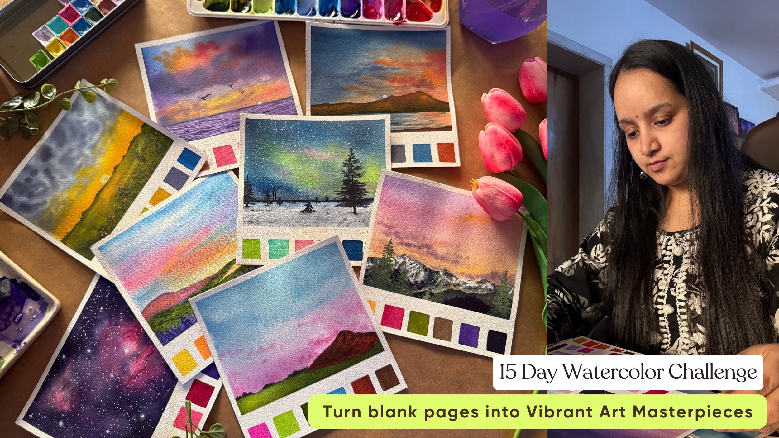
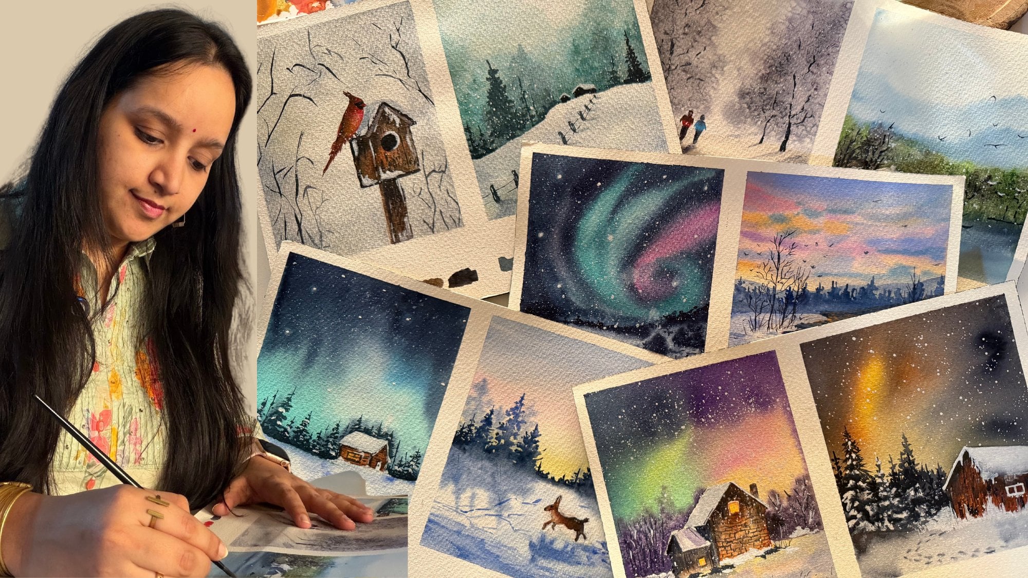
50-Day Watercolor Challenge. A few years ago, I had created my first 50-Day Watercolor
Challenge class here on Skillshare. And the reviews and the
projects from that class is what inspired me to create another 50-Day
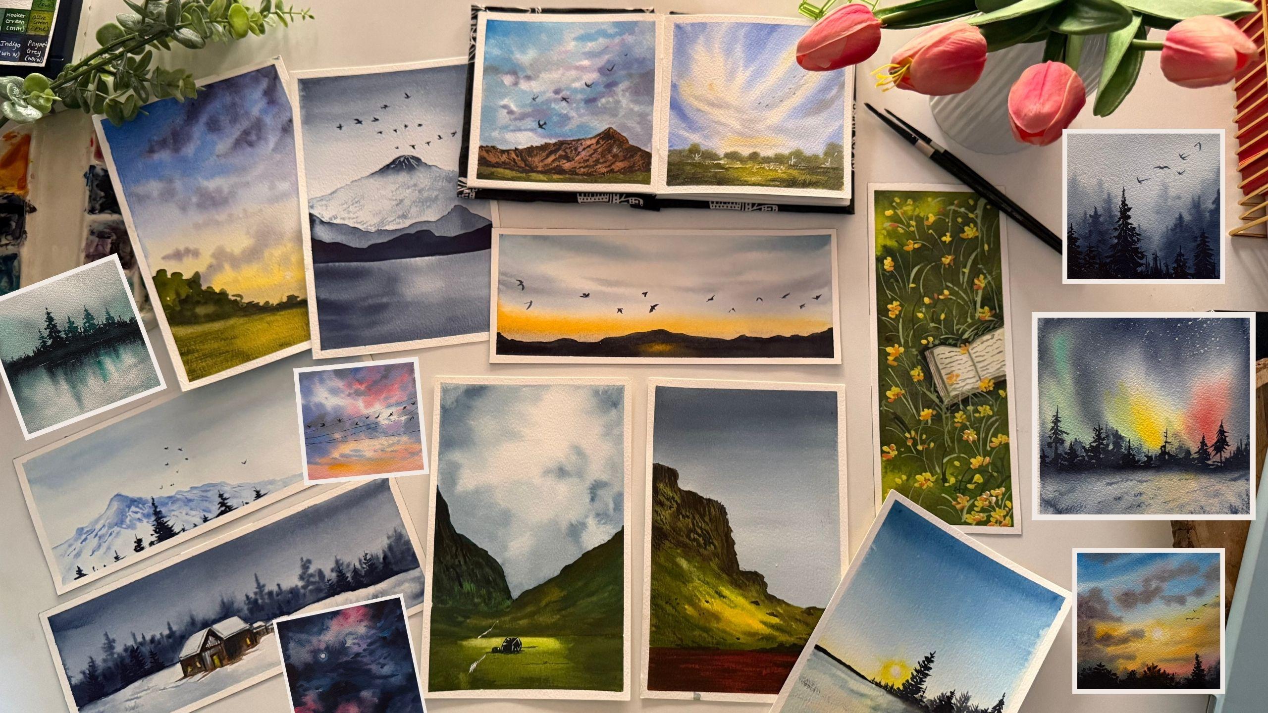
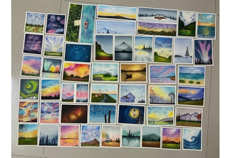
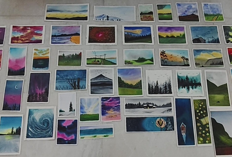
Watercolor Challenge. In this class, we'll be painting 50 different
watercolor landscapes for the coming 50 days. Each day, you will pick up
your sketchbook, your paints, your brushes, and sit along with me to paint a new
project every day. But here's the most
important part. This class is not about painting with perfection
or masterpieces. It's about building our
daily painting habit, about showing up every day, painting with ease and enjoying the process
along the way. Most projects are around
15 to 20 minutes long, detailed enough
to help you grow, but still easy to
fit into your day. And to keep things
light and balanced, I have also added some quick five to ten minute warm up projects in between. These are simple, playful, and perfect to keep your
creative momentum going. And here's something
extra special. We won't just stick to one
size or kind of paper. We'll paint on bookmarks, A five landscape, portrait, mini squares, and more. So you'll see how detail
and composition change with the size of your painting. We'll also explore
different paper textures, hot pressed, cold pressed, mate, rough grain, so you can see how the same techniques and colors create completely
different effects. Along with exploring
endless color combinations, you'll experiment with
different ways of layering, blending, and building depth. Together, we'll paint night
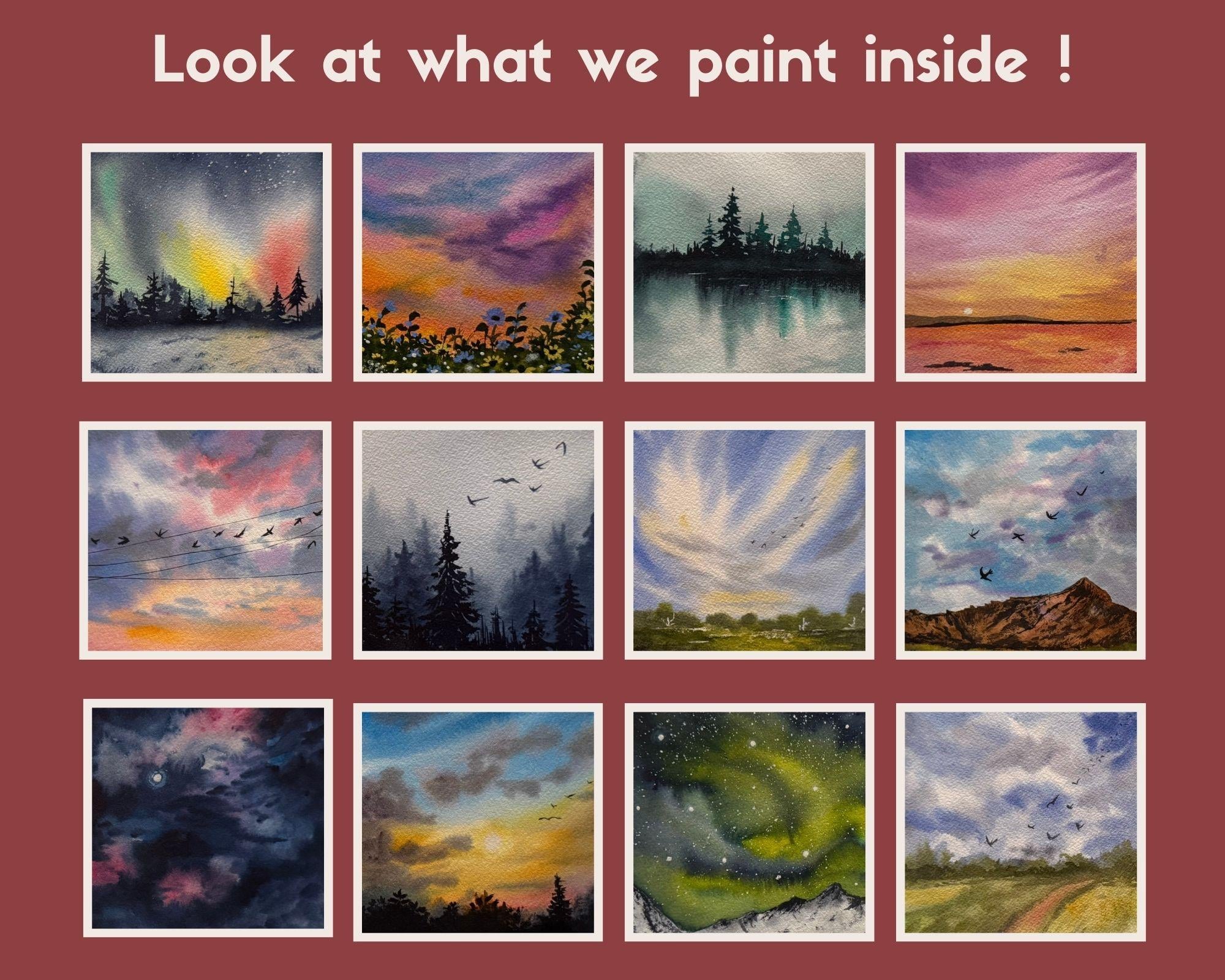
skies, winter scenes, pastel landscapes, galaxies, northern
lights, and so much more. Watercolors bleed in
their own unique ways, and the results
always surprise you. Through this challenge,
you'll learn to embrace that unpredictability and
find joy in the flow. By the end of these 50 days, you will not only
have a collection of 50 beautiful landscapes, but also the confidence and
a routine of painting daily, which is the most powerful
tool an artist can have. Grab your favorite sketchbook and your favorite
watercolur paints, and let's dive into this 50-Day Watercolor
Challenge together. I can't wait to see what you create inside this
50 days challenge.
2. Supplies Guide: So before I begin diving
into the lessons, let me quickly give you
a material supply guide that I will be using for this 50-Day
Watercolor Challenge. The first and foremost
important thing is a watercolor set. Now, I am going to be using in different watercolor sets
throughout the 50 days, but I have one curated
watercolor set which I curated in between this 50
day challenge for myself. So this has 36 paints
from different brands. I have a swatch card for this, as well so that I know which
color which brand is eight. So these are, um,
the colors that I have picked up depending
on the most used colors. So I have some pastel
shades here. You can see. I have the yellow,
orange, pink here. I have a range of greens here, blue, and some browns. For the black, I only have a
paint screen in my palette, which is the color that I use. I, you know, very
rarely use in black. So this is the 36 color palette, which I have customized
from different brands. So if you see, I have
Midge Alo Mission, White Knights, Windsor Newton, PWC Shannan, so all from different brands and the most
used colors that I need. And I have picked them up depending on the
landscape subjects that I usually go ahead with and the colors
that I wish to use. Now, you don't need
so many colors. You can begin in with a basic
12 color palette, as well. And through every color mix, I will keep on guiding you with the colour mix that you can
do with your basic palette. So say if you want this
pastel pink color, you can just use in white
along with the pink. If you need this
royal blue color, you can mix in blue violet and white and get this
royal blue color. If you need the
aquamarine mist color, you can mix in green and colo
blue and get in that color. So you don't absolutely
need all of these colors. Even a 12 colour basic
palette is enough. With that, you of course, need a white wash
paint because this is important for creating in pastel colors because
pastel colors are opaque. And to get that opacity, you need white quash,
white what colors. Don't make the
pastils too opaque. And plus for adding
in highlights, stars, you need an opaque color, which is this white quash
which we will be using in. Now, next thing after the paints is the paper that
we will be using. I recommend using 300
GSM, 100% cotton paper. Now, you can go ahead with
any brand that you wish to. So I will be using in this handmade sketchbook
from my own brand. This is made using arches, 300 GSM, 100% cotton,
cold pressed paper. So I can easily use
them up on both sides, as you can see, and the
paper doesn't buckle up. It's fresh and, you know, it does not wrap up on
the edges or anything. So this is one of the sizes, 5.5 inch that I will be using for a few of
the class projects. Apart from this, I will be using in this himi watercolor pad. Again, this is also 100% cotton, cold pressed, 300 GSM paper. And this is also cold pressed so you can see the
texture of the paper. So a few of the class
projects we'll be doing this size of
paper as well. You see? The reason of varying
the sizes of paper is so that we get a hang of
painting on different sizes, understanding how details
work with each size of paper. I will even be using in
this archies 300 GSM. Now, this is a hot
pressed paper. So hot pressed paper does
not have any texture. It has a very flat surface, but this is also 100% cotton, 300 GSM and perfect
for watercolors. But, of course, if
you like texture, you can go ahead with
the texture pad. I'm trying to use
in different paper so that we can see the
results on different paper, how some textures work differently with the base
of the paper as well. And I will even be
going ahead with some smaller size loose papers, which will be like, you know, mini paintings that we'll
be doing some three inch, four inch by four inch sizes, and we'll be creating
in different sizes of landscape throughout this
50-Day Watercolor Challenge. Next is the brushes. For brushes, you just
need a flat brush, a round brush, a detailer
brush, or if you want, you can even use a mob brush, you can use a round
brush which has a pointed tip so that you
don't need a detailer brush. So you just need
very basic brushes available at your end. And you will be needing in a rough cloth to keep on
dabbing the excess paint, cleaning up your brushes
throughout the class projects. You need some basic stationary
supplies, pencil eraser, a white el pen for
adding few highlights, and a black technical pen
for adding in fine details. Make sure it's a
waterproof pen so that if you ever have to overdo
anything on top of it, it does not spread out. We will even be using in a
spray bottle for creating in textures at places or you can use this if your
paper dries out quickly. You can use this to keep your paper wet for a
little longer time. Will be using this ceramic
palette for mixing in paints for some of
the class projects, and it's easy to get the right consistency
on the palette, and you would be needing jar
of clean water for each of the painting for going
ahead and painting. And of course, you would need
a masking tape to tape down your paper while painting
if you need clean edges. So this is the masking tape
that I will be using in, and I will keep on taping all the four sides
so you can see we have clean edges for each
of our paintings coming in. So that is about the materials that you need for this class. So go ahead, grab in
your basic supplies. The most basic or limited things that you need is a
watercolor palette, watercolor papers, brushes,
and a jar of water, and you are good to begin
in this challenge with me.
3. The Very Basic of Watercolor: So before we move ahead
to the class project, I just want to give you
very basic details about, you know, the basic
watercolor techniques. So first is a wet on wet wash. So for the wet on wet when
we call it, basically, you have a wet layer, so you have a wet layer
of water or paints. And on top of that, you
go ahead with wet paints. So here, I have gone ahead with a layer of
water, as you can see. Now this is wet because,
of course, water, as soon as you apply
it on the paper, it makes your paper wet. On top of these wet layer, you go ahead with wet paints. I will just randomly
pick up wet paint. And when you go ahead
on top of a wet paint, so this is called the
wet on wet technique, wherein your background
is wet on top of that, you are going ahead with
wet paints. All right. So this is the wet
on wet technique. Now, this layer of paint
that we added with the Coval green color
is already wet. On top of this, while
this is still wet, when you go ahead with
a different color. So say I pick up
the indigo color and we go ahead with the
indigo on top of this, this is still going to be wet on wet because your green
color layer is wet, and on top of the
green wet layer, you are adding in
the indigo color. So this is, again, wet on wet. So this is one of the basics
to begin with watercolors, wherein you begin
with a wet layer to begin adding in details. And when the paints and
the water flow together, they create in the
basic, you know, basic magic of watercolor, which is the softness, the glow, and, you know, the transparency that comes in. That is all because of the wet on wet technique
that you use in. This is the basic technique with which we are
going to be beginning each of our class projects
for the coming 50 days. Each of our skies are
going to be the wet on wet technique that
we'll be following along. All right. Now, once this layer dries out and then
when on top of this, you go ahead with a layer
that is called wet on dry. So we'll wait for this
layer to dry out and then go ahead with the
details on top of this. So now the wet on wet
layer has dried out, and when on top of this, you go ahead with wet paint. So you pick up paint in
your brush directly. And when you add in
details on top of this, this is called wet on dry. Your background is dried. On top of that, you are
going ahead with wet paints, and this is called the
wet on dry technique. So you see, we are just
going ahead with wet paints. This is used for
adding in the details and creating in the textures
into your painting, adding in highlights, creating in your
landscape elements, giving in more depth
to your painting. Now, this technique
is even used by many artists to add in
more details into the sky, but I usually work wet
on wet for the sky. And for adding in the elements, I go ahead with the
wet on dry details. So this is the wet on dry
technique that we used in. Another technique
or another kind of important thing
to learn about what colors is the kind of gradients or wash
that we have in. So when you just go ahead with one color and add a
wash of that color, such that everywhere the
color is of the same tone, it is called a flat wash. So you see we've gone
ahead with only one color, and throughout our place, it is of the same color, the same color gradients. So this is called a flat wash. Then there is something
called as a gradient wash. So you begin with a color tone, and then just using in water, you begin creating a
gradient of that color. So this is called
one color gradient. So you see at the top,
the color is dark. And as you move
towards the bottom, the color is turning lighter and lighter
because of the water. So this is called a gradient
wash. Now, of course, you can begin with a dark color at the top or dark
color at the light, depending on the kind of study that you are going ahead with. So this is called
a gradient wash. This was a flat wash wherein the color is same throughout. This is a gradient wash. You can see different grades
of the color. And another kind of wash
is a variegated wash, wherein you blend in two colors. So you begin with one color. And then you switch
on to another color. So from the bottom now, I'm going ahead
with another color. And at the meeting point, you try and blend
these two colors with the help of water or white paints or any
other technique that you wish to
blend these colors. So this is a variegated wash wherein you have two colors
blending into each other. It can be more than two
colors as well blending in, and that will also be called as a variegated wash. Of course, while a variegated wash, you need to keep a lot of things in mind about the color study, complimentary colors,
creating in muddy colors, secondary colors,
tertiary colors, how they blend with each other. All of that is something that you will have to keep in mind. So we went ahead with a
wet on wet technique, wet on dry technique, flat wash, gradient wash, of
irrigated wash. And another important thing
is a dry brush technique. So you begin in
with a damp brush. There is no water, absolute
zero water, zero pigment. I'm just tapping my brush onto
medium to wet, dry paint. All right. Again, you
dab it onto the cloth or a rough tissue that
you're using so that there is no excess pigment. And then you go ahead holding the brush at an angle and
creating in textures. You see the textures
that are coming in. This is called dry
brush technique, which we will be using a lot for creating in textures
onto our mountains, snows, grass fields, you see, the texture that we are creating in using the drybush technique. That is what we'll be using majorly to create
in the textures. Apart from this, I already
have a class wherein, you know, I have covered up the details about
watercolors in depth. I have linked that class into the about section of this class. So if you wish to go ahead with a lot of basics
about watercolors, about creating in
different skies clouds or different cloud
studies, sea waves study, different elements
studies, you can visit the technique section of
the class that I've linked in the about section
and go ahead with the basics of watercolors and then join us here into
the class project. But here, I just
wanted to cover up these minimal basics
about watercolors. And if you just
know these basics, you can easily and simply
paint along with me for the 50 days because through
each of the class project, I will be guiding you with the technique that I'm
using, the way I'm doing it, the method of adding in the
details so that even if you're an absolute Pign you
can easily follow us along. But in case if you
still wish to visit in, I have linked the class into
the A section of this class. You can go ahead and visit the techniques of the
class linked below. And now we will dive into
the Class Project one.
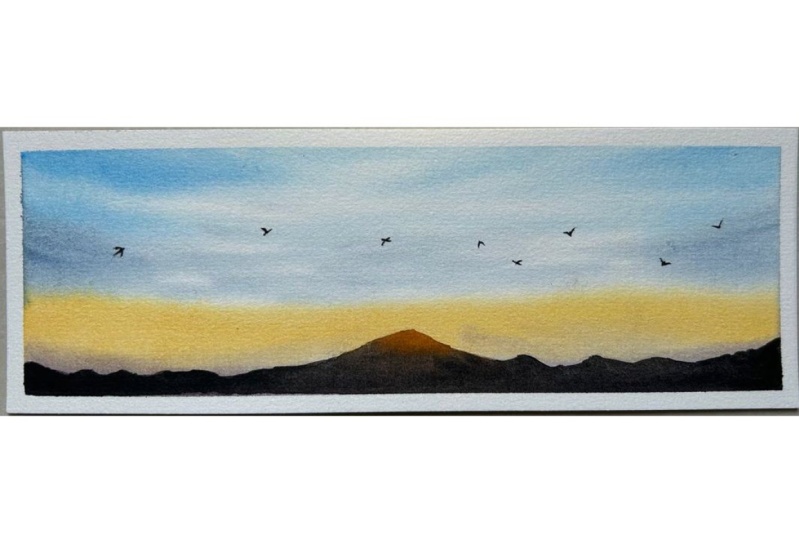
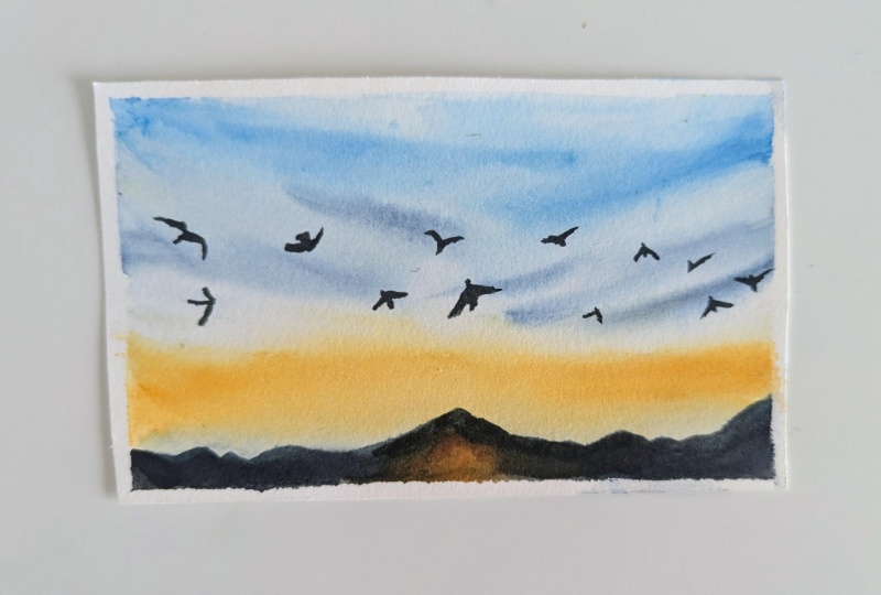
4. Day 1 - The Beginning: So let's begin with our first painting of this
50-Day Watercolor Challenge. We'll begin in with a simple
warm up kind of an exercise. I'm using the Archie's hot pressed paper for
the first painting. It will take us just
around seven to 8 minutes for today's project, and it would be a good
beginning to go ahead with your further paintings in this 50-Day
Watercolor Challenge. So let's begin with a layer of water onto the entire paper. So this 50-Day Watercolor
Challenge is structured in such a way that one day you go ahead with a
little detailed one. Then in between few days, you get these small mini practice exercises
kind of thing, which will just take up like
10 minutes of your day, but you still stay in the loop, practice, and have
that flow going in. So this exercise is going
to be pretty simple. So I've just gone ahead
with a layer of water. Now we are going to go ahead
first with the orange color. So I'm using the cadmium
orange color and just going to add in little orange first
towards the bottom side. Now going to go ahead with a little bit of the
fusian blue color, and we are going to let a lot of paper be
white and let the, you know, paints
to its own magic. So just adding in strokes
like these of the white, leaving in the cloud white
spaces automatically, then picking up a litter
of the indigo color. So major cloud strokes coming in from the edges and
towards the center, letting the white of
the paper to the magic, create in the cloud details. Now, when you go closer to the blue and the orange spaces, be a little careful. And towards the
bottom side here, I'm going to use in the
violet shadow color. Or you can go ahead and use in pain scream mixed in
with violet, as well. And in a very light consistency, just going to add in, like, a background misty layer
because in the foreground, we'll be adding in a
beautiful mountain range. So for that, I'm
just creating in a little blurry look
in the background. Now, closer to the orange, go ahead very carefully
while blending this in as well so that you don't
get in muddy tones. And now I'll just pick up a
little more hint of the color and just add in some
darker highlights from the edges only. Same way with the indigo,
some darker highlights. You see, it's majorly
using in the tip of the brush to do all
the magic on the paper. And towards the bottom again, just using in little of the violet shadow color
and just going to add in All right. So that is it for the main cloud details
that we'll be adding. We'll wait for this to
dry and then add in the final details
into this painting. So now my sky is completely dried and
we're just going to go with the simple silhtF that I'm using in the
paint's gray color, and we're just going to be
going ahead with a beautiful, simple mountain range
at the bottom here. Now, in between here, I'm
leaving that little gap, right, because there I'll use
little hints of the orange. Now, make sure when you
add this a little of the background violet color that you added in the sky is visible. And I'll just pick
up little orange and join these two spots here and just add in
this orange highlight. And in the rest of
the space again, just go ahead with a bold paints gray color to
fill in the space. So in between, you just have that little glowing spot into the mountain to show the orange
light as well falling in. Make sure to use
the pain screen of bold consistency
because after drying, the watercolors become
a tone lighter, so you need that bold effect onto the mountain at the bottom here with just a little simple subtle
glow that we've added in, blending them all
in well together. Of course, if you
want, you can let that glowing spot be at
anywhere else as well. That's perfectly okay. Now, I'll just define a little randomness to the
peaks of this mountain. Making sure that it looks
natural, uneven. All right. And lastly, just going
to be going ahead, adding in a few birds into the sky with the pains
gray color itself. So just some birds randomly that we are
going to be adding in. So you can go ahead
with different sort of silhouettes for the birds
in different flight angles. I'm just using in the tip of this brush and adding in
using the pains gray color. So, across the
entire space here, I'm going to show
birds flying up here. So I'm just going ahead with random movement of the birds. You can see they're flying
off in different directions, different angles
that I'm adding in. But I'm just making
sure to use the tip of the brush to add in fine
details for the birds. You see, through
the entire space that I'm going ahead and
adding in these ports, Now, just one thing here
with the paints gray, I'll just, you know, elongate this till
the orange space because this seemed
a little off to me. Now this looks perfect. Why the orange is
reflecting into the center space and giving
in that perfect dimension. So I did this because
it was still wet, but even if you don't do
it, it's perfectly fine. And that is it.
We are ready with this project in just
under 10 minutes. So that's like a
practice exercise in between the detailed
projects that we do. So, like this simple projeq
will help you just go ahead, maintain the whiteness
of the paper, add in quick skies, just go ahead with
different board studies, try to add in bods in different flight
angles, and, you know, just go in with simple blends of the
colors, creating in depth. So that's about,
you know, sometimes even simplicity can bring out so much beauty of the painting. That's what we'll be doing in between our detailed project. I hope you guys enjoyed
painting this with me today. I will see you guys into the next painting of this
50-Day Watercolor Challenge.
5. Day 2 - The Purple Hues: Welcome back to
another painting of the 50 days
Watercolor challenge. And for today's project, we are going in with this
mini watercolor painting, which is a three by three
inch watercour paper. For this, I am using
the Saunders Waterford. 300 GSM, 100% cotton,
cold pressed paper. First color that I'll be
picking up is going to be the permanent rose
from Windsor Newton. Alright, so this is a beautiful reddish pink color
that I have in. And using in this color, I will begin into the sky. So at the bottom,
we are going to have in a gradient
mountain range. So at the bottom, I won't be going ahead with
much of the colors. Just at the top, we'll first
begin in with the colors. And then I'm going to pick up the permanent violet shadow. So I already have a little of this color out here
on my palette. You see, this is a beautiful blackish violet
color, basically. And going ahead very carefully. At the bottom, I'm just
going to be diluting this because there we'll be having an gradient mountain
range later on. Now in the remaining
space of the sky, I'm going to be going ahead
with the clear violet color. So I'm picking up the
violet from this set, which is from the PWC that's
a white bright color. So you see all the three
colors are of the same color, family kind of pink violet, and then the violet
shadow color. So just adding in colors gently. And you can see gap the
white caps that I'm leaving in briefly and going ahead with very
smaller size brush, depending on the size of the
paper, and just, you know, creating in the cloud effect
while adding in the paints itself so that later on we don't have to go ahead with
much of the detailing. Now I'm just going to pick up a little of the pink
color that we use. That's the permanent rose
color and just going to drop in some clouds here at the top of the pink
color in between. So very little highlights
that you drop in. And lastly, again,
I'll just shift on to the permanent violet shadow that we used in and create in some darker effects
at the top spaces, moving from the top edge
towards the inside of the sky. So this automatically creates in the darker highlights and
the darker cloud effects. And very gently, you
see on the pink, I'm adding it in such
a way so that we have the pink highlights maintained still and just going ahead, adding in detail slowly. So that is for our sky. We'll wait for this to dry out. If you want, you can just go ahead with little
darker hints of the bright clear violet as well into your sky
before this dries out. Just some darker cloud effect. All right. Now, we'll wait for the sky to dry completely,
then move further. So now my sky is
completely dried and we are going to go ahead with the first layer of mountain. I'm going to mix in
my violet shadow with a little hint
more of the purple. So what you can do
is just pick in your purple color and mix in very little hint of
the black color. We are going to be creating
ingredients of mountains, so begin in with the
lightest color first, right. And I'm just going
to add in the color and just go ahead and dilute it. So I've added a layer,
cleaned my brush, picked up some fresh water, and just going to dilute this color towards the
entire bottom space here. I'm just creating this layer
of the mountain first. And onto this side here, I'm just blending it
into the sky and, you know, giving in the
damp blended effect to give in that misty
mountain in the background. So you see quickly
using in water. That is the reason
you always make sure that when you want to go ahead with such
kind of paintings, you take the sky with a
gradient color till the bottom, so that when you add in these, you can blend these and create
in these misty effects. So now, we'll wait for this first layer of
mountain to dry, then move ahead further. So now you can see this layer is also tried out completely, and we're going to go ahead with the next layer of mountain. For the next layer of mountain, just ten up the value of this color and go ahead with
a layer of the mountain. You can begin in
from any spot that you wish to just go ahead, vary the shape of the mountain, and, um add in this layer. And again, we are going to create in a gradient
for this color. So quickly just going to go ahead and create
up a light wash. So at the top, you have the darker color
hint, and moving downwards, you just use water and
dilute it till the end. So in the background,
you can see we've got that beautiful gradient
mountain that has come in, and then we have the second layer of
mountain that is coming in, and we'll be adding in another
layer once this dries out. So we'll quickly just add in some more darker
highlights at the top so that we have the lighter wash coming
in at the bottom. Now the shape of the
mountain, as I told you, you can define it
as per your wish. I need not be same as mine. You can see this
background mountain here. It has an open end showing
in that misty effect. And here we have
this one mountain. And in the background here, if you want, you
can just go ahead, add in another small
misty mountain effect using in a lighter
tone of the color, just as we had added in the
first layer on the left, same way, adding
another one here. Just added a line of
the color and blend it. Using the damp brush, just making sure that here it is well blended into the sky, and we have this one beautiful
layer at the top as well. So the top layer, we
have two mountains. They are not connected
to each other. There are two
different mountains, one on the left and
one on the right. And you see, just adding the color at the top
and then using water, I dilute it and create
a good gradient, creating in that misty effect. Alright. Now, by the
time this is drying out, I'll quickly be adding
in a moon into my sky. For that, I'll be
using in white quash. So I'll quickly pick up some fresh white quash
on my palette here. And using the white quash, let's create in and
using the white wash, let's create in a
dull background for the moon that we will be adding. So just adding in a drop of the white color and
using in the damp brush, let's quickly go ahead, blend this in into
the background. So just using the damp brush, blending it in, and creating in that dull
background for the moon. Now, of course, depending on the size of the paper
that you're using, make sure to keep the size for the moon as well in
accordance with it. Just using a damp
brush on the edges, make sure to blend it well. So I'm just running
across the edges again, making sure that there are no
hard edges on the outside. All right. Now, we'll wait for this and this
layer of mountain to dry out and then add in the final layer of detail
into this painting. So now this layer of mountain
is completely dried. And one thing I forgot
to tell you about this violet shallow color that it's a beautiful
granulating color. So you would be noticing
when it dries out, it creates a
beautiful granulation and some inbuilt
kind of textures. So to the sky, if you see here, how the granulation is working and creating
in that texture. So be careful about using such granulating colors
into your sky to, you know, knowing how the
granulation works out. Now for the last
layer of mountain, I'm using this color in a very dark consistency and just adding in the last
layer of mountain here. So you see I've picked
it up in such a bold, beautiful consistency, added in that last
layer of mountain. And now we'll quickly go
ahead, add in the moon. So for the moon, if you see the white layer has dried out, like, you know, it's kind of completely banished away here. So I'll just go ahead and
just create this layer again. So this way, you can
just go ahead and add in the layers again for creating
in this dull effect. So using in a smaller
size round brush, I've just created in
the dull layer again, which is now a bit
visible, you can see, and now I'll pick
up bold white wash in a good bold consistency. And just to the center of this, I will add in a dot, which will act in as the moon. So you see that is it. We are ready with our
beautiful mini painting in just under 10 minutes. Now, you can see the size of the paper is just three by 3 ", and still it took us a good 10 minutes to
add in the details. So it is not always
that a smaller size of paper makes the
painting done quickly. In fact, when you go ahead
with such smaller sizes, adding in the details
takes in more effort, more patience because
you've got to go ahead carefully creating
in the details. So here's the final look at
our mini painting from today. I absolutely love the sky, the granulation in the sky, if you see here at the top, and this pink glowing space that we've achieved
for the moon as well. So thank you so much for
joining me in today's painting, and I will see you
guys soon into our next class project of the 50 days
Watercolor Challenge.
6. Day 3 - Pastel Pink Sea: So now let's begin with
our next class project. And again, we are going to
go ahead wet on wet with an entire thing together and then distinguish
the horizon line. So we're going to be painting
in a seascape this time. It's going to be a
pretty simple one just under 15 minutes, and we're just going to
go ahead with a layer of water first onto
the entire paper. And then we'll go ahead and, you know, add in
all of the details. It's going to be a beautiful pastel seascape that
we'll be painting. Shades of yellow, orange, pink, and a little hint of the violet that
we'll be using in. So I need to accordingly
choose the size. So this is a one
fourth inch flat brush and a half inch flat brush that I'm going to
use in to create in. So first, I'll go ahead
with the half inch brush. So to begin in, I'm going to
pick up the beautiful pink, violet color from this set. It's a beautiful
pinkish violet color, and I'll begin with this
color at the top here. Then from the previous project, I already have this permanent rose from the Wincor
Newton palette, and I'm just going to use
this closer to the violet. Then I'm going to just use a damp brush and create a
gradient to the pink color. If you want, you can choose
to use in a little bit of white along with it to
create in that gradient. Then I'm going to pick up
the naples yellow color. So as I told you, we are going
ahead with a pastel kind of consistency for the
sky as well as the sea. So just added in a layer
of the pastel yellow. And now I'm going to pick up the orange color and
going to add it at the horizon line. All right. So these are just
the base colors that we've added in so far. Now I'm going to pick up a little more of the naples
yellow, add in here. Now, next, I'm going to go ahead and begin creating
the reflection along. So first, I'm going to pick up the orange color and going
to add in a little here. And then I'm just going
to go ahead using the pink color and create
in the entire C space. All right. So from the orange, we are going to be
having in the sea and the horizon line. So till 60% or 70% of our paper is going to be the sky and then from
the orange part, we'll distinguish the sea area later on by the horizon line. Alright, now let's go
ahead, add in details. For that, I'm going to shift into this smaller size brush. I'm going to pick up
some white color, add into the pink here
to create a little more lighter and a pastel pink
and going to go ahead, add in some smaller strokes. Going to pick up some violet at the top and add in
closer to the pink. Now, again, using
in a clean brush, I'm going to go ahead use in some white color between the blending point of
the pink and the yellow. Of course, pink and yellow can be blended to
each other easily, but I want to create that
little lighter transition. And that's the reason I'm
using white in between. Now I'm going to pick
up the yellow color. Now we are going to begin adding in the cloud
details to this. So again, going to begin in with the violet color mixing it
with the pink and the white. That's already on my palette. And I'm just going to begin
adding in the cloud details. So first here, make
sure you add in white to your violet so that when you add it over
the yellow color, it will not give you
any muddy tones. Plus, going in very
light handedly. You can see how I'm going
ahead very light handed. And just using in the
tip of my flat brush, creating in the cloud strokes here closer to the yellow
and the orange tones, using in the pastel mix of
the pink violet and white. You I'm using in
white watercolors only not going ahead with quash because even white
watercolors from this set is a good
creamy white color, which is giving me very
beautiful pastel tones. I'm liking the overall
vibe of this white here. Now, you need to just go ahead, use in two to three tonal
variations of this color mix. That's a pink violet and the white color so that you can create in
some darker details. From the top, just
pulling out some strokes, blending them all in
giving in that softness. You see how diagonally I'm
adding in these cloud strokes. And now you see the whiteness that we added in
between the pink and the yellow is creating
in such a beautiful, glowy space at that point. Now going to go ahead add in
some darker colour details here as well on the
horizon line space. You see very gently just using the tip, adding
in this detail. So you need to add the darker
details in such a way that you still have the
lighter details in place. And now into the S space, we are going to
add in the wet on wet waves detail as well, because in the sea,
we are not going to have in much of the details. We're just going to
give in a little of the wet on wet waves detail. So using in the same color mix, that's the violet, pink, and the white color, we're
just going to go ahead, add in some details
from the edge. Now my sea area has kind of
begun to dry out already, but I'll quickly go ahead with the damp colors and
blend them all in. So, you know, now in
the sky at the top, we have the darker color. So same way at the bottom, I'm going ahead with
the darker tone to create in the highlight spot. And I'm just going to pick up a little yellow color the naples yellow you can use in
and just create in a little glowing spot
into the sea as well. So you see where we have
the glowing in the sky. Same way, just create in a little glowy wave detail
into the sea as well. Very gently just giving
in the same way, you know, like just how you
added in the cloud detail. Same way I'm adding in
the waves detail here. So we've created little
simple wave details. Now I'll just go ahead given a little more pink wave details. So going to pick up a
little more of the tack up pink and using the
tip of the brush, give a little line
at the horizon line. Now, of course,
this will still be like a soft line for now. We'll distinguish
the horizon line once everything dries up and just going to add in some
waves with this pink color. So you see diagonally, I'm creating in some movement of water with this pink color flow. Basically, in the sky where
you have the darker depth, same spots, you
need to go ahead, add in the darker details
into the water as well, and the lighter glows
of the sky need to be maintained into the sea
showing in the glow. So very loose wet on wet details that we've
added into the sea, keeping it all simple. Alright. Now we'll wait
for all of this to try and then add in little
details into all of this. So let's go ahead, define the horizon line and add
in a little more details. So I'm going to pick
up the violet color. Now I'm going to pick it up
in a very light consistency. This is the violet shadow, and on the horizon line, make sure it's completely dry. I'm just going to go ahead, add in a soft loose
mountain range. Moving towards the right side, I'm just going to take
it as a very fine line. So you see, we've
got a distinctive horizon line look as well. And using in the
pains gray color, just going to add in
some rock details. So let's just add in
some rock details. You see somewhere
I'm dabbing and toning it very light and, you know, soft again. So very little details that we added of the rock into the sea, very light and easy ones. Now using this darker color
onto this right side, I'm just going to create another fine range
of the mountain. So this I'm taking
it for the fine. So you see in the background, you can see the lighter
mountain range that we added in using in the
violet shadow color and now just adding
in this detail. All right, little detail that we added in the foreground
of it, as well. And now I'm just going to
pick up some white quash. So I use the white quash from
this huge tub that I have, and using in a size
zero round crush. Let's pick up some
white quash onto a palette and using it in
a good thick consistency, going to add in a small moon from behind the mountain here. So, you see, I've not
kept it center align. I've taken it a little off
center towards the left side. Small moon that we added in. I'm so tempted to add in the
birds to this one as well, but I will control
my hands and let the beauty of the sky and
the clouds just be there. You can see the clouds
are looking so soft and softly blended between the
pinks and the yellows, and even the cloud
strokes that we added, all of them have such
softness into them. So we'll let the softness
of the clouds be there, and carefully, let's begin
peeling of the masking te. So here's our final
painting from this project, and I absolutely love the pastel colors of the sky and the soft
blend into the sea, a very simple seascape
that we went ahead, and it just took us almost 15 minutes to
finish this painting. So I hope you guys
enjoyed painting this, and I'll see you guys into
the next painting now.
7. Day 4 - Pastel Hues: Hello, everyone. Welcome back to the next class project
of this series. And today, we are
going to go ahead with another beautiful pastel
colour combination for our sky in the landscape. I'm going to use in
this royal blue color. This is like a beautiful pastel, violet blue kind of a shade. It's a beautiful, you know, sky color to use in. And next I'm going to be
using in the Naples yellow. So naples yellow, again, is just a basic
pastel yellow color, which you can get in by
mixing in white along with your cadmium yellow
or yellow light. But, um, you know, the thing about pastel paints, it's that the opacity
of the pastel paints. So try using in white wash to
form in your pastel colors. That will give in a better
outcome to your pastel colors because it will be opaque and
given that pastel of flow. Apart from this, I'm
going to be using in the lilac color a bit. So for the lilac color, I will just mix in a little bit of the violet to this
royal blue color, and I will get a beautiful
lilac violet tonee. And then I will be using
in the pastel pink color. For that, I will
use the pink from this set out here and mix
it with a white colour. I do have a ready
pastel pink as well, which is this pink peony. So if you have a
ready pastel color, you can use that as well. But in case if you want, you can even mix in white with your basic color and then get
in the pastel shades ready. So this is about the colors, and then at the bottom, we'll go ahead with
a simple field kind of a detail for the pactal sky. So let's begin in
with the sky first. There's no pencil
sketch just directly wet on wet that we are
going to begin with. So I'm beginning
in with a layer of water onto the entire space. Make sure you have an even
layer of water throughout, and especially on the edges, make sure there's
no water collected. Otherwise, it will be, you know, flowing back into your painting, and that may cause
in uneven edges, and, you know, you may
get patchy edges as well. So there you go. I have a
good even layer of water. Now I'm going to
get the paints out. So firstly, squeezing out a little bit of the
royal blue color. Now, this time I'm going
to use a flat brush, and beginning in with
this royal blue color, you see how beautifully it spreads as soon as you
add it on the paper? Now, along with
this, I'm going to use in a little hint
of the white color. I'm picking up this opera
pink from my shinan set here, laying a little bite
on top of it again so that it has a beautiful pastel
blending with the blue. Now I'm going to pick up a
little hint of the orange, mix it with a little
bit of the white and yellow to get a beautiful
yellowish orange color. And just adding it out on
this side of the paper. And onto this side,
I'm going to go ahead with the
pastel violet tone. So I'll just show you how I'm going to form my
pastel violet color, picking up the violet. And I'm just going to pick up the white color
and add into this. And you see I've got this
beautiful lilac tone ready. Going to begin adding
in the lilac color. Now, next going to pick up a little bit of
the naples yellow. You see how going ahead, blending in with
the pastel violet. And just going to create
in the highlights. With the violet
and yellow color, be a little careful
so that you do not have any muddy
tones coming in. Go ahead with the
royal blue at the top. Just dropping in some pink
clouds at the top, you see, these small highlighting strokes add in more depth to the sky. In between these
purples as well, going to add in these subtle cloud details with
the pink colour. I'm going to pick up a little orange color to add highlights. Again, when you're
adding in highlights, you need to make sure
that your brush doesn't have excess pigment
or excess water. Only then you'll be able
to achieve the, you know, softness as well as the glow of the highlights
that we want to create in. You see, I'm just
using the tip of the brush and adding
in these highlights. Now I'm just picking
up a little hint of the dark blue color, going to mix it with a
little of the royal blue. I'm picking up the serle
blue colour from this set. You can go ahead
with serle blue or a sky blue color or any medium tone of the blue that's available
in your palette. Avoid using Prusian blue
or ultramarine blue. You can try for the
thalo blue colour. Okay, I've added in a
little of those strokes, and now using in the damp brush, I will just soften
them up at the bottom. Again, I'm still walking wet on wet with all of these
details, as you can see. Using in the same color, just going ahead with
little details here at the bottom as well with just a little of the
blue highlights. Just adding in some violet
highlights as well. You see wet on wet we
are able to achieve in all the softness as well as
the clouds into the sky. So that is it for the sky. I will let this dry
out completely, and then we'll go in with
the foreground details. So now everything has dried out, and you can see here, I had a little excess
water which how it has peeked back into
the painting from the edge creating in
this bloomy space. Though this is looking very
pretty in the cloud here, and this part here will get
hidden into the field space. But these are small things that I want you to be
careful about because, you know, then with watercolors, it's quite difficult to go
back and get these rectified. Now for the bottom space, I'm beginning in with
this light green color. This is like the may green color or it's just a
yellowish green color. You can begin with any light
green in your palette, or you can simply add in a
little bit of the yellow to your green if you just have one green and use it as a base. And then I'm going to go
ahead and keep on darkening this shade with
different tones of greens and create in
the base for the field. So now I'm picking
up the satren color, and at the top, just beginning to
drop in randomly. So you see, since the
light green is still wet, it's automatically
blending it all well in. And once this paste
will dry out, we'll go ahead with
some detailed leaves and florals on top of these. So here, you see, I'm
just using the tip of my brush and creating
in the top space. Now in this also, you can keep on wearing in with
the shades of green, pick up more darker
green by mixing in black or dark blue
browns and, you know, create in as many possibilities
of greens as you wish to and just keep on adding
them along the way. So right now I'm just creating
in the first rough patch, and then I'll go ahead with some detailed leaves on
top of these as well. At the top, you
see, I'm just using the tip of this brush and
adding all of these in. I'm just going to mix in a little bit of
the pains gray to the sabtrene color so that I can get a dark green
colour consistency. And with that
colour, wet on wet, I'm going to go ahead add
in some leaf details. See, I'm just dropping
in simple leaf strokes, dabbing the tip of my brush
to create in these leaves. So just pulling
out simple leaves. Now for these leaves as well, you can use in different tonal variations of the greens again. So that is the reason in
the base I created using in the light green and the
Satrine color and then adding in these leaves with the dark
green color so that we have all the different variations
of greens popping out through different
areas of our field. So I'm just going to
quickly go ahead, add in these details, and then we'll wait for these
to dry out before adding in the simple floral details into this small field that we
are creating in here. So you see somewhere I'm just
pulling out small branches, moving towards the top and
adding in more leaves. The very simple one
stroke leaf methods that we are adding them in just dabbing in the
tip of the brush, giving in a pointed tip, and lifting up the tip. And if you want, you can leave it here
like this because we'll be adding in the
florals to this now. So I'll wait for this
to dry and then we'll add in the floals
on top of this. So now everything has
dried out completely, and we're going to go ahead add in the florals
on top of this. So for the florals, I'm
going to use in two colors. One is going to be
the naples yellow, and another is going to be
a beautiful lilac tone. Now, make sure you
use these colors in a thick opaque consistency because only then
they will dry out vie print and opaque on top of the dark greens that
we've added in. And if you want, you can add in white quash to your yellow and violet so that you get in that opaque consistency
of the colors. Alright. Now I'm just
going to go ahead add in simple daisy floorls so I'm going to be using
in two of these colors. As I told you, it's
going to be a lilac, and it's going to be this
yellow color that I'm using. You can see how bold and
opaque my yellow is here. I will even be using a
little of the white quash to just add in some fill of
laurels in between, as well. So just scattering up the
yellow flowers first on places. You don't need a lot of florals. You need to let the green also do its own talk everywhere. You see somewhere
I'm just adding in some very small florals. So now I'm done with
a yellow part of it. Now I'm just going to quickly
pick up my white quash. And using in the white quash, I will just add it to the violet colour on
my palette already, and I'll get a beautiful
pastel violet colour, which will be opaque as well. You see? And now using this, I will add in a few floorls I still want to make this
a little more brighter, so I'm just going to add in more of the white
quash to this. So now randomly, I'm
just going to drop in some small violet flowers. So you see in between the leaves also how I'm adding
in these florals. Make sure when you're
adding in these florals, you do not have excess water. You really want good thick pigment so that
when they try out, they try out beautiful and okay. So I just added in a little hint of the royal blue to my lilac as well so that it has this
much more better glow. Now using in the
white wash also, I will just add in some
filler florals in between. Make sure you use in
whitewash because white watercolors will
dry out translucent. They won't be that opaque and
vibrant once they dry out. So white quash will give
you a good opacity. Now, if you want
to some of these, you can create it
as a glowing bud. And then to the center of these, just adding in the glow. Jesse, I adapt it with
the finger to create a dull background and then
just added on top of these. Now, lastly, I'm going to use in a little bit of a
dark brown color. And to the yellow florals, just going to add in
small bud details. Now, make sure before you
begin adding in these, your florals are
completely dried out. You see, I'm just pulling
out some strokes. Alright, so that is
it. Let's peel off the masking tape and see
your final painting. Make sure that your
edges are completely dried before you begin
peeling off the masking tape. See the two florals
to which we added in the glowing spot
is glowing in so beautifully in between all
the florals that we added. Very simple floral details
that we added into this field and the beautiful pastel sky
that's coming in altogether. I absolutely love how
everything has turned out here. I'll just do one small detail that I feel is missing in here. So I'll just quickly pick
up some white quash, and in between these
lilac florals, going to add in the bud details. So thank you so much for joining me into today's painting, and I will see you guys into the next project soon till then, make sure to keep uploading your projects into
the project section. And in case if you
like this class, make sure to drop a
review so that it can help me reach
maximum students.
8. Day 5 - Loose Landscape: So let's begin with
our next painting, and we are going
to go ahead with a beautiful daylight
landscape with a blue sky. So let's go ahead. Now, the field part, I'm going to go ahead with a loose style of
painting this time. So I'm just going
to begin in with a layer of water onto
the entire paper. And then moving further, we'll go ahead and, you know, create in the details. So if you're someone
who does not like working in a loose
style, you can go ahead, mark out the field space separately first or little
of the bottom space, and just go ahead with the sky first and then go
ahead with the um, you know, field area. So I've added a good
even layer of water, and now I'm going to
begin with the colors. So the first color that I'm going to pick up is going to be a beautiful sky blue color, or you can even pick up
the ultramarine color. So I'll just go ahead
with this h blue. And to that, I'll just add in a little bit of this
ultramarine color. And using this, I'm just
going to begin in the sky. You see I'm just dropping in
some colors into the sky, leaving in some white caps for the natural
clouds to be there. As I told you, we
are going ahead with a very loose kind of
painting for this one. That is the reason just
letting everything go loose free and
keeping it all natural. The bottom is going
to be the field space where I'm not going
ahead with the clouds. Again, that also will be
in the loose style only. Now, what I'm going to do
is just going to go ahead, given some sharp edges
at random places. Lifting in a little of the color to create that sharpness. I usually don't go ahead
with these sharp style, but I want to let myself
loose and, you know, experiment and just let the colors flow do its
magic. That's the reason. I'm just going ahead loosely. Now, this is a mix of
the pains gray and the violet color mixed in
with a little hint of white, which we used in the
previous project. The same mix I'm using in here, adding in some darker
depths at random spots. Wherever you feel it's too dark, you can quickly just
go ahead, dab dab dab. All right. Now,
wherever you feel you want to create in
that cloud shape, depth or, you know,
that softness, just go ahead, lift
up some colors, create in those blends. See how easy it is to
lift up the colors. Now, if you want to go ahead
with the lifting technique, you will have to do a
color test of your colors first as to which colors
are staining pigments, which are non staining, because if the pigment
will be staining, by the time you
go ahead to lift, it may have already
stained your paper, so you need to know your
colors well in that case. You see a very simple loose
sky that we've created. Now I'll just pick up a
little more of the blue, add in a little hint
of the paints gray, and just give in some darker, you know, cloud spots. Just very little, not much. Because again,
remember, watercolors usually dry or tone lighter. So to maintain the, you know, luminosity of these paints, you go ahead accordingly
such that after drying also, they have that vibrant effect. You see, we've just added in
less of the darker spots. We have some sharp edges. We have some beautiful
grayish clouds coming in. Now towards the bottom side, let's go ahead and add in the simple field that we
are going to go ahead with. For that, I'm going
to first pick up a mix of the yellow and the yellow ochre color and just going to drop in
very loose lightly. All right. Now, since we are going ahead with
the loose style, the sky may still be a
little wet, and that's okay. So you just need to
control the flow of the yellow color there such that it does not move
much into the sky. Now, I'll pick up a little
hints of the green. So you can go ahead with any
sort of greens that you wish to the may green colour,
yellowish green colour, saprene color, olive green
color, whichever name, various greens, whichever is
available in your palette, you can accordingly go
ahead and use them. So I'm just picking up the
light green color first, then just adding in
little darker green hints on the yellow ochre
and the yellow mix that we had added
into the field. And now, once your horizon
line is a little dried out, I'm just going to pick up a
little saprene color here and just going to go ahead create in that little bush
detail which is, again, you see a little wet
on wet that I'm going ahead. So the sky is still wet. Since I told you
we are going ahead with a loose kind
of a landscape, not going to go ahead with
those precise lines this time. So very loosely added in little details on
the horizon line. And while the bottom
space will dry later on, then we'll give in some details to define the horizon
line a little sharp. Till then, let's pick up a little more of
the darker green and just going to add in some dark spots while
this is still wet. Again, if you feel, all of a sudden two dark
color has dropped in, just lift up little and drop in. You see the lifting technique is a very good technique to
create in the glowing spots and the highlighting details
into your field spaces. Now I'm going to
pick up a little of the light brown color and just going to add in a small muddy pathway
kind of detail. Again, lifting up the colors, creating in the lighter spots. You see how even
between the greens, with the help of the browns
and lifting the colors, we've created this pathway
kind of a situation. Now I'll just pick up a
little more yellow ocher, drop in at spots. Again, all of this, we are
still going wet on wet. So the bottom space is wet onto which I'm going ahead
with these details. You see, I've still
been working only with one brush because
this brush has so much possibilities because of the tip pointed
tip that it has, you can add in the swift detail. Now across the pathway, you see how I'm creating
in the darker green lines to create that distinctive
line for the pathway. All right. Now, we'll wait for all of this to dry, then add in some details here a little bold
patchy details. And then we'll be ready
with this painting. So now things are
almost dried out and we are going to go ahead
with the darker green color. So I've picked up a mix of the sap green with a little hint of the paint's gray color. And now just we are going to go ahead loosely and define the horizon line a little more in detail using
this darker color. Now with the darker
color, again, you can see I'm going
ahead and using in water as well so that we don't have too much of the
dark color as well. And you can use a little of the dry brush technique as well in between. Like
here, you can see. So this will create more
textures into your field, more, you know, details, more depth, giving in more beauty
of the nature. So the entire horizon line, I'm just going to go
ahead giving this. Now just going to go
ahead, dab my brush, and add in a little dry
brrush effect as well. So you see how we
are going ahead with a very loose style kind
of detail this time. And if you've always
been following me here, you may also know that this
is usually not my style, but that's something that I'm
trying to learn, develop, practice, different
ways, different techniques to work because watercolors has a lot
of possibilities, a lot of chance to explore. Very loosely adding in
some loose details. So as I add them, I'm dabbing them
so that they have that little soft texture blend. Same way here, also, I'm just going to go ahead,
dab them a little. So you see they have that
little more softness. All right, so we've given
in a little more details. And now, using in the violet gray color that
we created or you can use a beautiful
shadow violet color and just create a little
shadow space here. So you need to use it in a very light, watery consistency. I've gone ahead with a little
darker color, actually, so I'm just going to
quickly lighten this up by just tabbing
and lifting up, but you can see how it's
creating in that shadow effect. See, lighter shadows
that we are creating in. Now with the green color, just going to define this path line a
little more in depth. But again, the same technique
just dab, dab, dab, dap, dab dab so that you can
create in the blends, and just going to
soften this up a bit. That just adding in some
darker details with the mix of the sap green
and pains gray color, creating in little more
darker dip praises and now using in the mix of the violet and the
pains gray color. Just some simple bird silo hits that I'm going
to go ahead, adding. So this bird here, just trying to create in some feather details
as well. All right. Now, as we go far, just going to add in
some tiny dots as a flock of birds coming
in from far off. So that is it. We are
ready with this painting. A pretty simple, loose, kind of a field landscape. It took us just below 15 minutes to work on this
small loose kind of a field landscape painting with loose details and then
just some bold highlights. And that's how you need to incorporate little
pieces of practice as well. So let's peel off
the masking tape, see the final painting. Make sure that your
edges have dried out completely before you begin
peeling off the masking tape. So here's our easy
loose landscape from this project of the
Watercolor Challenge. I hope you guys enjoyed painting this and learn something new, creating in a loose landscape. I'll see you guys into
the next project now.
9. Day 6 - Sunset Sky: So let's begin in with
our next painting. For this, we are
going to go ahead again with a loose
style of a painting, and the colors that we are
going to use is I'm going to be using in the callow
blue color from this set, and then I'm going
to be using in the Indian gold color
from white Knights. So this is the Indian gold
color from white Knights, which is a beautiful
yellowish orange color, but you need to use it in
a very light consistency. So I'm just moving
a pinch of it. And then I'm going to use in a little of
the naples yellow. So this is a pastel
yellow color. So in case if you do not
have a naples yellow, you can just mix in
a little hint of white quash to your permanent
yellow light color. Or try using in white quash
because for pastel colors, white quash gives
a better opacity. Then next I'm going
to be using it is the violet shadow color. So this is the violet shadow that I have from
white Knights again. Now, in case if you do not have the violet shadow
color, it's okay. The color mix that we have been creating since the
previous two projects, that is the mix of the violet with a little hint
of pains gray. You can use that color in fact. Okay. And then I'm
going to use in the beautiful light red
tone from this color, or you can even
use a pink color. So if you have an opera pink, then you can mix that with
a little hint of red. So I have this permanent
rose color which is kind of a little
towards the pink tone. So I'm just going to squeeze
out a tinge of this as well. Very little because I'm going to use it with her
little hint of the red. So this is from the Windsor
Newton Cotman watercolors. I absolutely love this pink tone because of the
brightness that it has. And for the orange, I'm going to use the orange from this Mahini set that I'm using in because this
orange is a beautiful, you see bright orange
color that comes out. So as it is, I'm
going to be using it in a very light consistency. And plus, when you create
a pastel of this orange, it turns out really beautiful. So now let's go
ahead with the layer of water onto the entire sheet. So I'm going to go ahead with a layer of water
onto the entire sky. We're just going
to go ahead with a beautiful sky with
some cloud details, and then we'll just add in a very simple loose
silhouette at the bottom, Oliate wet on wet, loose style. Now, make sure that your
edges are perfectly wet. So run your brush
multiple times on all the spots so that
your paper is evenly wet. Otherwise, it may give you
patchy and uneven drying. I'm using Archie's 300 GSM, 100% cotton, cold
pressed paper skedjb. So that is the reason I know this paper will stay
wet for perfect time. But still, you know, I want to be really sure. So you see I'm running
my brush multiple times, making sure that it's evenly wet throughout and has that even glaze throughout
on the entire paper. Alright. Now, let's begin in
with the colors one by one. So I'm first going to begin
in with the blue color. So just picked up a
little of the blue color and going to begin in
diagonally little this time. All right. Now, next, I'm going to shift into
the naples yellow. So beautiful pastel yellow. Then shift into a little bit
of the Indian gold colour, which is a beautiful
yellowish orange tint. See such a beautiful
highlight it gives in. Go to pick up a little
bit of the orange now. Be very careful about the
orange closer to the blue. You see, I just let it be there and let the blends
happen naturally. Now running with a little bit of the orange over the yellow
and the Indian gold as well. And now I'm going to pick up this beautiful
permanent rose color from the PincerNwton series, which is, you know, a
beautiful pink tone. You can pick up a neon pink
as well if you haven't, or you can simply use any other tone of pink that's
available in your palette. Now you see at the yellow
and the blue blending point, you just need to go ahead
gently such that you do not form in the green tones
and using a dam brush, creating that soft
blend happening in. Now I'm just going to go ahead with another layer
of paint creating in the darkness or the bold effect because watercolors will
be drying a tone lighter. So first, pigging
in with the blue, just piging in with
the darker tones. And again, using the damp
brush running in here. Now I'll pick up the
naples yellow again. Now going to pick up a
little of the orange color. Indian gold. For
the Indian gold, you can just mix in a
little hint of the brown to your orange and you'll get
a similar looking tone. And now, lastly, I'll again pick up the permanent rose color. All right. And now using in
the violet shadow color, I'm going to go ahead and
add in the cloud details. So just going
ahead, blending in. As I told you, this
violet shadow color is exactly a mix of the paint screen and the violet color that
we have been using. So you can just go ahead
and use the same color mix. And I'm just going
to go ahead add in the cloud details using a little liquidity
consistency of this paint. So you see I'm adding in
a lot of water such that, you know, it has all the
softness into the sky. Even on the orange and the yellow spots going
ahead with this color, creating in the cloud details. So you see your paper
has to stay wet for enough time for you to add in all of these details wet on wet. I'm going to pick up
a little of the blue, mixing in with this
color and give in little cloud details with this bluish violet
color at the bottom. While blending, you got to be a little careful making
sure that you do not get in muddy tones or complimentary color while
mixing in these tones. I'm going to pick this color in a little darker consistency to add in little darker
cloud details. So now I'll be using the tip of the brush to drop
in these paints. Again, we are still working
wet on wet, as you can see, Just using a damp flat brush going to get in a
little of the color. You're in the center. You see, loosely using in the
brush to create in the flow of colors
towards the center side. I'm gently adding in
some cloud strokes with the same violet color in a
little darker consistency. And now at the
bottom space here, I'm just going to pick
up the pains gray color, mix in with this violet blue, or you can even use an
indigo color if you wish to, and just mix in your indigo, or you can directly pick
up an indigo color and just going to add in
that foiliage detail here at the bottom, wet on wet. So you see the loose kind of foiliage that I'm creating here. I'm just going to pick up a little pains grey
color on its own and drop it at the bottom to give
in more of that darkness. So you see you get that little lighter color in the background, and then the pains gray gives in the further darker depth
in the foreground space. Now, one last thing
that I'm going to try is lifting up
a little colour, creating in a glowing
sunspot here. So I'm just using clean
brush with a little hint of the water and trying to create in that soft sun space closer to the yellow area. You see slowly how that
glowing sun is coming out. Every time you use your
fingertip again to dab, make sure that your
fingertip is clean. Otherwise, the
color from your tip will begin laying out there. I'm just using a dam brush, running in a circular motion, creating in a circle out there
to create in that sunspot. So you may have to go
ahead two to three times to create in that
glowing spot of the sun. Now, just going to use in
a little naples yellow, and give it that definite shape. And on the edges, again, going to dab dab dab and blend them all in while this is still wet so that we don't have any sharpness for
that space as well. See just created in that
softness look as well again. Now, once this dries
out, we'll go ahead, add in a few more details, wet on dry and then we'll
be ready with this. So now everything here
has dried out completely, and I'm just going to go ahead, add in some wet on dry details. For that, I'm just
going to pick up the pains gray color
and just going to give in some detailed
bush detail with a violet or a dark
pains gray color. All right. So in the
foreground here, just adding in some
dry brush bush detail. So just using in
a spoiled brush, dabbing in, creating in this. You see how it is giving in
that texture of the bush. For this, you need
to make sure that your brush shouldn't
have excess water, neither excess pigment,
only then you'll be able to achieve this kind of
dry detail at the top. And at the bottom, you can
use any other brush and just fill in with the dark color
that you're using in. So at the bottom,
I'll just pick up this darker color and
fill in with this brush. And at the top again
so that these colors all have a beautiful
blended look, dabbing in. So you see automatically all of this is blending
with each other. You see the dry brush
texture that we are getting in for the bush details? In the background leo that we added wet on
wet is now acting in as the background
shadow to this, and then you have
this front foreground detailed bush detail
that we are adding in. Again, this is also very
simple method we've used using this spoiled round brush and
adding in these details. Now, I'm just going to go ahead, add in a few more
details before we, you know, are ready to peel off the masking
tape for this project. So I'm just going to pick up the same dark pains gray color. And going to pull out
some loose tweaks like this from the bush space and add in little
foiage to them. Now, at this spot,
I'm just going to give in some detailed leaves. So just going to pull out
some leaves like these. And you just need to make sure that all of this
has a blended look. So just going to make sure that it has a blended
look with the base. So just go ahead, dab the
color because at times one tone color
variations may also create that little difference
in the color tone. So, you know, it's easier to blend at the bottom
again quickly. You see, I'm just giving
in simple leaf strokes and some leaf branches
at the top here, giving in a little
more detailed look and dab dab dab blend
it at the base. So I'm not going to go ahead with this detailed
leaf throughout. So we just added one simple
kind of a tree out here. I'm just going to extend the tip of this and give in more detail. Okay. Now see simple details using in the tip
that I'm giving in, creating in those foliage look. And now towards the
center space here, we have the sunlight glow. So we'll just use this
Indian gold color, or you can even use in the
brown color if you wish to. And since I have the
Indian gold on my palette, I'm using this color. And using this color, I'm
just going to create in some glowing leaves
trying to show the effect of the
sunlight coming in here, which is causing these leaves
of the lighter color glow. But to blend them
all in together, I'm going to use quickly the pains gray color around these leaves
that I'm adding in. Such that the Indian
gold color will look as the glowing highlighted spots. Do you see how we have
that glowing spot? Now, into this,
we'll have to give in a little definite detail. So once this dries out,
we'll give in that detail. By then, just going to
use the violet color in a lighter consistency
and add in a few birds. This time, it's going
to be very few. All right, so just a
few birds on one side. You can see the glowing
space of the sun is giving in such a
beautiful glow into the sky and now
using the fins gray. Let's just quickly give in
some bold leaf details here. Now, you see the background
yellow leaves are acting in as the glowing
highlighting spots to these. So that is it. We are ready with our project of this
painting as well. A very pretty simple sky. You can see the pink
cloud highlights, which are still visible from
behind all the details. Then we have the
glowing effect of the sun that we've created, the violet shadow
clouds that we created, and then a simple view of the
background foolage that we added and then some detailed
foolage in the foreground. So that is it for this one. Let's peel off the masking tape. Peel off the masking tape carefully always
against the paper. So here's the final
look at our painting. You can see the glowing sun, the simple foiage
and the effect of the sunlight on the leaves
that we've added in here. With the help of the
Indian gold color, you can even use a brown colour. We went ahead with very
simple filage simple leaves, a simple tree to add
into the silhouette, and the glowing soft
sunspot that we created. So that is it for
this one. I'll see you guys into the next painting. Thank you so much for joining in and painting along with me.
10. Day 7 - Mini Autumn View: Hello, everyone. Welcome back to the next painting of the 50
day watercolor Challenge. And today we are going to
go ahead with another mini, which will be a very simple,
easy autumn landscape. So I'm just going to begin
marking out a cabin out here, a very simple, you know, layout or the silhouette of the cabin that you can
choose to go ahead with. You can choose a
front view cabin, side view cabin, and that's
absolutely your choice. And around the cabin space is majorly where it's going
to be a horizon line. So this is going to be a cabin, very simple details that
we'll be adding in. And this is going to be our
simple autumn misty sky, and this is going to
be the autumn field, which we'll be painting
in autumn colors. And here in the background, we'll give a little wet
on wet autumn you know, misty effect into the sky. And across this, also, we'll be adding in little of
the blurry autumn details. So let's begin with the
sky and step by step, we'll keep on adding
in the details. So first, pinging in with a
layer of water into the sky, we don't need an extra
wet layer this time. A normal wet layer would be
good enough to begin in. Now across the cabin
that you've added, go ahead carefully so that
there's no water running in there because we want
to keep the roof white, and the rest of the
details we'll be adding once this sky dries out. So just going ahead with
a wet layer of water. I'm using Saunders
waterfur 300 GSM, 100% cotton cold pressed paper. So this will stay wet
for enough time for me to just give in simple details
into the sky this time. Now for the sky, I'm going to be using in the
pains gray color, and I just need a little
hint of the pains gray you see a very light
layer, and along with that, I'm just going to be
picking up a little bit of the yellow Ochre color because
as it's an autumn one, just going ahead with
a very light mix of these two colors
into the sky. Again, closer to
the horizon line, I'm shifting into the
Pain's gray color. So you see a very light, misty sky is what we need, with a little hint of the
yellow ochre in the center. And the pain's gray also, you can see, it's a
very light colour. But make sure to have
that little pigment because watercolors dry
out a tone lighter. Now I'm just going to
be going ahead with some misty trees into the background of the
sky while this is wet. So just picking up a little of the yellow ochre and
the pains gray again. And just going to go ahead
and while this is still wet, just creating simple
pine tree details out here into the sky, creating in that mist only till the half of the cabin is where
I'll be taking it, and now using the paints gray, I will begin adding in details in between this yellow
ocher that we added in. So you see, we'll have
both the colors in the background in a
little misty form. Now, of course, if you
want, you can give in little detailed fooliage
to a tree or so out there. Again, just picking up little
yellow ochre in between, adding in some
more misty effect. Now, I'm just going to pick up a bit of water and drop it here. So automatically, the
water will flow at the top space and create in that misty effect because
towards the horizon line, we just want a simple plain sky. So you see just drop in water in between so that you get
in that misty effect. And I'm just you see quickly moving in the water in
all the directions. So that is it for the mistiness that we needed in
the sky out here. Now, for the base field, we'll wait for the
sky to first dry out and then go
ahead year further. But while the sky is
still a little wet, we'll just pick up a little
mix of the red colour, brown color, and a little
hint of the yellow ochre. So take up yellow ochre, mix in little of the yellows
and red and the brown to get this beautiful reddish color
for the autumn details. And wet on wet here, we are just going to go ahead, add in a little of
the autumn details into the horizon line space. You see I just mixed
in the bon sienna, my p roll red from Shinan and the simple yellow ochre
from Mijello Mission. You can use whichever colors available in your
palette from your brand. You can go ahead
with just a mix of the yellow ochre and a
little hint of red, as well. And if you add in
that little brown, it gives in that beautiful, you know, autumn feels. So that's exactly the
color mix that we've used here and just
adding a little of that mistiness on
the horizon line with this color while
the sky is still wet. Again, just dropped
in little water in between to create in
that soft effect. And that is for the background
sky that we needed. Now we'll wait for this
to dry completely, then add in the rest
of the details. So now my sky is completely
dried and we're first going to begin in with the
details into this field here. So I'm going to be using
in just a little hint of the naples yellow first closer
to this barn space here. And then I'm just going to go ahead with the
yellow ochre first, and then we'll just darken it to the autumn
color that we created. Now I want the yellow och also in a very
light consistency, and I've laid down a very
dark layer so I'll quickly go ahead and blend this into
the rest of the space. Go ahead carefully
at the horizon line. And I'm just blending it, creating in that autumn field. So this is going to be the
base of our autumn layer here. I'm going to pick up
this Pettersburg ochre, which is a very
light pastel color, and just going to
drop in a little in the center space because the yellow ochre was
completely hidden. You can simply go ahead and use in a very light yellow hint, or you can go ahead and add in white to your
yellow ocher and use it. Now to begin adding
in the darker hints, I'm going to begin with a
mix of the burn sienna, along with the red
color because we need a beautiful
reddish brown color, and just going to begin adding in little details at the bottom, wet on wet to give in
that autumn effect. So you see we are
working bit on bit onto this simple field that
we are creating in here. And now I'm going
to go ahead with a little bit of the
Vendec brown color, which is a dark brown. You can go ahead
with any dark brown that's available in your palate. And using in that little
dark brown hints, just going to create in little
bit on bit foolage effect. You see, just
running my brush in simple strokes in such a way that we still have
little yellow ochre, the reddish brown that we added, and now the yellow ochre, all sorry, the vindic brown all visible into
our field space. Now, closer to the
cabin that we've added, we will add in little of the brown hints wet on
wet here while this is still wet so that all
of this will act in as the details across the cabin. The cabin details we'll add
in once the field dries out because we don't want the colors from the cabin
to move here again. And closer to the craven space, I'll just pick up a little of
the paint scree as well to add in the darker effect right now itself
while this is wet. But very little
details you need in just go ahead with a very
light pick of the color and just see very simple outline basically to act
in as the shadow, and then just using
in a damp brush, going to go ahead
and blend it in. Just picking up a little more
of the vende brown color. Closer to the cabin space
and blending it in. So that is about the simple
field that we had to add in, and now we'll wait
for all of this to dry and then add in the
next layer of details. While our field is semi wet, I'm going to go
ahead with a mix of the sap green and the
paints gray color, and we're just going
to be adding in little pine trees here
onto our rightmost side. They're going to be very
little and minimal. So your sky's dried, and we just need simple details. So we'll just go
ahead so that we have that soft blend of the trees into the
field space as well. So my field is kind of like 50% d. That's when I am going
ahead with this detail. You can see those
little sharp edges and quickly using
in the damp brush, or you can even pick up a little of the brownish
color at the base and blend it blend these trees into the
base of our field. See? Same way, I'm just going to be going ahead with
another one here. And this one, I'll add a
little more detailed one. So just going to go ahead with
little detailed foolage so trying to create it
a little delicate because you see a size of our painting is very
small and mini. So these little details add in more depth to the painting. And one between both of these, you can use in any dark green color if you
directly wish to. I have just mixed in a
little of the sap green, along with the paints
gray and used in that. And now just quickly using in the dam brush here I'm running it so that we have that
easy blend coming in. And I'll just add in one simple tree closer
to the cabin, as well. A very small and tiny one. So that is for the details. Now we are only left to
add in the cabin details, which we'll add in once the field is
completely dried out. Now into the cabin, I'm
going to be using in the Pain's gray color
in a light consistency. So basically, a greyish
colour is what you need here. And just go ahead, fill in the entire space, leaving the roof space. So I'll let the roof
be white only and just going to go ahead with this color into the
rest of the cabin. And on the edges,
you can just pick up a more fine detailer
brush and drop the paints gray in a
darker consistency so that it acts in as the
shadow details of the roof. So since my brush
has a pointed tip, I'm going ahead
with the same brush for this detailed
wet on wet into the cabin so that it dries out and has that
smooth, soft blend. You see how the darker colors are coming in from the edges, and in the center, you
have that lighter effect. I'll just use a dam brush and create a smoother blend
between the colors. See it's a medium grayish
color that we've used in. Now, on the roof of the cabin, I'm just picking
up water and just picking up a little hint
of the paint's gray color. And I'm just going to give
in a washed layer kind of. But I'm not touching it
to the rest of the house, so I'm leaving that
little white line there because you see, as soon as you touch
in and it's wet, so the colors bleed in, I will quickly
lift up this color with the help of a damp brush. So be very careful or else, wait for the rest of the cabin to dry out first and
then go ahead with this. And using in the paints gray, I will add in a small
chimney out here. Now, we'll wait for
these to dry and then add in the details
into the cabin. So now this is completely dried, and I'll just begin using
in the white quash in a thick consistency and just add in the highlights
to this cabin now. White watercolors will
not dry out that opaque, so I recommend using
in white quash, or you can even go ahead using a white gel pen if
you wish to to add in these details or a
white acrylic color or anything that
dries out opaque and bold will give
you a better effect. Just adding in simple details with a white colour
to this cabin. I'm using a detail or brush
which is three by zero, so I'm able to get in these
fine details even into such a small cabin and just going to add in more
highlights with the white, and then we are ready to
peel off the masking tea, and we'll be ready with
this painting for today. Now, into the rest of
the space, if you want, you can just add in a
few white highlights. So just adding in some
white highlights. And that is it. So let's peel off the masking
tape and see a final painting from
today's mini project. And you can see, even despite being such
a small size paper, it took us almost 15
minutes to create this mini painting with the tiny details
that we've added in. The wet on wet details also take time to add in to
create in the depth. And here's a final
mini painting from today's class project autumn
them simple landscape. I hope you guys enjoyed
painting this with me, and I will see you guys soon into the next painting
of this series.
11. Day 8 - Learn to Paint Clouds by Lifting: So let's begin in with our
next painting in this series, and we are going
to go ahead with a beautiful bluish violet
sky this time, right? So I'm just going to add in a small mountain range
here at the bottom. Okay. And then we'll just add in a little of a field
kind of a detail here, very small, you can see. And we're going to
begin with the sky. So for the sky, as I told you, we are going to go
in with a loose kind of bluish twlet sky
with the cloud details. So I'm going ahead
with the layer of water into the sky first. You see, I'm running my brush carefully around
the mountain range, and on the edges as well, I'm making sure that there is no excess water because
in the last painting, you know how the water
seep from the edge. Though we could cover
that up easily, but still it's
better to be careful because at times with watercolors,
there's no going back. Once you lend onto
something, then, you know, it's very difficult
to undo with watercolors. I'm just going to begin with
very soft and loose strokes. So I'm going to let the
whiteness of the paper also add to the magic
of the sky this time. And first, I'm beginning in with very light layer,
as you can see, not going in with too
much darker bold tones already because
with watercolors, it's always better to
build in from light to dark because once you
lay down the dark colors, it's not easy to get in the lighter highlights
into your painting. So go ahead with the
lighter color tones first and then move
on to building in. Now across the mountain, going ahead carefully
defining in the outline. Now I'm going to pick
up the violet color. Again, the violet, also, I will be adding it in
such a way that we still have the blue maintained
as well as the whiteness. But you see I'm just
randomly dropping in paints to create in details
into the sky. Along with the
violet, I'm going to pick up a little hint
of the paints gray, but paint screen are very light consistency because,
you know, otherwise, it may give in very
bold and dark effects, which we would not want. We just want little
grayish hints between the blues and the
violets that we are adding in. You see how loosely I'm just
adding in loose strokes to create in the
details into the sky. Now, this is just the first
layer that we've added, and now we'll build in depth with the
darker colors a bit, and then we'll wait
for the sky to dry before we move on to
the next leg of details. Alright, now I'm going
to go ahead and add in some cloud details with
some bold color into this. So first, I'm going to
pick up the blue color and using the mix of little hint of the ultramarine
with the erlean blue, I'm going to begin adding
in some cloud details. You see how the dark colours are now popping up on the lighter
strokes that we added. Similarly, going to mix in
a little hint of the paints gray and drop in
some cloud details. You see, if it's too dark, you need to quickly lift
it up because we don't want too much of the
bold effects either. But with watercolors, you know, the watercolors will
try out a tone lighter. So you need to accordingly
build in your depth as well, keeping in mind how
your paints dry out. So it's always better to have a swatch test of your
paints ready so that you know how which color dries out and the effect of
each color that comes in. Going ahead with a
little bold effect of the serle blue color. From the edges, I'm
being careful this time, making sure that before
the paints dry out, I have the perfect,
you know, edges. And it's the wetness of the paper that's doing the
magic to these clouds, adding in the softness still. Just going to add in
little violet highlights, close to these bold blue
clouds that we add in so that we have a blend of the
colors coming in perfectly. All right. Now if you want, you can go ahead
with a little bit of a lifting technique at spots to create in
some cloud details. So you can either use a
tissue paper or the edge of your cotton cloth and
just go ahead with some dabbing at spots to create in the whiteness
effect of the clouds. Of course, for that, one thing that will play a major role is going to be your staining
property of your pigment. As to if your pigments
are staining, they won't give you that
effect while lifting up. But in case if your pigments are not that high
level staining, they will easily get lifted up. Just as you can see, I just have that little
stain on the paper, but the lifting technique has created such beautiful bold
cloud effects in between. So that is it for sky. I will let it dry completely, then move ahead further. So now my skies dry completely, and I'm going to go ahead
with the mountain space. So for the mountain,
I'm going to pick up the violet color a bit to just give in a little glow
into the mountain space. So very little layer
that I'm adding in. You can see it's a very
light, watery kind of a layer with just a little hint of the violet that
I've added in. And now I'm going to
use in the brown color. You can go ahead with
both Sienna first and then build in the depth. We are going to go ahead
with little dry brush as well onto the mountain
range later on. So I'm just going ahead
with a light brown first. And blending it with
the violet color. And on the top, as well, I'm going to give in the
outline with the brown tones. Alright. I'm just going to go ahead add in the
color completely. Now, while this is wet, let's pick up the darker
brown tones and go ahead and add in some
more depth and detail. So for that, I'm using in the
burnt umber color and just going to begin dropping in some patches of this dark color. Now, make sure that you add
these in such a way that you still have the lighter
highlights at spots visible. Just giving in the
mountain range a very rough edge so that it looks more
realistic and natural. You see, we have that little
violet highlight spot still there glowing and right. Now, I'm not going to add in much detail right now
into the mountain. We'll wait for that to dry
because we are going to add in some dry brush
texture this time. So, you know, we can build in the depth while
adding in that detail. But in the bottom field space, I'm going to go ahead
with the greens. So first I'm going to pick
up this light green color. And just going to add in
little into the center space. And on the edges, I'm going to go ahead with the dark green. So I'm just going to use in the sap creen color
on the edges. You can go ahead with sap creen, olive green, whichever
darker greens you wish to. You see excess water
that is ruling out here. Now, I've not waited for
the mountain range to dry or create a separation between the field and the
mountain at the moment, because when I'll go ahead with the dry brush technique,
I'll do all of that. So that is the reason I just went ahead with the field right now itself and adding
in the details. Now, using in the darker green, just going to drop
into the field. Just in the center,
I'm going to let in little of the lighter
green globe be there. And furthermore, on the edges, I'm going to use in
the pains gray color. All right. So that is about it. Now, we'll again wait for
all of this to dry and then begin adding in the textures into our mountain and the field. So now everything has dried out, my mountain, my field. This may look a very tacky
space for you right now, but now when we'll begin adding in the texture
to the mountain, you'll see everything
coming in together. So for the mountain,
I'll begin with this peak point here and just begin in giving in a
little distinction point. Now at certain spots, what I'm going to
do is just pick up a little color and first create
in some spots like these. So like the pain's
gray darker spots. Now when you go ahead with
the dry brush technique, the most important
thing to keep in mind is about the texture
of the paint. That is, you need to
pick up the paint in a good bold consistency so that you can get in
these dry brush strokes. Also, you need to keep in mind about the wetness of your brush. Your brush shouldn't have excess water, neither excess pigment. It should have these
dry consistencies such that it can help you
get in these textures. So you see I'm just
building in lines and then pulling out
the dry brush strokes. If you notice the
angle of my brush, it's approximately
a 45 degree angle that I'm holding it at and
building in the textures. So this center line that
I marked out from there, I've pulled it towards
the bottom left side, and from this side, I've pulled it towards
the bottom right. So this way, you can create
in the distinctive points and create in the flow of your mountain with the
help of the dry brush. So again, here, I'll just
give in a small flow. You see, in between, I'm just
adding in some bold lines. Now, this side, I'm going
to create in the texture falling a little first
towards the bottom left. And then from the bottom side, going to pull in a little
towards the top sides. So basically, these actually can go ahead in any
direction that you wish to. But it's all about
how you want to build in the flow into
your mountain that you decide as to how you want your dry brush
strokes to end up like. If you want, you can just
go ahead with simple flows, and now I'm just going
to go ahead add in some darker spots
into the mountain, creating in some rocky patches. Oh so you see now, as soon as you add in
these bold lines for this, make sure you use the color
in a good bold consistency so that they dry out
also bold and vibrant. Now, you see, as soon as you started adding in the dry brush, the field and the mountain is automatically getting in
that distinction point, as well as you didn't
have to wait much for the field details to
add in because of this. So at the meeting point of
the field and mountain, I've given in good bold, rocky kind of details. What Alright, you see how we build
in the depth into the mountain with
such easy techniques. And now into the field, I'm just going to take in a little bit of the
dark green hint. And just going to add in some small bush
details randomly. Okay, so just little details
into the field as well. Now, going to go ahead, add in a few birds into Aski. You can either use black or
pains gray for this, as well. So you see the
different flight angles of the birds that I'm
trying to add in. So that is it. We are ready with
our class project. So let's peel off
the masking tape and see our final painting. Make sure that your
edges are completely dried before you begin
peeling of the masking tape. And you can see
in this painting, I made sure that the water from the edges doesn't
see back from anywhere. So make sure that the edges didn't have excess
water firstly. You can see the texture
of the mountain is creating in so much depth, and the darker lines that
we added is creating the flow in the mountain
with a very simple, tiny little field that we
added at the bottom space. I hope you guys
enjoyed painting this, and I will see you guys into the next painting of the series.
12. Day 9 - Bright Sunny Day: Let's go ahead with the next
painting in this series, and today we are going
to go ahead with a very simple loose
kind of painting. This class is more about
learning small projects, easy, fitting into your, you know, simple time schedule, and that's how I've designed
all of the projects. So I just added in
a small field line, and I'm going to go ahead with a layer of water into the sky. This project may hardly take up like ten to 15
minutes of your daytime, but you'll get new
techniques to learn in. You'll get in a new
painting for yourself. Plus, it's going to be a good
15 minutes of self care, I would say, that
you can do with just small exercises
from this class. I agree a few of the
paintings may have details and may take up
a little extra time, but you can always split
it into two and go ahead. So first, I'm going ahead into the sky space and add it
in an even layer of water, running my brush multiple times, making sure that everything
is dried out completely. And now I'm going to begin in with a simple blue
color for the sky. I am more inclined towards using in the ultramarine
blue this time, but I'll try to stick into
a cobalt blue color maybe. So you can either use ultramarine blue or you can go ahead with a
cobalt blue color. I'm going ahead with a cobalt
blue color for this one. And using the cobalt blue, I'm just going to pull out
simple worlds into my sky. And this time, along
with the paints, I'm going to keep on
using little water around it to make it more soft
and, you know, easy going. So just going to go ahead with simple strokes
like this coming into the sky and this time, I'm going to use in
a little hint of the yellow occur as
well into my sky. So anywhere you feel that you need a little water
for the paints to spread in, just go ahead, dip your brush into
the water and add in some simple water strokes
along with the paints. So basically, you are using water as a color
as well for this one. Alright. You see, I'm
just going ahead with swirls into the sky with
the cobalt blue color. Along with the cobalt blue, I'm going to use in
a little hint of the yellow ochre and
then the pains gray. You see how such a
simple sky has come into the painting with
just very simple details. Now just going to use in a
little of the yellow ochre. Again, in very light
consistency, just highlights. So if you want,
make sure you add in enough water with the
yellow ochre colour, such that you just add
in these highlights. You see, just little
highlights that I added in. And now using in the
pains gray color. Again, the pains gray also we
are going to be using in in a very light consistency
and just going to go ahead, add in some flow and clouds. Now, wherever you feel that you just want to
soften these up, go ahead, use in the
damra, soften them up. Now just going ahead with a little more of the cobalt blue, darker hints at spots to
create in some more depth. Overlaying a little over
the yellow occurs as well. Now with the paints gray, adding in a little highlight. And that is it.
We are ready with our simple sky in
just under 5 minutes. And I'll just pick up a little more of
the cobalt blue color. Now, again, make sure you have a look at your
edges first before the sky dies out that there is no way water seeping in
creating any patchy look. Now into the field, I'm just going to go ahead
with the yellow ochre color. So I'm going to pick
up the yellow ochre. I'll leave a very
fine line between the field and the sky, and then I'm going to use
in the bright yellow color. So I've just added a little
of the yellow ochre, and along with that, I'm using
in the lemon yellow color. You see, I'm leaving in
that fine line in between. And onto this left area, I'm going to go ahead
with the greens. I'm letting the
white caps be there intentionally so as to create in little textures into
the field naturally. You can see the white spaces are acting in as the textures. So here are the spaces
that I've left in. And now going to pick
up a little green, go ahead on the horizon line. So all of this is still wet. Okay. And on the wet only, I'm going ahead with
this little green hint, giving in that soft bush
detail on the horizon line. So my sky is actually
still wet, if you can see, that is the reason the
greens are getting in that beautiful blended effect. You see the softness of
the greens coming in here. Same way, going to go ahead
with a little green as well. I'm letting the white cap
still be there at spots if you can see that is adding into
the texture of the field, giving in that loose effect. Now, just going to pick up
little pains gray color and add in some darker effect to these. Again, wet on wet. So the first layer
of greens is still wet to which I'm adding
in these darker hints, added in a little paints gray to the green and using
in the darker green. Of course, if you
want, you can directly use in a darker green
from your palette, but I usually like mixing in
the colors from my palette, which are already there so
that I can reuse the colors. Plus, they create in
much better blends. So just add it in the
simple field you're leaving in those white caps intentionally, as you can see. If you feel they are too much, you can just add in little
colour textures on top of them again. Okay. Now, we'll wait for all of
this to dry out completely, and then just add in a
few birds into the sky, and then we'll be ready
with this painting. So let's wait for this to dry, then move ahead further. But by the time this is drying, before this dries out, what I'll do is
I'll just pick up a little more of the
paint's gray color and just add in a little more depth in the bottom of the field
before it all dries out. So you see how I'm
just going ahead with lose paints gray strokes. And if you noticed from the start till the
end of this project, I have just been working in with this one flat brush to
create this entire painting. So that's another challenge
that you can give into yourself and use
limited supplies, limited color palettes, and, you know, build in more
practice that way. I just use the
bigger size flatbush for the wash layer,
and apart from that, all of the details I've been
adding in with this brush, including the bush, as well as the field and all of the
other details as well. So just added a little
more depth into the field. Just going to soften
it up at spots. Adding in litter of
the lemon yellow. Alright, now, I'll wait for
all of this to dry out, and then we'll add in
the birds into the sky. So now everything is
completely dried out. I'm going to use in
this 0.3 nib pen. And this time, I'm going
to add in very fine birds. Alright? So you see very small tiny
birds that I'm adding into the sky and majorly on the
top side close to each other. Just some different strokes
and just at the top, very light, very tiny
that I've added in. And last, one thing that I'm going to do is
I'm going to pick up a little of the paints gray
or the dark green colour, whichever you wish
to and just go ahead with a little dryush at
the bottom of the field. So you see just using in a little of the dark
and green colour, I'm giving in a
little dry brush. You can use either Pains
gray or you can go ahead and use in the dark
green colour as I told you, and just go ahead and pull
out these little textures. Letting the center
glow be there, not adding in much
details there. So that is it. We are
ready with our painting. I've let those white patches
be there intentionally into the field to add in a
little point of highlight. Now, if you want to add in another layer of
highlight to this, you can even use a white pen
and define these a little more a few into
the field as well. So just pulling out some
white strokes like these. Okay. So that's how you can use the white helpin as
well to define these, but we've already left
them with the dry brush, and that's all adding into the, you know, field part
of the painting. And that is it. We are
ready with this painting in around approximately
10 minutes time, and I'm so happy with
how this has turned out. Small pieces of practice, small simple details, but yet an entire painting
coming in together. I hope you guys enjoy
painting this one, and I will see you
guys soon into the next painting of this
series till then make sure to keep painting
along with us and keep up floating
in your projects into the projects section, as well as if you
like this class, do drop in a review so
that it can help me reach maximum students and help people understand what
this class is all about. And I'll see you guys
into the next painting.
13. Day 10 - The Majestic Mountain: Hello, everyone. Welcome back to the next project into the 50
day watercolor challenge. Today, we are going to go ahead with a beautiful field view. So the major part of the
paper is going to be the field space and the mountain range that
we'll be adding along, and the rest of the top
space will be the sky. So just marking out the huge mountain range that we'll be having
in here, right? I'll just define
it a little more. And then here at the bottom, we'll just have a
little field space, or basically a dry field here. So for the sky this time, I'll be using the indigo
from the PWC set. So basically, this indigo is not actually exactly indigo that
I've been using so far. This is more like kind
of a grayish blue color, which is perfect for the sky that I'll be going right now. Alright? So let's
begin in with a layer of water first into the sky. So I'm adding in
the layer of water, leaving in the mountain
space for now. And I'll just go ahead
with the sky first and then we'll move on to the
mountains and the bottom space. All right, so I've just given in a generous layer of water, making sure that
everything is even. No excess water needed
because we're just going to be having a
simple sky this time. So the top of the sky is going to be dark and moving downwards, we are going to
make it lighter to show the glowing
light effect here. So I'll just pick up
the indigo color, which I already have
on my palette here and just begin in from the top. And as I move downwards, I'm just going to
be going ahead and diluting this color and spreading it with the
water on the paper. So as I told you, we are
just going to be having in a simple flat
wash of the color. At the top, it's going to be a little darker hint
and moving downwards, we are just going to lighten
up this shade and give it a very light wash. Now, if litter off the paints are going into the mountain scape, it's completely okay because
they will all get covered up when we go ahead and add in the details
into the mountain. So just went ahead with a
simple wash into the sky, as you can see, I
will just go ahead with a little more layer
of the colors at the top. So as I told you, the
top will be dark shade. So just picking up the
dark shade at the top again and moving downwards,
we'll just blend it. You see, I'm not picking up any color for the bottom space, just using the water on the
paper to dilute all of this. So that is about it for the sky, just a simple sky,
as I told you. Make sure the transition
is smooth and even. Alright. So that
is it for the sky. We have this glowing
part of the sky here, the light of which will show falling onto the mountain space. So you see the glowing
part of the sky that is here will reflect onto the lighter spaces of
the mountain here. Now, by the time
this is drying out, we'll just go ahead and
fill up this space as well. For this, I'm first going to go ahead with the
born sienna color. I'm directly going with
the colour wet on dry. My paper is dry on that going ahead with
the wet layer of paint. Going to fill up
this entire space with the bon sienna color first. And then using in the
burnt amber color, I'll just go ahead and add in
little details wet on wet. So the bon sienna
color will be wet. On top of this, I'll
just go ahead with the burnt amber color and
just add in little details. So while adding in the details with the burnt amber color, make sure you use the color in a medium to thicker consistency. All right, and just towards
the bottom, wet on wet, add in lines like
these to add into the feel so the burnt
sienna color is still wet, so you will get the softness
of these paints as well. And on the horizon line, just going to basically
the distinction point of the mountain and
this base field, just going to add in
a little darker color to act in as the shadow. And now I'm just
going to be using in a little mix of the
paints green to the brown and add in some darker effects as well
onto the burnt amber color. So all of this is wet on wet, very simple part of the
field that we are adding in. So you see every
color is less than the previous color in such a
way that the previous colors are visible and each color has its own look
and detail visible. You see, we've
maintained the glow into the field as well here. So that is about
the field as well. Very simple that we've kept in. Now we'll wait for
the sky to dry and then move on to this
mountain space here. So at the top here, I'm going to begin in with this
burnt amber color, which I have squeezed
out on my palette here. And you can go ahead and
use in any medium to dark brown tone and just begin in with the
first layer first. So it's not going to be a
complete brown mountain. We are going to have a lot of greens moving towards
the bottom space. Now I'm first picking up a
little bit of the browns. To this, I'm just going
ahead with a little mix of the indigo or that I used in the sky to give
in some darker light. Alright? Now, I'm just going to be picking
up little greens. So this is the base leo that
we are creating in first, and then we'll go ahead
with the details. So now I'll just pick
up little greens in between and add in in
between the browns. You see, going to add
little greens between the browns to create
in the texture. And then moving downwards, we'll transition to the green. So you see how from the browns, we are transitioning towards the greens and then
moving further downward, we'll go ahead to
a lighter green. So I'm going ahead with
the first layer wet on dry because as we build in the layers further we'll
be adding in textures, so we don't have much
wet on wet to work here. That is the reason
for the first layer, I'm just going ahead with
the wet on dry technique. Now just adding little browns into the greens that we
added at the bottom. Now here we are going to have the glowing green
effect because of the light in the sky here. So for that, I'm going to begin first with a permanent
yellow light color. So adding in the layer of
the permanent yellow light, and now around it, I'm going to go ahead
with the greens. I'll go ahead with the
yellowish green color, which is a very
light green color. You can use any light green
that is available with you. So this space will act in as the shadow light space of the
field that we are painting. Basically, this is a greenery mountain range that
we are adding in. And now, along with this screen, we are going to use
in the Saprine color to keep on adding in the
darker effects as well. Now, if you're worried about
some of the blends or some of the spaces where they
may look sharp or uneven, it's perfectly okay because when we'll be adding in the
texture on top of these, everything will get hidden up. Alright. So now let's go
ahead with the Saprine color. Now into the rest of the space, let's just go ahead with the sabrene color
and blend them well. So by the time now I've
reached the bottom space, as I told you, my bottom
area is also dried out. Alright, now let's go ahead and add in some textures wet on wet. So just going to keep on
darkening up the greens. And for that, I'm just going
to be using in the tip of my brush now and using
the same sabrene color, creating a little flow out here. So you see I'm just
adding loose strokes. M I'm still maintaining the glowing effect that we need here and into the
rest of the space, going ahead with the
darker tones step by step, building in the depth
into the space out here. Now, if you feel that here the drying is looking
a little uneven, you can go ahead with
a layer of the browns again and blend in with
the greens, so you see. But go ahead in such a way that you have some
lighter spots. So for the lighter spots, you can just go with a layer of water to blend them all in. Now, using the browns as well, I'm just going to go ahead add in little brown
spots as well. At the bottom green wet on wet. You see everything is having in soft blends and
easily getting in, you know, blend easy
because of the wetness. I didn't want much
of the wetness. That is the reason I went ahead with the wet on dry technique, and then just adding
in little highlights because the paint is still
wet that we added in. Now, just going to pick
up little darker brown. So you can mix in
indigo or pain screy to your brown that
you've been using. And I'll just add in
some darker effects while this is wet before we
move on to the textures. So you see just adding in some darker highlights
wet on wet. If your paper is something
that dries out quickly, you can first add in
a layer of water into the entire mountain space
that we are painting and then go ahead
with the paints to keep your paper wet for
a little extra time. But in case if your
paper is something that, you know, does not
dry out that easily, then you can just go ahead with the way that I
went ahead that is directly using in the paints and going ahead and
blending adding in layers. Now, I've mixed in a little hint of indigo to the greens as well, and just going to add in some
darker spots of the greens. Make sure to maintain
this glowing light space. I will pick up this
lighter green and add in some green at the top here where all of the
greens have hidden up. So you see it feels
like a transition from a rock to the bottom
greenery space. Now let's wait for this
to dry out completely, and then we'll go ahead
and add in the details. So now everything is dried out, and we're just
going to go ahead, add in some textures before we wind up
this class project. So for the textures,
I'm going to first begin using in a little
darker brown color. I'll begin adding in
little dry brush texture to the mountain at the top here. Now, for the dry brush texture, you need to keep in
mind that your brush shouldn't have excess pigment,
neither excess water. Go ahead with very little
pigment onto your brush and just drag it a long way to
get in textures like these. Now I'm first adding
in these textures over the brown spaces. You see, pulling out small,
small texture spots. And somewhere you
can even add in some bold lines like these using the dark color first to create more flow into the rock spaces. Then here, I'm going to go ahead a little diagonally
with the texture. So I add it in that line, and now just going to
pull out little textures. So make sure again to dab off all of the
excess pigment first. You see how the textures
are flowing in. I'm leaving the green spaces
for now bland because there I'll be using the green color to add in similar
way of textures, and the rest of the
space here as well, just pulling out these
textures of the brown color. Do you see, simple way
of adding in texture. Now, same way we are going to
form in a dark green color. So I'm mixing in the
paints gray along with the green and just going to
use it in a dry consistency, dabbing off the excess
pigment, excess pain. And on top of these, just create in textures. Same kind of textures that we
used with the brown color, using the same just
with the green tone. Now here, you see the flow of the mountain is diagonal
from top to bottom. So the flow of the textures
will also be similar. Now I'm just going to use in some green color to add in
texture at the bottom space. Using the sap green color, just going to create a
little texture effect. Now, make sure that your
flow is maintained. And as I told you,
we're not going to be going ahead with
a lot of texture, just little texture
into the field. A little towards the
bottom side here. All right, so we're almost
through the texture part. Now onto the browns, let's go ahead with the
next layer of textures. Top space here, I'm going to go ahead with some darker texture. So sing in the pains gray color, just going to create in the second layer of
texture onto the browns. Again, it's going to be the
dry brush stroke method only that I'll be using in. Make sure to maintain the flow of the texture
that you want in. You see? Adding them in such a way that we still have the lighter texture of
the browns also visible, and along with that, we have the darker texture of
the pains gray color. Alright, so we've just
added a little texture. Now, let's go ahead, pick up a little of
the darker brown mix of the pains grey
and the brown color. And just going to add in some bold rocky kind
of look as well. So in between at
certain spots, see? Just adding in bold
details like these to create in the
texture or the depth. Now, here as well,
we'll just give in some rocks or stone
look like these. Okay. Oh. And I'll just add in very
little bush detail towards the right side here at the meeting point of this
huge rock that we've painted and the bottom dry field detail
that we've added in. So you can either use in
the dark brown color, paint's gray color,
whichever color you wish to use and add in
this little detail. And lastly, just pick up little brown or the
pain's gray color and going to go ahead with a little dry brush texture
onto the field, as well. So in the field, majorly texture that I'm
adding left to right, all moving horizontal only,
no diagonal, nothing. So let's peel off
the masking tape and see a final painting
with the clean edges. Make sure you peel
off the masking tape carefully against the
paper such that you do not tear off the edges or any excess water of the masking tape peeping
back into the painting. That's our final painting
from this class project. You can see the beautiful
gradient sky that we've got and very
simple texture and the details that
we went ahead into this space and a simple
bottom dry field, muddy kind of detail
that we added in. I hope you guys enjoyed
painting this with me today. If you are liking this class, make sure to keep uploading in your projects into the
project section so that it motivates
others to paint along with us and
share their works too.
14. Day 11 - Snow Mountains: Hello, everyone. Welcome back to the next painting into the
50-Day Watercolor Challenge. Today, we are going ahead
with another easy, you know, under 10 minutes
landscape element that we'll be doing in today. So we're going to begin in with a layer of water directly. What we are going to be
doing is we are going to paint in a simple sky basically, it's going to be just a wash of a blue color that
you wish to use. And then once that dries out, we'll create in a layer of
mountain snow caped mountain, along with some
simple pine tree slow hit and a bit of the birds
flying into the sky. So it's going to
be like, you know, very much under 10 minutes. Now, for the sky color, you can go ahead with
whichever color you wish to. I'm going ahead with
her little hint of the Prussian blue color, and just going to give it a
very light wash. You just need a hint of the
blue into the sky. So entire paper I'm painting in. So that into the snow also, we have that light layer
of the blue colour. So you see just a
very light wash layer is what you need
of the blue color. Don't need much
color effect here. You can even use a little hint
of the indigo if you wish to to just give in that
little bluish effect. I'm randomly picking
up the blues from my palette and just
blending them in. You can go ahead with absolutely any blue
color of your choice, no specific color, no specific tone that you need in a very light blue
wash is all you need. And that's exactly what
I've added in here, and that is it for the sky. We'll wait for this to dry
and then go ahead further. But what I'm going to be
doing is I'll just pick up my small brochure
and just add in little movement into
the sky as well. Very little. If you want, you can just let it be
plain out there and just let the colors do its flow. But I'm just adding in little
cloud details into the sky. You see, it's very little. Make sure the color
consistency is very light, and you need a very light layer. So you see how I'm
blending it in again so that we have the
very light effect only. I'll just pick up a little
hint of the cobalt blue, and give it a few
gentle strokes. You see, using them in a
very light consistency. That is it. I'll let this try out, and now then so that is it. I'll let this try out,
and then we'll go ahead with the mountain
and the other details. So now you see everything
is completely dried out. That is basically a sky,
which is dried out. And now we're just
going to go ahead with a simple layer of the
mountain that we'll be doing. Alright? So you
can just go ahead, mark out a very rough
mountain shape that you want. I'm just going ahead
with a layer of water, marking out that mountain
space that I need here. Okay? And into this, we'll just add in
little color details. So just create an obt
layer for the mountain. And using in the
cobalt blue color, I'll just begin adding in little colors at the
top of the mountain. So you see I'm just giving it a very rough shape
that I wish to. You can use cobalt
blue ultramarine, whichever color you wish to. It's absolutely your choice, or you can even go ahead with the pollution blue and
the indigo mixes itself. So just defining
in the outline for the mountain later on
when this dries out, we'll even be giving
in little wet on dry details as well. Now you can see I'm
going ahead with very rough edges to define the top of the mountain and
just giving in some wet flow. This is basically a snow
caped mountain look that we want to go ahead with. So leaving in most of the spaces white and not adding much there. You see how I'm going ahead with a very rough edged shape to make it look natural,
realistic. Okay? So just going to add in a little more from
the bottoms here. But you see I'm adding it in such a way that the whiteness
of the base is still maintained and we just have little flow of the colors
coming into the mountain space. Now, just showing in a
little flow by giving in little color spots
here like this. So my paper is still wet, but now it's, you know, beginning to dry out a bit. That is when I'm adding
in these little spots. Very little, you don't
need to add much of the details in here, alright. Now, we'll wait for this to dry. Then we'll just be adding in
little wet on dry details, and then just simple
pine tree silets here and a few
birds into the sky. So now this layer of mountain
is also completely dried, and I'm going to begin with a little of the altumgen colour, which I freshly squeezed out, and I'll just go ahead with some wet on dry
details again on this. So just some simple
textures to give in, right? You can even give
it in the form of little dry brush
textures if you need. You don't really need to
follow a set pattern or, you know, a set way
of adding in these. You can just be as natural
as you want to because this is just some more texture
that we are adding in. Now I'll just go ahead give in some textures
with this color. So I'm dabbing off all of
the excess and just going to create in little texture. Majorly at the bottom spaces. This side, I'm going to
let it be major white, giving in that snow caped look. So that is it for
the snowy space that we really need
to go ahead with not much to do with and not
going to fill it up a lot. Just let the, you know, colors do its own
flow, its own magic, and let the whiteness also play the role and just
going to add in some bold lines like these
to create in that flow. So just using in the tip
and the color and giving in little flow to the mountain. You see, creating the left and the right
partitions. That is it. Now let's go ahead with a little hint of the
indigo or the pains grave, whichever you wish to use, you are free to use, but
both in bold consistencies. And by the time this mountain
completely dries out, I'll quickly add in a few
birds here into the sky, very tiny one flowing closer
to the mountain space. So you see just
simple drops using the tip of my brush to
create in the birds. You can even use a technical ten if you wish
to if you are not sure of adding these so tiny details
with a brush directly. So you're completely
free to go ahead, use in a technical brush, and that is it for the
bods detail as well. And now, lastly, let's
just quickly go ahead, add in some simple pine trees. Again, for that, make sure that this space is
completely dried off. We'll just be having in very little details
of the pine trees. See how I'm just pulling out the foliage for the pine trees
very swiftly and easily. So you're going to vary in the heights of the
pine trees as well. Make sure to keep them
moving in natural. Don't keep them across
of the same lens. Vary the lens, the foliage, the textures of the
pine trees as well. So just pulling
out the textures. You see somewhere,
I'm just pulling out these small strokes
from the bottom. And that is it for the
pine tree details as well. As I told you, not much of the details to add
in. And that is it. We are ready with this
painting as well. I'll just go ahead with a
little hint of the indico and add in some thicker or
bolder strokes on the side, giving in a little more
layer of the detail. Very little strokes
that are added in. Alright, so that is
it. Let's remove in the masking tape and see
your final painting. So I just used in
a little hint of the white wash here because the blue seemed to spread a lot, and I just needed
little white glue. So just added a
little thick layer of white squash and blended it in so that I can maintain that
whiteness. And that is it. We are ready with our
simple class project for this 50-Day
Watercolor Challenge, peeling of the masking tape, make sure that your
pine trees are dried. If not, make sure you do not lay your fingers on top of it while peeling of the masking tape. So that is it. I just
under 10 minutes, we are ready with
another beautiful snow caped mountain, easy, pas, and just minimal use of
colours, just some blue shades, and you're ready
with a beautiful painting to hang it out, gift it to your loved ones. Thank you so much
for joining me into this 50 day Watercolor marathon. I'll see you guys into
the next project soon.
15. Day 12 - The Sky Story: Hi, welcome back to the next
project of this series. And for the coming
two to three days, we are just going to go ahead, paint in simple skies with
a lot of cloud details. So not going to work much
on the siloeat parts. Focus will be on building
in the sky and the clouds. So first, pigging in with a layer of water onto the paper. As I told you,
there's no siloed, so no pencil sketch, just going ahead with
beautiful colors into the sky, building in the
sky step by step. So I'm just going ahead with an even layer of
water throughout, running my brush multiple
times, everywhere, making sure that we have
even layout throughout, picking up all the excess water so that when we begin
working onto the sky, we do not have any excess water
coming in from the edges. All right. Now, to
begin in, first, we are going to go ahead with a simple paste layer into a sky. For the paste layer, first, I'm going to use in this
John Brilliant color, which is orangish,
peachish tone. You can see it's a beautiful
skin tone kind of a color. I'm just going to
lift a little hint of this color. Need very little. And I'm going to go with
this colour on the base of my sky So as I told you, this is just a very base washed layer kind of
color that I'm adding in. And on the top of it, I'm going to use a very light
hint of the blue colour. You can go ahead with
a sereline blue or a royal blue color or even
cobals blue, if you wish to. A blue, but in a
very light layer. So you see it's almost
equal to, like, kind of a no color layer, kind of just a wash layer with a little hint of the
pigment in here. So you see, I've just given in a very light wash layer that we have added in
to just begin in with. Now, let's go ahead and add in colour details into the sky. So we are going to add in beautiful tones of violets
to build in the clouds, and we are going to be using in the pink colour
for some depth. Now, I really love this Wincor Newton
permanent rose color, which is a beautiful pink. What I'm going to do
is I'm going to just peeze out a little
of this rose color. To this, I'm going to add in
a little hint of the red, so we can get a beautiful
reddish pink colour. All right. So here I have in the pink
and a little hint of the red. So we have this beautiful reddish pink color that
we are going to form in. And using this, I'm going to
add in some cloud details. Now again, important thing
is the pigment consistency, the wetness of the paper
so that we can get in the flow into the
sky and the clouds. So you see, again,
just pigging in, adding in little strokes of these clouds somewhere even
in lighter consistencies. Now, in between here, I'm going to use in a little bit of a mix of a yellow
and orange color, yellowish orange color
that I'm going to use in and add in some sunset hue here. You see slowly different
colors coming in together. And now I'm going to
mix in the Kobalt blue, along with a little hint
of the violet tones and begin with the blue
tones of the sky. Now again, I'm going to be adding in layers
of these clouds, so I'm beginning in with
light colors first, as you can see, and then we'll go ahead building in
the darker tones as well. So as I always tell you with
watercolors, begin small, begin light, and begin such that you can build
in layers and depth. Now, you see, I'm just using in random cloud shapes using in my brush, adding
in this pigment. So first, this is a mix
of the cobalt blue, and the violet color that I'm using in with
a little hint of the white which was there in my violet from the
previous projects. Now, in between, we are
going to let the light base of the sky that we did or
do its own magic as well. So we are going to let the
lightness also do its magic. Now, I'm using in
just the tip of my flatbush to add in
some details here. Now I'm feeling that my base paper is
beginning to dry out. So I'm just going to go
ahead with a layer of water quickly and make sure
that my paper stays wet. So in between, you can run
in some water layers with the base colors
again if you feel that your paper is
also beginning to dry. Now, I'm going to pick up
this very light hint of the pink color and going
to add it from the base. So on top of this peach
tone that we had added, I'm adding in little of
this pink highlight, but very light shade
that I'm building in. Now I'm going to darken up the blue hint into the violet
mix that we were using, and now I'm going to just begin dropping in some more
bold cloud details. For this, one thing
that you need to be careful about is the water
consistency of the paints. Now, you need to control
the water pigment in your water ratio in your pigment such that
they have in the softness, but yet they retain the
space in which you add them, still having in soft because
of the wetness of the paper. And you see I'm adding
them in such a way that we still have the
lighter layers visible. We also have the pink highlights
in the clouds visible, the yellow highlights
here visible. So that's how you need to go
ahead, build in the layers. You see, I'm just dropping
in random patches with the paint here such that we have the different
color tones visible. Very loosely just filling in
a very simple, pretty sky. Again, the wetness of the
paper is very important. You need to make sure
that your paper is still wet for you to add in
all of these details, create in all of the depth. Now I'm going to pick
up a little darker hint of this pink and
reddish mix that we were using and just going to add in some darker
highlights here. Now, this is too
dark, so quickly picking up a damp brush. You see how the wetness
plays a very important role. Now using in the pink, just
going to begin dropping in some highlights at the
bottom of the sky here. But I want them very
soft and blurry. So quickly after adding them in, I'm going to keep
them on blending into the sky using in the
dampness of my brush. And I'm using the pigment
very light, you can see. Now I'm going to
pick up a little bit of the pains gray color. And just going to
begin adding in some details, very
little highlights. If you want, you can mix
in the paints gray with your blue and then add in. Or if you want, you can
directly go ahead like this, add in little highlights. You can see the yellow
orange highlight that I've still
maintained in here. Now, at the bottom here again, I'm just going to go ahead with a little more darker
hints of the pink. Basically just
going to go ahead, add in a darker leer. And to this, I'm just
now going to pick up a little orange hint as
well and blending in. Just adding in
little blends with the red tones here at the top. Now going to pick up very
little hints of the violet and the purple colour to create in some smaller and darker depths. You see, I'm still playing
along wetness of my paper. So it's approximately
almost 10 minutes that I've been
working on the sky, but my paper is still wet. You need to be a little
quick with these things. That is the reason I've
included them into the project so that
you can just go ahead, practice these with limited time and try building in and
working wet on wet quickly. So just add it in little
darker hints as well into the wetness,
and that is it. Now, I'll wait for
everything to dry. And then we'll just add a very simple silo
head to our sky, and we'll be ready with
our project as well. Alright, so my sky is completely
dry, and as I told you, we're just going
to go ahead with very simple ilutate this time. I just want to keep it minimal. The main focus was building
in the clouds and the sky. So just going to first add in a few lines into the sky
to act in as the wy lines. I'm using a 0.3 waterproof pen, which is perfect for adding in these details
because even if I go ahead with any detail or layer of water
on top of these, the ink marks of
the pen will not spread out nor create any issue. So make sure if you're
going ahead using in a pen, you use in a waterproof
pen like this. And now using in a
smaller size brush and the paint's gray color. Let's just add in a few birds. So this time, as I told you, the silo heads are going
to be easy, quick. So you see very simple strokes that I'm adding in to
build in the birds. I'm intentionally letting in a little of the dry
brush stroke be there to add in more of the depth into these birds
that we are adding in. So you see, we just added
in simple board slow hit, added in simple violins into the sky and letting
the sky do its magic. So that is it. Let's peel off our masking tape and
see our final painting. So as I told you, a few of the class projects in the
coming days are going to be focusing on building in simple skies in under
ten to 15 minutes, which will help you build in your hand motion for adding in strokes quicker
while working wet on wet. These exercises are focused on building in your hand exercises
to move faster so that you can use the wetness
of the paper to build in the depth and let
the softness of the colors play its
magic into the sky. So a few more of
the class projects in the coming days are going
to be more like these, which will, you know, help you buckle up your wet on wet game and help you progress much better and faster so that
even you learn techniques, how you can keep your paper wet or how things
are working out for you to keep the
wetness of the paper alive to build in the
depth into the sky. Of course, you can
go ahead with the re wetting technique as well, but it's important to even get your hand movements fast and get the flow of
the paints coming in. So that is it for this project. I will see you guys into the next painting
of this series. Thank you so much for joining
me into today's painting. Okay.
16. Day 13 - The Bold Night Sky: Let's begin with our next
painting in this series. And again, as I told you in
the previous project itself, we are going to be going
ahead with, you know, loose skies only and
practicing more of wet on wet hand movements
quickly so that we can play along with the wetness of the paper
for a longer time, keeping it wet, adding in
the details step by step. So I'm beginning
in with a layer of water into the sky here. And this time as well,
we are going to go ahead with more of the
cloud details only, no silhouette and main
focus onto the sky, the clouds, developing
them step by step. For that, I'm going
to be using in the shades of blue indigo, pink and white this time, and a little bit of lilac
or a pastel violet color. And in case if you do not
have a pastel violet, you can simply form one. So I have added in
a layer of water. Now, beginning in with
the pink color first. So I'm going to pick up the rose color that's
on my palette already. That's the Winsor Newton
rose that I'm using in, and just going to
begin dropping in some shades of the pink here. You see, I'm just going ahead with little strokes
of the pink first, and then we'll be moving on
to the violets and the blues. And then I'm going to be using in the indigo from
White Knights. That's my favorite violet from all the brands
I've tried so far. The Michelomision, indigo color is a little towards
the Pain's gray side. Then the other palettes, indigos that I've used, eventhough Shenan
PWC indigo color, it's more towards the
Pain's gray tone. I don't like the indigo
or flow in that, so I prefer using in my
white knights indigo color. So this is the indigo
that I love using, which is from White knights. Before we move on to the
white knights color, I'm going to pick up the Prusianblue color and begin adding in
the Prusian blue. Now I'm going to maintain
in some white glows into the sky closer
to the pinks majorly. And you see automatically when the Prussian blue is mixing in with the pink that
we've added in, it's creating in
the violet hints. Now, again, here, as I told you, we are going to be playing along with the wetness of the sky. So make sure you
use the paints in a little flowy consistency so that they will help
in maintaining the paper wet for a
little extra time. Now, while adding in
the Prussian blue, make sure you have
some white spaces, move in circular motions. You can see despite I'm
using in a flat brush, I'm moving in circular
angles so that I can get in the cloud formations coming
in and going to and fro, building in the depth, and leaving in the
white caps as well, making sure the pinks
are also visible. Oh. Alright, now I'm going to pick up a little
of the lilac color. You can simply mix
in your violet with a little bit of the white
to get the lilac tone. So I already had a little
from the previous projects, which is the same that
I'm using in here. Just going to go ahead again, move in circular motions to build in the depth into the sky. You see the cloud shapes
that I'm trying to form in by just moving my brush
in circular motions. That's how we are just
going to begin adding in some lilac and the
violet details. Now again, I'm going to pick up a little bit
of the white color. You can use white
watercolors or white quash, mix it with the pink
together pastel pink. And using this pastel pink, I'm going to begin adding in some pink cloud details
here over the violet. So you see I'm going to move
in circular motions over the violet as well and over
the blue at the bottom here, which again, blends
with the blue and creates a beautiful violet
at the bottom again. Make sure after every
stroke you clean your brush and then pick up
fresh paint again because, of course, while blending, since we are applying pressure, a little of the blue gets
lifted onto the brush. Now, in between, I'm going to just pick up some
pure white colour. You can use white watercolors
or you can go ahead and use white quash and add in some white clouds
in between as well. Again, you're also
with every stroke, make sure to clean
in your brush. So major league
closer to the pinks, you will see I'm adding
in some white highlights. Now I'm going to squeeze
out some indigo color. And using the indigo,
I'm going to add in a lot of depth into the sky. Now, while picking
up the indigo, make sure you do not pick
up with a lot of water. Begin in from the edges, adding in the darker
details into the cloud. But in such a way that we still have all of
the other colors visible along with these dark detail that
we are adding in. Again, the motion that you
see is going to be circular, somewhere just pull
out some strokes. I'm still playing with
the wetness of the paper, so you can see the
indigo is dropping in in such soft blends on
their edges everywhere. At the bottom also here, you need to make
sure that the white, the pinks, the blues, lilac, everything is still
visible and maintained. You see in our Sky, we have
all the colors still visible. Now I'm going to
pick up a little of the Plcian blue color again, and closer to the
indigoat spots going to build in some
lighter blue blends. So whichever color was closed, you can pick up those colors. So here I want to give in a
little blend with the pink, so picking up the
pink again a bit, blending it on the edges. Then here, I'm going to pick up a little of
the lilac color. And add it closer to
the indigo again, create in the soft
blends and the flows. Same way, you're also going to add in little indigo highlights. Sorry, the lilac highlights. Again, in the center, going
to pick up some pink. You see, it's very important
to keep cleaning up your brush with every stroke because the colors get lifted. And here, I'm just going
to pick up a damp brush and blend the white
of the base already. So it's not necessary everywhere to keep
picking up paints. You can just go ahead
with damp brush as well for creating
in the softness, such that the white glowing
spots are still maintained. Now I'll just go ahead with
a little more indigo color. And using in the tip, just create in some small flow, basically to just
connect everything now. You see? Just added some small
cloud strokes out there. And now I'm just going
to pick up white, mix it with the pink here, and drop in some glowing spots. And let it do its magic. So I'm dropping this pink in
a little flowy consistency. So you will see that when
it automatically spreads, it creates in the
glow that is needed. You don't have to do anything. You just need to drop the paint for it to
do its own magic. Same way, I'm going to
pick up a little bit of the white alone in a
good flowy consistency, which is with a little extra
water and just going to drop it wherever I want the white to flow
and do its magic. You see automatically
how it's dispersing, creating in that glowing spot? In case if you feel
that you want to give them a little shape,
you can, of course, go ahead with a damp brush and just drop in a little
hint of water along with the white so that no does not have a very vague
dispersement coming in, and it also blends in well with the rest
colours of the sky. You see how beautifully it's created in the cloud
textures out there. That is the beauty of
watercolors that they can flow and create
in such beautiful, you know, textures on its own. Now, wherever you feel
that you want to give the whites a little
texture just on the edges, run in with a damp
brush, blending them in, creating in the softness. I absolutely love how this
cloud is turning out here. Lastly, just going to
pick up little white, drop in here at the bottom. I'm just going to squeeze out a little more of the indigo color. And going to go ahead
at the bottoms, making sure that everything
is well settled on the edges. You see how I'm just dabbing
in thick layer of paints, creating in some cloud textures. So in this project,
we mainly focused maintaining the wetness of the paper, but along with that, we've even tried to get in
some bold cloud strokes as well along and add in some darker details
as well into the sky. Along with that, we learned adding in the gluing highlights, just using the simple technique of dropping in the paints. And now just adding in the
final darker highlights, blending everything in well. You see at the edge here also, I'm just using the
tip of the brush, dropping in some simple strokes to make it all look blended
well into each other. Small strokes closer to each other to act in as the cloud. Alright, I'll let
all of this try now and then see how
everything turns out. And so now everything has
dried out and you can see how beautiful night sky kind
of a view that we've got in with just little hints of the pink and white
clouds peeking in. Now I've picked up some
white quash out here, and we're just going to
add in a glowing moon. So you can pick up any
spot that you want. I would advise you to
pick up a dark area. Alright. Now, I have first added in a spot
of the white kah. Now using in a damp brush. Let's create in
the glowing spot. So let's begin blending it
from the edges and giving it a soft edge and create in that glowing
space for the moon. Make sure you keep this in
a circular motion only, and towards the edge, make sure you give
it a soft blend into the base of the sky. Can you see the glowing
spot that has come in? So now you can see
that glowing spot. It has dried out beautifully, and now picking up bold whiteqh, I'm just going to
add into the center of this and create
that small moon. And you will see how
the glowing light automatically adds such a beautiful glow
to the moon as well. Let's peel off the masking
tape and see a final painting. Make sure that there is no excess water or
paint on your edges. Otherwise, lift
up very carefully such that you do not
ruin up the edges. So here's a final look at
our painting from today. I absolutely love the
bold effect of the sky that we've added in with
very minimal glowing spots, plus the magic, the water and pink and the white
paints that year, creating its own glow
into the clouds. I absolutely love everything
about this project and how under 15 minutes you could create such a
beautiful night sky. I hope you guys enjoyed
painting this with me today. I will see you guys soon
into the next class project. Thank you so much once again for joining and painting
along with me.
17. Day 14 - Skies of Dreams - Part 1: So let's begin with our next
painting in this series. And today, I'm going to be using in a few of the different tones. First, is this naples yellow. This is from magellomsion. This is basically a
pastel yellow color. So you can simply mix in your permanent
yellow light color with a little bit
of a white tint. If you see the pigments, you can see PW six, which is a white pigment, which makes it a
little opaque because pastel colours look
beautiful when opaque. Then this is Venice purple. This is basically a tone towards the maroon side moving
towards the family of purple. So for this color, if
you do not have this, you can simply use a dark red or a maroon color
from your palette because we are
going to be mixing in a little hint
of purple with it. And lastly, the aquamarine mist. This is a bluish sky
color that is there, but it has a little more towards tin going towards
the cobalt green color, which is like, the cobalt hue, which has a little
hint of greens in it. So that is the color
that goes inside this. Alright? So I have the swatches of all three ready for you here. So this is the aquamarine mist. You see, it's a beautiful
light blue colour. Then this is the
naples yellow color, which is a pastel yellow. I have diluted it, but if you use it in a
little thicker consistency, it will be like a
very opaque color. Then lastly, the venice purple, which you see is slightly
towards a maroon color, right. So these are the colors that
we'll be using separately, along with the orange from this my palette
that I'm using in. So I'm going to use an orange with this and along
with the orange, I'm even going to be using
a little hint of red. And then for the silhate
we'll just go ahead with the, um, you know, purple and
the paints gray mix. All right. So let's
begin with our painting. First, we are going to go
ahead with a layer of water. Again, as I told you, we are
working more towards, like, you know, practicing
in skies wet on wet, trying to master the wet
on wet art and getting your brush and your flow quicker so that you
can work wet on wet. So I'm just adding
in a layer of water. So I've added an even
layer of water throughout. I'm first going to begin in with this aquamarine mist color. I'm going to use it in a
very light consistency, little highlights that
I need with this color. If you do not have this color, you can even go ahead use
in your serle blue color, or if you want, you can even go ahead use in the cobalt blue color if you do not even want to
use a Cerlean blue. So I'm just adding in first, the blue patches into the sky. You see, I'm beginning in
with very light layers first so that we have the space
to build up our painting. Now I'm going to pick up
the orange from this set. And going to go ahead, add in some highlights
with the orange color. Now, close to the
orange and blue, you got to be careful because when they will
mix together naturally, they may not give
you muddy tones. But if you try to
rigorously mix it, you will have muddy
patches in between. So you see I'm intentionally leaving in white
caps and letting the color and the water flow and do all of its
blending there. You see in the white
caps that I'm adding in this orange color and
letting it blend naturally. Now at the bottom space, I'm going to go ahead
with the naples yellow. Right? Now, first, I'll pick
up this Venice purple in itself and just add in light strokes at the
bottom space here. Again, what plays an
important role is the water content because if
it will have too much water, the colors will just spread out. Now with this same color, adding in highlights closer
to the orange colors at the top space in such a way that we still have the blues in between coming in. If you do not have this color, I told you you can use a
maroon color or you can go ahead and use a
red color as well. Now I'm going to pick up a little bit of
purple color from this set and going to mix it with a little hint of the Venice purple
that we are using. And with this color, let's begin adding
in some highlights. Again, you see, we are
still playing bet on bet. I'm mixing in enough color so that I can add them quickly. Now, again, when you add highlights with
this color as well, be careful about the water in your pigment so that it
does not spread out much, but it's wet enough that it spreads on its own to get in
the softness into the sky. Now, just using
in the dam brush, going to run across this and
give them all a soft core. I So you're also at the bottom. You can see I'm adding them
in such a way that we have this yellow glowing
sunset spot in between. And we also have the
Venice purple highlight in itself coming in. Now, I'm just going to pick up the aquamarine mist color with a little bit of
the Cerlean blue. Just adding in some
darker highlights. You see how I'm just dabbing
in the brush to blend in? And since there was
orange color there, you see how when it
mixed in with the blue, it automatically gave in that muddy tone which I had
been avoiding since so long, so I quickly added the
Venice purple on top of it. And now just going to pick up a little of
the violet color in itself in a little
medium tone consistency and just going to add
in some spots of this. You see we're still
working wet on wet. It's approximately almost 8 minutes that we've
been working on this painting and everything is still wet on wet
that we are working. Mm. Again, with the purple, you will see I'm just adding
some highlighting spots. Now, since this mishap
has happened here, and I am a little bit
unsatisfied with that spot. So what I'm going to do
is I'm going to pick up a little of a
light pink tint. Mix it with a purple color and just going to create a
little cloud detail here. You see, little
tricks that can help you overcome the small
errors that happen in. Or you can even go ahead with a lifting technique there
and create in a cloud space. Now, at spots, I'm just going
ahead with a damp brush, creating in some
small cloud flows, giving in some lifting technique to create in some glowing spots. Some gentle lifting. You see, creating in these lighter
spots into the painting. Just simple dam brush, but after every lifting, I'm dabbing it onto
the cloth so that all the pigment
that gets picked up is cleaned before you go
on to the next space. Now, just going to
pick up a little blue You see the paper is still wet, dropping in some
darker blue highlights and letting it spread on its own with the
wetness of the paper, and then using in the dam brush, jars plenting them on the edges. Alright? So that is it for ky. I'll wait for this
to dry completely, and then we'll go ahead further.
18. Day 14 - Skies of Dreams - Part 2: So now everything is
completely dried, and we are going to go ahead with a mountain
range here first. So for the mountain,
I'm going to use in the same purple colour
or the lilac color, whichever you've been using in and mix it with a little bit of the Venice purple
colour that we had, and just go ahead here. Now, I'm going to
let this yellow part do its sunlight glow magic. So I'm going to go ahead, add in a rough line, considering a little
hint of the yellow from the sun part. All right. And now using in water, just going to add in
across the space. You see I'm leaving
that yellow gap still, now going to clean
my brush thoroughly, and just using in a damp brush, going to blend in here. In case if you want,
what you could do is you could go ahead, pick up a little bit
of the yellow color. So I'm going to pick up a little hint of
the yellow as well. First, let me just add this
mountain range completely. Now I'm going to pick
up a little bit of the yellow and going to add it here so that we have
that little glowing spot. And now I'm going to pick
up some violet on its own and just going to add
the darker highlights. So you see the
darker highlights, I'm adding it in such a way that the lighter tones
are still visible. Alright, we've got our
mountain range ready. And now we are just
going to go ahead with some simple silhete. See very gently going ahead with a light layer on top of the yellow such that
the yellow is visible. But it also has that
purple hint mixed with it. Now, going to use in
a detailer brush. So I'm going to use in this
very thin tip flat brush and going to pick up a mix of the violet mixed in
with the Venice purple. And using this, let's add in. So basically here,
I'm going to keep it a little dry brush kind
of a texture as well. So you see a very
rough pole that I've added in and
another one here. For that, I'm using
the flat tip. All right. Now let's go ahead, add in some details. So I'm just using the tip side of the brush and adding
in these fine lines. You can of course, go ahead and use in a fine line or brush, but I like to challenge myself
using in different tools to add in the details rather than again and again
shifting in between brushes, and now using the same color, we are going to go ahead, add in some details here. So you see this brush
is such a thin tip, so that is the reason I can use the tip side of it and add
in these fine details. And using the flat
side of the brush, I'm able to add in
the other details. So basically, I'm just giving
in some street details. And you can see how
roughly I'm adding them, not going ahead with a very detailed detail kind of a look. I want it very rough and draw. Adding in some more
details here from behind, adding in a small pole further. Now I'm going to shift into a smaller size detail or brush. So go ahead with any fine
tip brush that you wish to and picking up
the same colour, just going to go ahead add
in some lines into the sky. You see such fine lines, and I'm using the same mix of the Venice purple
and the violet color. See the dry brush texture
that I'm adding in here. Now, just going to go ahead add in some small vinins here. Okay. And now using in a little more diluted
consistency of this pain, I'm just going to add in a
few birds sitting out here. S simple bird silhouets that I've added in using
in the same colour. I did another set of birds
here, and that is it. We are ready with our painting. As I told you, our main focus is about the sky and then
a simple slow at. You see, we used very rough
lines to add in the details. Then we added in
a few wire lines which were not
completely straight, giving in some very light
strokes like these, and then some dry brush
textures like these, as well. All of these add to the natural
effect of the painting. So let's go ahead, peel off the masking tape and see
your final painting. Make sure that your edges are completely dried before
you begin peeling off the masking tape and also that there is no
paint onto the tape. Otherwise, it may see
pack into your painting. So here's the final painting
for today's class project. I absolutely love how
the sky has turned out and how we went ahead with different
colour possibilities, learning a connection
that we did here because of the mishap of the blue
and the orange blending in. And still we avoided it in the muddy color by
the end of aight. So these are small
tips and tricks like, you know, even for me, it is not always perfect. A few things maybe a hit, a few things maybe miss. So it's always about going on, trying to correct it,
learning in new ways, how you can get in things right. Alright, so this was
about today's painting, and you can see the
glowing spots that we created by doing a little
of the lifting technique. They add in so much more
character to your sky. So this is about it. I'll see you guys into the next project. Thank you so much for
joining me once again.
19. Day 15 - Winter Sunset: Hello, everyone. Welcome back to the next painting of the 50
day watercolor challenge. Today, we are going
to be painting a beautiful winter landscape. So we'll just mark
out the horizon line on the center of this paper. The top is going to be the sky and the bottom will
be the snow space. On the horizon line, we'll have a range of pine trees
coming in here, and we'll have a glowing
sun effect into the snow. And same way, the reflection of the sun will be coming onto
the snow space as well. Alright, so let's begin
in with the sky first. It's going to be a simple sky. So let's begin with
a layer of water. For the sky, I'm going to be going ahead with the
Prucian blue color and yellow to depict
the highlight of the sun closer to
the horizon line. Major space is going
to be the blue color, that's a Prusian blue color, and just the sunlight
effect closer to the horizon line will be of the yellow color that
we'll be using in. So I'm just going ahead with an even layer of
water throughout. Now, let's begin in with
the paint one by one. So first, I'll begin in
with the yellow color. I'm going to pick
up the yellow color in a light consistency. You can go ahead
with any yellow, which is light in tone and just begin in closer
to the horizon line. Alright, you see a
very light tint of the yellow that we've given in closer to the horizon line, and just going to create
in a little sun space. So just marking out the light of the sun
in a circular motion, the rest of the space around this circular will
be blue color. Now begging in with the
Prussian blue color. At the top, it's going to be dark in tone,
moving downwards. I'm just going to be using
in the water of the paper. And as I reach closer
to the yellow color, I will let it move
naturally blending without using in much of the movement so that we don't form
in any green tones. I'll just use in
the dam brochure and blend in these color spots. Again, taking up some color, moving from the
top to the bottom. You see how at the top, we have the beautiful
glowing dark effect and moving downwards, letting the colors bleed in naturally into the yellow color. You can use a dam brush
like this to blend in. And make the flows happen. Now here, we are going
to go ahead with a little color lifting to show in the sun
space. All right. So pick up a smaller size
brush and just lift in. So see my brush had
a little pigment. Now, just go ahead, lift
in little color from here, creating in that
glowing sunspot. You can even go ahead with the
lifting technique using in the paper towel or the
cloths that you're using in. Now just defining
the shape again. I'll just pick up a little
of the white quash. And since I laid down a
little of that color there, I'll just take help of the white quash to create
in that glowing spot. All right. So these are small trips how you can use
and correct these, you know, errors that happen, by mistake, and around the
white color again, just going ahead
with the yellow, blending in wet on wet. Now, I'll just use this
damp brush and pull out these little strokes
of the yellow into the blue very gently trying
to show in the sun rays. After every stroke,
make sure to clean it. So just pulled out a few
three to four strokes here and two towards the bottom
space and rest of the areas, just blending it
gently softly and maintaining in that white spot in between that we've created. So that is it for the top
space that we needed in. We're ready with our sky
a pretty simple one. If you want, you can go ahead one step further and use in a little of the Plutian
blue color and create in little cloud
movements into the sky. I'll leave it at this spot, let it all get
naturally blended well. Now, the bottom space is
going to be the snow area, so it's majorly
going to be white, but with just a
little reflection of the sunlight and the blue sky. So we are going to go ahead
with a layer of water. Be careful if your sky
is wet or wait for it to dry out completely
and then move further. And closer to the horizon line, I will just give in
little yellow highlights, and towards the bottom side, I will be giving in
little highlights of the blue tones that
we used in the sky. So just going to be picking
up the same yellow color. Very little i because
you just need to create, like, a light effect, right? So just dropping in little
light effect of this. So basically, it's
kind of a water layer that you're adding just with the little hints of the color. So you see such light effect, and now just going to use
in the prussian blue with a little hint of the indigo and going to pull out a
little of the reflection. Moving it you see
diagonally from the bottom, moving it towards
the center spaces, and from the edges, moving
it towards the center again. You see, we've just
created a reflection of the sky color falling
into the snow area. And now I'm going to be using in the mix of the indigo and
the Prussian blue color. And without much
of excess water, we are going to begin
adding in little of the darker hints
into the snow space. So just like this, we're
going to begin dropping in a few of the darker
shadow effects. So we are going to be having
in the pine trees here, so showing the light of them, shadow of them, falling towards the bottom side here like this. And from the bottom again, just pull out some
darker strokes. All of this, I'm still
doing wet on wet. So while my paper is wet, I'm able to add in all of
these darker details as well. Now, remember what colors
usually dry a tone lighter. So keep the tones of your snow and all of the details such
that when they dry out, you get the perfect desired tones that you are
looking in for. Now I'll just pick up little orange and add little
highlights over the yellow. Just very few strokes
that I've added in. So as I told you, on the horizon line
towards the right here, we are going to be
having in the pine trees the shadow of which
is falling in here. That is the reason we are adding in the shadow wet on wet. Again, used up a little of
the paint's gray color. Now, this is too dark, so I'll quickly
go ahead and just blend it all in while it is wet. Again, we'll just pick up a
little blue hint to add on. You see how I'm pulling
it diagonally so that it will look
like a shadow of these falling out
diagonally here. So that is it for our
snow area as well. Now, we'll wait for this to dry out and then move further. If you want, you can add in a little more hints towards the bottom
space here as well. Just a few more
highlighting strokes, but do this only if your
paper is still wet. Otherwise, you may get in the sharp looks. All right. So that is it. Now we'll
wait for all of this to dry and then add in the
details on the horizon line. So now everything has dried out. So now everything is dried out, and I'm going to be beginning in with the pains gray color. And I'm going to use the
paints gray first in a little dry
consistency and just go ahead and create in some
background dry brush here. So just going to just
use the tip of my brush, drag in and create in
some background foiage. Now, we're just going
to be having in the pine trees till
the sun space here. Also, remember, my sun is
a little off centered. It's not centered, so
you keep it accordingly. Alright, so this is
just the background layer that I've added in. Now, to the foreground of this, I'll go ahead and add
in detailed pine trees. So now I'll just use in this
smaller size round brush, which has a pointed tip, and I'll go ahead with the detailed pine trees
in the foreground here. Now, you can go ahead
with some scars, some dense pine trees, and just creating simple
looking pine trees. So the basic motive
of the pine trees is the triangular shape that it should have by the end of it. And you can vary the
heights of them as well. Now moving downwards,
going to define well the horizon line as
well with the darker tint. So somewhere, you see, I took the foliage moving
towards the bottom side, now towards the top side. And in the background,
you can see the lighter gray
foliage now creating in so much more depth and just going to keep on varying the heights of the pine
trees that we are adding in. You see, such simple
method to add them using the
pointed tip brush, very simple foliage, very simple details that
we are going ahead with. So at first, the background
detail may feel like, you know, why do
we even need it? But when you go ahead and add
in the rest of the details, you'll feel how the background
layer makes difference and adds a layer of depth to the pine trees that
you're going ahead with. Just make sure that for
the foreground layer, you use the paints gray color
in a good bold consistency. And now moving here, I'll just go ahead with some simple foolage you see a very scarce looking
pine tree that I added in. And now here, I'll just go
ahead with one huge pine tree. You see, I'm leaving in
gaps in between, as well. Just go ahead, add
on the foliage, and it's very simple to
add in the pine trees, the most easiest kind of trees and the beautiful of
them all out there. Okay? Now, if you want, you can use the paints
gray or the black color in much bold consistency and
add in some more bold trees. So this will create in layers. So you see, I went ahead with some lighter
trees in between, and now in front of those again in the
foreground adding in some more detailed
looking trees so that the background layers built
on and given more depth. Alright, now, towards
the left side, we're not going to be adding
in much of the pine trees. So firstly, on the
left side here, I'm just going to create
in a small rock bed. So I'll just use the
paints gray color in a very diluted consistency and just go ahead create in
the shadows to these. So pulling out from the
spot, moving out diagonal, then use the damp brush
and blend it across the edges so that it has a soft blend into
the snow space. So you see how the shadow is
now acting as a darker spot, and now I'll just
use my smaller size down brush and the
paints gray color. And while this is still wet, just add in a few more
strokes like these. Wherever you want the softness, just go ahead with a damp
brush and blend it all in. See how the shadow is
building up in layers. Similarly, here as well, I will just add in
a very fine line of a very diluted consistency of the paints gray to act as the
shadow for this spot here. And now into the snow space, we'll just go ahead with some
light dry brush texture. And for that, I will use in the pains gray color. All right. And we'll just create
in little texture. You see, I'm going with
very loose strokes and very gently. And I'm not onboarding the texture a lot at a
specific spot altogether, going ahead very carefully. It's very important to
make sure that your brush shouldn't have excess water,
neither excess pigment. I made sure my brush
didn't had any water. I just picked up raw
pigment and at the bottom, moving in diagonally
for the dry brush and towards the edges from the
top, moving in inside. That is it. I'm not going
to add in more texture, and, you know, we'll just keep it very
minimal, very basic. So that is it. Let's peel off the masking tape and
see a final painting. Make sure your edges
are completely dried, and peel off the
masking tape against the paper so that you do
not tear off the edges. So here's a final look at our winter scape from
today's painting, a pretty simple sky, the glowing sun effect
that we've given, the range of pine trees, and then adding in the shadow. You can see now how
everything is softly blended and just the shadow is making
the space look darker. And then a little texture
into the snow as well. So that is for this
class project, thank you so much
for joining me into this class and painting
along with me. I will see you guys into the next painting
of this series. Make sure to drop a
video if you like this class so that it can help
me reach maximum students, and I'll see you guys soon
into the next one. Oh
20. Day 16 - The Green Pines - Part 1: Hi, everyone. Welcome back to the 50 day watercolor challenge. And today we are going
to be painting in a beautiful misty kind
of a simple painting. So the two colors that we're
going to be using in for today's painting is
the viridian green and the Pain's gray color. Now, VaritanGreen,
if you do not have, you can go ahead use in Hooker's green color or you can even then go ahead
with sap green if you wish to. But the viridian green or the emerald green
you can use in. So the viridian green
or the emerald green will actually give you a or, you know, beautiful
misty kind of an effect that we want to
achieve in for this painting. So I'll quickly squeeze
out a bit of this color, and I'll just give you a
quick swatch so that you can know if you have
any similar tone and if you wish to use that. So I'll just quickly go ahead and swatch
this for you here. You can see it's a beautiful green which we are going to be pairing in with pains gray color for the rest of the details. So you see it's good, you know, a little closer to the
turquoise green color or the turquoise blue because
the turquoise blue also has this green hint,
the same pigment in it. Alright? So this is
about the green which we are going to be mixing
in with the pains gray. You can use even HokasGreen or emerald green or sap green. If you do not have
this specific green, that's absolutely okay. So this time our painting
is going to be something like we are going to begin in
with the horizon line here, almost in the center space,
just a little below. The top is going to be a sky. The bottom is going to be a simple C. And on the top here, first, we are going
to go ahead with some blurry background
or pine tree effect. And then in the front, we'll add in some detailed pine trees, the reflections of which we'll be adding in the sea already. So that is the layout
of this painting. Now let's begin in with, you know, painting first,
the base background. So first, let's begin in
with a layer of water onto the entire paper because we are going to be painting
in the base altogether. Make sure you go ahead with an even layer of
water throughout. Dunning perfectly on the edges, making sure there is no
excess water anywhere. All right. Now, let's begin with the colors into
the base layer first. So for that, I'm first going to be using in the indigo color. So just picking up a very
light tint at the top, mix in a little hint of the
green that you're using, whichever green you
wish to go ahead with. Add this color base layer onto
your entire page actually. Now, of course, go
ahead in one stroke, either horizontal or vertical. Preferably, of course, go ahead in the row
format so that, you know, you have that layout as well coming in into
your sky and the sea. So we just went ahead with
a very light base layer, as you can see of the pains gray and the
viridian color mix. Again, whichever
green you are using, you can add the hint of that to your pains
gray and go ahead. Now, on the horizon line here, beginning with your
green which you wish to use in a little
thick consistency. With not much water,
make sure to dab off the excess water because
our paper is already wet, and we are going to create a little of the glowy
background effect. Go ahead with a very
light consistency and just drop in the
paints like these. Now, along with this again, I'm going to pick
up a little bit of the pains gray color. Now just use in water and
spread this over to create in that glowy background or the blurry background
effect, actually. And just below the horizon
line also I'm taking the same color effect because that will automatically
act in as the reflection. Pairing it with the paints
gray, as I told you. All right. So we've added
in the background pase. Now, into the sea at the bottom here before going to the sea, just at the top, I'm blurring
it all out more at the top, blending it into the sky. You see such a blurry
background effect that we are trying to create in. Now, into the sea here, what I'm going to be doing is first using in a
smaller size brush, go ahead and add in a little bit of the pebbles kind of detail
with the same colour mix. Make sure that you
don't go ahead with much of the
darker tint also, a very light flow of
the water effect, you see, wet on wet
that I'm adding in. So just simple strokes
of this color. Now, just going ahead with
little liftings in between. So we just added that
little flow of the water. Now, go ahead, pick up a little darker mix of the paints gray and the green
that you wish to use. And using that without
excess of water. Now, in the center here, once this dries out, we are going to add in the pine trees. But the reflection of that we are adding in right now itself because we want the reflection
to have that soft effect. So to have that soft effect, we'll add the reflection while
the sea area is still wet. So you need to add
the reflection in such a way that on the top, again, you will have to add in the pine trees of
the same length. So wherever you take the length of the pine tree is taller, like this here, I'm
taking it this tall. So the pine tree at the top
will be taller like this. So you see, we need to create
the reflection wet on wet. With the wet on wet, you need to be careful about two things. The wetness of the
paper has to be there and don't
pick up the paints in too much of a wet consistency because they will
spread out completely. I'm controlling the heights
because as I told you, similarly on the top space, you will have to add
them of the same height. So go ahead with
the heights that you wish to go ahead at the top. Now, that can be
your personal choice where you wish to go ahead
with the larger pine tree, where you wish to go ahead with the smaller length
of a pine tree. So you see, I've defined
the horizon line, and in the rest of the
space just creating a reflection for the bush kind of the detail that
we'll add at the top. The center space will
have pine trees and the rest of the space will
just have simple bush effect. Now I'm going to pick
up the pains gray in a thicker consistency and
towards the horizon line, just going to create a little
more darker reflection. So on top of these,
just going to add in some darker color only
at the top line here. So automatically, you see it's
bleeding into the greens, creating in that two
variations of the reflection. Because in our pine
trees as well, we are going to give in darker
depth at the bottom space, and at the top, it will be the viridant green or the
green that you use in. You see, we've created a
reflection space already. The water flow is visible light, we have the blurry
background as well. Now, again, just using
in a little mix, going to blend it on the edges, creating in some
flow of the water. So again, I'm using it in
a very light consistency, as you can see, it's the mix of the same paint screen
and the green color. I'm just going to mention it as the green color
because, you know, whichever green you wish to
use in from your palette, you are free to use it. In case if you do not
have the pains gray, you can of course use
in the black color, not necessarily to have
a paints gray only, even the black color will
give you the same effect. Now, one thing that you can do is create in some cuts
into the reflection. You can even do that later
on using in the white paint. But if you want, you
can go ahead with the lifting technique
here as well. I'm just doing a little
lifting technique at sports and then
later on I will use in the white paint as well to demonstrate to you how you
can use the white paint. Now, if you want to make the reflection a
little more detail, you can show a little of the foliage to the
pine trees as well. You see the paint screen, also
how I'm pulling them out, blending it well with the green. So that is it. Now we'll
wait for this to dry out, then add in the
details at the top.
21. Day 16 - The Green Pines - Part 2: So now everything has dried out. Let's go ahead, begin adding in the pine
trees one by one. So I'll begin with the
green that we're using in. Of course, you can
go ahead again with the green that
you wish to use in. And that's begin adding
in the pine trees. So make sure you
use this green in a beautiful medium
tone consistency such that it gives
you bold effect. And then we'll alter it with the pain's gray color on the go. Now, here, the reflection
is this short. So accordingly, the tree here will be of a similar height. So make sure you maintain the reflection length
into your trees. Now, somewhere you
can go ahead with sparse pine trees and somewhere
you can go ahead with a dense one or any length that you wish to choose, you
can go ahead with. It's not specific
that you need to add a dense one here or
a sparse one there. It's absolutely your choice how you wish to go ahead with. Now before we move further,
let's do one thing, pick up a mix of
the pains gray and the green color and give
a horizon line first. Alright. And now pick up
the pains gray color. And this side just
going to add in simple bush detail according to the reflection that
you may have added in. Now, at the bottom of
the pine tree also, as I told you, here we added in the reflection with
a pin slay same way. Just go ahead with
the pins gray. So I'm just adding
in the entire pains gray patch for the
pine trees as well. And again, on the
rightmost edge here just going to go ahead with
some simple bush detail. So just using the
tip of the brush, adding in these details. Now, use a damp flat brush. Alright? So this is without
any pigment or water. And just pull out a little of this reflection towards
sorry, not the reflection, a little of this paint that we added towards the bottom side so that it adds in a layer of a texture
reflection as well. Alright, little and now again, go ahead with the same
painscrem mix of the green that you used on the horizon line and add a layer on top
of this again. So you see this will
basically give in just a little more of the texture
effect to the reflection. Now let's quickly go ahead
using the green color, add in the pine trees. All right, so let's go ahead and add in the rest of
the pine trees now. Make sure to vary
between the spars and the dense looking pine trees when you coming to
the foliage effect. I'm just going ahead with very
loose kind of pine trees. And when you reach
towards the bottom space, pick up more of the
pains gray color to add in the foolage. In between, you can just add in some very simple pine
trees like these. You see how at the top green I have used and
towards the bottom, automatically when it blends in with the paints gray
that we added here, it automatically creates
in that blended effect, and you get that glowing
green effect at the top. So that's how you need
to vary the paints, depending on the reflections
that you've added. Again, while adding
in the pine trees, make sure that you keep in mind the reflections
that you've added in. Now, here, I have
one big pine tree. You can see this reflection. So you just need to keep
on wearing these lens. And this is the last pine
tree that I'm adding in here. You see how we've used in
some darker pine trees, then a mix of both
the color tones, and then just some darker
dipths at the bottom spaces. Now again, defining in the
horizon line a little well. Now, I'm going to pick
up the pain's gray color in itself without the green and going to just pull out some
strokes from here, like these in between to give in those spas kind of pine trees effect along with
the greens that we have in. You see just adding in the
pointed tip at the top. Similarly, here as well. So that it all blends with
the bushes also well, and it looks like
a sink going on altogether and does not look
very abrapt at any spot. Now, again, these
lens, also, you see, I'm wading them across
throughout making sure that they are not of an
even length anywhere. Now, using in the flat brush, just going to pick up some paint scree without much of water, tap it again onto
the cloth or tissue. And given these
little dry brush kind of reflections falling out here, blend it with the last layer of the paint that
you've added in. But again, keep in mind the length that you
have to add in. You see, now, so it will all have a
beautiful blended effect. Plus, it gives the reflection, a beautiful blend with
the main elements. Now somewhere using in
the tip of the blush, I'm just making the
reflection go taller, depending on the trees that
you've added at the top. So you see the reflection
gets one more layer of depth because of the
texture that we add in. And now quickly
using in the mix of the pain's gray and
the green color, more of the pain's gray just
a little hint of the green. Just going to add in the
darker layer here again. And one last time going to do the flat crush
technique again. So this basically gives in the darker effects and maintains the color throughout. Alright. Now, using in the white wash, let's add in some cuts
into our reflection. Use a pointed tip
brush along with your white wash.
White watercolors will not give you
that opaque look, so that is the reason
I recommend using in whitewash or white plc. And using a pointed tip brush, just add in some simple
small dots or lines like these in between the reflection so that it gives in the flow
of the water effect as well. You see very fine lines
that I'm adding in? See not much, just enough to given that flow of the
water look coming in. H. Adding in a little of the foolise
texture at the tops here. And that is it.
We are ready with our class project for
today's painting, a pretty simple one where working on the reflection
was important. We created a little blurry
effect at the background and the reflections and then
added in the final details. So let's peel off
the masking tape and then see our final painting. While peeling off
the masking tape, be a little careful that there
is no water or paints onto the masking tape that seeps
back into the painting. So here's a final
look at our painting. You can see the
beautiful misty effect that we've tried to achieve in, and we just used two
colors in this painting, a green tone and the
pain's gray color. You can again, go ahead, choose in the greens
that we wish to. And if you want to
make it more detail, you can go ahead with
another layer of pine trees in front of these pine
trees once this dries out. But I really want to keep it simple for everyone
to follow along and fit into a 15 to 20
minute practice schedule. So yours are painting for today. I hope you guys
enjoyed painting in this and loved working
on the reflection, as well as the blurry and the misty effect in this painting. I will see you guys soon into the next painting
of this series. Thank you so much,
once again for joining me into this class and
painting along with me.
22. Day 17 - The Misty Pines: Hi, everyone. Welcome back to the next painting in this 50
days Watercolor challenge. And today, Ken, we
are going to go ahead with a misty painting. And this time we are just going to go ahead with one colour, which is the indigo. And then if needed, we'll use a little hint of paints
gray. That's it. So this time we are going to go ahead again with
another misty painting. So first, let's squeeze out a little bit of a
fresh indigo paint. So this time we are not
going to go ahead with the reflection kind that we went ahead in the last painting. This time we are going
to add in a range or series of pine trees
into our painting. So for the first layer, let's begin in with a layer of water onto our entire sheet. Make sure you have a good even
layer of water throughout. Your edges are perfectly taped down and no excess
water on the edges. Just lifting up all of the
excess water from the edge, making sure there is only an
even layer of water left. And now let's use in the indigo color and just
add in a misty layer. Now, this is too dark, so just going to
dilute this with water and spread it
onto the entire paper, which is going to
be a first layer. At the top, I really want very
light effect of the color, so pulling out all the color. Actually, I should
have begin from the bottom space only
that is my fault. So you be careful about this
little error again, right? Just making sure
that at the top, we have a very light layer
of this color coming in. Now, let's begin in
with our round rush and create in some foggy effect at the bottom space
using the same color. So just creating in that blurry background that we went ahead in the
last project as well. Again, we lighten
this up as well, because we don't really need
much of a darker effect. At the top, first, going ahead, taking it
towards the top, blending it such that it has a beautiful blurry
blended effect with the base color
that we added in. In case if you want, you can
just use in your flat brush to create in that smooth blend
without any sharp edges. Now, again, going to
pick up some color, go ahead with the next layer, which is going to be a little more towards
the bottom space. You see the color variations that we're trying
to create in here? So you've got three color
variations into our sky already with just one color
that we are using again. Now I'm going to go ahead with first layer of
wet on wet pine trees. So the background
is wet onto this, using a very light tone
consistency and just create in some loose background trees into the first layer
that we had added. So you see very
light consistency of the paint that I'm using in. Make sure you don't use it in a dark consistency
and very loose kind of just some shadow or background trees that I'm adding in in a blurry consistency. It's majorly water
that I'm using in, but just adding in the
shapes of pine tree. And here I will just add
in a little detailed one. So detailed but yet blurry. You see the wetness
is making in all of the softness into
the pine trees. And remember, when
watercolors dry, they dry your tone lighter, so you need to maintain that
tonal variation as well. We've added in the
first layer of the background pine trees
as well, wet on wet. Now we'll wait for these to dry out a little, not completely, approximately like
40% dry and 60% wet. And then we'll go ahead with one acoler of pine
trees just below this, which is again going
to be a little blurry. So we'll just wait for a
minute or so not beyond that. So it's been a
minute and my paper is a little dry,
not completely dry. Now just going to
pick up the colour in one tone darker
consistency than this previous layer and add in the second
layer of pine trees. This color seems a
little too dark, so I'm going to
quickly go ahead, lift it and dilute it into
the rest of the space and add in this huge simple
pine tree out here. Same way. Going to go ahead
with another one here. You see, the water
control is important. If too much water, it
spreads out quickly. So you need to lift the paint, dab it onto the rough cloth or the tissue that you're using in such that the paint in your brush is very limited
with limited water. All of the excess
water gets dabbed off onto the cloth or the
tissue that you use in. You see, now the trees
that are coming in. Now to this one again, if
you want, just go ahead, add in a little foliage
because you see excess water, it spreads out, then
you need to go ahead with another layer to
add in the details. Now we'll add up
another one here. This is still wet on wet on the first layer that
we are working in, creating in the background
patch of the trees. I'm wearing the heights
of all the pine trees. You see the foliage
that we add into these blurry soft trees
is very simple, quick. It hardly takes a few
seconds to add these. And then in the foreground, we'll have a beautiful
range of mountain, which will be detailed,
bright, vibrant, and, you know, very bold looking
trees that we'll add in. These are just the
background fillers that we are adding in
creating in layers. So we had the first
layer of pine trees, the second layer of the
background pine trees, and then we'll go ahead with
the third layer as well. So this is the second layer. Now again, I'll wait for this to dry out for a minute or so, not completely dried again, and then we'll go ahead
with another blurry or a soft layer first before we
move on to a final layer. So I just waited for a minute, and now this is
approximately a little dry. Now I'll pick up
the indigo color again in a little more
thicker and darker consistency and go ahead
with this last layer of the soft pine trees
before we move on to the final layer of the
detailed pine trees. You see, this is again,
too dark at the moment, so I'll quickly go ahead, lift up a little of
the tint from this. You don't need it in a very
dark consistency because the final layer that we'll be adding will be of the
darkest consistency. So make sure you maintain the color depth of the
trees that you add in. I'll add up another one here. And last daker one here. You see, all of this
is still wet on bed that we are working
since our first layer, we've created in three
variations already. Now to this one. Since of the excess water and the
lifting that I went ahead, you can see the foolage is
not that clear visible, so just going ahead with a quick layer to get
in some filiage look. Alright, now we'll wait
for all of this to dry and then begin
with our final layer. So now wait for this
to dry out completely, then move on to the final
layer of pine trees. So now you can see all of our background layers
are perfectly dried. You can see the color
variation, one, two, three. So you see so many
color variations into the pine trees
also that is coming in. And now we are going to
use in the indigo in a good bold consistency and go in with our final
layer of pine trees. Now the final layer will
be such that all of the background layers still have a view coming in between. So I'm going to go ahead with
a pinetree range like this, letting this be a little
blurry towards the end. Alright, so let's begin
in from this space first. Now, as I told you,
we are going to be varying in the heights
of the pine trees, as well as making sure that the background pine trees
that we added are visible. And these pine trees that
I'm going to be adding are mostly going to be
dense pine trees, not the past ones that I'm going to go ahead with, alright. And very simple foliage that I'm pulling out
for these as well. But you can see the indigo is
in such a bold consistency, giving in the dark bold effect. Towards the bottom space, I'm going to just fill
it completely like this. So let me just fill out this entire space
like this first. You can see the bold consistency of the indigo that
I'm using in here. Now, same way. Going to go ahead with another
pine tree here, but, of course, keep on wearing the length of the pine trees. You see the quick way of adding in the foiage
to the pine trees. Now, I'll go ahead with
one huge pine tree here, so I'll first go
ahead add that in. This is not pains gray color. This is the indigo color
only that I'm using, but I'm using it in a
good bold consistency because of which you can see
the darker depth coming in. And once this dries out, it will have that
beautiful effect as well. So make sure that in case if your indigo is not giving
you a good dark depth, then of course, you
can take the help of the pains gray color to
darken up your color. You see how simple
way I just pull out the foliage dragging my brush
randomly on both the sides. Just the main
important thing about pine trees is that
at the end of it, they should get in
that triangular shape coming in altogether. And a little of the
dry brush effect at the bottom also adds
into the texture. Now, in between, to just
act in as the fillers, I will just add in
simple strokes like these that we used in the
last project also here. You see, simple strokes acting
in as the f of pine trees. In between, if you want,
you can just create little foliage kind of
texture to these as well. Now, here I will go ahead
with another pine tree. So you can see how
the entire painting is coming in altogether. And now this side, I'll just go ahead with some simple
strokes like this. And just going to pull out a detail pine tree
from in between these. Se simple details
got so much depth. And now, lastly,
just going to add in a few birds as
well into this one, going to use in the
same indigo color. Make sure while adding
in these birds, you don't have excess water or, like, just have the right
consistency of the paints. Is he just adding in
some detailed words? All right, that is it. We are ready with our class project, and you can see in just
under 15 to 20 minutes you could create such a
beautiful, misty outcome. Let's begin peeling off the
masking tape carefully. My last layer is still wet, so I'll go ahead very carefully. And you can see the first
background layer that we began with has tried out so
beautifully in such a light, misty background layer, which is exactly what we needed in
with the indigo color. So that is the reason we went ahead with a light watch layer. So we just used one color and created in this beautiful
misty painting. So these were two
misty paintings from this 50 days challenge. I hope you guys enjoyed painting both of
these with me today, and I'll see you guys into
the next class project. And if you are painting
along with us, make sure to keep uploading
your class projects on daily basis so that
it can inspire others in the class to, you know, paint and share
their progress as well. No matter how the
painting has turned out, it is going to hold in a
story that you have to share, and it will be your journey that will be reflected
through the 50 days. So don't give up if Oda
does not turn out well. Keep on trying. Keep on
sharing your projects, and we can encourage
each other as well. And if you like this class, don't forget to drop
a review so that others may get motivated
to join this too. Thank you so much
for joining me. I will see you guys soon
into the next painting.
23. Day 18 - Mini Sunset: Hello, everyone. Welcome back to the next mini painting of the 50-Day Watercolor Challenge. And today, we are
going to go ahead with a very simple sunset misty or, you know, that windy kind of painting that
we'll go ahead with. So this is going to be a sky, and this is going to
be a simple field. It's going to be a very
windy thunder kind of, you know, soft and soft painting
that we'll be doing in. Alright, it's going to be
pretty simple, easy, quick, again, and we'll first begin in with a layer
of water into the sky. The colors that I'll be
using into the sky is going to be a little hint
of the Prussian blue. Along with some yellow orange to show in some sunset effect. And then for the field, we'll be going ahead with
the greens and browns. And on the horizon
line wet on wet, we'll just give in
some bush details, creating in that soft
background blurry bush effect. So first, just going ahead with a layer of water into
the sky quickly. It's going to be a pretty
simple, quick one. The main detail that we'll
be adding is going to be some foliage at the
top into the sky. That will be like
the detailed silhet that we'll be going
ahead for this one. So just going ahead
with a layer of water. Now for the colors, I'm
going to be beginning in with the Prussian
blue first at the top. So I'll just pick up
the Prussian blue from the PWC set that I have here and just going to begin in with this
color at the top. So I'm using a very
smaller size flat brush, as you can see. At the top, the
blue color is going to be a little of
the darker tone. And as we move towards
the bottom space, I'm just going to
lighten this up. Next, for the yellow, I'm going to pick
up a little hint of the Naples yellow color. And now I'm going to pick
up the Indian gold color. Now, in case if you do not
have an Indian gold color, you can just go ahead mix
in a little hint of orange and brown and get an
orangish brown color. So in the center, we have the
sunlight with the yellow. That's the naples
yellow that we used in. In case if you do not have
a naples yellow, you know, you can just mix in a
little hint of white or use in a very light
pastel yellow color. Now, I'll just pick
in a little more of the Prussian blue and
blend things out again. But Now, using the Prussian
blue just going to go ahead onto the yellow
orange spaces. That's the Indian gold
color a little and create in some wet on wet
cloud details, much closer to the
horizon line, basically. So you see I'm just
using the tip of my flatbush to create
in these strokes. So we have the yellow
maintained in the center, and towards the
rest of the space, we've given in the details of
the darker blue at the top. Just adding in little highlights
of the Indian gold color at the meeting point of
the yellow and the blues. Now, as I told you, wet on wet at the horizon line, we're just going to give in
little of that bush detail. So I'm just going
to be going ahead with the pain's gray color. So I have a little on
my palette already, and just going to lift very little and not going to
have in excess water either and just going to create in that soft bush effect
on the horizon line. Alright, very little details
that we've given in. Now we'll go ahead
into the field space. And on the field space, we are going to go ahead with a very dark green color first. So now you can pick up either
sap green when they're green or any darker green that's available
in your palette. Now your sky is still wet. So you either leave
a little white gap or wait for your sky
to dry out completely, then go ahead with this, or you will have to have
that water control. I want that little soft blend, so that is the reason
I'm beginning with it right now when my sky is, you know, a little wet. So that by the time I reach
the horizon line space, I can get in that soft blend. Now I'm mixing in the green, paints gray, and
the brown color. We want the field to be
of a very dark color. Now, very carefully, going
at the horizon line. So you see we got that
soft and soft blend into the sky and the field. And now closer to the
horizon line space, I'm just going to create
in some lighter depth by lifting up the colors
majorly on the right side. And towards the left, I'm
further going to be adding in more darker depth of the
brown and the pains gray. You see the light of the sunset that we are trying to show into the field that is coming in with that lifting
that we did here, you can see how the
light is reflecting. That is exactly what I just
wanted to get in there, and that's the
reason I just went ahead with that little
lifting out there on the center right
side and we have that beautiful
glowing sun effect falling into the field here. And in the rest of the space, we have the blended
aka highlights. So just adding in
a little more of the pains gray and
browns on the edges. Now, we'll wait for
all of this to dry and then add in the silhouette
details of this painting. So by the time this
field dries out, my sky is completely dried, and at the top, I'm
going to begin in with the silhouette out
here on the left side. For that, I've picked up
the pains gray color, and I'm just going
to begin pulling out simple thin branches like
these from the left edge. Make sure to use our
pointed tip brush to get in these fine lines. And now to these,
I'm just going to add in simple foilage detail. So just dabbing in the
tip of my brush to get in random foilage shapes. I'm just going to shift into a fine pointed tip brush and add in some more fine
details between these. So I'm using my size 0.3. You can see how fine the nib is. And now from these, I'm
just going to begin pulling out some
very fine details. If you want, you can use this
detail or brush to add in some foilage as well at places to give in more
detailed foliage look. I'm just pulling out some
very fine raw branches outside from this detailer
brush that I'm using in. See how I'm giving in some of the branches moving
towards the top as well, and at certain spots
just adding in some very detailed foilage
using in this detail or brush. So that is for the detailed fooliage that we had to add in. Now I'm going to
pick up a little of the orange mixed in with
white colour, and using that, we are going to create a very beautiful
pastel orange color to give in that sunset effect. So the setting sun that
we'll be adding in. Now, I would recommend
you to use in white wash because
white watercolors will not give you
that opaque look. So now here closer to
the yellow spaces, adding in a small orange circle which will act in
as our setting sun. And now on the horizon line, we're just going to add
in little detailed bush. For that, I'm going to be
using in the technique of the spoiled round
brush that we go ahead with and add
in the details. So using in this
spoiled round brush? I've just picked up
some pains gray color, and on the horizon line, just going to create
in some bush details. So you see, we had already added in the blurry background
for the bush. So make sure that at
certain spots you have that blurry background
still visible and just go ahead with a very dry brush
technique and create in these bush details
for the horizon line. And then using in a round brush, we'll just give in
a finishing detail. So you see, I'm just
defining the horizon line and giving in this finishing
detail on the horizon line. Now, from these as
well, if you want, you can just pull out
some detailed foolage Now, using in a little of the pastel yellow
color or if you want, you can even use in white. And using that onto the sun, we'll just add in the
second bright layer. So I'm using the
naples yellow color, and on top of the orange, just going to add
in little naples yellow to create in
that bright effect. You want you can use
in whiteqh as well, but whatever you wish to use, use it in a very thick
bold consistency so that you get in that opaque
effect after it dries out. So at the top majorly I'm
creating in that lighter spot. So you see at the top, we have a little lighter glow
and at the bottom, we have that darker effect. Now, to give it a little more
dark highlight on the edge, I'm just going to use in
pure orange color without white and just on the edge
creating that darker effect. See little bold orange
that I wanted to give in. So what I'm doing is I'm just creating a
soft background of this orange and the
yellow color that I created because the circle
had gone up too big. So what I'll do is I'll create this as the glowing background. And then using the white color
that is the white quash, I'll just add in
that sunset effect. So I'll just pick
up the white quash in a thick consistency. Picked up some very
fresh white quash. And just going to add it to
the center of this space, make sure you pick
up the whitewash in a very thick layer and just create a small circle into the center of
this orange space. So this looks better, giving in that better sunset
effect as well as you know that orange is
acting as the glow of the sun. I'll just go ahead with
one more layer of white because this seems
to be a little dull. I'll just pick up more thicker
white and add in here. So that is it. We are ready
with our painting for today. It took us like 15 minutes to create in this mini landscape. And you see simple sky and the simple feel with the glow
in the field that we have, and the simple
silhouette at the top. Let's peel off the masking
tape and see a final painting. Make sure to peel
off the masking tape against the edges so that you do not tear off your paper
and go ahead very gently. So here's a final painting
from today's class project. You see, I messed
up the sun space, but how we could just go
ahead with another way and correct it out and get a
beautiful setting sun effect. So I hope you guys
enjoyed painting this mini three by three
inch painting with me today. You see, minis also take time, and you can add in so much
more details in there. I hope you guys
enjoyed painting this, and I will see you
guys soon into the next painting of the series.
24. Day 19 - Northern Lights - Part 1: Hi, everyone. Let's begin with our next painting
in this series. And today we are
going to go ahead with a beautiful Northern light. For that, I'm just beginning in with a pencil sketch to mark out a rough mountain space at the bottom for the
silo hit part. You see, I prefer
taking the peaks of the mountains off site not
centre towards the center. So that the painting
looks well balanced. So this is going
to be a sky path, and this is going to
be a mountain space. Now for the Northern lights, I'm going to be
using two colors. One is the Kobal green hue, which is a beautiful
pastel greenish blue tone, and the other one is going
to be the indigo color, which I already have from the previous project
on my palette. This is the white
knights indigo color. So let me just show
you that as well. This is the indigo
that I love using in. It's perfect indigo shade. You know, I've tried it
from multiple brands, and this still
stands my favorite. And the Michelomsion
copalcreen hue. Now, in case if you do not
have a copalcreen color, you can go ahead and use
a yellowish green color because that will
create that beautiful glowing light effect, as well. I'm going to take a
help of little of this color as well to give
in the lighter tones. Alright? So let's begin
painting a sky first. Now, first, I'm
going to begin with a layer of water into the sky. Make sure you're given an even
layer of water throughout. Across the mountain space, I'm just going ahead carefully and giving in a
peaceful outline. Now, usually, for
the Northern lights, we go ahead with the
vertical strokes. That is the strokes like these. But this time I'm
going to go ahead with little horizontal
strokes and create in a beautiful horizontal
way of Northern lights. Alright. Now first, let's
begin with the green tones. So I'm first going
to be using in this beautiful
yellowish green colour, which is a beautiful
pastel light green tone. So you can just mix in a
little of your green with the yellow if you do
not have this color, and just begin adding in swolls of these
into the sky first. So at the top, I'm going to have a lot of indigo coming in, and towards the mountain side, it's going to be more
of the green tones. So with this green,
I'm going to add in the mix of the cobalt green hue that we have squeezed out, and then just given very little indigo highlights
between these, as well. So you see, we've just given
in simple spoils for now. Now let's shift into
the cobaltrine hue. When you pick up the
cobaltrine color, pick it up in a little medium consistency, not too watery. Otherwise, it will spread completely and not
blend in easily. So we want these
strokes to maintain the shape and the position
in which you add them, still having in the
softness with the water. So just on the edges
of the green, you see, I'm adding in this color
such that it blends in with the green creating in that beautiful glow
into the night sky. Across the mountain, go
ahead very carefully. Now, let's pick up
the indigo color. And into the spaces, wherever you've left in blank, it's going to be
the indigo color, but you just need to pick it
up in the world's motion. After this, we'll
still have to go ahead blending in these colors
with each other as well. You see how gently
at certain spots, I'm laying the indigo
over the green as well, creating in that swirl that movement into
the Northern sky. Now, towards the bottom space, going to add in some
lighter strokes. Now, as I told you,
we have to go ahead and create blends between
these colors as well, because right now, if you see, it's a little patchy. So I'm going to pick up
this light green color that we used in a little medium
to light consistency. And across the meeting points of the greens and the indigo, just run this color gently. So you see automatically how the blends are beginning
to turn out soft turnout. Alright. Now, after
every lifting that you do or every blending that you do before picking
up the color, clean your brush because now you have a mix of the
indigo and the green, and you just need
the lighter tones for the next blending again. So you see how the blends
are turning out now? Now, somewhere you
can even just go ahead use in a damp
brush for blending in. Now, at the bottom again, I'll just pick up
some green colour. Now, at certain spots, if you feel that the colors
are drying out too dark, you can just quickly
go ahead with some gentle lifting
with a damp brush. So I'll just quickly pick
up my round brush now. As I told you at the top, we
are going to have in more of the indigo with very
little green highlights. Now, I'm going to
pick up a little hint of a bright yellow color. And just drop in at spots. You see, I twisted my brush such that if the indigo color is
lifted, it's cleaned again. And now just go ahead, Blend this in on the edges well. Now, one trick that
I'm going to do is I'm going to be
using in this spray portal and just creating little flow between the color. So because of the spray bottle, you can see the paints being reactivated and in a
good moving consistency, that will help you
get some natural glow and flow into your
northern lights. So just two sprays, you see, and now the paints
are moving and creating in some
soft smooth blends. But you need to quickly keep on turning this into
different angles so that you can maintain
the color or glues as well. Now let's pick up
a little bit of wite Just creating in some more glows at the top. Closer to the mountain, as well. And you see you're
already getting in this white glowing
spot out here as well. I'm just going to
pick up little indigo and add in some
spalls in between. Okay. And again, while
this is all still wet, just turn and twist a little so that you
see the indigo is automatically flowing
and creating in smooth blends with the yellows. You see how the colors are
flowing because of the water? That's the magic
of water that you can use in for your
Northern lights. So we are almost
ready with the sky. You see a simple way that we
just went ahead and used it. Now we'll wait for
this to dry out and then move further and
add in the details.
25. Day 19 - Northern Lights - Part 2: So now you can see
everything is dried out, and I am picking up some fresh
white quash from this tub, and we're going to add in first the sprinklers for the stars. So I've got a white quash in
a good dried consistency, and now I'm just going to dab in some stars into
the sky first. So just go ahead, dab in in the or, you know, on your brush
like this with two fingers, or you can even use a
second brush for that. But just make sure
you have the paint in a good thick consistency
so that you get in these fine star details into the night sky and you don't get in those big
patches of colors. If the paint will be in
a flowy consistency, you will get patches
of white paint instead of these tiny stars. After this, of course,
you can go ahead, add in some detailed
stars if you wish to. Okay? Now, uh, by the
time this settles in, let's go ahead for the first
layer of the mountain. For that, now, I'm going to begin with the
Pain's gray color, and I'm just going to go ahead, add in little drops of
the gray color like this, and then just use in water and dilute it and create
in the snow effect. So just little patch
of the paint and then just water in the rest of the space to blend
everything in. Make sure that your sky was completely dried
before you begin this. Now, from the top, just dropping in litter of the pain's
gray color like this. Same way, I'm going to go ahead into the rest
of the space as well. Very little hint of
the pain's gray color is what you will be ding in. Like this, drop in a little of the snow mountain effect between the snow at
south end spots. Then we'll be adding in
the dry brush texture. This is the first layer of the mountain that we are
adding in first. So basically, you are just using water to act in as
the snow and using in the paint's gray color
to give in little detail of the mountain that is
actually covered with the snow. On top of this, when we create
in the dry Brush te show, you will get in the effect
that I'm talking about. For now, just adding in
some patches of colors. See, simple details. Majorly at the top space here, I'm giving in the darker effect at the top, wet on wet only. And then when we add
in the dry brush, the rest of the things
will be taken care of. So just defining the
mountain a little better. So at the peaks, you can see, I'm dropping in the paints. The mountain is
still wet on which I'm going ahead dropping
in this wet paint. So you can automatically
see how things and the colors are spreading
out naturally on their own. And just adding in a
little more of the color. Now, the rest of the details, we'll be adding in
with the dry brush once this layer dries out. So let this dry out naturally, splendid and lift it up a
little from this pitch. Now till that time,
we'll go ahead with the next layer of stars
here into our night sky. For that, we are
going to go ahead, create in some flowing stars. So we're just going to drop in some white drops a little bigger than the ones
that we have splattered. So you can drop them
at random spaces. It's not necessary to drop them at the same spaces
that I'm dropping in because your
splatter of stars may look different than what
mine look at the moment. And now just going to create in and blend these
into the background. So these will act in as the
glowing spot for the stars. To the center of these, we'll add in the stars. So as I told you, your
placement of these stars can vary depending on your splatters
or your need of the sky. Just on the edges, make
sure it's well blended, using in a damp brush. Alright, now to the
center of these, using in a thin or
a detail of brush, which has a good tip
for you to add in. Pick up the whiteqh in a
good thick consistency, and just using in the tip of
a smaller size round brush, drop in simple dots to
the center of these. You see how the
background dull space is now acting as the glowing
spot to these stars. Same way, at certain
spots wherever I feel, we can add in a
few bigger stars, dropping in some
bigger white patches. So that is for the stars
into our night sky as well. Now, we'll just quickly
wait for this space to dry and then add in little texture
to this snowy mountain, and we'll be ready
with our class check. So now this layer is also tried, and they're going to go ahead with the dry brush tech pie. I'm going to be using in
this size four round brush. Oh, so this is Oh, you know, this is the best
brush that I like adding in the dry brush texture. Now I'm going to pick up
the paint's gray color in a very dry consistency. So here, if you see, I'm not
adding in any water to this. I'm just picking up dry pin. You see how dry my brush is, no water on the brush as well, and I'm just going to create
in some textures at the top. So you just need to drag
your brush out here. You see the textures
coming in slowly. So build it with patience so that you don't
get very rough and, you know, bigger textures like that so that you can
control the textures as well. I'll quickly squeeze
out a little more of the fresh
paints gray color. You can even use
a black color if you do not have a
pains gray color. Now, again, picking
up the color, let's just go ahead, add in the textures
at the top first. We're just going to
create in more of the textures at the
top spaces only. Very little at the bottom that
we'll be going ahead with. Now, in between the textures, just going to go
ahead and define the outline a bit
and just give in a few bold strokes like these. Again, these are also
little dry brush if you see them closely. Just going ahead,
adding in this, creating in the rock
texture at certain spots. Now you see the
background glory layer that we added in is acting in such a
beautiful background to these textures that we
are going ahead with. Make sure every time you
pick up fresh paint, you dab it first so
that you don't have excess paint left onto
your brush because we need very little pigment in a very dry brush consistency to get in these textures right. Just adding in a
little texture here. Every time I'm
picking up the paint, I'm just dabbing it well. See just adding little
texture at the bottom, a few drops here and there. And now I'm picking up the paints gray in
a bold consistency. I'm just going to add in
some darker texture on the peak points at
spots. You see? This adds in so much more depth We're almost through
this painting as well, another minute or
so, and we'll be ready to peel off
the masking tape. Just adding in a darker
effect here as well. So that is it. I'm
not going to go ahead and overboard
it with the textures. I'll let the snow
effect do the magic. We are ready with the painting. So let's peel off
the masking tape and see the final painting
with those clean edges. Be very careful on the edges
that your edges have dried out completely before you begin peeling off
the masking tape. And here's a final look at our Northern sky from
today's painting. I absolutely love how the colors have blended
naturally here. And this glow, if you see, because of the water and the
white space that we left, you see these small water
magic that has happened here. This is the beauty of
what colours and I absolutely love how everything has turned out in this painting. I hope you guys
enjoyed painting this, and I will see you guys into our next painting of the series.
26. Day 20 - The Glow Northern Light : Hello, everyone. Welcome to the next painting of this
watercolor challenge. And today, again,
we are going to go ahead with another
beautiful Northern sky. This time, we are
going to add in pine trees as a silhouet. So at the bottom here, I'm just creating in
a small snow space. Alright. So this is going
to be the snow space. And here we are going to
have in a few pine trees, and the top is going to
be our Northern sky. Last time we went ahead with a little of the
horizontal pattern, and today we are
going to go ahead with the classic night lights, Northern lights with a
beautiful color um, palette, it's going to include a little
hint of yellow, orange, reddish tones, and
then the main indigo and the green tones. So that's about the colors that we are going to
choose for this time. And this time, we are
going to be creating in a little of the reflection of the Northern sky colors
into the water space here. So I'm going to go ahead, add in a layer of water
completely to the entire space. Now just make sure that you
have a good wet layer of water so that it's easy
for you to blend in. Like last project,
if you remember, we used in a spray bottle
to activate the pains or, you know, add in a
little more water depth to make the flow of the colors. This time, I'm going to first only keep the paper wet and let the colors and everything
blend on their own naturally with the
base layer water itself. So the paper this
time is going to be a little wet than the
usual that we keep in, but not that excess
that, you know, it has a lot of patches
of water on the edges. So just make sure that, um it's wet enough, but not extra wet again. Now, let's begin in with
the colors one by one. So first, I'm going
to begin in with a little hint of
the yellow color. So I'm going to use in this beautiful, permanent
yellow deep. So this is like a mix of the
yellow and the orange color. So beginning in with
this color first here, now going to go ahead with
a bright yellow color. So going to use in
this lemon yellow from my heinie palette blending it with this yellowish orange and now the beautiful
reddish tint. Very little in a
light consistency that I'm going to add in here. You see, going to pick
up a little more of this and go ahead and
blend in at the bottom. So I want the flow of these colors to go
towards the top space. Now I'm going to pick
up the green colour and begin adding in simple
swirls like last time. But this time, you see, I'm going ahead with
the vertical ones. Going to use in the
Kobal green color. Now, before I begin and move
on to the indigo color, I'm going to go ahead add
in a little extra water here so that I can get in the
flow of the indigo right. Now, picking up the indigo in a little flowy
consistency first, let's begin adding in
the strokes at the top and let it bleed naturally like this into
the paper with the water. So just going to go ahead and
play along with the indigo. So I let little of the white spaces do the magic of the glow
into the night sky, and you need to be sure
about a few things. If you will keep it tilted in one angle for a longer time, the colors will have
a very weird effect, so you need to quickly
keep on rotating the transition or the tilting of the paper that you
want to cheap in. So you just keep it
rotating here and then quickly turn it
around so you see the colors will flow and have that natural soft blend maintaining in these
white spots as well. So basically, I just want that
little flow of the indigo, but the white space is
also maintained in. Now, if at any
spot you feel like you see the excess paint
that is running out here, lift it up with an extra brush. Don't lift it up with the
brush that you are using in. Otherwise, again, once you
go ahead with that brush, and, you know, if the
colors stay on that brush, it will be difficult
to get rid again. Now at the bottom as well here, so you see such a different way of adding in the Northern sky this time that we went ahead with with a different
color combination, different color palette, and different close
style that we used. Now, into the bottom space here, I told you this time
we are going to play along with the reflections. So pick up the same
yellow that you used at the top and just
using a flat brush, create in the reflections
of the colors lightly. You know, blend in the
colors with each other well. And in the remaining space, just pick up a little very
light watery consistency of the indigo color and just
pull it out as well. You see very light. Now, in between these as well, you see I'm moving ahead
diagonally here to give in the flush of the indigo color
in between the reflection. So just trying to create in the indigo top
effect here as well. Now, onto a horizon
line as well, going to pull out a little
hint of the indico. Just giving in little effect. You see how the glue
is coming in here. Now, I'm just going to
pick up a little bit of the green and darken up the
green before this dries out. So you can either use the same light green colour
or a little of the cobalt green hue and add in little darker hints of the
green because remember, watercolors dry out
or tone lighter. So, you know, to maintain the
vibrancy once they dry out, make sure you use them
in a good consistency. All right. So that is it
for our piece of the sky. Such a simple sky. I hardly took us like seven to 8 minutes. Now, we'll wait for this
to try and then add in the pine trees on the horizon line and
balance out everything. Just one last thing is I'll
pick up the little indigo and add in a little more of
the horizon line effect here. Again, I don't want a lot, so blend it well. And one thing that I forgot was adding in a little of
the green glow as well. So just pulling a little of the slant
effect of the greens. Now you see all of
the reflections, we've gone ahead diagonally, trying to show the reflection falling in in the
reverse method, or Alright, so that is it. Now, let's wait for this to try and then go ahead further. So now you see everything
is tried out completely. We're first going to go ahead, pick up a good thick
layer of white quash, add in a few splatter
of stars into a sky. So majorly, the stars
will reflect over the indoor space because
rest of the spaces, the white will, you know, not be that prominent and
visible, but it's okay. Let's just go ahead
and add in the stars. Alright, now I'm
going to go ahead and add in the pine trees
on the horizon line. So for that, I'm going to go
ahead with a little bit of the indigo at certain spots and the pain scare
at certain spots, and just going to go ahead
add in some pine trees. So you can go ahead
with different kind of pine trees that you wish to. You need not follow the
same pattern as mine. Just go ahead with
random pine trees of your choice,
however you wish to. Along with it, I'm just
defining in a little of the horizon line first with
some dipras strokes only. So so here I'm just adding in some dry
brush background texture. See? And now in front of this, I'll go ahead with
a paints gray color and add in some bold pine trees. Do you see in the background how the dry Brush texture
is adding in as a different layer again to the pine trees that we are
adding in the foreground. You can just use
the indigo color or just the paints gray
color as well if you don't wish to use
both of the colors, or you can go ahead with a blend of both colors alternatively. So we've done with
the right side of it. Let's move on to the left side. So on the left side as well, what I'll do is first pick up the indigo color and create in a similar dry
brush pattern like this, very rough and random. So just add it in the block
of color and just creating in a dry feel of the pine
trees in the background. So see? Just a dry patchy background
that we've added. And now let's go ahead with the paints gray on
the foreground. Now, if you see
somewhere I'm adding in the scar pine trees and somewhere I'm going ahead
with tense pine trees. So that's absolutely
your choice. You can keep wearing and
alternating as per your wish. Also keep, you know, remember to keep on varying the heights of the pine trees
so that they look natural. You see I'm just moving
randomly criss cross for the foliage effect
of the pine trees. And the best thing
about pine trees is you can add them
however you wish to. There's no fix rule or a specific method that
you need to add them in. They are the most forgiving
landscape element, I feel that, you know, even the weirdest
one will look pretty when added in the
perfect landscape. You see how we vary the length of all of our pine trees
and the foliage as well. The most important thing
that is with the pine trees is the triangular shape that it should have
at the end of it all, is what you need to
just keep a look at. Now, you see the background
foliage is adding in so much beauty to the foreground mountains
that we've added in. Now, just using in
this damp brush, I'm going to go ahead and create a softness at the base of this so that this looks
well, blended into the snow. So just blending the edge of these pine trees
into the snow area. Oh so that is it. We are ready with our Non
sky painting for today. Let's peel off the masking tape. What I'll just do is before
peeling off the masking tape, just pick up a little more
of some fresh bold whiteqh. I'm just going to splatter in a few bold stars. That's it. Now, one last thing before we begin peeling off
the masking tape, is just adding in some right brush texture into
the snow as well. Very little majorly
from the bottom space. I'm using in the indigo color. See very little
of the dry brush. Add a little picture. So that is it. Let's peel
off the masking tape, see the final painting. Be very careful
because, you know, on the masking tape edges, you can see excess water
that will be there. So you need to pull
it against the paper. If you will pull
it out this way, this water will see
back into the painting. So very carefully peel it off
against the paper gently. So here's our final painting
from today's Northern Sky. I absolutely love the glow that we've got into our
sky here and here and how softly the colours are
blending into each other and the background pine trees
that we created with a very simple technique
of the drybush method. The reflections, everything of this painting looks so pretty, so beautiful, so
simple yet gentle. I hope you guys
enjoyed painting this, and I will see you guys into the next painting
of this series. Thank you so much once
again for joining me into this class and
painting along with me.
27. Day 21 - The Valley - Part 1: Hello, everyone. Welcome back to the next project into this
watercolor challenge. And today, we are going to
be painting a beautiful, you know, valley kind of a view. And for the pencil sketch, we are going to be having
in two mountain ranges, one on each side. Alright. So the first
one is going to be here, and the second one
will be moving like this towards
the top right side. Okay. So that's about
the two mountain ranges, and then we'll just have a little more of this
bottom field space, and then here we'll
be adding in a hut. So for that, the pencil
sketch is not needed because we'll directly be adding in with the paint's gray color that. So first, let's begin
in with the sky. Now for this sky, we are
going to have a beautiful, misty kind of a sky this time. So let's begin in with
a layer of water. Alright, so I'm just going
ahead with an even layer of water onto the entire sky. If a little of the color
moves into the mountains, it's okay because the
mountains is going to be of a quite darker color as
compared to the sky. Now for the sky, you
either use a little mix of the indigo with the pains gray or a blue mixed in
with the pains gray. We basically need a grayish, kind of a blue
tint into our sky. And this time for the sky, I'm going to go ahead with a very different
way of adding in. So I'm just going
to begin dropping in the colors randomly. So I have this
grayish blue color. Basically the indigo color
from this palette that I use, the PWC palette is more
towards a grayish blue color, and I like to use it as a grayish blue color instead
of the indigo color. Closer to the meeting point
of the mountains here, we are going to
have in little of the dark hint of the color. So here I'm adding in
more of the color. Okay. And in the
rest of the sky, for the first layer, I've just added very little of the colors. Now I'm going to go ahead with the spray bottle
and just going to spray a little water and let the water flow and do the magic of the
paints in all directions. So I want a lot of white
misty kind of spaces as well. So that is the reason I
have only added paints at very limited spots
for now so that we can build up in
layers. All right. So you see all of the
excess pigment, water. Just keep it tilting in all
directions so that it's not, you know, stick to one place. We can have the flow in the
colors happening again. Now going to go ahead with the brush and create
in some misty effects. You see, I'm just
moving my brush in circular motions to create
cloud shapes, mist. Now again, let's pick up
a little more colour, add in some more cloud
shapes onto this wet layer. You see how I'm just
going ahead and gently adding in very less
colors from the edges. And in the center, I'm trying to maintain in that
glowing spot that we have created with just a
light hint of the base color. So if you feel the need, you can even keep on adding
a little more blue hints. So to this color, I am still
adding in a little more of the blue hints so that I can get in a little more of the
bluish gray effect. You can see how beautifully we have different
cloud shapes and, you know, simple details
coming in altogether. Now I'll just darken
up the color and just towards the edges going
to add in some darker hints. You can see I'm
playing along with the liquid consistency
of the paints and letting the paint the water do its
magic for the blends. Just using the tape, dropping in little highlights
at spots where I feel there is too much
of the whiteness of the paper so that
they all blend, bleed naturally, and
create in that depth. See, slowly step by
step, wet on wet, we've created a misty kind of sky that we needed.
So that is it. We'll wait for the sky
to dry, simple, easy, and then we'll move ahead to the rest of the details
into this painting. So now my sky is
completely dried, and we are going to begin with these two mountain ranges first. For that, I'm going to use in this viridian hue
from the PWC set, so I will just
squeeze out a little. Along with this, we'll be
using in tones of browns and other green tones like
sap green, light green. You can use opera
green, olive green. Whichever greens, basically
you want to wish to use them, you can go ahead and use various tones of greens so that you can
create in beautiful, you know, different undertones
of the greens as well. Now, let's begin into the
mountains step by step. So I'll just begin in
with a light layer of water into this first
mountain range here. And beginning in with
the green color, that's the viridian green. Let's go ahead and define the outline to this
entire mountain range. Alright, so just added
in the first base layer. Now, going further, let's
keep on building in the dip. So I'll pick up the brown color. I'm using the burnt umber colour and using this at the top, let's begin adding in strokes like these in
such a way that you have greens in between and you have darker hints with
the help of the brown. So major top of this mountain
range is going to be brown and just with little
glowing spots of the greens that we
wanted to be there. You see, wet on wet. Using the tip of the brush, I'm adding in the darker
highlights with the brown color. So you see wet on wet, everything blends in
easily with each other. Now I'll pick up a little bit
of the olive green color. And just add in little green hints of
the olive in between. So you see now the
viridian green has some highlighting spots, and then you have
the darker spots. And now, lastly, going
to be picking up the pain's gray color in
a good bold consistency. And wet on wet itself, we'll just add in some
more darker highlights. So majorly using in the
tip of the round brush, just drop in the
darker highlights of the paints gray color, all wet on wet blended
with each other. Now, you can see in this, we have the greens, the browns, the light tones,
everything visible, yet having in all beautiful
textures together. As I told you, towards the top, we are majorly going
to be having in the darker look and
towards the bottom, little highlights of the green. Now, after this mountain range dries out, we'll paint this one. By then we'll just go ahead
with the bottom field space, which is, again,
a very easy one. So we are going to begin
in with the yellow color here first towards
the center spot. Then move on to a
light green tone. I'm using this may green color, which is a yellowish green hint. So over the yellow as well, give a little washed layer. And now on the edges, we are going to have
in the darker hints. So I'll just pick up a little
hint of the viridian first. And now moving on
to the olive green. So from the edge towards
the center space, I want the olive green color and Alfordo darken up the edges with the help of the
paints gray as well. Again, from the bottom, moving in diagonally
towards the top spaces. Now to create the blends, go in more smooth. I'm going to go ahead with the light green colour again in the center so that we can blend
all of this in naturally. Just go ahead with
a damp brush across the blending point so that
the blending is smooth. Now I'll pick up the paints gray color and
darken up the edges further. You see, simple strokes that I'm adding in creating in
the darker depths. Just using the pains gray color, adding more on the edges. And that is it for the
bottom space here as well. Now, we'll wait for
all of this to dry. Then go ahead with
the details here.
28. Day 21 - The Valley - Part 2: Now let's go ahead with the
last range of mountain here. And for that, I'll
first begin in with the olive green color and just go in with an
entire layer of olive green onto
this entire space. I'm going ahead with
the color directly, and then we'll build in details using the browns
and the paints gray. Alright. Just going ahead
with a very rough shape. And towards this site, so as to distinguish
the mountain, I'll go ahead with a
little light green first. All right. And rest
of the space, again, just going to pick up
the olive green color. Now, while this space is wet, we are going to go ahead on
top of it with darker tones. So I'll first begin
in with the brown. Now, let's go ahead with
the pains gray color and begin adding in
textures onto this. So you see how the
pains gray color is automatically
spreading around and creating in that beautiful blend because of the
wetness of the paper, and now just going
to go ahead add in some strokes with this
darker color blend in. Mm. See, using in the paint scray in a
medium consistency, adding in textures, creating in more of the color variations. Now, till the time
this is half dried, I'll just go ahead with
little textures on this one. So for that, again,
I'm going to use in the paints gray and add
in dry brush texture, moving from the top
towards the bottom. So this I'm doing wet on dry. So this mountain
space has dried out. On top of that, going ahead
with some dry texture. Towards the bottom, I will add very less texture
towards the top. We added in more of the texture. Along with the textures, I'll just add in
some darker lines of the pain screen as well. When you add the texture, make sure that the greens
in the mountains are still visible and accordingly, add the textures and
all of the details. Now onto this mountain. This is half tried,
and I'll just go ahead with some
darker hints of the green color and add in
some flow into the mountain. And in between, I will
use the lighter green in a little thicker consistency to give in some lighter spots. So you need to do a little dance between the lighter greens and the darker greens to build
in textures and simple, you know, just movement into the mountain range that I'm
trying to build in here. So you see simple curvy strokes, but all wet on wet, blended so that they have
a soft and smooth flow. Now, using in the dry brush, I'm just going ahead creating in some wet on wet
textures and blends. So just some lighter spots. Now, using in the viridian
green, just going ahead, adding in little darker
spots mixed in with the pinscre color over this lighter stroke
that we had added in. You can just even
use in any other darker green if available
in your palette, not necessary to use
the same green tones. If you don't have
a viridian green, you can choose emerald
green, hookers green. Any green that's available
in your palette, nature has its own beauty, so, you know, not necessary to stick into the same
tones of green. Now, we'll wait for
all of this to try and add in the
final details here. Now for the last detail, I'm just going to
be going ahead with a very dark brown
or blackish color. And we're just going to add
in a small cottage here. Just filling the entire cottage with the black color for now. And then once it dries out, we'll use the white gouache
and add in little highlight. And a small cottage
just close to that. All right. And around
the cottage space, we'll just use the
same color and create little strokes like these to give it a well
bended look into the field. So you see very simple
strokes with the same color. At certain other spots as well, giving in little textures. And now, by the time that
this dries out completely, we'll just go ahead and add
in little other details. So I'm going to pick
up my white quash, and using the white quash, I'm just going to be adding in a little flow of water here
onto this mountain range, so just a small fine line disappearing
somewhere in between. And similarly, water
flowing area here. See I'm using kind of
the dry brush texture of the white so that we have
that natural effect. So just a little
water flowing space at the bottom here as well. It Now, we'll wait for this space to dry and add in the final detail. Now using in the white gouache, I'll just go ahead and add in the details into this
cottage that we've added. So we'll just mark the outlines so that
we can get in the Oh, you know, three D dimensional
look to these cottages. So very simple white lines. I'm using in the white Koh. So just adding little dry brush in between and
given in the edges. Same way here as well. I'll just given very fine lines. You can even give a little cuts in between the lines
so that, you know, it gives in more of that
texture look like this. Okay? Same way to
this one as well, I'll just given a
very fine line, very little, and that is it. We are ready with
our class project. Let's peel off the masking
tape and see a final painting. I know this class
project took a bit longer as compared
to the 15 minutes, but then I really
didn't want it to skip any of the mountains
or the details. I wanted to keep it simple yet something new to learn upon. So here's our final painting
from today's class project. I hope you guys enjoyed
painting this with me. I love how the sky
has turned out misty, yet so beautiful forming in the clouds naturally
with the help of water, and then adding textures, creating this glowing light
space into this feel. Thank you so much
for joining me into this class and painting
along with me. I will see you by soon into the next painting
of this series.
29. Day 22 - Winter Cabin - Part 1 : Hello, everyone. Welcome to the next easy painting in this 50 day
watercolor challenge. It's going to be another
practice exercise where we'll be focusing
on one element. So that's going to be
adding in a cabin. We are going to
basically be going ahead with our winter
escape this time. So I'll just begin in with a
very simple pencil sketch. The pencil sketch
is just going to be distinguishing the
sky and the snow. So this is going to be a sky. This is going to be a snow. And here in the snow, we'll be having in a cabin. So let's just go ahead and
sketch out that cabin, which is the only
important sketch that you need in this
entire painting. Alright, so just adding in first the outline that we need. Alright, in front of
the cabin, as well, we'll be having a lot
of the snow space. So giving a very rough
border at the bottom, you can see to show
the snow depths out here and then
here at the top. So now, I'll just erase this extra horizon
line that we have. Or when you go ahead
with watercolors, the lesser the pencil marks, the better it is because once you lay down water on these, these marks become permanent. So it's very important to be careful about these
small things. Now, just going to give the cabin outline,
giving in details. So we'll focus only on adding in the details into the
cabin this time. Alright. So I'm giving in the
front view of the cabin, and then inside as well, we'll just give in
little details. So I'm marking out all
the pencil areas so that we know how many details
we are going ahead with. And then the door
to the cabin here, the main door, a little
window. All right. Another little window here. And this side we'll just keep it plain with just one window. Okay. And in the
background here, I'll just go ahead
with another cabin, which is kind of
hidden behind this. So just a very small one and then another one
behind this as well. So in these two, we won't
be adding in much details, major details in this one, and the sky and the
snow is going to be the simplest of all
that we'll be painting. Alright. So let's begin with the details into the sky first. Alright, we'll go ahead with a layer of water into the sky. It's a pretty simple sky
that we'll be painting. It's not compulsory
for you to use in the same size of paper
or either the same type. That is, I'm using
the hot press paper. So if you see this
paper has more of a matte finish or very sleek finish does
not have much greens, and it's a very smooth
finished paper, but it's 100% cotton, so perfect for
watercolors, 300 GSM. You can go ahead with the cold pressed or hot press paper, grainy paper as you wish to. Now for the sky, I'm going ahead very carefully across
the cave in details into the sky because I do not want any colors to
enter into the cave in space and making sure the edges have perfect clear
of water. All right. And now we're just going to go ahead with a simple
indigo color sky. So I'm just going to begin with the indigo color at
the top and just going to dilute it towards
the bottom space, creating in a beautiful
gradient wash of this color. The top will be dark towards the bottom,
it will turn light. And then again, towards
the horizon line, we'll just darken up a little. Be very careful to not run
this color into the roofs of the cabin because
the cabin roofs are going to be white,
snow cape completely. All right. So just
going ahead with a soft smooth blend of the
indigo color for the sky. Now, I'm just going to be
picking up little indigo color. And on the horizon line, just going to give in some
pine tree looking structures. So this is wet on wet. The sky is wet in which I'm adding in these
structure details. We won't be going ahead with
much detailed pine trees. We'll just add in a few randomly here and there, if needed. Across the roofs,
go ahead carefully, and just pull out
these small strokes like these to act in
as the pine trees. Make sure to vary
the length of these. Do not keep them of the
same length throughout. Just go ahead with a
very variegated layer. So you see some background
soft trees that I'm adding in. Now again, in this
wet on wet itself, going ahead with
some more details in such a way that we still have the background lighter
layers visible. So as I told you, we
won't be adding much of the detailed look
once this dries out. That is the reason just
building in the depth, wet on wet and just adding in some
darker details as well. So darker details are in such a way that the lighter
ones are still visible. And while this is still wet, you can just go ahead, add in a few strokes of the pine tree movements
like these wet on wet. So into the wetness itself,
I'm maintaining this. Even on top of this roof here, I'll just quickly go ahead, add in some pine
tree structures. So all of this is wet on
wet that we are doing. You see, just some
quick pine tree looks that we are adding in. You see how the details
are coming together? So that is it for the
pine trees as well. We are done with the wet on
wet details into the sky. Pretty simple, pretty
easy, as I told you, not much details to add in, everything wet on wet, letting the water and the
paints do the magic, the glow. Just defining the
roof space well. Hello. So now, everything
is completely dried out, and we are going to first begin adding in the details here into the small cozy
cabin that we have. So, into the windows
of the cabin, I'm going to be going ahead with a little yellow light effect
peeking in from the inside. So just in the
window pane spaces, just going to add in little
yellow and keep it for now. Alright. In between the door, also just adding in a little
peak of the yellow color. Now I'm going to go
ahead with the brown. I'm going wet on dry
for the cabin space. It's a small space details
that we need to add in, and into the rest
of the space here, just going to go ahead
with the brown color. This triangle at the top, I'm going to leave it blank, going to add in little
dry brush details with the browns later on. So you see wet on wet
how the yellow and the brown are blending
in with each other, creating in that glowing
effect out there. And into the rest of
the two pins there, I'm going to go ahead with
a little darker brown, which is the bunt amber color. You can use raw sienna or any darker brown
available in your palett. Now I want the yellow and the browns to have
that soft blend. That is the reason
I'm going ahead while my yellow is still wet. Alright? Just adding in the
details out here and then we'll just give in
little darker hints once these dry out completely. So you see now the
yellow light peeking from between the browns
is what we needed. Then we'll just give
in little details with the white color and some
darker hints for the snow. So while this is wet, what you can do is you can just pick up little darker color and
on the edges at the top, create in that shadow while
this is wet, wet on wet. So just on the
turning points and, you know, section bifurcations, you can give in
these darker hints. You can use Pains gray or use in brown in a darker consistency. And you see wet on wet
just along the edges, giving in these darker depths. Same way. You're as well, going to drop in
some darker details. Into the door also for now, I've added in little
darker hints. And when that will dry out, I'll give in the distinctive, you know, bold lines out there. The roof of this cabin is going to be like
completely snow cape. That is the reason I'm just
leaving it white for now, and we'll add in the
details later on. Into the center here where
we use borne Sienna, I've added a little more
of the darker hints. Now, same way into the
base of these two huts, as well or the cabins. Basically, I'll just add
in little brown hints, leaving in some random
white spots there to act in as the
rough snow spaces. Alright? And across
the cabin as well, you can just give in a little of the mud kind of
details like this, blending it into the
base snow area well. So this is going to
be the snow space. We are not going to be
having much details there. Alright, that is the reason I've added these for now here. And now into the base area, what we'll be doing is
we'll just go ahead with a little hint
of the indigo color. So I'm just going to go ahead with little layer of water here. Very carefully so that you
do not run into the sky. Just pick up a little
hint of the indigo, and only at the bottom areas is where you need
that indigo light. Across the cabin space also, run very carefully, across
the horizon line also, run ahead very carefully. All right, so you
see, we just gave in a little wet layer
of the indigo color. Very little basically
majorly towards the bottom space is what
you need that snowy effect. So just a simple snow effect. Now, into this,
what I'll be doing is use in a pointed tip
brush and just add in some highlighting
spots so that you have well defined horizon line,
well defined details. So basically here across
the horizon line, just going to go ahead with a little fine line
defining this well. So you see naturally the
colors will bleed in here at the bottom space
while this is wet. And just giving in
some flow wet on wet. Now if you feel the
colors go too dark, quickly lift it up
with the other brush. So your lines can
actually, you know, flow in any direction
that you need, not necessarily to follow
the same pattern as mine. Just going ahead with defining
the horizon line well, and then just some snow
bowl details wet on wet. So this area is wet, or that is the reason I'm adding this
and blending them all in. You see simple effects
that we've added in here. How quickly just using
in another brush, I'm making sure that
everything has a soft, yet, beautiful, bold
blend with each other. So that is for the snow area. We are done with the
snow area as well. Now let's just go ahead
into the roofs first. So into the roofs, I'm just going to be basically
using in water with a little hint of the
paints gray because it's, again, a snow cape thing. So just a little hint, you can even use the indigo itself and just give
in a wash like this. Half of the space
will be only water, and in half of the space, you can give in
this color if fat. Onto all of the roofs,
we'll be doing that. Using the indigo color. Let's go ahead and just
define in some details here. Okay. Just going to go ahead, given some darker details, you can use the
pains gray color, or you can use a
darker brown color or any dark color that you
wish to go ahead with. And with this, you
see I'm defining the outlines to the
windows, doors, everything. See how adding in
little darker details, And then we'll just use in white to depict a bit
of snow textures. Now, just going to use the tip of my brush again and using the paint's gray color in
a very light consistency, going to define these outlines that we marked across
the top roof space. You see, simple details
that we're adding in. And now into this
roof here as well, just going to go ahead with
simple vertical lines. In between, just going ahead, blending a bit, giving
in that blended effect. Now, we'll wait for
this to dry and finally add in details
with white wash, and we'll be ready
with this painting.
30. Day 22 - Winter Cabin - Part 2: So by the time the cavin
dries out completely, I'll just go ahead and add in a few detailed pine trees here. So I'll just go ahead with the indigo color in a
good gold consistency, and we'll just be going ahead with some simple pine
trees like these. We won't be adding it
into the entire space, just a few here and there over the background that
we've created. Alright, so just go ahead and add in a few
detailed pine trees, the foliage of which
you can use car students depending how
you wish to go ahead. You can even use a
blend of it all. So I'm just going ahead with a few pine trees,
as you can see. You see how easy it is to add
in these quick pine trees. You know, I hardly
takes a few seconds, but they add in a
level of detail again. As I told you, we won't be going across the entire horizon line. So in between, I'm
leaving in spaces as well and just going ahead
with a few randomly. Okay, now I'll just go ahead
with a few on this side. I'm using just the tip of my brush and the indigo color in a bold consistency
and adding these in. You see, I'm wearing
the foliage as well, moving them top down, random zig zag, criss cross, whatever you wish to call it. So just trying to make them look as much natural as possible. And, you know, the more you
let it go loose and natural, the more it will give in
that realistic effect. Sometimes it's, you know, leaving and letting the details loose that gets in
the perfection, rather than trying to
get everything perfect. The more the natural details, the more it looks realistic. So I'm done adding in a
few on that side as well. Now just connecting these
with a little bold line. So that is for the pine
trees that we had to add in. Now, quickly, let's go ahead, use in the white
quash and add in the dry brush details that we have to onto
the main cabin. So make sure that the cabin
space is completely dried. I'm just making sure it's
completely dried out. Now, first, I'll go ahead, use in either the paints gray or a very dark brown color and just going to add in the
outline points like these, breaking down the cave
in much more detail. You see just defining? Now, the door space someway, you can just give in half
lines and still let the, you know, lines do its magic
and create in that depth. Now, just going to go ahead
with the white color. Using the white wash.
Let's just go ahead, add in textures like these
to act in as the snow. So very simple dry brush
texture that I'm giving in. Not much of it you need, little So here I feel that the texture
has gone too much, so I'll quickly pick up a
little brown and blend it in. Now, just going to
use in white quash, and these lines out here
going to fade them up a bit with a little white hell. Alright. So you just
have those points, but not that bold and,
you know, prominent. And you can even define
the top roof if any of the indigo colors have
bled in from the sky, can just define them as well. So this space, I want to
make it completely dark, giving in that shadow
effect and the dimension to the cavin And here I'm using in a
little bold yellow again to depict some light. And that is it. We are
ready with the project. I won't overdo this. So let's peel off
the masking tape and see your final painting. Make sure that your edges are completely dry before
you begin peeling off the masking tape and always peel off your masking
tape against the paper. So here's our final painting
from today's, you know, landscape bookmark
kind of a painting, wherein we went ahead with a beautiful winter
landscape again. This was a little
detail when it came to the cabin and adding in
layers of pine trees, but yet easy to follow along in just like
20 minutes ' time. So I'll see you guys into the next lesson of these
watercolor challenge series. Thank you so much for joining me and painting along with me. Can't wait to see
you painting and see your class projects coming
into the project section. So I hope to see your paintings
and recreations soon. O.
31. Day 23 - The Garden Book - Part 1 : Hello, everyone. Welcome back to the next painting in our
50-Day Watercolor Challenge. A today, we are
going to be painting this open book into a
meadow, kind of a painting. So I've just outlined the
silhouette for the book. It's an open book, giving it a little three d dimension on the left and the bottom sides. And the entire space is just going to be
like a field that we'll be painting and then adding simple details
into the book. So we are going to begin
with a layer of water, and I'm just going to
be adding in the water, leaving the book space. So make sure you leave the book space completely empty because the
book is going to be of a very light grayish or wash kind of a color
that we'll be adding in. And in the rest of the space, we'll be creating in a beautiful
field kind of a detail. That's also going
to be a simple, easy, quick one that
we'll be working with. But just across the
outline of the book, go a little slow, gentle, and make sure there's no water moving
into the book space. Okay. Now for this project, we are going to be working in with the greens for the field. So while walking with that, make sure that you pick up the greens in a good
thick cold consistencies. Alright, so that you have a
good opaque kind of a look. So I'll first begin in with
this light green colour. This is like a yellowish
green colour in major sets, and just beginning in
with a thick consistency of this green colour
at the top first. Along with this, if
you want to give in a little more of
the bright effect, just pick up a little yellow. Now, next, I'll move on
to a little darker green. So I'm picking up the sap green. You can use a simple
green color as well in between and then move on to
much more darker greens. For greens to make them darker, you can take help
of browns, indigo, paints gray, and to
make them lighter, you can take help of
white and yellow color. Now I'm using the olive
green color as well. Closer to the book, we'll
have much of the darker, you know, shades of
the greens coming in. And in the rest of the spaces, we'll try to keep a balance amongst all the
different color tones. So I'm just giving an
outline to the book with a darker tone of the green so that this will
act in as the shadow as well. I'll still be further
darkening up this color, but just giving a clean outline using in the tip of my brush. So on the outline of the book, you can go ahead and
just directly use in a bold consistency of the paint's gray color
itself and given an outline. We'll further be still going ahead and darkening
up these color tones. But just keep on varying the
use of these tones and use different tones green here and there so that you
have that realistic field effect coming in. Towards the bottom side, I will just again use in a little hint of the
lighter green as well. Just a little, and then again, move on to my different
tones of green. So I have used in three tones
of green from my PWC set, which is the sap green colour, the olive green color,
and the light green. Let me show you the light
green name that it goes by. This is cadmium green light, but it also goes by the
name of um you know, in most of the sets, it goes by the name of greenish
yellow color as well. So that's the same color. Now go ahead, use in
a very dark color and create in the shadow
to the book wet on wet. So while this is wet across
the outline of the book, go ahead and add in
the shadow effect. So for the shadow here, I am using in a little
hint of the violet shadow. Since I have a
little of this color on my palette, I'm going ahead, using this color, defining
the outline of my book first. You see the benefit of having your paper taped down
on a movable surface. This makes it easy to just rotate around and give
in the details easily. All right. Now in the rest
of the spaces as well, just go ahead with
some darker color. As I told you, you can
take help of indigo, you can take help of browns, you can take help of
Pains gray to just create some darker shades
of the green tones and add them as well wet on wet. So you see now I'm just dropping in some
darker shades loosely. So I have picked up
a little indigo, mixed it to my green, and then just adding it into
the spaces wet on wet. You see, at the top and bottom, we still have the
light glowing spots. If you feel that you need to just create smoother
blends between that, you can drop the lighter
colors again like this so that they also blend
with the darker tones. You see, closer to the
dark spots, again, just going swiftly
so as to make sure that those spaces
are completely dark. Again, as I told you,
you can go ahead, use in any darker
tones that you need. So wet on wet, going
with another layer, closer to the shadow
space for the book. Now to balance it
closer to this also, just give in little highlights
of the darker color. Again, for these,
you can go ahead using darker brown, Pains gray, indigo, but all in a very dark consistency to create that shadow
effect for the book. Now, just going to drop in
some more darker greens. Taking up little
browns, as well. So as I told you, your color layouts
can vary completely. You need not follow the
same layout pattern. You can just go randomly with any mixes of the
greens that you wish to and just let it
go free and wild. So that is for the base layer. Now, once this dries out, we'll give in little
grass details on top of these and just
a little floral details, and then we'll add in the
details into the book. So let's wait for all
of this to dry out, and then we'll move further.
32. Day 23 - The Garden Book - Part 2: So now everything is
dried completely. I have picked up a little
bit of the white gouache, which I'm mixing along with
my light green colour. Now the reason of adding in white gouache is to
get a good opaque look to this lighter color so that when we add
in the grasstkes, we have that opaque
looking grass strokes. And using in this liner brush, I'll just begin adding
in some grass strokes. So you see, we'll just
be going ahead with some random placements
of the grass strokes. If you want, you can
go ahead and fill in the entire space with
detailed grass strokes, but I'm going to keep it a
bit loose and flowy, kind of. Just adding in
loose grass strokes using in the line of brush, you can see how the opaque color effect is
coming in because of the white coach that we added while adding in the color here. So you see with watercolors, if you just add in
a little bit of white quash to create
in the pastel tones, or they stand out
opaque and give that beautiful effect
even on the dark tones. Otherwise, if you would
have gone in with the lighter green colour directly for adding
in these strokes, they wouldn't have stayed out opaque and it would
be very difficult to, you know, get in
that opaque look. So I'm just going ahead
with loose strokes so far, and then we'll just go ahead with some flons on top of this. But before that, we'll add in the first layer for our book as well so that even that can dry out for us to add in
the details later on. Now, in between, if you want, you can even use in little of
the darker green colour and add in some dark green
strokes for the grass. So again, to the
dark green, also, if you just add in a little
hint of the white gosh, it will give in
that little opacity so that it stands out. And then I'll just go ahead
with some darkest green. For that, of course, we will not need any white colour because that will any which
way stand out on the light background
that we have for that. H So just add it in. Now I'll wait for
these to settle in, then go ahead with the
darkest color stroke. Till then, let's quickly just go ahead and add in a
layer for the book. So for the book, I'm just
going to be going ahead with a little hint of the
yellow ochre colour. It's going to be like a wash of the yellow ochre, basically. So I'm just pinning
in with water first. And I'll just pick
up a little hint of indigo along with
the yellow ochre. Picking up very light
end of the yellow ochre, and I'm just going to spread
it into the entire space, giving in kind of a washed
layer for the book first. You see, it's a very light
layer, majorly water, just a little colour touch
so that it is not white. All right, so we've added
in that layer of detail. Now we'll go ahead with the colors on top of this
once this dries out. But by the time
this is still wet, I'll just pick up a little of the dark hint of the mix
of the violet, sorry, the mix of the yellow ochre with a little hint of the
paint screen and just going to go on the
fold points of the book, giving in some wet
on wet details. And then the outline
of the book here. So this will basically
act in as the wet on wet shadow that
I need in later on. So just on the edges, creating in this
little you know, darkness, basically,
or, you know, calling it like
the shadow effect. So just on the fold of the
center and on the edges, this space is as it is going to be of the dark
color later on, so I'm not worrying much
about it right now. Now, by the time this dries out, let's quickly go ahead with a very dark green color and
add in some grass strokes. For that, you can either pick up a very dark green colour
or mix it with the help of indigo or pains grey
and create in a very dark, dark, dark green and add in a few grass strokes with
the darkest green color. So you see with the dark, I'm just adding in
very limited strokes, not going with much, much strokes with
a darker color. Now, into the greenery space, we'll be going ahead
with simple florals. For that, again,
we'll have to mix in our white wash
with the yellow so that they stand out
opaque and beautifully. Alright, so I'll
just quickly pick up some white wash and mix it with the bold yellow
colour and get a good yellow pastel color. And we'll just begin dropping in simple florals like these. So you see, I'm just
going ahead with random shapes to act
in as the florals. Once these dries out,
we'll go ahead with a little orange hint on top of these to give in a
little dimension. In between, I'm just dropping in some petals to act in as
some budding florals. Once we add in the
details on the book, we'll add in a few florals and grass strokes overlapping
there as well. Till then just in the
remaining spaces. You see, just because
of the white quash, we have such a beautiful bold effect to the
yellow as well, and I'm just dabbing
in the tip of my brush to create
random floral strokes. That's the beauty.
You can just go ahead with any kind
of loose strokes. Let nature have its own
glow, its own variation. Once this dries out, as I told you, we'll pick up a little darker color and
add some darker hints to these to add in a little dimension to the
florals and a little more dip. So for now, I'm almost done with the yellow layer
of the florals. And the white quash has done a real good magic to all of it. See how at the top, I just dropped in little
simple details. Now, we'll wait for
all of this to dry. And if by then our details
on the book has dried out. So let's go ahead and add
in the details there. So I'm going to be picking up the pains gray color and
adding in the details. So I'll quickly just squeeze out a little bit of
the paints gray. And and we are going to be using
the paints gray in a very light consistency. So it's going to be a
very dull grayish color. If you want just add
in a little hint of brown to it to make
it look natural. And let's just begin adding
in the details to this book. Now, what I'll do is after
adding in these lines, I will just tap the paints at certain
spots to give him that, you know, more of
a detailed look. Now we'll go on this side as
well with the same layout. And at the bottom s pieces here, I'm just going to be going
ahead with a watery layer. So now here at the bottom fold, just going ahead with a
little hint of the brown. Now, this is too dark, so I'm going to quickly
dab it like this. Alright, same way. I'll go ahead on this side of
the book leaves as well. That is the pages of the book. And just going to
dab this as well. So you see it has given
in that dimension. Now, once this dries
out, we'll give in lines to act in as
the pages as well. And to the notes of the book, let's just go ahead
with a little hint of the color and just show in
as if something is written. See how simple writing effect. Same way onto this side as well. Of course, if you want,
you can use a pen and go ahead with some
detailed writing. If you really want to
gift it to someone, you can write a letter on
this and send it to them. That's a great way again to
write down your letters. So I'm done with the writing
part on the book as well. Now we'll quickly go ahead
with the next layer of floris. So now I'm going to be picking
up the white quash and mixing it with a little
hint of the orange color. Now, again, the same
logic so that we have a little pastel effect and
the colors pop out well. That's the reason I'm
adding in the white wash. So I need a yellowish
orange color. So I'm just mixing in
a very little hint of the orange with the
yellow and the white wash. I'm just going to go on top
of these and add in some, you know, detailed
strokes with this color. You can see the color variation. It's very slight
but yet different. So just some
overlapping the yellow and some just randomly
at certain spots, adding in these yellow
orangish spots, making the florals pop out. Now, as I told you,
we'll be adding in little details of the florals
on top of the book as well. So on certain spots, just add in some florals like these over the
book and same way, use the yellow sorry, the yellow mixed in
with white quash, and add in the yellows Now, to these leaves out here, giving in some lines to act in as the pages between the books. So I'm using the lino brush and using in the gray color or the paints gray
color you can use in in a very light consistency and add in strokes like these to act in as the pages of the books and towards
the bottom as well, if you want to just
give in a few strokes to give it more detail. So you see, just given in the pages of the
book effect as well. And now, lastly, before we just peel off
the masking tape, just going to pick up
some green mixed in with the whitequah and going to
add in a few grass strokes, moving on top of
the book as well. So first, go ahead, add in all of the details
into the book and then add in these strokes
overlapping the book. Otherwise, you know,
the color will begin to spread when you add in
the details into the book. You see just some strokes
moving into the book? Don't overdo it also, but just going to go
ahead and add them. And that is it. So we are ready with
our class project from this painting. So we are ready with
our class project for the 50-Day Watercolor
Challenge for today, and we went ahead with a
little detailed painting. Actually, it was
detailed because we had to work in layers
to build in the depth. But of course, if
you want to keep it simple and much easy, you can skip the florals, you can skip the grass strokes. You can just keep a
blurry green background and add in the book details. So that is about this beautiful
bookmark that we painted, a book between the meadows. I hope you guys enjoyed
painting this with me, and I will see you guys into the next painting
of this series.
33. Day 24 - Sunset Fields - Part 1 : Hi, everyone. Welcome to the
50-Day Watercolor Challenge. And for today's class project, we are going to go ahead with a simple sky and a simple
bottom silhouette space. So what we're going to be doing is we're just going to add in a small field kind of a detail at the bottom,
moving diagonally. On top of this
field, we'll add in some bush details
with the greens, and the rest of this space
is going to be our sky area. That is how we are
going to just break down this entire project into. Alright. So first, let's
begin in with the sky. For this sky, we are
going to be using in the shades of
cobal blue, yellow. And then a little
hint of the violet to add in the cloud details. So first, let's
begin with a layer of water into the entire sky. I'm moving ahead with
a wet layer first. We are going to be working
wet on wet into a sky. So just going ahead with an even layer of
water throughout. Alright, making sure that we
have enough space, sorry, enough wetness of the people to work wet on wet into the sky, adding in all of the details. So just till the field space, going to go ahead and add
in the layer of water. Make sure that it's
evenly spread out. Now let's begin in
with the colors. So for the top of the sky, I'm going to be going ahead
with the cobalt blue color. So I'm picking up
the bald blue from my Shenan PWC watercolor
set, which I have it here. And at the top, I'm going to go ahead with the
Cobalt blue color. So major part of the sky
is going to be blue. And then at the bottom space, I'm going to go ahead
with the yellow. For the yellow, I'm going to use in the naples yellow color. So I have the naples yellow removed from my
yellow mission tubes, so I'm going to
be using in that. If you do not have
a naples yellow, you can simply use in a
pastel yellow color or mix in white to your yellow to get this beautiful
pastel yellow. Now moving towards
the bottom space, just going to add in
the yellow hints. Now in between the cap
that I've left in, I'll just go ahead
with a damp brush and create a smooth blend moving
between both of the colors. Now, towards the top area, I'm going to go ahead with
more of the cobalt blue, darkening up the space a bit. So with watercolors, you can
build in from light to dark. That's anytime easier
because, you know, once the dark colors
leave their stain, it will be very difficult for you to get in the lighter hints. So always work from lighter
to the darker strokes. Alright. So I'm just building up the blue color now at
the top first and then we'll move on to the
purple color for adding in some cloud
details as well. So for the violet color, the color that I'll be using is going to be the
violet shadow color. So this is the
violet shadow color from the white knights. You can go ahead and use in your basic simple
violet as well, and that's perfectly okay. I'll just squeeze out a
little of the paint here. And I'm going to use it in a little medium to
light consistency, or we don't need much
bold effects of this. So now I'm shifting
into my round rush, and I'll just begin
in with this color. Make sure you first do
a swatch test always of your color so that you know how it is going to come
up on the paper. All right. I'm just pigging
in with this color. And while this is wet, just going to go ahead, add
in some clouds at the top. You see the wet on wet
magic that happens, the paints automatically spread, get in their own softness and
the blends go in smoothly. So basically, this
violet shadow is kind of a color that is majorly used to add
in simple shadows, but it has a little
hint of the black tone, I would say, because
of which you see, it's automatically giving
in the grayish violet hint. Now onto the yellow
as well, going ahead, very softly adding in some
clouds with the violet. So all of this wet on wet, just adding in simple
cloud details. So just adding in
some second layer onto this to build in some
darker depths as well. Very little, not much
to go ahead with. And now using in the
Cobalt blue color again. Just adding in some
darker blue effects as well in between
the violet clouds majorly at the top space. Now, at the top,
the violet clouds, I'm just going to darken
them up a bit a little. Maintaining in the softness wherever I'm feeling
that the softness is, you know, drying out or
something like that. And now using in
this flat brush, just going to soften up
the edges and the blends. I'm using the brush in a damp consistency so that
the colors blend in easily. That is it for our sky. Now we'll go ahead and add in the base layer for
the field as well. For the base layer of the field, I'm going to begin
with the yellow first. All right, so beginning in with a major chunk of the yellow. If you feel like your
sky is not dried out, you can wait for it
to dry out or leave a small white cap
between your sky and the field so that the colors
don't bleed into each other. Now I'm going to begin in
with the yellow ochre color. All right. So basically, I want the yellow
glow on this side. So the rest of the
space, I'm going to go ahead and build in the depth
with the yellow ocher. Now, while building
in the depth, I want to show in two
moving crossways here. I'm just going ahead with
some easy lifting technique. All right, you see, just
going ahead with a damp, smaller size flatbush
lifting in some colors from here to create in the walkway
in between this feel. So at the top here, it's thin. As you move downwards, it's going to be broader. Sometimes you may need
to just go ahead with two to three times to get the
lifting technique perfect. Now, you could have
left it white as well, but I needed that little
color stain at the bottom. That is the reason I went ahead first adding in the color
and then picking it up so that I can
get in that glow of the shine of the
yellow color, basically. And now using in the browns, let's just go ahead, add in little hints over the
yellow ocher as well. So I'm using in the
burnt sienna color, sorry, the burnt amber color. I'm just going to go ahead, add a little effect
over the yellow och on the edges across the pathway, just given that darker shadow effect while
this is still wet. Now, using the dam brush, I'm just going to
blend in all of this, create in that soft looks, and then we'll wait
for all of this to dry completely,
then move further. Now, make sure that this yellow glowing
space is maintained. I'm just running from the top
towards the bottom spaces. I'm just going to be picking up little hints of
the green color, and we are going to be adding in the green
bush at the top. So while our field is still wet, just add in little green hints at the horizon line
spot so that you have that shadow kind of a detail to the greens that you will be adding in at the
top of this space. All right. Just going to go
ahead with a soft blend. So I'm doing all of this while my field is still wet, right? Now, if you feel
that the lifting again needs a little help, just go ahead with a damp brush
and do the lifting again. Now, I'll give in
more of the textures once everything dries
out. All right. So let's wait for this
to dry completely, and then we'll go ahead further. I'll just soften up
these lines as well. So let's wait for this to try. Then we'll move further.
34. Day 24 - Sunset Fields - Part 2: So now everything is dried
out and we're first going to begin adding in
textures onto the field. So what we are going to be
doing is onto the pathways, we'll just pick up the
yellow aqua color on a dry brush and just create in some dry brush
textures like this. You see, just some
dry brush texture. Now, at this point, I'll
just quickly go ahead with a little damp brush and create in the
pathway space again. So even after
everything dries out, you can even create
the pathway space. Now I know it's difficult to distinguish the
pathway at this point. So now we are going to pick up a little medium to dark tone
of a brown in the same, you know, technique of
using it as a dry brush, and then just go ahead, make sure the color is
not too bright and across the pathway going to define its outline and
add in texture like this. Same way towards the
center of the pathway. You see now the pathway
is perfectly visible. So just using in the brown
color in a medium to light, medium to dark consistency and giving in the dry
brush into the rest of the field You see now the pathway
is lifted because it has the light
texture and across it, we have the dark textures. Now at the top of this,
we are just going to go ahead with some
green bush detail. For that, we are going to begin in with the yellow ocher again. And I'm going to use this
color in a very, you know, watery consistency
and just creating a rough bush outline, leaving in some random
gaps in between. And then on top of it, we are going to go
ahead with the greens, adding in the greens. So the greens also
we'll be using in some flowy consistency. So first pigging in with
the light green tone. Just drop it in between these yellow ochre droplets
that you've added in. Let the colors bleed naturally and create
their own magic. And now we'll go ahead
with the dark green color. So I'm going to begin dropping
in the dark green as well. Now, you drop the dark green in such a way that the yellow occur and the light greens are still visible at certain spots. All right. So that's about. I'll go ahead, use
in a little hint of the pains gray towards the bottom side and add
in the darkmost effect. So you can use in
Pains gray indigo, or if you have a very dark green in your palette already,
you can even use that. You see just adding
in these dark greens. All right. So we've got
this beautiful bush effect. Now into the rest of the space, just going to be
adding in small bush. Somewhere with the
darker ones and somewhere just some lighter
effects of the bush. So if you add in such a
dark bush altogether, you can even go ahead, lift
in little colours like these. You see you get that
light effect already. Now, again, I added up one bush, I'll use in the darker color and add in some darker
highlights like this. And now onto the edge here, let's go ahead with the same technique that
we went in here. And here also, if you want, you can just go ahead with
little lifting technique at spots to create
in those effect. Going to go ahead with
the yellow ocher. Moving on to the green. Now, of course, you
can keep on wearing the tones as per availability
in your palette. You need not exactly have
in the same greens or the same tones of
yellow aka as mine. You can just go ahead and use in whatever is available
in your palette. You just need to make sure
that you have the lighter and the darker effects of the
bush details coming in, creating in the lighter details and the shadow parts as well. And now Simma just
going to go ahead, use in the paints gray color and add in some darker details. All right. Now, one
thing that I'm not happy with is my
bottom pathway space. I don't know, it's not looking
in that appealing to me. So what I'm going to be doing
is I'm going to pick up my flat brush and run a layer of water into
the entire field space. And since my green
at the top is wet, it will make the colors from
the green bleed in here, and that's perfectly okay, giving in that beautiful blend. So you see using the
rewetting technique I've corrected in
this field spot, and now I'm just going
to go ahead and, you know, I'm just going to go ahead and just
correct this entire space. So I'll take it into
the green effect a little and just go ahead, creating or feel kind of
a detail all connected. But see the colors
that I have bled here completely once
this dries out, we'll define it all
again together. All right, so I'll
wait for this to dry out and then
we'll correct it. I have tried and maintain a little yellow glowing
spot here still. But in case if that
also goes away, you can add in a
yellow layer again. So let's wait for this to
dry, then we'll move further. So now all of this is
completely dried and I'm going to pick up the green mixed
in with the paints gray, and I'm just going
to go ahead and define our horizon
line space well again. So I'm even going
to be adding in some texture like this
onto the bush. All right. So this is going to be the
second layer of the bush and I have to move in diagonally
towards the bottom space, just going to go ahead. In between, you see I've
left in that little gap. The, I'm just going to use in the damp brush with
little water and let the colors flow and get in that lighter and the
darker glow effect again. So you see in the center, you get in that little light effect. Just going to add
in some darker dips at certain spots again. And now I'm usually on
the horizon line space, going to go ahead
with the darker if. And moving downwards, I'm
going to go ahead and keep on creating in the darker values
and moving diagonally, just defining in the
horizon line well. All right. And now
just going to use in a damp brush and soften
up these edges a bit. So it looks like blended into the field, but
still distinctive. And into the field, we are just going to add in little texture with
the green color. So I'm going to be
using the green in a dry consistency
and just going to be dragging in some texture like this from both the edges. For this, you need to make sure that your brush does not have excess paint and it's completely dry so that you can get in
this dry brush texture. All right. So I've
just created in the dry brush texture
into the field. I'll use in a little hint
of the paint scree as well and add in some more darker
texture at the edges. All right. So that is about it. We are ready with our painting, and I'm just going to add in I'm going to go ahead with
my smaller size round brush. Okay? Now, I'm just going to
dip this brush into water. Still remove off the excess
water and just going to create in a
little color lifting at this spot to create, like, a glowing sun naturally. You can use white quash as well, but, you know, the lifting
technique will go much better. So I'm just going ahead with
a little lifting technique, dropping in little
water, lifting up. Basically, I want
a very small glow. You can see the glow
is coming in slowly. You may need two
to three attempts because we are going
ahead with this lifting. At a little later stage. So make sure when
you use your finger, your finger is completely
clean and use in clean water. So you see, I got that
little glowing effect, little that's exactly
what I needed in. And now I'll just use
in a little hint of the white color as
well to add on to this glow and just going to pull out
small rays like these. Towards the bottom
space, very little. You see this one ray
that I pulled off? So that is it. We are
ready with our project. Let's remove in the
masking tape and see the final painting
with those clean edges. Make sure that there is no water on the edges of
your masking tape, and always peel off the
masking tape against the paper so that if there is any water
on the edges also, it should not come
back to your painting. Okay. So you see the masking tape is peeling off the paper on this edge because I may have
gone in too quickly. So I'll just quickly
try and fix this up by going ahead from the other side here now and
go in slowly and there. Now, I'll just quickly tape
this out. There we go. We are ready with our painting from the 50 degree
watercolor challenge, a simple sky, a simple field, and just some bush details. I absolutely love the glow
of the violet colour clouds into our sky and this last
sun that we added in. So here's the painting from
today's class project. I hope you guys enjoy
painting this with me, and I will see you guys into
the next painting soon.
35. Day 25 - The Bird View Ocean - Part 1 : Hello, everyone,
and welcome back to the next painting of the
50-Day Watercolor Challenge. And today we are going
to go ahead with a portrait style of
the bookmark painting. This is the Archie
hot pressed paper that I've been using
in this series. And I have just added in a
simple boat silhouette here. I have got the
pencil sketch ready. You can see you can
choose any boat silhouet. So today we are going
to be going ahead with an overview or sea painting or a beach painting,
as you can call it. And we are going to have
this boat silhouete from the overview point that we'll
be painting in here, okay? So we are going to go ahead
with the waterblue colors, and I'm going to be using in a little of the cobalt
green hue color and the aquamarine mist color, which are the perfect
tones, you know, to create in those water
details and a little hint of the ultramarine
and the pock blue for darker tips that
I'll be adding in. Now, if you do not have
these exact same shades, you can simply pick up
your turquoise color, or you can just begin in with your Cerlean blue color and the ultramarine blue
and go ahead with that. Or you can create in
your cobalt green with a mix of the u you know, a little bit of the green color. You can use emerald
green or viridian green with a little hint of blue and white and get a
cobalt green color. So I'm going to begin in with the four colors that I
told you, cobalt green, ultramarine for highlights,
or peacock blue for little daca details and
the aquamarine mist color. So we are going to
begin in wet on wet. For the sillod part,
let it be empty. Just add in a layer of water
into the rest of the paper. So I'm just adding in a layer of water onto the entire
sheet, you can see, and across the boat silhouette
that I've marked out, I'm going to go ahead carefully so that there is no water and paints
seeping inside there. And just going ahead, adding in the details. For the area around the boat, I'll shift into a smaller
size brush to add in the water layer. You see very carefully marking the outline because
across the outline, we'll have to add in the
highlights to the boat, the shadow effect to the boat, the moving boat water effect. So we need that layer
of water there. Now quickly make sure
that your paper is good wet because we'll be
playing on wet on wet, creating in the base out here. Now for the paints,
let's begin in with the colours one by one. As I told you, if
you do not have these exact same shades,
it's perfectly okay. You can go ahead with the shades available in your palette. I'm beginning with a little
hint of the cobalt green hue. You can create this pastel
color by mixing in green, blue and white, more
of green and white, very less hint of the blue. And randomly, I've added
in the spot of this color. I'm purposely leaving in
some spaces white as well. Next, I'm going to pick up
the aquamarine mist color, which is a beautiful
turquoise kind of a color and just begin
adding in this color. So beginning with a light layer, don't move ahead with very
dark tones of the color because then you won't be
able to build in the depth. Let the paints flow
on its own, blend in. And if you feel at any spots, you need little water to
make the paints flow, just drop in water
like this as well. So I'm making sure
that the lighter, that is the cobalt green
color is also visible. And in case if you
have the aquamarine miss color or a turquoise color, you can just mix in white to get the cobalt green color
look to your paint, and that will also do all
the magic that you need in. And intentionally, you can see I have some white caps
as well left in, and I'll just begin dropping in some water to create
in some water effect. So you see you will
get those lighter patches of the paints. Now, I'll just pick
up the ultramarine in a little darker consistency
and wet on wet itself, I will just begin dropping in some darker hints as we dropped in water to
create the lighter hints, dropping in the ultramarine in a darker consistency to
create in the darker spots. Now, using in a
smaller size brush, while this is all wet, I'm going to pick
up a little mix of the ultramarine with a
little hint of the paints gray and create a very dark kind of a mix of this
ultramarine color. And towards this
side of the boat, I will add in the
shadow for the boat. So I want to show that the light is falling in from
this side here. So automatically the shadow is falling that side on the water. You see this will give a three d dimension to your painting, and wet on wet, I
will first blend this first layer of the
shadow that we've added in. See? Blending it with the
rest of the space so that it looks well blended
into the painting. Now, picking up a little of
the cobal green color here. Go ahead very carefully across the outline so that we don't
run on the inside out there. H. Now I'm just dropping in little cobalt
green at certain spots. You can see the white has
done such beautiful magic of spreading the paints and
creating in those glowy spots. Now I'm going to be picking up a little of the
ultramarine deep color. You don't need much.
You just need little to create in a few highlights. If you do not have the
ultramarine color, you can just go ahead with your cobalt blue color as well. And you see I'm just dropping in little pigment of this to create in that another
layer of water depth. As I told you, this color
is just going to be kind of like a highlight
that we are using it for. So very little highlights
that we added in. Now you can see how this beautiful shadow effect
is coming to life. Now we are going
to go ahead with the second layer for
the shadow there. And this time it is going to
be majorly across the line. So the first layer, we
made it a little softer, blended it across
in the inside space so that it looks well blended. And now for the second layer, we are just going ahead
closer to this boat silhd that we've added in and just adding it
across the outline. So it's the same mix of the
ultramarine and the pains gray that we're
using in wet on wet. You can see we are still working
wet on wet on our paper. And now with this second layer, the shadow has turned more bold, more detail and gives in
that perfect you know, shadow effect falling
in of the light. Now, in the background, I want to add in little
detail of the water. That is, like, you know,
the boat is moving, so creating in those wavy
effect in the background. And for that, I'm going to
pick up the white quash color. And using the white wash in a little liquidty
consistency, I'll just begin dropping in a little line here at
the back of the boat. So closer to the boat,
it's going to be broader and moving downwards, it's just going to get diluted. And you see
automatically this is creating a little
flow of the water. And once this dries out, we'll even add in some drybush
texture on top of this. I'm just pulling
out simple waves out from this in the
first layer itself. Then go ahead with another
drop of the colors. See how zigzag zigzag
zigzag I'm dropping in. And what you could do is you could use this smaller
size brush like this and just pull out wet
on wet some waves as well. So to build in that opacity of the water foam that gets
formed because of, you know, the motor of the
boat that runs in, you need to build
in depth by adding in layers to create
in this effect. And across this line also, using in a smaller size
brush and a mix of the aquamarne mist and
the paints gray color. I'm just going to be adding in little shadow and just
going to go ahead, use in the damp brush
and blend it in. You see how the shadow is coming in for this wave as well. On both the sides, we'll just go ahead with this
little shadow effect. So little details, but they
give in so much more depth to the painting and bring
the painting to life. Now, before
everything dries out, we'll quickly just go ahead
with some darker details. So first picking up
the aquamarine mist, adding in some darker spots. So some darker spots randomly that we've added in
here and there and just going to pick up
little flow of the water again and drop it in between
the aquamarine mist as well. So you see, again, little blooms will happen and create in that proper variations to the watercolors that
happen in And that is it. Now we'll wait for
this to dry out completely and then add in
the next layer of details. The important part
here is the wet on wet shadow and the wet on wet white part
that we create in. Rest of the details. Now
we'll go ahead, wet on dry.
36. Day 25 - The Bird View Ocean - Part 2: So now everything is
completely dried out and we are going to begin adding in the details into the boat first. For that, I'm going to begin
in with the indigo color. And using the indigo color, I'll just begin
adding in the details into part by part of the boats. So alternate parts, I'll be
adding in the indigo color. So firstly, at the top here, adding in the indigo color. So I've added on the edges, and now using in water, I will just create
a lighter wash. Make sure you use
a detailer brush to add in these details. Now into this next part here, that is the next block. I'm going to go ahead
and use in a mix of the burnt umber, sorry, I'm going to be using in
the mix of the burnt sienna along with the red color so you get a reddish
brown color, or you can even directly use a reddish brown color
if in your palette. Same way, just as
I went ahead with the blue pa same
way on the edge, I will add this color
and in the center, I will just use water and
create a lighter gradient. Out to the next block again, I'll go ahead with
the brown color. For that, I will use in
more of the red this time and just going to mix in the brown and the red together and get a reddish brown color. And the center space here, which is going to be the
sitting space in the overview, just going to go
ahead on the edges. So we are going ahead,
wet on dry this time because these are small little details that we are adding in. And now using in water, just going to go ahead
and spread it across. Oh now the next one, I'm going to go ahead and
use the indigo color again. If you don't have
an indigo color, you can use even the same
aquamarine mist color that we used in the sea
and use that itself. That is also fine. You can
use any dark blue color. Basically, for the
overview of the boat, you can go ahead with any color combination
of your choice. You don't need to be rigid to the colors that I'm using in. And the last block here again, going ahead with the reddish brown color that we mixed in. So you see between
each of these blocks, we have a gap line, and that is why we are able to add in all of these
details together here. Now, once all of
these details dry, we'll add in the rest of
the details for the boat. First, we'll just go ahead with the white wash here and create in the little dry brush
or water texture here. So I'm picking up
the white wash in a good thick
consistency and just going to begin adding in
simple waves around this area. So just go ahead with
simple swirls like these. I'll shift into a
detail or brush so that we can get
in the fine waves. You see the water details
that I'm trying to add in moving from the
edge of this boat. I'm going very simple strokes, you see, moving my brush
randomly crisscross. So you need to use in a
mix of some bold strokes, some very thin strokes to show that water effect coming in from while the boat is moving in the foam that
gets created, basically. You see how we're creating
the bold effect to the foam. Now on top of these, go ahead with little more
bold white tones. Same way here as well
onto the other side, just going to give in
little water waves effect. You see in the rest
of this piece, just adding in highlight
to get in that blend. Just tabbing in little
of these waves, creating them dull, so that we have that shadow
effect also there. I'm going to pick up a little
more bold white quash. Now the boat is completely
dried on the inside. So we are going to pick
up the indigo color in a very light,
watery consistency. Basically, you need water with
just a hint of the indigo, and we're just going to give in a washed layer to the
outside of the boat here. You see the white gaps that
we had just filling it with light tone of this
indigo mixed with water, basically water mixed in
with indigo, actually. So a very light layer
that we've added in. Now, again, we'll wait
for all of this to dry, then add in the final layer of details into this painting. So now everything is
again, completely dried, and we're just going
to go ahead with the final detailing
into this painting. Firstly, I'll pick
up white wash, and I'm going to be going ahead and adding in
some dry brush texture. So I have not picked up
any pigment onto my brush. And now just using in a dry brush and the white
wash in a thick consistency, and dabbing off the excess onto the rough cloth and just going to get in little dry brush
textures around this space. You see bold white giving in
more of that foamy effect. So when the boat moves, the foam that gets formed behind is the texture that
I'm trying to give in here in between the water kind of movements that we've created. So just across that, added in little dry brush to give in
more of that depth layer. So closer to the boat, the details are more
in depth and bool. And as you move far away, the details get smaller and, you know, less in detail. Same way, just on
this side as well, adding in little dry brush. Oh the dry brush technique. You see how it's
adding in texture. Now, if you want at
certain places as well, you can drop in little
dry brush foam effect, but I'll stick limited
to these two spaces. Now the last detail
that we have to add in is adding in the outlines to the details that
we've added in. I'm going to pick up
the indigo color in a bold consistency and using
in this line of brush, I will just go ahead
and begin adding in a very fine
outline to our boat. You see the outline as soon
as you begin adding in, the board begins to get
in more of the depth. So you see, since my paper is taped down on a movable surface, it makes it easy for me
to just tilt my board to my hand comfort and get in these details
easily and swiftly. Same way to the inside
blocks that we've added in. I'll go ahead for the
indigo colors with the indigo color for a dark layer detail
and mark the outlines. Make sure to use a fine
brush while doing this. See, I'm adding in little
details on the inside as well. So first, I'm just going
ahead with the indigo parts, and then we'll move on
to the brown color. Now, I'll pick up a
dark brown color. If you have a dark brown, you can directly
use a dark brown or you can mix in
a little bit of the paints gray to your brown and get a darker brown color. And just with a dark brown, add in the outline
to these blocks. You see the fine lines
that I'm adding in there. I'm using a three by
zero size brush so you can see how
detailed this brush is. So you see on the inside, the brown lines, I'm not
taking them completely. I'm just some of them. I'm taking them only
till the halfway. So that is it. We are ready with our class
project for today. So you see on the inside, wherever the color was bleeding, I just gave in the white
on the edges again to fill in those outlines if
they had gone out of space. So you can use white
quash like this to give in more of the details.
And that is it. We are ready with our
class project for today. Simple, easy, wet on wet background C and then
the details of the boat. And let's peel off
the masking tape and see the final painting. Oh the years are final painting. You can see the white
drybrush that we gave in here is creating in
so much depth to the phone. And I hope you guys
enjoyed painting this beautiful overview
seascape with me today. And I will see you guys soon into the next painting
of this series. Thank you so much for
joining me into this class, painting along with me each day. I can't wait to see
your class projects into the project section, and do drop me a review so
that I can improve myself, as well as, you know, it can help others to
understand how this class is and may inspire them to
take up this class as well. Thank you so much
for joining me, and I will see you guys
into the next painting.
37. Day 26 - The Dreamy Sunset - Part 1 : Hello, everyone. Welcome back to the next painting
of the series. And today we are
going to go ahead into this landscape mode. So this is four by six inch
paper that I'm using in here. So this is a four by six
inch paper that I'm using. This is Archies 300
GSM, 100% cotton paper. Today, we are going
to go ahead with a beautiful pastel landscape. So I'll just mark out a very
small field space here. So this will be the field.
This is going to be the sky, and then we'll be adding
in a lot of bush details. So for the sky, I'll be
mixing in pastel yellow, pastel orange, pastel pink, and a pastel purple color. So I have some white quash ready on my palette,
as you can see. Now to this, I'm
going to go ahead, add in the pink color. So for pink, I'll be using in the quin pinacin crimson
lake from Michello mission. So I'll be using this color to create my pastel pink color. So closer to the white wash just adding in the
pink and keeping it. Now, for the orange, I'll be using this orange
color and keeping it. For the pastel yellow, I already have the
pastel yellow, which is the naples
yellow color. And for the pastel violet, I'll be using the bright clear
violet and mixing it with the pink mixing it with
the white. All right. So I've just removed a little
bit of the colours and kept them ready so that when
we go ahead step by step, we can mix them with a Y. So with watercolors, it's
important to keep your paints ready so that when you
begin working wet on wet, you do not have to
go to and through. Now, first, I'll
begin with a layer of water into the entire sky. So you see I'm going ahead
with an even layer of water, making sure that it's evenly wet and no
water on the edges. Now, first, I'll begin in
with the naples yellow color, which is already
a pastel yellow. In case if you do not
have the naples yellow, you can even mix that
by adding in white. Topping in the yellow hints. Now I'll move on to
the pastel orange. So mixing in with white quash. If you ever take a
pastel tube ready, and if you read the
color pigments on it, you will notice
that pastel colors usually have a white
pigment to it, which makes it opaque, and that gets in that beauty
of the pastel colors. So that is the reason
I have been adding white quash to get in that
opacity to the pains. Now for the pink, mixing in the quin rose with
the white quash. Now, at the blending spots, I'll quickly be running
in with damp brush so that the colors blend and bleed into each other naturally. So while mixing in your
own pastel paints, you have that freedom
to, you know, adjust the tonal variations
of the colours and, you know, somewhere use
in darker hints and create more flow into the sky. Now, at this spot, I'm going to keep it a
beautiful white color. So I'm just going
ahead with a layer of water here so as to blend in this little pink highlight of the sky and getting in the yellow and the
oranges flowing in here. But this area here will be like a glowing patch into a sky. Now, just picking up
the same colors in a little lighter
watery consistency, basically, and dropping
them again so that we can create a good flow
between the paints naturally. So I'll show you what
I'm talking about. So I'm just dropping
in the paints. You see in very watery
liquidy consistency. And now I'm just going to
tilt my board like this and let the paints
flow naturally into each other and
create in those blends. So for this, what I'll
do is I'll mix in a little bit of the violet
now with the white color. And begin dropping this
as well on the edges. So see, from the edge, I'll
just drop in a little. Make sure to mix the
violet with white quash. Otherwise, it will create
a muddy color there. So just on this part
here on the edges, we'll be having little of these violet highlights
coming into the sky. And with that, I'll
even begin picking up the orange color in a
little bold consistency and begin creating in some
bold cloud details using in just the tip of my brush. See? Moving in circular motions, creating in those darker hints, giving the softness to these violet details very
carefully because otherwise, you may get in
those muddy tones. To blend in, you can
use the lighters at the base like this and
blend them all in, giving in that softness to
these darker strokes as well. Now, I'll just pick
up a little bit of a plain white wash in a little medium consistency and give in some white
highlights into the sky, creating in some cloud shapes. You see, just choosing
the tip of the brush, giving in some cloud shapes
with a white colour. And lastly, for the sky, I'll just pick up a
little more yellow now. And given some
yellow highlights. So you see we've been
working wet on wet. If you feel that you need to make your yellow a
little more bright, you can add in
little white to it. And now at the
bottom space here, I'll just be using in
the tip of my brush and a little medium
tone orange color and given some cloud details like this using in
the tip of my brush. So I'm just using
a medium tone of the orange color and
adding in some highlights. M See, I'm using the tip of the brush and adding in these strokes. If you want, you can even create some highlights with
the pink color as well. Alright, so that
is it for our sky. Now, by the time the sky
dries out, after that, we'll go ahead and add in the details into the foreground and the rest of the details. So let's wait for the sky
to dry out completely, and then we'll move
ahead further.
38. Day 26 - The Dreamy Sunset - Part 2: So now, as you can see, my
sky is completely dried, and we are going to
begin in with the field. And for the field,
we are going to begin in directly wet on dry. So first for the field, we are going to begin in with a beautiful olive green color. If you do not have olive green, you can go ahead
using sap green. So picking up the olive green in a medium to light consistency, going to add it at the bottom. And then at the top of it, just going to add
in a little bit of the yellow ochre
color. One line. And the major part at the top
that is left white still, there we are going to go ahead with the pastel pink color, creating in that beautiful blend of the sky tones and like, basically reflecting in the sky colors into the field here. So just going to go ahead with this line of the pink color
into the field as well. I'll just square ahead again with a little bit of the green. So you see now in
between the pinks, also, I'm just dropping
in little greens such that the pinks will
look as floals in between. And then once this will dry out, we'll add in a little
more of the details. But for now, I'll just pick
up a pastel pink color now. First, we picked up a medium
dark tone of the pink, now picking up it in
a pastel consistency, just going to drop in using
in the tip of my brush. H. Now, again, we'll wait for this to
dry completely and then begin adding in the bush
details into this painting. So now my field is dried
and we are going to begin with a medium
light green color. So I'm picking up
the sap green color and using the sap green, I'll just begin adding in
some dry brush stroke. So I'm picking up the
green onto my palette. I've picked up this
boiled drown brush. I've not dipped it into water, directly picked up
little pigment, and we are going to begin
creating in the bush details. So just dabbing in
the tip of my brush, creating in this
bush at the top. All right. Now, along with this, I will keep my other brush also ready so that I don't have to
dip this brush into water. And I will just begin adding in the pans at the
bottom space till the horizon line and create
in the darker details. So you see, I'm defining
the horizon line, and I'll just go ahead with
the sabrine color again. And now at the top, just going to give
in another layer to blend in the
bottom dark details. Now, just picking up
little paints gray color to drop in from the bottom. So you see just dropping
in at the bottom, so it will automatically
blend in and move at the top. While it is all wet. Same way, we are
going to go ahead, create a little more
of the bush details. So I'll again shift into
my dry brush brush first, which is basically a spoiled
on brush or as you see, even a spoiled brush
can do so much magic, and just dabbing in
at the top to create these raw grass kind of look. And for this one at the bottom, I'm just going to go ahead
with the paint's gray color directly and add in the details. So basically, you need that
little green highlight and then the darker shadow
detail at the bottom space. Now, first on the
left side here, I'll go ahead with the
green color again. And here we are going to have in one huge tree coming
out from this side. So you see I'm just pulling out the rough foliage with the green color. Now, same thing.
I'll go ahead with the pains gray color and
create in the foliage. So to this tree, I'm
not going to add in, like, you know, a
patch of the color. It's going to be
this tribra strokes only that is going
to stay there. See, Blending it well
into the base green here. So at the background, we
have the lighter green, and in the front, we have
the dark paints gray effect. I've picked up a little yellowish green
colour and adding in little highlight to create in that glowing spot because
here we have the light glow. So trying to show that
light falling in here and giving in these
lighter foliage detail. So you see just with
dry brush texture also, you can create in so much depth and character into
your painting, giving in so much
more natural effect. So we're almost
through the painting. We'll just go ahead with
some detailed strokes onto these foolage you see how the dry brush texture is creating in the
realistic effect. So just adding in
some darker paints gray foilage effect at spots. And now quickly, I'll just go ahead with a fine tip brush. And using a medium to dark consistency
of the sap cream with a little hint
of the paints gray. Just going to pull out
some detailed foliage. So my brush has a pointed tip, and that is the reason
with this size zero brush, I am able to sorry, a size two round brush, I'm able to pull out
these fine details. Do you see, simply pulling out
simple strokes like these. Now into these as well, just pull out some detailed
foiage if you wish to. Just picking up a little
of the paint's gray color, giving in some darker filage at the piece here again because it was drying out a little lighter than what I
had expected it to be. And lastly, I'm just
picking up a little bit of the pastel pink color and going to give in
little hints like these. Just very simple dry
brush in between. And to these, I'll quickly
create a soft blend and given that embedded
effect. All right. So that is it. We are
ready with our painting. Let's peel off the masking
tape and see a final painting. Make sure your edges
are completely dried and peel off the masking
tape against the paper. So it took us a good 20 minutes
for this painting today, but you can see the
beautiful pastel sky. I lock the violet clouds
coming out from the top out into the sky and from behind
this soilage space as well. So here's a final class
project from today's painting. We created the light effect
falling here on the foolage, the dark effect falling in here, a simple floral light effect falling onto
the field as well. So I hope you guys enjoyed
painting this with me today. If you like this class,
make sure to drop a review, and I will see you
guys soon into the next painting of the series.
39. Day 27 - The Indigo Mist - Part 1 : Hello, everyone. Welcome back to the next project into this
50 day Watercolor challenge. And today, we are
going to go ahead with our monochrome painting
using just the indigo color. So we are going to
go ahead with a sky, sea, and a beautiful misty mountain range
in the background. Alright? So I'm just going to be marking out the
sea space for now, which is going to be the space. The top is going to be the sky. Here in the background,
we'll have a misty mountain, and then here in the foreground, we'll have two more prominent
mountains coming in. So we'll first paint the sky and the sea together wet on wet. And then once these dry out, we'll go in with the
mountain ranges one by one. I'm going to be using in the indigo from the
White Knights set. This is my favorite indigo from all the brands
I've tried across, and I'll just peeze out a little of the indigo
on my palette again. And we'll begin in with
a wet on wet technique. So let's go ahead
with a wet layer of water onto our entire paper. Since we'll be painting the
mountain ranges later on, we'll get the definite line at the horizon line while painting
in the mountain ranges. For now, we'll just
go ahead and paint in the sea and the
sky both together. Make sure you don't have
excess water on the edges. I'm just making sure there is an even layer of
water everywhere. Now I'll begin in with
the indigo color. So I'll just pick up
very little hint of the indigo and begin
in from the top. And I'll just clean
my brush a bit so that if there is any excess
paint, it all goes out. I'll keep it a bit tilted
and just create a light, you know, transition
of the color. Basically, I just need a simple flat wash of the
color, which is at the top, it is darker so it's like a variegated wash that I'm going ahead with moving on from the dark at the top
to turning it to a very light hint of the
color at the bottom space. Now here, we'll be having the
mountain glows coming in, so we don't really need much of the color effect because we want to create in
the misty look. Alright, so that
is it for the sky. Now for the sea, we are
going to go ahead with the same way that is just
using the indigo color. So first, we'll begin in with a wash of the indigo
color in the sea as well. So begin with a lighter color
so that you can build in little movement of water wet
on wet with the dark tones. The color is too dark, so I'll quickly
clean up my brush and just dilute this
everywhere around. So you see, for the sea, I'm just moving to
the horizon line. Now I'll shift into
a smaller size brush and using the indigo. Just going to begin in. First, I'll add in a
little darker effect on the horizon line so that this will act in as the shadow to the mountain that we'll
be adding on top of this. And then just begin adding in some darker effects
from the edges, pulling it towards
the center spaces to act in as the wave out
of the water movement. So just going in with a very
soft layer for the water. Now, it's okay if the little of the dark color is
moving into the sky. When the mountain will come in, it will hide in all
of those things. Now, same way, just going to move in from the
edges a little more, moving towards the darker
tints and blending it all in. Need very soft blends. I don't need any sharp
look into my waist, maintaining a little glow in the center and from the edges, beginning to build in the depth. So you see we've got the
natural looking water space. If you want, you can
even just go ahead with a little lifting
techniques at sports, creating in some cuts in
between for the water. So you see I'm just giving in a little glow in between
on the left side. Just going to soften
all of these up again. Now, just from the very
close to the edge point, adding in some more
darker effect. Alright. So that is it
for the water, the sky. Now we'll wait for
all of this to dry and then move on to
the mountain ranges. Don't be worried about the
color that's moving in here. It will all get hidden once we add in the layer of
mountains, alright. But as much as you can avoid it, avoid going into that space. If you can't just let
it flow naturally, and the things will follow on. So now you see
everything is dried out, and we're going to go ahead with the force layer of mountain. For that, using the round brush, I'm just using in
water on the brush and defining in a rough
outline for the mountain. The mountain is majorly
going to be, you know, a misty range, and it's just going to have
light tints of the indigo. But we just need to go ahead
with a layer of water into the entire space
to make sure that there is no unevenness
after drying out. So till your horizon line, add in this layer of water where you want to end
up your horizon line. Alright? So I'm just adding in the horizon line till here. All of these colors
that are bleeded from the sea will all get
hidden up perfectly. I'm just giving in the
rough shape with the water itself for the first top layer of mountain that I need in. And now using in a smaller size brush or the
tip of a rounded brush, go ahead with the
indigo color and just begin dropping in
little hints at the top. So just at the peak
of the mountain, go ahead and drop in this little hints of
the indigo color. Now I'll again use this
same damp brush and just run again here so that
the colours bleed naturally. Alright. And they
get in that flow. Now just at the top
edge defining in this line so that we get that little colour
hint on the borderline, but we don't really need a
thick thick colour effect. So just a little hint of
the damp indigo color. I'm just picking up like a very tiny size,
pin size, basically, and blending it all in
So majorly at the peak, we've got the darker effect, and now towards the bottom, we've just diluted
in the entire color. Now, at the bottom here, I'll again use in the tip a little and just created
little darker spots, very little, not much, you see, blending it all in so
that it's not visible or prominent trying to make the shape of the mountain
as irregular as possible. H. You see, creating in the misty effect using in the flow of
water and the paints. So I dropped in a
drop of color there and then just used water onto the wet mountain range
for the color to spread naturally and create
this misty effect here. Basically, you just
pick up the colour, drop in the color like this, then pick up water on your brush and drop in a drop
of water on top of it and let the colour do its own magic
creating in the mist. Now, if you want, you can
just create little tilts and movements in that using
in the flow of paper. I'll just add in a
little more darkness here at the peak point. And this side creating
in the entire Mr. Effect All right, see, I'm
heaving it tilted, so the comes are flowing
naturally downwards, creating in that
flow and the flow. Alright, stat is for the first misty background mountain range that
we've worked on. Let's wait for this
to dry and then go ahead with the next two
layers of the mountains.
40. Day 27 - The Indigo Mist - Part 2: So now this first mountain
range is dried out and we are going
to go ahead with the next mountain range, and we are again going
to be picking up the indigo color this
time a little bolder than the previous layer and
just going to go ahead with a second mountain
range out here. Make sure to keep the peak of this mountain away from
the first peak, alright. Even if you don't
want to give it a peak range, it's
completely fine. And now just going to use in water until the
horizon line going to go ahead and just give
it the perfect outline. So you see this is just one tone darker than
the previous one. Now, into this as
well, if you want, you can just pick up little
darker hints and drop in at certain spaces to
create in the misty looks. And rest of the spaces, you can let the glow and
the water do the magic. You can see here how we had created in that one
spot of the misty look, and it's giving in
such a beautiful view. I just define this
range much better. H Now, by the time this dries out, I'm going to go ahead and add in little textures
onto this mountain. So for that, I'm going to use in the indigo color in a very
watery light consistency, tap off all the excess water and pigment and just going to
create in little textures. No, it's going to be
almost like negligible, but still texture effect
that will be coming in, you see, very little texture. Make sure to go ahead in a very light consistency
of the color, move along a little diagonally. You see in between, I'm
leaving in spaces as well, but I'm not adding in texture. So that is it only this much
texture is what we need. And now using in
the white color, you can either use white
quash or a white geltin, make sure that the
color will be opaque. So that is the reason I prefer
using in white quash and not white watercolors and
just using in the tip, going to give a little
texture to the peak here. To just some random lines onto the peak to show in
some slow misty effect. And now just going ahead with little dry brush effect to blend in the white
moving upwards. All right. I'm using the same indigo color
with a bold consistency, and we're going to add in
the birds into the sky, and then we'll go with
the last mountain range by the time that this
mountain will dry out. So closer to the mountain
here I'm going to be adding in the birds
in flight, right? So just going to go ahead
with the indigo color, bold consistency, small silo heads to
act in as the birds. If you want, you can use
in the pain's gray color. I'll stick into the indigo
color in a bold consistency, which will give in the
same beautiful effect for the birds that we need in. So, you see, I'm just
going ahead with random silhouettes for the bird. First, moving up in a
beautiful same line. Alright now, I'm going to add in a few at the top, as well. So very simple quick strokes that I'm adding
in for the birds. You see, simple iluhts
that act in as the bods. And we're almost adding
in the bods as well. So that is for the
bods part. Alright? A lot into the sky. And now we'll wait for this last mountain range to die and cut in the last
mountain range. So now this is dried completely. And for the last
layer of mountain, you're going to pick up
the indigo in a bold, dark consistency,
not dark as black, but dark as indigo. And we're going to add in the
last mountain range here. Again, you see I'm going ahead
with a very tough outline. As you need, you can define
your mountain accordingly. Just make sure that the
color is bold, beautiful, and just want to go ahead and just add in this last
layer of mountain. So you see all the paint that had seeped in while
adding in the water is now completely heading
up as in how we went ahead, adding in the layers of mountain and everything has
all come together. You see, we've added in
this beautiful last layer of the indigo color for
the mountain as well. And that is it for this. Now we'll wait for
this to dry and then peel off the masking tape. So now everything is
completely dried in, let's peel off the masking tape and see the final painting. Make sure that your edges are completely dried off
and go ahead very carefully while pinging off the masking tape so that if there is any excess
water at any space, it does not see back
into the painting. And also, you do not
tear off the edges. So here's a finding
look at our painting. I hope you guys enjoyed painting this monofom painting
with me today. I absolutely love the
glow in the water, the movement of
water wet on wet and the misty Mountain ranges
that we created in this one. Thank you so much for joining me and painting along with me. I will see you guys into the next painting
of this challenge.
41. Day 28 - Mini Autumn Field: Oh everyone. Welcome back to
the next painting of the 50-Day
Watercolor Challenge. And today we are
going to be going ahead with another beautiful, misty autumn kind
of mini landscape. So I'll just mark out
the horizon line, which is going to be pretty
below the center line. So we'll have a beautiful, simple sky with some
background blurry mountains. Then here we'll have
a small green field, and then in the foreground, we'll have beautiful
orange autumn colored flowers coming in. So that's how we'll be laying
up this class project. Not much of the pencil sketch. We'll directly begin in with a layer of water into the sky. So the sky is going
to be of, uh, pretty green tones, mixed in with a hint of pains gray, creating in that mist. And in the background,
we'll go ahead with misty, um, you know, mountain
ranges wet on wet only. So we'll have those,
you know, simple, blurry mountains
in the background that we need in the sky itself. So just going ahead with a
layer of water completely, and then we'll go ahead with the green
color that we wish to. So I'll use the
vende green color, which is from Mgelomiion in this set that
I've squeezed out. It's a beautiful, you
know, grayish green color. So I'm going to use it in
a very light consistency. If you want, you can
use sap creen with a little hint of the pains gray. But you need it in a
very light consistency for the first background layer. So beginning in with a very
light layer or into the sky, So you see, it's green
mixed in with paints gray. That is gone in as the
first layer into the sky. At the top, I'll just
pick up little hint of the indigo color and add in
little hints of the indigo. So my indigo is
from white knights. Now to begin with the background
misty mountain ranges, I'll just pick up
the same green in a little darker hint and in a little medium consistency and add in the first blurry background mountain
range, wet on wet. So my sky is wet. That time only I'm adding in
this layer of the mountain. And same way, I'm
going to go ahead with another layer of mountain
while this is also wet. So for that, again,
I'll just add in a little more hint of the
paints gray to the same mix, and we are going to be
using it in a little lighter, like,
muddy consistency, basic sorry, in a little
liquidy consistency, not muddy and just going to add in the next layer
in the foreground. So you see, they've
all gone soft and well blended
into each other. Now, I'll just go ahead with little more darker hints to define the shapes
of the mountain. So just picked up a
little paints gray. And for the background mountain, picking up a little more
of the vende green color. So you see, we've gotten two
soft glory mountain ranges. So basically, they are blurry, so you cannot see much of
the details of the mountain. That is exactly what we need in. Just need the shape of
the mountain coming in. Now, we'll wait for this to dry, then move into the field space. So my sky and the mountain
ranges are tried, and now I'll go ahead with the greenish yellow color
into the field here. I'm directly going ahead
with the wet layer of paint, not adding in a background
layer of water. And in the bottom space, I will just go ahead with
the yellow aqua color. So getting into the autumn wipes with the field at the base and just going to go ahead with this first layer into the field. Now I'm going to go ahead
and use in this brown color, which is the vindic
brown color out here on my palette and going to
use a smaller size brush. I'll even pick up the
sepia color and mix in a bit and just begin dropping it at the bottom
here and let it disperse. And same way at
the horizon line. Just going ahead with
little of the browns. Now, to create in a
little darker brown, I'm just mixing in a little
hint of the paints gray to this brown and going to drop
it like this wet on wet. So my base of the field is wet when I'm dropping all
of these details. So here we need to maintain
the green highlight, and in the remaining space, we are just going ahead,
adding in the brown hints. Now, by the time this is drying
out on the horizon line, using in the same
vindic green color or whichever green
you may have used in, we are going to go ahead add in bush details on the horizon
line with the same green. So just going to go ahead and
create in bush like these. So this time I'm not mixing
in the paint's gray color. My field is wet, so automatically
a little of the green, and the green from the fields will blend into each other and
given that natural effect. And that's exactly what I want. That is the reason I'm going ahead while my
field is still wet. So for the bush, you see, I'm just dabbing the
tip of my brush and wearing throughout the
lens of the foliage. Just dropping in
some darker hints at tops at certain spots
with the same green, not adding in any paints gray. Somewhere, take the foliage a little more taller
than the rest of the spaces and try avoiding
it to be the center space. Now, with the same green and
a little darker consistency, I will just pull out some
small branches like these. And just adding little, you know, thorn kind of
details to them in between. So that's it for the details
on the horizon line. Now we'll wait again for
all of this to dry and then add in a final layer of the
floral details to this. So now my field is dried, and I have mixed in a little
bit of the white quash into the brown and the
paints gray color that we used here at the bottom. And I'm just going to
go ahead and give in some grass details like the dried grass details before
we move on to the floris. So just pulling
out simple grasses like these, the dried grass. Now, if you want,
you can add in a little more white so
that it's visible. I'm using white gouache
so that it gives in that beautiful opaque look
over the dark color as well. So I added few with
the darker color. Now I've just added little
more white gouache and you can see how vibrant
the color turns out, and it becomes much, much, much opaque and beautiful on it. So just pulling out
simple strokes randomly, as you can see, and then we'll just
quickly go ahead with some orange floral details
on top of all of it. Now, in between, if you want, you can go ahead with a few of the sap cream color strokes
into the grass area. So I'm just mixing in a little
bit of the sap creen with a little darker green colour and using that just going
to add in a few strokes. Now, since the green is, you know, already
a darker color, so you will not be kneading in a Now, since the green is
already a dark color, so you will not be ding in, you know, any white
quash or anything to add into this because it will
automatically be visible. And only at the bottom space you see I've added more
of the greens. Now again, we'll wait
for these to dry a little bit till then
to my white quash, I will quickly mix in beautiful bold orange
and red colour. And using this, we'll create
in a good pastel color. So you need a
beautiful autumn color coming in, so I've added in. So I've added in the red color. And to this now, I'll add in a little bit of
the orange as well. So my orange is from Migo
mission and my red is from PWC. And you see a beautiful autumn
color that's coming in. I'll add a little
more of the orange. And I'll just add in a little
more of the white wash. Yes. Now, the reason to add in the whitech again here also is so that we
have that opaque look. So now using in this, we're just going to
go ahead and use the tip of a round brush
and keep on dabbing, you know, florals like these. Now, at the bottom in
between the grasses as well. So you see how
randomly we've left the gaps and added
in these details. Now I'll quickly go ahead with a little darker mix
of the same color. So to this itself, I'll just
add in a little more of the red colour and create
one layer darker color. I'm just going to add in some darker florals in
between the lighter ones. If you want, you can, of course, directly pick up the
red color as well, and it will give you
a beautiful effect. So at the bottom, you see, I've added very scattered florals, and here I've added a
good bid of the florals, taking some florals moving into the top bush area as well. And now I'm just picking up
the orange color without any white and going to drop in
some orange highlights, which of course, may be on
the camera from a far view, you may not be able to see. But when you add it
on your paper and you'll see the three colors that you get in for the florals of the autumn that
you try to add in Now, just picking up a little
off the green hint and adding in a little
effect here in between. And now, lastly, I'll
just pick up a little bit of the green colour with
my smaller size brush. And in between the floals
just going to drop in some green highlights. It's very limited details of the greens that
I've added in. Just blending them in And now using my 0.1 nib pen, I'm just going to be adding
in a few birds into the sky. I want them very tiny. That is the reason
I'm going ahead with this pen. So that is it. We are ready with
another beautiful, misty autumn themed landscape, and it took us around 15 minutes for this mini painting as well. Peel off the masking tape once
your edges are completely dried and peel it off
against the paper like this. So here's a final look at our painting from
today's class project. You see the
beautiful, misty sky, the background mountain ranges, and the simple floral
details that we added in. I hope you guys enjoyed
painting this with me today. I will see you guys soon into the next painting of the series.
42. Day 29 - Galaxy - Part 1: Hello, everyone,
and welcome back to the next painting of the 50
day Watercolor challenge. And today, we are
going to be going ahead with a simple galaxy, wherein the entire magic
will be created with the flow of water and the
paints that we'll be using. So we'll be going ahead with a beautiful blue toned galaxy. So I'm going to be using in
the shades of blue here. So I'll use a little
of the aquamarine mist first in a lighter shade
to get that glowing spots. Then we'll be using in Prussian blue indigo to
get in the darker depths. And on the edges, if needed, we'll add a little bit of
paints gray if needed. Otherwise, indigo
will do a good job. And then we'll be
using whiteqh to create some highlighting
spots and the stars. So first, we'll begin in
with a layer of water into the entire space
because it's a galaxy, so you have no pencil sketch. You just need a good
layer of water. Make sure that the layer
of water is, you know, a little extra wet this time because we are going
to be working wet on wet and letting the flow of the water and the paints do all the magic
into the galaxy. So make sure that you have
a good even layer of water, and it's wet enough for you to work with paints and
the water flow magic. So first, beginning in with
the acamarne mist color. I'm just beginning to drop
in this color hint randomly. So you see I've
randomly just begun dropping in with the
aquamarine mist color, and now I'll move on to the little hint of the
piock blue colour. So you can use
Cerlean blue colour. That's kind of like the piock blue color that I have in here. You see, it's a tone darker than the acumarin mist
that I had used in and just beginning
to drop in at spots. Now, in between,
beginning to add in little swirls and flow
into the galaxy as well. And now I'll move on to
the Prussian blue color, wherein we begin adding in in medium tone
consistencies first. So just beginning in
from the edges, you see, I have picked up
the pigments also this time in a little darker, sorry, in a little
watery consistency, and you see how as
soon as I added them, it began to flow towards the center and create
in these dispersement, because of the water around it. So that's the magic
that we need into our galaxy. Same way. We'll go ahead with the aquamarine mist colour
again a bit and just drop in a little
more of the highlights. Now from the edges, I'll begin
in with the indigo color. Again, just beginning
to drop it in a little liquidt consistency
for the first layer. And as we keep moving further, we will build on the depth. Now, I'll again go ahead with a little of
the Prussian blue. Now you see with the
aquamarine mist color, I'm beginning to create in that diagonal detail
into the galaxy. All of this, I'm still working wet on wet and going ahead with a lot of wet consistencies of the pins so that they
can do their magic. Again, on the edges,
begining with the indigo. Basically, you just
need to keep on going to and fro
with the darker, lighter tints and
create in all of the details such
that on the edges, you have a good dark
consistencies of the colors and moving
towards the center space, you have the lighter glows
and the glow into the galaxy. Now again with the
Prussian blue, you see I'm just
dropping in patches of the color to create in the
texture into the galaxy. So till now, I have been
majorly using three colors. That's the aquamarine mist, or you can use a turquoise color instead of that, if
you do not have it, or you can simply use in any lighter tone of blue that
you have in your palette, the Prussian blue color
and the indigo color. In case if you do not
own an indigo color, you can just mix in black
to your Prussian blue, get a darker blue
hint, and use that. Now, with every color you see, I'm just dabbing, dabbing, dabbing, maintaining
the darkness on the edges and towards the
center, keeping it light. All right, so just going ahead
with the Pru hindru again. So to build in the
depth into the galaxy, you need to build up layers only then you'll be able
to get in this detail. If you will go ahead with a darker color layer altogether, you will not begin getting in these layer of details which
have in the lighter details, the darker details,
building in the depth. So it's very important to
begin with lighter colours. You see how we had begin
with very random patches of the aquamarine mist color and a little hint of
the pick of blue. You may feel what
that color did, but if you keep on building, you will get to know how every layer is
being built up with the help of the lighter tones in the center that we began with. Going ahead with the
darker hints again. And on the edges again
layer of indico. You see how the wetness of the paper is getting so much
softness into the painting. You don't have to do
much the wetness of the paper is doing
its own magic. Now, in between in the center, I've just given in
some darker spots with just the tip
of my brush swirls. Now, I'm just plattering in
some darker paints like this. I have indigo on my brush
and just splattering. Now, these platters will
cause your table to be messy. So if you want, you
can just go ahead, keep in a newspaper or a rough paper underneath so that you don't have
messy tables around. And now coming to
the magical part, I'll switch to a smaller
size brush and begin in with the white quash in a very light to
medium consistency. And while this is still
wet, we'll just go ahead, begin dropping in some
random white spots to create in that further
glow into our galaxy. Now, I'm just going to begin
tilting my board to let that flow off the plaint
and water do all the magic. I'm going to pick up a little
of the pastel pink color. I had it from one
of the claspjqsVin. I had mixed in white quash, along with the pink
color from my palette, just adding in little
pink highlights. And in the same way, I'll pick up a little
of the lilac color. You can mix in violet and
purple and just go ahead, add in little violet highlights. These act in as
little glowing spots, creating in that glow. See how the details
are coming in. Now, of course,
along with these, you will again have to go to and fro with a little hints of blue in between to get
in the blends and, you know, all of the blending, along with the blue
smooth and soft. So you'll have to keep altering a bit between the blues again. Now if you see my brush
strokes have been very random and there's no fixed
place that you add in. Your galaxies are going to
be different from each one. It's just about the
process to follow. That's going to and fro
with the pants, blending, the paper tilting, and all of the details to
build in the depth. Now I'm going to pick
up this damp brush, splatter in some spots of water. You will see when
this dries out, it creates in that beautiful
glow into the galaxies. Very little. They
should be minute. And in the similar way, I will pick up white quash, but in a medium to
thin consistency, not too bold, but not
too light as well. So medium consistency.
And from far, going to add in a little bit of the white splatters as well, wet on wet majorly
in the center space to create that glow
of the white colors. And again, a little of the waters platters
along with the white. And now we'll wait for
everything to dry out completely and see
the magic unfold. If you feel anywhere the
white patches are too huge, you can just drop
in little water and see what magic it will do. Alright, now, we'll
wait for all of this to dry and then move further.
43. Day 29 - Galaxy - Part 2: So now as you can see,
everything is completely dried. You see the water droplets have done such small glowing effects. Now we're going to go ahead
with white quash first and create in some
texture into the galaxy. So what I'm going to
be doing is you can either go ahead with a
rivetting kind of a technique or what I like doing
is I'll just pick up the white quash and just add in simple
squirls like these. Alright, now I'm going
to clean my brush, just dip it in water and
blend it onto the edges, creating in that soft
glowy kind of a detail. So you see just
using a dam brush, I'm running on the edge. Just making sure that it
does not dry out patchy. So this way, I'm
going to go ahead and create in a few swirls
into the galaxy. The same process just
going to go ahead and create it soft and
glory on the edge. Now onto this one,
I'll just give in a fine line at the top side. Now, in the same way, just going to go ahead
with some more swirls. So you see I'm trying to create a spiral kind of thing
with these swirls as well. So that is the reason
you see they're majorly in the center space that I'm placing them and just
going ahead with a soft glow. I'm just going to go ahead
with a few more of these. You see overlapping
each other as well, creating in that beautiful
glow space into the galaxy. Now using the white gosh in a little thicker consistency
at certain spots, I'm just going to go ahead given a little dry brush texture. You see how the
dry brush texture is further adding
into the depth. For this, you need to make sure that your white gosh is in a good bold consistency and your brush also does not
have excess of the pigment. See? What a beautiful glow this is creating
into your galaxy. Just from the swirls
that you added in, at those spots, just go ahead, create in these
little textures with a white wash. You don't need
to go ahead everywhere, of course, but at certain
spots, creating in these. And you see I'm taking it in circular motions a little
towards the top side like this. Going to blend it a little on the edge to create in that
glowing space in the center. And just a little more
texture before we move on to the final details. Now, just adding in
some fine bold lines along with the texture
that we've added in. So you see the texture that
we created with, you know, damp ways of the spiral
and blended them in, they are now acting in
as the glowing space to these that we are adding
in the bold consistency. And you just need a little
of them only, not much. And you can even give them a
little soft blend at spots. Oh And now, lastly, going to pick up the white wash and using it in a good
medium consistency, I'm going to splatter
in some stars. Alright, some tiny
stars into the galaxy. And now I'm going to use my fine tip brush and
using the white quash Let's go ahead, add in
some shooting stars. I'm creating in
some shining stars. So you draw a plus and
then a diagonal cross. Giving a small tip on
the edges to it all. You see, I'm using a fine brush. This is three by zero. It has such a fine tip. And to the center of it, just going to add in
a small star. See? Same way, just
going to go ahead, add in another one of this. Maybe this side
here, a smaller one. Alright. And now I'm just going to create
in some glowing stars, and we'll be ready with
this project for today. I am absolutely in love with how this
galaxy has turned out. Believe me, I didn't have
any reference for this. I just knew I had
to choose colors of blue to create in
this galaxy painting, and I just went ahead with
the colors and simple flow and went on creating
and playing along with the water and the
flow of the paints. And everything that
has turned out into this galaxy is what I am loving. Now I've put in some
white dots going to go ahead and blend them
into the background, and just going to create
in the soft spaces. So you see I've added
in these glowing spots, just added white dots and blended them using a tam brush and created these flowing spots, and now they're completely
dry and now picking up fresh white quash and use them in a good bold
consistency without water, and use a fine tip
brush and just add small dots to the center of these glowing dots
that you added. And you will see the
glowing stars coming in, which will look in and add so much more of the
beauty to your galaxy. All right. And that is it. We are ready with our class
project. Just one more thing. This star, if you see it has
dried out, a little dull. So I will quickly just go ahead
and do a relayer on this. So let's peel off
the masking tape and see a final painting. Now edges, you see there is wet paint because of the watery consistency that
we had played along with, and it will automatically begin lifting up onto your
fingers and hands. So you need to go
ahead very carefully. You see. You need to make sure that while peeling
off, you do not, you know, lay them
onto your edges again, and then your white
edges will get ruined. So you've got to
go very carefully, and that is the reason
you need to begin lifting it against
the paper like this. You see, even
underneath the tape, there is so much pigment
that goes in because of the watery consistency that
we used of the paints. So here's our final painting
from today's Galaxy, and I am in love with this. You see, we had added subtle
glows of the violet color, which are not even visible, but they are
creating a beautiful glowing effect at the spots. I hope you guys enjoyed
painting this with me today. I will see you guys soon into the next painting of the series. Thank you so much once again for joining me into this class, painting along with me
and cheering on to each other to carry along and set a routine of a
daily challenge.
44. Day 30 - Autumn Landscape- Part 1 : Hello, everyone. Welcome back to the next painting of the 50
days Watercolor Challenge. And today, we are
going to go ahead with another autumn landscape. I'm just beginning to
add in a very rough, background mountain
that we'll be adding in before our autumn foliage
that we go ahead with. So I've just added a
very rough outline. The top is going to
be a simple grey sky. We'll be painting
a gray mountain, so basically a misty kind of view that we're
going to paint in. And then in the foreground, we'll be adding in
the autumn color, um, pine trees and, you know, simple
foolage at the base. So first pigging
in with the sky, I'll just go ahead with a layer of water into the sky area. And then once the sky dries out, we'll go ahead with the paints
into the mountain space. Making sure adding a
good even layer of water into the sky area. So as I told you,
the sky is going to be simple of a gray color. So I'm going to be using
in the Pain's gray color. In a very light consistency. And to my pain scream, just adding a little hint
of the violet shadow color. You can just add in a little
hint of a purple color. You use this color in a very light consistency and just add in a very light
layer of water like this. So it's basically a
layer of water with just a little hint
of the Pinscree gradiation that
we are adding in. Alright, a very simple sky
that we've gone ahead with. I'll just pick up little hint of the violet shadows and add them at the top here like this to act in as
some cloud details. So that is for our
simple easy sky in just under a minute. We'll wait for this to
dry and then move on to the mountain space and
then the foilage detail. Now, my sky has dried out. I'll begin with a layer of water into the mountain
space as well. And then once the
mountain also dries out, we'll go ahead with
the foilage detail. It's easy, simple,
and, you know, a quick painting that we are doing on the postcard
size of the paper. I've just added in a layer of water into the
entire mountain and the bottom space as well so that all of it
dries out even. And now into this, I will just begin in again with the same gray
color mixed in with a little hint of the violet shadow and define the outline of
the mountain well. And as we move towards
the bottom side, I'm going to create a
gradient into the mountain. So just going to dilute this
color into the first layer. Now I'm going to pick
up a little more of the violet shadow color and
begin adding in at the top, creating in more detail into
this mountain space here. You see I'm defining
the outline of the mountain with the second dark layer now that
I'm adding in. You just creating in lighter
values at the bottom space. Now, again, going to pick up
one more layer darker value, mix up the same two colors
I'm using in still, and at the top, going
to begin adding in some more darker values, creating in the wet on
wet texture as well. See I'm just dabbing
in little here and there while my mountain
is still a little wet, automatically, it's creating in different gradiations
into the mountain. I'm not adding any details
here because here, as it is, we'll be having
in the autumn foilage. So just for the background
to have in little values, I'm adding in these
little details here. And that is for the
mountain, as well. We'll wait for the mountain
to dry out completely, and then we'll go ahead with
the details of the foilage. But before that, I'll just pick up a little
more darker value. While this is wet,
just going to drop in some more darker values to create more texture
into the mountain. All right. Now, we'll wait for this to dry, then move further. So now everything is
completely dried, and I'm going to go
ahead and begin adding in the detail foliage. So first, I'm beginning in with a very watery layer
of the green color. I have picked up a mix of the hookers green
and the vende green, and beginning in with a
very light consistency, just beginning to drop in here. You can go ahead with
sap green color. If you do not have
the same green, you can begin in with
the hooker's green. You can begin with EmralGreen, Pidian green, whichever
available in your palette. And at the bottom, I'm going to be using in the
Indian gold color. You can go ahead and use in a mix of the yellow ocher with a little bit of the orange. I'm using in the Indian gold. That's beautiful autumn color, and that's the color that I'm
using at the bottom here. Now, at the top, while
it is still wet, I'm just going to give in little of the detailed foliage
of the pine trees. So I'll shift into a
smaller size brush. And just at the top, begin adding in some foliage
while this is still wet. See? Very simple
foliage that I'm creating blending it with this base here that
we've created. So I've just added
a little hint of the paints gray to the same mix so that you see at the top, you get in this
beautiful dark effect. And at the bottom, it's blending
with the base wet layer. Don't go ahead with a very dark green altogether in the
beginning because we are going to be adding in
some detailed pine trees in the foreground once
this layer dries out. So for now, we are just creating in this background layer. So you need to work quite
quickly for this one while everything is still wet so
that you can create these, you know, wet on wet details. Now, at the bottom, I'll
again pick up a good layer of the Indian gold
colour and add in. So you see I'm working
wet on wet into the bees foilage space as well. I'm picking up a
little yellow ocher, creating in some lighter
spaces in between. I'm going to pick up a little
of the yellow color in a good light consistency
and drop a little to create some lighter
spaces in between the greens and quickly blend this again with the help
of the Indian gold color. So you see, we've
got a little of the bright autumn color
as well coming in. Now, while this is wet, I'm just going to pull out a
few grass strokes wet on wet just using the back of my brush that will create in
an in built texture. So be careful about
these strokes that you put in very mindfully, just a few strokes at the base. Once they dry out,
you will be able to see the grass effect
that I'm pulling out. You can see slowly the
grass effects coming in. Now, I'm going to pick up a little of the dark brown color. I'm picking up the vindic crown and just going to drop
in little like this. You see wet on wet.
Everything is spreading, creating in that
beautiful blends. Now, I'm going to mix in a
little bit of the orange, along with the Indian
gold color and get a beautiful reddish orange
color for that autumn glue. And just going to be adding in a pine tree here in the
background with this color. So that after when
this dries out, we'll be adding
in the foreground detail trees with the green. So in the background,
you'll have this little orange
autumn colors coming in. Same way here, I'm just
going to go ahead, drop in some foliage. You see, I'm just dabbing
in simple leaf shapes. Then we'll give in the branch
details once these dry out. All right. Now, we'll wait
for all of this to try, then move on with the
next layer of details.
45. Day 30 - Autumn Landscape- Part 2: So now everything is completely
dried and you can see the grass strokes
that we added using the pat tip of the
brush, wet on wet. They are visible and giving in that little in built texture. Now using in the
wendy cretan color, or you can just use in any
darker green that you have. We'll begin adding in
some detailed pine trees. So I'll just go ahead and begin adding in the pine
trees from the left. I'm using my size
four round brush. I'll just dilute
the color a little. And now just going to begin
adding in the foliage. You see? The orange tree
is also completely dried, so now when the foliage will
overlay on top of that, the orange tree will look like a background tree and
in the foreground, you'll have this green tree. Same way, we'll be
adding in a tree towards this side as well. M So you need to add the green foliage in such a way that the orange tree is visible in the background. Now for the paste, I'm
picking up a little of the paint's gray color
and going to darken up the foliage at the base and add the base to
make it look blended, just going to go ahead with a
dam brush and blend it into the base of the green field
that we've added already. Just adding in some
darker foliage to this pine tree as well. Now, I'll go ahead with one
more huge pine tree here. For that, I'm mixing
in a little bit of the pains gray to the
vindic green colour, and I'm going to take a bigger
pine tree on this side. See the foliage of pine tree. You just need to move
crisscross and let the natural strokes do its
beauty into the pine trees. So by the time we reach
the base of the pine tree, it just takes a triangular
shape altogether. Again, just blending the
base with a damp brush. I'm just going to go ahead with a few more pine trees
at certain spots. Using a dam brush,
going ahead with the same softening at the base. Now you see the background
trees that we added in the first wet on wet layer
are acting in as such a good, you know, layer of the
background trees for these main trees that we are adding in
the foreground now. Same way, going to
use a damp brush, soften it up at the base. Now on the rightmost side, we are going to go ahead
and add in branches. For that, I'll shift
into a detailer brush and using a mix of the paints
gray and the brown color, let's begin adding
in some branches. Make sure you use in bold colour and a fine tip brush for this. Just going to pull
out some branches. From the bigger branches, just pull out some
smaller branches on which the foolage
is basically there. Just make sure that the
color that you use is bold and use a fine tip brush. Just pulling out some
smaller branches, very rough, very crooked. And, you see, I'm just
going very loosely, making sure it looks natural and tried and those fall
effect coming in. We'll go ahead with a layer
of foiliage or get on top of this so that it brings in
more depth. Now, same way. I'm just going to add
in some twigs here as well in between the pine
trees that we've added in. See very fine details that
we are going ahead with. This will bring in the
delicacy into your painting and give one more layer
of detail as well. See some lighter twigs that
I'm pulling out in between. So smaller fine branches. Now, I'll pick up a mix of the orange with
a little hint of the Indian gold color and just given the second
layer of foliage here. So it's a bit darker
than the first layer. Now, accordingly,
this will look in as the second layer and
give in more detail. At certain spots, I'm just dabbing the tip of my
brush and giving in simple you see the leaf
detail for the autumn. Into this one as well, adding in some more detailed
foliage at the top space. And lastly, before we go ahead and peel off
the masking tape, I'm just going to pix
in a little bit of the white to the, you know, Indian gold color. So I'm using white gouah so that we get that
beautiful opaque look. And again, using in
the fine liner brush, just going to add in
some grass strokes. You see, as soon as you
add in the white quash, it gives in that
opacity because of the, you know, quality of
quash that is there. If you will add in
white watercolors, it will give you
a translucent and a transparent look and it
won't stand out after drying. So make sure to
use in white quash for mixing in for these
highlighting grass strokes. So just a few scattered strokes that I'm adding here and there. So more lighter strokes. So using one more
tone darker color than the previous layer
of strokes that I added. So now you see getting in
more of the highlights. Now, just dabbing a little to showing us some
foliage, very little. And that is it.
We are ready with our painting for
today's class project. So let's peel off
the masking tape and see your final painting. Make sure to peel off
the masking tape against the paper and once your
edges are completely dry, only thing I feel what could have been better
into this painting was a little more of the yellow ochre
highlights into the field. But since my green
had already covered up a lot of space and it
was a staining pigment, I could only get a little
at the base clear. It's still looking beautiful, but to give in more
of the autumn vibes, if it would have been a little more brighter with
the yellow ochre, it would have turned
out much better. But here's a final look at
today's landscape painting. I hope you guys enjoyed
painting this with me, and I will see you guys soon into the next painting
of the series. Thank you so much, once again, to each one of you
for joining me into this class and
painting along with me.
46. Day 31 - The Blue Sea - Part 1: Hello, everyone. Welcome back to the next painting of the 50
days Watercolor challenge. And today, we are going to go
ahead with a simple, easy, beautiful beach painting or a seascape painting
that you can call it. I'm just beginning
with the horizon line, which is a little
below the center line. Our top is going to
be the sky and bottom will be a beautiful sunset
beach that we'll be painting. For the sky, the
colors that we'll be using is going to be the
pastel shades of orange, yellow, and a regular
sky blue color. So beginning in with a layer
of water into the sky first, we'll be working wet on wet. So I'm just going ahead with
a good even layer of water, not too wet, not too dry. And beginning in the sky, I will begin in with
the blue tone first. So for the blue in the sky, I will be using in the pick
blue colour that I have, or you can even use
a Celan blue colour. So I'll just begin
with the blue. I'm just adding in a little hint of the serleanblu to it as well. So just beginning in with
the blue at the top. Now, while I'm
adding in the blue, you will see I'll
intentionally leave in some white caps
into the sky at the top space to act in as the cloud spaces into
the sky at the top. Now towards the horizon line, I'm going to be going ahead with the pastil yellow and
the orange tones. So for that, I'll first
pick up the pastel yellow. So I have a naples yellow in my palette which is a
pastel yellow already. So just adding in a layer of this yellow closer
to the horizon line. And now I will go ahead with
my smaller size round brush, and using that, I will begin adding in the orange details. For that, I'm going to be
mixing in my orange color from this with white quash
to create a pastel color. You can even use a
yellowish orange color or you can directly go ahead and use a peach tone if you have it ready
as a ready tube, or you can just simply
mix in an orange like this and begin adding in some cloud details
closer to the yellow. So I'm using in a smaller size size four unbrush which has a pointed tip and using the pastel orange
over the yellow, I'm creating in simple cloud
strokes in such a way that I still have little
yellow visible at spots and over the blue as well, just beginning to add in little cloud details
very gently. Because remember, when
orange is laid over blue, it begins to create
in muddy tones. But since we are using in a pastel consistency of the paint, you will see when
you lay it gently, it does not create
much of a muddy color. And if you just lay
it very gently, it will just give in that
soft blend wet on wet. So just adding in simple
strokes with this at the top as well to create in some cloud in
between the blue. So that is the reason
we had left in a few lighter strokes or lighter spaces into
the sky as well. Now, I'll just go
ahead with the blue and add in some darker clouds. So just adding in some darker
highlights with the blue. Now, I'll just pick up a
little bit of the white quash. And while this is still wet, using in the white wash, we are going to create in a
good glowing sunset effect. So I've picked up
the white quash, and in between the yellow
and the orange spaces here, just begin adding in a
little of this white. You see, just blending it adding in another layer of the white. And now I'll again go ahead with a little bit of the
orange around this and show in that
glowing sun effect. So I've just picked up
some bold orange as well, and adding in some highlights, using the tip of the brush
with this bold orange colour. Now you see the
white has created such beautiful glow at
that spot out there. So that is it for our sky. Pretty simple you see. Now we'll wait for the sky
to dry out completely. And then we'll go ahead with
the details into the sea. So for the sea, we'll
be beginning in wet on wet and beginning wet on wet, we'll go ahead and create in simple waves and then add in the reflection of
the orange clouds as well. And then given some
crashing wave effect. Using the white, I'm
just creating in some highlighting spots
while my sky is still wet. Okay, so we'll wait for all of this to dry, then move further. So now my sky is completely dried and we are going
to begin with the sea. We'll begin with a layer
of water into the sea. So I'm just going to go
ahead with a layer of water. Be careful closer to the
horizon line this time, such that you do not
run into the sky. Go ahead very carefully with
an even layer of water. Now, to add in the reflection of the sky that is the sun area, I'll just be adding
in a little of the yellow and the orange
highlights in the center for. So just a little of the yellow and a little of
the pastel orange. And now in the
rest of the space, I'll go ahead with the
aquamarine mist color. If you do not have an aquamarine mist, it's perfectly okay. You can use the same cerule
blue that you used for the sky and go ahead and
add in that layer of water. So begin in with a very
light layer force so that you can add in some
wet on wet waves detail, going ahead very carefully
at the horizon line. And from both sides
of the edges, pulling out the colors
towards the inside, make sure to clean
your brush if you lift up any of the yellow
and orange tones. Now, carefully going
to go ahead with the aquamarine mist color and run gently over the
yellow highlights like this. After every runaway like this, this is called the
glazing technique wherein you have a
Best color added, and on top of that, you
add in this next color. So now you see you have that
reflection of the sunset, but you also have
the water effect on it coming perfectly. Now we're just going to begin adding in the darker
depths into the water. So I'm just adding in pulling out the darker color
from the edges. And now I'll just shift into a smaller size
brush to begin adding in some fine details
while this is still wet. So I've picked up the
aquamarine mist color only in a little
daker consistency, and I'll just be adding in
some cold water wave details. So you see wet on wet, we are trying to create
in some wave details. And then wet on dry, we'll give in little highlights. So I'm just using in
the tip of my brush and the acumaren mist color
in a thick consistency. And wet on wet, I'm adding these wave details so that
it has in that softness, but also has that
beautiful bold effect. So on this left side here, I'm just pulling out a few
strokes closer to each other. And here, I'm going
to be creating in the foam effect
with the white quash. So just creating in some
foam flow of the water. Now, if you want to darken up this color and give
in more depth, you can go ahead and add in
little of the indigo color to this color itself and create
in some more darker depth. I'm using the same color in
much darker consistency, adding in some
darker wave details. You see, creating in
the flow of water. So wet on wet, we've gone ahead, given in a little detail. Now, once these will dry out, we'll go ahead with some wet on dry details and add in some foam effect
here at the bottom. And we'll give in some
wet on dry details, and then we'll be ready with
this painting for today.
47. Day 31 - The Blue Sea - Part 2: So now everything is dried out. I've shifted into a very
fine pointed tip brush, and using the same
comen mist color, we'll begin adding in
some wet on dry leaves. So I've picked up
the color first in a little darker consistency, and I'll just begin adding
in some bold waves. So you see we had
already created in the depth for it while we were adding in
the wet on wet details. So these bold waves
now from these, just going to pull out
very fine lines like these towards the bottom side to
show in the flow of water. Same way towards
the bottom side. So you see, I'm just using
the tip of the brush, and wherever first we had
added in the bold spots, just showing in little
flow of water there. So just adding in the
line and pulling out little sea strokes
towards the bottom side. And now using the color in a
little lighter consistency, first at the top, I
will just go ahead and begin adding in smaller
strokes like these. You see just small
strokes close to each other with a
light consistency of the same blue colour to
add in the wave details. Make sure to use a very
fine liner brush or a brush that has a
pointed tip like this so that you can get in
these fine wave details. Now, closer to the horizon line, we'll be going ahead
with very fine waves. You can see they are very
light and very fine. Since they are far off from
the view, that is the reason. They are light in shade and very tiny and not visible
much in detail. And these waves here are
much closer to our view. That is the reason we added
them in a bold consistency and with much better
clear details of the water flowing in. Now, as I'm moving
towards the bottom space, you can see I'm
increasing the length of the waves and beginning
to create more depth. And as we move towards
the bottom side, we'll even keep on darkening
the color of the waves because those waves
are much more closer to our view
and closer to us. Now, along with these lines, blend them into these old waves that we added these waves, blend them along so that it
all looks well together. So, you know, when you
add these wave lines, add them overlapping
them as well a bit so that it will all look
together a part of, you know, the same water flow. Now, as we move further
towards the bottom space, I'll increase the length or the depth of the weaves and give it some thicker
waves as well. Now, towards the bottom space, I'm not going to be
adding in much of the waves because we
are going to go ahead with a white quash and create a good foaming wave effect at the shoreline
kind of a detail. So we'll pick up the
white quash now. And to this white gouache, I'll be adding in a little hint of the same aquamarine mist. So basically, I don't need
a white white effect. I want the sky effect of the color falling into
the foam as well, so you see, adding
in this little tint. All right. So it's
a very light hint of the same acamone mist
that I've added in, and just beginning to give
in the foam effect here. So you see, I'm going ahead with a very rough criss cross. And now from the bottom, just going to begin
with simple dry brush. So you see simple patches of the color along with
little dry brush, and you get a beautiful foaming
effect into your water. At the top here as
well just giving in little foam and connecting
it to the bottom foam here. And from the left edge here, just pulling out
little dry brush. So you see how the
foam effect has come. And you see now the glowing
effect that we have that we added of the yellow and
the orange color earlier. Now I'm just going to
pick up a little white separately and onto
the foam as well. Going to give in little
highlights of the white spots. Oh You see, at the
top also of the foam, I'm keeping it very rough, natural and with that
dry pash effect. I haven't added any
water to my white and using it in that
dry consistency. Now at the base as well, just giving in
little texture with the white over the green that
we had already added in. So we've got that foaming
effect at the bottom. Now, lastly, I'm
going to go ahead use in a little bit of
the pastel orange color. So you can use
whichever color you used in the sky
instead of the orange, and I'm just going to add
in some fine strokes. In the center space area majorly where we have
the yellow highlights. So if you notice the yellow
highlights are visible, but the orange highlights
are not that much visible. So you can just create in little highlights of the
orange color as well, some very fine
strokes to given that sunset glow falling
into the sea as well. And with white gouache, even on the blue tones, it will be perfectly
visible because we've created a good opaque
color of the orange, and you can see how it's
turning out slowly. So much details just 20 minutes, but everything is
coming together slowly. You see, we've just
added little highlight. And now, just one last thing before we move on
to the masking tape peeling off is going to pick up the aquamarine
mist color again. And using this in a little
darker consistency, going to create in
little shadow closer to this dry brush details that
we added in off the foam, creating in that
little darker depth to show the shadow of
these waves falling in. It's a very dark color just on the outline of
the tie brush area. And if you want in
between the tibush also, you can just pull out a
little flow of the water. Adding in little green hints. Right, you see. And you see, my brush, it's moving all
downwards like this, trying to show in that
waterfall effect. Again, just giving
in a little white on top of the greens if it's
too much of the greens. Hey, we've got a
beautiful foam effect. I won't overdo anything. And lastly, just
going to go ahead and define the horizon line
with aquamarine mist color. So just added a
beautiful gold line of the mist color and blending
it at the bottom side. If you already have a well
defined horizon line, you don't need to do this step. But since I had a
little unevenness, I wanted to give it that
beautiful clean effect. All right. And that is it. We are ready with hard
painting for today. Let's peel off the masking tape and see the final painting. I love everything
about this painting, especially the wave
details that have come in so detailed yet
so easy to add in. So here's a closer look at a final painting from
today's seascape painting. I love how we have the
glowing highlights of the sun colors into
the center of the sea, the waves detail that
we have added in, for creating in the wet on wet
details and then adding in the subtle wet on dry bold details to show
the water flow, the bottom foaming effect,
the beautiful sunset. And I hope you guys enjoyed painting this detailed
painting with me today. I will see you by soon into the next painting
of this series. Thank you so much
for joining me into this class and painting
along with me.
48. Day 32 - Warm Sunset - Part 1: Hello, everyone. Welcome back to the next painting of the 50
day watercolor challenge. For this painting,
I've just marked out a small boat
silhouette on top of that, a small both silhouette
and the horizon line. You can choose the both
silhouette of your choice. I have gone ahead with
a very simple one. Now here we are going
to have a white space, which will be the
glowing sun space. So while adding in the paints, we'll maintain that white space. Alright? So we'll first
begin in with the sky. I'm going ahead with a layer of water into the sky only for now. It's okay if the water
goes into the bird area, and if you do not want to add the bird at all completely also, because the bird is going
to be of a eluate color, so it will be perfectly okay if the colors of the sky going
in there at the moment. So I've just added
in a layer of water. Now, first, I'll begin with a little bit of the
naples yellow color. And with the yellow color. So here I want this circle to be So I want this
area to remain white. So I've just marked
out a circle, and now around eight, I will begin dropping
in the yellow color. And I'll be majorly going ahead
in circular motions only. Now next closer to it, I'll go ahead with a little
hint of the orange color, or you can even use the
Indian bold if you wish to. All right, so moving into
the darker tones now. Now in the center, if you see that the colors
are moving in, make sure to run a damp brush
and lift up the colors from that white space
that you have to maintain for the sun area. Okay? And now I'll just
move on to a little hint of the orange mixed in with a
little bit of the brown. So you see, we get this
warm orangish brown color. And now at the topmost space, I'm going to use in
the Vandek crown and a little hint of
the pains gray mix. So it's a pretty simple
sky in that way, if you see, but just maintaining in that white spot is going
to be the tricky thing. Again, I'll go ahead with a little lifting technique
with a dry brush. So using this round brush, I will just run in
circular motion. All right. So you see that
white space is maintained. Now, I'll just go ahead
with the darker hints of the colors before
everything dries out now. So I have used a little bit
of the Indian gold with brown and then brown with
orange and pink screen. And that's it for
our simple sky. And we have that
beautiful sun effect. I'll just pick up a
little more of the yellow So I dropped in water
at that white spot. So automatically, the
colors will disperse from there and create
in that spot again. And I will just use in
a little yellow around it to blend it in with
the rest of the space. So you see, that's a small trick that you can use a
drop of water to get in that round
glowing sun area again. And then just go ahead and blend in the rest of the
details again. Just using in the
darker hints of the browns and the Indian
gold on the edges. Right, Susy, just got in a
beautiful sunset effect. I've just picked up
a little orange. I'm going to blend it well. And that is a sky. We wait for this to dry and
then move into the sea area. So now the sky is
completely tight, and we're going to
create a reflection of the sky into the sea area. We'll go ahead with a
layer of water as well, and we are going to go ahead with the same
colors in the sky. Now in the sky, we maintained a beautiful glowing sunspot. Same way we'll maintain
that spot here as well, closer to the bottom
edge of the boat. So you see the alignment. Here's the sun and here's the reflection that
we'll be maintaining in. Alright. And we're going to go ahead with the same colors. So I'll begin in with
the naples yellow. So leaving in that huge
white cap to begin with, because the colours will flow in there and then moving
into the Indian gold. Let the colors go into the boat. Also for now, it's okay because the boat is going to be of
silhouette black color. Just maintaining
this glowing spot at the bottom of the boat or wherever your sunlight
is falling in. Go in with the same colors
that you went in with the sky, the gold, orange, browns, whichever color you used,
you can just go ahead, create in a same reflection
of it into the sea. Into the sea, the only
additional thing that we'll add in right
now itself is going to be a little reflection to the bush that we'll be
adding on the horizon line. Here that is the
reflection that we'll add in right now itself while
adding in these colors. So you see here again, I've
maintained in that space. We'll just add in little
orange highlights as well. And now I'll just pick up a
little bit of the bean scree. So you see, we've got a
similar looking detail into the sea as well. So just as the sky is looking, same way, we are going
ahead with the sea. Making sure that the spot
here remains bright. See? Now, here, while this is wet, we'll pick up the
paint's gray color in a little lighter consistency and just add in the reflection to the bush that we'll be adding at the top. So just some lines. So we're going to be having in
a simple bush detail across the entire horizon line, the reflection of which is
what I've added in here. So when we'll add in the
bush detail at the top, you'll be able to
judge it better. So just adding little lines with a medium tone of the pains gray more towards
the horizon line, moving downwards, you see a
decrease the length of these. And in the center,
keeping it little light. Alright, now, we'll
wait for all of this to try again and
then move on with the final silhouette details
into the painting. What
49. Day 32 - Warm Sunset - Part 2: So now everything is dried, we'll begin in with the
port silhouette first. So let's go ahead with details into the port
silhouette space. I'm going to be beginning in
with the brown color there, and then we'll just be giving in the details with
the paints gray. So go to the outline of the silhouette that
you had added in. And even to this silhouet
I'm going to be adding in the glowing space where
the sunlight is falling here. So there I'll just
pick up little hint of the yellow to blend
it with the browns. And now I'll use the Pinscrek color and just add it on the edge that is the outline
that I had made. You see, very gently wet on wet, adding in the darker
highlights on the edge, and in the center maintained
in that glueing highlight, falling off the sunlight there. You just did a little lifting of the color to get
that light effect. And now at the paste
same way, here, we'll have the taker
hints and here, we'll have the lighter color. So there I'll go in with
a lighter brown only. Very carefully
across the outline. And now I'll move on to the taker color at this
edge on the left side. Same way as we did at the
top space now on the edges, beginning to drop in
the paints gray color. So you see we have that light golden effect coming in here, and the rest of the
details are dark. Just going ahead with
another layer of bold paints gray color so
that after drying out also, it is bold and black. Now to the bird as well, I'm just going to go ahead with the pain scree
on the outline. And just going to use
the Indian gold color, or you can use a little
bit of the Bonsiena color and add it into the rest of the silhouette to show
that golden effect. To just pulling out little
feathers of the birds as well. See simple bird silhouette
that we've added. Now, by the time this dries out, we'll quickly go ahead and add in the fooliage detail
on the horizon line. And for that, I'm
going to shift into that spoiled round brush
through which we add in the texture and picking up a mix of the paints gray with a very
little hint of the brown. On the right side here,
we're going to have in a little lengthier filiage. So the length will be a little taller as compared
to the left side. So I'm just giving in the
top area first and then we'll go ahead with
the base filling, which is going to
be pretty simple. All right. And now let's
just go ahead with our brush and using in a mix of the brown
and the paints gray. Just blend all of these in. Now, I'll pick up a little
of the pain screy again. And using this brush, just going to dab again so that it all has well
blended effect. And now you see the reflection
of these that we had already added into
the sea area here. Same way onto the
left side as well. Tap, tap, tap to blend in. Now, one mistake that I actually did was
closer to the board. I should have taken the
details very thin and lighter. But I went ahead with a very
dark color here as well. So now the board silhate is a little bit merging in
with the background. So maybe what I'll do is there's nothing much actually
that I can do about it. So let it be there. I won't true in up the rest of
the space, actually. I'll just go ahead and add
in the foolage detail here as well at the top,
just dabbing in. And now with a little bit of the Indian gold colour
to give in that. So you see where the
sunset is there, I've just added in a little of a bold Indian gold color if ft. And now, lastly, we have to add in a reflection to
the boat as well. So let's go ahead with the
reflection of the boat. And for that, I'm going
to be using first, the brown color or the Indian gold color
in a light consistency. And I'll just go ahead
with a rough outline. So it's going to be the reverse. Mm. Just going to fill
this completely. Intentionally leaving
in some gaps of the sea closer to the meeting
point of the reflection on the boat and now just going to go ahead
with the pains gray color. All right. And just going to
final up this reflection. Pulling out these lines
to the reflection. Do you see the reflection to the boat that
you're adding in? The reason of pulling
out those lines from, you know, random
these random spots. And now this string
that we've added a tiny reflection
to that, as well. Alright? So when you
add the reflection, break it so that it
looks like a reflection. I'll just add in the bold
detail again to the boat. So I guess I'm pretty much
satisfied with the reflection. I won't overdo it or pulling out some small
lines closer to this. See the reflection has turned out so beautiful and pretty. Now, the only thing
that I'm going to do is pickup little bit of the paints gray and
try to darken up this silhouette of the board
so that it's also visible. And that's the max that I can do to save this board out here. So I'll just let that be there, and now into the sky, just going to add in some
more board silhouettes. You see simple silhouettes that I'm going ahead
with of the porch? Alright, that is it. We're ready with our
painting for today. Another class project in almost a 20 minute
time schedule. So let's peel off
the masking tape and see a final painting. I love the reflection of this painting and how the
sunset has turned out. I'm just a bit unsatisfied
with the both silhouet thing, the mishap that happened while adding in
the bush details. But I guess it's okay.
It's a learning. Still, it's better.
It's beautiful. And here's a final painting
from today's class project of
50. Day 33 - Purple Sunset - Part 1 : Hello, everyone. Welcome back to the next painting of the
50-Day Watercolor Challenge. And today we are going
to go ahead with Anata's simple yet
beautiful seascape. So for the pencil sketch, we're just going to be having in a simple outline of
the horizon line. So I'll quickly just mark
out the horizon line, which is going to be a lot
below the center line. So our major space is
going to be the sky. And then here, we'll
just be having in a very small sand or the
main beach area coming in. Alright, so this will
be the sand beach area. Here we'll have a simple, you know, small black
silo hit at the end. And this will be the simple water body area that
we'll be painting, and this is going to be a sky. Now for the sky this time, the colors that I'll be
using is going to be or the royal blue color with a little bit of
the Cerlean blue, a pastel pink color. So I have the pink peoni
already in my palette here. You can simply mix in
white to your pink, whichever is available,
scarlet crimson, quinacin rose, permanent rose. By whatever name it
is in your palette, you can choose that
color and just go ahead with a layer of
water into the sky first. Now, beginning in with
the colors one by one. So first begin in with a little bit of the
cerule blue color. Pigging in with
small strokes first. See, I'm leaving
in white caps for the colors that we'll
be adding later on. That is going to be the pink and the violet tones into the
sky that we'll be adding in. Now I'll move on to
the pinks first. So I'm using this pink peony as the first base for the pink. Now, when the blue and the pink naturally mix with each other, they form that beautiful
blending violet tone. So you will see automatically a mid tone of the
violet color coming in, and that's a beautiful mid tone that gets formed naturally. Now I'm going to pick up a little bit of the
royal blue color. And just begin adding in
cloud details like these. The royal blue is
also a pastel color. So in case if you
do not have one, you can simply mix in a
little bit of your violet, blue, and the white color
to get a royal blue color. And we're just building
in a very simple sky, as you can see, with the tones
of pink, violet and blues. Now I'm going to begin adding in little cloud depth into these, so I'm just going to pick up a little hint of
the indico along with the Cerlean blue mixed in with a very
little hint of the purple. And if you want, add
in a little white so that you get that
lighter consistency and just begin adding in simple strokes like these
to add in the depth. So you see, I'm just
using the tip of my brush and adding in some cloud
details with this bold color. Same way at the top, just
going to go ahead, build in. So you see, you need to
make sure that you have the pink highlights
visible into your sky. All right. And just go ahead, building in, adding in
simple details like these. And now at the top,
I'll just go ahead with a little hint of
the violet mixed in with the white that I have on
my palette here and just going to add in little bold
strokes with this color. And using in the pink,
blending it all in using in the same dark blue mix, just adding in little cloud highlights at the top, as well. See how I'm just
using the tip of the brush to add in
the fine details, and I've been sticking into the same brush for adding in all of the details
into the cloud. So just the wash with
a bigger brush and then using the same brush to
add in the lighter details, the bold details, and
creating in the depth. So that is it for our sky. Now, I'll wait for it to dry. Then we'll move on to the
sea and the water body area. So now my sky is
completely dried and we are going to go ahead
into the sea area. So, into the sea,
it's going to be the same colours that
we'll be adding as in the sky to create reflection of the colours of the sky falling
into the sea area as well. So just going to go ahead with a layer of water very carefully, and then begin in with the
same colors of the sea. So first, I'll begin in
with the pink highlights. And then moving across with
the violet and the blues. Now, across the beach line, I'm going to go ahead carefully and mark out this space for
the sand area separately. And now I'll move on to
the blue highlights. So you see, just randomly, as we have in the sky, same way adding in
little reflections, making sure that we have the violets and the
pinks also visible. And into the water space, we'll be adding in the
details once everything dries out and creating the
foaming effect as well. For now, we just need
a base layer wherein we want in a good glowing
detail of the sky. Now, I'm just going to go
ahead with a little bit of the pink and create in
some more highlights. And now across the line where
we have this shoreline, there we'll go ahead
with a darker color and add the shadow while
all of this is still wet. So a little shadow
to the beach line. So for that, I'm just
using the indigo color, and just across this
line going to drop it. So when we add in the
details of the sand, you will see this will act in as a small shadow to this area. And add this while sea area
is still wet and blend it all in like this so that it does not look like a separate detail that you've added in. Okay, you see, we
created in that dead. Now we'll wait for
again this to dry. Then we'll go ahead with
the foam details and the little wave details that
we need to create into this. And then we'll add in the sand and the rest
of the details as well.
51. Day 33 - Purple Sunset - Part 2 : So now my base of the
sea has also dried out, and now Alphas begin
in with the sand area. So for that, I'm using
my Pettersburg ochre. You can just go ahead use in a lighter shade of the ocher color by mixing
in a little hint of white, and then I'm going to shift
into the yellow ochre color. So just a little at the top and now a little of the yellow
ochre at the bottom. Now at this pace here, I'm going ahead with the
wet on dry technique only, not going ahead
with a wet leopos just directly wet paints
and blending it all in. So you see how with
a yellow ochre, now I'm just blending everything And now I'll just pick up a little bit
of the bone sienna color. You can pick up bone Siena
or you can even pick up a little hint of the light
red color if you have it, or you can even
go ahead and pick up a little bit of a
reddish brown color or any brown for that reason and just go ahead
add in some darker depths, especially across the outline
and blend it all in well. All right. So that is our simple sand area
that we've added in. And now, I'm going to go ahead with the
details of the waves. And for the waves,
I'm going to be using in the colors that we've
used and the base layer, the same color shades
we'll be using in, but just in a little, you know, bolder consistency so that they are visible
on these layers, and we're going to
create in the details. So first, I'll pick up a little
hint of an indigo and add in some Daco wave or the bold wave details
that we need in at spots. So you see, I'm just using a fine pointed tip brush and creating in this
bold wave detail. I'm just pulling
out small strokes like these to make in
the flow of water. Make sure you use a
fine pointed tip brush to add in these details so that, you know, they stay in control. And plus you have that detail
of the painting intact. Now, to my pink peony, I'm just adding in a little
bit of the quinacnin rose color so that I can get
a little darker pink tone, and just going to begin adding in waves with this
darker color now. Again, I'm using the
same pointed tip brush. This is Princeton
round velvet touch. You can see the fine tip of this so it's letting me
add in these fine waves. Now, the same logic closer
to the horizon line, go ahead with very small tiny length waves
closer to each other. And as we move towards
the bottom space, we'll go ahead with
the longer waves. Then we'll be adding in
the foaming effect with the white quash and creating in the flow of the water
and the foams, as well. Now, with this pink as well, just going to go ahead with another beautiful
water line like this. And when we go ahead with a little bit of the
white wash detail, you'll be able to get all
of these much better. You see, I'm just
going ahead with simple swirls to add in the
flow of water at the moment, and the major details
will come live when we go ahead with
the white quash. Just adding a little dry
brush at the bottom here. Now let's move on to
the white wash and then move to the
rest of the details. So to my white cash, just going to add in a little
hint of the pink this time. Getting enough color ready. You just need that
little hint of pink. So I have that
little hint of pink, and now I'll just begin
adding in the details. So first, to this bold
line that we added, just going to go ahead and add in the foam details on top of this pink line such
that the pink line will act in as the shadow to this foam effect
that we've added in. All of the water flow is
happening towards the left side. So you see I'm pulling
it all towards the left. Then here just going to go
with a little dry brush. You see, the foam that's
there on the beaches. That's what we're trying
to create in here. We'll be going ahead with a bold white layer as well
on top of these, but this is the first layer
that we are building in. Now here, we are going to go ahead with the foam effect
in the center space here. You see, creating
in that foam using the dry brush texture and a little of the
dabbing technique. Same way onto this
indigo line as well, going to give in a very
light highlight of the water detail flowing in. Now picking up the
pink peony again, just going to go ahead with some highlights of the
bright pink color. Make sure you use the pink
peony or the pastel pink in a good bold consistency so
that you get this bold effect. And now I'll use in white
quash without any water or any other tone and going to go ahead and create in the
next layer of detail. You see how I'm using the
dry Bush texture to create the foam effect into the painting and the
water space here. Same way, adding in the white
highlights here as well. So it's very important to
go ahead step by step. Every layer of detail makes the difference and is important. So just added in good detail
of the foam coming in. Now just going to pick up the darker colors that
we use to create in the shadow and give in little highlights
in between again. See, everything needs to go well, blended
into each other. So you need to go to and
fro with the colors to blend them all in and create
in that flow into the water. So you see now using
the indigo color, how I'm building in with the
white and blending them in. And same way, just going to use in a little bit of the pink again and add in this spot. I'm adding in a little hint of the violet, as well to the pink. See, very loose free strokes. Now at certain spots, just using the white
uh and giving in one more layer of the
bold detail of the phone. Now, just giving them
a little soft blend at spots so that they look
well, blended and soft. Is just using a damp brush, running in a bit and
creating in some softness. Now, using the
Pain's gray color, you'll quickly add in the
last layer of details. I'll quickly create in a
small bushy detail here. See filling it completely with the pinks gray color at the top, creating in some detail using
in the tip of my brush. All right. So fine details. And using in a dark brown color, just going to add
in little texture. Sing in the pains gray color, just adding in little
human figures on the beach just simple strokes that I'm adding in to act in as the human figures
in the beach area. And lastly, here into the sky, we just add in a few words. Right. So that is it. We are ready with our painting. Let's peel off the masking tape and see our final painting. So this painting took us
a little about 20 minutes because of the details
that we had to add in and, you know, slowly
building in the depth. But I absolutely love
the final outcome. Simple details. T so beautiful.
So here's the final look. I hope you guys enjoyed
painting this with me today, and I will see you soon into the next painting
of this challenge. Thank you so much for joining me and painting along with me.
52. Day 34 - Mini Pink Sunset: Hi, everyone. Welcome back
to the next mini painting, and we are almost halfway
through the challenge, and I'm so happy to see in
your paintings coming in. For today's class project, we are going to go ahead
with a beautiful pink, orangish sky, and we are
going to be having in a very simple feel and two simple mountain
ranges in front of these. So I've just marked out
the first one, second one, we'll add it as a layer on, and we are going to have in a
very beautiful, bright sky. So we'll begin with
the sky first. So for that, we'll go ahead with the wet on wet technique. Now for the sky, the
colors that I'll be using is going to
be the violet color. So I'll be using the
bright, clear violet. Uh, the bright clear violet, I'll be using in a little
bit of the quin rose color, which is a beautiful pink color. And then, of course,
the orange color for the beautiful orange sunset glow that we'll be going ahead with. So just pinning in with a layer of water into the sky first, leaving the mountain and the little field that we are adding in blank for the moment. And just wet on wet, we are going to be going ahead with a simple, beautiful sky. So let's begin in with
the violet color first. I'm using the clear
violet from PWC. And using it in a very
light consistency first, just going to begin
adding in at the top. So the three colors
that we are using is a shade of violet,
pink and orange. Now for the pink, you can even use a little bit of the
bright opera if you want to give in some really
bright and bold pink effect, or you can just go ahead with any pink of your choice
from your palette. So I'm using a little of the bright opera,
as you can see, and then the quin crimson
lake from Michelo Mission, which is a beautiful
violet pink color. And if you want to
blend these all in, you can use a
pastel pink or just mix in white to your pink
whichever you are using. I'm using in the pink peoni
that's there in my set. And in the rest of the space, we are going to go ahead with
a beautiful orange layer. So just going ahead
with the orange. That's too much water,
quickly lifting it up. Just go ahead and define the mountain outline well at
this point itself so that, you know, you have that beautiful outline
to the mountain. Now, just lifting
a little orange and adding it into
the pink spaces, creating in those cloud details. Now, I'll just go ahead with a little more of the pink color. I'm using the pink peony color and going to add in blends
between the orange, creating in some cloud details. All of these, we are going
wet on wet, as you can see. And at the top, I'll just pick up a little
more of the violet color, add in some violet clouds. I'm using a very smaller size
flatbush as you can see, and just using in the tip in a little tilted angle to
give in some cloud details. Now at certain spots, I'm just using in my damp
brush and going ahead with little lifting
technique to create in some cloud highlights. So you see how the lighter
highlights are coming in. So I'm moving in
circular motions, even with my flat brush, creating in some cloud details. Now, just dropping in some
darker hints at the top. So that is for our
simple easy sky. It just to cut like what, four to 5 minutes to
build in the sky. Now, while the sky dries out, we'll quickly add in
our simple field space. So there I'm just going with
a simple layer of water. And I'm going to begin in with the cadmium light green color. You can use any yellowish green. And on the edges, I'm going
to drop in the olive green. So this is the olive
green from the PWC set. Now, at this point, also, the distinctive point between
the field and the mountain, just go ahead and
define it well. Now to add in some
darker highlights, I'm simply using in the browns
and the greens that are on my palette and just adding in the darkness
from the edges. Again, for this project
as well, if you see, I'm just been working with
one simple brush since the beginning h so just
add it in a simple field. Now we'll wait for
all of this to dry and then add in
the further details. So now everything is
completely dried, and we're going to begin
with the mountain range. So first I'm picking up
the light red color, which is a reddish
brown color from this palette that I have. So this is from my PWC set. You can simply go ahead, use in any lighter brown color. It can be burn Sienna or any other lighter brown that's
available in your palette. Or if you want, you can mix
a little reddish hint to your normal brown to get a light reddish brown
color like this. And I'm just using it in
a very light consistency, medium to light consistency, and going ahead with the
first layer of mountain. And then once this dries out, we'll just add in a foreground
mountain in front of this. So just adding in
this layer first. And while this layer will
be wet, on top of it, I'll just create in some wet on wet texture with a
little darker hint. So I'm picking up
the ndeg brown. This ndeg brown is again from the PWC brand that I'm using. And just at the top, you see I'm dropping in that
little darker hint. And at this spot here, I'm going to create in a
little light glowing space. So just going ahead, lifting in little
color and you see the lightness that I'm trying to create into the mountain. Now, if you want, you can lay in a little of the
orange color there. I'll just pick up a little
of the pastel pink hint, as well and lay onto this glowing space that I'm trying to create
for the mountain. Now, by the time this
first lao dries out, I'll quickly go ahead, add in a few birds into the sky. And for that, I'm
going to be using in my very fine
tip technical pen, which is a 0.1 nit, and we'll just add in a
few birds into the sky. You can, of course, use in
the detail or brush and the paints gray or the black
color and add in these birds. If you don't want to add them
using a technical tip pen. But since the size of a
painting is very small, I prefer adding these with this fine tip pen so you can see how fine the
details come in. So just add a good number of birds as well into
the sky quickly. And now this mountain range
is also completely dried out, and I'm going to go ahead
with the next mountain layer. For that, I'm going to use
in the dark brown color. So I'm going to be using
in the vende Brown. You can go ahead, use
in a dark brown color, or it can be with the
name of fendi Brown, burnt amber, or you
can just mix in a little hint of the pinks grey to get this
dark brown color. Make sure that the mountain
space is completely dry and just go ahead with this
second layer of a mountain. And again, just going to fill
it till the horizon line. See this is a very dark brown
color that I have used. And in this also, if you want, you can just go ahead and create in some highlighting
spots at this point. So just going ahead with a little color lifting
at this point. And in the rest of the space, also just dabbing
in to create in the textures while it is wet. So automatically
when it will dry, it will have little
lighter highlights. And now just using in little
of a dark green hint. Adding in little grass strokes at the bottom of
this field here. I'm using a three
by zero inch brush, so you can see how fine these grass strokes
are coming in. So just little of these
that I'm adding in. So I'm randomly using the greens that
they're on my palette. You can go ahead
with a medium to dark ton of a green color, and you can even use little
of the brown, paints gray, yellow ocher to create in
a blend of the greens. So some simple grass
strokes that I'm adding in here, just at the base. Of course, if you
want, you can add in more details, more
floals, leaves. You know, there is so
much room for creativity, even in a small
piece. So that is it. We are ready with our painting. Easy, quick. Let's remove in the masking tape and
see the final painting. Make sure you peel
it off against the paper and once your
edges are completely dried, so here's a final painting
from today's class project. You can see the glow in
the sky that we have. So here's a final painting
from today's class project. You can see the glow that we've created in the mountain
here with the pink and the orange highlights and the simple dabbing that we did on the second
mountain range, the mini grass troops
at the bottom, the little glow in the field
with the light green color, and the glow in the sky here. I hope you guys enjoyed
painting this with me today. I will see you guys soon
into the next painting. Till then, make sure to keep uploading in your
class projects into the project section so that we all can share our
creations with each other.
53. Day 35 - Unwind the Galaxy - Part 1 : Hello, everyone. Welcome back to the next painting of the
50-Day Watercolor Challenge. And today, we are going
to be going ahead with a beautiful
galaxy painting. We'll be beginning in with
a layer of water directly. I'm using the Archie's hot
pressed paper this time. So you see there is no much
of the texture that is there, usually in the cold pressed
and the rough green paper. It's a beautiful flat surface, and we'll just begin in with a good layer of water
because galaxies, the glow that will
come in is with the help of the
flowy consistency of the paints and water. We're going to be going
ahead with warm tones. So we'll be using
in yellow, orange, browns and then moving
on to darker tones. So I'm first beginning in
with a pastel yellow color. I'm using in the naples yellow. You can just use in any bright yellow color with thumx of the white
if you wish to. Then I'm moving on to
the Indian gold color, which is a beautiful
orangish red color and just adding in little
spots with this color. Now, between each of the colors, you will see I'm naturally
leaving in spaces and gaps for the flow to happen
naturally between the tones. Now, next, I'm going to move
on to a bright orange color. So I'm using the
orange color from my palette and just going
to begin dropping in. You see, I'm using
all of the paints in a good flowy consistency so
that they blend naturally, move naturally and
create in those blends. Now, next, I'm going to be using in a little of the
light red colour. Now if you don't have
a light red color, you can just go ahead and
use in a little bit of the bon sienna mixed in
with a little hint of the red color or even directly a bone sienna color
will do the works. Just little, you see,
I'm just randomly dropping in paints in
the first layer here. Everything is messy,
nothing is clear, nothing is, you know, in place as of now. Next, I'm going
to pick up a quin rose color or a red violet
color that you can use in. Just a basic pink tone
that you need for a little highlight
at a spot here. Now, I'm going to move on with the same colors
that we used so far, so going to go ahead,
add in the yellow again, where I added the yellow, going to pick up the
yellow orange, or sorry, the orange and the
Indian gold color again and drop it exactly where I had dropped
them previously. So this second layer that
I'm adding now will create more of the flow between
the pains happening in. So drop them in a good
liquid consistency with water in it so that you see it will
naturally begin to flow. And now I'm going to pick up the light red color or the bon sienna that you can use if you don't have
a light red color. And now I'll just drop in
little drops of water at spots. Depending on the
size of the paper, you'll have to adjust
the water droplets, and now just begin rotating
it in all directions. You see the paints are beginning
to flow into each other, create in that natural blend. S. Now we'll begin with the next layer,
building in more depths. Make sure you maintain
these glowing spots. So now, first, I'm
going to go ahead and use in a little bit of
the violet shadow color. Again, dropping it in a
good bold consistency. So we are going to
have a good orangish, yellowish glue at this
spot here diagonally, and the top and the
bottom is going to go on building darker
with the darker tones. So beginning in with
the violet color or violet shadow,
whichever you have, you can use that and then move on to the pains gray color. Now I'm moving on to the
pains gray color and going to begin dropping it at the
top and the bottom spaces. You see the diagonal glow
that I'm maintaining in? Now, after you add in
the pins gray color, do not lift your paper directly. First, go ahead with the
same colors that you used. So moving on with the orange, adding it at the orange spots. Be careful that your brush is clean, picking up the yellow, dropping it again at the yellow spots in a
good liquidy consistency. Moving on to the
Indian gold colour. And moving on to the final
light red color that we used. And now, again, picking up a little of the dark consistency
of the paints gray, topping it majorly at the
top and the bottom edge. And now we are going to go ahead and do the magic
of the paints again. Now, you need to be
very careful such that the paint's gray color does not move much into the
center glowing spot. So you see you need to be quick with the top
and bottom swirls. Now into this yellow space, I want the orange and
these colors to flow in. So just going on, creating in some swirls see the texture
that's happening in. Very gently the color
that's lifted on my brush. I'm just topping it
up and creating in some swirls topping in the darker color at the base
again, at the top again. Now I'm going to pick up a
little bit of the white quash. I'm picking it up in a
little flowy consistency and just begin dropping it
using in the tip of my brush. I'm just going to pick
up a little bit of the pink and drop
it here as well. Now again, just going
to let the water flow. You see the white paint that is flowing and creating
in that glow. See how the black
is flowing quickly. You need to control
these worlds and flow in such a way that
it all looks natural. Now I'm just going to splatter some water
droplets from far. You see the water
droplets are creating in those blooms and the glue
into the galaxy again. Just going with some
more splatters. You can see the natural blooms
that they'll create in. I'm just blending
colors at spots before we let all of this to
dry out. All right. So we'll wait for
all of this to dry. Then add in the next layer
of details into this galaxy. This yellow spot here, I'm just going to blend it with a little
hint of the orange. In such a way that the
glow is maintained, but with a blended effect, okay? Same way here as well. Just a little blend. Now, we'll wait for this
to dry, then move further.
54. Day 35 - Unwind the Galaxy - Part 2: So now, as you can see,
everything is completely dried, and we are going
to go ahead with a white quash to create
the glow into the galaxy. You can see those small
water splatters have created such beautiful spots
naturally into our painting. Now, firstly, I'll begin in with the white quash and begin creating in some
swirls and some, you know, simple textures
into the galaxy. This is exactly how we had done, even in our previous
galaxy project, which was a blue colour galaxy, if you remember, from this
50 day challenge itself. Same way, we're just going
to be going ahead with the white coach and just begin creating in
some simple swirls. So I'm just randomly adding in some simple soles
with a white ch, and then we're just going
to dilute them into the background and create in
that blended effect first. I see simple thunder effects
that I'm pulling out. And now using in the damp brush, I will quickly first blend this bold layer into the piece. So I'm just using
the damp brush, running over the white color on the edges and
blending it all in. Just pulling out
simple thunderstrokes. See, using the dam brush, how I've just blended
those strokes well into the background. I'm going to pick
up the white quash and splatter in
some stars first. So I've picked up some
cold pool white quash, I'm just beginning
to splatter in. And now I'm going
to go ahead and create in some
glowing star details. So to some of the
platters that look huge, I'm just going to go
ahead and turn them into the background for
the glowing stars using in this damp brush. You see how the spots
are turning dull. And once they dry
out, they'll act in as the background to
our glowing stars. Simple technique,
just a white spot, and you dilute them and turn it into a dull, white background. See, we've added a few of these. Once they try out completely, they will have a few
toful bold effect. Make sure that the
edges are well blended. Just adding in some
more white spot in between and just
going to blend it. S. Simple technique, a
simple white blend, and we've got such
beautiful glow coming in. And now, just to the
center of these, I'm going to go ahead
and add in these spots. So you can see now
the glowing stars that are just
beginning to pop in. Just creating in blends
wherever I feel that, you know, the veins are looking
mismatched or something. We've given in very light
in details, if you see, and a good patch out here
to this patch, again, just going to add in some
white quash and just go ahead and blend it and create in that,
again, glowing spot. So it's in such a way that
the yellow orange browns are still visible in that spot, but still there is this huge glowing glow that's coming in. And to closer to this now, I'll just create in
some broken swirls trying to create an orbit
around this glowing space. Now, just to the last
layer of this as well, I'm just going to give it a well blended effect into the base. So just using a damp
brush, running over it. So all of it has that
distinctive view, but still it's embedded
into the painting, having that soft blend. That is what we try
to achieve with these simple blends
that we do in. Alright. Now, just before we begin to peel off
the masking tape, I will shift into
my fine tip brush. So I'm using in the size
three by zero Princeton. Fine tip brush, sing in the whitewash in a
good fold consistency. Just going to create
in some stars. You see fine stars
that I'm adding in? Just a few of them. Not much. All right. So that is it. We
are ready with our painting. Let's peel off the masking
tape and see a final painting. Make sure while peeling
off the masking tape, you peel it off
against the paper because since we had worked
with the wet on wet, you can see the
excess paint that has dripped through even
through the masking tape. So, you know, the
paints shouldn't be wet while peeling off
the masking tape. Otherwise, they'll fall
back into your painting. So here's a final look at our painting from
today's galaxy. I love how this cloing
spot has turned out and all of the details
in this mini galaxy that we've painted along. I hope you guys enjoyed
painting this with me today, and I will see you
guys soon into the next painting
of this challenge. Thank you so much
to each one of you for joining me and
painting along with me.
55. Day 36 - Winter Lamp - Part 1 : Hello, everyone. Welcome back to the 50-Day Watercolor Challenge. And for today's painting, we are going to go
ahead and paint a beautiful street lamp
in the winter scenes. So I'm just going ahead and
creating a silhouette for the street lamp towards
the right center side. It's not exactly in the
center, as you can see, but it's towards a little
right of the center. I'm just going ahead with a very simple silhouette
for the lamp. You can choose your own
silhouet for the lamp, and that's perfectly okay. You need not follow
the same slouhet as I am going ahead with
for the street lamp. And just go ahead with a very simple pencil
sketch for this, and then rest of the
details we'll be adding in. And it's going to be a
pretty simple one or simple way to create
in these lamp details, paint in a winter scene
winter street basically. And given that glowing
effect to the lamb, that's going to be the
focus of this painting. I'm just beginning to add
in the pencil sketch, as I told you, and a
very simple sketch. I've added in. Now we'll just add in the coal to this lamb. Just getting the symmetry
right of the lamp shade. All right. So that is
about it. Just add it in. I'll just cantalize this again. Okay. So that's our silhouette
for the pole. Now, we are going to
paint the rest of the scene with a very simple, you know, indigo color and the Prussian
blue colour layout. And around this lamp space, we are going to
keep it yellow and orange to keep the
glowing light effect. So while painting only we need to maintain all
of these details. So we'll begin with a wet on wet layer onto
this entire paper. And wet on wet, we'll add in the glow
effect of the lamp already. And then once
everything dries out, we'll just give the
perfect outlining to the, you know, outline of the lamp so that it gets that
silhouette effect. But the light effect
will be all wet on wet when we add in the panes. So first, closer to
the lamp shade area, that is around this circle of the lamp where
the light comes out. There we are going to have in the yellow and the
orange effects. So I'm going ahead
with a naples yellow. You can choose to use in any light and bright
yellow color. In the center, I'm still
leaving a little of the white cap, and around this, I'm going to go ahead
with a little hint of the orange color
mixed in with a little bit of the yellowish
orange so that it's not too bold of an
orange as well. So you see just marking that glowing light
space around the lamp. And I'll just pick up a
little hint of the white. And with the white, I will
just go ahead in the center. So you see in the
center, using the white, I just blended in the yellow. Now, as I move towards
the round side, I'll just pick up a little
bit of the Indian gold across the orange colors so that it becomes easier for me to
transition into the blue colors. You can just use in
a little hint of the browns if you want,
so that, you know, while blending the
blues and the orange, it will automatically give
you that brownish hint, but this will make the
blending also easier. You see the orange, also, we've gone ahead with
very light effects, not too bright of the orange
colors that we've used in. And now I'll begin in with
the Prussian blue color. And first using in
the Prussian blue, I will go ahead and add in
a good blue layer around. So make sure now that you're maintaining in
that glowing spot. You see with the
Prussian blue color, I'm going ahead in
circular motions. And now I will pick
up the indigo color. And from the edges, begin adding in
the darker values. You see, again, I'm moving
my brush in circular angles. Now if you see the colors are very light in the
center space still. So now to blend in, I'll go ahead with
the same colors. So first going ahead
with the Pusianblue again on the inside space. And then moving into a little bit of the
Indian gold color. And now from the center again, move on to the yellow
and the orange. So you will see then the blends becomes smooth and even out. See how you need to
run your grass to and fro to get the blendings
right, smooth. I've just added in
the yellow color again and closer to that, again, going ahead with
the Prussian blue color. And then with the indigo
on the edge again. You need to make sure
that around the lamp, you have limited space basically
outside the lamp area, a limited space that's emitting in the
glowing light effect. Now, just using in a little
bit of the white around this space at the blending
point of the yellow and the blue so as to get in that transitional
effect happening in and the glowing light
coming in much better. You see? And I'll just pick up a little hint of
the yellow again and move towards the
inside with the white. Make sure your brush
does not have any sort of blue colour while doing
the yellow part again. Otherwise, it will
not give in that, you know, glowing
effect to the light. And now I'll just pick up little hints of
the orange again. From the lamp space, lifting
up a little light so that the rest of the space now acts in as a glowing light. You see, step by step, we are getting in that
glow slowly coming in. So towards the left side, I'm maintaining in this little
orange glow of the light, and towards the right side, I have the yellow glowing
effect of the light. And from the lamp space, I almost have a white color with just a layer of
the yellow coming in. You need to be very
careful about your brush, whether it has any color lifted. Alright, now, we'll
wait for this to dry completely and then
move ahead further.
56. Day 36 - Winter Lamp - Part 2: So now you can see everything
is dried out completely. We've got a beautiful glowing
spot across the lamp area. Now we'll first begin
adding in the details into the lamp and then go ahead
with the rest of the details. Basically, the rest of the
details is just going to be simple snow foliage that we'll be adding by using
in the white pine. But first picking up
the pains gray color, you can either use
Pains gray or black, and I'll just begin
defining in the siloeate. Now, when we begin defining
in the silhouet for the lamb, you need to be careful that you need to maintain in
this glowing spot. And at certain spots of
the silhouet as well, you need to give in that
light effect of falling in. So let's begin in
simple and quick. So I'm first beginning in
with a pains gray outline. You see, since my paper is taped down on a movable surface, it's so easy to
just tilt it around and adjust according to the
convenience of my hand. Now, what I'm going
to be doing is I'm going to begin picking up a
little bit of the light red or the Bonsiena color and at certain spots here to give in that light
effect falling in, I'm going to add in
little brown hint first. And then using in
the paints gray, blend it with the brown. So you see you have
that warm brown effect because of the light
falling in there coming in. Same way, even in this
bottom space here, I'm just going to be
picking up a little hint of the brown color and
blending it with the black. Now, at the bottom here again, I'm just going to go
ahead with a little hint of the browns and then add in a border of the black color or the pains gray whichever
you are using in. You see wet on wet, the colours bland and it's getting
in that lowing effect. And now to the
pole, just going to go ahead with the
pains gray color. Now, in the center of this, I have to create in a few lines. For that, I'm going to
be going ahead with the brown color first because the light is
inside and it's of course, falling on the siloed
parts inside here. Make sure you use
a fine tip brush. Do you see how with the
browns, we've just added in. And now I'll just
use in the pains grey color and add in a little on the
edges of these browns. So actually, these rods
are of the black color, but because of the light effect, there is that light
falling on those. That's what we've tried
to depict in here. Now, I'm just going
to be picking up a little bit of
the pains gray color. And I'm going to add in a pine tree silo heat
towards the right side. So it's going to be this huge pine tree that we are adding in. I'm not going ahead with
much of the details into the pine tree because when
we add in the snow details, we'll, you know,
define it much better. And now using in
the paints gray, from behind of this pine tree, I'm just going to pull
out a few branches. You see just pulling out the smaller branches from
the bigger ones. The branches are from
behind the lamb space, not onto the lamb. So, you know, there are no branches coming from over the lamb space, all are behind. And I'm just pulling out simple smaller branches
from these bigger ones. You see, I've been working with just one brush for
adding in all of the tiny details
as well and adding in the background
layers as well. So you see this mop brush has such a fine pointed tape and I'm able to add in
all of the details without shifting in
between brushes a lot. Now, using in the
pains gray again, I will just go ahead, add in a layer of
detailed foolage now. So now, this time I'm
using the pains gray in a little much more
bolder consistency. See, the foliage is quick but a little more detailed
than the previous layer. Now we'll begin in adding in the snow details to all of this. So for that, I'm going to be
picking up the white wash. I've picked up some
fresh white quash. And now using this, I'm going to begin adding in
the snow details. So first, using the white
wash in a bold consistency. Over these branches
that we've added, go ahead and add in
small white lines to act in as the snow
collected on top of these. You see? Simple details. It's not necessary to have
it on all of the branches. You can skip a few and just show a little snow
on the joint parts. Just adding a little snow over this lamp space
also here randomly. You see simple snow details. And now onto this huge pine
tree that we've added, we'll be adding in the snow
details there as well. So from the center, just show the snow deposited on
some of the foilage. Now, be very careful. Don't dab your brush too
hard because otherwise, the paints gray will begin
lifting into your brush because we are using watercolors and they get
reactivated with water. So you need to go very gently. So you see, we've shown
in snow collected onto the pine tree as
well very randomly. So you just need to show some
snow collected at spots. And now, lastly, I'll go
ahead and splatter in a little bit of the white quash to show the snowfall effect. See, the beautiful snowfall effect that's come in
with a white quash. Make sure to use
in white quash for this because white
watercolors will dry out, you know, very dull
and will not give you that white snow
effect falling in. Now using in the paints gray, I'll just highlight a little
of the pine tree details, and then we are ready to
peel off the masking tape. All right, so that is
it. Let's peel off the masking tape and see
your final painting. So here's our final
winter painting from today's class project. You see the simple lamp
detail that we added in simple highlights into the
lamp using in the browns, and then the simple sillohad of the pine trees and branches. I hope you guys enjoyed
painting this with me today. I will see you guys soon into the next painting of the series. Thank you so much once
again for joining me into this 50 day transformative
watercolor journey and painting along with
me each day. L
57. Day 37 - Simple Mini Field: Hello, everyone. Welcome back to the next painting of the 50
day Watercolor Challenge. And today, we are going
to be going ahead with a simple field view landscape. So I'm beginning
to mark out this simple field space
at the bottom. And here we'll be
having in a simple, you know, misty kind of
background or pine tree effect. And then on this horizon
line of the field, we'll be adding in
simple pine trees, simple brown field and
a beautiful sunset sky. I'm going to be using in this
Naples orange this time. So it's basically a
pastel orange color. So you can just mix in a little bit of white
to your orange and use a pastel consistency of the orange color,
whichever you have. To this also, I will still be adding in a little
hint of the white or you can use John
Brilliant color directly, which is a beautiful
skin tint color for adding in the details. And the other color
that I'll be using in the sky is going to be
the cobalt blue color. So I'll first begin in with a layer of water
into the sky first. So just ping in with a
simple layer of water. I won't be running
into the field space, and I'm just adding in
this layer of water into this simple pine tree range that we'll be adding here. But while adding in the colors, I will avoid adding in a
lot of colors in there. So just going in with a good
wet layer of the water. And now beginning
in with the paints, I will pick up a little bit
of the John Brilliant color, which is a beautiful
peach skin tint and just mixing in
with a little bit of the naples orange. And I'll just begin adding
in the first layer of the sky that we have that is simple clouds
with the orange color. Now next, I'm going to be using
in the cobalt blue color. I'm going to let
in some white gaps be there into the sky this time and in the rest of
the space going ahead with strokes of
the blue and the orange, creating in the details. Closer to the John Brilliant, go a little careful with
the cobalt blue color so that you do not form in
any sort of muddy mix. But since it's a pastel color, you won't get in that muddy mix, but still be a little careful. Very gently overlaying
on top of it. Now, wet on wet itself, I'm going to begin building in the darker depths with
a blue colour as well. So I'm just using the
cobalt blue color in different consistencies. First, I began in with
a very light layer and now beginning to darken up
the layer step by step, building in the dark
effects of the clouds. So as I told you, the
space on the left side, I'm going to leave it
a little blank for the misty range that
we'll be adding in there. And in the rest of the space, just going ahead,
building in the depth. You see, I'm just
using the tip of my brush to add in
the cloud details. So over the John Billin color, you can see how carefully I've overlaid with
the blue colour, such that we have that highlight of the orange into the sky. Very carefully, just adding
in a layer there again, such that it looks well
blended with the blue colour. It I've just laid a little bit of the ondan color here and blending
it with the blue. Now, I'll again pick up
the cobalt blue colour and layer on top of this. You see, I'm layering again
on the top space as well, such that it blends in with
this space look as well. All of these I'm still working wet on wet with two colors, just blending them, creating
in the depth into a sky. We even have some simple
white caps into a sky, creating in that beautiful glow. So that is it for
our simple sky. We'll wait for this to dry out completely and
then move further. I'm just lightening
up this space a bit. And here I'm just running in with water so that
it all dries out even here when we add in that
layer of the misty effect. All right. Now, let's wait
for this to dry completely, and then we move further. So now my sky is
completely dried. I'm going to begin in with the indigo color
and begin adding in the mountain range or the misty pine range that I'm going to be adding
here on the left side. So I'm just pigging in with simple spikes at the top first. So I'm going to vary the heights and moving towards
the center side, I'm going to take it moving
downwards, as you can see. And at the bottom, we are just going to fill
in the space with, you know, indigo color. So while adding in this itself, make sure to add the colors accordingly at the bottom so that it does not dry out uneven. So you see I'm
running to and fro, making sure that everything
dries out evenly. Now, depending on the
space that you've left, accordingly, you will go
ahead and fill in this space, and then I'm just going
to be using in water and creating in diluted range
at the bottom here. And so that everything
blends well with each other, I'm going to quickly just
pull out from the top again so that you
see it does not dry out uneven because the top layer may have
already begun to dry out. So when you pull
it out from this, you see it again gets all
a blended look and well blended with each other without
having any uneven edges. So that's for the
simple misty range that we needed it here, just going to go ahead with
a little water to and fro. You see at the bottom,
I've maintained the color in a very
light consistency. And now into the field area, I'm going to be going ahead with the burnt sienna
color mixing with a little bit of the ndeg brown and beginning in
from the bottom, just adding in this color. So for the field, you
see, I'm just going ahead with a simple
wet on dry layer, picking up the yellow
ochre a little at the top, and towards the right
side here at the top, I'm just going to be going ahead with a little bit of the greens. All right. Now,
I'm just going to be darkening up the brown color. You see just darkening
up the tones one by one. And then once
everything dries out, we'll just go ahead
with a little bit of the pine trees on
the horizon line. Now, since my misty layer here is wet and you can see the colors are
bleeding into each other, it's perfectly okay because everything will get
hidden once we add in the layer of the trees on
the horizon line out there. Now I'll just pick up a
little more of the green. M very simple field to add in. Now I'll just go ahead
with a little bit of the darker hint and
create little textures. So I'm picking up a mix of the paints gray and the brown color. And while the field is wet, just going to go
ahead and create some details into the
field wet on wet. Now, when you add in
details wet on wet, you need to be careful
about the water control. You need to take care about the wetness of the paper so that you don't
get sharp edges, you need to go very gently. Use a smaller size
brush to maintain the details according to
the size of the paper. So you see just added
in simple dark details. And now we'll wait for
all of this to dry and then go ahead with the
final layer of pine trees. So now my field is
also completely dried, and I'm going to go ahead
with the paints gray color in a bold consistency and begin adding in the final
detail of the pine trees. Now, these are going to
be simple, quick, easy. Make sure you use the color
in a good bold consistency, use a pointed tip brush, and I'm just going to begin
adding in these pine trees. So I'm going to be varying in the heights of these pine trees. Some of them are
going to look detail, some of them are
going to look quick, and some of them will look
like fillers in between. So across the entire
line of the field, we are going to be going ahead
with the pine tree range. See I'm just going ahead so quickly adding in
these pine trees. Now, make sure to vary the heights of these
throughout so that you get in that
natural looking effect and make some of them
dense and some of them, you know, filled in with
fooliage and some of them just very scarce and
limited foliage. In between, you can
even add a few just, you know, the stems or the branches of the
pine trees like these. You see you just coke criss
cross with the foliage. In between, I'm just adding in some simple
strokes just as we added in the misty range to
act in as the filler trees. To those also, you
can see I'm varying the length so that they
have that natural effect. You see simple pine trees. So the entire line of the
field we've added in. Now I'm just going to add in some simple
strokes in between the pine trees to add in
the background depth. And now using in the pains gray at the bottom
of the pine trees, just going to create a little dry brush
texture to the feel. So you see it looks like
a well blended part of the field and also adds in a
layer of depth to the field, very little dry brush. All right. So that is it. We are ready with our painting. Let's peel off the masking
tape and see a final painting. I'm just a little
bit unsatisfied with this blend of the misty trees that
has happened here, though it's looking
natural and, you know, the blends are smooth, but the colour
transition could have been better, but it's okay. Sometimes you learn,
sometimes you grow, and sometimes you
just, you know, let things be there
and let the beauty of the nature do its work and
the paints do its magic. So here's our final painting for today's class project of
the 50 days challenge. If you're liking this class, make sure to drop a
review so that it can help me reach
maximum students, and I would like to see all of your class projects into
the project section. Thank you so much for joining me into this class and
painting along with me. I will see you why soon into the next painting of the series.
58. Day 38 - Pink Glow Aurora - Part 1: Hello, everyone. Welcome back to the next painting of the
50-Day Watercolor Challenge. And today, we are
going to go ahead paint in a beautiful
Northern lights. It will be quick, easy,
no pencil sketch. We'll begin with a layer of
water onto our tie of paper. When we paint in
Northern lights, the magic comes with the flow
of water and the paints, and you know, the natural
flow that happens because of the wetness of the paper and
the wet layer of paints. So make sure you go ahead
with a good layer of water such that your paper
can stay wet for a good time. And plus, when you
add in wet paints, it can flow naturally blend
and bleed into each other. Alright, so just begin in
with a layer of water. I'm going ahead, making sure
I have a good wet layer for my pains to flow easily and naturally
amongst each other. Now for the colors,
I'm going to be pining in with a peacock
blue color this time. It's kind of like a cerulean
blue color, actually. So in case if you do not
have a peacock blue, you can actually mix in serlean
blue with a little bit of the turquoise blue color that will give you this
peock blue colour, or you can even directly use the turquoise color
if you wish to. So I'm just pigging in with
this pecock color at the top. And you see I'm beginning in with a light
layer first because we are going to build in
depth with the colors. Now next for the pink, I'm going to begin in
with the opera pink. If you do not have
an opera pink, go ahead with any
lighter tone of the pink that's available
in your palette. And when you lay the
pink over the blue, it will automatically give
you this violet tone you see. So somewhere we just need simple pink tones,
so laying that down. Now I'll go ahead with
the indigo color first. Now indigo, I'll be using it in a liquid consistency
from the top, beginning to create
the darker highlights. You see how the paints and the wetness of the paper
is doing the magic, making the paints blend
into each other naturally. At the bottom here, we are majorly going to
be having in the, you know, highlight
of the pine trees. So that's why I'm
not going ahead with major of the colors out
there at the moment. We'll just go ahead
at the end and give it a water wash. Now, I'm just using in
the pink color. That's the opera
pink, and you can see automatically blending
in with the blues. It's giving in the violet hints
into the Northern lights. If you want, you can even
directly use a bright, clear violet or a purple color. And if you want, you can
just use the pink to do the blending and create
in the depth on its own. Now I'm just going to
pick up water and drop from here so that it creates
that glowing highlight. You see how the
water is flowing in, creating in that glowing spots. But you need to make sure
you need to keep rotating quickly because if you will stay at one spot
for a longer time, it may even create
a dull patch then. Now going ahead with darker
highlights of the indigo. If you do not have an indigo, you can simply mix
in pains gray to your blue that you're
using or pains gray to your Prusian blue and get this darker blue
hint and use that. Now, again, you see the indigo. They don't have
blends with the pink, so I'm just going to
go ahead with a layer of pink closer to
the indigo again. And then, again,
just drop in water to make the blends happen
naturally and smooth. As I told you, if you
want, you can even use a little bit of the bright,
clear violet color. But I am happy with how the pink is doing the job
of the violet as well. Now, just to get the
blends right and smooth, I'm going ahead with little
of the water technique, dropping in water from
this bottom center point and letting it blend with
the colors and create in, you know, blends and
the smooth flow. But you see you need to
keep rotating quickly in directions so that the
blends go smooth and, you know, they have that
soft blended effect. You see how
beautifully the colors are blending into each other. I'm just going with a layer of water at the bottom,
because otherwise, the bottom of the paper will dry out giving in uneven edges. Now, to create in
certain glowing spots, I'm going to be going ahead with a lighter color
and drop it simply So I'm going to be using in the shell pink color from the brand Michelomssin
that's here in my palette. You can just go ahead
mix in a lot of white to your pink and a
little hint of orange and use this color in a
good watery consistency and just begin dropping
in a little from here. And to this again, I
will just go ahead, pick up some pink in a good liquidity
consistency and drop in. And you see now how
the shell pink color and the opera pink
color will flow and create in its
own path because of the water and the
liquidty consistency of the paints that we are using. Just a quick, you know, turnaround of the paper is what will play the
blending roles here. You see how quickly
I'm rotating my paper, making sure that it's not in a single position
for a longer time. Now to this, I will just drop
in little water from here so that I have a good
white spot glow. You see the glowing spot
that's formed here. And now before
letting this to dry, I will just give in little
darker indigo highlights at spots at the top. You see how naturally the
blends are happening. They're looking in so beautiful. The entire play here is
how you make the colors quickly flow with the help of water and create in
those smooth blends. So that is it for
the Northern sky. I will let it dry completely. You see the glowing
spot we have here. Now I'm not going to touch it. I'll just wait for it to dry, then move in further with a layer of the pine
trees into this. And before letting it to
dry on this spot as well, I will just give in a little
bit of the pink highlight. Maintain this glowing
spot, bad? All right. Now I'll just wait for
all of this to dry. You see, I have a
beautiful glowing spot out around this area. Now, let's wait for this to
dry and then move further. Make sure the indigo
layer is good and bold because once
the paints dry out, they dry out a tone lighter. So wherever you feel
that before drying out only you want to give
in dark indigo layer, you can just go ahead and add in the darker color effects. I'm just adding in little
dark indigo on the edges. And now I'll just
wait for this to dry out and then move further. Oh
59. Day 38 - Pink Glow Aurora - Part 2: So now as you can see,
everything is completely dried. You see a little of
the water flows, the texture that it has created at certain spots.
It's beautiful. At spots, if you feel that you want to cover
up these, you can, of course, use the
stars that we'll be splattering right now
to cover those up. So first, we'll begin
splattering in the stars into our night sky and then move on to adding
in the pine trees. So I'm beginning in with
white quash for the stars. Make sure to pick up
the white quash in a good cold consistency
so that you can get the opaque star look. If you will use
white watercolors, after drying, they
may turn out dull. So it's important
to use a color. Which will give you
an opaque look. So I'm going ahead
with this white quash, and I will just
begin splattering. I'll just close my
palette so that the colors don't
splatter in there. If you want, you can
splatter it keeping a newspaper or a rough cloth underneath because it's
going to be messy. So you see there is
paints everywhere. So you can just be a
little careful about this. So we've splattered
off enough stars. Now I'm going to go ahead and add in the pine trees first. So for the pine trees,
I'm going to be going ahead with the
pains gray color. You can go ahead and use in the black color if you do not
have a pain's gray color. Once these stars dry out, we'll even be adding
in some glowing stars. But before that, let's go
ahead with the pine trees. So I'm using in the
pains gray color. You need to use it in a
good bold consistency. And I'll just begin adding in
a good range of pine trees. You see, the foolage is going
to be quick, easy, simple. Now, if you're someone who likes painting in detailed pine trees, you can choose to add in a good detailed
range of pine trees, but I really like to go ahead with these
quick ones first. Now, at the bottom space here, I will first just quickly go
ahead and add in this space. Now I'm going to go ahead
and add in more pine trees. You see I'm going a little diagonal and adding
in the pine trees. There are a little tilted
that I'm showing in. Just blend it well
into the base here. Now, in between the pine trees, you can even use in
just some simple, you know, twigs like these. Now, in the center,
make sure you maintain in this glowing space that we have formed out here. So just go ahead quickly, add in a good range of pine trees at the bottom
space completely, but make sure to
vary the heights, the angle of the pine trees so that it gives in that
beautiful natural effect. You see, with every layer, I'm going ahead and
blending it in the bottom again so that they
don't dry out uneven. I'm just going to go ahead with some smaller
pine trees here. I'm dragging my brush
left and right and giving in this detail
into the pine tree. I've learned one thing while
adding in the pine trees, the more you let your brush
dance and let it loose, the more natural effect you
get into your pine trees. So I'm just using the tip of this mop brush to add
in these pine trees. Now, in between these,
I'm going to go ahead, add in some dense looking, sparse looking trees as well. So just the twigs, basically. See, just adding a very
simple foliage to these. You see, we've created
up such a beautiful, simple space with
the pine trees. Now, let's go ahead, add
in some star details. So for that, I'm
going to be using in the white wash and create in some dull spaces
for the glowing stars. So you drop the white colour and then using in the damp brush
just create a dull space. So like this, I'm
going to quickly go ahead and create
a few of these. On the edges, make sure
to blend this well. Make sure you
create these spaces dull and the edges are well blended into the
base of the Northern sky. So I've dropped in a
few of the spaces more, and now quickly using the damp, I will turn them dull. Now to these spots
that we've added, pick up fresh white quash
in a good fold consistency. So I'm just picking up
some fresh white quash. And using it in a good
cold consistency, I will just begin dropping
it into the center of these glowing spots
that we created, and you will see the
stars coming to life. Oh Now, depending on the size of the
paper that you are using, and if you want to create
in a few more of these, you can go ahead, create
in a few more of these. I'm just randomly adding in
some bigger stars without the glowing spots because
the splatters that I did, you could see they were
very tiny and small. So just to balance
out everything, All right. So that is it. We are ready with our
painting for today. I am in love with this
glowing area that has been formed here with just the flow of water and a light pink color. So it's not absolutely white, but it has a little highlight of the pink that we need it. Now, let's peel off
the masking tape and see the final painting. Make sure that your
edges are dried and be careful because you see there is so much of the paints
that has seeped in because my masking tape
was not laid properly. Be careful while pulling
off the masking tay. So I quickly used in a good bold layer of the
white wash at the top and bottom and corrected the spaces which had those
bleeds happening in. So you can quickly do
the same in case of any painting that you feel the issue of bleeding of
the colors on the edges. You can use telics
or white wash, but in a thicker
consistency so that, you know, they stay
and don't dry dull. So here's the final painting
from today's class project. I hope you guys enjoyed
painting this with me today. And I will see you guys soon into the next painting
of the series. Thank you so much, once again, to each one of you
for joining me into this 50 Day journey and
painting along with me.
60. Day 39 - Winter Landscape - Part 1: Hello, everyone. Welcome back to the next painting of the
50-Day Watercolor Challenge. And today we are
going to go ahead with a simple winter landscape, and we're just going to
have in a good wooden log, and we're going to create in a beautiful snowfall landscape, and it's just going to be simple sky and the snow details
that we'll be creating. So it's kind of like a field wherein so I've just
added two wooden logs, and then we'll be
having in some, you know, the metal as
crossing through these log. I'm not adding much of the
pencil sketch for that. We'll directly add in
with the black paints. And then at the past,
we'll just add in some simple dried grass
effect with the brown tones. And for the sky, we are
going to go ahead with a beautiful blue, snowy
winter landscape. So let's begin in
with a layer of water onto the entire paper. Now, if the color goes
into the wooden log, it's okay because
we are going to be working in with the browns. But if you can avoid adding
in the paints there, then that could be better. So just beginning in with
a good layer of water. So for the background sky, we are going to be going
ahead with a gradient color. So at the top here, we'll be having in the
dark blue effects. And at the bottom,
it's going to be like a white with just a hint of the blue colors to show
in that snow effect, right. So we'll begin in with
the blues at the top. Now to choose in the blue, I'll be going ahead with a little bit of the
aquamarine mist first and then move on to a little
of the crucion and just very little of indigo to give in some
darker highlights. So first, beginning in with
aquamarine mist color. As I told you, at the top, we are going to have
the darker gradient and towards the bottom side, we are going to have
in the lighter color. So I'll keep my
boat tilted so that the color flows towards
the bottom side naturally. You see how the color is just flowing in from the top
towards the bottom. We are going to
create in textures wet on wet into this
painting as well. Now I'll just shift into
the Prussian blue color. You see, from the top towards the bottom when I'm running, I'm not even lifting pains. I'm just using water and creating in that lighter
effect at the bottom layer. Every time I pick up color, I begin in from the top and just keep on creating in
a good gradient, moving till the bottom space. Now remember, watercolors
or tone lighter. So if you will leave just
bottom space completely white, then after it dries out, it may actually turn out white. So it's important to add in that light blue layer
that we are moving, creating in the gradient. Now using in a little
hint of the indigo, I've added a layer at the top. I just added in a little
indigo highlight. And now I'm going to use
water and splatter in here and create in the splatters
to give in that snow effect. You see how naturally the
snow effect has come in. Same way, I'm just going
to pick up a little bit of the fusion blue
colour and splatter. So you see now everywhere that the Pushienblue
color is going, it's giving in that
natural splatter. Now, at the bottom here, I don't need much
of the blue strato, so I'll just quickly
blend them in. But towards the top of the
sky, I'll let them be there. Same way, I'll just go ahead with a little layer
of water again. You see, after it dries out, it will give a beautiful snowfall texture
that we need it. And then we'll add in some snow droplets with
the white as well. Just dropping in some darker indigo highlights
at the top again. And I will just go ahead with the splatters
again at the top, but I'll just go ahead
and blend this first. Now, make sure to add the water splatters
at the bottom also. You may feel that at the bottom, you don't have
much of the color, but you can see that little light blue color also
creates in that effect. Now, just dropping in
some indigo highlights, creating in some
darker spots randomly. See the water that I dropped in here that will
create a beautiful, you know, the texture
of the water splatters. I will give you the beautiful snowy texture that we
are looking in for. I'm just going to pick
up little hints of the Prussian blue and
randomly drop it at spots, but in a very
liquidy consistency so that it automatically
blooms in and create in that blooming effect. Using the damp brush,
blending it all in. So we are ready with our sky, just some last flue
splatters of the water. Now we'll wait for this
to dry completely, then move on with the
details into this painting. Now, at any spot if you feel
that the indigo is too dark, then you can just simply
blend it in at spots. Alright? So now I'll wait
for all of this to dry completely and then
we'll move further.
61. Day 39 - Winter Landscape - Part 2: So now you can see my
sky is completely dried. You can see the blooms, the effects that have come in. Now I'm going to first go ahead, add in a layer of
reddish brown color. You can either use
a bon sienna color or you can mix in
a little hint of red to your brown or use in a reddish
brown color directly. So I'm just going to use a light red color with a
little more hint of the red, and I'm just going to add in the first layer into
these wooden logs. And then once this
layer dries out, we'll add in some textures
into this as well. Now, for the first layer, also, you can see I'm going ahead with a very uneven outline because I really want the wooden log to look
natural and realistic. Now, if you've given
in the pencil outline, make sure you follow that. Otherwise, that will be visible. And if you've not gone
ahead with any outline, you can just, you know, go randomly with whatever
shape you wish to. Now, while this is
still wet on the edges, I will add in the darker hint
using the ndic crown color. So I'll just pick
up a little bit of the ndic crown and using
the tip of my brush, I will just begin dropping in
a little on the left edge. So you see this is giving in a dimension to
these wooden logs. See, I'm giving it more
of an uneven outline. Same way to the
smaller one as well. I will again just go ahead, give it a little more darker
outline on the left side. Now, by the time this dries out, we'll go ahead and
quickly add in some dried grass at the
base of the painting here. So for the dried grass, you can use a simple
brown or a yellow color. I'm just going to go ahead with a light red colour and just add in some dried grass
effect like this at the base. I'm using a liner brush. You can see how fine
tips I'm able to get in. Plus, it's able to hold enough paint for me
to add in around seven to eight of these strokes altogether so that I
don't have to quickly, you know, go on
lifting in the paints. You see I'm going ahead
very randomly with this. You can just go and drag your brush as you wish to
give in this bottom detail. I'm just overlaying with
some darker strokes as well. You see, I'm just moving
my brush very loosely, pulling out some smaller strokes from the bigger ones as well. So that is for the
simple base grass detail that we had to give in as well. And now I'm just going
to be going ahead, using in the pains gray color. And using the pains
gray color remumi And now using in the
pains gray color, I'm just going to
be going ahead, adding in a beautiful or, you know, dried flower
kind of an effect. So using in the pains gray, I will just create in the
branch to the flower first. So you see very loosely, I've just added in a branch. And once this dries out, when we go ahead with
the white quash, we'll add in the
detail into this. All right. So just
a simple branch in between that
we've pulled out. Now, of course, if you
want, you can just go ahead add in smaller
thorns to this. Okay. Now, using the
same pains gray, I will just add in a few strokes at the bottom so that, you know, the floral strokes
also looks well into the synchronization
of the color palette. So just a little
that I've added in. Now, using the
pains gray itself, let's just quickly go ahead, add in those wires
into this field. So you see these buyers, also, I'm taking them
very loose and not going ahead with simple
straight lines Poincris cross. All right, we've added
four of these as well. Now what we are
left to add in is the snow details and the
texture onto the wooden logs. But for the wooden logs, it's still not completely dried, so we'll go ahead with the
snow texture till then. So for that, I'm going to
pick up fresh white quash. Make sure you pick
up the white cash in medium consistency,
not too watery. Now, I'll quickly for close
my palette because we're first going to go ahead
and splatter in the stars. Sorry, not the stars. This is the snow detail
that I'm splattering in. So it's a snowfall scene
that we are creating. So a lot of snowfall
that I've created. Now, using in the white quash, I'm just going to be adding
in some bud details to these. So very randomly just
pick up a good layer of the white quash and
add in the snow bud details like these on top of these marks that we created
in for the florals. You don't need to go
ahead onto all of the branches that you've added onto a few that you can
go ahead and add these in. Make sure you pick
up the white wash in a bold consistency so that
after this dries out, it gives in that bold effect because on the light blue
snow effect that we have, it may not turn out that bold. And using the white wash itself, I'm going to be adding in a little snow collected
onto these lines as well. Basically, the wires
that we've added. So not onto the entire space, but just onto some spots I'm adding in some
snow collected in. In between these branches, also, you can show the snow
collected at the joint points. For this, you need
to be sure that the whiteqh is in a
good thick consistency. Going ahead with
another layer so that, you know, it has that
bold effect after drying. Adding in some snow at the base of the
wooden logs as well. I'm just going to pick
up a little hint of the red colour and drop it into the florals here at
the base of the white, drop in that little
bud kind of a detail with a red colour. So you see the florals get
another dimension again. Just very simple drops
at the bud points. And now, lastly,
let's quickly go ahead add in the textures
to the wooden law. For that, I'm going to be going ahead with the dark brown color. And let's just go
ahead and add in the patterns and the textures. You just need to go
ahead with uneven lines. So you see in between, I'm
just giving in simple spirals, and they're very
uneven, if you see. That's the beauty of
the wooden thing. You can just add in little dry brush textures as
well in between. Same way to the
smaller one a Ben There are times when, you know, I just don't feel like going in with details that look real, real, real or, like, you know, completely perfect. I just let my brush dance
and do its own magic, and then the outcome really looks so natural
and so realistic, just as these wooden
logs now that you see. Now, lastly, just going to pick up the pain's gray
color once again. And under these lines, just going to give
in that bold effect so that the snow details
is visible much better. You see watercolors
dry or tone lighter. And if you will add
in too much water to your darker colors, and then they dry out dull, just like the paints
gray that happened here, and now I have to go
ahead with a overlaying. And that becomes difficult
because you need to really run onto that line that you set in in the light colour tone
and getting in that, you know, flow right again. I'm just going to give
in some knots to this. Just giving in a little
darker depth to these as well because I feel
they've dried out dull. So that is it. We are ready
with our painting for today. Let's peel off the
masking tape and see our final painting a simple wooden simple
winter landscape. Just use a little
of the whitewash. You see, despite using it
in bold consistencies, after drying out, they
look dull at spots, and you can simply
just quickly go ahead and overlayer Now, let's peel off the masking tape. Be careful because
your masking tape may have water collected at the meeting points because we
had gone ahead with a good, flowy landscape this time. So here's a final
window landscape from today's painting
a very simple, easy one, simple details. I hope you guys enjoyed
painting this with me today, and I love creating in these blooms into
the sky showing in that snowfall effect
and the texture on the wooden log that was
free and easy to get in. I hope you guys
enjoyed painting this, and I will see you guys soon into the next painting
of the series. Thank you so much
for joining me into this 50-Day Watercolor Challenge and painting along
with me each day.
62. Day 40 - Beach : Hello, everyone. Welcome back to the next painting of the
50-Day Watercolor Challenge. And today, we are
going to go ahead with a simple beach painting. I'm just going to begin in
marking out the horizon line. The top of which is going to be a simple blue sunny sky with the white cloud effects that we do naturally by
leaving in the caps, and the bottom
will be the beach. So I'll just mark the water
and the sand space as well. And then in the sand area, we'll just add in a little
greenery push detail. First, we'll begin
in with the sky. So let's go ahead with a
layer of water into the sky. So I've just gone ahead with a good even layer of
water into the sky. And now for the sky,
I'm going to use in the serlem blue colour and just begin in
with the blue colour in a light consistency and just add in loose
strokes like these, leaving in natural white caps into the sky to act
in as the cloud. So you will see that painting in the sky will hardly take
you a minute or two. I'll just pick up
a little bit of the ultramarine blue color and just add in
little highlights. Make sure you maintain these white caps to act in
as the national clouds. So you see I'm picking up the
ultramarine very list just onto the tip of my brush and adding in these
highlighting ways. So depending on the
size of the brush, you need to see how you will control the flow of
the paint, the water. Since I'm using such a
big size of the brush, but I'm making sure
I'm just using the tip of the brush so that I can add in the details and have control over the details
that I'm adding in. Now, just using in the tip and the ultramarine blue color, I'm still creating in some
cloud details, wet on wet. We are almost through the sky. All right. Now, we'll wait for
the sky to dry out completely and then move into
the rest of the details. That is going to
be the beach area and then the sand area. So let's wait for
the sky to dry out completely and
then move further. So before this dries out, I'm just going ahead doing in a little color
lifting and creating in some rough cloud
shapes like these. For this also, you can see I'm just using in the
tip of the brush. And while it is wet, I'm
doing this color lifting to create in the cloud details. If the paper dries out and then you go ahead with
the color lifting, you will get in patches
and uneven drying. So make sure you do
the color lifting only if your paper is
wet and just given in little cloud details and cloud shapes like these
using in the damp brush. So you have the
ultramarine highlights, you have the serle
and blue highlights, but you still have the beautiful sunny glowy effect as well. So now let's wait for
this to dry completely, then move on to the water body. Now my sky is completely
dry and we'll paint the water and the
sand area together. So for the water area, I'm going to go ahead using
in the aquamarine mist color. And I'm going ahead with a different technique this
time that I usually do. This is also, you know, new for me because
I have, of course, tried it out as
practice exercises, but doing it in a final piece and being confident with that. It's something new
for me, as well. So I've picked up the
acumine mist color, and I'm just going to
begin in wet on dry. So I haven't added any layer of water into the water space. I'm just going ahead directly with the
aquamarne mist color. First, I'm just defining
in the horizon line. You can use the
turquoise blue color in the rest of the space, I'm just going to
be going ahead, using a little dry brush effect, leaving in these natural
white gaps in between. So you see this natural bite effect that's
there in between? So just some white spots that
are naturally coming in. I'll just go ahead with a
little more of the aquamarine and create in some depth. And into the base area here, I'm going to be using in
this Pettersburg ocher. Now, in case if you
do not have this, you can go ahead use in
yellow ocher mixed in with yellow and a little hint of white to get this
beautiful sand color. And while my water space is wet, I'm just adding
in the sand layer till the water blending effect. So blending in the green
that I've added, sorry, the aquamarine mist
and this Petersburg occur so that the sand and the water area is all
well blended with each other. Now, while this is wet, I'll just quickly go ahead with some wet on
wet waves detail. Again, just using
the tip of the brush and adding in this detail. You see, I'm maintaining that
white dry brush effect that I have added in and just
letting it be there, giving in that
natural foam effect. Now, you're also just going with little color lifting
and creating in or, you know, some details. Very simple way. Defining the horizon line well. And now into the sand space. I'll go ahead with a
little bit of the green. So I'll use the sap green color. We'll add in more texture to
these after these dry out. So for now, I'm just adding in a simple wet on wet layer to give in that soft
background effect. All right. Now, we'll wait for all of this
to dry completely, and then we'll go ahead with
the details, the shadows. I'll just pick up a little bit
of the vende green colour, which is a beautiful dark green and just add in little darker, wet on wet details as well. So now, we'll wait for
all of this to dry, then go in with the final layer of details into this painting. Now, I'm going to go ahead
and add in a reflection to these grass strokes
that we've added in. And for that, I'm
just going to pick up a little bit of the same
Petersburg that I picked up and just add in a
very little hint of the pain's gray or
a brown color to it. Very little. Basically,
you just need one tone light darker
than the color that you used in the base to add the shadows and the
reflections to these. So, you see, I'm just creating
in rough shadows of these. Now, at the top, I'm going to be adding in the grass stroke. So first, let's just go
ahead with the green color. So I'm just using in a mix of the sap cream with a little
hint of the paints gray. Just pulling out some strokes. See? And just added
in the reflection to these using in this color. So just pull out the
reflections randomly like this. So that's acting
in as the shadow. Same way here as well. I'm going to first go ahead with the greens and add in simple grass strokes
on top of this. And using in the same
color that we mixed in, that's a Petersburg yellow
with a little hint of the paints gray or the brown, creating a shadow area
for this as well. Very loosely add in
some reflections and, you know, your shadow
doesn't has to be perfect. It just has to be
there, basically. So you see, at certain spots, I've even given the shadow or blended effect into the base
with the help of water. So that is for the details
that we had to add in here, simple and simple shadow details that we've
added in quickly. And now onto the horizon line, I will just go ahead
with something. I'll just pick up
brown basically and add in a very tiny mountain. So I've picked up a
good dark brown color. And leaving in gaps, I will just create in
this little tiny range. Alright. Lastly, I will
just use in a little bit of the white quash and just give in little textures
on the water space. Okay. So you see a quick beach painting in
just under 15 minutes, limited details, but using in different techniques to
create in the white spaces, the foaming effect
here naturally, and the simple reflections
that we've added in. So that is it. We are ready
with our painting for today. Let's peel off the masking tape and see the final painting. This is like quick
practice exercising to learn to add in
the shadows quickly, to create in simple water space without adding in much detail. Mm. So here's a closer look at our final painting from
today's class project. I hope you guys enjoyed
painting this with me today. I love how these shadows
have turned out. I'm usually not a person who
loves adding in too much of the shadows because I feel they don't turn out beautiful. But today, I'm really
happy with the techniques that I choose to add in the water and the
shadow, as well. Thank you so much for
joining me into this class. And if you're liking this class, make sure to drop a review
so that it can motivate me, as well as others to
keep on trying and, you know, building up a habit of painting on a daily basis. Thank you so much, once
again for joining me. See you guys soon into
the next painting.
63. Day 41 - Sunset Hues - Part 1 : Hello, everyone. Welcome back to the next painting of the
50-Day Watercolor Challenge. And today, we are
going to go ahead with a very simple painting, and we're not going to have
in much of the pencil sketch. We'll just mark out
a very small line. Which will almost be at
the bottom of the paper. I'm using my A five pad. So only this much area
will be the water area. And at the top here, I will have a very
small ship siloouete. So I'm just giving in
a very light outline. It's going to be very
small and, you know, very minute silhouette
that we'll be adding. At the top here, we'll
have the mountain ranges, but we won't go with
any pencil sketch. We'll directly be going
ahead with the panes. So let's begin in,
adding a layer of water first into
the entire sky. So I'm just adding
in a good layer of water into the entire sky. So now into the sky first, I'm going to be pinning in with a light yellowish or
medium yellow color and just begin adding in
simple glow with the yellows. I'm leaving the major area here closer to the
horizon line blank for now because there
we'll be adding in details when we add in
the mountain range. So for now, just going ahead with this
yellow deep colour, permanent yellow
deep, you can go ahead with any medium
tone of yellow. All right. And now for the blue, I'll first pick up the
Cerlean blue color and just begin adding in the
blue strokes into the sky. Be careful closer to the yellow. You, you know,
prefer to leave in the white caps so
that the yellow and the blue can naturally
meet with each other and create the flow
of the colors. You see into the
yellow how gently I'm taking in the blue tones. Now, next, I'm going to
be picking up a little of the indigo color mixed in
with the serlean blue. And carefully just using
in the tip of the brush, I will begin dropping in some
highlights into the clouds. So I'm just using in
the tip of the brush and adding in some
cloud highlights. While doing this, you got to be careful about the water in your brush because
if you're using a bigger size brush or
a smaller size brush, the water control will
play a major role here because you just want some cloud like
shapes coming in. Very carefully, you see, just using in the
tip of the brush, I've added in the cloud shapes. Just going to go ahead, use in a little bit of the serie blue again
and blend it in. And now I'm going to just
pick up a little hint of the Indian gold
color. Very little. And again, just using
the tip of the brush, just going to drop
in some highlights with the Indian gold color. So this seems to be
a little too dark, so I will quickly
just dilute it. Planning in with a little bit of the base yellow that I used. Mm. Se just going ahead gently blending in. Now using in another
layer of indigo color. Again, in a medium consistency, making sure my brush
doesn't have excess water, using in the tip,
going to create in some flow into the sky. Just keeping it a gold glowing
space here at the bottom, and that is it for our sky. Now, by the time
a sky dries out, I'll quickly go ahead with
the layer into the sea here, which is going to
be a simple layer. So I'll just pick up the
Indian yellow, sorry, the permanent yellow D and just going to add in a
simple layer of this. And at the bottom, just going to add in a very
light blue color effect. So just going to pick up a
little mix of the indigo with the serle blue and just add in and blend
in with the yellow. So that's easy water body
area that we are adding in. Now, the major details
that we have to add in is going to be the mountain spaces
that we'll be adding in. So we'll have to wait for
this to dry out completely. I will just lighten
up the yellow a little by going ahead, doing in the lifting technique. And at the bottom, I will just
give in more of the blue. Alright, now, we'll
wait for all of this to dry and then
move ahead further. So now, my first layer, my sky, see, everything
is completely dried, and I'm going to begin adding in the Fos layer of mountain, after which we'll wait
again for that to dry as well and then move
on with the next layer. So for the fos
layer of mountain, I'm beginning in with a mix of the Indian coal along with the mix of the permanent
yellow deep color. So you need a good, you know, yellowish tint, which will reflect the highlight of the sky falling
into the mountain. That's what we are
going to be doing in. I'll first begin
with this color for the first mountain range and just going to begin adding in a very rough top pia and
just diluting this color. So you see, we haven't
added in any pencil sketch, and now into the
rest of the space, I'm going to be blending this
with the pains gray color. So just picking up
the pains gray in a light consistency and just going to blend in till
the horizon line. Now onto the right side here, we'll be having in another
range of the mountain which we'll add in once this
layout dries out completely. Until the horizon line here, I'm just going to create
a gradient of the pains gray and give it a glowing spot. Just filling this entire
space so that when we go ahead with the second mountain
range in the foreground, we don't have to worry
about an uneven outline. I'll just give a very
rough shape that I'll be giving in for the second mountain range here at the top. For now, I'm just going ahead
and you can see creating in this first mountain range
wherein I've given in the highlight of the
sky yellow color falling onto this
mountain range, and just using in the
pains gray color, creating in a good gradient. And towards the bottom, you see I'm just using in water and blending
in this color, giving in that light glowing effect that I
want your coming in. Just giving in little
highlights with a pinscray on top of
the yellow at spots. All right. Now,
we'll again have to wait for this first
layer to dry out completely so that then we can go ahead with
the next layer. Now, make sure you maintain
a good glowing space. And the yellow is perfectly giving in that
highlighting spot. And here also, you can see the white sky cloud glowing spot that we have maintained in. Alright, now, we'll
wait for this to dry completely and
then move further. So by the time this
layer is drying out, I'll just quickly
go ahead and add in little wave
details into the sea. For that, I'm just
using in the mix of the indigo and the
Ceren blue color in a medium tone consistency and in a medium value and just adding
in some wet on dry waves. So I've begin from
the bottom side wherein I'm going ahead
with some detailed waves. You can see very simple strokes that I'm adding
close to each other, criss cross, no fixed
pattern to follow, giving in the flow of
water, the waves effect, and towards the top edge, I'm just going to go ahead
with a little dry brush. I'll use the same brush, just tab off all
of the excess now and just give a glaze
effect at the top. So just a glaze effect on
the yellow at the top, giving in the texture
into the water. Now, I'll just pick up a
little bit of the yellow. And just add in little
yellow here again. So that space had
turned out to blue. So I just quickly added
in a little layer of the yellow while
it was still wet. And once this dries out, I'll give in the waves
detail again on top of it. Or what I'll do is I'll quickly
just go ahead and blend this entire space once so that it does not have any sharp, uneven edges because I'm a bit unsatisfied with how
the waves have turned out at the top of the space. So just to give all of it a
well blended effect again. All right. So just added
in that little yellow, and now I'll just quickly go ahead with the
lifting technique. So you can see I've got that light effect of the
yellow color again at the top, and the waves that I have
added have also been there and have a very well
blended effect and have toned light because of the
overlaying that I did. And now I feel happy with
how the sea is looking. So basically, I had to do all of this because
on the right side, I needed this good yellow
effect which got covered up because of the excess
indigo paint on my brush, but now it looks settle. Now, once this front layer
of the mountain dries out, we'll go ahead with the rest
of the details quickly. You
64. Day 41 - Sunset Hues - Part 2: So now my first range of
mountain is completely dried, and I'm going to go ahead
with the pains gray color. In a very medium
tone consistency, I don't really
need a dark color, just a layer, and we'll just go ahead and add in the second
mountain range here. Now, this top outline
that I've marked out, I'm going to follow
that only for the second mountain
range so that I have that perfect blending effect. Just creating in a very rough, uneven edge, and towards
the bottom again, just going to dilute it and
creating the entire space, giving in the horizon
line well this time. All right, so just given
in the horizon line. And now, I'll just quickly add in this ship
detail here that we have in. For that, I'm going to use
in the indigo color in a watery consistency first and just add in the first layer. This is just the first clear that I've added with a
very light indigo color. And by the time this dries out, I will quickly use in a little thicker
consistency of the indigo, and towards the bottom of it, I will just create in the
ripple effect of this ship, giving in very
fine indigo lines. Don't worry, we'll be adding in little more details into
the sp once it dries out. So just add it in this
simple water ripple effect, as you can see. And now, once the first
layer dries out, after that, we'll add in the
second layer details into the ship and
the final details. And once this mountain
also dries out, we'll add in the final layer of the pine trees here as well. So now everything is
completely dried. I'm forced pigging in
with the indigo color, going ahead, adding in the
details into the ship. Just giving it an outline, maintaining in some
lighter details into the ship as well. And just going to add
a very fine line. All right, so just give it in a little detail into the shape. Now using in the pain's gray
color in a bold consistency, I'll just creating a mountain
pinetree range here. Just creating in this bed first. And now I'm going to adding
in simple pine trees. Lifting up a little color to give in little
glowing effects in between. All right. And in between, I'm just
going to be picking up the Indian gold color and add in a few
pine trees here with this color to show
the reflection of the sunlight falling
on the pine trees. And towards the bottom, I will blend it with
the pains grey. So you see towards the bottom, I've blended it with the pains
gray and towards the top, I just have this glowing effect. So basically to show
the effect of sunlight and glow falling onto
these pine trees here. And now, lastly, just
going to go ahead with a little lighter indigo tone
and add in one pine tree. You see, we've just
added a simple layer of the pine trees on this
side of the horizon line. Now into the sheep again, I'll just go ahead and
give him the outline. So you see, just given in little outlines and
define this ship area. And now just onto this
leftmost edge here. I'm using in a medium
consistency of the pain's gray color and
adding in some pine trees. You see, it's not
bold, it's not dark. It's a very medium, light
grayish consistency. Oh And just adding in some simple strokes in between to add in as
the filler pine trees. And now, lastly, just
going to go ahead, use in a little hint of the
paints gray color and just add in a little shadow effect to these using in fine
lines at the base. So maintain the shape. So you begin with longer lines first and then moving downwards, you just create in, you know, smaller length waves to show
in the reflection of this. Same way onto this side as well. Going to add in Pain's
gray lighter lines to act in as a reflection. You see just simple strokes
of the paints gray, which is acting as the
shadow to the reflection to the top mountain pine tree
range into the sea area, and now just using in a little lighter in
remote consistency. So waves detail. So that is it. We are ready with our painting
for today's class project. Let's peel off the masking tape and see the final painting. I'm just picking up a little
of the Indian gold colour, and I will just give a little detailed look to these pine trees here because
they are trying out very, you know, patchy which
I'm not liking in. And I will just pick up a little of the indigo highlight
and drop them here. Right? So that is it. We are ready with our
class project for today. I hope you guys enjoyed
painting this with me. I'm in love with the sky
and the glowing spot here. And the simple ship
silhet that we've added, it's turned out a little huge actually than what I
expected, but then it's okay. And I love the rest
of the details simple foolage,
simple reflections. I hope you guys enjoyed
painting this with me. I will see you guys soon into the next painting of the series. Thank you so much
for joining me into this class and painting
along with me.
65. Day 42 - Dreamy Pink Mountains: Hello, everyone. Welcome back to the next painting of the
50-Day Watercolor Challenge. And today, we are
going to be painting one painting for today and one
painting for the next day. So I've marked down
everything on the paper. This is an A five size pad, which I've divided into, like, A six A six size, and we'll be painting
on these A six size for the next two days now. So for today's painting, we're going to be
painting in a simple sky with two to three
mountain ranges, and then a simple foreground filled with little
pine tree details. So we'll begin with
the water directly. I'm not going with the pencil
sketch because, you know, we are going to go ahead
with very light color tones, and I don't really want the pencil marks to then be there. So I'm just going ahead with a layer of water onto
the entire paper, and we'll just build the
sky at the top for now. We won't go ahead with
the rest of the detail. So for the sky, I'm using a little bit of the
payroll red color. And to this, I will just mix in a little bit of the
bright opera color. You see, we've got a very
beautiful peachish red colour. So almost 50% to 60% of the
paper will be your sky part. So just go ahead with
the sky details there. Let this bottom space be
there for the mountains and the field detail that
we'll be adding. At the top for the sky, now I'm going to go ahead and use in a little of this
peacock blue colour. You can use a Cerlean blue if
you do not have this or you can even simply go ahead use
in your sky blue colour, whichever blue you
have in your palette. And this time, as you see, I'm just going ahead with
very simple strokes, just leaving in gaps in between to act in as the natural
white cloud details. Now, as I move towards
the red peach space, I will go very carefully
and overlay some clouds with the blue very little to just given that
blended effect. Now, using in one
color ton dark, just going to add in
some more highlights, you see naturally
leaving in gaps in between to let the clouds
form in naturally. The white caps act in
as the natural clouds. Same way, just
going to pick up a little of this color mix
of the bright opera, along with the pole red
color and just add in some highlights over
the blue as well, and some darker
tones here as well. You see the lighter
colors are also visible, and then you have the darker
highlights coming in. Now just going to go ahead, overlay a little and take
it into the top of the sky. I'm using a size four round draw so that I can get in the
details fine and right. So you see, giving
both the colors a good blended effect as well. Now we'll wait for all of
this to dry completely. I'll just blend
this till the base. And once everything
here dries out, we'll go ahead with
the next layer of details into this painting. So let's wait for this to dry
first, then move further. So now my sky is
completely dried, and I'm going to pick
up the same mix of the Peru red and the
bright opera colour and use it in one tone
darker consistency than the sky and going to add in
the first mountain range. All right. I'm going to use it in a medium tone consistency. And almost in the
center space here, I'm going to add this
first mountain range. And while this is wet, going to quickly dilute
it till the base, leaving the base here empty
for the greens later on, but just giving it all
a well bnded look. So make sure at the base, you don't have much color tones. And while this is wet, just going ahead with
a little dabbing and lifting to create
textures wet on wet. And on this side, just use in the damp brush and
blend it into the sky. You see, it has that
blended effect. All right. Now again, we'll wait for this force
mountain range to dry. Then move ahead further. So the Fst mountain
range is also tried, and now I'll pick up
the same blue color that we picked up into the sky. And to that, I will just add a little hint of
the violet color. Very little hint. It's like majorly blue with
just a hint of the violet. And for the next mountain, I will just add in this layer. And again, just go ahead with a very diluted
range at the base. So, you see, because
we had added the pink, we have a pink undertone
highlight as well. And while this is wet, just pick up a little taco
hint of these colors, and you can just add in little textures while
this is bet on wet. And onto this side, I will just go ahead with a dam
brush, blend it all in. We'll be having in the third mountain range coming
in after this. So you see that perfect
blended effect. All right. Now again, we'll
have to wait for this to dry and then move on
with the next mountain. So the second mountain
range is also tried, and for the third
mountain range, we are going to go with
the same color as the second one, one tone darker, so less of water,
more of the pigment and just going to go ahead, add in the third layer, and then finally we
move on to the field. You see, I'm trying to give
it such an irregular shape, creating in that natural
effect of the mountain. So it's the same blend of the violet and the
blue of the sky. Just one tone darker than
the previous mountain layer. And into this as
well, violet is wet. I'll just add in little
textures wet on it. You see the darker spots. And finally, when this
mountain range dries out, we go ahead with the last
field into this painting. So now, even this mountain
range is dried out, and we are going
to begin in with the colors into the pine
tree and the field space. So I'm just picking up
a simple green color, and I'll begin adding
in the pine tree here. Now for the pine trees, I'll be altering
between the shades of green a little of the yellow
ochre and the paints gray. So you see, as you keep on
adding each of the pine tree, make sure to go ahead and add in the base
that time itself. Very simple pine trees, not much detailed
foliage, simple strokes. Now, you can see I'm bearing the heights of the
pine trees as well. Now, I'm just picking
up a little of the brown color as well. And just covered
the entire space. Now I will just pick up the
greens and add it on top of the browns and just create in this bottom blended
space with the pine trees. You see in between, I left a little gap and
then just adding simple strokes to act in as some fire off
pine trees here. I see such a simple range
that we add it at the base, we are almost through
this class project. I'll just pick up a little
of the may green color, which is a very
light pastel green. I'm just going to drop
in little highlights. Picking up the paints gray, just going to add in
some second layer of pine trees in front of this. See how the color is bleeding
because of the wet base, and it's creating in the
beautiful natural effect. Just dabbing, lifting up little colors to create
some spots here. And that is it.
We are ready with our painting for
today's class project. I will not peel off
the masking tape now. We'll do the tomorrow's
painting here and then peel off the masking tape
and see everything together. I hope you guys enjoy
painting this with me today. I will see you guys soon into the next painting of the series. Thank you so much once
again for joining me into this class and
painting along with me.
66. Day 43 - Misty Pines: Hello, everyone. Welcome back to the next painting of the 50
day Watercolor Challenge. And today we are going
to go ahead with another simple landscape to complete this mood board here. So we'll begin in with a
layer of water directly. I'm just going to add in a layer of water into the entire paper. Now I'm going to begin
in with the sky. So for the sky this time again, I'm going to go ahead
with the Paul red color. Okay. So beginning in
with the payroll red, just going to begin
adding in simple strokes. This time, I've not added
in the bright Opera color. I've directly picked up the
beautiful red color as it is. Now, for the top of the sky, I'm going to be going ahead with the Prussian
blue color first, and then we'll move on
to the darker tone. So just adding in leaving
gap between the blue and the red color so that there is this natural
glow happening in. Just going ahead with
the Prussian blue color. And then at the top, using the indigo color, I will begin creating in the
highlights into the sky. So picking up the indigo now and just dropping
in from the top. So you just creating
in the darkness. Same way, I'm just going
to go ahead again with a little bit of the red colour
in the bold consistency. Just blending them
a little with, you know, top of
the blue spaces. I'm using a size
four round brush to add in all of the
sky details as for now. And at the base here, now, I'm just going to
pick up a little of the indigo color and create a background misty foggy
layer wherein I'm leaving in a little gap between the red and the base layer violet
again, as you can see. So you see the natural glow
that again is left in there. Now using in the indigo color, I will just go ahead and add in some background
misty pine trees. But for this, I will just go ahead with a very light layer of the color and just add in simple strokes like
these in the background. You see, make sure
that the glow between the red and this indigo
layer still persist, which is very important to get in that glowing
effect into the sky. I'm just dropping in some
very blurry background range of the misty pine trees and
blending it with the base. Go ahead with a very light layer of the indigo here because we'll still be adding in bold pine trees once
this dries out. So there we'll be adding in
the good bold color effect. You see how slowly I'm
building up this layer of the pine trees
and blending it all in creating in that misty background. All right. Just keep adding in some
background misty layer with very limited details. You will see it's
going to be a soft and soft layer in
the background. You see, I'm just
blending it all in giving in that soft effect. And once my paper will dry
out approximately 50%, I will be adding in a
little more detail here. I will quickly pick up a
little of the blue colour. I'm a bit unsatisfied with how things were
turning out here. So while this is wet, I will quickly
just go ahead with a little Crucian blue and
make the drying even. Alright, adding in
little brue strokes to blend everything in. So that is it for the sky
and the background layer. Now, I'll just wait for this
space to dry out a little so that we can still add in one more soft background
layer of the trees. So now this space is completely
not completely dried. It's like 50% dried. So going ahead with a little of the indigo color again
and going to add in some background misty semi
soft pine trees, you see? Don't go ahead with
a very dark color. Go ahead with a
little medium hint of the indigo and make sure that
your paper is a little wet, not too wet, so that this time, the trees retain their soft
shape that you add them in and just add in a few bunch of the pine
trees here and there, creating in that background
layer for the trees. You see, I'm just adding in the stroke of the tree,
and from that itself, I'm just pulling out very light, soft blurry strokes for the background range of the
trees that we are adding in. All right, so we've added in this background
misty layer as well. Now we'll wait for
all of this to dry completely and then add in the final layer
of the pine trees. So let's wait for this
to dry out completely. I'm just making
sure that we have this glowing space
between the indigo and the base layer of the redtones now we'll wait for everything
to dry completely, then add in the final
layer of the trees here. So now everything is
completely dried, and I'm just going ahead with the final range of
the pine trees. For that, I've picked up
the paints gray color in a bold consistency, and I will begin adding in very delicate pine
trees this time. So just going to go ahead and keep adding in very
delicate pine trees. So you see the foliage will also look detailed and realistic, and you need to just
basically go in a little slower to
build in these. I will first quickly add
in all of the pine trees, and then I'll build in
the base of all of this, blending it with the dark base. Now, keep on wearing the
heights of the pine trees. You see, I'm going
very slow building in all of the details. Again, if you've noticed one thing for this painting
as well, since the beginning, I've been working with only
this one size four brush to add in the sky, add in the background layers, add in these
detailed pine trees. I love challenging myself with these kind of challenges
which, you know, happen naturally that I just don't move on
with any other brush, just one brush for adding
in all sorts of details. Now I've picked up a little
indigo color and just created a blurry or base to all
of these pine trees, blending the base of
the pine trees and making sure that this
is not completely dark. This base here. This has a little glowy glowy effect
of the indigo color. Now, I will go ahead
with one huge pine tree. You see, just pulling out
random strokes from both sides, but just making sure by the time that I reach the
end or the base, it's having a triangular
shape coming in. And now I will just use in water and dilute the base
and blend it into the base, giving it that
soft foggy effect. Oh Just another few detailed pine trees. Since the size of
the paper is small, though the pine
trees are detailed, but they get added in
quickly, like, you know, in just a matter of seconds because we are working
on a smaller size paper. And now using a damp brush, just going to blend
all of these in at the base and create
in that dullness. Now at the center here, you see this hard effect. I will just run a damp
brush sure and blend it into the background
foggy effect. And here, I'm just going
to use in a little bit of the indigo color in a lighter consistency with
a little extra water. And just going to create in some see some blurry
background effect and blending everything in. Now I'm going to pick
up my detail or brush, and using in the paints
gray color itself, let's go add in some birds. Just a few bods here and
there that I've added in. And now I'm going to pick up whitewash and add in a
simple moon as well. So here in the sky, I will just go ahead add in a small semi not even semi
basically a crescent moon. But make sure you use
the white gosh in a bold consistency so that you can get in that
opaque effect for the moon. Right? A small moon that
I've added in there. I will just go ahead and
blend in this space out here. Defining the shape of the
moon a little better. All right. So you see, I used up the indico to define the shape
perfectly and then just went ahead and added in
the details on the edges. So let's peel off
the masking tape and see our final painting. I am absolutely in love with the colors of this
mood board and how the color combination has perfectly set in for a
beautiful sky study. Simple details,
both the paintings and the 15 minutes each. But you see the outcome. It's so beautiful,
so elegant and perfect to gift it as postcards
in this holiday season. So here's a final look at our paintings from
the past two days. I hope you guys
enjoyed painting this, and for another next two days, we are going to go ahead with the same set of combination, basically creating
in a mood board with two choices of colors. Like here, we worked
in with red and blues. Same way, we are going to work in with a different
colour combination for the next two days and create a moodboard sky like this. I hope you guys enjoy
painting this with me. And I will see you guys soon into the next painting
of the series. Thank you so much, once again for joining me into this class, painting along with me, dropping in your reviews and
your class projects. I love seeing all of them. Thank you so much, once again, and I will see you guys
into the next painting.
67. Day 44 - Country Side - Part 1: Hello, everyone. Welcome back to the next painting of the 50
day watercolor challenge. And today, we are
going to go ahead with road view landscape. So this time, I've used
the A five sheet and divided it into two
landscape sites. So basically, it's
like landscape bookmark size that
we're using in. Alright. And this is
perfect for creating in those pretty bookmarks
to gift into anyone. Now, for the first one here, I'll just begin marking out the silhouead that we'll
be going ahead with. So out here, we're going
to have in a pathway and then here we are just
going to have in greenery and this little
water area here. All right. And onto this side as well, we're just going to be having in the greenery space, basically. And then from here,
we'll be adding in one power line and taking
in another one here, and then another one here. So these are the silhdes
that we'll be adding in. And around this space here, we'll just add in two small Very tiny houses. Another one is, like, you know, the pole is in front
of this house, basically kind of a situation. This one, I will just
correct the silheter bit. So basically, it's
the front view that's visible more and
the side is less. Now, I'll just lighten
up these sketches. All right, so the front is more and the backside
visible is less. Same way for this house as well. So we have our simple pencil sketch ready, two simple houses, and I'll just add up another small door entrance
kind of a situation here. Alright. So two houses,
the greenery spaces, the runway for the cars, and the poles that
we'll be adding and a very simple
water illustration that we'll be adding in here. Alright, I'll just
give in a little more. And the top is
going to be a sky. So let's begin with the sky. Now, just go ahead, lighten up all your sketches. We are going to be going ahead
with colors on top of it. And as soon as you add
in the layer of water, these marks will
become permanent. So let's begin with
the sky first, going ahead with a layer
of water into the sky. Now, be very careful closer to the house spaces because we are going to add
them with a beautiful, glowing sunlight effect color. Now, for the sky, I'm going
to go ahead with a blue tone. I am going to pick up the
aquamarine mist color. You can pick up delineblue, sky blue, peacock blue, whichever blue you wish
to and just begin in with a very light layer of the
blue into your sky like this. Basically a very
simple gradient sky. And closer to the horizon line, I'm just going to pick
up a little hint of the orange and the John
Brilliant color mix, basically a little pastel
orange that you needed. And just add it closer
to the horizon line. S. Onto the horizon line. And because I'm using a little hint of the
Jon Brilliant color, you see the blending with
the blue is smooth and easy. Just going ahead with a little
more layer of the blue, building in little
depth into the sky. So that's it for our
simple sky this time, just a simple blend between the pastel orange color
and the blue colour hues. And that's it for the
sky that we need. Now, by the time the
sky is drying out, I will quickly go ahead and
paint the house areas here. So for the house, again, I'm going to be using in
this John brilliant color. Basically, I'm going to show the reflection of the sky color, the sunlight color falling
brilliantly onto these houses. Now, make sure that you
do not go into the sky, leave that gap there, and just add in the
base layer for now. Same way to this
background as well. Now, another thing I will add in the color into
the pathway as well, which is going to
be a light layer of the paint's gray color. You can mix in a little hint of the Prussian blue to this
to get a grayish blue color and just add a very
light grayish layer basically like this. Now, make sure this also you
don't connect into the sky. Defining this perfectly so that you have that perfect shape for the pathway moving in. Now just create some lighter and darker shadows here as well. So just giving in some
darkness on the edges, on the curves, showing
in the shadows. Alright? So you see,
we've just added in little texture wet on
wet to this as well. Now we'll even paint this
simple water body space. For that, again, I will use the same aquamarine mist color and add in a very
light layer of water. Basically a simple
gradient water layer. Yo. And towards the horizon line, just blending and
creating it very light. My sky has dried out by the time we've added
in these details. So now we'll go ahead with
the next layer of details. So make sure that the
houses are completely dried before you move on with the
browns for the house areas. So for the house, I'm
going ahead with the mix of the yellow ochre, along with a dark brown, creating a medium brown tone like a chocolate brown color. And I'm going to go ahead
add in the roof this side. You see, between the John Brilliant color
and the brown color, I'm leaving a fine white line, which will give in that
three d dimension. Alright. Same way. I'm just going to
go ahead give in a very fine line
here at the top. You can see the
white line that is maintained between the John
Brilliant and the brown. In case if you're unable
to maintain that, you can later on go ahead, use a white pen or white wash and add in these
highlighting strokes. But since my paper
is complete, white, I'm maintaining the whiteness and giving in the
details here as well. So just creating in these
simple brown strokes to act in as the windows
out there as well. Same way onto the
second house, as well. I messed up with
that extra stroke, so I will just have to go ahead and correct the shape now. So you see, since my paper is taped down on a movable surface, it's so easy for me to just tilt as per my
hand convenience. Again, here, also, you see I've maintained that white line. This space completely turning it brown and simple,
not much details. Now using the same brown, I will quickly add
in the details here. You see such a mini painting, but so many details
springing in the depth. All right, so to this one, we add it in the doors to this one, we add it in the windows. We'll add the white
highlights later on. I will just cover
the half of these. Now, let's move on to the
green details on this part. So I'll begin in with
the yellow ochre. Go ahead with a
bold layer so that, you know, you can give in
the shapes perfectly now. Then I'm going to move into
the light green color. So once you have your, you know, light pencil sketch ready for you to guide you
through everything, then things become much
easier to add in the details. And now moving on to
the subcreen color. All right, blending
the yellow aqua well so that it
all looks blended. And now moving on to a
very dark green to create in the base shadow effect here. Now using in the green, I will just connect all
of this from the back of this house here. Do you see connecting
it to this space? Picking up little yellow ochre, dropping in to show
the sunlight effect, calling here as well. So wet on wet, you
will see they blend in naturally amongst themselves. And now here at this spot, I'm just going to use in a very light layer of
the grayish color. We'll just go with
little dark green. Right? You see how everything is blending naturally
because of the wetness. Wherever you feel
excess pigment, water is happening
in, you can just pick the color up a bit. All right. So we are
done with this part of the simple greenfield area
that we had to paint in. Now we'll go ahead
with this side in the same fashion that we
went ahead onto this side. So first, we'll begin in with the yellow ocher and
using the yellow ocher, first around this space here, we are going to add in the yellow ocher effect
of the sunlight. And now closer to the house
spaces, go ahead carefully. See, I'm going very carefully. Make sure that your houses are completely dried before
you go ahead with this. Now we'll go ahead with the same way as we went
ahead on the right side, moving to a lighter green first. And now the sabtren color. So you see, to blend in, you can just move to and
fro with a little bit of the yellow ochre again so that it all has a
well blended look. And at this spot again, I'll go with the
vende green colour. Now, in case if you don't
have a vende green, you can just mix in a little
bit of the paints gray to your saprene and get that
beautiful dark green tone. You see, in front of the houses, we've given in the good layer, blending it all in, giving in
that softness grass effect. Just going to pick up
little darker green, blend it on this side as well. Now, at the top here, again, I'm just going to go
ahead and create in like a little yellow ochre
effect first at the top. Very little line. And then move on to
the greens again. First, the light green. So basically using
this light green creates a good transition
between the greens. So at this spot here, I'm just moving again with
the yellow ocho. Yeah.
68. Day 44 - Country Side - Part 2: Now I'm going to go ahead
to the vende green color. And blending it all in making sure that I
have this center yellow ocher effect
also be there. All right. So you see
slowly and gradually, we've build in almost
all of the base layers. Now we are left to
add in the details. And for that, we'll have to
wait for a few things to dry. But before that, just picking up a little of the
vende green colour, adding in some darker details
here while this is wet, Now, first for the poles. For the poles, also,
we are going to use the color which is going to be the Jon Brilliant color mixed in with a little
hint of the orange, and then we'll define it
with the brown color. So basically, we
are going to show the light effect falling
onto these poles as well, but it has to be one
colour darker than your house color that
you have used in. So you can mix in
a little hint of brown or the Indian gold color. So I first picked up
the Indian gold color, and I will go ahead with this first pole which was
overlaying the house. So you see, this is just one
tone darker than the house, but when I'll add in
the brown highlight, it will be perfect tone. The second one here,
which is going to be small and the third one here. Now just pulling out the
details to each of these. So if you just observe a simple
power pole closer to you, you'll be able to see
all of these details. So just pulling out
gradual random details. And from this one, I will just pull out a pole light as well. Now, once these dry out, we'll be adding in
the brown highlights to define them in
a three D manner. All right. Now we have to add in a few more
details here and there. So first, I'll just
pick up a little of the brown color and just add in a simple chimney
on top of this. You see, it's lighter
than the roof color. Same way to this
one as well here. Now, by the time these
things are trying out, I will quickly move on to my white elfin and add
in a few highlights. Now, in case if you don't
have a white helpin, you can even use
in a white wash. See, simple details with a white elpen that I've
added in very little. Now, I'm going to pick up
a pastel yellow color. I have the naples
yellow in my palette, but in case if you don't
have a naples ready yellow, you can just mix in your
permanent yellow light with a lot of white quash and get a good pastel yellow color, which is opaque so
that we can just add in the pathway details now. One fine line and disappearing
as we move towards the center and another
one closer to it, disappearing as we move
towards the center. All right. You see
how the lines are disappearing as we move
towards the center space. And now, lastly, we
are just ready to add in the highlighting
details into this painting. So I'm going to be picking
up the dark brown color. I'm using the ndeg brown. I'm using this size 550
round point tip brush. And let's begin adding
in the highlight here. So you see, this fine brown line is defining the
three D effect now. Same way onto all of the pools. You see, I'm just adding some fine details with the
Taka color as well on the go. You can see as soon as you've added in these dark highlights, everything has begin getting
in so much more depth, so much more dimension. Now using in this color, I will add in a few
lighter wirelines. I'm using it in a very
diluted consistency. You can even use the
Pain's gray color. But in a very fine
diluted consistency, You see, it's not
bold, it's not dark. It's very light. You can further even use little more lighter effect. See? Just random criss cross lines
and a few from this end. Make sure that these lines
are very fine and crisp. And now, lastly, I will just
pick up a little bit of the round color and onto this side here at the
horizon line, basically, lightening it up. So that is it. We are ready with our painting. You can see such a mini
bookmark, but so much details. We're almost through the
end of this challenge, so I decided to go ahead with a little detailed
painting now so that, you know, I know it took us almost around 25 to 27
minutes to build this up. But then the details and
everything feel so lively, and you will learn how even
on a smaller painting, you can add in details
and get it to life. I hope you guys enjoyed
painting this with me today. I am not peeling off
the masking tape now as the previous
smooth board, we'll paint the second
painting for this and then peel off the
masking tape together. So let's wait for this
to dry completely, and then we'll move
ahead further.
69. Day 45 - Cityscape - Part 1: Hello, everyone. Welcome back to the next painting of the 50
day Watercolor Challenge. And today, we are
going to go ahead with a second painting for this
layout that we've created. And again, for today, we are going to go ahead
and paint in two beautiful, simple, easy houses,
along with a simple sky. So just going ahead, adding in. Again, this painting will
make you go a little detail, but that will be basically the details adding
into the house and not much of the
details into the sky again because sky's
going to be simple. So just going ahead with the silhouette for
the house first. So this is the first house. You see, from the
top, it's smaller, and as you move
towards the down, the roof has widened because of the angle perspective
that we're keeping in. And the second house
that we'll be adding is going to be just
behind this house. All right, so the
second house is completely the front view. No side view coming in. Now, we are going to have in
two windows into this one. Now the reason why I'm
adding the window silouet because we are going
to show the light coming out from this window, which we'll be painting
in with a yellow color. And then we are going to have
in a window siloed here, which won't emit the light, but, you know, we'll be adding in the black
colour details. All right. Then here we'll
be having another one. So as I told you, this time, the detail is all going
to be about the silo eat, and then here we'll be having in two of the window details. Again, this is going slant view, so you will see the first
one is a little bigger and the second one is comparatively a smaller window because of the perspective moving
diagonally. Alright. So this is our basic lo heat, and then we'll just be adding
in some simple details. So here, we'll give
in this dimension showing in the back roof
with the Taka color. Then we'll just add in a
simple range of pine trees here and a few power
lines and a simple sky. So that is for the
pencil sketch. Now I will just go ahead, lighten all of this up a bit. Now, on the inside, we are going to have in
this double lining to show again a three
D look to these. So I'm adding that as well. Same way to this
top one as well. On the inside, All
right. That is it. And then we are going
to be giving in a lot of fine details. That is very fine lines
on these houses later on. All of that will be when we
go ahead, add in the details. So now let's begin adding
in just a simple sky. So you see, again,
here also, I've given in that three D line. So let's go ahead
with a layer of water quickly into the sky now. And along with the sky, what I'm going to do is
I'm going to be painting the base layer of
the house as well. But one thing that you
need to keep in mind will be not to add in any color
into the window panes here, or else you can keep the
house blank for now, and then we'll go ahead
once the sky dries out. I've added in the
layer of water, that's okay, but I will
have in that control. Now for the sky,
I'm just going to go ahead with the
Prussian blue color. So I'm going with
this light color of Pushianblu into
the entire space. Just these two window panes, I will leave them blank. And in the house, I'm
just adding this as the background base layer for now so that it's easier
for me to add in the sky. Now for the sky,
it's going to be a simple blue sky with a
gradient wash of the blue first. Now, make sure you
don't go ahead with a very dark blue altogether. Now, if in the window panes, you add in the color, make sure to lift it up quickly like this. And now I'll just pick
up a smaller size brush, and with this brush, using the Prussian blue color, I will just quickly go ahead, add in the cloud details. You see, very simple details. You can mix in a little hint of the purple if you
want to create in some cloud highlights to the
same Prussian blue color. You see just adding in some
smaller strokes of clouds. It's very important
that you maintain the colors light when
you begin and then for building in the
depth you use in the darker tones so that you can have in that depth into the sky also with just a very
simple step as you see, and we are ready with
the sky, simple, easy. All right. Now we'll wait
for everything to dry, then move on to the details into the cabins or the houses
that we are adding in. So now my first layer that is the sky is completely dried, and we're going to go ahead with the second layer first
into the houses. So for that, I'm
going to pick up the Blushing blue color and mix in a little bit of the bright clear
violet color to this, which has to be a tone darker than the details that
you've added in the sky. Alright. And using
this color mix, I'm just going to go ahead, add in the layer
into the houses. Now, make sure it's not too
dark because we still have to define the outline of the houses and everything
with the same color. Alright, I'm using it in a
very diluted consistency. And I will just go ahead with all of the space covering
up with this color first. So just making sure
there is not much color. Now onto the roof, we'll be
adding in the brown later on, but that also we'll do
after this layer dries up. Then when we begin
defining in the details, that's when we'll do
that as well there. You see? It's just
one layer darker. Just adding a little more
of the blue for this side. Again, I will just go ahead and lighten this up
and blend it in. Now into these windows here, I'm leaving it blank because we'll be adding
in the yellow there. Now, if you add
this darker color, then adding the yellow there
will be very difficult. So make sure now you
define these spaces. Okay. So you see, we've just added a darker layer. Now, we'll have to wait for
this to dry completely, and then we'll go ahead with the next layer of details
into the house here. By then, I'll just go ahead and quickly add in a good range
of the pine trees here. And for the pine trees as well, I'm going to be using in
this Prussian blue colour mixed in with a little hint
of the violet and create in a good range of pine
trees and then use a little indigo as well to
just add in the darker depth. So this color still
seems a little dark, so just quickly
lightening up the color, adding in simple pine trees. You see, simple pine trees. Quickly, you just
go ahead at them. Onto this side, I'm
just pulling out some simple strokes
to give it this, you know, ended look and varying the length
of these as well. Just going ahead with simple pine trees first and
then we'll move further. All right. Now, after
this dries out, we'll go ahead with a few pine trees in front of it with the indigo color till then just making sure that if this space is
dried out completely, which is still a little wet. So now we'll have to wait for everything to
dry completely, then move with the
next layer of details.
70. Day 45 - Cityscape - Part 2: So now everything is
completely dried and we'll begin adding in
the details one by one. So first, I'll pick up
the Naples yellow color, which is a pastel yellow. You can just mix in
white to your yellow. And as I always say
for pastels, go ahead, mixing in Biteqah and I will just create in
this light space. Fill the complete window
with the yellow for now. Make sure you use a little
extra white if you've used a blue layer underneath
so that after drying also this dries
out bright yellow, just defining the
perfect outline and the shape to
the two windows. All right. Now, after
this layer dries out, I'll add in another layer, maybe to brighten it up with
the help of white a little. Now next, I'm going to go ahead and fill in this roof
with the brown color. So I'm just using the
burnt amber color. First defining the outline well. In the center, you see I've
left that little gap there. I'm just going to pick up a
little yellow and blend it in to show the light of these windows falling
on the roof here. I'll just pick up a
little more brown now and add from
the edges again. You don't want the entire
roof to be yellow, just a little light
like this falling in, and now using in the brown. Just going to define this
little space here as well. We Now I'm going to be using in. You can either use the
indigo color directly or use the Crucian
blue mixed in with the violet in a dark consistency and begin adding in the details. So I will begin the outline
first step by step now. So I'm using a fine
line of brush. I'll just lighten up
the color a little. You see how light the color is, one layer darker than the background color
you may have added. Now, you see just adding
in the horizontal lines. Make sure you add
them also fine. Onto this side, the
windows that we had added. Now you can choose your own
silhet if you wish to and follow that along because the details will vary
according to your choice. I'm just giving in simple window looks to these filling
in the darker colors. So simple detail to this
window here as well. You see, again, I just need my hand convenience
to be there. Adding in the details to
this bottom window here. Now, again, in this also, I will just define in
some window panes. As I told you, how much
details you want to add into this house,
will be your choice. You can go ahead and
accordingly to that. Now I have to still add in
a few more detailed lines, but I'll have to, like, just wait for the other
details to be dried out. Till then just adding
in the lines here. So these lines also
dried out to dull, so just going ahead with a
layer again on top of it. Now into this house as well, we have to go ahead with
the same kind of lines. Till the time that
is drying out, I'll quickly go ahead, add in the power lines. So I'm using the
pains gray color for adding in the
power line details. So we'll have one power line from between these
pine trees here. Another one here. Then
from behind the roof. Alright, now to these, I'm going to add in the wires. For the wires this time, I'm
going to go ahead and use in the 0.1 nib technical pen. Just connecting them from
between the pine trees. So the reason of using in this fine tip pen
is so that I can give in some lighter
lines and, you know, simple ways to just
connect all of these in And that is it for the
details out there as well. Now we have to quickly
add in the details into this house until the time
that is also drying out. I will quickly go ahead
with the indigo color, add in a few front pine
trees with the bold color. Such a way that both the
colours are visible. That's the background layer as well as this
layer of pine trees. See, the second layer
of the pine trees. As I told you, we are going ahead with really
detailed paintings for these two paintings to
build in more practice. Now quickly using
the darker color. Let's add in the details
into this house Nores Bell. Go ahead very carefully if your yellow
color is still wet. When you want to add in
these precise lines, hold the brush closer to the bristle and you will
see you get more control. Now across the windows, defining the outline shield of the window with
the darker color. And just giving him the
center window panes. And lastly, using
the technical pen, let's just go ahead
add in little details. All right. Just a few bods
into the sky here and there. I am just a little bit
unsatisfied with this line here, which has turned out to bold. I will just use this white
pen and tone it light. Yes. So that adds a
little highlight also, but also, you know, covers up that bold effect. Now, using in the black pen, giving in some highlights
onto the roof space. Just going to using
the white again. You see, I've defined the
paints with the white color. You can use white
quash to do the same. Same way to this
also if you want, you can just go ahead, define the pains, window
panes, basically. You see? So now let's peel off the masking tape and see the final painting. I am so much liking
this entire spread, how it has turned
out so detailed. It took us a lot
of time, I agree. But of course, time patience gives you details,
gives you beauty. And once in a while or if you have a lot of time
every day, of course, you should go ahead, give in, go slow and paint in detailed
paintings like these. So you are painting
from the past two days. I so love. Both of these paintings, kind of my favorite from the
50 days Waagol challenge, especially this top one. I hope you guys enjoy painting these two detailed
paintings with me. We are almost nearing the end
of this 50 day challenge, and it's kind of a bittersweet
feeling for me, as well, because shooting,
painting, editing, and everything in between, seeing your creations coming in. It's such a bittersweet feeling to see this come to an end. But, of course, every end, we have a new
beginning later on. But for now, I love
these two paintings. I hope you guys enjoyed painting
these with me, as well. And I will see you
guys soon into the next painting of
the 50 day challenge.
71. Day 46 - Sunset Field- Part 1: Hello, everyone. Welcome back to the next painting of the 50
day Watercolor Challenge. And today I'm using the
Archie's hot press paper. This is 100% cotton, 300 GSM. We worked on this
previously as well. And for today's landscape, I'll just mark a simple
field space at the bottom, a very rough space. The top is going to be the sky, and here we'll be adding in
simple field details and a little details on top of this horizon line that
we've marked out. Now for the sky, I'm
going to go ahead with a sunset yellow kind of a color and a violet
shadow color. So I'll begin with a layer
of water first into the sky, and I'm going to be using in the medium yellow or
the permanent yellow. This is the color
that I'll be using permanent yellow deep from PWC, or the Shinan paints that
I have squeezed out. So just into the entire sky, go ahead with a good
layer of water first. Make sure that you have
an even layer of water. Now I'm going to pick up this yellow color that
I just told you, and towards the
horizon line first, going to go in with
this yellow color. Now, towards the top of the sky, I will first begin in with
the clear violet color, which is like a
simple purple color. And then using in
the violet shadow, I will begin adding
in the sky details. That's the cloud
details, basically. Now, when you blend in the
violet and the yellow, be careful because otherwise, if you blend them
too much directly, you may get in
uneven muddy tones. Now using in the violet
shadow color I'm going to just begin using in the tip and begin adding in the
cloud details like this. Just using in the tip and the color in a good
bold consistency, begin adding in some
bold cloud details into the sky over
the violet spaces, and slowly we will bring
them towards the yellow. So the top of the sky is going
to be too dark and bold. Now, I'll shift into a
smaller size brush to add in little smaller details and have more control and precision. Always make sure you use a
brush wherein you can have more control or adding
in the details. So I'm just going ahead, adding in the details. Now, if you do not have
this white bright sorry, the violet shadow color. This is from white
nights that I'm using. You can simply just mix in
a little hint of the paints gray and get a dark
violet kind of a tone. You see a little muddy effect
that has formed in here? This side, I want to let
it be a little bright, and I will just pick up little orange for
the side and add in. Now going to go ahead with a
little mix of the blue with the violet and just going to create in more
drama into the sky. So I'm still working wet on wet. You see, this is a very
loose sky that we are building in just going
ahead with paints and building in the depth in such a way that the previous lighter layers are
still visible, creating in more of the color
variations into the sky. So towards the right side, I majorly want the darker tones, and towards the left, I want to keep the good sunset effect. You see how to give in
that blended effect, I'm just using the
tip of my brush, adding in some smaller cloud details on
this side as well. Again, if you want,
you can still build in more depth
into the sky. So you see building
in the depth and how much layers you want
to build in can absolutely be your choice depending on how many color variations
you go ahead and use in. I'm just using the tip of
my brush and dabbing it. Oh. I'm going to use in a little bit of a tissue, and we are going to create
in little cloud details. So I'm just taking
up a good edge and going to dab in a little. So you need to do this
while your sky is still wet and you will see some beautiful cloud
details forming in. Oh You see the lighter effects that have come in and giving in more variation and
boldness to your sky. And just by light dabbing, you could create in some
beautiful cloud strokes. Now, this point here, which is seeming too dark, I'm just going to go ahead
and blend it in quickly and make sure you keep
altering the end of your tissue so that the colors that are lifted don't
get laid down again. So I've just got
a simple sky now. Now for the base
layer of the field, I'm going to go ahead with
the yellow ocher first. Now, make sure that your sky is completely dry so that the colors don't move
into each other. And after this now, I'm just going to be picking
up some random greens, I'll mix in sabtren along with some paints gray and blues to
get in some darker effects. If you want, you
can directly use darker greens and give
in these effects. So some very rough,
loose strokes. Se just building in some random field details with the green. First, adding in wet on wet. And then once this dries out, we'll build in even more
for the depth using in the wet on dry technique and
the dry brush technique. You see how easy it is to create color variations using in some simple blends with the
colors on your palette. So it's not necessary
that you always need darker tones or already
colors in your palette. You can just go
ahead, mix, match, build in, and create in that harmony into
your palette as well. Now, just picking
up a little bit of the browns giving in some
muddy fields at random spots. And now I'm going
to pick up paints gray and add in
some more dacorifts Se just simple drops
of the colors? Creating simple drama
into the field. And you can see this
time my field line is also very uneven and, you know, not a simple straight line that I've followed in. Now, I'm just going
to shift into my spoiled round brush so that we can just give in some simple details
on top as well. So using in this brush, I'm going to be
picking up green and a little mix of the
paint's gray and just going to create in some simple
bush details at the top. You see, I'm just
dabbing in my brush, giving in that natural effect. And while it is wet,
you can even add in some darker depth using
in the darker color. So I'm not going to
cover the entire space, just a little here and there. And then we'll be adding in some more details after all
of these things dry out. You see, simply,
you could add in the bush details
that we wanted to. Now using in the
normal brush again, going to create in
some detailed trees. You can use in green in
different variations. Now for this, you
don't really need to wait for the field to be dried because all of
this is, you know, like the natural effect texture that will come in
with some blending, some dry effects. Right? Now
72. Day 46 - Sunset Field- Part 2: So I've just picked
up some brown. And creating in simple
cottage highlights. See just some simple
cottage in between? Using in the plaque
or paints gray, you can add in little details. And now I will just shift
into my liner brush. And using the paint screen
in a very light consistency, I will just add in some
pools and violins. Very light, you can see. You see I'm leaving
gaps in between creating in those cuts
and far off detail. Kind of a situation. Simple details that we've
added in there as well. Now, picking up the brown defining this space
a little more. Write another
hidden cottage kind of detail that I've added in. And now, lastly, I'm
just going to go ahead with some bold
green details using in the sacren color mixed in with a little hint
of the paints gray. Do you see simple crass details that I'm adding in
into the field now? M just adding in a little of the yellow aqua effects again and blending details
into the field a little more. So you see, you can rewet the layers for adding in
details into the field. I like wet on wet details into my field rather than
some wet on dry details. That is the reason I just rewet that space and added in
some darker highlights. Just using a damp
brush and lifting up a little bit of excess tones so that the thing
can dry out quickly. Creating in some lighter
highlights into the field, using the Pettersburg cher. You can simply use
in a lighter tone of the yellow color
if you wish to. And now again, some
final green highlights. So that is for the field. And now, lastly, using
the white quash. I'll quickly add in a
setting sun effect. So using the white quash, Now, before things dry out, I'm just going to
go ahead create in a little more of this
lighter space here. So you see this side, you
have the light effect. That is the reason I'm adding
a little lighter tones into the field here as well. And I've changed the appearance of the field a lot. I agree. But you see how you can simply just go ahead and
adjust as per your liking. Blending it all in
again. And that is it. We are ready with our painting
for today's class project. I know the field took
up a little layers because I was unsatisfied, but that's how you
can, you know, it's as per your liking, if you like more of the wet on dry details or if you like more of the
wet on wet details, you can, of course, go ahead and alter and adjust as
per your liking. So here's our painting from
today's class project. I love how the sky is looking so dramatic and the details on
the top of the horizon line. I hope you guys
enjoyed painting this, and let's peel off
the masking tape and see our final painting. Be careful if your
painting is wet. You can see the extra
water that's dripping out. And you see how the clean edges add so much more definition
to your painting. I absolutely love now how the field is
also trying out with the lighter effects and the simple details that we've
added into this sunset sky. I hope you guys enjoyed
painting this with me today. I will see you guys soon into the next painting of the series. Thank you so much once
again for joining me into this series and
painting along with me.
73. Day 47 - Soft Pastel Sky - Part 1: Hello, everyone. Welcome back to the next painting of the 50
day Watercolor challenge. And today, we are
going to go ahead with another beautiful cotton
candy, kind of like a sky. The main focus is going to
be building in a simple, soft sky and um then we'll just add in some silhouette details
at the bottom, seeing how the sky turns out. We can either go ahead
with a simple field or some simple mountain range or whatever we feel
like at the end. For now, we're just
going to go ahead with the entire space
building in the sky. So I'm just going ahead with
a good layer of water first. Now, you just need a good layer of water because it's
going to be a very soft, naturally blended kind of sky that we'll be
working in with. Now, you will be ing in
pastel colors for this one. So you need pastel
yellow, pastel orange, and just some simple
pastel colors to build in that
beautiful pastel sky. So I've just gone ahead with
the Naples yellow first, which is a beautiful
pastel yellow color. Now, next, I'm going
to be picking up this little hint of the John
brilliant color that I have, and I'm going to mix it
with the orange color. So just going to mix it with the orange so that I get
this beautiful pastel. You can just mix in
your orange with white, of course, and closer
to the yellow, just creating in the cloud
details with the orange. So I'm first adding in the
pastel effects of the sky. You see in between, I'm
using the water effect to make the colors flow and create in the lighter
details as well, adding in a little of
the naples yellow again. Now I'm going to be picking
up a little hint of the violet mixed
in with the blue. And towards the bottom, I'm just going to be using the Ceren blue color in a
very light consistency. I want this violet blue mix to flow towards the top space, so I'm tilting it
towards the top. And now towards the
top area here as well, just going to be picking
up the serle blue colour. Oh. Now, I want all of these colors to naturally flow and
bleed into each other. So I'm just going to pick up the same colors
in a very liquid, watery consistency and drop them at their spots
again, the yellow, the orange, the blues and see the flow of
water, do the magic. So first, let it be, you know, flat, add in all of your liquid
consistency water colors. And now, just going to let
the flow be and do its blend. So you can see how the softness in the sky is being built up. Going to go ahead with some
more of the blue violet mix. Now that we have a
good space ready, we are going to go
ahead and create some cloud depth by blending
in using in your brush. See, creating in some
cloud flow and shape. Now, again, going to use in the tissue hack and creating little light spaces. Now, you see, it has
become too light. It's completely picked
up, so going to quickly go ahead with a
layer of water and, you know, create in that very
light base kind of a color. Now, in the top area
of the sky again, just going to go ahead with
some darker blue tones. And towards the bottom, another layer of cloud detail, using the tip of the brush, dropping in these clouds. See how I'm just
using the tip of my brush and dropping some
simple cloud details. See slowly, we are building in so much character
to the painting. Now I'll just pick
up a little mix of a pink color mixed in with the
pastel orange that we had. Drop in a little here between
the orange and the violet. Just a little in the
center to create in one more layer of the cloud. Using in the blue violet mix. So you see the major
cloud look that is there is of the violet color
that we are adding in, and the rest of the details
are very soft and subtle. Now I want this paint to
flow towards the top side. Hence, I'm just tilting
it towards the top space. Going to drop in
little water for the paints to flow
naturally towards the top. Now, you need to, of
course, control the flow quickly because you
just want a little flow towards the top and
not complete coverage of the orange or
the yellow spaces. You see, we could
work so much wet on wet, building in this sky. Going to go ahead with a
little more cloud detail. I'm just going to use
the tissue hack here and very gentle dabbing
that I'm doing to create in little textures
at the base here. Okay. Now, I'll let everything
dry out completely, and then we'll decide and move on to the silhouette
part of this painting. You see I'm not even
applying any pressure, just a simple dab to create in little drama into
the cloud space. Okay, so let's wait for
this to dry now. Oh
74. Day 47 - Soft Pastel Sky - Part 2: So now everything is
completely dried, and this time for the silhet, I've thought to
go ahead a little different and kind of
challenge myself as well. I'm going to be mixing in the
brown and the violet color, which is your on
my palette and get this brownish color with a
little of the violet hint. You can, of course,
mix in more color. And we're going to go ahead with a very simple silhouet So beginning in
with this color mix first at the base here. So you see in between, I randomly picked up a
little more of the brown. So you see, it's not in
too dark consistency. And using in this round brush, I'm just going to go ahead built in a very rough top space. See the natural
effect of the feel. Just pulling out the
paints from the top. Now into this, first,
I'm going to go ahead, add in some darker spots
using the same colour tones. Now, by the time
this is still wet, we'll quickly go ahead, add in the three silhes that I'm going to be
adding in for this time. And for that, also, I'm going to use in the same mix of the violet and
the brown tone, not a complete brown,
not a complete violet. So the mix will create
a good harmony, and we are going to use it in a medium consistency so that
it's not completely opaque, but not completely
translucent as well. And using in the tip
of a pointed brush, let's just go ahead and create a simple tree outline going
in very rough and loose. Again, if you feel that the
paint is too pigmented, you can just lighten
it up a bit. See very loosely, I'm
adding in the branches. Another one here. I'll just
mix in a little more violet. You see, giving in
that natural effect of very uneven sharp
edge to these trees, creating in that
natural wooden kind of structure while we add all
of these details wet on wet. And this side here, I will add in a big huge one. I'll just use my liner brush to add in some very fine details. You see, breaking
them in between, creating in that natural effect. Now, on top of these, we'll be adding in the foliage
detail as well. And for that, we are going
to use the simple technique of using in this round brush and creating in some simple
dabbing foilage. And that to not too dark, so just going to
pick up this color and dab in some foliage onto this one here as well. You see, as I'm moving
towards the bottom space, I've kept the
foliage more light. Now onto the foilage, just dropping in some darker
highlights at random spots. You see, while the
foilage is wet and you drop in the
darker highlights, it blends and create
in a layer of depth. Just use the tip of any brush, drop in little darker spots
to create in that more depth. Now just going to give
in some dark highlights. Now, into this painting, I'm going to go ahead and create a beautiful
sun effect here. For that, I'm going to begin
in with the white quash. So I'll pick up the white quash. Dropping in the
white paint here, going to go ahead, blend in and create that
beautiful white spot, but it has to look well blended, so you need to go to and
fro around the edges in such a way that the blend
happens smooth and easy. And while this space
is going to be wet, I'm going to pick up
the pastel yellow color and drop in the center of this. And just around the edges, make it soft so that you get that soft setting sun
kind of an effect. If you want, you can even use a little bit of the
orange highlights. Towards the bottom space, blend in giving in
that warm sun effect. All right, so we've got a
beautiful setting sun effect. And lastly, now, just
going to go ahead, add in a few birds into the sky. And now to keep all
the colors in harmony. I'm going to use the same mix of the brown and the violet to create in the bird
silhouettes, as well. Now, make sure for that you
use a good pointed tip brush. So very bold silo hits. See? Just some far off board effect. Alright, so here's
our final painting for today's class project. I love playing with
this kind of painting, especially the silhouette part. So if you've been following me with my watercolor journey, you would be knowing that
I'm usually not a person who would be going ahead with these kind of loose silhouettes. I go ahead with, you know, some definite silhouettes and, uh and these kind of loose silhouettes is
generally not my style, but I loved experimenting
through this 50 day challenge, and I've tried out so
many new silhouette, new ways of adding in details, and I've loved some of the techniques that
I've tried out myself, and some of them were
a big mono for me. But then I love how
I am experimenting, and I am also learning
through all of it. And I love how, you know, the details have
come in altogether. So I hope you guys enjoy
painting this with me, as well, and I will see you guys soon into the next painting
of the series. Thank you so much once
again for joining me into this class and
painting along with me.
75. Day 48 - Soft Loose Clouds - Part 1: Hello, everyone. Welcome back to the next painting of the 50
day watercolor Challenge. And today we are
going to paint in a beautiful sunny field view. I'm just marking out
the bottom field space. All right. So you see from top left to bottom right
is how I move. And at the background here, we'll give in a little bit
more of a dark detail. And then here, we'll be having in simple tree
structures that we'll be adding and the reflection of which we'll already
be adding in here. So, you know, just marking out a small space so that we add the reflection wet on wet when we add in the field details. So that's about
it, and a simple, beautiful white cloud sky is
what we'll be painting in. So first, we'll begin
in with the sky. So let's go ahead
with the layer of water and the details
into the sky first. For the sky, I'm going to go ahead with the beautiful
sky blue color. I'm going to use in
a very light tone of the peacock blue. Now in the sky also this time, I'm going to go ahead with a very different
way of painting in. So first, I'm just adding in the layer of water into the sky. And now using the
Pico blue color, I'm going to pick it up in
a very light consistency. And you see, I'm forming in an outline at
the top majorly. Make sure you go ahead with a very light consistency
of the color first. You see, I'm just
creating an outline to a cloud, and at the top, we have the blue color, and towards the bottom here, we'll give in the highlights
into the cloud later on. See slowly how I'm building in the darkness into the
sky at the top here. Now, I'm going to quickly use in a tissue and create
a very small edge and just give in good shape by dabbing
in So you see, we've created a good
outline to the sky. Now in the remaining space, I'm going to go ahead
with a little mix of the indigo along with
the blue that I'm using. You can even add in
Pains gray if you don't have indigo and you need it in a very light consistency
and just drop it here. I'll just pick up a little
hint of the pains gray along. Now, I'm going to maintain
that outline that we gave in so that we have that
sharpness into the sky. So at the top here,
I'm going ahead with a very liquid
consistency on my brush. See, towards the edges, making sure it
looks well plented. Now, I'll quickly shift into my smaller size brush and using this color in one
tone, darker consistency. Let's begin adding in some more depth from
the bottom here. You see, I'm just creating in some drama and some
movements into the clouds. Now, using the damp
brush on the edge, giving it a soft edge. Now, using the
Pecock blue color, going to put in a
little on the top. Make sure that your top is still wet only then you
go ahead with this, or else you will have to go
ahead and blend like this. Since my space at the top has dried out a little, you
see I'm going ahead, blending it all in Now, while this bottom
space is still wet, just going to add in
a little more depth. So you see just dropping
in colors also creates in that automatic
blooms into the sky, creating in the depth, the
cloud effect, the gloominess, all on its own, you
don't always need to, you know, do
everything yourself. Sometimes in watercolors, the flow of the water and the
color does its own magic. So that is for the sky. Now I will quickly just use in little dabbing effect
at the bottom as well to create in some
color variations, some simple dabs giving in more, you know, depth to the clouds. Now, we'll have to wait
for the sky to dry first and then we'll
move ahead further. So let's wait for everything
to dry out completely. Then we'll go further
adding in more details.
76. Day 48 - Soft Loose Clouds - Part 2: Now, my sky is completely dried and we'll begin
with the field. So first in the background here, I will just go ahead
with this dark color which is on my palette It's
a mix of the sap green, along with a little bit
of the paints gray. And I will just
create in a little of the simple background
greenery detail here, just adding in at the top, filling in at the base here. All right? Now, in the
rest of the field, you see we've planted
out this shadow space. This shadow space
will be one tone darker than the base
field that you add in. And for the base field as well, I'm just going to be going
ahead with simple color tone. So first, I will begin in
with this light green color. I'm just going simply wet
on dry because there's not much detail to add in wet on wet and we can simply
fill in this space. Now, you see I'm leaving in that shadow space blank for now. Now in between, I will just pick up a little bit of
the yellow color. You can use a yellow
ocher if you wish to. I'm just going in with a little hint of the
yellow in between. And at the base, I will go ahead with a little
of the sap green. And you see I'm just blending in all of the colors together. Now, if your paper is something
that dries out quickly, then you can go ahead
with a layer of water first and then go
ahead with the colors, blending them in
so that your paper stays wet by the time the
colors blend into each other. Now using in this same
darker color mix. I will just define in
a little on the edges. And this shadow space, which is going to be
of the dark color, adding in this
dark color here in the entire shadow area for the trees that we'll
be adding later on. But now we don't want
the shadows to look, you know, very
uneven or, you know, like, very monotonous
or something. So just pulling out little
strokes like this to show in that reflection of the trees or the shadow of the trees
that will be falling in. Alright. And now into
the field again, just go ahead with
simple blending. And at the bottom, I will just give in a
little more darker depths. Before that, into this shadow
space again at the top, drop in a little more darker
hint and blend it with this first layer of the
dark color in the same way. You see, I'm pulling
out the strokes to show them as the shadow of the trees that we'll be adding on the top. Now randomly at certain spots, you can just go ahead with little darker green colors and create a little flow
into the field as well. So just picking up
simple dark green. Now, you can always mix, match and create your
different greens by taking help of the indigo, brown, pains gray, and
accordingly creating, you know, variations of basic
green color that you have. So I mixed in sap green
or little hint of the indigo and pains gray
to get this darker green. And so same way, as I told you, you can just mix in
endless possibilities of the greens to create in
those different variations. Now just adding in
a little more depth to the shadow here. You see how step by step we've
built in this shadow area, giving in that
darkness, that depth. Now again, our main
focus to give in this flow and natural effect to the shadow that
will be coming in. Se simple details. Picking up a little green, the dark color and putting
it here as a second layer. Now, the trees that we have
to add on the top here. So for that, I'm
just going to be going ahead with a
dark green colour, mixing in a little bit of
the sap green and indigo. So simple cone trees like
these that we'll be adding in. Now, you can vary the tones
of greens if you need to. You see, I'm just adding in the main branch first
and then the main stem, basically, and then just tabbing in creating in simple foiage. Go ahead and add in
a few of these here for the space that we've
created the shadow already. Just dropping in
little darker tints at the base of these
lighter trees. So you see through the shadow of these that we've
already added in. Now, just going to
pick up little and create in simple detail here. Now, into the base here, I'm just going to go ahead
with little floral details. So make sure that the
space is completely dried, and then we'll just quickly go ahead add in simple
florals here. So I've picked up the
shell pink color, which is a pastel pink. To that, I'm just going to add in a little hint of
the payroll red. You can simply mix
in white quash, and now I'm going to cover
up most of the spaces. So basically, I just need
splatters here at the bottom. Now, make sure when you go
ahead with these platters, they may go into the sky into the rest of your painting
and even on your table, so you need to control them. So you see, I've got
simple splatters. Now I will just add in a little more lighter
hint to this. So I will just go
ahead and mix in my white wash. Mixing and bite cosh will give it that opaque consistency, right? And just go ahead
with the same method. So you see you've got
simple floral details. Now, the ones that
were too dark, just adding in little lighter
hint using in the tip, and we've just added in
simple floral details there. Now, I'm just going to create one more lighter tone by adding in little
more white to this. Now, make sure that
your colors are in a good opaque consistency so
that even after drying out, they dry out good opaque. And I will just place
the rough cloth underneath and cover
up the top area. You see the simple loose florals that we've got into the field? Now, of course, if you
want, you can give in some detailed
florals, as well. Right? And I will just pick up a very
dark consistency of the green and just going to add in a little to create in that shadow effect for
these florals as well. So just in between the
pinks at the base, drop in this dark green, which will give and
uplift your florals. So you see as soon as you
add it in that dark depth, the florals have got a
little lifted effect. Now, just going to pick up a little of this dark hint here. Giving in another layer, but in such a way that we have little hints of the previous
layer as well here. Creating in one little
lighter green highlight. Now onto the florals, I just want to go ahead
with a little detail, so I will just pick
up a little of a dark consistency and
add in some darker spots. You see some simple
dark florals. So now everything
is completely dried and before we just peel
off the masking tape, I just wanted to add
in a few more details. So using in a little of
the dark color hint, I'm just going to give in a little more depth to
these shadows here. So using in a little of
the dry brush technique, I'm pulling out this
little shadow effect, as you can see, so that it gives in a more
cohesive and blended effect and gives in that
little texture as well. And the second thing
that I wanted to add in is a little more
floral detail. So just going to
create a medium tone. And now on top of the, just going to give in a little detailed floral so that, you know, everything looks
well in sync with each other. Onto the dark ones also, you see I'm just adding
in some highlights, and that is it for
the florals, as well. And we are ready
with our painting. Let's quickly peel off the masking tape and
see our final result. I love how the sky has
turned out in this one and also the simple
feel that we added in with the simple
shadow and florals. So here's the final painting
from today's class project. If you want, you
can go ahead with more detailed floors
here as well, but I like to keep it loose
and simple like this. I hope you guys enjoy
painting this with me, and I can't wait to
see you guys into the last two project
of this challenge. I'm so happy with how everyone
has been participating and the reviews that
have been coming in in case if you are still, you know, onto painting with us or onto any day that
you are, keep going. No matter if we
end the challenge, you can still go ahead and paint each day at your own pace. I would love to see
your passport jets coming in later on as well. Thank you so much for joining
me into this challenge and painting along with me and you guys into the next painting.
77. Day 49 - Snow Pine Tree: Hello, everyone. Welcome back to the next painting of the
50-Day Watercolor Challenge. And for today's painting, we are going to be painting
a beautiful snow caped, wet on wet pine tree, the sky of which we'll
keep it pretty simple, easy, and a quick one. And then we'll
just go ahead with the simple pine tree
that we want to paint. So I'll just mark out a simple snow space at the base here, a very simple snow area, and the top is going
to be the sky. Now, as I told
you, we'll just go ahead with a quick, easy sky. So for the sky, I'm just
going to add in, in fact, even for the snow area
right now itself, just go ahead with a good layer of water onto the entire paper. So now into the sky, I'm going to go ahead
with a simple blue color. So I'm going to be picking up the ultramarine
blue this time in a very light consistency
and just creating a simple winter themed sky. You see how light I'm
keeping the color and that also I want just majorly at
the top and moving downwards, I'm just blending and
creating in a gradient, which will give in a
beautiful winter sky effect. All right, a simple sky. And for the eyes as well, the snow area at the bottom, just going ahead, the reverse way and creating in
the snow detail. Alright marked out a daca wet
on wet effect for the snow. Now if you want in the snow, you can even give in little darker depth with
the indigo color. And I'll just go ahead with one more layer at
the top of the sky. Remember, watercolors
dry or tone lighter, so you keep the
colors accordingly. So that is for our base. Now, we'll wait for this
to dry completely and then go ahead with a
beautiful detailed pine tree. So now our base is
completely dried. We have a simple
gradient snow sky and our simple snow field
area, as you can see. Now we are going to begin
adding in our mean element, which is going to be
the huge pine tree. Now, for the pine tree, I'm going to go ahead first
with some pencil detailing, which will act in and give in more depth
to the tree later on. So what you have to do
is just begin adding in simple foliage
to the pine tree. Beginning in from the top, you need to make sure that
the foilage is, you know, um, smaller in length and
moving downwards, keep on increasing
the length and just pull out some
simple foliage detail. You see, it's not
completely dark, but it's not completely
light as well. We are not going to erase these. These will act in as the
in depth marking to the, you know, pine tree that we'll
be painting out from here. And I'm just going ahead, creating in some simple branches and adding in some
small fine details. And you can see the
triangular shape that's coming in, right? At the bottom, I've even
widened up the base. You see some simple lines and detailing that
you need to pull out. Alright, so we've given
up a good outline. Now for the pine tree,
before you begin painting, make sure you have your colors
ready onto your palette. So the two colours that
I'm going to be using is going to be firstly
the royal blue color. So I will just go ahead and
pick up the royal blue color. Now, in case if you do not have a red royal blue color,
it's perfectly okay. You can just mix in
your ultramarine with a little bit of white. We need to use it in a little
diluted consistency only. But I'm keeping the color ready. To this, I will just add in a little hint of the
ultramarine color. Alright. Just a little hint. And as I told you,
you need to use it in a good light diluted
consistency. So you can simply even mix
in white to your ultramreen and add in water and get
this diluted consistency. And the next color that we
need is a good green color. So basically, we
are going to paint the snow and the details of
the mountains altogether. And for the green color, I'm picking up the sap
green color first. And to the sap green, I'm just going to go ahead and add in a little
hint of the indigo. All right. So I've got
a good dark green. You can even add in paints gray, but indigo gives it
a good green touch. Now, of course,
you may feel that it's like a very dark color, but it's like a dark
green, not a black color. Now I'm going to keep two
brushes ready as well. One is going to
be for the green, which is going to be for
adding in very tiny details as we go ahead and the other one for adding
in the snow first. So the snow is going to have the reflection
of the sky color. So we'll first begin in simply adding in simple
snow details like this. Now, as you go ahead, at that time itself, at the base of these, just go ahead and keep on adding in the darker green
hints like this. We'll give it more definition at the end when
everything dries out. So you see, with every layer, I'll just go ahead and drop
in some greens at the bottom. Now, since we've added
in the pencil marks, you will see that these
pencil marks even add into the depth of the tree
and act in as the veins, giving it a more realistic
and natural effect. Pulling out simple foilage
with the snow color. Now we'll go ahead
with the green. Now, I'm going to go ahead
and make the green a little thicker so that I have more
control while adding this in. You see, now with the greens, I'm beginning to pull
out simple foolage So everything is still wet, and while it is wet, I'm going
ahead with these details. And on the edges, you will
see I'm beginning to pull out the foliage detail
as well with the green. Now at the base here
as well, first, dropping in little
greens at the bottom in such a way that the snow
color is still visible. Now I've build up the stem with a darker color and at the base, just going to blend it
into the snow area. You see how simply just
using the snow color, I blended it into the base. Now again, just begin
pulling out simple details. M You see how slowly we are
building up that snow caped tree here or directly. Now, at the top, the green
had actually spread up a lot because I added it while
the blue was extra wet. So you can see it's majorly covered up with green,
but that's okay. So it's not necessary that snow needs to be
on every branch. We can just add in
some darker details with the green further and
just create in that depth. Now at the top, giving
in good fine detail, pulling out simple foliage. Now, just going to go
ahead and pull out some simple foliage
from between, giving in more
depth to the tree. So I've added a little
more indigo to the green so that I can give in
more definite details. Now, if you will
have a close look at your pencil sketch that you
may have added for the tree, you will see how the
pencil sketch is also acting in as a light or
in detail into your tree, and that is the reason
we went ahead with that pencil sketch
first so that we have a little guideline
of everything as well as to how things
are moving in. And along with that, they add in that level of depth
as well to the tree. Adding in some
darker highlights. Now, once this dries
out completely, what I will do is I will
just pick up a little of this color and at the top on certain spots just
dropping in this color so that little snow places
can be formed naturally. Just a little drop that I did. Just running a damp brush, blending the base well. Now into the snow area, I'm just going to go ahead with little indigo color and
given little dry brush. So this area was wet, so it got a darker patch, quickly blending it in dabbing. You see simple snow details
that we are adding in. And now I'm just going
to be going ahead with the same colour mix of the royal blue and a
little of the ultramarine. And I'm just going to create
a range of these trees here. You see how I'm just wearing
the length completely? Just picking up a light value of the indigo to add in the shadow. And now, while that
area is still wet, I will quickly go ahead with the same green mix on top of it. So you see on the peaks, it will look like
there is no collector. You know, a simple
detail that we added in. Now, just picking up a little
of the royal blue colour, which is a pastel color, as you know, and adding in
little snow at the top here, which was completely
covered up by the green. Using a little green. So you see, you can go to and fro and get the details again at certain spots where you feel that the details
have not gotten right. And onto the right edge here, just going in with the greens, building in simple foliage
and using the damp brush, I will blend it in,
create the soft paste. Now, I will just pick up
a little more indigo. And I'm just going to add in
some details on the edge for the So basically the kind of pencil line details that
we had been going ahead with, just some similar detailed
foliage on the edge, giving in more depth and dimension to the pine
tree that we've added in. So that is it. We are ready with heart painting for the second
last project of this class. I love how the tree
has turned out, though we messed up a little at the top first, but you see, using a little bold
consistency of the royal blue, we could again go ahead
and add in the detail. I'll just add in a little more
on the edge here to define the shape of the
tree well. Okay. And now let's peel off the masking tape and
see the final painting. We're just left with one more painting to close
this 50 day challenge, and I'm so happy with how the class
projects have turned out. A few were, of course, amiss. A few, I did not even
consider adding them here, but a few were a learning
for me, as well, and I really wanted to put them up for you and let you know that mistakes are inevitable and I
still make mistakes myself. Now quickly using invitewah, I will just correct
the edges and be back. So here's a final look at our painting from
today's class project, a simple winter landscape, the focus of which
was building in a snow caped mountain using the base blue colour as the snow instead of
using in whitewash. I hope you guys enjoyed
painting this with me, and I will see you guys soon into the next painting
of the series. Thank you so much
for joining me into this class and painting
along with me.
78. Day 50 - Roaring waves: Hello, everyone. Welcome back to the 50-Day
Watercolor Challenge. We are on the last
painting officially of our 50-Day Watercolor Challenge and what a journey it has been. Today's painting is going to be a roaring wave painting
that we'll be doing in. Before we move on
to the painting, I just want to guide you with some basic strokes about this. So what we are going
to be painting is, let me just create a
first simple thumbnail. So we are going to create in
the crashing wave effect. This is our painting, which
we'll be doing in here, and we will have the waves
moving like this. All right. And we'll be having
in the foaming effect forming on top of
this and this here. So this is our basic thumb nail. Now, if you see the
movement of water is moving all curve
from bottom to the top, so your water strokes
that you will be adding in also have
to move like this. So your brush
basically has to move from bottom left to
the top right in circular motions to
build in the flow of the waves and also give in the depth with the different color tones that
we'll be giving in. And then using in
the white quash the foaming effect
that we will be giving that will also be in a little dry brush
manner, but at the top. So it will be, again,
in circular in a little curvy manner
strokes that you need to pull out
like this, right. And then at this point here, Okay, we need to
create in the shadow. So basically, when you will keep on painting
in the waves like this, here, you will have
the darkness part of the waves because of the water
shadow that is falling in. So this area here that
we will be creating, this area will be
of a dark value that we will add wet on wet. And the rest of the spaces, we'll just add in
some darker value for the wave details
at random spots. So this is the basic brush
movement, the shadow space, the dry brush foaming effect, and that's how our
painting is going to be. We are going to begin in with a complete layer of water
onto the entire paper. The sky is going to be like a very tiny space
visible on the sheet. Alright, so just
begin in with a layer of water onto the entire paper. Make sure you have a good
even layer of the water. For the sky, I'm just going to be picking
up a little bit of this pick of blue color and
add in here at the top. You can just pick
up serelon blue or any sky blue color
that's there in your palette and
add it at the top here to act in as the sky. Or pretty simple sky
is all you need. Not much detail to
add in and creating simple variations into
the color if you want to by just adjusting the values. All right. But just remember watercolor is dry
or tone lighter. So always keep that in mind while putting
in the tonal values. Now we'll begin in
with a brush movement. For that, I'm going
to be beginning in with the aquamarne
mist color. Now, in case if you don't
have an aquamarne mist, you can use the
turquoise blue color. You can just simply go
ahead with a mix of the emerald green or viridian green
with your blue and create a similar
looking watercolor. And now, as I told you, you see how my strokes are moving from the bottom
towards the top, lifting it in curves to create in that wave effect
while we begin. I began in with a lighter color. Of course, this spot, I'm not working much with
darker tones because we are going to be adding in a lot of the foaming effect there. You see with every layer, how the movement of the
water is forming in. Most important thing
here is going to be the brushstroke movement that will define the flow of water, the movement of water, the flow of the waves. So you see we are
building it all in you see with every layer I'm going ahead with one tone darker
color consistency, and you can see different tone variations
already forming in. Now I'm going to pick up a
little of the indigo color, mixing it with the
aquamarine mist that I'm using and begin adding
in some darker waves. These will of course, not be in the entire space,
as you can see, giving in some little flow
of the water in between with this darker color and
majorly here at the top, creating in that shadow
space, as I told you. Okay. You see? Now to this also, I'm going
to build in more depth. Now I've just picked
up your indigo without the aquamarine and adding in
some strokes again there. Se just giving it that curve
and flow into the water. Same way with the indigo, giving in more dark
or bold wave details, but very little, as you can see, as compared to the
previous mix of the aquamarine color
that we already gave in. You see the way details
that we've given in so far. We've build in most
of the details wet on wet using in
simple technique, and we are just building in the depth before we let
everything dry out. I want to this spot
here just going to do a little tap tap, tap tap stuff because there we are going to add in the
crashing wave effect, I mean, the foaming
effect of the waves. So just lightening up
the colors a bit so that it's easier to get in the
whitewash details later on. All right. Now we'll wait for
this to dry first and then move on with the
next depth into this. So now everything is
completely dried and it looks so beautiful
at this step itself. We'll just go ahead with simple white detailing
now into this. For that I'm going to be using
in the white quash colour. All right. Now first, let's begin
creating in some texture here. At the top space, giving
in that foam effect. Again, you see,
I'm taking it from top from the bottom
to the top in little curvy motions itself. All right. At the top first, now
to blend this all in, just going to go ahead with
some dryblush texture. So at the bottom of the white, just go ahead with the
little dry brush stroke and blend it all in. You see, giving in that effect. Again, just some
simple dry brush. Now into the water as well, going to give in little
dry brush strokes. Even the dry brush strokes will have the same movement and flow as the initial waves
that we had added in. Now, at the top here, I'm going to go ahead with the icosh and just do some
dry brush tabbing. You at the top creating
in that form effect? I just went ahead with another
bold layer here to give in more depth and
to blend it all in, just going to add in a little more white strokes
at the top line. See? You may have to, you know, even build in the depth with
a white color because it may dry out dull because
of the dark base. Plus we are using it in
the dry brush consistency. So you see, when you run
in with another layer, it will all give in that
beautiful depth and, you know, flow again. Now from this space as well, just pull out little dry brush towards the bottom,
giving in that blend. See how everything is
coming in together. Now, using the white quash, just going to go ahead, add in splatters at the top. Do you see how they are acting
in as the foaming effect. Just going ahead, building in the depth with the white color. So till the edge year, I've
taken up the foaming effect. You see, all my white strokes are also moving in
the same direction. Created a good foaming
effect here as well. And now, lastly, just tabbing in here to give in
that rough edge to the foam. Just picking up a
little in deco, giving in some
more strokes here. Blending it well with the white so that it looks like
a well blended effect. And that is it. We are
ready with our painting. The simple foaming effect
that you can add in. Now, of course, if you
want, you can add in still more depth
into the painting. So just in between, adding in little dry brush with a dark indigo color to
give in more depth. Just go ahead with a damp brush
and blend it all in, see? So darker depths at
spots if you wish to add in. And that is it. We are ready with our
crashing wave painting. Let's peel off the
masking tape and see your final painting of this
50-Day Watercolor Challenge. I can't still
believe that this is the last painting that I get
to do for this challenge, and we are through the 50 days
of the watercolor journey. So here's a final painting from the 50-Day
Watercolor Challenge. I hope you guys
enjoyed painting this. I will just quickly add in
little dry brush texture your Just a little to create
in that flow and depth. I can't wait to
share a good flip through of all the 50
paintings in the next lesson, and I can't wait to see all of your paintings
from this challenge. So go ahead and share them
into the project section. And if you'd like this class, make sure to drop
a review so that it can motivate me
and others as well. Thank you so much once again
for joining me and see you guys into the next flip through of the 50 Day Challenge.
79. A Glance Through the 50 Days: We are officially through the 50-Day Watercolor Challenge, and I can't believe we painted all these 50
paintings together. Let's quickly have
a flip through of all the paintings that we did through this 50 day challenge. We went ahead with
different sizes, beginning in with minis, and we painted different scenes, different weather conditions. We went ahead with a little
bigger sizes like these. We painted galaxies, winter
wonderland, Northern sky, seascapes, you
know, boat details, pastel skies and everything possible that we tried to
cover with different topics, beautiful autumn
theme landscape, winter the landscape,
bead scapes. And most importantly, we went ahead with
different sizes of paper, experimenting different ways, loose style, or detailed style, going ahead with, you know, very loose kind of the florals, going ahead with
detailed paintings, taking in all the time
to put in the details, some loose bold sky,
simple studies. Plus, we went ahead with some
really detailed paintings, putting in so much
of the texture, playing in with
the flow of water, doing in monochrome
paintings, and, um, so much more through
this 50 day challenge. And you see we went ahead
with different sizes, different ways,
landscape, portrait, building in all the details
into each of the painting, creating in depth and the liveliness of each
of the paintings. You see, we went ahead with detailed paintings,
loose paintings. We also painted a few
on the sketchbook. So let's quickly have a flip
through of those as well. And you see how beautiful
the sketchbook, you know, flat lays look with
the simple paintings that we went ahead for the
50-Day Watercolor Challenge, again, painting in
monochrome painting, misty backgrounds,
the Northern lights. I hope you guys
enjoyed painting each of these with me through
the 50 day challenge. And thank you so
much, once again, to each one of you for
joining me into this class, painting each of these with me. I am forever grateful
for each of the reviews and the class projects that you've uploaded
through this class. Thank you so much, once again, and I will see you
guys soon into my next Skillshare class. Till then, keep painting.
 Umashree Taparia, Artist, Art Instructor, Entrepreneur