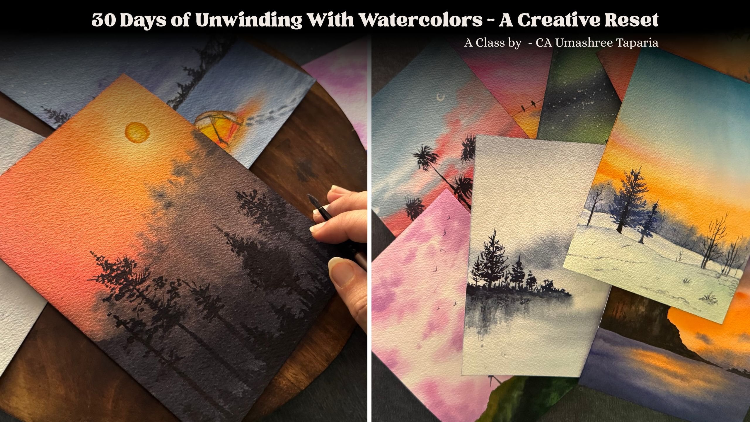
Transcripts
1. Welcome to the Class: There's something
incredibly smoothing about watching the
watercolors flow. Gentle, unpredictable,
and also beautiful. And when you combine that fluidity with a
soft pastel palette, you get artworks that
feel like a breath of fresh air. Hi. I'm OmahiTapaya, a
chartered accountant, an artist, a watercolor
and a quash educator, and a creative
business entrepreneur. If you'd like to follow
more about my journey, then follow me on Istatam
under the handle, creating from the heart or visit mastitparya.com to dive
more deeper into my world. Watercolors have a
life of their own. The way the pigments flow
with water, so free, so fluid is what makes
it so unpredictable. And that's exactly what makes
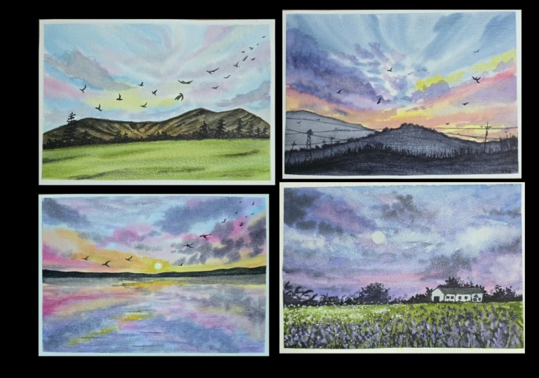
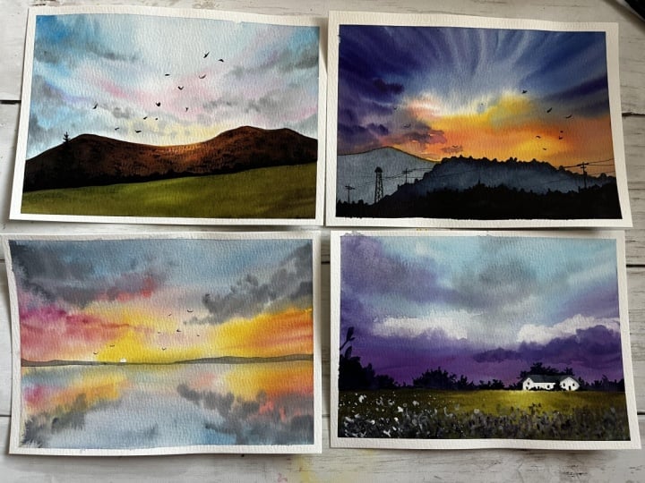
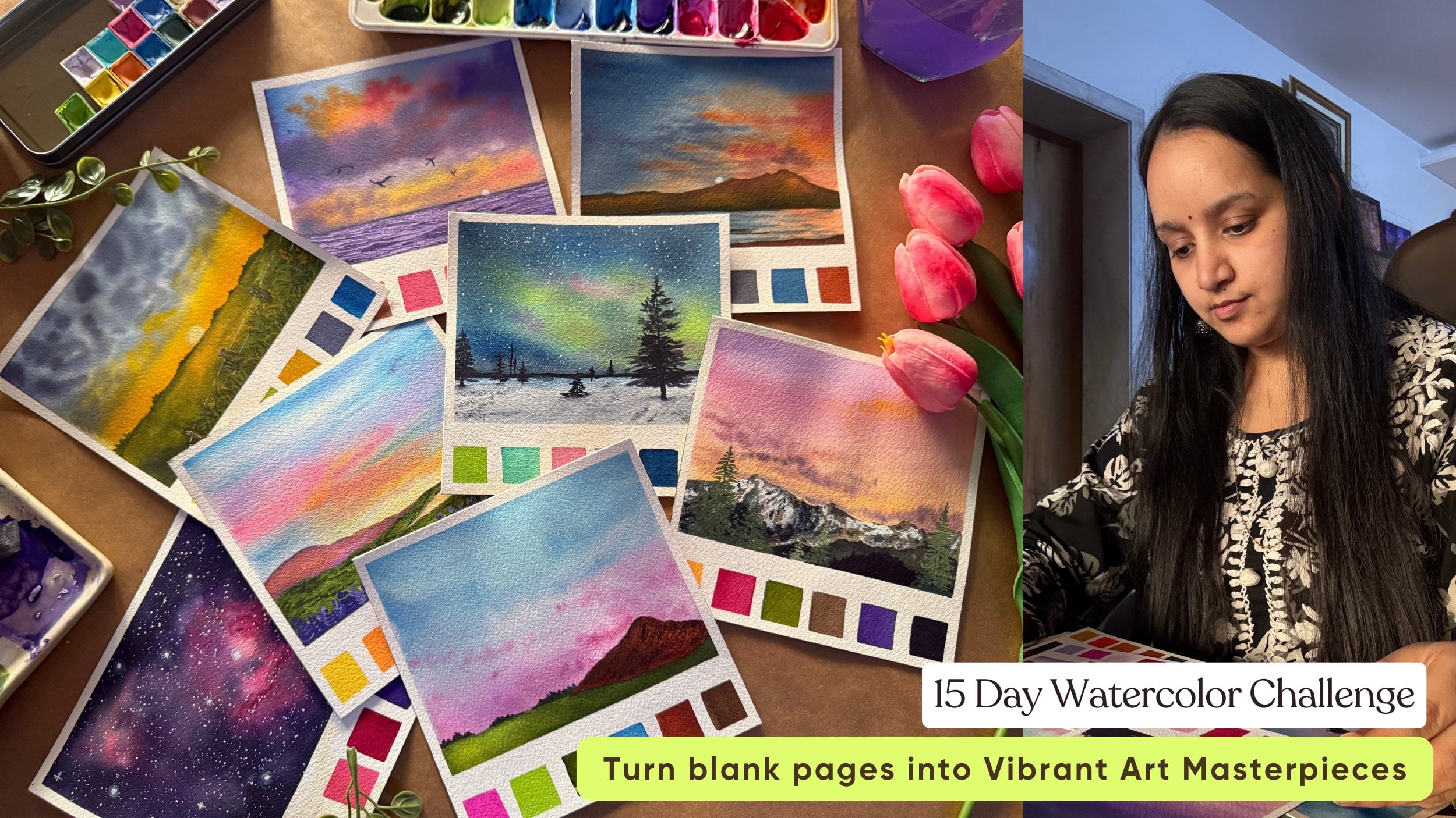
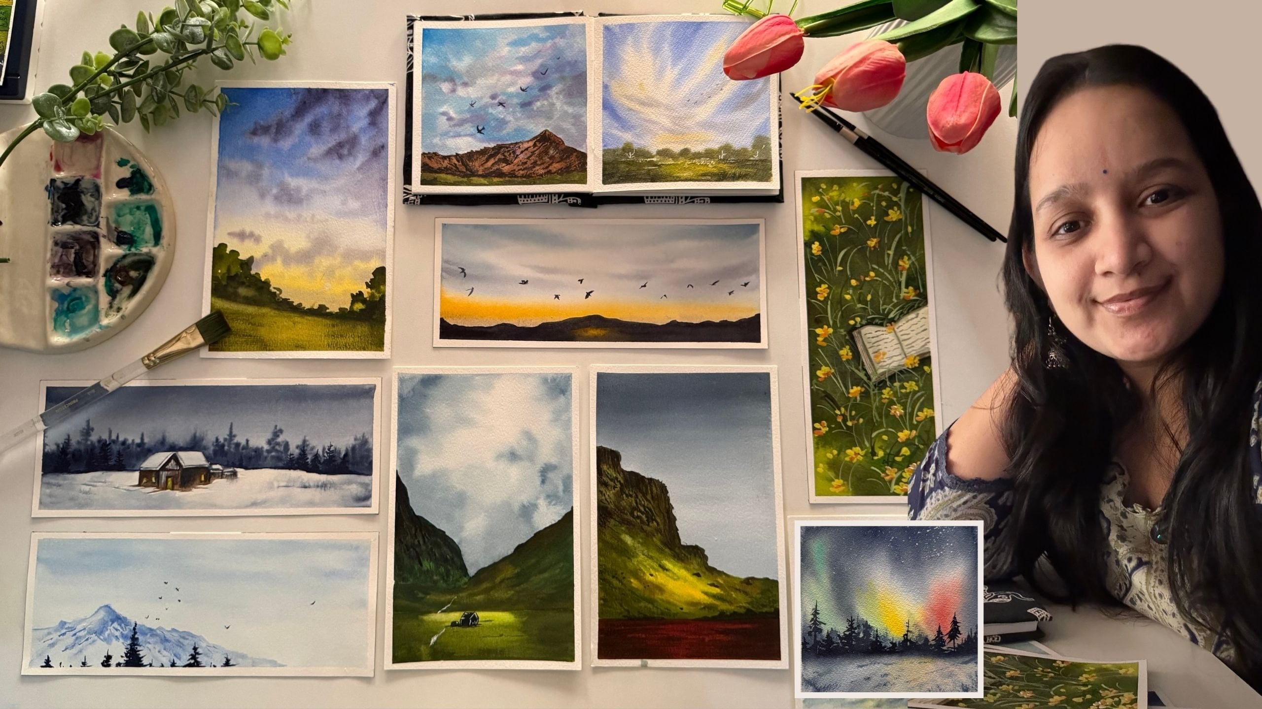
results so mesmerizing. In this brand new class, we are painting four frameworthy pastel
watercolor landscapes. Each of these landscapes
is designed in such a way to help you build
confidence with water, layering and with a
wet on wet technique, working with large
size watercour paper. You learn to form your own
beautiful pastel palettes, blend the colors
effortlessly and add those dreamy details that
get your paintings to life. Before diving into
the class project, I'll guide you with an
entire supplies list that I'm using for this class, plus recommended supplies that you can use if you do not have the same supplies
and also guide you through forming in
your own pastel colors for each of the projects. So whether you're new
to watercolors or looking to subtly explore
the beauty of pastils, this class will guide you one gentle
brushstroke at a time. So come, let's dive
into the world of pastils and create something
beautiful together.
2. Materials Required: So let's quickly have a look at all the materials that you would be needing for this class. First and foremost,
the watercolor paper. I'm going to be using in
this Saunders Waterford. This is coal press, 300 CSM, 100% cotton paper. So it's a perfect
paper for watercolor, and the size of this paper
is 12 inch by nine inch, a little bigger than the A
four size, very minute bit. So it's approximately
an A four size that you can consider
that I'm using. Now, this is a block which is glued on all the four sides. So I will be using in this masking tape to tape
down all the four edges, and then I'll be using this paper for each of
the class projects. We're going to be painting
huge watercolor landscapes for each of the four class projects that we go ahead for this class. I would recommend going
ahead with 300 GSM, 100% cotton paper
because we are going to be working in a lot of wet on
wet into our pastel skies. And secondly, that will help you keep your paper
from wrapping or, you know, from letting
it to dry out quickly. So I recommend 300 GSM,
100% cotton paper. You can go ahead for brands
like Canvas Heritage, Arches, Bohng or Saunders Waterford, or any other professional grade or artist grade paper that
comes into your budget. But a 300 GSM, 100% cotton paper is what I recommend for
this class minimum. Now, coming to the paints, I'm going to be using in
this 24 color paint set. This is from the brand Kimi. So this is into a tin
palette like this. Alright, I have all the colors watches here with
me so that I can select which color to pick up and which color
will be turning out how. So I always recommend having a color swatch with you so
that it's easier for you to, you know, see which color
you are picking up. And apart from this palette, I'm going to be using in a
few of the paints from these. So like, I'll be going ahead, using in the naples yellow, I'll be using in
the lilac color, the pink peony color, a little of the royal blue
color in one of the projects. So as and when I'll be
using these colors, I'll be sharing them with you. But you do not need these
pastel **** tubes separately. You just need a basic 12 or
24 color palette to begin, and I'll be guiding you through the color mixes through
each of the class project that you can alternatively use if you do not have
specific tones. I'll be using in the ceramic
palette for mixing in the colors and getting in
the colors onto my palette. So this is a little of the Jon brilliant color
that I removed for one of the class projects or a little of the
Indian gold color. So this way, I'm going to squeeze out the
paints from the tubes out on a palette so that it's
easier to mix and use plus, since they are on
a ceramic palette, even if they've dried out, I can just reactivate them
easily with the help of water because watercolors
can easily be reactivated and reused, as well. So this was about the paper and the paints that you will be
ding coming into the brushes. You would be king
in a flat brush for giving in the
water wash first. So I'm going to
use this Princeton Neptune series, flat brush. This is a three fourth
inch flat brush, which I will be using in for giving in my flat water washes. And then I will
be using in these four of the silver
black velvet brushes. This is size 12, size eight, size four, and size two. This is for adding
in fine details. This is for adding in, um medium cloud
details into my sky, and this is for the main sky coverage that I'll be adding in. So these are the
only four brushes majorly that I'll be using. And apart from that,
I'll be using in this detail or size
zero brush for adding in some tiny details like the
moon and stars into my sky. For that, I'll be
using in this brush. This is a travel brush so
I can just gently close it and keep it like this. Alright? So these are the brushes
that I'll be using. Um and you would be king in a rough cloth to keep dabbing off the excess paint,
cleaning up your edges. Plus in one of the
class projects, we'll be doing a little
of the paint lifting to create in the cloud deck. So for that, you either
need a paper towel or you can use a cloth
towel as you wish to. Masking tape, as I already told you for taping down the
paper for clean edges. For every class project, you would be needing in
two jars of clean water. Make sure you have two jars. One, clean water jar for
adding in the washes, adding into color for mixing in the paints and the second one for cleaning
up your brushes, because after you
clean up your brushes, when the water turns out muddy, if you will add in
this muddy water to your paints or paper, your painting may
begin to get in the muddy layers which
we want to avoid in. So make sure you use in
two jars of clean water. Apart from that, you would
be needing basic stationery, like a pencil and an eraser for just some light
pencil sketches. If you want, you can use a waterproof pen for adding in some fine details
into your painting. And a white gelpin for adding in some white details that we'll be going ahead in the painting. I'll be using white quash. One thing that I recommend
you to have is a white quash, because when you create in
your own pastel colors, it's easier to create
it with white quash, because if you pick up any pastel color from a
tube directly and see, it has a little
opaque consistency. Pastils the beauty of pasteles is about the opacity
of those paints. So I recommend having in a white gouache so that
you can mix and gouache with your basic colors and create in opaque pastel
colors of your choice. If you will go ahead use in white watercolors for
creating in the pastel tones, it will not give you that
opaque consistency and the pastel effect that the opaqueness pastel
colors should give in. So go ahead, grab either a paint a tube of white quash or a paint cup or a paint
bottle of white quash, because I'll still be
using this to create in a few of the pastel tones
on my palette directly. So white quash is something
that I recommend having. Plus, while adding in stars
and moons into your sky, white quash gives in that opaque bold look which white watercolors
will not give you. So make sure you have
a whiteqh handy. So that's all about
the materials that you would be needing
in for this class. So go ahead, grab in all of your supplies and I'll
see you guys into the next lesson where we begin with our first
painting into this series.
3. Project 1 - Cloudy Blue Sky - Part 1: So let's begin with
our first painting. We are going to go ahead with a very simple sky and a
siloete to add onto it. So for the siloet, I'm going ahead with, you know, tiny mountain or closer
to the horizon line. And at the bottom, I'm going to add in a simple
feel, you know, slohet. So, you see, at the
bottom, I've gone ahead a little dignil moving from the smaller towards the left end and moving towards the right side have
increased the length. You can go vice versa
as well if you wish to. Now just going ahead with a very rough and curvy
mountain range on top of it. Okay. We'll first
begin in with the sky. So we'll go ahead with a layer of water onto the sky first. Now, make sure that you have
an even layer of water for you to work wet on wet enough to get your soft
blends into the sky. But also be sure that you do
not have excess of water. Otherwise, um, you know, the colours will flow and
blend and will not give you the desired shape
that you may be looking for into your sky. You need the wetness enough to have the softness
into your sky, but not much more that it ruins up your color or
placements completely. Now I'm not adding the water
into the mountain space. I'm just going across the line and also make sure
that your charcoal marks, that is a pencil
outline is very light because as soon as you add
in the layer of water, those charcoal marks will turn permanent and you won't be
able to get rid of them. Now, you need to see how
your paper reacts to water, as in if it is not
100% cotton paper, it may dry out quickly. If it is 50% cotton, it may dry out a
little you know, slower as compared to
not to cotton paper, and 100% cotton paper will
take the max time to dry. So accordingly, you will have to work on with the
layer of your water. One tick that you can use is,
you know, wet your paper, let it dry out for around 50%, and then rewet it. That way, your paper will be wet for a longer time because the cotton inside your paper will be much more wet
with the second layer. So that is one trick that
you can try if your paper is a one that dries out quickly or if you are
in a zone where it's, you know, very humid
and summer and dry air, which makes your paper
dry out much quicker. Now I'm going ahead with a
good even layer of water. I've made sure to run
my brush multiple times so that I have
that good even blends. Now I'm going to begin in
with a blue color first. So I'm picking up
the sky blue color from this set that I'm using. So just going to begin and add some blue details into the sky. You see, I'm going very
loosely with the blue color. Now, don't go ahead with a
very dark layer altogether. We want to build the sky, so you need to go ahead with light to dark consistency such that you can build up
the depth into your sky. Of course, you'll
have to keep in mind your paper wetness as well while going ahead with
this kind of, you know, structure for painting,
such that your paper does not dry out and you are left to still add in the
details kind of thing. So it's very important to go according to
your paper as well. But still, building in layers, using the re wetting
technique can help you keep your paper wet again and build in layers and
depth into your sky. So I'm going with
very loose strokes, as you can see, I'm using
a smaller size mop brash. Now, you see, I went ahead
with one tone darker than the previous layer that
I used, and automatically, you can see how you get two to three tonal
variations of the blue into your sky just by going ahead layers and building in
the depth into the sky. So I've gone ahead with a loose blue colour detail into the sky. Now I'm going to go ahead
with a pastel pink color. You can, of course, just mix
in white to your rose color, crimson color or create any pastel pink that's
available with you. I'm using this pink
from white nights, which is a pink peony. It's a pastel pink color, and I'm just going to go ahead add in some pastel pink details. To this, I'll just add a little of the rose color
from this palette. Now, see, you need to make
sure that you do not have excess water while adding these because if you
will have excess water, it will begin to spread out and not retain on the shape
that it's adding. Now, you see, as soon as
the pink meets the blue, it creates a beautiful
purple undertone blend. And where you just lay the pink, you automatically get that
bright pink highlight. So just a little of
the pink into the sky, creating in beautiful
purple blends. Now I'm going to go ahead
with the naples yellow color. This is one of my favorite
pastels yellow to use. You can mix in white to your
permanent yellow light, along with a little hint of the permanent yellow
deep color to get this. You will need to use
white wash if you really want the beautiful opaque
consistency of this yellow. Now again, while
picking this up, make sure you do not
have excess water. Now go ahead very carefully
closer to the blue when you add this yellow because if you mix it with the greens, it may give you green crones. Now across the yellow,
I'm just going to blend it with a
little hint of the pink. You see going ahead with very loose strokes,
gently blending them, creating in that
beautiful sunset effect, making sure there the yellow, pink blue all are in
harmony with each other. Now, I've just mixed
in the pink and the blue that we use to
create this purple mix. You can directly use a
purple color as well, but when you mix in the colours that you're using individually, they go much better in
harmony with the rest of the colors that you
lay over into your sky. So I just mix them up
and adding in them. Now just going to pick
up a little blue. Oh and adding them
at the top here. You see my paper is still
wet that I'm able to work with this next layer of
details as well, wet on wet. If you notice my brush angle and from where I'm
holding my brush, you can see I'm holding it
so loosely from the end of the handle such that I can let the looseness be in the sky
and my strokes as well. Now just going to pick up a little hint of the
paint's gray color. And just going to drop in
some more cloud effect. You see? Water control, very, very important part for any kind of clouds that
you may want to create. You see how I'm just dropping in little droplets
of this color. So that is it for a sky. I will not overdo it. I'm very happy with how
it has turned out so far. We'll wait for this
to dry and then move on to the next layer of
details for the mountain. Till then what we'll
go ahead is with this bottom field space because they and the
field is not connected. So we can go ahead with the
layer of paints in here. I'm just going ahead
with a layer of water. Before that, can you see
here how dark it is? Because this area had dried out. I'm just going with
a softness here. So now I'm just
going ahead again with the layer of
water into the peel. Alright, now, let's go
ahead with the greens. So I'm going to pick up the
beautiful sage green color. You can pick up any
medium to dark bone of green and go ahead with a
layer of the green first. Now, again, for the field also, we are working wet on wet. That is you have a wet layer. On top of that,
you're going ahead with the wet details
of the paint. You can pick up olive green, hookers green, whichever
green you wish to. I prefer using in this
sapreen, sage green, olive green tones because they
have this beautiful green, which, you know, gives
a more earthy tone. Now, for the second layer
of the green, you see, I'm going ahead
with strokes such that we have the lighter
greens also visible. Again, for the field also, we're just going to go ahead and keep building
it up in layers. Now I'm going to
pick up a little of the pain's gray color
and mix it with the green that we
are using in and going to add in some
darker highlights. You see how the darker
strokes are much less as compared to the greens
that we already added in. So you just need to go to and fro with the colors
that you're using, like I'm going ahead with
a mix of the greens and the black to just keep on
adding in some details. Of course, you need to
work in layers to get in the depth and the glow
into the field as well. So in the center, if you see I'm maintaining in that glowing spot because here we have
the glowing sun effect or the glowing sky, the light of which is exactly falling into the field here. That is the reason that spot
I'm still keeping in light. Now, I'm just going to pick
up a little of this naples yellow colour drop
in in the center. You can go with a may green
colour, light green colour. Since I have the
yellow on my palette, I'm going ahead with that
yellow to create in that spot. Now just going to pick up green and blend in
with the yellow again. Now, when you go ahead
with this next layer, you need to make sure
that the water control is very perfect because if
you will have excess water, it will all blend
and not give you these stroky details that
we are trying to go in for. So you need to have
very minimal water into your brush and paint. You need to really
pick up thick paint. You see how I've just picked up the thick paint gray color
and pulling in bold strokes. So that is it for
the field, as well. Now I'll wait for these to dry, and then we'll go ahead with the last leg of fetails.
That's the mountain.
5. Project 1 - Cloudy Blue Sky - Part 3: So now the mountain
has dried out. We are going to go ahead, pick up the pains gray color, and we're going to go ahead
with some dry brush texture. Now I'm picking up
the pains gray color in a dry consistency. You see, I'm not
adding in much water and my brush is also not wet, and we're just
going to go ahead, drag our brush like this to create in the texture
onto the mountain. Now for the texture, you can go ahead with two to three
tonal variations. You can first use browns
and then go ahead with the medium tone consistency of the pains gray and then
with a dark consistency. But I'm going ahead directly
with the pains gray color. Now, in between, you can give in some darker details of
the pains gray as well. You see at the top how I
created this darker line, giving in a layer of detail. From the left, I'm going
towards the right side, giving in the dry brush texture. Now, even into the glowing spot, we have to give in a
little texture effect, but in such a way that the glowing effect still
is visible perfectly. Is he just giving in
some darker details with a paint screen now? No. Now, using the paints
gray or the black color, just begin adding in these
little bush detail at the meeting point
of the mountain and the field space
that we've added. I'm not going to add
this bosh detail across the entire line. In between, I'm going
to leave in some caps, and plus while
adding these, also, I'm going to, you know, add them in different heights. I'm using my size
four round brush. This has a pointed tip. Because of h at the top, I can add in all of
the detailed look and then fill the bottom space with the pain screy
color directly. Now you see in the field, we had already added a
darker line at the top area. So that is automatically acting in as a shadow to these bushes. So almost through
the entire space, I've gone ahead added
in this detail, living in small gaps in between. And now, lastly, using
in the pinks gray color. I'll just go ahead with
a small pine tree here. Right? Just a small one and just another small
one close to it. And some details here. So somewhere, you can
just go ahead with, you know, simple twigs detail. Not necessary to add in a lot of pine trees
only everywhere. Somewhere you can just add in simple twigs and
let them be there. Just giving in
some darker lours. Now, you do use the damp
brush and n the skin. Right? So that is it
for the painting. Let's remove in the masking tea. Make sure that your
edges are tried from everywhere before you begin
peeling off the masking tee. So here's a final
look at our painting. If you see we still have
the glow in the mountain, along with the dry
brush that's coming, we've given in some rough
and cool structures as well into the mountain, a simple pinetree silhouette, along with a simple feel
and the both silhouette. So I hope you guys
enjoyed painting this today and as you guys
into the next painting.
6. Project 2 - Behind the Mountains - Part 1: So let's begin in with our second painting
in this series. And today, we are going to paint another
beautiful pastel sky. And for the silhouet
part this time, we're going to have, you know, a series of mountain range. So the first mountain range
will be here at the back, which is going to be
a blurry mountain, although it's a very small one, then we'll have another
foreground mountain. Then another mountain
in front of this. And then the last
mountain range, you know, somewhere
just like this here. So we're going to have kind of these four mountain ranges, one, two, three, and four. This is going to
be the blurry one, and these three
are going to be in three different
tonal variations of the bluish indigo color that we are going
to make and add in. Apart from that, we are going to go ahead
with the pastel sky, and then we'll go ahead
with the mountain ranges. So we'll first go ahead
with the pastel sky. Now, before moving
ahead this time, what I'll do is I'll squeeze out the colours that
I'll be kneading in. One is the naples yellow that I will be kneading for
the pastel yellow. As I told you in the
previous project as well, you can create this by
adding in white wash to your permanent yellow light with a little hint of the
permanent yellow deep. Now for the pink, I'm going to use the rose
from this palette, and I'm going to
just mix it with the pastel pink peoni color that we used in the
previous project. The same pink, I'm going
to pick it up here. You can simply mix in
white to your rose, carmine or scarlet
color as well. Now, one thing that I recommend is while creating in
your pastel colors, it's better to use whitewash because if you ever go and
see the pastel colors have, you know, the pastels actually
have opacity consistency. That is there a
little more opaque. So that is the reason
why I recommend using in pastel colors with a mix of the white quarh so that they have that opaque consistency. So I've got the two
pastel colors here. For the orange, I will mix in orange from
this palette here. I'm going to use
this shade called cadmium orange hue
and mix it with the white to get in the
pastel orange color. You can, of course, mix
in white quash, as well. But since this orange is
quite opaque already, the white watercolors
works well. So, of course, it's going
to be trial and error that you will have to decide
how your colors work. Then for the violet color, I'm going to use the violet
from this palette a little, and I'm going to
be mixing it with a little hints of the pink color to create a pinkish violet tone. Now for the blue
color this time, I'm going to use the
thalo blue mixed in with the sepia color from this
or the pain's gray color. You can directly even use the indigo color if you wish to. So I usually prefer
liking the indigo from white knight because that's my favorite indigo from all the brands that
I have tried so far. Now, since this set does
not have an indigo color, I can either use this or I'll
mix in the thalo blue with a pains gray colour to
get in that consistency. Or you can even go ahead using a little bit of the
Prussian blue mixed in with the pains gray or the black color to get that
dark blue consistency. So that is about
the colors yellow, orange, pink, violet, blue. That's all the colors we are
going to be using in the sky along with a little bit of the whiteness of the paper
that we'll be leaving. So let's begin in. I'll begin with a layer of
water into the sky. Go ahead with an
even layer of water. So I'm just going ahead with
an even layer of water here. So you see just an even layer of water everywhere
into the sky only. I'm not going into the
mountain range for now. Making sure that
all the edges have the perfect layer of
water everywhere. Alright, so I've got
an even wet layer. Now first for the blue
color, I'll begin in. So I'm going to pick up the
hallo blue as I told you. Along with the
pain's gray color. So I'm going to make
sure that I already mix the color in a good
enough consistency. Since we are painting large, it's going to take
up, of course, a lot of color
because a major chunk of the sky is going to be blue. So you see, I created my own indigo kind of a
mix that I needed in. I'm beginning in with
a medium consistency first that is not too dark, so I've diluted it with water so that I can
build up in layers. Now I'll just remove you see the brush can hold
so much of the pigment, and if too much
water will be there, then of course, while
dropping it here also, there will be excess water also coming in again
onto the paper, which is not what
you would want. So make sure that
you do not have excess water onto
your brush as well. You just pick up
a little pigment. And usually these natural
brushes hold a lot of water and pigment
by the nature of them. So it's very important
you make sure that you don't lift up
excess water with the pigment because
excess water will keep dropping basically onto
your paper only at the end, which will create, you know, a lot of water
flow on the paper. Now, I'm just going to pick up a little hint
of the pink color. I'm just going to drop it here. You see blending them in. Now I'm going to pick up
the naples yellow color. All right. So my brush had the
blue and it has caused the yellow to
turn into a green. So I'll just pick up the
fresh yellow from this edge. You see how important it is to clean your
brush thoroughly because such mishaps may then create a very uneven
finish on your paper, which will not give the
pleasant look to your sky. All right. So this cap
here, I'm leaving in white. Now I'm going to pick
up a little orange. Now, of course, if
you feel the need, you can shift the size
of your brush so that, you know, you have
more control over these small strokes that
you will be adding in. So I'll just shift into a
smaller size brush now. Now, I'll pick up
the rose color from here and mix it with this pink that we
have in our palette. So you can just simply mix in white wash if you do not
have a pastel pink color. You can use the carmine
scarlet, rose color, quinacin rose, permanent rose, whichever name it's you know, every brand will have a
different name for their color. So it's just basically you
need a pinkish toll like this. I've just created a good blend now going to pick up this color. I'm going to go ahead with
the next layer at the top here to give in the
darker strokes. Now, when I go ahead
with this, you see, I'm going to go at lesser
space such that we have the lighter strokes
also visible. You see extra water, the problem that it creates. So it's very important to
make sure the water control. I just mixed in a
little more color into the same water that we had here. Now, just adding in some
darker strokes from the top. I'm going to pick up a little of the violet color and going to blend in the pink and the violet along
with the blue here. Now picking up the violet, I'm going to mix it with a little of the blue that we have. And then using this
violet blue color, I'm going to add in
a huge cloud here. Again, water control
will play a major role. You see, I'm just moving in simple round consistencies
with my brush. Your paper has to
be still wet so that you can get all of these
details fine and right. Now, at the white spots, just going to drop in some
small cloud with this color. Such that we have the whiteness of the paper also maintained. Now, adding in some pink
details into the sky here. You see loose small strokes
to build in the depth. So I'm just mixing in this same violet color with the pink here and then adding in some loose cloud details
over the yellow. Now, again, the consistency, the boldness will
make a difference. So water control is going
to be very, very important. So I just picked up
some fresh thick paint again so that I have
more water control. Now, over the blue as well, just adding in a little
of the cloud highlight. You see how small strokes that I'm dropping in to
act in as the clouds. So building in the
clouds is all about luring and building in
the depth into the sky. Now, wherever you want
little soft blends, you can just go ahead with a damp brush at
the bottom spaces, creating in the blends
and the softness. Picking up a little pastel
pink, lending it here. I'm just going to
go ahead with a little more of the pink color. Now, using this pastel pink, going to add in
some details here. You see, I'm just using
the tip of the brush. The paint is in a good
thick consistency. That is why it's retaining the space at which
I'm adding them, but yet having the soft edge because of the
wetness of the paper. So giving in some
underlining to the clouds, basically creating in
the lighter highlights. And now, I'm going to create up the paste
and orange color. So as I told you, just mixing in the
white and orange from this set and going to add in some orange
highlights as well. So you see how just using
the tip I'm dropping in this color to
do its own magic. The wetness of the paper makes
it automatically go ahead, blend in with the base. Now, since we are using it with the white and a
pastel consistency, you will see it will not
give you muddy tones. So the pastel consistency of
colors while blending will make the blending game different because because of the white, you may not naturally
get in the muddy tones, even when the orange, blue, and the purples blend together. So it's very important that you create the pastel
consistencies accordingly. And while blending,
you keep them in mind. Now just going to
pick up little pink, drop them in between, such that it's not only an
orange color look. It gives in the blend of the pink and the
orange perfectly. Just going to mix in a
little red, yellow orange. I was just unsatisfied
with that spot. I quickly created a good pastel
color and added in there. And now using in
the violet color. Just going to add in some
strokes on top of it. You see if your
paper is still wet, you can go ahead and
create as for your want. So now, I'll wait
for the sky to dry. That is it for the sky. I'm really happy with
how has turned out, the pastillness, the bolness, the top darkness, and the
glow here in the center. We'll wait for this to dry, then move on to the mountain
ranges step by step.
7. Project 2 - Behind the Mountains - Part 2: So now my sky has dried
out and we are going to begin with the mountain
ranges one by one. Now, this background
mountain range is going to be a
very blurry one. So I'm going to first go
ahead and paint this. For painting that, I'm just going to pick up a
very light mix of the purple and
blue color that we used in the sky and go ahead
with a very light layer, which will almost look like
as if it's a part of the sky. That is the reason
I'm just going ahead directly with
the paint here, not going ahead with, you know, a wet on wet technique
because it's just a small space
that you want to add in and given that very
blurry kind of a layer. Now just going to pick up
a little more pain spray, mix it to the blue here. All right. Now,
we'll go ahead with the next layers once
this one dries out. So now this layer has dried out, and I'm going to go on
with the next layer. So for that, I'm going
to pick up the same mix, just one tone darker
than this mix. So just mixing in a little hint of the blue and the paints gray again and going on with the
next layer of mountain. Now, if you see I'm going ahead with a very rough outline, making sure that
it's not, you know, a straight line or a very uneven kind of a shape
that does not look natural. I'm just trying to go ahead with a natural mountain curve
as much as possible. Now, make sure with
every mountain range, we have to darken up the color. So you go ahead with the colors
accordingly such that you still have space to darken up your color for the
next two ranges. What I feel is this
mountain range is looking actually a little
extra dull for me. So I'm just going
to go ahead with one more layer on
top of this as well. To this one at top as well, just going in, giving
in a very rough shape. M Now, this mountain range is
going to be the darkest, and this is going to be a color between this
and the dark tone. So this is also almost dried, and now I'm going to
go in with this one. For that, again, I'm going
to pick up the blue colour. Now I'm going to reduce
the mix of water into the paint so that we get
very dark bold colors. And I'm going to use the
paints in a thick consistency. So I'm using the same
mix of the thalo blue and the paints gray
color from this set. And you see, I'm going to
add in very little water. And beginning in at the top. Again, for these also, you
see I'm going ahead with the wet on dry only because I don't have much
details to add wet on wet and this will save
up the drying time of the painting as well
because it will dry out quickly since we do not have an underlayer of the water here. So you see how the tone is darker than the previous layer. Now just going to go ahead
and fill this color here. As I told you, with every layer, the color needs to be darker
than the previous layer. Now, in between, just giving in some strokes to
create a little or, you know, texture and detail
into the mountains as well. So like, I'll just pick up
a little paints gray color and drop some
strokes like these. Now I'm actually going to take this mountain range
from this spot here just adding in more. Now at the top, just going to
give in little details like these to create
some bush texture on top of the mountain
range as well. You see the uneven shape
that I give at certain spot? Now, we'll wait for this to dry, then add in the last
mountain range here.
8. Project 2 - Behind the Mountains - Part 3: So now this has
dried and I'm going to go on with the
last layer here. For the last layer,
I'm going to go ahead with more of
pains gray and, like, almost equal to negligent blue and going to create in
the darkest range here. See how dark and bold
this last layer is. Now, of course, when a little
of the overlayering goes, you'll see the
difference of the color. So for that, you'll have to go ahead with layers
and blend them well. So we've added in
the last layer. Now to this last layer, I'm going to create
in little details. So I'm just going to
use this detail or brush and use the same
color that we've used in the last layer and just going to pull out some
strokes like these. You see, giving in
that spiky detail. Make sure you pick up
the paint screen or dark bold consistency
while adding these as well so that you get those blended perfect
color match detail. Now across the entire length, you'll see I'm
varying the height, and you'll have to go a little
quick with this because since we are going
with the wet on dry for this mountain range, we don't want the range to dry
out before we add in this. If you want, you can go ahead
with the wet on wet layer then if you think you won't
be able to add it quickly. So you can go with the
wet on wet technique and add the mountain range
in a wet consistency. So that way it will stay
wet for a longer time, giving you enough time to
add in these details and given that blended effect with the top of this
with the mountain range. Cs, I'm wearing the
length throughout. Now if you feel that it's
not blending easily, you can quickly run in a
layer of paint in between. Now you see somewhere I'm
taking it so tall till the last mountain
range that we added. All right. So you see how I've
added in the detail. Very swift and easy
detail that we added in. Now, we're just going to add in a little more silhouette to this and we'll be
ready with the painting. So first, picking
up the paints gray. Adding in a fine line here. Creating in too wide, kind of a detail to add in a little power
line details here. Now, in the inside going to
go with criss cross details. Fizzy created a
small detail here. Go to go with one slant line here and going to go ahead
with another one here. Now, for these
details, if you want, you can even go ahead and
use the technical pen, which is a waterproof
pen to add in these details so that you
don't have to worry much. Now, you see the uneven drying that's still
happening here, and I really want to avoid it. So just going to pick
up the paints gray quickly and add a layer here. So you see, again, the
drying will become even. So from this only, I'm just
pulling out the strokes again so that the top
strokes look blended. Not necessary to do this again, but since I was not
liking the uneven drying, I went ahead with this, you can, of course, go ahead
and skip this part. You see, I'm pulling from the bottom color layer
towards the top side, so automatically, it will
give in that blended effect. Now, I'm going to
use a technical pen. Make sure you use one which
is waterproof. And here. In this back mountain layer, just going to show
in some violins moving from the back
of the mountain. You see how adding
in small details. And now, these
lines are basically going to be connected
towards this end. So from the back of
the mountain here again, just going to connect it. So moving from here, they're
going here and in between, they're hidden behind this mountain range that we've added. Random two to three lines
that we've added in here. Now, in your just
adding in a few lines, On top of these violins, adding in some bold
iluhits as well. Okay. So that is it. I won't
overdo any of the details. I'm happy with how
everything has turned out. Now, if you want, you
can add in a few birds into the sky, very little. Now for the birds
as well, you can, of course, go ahead
with the black pen. So I've just added a
few bord silo heads as well into the sky, I'm
going to leave it there. Adding a few on
this side as well. Alright, so that is it. Let's peel off the masking tape, see the final painting, make sure your edges
are completely dried, and go ahead carefully, see the final reveal
of the painting. I know this painting had a little overdo with
the mountains and, you know, a little
overlayering on my end. But that's a part of painting. Sometimes you go wrong,
sometimes you go right, sometimes you need
corrections, and that's okay, as far as your learning,
as far as you are not giving up and making it
go beautiful at the end. So here's the look.
You see automatically, you get in these
glowing spots of the yellow color because
of the underlayer. All right. So here's a final look at our
second painting from this pastel skies. I hope you enjoyed
painting this, and I'll see you guys
into the next project.
9. Project 3 - Pastel Seascape - Part 1: So let's begin with our third
painting in this series. And today we are going
to go ahead with a beautiful pastel sky and a seascape to
go along with it. We are going to go in
with very simple details. Like we won't be adding in
much details into the sea, but still it will be detailed with the
wet on wet details. Now, this time, what we're
going to be doing is. So basically, see this is approximately 40% of the paper that you're using will
be your sea area, and 60% will be the sky. Now, we are going to
paint the sea and the sky simultaneously in such
a way so as to make a perfect reflection of the
sky falling into the sea and just the horizon
line we'll create a little distinction point such that the sky and the
sea are separated. Basically, it's going to have a little blended effect because we are going to work
with both together. But still, it will have
that distinctive point of distinction that your the sky ends and your the sea begins. So that's the whole point. Now, before we begin in, I'll get the colors
ready on the palette. So I'm going to use a
little hint of blue, which I will directly
pick up from there. I need a little bit of
the naples yellow color. So let's first pick
up the naples yellow. Of course, you can create
your naples yellow. I have been telling it in the
previous projects as well. You can mix in white, along with white gosh, along with the prominent
yellow deep color. Next I'm picking up a little of this John Brilliant color, which is nothing but
like a skin tone. Now for this skin tone, what you can do
is mix an orange, a little hint of
red and white ph, and you can get a similar
skin tone as well. And next, I would be ding a little bit of the
royal blue color. Now, this royal
blue is basically kind of a violet
blue pastel color. So you can mix in
your blue violet and a little white wash
to get a similar tone. And I need one
pastel pink color. So again, as I've been telling
you can use white wash and create endless possibility of the pastel colors
that you wish to. I'm going to use the
lilac color this time, and with the lilac, I will keep on mixing in a little hint of the
rose from my palette. For the previous project,
we had used the pink peony. All right. So here's the color. Now, along with
this peach color, I'm going to pick up
the Indian gold color, which is a yellowish orange
color, a beautiful tone. So I'm just going to keep
a little hint of it here. It's a beautiful,
yellowish orange color, giving that golden
highlight view. So I have the colors ready here. I just removed a little bit of this Wincor Newton
permanent rose color along with the lilac to create in that little
pink highlight. Now, let's begin in with the layer of water
onto the paper first. So I'm going to go ahead with water onto the entire space. As I told you, we are painting the sea and the sky together. So, you know, you just need that line to know where
it is going to be, but make sure that the
line is very light because once you lay down
water on that charcoal line, it will become
permanent and then watercolors are
already translucent. So it will be very difficult
to hide that line. And since we are
going ahead with that blurry merger point of the sea and the
sky for this one, it will be difficult
then for you to, you know, hide that point. So make sure that
you go ahead with a very light pencil
sketch only if needed, or you can mentally
keep a mark of it as to where you want your sea to
begin and the sky to end. I'm going ahead with a
good even layer of water. We are working on
this large size altogether with the
sea and the sky. So, you know, you need
your paper to stay wet for good enough time so
that you can work with all of the wet on
wet details swiftly. For the sea, also, I'm going to go ahead with the
wet on wet waves, only I'm not going to add in much of the detailed
waves later on. I prefer, you know,
blended waves look. And plus this time, the sea is basically going to be
a reflection of the sky. So not much of the waves detail also that you'll have to add in. Now I'm running my
brush multiple times, making sure that my
paper will stay wet for enough time for me
to work wet on wet. In case if needed, we may go ahead with the
rewetting technique, but I would, you know, mostly not want to do that. I'm making sure that
my paper stays wet for enough time for me to work wet on wet and
given the details. And then wet on dry, we'll see if there is any
details we need to add in. You see, despite I'm
using 100% cotton paper, which is 300 GSM, I'm running my brush so many
times to make sure that my paper is wet from
all areas equally, and it stays wet for enough time for me to do all of the
wet on wet details. So that is it. Now let's begin in with the
colors one by one.
10. Project 3 - Pastel Seascape - Part 2: So just begining in with
the sky blue at the top. If you do not have a
sky blue named color, you may have it in the name of Cerleanblue or you can even go ahead with the
hallo blue color in a light consistency. So, you know, the names
may be different, but the color tone
that is you need a beautiful light blue kind of color is what you
kind of need here. Now I'm going to pick up
this royal blue color. Now, make sure your
one jar of water is always clean because you will be working with the pastel colors so you
will need clean water. So make sure that
you don't, you know, clean your brush in both
the waters because you need clean water for blending
in the colors later on. Now, I'm going to pick
up a little lilac color. You see, it's a
beautiful violet, pink pastel tone that is there. Now, this beautiful pastel. It's not actually pastel, but the color used in light consistency gives a
beautiful pastel undertone. So I'm using this permanent
rose from Winsor Newton. So it's their Winsor
Newton Cotman watercolors. So in that, it's the
permanent rose color that I've squeezed out a bit. Now, you see, I'm just going ahead with the first flavors. Now, as I told you, we are
going to work wet on wet similarly at the bottom space
as well on the same time. So at the top, where you
laid the blue color, same way in the bottom here, lay down the blue color. So you need to work
simultaneously so that, you know, none of the spaces
dry out uneven because if you will not do any activity over
the water space, the water space will
become to dry out, and the sky space will keep on being wet because you're
working wet on wet. So it's important
that you make sure you work simultaneously on both the parts when you are working with a blended
technique like this. So the same colors going in the reverse manner from bottom to top till the horizon line. I'm shifting into a smaller size brush for further details. I'll just squeeze
out a little more of this permanent rose color. Now picking up the
naples yellow. Make sure you use a clean brush, clean water, and at
the horizon line. Dropping in the color. Same way in the water space as well. Going to go in with
the naples yellow. So, you know, try to
maintain the same shape that you are adding in in the sky, same shape in the water as well. I'm going to pick up a little of this yellow Indian gold
that I have added a little If you do not have the Indian
gold color, it's okay. You can just pick up a little of your orange mixed in with a little hint of the bon sienna. Very little mix of the
bon sienna, not too much. So again, same as
you add in the sky, you go ahead in the sea as well. Now I'm going to go ahead with
some bold clouds as well. Similarly, in the
Cs part as well. Now you'll go in
the reverse way. So this time it will be
moving towards the upside. So that way, it will act in as the reflection of that
cloud that we've added. Now at the top, I'll pick up a little of the dark blue tone. So my paper here is kind of
beginning to dry at the top, so I'm quickly going ahead
with little water first. You know, you need to go very gently with the water layer, so I'll just quickly use my brush and run a
little at the top. Now, I have this beautiful
undershadow violet tone. I'm just going to mix
that a little with the blue color and just going to give in some dark
cloud at the top. Now you don't need this
color specifically, you can just mix in a little
of the violet paints gray and the blue color
that you're using in the sky to give in
this cloud details. So at the top, I wanted to create in little darker clouds. This is the violet shadow from white knights
that I'm using in giving in some pink clouds. You see how in the
center I just use the tip of my brush to
create smaller cloud. You need to go in with
very loose strokes. The control on your
brush will depend on the space from where
you hold your brush. So you see how I'm holding
my brush from a little edge. Now, same way, quickly
going to go ahead with the cloud details
here in the sea, creating in the darker depths. So you see where I've placed, that it's moving from
top to bottom this place because of the reflection
that we are adding in. I'm just going to pick
up a little blue here. Now going to pick up the
permanent rose color. You see where there is
the glow in the sky, there is the glow in the sea as well that we've
maintained in. Now I'm going to
pick up a little of the paint's gray color and pick up the blue that we are
using and onto the pink, just going to create
in small clouds. You see, I'm just using the tip of my brush,
dropping in the paints. The wetness of the paper does its own magic and creates
in those bold shapes. You don't have to do
much. You just have to randomly drop in a little
of the paints like these. Similarly, reflection will be. Since this is moving towards, reflection will be
moving downwards. Try to maintain the same shape that you go ahead at the top, at the bottom, as well. Again, here what we added
will be added in here. Again, that will be
moving downwards, here will be moving upwards. Just adding in a little more of the under violet here to
create the darker effect. You see how we could still
maintain the wetness of the paper by quickly going ahead with that
layer of water in between. When you lay that
layer of water, you have to go in
very carefully and gently because if you want
to apply a lot of pressure, the colors will begin to
bleed into each other again. Now picking up this peach color. Going to create in small
cloud details like these. You see very small strokes
that I'm adding in. Same in the Caspace as well, moving towards the top area. Now, if you feel in between, your brush has picked up some of the pigments from the base, make sure to clean
your brush and then pick up fresh pigment. Now, I just want
to add in a little more of the pink cloud details. So I'm going to
pick up this pink. I'm going to pick
up the rose color from this set as well, which is a little darker
than this rose that I've been using in and just going to drop in some Light pink clouds like
these in between. Quickly, add the same spot
into the sea as well. You go ahead with the details. So that way you maintain, you know, harmony of
the colors as well, as well as you are adding
them at the same time so you know what shape you
went ahead with at the top, same shape you want
to go ahead with at the bottom as well to create
in that reflection spot. For the reflection, you
just need to keep in mind the opposite movement to
follow for the reflection. Now on the horizon line, let's give in that little
distinction point. For that, I'm going to pick
up the pain's gray color. Mix in a little of this
violet undershadow tone, and a little hint of the
blue that we are using in. I'll pick up a smaller size
brush because I really want in the detail to be very
gentle and delicate there. Now, make sure you do not pick up excess water or pigment also. Just going to dab off
all of the excess. Now the line that you have
just run gently on that line. So you see the wetness is
still doing its magic, creating in that
soft blurry effet. I'm just blending it because I really wanted to have
that blurry effect. Now, where your stroke
goes at the top, same way it will go at
the bottom as well. In the center, I've left a little gap to let
that, you know, meeting point be blank and have that blending
effect. Okay. Now just going to
pick up a little more of these violet directly. As I told you, if
you do not have this, it's perfectly okay. You can go ahead with a mix of your violet with a little hint of the pain scray directly. But you see I'm using it in such a light consistency
because I just want to create a soft distinction point and not given much of this
bold colour detail here. I want to maintain
the pastel look of our sky that we've
gone ahead with. Now, quickly, if you anywhere
feel that, you know, strokes are very bold or sharp, you can just go ahead with a dam brush, blend them all in. Okay. So here I dropped
in that excess water. Now, one thing that I missed onto was I added in
this cloud here, and I didn't add that similar
one into the sea area. I'm just going to
pick up this color. You see, that is the reason. The moment you add something
at the top, go ahead, add it at the bottom as well so that you know where
you've added what effect. I dropped in a drop
of water again. I'll have to get that
spot blended all again. So you see, you've got
to be very careful with these little things that
may create mishaps. Just blending it
because I really don't want any sharp
edge or anything. So that they dry out all even
without any uneven strokes. Now, you see, we have
a perfect reflection of the sky and the clouds. Now, we'll wait for this to dry. And then we'll just re wet a little or maybe
we can do it now. Yeah. So my paper is
still kind of little wet. I'm just going to
go with a brush, go in just at the
top very gently. After every stroke, pick
up fresh water, right. And I'm just going to give in some wet on wet sea details. So I'm going to just wet
the entire see space. You see, you got to go very carefully because if you will
add in a lot of pressure, the colors will blend
into each other. Right now, my colors have retained the space at
which they've added in. Now I'm just going
to pick up some blue and add in some
sea wave details. So you need to pick up
the same colors that are there in the
sky at that spot. All right. So where
there is pink, I'm going to pick up the pink. Now, wherever you feel if
there is excess water, you can just dab off a little. So just some wet on
wet waves detail. We could have actually
given that previously only, but it just kipped
my mind that we had to add in a little
of the waves detail. Now, in case if you feel that the cloud shapes
are loosening up, you can quickly again
add a re layer of this year and let
those shapes be there along with
the little waves that we are trying to add in. Do you see here, we have pink, same way at that spot, add in the waves
with the pink color. Now, when you go ahead with
the revetting technique, you've got to go very carefully such that the colors
don't go into the sky. If you want, you can
even avoid adding in these little wave
details that we had to because if you're not fluent with the revetting technique, it may be a little
tedious for you. So you can of course
kip this part. But since I can handle
the part of it, if you want to still try it out, I would recommend first practice the rewetting technique on separate paper so that you know how to re wet and how to go ahead
with the details. Where I had the
peach color cloud, the Jon Brilliant color, same spots, I'm going ahead
with the little details again because because of the revetting they
had blended up. Now you see this uneven thing that's happening because
of the revetting thing, because my sky is
completely dried, my sea is wet and I
did that revetting. That is the reason it's
creating in that error. Now I'll quickly
have to go ahead, dab in at the top
and try and see if I can get rid of those. Or else on the horizon
line later on, I'll just add a small point to create that
distinctive look again. So for that, I'm just adding in the reflection
and keeping in. So this will basically act
in as the reflection to the little tiny mountain
thing that we'll add on the horizon line to cover up that blunder
that has happened. Just trying to get rid of the sharp edges
with a soft plush. Now I'll let all of this dry. I won't overdo anything more. Let's wait for it
to dry and then see how we take it further.
11. Project 3 - Pastel Seascape - Part 3: So now this has
tried completely, and I'm just going to go
with that little highlight, as I told you, on
the horizon line. For that, now I'm using in
the same violet shadow color, but I'm going to use it
in a light consistency. You can even go ahead use a little of an indigo color
tone if you wish to. And maybe I'll just add a little hint of the blue and
the paint's gray to this. Now, make sure you don't use it in a very dark consistency, I'm adding water to dilute this and very carefully
on the horizon line. I'm just going to go
in with a fine detail. Now you see since my paper is staped down on a
movable surface, it gives me that comfort of just tilting in and
adding in this detail. I'm just going to add more
water and dilute it further at certain spot because I really don't want a
very dark layer here. I just want a small
highlighting spot to distinguish the
sky and the sea. Going very carefully, you see defining in that
horizon nine well. All right. Same way. Going to go at this spot here. Now, in the center, I'm
going to leave a fine gap. So it's not going
to be exact center. If you keep the gap or the highlighting thing
exact at the center now, it does not create it
just creates a very, what do we call
it like a I mean, I exactly don't like
keeping the main focus on the center space
because then rest of the things just
get blurred out. So that is the reason I keep
such spots on the edges, like the peak of the
mountain or, like, this distinguished cut point that we are trying to give in. All of these, I like to keep it a little off center so that
it has that beautiful, you know, more highlight
to the painting. Try doing this, try putting
the cut in the center and try putting it on
the edge and see the difference in your
painting it will make. So you see in the
center, I've just given a very blurry line. You see here, it's almost not there because I've just used water and a little
tip of the color. I'm just blowing
this up further with her damp brush. All right. Now, I'm just going to go ahead, pick up a little of this
color only that we have. That's a mix of the blue, violet violet shadow,
and the paint's gray, and going to use it in a
medium tone consistency, and just going to add in a
few board silhouets maybe. You see how carefully
I'm just going with simple strokes to
create the words. Now just going to add in
a few dots at the end. And one last thing that
I'm going to do is, I'm going to create a
little yellow spot. So I'm going to add in the
yellow naples yellow color, use in clean water. Just create a damp
or dull space. And now I'm going to
use in whitewash. So I have this huge
jar of white quash. It's, of course, economical, plus whiteqh is something that I can't do without
made biguah or watercolors. If you are someone
who really wants to create and pastel watercolors, use whitewash and your base
colours while painting, and you can do all
the magic there. Now I have this dull spot. To the center of this,
I'm just going to add in a small circle. So kind of like the
rising moon detail that I'm trying to add in here. Now this also, I'm just
going to go ahead, blur this first layer
with the yellow. So first, we have a
blurry yellow layer, then we have a
blurry white layer. All right. You see? And now to
the center of this, I'm just going to add
a bold white dot, which will act and create that
glowing moon effect here. Going to pick up a
little yellow first. Adding it onto the
glowing space. At the edges, go ahead very gently with a damp
brush and blend it all. And now I'll finally add
in that glowing moon dot. Right to the center of this. You see how the moon is giving in that glowy
effect on the edge. I'm just going to run
the damp brush again so that we don't
have the sharp edge for the glowing space. Again, you see, I've kept
the moon also off center. So that is it. Let's peel off the masking tape and see
this beautiful painting. I love as soon as you peel off the masking
tape and you get that beautiful glow to your painting because
of those clean edges. Okay. So here's a
final painting, the third painting of this painting large
pastel sky series. I hope you guys enjoyed
painting in this. And the biggest learning
from this one was you see how I had messed up
at the blending point. I wanted to keep it
soft and natural, but it did not go
as per the plan. But just adding in this
small mountain range here, covered up everything. I could just use a
dam brush and blend the rest of the cloud at the top so that we
don't have sharp edges. Of course, two to three sharp clouds that
you can see here, but still they are adding on to the beauty of the painting, which I'm absolutely loving it. So I love everything, how things have turned out here, even the soft waves that
I could add in here. I'm utmost satisfied
with this painting. I hope you guys also
enjoyed painting this, and I'll see you guys with the last painting of this series.
12. Project 4 - Countryside - Part 1: So let's begin with
the pencil sketch for our last painting
of this class. So I'm going to have a
small field at the bottom. So I'm just marking out
that little field space. And on top of the field here, we're going to having some
small cottage core houses. So very small silhouettes
that I'm marking out. So basically, I'm giving
it in two to three parts. So first, this is the second one and the
third one out here. Alright, very light pencil sketch that you need
to go ahead with. Then on top of it, we'll give in some foliage on the
horizon line here. And here we have a
simple lavender field with a very simple technique
that we'll go ahead with. And the sky, we'll have a beautiful lavender
stone kind of sky this time action going in. Alright, so we'll be
digging in with the sky. Before that, I'll get my colours ready on the palette
so that after my, you know, paper is wet,
I do not have to wait for my paints or
anything like that. So I'm going to begin in, and I'm going to pick up little of the violet
and the blue tones. So I'm going to pick
up the violet here. And a little blue tone. And I'm going to mix it to this royal blue that I
have here on my palette. So you see, I've got a
beautiful pastel violet kind of colour thing happening here. So you can simply mix
in a little bit of the white guash or
white watercolor in thick consistency to
get a similar violet, blue tone coming in. Now, this is a little dark, so to dilute it again, I'm just going to go ahead
add in little white to this. So I'll just pick up some
white watercolor, add in. So I've got a beautiful bluish violet pastel color
thing happening here, which is going to be
my major sky tone. I'm making sure that I have enough color ready
because, you know, once I begin to add in, if the paint will not be enough, it will be very difficult
to get the right mix again. And since watercolors can easily be reactivated
and used again, I'm not worried about wasting
in the paints or anything. So I've got the color
in enough quantity, depending on the
size of my paper. Next, you would be kneading in a little of the pink color. Now, since we're going ahead
with the pastel sky studies, we, of course, need
all of these colors and good pastel consistency. So I have that peony color from the pastel tube that I
had removed in here. To that, I'm just adding in the permanent rose from
this my palette. And getting in a beautiful
pastel color again here. So these are the
two major colors that we'll be using
into the sky this time. That's the violet blue color
and the pastel pink color. Along with this, we'll be adding in little darker
tones of this color. But for that, we'll
be going ahead and using the paints gray into this mix only to create
in that pastel consistency. So first, we'll go ahead
with the wash layer, that's the water layer
onto our painting. Go ahead with clean water. Now, do not add in
water here into these small cottages that we've added onto
the horizon line. So there you'll have
to go ahead carefully. So you see I'm going ahead
with an even layer of water so that there is no uneven edges of water so that when I begin
adding in the colors, there is no uneven drying and
across the cottage space, you can see I've gone ahead very carefully across the
outline of the cottage. We're just painting
the sky for now. We'll paint the field once
the sky is done and ready. Just running my
brush multiple times so that there is no
gap left anywhere, and the paper is evenly wet. Despite I'm using 100% cotton, 300 GSM, professional
watercolor paper, I still make this
habit to run my brush multiple times such that
there is no uneven patches, and then no uneven drying
will also happen in. Now let's begin with the color. So first, I'm going to pick up a little of the blue colour. This is the hallow blue from the palette that I'm picking up. To this, I'm just going to
add in a little white again. And with this, I'm just
going to first begin with a light kind of a wash. Now slowly, I'll begin mixing in this color mix
that we had created. So for the first layer, I want a little more
towards the blue side. That is, I began with
a halo blue first, and then now I'm just
slowly swiftly adding in this pastel violet blue color that we created and kept ready. Onto the entire space, I'm going ahead with this color. Now across the cottages, go ahead, carefully across the outline that you've created. You see, we've got
such a beautiful color transition happening in. Now onto this, it will be easier for us to create
in darker clouds. So the first layer always prefer going ahead with
lighter layers so that, you know, you have the bandwidth to build in the depth with darker
tones moving ahead. Now, I'll shift into
a smaller size brush and begin adding in. So I have this
shadow violet from white knights that
we had removed last for the last painting. So I'm just going
to begin adding a little of this to this here. Just little of the
darker tone and more of this mix that we had and begin adding in
some cloud details. Along with that, if you
feel the need, go ahead, pick up some blue to create
the darkness at the top. So you see, when you have the colors ready
in excess already, it becomes easier
to begin adding in the details and you do not have to wait for the
color mixing again. Otherwise, your paper will
begin to dry out very quickly. Now, underneath this
violet cloud that I added, adding in one more layer of the blue to build in the depth. And then again, I'm going
to pick up this color, mix in with the little
violet shadow here. Very little of the violet shadow because we are still going
to be building in depth. And now I'm going
to go ahead with loose strokes like these
to build in the clouds. Now I'm going to pick up
the pastel pink that we've created and going to
add it at the bottom, much closer to the cottages
and the horizon line, a little between
the violet as well. This is just the basic layers that we are still building in. We are still going to build in good depth into our clouds. You need to make sure that
your paper stays wet on every edge such that you can still work wet on wet
and add in the details. Now, using in this, I'm just going to create
in some cloud shape. So just quickly dabbing in. Not too don't apply too much pressure while dabbing
this slightness, you see. Now, when you go ahead at the dabbing with the next place, make sure that you use
clean edge again because if the colors that are lifted on the cloth will begin
dabbing again. So it's very important to have clean either tissue or the
cloth that you're using. And now quickly, we'll go
ahead with darker depth. So now I'm going to mix
more of the violet shadow. And while this is wet, let's go ahead creating more
darker depth into the cloud. The wetness of the paper will be very important to
create the softness. If the wetness will be lost, it will be very difficult
to get all the soft edges. We just need this
little cloudy shape. So you see, I'm just
making sure it's a very uneven shape for
the cloud and not very, you know, symmetrical kind of
shape that you do not need. So make sure that that's a very rough cloud shape
that you add in. And then on top of it, given highlights with the
darker color quickly. So only this area has dried
out because of the lifting, which is the exact thing
that we needed in. Now, just going to drop in some smaller clouds
here as well. Everywhere, it is still wet. Only the white
spots that we went ahead with the lifting
technique have dried out. Now I'm picking up more of
the shadow violet color, beginning to add in more depth to the clouds at the
bottom, as well. So very loose strokes
that I'm adding in. You see how we get
in two to three different tonal variations of the same color mixes when you go ahead with the
layering step by step. Now I'm going to
pick up a little of the pink colour in a
darker consistency, add in little highlights. Adding in a little blend
of the blue again. I'm going to add in
little pink highlights of the clouds at
the top, as well. My paper is still wet. If your paper has
begun to dry out, you need to be cautious
about adding in these because otherwise you will begin to get in the patchy, you know, shapes
which we do not want. So at the top, adding in
more of the darker depth. Again, you see these small
clouds that we added. When they begin to
disperse, you go ahead, add in one more layer to
build in the darkness. Well Now, here, at this point, since I do not
want a sharp edge, I'm gently running
in a damp brush and softening this
white cloud detail that we've created
such that it has a beautiful blended look with
the blues and the violets. You see how at both the edges, I'm just creating in a blend
using in the damp brush. You see how we've just got
rid of the sharp edges, but we still have the boldness in the cloud and the
white detail coming in. Now, just going to pick up a
little of the pastel pink. You see, I'm just
blending on the go, making sure that there are
no sharp edges anywhere. At this spot, just going to add in some more violet touches. Now, at the top here again, just going to go ahead and blend in given that soft
edge at the white spot. So that is for the sky. Now we'll wait for
this to dry and then move ahead further. Oh
13. Project 4 - Countryside - Part 2: So now my sky is completely dry. I'm just unhappy with
this one water drop that might have fallen here, rest everything in the sky looks pretty, balanced
and everything. Now we are going to go
ahead with the field. So for the field,
I'm going to begin in with a layer of water first. We are going to go ahead
with a very loose kind of a field detail here. So go ahead very carefully
closer to the sky or the horizon line so
that you do not run the water into the
sky space again. All right. Now I'm
going to pick up the green color and go
ahead with the base green. I love using sap treen or
olive creen for my fields. You can go ahead with
whatever green available in your palette or the
greens of your choice. Now, the reason for
going wet on wet into the field space is because I'm going to go ahead with
a very loose kind of wet on wet florals here. I'm first going to pick
up a little more of the dark green color mixing in the paints gray from my
palette with the green, creating in the darkness. I'll still go ahead with a little more depth before I move on to
the floral details. So every time that I pick
up more darker color, it will be more towards the
edges and towards the center, I will maintain the
lightness of the feel. On the horizon line, go ahead carefully defining it. Make sure that your sky is
completely dried before you begin with this step because
if your sky will be wet, the colors will
begin to bleed into the sky and you will ruin all the blends into your sky completely because of the water moving
into and fro. You see, loosely. You do not have to fill
in all of the spaces with the darker color
completely on the edges, given little darker
depth and in the center, maintaining little
lightness of the field. Okay. Now, while
this is still wet, I'm going to pick up a little
of the white quash color. Make sure you pick
up white quash so that you can get the opacity. So I'm first going to
pick up a little of the violet color because we are going to add in simple
lavender flower details. So just adding in little violet. And to this now, I'm going
to mix in the whitewash. As I told you, make sure that
you either use white wash, white watercolors
will not give you that great opacity because we are going ahead with a very
loose kind of a detail. Alright, so I have this
pretty lavender color ready. And now I'm going to cover
up the top of my sky. So before you begin
with this technique, make sure you cover
up the top space so that the splatters
do not go at the top area and just begin
splattering this wet on wet. So your field is wet into that wet field
you are adding in this platter to create in
the loose floral detail. Now, of course, you see these will go onto your desk as well. So you need to see how you want to keep it if you
want to keep in some paper underneath to
maintain the splatter going across or how you
wish to go a hair way. Now, along with
this, I'm going to add in more white
to the same mix that we created and create
a further lighter color. You see, it's such a light colour as compared to the first one and go ahead with the same kind of
splatters on top of it, but this will be less as
compared to the first one so that we have a
blend of both of these. You see, on the left side here, I'm letting a little of
the green space be there. The light splatters is quite less as compared
to the dark one. Now I'm just going to pick
up a little purple colour. With very little white and add in some dark splatters
on top of all this. Directly picking up
violet purple colour or watercolor to add in
some darker splatters. All right. So that
dark one is very less. That is it for the field space. Now we'll wait for this to dry, then add in further details. Till then I'll just get
this mess cleared off.
14. Project 4 - Countryside - Part 3: So now the field is dried. Now I'm going to pick up
a beautiful gray color. So I'm using this gray from
my art philosophy set, but you can simply mix in
a little bit of your black along with white and a little hint of blue to get
this beautiful gray color. And using this gray, I'm going to add in the roofs of the cottages that
we've added in. So all of the roofs, I'm going to go ahead and
add in with this gray color. In between for the
distinction points I'm going to use in
Pains gray or black. So very carefully using
in a detailer brush. I've gone ahead defined
in the cottages. So the cottage is going to be of the white color only, so
I'll let that be there, and then I'll just add in the window panes detail
using in the black color. Now using in the black first, I'm going to add in, you know, separation point
between these cottages here. Make sure you use a detailer
brush or a brush that has a pointed tape so
that you can get in these details easily. All right, I'm done adding in
the details for now there. Now, next, I'm
going to go ahead. Pick up the mix of
white quash and the violet color and add in
some bold floral details. So you're just going to add in some simple floral
patches like these. So we already have a
good background detail, as you can see. Now, you just need to create in some forefront lavender details. So simple dabbing, dabbing, dabbing of the same
color tones that you used in the background layer. Just going to create in the front depth of
that for some florals. Along with that,
going to pick up green and add here on
the some grass strokes. So you see just creating
in little details. Now I'm going to pick
up some white quash. It's going to be major
pure white color. And I'm going to create
a little splatters here. Now, again, if you're not sure of these running
into your sky space, make sure you cover up
your sky and go ahead from a little distance and add in the white
floral bed here. So you see just some
little floral details now? I'll go ahead with a
little bigger size brush. Add in some bigger
splatters as well. I majorly wanted the white
floral field on this side. And that also I didn't
need it wet on wet. So that is the
reason I went ahead after my grass layer was
completely dried out. Okay, so we've got the
details out there. Now on the horizon line, let's go ahead with the
pains gray color and create in the details at
the horizon line. So we are going to go ahead
with simple bush details. Now, if you want, you can add in a little bit of
the green as well and use a dark green colour or you can go ahead with a
pains gray color directly. So first here, You see how at the top, I'm just going ahead with
a very rough brush angle. And now at the horizon line going to fill it up completely. Now on top of these
cottages as well, I'm going to give
in some background tree details very little. You do not have to add it
everywhere behind the cottage, at certain spots wherever
you feel the need to. So I'll leave a
little gap in between here and just connect it here. Se giving it connection
to this push here? Now across the
entire horizon line, make sure you vary the length of the bushes and not have these bushes everywhere
of the same length. So you see somewhere
I'm taking it very small and somewhere
you can take it with. Using the tip of the brush, I'm first dabbing in at the top, creating in that detailed bush and towards the bottom space, I'm just going ahead and filling it up
with the black color. So at the top, just using
the pointed tip, tabbing in, and towards the bottom side, fill in a line and
fill it up completely. Now, to just give a
little connecting point, very small length I've
taken here, as you can see. As I told you, you can
even go ahead with a dark green color if you do not want to go ahead
with a black color. Now, here at the top, I will just give in more definition. All right, so just use the
dilted dry brush technique. I'm just defining the
entire line well. Make sure you use the color in a good bold consistency
so that you can get the bold
effect after it dries out because if you
will add a lot of water after it dries out, it will give you
that dull effect. Now, from here, I'm just going
to pull out some leaves. Oh Just some simple one stroke leaves that I've pulled off. And you're just going to give in little details using in
the tip of the brush. Again, as I told you,
can you see I'm just varying the length of these bush details that I'm adding in. Somewhere I've taken it
so tall to heights and somewhere just very close
to the horizon line. You see simple details building
into this painting here? Now, using in the black
color in a bold consistency, just going to add in some
details into the cottage. Is he just giving in
simple window details? And now, using the black color, I'm going to give in
little bush detail in front of these
cottages as well. Not going to cover
it completely, but just finished blended look. So just some little bush detail in front of the cottage to, you know, actually blend
all of these together well. So somewhere you
can take the bush a little onto the cottage
as well like this. You see how simply
we've added in the details step by
step into the painting. Now, lastly, using
the whitewash. You're in the center
of the blue sky. I'm going to add
in a small moon. And using in the white, I'm just going to give in some bold floral details along with the splatters
that we added in. And this side as well. Just adding in some lilac color. That's a pastel violet. And lastly, with the greens. Just add in some simple
grass or bushes in between. So that is it for the painting. I'm going to go ahead, peel off the masking tape and have a
look at our final painting. But before that,
I'll just pick up a little darker violet
and onto these, add in the darker details. So the detailed florals that we added with
the lighter color, just creating in some
darker details in such a way that the lighter
ones are still visible along. Okay. So we've gone ahead with a very loose kind of field and floral detail for this one. Let's peel off the masking tay. I'm so tempted to add
in words to this, as well, but just controlling. So here's a final closer look at our final painting from
this pastel Skies class. I hope you guys enjoyed
painting in all of the four pastel paintings with me and I'll see you
guys into a new class. Thank you so much
for joining me and painting along with me through all of these four paintings. Make sure to upload
your class projects so that all of us can
share with each other. And if you like this class
for whatsoever reason, make sure to drop a review. And if you have any
feedback wherein I can improve in, let
me know that as well. I would love to go ahead
and improve myself as well. I'll see you guys
into the next class. Thank you so much for
joining me again.
 Umashree Taparia, Artist, Art Instructor, Entrepreneur