Transcripts
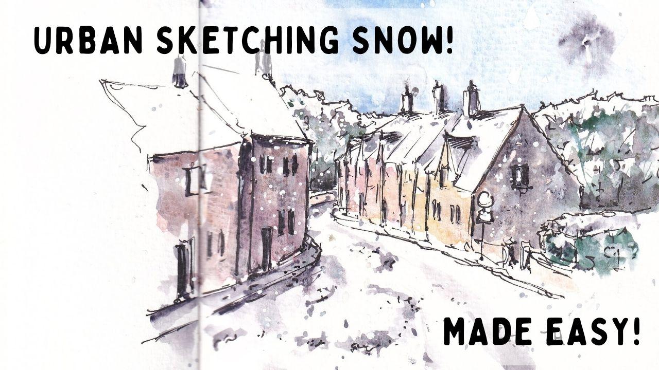
1. Introduction: Hi there, my name is Toby, and thank you very much
for joining my class all about urban sketching in snow. In this class, I want to
show you how to sketch snow, which seems almost
silly, doesn't it? Cause snow is white, so how can you sketch it? Well, I think we
all probably know that snow is one of the
things which is actually really hard to get
especially when we're using the sort and wash, ink and watercolor techniques because we don't have
white in our palette. We don't have white watercolor, we just have the
white on our page. Well, what I want to show you
in a series of lessons is, firstly, what color is snow? Snow isn't actually
always white. We'll look through some
photos and then we'll see that actually the snow is
all about the shadows, the reflections, different
colors, and actually, there's hundreds of
different colors in snow. With this framework,
we can practice drawing some snowballs,
drawing a tree, and then making a
cute little card, maybe a Christmas card
or something like that with a snowman team. From putting all of
these bits together, will learn about contrast. We'll do a little
bit about different layers and to have
an understanding that snow isn't soft
and round and circular, and then we'll go on
to our final project. Our final project, I'll
provide you a reference photo, which is of course, in
the class resources. With that reference photo, we're going to sketch it through five different
stages, pencil, pen, first layer of watercolor, second layer of watercolor, and then those final
interesting bold touches. We're going to sketch
this whole scene and bring it to life. Trust the process, don't rush. Like with all watercolor, it takes all those stages
until it starts to look good. But I'm confident that by
the end of this class, you have something you're
proud of and you have a lovely framework
for capturing snow, getting those colors,
those contrast right that you'll be competent
to produce your own image. If you enjoy my stuff, please do follow me
on my socials at tobyurbansketch on
YouTube or Instagram. Of course, follow me
on here and check out my other classes where
I would love to join you in learning more about urban sketching and ink and watercolor
techniques. [MUSIC]
2. Suggested Supplies: [MUSIC] Hello
everyone. The first lesson, the first bit, we're going to look at the
supplies that you might use, and this is more than
everything that you might need. You certainly won't
need all of this, but I wanted to give you
a few different options, few choices, so that you can
choose what you do have and be a bit flexible and get excited like I do
about supplies. The first thing I've got
here is a mechanical pencil. It's a 0.5 millimeter pencil. I like this because
it's always sharp. There is always a
good lead in there. It's got a rubber on the end. A Patio eraser it
does work best. That means you can erase
quite gently and things. But often, I just
use the eraser on the end of my pencil as well. On the left here, you can see, what I obviously got,
I've got my fountain pen. This is a Lamy
safari fountain pen with an extra fine nib. I use Platinum Carbon Black
ink, which is waterproof. Having waterproof
ink is important, but the exact kind of pen
it's not important, so here, I've got a Fude pen
which will be useful, so a Fude pen gives us a really bold line as
opposed to really thin line. Another option would be a brush pen or something like that. The idea of that
is, as you can see, because it's got a bent nib, we can do such a
huge range of marks. This really bold line is something which is going
to be quite important, quite useful as we get to
the end of our snowy scene, being able to create
this high contrast lines is pretty important for
this kind of sketching. Another option, like I said, is something like a brush pen, so brush pens got
a flexible nib, like a very flexible
felt tip and that means you can create
really, really thick lines. There are lots of
other things as well, this is a Fude pen, which is a bit closer to
a felt just by Tombow. Another option is
just to have a range of different fountain pen, so this fountain pen, for example, it's
got a fine nib, so it's a little bit bolder, and it can also
create all sorts of different marks and that's what fountain pens are good for, it's creating a range
of flexible marks. What have we got
next? After all pens, well, let's have a think
about our watercolors. I always use this little
old set of watercolors. I got 14 colors in there, but we're not
using all of them. If you just pause the
video now, on the right, you can see the colors
that I will be using, which isn't a huge number. As I use those colors, as I use them in the
videos and things, I'll make sure to explain which
colors I'm using and why. If you look on my
[inaudible] description, you will see, I'll list all the colors in the
pallet, a moment for you. and you can see that
in all my classes, I like to let you know exactly
what colors I do have. Now with watercolors,
comes brushes. I've got three brushes today, a large mop brush, which is one of my
favorite things to use. It's similar to a
Size 12 round brush. Then this one is a
small round brush, nice for making
little iron marks and denser bits of watercolor. Then somewhere in the middle is a medium-size round
brush as well. You could really
make do with just one of those brushes
if you had two. Really important,
things I always forget having some paper roll, I like to use towel, having a really big tub of water and my water is a bit mucky
because I've been painting, but good to start with
it clear, at least. Although as you see, it doesn't stay
clear for too long. Now, what else? There is a couple of special
things in this class. We've got some white marks
we're going to want to add, now you could use some
girth which is available in all sorts of brands
and with that you just apply with normal brush. Advantage of that it's cheap.
It will last you forever. You get these really
big tubes like this. What I'm going to be
using it my POSCA pen. POSCA pens are a brand
of White Acrylic Marker. There are lots of
different brands. They are quite expensive, like five pounds or so for
pen, but they do, again, last quite a long time and the advantage of
to control very well. Look how opaque that is? Not many white marks
that you can make with watercolors and ganache
are that opaque. Now in terms of paper, I'm just going to be using pretty basic paper
by Taylor Ronnie, A4 student grade cold
press watercolor paper. I do like to keep my board
elevate by about 15 degrees, and all I do, is
I just put a roll of masking tape underneath. That is everything I
think you could possibly want to use in this class
so without further ado, let's do some sketching. [MUSIC]
3. Start 'Painting Snow': [MUSIC]. What color is snow?
That's a silly question; isn't it? Or is it? Well, in this lesson we're
going to do two things. We're going to have
a little play. Obviously, we're going
to do a little exercise where we paint some
snowballs and a tree. We're also going to
start here by looking at some photos and a little
bit of decision-making. Is snow white? Well, look all of these factors
show that yes, snow is white. But how do we know it's snow? We know it's snow because
of the shadows on these various
scenes we're seeing white but we're seeing
it's surrounded by dark. We're seeing contrast,
and in this photo, in this murky scene, the snow is not even white. It's white compared to
everything around it. It's called reflections. It's got a lot of blues
where my mouse is, and it's got yellows and browns. Perhaps we need to break
away from this idea that snow is white and
that there's white in it. But there's also these
blues look at all of this and within that some gold. Actually, snow can probably be whatever color we
really want it to be. It might be a very crisp white. In this, we got
this crisp white, but those trees are defined
and the crisp white a few speckles again of
high contrast is almost black if not
actually black. Now we're starting to
realize that okay, snow got some white in it, but not always, and also it's
got lots of other colors. Let's see how we can take this knowledge and
apply it into reality. I said at the beginning
we'll do some snowballs. Here's three
snowballs and a tree. We're going to have a
look and a little play at different colors
to make snow, and it's a bit of a practice
of shadows as well. This is quite a fun exercise. These things can actually make really nice Christmas cards. Have a think about how
you want to use them and if you want to splash
or do them neatly. This first snowball we're
going to do with moon glow. As I say here, don't worry
if you don't have that. There's a lot of good
alternatives and things like Payne's gray or doing some of the other mixes or using some
of the other shadow colors. Its colors like shadow violet, for example, mangroves are
lovely, shadowy color. What we're doing here is
we're just applying a shadow, so imagine that light is coming from the top right
of the screen. Actually, there's a shadow on the lower left of our snowballs, and if we apply that
nice and gently, softly, and then we
can soften that edge. We come in with a
clean brush and we just scrub the edge
to make it soft. Now we've got this soft
graduating shadow coming across. Shadows don't just
exist on the snow. When we had a look
at those bridges, there are shadows underneath and shadows all around
in the urban scene. So, a darker shadow will connect the snowball to the
ground and make it feel much more real. Now, in the various photos
we talked about blues. Here I'm using a cobalt blue but you could use
an ultramarine, you could even use a cerulean
or basically any blue. Ideally, a cool blue and we're
using it in the same way. We're applying a
really soft, quiet, gentle shadow across
that lower left side of this snowball and
just building it up. Payne's gray is another color
I talked about briefly, is a potential
alternative to moon glow. It's so much deeper, navy gray, almost
navy blue gray. We can use that with our cobalt, whatever blue we use, and just deepen that shadow. You can see how I'm applying it, but because the pages wet, it's all going to
soften together. At the moment it looks a
bit separated and blotchy but it will just soften then we get that dark
shadow as well underneath. We're starting to get shape instead of just a white block, this shadow is producing
us some shape. Now, the last option is to do some mixing, a blue and a brown. I'm going to use cobalt
and van **** brown. The more classic version of this would be
ultramarine blue with a burnt sienna or
burnt umber and that produces you
a very neutral. As you can see, you can change that from being neutral to
more blue but in more blue, you can change it
from neutral to more warm brown, bilingual brown. Then we could do
exactly the same thing, so nothing clever here. Exactly the same thing. Now we're creating a
more neutral shadow. We could add more brown
and make it more murky shadow and all this is doing again it's taking
that white object. By applying the shadow, we're showing the viewer that this isn't just
a white object. This is a white object with
shape and it still appears as a white object because I interpret the
shadow with shadow. I think it's really
important to get that shadow underneath to connect
this navel to the ground and to
show that there's a shadow and a light source
been cast from one direction. Time now to leave
the snowballs behind and move on to our tree. Now I'm getting some green here. I'm using cascade green, it's the green I
love playing with. It's a nice blue screen but
you could use all greens and if you want to see them just have little
rewind and just read. I've left lots of nice
alternatives that you can use. We can also deepen
that green with any of these shadow mixes but I'm using the cobalt and van **** brown to make two different greens, dark green and a
lighter cascade green. We can now use
that on our trees. Now, remember that
trees also have shape and they are filled with bunches of leaves perhaps less so in winter but
evergreen winter as well. They've got that white,
which is sitting on top. We leave lots of white within our tree and we
apply the green instead of loose patches and
then we can bring that green down a
little darker and apply the shadow underneath it. You've got white which is
our snow and underneath it, we've got that lighter
green as humans is an evergreen tree of
course and then underneath that we've got our dark colors. Then we've got our darkest
colors which are our branches, which we can just
loosely apply and some of them will
be covered in snow. We are going to see them as like solid lines but some
of them won't be. We just got to remember that we're painting
this as a part of. This isn't a detailed
painting of a tree. This is part of the scene. We also have to remember
what colors will build up. You have to leave lots of space and trust
that as you build, things will work out. An already great example of
this is negative paintings. If we now just apply
a blue sky around it, notice how all of that white is now being
contrasted and this is yet another time where we're
talking about contrast because white only looks bright if it's contrasted
against other things. Soon as we put in a
blue sky and a bit of a blackish shadow underneath
with some moon glow. Then our tree becomes
an object and it's the same with our snowballs. If we apply that
shadow underneath, maybe what we could have done is applied a bit of color
around the outside as well and suddenly instead of just having a white through
something a white shape, we now have a 3D object because
we have given it shadow. Understanding those
shadows and understanding the shadows are all colors. The colors of snow are not
just white is what I'd love you to get from
this lesson. [MUSIC].
4. Next a Snowman: [MUSIC] This lesson
also about the colors. Now, this time
we're going to take 30 snowballs, the funny tree, and we're going to
put it into practice with cute little fun snowman. A snowman is a nice way to
start because it gives us the opportunity to
create a little bit more of a scene around what is essentially a
stack of snowballs, snowball bodies, snowball
legs, and snowball head. It also creates a really lovely image which
you might want to use maybe for a Christmas
card or something like that. Now, as per the supplies lesson, just going to be using my
LAMY Safari fountain pen, extra fine nib, and some
black waterproof ink. Got a reference photo up in
the corner there for you. What we're gonna do,
we're just going to start with a loose sketch. We're not going to
try and be smooth, we're not going to
try and be clever, and we're not going
to trying be perfect. But also we're not going
to try and be smooth, but curves, snow isn't smooth. Now, we want to think
snow is smooth. Seeing that lovely
soft snowballs. Actually really look at that reference
photo and just see, maybe next time you're out in
the snow, just have a look. Try to make a snowball. Snow is not smooth, it's lumpy, angular, hard. It's got all edges and crevices. This, of course, is why
it has so many shadows. Because if it was a
perfectly smooth sphere and it would just have
one smooth shadow on it, but it's not. It's got loads and loads of
different shapes and shadows. We can exaggerate
that angularity with our lovely
loose-fit line work. Now as we get to the ground, we want to connect
it to the ground. We're not actually seeing
the bottom of the snowball. The bottom of the
snowball is sunk, so we draw this edge of the
ground instead of that. Then we've got a
little touch like the arms which we can
just pop in here. Then we put the other arm, of course, to just drop
in on the other side. We can have a look
around and find those other small shapes where the arm crazy and under the neck we've
got dark shadows. What we're looking for is if we just demonstrate
in the background, we're looking for planes or
layers of the foreground, the background, and
shapes within shapes. What I mean is where you see a line of snow in
the background, we capture that
little line of snow. Things like that also
work as a horizon line. If you have a horizon behind
something it grounds, it shows us the sky
and the ground. Even though in this
reference photo, of course, we are really only seeing any
type background of ground. But having horizon lines
are really useful way of just grounding in imaging
and giving it some context. We're going to stop that
is loads we could do, but what we'll do is we'll
do some watercolors. We do these same principles
we were doing before. We can come back
and we can actually find some of those
shapes within shapes, some of those planes using the shadows we covered
in the previous lesson. Starting with some moon glow and remember there's lots
of options you could use. I'm going to start
with moon glow, using a really light
and watery wash. We're applying the
lightest shadows, the shadows which have
the lowest value. This is the first wash and
you can do several washes, often at least two or three
washes in watercolor. We can still vary the density of shadow at this point a bit, but it's much easier to
vary it when we come back. Notice how like with the tree, I'm leaving lots of white space. The shadows are, as
we talked about, in different shapes,
shapes within shapes. They're irregular,
their snow is hard, so there were lots
of white patches, but then within
those white patches, there is dark and shadow. The shadows overrule on more in the left lower side
of our snowman. But even on the shiny white
sides, there's some shadow. Even within those
darkest shadows, there's some reflective,
bright snow. We're just gradually introducing that shadow all through
our little snowman. It doesn't have to be entirely
based on the reference, the reference is a
really useful guide, but we're not being perfect. One aspect of not being
perfect is in woodcuts, the ability to soften. It allows you to make
your washes more varied. It prevents having
too many lines. It prevents you
overworking your image. What colors are best
when you're been familiar when you're being
suggestive and soft? Now, as before, that grounding shadow
under the Snowman, which further
demonstrates the shadow and the source of light. Then we're looking at separating
our planes our layers. When I'm saying layers and I promised I'd
come back to this, layers are a foreground, so our snowman is the closest
layer to it, isn't it? Then our next layer is behind, and then the next layer
is the background. What we're trying to
get is this contrast between those layers, because the contrast is
what makes things white. Where we've got these
brightest areas, we're trying to get some
contrast between them. So in my second layer
behind the snowman, I've popped a little shadow
which I've invented, which meets the brightest
area snowman and now our layers are pulled
apart and enhanced. And the background behind what a horizon line we can do with our furthest away layer is to
just real suggestive lines. We can still suggest
these bits of grass. We did that a little
bit with our pen line, but now we can just use little watercolors
and I'm using a bit of Van **** brown here. So moon glow for the shadows, but a Van **** brown, to suggest these tufts of grass. Again, if we bring them
down to a snowman, we have them peeking
out from behind them. That is doing two things. One, it is applying contrast. Suddenly our snowman
gets pushed forward, and this pushing forward shows that he's a
different layer, but the contrast
doesn't just do that, doesn't just separate him
and push him forward, it also shows how white he is, how bright some of these
areas of snow are. Now, we move on to a second one. The same color, moon glow. So far, only two
colors have been used. Now we're finding
darker shadows. We found these big
areas of shadow, this big shapes within shapes, now we're finding the lighter
shapes within shapes. And we're getting
these darkest shadows. We look where are they. They're between the
snowballs and on the left-hand side
and the bottom, and they are quite small, so the darkest areas
are quite small. A good way of finding
the darkest areas is to squint your eyes, and
when you squint your eyes, you'll find yourself moving
around and being like, "In the background there some dark shadows
in the foreground, and this bit of grass
is really dark." Don't forget to, just as
we did before, soften. Just to talk a little bit
more about softening, best done with a clean, slightly damp brush and
you come and you just push around the edge
of that watercolor, and to stop it being
a hard line so you can't tell exactly where
the watercolor start. Now, we can do a
little bit of fun. This is no longer the exercises, this is us creating our
own Christmas cards, so little bit of Van **** brown for the
arms you saw me do in now. Bit of a scarlet
lake for the nose. nice carrot nose,
eyes and buttons, and things like that.
So just have fun. Let your imagination run wild. Create your Christmas card. Or if you don't want to, if you want to just
stop there with a lovely little scene, we can call it finished and
move on to the next lesson.
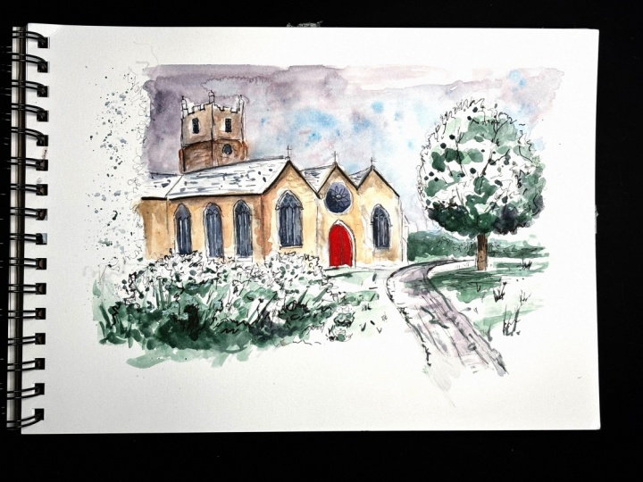
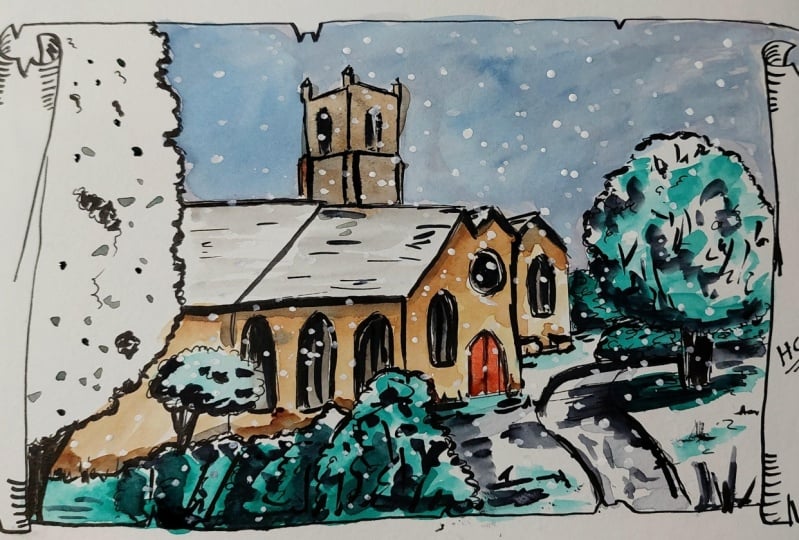
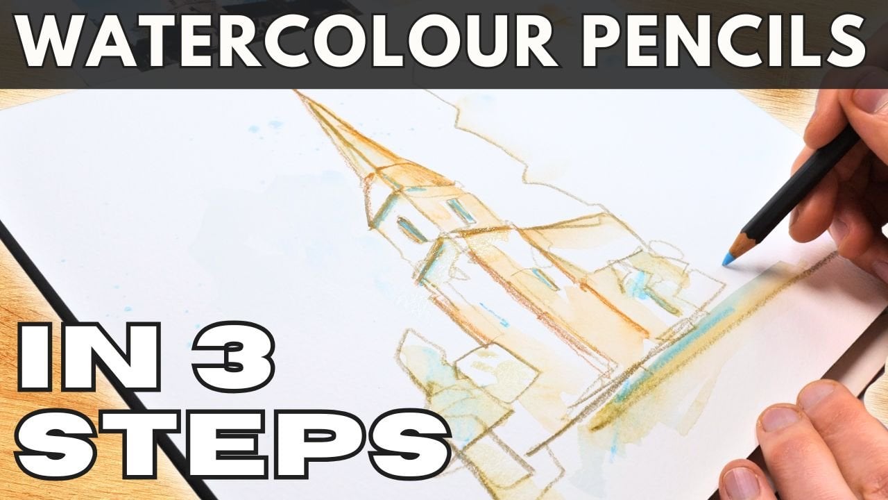
5. Step One - Pencil Sketch: [MUSIC] It is time to
start our final project, and we are of course starting with a little pencil sketch. This is my A4 piece
of paper, taped down, and we're sketching
this lovely scene, St. Mary's Church in Cheltenkings in Jordan,
near where I grew up. A really lovely
little church and a lovely little factory with
a light dusting of snow. Now we are going, of course, to exaggerate that snow a bit, which isn't so hard
to do now that we have all the skills. Like I say, let's take reality
and be a bit creative. It's painting our decisions. Now, I'm using this a nought 0.5 millimeter
mechanical pencil. I'm actually going to be
a bit harder than normal. Normally, I be very light
with my lines because I'm not going to rub the lines up. You can if you want, hook them up gently. I'm going to leave
them there and I'm going to show you
that it doesn't matter, that they'll be there
and be interesting. It doesn't matter
if we leave them. Starting with big
shapes and I'm starting with this tree on the left. The reason is, that frames
our composition already, that big tree sticking in
frames our composition. I'm now just looking for shapes. Our roof is a couple
of parallelograms. It's worth, when
we're thinking about shapes or any part of it. Shapes got angles,
but we can use our pencil if you
want to line up those angles and then just work out the shapes
approximately right. If they are, keep going. All these roofs are
just triangles, with little other
triangles next to them. Then we can find where the
big vertical lines are. If we look again at the
angles and the shapes, we'll see we're basically making a rectangle at the front, rectangle at the side. We can simplify things. There's all little extra bits and pillars and what
not on this building. Those little bits can be left out, at
least at this stage. Remember things like these
bushes, they're just shapes. They're just little shapes
and these pencil lines are just guidelines. It doesn't matter if
they're a bit wrong because we're going to
come back in with pen. We can always change
things. Even with the pen, we can change things as
long as we're gentle. Can get things like the path in which feels
quite important so their flow through this image. Then just moving around finding the other
important thing is this big tree for puffing up
and we can change the size. I've made it a little
smaller, perhaps. You give it a bit of asymmetry. We've got this big
tree on the left, slightly smaller
one on the right. Then behind the tree between the tree and the
church is a bit of chaos. It's hard to see
what's going on. Then invent things, just
draw what you can see. This tower is obviously a really important
part of our sketch. I'm exaggerating if you look at how I've done
the lines perspective, I've floated them outwards, which is the wrong way around
they should be going in. But it adds fun, it adds a pretty character. Why not? Basically,
why not do it? Why do it? Because it adds
character. Why not do it? Well, we're not after realism, so we can have a play, have fun. We can find all of our
windows, things like that. We can find the doorways. It doesn't have to be perfect. You see, I've left out
these pillars around the corners of the church and
at the front of the church. Now, if I was sketching for
another half an hour longer, I would add all these little
details, but I'm not, I'm getting the
essence of the scene and I'm having fun and
I'm getting the snow. I don't have to add
all the details. Just looking around,
getting this basic purpose, that's all we need to do. Having done all we need to do, having been gentle with it, we can move on to
the next stage, playing with our pen. [MUSIC]
6. Step Two - Pen Sketch: [MUSIC] I've got the same
pen I've been using. Got our pencil sketch already, and this pen is my
Lamy Safari extra fine with waterproof
packing in it. It does need to
be waterproofing. Even if you're
using a fine liner, which is perfectly good, just make sure it's
waterproofing so we can add our colors on top. We're now finding
those shapes again. I'm starting upside down to start really gently and I mentioned this in
the pencil lesson, we want to be gentle
because even if we make mistakes when we're
drawing these shapes, we can correct them. We can add the right lines,
even if we've gone wrong, we can add the right
lines and create textures and things,
if we're gentle. Using a fountain pen upside down is a really great
way of doing that. Now what we're going
to do is move around, move around finding
these pencil lines and not being worried. If I think a pencil
line is wrong, I'm not going to be
worried about editing it. Other side here. Now, I think this roofline is cut down a little
bit so we can get the shape of the guttering
on the side of it, so I'll move it down. It's now not perfectly
aligned with the pencil, but that's fine, the
pencil is a guideline. With these windows, I did them really quickly. Now I can decide if I want
to move them left or right, make them bigger or smaller, and add in shape. We're looking at this an angle so we can see the
edge like here. We can see the
edge windows of 3D they've got a frame and we
can see the edge of it. I'm now just going
to add those edges in which I didn't
do with pencil. Our doorway, we can add the
edge in as well, the frame, but we can also add some of
these other suggestive lines like the closure
point in the middle. Can we see that
in the reference? No. But it's okay to make up simple things, simple details. We're trying to show
them this picture, we're trying to show
them our scene, and if adding a door
knocker to door helps show that we've drawn
the door, that's fine. Then don't spend too long
so move around going back and forward and moving
to different areas and again, adding in these shapes. You can probably see more
clearly now that it's dark. I've walked up perspective. It's not immediately
obvious that it's wrong and I think that's probably
because it's subtle, partly because it's
done with confidence. Don't overdo it on
details at this point. Remember, we've got more lessons to go. We're
adding some colors. We can always come back and add some more details
at a later day. Don't overdo it at
this point and just focus on these really
big clear shapes. The good example of
this is our bushes, so bushes are
shapes but texture. We did some really loose
lines for them before, now we're going to come back and we're going to change
that loose line into a slightly textured line but we're not going to worry
about it being perfect. We're just trying to
build on that pencil, build on that structure, and just quick loose feathery, loose leafy outline and we can build a few
bits of shadow in. Where we know there's going
to be shadows inside, we can start studying those
few little leaves and things inside and
there's going to be more leaves visible underneath, that's where the shadows are, and more of these
leaf lines here, add more shadow that
we're implying. These textural initial
structural lines can also be building up towards aiding the watercolors and creating those shadows. Just the little things that
we can start to think about, especially with natural
things like bushes. Just notice how I jump around because I'm working
near that window I spotted and I just want to slightly
nudge the window to one side so I'll do that now that I'm nearer,
I'll do exactly that. Then we can jump to
our bigger objects, our tree over here and there's not that much to see in the
reference photo if we're being so harsh
on the reference photo, not much to see but we can, again, be creative. We can find our own shapes. We can come in with those same little loose feathery
lines and just build up. Look at the reference
photo to see where there are those little bundles, dark bundles of green,
bundles of white, but also to have come with our own random lines and gradually build
up those shadows, gradually build up those
tint which we can then, in a moment, add our watercolor to and create a real fun image. We can also start our
shadows on the ground. This is a really lovely
example of how adding a shadow to the ground really
crowns an object. By hatching in underneath and also by hatching at the edge of the path near the
edge of the tree, we're really showing that
the tree is an object, we're showing how it interacts
with its surroundings, and adding the edge of
the path around that. We're suddenly getting
a scene just with these little touches and these little shadowy textural
touches really do help. We can suggest the path in the distance and
we can also create tiny little grassy marks
in the foreground. When we do a snowman,
if you remember, we have these
little tufts coming up and they help with contrast. Well, much in the same way, these little dark tufts of grass are going to help
with contrast showing that this white amongst the
white little other tuft. Then we're back into what I
call a chaotic background. There's a bush or
something going on there. Draw, you can see
door and oven vent. We can see there's a few bits, so we can see vertical lines, we can see also random lines, we can add those in. On the left, that's
where we started. If you remember, I started
the pencil drawing with this and big tree. I'm finishing the pen
work with this big tree because it's so imposing
and I don't want to make it too bold or too light. I want to make sure
it's in the right place and I can only really do that with my pen once I've
seen the rest of the image. Now it's got this
nice little balance. It's got a flow through it. We've got the big shapes
we started to build out and understanding
of shadow and texture. We're ready to leave
our pen for now. We can come back,
so don't worry, we can come back
and add our colors. [MUSIC]
7. Step Three - Add Colour and Shadow: [MUSIC] Time for the unbearable, perhaps the scary bit, but we've practiced now at
this moment we don't snowball. Hopefully we are
prepared trading those light colors and
those little shadows. Now I'm going to use my
mop brush to start with, which is a medium-sized
mop brush equivalent to a size 10 or 12 round. I've also got my little
brushes on the site, but I'm mostly going to
be using that big mop. Under the reference photo, I've got a really
big tub of water. That big tub of water helps keep the shadows nice and clean. Now, if you look at the sky, we need to make great decision. That sky is white gray, boringly, not fun sky, isn't it? But we can make it interesting. First thing I'm
going to do is make our sky a bit more interesting. That will help
with the contrast. It will contrast those roofs, which gives us the
whiteness of the snow. I'm using our shadow color. I'm using moon glow
and I'm applying it gently with lots of
water with a big brush, moving it around,
keeping it quite neat. Because I want that contrast. I want that edge where
it goes from shadow, moon glow to white snow. Just move around. Notice how I'm not
filling in the whole sky. You don't need to fill
in the whole sky. We can build it up,
we can build it down. But we don't need to have the whole sky
filled with color. A few splashes still just a moon glow touching in
little bits of pigment, and then adding in more
life with some cobalt blue. Notice because it's wet, I don't have to paint
that cobalt blue. It will do its own thing. Watercolors will paint
themselves, they'll move. They'll flow down the page because we've got it
elevated as well. Then we can move
into the foreground. Still not the focal point,
but the foreground. We've got our
cascade green here. Much like when we
did our snowball, we're looking for the shadow
areas because we do need to leave lots of snowy white. I know we've gone to great lengths to explain that
snow is not always white, but leaving white is a key part of creating the effect
of reflections in snow. Using this green to find
shadows in the grass, shadows in the trees. Applying it loosely and
gently and in little patches. Again, lots of white paper so that we can leave
that effective snow. Hopefully this feels
similar as you're doing it, to when we added the green into our tree earlier in the
second lesson of this class. Then, as before, come back
softening some edges. I've moved to my
middle sized brush. This is Size 8 and 10 round. It's actually a small
quill or a small brush. Here we can soften those edges. We can start creating
branch-like effects. The early process of watercolors
never looks like much. But watercolors is all
about building it up. I said this earlier in one of the first two
lessons as well. It's all about just taking time and letting things buildup. We've got the same with these bits of green
here in the front. Notice how squinting
you your eyes, they're much darker, much darker than the grass. We can start with a nice
stronger touches of green. Again, do you see how
they're all very hard, little discrete blobs until
we come in and soften. I've got my wet brush drying it, cleaning it slightly, then
popping it back in the water, drying and cleaning it slightly. Then by controlling
the water underbrush, we can control the
effect we have as we move that watercolor
around the page. Again, we still want to intercrete patches, we
still want that white, especially the white
is especially at the top of our objects, at the top of our chart, to the top of our tree, at the top of our bushes. Notice how I've left white
at the top of these areas. Now, as well as these greens, we've just got shadows coming in with some more of the moon glow
finding the shadows. The shadows on the path, the shadows under the tree
and that kind of thing. Constantly looking
for little shadows. By doing a little dragging
of my brush along the page, just dragging it quickly along, you will see great
interesting textures. It's a bit like dry brushing,
especially on a path. It suggests someone
walks along this area. Now we can start to find some of these warmer colors
in our image. I've got a little bit of
a Quinacridone sienna, just to really light
wash with a little bit as well of Van ****
brown in there. These gentle colors are
just going to be loose. If I look at the color
of the church is a very loose and gentle
sandstoney color. Amongst all these
other contrast and interest in the changes
we've made to the sky. We don't need to
go too overboard. Just start off with this
gentle varied wash. Then similarly to before
neatening up these edges. I was a bit untidy at the edge, and I want that snowy surface to stay white initially
because it's bit untidy. I just come in
with a clean brush and modify it a little bit. Again, same little
mix of colors here. Now we're just going to
gently find those shadows. There's always a bit of a shadow under the eaves,
under the guttering. There's also a
little murky bits, the bricks and have
all the same color. Just by touching in little
bits here and there, we end up with a
lovely varied one. I'm building in a little bit
more of that Van **** brown. Notice how this in the reference as well
as the actual image. This wash is more neutral
or imposing in that field. I'm just doing that to
keep it closer to reality, but also to have a bit of fun, to leave it varied
and interesting. Then changing back to
that more warm brown, a bit of Quinacridone Sienna to show the different
structures, to show those different
pillars versus the actual top. It is at this stage
where we start looking and thinking,
is this working? Is it going in the
right direction? Trust when I say, no one ever thinks it is. Don't worry at this
point, just keep working and doing the processes. Now we've got some more shadows. Get more moon glow shadows in those windows and also
shadows on the roofs, and more dry brushing. We did a little bit on
that path, on that tarmac. But now, taking my
brush and squishing it. I'm working really
quick little movements with a brush really dry. It's really hard not to
get my hand in the way. But you see how it creates
that interesting texture, which suggests a complex set of shadows rather than just a
loose splotch of shadow. There we go. That is the first
watercolor a [inaudible] next we're going to add
a second layer. [MUSIC]
8. Step Four - Develop Contrast: [MUSIC] We are on to the
second wash of color. Now this is all about
those deep tones, so it's bits of contrast. This is very much what
we did with our snowman. When we came back, we'd
had that light shadow, we added some dark shadows. What we're going to
be doing, gently, is with as medium
brush this time. If you have a look, I'm using
a Size 8 round brush now. We can be adding thicker paint, so the same colors. This is a mix of cascade green and moon glow that's thicker, like maybe a very running honey. Not really dry, not
like toothpaste, but quite thick paint. We are using it in the same
way we did on assignments. Within the light shadows
are areas of dark shadow, and this is where the
contrast really pops out , becomes really noticeable. That's not till the next stage that things really
come together. As I said before, with watercolors, don't worry, trust the process and just
gradually build it up. But we can start adding
bits of detail now. Within our extra
bits of dark shadow, we can get little bits and
dots of leaves, for example. We can get these little, really dark areas in the white. We can add little
lines which are beginning to suggest branches. By doing so, we are
building up from a very loose to a much brighter image. Those little scattered dots, these little dots, is where you're starting
to understand what this white area is. You're starting to understand
that it's got shape. It's got something, and its
leaves poking out of snow. Just take your time
and take it gently. Don't overdo it, but trust the process and
don't worry, either. Where we notice
areas of it blank, we can find loose shapes. On the left-hand corner, we've got these
little bits of grass. But we can also just add
our own little shapes, and just these little
horizontal lines. Then we couldn't
continue those across our snowy grass and
other places as well. By continuing the same
lines in different places, we unify the image. Don't forget, we can soften. In fact, softening and applying slightly middle tones
is really important. Do not overdo it. Don't create an
overworked image. Now coming around this path, again, finding these
darker shadows. This time, I'm using
mostly moon glow. I'm just finding little lines, just little bits
and dots to add in. It's important to keep
just looking around, moving around, finding those
areas which seem too flat. And within those, we can add contrasting shadows,
you lift them. We can really darken
some shadows. Look under that tree in
the reference photo, and if you squint, just look how dark
that shadow is. Also notice, as we did, that we leave bits of white. That little slither
of white at the back, little slither of white
coming up the path, that makes it not flat. Just like we don't want
anywhere too white, we want to have these
little flecks of grass coming up to
prevent it being flat. We also don't want
our black areas, our dark areas, to be flat. To keep them there, we will keep flecks of white in them. Don't be afraid to
go really dark. I said, squint to the
shadow under the tree, we'll still squint to that tree. Look how old that
shadow is in that tree. Then go for the experiment. Have fun, take a
risk and go bold. The risk isn't in
going too bold, it's in doing too much. If we don't leave
that white space, then we just want a
black, dark splurge. But if we work quite
quickly and gently, keep it a little bit wet, and we go dark. Then what we're doing, we're
increasing the contrast, and it doesn't look
like much now. I said that before,
and I'll say it again, it doesn't look like much now, but it comes together. We're just finding shapes. As we build up all those shapes, eventually, we have something
really interesting. Also, you might
notice the shapes and the movements that
I'm using here, the same as the shapes
and the movements I used to do the bushes
in the foreground. But using the same shapes and
movements, unifies things. Unifying things
allows the person to visualize easily and understand that these
are the same as that. When I was putting down
these shapes, as before, it looks very clunky and very glamorous and
clumsy, maybe. But then we can soften things. That's when I'm saying
we need to work quite quickly. We need to rush. But if we work quickly, we can come back and soften our edges before
they've all hardened. We get this less clunky, more varied area as we fill in the darkness
in the background. Again, remember how I said? Don't leave it flat. We've got a little
room of white. A little room of white effectively means that our
darkness is negative painting. The same as we come down
to your bushes here, we add shadows around the bush. Look, it's pushing in. It's creating shapes, and we can do it on the
other side as well. Mainly, we don't just have
any areas which are flat. We don't have shapes bumping into each
other and being flat. We're creating contrast,
we're negatively painting. We're taking white and
encroaching around it, and so we end up with shapes, and interest, and a
feeling of 3D in us. It's important just to keep
moving around and looking. Don't work too hard in one area. I keep saying that as well, and that's, I think, a really important
aspect of sketching and of watercolor painting and
watercolors sketching. Never work too hard in one area because you need to move around. You need to add shadows. Also, I need to add shapes elsewhere to get
the image working. With that in mind, let's
move on to our church. Now we were talking earlier about how we want
the church to be quite a delicate color to contrast against
all these other darks. I'm going to start, actually, by hitting the windows
with some shadow. Again, try not to
make them flat. When I say that, I mean, leaving a little
slither roofline, leaving these
reflections, we can come back with our white
marker later or with a brush, we can add white back in. But white is most effective in watercolor if you have lifted. If you can do some pre-planning, you can recognize you need to leave variation in your washes. That will be the most
effective way of doing it. All these darks that
I'm using are a mix of either moon glow or now
moon glow, and other paints. We can find these
really dark shadows of the church as well
and add them in. Look how, again, this is clunky, isn't it? This edge is really clunky, but that's what happens
with watercolor. You put it in, clunky
to start with, but then you can move it around. You can come back
with your brush, clean it off, a little bit of
water and soften. I keep saying this
word, softener. It's not something which is easy to immediately understand, but hopefully, you can gradually understand as you experiment yourselves with the
idea of softening. When you touch an edge of
wet paint with a clean, slightly wet brush, you soften it, you make it
less of an obvious edge. Then you decided here to move some of these
shadows down as well. Again, this is
negatively painting, so I'm adding a lot
of shadow around the white of our bushes. The white of the bushes is now surrounded by these
deeper tones, these darker values and
looks more and more white, and makes it more and
more of a single shape. These brushes are
now their own shape, rather than an obvious
source project. Now, some light and interesting touches need
to come in at the end. Got our red door. You can only just
about see it's red, but let's make it really red. This is scarlet, like
I've added in there. Other points of contrast, the little windows at
the top of the tower. Now they're not dark in reality, but I think, right at the beginning
of this class, I said, as we're starting
out with a pencil, we're going to be making
our own creative decisions. This is where I'm starting to look around
the drawing now. Where could I add
dark shadows or points of interest which are
really going to lift it, which are going to
separate out shapes, which are going to
contrast between things and make it more fun? Sometimes just adding
little bits of color as well for texture, so little splotches there
in the top of the tower. They're just for a bit
of texture, again, to stop things appearing flat. Now we got our snowy roof. Our snowy roof is
already looking white, some light shadows. What we're going
to do now is get some shapes, which
suggests tiles. Because as the snow sits
on a tiled roof like this, you get the shadows
which are tiles. Also, there's some randomness, so that is random effect. Watercolor splashes
are a great way of producing that random effect. I'm going to use this framing motif which
you have on the left, this big tree, the very first thing we
sketched in with the pencil. I'm going to also introduce some randomness in there, but
I'm not going to paint it. It's not going to be
a big negative space, which is pushing everything else towards looking in the church. The reason I'm doing
that, I think, there's already a lot
going on elsewhere. We don't need everything in our image to be
filled with color. For me, leaving these
interesting areas really does push the eye around and
make it more interesting. Then next bit, we're going to be adding bold lines
and some white. Get your brush out if
you are using that, or get your acrylic marker, and let's get ready to bring
this whole scene together. It might not look like much now, but in five or 10 minutes, you're going to be so proud of what you've
achieved [MUSIC]
9. Step Five - Bold Lines and Highlights: [MUSIC] We are in
the final stretch. We're adding some bold lines
to the white highlights and suddenly this quite loose
image will come together. It becomes something
really quite pretty. How are we doing that? Well, it could be playing with our fude pen or you might
use something different, but I'm going to be
using my fude pen. We could use a
bold fine liner or a different fountain pen with maybe a bolder medium nib
or heavier nib than that. For example, I've got my
medium nib fountain pen here. All these things
are fine to use. You don't have to go out
and get a special pen. Fude pen is a lovely
thing to have, create that huge
variation in line, and it is useful for this particular image to be able to create fine lines, thick lines, and really create a really
interesting image. We've also, of course,
got the Posca pen, so lots of ways of adding white, but I'm going to be using this white Posca acrylic marker. We can add a really
opaque white very easily. We can also do things like splash it around if we need to. Easier to splash around,
gouache and things, but I'll show you in this
video that we can actually create lovely little
splashes with our acrylic markers as well. Let's get started. Now, it is absolutely amazing how these bold lines
really make it pop. They just create a
illustrative contrast. We can start anywhere.
I'm going to start around the edges
with these bushes, and I'm going to find the
outline of that white edge. I'm going to use the
thickest part of my fude pen on the bottom and a bold, but the least bold
edge at the top. That means we can make
things look neat, make them look purposeful, and just really stop showing where there
are contrasted edges. Where that white of
the gouache meets the brown of our church, and suddenly we've
got white snow. It's amazing, just a few
touches and already, I hope you agree, these bushes
are really becoming real. I mentioned in one
of the last lessons, it's really important
to just trust the process and
watercolors, not panic. Just know that at the end as you add those darkest touches, things will come together. Don't rush, just take your time. I hope you agree again. I hope you agree is
what is happening already in this last section. What we can do now is
move to a focal point. Again, we can use this thick line to
create that dark shadow. Squint, look at the reference, and you'll see along
this guttering edge is really dark shadow and the
same on these edges here. We can just simply
create that shadow. We can make it dark more
easily than with watercolor. Using a thick line, suddenly there's a nice shadow. Then we can vary the edge,
make it slightly thinner, but still bold line on the
other parts of the roof. We've now started to frame
these shapes as well. We will jump around, move to the tree and
start doing a little bit of shape and interest
here as well. Again, it's the same process
as we did with the bushes. Little jerky movements
capturing the outline of the tree and just now really showing that
contrasting point, showing where sky meets snow. We've added this now. The tree on the right, not very impressive
in the reference, but as we said at
the very beginning, we're going to be having
fun and doing our own, but we can go through
the tree and find that its contrast lined up this random little
lined up more branches. Again, it all just comes
together with these lines. Now, do be careful
not to overdo it. I'm just moving around,
flicking around, stopping, lifting my pen up, moving to
another part of the tree, going down to the shadow. The reason I'm doing that is because I don't want to
overdo it in one place. Very easy to overdo things, watercolor or ink and hard, it's more impossible
to undo things. Don't worry if it
doesn't look great. Just move to somewhere
else and come back. When those shadows in
important places like around the edge of that path,
we've got shadows. Get that contrast
and the shadows, why they're important
on the path of course, add contrast between
the shadows of the path from the snow on
the ground creates the snow. As we sketch, as I do my little narration of stream of consciousness
and sketch, hopefully you can see that
everything is becoming a lot darker because all these
darker bits repairing, certainly there's a lot
more white on the page. Even though there isn't more
white on the page here, it appears to be more white. We can just move back. Again, it's important
to keep moving around and get stuck in one
place. We can move around. We can use our pen to apply this darkest shadows around where we applied
previous shadows. We're emphasizing,
and then we've got the first washes is like the middle washes is medium
and then this is very dark. This is where the darkest
shadows are coming in. My lines are nowhere
near perfect, and that's fine as well. We make mistakes, there's
still the pencil lines there, some of which are in
the "wrong place." Then there's the watercolors
which were loose a bit, splashy, and they've definitely not stayed within those lines. Now, but is this other line. But together, it all works, together it all comes together and creates
really a lovely effect. Where there's watercolors
haven't quite stayed. Like in these windows, the watercolors weren't perfect, they were just too
roughly put up. But we can use a pen to just slightly move with a bold line, slightly move where the
original line was in. We know now we've
got a neat edge, though we're cheating
via outlining our previous colors
and pretending that's exactly what
we meant to do. Again, finishing the
sketch with the frame. We've got this negative
space where we decided just to add a few
splashes rather than paint it. Now, we can add already
bold fude pen doing that. Remember that we did that
random line work right at the beginning to create
that first line work full of pushes and hedges. You're just doing that same random field with a bolder line. Now, it's got a
really lovely frame. I just move around, find a few bits to touch
up here and there, keep casting around,
keep moving around, but then put your pen
away before you've done too much, and
you can come back. Now, let's get out the Posca pen and let's see what
we can do with this. Have a look and see
the different mark you can create with it. It's good to use the masking tape for
example, to activate it. Sometimes it gets a
bit splunched up. That's what I was doing
at the top right. Then we can come around and we can find both natural whites. We can find highlights
in windows. Nice to create the idea
of a frame in windows, just with a little
flack of reflection. We can also create little white edges going
around our darkest shadows. We can create little lines, a little squiggles all
over the roof just suggests that
randomness of snow, not randomness to the different
shadows and the shapes. It's not just a
soft uniform thing. It's not, it's
random and splotchy. We can keep moving around much
like we did with the pen, but with maybe
fewer touches here, just taking a few
bits here and there, and we can create those
highest point of contrast. We can now create these
little white touches, which appear within that flack, we can use a finger
to smudge it. If we don't want it, just
like with watercolor, we don't want it always
to be a really harder, we can touch a bit of paint. Effectively, what
we're doing is just softening the white edges. So with the reward
color, soften the edges. We can do the same
with this acrylic. We can just move around, little bits here and there. If you like what you're doing, you can keep doing
it in other places. If it goes wrong,
just take it gently and it's always recoverable. As I was with the pen, I'm moving around all over
just doing fine touches. I don't want to overdo it. As we move around, you'll
always find things you forgot. I forgot to do that little
edge of the church, and we can move that
in. That's what I said. When I said we're putting
the pen away, I said, if we find something
you want to do, we can get the pen
out and just do it. Now, let's do some
real fun stuff, some splashes, these
bits which make a snowy scene feel
alive through snow. We do splashes over
time with watercolor. With a pen, it can
be tempting just to touch all these
little white marks. We don't have to, we can mistreat up just like we do with our brushes
and do some tapping. You can see, especially
in these dark areas, you can see those
little splashes of one. If you want, you could
pause the video now, and you'll be able
to see, they are all around my drawing board
that little touches of white. That's not really easy
to see on the camera. The white certainly has come. We use watercolors, we splash with all the time, and you could do exactly
the same with gouache, because this curiosity blocked in white and
things like that. Let's just show you a bit
of watercolor splashes. Well, gouache of course, is really just
opaque watercolor, or that's how you can
think of it, at least. Sometimes you want
this to be subtle, but with snow it can
be really nice to have read dense application of white. That's why I've done
a lot of these marks, and now I think they're
pretty obvious. It's just that quaint touch
which makes it a bit kitsch, but for me, it's a
really nice touch. It makes it really pretty seen. Don't forget to sign your art. It just makes you feel more proud when you come
back and look at it. It makes sure everyone
knows who did it. Because people love
knowing about bits of art, they love knowing who
the artist is. [MUSIC]
10. The Final Project Revealed: [MUSIC] Fantastic, well done. Thank you so much
for joining me. We are done. We think it's important
to do a little unveiling. I've already signed my piece, but this is where we get
to see why I bought it, put tape around it. Because look at that
really crisp edge that we can deduce. I like crisp edge. Now that we've removed
that masking tape, it highlights that
contrast so much. Now we've got a really
beautiful painting. Little sketch, didn't take long. It's something which
looks amazing in a frame. Although everything looks
amazing in a frame. But do be proud of your art, and if you want to frame it, just try out a couple of
frames which fit nicely. Now what be amazing
is if you want to join in and do
your own version, they've got the reference
photo that I've been using. But you don't have to
use my reference photo. You could do something yourself. This is my hometown now, I did this set
outside very cold, and all you have to
do if you're using your own scene is
take it step-by-step. First those shapes, then a little pen to grab
these shapes again. Again, do not rush
just little by little, leaving
plenty whitespace, plenty of decisions to come
with this gentle colors, those slightly darker colors. Then there's magical marks with those dark and bold penned, the white splotches, in this last lesson that we did, which will just make things
suddenly pop to life. If you do choose to do your own, I would love you to. Then please just share, share it in the
class project and I'll make sure to comment, give you feedback, ask
you some questions. If you enjoy my classes
and want to follow me, I love producing these classes, I love interacting, and so you'll be able to
see my upcoming classes. You can also find
me on Instagram, on YouTube where I'm called Toby Urban Sketch
so @tobyurbansketch, and you can find me,
follow me there as well. Most of all, thank you
so much for joining me for this fun little
seasonal lesson, and I hope you have a good
time sketching. [MUSIC]
 Toby Haseler, Urban Sketcher, Continuous Lines