Transcripts
1. Introduction: All right, let's talk about minimal color because
sometimes less really is more. And with watercolor pencils, you can get straight
to the point. Get it, get it. I'm Toby known as Toby
sketch I really love quick, agile, loose and expressive
sketching techniques. And that is exactly what
watercolor pencils can offer us. Today, I'm really
excited to show you my new model for line
and wash sketching. No, I'm not going to throw away my normal watercolors and
ink forever and ever. But increasingly, I absolutely love sketching like I'm going to
show you today. I want to show you my
framework, three techniques, which is step one, step two, and step three of our process. As long as you follow that and keep a few key concepts in mind, a single swoop of color, a splash of water, and
your paintings done. If you're ready to keep it
simple and make it stunning, which sounds like a
pretty fun combination to me, let's get started.
2. Supplies and Project: Watercolor pencils often
come in giant packs. We don't need all
of these pencils, let alone all the pencils I have squirreled away in my room. No, we only need one pencil, we'll do something
nice and punchy. Two or three. Brilliant. Four,
almost getting too many. Don't worry if you don't have loads of watercolor pencils. You can use ink tents, you can use water soluble graphite. You could even use soluble ink. The concepts here are transmissible between all
of these different things. I will be using few of these, just a couple for each sketch. Are there any special brush
or paper requirements? Easy answer? No. Any brush will do.
Paper. Well, I suppose you need something which will take a bit of water. I am using watercolor paper, but as long as it's good quality sketching paper, you'll be fine. Pretty much any sketchbook
will be held to handle enough water for these
lovely simple techniques. Guess we should talk
about the project. Every good skill share comes
with a project, right? Right. Today, we'll
be making art. I'm showing you a framework, a way of thinking
about sketching. We'll do some really
simple stuff together. We'll do a slightly
more complex church and then I'll show you
something more abstract. Then I'd love you to also take these ideas
and run with them, set up your own little
still life at home, using weird and
wonderful objects, whatever you have to hand, find photos online, use
your travel photos, whatever you want to do, how it abstract you
want to make it. I would just love to see
your take on these ideas.
3. The 3 Techniques: Let's start. I'm
going to show you now the three very simple techniques to consider using with
your watercolor pencils. Now, these three techniques very cleverly are also
the three stages of drawing and
painting your line and wash with watercolor or
water soluble pencils. So let's have a look at my funnil page and see how we build these free
steps and free techniques. So our first technique is what we probably think of first
when we think of pencils. It's dry techniques. For these, it can
be helpful to have a well sharpened pencil
with a nice point on it. I just sharpen it
the normal way. And there are lots of other
ways you can sharpen pencils. And here we get obvious
things. We get lines. Lines can mean flowing lines. It can also mean details. It can also mean
drawing the outline, the structure of things. For example, buildings or anything else really
in our scene. We also have shade, shading, hatching, and
textures like that. Again, really obvious things. Now, we'll think in the
next lesson about how we apply all of these
with our concepts, but they're the
basic techniques. Number two, we then activate that dry pigment or
some of that dry pigment. When we say activate with watercolor pencils,
water soluble pencils, we mean picking up a brush, dipping it in our water, and making our paint wet. That will bring out the
pigment, make it come to life, and activate it, hence
the terminology. Again, in the next lesson, we will be looking
at things to think about when we are
activating our pigment. Last but not least, we have the sort of more
exploratory techniques, which are the wet techniques. Here, you might, for example, load up your page and
notice that you can paint wet from a pre loaded little
palette of scribbles. You can pick up paint directly
from the pencil as well, or you can flick the end and
get these lovely splatters. You can draw with the dry
pencil over wet areas, and you'll watch as the line
changes in its sort of tone, in its feel, in its intensity
as it goes from dry to wet. These are our three techniques. These are the three
stages we go through, and we'll be building on them
in the next few lessons.
4. The 4 Concepts: To go with our free techniques, which I'm sure you've started
to understand and if not, don't worry, we'll be repeating them as we build
up the complexity. We have four wonderful concepts. Now, concepts. These are
just ways of thinking. They are ways I would
encourage you to think if you want the
same style as me. I'd encourage you to challenge them as well
because it's really important for us to have our own comfortable
way of creating. Let's see how Toby thinks. Potentially a
worrying proposition. This light bulb is
going to represent our thinking processes and also be how we demonstrate them. So you can see here we're using dry techniques with a
red and a yellow pencil, along with the darker colors which are already on the page. As we build up the amount of pigment on
the page with dry pigment. What we're doing is we are
loading the page with pigment. So that's how we can think about all those
hatching in textures, especially in the first layers. We are just loading the page. Whenever it's dry, we're
trying to fill it in. We're not color it in, we are loading pigment
onto the page, which leads us on to
when we activate it, when we need to think
about the flow of that pigment and watch carefully
how the pigment moves. Where we put our brush, where the water is, the pigment will flow in that direction. Notice how the red flows down underneath the line until I move the brush
off to the left, then it flows off to the left. If we want a shape to
be filled with color, but the color not
to expand outward, we need to think about when
we put water on the page, which way will that color flow? And we can drag it and move it and use different sizes of brush to give different effects
with that flowing color. Number three. Well, we need to think about how
those colors will blend. When we are loading
that pigment, we are going to be loading
dry singular pigments. But here, look,
where I'm pointing, we get different mixes, oranges, yellows, reds,
purples, blues all forming from the different
pigments flowing together. And last but not
least, we need space. Again, look here. We've got lots of white space on the page. But space might also
mean we come back and we redefine the space
with a hard edge. Edges, lines define the
space more clearly. We want both space
literally on the page. We also want spaces to be defined with bold
lines towards the end. And like that, we have our four concepts which link together, they flow together, and, of course, they link to
our three techniques. So hopefully, it's all starting to make a
little bit of sense.
5. A Still Life in Practice: Our first scene is going
to be a little still life. Now, this still life, I'm going
to do for my imagination. But if that seems
like a stretch, I'd also encourage you just
to put them together at home, put a box out, put
a towel on it, and put some objects
on top of it. That will give you
something to work with. The purpose of this lesson
is just to work through our processes and see what
happens in a risk free way. In the next lessons after this, we'll go through our three
steps in a more formal way. Now, you may have
been playing with lots of different
pencils so far, but this can be overwhelming. So what I'm going to encourage
you to do is just pick three or four slightly muted or murky tones
to start with. This is one of the easiest ways to get going with
these techniques. So that's what I've done. I've got a couple of bluey, murky purples,
green, a murky red. We'll see what we end up using. Picking one of the
colors at random. I'm going to do line drawing, single line drawing
for the most part, focusing on just
the basic shapes. And my scene is going
to be something I can draw easily
from my imagination. So we have here a stack of books on just
drawing on the right, simple rectangles, all
connected with these lines. On the left, hopefully, hopefully you can tell I'm
trying to draw a teapot. And then as a classic
still life twist on top, of course, we have a vase
with some simple flowers. And you can see all connected with one line.
Don't do too much. Look how simple that
is. That's plenty. And just to remind you, these
are dry techniques so far. So pop that pencil away
and pick up a brush now. We'll move on to step
two, where we do what? Activate. And this is where we need to think about
that flow of the color. I want the red of this wash to stay within the
objects for the most part. So, where do I put my brush? I put it inside the shapes. That ensures the color will flow into the shapes
and not scourge out. I won't bleed outwards, or at least not very much. By doing this, we are
generating tone and a sense of shadow within the key areas of these shapes.
All we're doing. But it also just suddenly
looks pretty cool. It just actually starts
to jump off the page. This very, very simple piece of art already looking quite nice. But quite nice isn't
what we're after. We're after super fun,
wonderful, amazing, even. So we move on to step three, and that is where the
richness starts to happen. I've scribbled on
the side again. Hopefully, you can see I'm using that little scribble
as a palette, and that will gently
enrich some of the tones. You can see from
the flow of color, lots of the lines have
kind of been lost. That's great. That's
why we work in these stages. We have lines. We soften them out,
get a bit of tone, and then we have stage three, where we start to redefine our spaces and just create a whole lot more drama
with the wet techniques. Experiment with restating
lines to restate those spaces. I'm going to just show you this from a couple of angles
because I think it's really important to
get a feel for how these bolder lines really do start to make the
piece of art pop. They really do start to make things suddenly come to life, despite the simplicity of the techniques that we're using. Little dry textures from our first step can be
added on top, as well. We don't need to consider
these different techniques, these different processes
as strictly linear. We can jump between
them a little bit to bring out the details and
the lines that we want. Not just focusing this
last step on being abstract and being chaotic
and having a lot of fun. It can also be
there to bring back detail and purpose
into our sketch, which is what that first step often feels most strongly about. And it's important to experiment because you can see here where I have added my pencil lines
on top onto the web page, they're much harder to activate. They've already sort
of been pre activated. So these lines I'm adding
later are much firmer. Don't forget we can use our pencil as a little
well of color as well. Here, I added some purple, moving from my monochrome
to something perhaps more dynamic because it's using multiple different colors. It's easy to go too far, though. So if you've used predominantly one color in your sketch
so far, brilliant. Do experiment with something
else, a couple of colors, but don't take it too far and a few well chosen lines and a few specific places
to add specific colors. For example, these greens just to further suggest greenery, stems within the
flowers and the vase. All I might want to add
on top to prevent it becoming confused and to prevent it from
becoming complicated. If you take a step back, you can fill some of that space. Remember that fourth concept space with a few splashes,
a little bit of fun. But don't fill that space. Take space yourself from the painting, to
have a look at it, see that it already
looks pretty great, and that means we
can leave it there and move on to the next one.
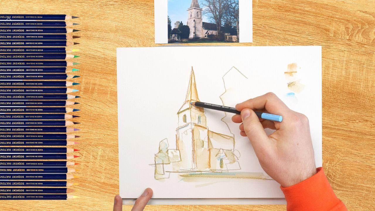
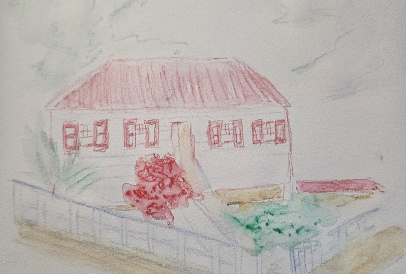
6. Church Step 1: So it is on to our
little project. Well, my little
project, at least. This is going to be a church
from Lowes Slaughter, where I absolutely
love sketching. Beautiful village in the
Cotswolds in England. We are going to take it step by step, technique by technique. So this first lesson is
those dry techniques. Think linework, think shading. In terms of concepts, think about loading the
pigment onto the page. Now, you can use any
pencils you like, but you can hopefully
see here I've changed to three
different pencils. I've got a sort oaky color. I've got a more ochery color and then I've got a light blue. And for me, these colors
represent most of all, what kind of colors
I see in our scene, especially when
you activate them, hopefully you can get
that light cocktail stone feel and that beautiful, crisp, spring sky blue. And that is why I've
chosen these colors. And I'd encourage you,
whatever scene you're doing, if you're joining in with me or if you're doing
your own scene, just pick three key colors, two key colors or one key
color and leave it at that. To explore your scene with. Picking one of those colors. Start with some bold linework to outline the shapes
of your scene. You can see here I'm being quite pressurized with my line,
but it's still loose. I want plenty of pigment
loaded onto the page. Now, the reference I've
got alongside my painting, but you can also download it so you can follow along
if you like, as well. Just check the
class resources tab to make sure you've got the
reference up in front of you. As I move around, all I'm doing is using
one big continuous line. That's my preferred technique. If you'd prefer to break up
that line, that's also fine. As long as you don't get too
stuck into being accurate, as long as you don't
overdo the details. Remember, we're going
to soften all of this out with our activation phase. This step, this part
of our class right now is only about creating
that ink outline, those little details,
little bits of texture, and those clear shapes where we load the page with pigment. The space. We don't want
to fill the whole page. We just want to lay
out the key shapes, leaving lots of nice
space in between. Now, here we can take a
different approach to before, instead of waiting
till we've activated our first phase before
adding more colors, why not try using a couple
of colors together? So I'm going to
put my two brownie colors on the page at once, using this deeper brown or this more nutty brown to make
some sides of it richer. Then I'm going to
use my light blue, just in a couple of places. I know that brown and
blue will neutralize when they blend together with
that flow of color. And like that, we're
ready to grab our brush, and we'll be activating
things in the next lesson.
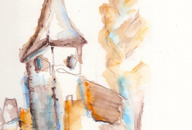
7. Church Step 2: Step two, we activate
that pigment. Think about how you're allowing
the water to flow and how that flow interacts with
where the pigment will go. Also think about
the blending and the magic happening on the
page, but don't overthink. Allow stuff to happen. Grab your brush, a
little bit of water. And let's activate. You can see I'm using my
very big brush again. I'm just being careful to
remember about placing the water where the flow of the water will drag the pigment. That is enabling me to make sure that the pigment stays
within these shapes. That's how I want it for now. But perhaps in the foreground, allowing it to spread more
to suggest that kind of grassy foreground we have
in our reference photo. In other places, I want to
soften the lines even more, so I sort of scrub
them a little bit. And in other places, I want
lots of space and light, so I barely touch in
the water at all. By allowing colors to be
loaded onto the page first, hopefully you can tell
where we've got that blue, it neutralizes and gives us something different,
a different feel, something more murky, like
in these little windows, which suddenly feel a lot bolder than the
rest of the scene. Like that, we are done, ready to move on to the next
stage in the next lesson.
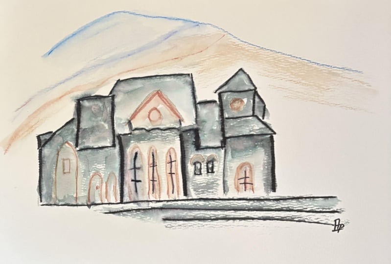
8. Church Step 3: Finally, our wet techniques, the page is still a
little damp in places, dry in other places. We want to maintain that space. We want to create more texture. We want to define that space
with some neat outlines. Don't do too much, less is more and the magic is
already there on the page. Now I'm going to
come straight back in with some more
pencil marks to outline and redefine
the spaces of my page, the shapes of my watercolors. And that helps me just imagine and work out
what else I might want to do. What are the more
abstract or fluid or flowy kind of techniques
I might want to use? Oh, a few edges later, and I start to think, Why not introduce that blue? I liked when it
neutralized things, and perhaps we can just suggest a sky with
some simple splashes. I really want to
encourage you to both experiment and
explore during this phase. Just try things out with the safety blanket of only
having a few colors with you. If you only have two
or three colors, it's very hard to overwork
and overdo things. As long as you keep
in mind that space, as long as you keep in
mind a purpose for each of your marks and how much pigment you're trying to
pop on the page. Remember, as I say, over and over again,
less is more. So when you're getting towards the point where you
think you might be finished or you're
not sure what else to do or else to add to it, pop your signature on the page and take a few
minutes away from it. I'm going to leave mine here, but perhaps in a day or two, I'll come back and think, Ah, there's just one extra
thing I wish I'd done, and I can, but I can't take away anything I do
if I go too far.
9. Abstract waterfall: And now for the more avant
garde version of my project, here I have a hopefully what you'll agree is fun
little waterfall. This is a place I took
a walk to with my wife and my dog one day and we
thought it was very pretty. I took some photos, and
that's exactly the connection I like to make with a scene
I am going to sketch. When I make that connection, it allows me to find the simple shapes with
our dry techniques, activate things and blend and move towards something
more expressive, abstract that
reflects my feelings about the place and
about the process I'm currently going through. So all in one, we'll go through this. I just want this to be
something which inspires you, hopefully, to break out the mold and do
things for yourself, which fit how you would like to create using these
simple techniques and still keeping those colors down and muted and
simple and minimal. Like that, I'm ready to,
well, start getting ready. So I've picked out a few different colors
again, actually, going back to his
initial greens, blues, purply, murky reds. And I'm going to start
by making sure I've got a nice sharp point for my dry techniques and getting
those shapes on the page. Shapes in nature
can be hard to see. So, for example, here, I'll outline the lumps, the areas, the shapes
that I'm seeing. And then I'm repeating those
exact same shapes that I show on my photo onto my page, really simple shapes, turning this whole cliff into
an area of darkness, turning this wadfall into
a simple linear structure. We can look within those complex shapes
and find simple things, things which we can far
more easily understand. There are lots of
things in our scenes which are extremely complicated. These trees are
one such example. There is a mass of them
uncountable numbers. So within our art, especially in sketches, we just need to find a simple
way to represent them. Every media has strengths
and weaknesses. The strengths of pencils in dry form are linear
marks for the trunks, little bits of shading for those more tonal areas of
leaves. Then I'll move on. Notice how we can find colors that represent
within the scene. There's an area of more
warmth in the front. I'll use my warm ready color to map out a little bit
of the shape in there, but as well as thinking
about the shapes. I'm also thinking about how can I load the pigment
onto the page. So all the while all the time, thinking about these concepts, this is exactly how I think, no matter the complexity of the sketch I'm doing,
in the distance, these dark areas, and
in the foreground, some of these dark
areas in the top, some of these dark areas, well, I've now got a pains gray, a very dark pigment that I can, again, load the page with. Remember, space, this pigment will flow around the page
when we activate it. So we don't need our darks to
fully shade in everywhere. We do not need to use
these coloring pencils, where we draw every bit in. No, this is a water
soble medium. So just be loading the page. Just be applying little areas
here, little areas there. Get used to imagining
how the water will flow, activate, and allow
this to come to life. And like that,
we're ready to move on to activating our colors. So I'm going to pick up
my favorite giant brush, but also a bit of tissue, not something we've
talked about before, but that tissue we can use to dry out the
belly of the brush. And I'm going to show you this angle for a little while so that I can show you
exactly why that's useful. Notice how the colours
are flowing around. Now my brush has lots of different pigments on
it, lots of water on. So gradually that mix that
blend becomes more muted. I want to clean my brush off, which is me dipping it off to the left hand
side of the screen. And then I want to
control the amount of water within the brush so I can control the flow by dabbing
it quickly on my tissue. This is something hard to teach. You can't just copy,
but easy to practice. And with practice,
you'll get really confident in that quick rinse, dab and splash, as we'll
call it from now on. And in getting fluent with that, you'll find you're
much more able to control the flow of the
colors around your page, which is vital for creating something which you
feel in control of. Whilst I'm continuing
to activate this first layer and use my
tissue to dry and control it, I also want you to just notice the difference in the two views, if we look zoomed out like this. If we look close in or if we look even
closer from the side. Do you see how the
feel of the paint, the pigment, the
movement all changes? Now, as an artist,
it's very easy to get extremely sucked
into your painting, and you only ever have this
really zoomed in view. And you never get the
space that you need. You never take a step back and look at how
things are really going. I'm mentioning this all
because it's really important, especially when we
are doing something like loose watercolor work or loose watercolor pencil work. Here, we are having to
have a leap of faith. Every bit of art will
have that ugly stage, and this kind of technique
is exactly the same. And it's easy to panic and
try and rush to the finish. But don't rush.
Follow the processes. We've done our dry
stuff, we've activated. And now I'm moving on
in the next step with my wet processes where I can start to
redefine structures, build up the value, blend
the colors where I need to, and make things darker and deeper where I need
to do that, as well. A few minutes ago, I pointed out those areas which were really
dark around the river. I pointed out the structure of the stream being quite a
linear falling down thing, isn't it, naturally,
as a waterfall. Now is the time to
make that clear. It doesn't matter if it wasn't
clear a few minutes ago. As long as the general idea is taking shape as long as those colors are looking interesting, we can now use our wet
techniques to be bolder, to be braver to be
abstract and to make this into a piece of
art that we enjoy creating. And hopefully, if we
enjoy creating it, we'll also enjoy
looking at it after. It's not a guarantee,
though, is it? But that's part of the fun
of the process is the risk, the not knowing exactly
what's going to happen, and yet still as an artist
proceeding, nonetheless. I'm using this final
stage in this painting to quite extensively rescope
out some of the shapes. The more complicated a
scene that you embark on, the more softened the colors will be in your
activation phase, and the longer this
tertiary final phase of the painting process will be. It's again, really
important that you continue with a key
process in mind. You're not just scribbling
and filling the page. We want that space. So
I'm being careful here to just occasionally
take a step back and make sure I'm
not going too far. Make sure that there's
still white paper, I can see through the page
so that it's not just busy, overworked and over full. Allowing splashes,
allowing the flow, allowing the
different blending of colors to work together also keeps things a bit
loose and unexpected, and that gives me a
little more inspiration and motivation to
keep working and stops me blaming
myself if everything feels a bit like it's going wrong, which
sometimes it can. The main focus, the main
point of focus that I have at this phase is building
value and structure. So notice how I keep
coming back into the areas which in the photo
appear to be the dark. Around the river,
around the stream, underneath these
little overhanging cliffs areas of grass. That's where I see the darkness. So that's where
I'm coming back in building value with these layered pigments.
Equally the foreground. It wants to stand
proud and be at the front and to stand
proud and be at the front. Otter needs to be darker. Before I put my signature on cause I'm not sure if there's
anything else I want. But that little moment allows
me to take some space, take a step back and keep going
just a little bit longer. I needed that mental
break, that mental shift. Yeah, this is almost finished. And deciding that allowed me to see what I could do extra, what I could do
without going too far. And for me, I just felt, isn't that more interesting,
adding a few extra lines, a few more trees, a
little bit more chaos, a little bit more darkness, a little bit more interesting. But it's always important to eventually step away
before you go too far. And I can still add to
this in a day or two. I can still come back, or I
can just look at it and be happy that I finished it
when I feel I should.
10. The most important bit!: We are there, well done. Thank you so much
for joining in. I hope that what
you've taken from this is that with really
simple steps, you can actually build up drama, fun, complexity, clarity. Minimalism doesn't actually
mean uncomplex to look at, but it keeps the process
from overwhelming us. Please take a photo
of your project or project and upload them into
the class resources gallery. I would love to see them
there. Please leave a review. If you've enjoyed this,
let me know your thoughts, ask any questions in the
discussion, Fred, below. If you want to
find me elsewhere, you can find me on
Sketchloos dot code at UK, where I have some really in depth courses all
about my style.
 Toby Haseler, Urban Sketcher, Continuous Lines