Transcripts
1. Introduction: Welcome into the adventure where we will go into the woods and explore the gah paint in a creative and inspiring way. My name is Anya.
I'm an Illustrator, and I love to explore
different techniques, and I often use ga in my art. If you would like to
learn how to paint with gah in a very creative
and expressive way, then I invite you to this class. In this class, we will see and explore a lot of fun, easy, and quick tools that will help
you to explore this medium and overcome the
fear of painting with ash in a fun
and creative way. We will explore this paint. We will do a lot of exercises that will
explore both techniques, colors, and to composition. In the end, we will
use all those tools to create a final illustration
inspired by Woodlands. I hope you feel inspired. Let's jump into the class, and in the next lesson, I will show you
exactly the steps and the classes project.
2. Tools & Class Project: For the final project, we will paint an
illustration with ah and some of the mixed media, and the illustration will be inspired by the
woodlands scenery, by the nature and forest. Here are the steps that we will take in the class and
the tools that we will. First, we will see what the Ga is and its
main properties. Then we will do
simple exercises that will explore the paint and
teach you how to paint, for example, in layers, wet on wet technique, how to paint in a very
expressive, intuitive way, and those exercises are meant to overcome the fear
of painting with guash. And also we explore the techniques that we will
use in the final project. Then we will search for an
inspiration for our painting both for the colors
and for the theme. Then we will see how
to work with color, how to create effective
color palette, and how to use color in a way
that is both coherent and varied We will see the tools that will help to
paint trees in a fun, modern and stylized way. I will show you
also simple tools to create simple compositions. Then we will gather all the tools and paint
the final illustration. Again, it will be a
forest woodland scene. I cannot wait to see
what you will create. So be sure to share
your project within the project gallery and show to all of us your
beautiful illustration. Let's get started.
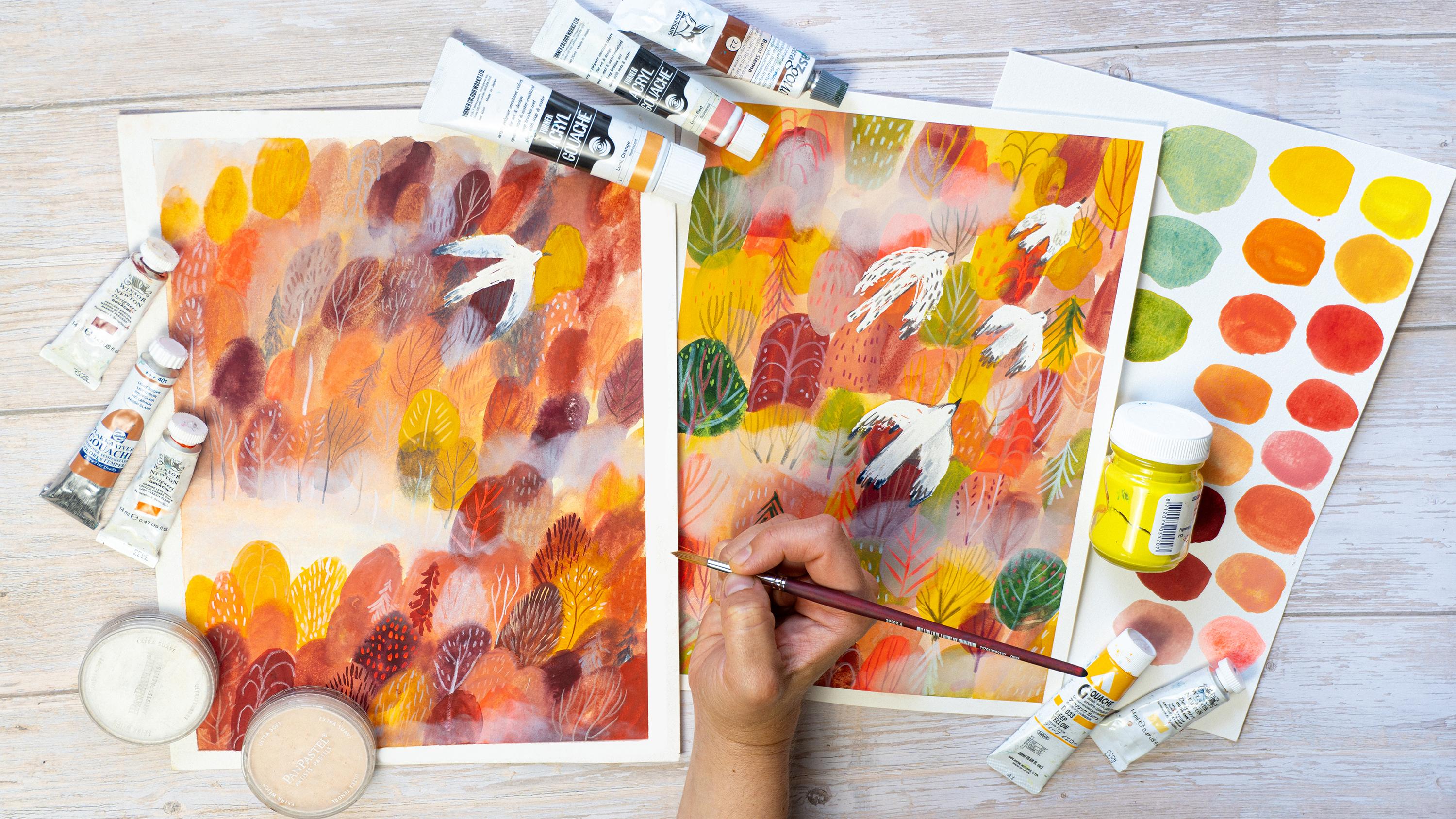
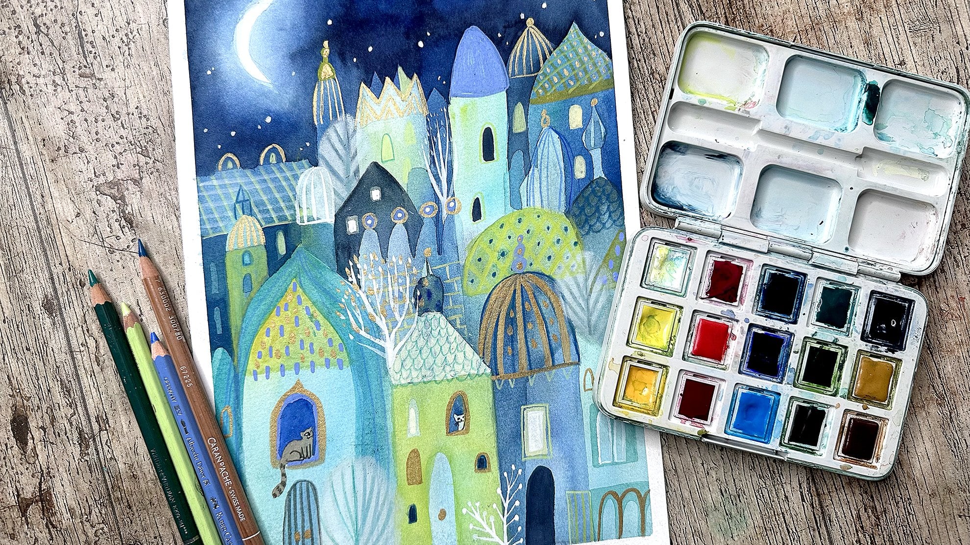
3. Art Supplies: Let's walk briefly through the art materials that will
be needed for this class. So obviously, we will use ga. I will explain the kind of different that you can
find in the next lesson. So if you're new to
ga and you don't know what kind of medium is, I invite you to the next lesson. And if we will use also
the colored pencils, they are not necessary. You can do all the
project with guash, but if you have
pencils and would like to draw smaller tiny
details with them, then would recommend to grab
the ones that are more oily, waxy, the ones that will work
good for the mixed media. It means that they will draw over the gash color
without any problem. They will cover it well. So, for example, you
can use sir wind, light as, or watercolor, pencils, or you can test which one will
work best for you. As for the palette, you can use different kind. I have this simple palette that I usually use to
work with gashes. I will use several colors, so I don't need
extended palette. Good tip is to use
plastic packaging object, so it's also a good
idea to recycle. Something that you could use, for example, as a color palette. As for the brushes, I would recommend synthetic
watercolor brushes, synthetics will work better because they are a little bit
harder than natural ones, and they will go for. They will work with
Gach in a better way. You can work only with a
round a brushes if you want, then I would recommend
to take one medium and one large size because we
won't get into tiny details. And also if you have a good tip, then you can use also the
big brush for your details, otherwise, use tiny for your
brush for your details. Also, you can experiment different forms and
shapes of your tips. For example, I have those two, the angled brush,
and the other one, I don't know its name, but I use it often to
paint leaf patterns. So if you have some
different kind of brushes, and you would like to
experiment to paint with them, to paint trees, then go for it. I will use also masking
fluid for the final project. It's up to you. You can skip it. You don't have to use it. I will use it to
mask the bird shape, but you can do it in a
different way, for example, you could use wash to paint
over to paint a bird. So it's up to you. Another
thing that is something extra, you don't have to use it, but if you have you
can try it out. Those are the precise erasers, which means that you can
erase tiny strokes with them. They are usually in
form of pencils, so if you have them, you
can try them as well. Another thing that
we will use in my bonus part, Pam pastels. Those are pastels in
this rounded solid form, but it's basically pastel, and I really love to use it. So if you have it, if you want to give it a try to the effect that I want
to achieve with them, then I think it's a cool thing
to do it in this lesson. Last but not least papers. So basically, ah is more
forgivable than watercolor. So if you want to
use a lot of water, you could use mixed media or a good quality drawing paper. For example, this fabriano
academia paper is suitable also for
water soluble mediums. So I will use it especially for the exercises to warm
up and to paint trees, the first lessons before
jumping into the final project. You don't have to use
anything expensive or fancy. But basically, final project
will use more water. So if you have watercolor
paper that it will be better, I will use arches, hot press. It means that it's smooth. It has a smooth surface. It doesn't have texture, but it's up to you.
What do you prefer? If you prefer cold
press then go for it. And if you don't have
watercolor paper, then anyway, any cheaper mixed media paper, but it should be at
these 200 grams, should be a little bit thicker, should work as well. And also, I will
use a color paper, but it's okay also to use simple copy paper to cut
out shapes and forms. And I will do it just to understand better
the composition that I would like to create, I will cut out birds
and make a composition. So it's a step that
you can skip as well, or if you want to
try it because it's also useful tool to
make your composition, then just grab some piece
of paper and your scissors. Okay, so that's it. I'm very happy to
jump with you into the other lessons where we will paint and
to the next lesson, we will see better
what the guash is.
4. What Is Gouache: If you're new to guage, then let me explain you briefly, what is this medium? Basically ga, you
can often here, which is basically more or less true that they're like
opaque watercolors. It means that they are
water soluble and they are water and mediums that
works like watercolors, but they have high coverage. They are opaque. And if you use them
as a dense medium without much water,
it's really opaque. And more you dilute it, the more it will be
similar to watercolors. There are some differences. For example, watercolors
usually have this kind of pigmentation and are
more unpredictable. Whereas, guash, usually,
if you water them down, they are like monochrome, plane. They give the monochrome
plane wash of color. And yeah, they cover really
well if they are dense. You can find two
different kinds nowadays. The traditional gah which it means that you can
paint layers with them, but you have to be
careful because they reactivate with water. So this is the difficulty that it's the same for water colors. Whilst there are
also acrylic ah. You can find acrylic ah. It means that they have
acrylic medium inside. Acrylic basically is
a transparent plastic in which you add pigments. Here is something which is not full acrylic at not full gash. Basically, acrylic
makes your color solid and the color won't
reactivate with water. So they're good for layering, and also on the
contrary to acrylics, they are they don't have p lasticy surface and
a dry opaque and flat, which is usually the
thing that we love in ah. If someone doesn't
like acrylics, but wants the same quality
of acrylic paints, then this is a good solution. The last thing that I wanted
to tell you is to look at kind of the coverage
that each Gach has. For example, you can
find those squares. Basically on each tube, it's the same for acrylics, the same for watercolors. If you saw this and didn't
ask yourself what it means. Then this this rectangle means
how opaque the color is. So for example,
full square means that the opacity is maximum. So it's very opaque, and it covers really well. For example, here,
there is half full, half white, black, half white. So it means that the
opacity is 50 50. So it's semi opaque. You can find, for example, also, this kind of square, and it means that it's
semi translucent. And the last let's say, great, which I'm not sure if
W has this kind of opacity would be the rectangle
without anything inside, and it would say that
it's fully translucent. So it depends on what kind of effect you would
like to achieve. I don't really notice
this kind of thing, and they are not
fundamental for me. But if you want, for example, If you would like
to have a piece of art that is really opaque, then be mindful that
with some colors, you won't be able to create a full opaque swatch of color. We will continue
to explore Gach. So in the next lesson, we will test the Gach qualities.
5. A Bit of Gouache Theory: For this exercise, prepare three or four different colors, and it would be good to have
different kinds of opacity. Look at your tubes or containers of Gach and see if you
can find the opacity. In this way, you can test
different effects with different kind of transparency
of g. Let's get started. Finally, the moment of
testing the gauche arrived. So let's dip our brushes into
the gauche into the color, and let's start to explore it. Before we will dive into
the full playing mood, just a little bit of theory, but without stressing
out, also here, you can just have this kind of thought inside your
head of curiosity. Without thinking of outcome
of to see how guash works, just take your brush, take your gah in water
and play with it, see what happens if you
apply a dense color. What will happen if you will add water to it? You
know what I mean. Just keep in mind
this playful spirit. For example, here I'm doing it, I'm just playing with
the brush and water, testing dense gash, testing more translucent
guash, this is it. As for the theory, If you remember in
the previous lesson, I told you about
different opacity, different kind of transparency. Maybe it's better to say
transparency of the color, so I will test it. Here I'm testing magenta,
and This packaging. I didn't find the sign, the symbol of transparency. So I wasn't sure. I wanted to test it.
It's quite translucent. You can probably
see the strokes of the brush in the left square. So it seems that
it's not so opaque. It's more translucent color. Here, instead, I wanted to test the full opacity the gah with
the symbol of full opacity. So it means that this color
should cover really well. It should be really opaque, not translucent
color. Let's test it. This is kind of a violet maroon. The first one was magenta. And yeah. Well, I probably you shouldn't follow me by picking the color
directly from the tube. Maybe it's not the best thing, but I often do that. So the best way should be to squeeze a little
quantity of color in your palette and adding water. In this way, you will understand mixes of color with water. Here I did this. I put water with a
color into the palette. This is more translucent,
transparent swatch, but because I added more water, in this case, it's
more like water color. The last color is this yellow
from Windsor and Newton, and it's semi opaque. I was curious, what's the difference and what
is semi opaque color? To be honest, this is
what I was talking about to test that we always
learn, something new. I knew about this story about transparency, especially
in watercolors. I knew that also wash
have the symbols, but I didn't really put
much of thought into it. And instead, by
doing this exercise, I thought that it's really useful to know it
because, you know, sometimes you just want to
achieve a specific effect, and you have to know
the paint that you use. If you want to paint
really flat opaque colors, then probably with this magenta, I would be frustrated because I couldn't achieve
flat opaque color. So it's good to know
this kind of stuff. So I realized this
by doing this class. So yeah, we are learning
every step of the way, and sometimes it's
good to do something to know beforehand the
medium that that you use. So those are the swatches
that I prepared. And I will try to show you closer the swatches
to see the opacity. Maybe it's not so visible. This magena is more transducent. You can probably see the paper showing through
the brush strokes. This maroon is much more opaque, and the yellow gives
more flat swatch, but it's semi opaque. Probably it's about how the color works also on the
top of the other colors. Let's test also the layering. So as I told you in
the previous lesson, gases are water soluble, and the gases that
are not acrylic colors will reactivate
with color. So as you can see, here, I painted with yellow over
on the top of the magenta. And by using water, big quantity of water, so it's quite diluted
color, the yellow color. I reactivated the color
that is beneath it. Basically, there
are several rules that you should be aware of when you are layering
colors with guh. First, be sure that the
color beneath is dry. Then second is that the color that you paint on
the top must be really dense. Use a a little
water as possible. In this way, you won't
reactivate the color underneath. And the second and the
third rule would be to use as little brush
strokes as possible. It also will protect the color not to mix the color
that is underneath. So you should probably
be quite de side, use a neat and danse
brush strokes. So I continue to paint
with yellow color. I'm making it dance every
time it's more dense, not sure why it gives this
effect of repeled color, not sure why it happened. Right now I'm testing the yellow color above
the maroon color, and as you can see, yellow, it remains semi translucent. When I painted on the yellow
color over the white paper, maybe it wasn't so visible. But now you can see why
the yellow is semi opaque. This is also why it is useful to know the
transparency of your color. With this yellow, I
won't be able to achieve really flat and opaque layer. Test your colors. Remember about the rules, and if you are not
able to layer it, then don't be frustrated, not yet and not ever really. But we will play with Guash in the other lesson and right now, just test it, but
don't be stressed out. Let me know in the project
about your discoveries, if you have any
questions or doubts. As well, you can reach out to
us to me in the discussion. And I'm curious about your own thoughts about
Gach and layering. Maybe you have more
experience than me. I'm using Gach in more
explorative mixed media way. It's not my unique medium. If you already know me, then I really used
a lot of mediums. So it's always something
new to discover. All right. So that's it. Again, let me know in your
project, in your comments, if you want to share with us
your exploration of Guash, and this is the final outcome
of this quick exercise, and in the next lesson, we will continue to
explore Gua maybe with more playful way and try
to warm up our hands. So see you there.
6. Play With Gouache Part 1: Win this lesson, we
will start to warm up our hands and
play with guash. We will try to paint techniques that we will
use for the final project. But we will explore
them in a playful mode. Doesn't mean that we
will do kids stuff, but I think that we often block ourselves because we want immediately have excellent
capacity of using a medium. We want to see results
and beautiful outcome. But let's do one step at a time. And to do that, just
relax and play. So prepare your paper, your color, and brush,
and also water. And with those ingredients, let's start to play. So You can start by swatching
out diluted swatches, by switching out dense
swatches, it's up to you. For example, here, I'm trying to see what will happen if I will
use guash as watercolors. Also, in this lesson, I will start to explore more the techniques that I will apply in the final project. We will use in the most time very diluted and watery
washes of guash. And sometimes we will
use more opaque guash, especially when we
will do layering. So what is most important
is to try to have loose hand and try to play with Guash
as much as possible. But right now let's
not think about it. Right now, let's focus on enjoying exploring the gh paint. So what will happen if
I will land to colors, use a little bit of wet on wet technique or if I will
paint with more dense color. What will happen if I will paint on the color while
it's still wet? And while it will
dry, for example, above on the right, I painted two colors, first, yellow one
and the red one, and the yellow one was wet
when I painted the red, so they blended into each other. So you can start with this more watery swatches and play around by
diluting your color more. You can also paint
different shapes. Since for the final project, we will paint simplified shapes of the tree so you can start to think about it right now
and get used your hand to those shapes paint circles, or maybe ovals or some other shapes that you
would like to use as trees, or just any kind of
geometrical shapes. You can also start to
paint with flayers. So paint on the top
of the other swashes. For example, even
if it's still wet, see what will happen, how
the color will blend. What will happen if
the color is very wet, when it's not so wet, when it's dried, when you
use very diluted color. So, play around and try to be mindful also
of what's happening. And in this way, you will learn and get used to use squash more and more and
see what you can discover. Continue to paint
rounded shapes. I'm trying to paint something that could be already
a tree forrest. So you can play with that
as well or just continue in your own way by painting whatever shapes
come to your mind. So play with
different densities, play with different
shapes and forms and with layering and start to get
into this kind of process. So it doesn't have to be
anything big or time consuming. Every exercise is meaningful. So I hope you enjoyed
it that it helped you to unlock yourself
a little bit, and in the next lesson,
we will proceed. So see you there. Oh.
7. Play With Gouache Part 2: Welcome to the final
exercise lesson where we will paint a
textured background, the one that we will use
also for the final project. This kind of exercise
and painting with guash will help you
to be more lose, loosen up your hand
losing up your style, lose a little bit of control, but at the same time, get more confident with wash. So before jumping up
into the final project, it's good to warm up yourself and do this kind
of exercise separately. Obviously, if you will be
happy with your outcome, you can, then use it
for your final project. But right now, let's see
what we are doing here. So there are not
many rules here. I would like you to explore paint different densities
and try to lose the control. But the things that will be helpful for you in this process, are those following steps. So work with gouache
like with water color. It means that use it
with very diluted, watery washes, and then paint
from light to dark colors. So first layers use
lighter colors and for the further layers
use darker colors. And also work from
diluted to dense. So for the first layers, use, really watery wash, and while you will
build up the layers, then use the dense color. So what we are doing here, I'm trying to imagine that I'm painting a base for
the forest scene. So I'm trying to do a
textured background where I already give impressions of impression of trees
of shapes of trees. So as you can see, right now, this is
the second layer. I'm painting the round
oval shapes with wet on the wet background with more dense and
more dark color. And I already can imagine
that it can be a forest seen. And if you cannot,
then don't worry. It's the process of layering. So at the beginning, it's
you create a whole mess. And that's okay. That's what I want you to do. Try to do some mess. Try to lose the control. So don't worry
about the outcome. This is the exercise sheet. Play around paint tree shapes with wet on wet technique,
try to be quick. In order to do the wet on wet technique, you
have to be quick. And I ask you to do this on
purpose because in this way, you won't overthink it. I want you to play. And yeah, as you can see, I change, also, so use
the colors that you want. And try to paint your
imaginary forest. This exercise is
for you to explore without stress of the
of the final outcome. Also, when you lose control, you can discover things that
you wouldn't discover if you would try to plant things and do things
in a controlled way. And often those are
very nice surprise, and you can discover some things that you can
apply later on to your style. And it happens only
when you are quick, when you don't over think, and when you just
explore your painting. So have fun. Again, if
you like your results, then you can use it for
your final project, otherwise, we will do the same process for
the final project. And in the next lesson, we will see how to build
an easy color palette. See you there.
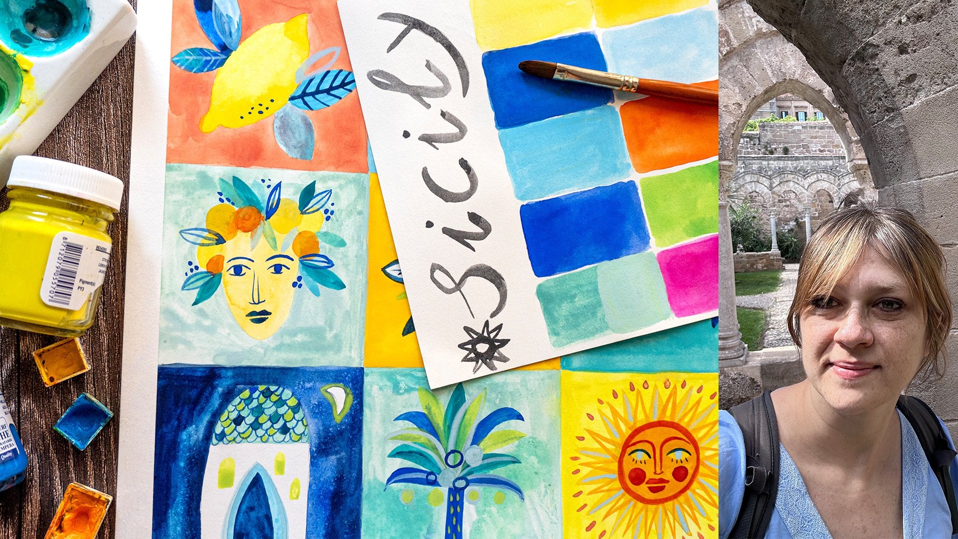
8. Inspiration Source: My evergreen inspiration are
always nature trees, forest. That's why I propose this
for this classes theme. Obviously, feel free to explore whatever
topic you prefer. But nevertheless, I will show you how I am searching
for an inspiration. So first, my own photos. I'll show you the photos that inspired me for this project. I made them in
Italy where I live. A couple of years ago. I was in this beautiful
place. It was Autumn. And also right now when I'm
doing this class is Autumn. And that's my favorite
season as well. That's why I will paint Autumn, because of the colors,
because I love this season. I was inspired by this scenery. I was in high rock
mountain, let's say, and hill, and I had this view
over the trees from above. And that's why I decided to use this as a
source of inspiration. Also, if you can see the clouds, the fog is something that
really evokes emotions in me. That's why I will also try to represent it in my
illustration as well. The other source of inspiration, something that I often very often propose to do in my classes is to create
your own moodboard. So I created the moodboard
in the pinterest, where I also pint a lot of similar photos of
the forest woodlands from above, obviously
autumn colors. So I will look at them
both for the colors, but also for the shapes of the trees because there
are so many of them, and in the In the other lesson, I will show you how
you can explore this kind of inspiration,
shapes of trees. But you don't have to
always use your head. Go to the reference. What I would only encourage you to do is to use
the photo references, not to be too much inspired and influenced by other
artists or illustrators, just in order to seek for your own style and
your own inspiration. So I will leave you the link to the smooth board, otherwise, create your own moodboard, see what you would like to grow. Are those forest trees from above or maybe
some other layout, some other point of view. Don't have to do it from above. You could do it just a
simple forest sample, straight ahead point of view. It's up to you. Have fun, feel inspired by
whatever you want, by whatever season you
want to and have fun.
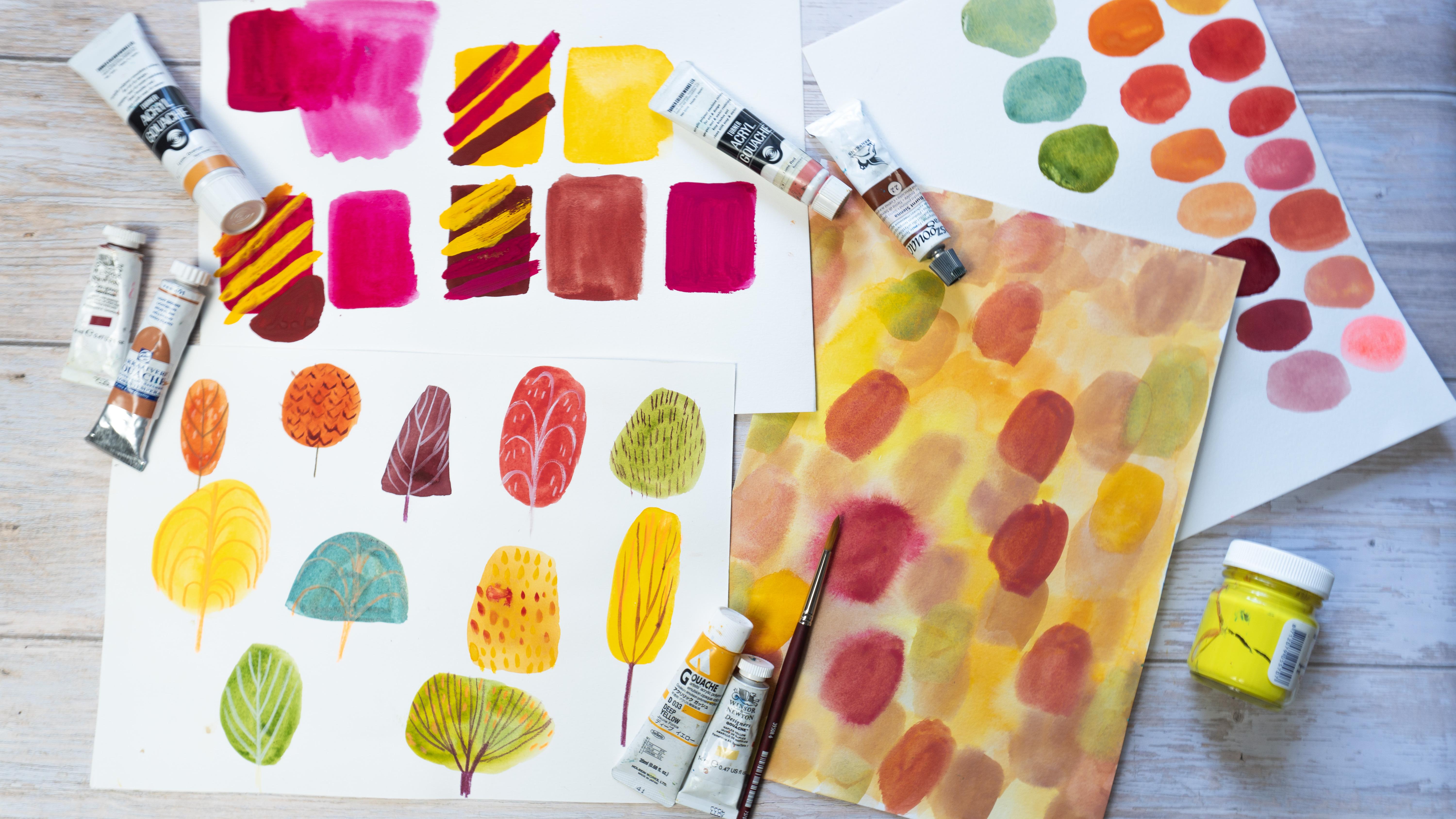
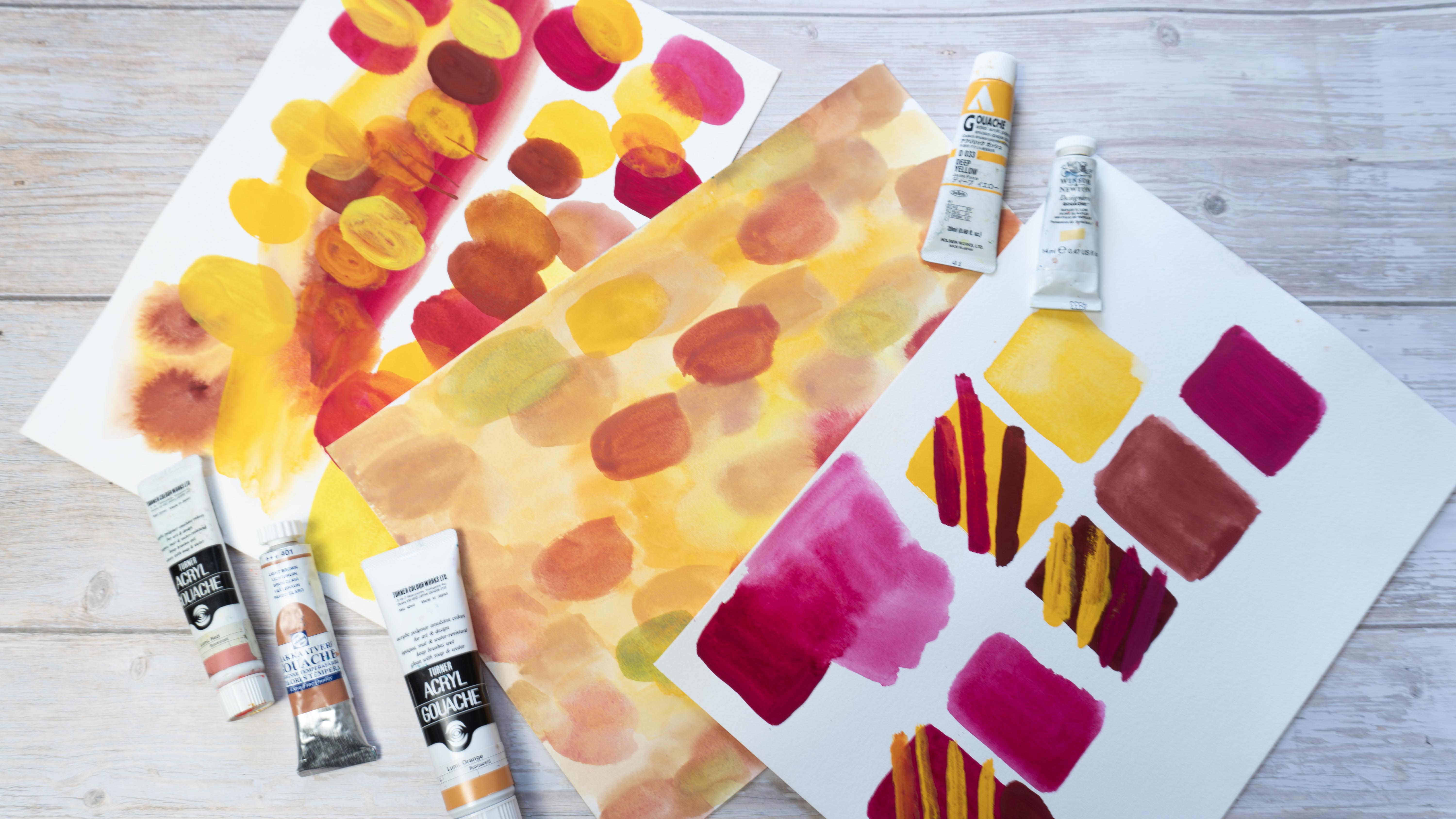
9. Quick Color Palette: If you want to build your
color palette from scratch, if you don't have
a lot of colors, and maybe you're not
sure what colors to use, and I will show you a
simple way on how to create very simple color
palette from basic colors. I will use basic colors and
I will mix them together. Since I will work on autumn
theme Autumn forest, I will use warm
colors for my forest, and now it's up to
you if you want to paint maybe spring colors, then obviously you would
like to use other colors. But the rule to apply
will be the same. So pick up your basic colors
that you want to use. Three, four, let's
say maximum five, just to stay simple and quick and prepare them
in your color palette. So I'm adding a little bit
of water into each color. And I will use two
kinds of yellow, cool yellow, and warm
yellow, and also magenta, and the parle violet, the kind of my room that
I used for the exercises. When I'm ready, I
will switch out all the colors from my palette, and I can also start to mix them one with another. You can proceed by painting
each color with each color. There's no rule here. Just do it with your own system. But try to create different
mixes of your basic colors. Oh, I forgot that
I also have white. Sorry. You can also add
white for your washes. It's a good solution
for translucent colors. Let's say that you
would like to have yellow that is more opaque
and not so translucent. Then to your semi opaque
translucent color at a little bit
tiny bit of white, and it will make your
color more opaque. It will be lighter, of
course, by adding white. Also, it will be more opaque. So sometimes it works good. Since I'm running out
of space in my palette, I'm taking the Other palettes, as I told you in art
supplies lessons, I often like to recycle different packaging that
I have at home different. Plastic surfaces,
works really fine. And since I wanted to paint create bigger quantity of the color that I like
for my final project. So let's say I like this kind
of orange that I created. I want to create an abundant quantity of this
color for my final project, so I won't run out of it. I could do that in my palette, but my palette is too small, so that's why I'm using my
extra recycled palette. It's also good for Gach because you don't have to use this color right away
if it's not acrylic ga. If it's traditional gah, then you can also do this in order to use your
color later on. You don't have to
use it right away. You can keep your palette and reactivate it
with water later on. It's also a, let's say
thing to do with ga. If you like some kind of color, you can create a
separate container with this color and
use it in the future, even in amounts of time. It will be dry, but
if you will cover it, protect it from dust and you can reactivate it with water
whenever you want. I proceed with
creating my tones and hues of warm colors And since I'm a big
fan of flu colors, I will add my my red color into my palette to make little spots into
my illustration. If you like fluor colors then feel invited to
use them as well, depending on what kind
of palette you create. Maybe it's not so visible
in the video, but, it's really flu very
bold striking color. I decided to add greens
as well to my palette. What I did is that I use the
yellows that I already have, and I add ultramarine color
with different proportions. Sometimes I will use more
blue, sometimes more yellow. If you will add orange
or maroon to it, then it will be more dull and not so vibrant,
so it's up to you. Again, I can create diferente, different hues of yellow. As you can see with
this technique with several colors
by adding white, by mixing all the
colors together. You can already have simple
and lovely color palette. Let's keep it simple. Let's keep it Pam. And I cannot wait
to see what kind of palette did you create
or what kind of season? Is it Autumn as
well, maybe winter, may be summer, or spring greens? There are many possibilities. I will stop here. So see
you in the next lesson, we will paint
different trees and start to imagine our
forest. So see you there.
10. Tree Shapes: Trees, shapes of trees, forms of trees, how
to paint trees. So if you're taking this class, then I'm guessing that you probably don't want to
paint to realistic forms and shapes and to
realistic trees because I want to show you how to
paint more simplified forms, how to paint with more
stylized kind of illustration. So in this exercise, I want you to start from
building the forms, the shapes of trees before
painting the details. And to do that. We will paint
just geometrical shapes. Use your wash. In this case, you can be more diluted
or dense, it's up to you. And think of the shapes that comes to your mind
when you think of trees. It could be oval. It could be circle. For example, I painted
the triangle as well. You can paint half circle, Maybe also a square, why not? You interpretation
to continue to paint the geometrical shapes, and then we will jump into
painting the branches. Now let's paint or draw
details, branches, trunks. If you already took my class
classes, if you know me, then you know that
I really explored the theme of trees really well, and I painted a lot. But I always like to
challenge myself to change, to find new ways. Those simplified trees, really those geometrical shapes are something that I like
to do right now. So if you want to follow
this kind of style, then go for it and explore
different mediums. For example, you could try different brushes to see
different brush strokes. So right now I'm
using angled brush or maybe this one is more
like a dagger brush. I use it often to paint
leafy grassy textures. You explore your brushes, see what different shapes and lines you can paint with them. If you have some other
brushes then round brushes, then try them out. If you have only round brush, then see what you
can do with it. For example, later on, I will show you how you
can make leave shapes with just pushing the tip
of the round tiny brush. This is how you can
use around brush to paint leaves with
a tip tip shape. I also have this strange brush, seems like a bird's
tail and I use it to paint bushes leaves. Now I'm jumping into
pencils, colored pencils. Remember to use more
greasy, more waxy, pencils, they will
cover your gash. As for the inspiration, look at the photos of the trees. Explore different shapes
of the tree crowns, of trunks of branches. And most of all, have fun, explore new ways of drawing. Don't be afraid,
paint as many trees, shapes as you want until
you're happy and satisfied. I cannot wait to see
what you created, so if you want to share your trees in your
project as well. Let's jump to the next
lesson where we will finally start our
final illustration.
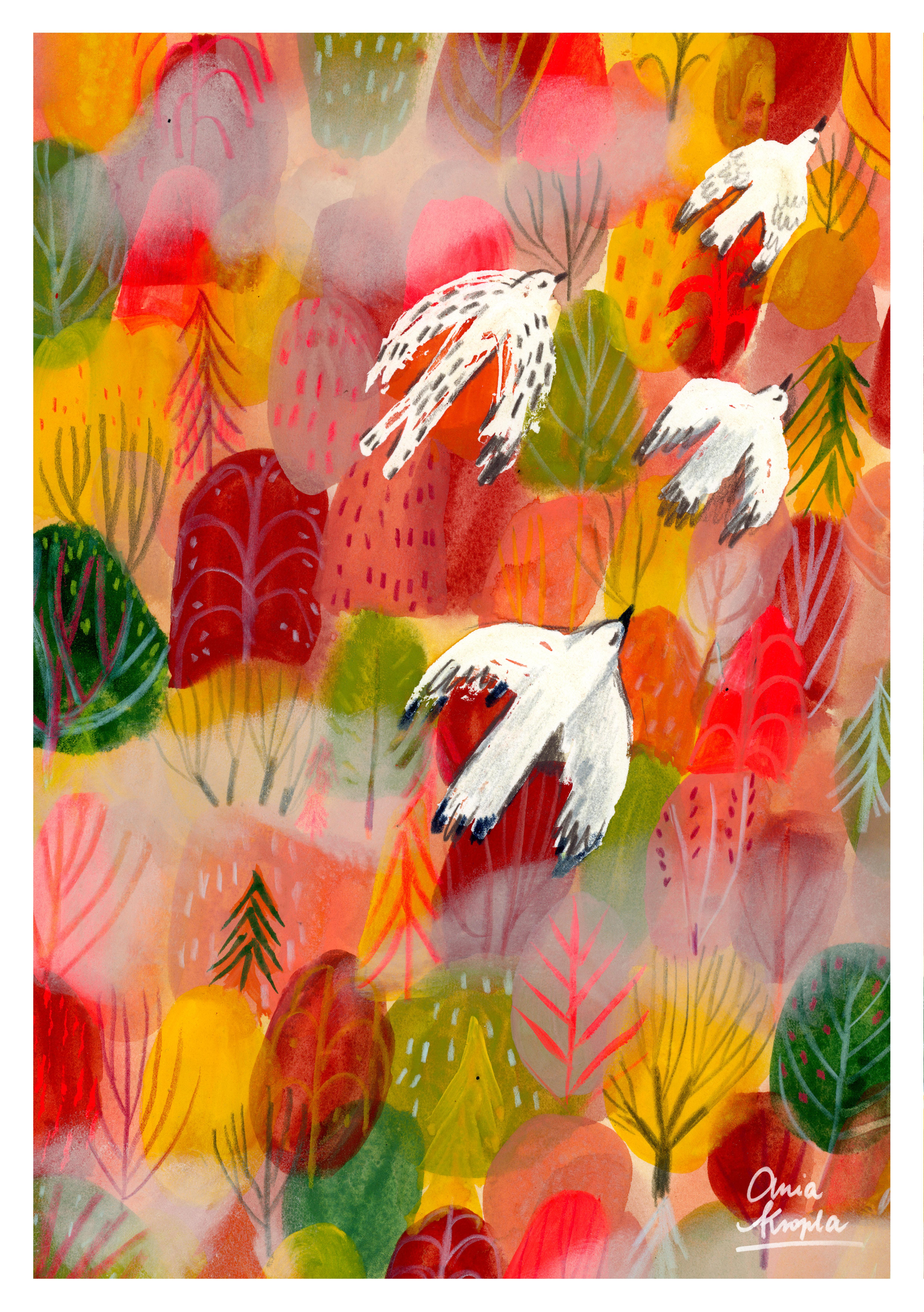
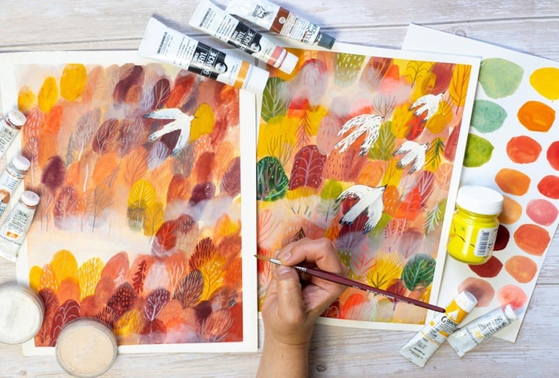
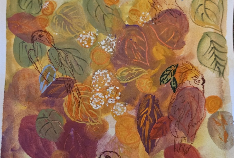
11. Final Project: Now that we have all
our exercises done. We did all the gah warm ups. We painted trees, we painted our background texture
and created our palette. Gather your things and think of your final illustration of
your colors of the trees, and let's jump in. First, let's think
about composition. So think about what elements you would like to add
to your illustration. If you want to paint
forest, as me, if you want to paint some
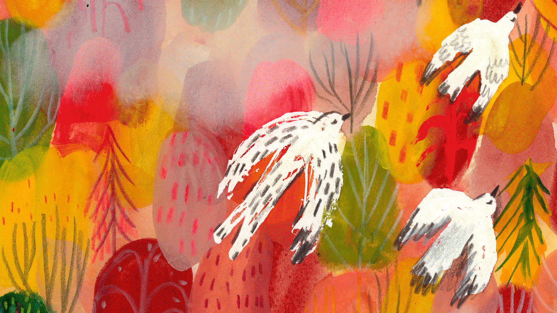
other animals than birds. And I will paint a forest from the bird view and
the birds that are flying over small I mean, faraway trees from above. So I will paint I will draw
different size of birds, and then I will cut them
out and in this way, see different layouts, play
with different compositions. It's useful tip, but you can
also just do small swatches, several swatches, sketches where you will paint
different compositions. It's up to you. I will finish to
cut out my birds, and then I will do some
testing of different layouts. This method of creating a composition can be useful
for a couple of reasons. One is that you don't have to draw many times
your composition. You just have your
birds and play as much as you want until you're
happy with the layout. The second one is that I will work also with
masking fluid. In this way, I will know where I will have to precisely
apply my masking fluid. So if you're new
to masking fluid, I have a separate
class about it. So be sure to look at it if you don't
know how to apply it. What kind of medium is it? I explained everything
in the class. So basically, it works. Usually It goes
with watercolors, but it also works really fine with Gach since
Gach is like watercolor. You can use it with
different mediums. Anyway. So right now I'm
applying it under the shapes where I placed
the shapes of the trees. And I'm applying it
with a silicon brush. I don't do it directly
from the bottle because it has some issues
and it's too fluid. I think it's also
a little bit old and I wasn't able to apply
directly from the bottle. Another tip would be you could apply it with
silicon brush, but anyway, it's everything it's also in the other clash
about masculine fluid. The other tip would be
for you if you don't have skin fluid or you don't
want to apply it, mask your forms and shapes. You can also paint
directly over the trees. For example, I could
paint with white quash over my trees because ash can
cover the layers beneath. And since I want my
birds to be white, I could do it both ways. It's up to you if
you want to use masking fluid. I like to use it. I like to create
textures with it, so that's why I
decided to use it. All right. Once it's dry, as you can see, it's dry, when I touch it, it's a little bit tacky and seems to be
like a rubber gum, and it's important that it has to be dry before
you will paint over it, otherwise, you can
ruin your paper. And now we can jump to create
our background texture. So the same thing that we
did in the last exercise. Again, if you're happy
with the outcome and you would like to
proceed with the exercise, go for it, I will do
it once more time. So to repeat briefly
the process, use wet on wet technique and start with light
and diluted washes and build up your illustration with more dense and
more dark colors. I paint also the
shapes of the trees. I will do more or
less the same thing that I did for the exercise. Think about the
shapes of your trees. You can start to suggest the forms already
in the background. T also the composition
if you want big trees, small trees, this kind of stuff. I will speed up the process. O. As you can see, I already have several
layers, a couple of layers, and I'm painting
the third layer, so my trees are der and
color is more dese. I have the exercise with
the trees on my right side, I see different shapes and I
choose the one that I like. I will also introduce
new colors. I will introduce
green color since I didn't do this for exercise, but I don't want it to
be only orange and red, even if it's autumn a forest, but still a little bit of green will give a
lovely contrast. It won't be to too
boring as a palette. I also will alternate
shapes of the trees. We'll add some triangles,
maybe half circles, I will play with forms and shapes of the trees
as well and continue to paint new layers of trees. Do we have limited
palette right, but also we have
a lot of colors. My good tip for you how to paint different
colors in your art is to distribute them in equal
way all over your artwork. For example, when I use
this olive green eye painted trees more or less in all the places of the forest, then I switch to under
color and place it more or less in equal distance
in all over the artwork. In this way, the viewer will see different colors
distributed equally, and it will help the eye
of the viewer you know, not to be guided in just the one direction
of your artwork. And it also helps in the harmony of your color
palette in your artwork. Maybe you ask yourself, at what point you should stop. Well, there is no really
good answer here. It's up to you. It depends on what kind of artist are you. If you like more clean art and
like to have clear spaces, then obviously, you can do
some art that is really different from this from
this messy surrounding. Or if you have something
like maybe I have, which is horror Vaki, it means that You don't really like empty spaces in your art. So it's really personal, and there are no right
or wrongs, really. So I continue to add elements. So this is a good thing
about wash that in the end, you can continue to build up
those layers to paint over what you already have
and in this way. I think it's a little stressful, maybe than water colors. Anyway, I add pine trees because I thought
to vary a little bit the shapes of trees which are basically all round shaped. So I already ask you if
you like fluor colors. I use it quite a lot
in my art quite often. Even if you have to be aware that it doesn't show if you
want to scan it and print it. So it will become flat
color, not flu color. It's only visible in real life. So for example, you
can see also here. It's really difficult to see. It's real hue. It's how it really is. So this is flue My red of turner, acrylic ah, and I will
just paint tiny details. If you never used fluor colors, maybe you can try it. I mean, if it's definitely
not your thing, then skip it, but if you never
tried it and you have some luer colors in your home, you can see and test maybe
it will work for you. It adds just a little
bit of sparks. Also, I heard that flu colors
are not really light fast. So it's good to put some UV varnish over to
protect it from light. Otherwise, the color the
fluor color can disappear. Apparently, it's not so good
and it disappears in time. So probably I will apply UV varnish after I
finish this piece. Oh Finally, I decided that I
will call it done, and I start to paint details. So I start with guash. I will test different
brush strokes as I did for the trees exercise. And also here, good tip is to use the same color for different
parts of your drawing, for example, if right now, I started with my flu color. So I will pick several trees in
different places of my drawing in this way, it will all be
harmonious and it will result both varied
and harmonious. I will vary also the
shapes of branches. I will continue in this way. I will swatch different colors, I will paint with
different colors, and I will vary the shapes
of the branches and trunks. I will also paint
colored pencils. And I will try to
as as possible. The kinds of trees and branches. As for the colors of details, I will use the same ash palette that I use for the base forms, and the same for the pencils. I will use the same
family of colors. So greens, oranges, reds, Also, I will use brighter
colors, lighter colors, white, creamy white to brighten up
a little bit the colors, but if you will use
the same colors as for the shapes of the trees, the art will be more harmonious. But remember not to
use the same color on the top of the same colors. So you can play with contrast. For example, I don't know lighter color
over the darker color, red over the yellow, et cetera. In this way, it will be
varied and colorful, but at the same time harmonious. Also here, it's up to
your personal taste, how many details
you want to paint, if you want to do
less then do less. If you want to fill
up all the page, then go for it. But it's really tricky not to
overwork your illustration. I think it comes with time, but it's also something personal
and it's personal taste. So it's time to remove
the masking fluid. I think I finished
to paint and draw, and my birds are
almost disappeared. And I have some difficulty
to remove that skin fluid, but that's because it's old. I think that's the reason
and it's really sticky and it's not going away easily. Usually it and it peels
off much more easier. Also, it often
depends on the paper. Some of the papers will react in the way that your skin fluid will
tear off the paper. Yeah, that's something to test maybe before you apply it. Mm. Anyway, I will help
myself with the foil. Plastic foil. I will just
show you in the second. For the other bird beneath, I used other masking
fluid and it worked better and
it removes easily. But also you can see
the lovely texture it created by applying it
with the silicon brush. This is also the kind of
effect that I really enjoy, and that's why I
like to apply it also with silicon brush. This is the plastic foil. This is a simple kitchen sophon, plastic foil that you used
that you used in the kitchen. And it's a good tip. You can also use razor. There are also
specific rubber gums that are made to
remove masking fluid, but I don't have any, so I just do some homemade tips. V. All the birds are
there safe and sound, but they're too flat. I will just add some
dimensions to them by adding darker
spots, some contrast. Maybe some lighter gray
as well for the feathers, but right now I want to
define better the contrast. I will paint the beak, for example, and There are several ways that
you can do this. You can just draw the out line all around the birds, but I
don't want to use it. I don't want to do
it. Sorry, because I like the texture that I have. So I don't want to just paint
a simple line all around. So I will add some dark
spots here and there. You could also paint a shadow, for example, or paint
some darker colors. Also around your
bird here and there, just know to suggest maybe darker shades and
a little bit of shadow. So I will build up
those darker colors. And I will use for
it just pencils. At this point, I want
to use squash because I want my birds to be white, and I think they already are popping out from the
colorful background, and I don't want to, you know, use other colors than white and some
light lighter colors. That's why it's better for me to apply apply it with
color pencils. Again, if you didn't
use masking fluid, but you would like to have maybe bird or at this
point, I don't know, maybe some other animals that
sputs out from the trees, maybe a deer, maybe a
rabbit. I don't know. Then you can do it also
with white wash. Why not? Try it out. White or other color. Yeah, it's up to you. I will finish to paint
details of the birds. So it's finally time to
remove the masking tape and see our illustration
as a finished piece. But to be honest,
it's not finished. Already, I invite you to the next lesson where
I will show you some extra bonus
technique to add a little spark and atmosphere to your
forest illustration. Before we will do that, let's recap what we did
until now because maybe this is the point
that you will end up your final project. We explored Guash in a more
creative and expressive way, and we build up layers from
more diluted to more dense, but still in very let's say
creative and expressive way. We were thinking about our
composition beforehand by cutting out
elements from paper, which is very helpful
in your layout. And also, you can think
beforehand if you like more minimalist and clear composition
or messy and full page, or you can just decide
during the process. So enjoy your painting, enjoy your exploration of ash, and I invite you to
the last bonus lesson.
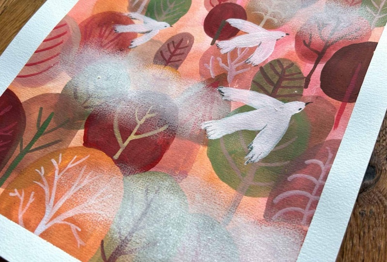
12. Bonus: Welcome to the
bonus lesson where I will show you a
little extra tip. If you like mixed media, then I hope that you
will enjoy this part. I don't know if you
know pa pastels. Those are pastels
compressed in a pat. And I usually apply them with the sponges that are
specifically for pan pastels, and I will do it to create this atmosphere of fk or clouds, let's say, I use it in
different situations. So here I show you how
I apply pan pastel. You can try to apply it also by your hand or maybe with a brush. But I found that those sponges are really cool and I
prefer to use them. They are specifically
for pan pastels. You can buy them together with pant pastels or in
art supplies chop. There is also this
applicator in form of a smaller sponge and you have different shapes shapes of it. Right now, I'm using
the larger sponge. And as you can see, this thin layer of sem
translucent pastel is applied. If you don't have pa pastel, maybe you can try normal
pastel as well, soft pastel. You can obviously try it by applying it in
a normal way or you can do a powder from your pastel and scrub it
into your illustration. You can explore this kind of application of
pastel as well. Otherwise, give a try to your pampas tel if
you have one at home. I have different and I use
them in different situations. Right now, I'm using a
creamy light colors, of course, for the
fk or cloud effect. The other thing that
I often do with pam pastels is that I
cancel it with erase. For this, I use the precise
erase in the form of pencils, and I often use it to
add textures here, I'm showing you that
you could, for example, paint a tree with pam pastel, and then by erasing it, you can negative painting
way create branches. Also, if you want to uncover
some parts of the layer, you can erase it. For example, here, I'm
trying what will happen if I will paint pain, create branches by
erasing p pastel. But then I thought that
maybe it's not the case. I again covering it. As you can see, you can smudge it with your finger as well. The difference
between Pan pastel and the normal
pastel is that you can apply it in a more
uniform and opaque way. It doesn't mean that
normal pastel is wrong, but it will be different. Try to explore it. If you have pan pastel, try it. Otherwise, you can try it
with a normal pastel and see what you can do in order to create some
atmosphere out there. I hope you will enjoy. I'll call it done and I think it's enough. I don't want to cover to too much space
of my illustration. I guess it's more cloudy
effect than a **** effect, for example, the
illustration that I did last year is more like a fo. That would be it. Next lesson will be
the final lesson, and I will leave you just
some final informations.
13. Final Thoughts: Thank you so much for
taking this class. I hope you enjoyed it. I hope that you learned
something new about Guash. And if yes, then please share it within the project gallery. I cannot wait to see
what you created, your artwork, so
share it with us. I also encourage you to comment
on your colleagues work. It's always so good to have a simple feedback
about what we do. And about the feedback, I would also appreciate your
feedback about this class, so leave a review if you can. And I also invite you
to see my profile. I continue to
create new classes, new content about
different art techniques, and I would love to explore
a lot of them with you. So I hope to see you
here very often. I will also be happy to welcome you on my Instagram profile. Also, I have a small
YouTube channel. So I hope to see you here
as often as possible. Until then, I wish you a
very creative time. Bye.
 Ania Kropla Malinowska, Award-winning illustrator