Transcripts
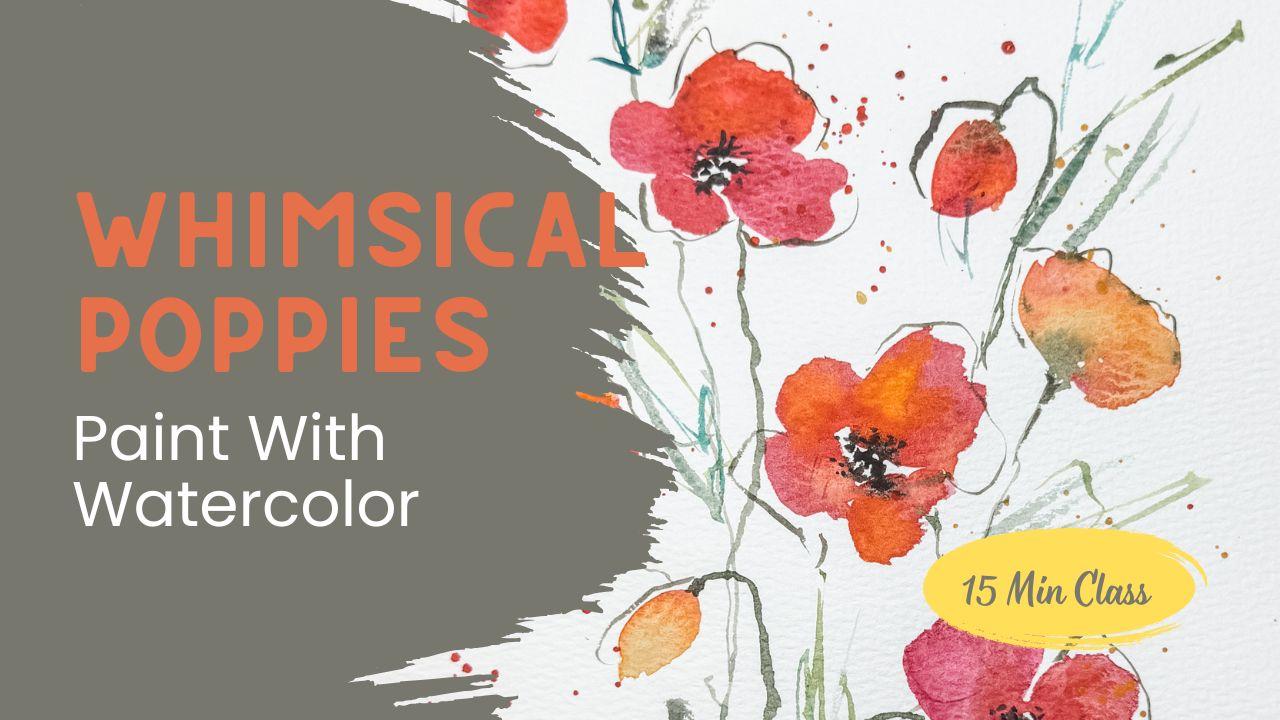
1. Welcome to Class: Welcome to my class where
we're going to paint a whimsical poppy painting
in a loose watercolor style. This project only takes
about 15 minutes, which makes it perfect for
a short practice session or for trying out a new flower or technique without
feeling overwhelmed. Hi, I'm Brenda. A watercolor artist who loves the playful imperfection
side of painting. My teaching style is
relaxed and encouraging. I want you to enjoy the process, not worry about perfection. This class, you'll
learn how to bring a group of poppies to
life with soft petals, flowing stems, and loose
expressive leaves. By the end, I hope you feel inspired to keep experimenting
with watercolor. I can't wait to see
your class project.
2. Supplies You’ll Need: Welcome to class. I can't
wait to get started. For this class, you really
don't need anything fancy. Just use whatever supplies
you already have. Even if that's kids watercolor
paints and scrap paper, what makes it most important is that you're playing
and experimenting. I'll be working with Cotton Watercolor paper, Daniel Smith, tube paints and
meat and brushes, including a couple
small detail brushes. But please don't
feel like you have to match my setup exactly. Have. You'll want to
have a cup of water, a rag, or paper towel
and good lighting. That's all you need
to get started. Simple, approachable, and ready to get some
fun painting done. Join me in the next
lesson when we talk about the colors that
we're going to use to create these
beautiful poppies.
3. Choosing Paint Colors: In deciding on the
colors I'm going to use, I like to start with
a scrap piece of paper so I can test out
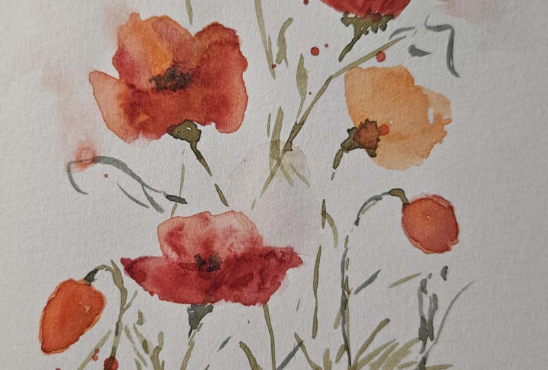
the colors before I begin. I've got a finished sample on my desk to show you where
we're going to be heading. But for this painting, I
think I'm going to make my poppies a little bit
more orange and less red. Of course, your poppies should be any color that
makes you happy. No matter what kind of
paint you're using, the most important step
is to wet them down about 30 seconds at least before you're
ready to start painting. I just use a spray bottle, but you could use
anything you wanted, including your brush
to wet your paints. Now, let me show you the paints and the colors that
I'll be using. I'll use two different reds, one leaning towards
the pink side, plus an orange and a yellow. I'll be blending these
different colors together during my painting. So here I am showing
how they're going to look all beautifully blended. I always use three
different shades of green. I like to use a yellow green, a grass green, and either a
blue green or a brown green. These three different shades adds instant depth and interest. I hope you choose to use a bunch of different
greens as well. I'll be using a dark brown with a tiny detail brush for
the center of the poppies. I'll use that same brush for
the stems and the leaves. I think we're now ready to move on to the next
lesson where I can show you how to start putting poppies together onto
your piece of paper.
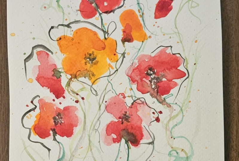
4. Painting the Poppy Flowers: All right, let's
paint some poppies. First, load your paint
with plenty of water. I'm aiming for that
milk like consistency. When you dip your brush in, it'll cling and almost
drips, but not quite. If it's too runny,
touch your rag. If it's too thick, add a
little bit more water. Remember, watercolor
is all about seeing what happens when you play
with water and paint. We'll start with a simple bud. Make one very easy
oval. That's it. Congrats. You've painted
your first poppy bud. For a bud that's
starting to open, paint two ovals side by side, so they nudge into each other. Keep your light touch and let your water carry some of
the paint to the edges. Now, let's paint a
poppy that's facing us. I like four petals. Paint each petal with slightly jagged edge so that
it feels loose and alive. You can add a bit of
white space in between petals or let them bump
up against each other. Both choices will be beautiful. Your poppy does not
need to match mine. Yours is your art, so it is correct,
whatever you do. To far, you may have noticed
that I used one warm red. Now I'm going to drop
in a second color right into the petals
while they're still damp. Try an orange or even a touch of yellow and just let it bloom. This is the magic of wet on wet blending where the colors
meld into each other. You could even tilt the paper if you wanted more movement. Keep it flat and soften the
edges with a paintbrush. Watercolor is all about. Let's see what happens when
you try something new. Go ahead and place on a few more flower heads around your page wherever
your eye wants them. Trust your instincts.
This is your art. You could put a bigger one
here, a smaller one there, vary the sizes and the angles
so that they feel natural. If your paint brush
starts to get dry, rewet it with some
more paint and water. It's called watercolor
for a reason. Drop in your
secondary color right away so that the colors
have a chance to mingle. You can add some easy depth, touch a slightly
darker color into the outer edges or into the tiny folds where the
petals would overlap. Only need a whisper of that darker pigment
and when it dries, you're going to see a
beautiful soft gradient that gives your flour a lot of form without very little effort. If you feel like
you've added too much, you can rinse your brush, blot it, and lift up a
little bit of paint. We're experimenting here,
not chasing perfection. When you're ready, add some more buds and some
side facing poppies. For a side view, think of a crescent shape
with a shallow top edge, and then pull one or two
loose petals from that curve. Keep it sketchy and light. Leave a few bits of
white paper showing. That sparkle of paper is part
of the watercolor charm. Step back and look
at your painting. Do you want one flower to
stand out as the star? If so, add a bit more depth, maybe a darker shade at the base of the petal or a
crisper center. Keep the other flowers
softer and lighter so the eye naturally goes to
the main bloom. Be yourself. Your version is
the right version. When your front facing
petals are no longer shiny, but a little damp, that's a good time to add some centers. You'll want to switch to one of your tiniest brushes
that you have, something that you can
add some details with. I prefer to use a nice dark
brown, almost black color. And I'm going to
touch the center of the flowers and make a little
cluster in the middle. Let a few tiny dots or short
spokes radiate outwards. And if you see that the
center is bleeding too much, wait a moment and dry
your brush or lift it. It's all about a balance. Join me in the next lesson
while we talk about the stems and these beautiful leaves that
we're going to create.
5. Adding Stems, Leaves, and Details: Now that our little
flowers are in place, let's bring them to
life with some stems, leaves, and some final details. For this lesson, I'll be using my tiny little
detail brush. If you have a rigor brush,
that's even better. Truly, though, any small
tipped brush will do. Remember, it's not
about the tools, it's about the
practice and play. I like to mix up
several shades of green and test them on a scrap
paper before I begin. Once I find the tone I like, I start to add stems. Poppy buds grow upside down, which makes them fun to paint. Begin right at the top of your bud and arch
your stems over. Don't stress about making
them perfectly straight. Nature isn't straight. Let your stems wobble and bend. If one passes behind
another flower, simply lift up your brush and continue the line
on the other side. It's an easy way to add depth. Try using two or
three greens here, so your stems feel
varied and alive. Now, let's add some leaves. I want you to hold your brush way up near the
top of the handle. About the last 20%
of the handle. This trick will take
away your control, which is exactly what we want. Just let the brush
dance across the paper, make quick swiggles and jiggles, add a few wisps, and then let them
fall where they may. That lack of control
is what makes the leaves feel organic
and spontaneous. It adds a little bit of
whimsy to your painting. I'll just give you
one word of caution. Stop sooner than you
think you should. It's so much fun adding leaves this way that it's actually
easy to overdo it. You can always come back
in and add more later, but it's very hard
to take them away. Let's take a look at how
I'm painting these leaves. Do you see how I have my hand all the way at the
top of the brush? I'm dipping into several
different colors of green. I'm just letting it dance across the page
without any plan, mixing just the right
shade so that I have lots of depth and
texture in my painting. Adding some jagged edges here, some squiggles there.
You've got this. I know it's intimidating, but it's the lack of control
that makes this so much fun. Just breathe through it
and let yourself go. You are going to discover how
much fun this actually is. Remember, yours will look
different than mine. Just like mine looks different than my
first one that I did. Now let's add some
whimsical outlines. Again, I'm holding
my brush up high on the handle so my
lines stay loose. Use that same small brush and lightly outline some of
the flower heads and buds. Let the line wander outside the petals
onto the white paper, make it jagged, maybe
just half a outline, or even just a broken edge. There's no right way to do this. If this doesn't suit your style, you can skip this altogether. Remember, it's your art. Do what makes you feel happy. Before we add some splatter
as a finishing touch, the painting needs to
be completely dry. I'm going to use a height gun, but you could use a hair dryer or just let it naturally dry. Once everything is dry, load your brush with
very watery paint. Back to that milky consistency and tap it gently
over the painting. I splattered it with orange and yellow to tie in my flowers. Little bursts of color
and movement and energy, almost like the petals are
floating off the page. From here, you can
decide if you'd like to add any final touches, maybe deep in the centers with more dark dots or add
another leaf or two. Let your eye guide you. These small playful
details will add so much character to your
finished piece. That's it. For this section in
our final class, I'll walk you through
how to wrap up everything and enjoy
your completed painting. I really hope you
take a picture of your finished painting
and upload it to the class so that we can all
enjoy the art that you made, even if it looks completely
different than mine. It's your art and
I'm so proud of you.
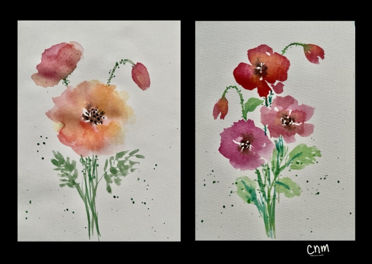
6. Framing and Finishing Touches: Wrap up and take a look at
the finished paintings. Here on the left is my
paint practice painting, which turned out a
little bit different in color from the one I
created for this class. And that's the beauty
of watercolor. No two paintings will
ever be the same. I suspect your version will
look different from mine, too, and that's wonderful. I hope you'll be brave and share your work with us in
the class project. We're here to support you, no matter what level you're at. One fun tip is to use a mat
to frame your painting. If you painted larger
than your mat, you can move it around until you find the section you love most. See how shifting it
changes the focus. Decide what you want to highlight and what can
sit behind the mat, and don't forget to
sign your artwork. That little signature
of yours says, Yes, I made this and
it's worth celebrating. I can't wait to see
what you have created.
7. Next Steps and Stay Inspired - Follow for More Classes: Thank you so much for
joining me in this class. I'd love to see
what you created. So don't forget to
upload your painting in the class project section and leave me a
note or a comment. I truly enjoy
connecting with you. You can also follow
along for more of my watercolor work on Facebook, Instagram, YouTube, and Tik Tok. You can find me at my handle
at Brenda's dot eight.
 Brenda Jones, Watercolor Artist & Teacher