Transcripts
1. Introduction: Everyone, and welcome
to Webflow foundations. This course is intended as
an introduction to Webflow, and we'll provide you with
all the necessary skills that you need to get
started on the platform. The website that we're
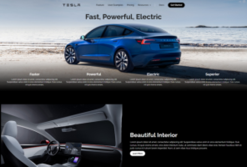
going to be building in this course is of Tesla
inspires landing page. It's just one single page. On that page, we're
going to cover all of the essential
elements of Webflow. By the end of this
course, you should understand the platform
in much more depth. We're going to talk
about the Webflow platform and how
it actually works. We're going to look at
building your own stale g, you're on custom sections,
you're own dred layouts, staling your website to make sure it's exactly how
you want it to look and ensuring that
your website is responsive across all devices. When we combine all
these skills together, the end product should be a
well designed landing page. And by the end of
this course, you should be able to
continue to expand your Webflow skills and build a full comprehensive website with white Tas you
on this course. So I'm super excited to jump
into this course with you. So with that being said,
let's get started.
2. Project Overview Creating Your Landing Page: The project for this course
is really straightforward. All that you have to do
is follow along with all the steps that I'm going to be going through in this course. By the end of it,
you should have a page something like this, which is Tesla inspired. Now, the images can be downloaded in the project
files on this course. But also if you want to build your own page with
your own theme, that follows a similar layer in structure, that's
okay as well. This is entirely open ended. The whole point of this is
just to get you familiar with Webflow and get you more
comfortable with the platform. Regardless of what
you end up with here, it's still progress. Whatever you do end up sating, please share it in the
discussion panel so everyone can learn from
what you've built, and we can really
drive this forward. I'm looking forward to
getting started on this. If you have any questions
about the project or any questions about webflow, please comment on the course, and I'll get back
to you as soon as I can. Let's jump into.
3. Lesson 2 Design Before Development: Okay. Before we actually jump into web flote
and start building our landing page there
was something really important that I wanted
to discuss first. That is about wireframing and designing and how
that is different from development and how
wire framing designing should always come
before development. Because this is a mistake
that is very easily made, and you might not even realize
it's a mistake to later, but it can be quite a costly
one in terms of time. And in my opinion, anyway, because this is
something that I did incorrectly at the start. When I first started
using Webflow, I used to just do everything
inside web flows. I used to do all my design in there and my development there. You're just doing one.
At the beginning, you think that you can. You don't really
see the difference. You don't really understand that difference between
design and development. And I think this difference would be much more
prevalent if you were if you didn't
have web flow and you were forced to
code up your projects, if you were building
a new website and you had to write
the code from scratch. This would be much
much more obvious because it's very difficult for most people to write code from scratch for a new website and do the design when
they're doing that. That's quite a tough one. But if you've got a platform like Webflow frame, et cetera, it's very easy to go in there
and think you can just do all your design wire frame and development, just
do it all in there. But this is a mistake. What is actually a much better
process to follow. Is to go into FM or create an account with Figma
like I have here. If you've not heard of
Figma in the near future, I'm going to be creating
a full course on Figma and designing and everything you
need to know about it, it will be completely
beginner friendly if you're completely new to it. But just as a side note
for now in this course, I'd highly encourage that you go in and experiment
with this platform. You can follow along
with me as I do this. You might not need to do this for this particular project, but I definitely
going to the habit of it and I would
definitely recommend it. So In here, I have this course here and I'm just going to this course here called
Skillshare course assets. This one is for the course that we're
doing now, obviously. I've not put much into this, but I'll show you what
I've got inside it. The ones that I
really wanted to draw your attention to some of the projects that I've
done in the past. I have one for let me see. I'm trying to think of a
good one I can show you. Probably one I can show you
that is not client work, that would be Let's
just go with this one. So A without taking too much time away from
the real focus is here. Abi is a software company. I've been designing
the back end of my software and the
front end of it on Figma for lack of more context. But one thing that I tend to do is I just try and design everything
in Figma first. This is a rough cast of the landing page that
you can see here. And that I did actually
end up creating this page, turned out a little
bit different. You can see here
that it's lacking images in certain spaces. But for the most part, I done almost all the design
I needed to in here. And also for these
pages up here. Now this is that you're never going to get
it perfect when you do in Figma unless you here's
an example of more pages that I create not my best
work, but it's not bad. But the point is when
you're working in Figma, you can focus fully
on design because of the way because of the way Figma has designed
its own user interface. Because I don't need to
worry about death blocks and classes, instruction
and all that. I can just focus on
design and putting in, you're creating ate
that I want to create. And that's the benefit of it. Then when I'm satisfied,
I've designed everything to the full extent, then I can go into Webflow
and I can just go all I is focus on copying this design and
recreating it in Webflow, which is much, much easier than having to do both
inside Webflow. I'm telling you that
from experience. Well, that was ambu. That basically just gives
you an idea of what I feel like figma document would look like if you're
designer on it, you can take it even
further than that. I'm quite bad for not keeping everything organized
and keeping everything up to date and that's something for me
that I need to keep getting better as I go
along my own journey. This one here for
the course just has images in it that
we're going to be using on the site
as already said, but it's just a good point to keep in mind design
before development, and I would encourage you to do that going forward
in the future. Project you may even want
to try it out in this one. Like I said, I have
a full course on Figma in the near future. Okay. And that's it. Let's move on to actually
jumping into wet flow, building this landing page and actually creating something.
So let's do it. Okay.
4. Lesson 1 Understanding the Webflow User Int(1): Okay. All right. The very first thing that
we're going to be looking at here is understanding the
Webflow user interface. I think this is a really
important place to start because it provides you
with some essential context on how Webflow actually works and what it's doing behind the scenes when you're
building on it. Because Webflow is a
little bit different from some of the other platforms
that it competes with. So If we were
looking at bikes or Schramerbflow does the
same thing as them. All these platforms do the same. They're all intended to help
you build websites easier, faster with less hassle, really. Because if you can write
code and you're good at it, then that's what you'll do and you'll be great at it and you'll achieve the same things
as what we would do for using no code platform. But if you can't code and you don't have the time
to learn how to code, these platforms make
a huge difference. They really fill a void
because they provide you with a more accessible user
interface that really just helps you get helps you achieve what you're trying
to achieve much faster. But Webflow is
different compared to these platforms
because it is more closely aligned with
the program and lineages we would generally associate with
building websites. It is more aligned with HTLCSS Javascript than what
the likes of X and framer. And what I mean by that is they When you design
on We framer, you're presented with a blank
canvas right on Webflow, you're also presented
with a blank canvas. But on we and framer, when you genuinely
have a blank slate, like a blank piece of
paper to write on, you can drag and drop elements on it and move them
as you see fit. You don't have to really think
about that stuff as much. On Webflow, you do
have to think about that stuff and you have to be much more considerate of it. Same goes with classes and just the general way that you're structured
in the entire site. I'm sure it's drag and drop, but it's drag and drop
with constraints. But those constraints
are actually far more useful than what you
would think they are as you get deeper into
the development process, and you understand
more about what this platform is
actually all about. Okay. So to aid this, what I want to do here is talk. I want to give you a little
bit of an introduction to HTML, CSS, and JavaScript. Then we're going to jump
in to Webflow itself, and I'm going to just
talk you through the interface and where
these programming languages fit in and the different
parts of the platform where Webflow is actually dealing with these programming
languages. With HTML, CSS, and JavaScript, I am not trying to give you a crazy in depth take
here on each of these languages because
each of them on their own are very in depth and get very
complicated, very quickly. All I'm trying to help you
understand is what they are and the purpose
that they fulfill. HTML or hypertext
market language, you should basically
be thinking about this as the building
block of the web. Now the two metaphors that
I've got here to try and help you bring that home
a little bit better, you should think of HTML like the frame of a car or
the frame of a house, it simply provides
the structure. For the frame of a car, the frame tells me
nothing about what the car is what it's
interior will look like, how fast it will go,
what it will look like. It gives me nothing all I know from the frame of
it is that it's a car, and it's very similar with HTML when it
comes to websites. If I just use HTML with
no style with no CSS, no javascript, it's not
going to look very good. And below here, I
have an example of what a basic HTML
website would look like. This code here, as you can see, you don't have to understand much of what's going on here, but basically all
we've got is a title, somebody text and
a couple of links. That's what this
looks like in HTML, and there's no CSS in this
there's no styling in this, this is just straight HTL. And this is what it looks like. Now, if I had a customer or a client and I design a website and it
looks something like this, we're not going to
be very happy and they're not going to
be very happy about it because this isn't
what we'd expect from a modern website. We expect something to be
styled properly to have a brand to be unique to follow modern design principles,
all that kind of stuff. This wouldn't do it, but
this is what I mean by being the frame because HTML provides the structure if you think of just take one
individual web page, HTML would provide the structure of that entire
page for this one, it provides me with a structure. I've got a section,
I've got a title, I've got body text and links, and if I wanted to add any
more contents to this page, I would add that in HTML. But if I wanted to add
any background colors, if I wanted to change the fonts, if I wanted to change
anything about it, I would do that with CSS. Likewise, if I wanted
to add any interaction, If I wanted the link pillars to change when I
hovered over them, I would use Java
Script to do that. If I wanted the text size to
change when I hovered over, I'd use JavaScript for that. Anything that involves
any small animations or interactions, that's all JavaScript
that's doing that. But anyway, that gives you an example of HTML.
Let's move on. If we're moving on to CSS, CSS basically defines how our web page is
going to look and that's what I've
already mentioned. It's about design
that's where you take the paint brush to the page and you make it exactly how you want to make it Colors, fonts, size and proportions,
responsiveness, how these elements
how the HTML elements will change as a page increases in size or
decreases in size. For instance, as it moves
from desktop to mobile, that's where CSS
comes into play, and following the metaphor
that I used earlier. CSS is going to dictate
how your house looks. That's what takes it
from a frame to house. Same for a car, the CSS
in terms of web design is the difference between
the frame of a car and a fully built Tesla. It's what makes a website
a website in the end. An example of CSS, this is a very basic example and it's not necessarily
a good example, but it illustrates
exactly what it is. The CSS here on the on the left is basically telling
us that we want the background colors of both of these
elements to change. Now, this code, as
you can see, is HTML, and CSS has been applied
inside the HTML code. This often wouldn't be the case. If you had a real
project going on, your CSS is going to be in a different file from your HTML, and you're going to import
your CSS whenever you need it. Now, all I'm doing here is, I'm just adding the
CSS styes inside the HTML elements
for convenience because I know that I don't
need a separate file for it. For the first one
for the H Okay. It's for the head in one style. We're changing the
background of that to blue. And for the paragraph, we're changing that tomato, as you can see here, and
Dodger blue for the first one. And that's purely to
illustrate what it looks like when we're
trying to change these elements and
what it actually does. That's all we're
trying to show here. Now, if we take what we
know about HTML and CSS, and move to Javascript. If we think of a car, JavaScript is like
the engine of a car. It's about movement. It's it's about interaction. It's about where the
website is going. So JavaScript is a
powerful program, and line is used
primarily for adding interactivity and dynamic
behaviors to websites. It operates alongside
HTML and CSS, where HTML handles
the structure of web content and CSS
manages its appearance. JavaScript brings the
static elements to life, enabling them to respond to user actions and perform
complex functions. So JavaScript can get very complicated very quickly and you can do an awful lot with it. On the very basic level, that's where you
add interactions to you for hover interactions over buttons or if you want a button to do something
when you click it, um if you want to
have a slide show on your website and you
want a button to trigger that all
that's Javascript. But Javascript can go much
much further than that. But really, it's the
engine of a website. If you want your
website to do things, JavaScript is going
to make that happen. An example, And again, I should say a very
basic example of JavaScript is what
I've got here. Again, we have HTML code on the left and we have the
output of that on the right. All that happens in
this interaction is that when someone clicks
that button that says, click me, a notification will
pop up saying hello world, and this is the
code that does it. It wouldn't be
possible to create anything like this
without JavaScript. When I Okay. If any interaction like this, anything like this
involves Java script. And I'm going to show you
exactly where this comes into play on Webflow, because
it doesn't look like this. You know, on Webflow, you're not going to have
to write any codes. You're not going to have to
worry about any of that. But it does help to understand that this is what
you would have to do if you were designing this if you're writing
code from scratch, you would have to be writing
your own Java script, you'd have to be coming up
with these functions yourself. It can be, right here. This is the JavaScript function
right here in the green, you'd have to be writing
your own functions and creating them from
scratch basically. So I think I mentioned this at the
start but the majority of the websites on the
Internet are built using a combination of HML CSS. JavaScript, I think the
exact percentage of that is 94% of all websites
on the Internet, that are a combination of
these three languages. And the point is that And even when you use a
platform like Webflow, your website is still being
published in these lineuages A Webflow does is
it provides you with an interface
on your website, and then it translates into a language that the
Internet can understand. It's not as though the
website is published in a Webflow way as if Webflow is got a special
way of doing that. All these platforms, all these local platforms do
the same thing. They take your design.
The convert it into a code that the Internet can understand and
they publish it. Mflows no different
in that regard, but the way that it does
it is better than most. So what I'm going to do now is we're going to jump
out of here and I'm going to go into webflow
and actually have a look at the platform
and see what's going on. I'm going to move myself here, and then so this is a website
for my startup called ambo. This is not to promote
ambos just this is the website I've chosen
to demonstrate on. But This page itself
is intended to be pretty straightforward
and simple and the land page that
we're going to design is also going
to be the same. We're going to focus
on simplicity and just creating something
that's well designed, but focusing on the
user interface. There are a couple of key areas that I
want to discuss here and all of them relate to everything that we've just been talking
about previously. Because I don't want to
overcomplicate this too much. I just want to
basically explain to you the key areas that
you'll be using the most when you're designing with Webflow and why
they're important. Just briefly, this first
tab here is your pages tab. That's where you'll
create and add new pages and manage the
pages that you've got. This is your CMS collections. We're not going to
get onto that now, but we'll come onto
that another time. The second one is somewhere where you'll
spend a lot of time. This is the structure
of your page, and this is what I was
talking about when it comes to HTML. For me when I look at this, this represents a
HTML structure to me. This is the structure
of your site. For every website, I tend to class everything with
standard section, standard container unless I have anything unique
that I'm doing. But as you can see here
for this top section, I've called this hero section
one hero container and then I've put a
wrap around it and then all my contents
are on that. Then I've styled each of these deadlocks basically
on the right hand side, which is what I'm going
to get onto next. So if I want to add
elements to the page, I add them with the plus button, and so if I want to add
a deck I can drag it on, but it's not like
I can just drag or drag on text and put
it whatever I want. I have to style accordingly, using proper HTML
and CSS principles. I'm just going to
delete that for now. If I go back in here, if I wanted to
edit this heading, I would do that on
the right hand side, on the right hand side,
this is what I consider to be all of your CSS edits. When we think about
CSS and styling, everything happens on
this right hand side. I often think about it
on the left hand side, I'm dealing with HTML here. And then on the right hand side, I'm dealing with my CSS. Now, eventually, you won't think about
it too much that way, but for starting out, it helps
to look at it like that. Whenever you want to
make edits to title or a button or color or anything you do it on this
right hand side. But then lastly
when we think about JavaScript, JavaScript
is interactions. At the very bottom of
this right hand column, you'll see that you
can add effects. Now, Webflow added this initially
as an easier way to add interactions that
aren't huge and complex and require a
lot of time to build. You can you can have
animations for your opacity, outlines, box shadows,
TCD transformations. All that can happen here. But if you wanted to create more sophisticated interactions, you do that in the
interactions Parel. So this can be
animations for when pages are either mouse
click, mouse hover, if you scroll the page, IN elements being
scrolled into view, all of those would be considered
Javascript interactions. So with that, I hope I've explained and given you a little bit more context
on the platform as a whole. But we're going to
dive into this much deeper and you can follow
along the whole way as I do. This was just intended to
give you a little bit more of an introduction about
how the platform works. And and the powerful
technologies that are underpinning it. But we're going to get
into all this and we're going to build a
great landing page. Let's go on to the next video.
5. Lesson 3 Building Your Style Guide: Okay. So now that we have talked a little bit about
the webfll user interface, we've spoke about the importance of design before development, and I gave you a
little introduction to what GM is and why
you should use it. Now what we're actually
going to do is go ahead and start building
this landing page. And if you are a
beginner in this, like this course is intended, I would highly recommend
just following along with exactly what
I'm doing to get yourself familiar with the
platform and then share your project at the
end, and I can review. I can give you some advice
on how to make it better. But really, the whole
point of this course is just to get you familiar
with the platform, and that's what
I'm hoping that we can that's where I'm
trying to get to here. So The first thing that we're going to do and the
first thing I would always recommend anyone does. Whenever they're building
a new website on Webflow is to build
a style gate. Now, you may already know
what a style gate is, if you've ever used
one for branding. It basically just gives you an overview of what your
brand is and the specs of it, what should be following
if you're ever creating any design assets for
a particular brand. On Webflow, the use of this
is slightly different. It's less just about
demonstrate the brand, but there's a much more
practical application for it. So when we create a style gate, we choose a fonts or colors. We create buttons, that's where we can style our
farms or rich text blocks, basically, everything
that we're going to be using consistently
throughout the site, that's where we would style it when we style it on
the style guide, we can reuse the elements
that we create everywhere else on the site without having to recreate them every time. Webflow is all about
reusable elements. That's one key thing that I
think if you're new to this, the sooner you
understand that the better because
Webflow can be very, very tight if you're building everything from scratch
every single time. What you'll do if you do that, all you'll do is blow
up all your classes. You'll make it a bit slower. Your site will be much
heavier than it needs to be. But if you're focused on
creating reusable elements, your site will be much
more lightweight, it will be faster, and it'll be much easier for you to
expand on and build on. So that's what I'm
really getting at here. You can see here that inside
the web flow dashboard. What we're going to do
is I've created a lot of folds up here
called demo websites. We're just going to go into
that we're going to create a new site to start
from a blank document. I'm just going to call it Tesla Inspires Model
three website. The other thing I want to say is the images that I'm going to
be using across this site. You'll find them linked below somewhere for you to download and you can use
them to follow along. I won't be using much
images on this first page, but in the lessons that
follow, I will be. Let's just and we can
get started on this. Great. So when you start
with a new project on WebP, you'll always be presented with a blank canvas that
looks like this. But if you go to
the Pages tab here, by default, you will
have a home page, a password page, and a 404 page. That's your baseline. That's
what you'll start with. What we're going to add here is we're going to
click this button, and we're going to add a
page called Snail guys. Okay. And you don't need to worry about
anything else inside page sentence for now, but we're just going to
go ahead and create that. So the first thing that I want you to think
about here is back to what I was talking about with the different
programming languages and the box layout the web uses. Technically, it still a
drag and drop biller, but it requires you to
do so with box layout. It has a bit more restraints, but they are helpful, the deeper you get into
learning about this platform. When you learn about
this platform, you would prefer
to work this way, in my opinion, anyway. So the first thing
that we're going to do is just add a section. And this up here in the
top right hand corner, this is where you're
going to create classes. Now, you can just have
base line classes, which are just single classes where I type in one thing here, and that is my class, or
we can have combo classes, which is where we
have a base class, which you're going to see me create here for our head ins. And then we'll add other classes
on top of that so we can add individual sale and
options to each element. So we'll get to a
little bit later. But the first thing I'll
always do when I come in here. I just create a class
called basic section. So this is just a reusable section I'll use I'll throughout this page and most
other pages because sections don't need that
much style usually. So that's the first
thing I'll do, and I'll set the width
to this to 100%. And I won't add any padding
or anything like that, just because there's
no real need to. That's the first
thing. Then over here, you can see value the section. Now I'm going to
add a div block. Now, I want to point out one thing here that I
think it would be really good for you to get in the
habit of for containers. Try not to use Webflos container Structure that I gives
you by deft up here. Always just use a
deadlock and then style it to whatever
way you want. There's no difference
between either of these in terms of how your site is going to perform or the
way it's going to use it. They're used in the same way. Containers Webflow version of a customized deadlock but it just gives you if you need it. A lot of the time, though I find the container is much more redundant than maybe what
they're intended to be. I always just use a deadlock
and style it as I see fit. That's what I'd recommend.
I've added a deadlock in here, and we're just going to call this basic container.
That's the first thing. In inside that, this is
the last block we're going to add before we actually
start adding elements. I'm just going to
call this one rapper. Because we're going
to put the heading for the page. You
don't have to do this. I just as practice. It's also just a good
place to start really. Plus then we're going to add
our first heading up here. And we're going to
add a paragraph. We're not going to
style these yet. We're going to
come back to that. We'll style them later
because there's just no point of staling
either of these yet. And then if we go
to Tao wrapper, we're going to make some
changes on the right hand side. We're going to set the
padding for each side of this I'm going to put it as 60. I might actually
change I'm going to change to 40 and then I'll show you what I'm
going to do in a second. Then I'm going to change the alignment of the step block so that all the text shows
all the text is centered. So what we're going to do here is we're going
to change to flex, and we're going to
have it going down, and then we want
it in the center. We want everything
in the center. Now, you can see it
centered the heading, but it hasn't done that
with the paragraph. That's because we need to change this at the paragraph level, but we're just going to
leave these for now. Now in terms of the width
of the title wrapper, I am going to change
this to a percentage, and I'm going to make this 60% because I find that two wise. Now, you can see
though that it's pulled everything to
the left hand side, and this is where
we have to go up the hierarchy one and
we have to change that to make sure that the
title wrapper is centered. So we'll go to basic container. And this is actually
something that I would have intended
to do anyway. We're going to make that flex, and we're going to make
sure that sense that's it, and we're going to
make sure it's going down in a vertical manner. Now we'll come back to
this a little bit later, but I'm just going to put in your style that filler text
can just stay the same. But none of the style of
this doesn't matter for now, we're going to come back
to So then what we're going to do is we're going
to add another section. We're going to put
another div block inside that and another
one inside that. Now I'm going to show you what these look like on this side. We just have a section with the dvlock then another
diblock inside of it, but we want to make a
look something like this. And this is what
I'm referring to when we're talking about
reusable elements. We'll take that a little
bit further later, but right now we're just
focusing on the basics. We've already created a
classical basic section, basic container title wrapper. Over here for this section, we're going to call this
one basic basic section. Then we're going to call
this one basic container. And we already have these there and you can see that will apply whatever style
options we've made to these classes by default. Then this last block, we're going to call this
something different. I'm going to call this
headings wrapper. Because this is where the
headings are going to be. So inside the headings wrapper. This is where we're going
to look at our headings. We're going to style
them. We're going to apply the right colors fonts. We're going to make
them look exactly how we want them to look and we're going to make
sure they're styled appropriately
across each device. So first things first, let's add six headings
because there are six different heading tags
in HTML that's H one, H two, H, H four, five, six, and we want that to be
reflective on our style gate. You might not use
all H six headings, but good practice just to have them and know that
you've created them. So that's heading one. And
then for the headings wrapper, we want to change the
width of this to 100%. And that's because I have
the container styles to be Essential the vesicle. It will just pull
everything in unless I tell the child element of that, that it has to be the
full width of the page. So we've done that, and
then I'm also going to add four Px each side of this so that it looks
somewhat in proportion. So we're going to
duplicate these six times. We're going to call
this one heading one, heading two, three, or Five and six. Right. So now we
can actually just focus on this a little bit. This is where we're going
to create a combo class. The first class
that we're going to create is just for
a heading itself. So we're going to add a class to all of
these will be styles, but we're going
to add it anyway. We're going to add
a heading here. Here, you can see
how Webflow will recommend it to me
because it knows it's one that I've
just recently created. Words, we want to
change the properties, all of these elements are
going to have in common. So we know that the font is something they're all
going to have in common, we know that the color
is something that they're all going
to have in common. The one thing that they
aren't going to have in common is the size of
them and the height. But another one that they
will have in common is line height just to point that
out. But we'll go through. So we're going to change the
font of this to railway. Now, if we go to typography
over on the right hand side, and you can see already just because I have they over these, you can see how they all change. But the first one we
want to add is what's the font I want to be using
but railway isn't shown here. So if we want to add a custom
Google font to Webflow. That's very easy to do because Webflow has all
custom fonts built. But if we want to add a
truly custom fund one that we downloaded or but
from a third party website, we would actually
have to upload it. So let's hit the button
add fonts up here. And it will take us to the
site stence for Webflow. And when it loads, we'll see. So for Google Fonts, I can choose a font
from this list. So I'm going to hit railway. I'm going to just
check all of these. Sometimes Webflow can kick you back for checking
all of these. Other times, it's not a problem. But I'm just checking all of
them just because I want to have I want to have full control
over the font I'm using. So we're going to
add that. And if you had a custom fund
that you wanted to add, you would do that here,
you would upload one. So you would upload you
would upload your files. Generally, they would
be those would be TTF files or OTF files. Anyway. Moving on,
we've uploaded that. So let's go back to the
designer and see if we can now access railway or at least see if we can use
that in our project. So we're back in here and we
are going to go to Stairway. So if I go to
heading, There we go. You can see railway is there. So that's the font that
we're going to use. Now, the color for the
purposes of this course, I'm just going to be using
basically black and white. I'm not going to be
doing anything to fancy with the color schemes, especially because
the images for the landing page are going
to do most of the talking. It would be quite redundant
for me to try and throw in new colors and they just want
to keep it quite simple. So I want the fonts I want
the colors to be black. You never really want to
use black for this one, I'm using quite a heavy black. Heavier than the one that
Webflow provides by default. But yeah, you
always want to stay true black or sometimes, true white is often used true black, I always
stay away from. I've set the color for
that. We've set the front. The last thing we want to
do is set the line height. So in ppography you can see
here that we have height. Now, one thing that I
would recommend with this is Webflow we'll set it
at 44 px by default. I would recommend editing this at what we're doing now
at our base class level, and I'd recommend changing
it to a percentage, and you can see
that it pulls in. And then I would recommend
changing it to 145% at 125% would be your minimum. I'd recommend 145%. And if you feel like
you really need it, you could push it to 165%. But that's the kind of
range that we've been looking at in terms
of the height of your heads and your paragraph
text. So let's go 145. I think that is a
good place for us. By default, all your headings are going to have margin added. You can see I have 20 margin
at the top for this one, and I have ten at the bottom. I'm going to leave them
like that for now. I might go back and change these later if I don't think
they fit with the text, but as a general default,
these should be okay. Now that actuate the
base class for this. The next thing that
we're going to do is it each of these individually. For heading one, I'm going to add another class called H one. The second one that I'm
going to add is H two. Then another one is H three. Okay. H four Okay. So now that we've
valued each of them, what we actually
want to do now is change the size of each of
these headings to make sure they're consistent
across each device as we can see up here. The tool that I'm going
to recommend that you use for this is
called type scale, and I've used this
most of the time. Basically what I'll do
is it will just give you the correct sizes
that you should be using for each of your heads. So in this case, I've
set the base to 18. We supports each of
these REM PX or PT. But I would just stick with P x, and these will be used
across each device. The first one we're
going to take is 53.75, and we're literally
past straight in. And you can see that because we've added
these combo classes, I can now stale each of these heads individually without when I'm
make an heading, it's not going to
apply to all of them, it will just apply to
the one that I'm on. And let's just get this done. I 44.79 past straight in. Three And lastly, six. I would say that looks good. So now that we've styled that, let's just have a
look at how these look on different devices. I think they overall as they
style as they come down. When we get down here, I think overall that
the H one will be okay. I find on that a bit big. But we'll come back to that anyway if we think
it's too much. But than that, we are going
to create another section. This next section, we are
going to do the paragraphs, actually, I'm just going to
add these directly in here. I'm going to change
the name of this class to make the text wrapper. I should help. We'll
go back up here. We'll add a paragraph. Now, what I would generally
do for paragraphs, I would be looking
at add large text, medium medium or standard text and then small text because you might you might
need different sizes of the text depending on what part of the website that
you're working on. So one to three and we're basically
just going to repeat the same thing again. We're just going
to put paragraph. Or sometimes either put
paragraph or standard text. We'll just use paragraph now. And we're going to
set the front of that to railway and we're going to change the size of it to 18
because that's what we said the base size of our
text is going to be. Then the last thing we're
going to change the height. Now this is either going to
be 125 or one four, five, I think we're going
to go one four, five, so then we'll
take paragraph. We're going to apply
to each of these. That just gives us a
standard looking paragraph. Then we're going to do
is we're going to add large standard and
medium and then small. The first one is
going to be large. I'm going to go with standard
here because I know that. That's the one and then small. And we want to do is large text, I would usually put two P x
higher than the base line, small text, two P x,
lower than the base line. So if our base one is 18, then I'm going to make a large and I'm going
to make a small 16. You could expand
this out. You can have extra large extra small. You could take that up
or down as you see fit. But for me, I
generally will need these large medium and small. So now that that's done, again, we can have a look at that and see how it scales down. To me, that looks pretty good. The sizing looks good and the
proportions look correct. Now you may be wondering what we're doing
with this up here. Now that I have
the correct sizing and styling for each of these, and the only thing I
forgot to last thing. We're going to make
this one up here. We're going to reuse these
classes as we should heading and then
we're going to put C Webflow suggest now, then
we're going to put H one. Then we're going
to put paragraph. And we're going
to use standards. Now, what I often do is there's
two ways you can do this. You can duplicate this out because what you
want here is you'll want your headings or text to
be sentd at certain points. Now, what will happen is if I actually change this right now, I'll just take the standard
one of these examples. If I centle that, I've now changed this property
for every single place, the common class paragraph in standard shows up and
I don't want that. So what I would actually
want is to add another class Okay. And what I'm going to do actually here is to
demonstrate this. I'm just going to duplicate this entire section to show you. So now we have a duplicate. And what I'm going to do
here is for each section. We've a head in H one, and
I'm going to add senors. You can name this
whatever you want. This is just my
personal preference. This is the way
I've chosen to it. But I would add sensors. And then I would change the
property of that to sensors. Okay. You can see where I'm
going with this hopefully. And now I'm just
going to take that and I'm going to do it
to every single one. So if I want to add
a sensor title, I would add one sensors as opposed to heading H one
or something different. It makes it easier for
me to easily categorize exactly what I want as
I'm building my website. I'm going to C This one will automatically
apply because basically, even though we're calling
it the same thing, Webflow will treat each of these as individual classes that's being used as part
of this combo class. Getting back into
it, we're going to make this one sensors. Okay. I'm just going to copy this
just in the interested time. And we can see that is coming together very nicely overall. And then we're going to
do the same for here. Great. That's that done. And now to get back
to the initial point that I was going to make,
if we go back up here, now I can simply just
add in this center form, and it's not going to
break my entire site in my classing system. So that's the way I would
recommend going about that. Now we've got standard headings, we've got centered headings. What comes next after this? The next thing I'd be looking
at is background changes. We have these headings
are in black. But what happens if we have a black background or a very dark background
and we want to add or cons and we don't
want to have to create an entirely new set of classes just to make them
white or lighter. What I would recommend doing here is I'm going to
duplicate this again. Just one more time.
This entire section. Take that duplicate a time. And then what we're quickly
going to do here is I'm going to change the
background of the section. So this is another thing
I would do for sections. You'll have a bunch of
different classes that you'll create because
different sections will have different
backgrounds naturally, that's one of the ones that
you'll change an awful lot. So I'm just going to call
this one dark background one. All right. And then
when I do that now I can dit this section
as as an individual. So I'm going to just add
a color here to make this basically black
almost fully black. And And now that
we've done that, I'm going to go into each of these ones individually again, and I am going to
add dark background. Well, I would say often here
I would add dark background, but you might actually
want to add something that maybe be a bit
more relevant to you. So lights we're just
going to make it white. This can take a minute
when you're doing this. Now that we've done
that for heavens, and you just want to do the
same thing again for text so I Light text. I feel like I have
to make a mistake. You've got all your
texts and everything. Now you've got to set a
different set of class. You have a different conmbo
class if you want to have your heads and text
over a darker bag. And this is just a good habit
to get into doing all this. It might seem a bit tedious and time consuming, but at
the end of the day, this stuff really does make a huge difference
if you're on a larger project and you're
trying to work at speed. So Now, we've done that, that's our texts pretty
much taken care of. Some of this you
might want to come back and tweak at
certain points, especially if you if you had specific colors
you're trying to use or any of these elements needed more work,
we would do that. But because I'm just
using black and white for the majority of
this landing page, I'm not going to need
much color or anything. I know that this
will be sufficient. The last thing that
you want to do here I would recommend
at the very least, you want to add your buttons
and style them accordingly. That's probably quite
a big one as well. And then the last
one after that, we'll look at rich text, we'll quickly just
do the buttons, and then at least you can
see how to properly do that. We'll just add another
section lets us. Sometimes this can
play funny sometimes. So fresh section there, then we'll have to block. So all we're going to
do is we will simply just duplicate this
section again because there's no point in having to
build an entirely new one. I'm basically just going to
delete everything that's in it and change it back. Get rid of the dar For this one, we will get rid
of it, get rid of And then for that here, I'm just going to get
rid of the text wrapper because I know we don't need it. Then we'll add another
block in here. And I'll just call this
per add so we can see it. And we'll do something similar
to what we've done before. We can just go the
whites hundreds a sets. And we're just going
to drag a button on and stay this as we see fit. What I'm going to do here before and with the heads in
the text the text. I would have three buttons,
large medium small. That's a good habit to get into. Let's just do that and
see here we go on. Turns to, going to go Okay. Okay. So now that we have
the sons and here, we're going to just
stay we're going to go on And I think in this instance, I'm probably going to
make them all black and then I'm going to duplicate
them over and make them white because I don't think I'm going to need
anything more than that. But we'll just make sure they'll side What we'll do here for this first button
or for all these buttons, we know they're
going to be white. So we're going to change
the background to white. I'm going to add one P x border just so I can see each of them. And then for the text,
we're going to make that black. You can see there. We're going to change the
corners to it least 20 px. Curve just like that. Then I'm going to make sure
that the font is changed to railway and that
we are using bold. Then I'm going to change
the padding to be 20 P x on the inside instead of 15 because I
think that will look better. Then I'm going to change the to large small. For each of them,
I'm going to add a box shadow to help me out. The standard one
for that's okay. Once I've added the box shadow, I can remove the
border because I already know how it looks. You can get rid of that. And bear in mind, these
white buttons are going to be shown usually
with a dark background. So even though you can't
see them very well here, you'll see them much better
on a dark background. That's it. And then last
thing I want to do is I want to add a hover and click state. So I want to add not a transition. I want to add Yeah,
a transition. And I want to change
the background color. Now what I'm going to do now that I've added that transition. If I go to Hover, I can simply just change
the background color to what I want the
hover state to be, and I'm just going to
make that slightly off white, nothing too crazy. Now I hover over that. You can't really know
with white background, but I just gives about feedback to the user
that when they hover over it. They can see that
it's clickable. And that's just good practice. Again, it's just another
one of these things. It's good practice. Now
done that last thing we want to change as a size
we have button base class, they're going to want
to change to large. Aim and small. So large I'm going to
bring this I'm going to make it Let's call it 30 30, and then we're going to it to 12 at the top 12 at the bottom. And then we're going to
change the size of it to large text we're
looking at 20. Great. So that one looks okay. Then for the second one, we are going to be looking at 18 for the text size because
that's our base text size. We're going to increase this to I think actually up that we go to 15 make
the middle one 12. And I'll make it 25. And then for the
small, we're going to leave we're going to up to 16. We're going to leave
it at 28 and nine. And that's all we really
need to change to that. And then I'm going to take each of these buttons. I'm
going to take the button. I'm going to duplicate it down. I'm going to change
the background of this to again. Okay. And now that I've duplicated that what I'm going
to do is I'm going to change these to I just need to change
the bro color and the text color of these. We're just going to do I'm going to put invert here. Again, you can call these
classes whatever you want. You don't have to do exactly
what I'm doing here. It's just it's more about you understanding what
the classes are. So I'm going to put invert color because that's something
I would normally do if I'm literally doing inverse of everything
that's there. It color. So we're going to make the
backgrounds black. We're going to make the text white. There we go. No. These are the key things that you need to do when you're building your style
guide because I mean, the elements were created here, these are the most
reusable elements. I mean, you need headings, you need text, you need
buttons and these are. But instead of taking
another 25 minutes to go through all of this and continue showing you because I think
hopefully by now, if you follow me,
you get the idea. You should know how to class. You should know what properties
you should be changed and what shouldn't and be familiar with
creating Cbo classes. But I am going to
quickly show you a fully finished
style guide doing so will take probably about
over over an hour. I'd say if you're
doing it properly, it depends how much of your site that you
have put together. So I'm going to go
back to the dashboard. And the one I'm going to
show you is for ambi again, I take it too much. I just want you to
understand what a fully finished style
guide looks like. So Again, this is the
website for my start up that I'm going to demonstrate
to you. So here. And again, when I was
building the site, this is the very first
thing that creates. Style guide. I've got
my logos in here. You know, I've created more headings and
stuff here to give it a bit more context all the different colors
that I'm using. Because like I said
earlier in this video, this is more of an
illustrated website, so the colors and branding
need to be a bit more, you know, they need to be
doing more of the work for me. So I've got my colors in
there I've got my heads. I've got different types of
texts, different link sizes, loads of different button sizes and just different formations. Then I've got my text,
forms, inverse texts. I mean, all of its in
here because when I go out and I'm actually
built in the site because I've already
done all this work. It's much much easier to just
create pages from scratch. Because I don't have to create anything used from scratch, maybe sometimes I will, but anything reusable, I
don't have to do that. So That's where I'm
going to leave it for style guides because I know
that we have enough in the one more building
for a landing page now I can go ahead and use that. I'm not going to I'm not going to have to
tinker with it too much. I've all the important sites all the important classes that I need have now been created, which one has Okay. So what I'd encourage you to do, if you want to add
more variation in properties to these if you want to use
different colors, maybe you want to add red
buttons, blue button, whatever you want,
maybe you want the text colors to be
slightly different. I recommend that you take
the time to do that. But I'm going to leave this
here for the sale gate. And in the next schedule, we're actually going to go
ahead and we're going to start building the page
out from scratch. And we're going to
use these classes to help us do that. I'll
see you in the next one. Okay.
6. Lesson 4 Building Your Navbar: Okay. So by now, you should have created your
style guides and you might have continued
to add more elements to yours I did in
the previous video, regardless, the next step is to move on to building
your navigation. Now, really, you don't have to start with this,
but I would recommend that. Your Nav Bar and your
fo are generally things that are
going to appear on every page of your website. In this case, we're only
building a landing page. But if you had a big project
and it was a larger site. I would always recommend just getting the Nav
Bar the way first. The reason for that
is that while the one that we're going to
be building here is relatively
straightforward and simple, Nav bars can definitely get more complicated quite quickly, especially if you're working
on a larger project, which is just something
to keep in mind. On top of that, they can be a little bit
buggy when you're trying to when you're trying to get the responsiveness
right across devices. Again, for this one
that we're doing here, we shouldn't have any issues, but I'd say you're
more likely to run into issues here the yard and other places in your
development journey. So there's actually two ways that you
can go about doing this. The first one is to go
to the elements tab and scroll down and you can just drag in a
nav bar from here, but it won't have many
style and options. I actually probably wouldn't
recommend using this one because there's always something that I have to change
every time I use it, but let me just pull it up if I can see whereas they would go. So when you pull this up, the main thing I emphasize about this one is it comes in
with a built in container. Now, this can be a
bit problemmental if you're wanting to do different things with
the responsiveness. And this is as I
was saying earlier, Webflow built in containers
are constrained. They aren't like a
normal did block because Webflows um just edited certain parts of it
like the webs and the pad and it's quite fixed and rigid
compared to Diplock. We're not going to use that. What we actually just recommend doing for peace of mind is just going into plus
and then layouts. Now, I'm just going to quickly talk about this because
Webflow is built in libraries for every
single project you build, you'll have your
started library, but there's other
libraries that you can add to your workspace. If you click here,
browse More libraries, you've got all these different
UIkits that you can use. And if you're in the
early stages of this, I'd much rather you go through the process of creating
your classes and designing your own elements so that you get more familiar
with that process. If you're really looking to
get something up quick and you're in a hurry and
you've got deadlines, then these libraries can really make a huge difference because
they provide you with all everything you
need basically to build a website from
scratch and then you can just customize these
elements as you see fit. Getting back to it. Flow, we're going to go to
start our library, and then I'm just
going to take one of these navigation layouts, which one is not really
that big a deal. Let's just go we'll
just take this one. We'll take this one up here. And this provides us with a
really standard navigation. And if I go to the
free view up here, we can see that it comes I'm not sure
how much I like that, but let's see how
it looks on mobile. I'll come with
navigation built in. And actually see that's fine. The way showing up in tablet not a fan of,
but it's actually okay. I actually look at it closely. But regardless, let's just go back to desktop for a minute. And we'll come out of review. So Webflow will
scale your Navbar, even if you use the
other methods and you take one straight out
the elements tab. It'll take that and anally it'll be
responsive by default. So there's not any
special setting you have to do to
get it to show up like this on mobile or tablet. It will do that by default, and you can edit
those accordingly for fronts and just the usual stuff. What we're going to do here is we're going to make this
fit with our brand. Remember we're Tesla
inspires landing page. So this button comes with a default class
of Bustin primary. What we're going to
change that to is just button and we're going to go I think we'll
just go medium here. And then we'll make it black. Now that comes with
all our fonts. But what we need to
do here is actually change the setting
of the navlink. If that was anything different, I would have deleted that and
changed it to Nav link is the general class that I would
go to if I was doing this. We want to change the font to railway and let me just
see this a second. Yeah. We want the
font size to be 18. I'm actually thinking
that that's too big. Let's just go back on that. The button, I'm going to
take down a size to small. Okay. And then we'll
invert the color of that. Come back over to blink. Railway, will make it 16, and then we will make it I
think we'll make it semi bold. Yeah. Then we'll do
the same over here. The classes that this one
has used by default Webflow. These are the classes
that I would be creating anyway if I was
building this from scratch, for your dropdown to, that's the name of the
class that we use. I would just copy
these. The more you do more you'll
memorize them, the more you'll get into the
habit of just using them. We're going to do
the same here's what I'm And then I can't remember
that pools or semis. Cool. Now, all of these
are going to keep. I'm actually just
going to go ahead and actually I'll keep them
for illustrative purposes, but none of these lengths
here will be active. So let's just leave them as is for now. I'm going
to change this one. We can change that sight the last thing we want
to do is add the logo. So you'll find the logo
in the file that I have for you on the course
that you can download. So we're going to go to choose
images, uploads an image. And I'm going to go to
download and I have it here, and this is a logo. It's a vector logo, a vector
tells a logo. It's SVG. You won't really be able
to change much of it. But when you upload it,
it absolutely fine. If it adds. There we go. I'm going to bring this down. Great. There we go. This is essentially it basically races or Na always have
to get linked up. But again, we're just
creating a landing page here. I'm not going to have
to link all this up, but you would do that down here. If you're going ahead and
you're trying to build a full website off
the back of this, if you're adding links
to your NaF Bar, you would do it down
in the link stens over here and you would select your page or you can
select a section of the page, which is more likely what
we're going to do with this. I'll come back to that
a little bit later. Okay. So yeah, that is
essentially a NaF bar, and it's scalable,
as you can see, bring it back into
free few modes. So if I take that out, It's going to scale
up and down with me. As I said, in my experience, I've done a lot of these Naar on face value can usually
be very straightforward, but they can get very
complicated very quickly, depending on what
you're trying to do, especially if you've got
a really specific idea in mind of what you're
trying to create. In this instance, it doesn't bother me really the way for me, this looks absolutely fine. But apart from one thing
I'm actually going to fix. But if this was mine and
I really cares about brand and making sure it was a really particular way I could be at this for a long long time. So, in this instance, it
might take you 10 minutes, but and another another time it may take an
awful lot longer. But yeah. That's it. So I'll see you in
the next one. Okay.
7. Lesson 5 Creating a Symbol: All right. There was
one last thing I wanted to add in about the Navbar. When you've created your nav
bar, you styles it properly. It's all looking exactly
how you want it to look. The last thing that needs
to make it a component. A component is basically back to this idea of
reusable elements. Right now, we've been using reusable elements in
the sense of classes. We've been adding classes
to elements to make it easier for us to do
our development work. But creating a
component basically creates a fixed element
that you can drag and drop onto any page and
it makes it much easier. It helps make your design
process more efficient again. So What we're going to do here is we're going to
click on Navbar. Now, you want to make
sure you actually click the whole thing. In my case here, and then we're going to here and we're going to
create a new component, and we're just
going to call it N what'll happen is if
I just as an example, go to the stale guides and
I want to add this Navbar, I just go back to components, and then I can just drag it. To. And then I can literally just take it and I can add it to the top
of my page like that. Obviously, that
doesn't look correct. So what I'm going to do
is quickly stay this. And as you can see
there, they have a NaF bar on our Sale gate page. So that wraps up
for the Nath bar. Any questions, leave
some of the comments, and I'd be happy to answer them. So I'll see the next one. Okay.
8. Lesson 6 Building Your Hero Section: All right. So now that we
have created the NaF bar, the next thing that
we're going to do is create the hero section. Now, if you don't know
what hero section is, the hero section is simply the banner that will show
above the folds of the page. So basically, it's the
first thing that people are going to see when they
visit a particular page. In this instance, if
it was your home page, it's the first thing
most people are going to see when they visit
your site as a whole. Um, they might not go deeper. They might not look at
anything else on the site. They might not even scroll, but the first thing that they'll
see is the hero section. So you want that to be the
best it can be, basically. So this is where you'll commonly see videos adds as a background. You'll see marketers
and designers put the most time and
effort into making sure this section as
compelling as it can be. And in this instance,
we're just going to try and yeah we're
going to try and create a good hero section
that that will drive users. So what we're going to
do is add new section. Again, I'm going to I think I'm going to build
this part from scratch, but I'm just going to mention it just in case you want
to go down this road. You can just add a hero section from one of
these layouts if you want. You're not going to
get the most benefit of that from a learning
point of view, but you can do if you want literally has hero sections
that you can add here. They have templates. But what I'm going to do I'm going
to create it from scratch just so you can see
the full process and what you have to do if you're building
it from scratch. We are going to
add a new section. In that section, we're
going to add Diplock. I'm going to make sure that
went in and it didn't. So we're just going to correct that I'm going to make sure
these are names properly. Basic Basic section. Basic container. This is one of the instances actually where
I'm actually como classes out of my basic section
and basic container depending on the size and
proportion I want it to be. That's what I would
usually do and I would usually just
call the class hero, but I'll get onto that
when we get there. Then inside my container, I want to add another lock. And I don't really know what I'm going to put in here yet, so we're going to
come back to that. So for the section,
what I want to do is the wtf is 100%
size and proportion. What I'm going to do first
is add the image, I think. I'm going to just take
all the images that I have because I haven't
done that yet. I'm going to add all the images from my folder to the site. So you can see here we uploaded the image before, so you should know
how to do this, but we'll just upload And then it's these images
here, one outflow. So we've got them
all inside Webflow. A lot of these images
are fairly big. Usually I would spend
the time to scale these down into a smaller
size because you can see it. I'm pretty sure Webflow is going to flag them up
when I upload them. Yeah, I did. It seems to be it's not uploaded all
of them, but most of them. That's fine. I'm going to
quickly just come out here and I'm going to make
some quick changes. I was already had set up. Okay. Take them, pop them in there. And I think that'll do it. I don't know if I'll leave
that in the video on, but if you want to know
how to convert images to something smaller on
Mac, then there you go. Let's go back to
full screen here. So when you're adding background to your section and I'm going to go ahead
and add that class, you're going to put and I'm going to make
the height of this. I'm just going to
make it something so I can see the
background initially. We'll do that and then
we'll just call it 500 just so I can see exactly
what's here. Now what we're going to do is if you scroll down
here to backgrounds, and we're going to add
the background image. Now, one I haven't decided. I'm just going with
the flow here, if I'm honest with you, but I think we're going to go for
something a bit brighter. Like one of these actually I
think this one should do it. Right. Now, you have a couple
of options here. You've got custom
cover and contain. Custom is where you can
choose exactly where on the image, what
you want to show. Cover is where try and show
the whole image inside, but you can still select what part you actually want to show. Custom is just set the width and height
you set all of it, but you end up
with a weird thing where the image will
start to repeat, in this case, three times
it's trying to repeat itself because it
just doesn't fit and it doesn't really know what
you're asking it to do. We're going to go
with cover just so that always fits
on the screen. We're going to have it centered and I'm going to
adjust the height of this to Like, 800, I think, maybe less
than that, maybe seven. Yeah, and then I want to change the way the
background also sitting. That's not going to make
too much of a difference. Let's try six. Maybe that
will be the switch part. Yeah, that seems better. 600. What I want to do here, I want my nav bar to show
over the image. And what I mean by that is I want it to sit on
top of the image, and I don't want any
white background. I just wanted to sit nicely. I want it all to come together. What we're going to
do is we're going to go back up to the NaF Bar. And we are going to change
the background of this. So we'll go down here, and I think the background
might be coming from Nope. Must be coming from
the container. No, it's not coming
from the container. But let's just see we'll
just try from the top. So there is white
actually might not be. What we're going to do is create we're going to make
this nap bar sticky, which just means that in terms of where it
sits on the page, it doesn't have a pavement or
it's not inherit anything. So it will just sit as a fixed element on top of
everything else in the page. And as it scrolls,
it will stay fixed. So we're going to do that now. So if I go up here, right
now, it's set to static, but I'm going to change that
and I'm going to set it to and you can see that there
was no white background. I was wrong about
that initially. So now that I've
shifted that up, the logo and text now the Navbar now sits
on top of hero section. But because I've
changed it to fixed, it's done something to
the width of the Navbar, so we're going to go
ahead and fix that. And we need to make sure that
this is set to 100% width. Okay. Because right now, as you can see it's on 86.
We do that, that's it back. Now, I think that looks okay, but I'm not sure about this image now
that I'm looking at it. I think I maybe want to change it if I can find one
that's brighter or it's a clear color on it in the sense that
there's no patterns. I think I'll use an
image like that. Let's see what
we've got. So we'll go back here, choose image. And this one with the blue
right here, there we go. That is looking
100 times better. So we can easily see all the text from an
accessibility point of view, no one's going to have
any trouble reading that, and the image of the car
is a lot more focused, and it probably just
fits a little bit better as a hero section. Now, in terms of text, That was the next thing
that we need to do. And we're going to go up here. I already added a deve block, so we'll go back to
that and see how that's doing. That's
up the top here. So this is where I'm going to actually I'm going to put some padding into this and I'm not going
to class it yet. I'll change that later, just
so you can see exactly where it is now you can see
this dev block here. Let me go back to it. Okay. You can see how it's sitting
at the top of the page. If I start either text to this, it's not going to
look right and I'd have the monkey
around with a lot to actually try and get it if
I kept this layout option. But if I go up to the pair of this deblock
which is the basic container. I'm going to make this hero
the s for home container. What I'm going to do is edit
the layout of the container. I'm going to make
everything sent basically. So here. Actually that's Okay. Now that we're going to go
ahead and add some texts. There's a few
things that we have to consider before we do that. Remember I was talking about
placing combo classes out of the basic section
and the container, this is where we're actually
going to have to do that because if I start trying to add text and add elements
and move them around on this the
way this is set up, it's going to be very
difficult for me to do that. What I want to do there's two things that I
have to addit here. I have to edit the
basic container, and I have to edit the
dev lock that I've added, but I'm not actually made
any customizations to yet. If we go down to the
basic container, What we're going to
do, I'm going to make the height of this 100%. What was the percentage, and we're going to make
this 100 and you can see that will now fit 100% vertically
and horizontally. But what that allows me
to do is it allows me to bring the death block into
the center, basically. Now that's done, I
can go back up here, and this should be and we can see the deadlocks
here in the center. So now we go to the D block and I'm
going to change the name of this to uro Content wrap
or something like this. Again, you can call your
classes anything you want. I'm just some people
prefer to use codes or abbreviations for their
classes because they want to use small amounts of texts. For me, I'm quite a
linguistic person, so I like to use the
words which As an ideal, sometimes, maybe you want your classes to be a
little bit short, I just find it easier
for identifying and also remembering them. That's just me.
Everyone is different. Now that we have that in here, the width of this,
we are going to make 100% again,
which is currently. Just like the container,
we're going to make the height 100%. It gets fun. So you
might be wondering the reason why I've
taken the deadlock and basically made it
the same as a container. And that's because when I add the elements into this text, what I'm going to add and the changes that might have to
make it makes more sense for me to just have my
own deadlock for all of that as opposed
to trying to make edits directly to the
container every time. Because even though
it's a combo class, I still don't want to be
making many edits to that. I want that to be
pretty much consistent no matter where I
go because I could create a totally different
hero section with a completely different intention and I want to show
different stuff, I want it to be
completely different. That combo class I've got for the hero section then
might become redundant because I've customized it specifically for
what I'm doing here. Always just makes sense just to use a fresh dead
block where I can and it doesn't impact the
site at all pretty much. Here, we're going to add some texts. That'll
be the first thing. You can see where
that's setting here. In terms of text, I'm
just going to go fast. It's going to be fast electric. I'll come back and
change, I think. But so we can get it done. And we're going to go
Clasre going to make heading and we're
going to put h one. What was the last thing
that I wanted to do here? We're going to make it centered and that should do as I think. Now, what I have to do here is the position that text
is a bit too high up, so I want to make that a little bit lower and that's
where I can come to the heedro contents wrapper and I can change this basically. Instead of doing 40,
I can make it 60, 100, 140. You can
see that's too low. 160, maybe slightly too high, so we're going to go
for 65 to maybe 70. Yeah. That seems to
do the check for me. Now, what if I want
to add something to the bottom in this section here, like just some information, little blocks of text. What I'm actually going to
do is add another de block. And I'm going to put that to
actually do any actually. Let's just jump in and see if we can just add a
grid straight to this. I'll get rid of the
deblock I'm going to take a grid quick stack
actually is a good thing, just an opportunity for
me to point that out. Grids are something that you'll get used to using a
lot in web flow, I would say. Rids make it much easier for you to add in
position elements, especially if it's like
columns, a little bit of text, stuff that you want to aligned and that is in a grid format. You wouldn't want to be
using lots of deplocks that. You might not want to be
using lots of columns for it. Overall, using a grid will
usually make the most sense. You can see here I've
added a two by one grid. I'm going to make four by one. Then inside it, I'm going
to add Dlocks it lets me, which is not as usual. So we're down here. We're just going to add
it straight to the cells. Still doesn't seem
to be like in it. Bear with me. I make these 20. And in each of these cells, I'm just going to drop it
about text just so you can see as I'm working on
this if it lets me, which doesn't appear to be. I'm just going to take
it and copy and paste it into each cell because I think
that would be much easier. Anyway, we'll copy paste, paste, paste it here. And paste it here. Now, before I start customizing any of this, I want to make sure the
position on the page is right. So what we want to do is go back up to
our content wrapper. And the way that
we have this setup and I think I've
got wrong this is. So we want to go to flex. We want this to be
going vertically. And we want it to be we want them to show at
the top and the bottom. So let me just bear with me for 1 second. There we go. So we want it space between. So I want to have my
tile here at the top, and then I want to
have all my text elements at the bottom. So what we're going to do is we're going to make this grid, and we'll just call it grid
doesn't really matter. We're going to make that Okay. 100%. Now inside here, I want to add paragraph text, so we'll just take
this and add it there. Again, this is going to get
changed, so don't worry. At the end, it will
look much better. Okay. Now, obviously, the
colors text and stuff, we're just about to
change the contents. I'm not actually going
to fiddle with too much. But anyway, we'll
start customizing it. We'll do heading and I'm going to share with
you something here. The h12 345, the ones that were styled
in the style guide. Those can be applied
to different tags. So settings, which is something that should
show you here, you'll have these are
your head settings here. This one is correct, obviously, at the top of the page, the H one that's
also your default. That's the one that
we're going to use. For this one here, This would
technically be a H two, and it will size up proportionally
without any classes. But when I go here,
I can make that a H three or a H four
if I wanted to. I can make it a H
five if I wanted to, and it's not going
to affect the tag. So what I mean by that is you don't need to
restrict yourself to the specific style that you've created for
a specific tag. So it can be tag as H two, but really you're
using a H four style, something to keep in mind as
you're going through this. We're going to go
for five because I want it to be quite small and heading H five, you're going to get
in for these two. Pgraph then what we're going to do is we're
going to make that small. And let's just quickly
apply all of this. Pgraph Small. M. Okay. And we need to
change the color of these because right now
they don't look right. We're going to make each of them sensors and I want them
to have a light head. The cell itself, we need
to set that sensor. So you can see that I've just
changed it for that cell and I'm just going
to make a cell. Sometimes as well for the cells. If you don't want to
edit them directly, you can add a deadlock
directly to them in this case, and just d the cell because I can if it was a more
complicated layer, I just add a deadlock just
to give me that extra layer of customization if I wanted. Right. And we need to get rid of some of the text in here, so
we're going to take that. Now this text, you might be wondering is almost definitely
going to have to change. I don't mean the text is going
to have to change itself. I mean the style of
it because I don't think this is going to
fit very nicely when I style all these I'm
debating here, debating Now, also something you can see. I'm doing all of
these individually. Usually, I'll just
copy and paste them. This is just for
demonstration purposes. Also it just
demonstrates how easy it is just to add
classes quite quickly. It's not hard because
web is quite intuitive, it knows roughly
what you're going to ask it to do before you ask it because it knows what the
existing como classes are. Right now that's done, this text isn't looking right. So the paragraph text, I
think has to be smaller. This is where again, we can add another common class
to make this work. So I need this to be smaller. So right now this is sitting
I think 16 can see it there. Really needs to be 14. So What I would do is add
another combo class, usually. Now, in an ideal world, I will accommodate it for the
fact that I'm going to need even smaller text than 16 p. I'd add it
to my style guide. I'd bring it back in here, and I would apply it in
this case and not. I'm just going to create
a new class here now because as is more convenient and it saves me a
little bit of time. So we're just going to
put hero red small text. And this is specifically
just for this element. I use this layer, and if I reuse a layer and I'm using it in
different places, then I'll rename it again. We're just going to take that
and going to make this 14. That's much better and
the hundred 45% can stay. That's okay. I'll take that
apply to all of these. I want to see if I
should keep this dark debating debating debating. And I think actually am I think I'm going to keep it black. So now that I've been
through all that, you can see that
this isn't actually showing up as good as
I maybe wanted to. So I'm going to go ahead and actually make some more edits. So I want to bring this down
a little bit this grid, and I'm going to make it maybe even ten, bring
it all the way down there. On the section level, I'm going to add
something just so that this texture up a bit better. If we go back down to
backgrounds, we can click. We can click plus, and we're just going
to add a gradient. Now, the top level of this gradient is going
to be zero transparency, bring that, get rid of that. On the bottom, we're
going to change it to black, just like this. Then we're going to bring
this slider down like that. So we can see there that we've
created a enough contrast between the background
and the text for the white text so that it
shows up properly now. But it doesn't really interfere with the image
or that top text at all, can I just blanch together
quite nicely now. So again, I'm not going to spend too much
time on the copy here because this isn't of
course on copyright. I'm going to put superior. I've never run the tele,
I've never driven one, but if you think it was
superior, then for play. So, this is a good example
of a hero section. Now, you might be wondering, what do we do here when we want to style this sorry when we
want to make it responsive. Now I'm going to add a lesson a little bit later
on responsiveness as a whole. But just for demonstration
purposes here, if I take this down to tablet, that actually looks not too bad, but there's some edits that
I'm going to want to make. So On the contents wrapper, this is going to
have to change to probably zero, I think. Yeah. And then in terms
of the grid itself, if you click on the
grid and just on there, you can decrease the pattern of the margin story
between each element, and I don't actually know
if I want to do that. Maybe I want to keep that
exactly where it is. But as you can see,
as you can see, this text hasn't
shown up exactly how it just looks a bit
clunky to tech together. And for the screen size, this text looks a
little bit too big. So because I've already
added my combo class, I can just go ahead back
down to the typography, and I'm probably going
to change this to 12. I think that looks about right. You can see the
difference that looks easier to read and look at Next, ether we're getting down
to the smaller ones, horizontal phone and a phone, and this is where we can
actually change the grid y. What I would want to do is get rid of these columns and
make this a four by four. And that looks good, but it clashes with the image, and I'm going to have to extend the size of the section
to make this one work. So it was 600, scrap it gradually in
100 and see that we get. 700 is better, 800,
make it too much. No, actually, that's okay. 800 works as well. That looks good to me. Then lastly, The last thing that we're going to want to
look at is mobile itself. So now on mobile. This one actually looks okay. I just need to extend
that again a little bit further just so the
text isn't in the way. And I maybe want to
bring that gradient up away but more so the
text is still easy to read on higher up in
the page where it says faster and powerful. We'll go to section. We're going to increase that
to 900. That looks better. We're going to come down
to the backgrounds, and we can see our
background gradient there. We're going to bring this back just a tad and that looks
much easier to read already. Now, you'll notice here, this is something I'm
not going to spend too much time on for purposes
of this demonstration, but this is an illustration of where nab bars can
become quite tricky. You can see here when I start scrolling that the
elements fixed, and this will
become more evident as we add more to the page. But the black is going
to it's not going to look right as I'm
going down the page and the elements aren't dynamic, so they're not going
to change color as they're going over things
that are darker or lighter. What I'd actually want here,
I'd want some interaction or animation that when I start scrolling the
background turns white. Now, interactions is not something that I'm
going to work on here, but the leading the course that will follow up to this one, which will be called Mastery for web flow or something like that. When we expanded this
website and turn it into a fully fledged Tesla website with all the vehicles and stuff, you'll see me create interactions and I'll actually
expand on this much more, but we're just going to
leave it like that for now. But you can see that looks good. In my eyes, this is a completed herosection as
good as Tesla maybe not. I actually now that
I'm looking back on this maybe make this
a little bit bigger. So back down to
move my face out of the way back down to section. And I'm going to make it 700. Okay. Beater. Yeah,
that's definitely. No cramped bit more space. Space is your friend when it comes to design and websites. This, in my opinion, having looked at a lot of these. This would be considered
a quite a good one. It puts emphasis on the vehicle. We'll get text below and above. If we're putting
good copy into this, it would probably be
quite compelling. Now that we have created our hero section and the next
thing for us to do is go ahead and add more content to this page and make it more
of a fully formed page. We'll do that. I'll see
you in the next one.
9. Lesson 7 Creating The Body of Your Page: All right. We've just finished
building our hero section. The next thing that we
need to do now is just go ahead and start filling
out the rest of this page. I've not thought too much
of it in this instance. If you took my advice in earlier video and you've
went ahead and tried to create a wire frame or
you've some inspiration of the page that you're trying
to create the brilliant. In this instance. I'm
just going to the flow. This isn't going
to be a huge page. All I'm really trying
to do here is cover all the basic structures of the basic page layouts that you're probably
going to implement. The first one we're
going to do is we're just going to
create a basic column. Basically due column layout. I'm going to take
section container. And when it comes to columns, there's
two things you can do. Webflow right down the bottom. They used to put much more emphasis on
this than they did. Now they used to use
Quickstak for everything. So you can either you can use the columns or grid
function down here. Won't recommend declam because you don't really need to
worry about either of these. I would just focus on using
Quicksta for everything. It's much easier, fulfill all your needs and you're
not going to have to jump between the old dri layout
system or the column system. So just use Quickstak. So we'll drag that And then I'm going to quickly
just make sure I've added my classes to
these correctly, so we'll go basic section. Basic container. And then I'm going to call this
dual column grid. And we're going to make
the words hundreds. In terms of backgrounds. Those are a couple of
things we can do here. We can either right now, I'm
just going to make it black. I come back and add an image, not really decided yet, but we're I'm just
going to add another. We'll go here and we're literally just
going to make this black. Then in the cell, we're going to add another diplo and this is what I was talking
about earlier it was just a little bit
more customization. I'm going to add
an image in here. Okay and we're going
to choose an image. Image will I choose?
That is the question. Now again, if we're
really focusing on the content of this
page and everything, we'd be making something
maybe be talking about accessibility or the interior or the specs of the
engine, stuff like that. Right now, we're
just focusing on the layers and actually
using web flow. So we'll go for something
like this, I think. Then over here,
we're going to add another dip block it we're
going to add a paragraph. We're going to add a heading above and below that, we're
going to add a button. We're going to create heading and then we're going
to make it a H two. We're going to make it, we
don't want it to be censored. We're going to make it. Make it heading. I've had to create
another class here called light heaven because I want to keep it left I
want to keep it to the left a standard heading. I want to make it white. But because I'm not
using the center then the light
heading combo class, I want to take the center out. I'm having to create a new
class that will make it white. Again, it's just something that you have to do
from time to time, but it's not that big a deal. I'm probably going
to ask to do the same with this one,
which is okay. Paragraph. We're going
to go standards, we're going to go
like paragraph, and we'll make this whites. I think we'll actually
make the small though. I'm not too keen on
I think the stands, maybe I leave it too big. That's better. Then we'll do the. I think
that will be fine. Now if we're looking at these, I actually looks okay overall, but I want to make sure that the pattern for this is a bit more tuned we're going
to put maybe 40. I think we're going to
go for 4020 of that set then in terms of the
g, we're going to go First here and 40 below. I'm thinking maybe
weave more space, so maybe 60100100 here. That's better a
weave more space. And I'm going to
put the interior. That's one section done. Next, we'll another more
image focus section. Below here, I am going
to add another section. Another dev. And what we'll do is we'll
do another heading and we'll do another dev. Then we'll do a paragraph and under that,
we'll do a button. And you'll see where I'm
going with that in a second. So we'll go back up
here, basic section. So you'll notice as I'm going. I haven't been working
on the responsiveness as I've been doing this, but I'm going to come back to
that and do it at the end. So then this one is going
to be basic container. And then for this section, I'm going to do I'm
going to do backgrounds. A one. And here, we're going to make
sure we had an image. We're going to choose an image. So one that we could probably that's quite striking,
I think would be good. I mean, we've got a lot
to choose from here. Maybe that one that we had
initially may be a good start for this again, we want to make sure
that the height of the section is adequate, so we're going to make that 800. And I'm just making sure
this is correct as I go. And I need a wrapper in here, which is something you'll
notice that have not added, so I need to go
inside the container, and then I'm going to put
everything else inside that. I'm just going to
call this contents. No, as I'm going a
good one to do for your wrappers is maybe just have a base class
of content wrapper. And then on top of that,
you maybe want to add another combo class to
make things more specific, but again, that's
entirely to yourself. And then content wrapper
again, we're going to go. We need to make the
width of this 100%. We make the height 100%. And fix this was the container. That should be set a
little differently. Then with the content trapper we're going
to make that flex, going down and we want to I want to make sure
this is stretched, but I don't think
it's doing it yet. I'll do it so you can see that but this
doesn't look right, so we need to add some
padding around this. There's a couple of
things that we need to do maybe shot on the height of the section because it may be we are too tall for
what we're aiming for. Okay. And we do want
it center this time, and we want it to be like
and for the deadlock, again, we want to
make this centers. Okay. I'm just going to
add to the button. I care. Once you've been doing
this for a while, eventually it just becomes
quite second nature. It takes time, of course, but Webflow isn't as hard as what
some people make it out. I think a common
complaint about it that I've had about Rigid. I get where people are
coming from for that, but when you're doing this
type of work for long enough, you start to appreciate the
constraints a bit more. Emmausally have a structure that you're working with. When you You know, you know, other platforms like Wicks which I've used plenty of times now. I definitely I'm not
that much of a fan of. And it's not to say that
they're bad platforms. It's just that when you
start trying to do some more complicated or you really want to taper down
some things or, I say the main thing
is complexity. If you're starting type
complexity of your project, then wx isn't the one to use. I wouldn't say it
doesn't really have the capabilities in my opinion, but then again, everyone's
got their own opinion. So anyway, so we'll
bring that Okay. Bring that down and this should all tie
together quite nicely. I think for here, we need to change
the width of this because you'll notice with this paragraph down
the bottom here, it's way too wide if
we were talking about, we were looking at the user experience of
this and the design, this is not good
user experience, and it's not a good
use of design. We want this to be
much more takers. So we'll go 60 there, and then I need to I need to make sure
that this is sensors. Okay. There we go. What I'm going to do to our
background again, we're going to add something
else to this section. Again, this is about making
sure the text is readable. That one is okay. That one we're going
to in the middle. Get rid of the
transparency of that one. In the end here, we're
going to add another color, which is just going to be bla. You can see there. That looks. Okay. Okay. I'm just going to put
performance performance first for the fund more. Again, that's another section. Not to think too much about it. The great thing about this
kind of blend of page and I mean this is credit
to Ted nothing to do with me but the quality of
the images are really high. I think that if you're going
through this and you're working on your own
project and you're trying to bring together
your own ideas, your own ideas to life. You can't you can't underplay the importance I can't underplay the importance
of having good images. And whether it's
of your product. I mean, these are technically products images that
we're looking at. They're just such a high
such a high standard. But if you're on, you
just want to try and make sure the content is
as high as possible. Because it just brings
everything else together and makes
everything so much easier. Okay. So that section is done. Now, we are going to We're
going to take this section. Again, this is just a bit
of a cut and paste job, but we're going to take
that paste down the bottom, and then we're going to flip
over the contents of this. And that one is going to
go into the next cell. We're going to change the image. Something like that. Be good rig that's
looking good again. We're going to change
obviously you would change the text
as you did so I'm going to put I don't know. Drive can tell put lows of thought into the
contents of the landing page. But overall, I think from a design point
of view, I think it's total. So we would do that
and All right. And with that section done, I'm going to call it there
for the body of the page. So you can see how easy
that is to put together. It's not overly complex,
I wouldn't say. These are quite
straightforward layouts, but the more that you do these effaci
you'll get out of it, the more comfortable
you'll get with it. Webflow is more
scary than it looks. It's not that hard to use. I'm going to get
in a rhythm of it is a really, really
useful platform. So I'm going to call
this here for now. The next thing that we
have to do, I'm going to create a farm section
for lead generation, something quite standard that you'll see a lot of websites, and you'll probably
want on your own. And then after that,
we're going to create the fzer we'll take
it from there. So see in the next one.
10. Lesson 8 Building Your Lead Gen Form: Okay. So now that we've
got the body for our page. The last thing I want to one of the last things
I want to do in this page is build our
generation farm and farms are a big part of Webflow and they're a big part because they're so customizable, and that's something you
don't get on a lot of other website builders
and even form builders. A lot of the time
you can't really do much to customize the forms, how they look the way they interact hover interactions
or hover animation. There's a lot of stuff
that you can do on a lot of other forms you get on
these other platforms. But on flow you can style
exactly how you want. I wanted to take the time to dive into forms
specifically because normally I would add them earlier in the process when you're creating
your style guide, that's where I'd
be working on it, and then you would just import it into whatever page you want. But in this instance, I want to act I want to go a step by step. We're going to jump back
into the style guide. We're going to do all the
configurations we need there. Then I'm going to add in a fresh section down
here and I'm going to make it look I'm going to make it
fit with this page and hopefully it's going to look quick and it's going to help
contribute to this page. Let's jump back into stale gate. I'm going to scroll down
to the bottom here. We're going to create
another new section. You just bear with me. This is one thing we can be
quite buggy with, which is that when you're
placing sections on a page, sometimes it just doesn't
like it that much. We'll bring this
down to the button. Delo inside. Another dev block inside
these classes adds. The container. And then we are going to add we're just going to
call this form refer. I'll Probably use this on the
Landon page, but we'll see. We'll make 100%. And we'll make this
one 100% as well. I'm just going to add
some pad and room. Let's just so it's a
little bit easier to see. Right. And then we're going to just
drag a form in and I'm going to go through all of this
with you step by step. The main thing we're trying to do here just like we did with all these other
elements on the style just to do a quick recap. We're adding the form. We're going to style add
the correct classes, and then we can take
that form and we can add those classes anywhere
else in the site. So let's just drag a form in and we'll
get started on this. Okay. This is just a
really basic form, but there's some other stuff I want to add here because there's other functionality that you
can have with Webflow forms. So you can have your form block, then we get labels as we've
already seen a checkbox. Then we want to add a radio
button. If it lets me. If we go. And then we're
going to add a drop down. And then recapture. I'm just going to go
through all these. We're going to talk
about them, and we're just going
to customize them. So let's start with
the field labels. So I'm just going
to las as labels, we want to make this railway. The font can just
say for fast about that and we're just going
to take that class, and we're going to add it there. Right. Inputs inputs
are important one. I mean, these are what people
are going to type into. You want to make sure the users getting the correct
feedback from them. You want to make sure that it's easy to type in and easy
to read and understand. So let's just go
ahead and farm input. We're going to make
sure the topography is set to railway. In this particular one, I
want to make the height of this I think we're
going to go with 30 40. I'm sure that usually.
50 I'm going to say 51. And then with that, we are going to I'm just going to add placeholder text into this just so it's easier
to understand. So we're going to I'm
just going to add actually. Here I'll do the same. Okay. Right. And I think I'd like
these to be curved. Right now, it just
looks a bit boxy. So if we go down to the bottom, I might need to add
more than that. Maybe seven feet,
I should do it. Okay. And the size
of the text inside so I'm thinking 16 to 181618. I think 18 is better. And up here, I'm just going
to change the padn slightly. I want to 20 each size, not 12. I was looking best. And then I don't
really want a border. What I want is a box shadow, so if we go down to
the bottom here. And that's fine
for a box shadow, and we don't need
to change it much. I'm not really all
that fast about it. So we border there that's gray. Again, because G are going to be doing so
much talking for us. We don't really need to
worry about the border. The box shadow helps just to see if we're looking at
it on a white background, but overall, that's okay. The only thing that I
would really change here and this is another interaction to add we're going to add a transition
and it's going to be border color or Yeah, we're going to make
it border color. And when a user is focused and focus means when they're actively
typing inside of it, we want the color of
the borders to change. And we're going to change it to I want to change it to red. I'm just going to try
and it here, I think. No, actually, we'll change it. Yeah, we'll change it to red. We'll change it to this.
We'll see how that looks. Now if I go to preview, if I start typing on this, you'll see the changes. One last thing that they need
to change is the color of the text and someone is typing on it because right
now that's too faint. So we'll come out here. And I change hopefully. Okay. There we go. That's the way we want it. That's good. You'll see here that the boards are
changing color. That's something
you've probably seen when you interact with
a lot of websites. We're used to little
things like this. Every company does it
slightly differently. But the key thing here is
giving the user feedback. If that turns red apart from the cursor flashing
at them to type, it just tells them that they clicked on it and they can start typing an accessibility thing. It's a design thing. It's good for user experience,
that's the bottom line. We can come out here and I'm
going to take form input. I'm going to apply it to here. Okay, so that's looking
better already. Now, for checkbox, this is
going to be similar again, but we're going to we're
going to change the font to railway don't used
to do much else. Okay. And we're going to
change the radio to radio. I've just done that
without adding any custom classes because I know that these
are the classes that I want to use for this
and then you'll be able to see if it goes to freview
if you check it there. Radio Radio has to be inside its on questions,
so it won't work here. I'm pretty sure it also
doesn't work if you test. It won't work inflow free view, you'll have to test on the
live site or a feview link. Then lastly, we have this now I'm going to take form input and I'm
going to pop this here. And that will probably
be fine, actually. So you'll notice that
this will stay gray. Just leave it like that.
Don't try and change it. This is one of the
ones in we fell forms. It's a bit more rigid. I would just recommend
leaving that as is. And when you pop up, you don't need to
worry about the drop down or anything because it provides you with your options, and that's the options you
get. And that's it really. Now recapture, this is one I
want to spend a second on. So if you have
recapture enabled, and I'm going to go
into site sentence because that's where this
has to get activated. So if you have recapture active, it must be added to every
single form on the website. If it's not active, you
won't be able to use it. Activate it as hard,
you just need to create a key from read to Webflow rest. It's It's not too tricky. You go to farms. And then we go down here
to recapture validation. And then we register for UK. So you can see that I've
already got a couple of these here for different websites. You just want to add one here. I'm I'm just going to cover
this model three website. The one that you use
is version two. Yeah. It's version two and I'm
not a robot chatbox. That's the one that
we get to use. Website only supports that one. That's one you want to make
sure you use every time. And then we don't
have the domain here. Well, in this case, I'm going to have
to just put one in just put model three website. Dot com. When I do that, I'll get two keys I can take and you just
take them and copy them, paste them back in
Webflow and here. Make sure it's enables
save your changes. Then after you
publish them and you start recapture all your form. So anyway, so that's recapture. Again, if you enable it, it must be added to every
form in the site. That's a common
misconception that is made and it will save
you some headaches if you just remember
that one thing. So we'll head back to
the style guide here. Overall, that's basically apart from the button on
the bottom here. We need to change that. Okay. Again, because we're already created the
button classes, these can just get added. Generally, you'd want
to use a large button for your submit button. That's pretty much it. There's
not too much else to it. Now that we have
the form classes creates and we're
happy with that. We can go back to home and we're going to start building
out this form section. Let's just make sure
that we've properly at basic Basic section container. Lock. Then we're going to add form wrapper
in here actually. I think that's
just the best bet. Because I've already added form wrapper in the stale gate, but I know that I'm going
to have to change in here. Then what we're going to
do is add form block. And what we're going to do here is change
the background of the section to
something nice. So that fits in line with the theme of the
rest of the website. So we're going to go
to section and I'm going to go image background to something to make the height
of this probably 800 again. Maybe not as big as that.
Maybe Maybe it was 600. Once that's done. Take that
and we'll add an image. The image to pick any one
here that I'm going for it actually quite like that
or one of these red ones. That's quite nice but the
formal cover of the image. So I think we're going to
choose something different. What? I don't know how
to feel about that one. Yeah, let's go for something
like that. I think. Now what we want to
do is we just want to apply the classes to this form. And I think we're going to
change a couple of things, but I'll show you that it. Okay. So you can see that this is the form is going to have a huge contrast with the
background, right? And this is something that you can leave and you can work, but I'd always try and avoid it. And I'm going to show you what I usually do to
try and make this. So for label, and
then we're going to go you're going to go whites. Okay. Right. Okay. So for the input, and I'm going to make sure
I've got place here again. Let's go for mail.com. If we want to add.
I'm just going to add a text area in here as well. I keep it going. And I don't think I add a And then on the end side, we need to try and make that a bit. This can be quite tedious
as I'm sure you can see, but it is worth it in the
end and the end result be satisfactory, real. 18. This is going to
have to come in. Yeah, that's okay. I think
I'm both t he consistent. Yeah, that's okay. Okay. Now, what I want to
do is I don't want the image to feel as
the background image, sorry, I feel like it's
divorced from the form. I want it all to blend together. I want it to be a nice years of experience when someone's
interacted with. So for the input, I'm going to make a coolest, we're going to put We
are wanted to train. Dark bros. What
we're going to do here Background haven't
decided yet actually. First thing we're going
to do is decrease opacity down to 75%, 50%, maybe you just want it enough so that it's blended
number the background, but you don't want
it transparent. That's the first thing
we're going to do. I might come back and change
this, but just bear with me. Then we're going to
change the color of the p text in general, but I'm also going to change
the placeholder color to completely white,
just like that. The boards are The border, I think is going to
be completely white, it's going to be black. I think we'll go with white. I think that keeps the
accessibility quite high. Then if I just review this,
let's make sure that mess. That looks okay.
We're going to take that one class we're going
to put that in here. Then we're going to put that
into text area as well, but I just to make sure And I need to make
the place holds are text white again and
it takes 2 seconds. Great. So let's look
better. All that's really happening here is I'm trying to unite the
background with the form. I don't like I said, I don't want them to feel
divorced from one another. So this does a much
better job of that, in my opinion, I
just need to make it centered now and they
need text to the top. So we're going to add a
heading here paragraph here. This one is going to be Heading Jump myself heading, then we'll make this H two. In this case, yeah, I think
we're going to make it. Paragraphs text. Then I'm going to
put that into dep because I need to
make sure that again, the paragraph is just too wide. And we're going to
make that deadlock. Heading rapper. I think that
should be the one. I think. Regardless, we'll
just go with this. Heading rapper and then we're going to make the width of 60%. And then I need
to make sure that the form rapper is centered
so that this all works, make this verticle Right. Okay. So I need it sensed, but you can see when I do
that it brings the farm into what we're going to do
is we just go to the farm. And then we're just
going to make that. This isn't played nice
for some reason. At 800%. Okay. Just best me while I try and fix this block. So you can see here the problems that you can run into
when you do this. It does there we go. I think that must have
just been a weak bug. There we go working. Form is still of white. I'm actually going
to change that. To Do you know what it is. It's the form block that's
causing problems here. I just realized
that make it 60%. Maybe 70. You can
make up your mind, but I'm just trying
to find that balance. That looks okay. For the form label, I want to add a bit margin to the top here for all of these
because a specim. Now, I just need to make sure the section is an
adequate height. We should be good to go. Okay. Okay. There we go. That's a form. Again,
we're going to come back and edit
the responsiveness. Again, we're going to
come back and edit the responsiveness of this, but this gives you a good
idea of where we're at. Overall looks okay.
I'm not going to ask to make any
edits to this page. I don't think, but we can
see here's bill form. And I'm going to
quickly just take you into page settings to show you the things you need to do to make sure
your forms will be access. So if you go to the site settings and
then we come in here, you can change your sender name. You want to make sure that
your firm submissions are getting forwarded to
the right e mail address, and make sure your e mail
address is in there. You can addit your subject
line as you see fit. Webflow leave notes about
that on the right hand side. If you want an email template,
you can add it there. We already spoke
about recapture. If you want to integrate your firms with
any other places, but I think that. Most people won't
be worrying about that because that's
for enterprise. Spam filtering, have that on. And Yeah, you definitely want to restrict upload
file access on. I'll tell you down there how many of your form submissions you've used for the month.
Other than that, that's it. Forms can be a bit tricky
to style and stuff, but when you get used to it, they're
pretty straightforward, I would say all the things in the Webflow ecosystem forms are probably the most
underdeveloped in terms of the fact that
The fact that you need to be on Webs
enterprise plan to properly integrate these forms
with other platforms is a real kick in the teeth
because it makes it much more difficult when you're just
trying to send information to different places like you almost have to use
Zapier all the time. But other than that
for basic form submissions they're
really straightforward. So that is it. And the next thing we need to do or the last
thing we need to do in this instance is to create the footer and we're going to
do that in the next video. Okay.
11. Lesson 9 Building Your Footer: All right. So we have done most of the things we need to do for
this landing page. The last thing we need
to do is add a fitter, and then we've got some
responsiveness stuff to work on, and there's a couple of little
things that I'm going to show you just to
polish it all up. So let's just add a fitter. And the process
that we're going to follow for adding the fitter
is going to be simple. So is going to be similar to what we did for
adding the nav bar. So you can either do this I don't actually think
Webflow doesn't have. We're going to go
to layouts, and we're going to go to
start the library again and we're going to scroll down to the fuser you can pick whatever
one you want here. It doesn't really
make a difference. Just for the purposes
of demonstrating this, we're just going to pick
this one, and I'm going to pop this down the bottom. Once that's done and we're
down the bottom here. Great. We've got
a foot in place. Now we just need to make
the necessary edits to it. The first thing
I'm going to do is I'm going to make the
background black. We actually before I do that, I think I'll make sure I add all the
correct assets in here. Yeah. Actually black
will make it white. I think I might actually just
remove the logo altogether. Because this doesn't have
to be too complicated. Then we'll change all of these to railway. Nearly there. And I'm going to
leave this in We're not going to set this part. The part where we're asking users to put in the
uni dress and stuff. There's no need, but I'm going
to sell it and we'll see. So we'll change
that the real way. And we'll make it c I think
that will be, we will. So here, make
that'll do for that. Last thing we're going to do is just make these all white. Then we're going to I'm going to change this to the for doctor
so the class is accurate. I make We'll make this button.
I think that would be. Okay. It doesn't seem to
change the age actually. So we'll just leave
that as for the moment. That's basically
need to style more. I'm not going to waste
too much time on it. But there's lots of different
stuff you can do here. These are, I can't change. These are images, so I'm
just going to actually them. Border here that we're definitely going to want to
change because it's a bit. And then that's it. And then should scale because it's we zone,
which yeah does. That's all right. Yeah. That's perfect.
We just want to make that symbol the same way
with the apparel is it? Components component, call The creates create after the instance that we're creating
multiple pages here, we'd be able just to
add on that bar and fister to every page
that we're working on. That's it. So last thing we need to do is just edit this page for responsiveness and then we're in a good place. I'll see
you in the next one.
12. Lesson 10 Making Your Page Responsive: Okay. So now that we have finished basically
creating our entire site, we just want to make sure it's responsive across
every device up here. So on desktop, I think overall, this page looks pretty good, pretty quite happy with it. You know, I'm not going to be spending
much more time on this, but if I if I was, I mean, I think this would be a
really, really great website. Okay. But anyway, let's
focus on the responsiveness. Overall on desktop, I think we all this as you would expect. Go to tablet, and
the only thing here. What I'm going to do is
I want the image to be centered the image
is too high here. So in the cell, I'm going to take
this and I'm going to make it centered so that
already looks better. And what I want to point out here is that on
each breakpoint, which is what these
are breakpoints, when you make a change, it's not going to change
it on desktop. But in this instance, any change I make on table, it will apply to
horizontal phone and phone. It kind of works. And likewise, any changes I make on desktop it
applies to all of them. And any changes I
make in mobile, it just applies to mobile, so you can see the kind
of hierarchy there. This all looks good.
Same again here. I want to make this
centered In this form, this year, I'm going to increase to 70%, I think
that's sufficient. Great. And that looks good here. And on horizontal, let's just go back up to the top
here. This looks good. This here As we go in, you can see that I'd probably
not be too happy with that, but as we come out, it
actually looks okay. This is one, let's try it. If we go to the grit and delete this column,
let's see how it looks. That actually looks okay
like this. I'm pretty happy. Actually, I'm happy with that
because this is the thing. Sometimes images aren't
good enough to have the Sometimes for some websites they aren't good enough to you don't want to have so
much emphasis on them. In this instance, this image is good enough to put emphasis on. Actually this works really well, so I'm going to do that for
the other section down here. Great. That works really well. And Great. We'll leave
that like that. Then here, again, I'm going
to change this to probably. That's better. Lastly, mobile. This one should not
take long at all. This one looks fine. This needs to get extended out. I'm going to pull this
out a little bit. Yeah, this fixed. This has to get changed to 100% them going to need some pad on the inside of
here and make that 20. And then for the text
size itself, Okay. The text side. I think
that Let me see. If I make the section bigger, it would expand
it with and maybe more of the gradient would catch that text and
make it look okay. We'll make this 800. That's we'll go down here.
We'll look at our gradient. Then we're going to bring
that half that's much better. That one is looking good.
That's brilliant. Love that. This has to change to 100%. Same with this. Form block. Great. And that fair loose, great. So there we go. That's it. So that's the
response of miss Dunn. So all you need to keep in
mind when you're doing this, you're just trying to make the website or the page look as good as possible on each
individual breakpoint. That's it. Once
you've done that, be This web page is
in a good place. There's a couple of little
things that I want to do here. And in the next video, I'm
going to talk to you about. I'm going to show you a
specific interaction. I want to add to this page
just to really bring it home because right now it's 99% done. There's just one thing
that I need to change to bring it to the standard
that I want it to be, and I'll share that with
you in the next one.
13. Lesson 11 An Introduction to Interactions: Okay. So that's why. So this landing page is
pretty much finished and hopefully you've enjoyed going through this
course with me so far, but there's just one
thing that I can't leave and it's to do
with the nav bar. You can see here as a scroll. Sometimes the text
is just blended in completely with
the background, and it doesn't really work. Detracts it just
doesn't look right. This could not get published
as a finished page. In order to fix this, I need to add an interaction
because at the top here, I still want to be clear and blend in
with the hero section. But as a scroll, I want the
background of the na bar to change color to
white so that it's still legible and easy to use on the site as
someone scrolling. So what we're going
to do here is interactions is something
that I'm going to cover much more deeply in the
follow up to this course, which is wi flow mastery. But in this particular instance, we're just going to create a
really simple interaction, and this is probably
a good opportunity to see how interactions
actually work. Because we've already been
seeing how some smaller, less significant
interactions are used in the style section in
the effects column. But interactions are
a bit different. They're more complicated. The, they can get very
complicated very quickly. In this instance, it's quite
a straightforward one, and it's probably a really
good example to use. So I'm just going to do this. What we need to do
here is we need to create a scrolling animation. When anyone scrolls down, something will happen
and when the scroll back up to the top it will
return to the way it was. To do that, we need
a page trigger. The one that we're
going to use is while the page is scrolling,
this one here. I'm going to click that
and then we're going to select an action, and we're going to hit
play scroll animation. Now, I have no current animations
that have been created, and this is one
place whereby flow generally doesn't provide
you with any defaults. You have to build with
them from scratch. We're going to create
a new animation. We're going to hit the plus icon here and we're going to
hit background color. You can see here, it's given me two places for me figure
the background color. In this first one,
we're going to set the background color to
completely transparent, just as it has been,
and that's 0%. And the percentage
represents how far down the page that
we're scrolling. Then the second one here, we are going to move up to
about 5% We'll make it 4%. Then for this one, we're going to make it
completely white. Now what we're going
to do is we're going to turn live preview on. Then as I scroll,
you can see that the nav bar now turns white, and that's all
we're doing here. But that makes a
huge difference to the user experience and
accessibility as a whole. The way it was
previously, couldn't get published in this
instance, it can. So I just need to make sure that we save this
and that it is active. As you can see here, what we're going to do here that's activate what we're
going to do is here, you won't see it
in the designer, but if you hit the
play button up here, and that's not what I'm really looking
for that 50% up here, you can see as a scroll it
changes, which is perfect. That's exactly what
we're looking for. And you can see here
as we start scrolling, it changes, and
that's exactly what we're looking for. That's it. This page is pretty much done. I'm absolutely happy
with this page. If I had all the time in
the world to spend it, I could make it much much
better than that but overall, I think this is a
really good demo of what you can do in Webflow, if you're a beginner
and it's a really good exercise to
follow along with. That's it. Um Okay.
And that's it. In the next video, I'm going to talk to you about
the page stings for this website and
just talk to you about how to publish
it and get it live. But then after that, yeah. So hopefully you should
be in a better place with Webflow by now and understand a lot more about the platform. I'll see
you in the next video. Okay.
14. Lesson 12 Publishing Your Site: So now that we're
in the position where we've completed
our landing page, you might be in the position where you're ready
to publish this. So that's what I'm going to
quickly show you how to do. So before we even get into connecting your domain
or anything like that, I'm going to just
take you over to page sentence just for a second. So we go to pages, and here. In your title tag, this would be the
home page generally, but this is where
you want to optimize for you put the brand name,
which might be Tesla. Then we would put model or order model C
today or something. Something like that. And then you would have a
description in here. That title tag and description, you can then set to be your method description
in the title tag. If you have an image
that you want to add, you would take it I'll just
show you as an example. So we'll just take this one. It probably won't do
it because it's not the right you copy that go
back to your page sentence. And then you would
paste the URL in here. All right. That does work.
Okay. So you can see it there. That's how we would
show up if people were sharing it on social media. Then down here, you can add
any custom code you want. Probably not going to do
that in this instance, but if there was
anything you needed to add, this is where
you would add it. And then just save.
Now this page would be ready to publish, but assume you have
a whole project, you'd have quite
a lot of this do and you'd probably want
to think a bit more carefully about how you're
going to tackle SEO. Now if we want to publish,
we just go up here, publish, can we can publish
it to our staging domain. I'm just going to
do that just now. Anyway. Then down
here for production. Staging, that's your
staging domain, and then we would want to take it into production
if we're finished, we'd want to add
a custom domain. If we're in site settings, you'd have to
choose a site plan. Now, weblos pricing structure generally goes with you'll
pay for a workspace. They have different tiers for
that and then within that you when you're ready to
publish an individual site, you'll pay for a site plan. The one that I would normally
go for on the one that I'd normally recommend
is the CMS plan. You can pay monthly or yearly. If you were literally
just publishing something akin to what we just done, you wouldn't need
the CMS version, you would just need
the basic one. And the reason for
that is we haven't actually used the CMS Webflow. We haven't created
any collections. There's no dynamic content. We don't need any
of that. So you would just use the basic plan. But hopefully that
helps give you a little bit more
context around that. In terms of actually
adding the domain, we would go to publishing, I'm sure, it is. So You would have to add a site plan before we
can do any of this. But I'll show you another
site really quickly. I'll show you the
ambio one just so you know exactly what it looks like. If I go here and over here, you can see here that you can see that I have
ambu as the default, and I also have able as
another domain that I can use. To add these, you just
need to insert a couple of TXT record and a name record
that you insert into it. For instance, I use name sheep, I add that into name sheep, and then I can use the
domains over on web flow. And that's it. That's what you would do to
publish when you did your domain you select
one one you want to publish and then a
published button, and then that is you good to go.
15. Conclusion Next Steps: Alright, so we're now at
the end of this course. First and foremost, I
just want to say thank you for you taking the time
to go through this course. And any feedback that you can provide on the quality
and anything I can do to make it better would be very, very much appreciated. Other than that,
hopefully, you're in a position now where
you can go forward and continue building your skills on Webflow and become
a better designer. We've covered everything from
the Webflow user interface and how the platform
actually works. So box layout and all the other introductory
components that you need to know about
for you to be able to effectively build
on this platform. If you're in a position
where say you're a small business
owner and you're trying to build your website, but maybe you still feel
like you don't have all the required skills you need to build the
website that you want, feel free to get
in touch with me and I'd be happy
to help you out. Or otherwise, simply
just leave whatever you have to say in the comment
section of this course, and I'll get back to
you as soon as I can. But overall, I thoroughly
enjoy teaching this course, and I can't wait to release more content like this
in the near future. So thank you, and I'll
see you in the next
 Aidan Brotherhood, Building things