Transcripts
1. Hello Summer!: There's something about
the ocean in summer, the way the sunlight
dances on the water, the rhythm of the waves, and that endless feeling
of calm and freedom. Hello, everyone. I'm Aishwarya, a watercolor artist
and an art instructor. Welcome to this tropical
watercolor journey. In this class, we are going to capture that essence of summer, sunlit waves, vibrant
turquoise waters, and a rugged island rising
beautifully from the sea. This painting is all
about movement, light, and the magic of layering colors to bring a scene to life. I'll guide you step
by step through creating this expressive
seascape from building a soft glowing sky to the calming blue
waters to shaping the dramatic textures
of the rock, and finally, adding those
lively crashing waves that give the
painting its energy. Along the way you learn techniques for blending,
creating depth, and using contrast to make your painting feel
dynamic and alive. Most importantly, this
is a space to relax, explore, and enjoy the process. So grab your brushes, let go of perfection, and let's paint a little
piece of summer together.
2. Art Supplies: All right, so let's take a
look at the art supplies that you will need for this
class. First is the paper. So I'm using the paper from
the Brand Saunders Waterford, which is 100% cotton
watercolour paper with a minimum thickness of 140 B. And this is a coal
pressed watercolor paper. So you can go with any
cotton watercolour paper, which is 100% cotton and with a minimum
thickness of 140 B. All right, let's take a look at the brushes that you will need
for this particular class. So for the brushes, you will need one
larger sized brush. It could be a mob
brush or a flat brush just to wet the entire
surface of the paper. And the other basic brushes that you will need
are size 12 or ten, and you will also need
size six and eight and a smaller sized brush
like size zero or one. All of these brushes are from the brand silver black velvet, but you can go with any
brand that you have got. Finally, you will need
a synthetic brush to add the foam and
other final details. All right, so that's
it for the brushes. Next, you will need a pencil and an eraser for adding
the pencil sketch, and then you will need a masking tape to
tape down the paper. You'll also need a
masking fluid to mask out the Rocky
Island region, and you'll also need
a color palette, and the detailed list of all
the colors that you will be using for this
particular painting is created in a separate video, so you can watch that
and prep your colors. Next, you will need
two jars of water. I just have one over here,
but you require two. One has to stay clean, and the other one is to
remove the excess paint. You'll need a
cloth, and finally, you need a backing board
to fix your paper onto. Get your art supplies ready and I'll see you soon in
the next section.
3. Colours: All right, so let's
quickly take a look at the colors that you will need
for this particular class. So the first color
is, of course, one of my favorites, that is the bright blue. This is a really gorgeous blue, and I use it for all
my landscape paintings where I usually paint the
skies using this color. But you can go with any
blue of your choice. Just make sure it is nice
and bright and subtle. It's not too dark. All right. So the next color that you
will need is Prussian blue. This is another
favorite of mine. This is used for
painting the ocean. And obviously you will need
a turquoise blue as well. So this is a beautiful
turquoise blue. All of these colors are from
the brand white knights. Few of them are from
the brand Shin hen, but you can go with any
brand that you have got. There's absolutely no
stress about it. All right. So the next color that
you will need is, this is the cobalt green. So I have cobalt
green from Shinhn. You can go with any other brand. And if you don't have this,
you can mix a little bit of your blue with viridian
green and create this. Next up is yellow ochre. I hope this color is present in all of the basic palettes. Again, you need not
worry about this. And the next color that you
will require is burnt sienna. This is basically
to paint the rock. So if you don't have burnt
sienna, no need to worry, you can go with brown when dice brown or any other
brown from your palette. And to make it a little
bit burnt in nature, you can add a little
bit of your red to it. So this is how you
can create colors. And I highly recommend
you to swatch out the colors first before going
onto your main painting. Then you'll also need raw
umber so you can see, but we will go with
a lighter shade. Well not go with a darker shade. I'll explain all of this when
we are painting the rocks, so you need not worry
about that. All right. And the last color that you
will need is paints gray. This is for making the
brown a little bit darker and also you'll require
this in painting your see. And finally, you will
need some white gauche, of course, to add the foam. If you don't have white gauche, you can go with
white watercolor. Get your colors ready and let's dive straight
into our painting.
4. Pencil Sketch: All right, so let us begin
with our pencil sketch. So we are going to define
a huge rock or an island, whatever you would like to call it right in the middle
of our seascape. So first, I'm going to
define a rough horizon line. So basically, we want to divide the sky and the sea portion. And as you can see that, I am not dividing the paper into exactly half because we don't
want that exact proportion. So I'm keeping a lot
of space for the sea. And for the sky, we would just require one fourth or three fourth of the
paper. All right. So divide your paper
into two sections. Make sure that you're not
dividing it into exactly half. Okay, so make sure
to keep the rule of perspective in the mind when you're sketching
out. All right. So now I'm going
to slowly sketch out the rock or the island. So I have my reference
picture in front of me, and I'm just following
the outline. So one important
tip here is you can just wait for me to finish
the entire pencil sketch, and then you can add
it for yourself. In this way, you will avoid multiple erasing and you'll
also protect your paper. Okay? So when I'm sketching, I may erase a multiple
times because sometimes the pencil sketch
does not look properly. So in order to
avoid all of that, you can just wait
for me to finish, and then you can
pause the video, take a screenshot, and
then gently and calmly, you can take your
own sweet time and prepare the pencil sketch
for yourself. All right. So there's nothing
complicated here. It is a simple rock structure. I'm just following the outline as shown in the
reference picture. And you need not follow
exactly what I'm doing here, but just the outline, if you get it right, that's
it, you're good to go with. Okay? So here and there, small little change is bound to happen because we are all unique and each one's painting is going to look very
different at the end. And that is one of the beautiful things
about each one of us. So embrace that and
yeah, just have fun. Alright, so let me just go
ahead and quickly sketch this, and then you can do
it for yourself. Oh All right, so the pencil sketch
is almost ready. So you can now pause the video, or you can even take a screenshot
and prepare the pencil sketch at your own pace and I'll see you soon in
the next section.
5. Painting The Sky: All right. So now
you can see that I have applied masking fluid
all over the island, and you can go ahead and
mask out your pencil sketch. All right. So I did
not make a video on that because it's a
lot of time consuming. So just go ahead and apply masking fluid on the areas of the island and
let it completely. And once it is dried, let us move on
with our painting. Okay. So now I'm going
with my mob brush, and I'm trying to wet
only the sky region, so you can see I'm
just gently moving my brush and trying to
wet only the sky region. Right now, we are not bothered
about painting the rock, and we are also
not bothered about painting the water. Alright. So you can go ahead and apply the water on the
entire sky region. If the water comes
on the island, that's completely fine
because we have applied masking fluid and we're just going to go ahead
and paint around it. All right, so you can see, I'm just trying to wet my paper in a good manner so
that the fibers of the paper are nicely wet and they are completely
soaked in water. Since we're going to work on
the wet on wet technique, it is very important to take
your own sweet time and apply the water multiple number of times and when I say this, I am just saying it with
all of my experience. Please take your own time to wet the paper. I
know it is boring. This is the initial step, but prepping your paper is
one of the important steps, and that is what
is the foundation. So the foundation
has to be right. Okay? So now I can see that my paper is nicely wet and I'm good to
go with my painting. So let us start
with the painting. So as you always know, bright blue is my favorite
color for painting the skies. And again, this time for
this particular painting, I'm going to go with the bright blue shade
from white nights, and you can see I'm just dropping the paint
onto the paper, and I'm not going with a very dark shade
in the beginning. I'm just going with
a lighter shade. It's not completely
light. It's medium tone. Okay, so you can see how
I'm going around the rock, and I'm going to create
some clouds here and there. I'm going to leave
some white gaps. And in case you're not able to leave some white gaps,
that's completely fine. You can take a tissue
paper later on and dab it to create natural clouds. All right, so yeah, it's as simple as that. We're not going to
complicate the sky here. It's going to be really simple. We're going to paint subtle sky with little bit of white clouds here and there. So you can see it is so
simple and so gentle. And there's no too much water. There's no too much paint. Everything is quite
calm and very gentle. And it's a very relaxing
class, by the way, because water, I don't know, it makes really relaxing. And just looking at the
beach or the sea or the ocean in itself is so
uplifting and so calming. Okay, so as we progress further, you can see that I have added another layer of the
same bright blue, and this time, it's a little bit darker than the first time. So we will keep building, and we are going to
paint in layers. So when you paint
in layers, right, you will retain the
transparency of the painting, and at the end, it's
going to look natural. But at the first place, if you go with a
very dark shade, it's it's going to look
really muddy and it's going to look really unrealistic
and very unnatural. And we do want that to
happen to our painting. So we're going to
work in layers. We're going to build the layers. We are going to have
a lot of patients, and I mean this when I say this. Okay. So yeah. So we tend to, you know, do everything quickly, and
we want instant results. But this painting is going to teach you a lot of patience, and at the end, it's all going to be worth it. Okay, so you can just see me, and then you can paint
it for yourself or you can paint along with
me, alright? So yeah. All right. So now that we have created the background sky, let us go ahead and create some clouds.
So it's very simple. While the paper is still wet, you're going to grab your tissue and you're just going to lift off some paint from some
regions of the sky, and you're not going to press the tissue too hard
onto the paper. It should be very
gentle feather touch and just create random
shapes as though, you know, those look like
a fluffy cloud. Okay. So there's no
pressure or anything. If you do want to
create the clouds, then it's absolutely fine. You can just go ahead with
a plain sky, a clear sky. Alright. And if
you want to create something new and if you want
to try out something new, then you can go ahead and just create the
clouds for yourself. It's totally optional. You need not follow everything
as it's told in the class. Sometimes you can use
your own intuition. You can add your own elements, and that's how you
will be standing out from the rest of the others, and everyone's painting
is going to be unique and beautiful in
its own way. Alright. I'll see you soon in
the next section.
6. Ocean Base Layer: Alright, so let us start
by painting the sea. So before we begin the painting, we need to wet the portion of the sea because we are going to be working on the wet on wet. So just make sure that
your paper is nicely wet and you do this
multiple number of times because we want our paper to stay wet for a
longer duration of time as we're going to work in layers and we are going
to build the layers. Okay? So just make sure
take your own sweet time. Go with a larger sized brush, either a mob brush
or a flat brush, anything that is
available with you. And just go ahead
and make sure you're nicely and evenly
wetting the paper. We don't want large pools of water to be present
on the paper. All right. So yeah, I'll quickly go ahead
and wet my paper. And meanwhile, you can also wet and prep your paper,
and it's fine. Just take your own sweet time because I am going to stress on this a lot of time because the foundation
has to be really right. And even if it is boring
to wet the paper, you got to do this because
that's the foundation. So we cannot skip that, alright. So yeah, if there is any excess amount
of water that is getting collected at the
edges of your paper, take a towel or a tissue paper and just wipe out
that excess water. Alright, so we can
start painting the sea. I'm going with my silver black velvet brush
size number eight. You can go with any other size that is comfortable for you. So I'm going with serlean
blue or bright blue. You can go with any light blue. Basically, the one
that you use for sky, that would be a
great option because the reflection of the sky
is falling on the sea, and that is what we
want to depict so yeah. So let us start. I am gently going ahead with a very
light tonal value. It's barely visible. It's not at all dark. So since I told you
in the beginning, we will be working in layers. So just make sure
you're going with a very light tonal value. Okay. The blue from
white nights here, that's a bright blue
or any other blue, it's basically a staining color. So it's going to be like, even if you take little, it's going to look a
little bit darker. So just be careful with the
blue that you're using. And that's the reason I said already a lot of
water in your paper. You just need to pick a little
bit of blue diluted with water and just go ahead and apply this color onto the paper. And at the bottom, I have just sketched
out some areas where I want to draw
the foam, basically. But right now, don't focus
on that because even if the foam gets covered with the water,
that's absolutely fine. We can just create it later. So just go ahead and paint the entire sea region with
the blue that you have got. All right, so now that you have painted the base
layer on the middle, we are going to use
the turquoise shade and we're going to lay
this color slowly. Again, we are not going
with a darker tonal value. We are first going to start with a lesser intensity of
that turquoise shade. And as we progress further, we will keep on
building the layers. Okay? So for now, you need not think too much. Just follow my guidelines
and let's keep painting. Okay? So first, we
added the base layer. You could go with bright blue or serle blue or any
other light blue. And on top of that, in the middle layer, we are going to add
the turquoise shade. So basically our sea or ocean is going to be a mix
of all the blues. Like in the middle, we have the nice greenish blue, that is the turquoise blue. And on the edges on either side, we're going to have a deep blue. It can be either Prussian blue or ultramarine blue.
It's up to you. So whichever color is
present in your palette, you can go ahead and
paint with that. There's absolutely no
hard and fast rule. To use the same colors
as I am doing here because C is all about,
organic and natural. So you can take out all your blue greens from your palette. Before starting the painting, you can even mix and
match and swatch the colors on a scrap
piece of paper so that it becomes easier
for you to understand how your C is going
to look at the end. Okay. So yeah. So let's just lay down the turquoise blue.
It's very random. I'm not thinking of achieving a nice clean blend at
this particular moment. I'm just looking
at the reference and going ahead and
dropping this shade. Now to the same turquoise blue, I added a little bit
of viridian hue, so to get that
greenish blue because my turquoise blue is
more on the bluer side. It's more on the cooler side. So I wanted to add a
little bit of green to it. And whenever you
are adding green, don't go with any leaf
green or olive green. Make sure it is the
simple dark green. Okay? Basically, Vidan hue works well, and I hope that is present
in almost all the palette. Alright? So, yeah. If you don't have that green, then you can take a little
bit of lemon yellow and mix it to your turquoise blue.
That also works well. So as I said, just mix and match the colors and you will get it. Okay. So yeah. So this is how it is looking at the present moment, and, yeah. Now, I can see that my paper
has started to dry slightly. So as I told you, even though you apply multiple
layers of water, the paper will tend to dry
depending upon the region you stay in depending upon
how humid your area is. Okay? So it's very
important to have a 300 GSM 100 person
cotton paper. And despite that, the
paper will tend to dry. So that is very natural. You cannot control that, but the only thing
you can do is wet the paper multiple number of times and even in
between your painting, just make sure that you keep watching your paper and
take necessary actions. If all your paper
dries completely, then just wait and reapply
another coat of water. Alright. Having said
that, let's move ahead. Now you can see
that I have started to paint with my Prussian blue. This is also one of
my favorite color, and this color is
from the brand Shinn. I like the Prussian
blue from their brand, but you can go with any
Prussian blue you have got. If you don't have Prussian blue, you can go with
ultramarine blue. If you don't even have that, go with your same light blue, add a little bit
of paints gray to it to make it look a
little bit darker. But usually, the dark blue is always present
in the basic sets, so you need not
worry about that. Now you can again
see I'm going ahead. I'm placing the Prussian blue
as per the reference image, and I'm just trying to
create some wavy patterns. You know, there are some
waves in the water, and those waves are usually
in a defined manner, and they appear to be in a
certain shape and all of that. But we're not going
to focus on how it's going to look because
waves are just natural. They just keep flowing and the shape also
keeps changing, right? So we just want to
get that wave like structure in our sea or
in our ocean, right? So Make sure you're not
going just in one direction. Try to add the waves in
different directions. Try to create some slopes. So it should look like
the water wave is just, you know, it's like flowing, and there are high tides. There are low tides. There are some
slopes, all of that. So I hope when I'm talking, you're able to imagine
how water looks like. So to make it much more simpler, even before you
start this painting, I suggest to go on Pinterest
and just type water waves, ocean waves or blue waves simply and you'll get
hundreds of images. Just take a look at
all those pictures. Don't get overwhelmed. I'm just saying just take a
look at those pictures and you'll just get an idea
of how the waves are, how the ocean looks like. What colors should I choose? How should be the pattern
of the water, all of that. You need not copy the
exact reference image. All you need to do
is just understand the basic structure and then
apply to your painting. Obviously, the end
painting is going to look completely different
because I told you, right? We are all unique. We
are one of a kind, and that's the magic. So yeah. So having said that, just
look at that how I'm creating the waves from the
left and from the right. And you also need to keep in mind the
rule of perspective. The further you go away, the waves should be very
smaller and lighter, and towards the viewer, it should be darker,
thicker and bolder. This should be followed. Otherwise, your painting
is going to look very unnatural and we
don't want that to happen. So was that are closer to you should be very darker
and thicker in nature. And as you move further away towards the rock or
towards the island, it should become smaller,
thinner and lighter. So there are so many
things to keep in mind, but don't get overwhelmed. Things will get easy
as you practice. You just understand
the basics and the structure and the rest,
everything will follow. All right. So yeah. All right. So this is our base layer, and I'm really happy with the colors and the
way it is looking. The sea is really
looking soft calming. And yeah, I'll see you
soon in the next section.
7. Re-Creating the Sky: All right. So now that the
ocean base layer has dried, I felt like there's something
missing in the sky. I did not like how those
clouds turned out, and hence, I want to
recreate the sky. But if you're completely
happy with your sky, then you can skip this
particular section. All right. So I wanted to add this particular video
intentionally in the class because multiple number of times there could be situations where we
make some mistakes, and we would like
to correct that. Not all mistakes
can be corrected, but some mistakes in watercolor can be corrected if it is
in our control. All right. And this is a perfect
example of that. So basically, I'm
going to re vet the entire sky
region very gently. I don't want any water entering into the
ocean region because that is completely dried and we do want to ruin our brace layer. All I want to do is re
wet the sky gently, and I want to try to hide all those clouds
that we created. So to hide the clouds, I'm simply going to go
ahead with my bright blue. And I'm going to go
with a lighter shade. Then keep on building the
layers and try to hide the white spaces that we
created using the tissue. You can see with a
very gentle touch, I'm just going ahead
with my bright blue. It's very light, it's not dark, and I'm not forcing any type of harsh color or very dark
color onto the clouds. I'm just going very slow, building the colors in layers and trying to hide the clouds. There's no rush. Just take a step back and just
go step by step. This is very
important because if you lay down dark colors
in the beginning, you will not be able
to do anything. I told you the blue
is a staining color. The moment it touches the paper, it's going to remain there and you'll not be able
to lift off the color. Even if you try to
lift off the color, it's not going to go easily. So just go with lighter shade, and as you've progressed
further, keep building it. Now you can see certain parts of the clouds have already
got hidden, and yeah, we need to keep working more, picking up more blue this time, a little more darker
compared to the previous. And I'm going to
keep adding this. You can see that I am not
creating a perfect blend. I don't want my sky to
have a perfect blend. I'm just creating some strokes, and towards the edges on
the left and the right, I want to create that
depth by adding darker, deeper tonal value of
the same bright blue. But in the center where
the rock is present, I want that area to be lit. As though the sun
is falling there, I want that area to be
bright and shiny and nice. So I'm not going to add
any color over there. The underlying color
is going to work well. So on the other areas, we will keep adding
the darker blue and create a nice depth. So I'm not going to have
a clear sky over here. We're going to have a
sky with some strokes, some shapes. Okay. So yeah. So you can see I already
added certain amount of blue, and I'm slowly going to go ahead and add a little bit of blue, and we're going to
create a nice depth. It's going to be very simple. There's nothing complicated. You're going to go
with the same blue that you used earlier. Please note that you use the same blue and
not any other blue. Otherwise, again, it's
going to get ruined. Now you can see, I am creating
some stroke like patterns, just pulling the paint from either edges
towards the center, not exactly towards the center, but I'm stopping halfway. You can see, I'm just
taking the paint inwards. From the out, I'm pulling
the paint inwards. Okay? So make sure you're going with a slightly
smaller sized brush. I'm going with my
size number six brush because it creates
beautiful strokes. Don't go with a
larger sized brush because you should not have a
lot of water on your brush, and you should also not have too much paint on your brush. Otherwise, everything
will flow and you'll not be able to control
the flow of the paint. Okay? So just go with
very minimum paint and very minimum water
because already the water is present on
your paper. All right. So this is looking nice. I think I'm going to go with another layer of the
same bright blue, and this time, it's going to be one shade darker
than the previous. So we want to have that
nice depth in our painting, and I'm creating those
strokes. All right. Okay, so this is how the
sky is looking right now. So you can see the moment
we start working in layers, the underlying layers
starts getting, you know, it starts looking a little bit
more transparent. So that is what I
was talking about. When you work in layers, the underlying layers
start to shine. So that is what we
want to achieve. Okay? So I'm absolutely loving
the sky, and with this, you can correct the
mistakes in this way and just have a little
bit of patience and everything will work
well at the all right. So if you have created your sky, then we'll move on
to the next section.
8. Ocean Part 2 - Reflection: All right. So now that everything
has dried beautifully, let us go ahead and add some
reflections on the waves. So when you look at the waves, you might have
observed that there are some hard edges
on the waves. And if you have
not observed this, I suggest you to take a
look at some pictures and you will get an idea of
what I'm talking about. So on the soft waves at
the edges if you see, there will be some hard edges, and it will not be
present all the time. But when you have
certain objects, like for the example,
we have the rock here, so the reflection of
that is falling onto the water and we
want to depict that. For this reason, I am
using my synthetic brush and the technique used here
is wet on the dry surface. We're not going to
re wet the paper. We are just directly
going to pick up some paint and apply
this onto our paper. And, yeah. So this is, again,
a very simple step. You need not go with a
very intense tonal value. Just make sure you're going
with a lighter tonal of the same color that you use to paint the middle
region of the ocean. That is a mixture of
turquoise blue and din hue, or if you have cobalt green, you can mix a little
bit of blue with that, and you can go ahead and use that mixture to add
these reflections. All right, so you can see what I'm doing is I'm
just adding it to the edges of that middle
portion and the excess paint, I'm trying to blend it with the existing turquoise blue and the iden hue that was
already added earlier. So these are just random lines, and it's not very thick, very thin, delicate lines. There's no particular shape. I'm just following my
reference picture. So I suggest you to wait for me to finish painting
this completely, and then you can pause
the video and then you can paint it for
yourself. All right. So it's very simple, and it's just going to
be on one side. And yeah, so you
can just watch me. Right. So this is how it is looking at
the present moment. And again, make sure that
you're not going overboard. You can see how thin and
delicate my strokes are. It's not at all very thick. If you just draw thick lines, then you're going to ruin the perspective
of the painting. And if you're unsure about this, then I suggest to
completely skip adding this particular reflection.
That's completely fine. Just don't ruin the painting. Okay? Only if you're confident, just go ahead and add some thin delicate
reflections. All right. So that was it for this
particular section. And let us allow this
to dry completely. And I will see you soon
in the next section.
9. Ocean Part 3: Alright, so let us start
with the second layer. So make sure that the first
layer is completely dried and then start to reapply the
water onto the paper. So this time, again, we will be wetting the paper
multiple number of times. But this time, we will be a little bit more
gentle because we don't want to disturb
the underlying layer that we have already
added, right. So make sure you're not scrubbing the brush
onto the paper. You're just moving the
brush very slowly. Just make sure that it is a
feather touch and it should be very gentle because you don't want to disturb
the underlying paint. All right. So again, this time, we will be working on the
wet on wet technique. So we want our paper to stay wet for a longer
duration of time. So the reason why we
are not painting all of this in one single
layer is first of all, it becomes a little bit harder if the paper starts to dry fast, and we will not be
able to control that. And second, if you
paint it in layers, it'll be very easy, and the underlying layers will shine out bright
through top layers, and that is what we want to achieve by painting in layers. Also, when you paint in layers, as the watercolor dries, your painting does
not appear to be dull because there
is a lot of layers, and the colors
will be very rich, and the quality will be good. Okay. So this is something new that I have discovered
in painting in layers, and I really enjoy this
particular technique. So do give it a try and let me know how
do you feel about it. Al. So I am taking my own
sweet time to wet the paper. So although I'm having
a very large mob brush, you can see that
I'm not disturbing the underlying layers
of the colors. I'm just going very slow, very gentle and making sure that each and every portion
of the paper is wet, basically the sea region. All right. So now that
your paper is nicely wet, let us begin on to the painting. Okay? So this time, we're going to add a little bit more of the darker colors. So this time, I'm going to
go with my Prussian blue, and I'm going to intensify
the blue that we already added underneath
the island or the rock. Okay? So you can see that. Again, it's not going
to be very dark. We will again work in layers. So just lay down the colors, and once it dries, we will go over it again
over the same places, and we will intensify the
tonal value of those colors. Okay. So pick up your pression blue and start
adding the waves. Now, there's one more
point to keep in mind. So further away where
the rock is present, we want the waves to be
slightly smaller and thinner, and it should not be very thick. Otherwise, it'll go out of proportion and the rule of
perspective will be lost. But as you approach closer
towards the viewer, the waves should become very thick and appear to be darker. Okay, so just keep this rule
in the and I'm making use of my smaller sized
synthetic brush because it does not
hold a lot of water. And I'm just picking
up little paint, and I'm trying to create
some small teeny tiny waves. This way, the water will
not just spread out, the paint will not spread out, and that is the reason I'm
going with a synthetic brush. Uh, what happens is the natural brush
holds a lot of water, and when you try to add
these smaller waves, the paint may spread, and it may create some blooms. So we don't want that to happen. So it's very good to have
a synthetic brush handy, and you can just keep adding
these teeny, tiny waves. But as you approach
towards the bottom, you can switch on to
your natural hair brush, and you can go with even
a larger sized brush to add thicker and bigger waves. This way, you will cover the entire portion of the
paper in a very small time and it'll allow you to have an extra time
painting wet on wet. Okay. So there are a lot
many things to keep in mind, but all of these things will come only when you put
this into practice. So practice is what makes
everything beautiful. So just have a little bit of patience and keep practicing. Right now, if you don't
feel like painting, you can just watch this class as a part of learning and as a
part of gaining knowledge. And once you're comfortable, you can just start with
your own painting. And even before you start, you can practice these waves, try to paint wet on wet waves
on a scrap piece of paper, use different color tones, mix different blues and
see how it turns out, and then you can create your own palette for your ocean and use that
in your next painting. All right. So now the technique is going
to remain the same. Synthetic brush for adding the smaller teeny tiny
waves closer to the rocks and natural hair brush for adding the larger waves
closer towards the viewer. All right, so I'll
keep adding them. You can just watch or
paint along with me. All right, so let us continue. So in the middle, you can see that it's a mix of turquoise blue and veriden hue. But if you have cobalt green, you can directly go with that, but I suggest to mix a
little bit of blue because we want to blend it with the
blue on the either side. So now you can see at
the bottom of the rock, I want to add the
shadow of the rock. So these are the small
little things that will make your painting look really
natural and realistic. And this also kind of gives a three D effect
to your painting. So as soon as you
add the shadow, you can see how the perspective of the painting has changed. Right now, you may not be
able to make this out, but once the entire
painting is finished, you will have the dots
getting connected, right. So let us keep adding that. And again, while
adding the shadow, just don't go with a very
dark tone in the first place. Lay out the base color first, and then you can intensify
the colors in layers. Okay? So this whole painting
is about painting in layers, building a lot of patients, and the end result is going
to be just phenomenal, right. So again, I am not having too
much of water on my brush. There's very little paint, almost semi dry because we
don't want the paper to, you know, just bleed and the paint should not just
flow here and there. It should be in
absolute control. And yeah, so just make sure that you're not
having too much of water. Okay? And this comes
with a lot of practice. So there's no need to worry. It's really simple. There's nothing complicated. First, when I started
painting waves, it was really
overwhelming for me. That's because there
was lack of practice. I would not practice enough
and I would directly jump onto painting my main
reference photo. And that's where I failed
multiple number of times. And for the sake of this class, I practiced a lot even before starting to
shoot the class. So that's what I
would like to say, please practice, and then you can see yourself flourishing. Again, if you are interested, you can go ahead and add
some teeny tiny waves. Make sure you're
not adding too much and don't make it very crowded. Okay, so it should be very
nice, gentle, smooth waves, and the waves should be very irregular and of different
shapes and sizes. Don't go with one
particular shape or one particular direction. That's going to make
your painting look very flat, right. So yeah. All right, so now you can see
how we have laid the waves. And once these waves
are laid down, you can go ahead and slightly intensify the color tonal
value of these waves. So you can go with a darker
shade of the Prussian blue and now go over these waves again and intensify those waves. So you can it creates
such a beautiful depth, basically at the bottom
and towards the edges, we are going to have a
darker tonal value of this Prussian blue and onto the center when we
approach the center, the color gets lighter. Make sure you maintain
this depth because it's very important and it creates a nice realistic
effect of the waves. Basically, it gives a nice three dimensional effect
to your waves. Okay so it's very simple. There's no particular
shape for a wave. Once you practice,
your hand muscles get adjusted to it and you'll be able to just freely add or paint these waves. Okay. So make sure you're
not going overboard. Don't add too much of these. Even if the waves
are very little or, you know, medium to very little, it's more than enough. Just make sure you're
not adding too much and making it really
overcrowded. All right. So you can see it's looking very beautiful
at this moment, and I'm hoping that you
are enjoying the process. Enjoying the process
is much more important than the end result. So make sure you're having fun and you're happy while painting. All right, so I'm
just going to quickly go ahead and add a
little bit of waves. But if you're already
satisfied with your painting, then you can stop at this particular point and allow your painting to dry completely. And yeah, I'll be seeing you
soon in the next section. Make sure your painting dries completely before we move ahead. Alright? So, yeah.
10. Foam - Part 1: All right. So now that
everything is beautifully dry, it's time to add some foam, and this is my favorite part. So remember in the
beginning of the video, I told you I had left some
space for adding the foam. I usually wanted to capture the foam from the paper white, but that didn't happen because of the wet on wet technique. But nevertheless, when
we have white gouache, which is our biggest savior, everything becomes very easy. So if you don't have white gouache, that's completely fine. You can use your
white watercolor, but make sure you're not
adding too much water. Otherwise, it may get diluted and it'll become
very transparent. Alright, so white gouache
works much better since it is opaque and it gives a nice white finish to
your painting. All right. So now what you have to
do is you have to create some foam and make sure you're having a nice
synthetic brush. Even if it is old,
it's very good because the old brush gives you a nice dry brush technique, and that's very useful. So pick up any synthetic
brush you have got, and you can see the hand moment. I'm just picking up some dry
opaque white gouache from my the palette and I'm just
dabbing it onto the paper. I'm not just pressing
the tip of the brush. I'm just making some dotted
patterns on my paper. So make sure you add it
in the form of foam. So you might have seen
the water splashing onto the rock or
whenever the waves are very huge and they are just
about to hit the shore, you might have seen
that white foam, right? So we want to create those
white splashes the foam, and that is what
we are trying to achieve here. It's very simple. There's no particular rule
or technique or any shape. It's going to be
completely organic. Just follow the structure
the way I'm doing it, and then you can follow it
and paint it for yourself. I'm just adding the foam based
on the reference picture. So the foam is right in
the middle and yeah, that's what we are
trying to create. You can see I'm picking up some good amount of
opaque white gouache. And before I apply
it onto my paper, I'm just removing
the excess from my brush with the help
of a tissue so that, you know, there's no too
much paint on my brush. Okay. So also make sure when
you're picking up the paint, don't dip your entire
brush into the paint. Just the tip is what we want, and that will give you a
nice dry brush technique and make sure your
brush is not wet. It has to be dry, okay? Otherwise, it's
going to blend with the underlying watercolor
that you have already added, and we don't want
that mess to happen. Alright, so I'll just
keep creating it and you can watch it or you can
even paint along with me. All right. So the next
step is to create some lines or the foamy
waves onto our ocean. You might have seen
amidst the water, some foam gets collected, and that is what we
are trying to create. So it's good to have a
nice thin, delicate brush, and if you have a rigor brush, it's even more useful. But if you don't have one,
that's completely fine. You can use your size number zero or size number one brush. Just make sure it has a
nice fine so you can see, I'm just adding these foamy
patterns onto the ocean, and it's again, very
thin and delicate. I'm not just picking up dark amount of
that white gouache and I'm not creating
thick lines. It's very delicate,
it's very thin. All you have to do is just
hold your brush at an angle and make sure you're holding it very far away from the brush. And that is when you can
move your hand freely and create these smooth wavy
patterns. All right. Again, it's not going to be
very similar for everyone. Everyone's patterns of the waves are going to look
completely different, and that is what we want. You cannot copy
these foams, okay. Make sure it's completely
organic and thin and delicate. So just keep adding this. Again, do not go overboard, do not add too many, and don't make it
look overcrowded. It has to look very
natural and realistic. All right, so you can see it's already looking so beautiful. I'm just going to
go ahead and add few wavy lines onto
the top, as well. So it's completely up to you
where you want to add it. And mostly I want to
focus this on the center, starting from the center,
moving downwards. And, yeah, that's it. So I'm not going to add
too much on the top, so you can see just creating
some foamy patterns again. Again, my brush is really dry. There's no water at all. Only when you have a dry brush, you will be able to achieve
this dry brush pattern. Otherwise, it's not
going to be a dry brush, and it's going to the
white paint is going to mix with your underlying
blues and greens, and we don't want
that to happen. So you can see, again, I'm adding some more
foamy lines onto my. And it's very random, very thin, very delicate. I'm repeating this again and
again so that you do not make a mistake of adding thick bold lines
because once you do, you'll not be able to correct
it because gouache is an opaque color and even if you're using
white watercolor, it's going to be very difficult
to correct that mistake. That's the reason I'm repeating these things again and again. You can see it's so delicate just by looking
at the painting, I am feeling so much more calmer and I'm feeling so much
better in my mind. So sometimes these
small little things like painting or taking
a walk in the nature, just listening to music, or even cooking a
meal for yourself, all of these have a deep
impact on our mind, and they just help us release
any kind of stress or any kind of tension that
may be present in our mind. So it's very important to
take out some time for yourself every day and just
connect with yourself. And yeah, so that
is what I wanted to share through this class
and through this painting. And as you're painting
along with me, as you're listening to me
or as you're watching this, I really hope that you're
able to smile more today. You're able to find
some peace and joy with the little
things in your life. Alright, so I think
we have added enough of these wavy
foamy patterns, and I think I would
like to add a few more onto the middle. But if you're already happy and satisfied with your painting, then you can stop completely
at this particular point. All right, so let us
allow to dry completely, and I'll see you soon
in the next section.
11. Foam - Part 2: All right, so now
let us add some foam onto the bottom layer of
the rock or the island. So you might have seen
wherever there is an island or a rocky structure, the water always gets
collected over there, and there's always
a splash of water, and because of that, the foam
gets created over there. So let us try to
add that and try to make this painting look a
little bit more interesting. Right. So all you
have to do is again, take your smaller
sized round brush and pick up your white
gouache or white watercolor. Again, you have to go with a very dry paint and make sure
there's no too much water. If you have a dry paint, that will give a nice texture, and you can create
beautiful textures on the paper using
the dry paint. If at all, you feel like your
paint is not very much dry, then dab the excess
amount of water onto the tissue paper before
painting it onto your paper. All right. So it's very simple. All you have to do is
just follow the line, the pencil sketch or the masking fluid line that you are able to
see on your paper, and using that as the guideline, just lay this foam
onto the rock. So you need not add it
in very thick layers. It has to be very
thin and organic. And at this point, if you're not able to do it, that's
completely fine. After you take off
the masking fluid and after you have
painted the rock, you can also do it
at that moment. But I felt like this will
be a lot more easier, and we can go step by step. All right. So you can
just watch me painting it and you can also
paint it side by side. All right. So this is how the foam is looking
at the moment. If we want to do
any corrections, we can do it in the later stages of the painting. All right. So if you're already satisfied
with how this is looking, let us allow this to dry and I'll see you soon in
the next section.
12. Rocky Island - Part 1: M All right, so we are on to the last
part of our painting. Now it's finally the time
to paint the rocky island, and this was my favorite part
of the overall painting. Nevertheless, I enjoyed
painting the entire one, but yeah adding the textures on the rock was really
therapeutic for me. All right. So for painting the rock, it looks like it is
intimidating, but it is not. It's very simple. So
let us get started. So like always, start
wetting the surface or the base of the rock with a
clean brush and clean water. Ensure that there's
no blue paint. If at all, you are using
the same brush for painting the rock that you used earlier for
painting the water, then make sure the
brush is nicely cleaned and there should
not be any tinge of blue. Otherwise, it's going
to be very difficult, and we don't want
any stains. So yeah. So let us go with a
nice pointed brush, and we will generously
apply water gently only onto the
surface of the rock. Okay? So we are not
going to disturb the sky and we are not even
going to touch the sea. At this point, I know the excitement level
will be very high, and we want to avoid we don't want to have any
accidents in our painting. All right, so yeah. Okay, so let us start
with yellow ochre first. This is a kind of yellow
and a brown shade, and this is another basic color that is present in
all the palette. And if you don't have
this does not matter. You can take a little
bit of yellow and mix a little bit of brown and
you can create this shade. It's going to be very light, so you can see I'm having a lot of water on
my paper already, and I'm going with a
very light tonal value of this yellow ochre shade. So always when you're
painting some subjects like rocks or any other main
subjects of your painting, never go with a direct
a dark tonal value. This will not give
a realistic look. Your painting is
going to look really flat and it's not
going to pop out. What I mean is it's
not going to give that three D effect
to your painting. So always start
with base layers, and we will gradually
keep building. So this painting was all about learning how to add the I mean, learning how to paint
in layers, basically. All right, so yeah. So now you can see slowly I'm starting to intensify
the colors, and that is how we
are going to work, and that is the key, actually. All right, so be very careful
because we do not want any paint to be touching the already dried
areas of the painting. Otherwise, it's going
to leave a mark, and that's not
going to look good, and you cannot correct it later. Alright. So having said that, I'm going with another
layer of this yellow ochre, and I'm trying to add that. So as I can see in
the reference images, there's a lighter part
to the rock and there's a darker area that is the
shadow area of the rock. This is because there's
a light source, and wherever the light
source is hitting the rock, that area is going
to be light and the shadow is going to
be dark. All right. So you need not worry
about all of those things. Once I explain everything, it'll be clear for you, and then you can paint
it for yourself. So I'm just making that partition between the
light and the dark area. It's somewhere in the
center, not exactly center, but yeah, you can have this crooked line which is separating the rock. All right. So now the next color that I'm
picking up is burn sienna. This is a very good
color for painting the rocky structures
or any other island. It's a very good shade. If you don't have burned
sienna, that's fine. You can go with brown and
you can add a little bit of your crimson or red to it to make it a little
bit burnt in nature. So always, you need not worry. Whatever colors you have
with the basic colors, you can actually mix
and create new colors. And yeah, there's
absolutely no need to stress about anything, okay? So just go with any
shade of brown you have, add a little bit of red, and you will be able
to achieve this color. Okay. Just make sure you try it on a scrap
piece of paper. And then if you feel
that the color is right, you can create that mixture
and use it for your painting. Now you can see I'm
starting to add this light layer of
this burned sienna, and I'm also using my
normal brown Vendik brown. So if you don't have
this burn sienna, you can go with
Vendik brown as well. So just make sure that you just try to have
different shades, mix and match and try
it out. All right. So from here on the
process is going to be simple and it's
not that complicated. Whenever you feel like
your paper is drying, just make sure you wait for some time for the
entire painting to dry, and then you re wet
the surface again and you can start painting
with the same process. All right. So
first, let us paint the left hand side of the rock, and then we will paint
the right hand side in the next section. All right. That way, it'll be very
easy for you to follow, and you'll get enough
break in between. Okay. So now you can see, there's no too much
water on my brush. Again, I'm picking the
same burnt sienna and I'm trying to make some adjustments, some darker tonal values, and I'm constantly looking
at my reference image, and I'm trying to create those structures and lay
the colors as they are. And you need not always
exactly be precise. Just the reference image is
just for your reference, and you can just
modify it and use it whenever and however
you want. All right. So at this point, the rock may be looking a
little bit messy, but like I always say, trust the process and
everything will be beautiful once the
painting is dried. Okay? So see at this moment,
everything is light. So even if you are committing
any mistake over here, there's room to cover
up that because the colors are really light. But if it is darker
in the first place, then it's very difficult
to correct those mistakes. And that is why I
say start light and then gradually
you can build it. Alright, so now I'm identifying the darker
areas of the shadow, and I'm trying to add a darker intensity of
this burned CNA shade. So towards the edges, I
want it to be more defined. The rock has to be a
little bit more defined. So I'm trying to create that. And while I do that, I'm also
pulling the paint inwards, and I'm trying to
blend it with the rest of the color that is
already added earlier. So again, I'm not going
with a very dry paint, and I'm not even going
with a very wet paint. It is in middle and the
paper is already wet. The water is there on my paper, and I know that. So you need to gauge your
paper, you need to judge, and based on that,
you need to take the decisions and paint
accordingly. All right. And all of this comes
with a lot of practice. So practice is the only key. Now you can see how I'm able
to create those structures. As you can see, the
paint is not very dry. And it is not even
getting blending well with my rest of
the underlying colors. Okay? So go with a very
light tonal value first. And then if you feel
like it is too light, pick up more paint and
keep adding the textures. So now you can see at
this point the rock is a little bit getting defined
and it's taking its shape. So give it some time and
slowly it will take its shape. Alright. So yeah, just
keep watching and yeah. All right, so this is how the base layer of the
rock is looking. So you can already see there's
a lighter area and there's a darker area where we have
defined the edge of the rock. Now let us start intensifying and let us add some
depth to the rock. So using the same
brown mixture again, I'm just going over it again. And this time again, I'm not going with a darker tonal value. I'm again, starting
with a very light to and I'm trying to create the transparency
between the layers. And towards the bottom
edge, the lift, bottom edge of the rock, we
want to create a nice depth. So I'm adding a little
bit more intense shade of this particular brown and trying to create a nice
deeper tone over there. Okay? So this is how
you need to paint. You should not go
straight away with one color and with one tonal
value for the entire rock. Then that's going
to look very flat, and that's not what we want to achieve through this painting. We want to add a lot of
layers, lot of textures. Lot of colors, and finally, your painting is going to
look realistic. All right. So now you can see
that deep brown only towards the edge is making that rock look even more better, and it is allowing it to stand out from the
rest of the painting. Okay? And that is what
we want to achieve. So please make use of a
nice synthetic brush, and now we are going to create some nice
texture onto this. So you can see I'm picking up some nice dry paint
from my palette, and I'm trying to
create some textures towards the edge of the rock. So I'm applying a layer
of the paint and trying to pull that paint
towards the inward, where there's already paint. So you can see I am just
painting a thick layer, not very thick, just
very subtle amount. And I'm trying to create some
patterns, some structures, some lines, some
dry brush patterns. Okay. So you can just create texture in whatever
way you want to. I have seen some
people making use of credit cards or ATM
cards to create these structures and you can go with absolutely any
method of your choice. There's no restriction on that. Okay? And learning happens
in different ways, and we should not
restrict ourselves to one particular technique or one particular
video or a method. Okay, and allow yourself
to explore fully. And yeah, that's how we keep growing and
we keep learning. Okay, so this is how it's
looking at the present moment, and I feel if you want, you can go ahead and add
a little more textures, but please don't
go overboard and make it look too
much overcrowded. We do want that. Okay?
So less is more, and keep that in mind. And yeah, so this is
how it's looking, and I'm really happy
with those textures. Process was really
highly meditative. I was completely drowned while I was adding
these textures, and yeah, I'm really
happy with this. Now, we will allow this to dry, and I'll see you soon
in the next section.
13. Rocky Island - Part 2: All right, so let us paint the second half of
the rocky island. Again, we are going to start
with a base layer, again, going with the same
yellow ochre and burn Siena mixture
for the base layer. So this time, again, we are going with a very
light intensity of the color, and it is going to
be the same process. But for the sake of explanation, I'm going to be doing
it again so that you will not have any
difficulty while painting. Okay, so again, we are just trying to create
that base layer. And once this is done, we will keep on building
the layers of the colors, and then we will finally add
the textures onto the rock. Okay? So if you feel like
your paper is drying, then you can just
go ahead and re wet the entire region of the rock that you
are going to paint. So it's going to be the same
process like I mentioned. And now I'm trying to add the base layer using the burnt sienna and the
yellow ochre mixture. And towards the right side, I'm just going to add a darker
shade of the burnt sienna, so you can see there is a part or portion of the rock that
is a little bit darker, and I'm trying to add that. So it's very important to study the reference picture thoroughly before you
start any painting, and that will give
you a clear guideline or a map or a layout
before you start painting. So now you can see the
edges of the rock, again, have to be a little bit darker compared to the middle
portion of the rock. This kind of creates a nice
depth to the painting, like we did onto the
earlier edge of the rock, that is towards the left. Also, we added a lot of color
in the previous section. And for this also, we will be doing the same. Okay, so now you can see how
there's a clear partition between the shadow area and
the lighter area of the rock. Okay? So now towards the edge, that is the bottom of the rock, we are going to have
some definitions. So I'm going to add
some darker layer of the burnt sienna. And you can go with ndike brown also because we
want to have that dark brown. And if you want to create
a darker shade of brown, you can also add a little
bit of paints gray to your brown and make it
a little more defined. Alright, so now you
can see I'm trying to blend that dark layer
of the color with the underlying base
layer so that it should not look that these two
colors are separated. I want a nice blend
between these two, and that is what is going to make your painting
look more realistic. And here I'm trying to create some rock partitions
using the texture method. So you can see instantly
I added few lines, and now it's looking
as though there are multiple stones or rocks
present over there. Okay? So it's up to you. Like I said, you need to study the reference image where you want to place which material, and based on that, you have to follow
your intuition and then just get going
with that. All right. So now that we have
added the base, I think now it's time to add
more layers and textures. So starting with burnt
sienna, this time, the tonal value has to be slightly darker compared
to the previous one. And I'm just adding
the lines and some different kind of shapes while the
paper is still wet. Okay. So make sure it's slightly wet and not too dry because if your
paper is too dry, it's going to create
some harsh edges. And at this point, we don't
want any harsh edges. The base has to be a little
bit soft and the textures on the top have to be dry
and kind of more defined. Okay. So you can
just keep watching and the process is going
to remain the same, and you can paint along with me. All right, so let us add
some depth to the rock by making the edges a little
bit more defined and darker. So you can see on
the edges that is towards the tip of the rock
and towards the bottom, I am trying to
intensify by using a darker tonal value of the same burnt sienna and
the yellow ochre mixture. This kind of creates a nice
definition to the rock. Just imagine if we would
have painted the entire rock with a single shade and
with the same intensity. I would have looked
really flat, isn't it? So it's very important to create different tonal values,
different intensities, different shades
of the same color, and that is what
makes your painting look more lively
and more natural. Okay? So now we'll
intensify a bit more, and you can see I'm trying
to create some dry patterns and dry textures onto the partition that I
had created earlier. Okay? So it's very subtle
and it's not too much. So don't go with a very darker tonal value
in the first place. I know I'm repeating the
same words again and again, but it is very
important for you to follow this because otherwise, you're not going
to able to achieve that texture and
that realistic look and feel to your painting. It's these subtle
and small details that make your
painting stand out. Okay? So now at this point, I'm really loving how the
painting is taking its shape. The rock is really
popping out and it is instantly looking
very beautiful, and it's giving a
nice three D effect. Overall, I am loving the process
and I'm really enjoying, and I hope you are
enjoying along with me. Okay, so having said that, let us add some patterns
and some textures, and this is my favorite part. You can just grab
a cup of coffee, play music if you want
a soothing music. Once you know the
technique right, you can just pause the video
and you can just paint it for yourself in
the way you want to. There's no need to even
look at the video. Okay, whenever you're
adding the textures because once you get the
one side of the rock right, the other side becomes
a lot more easier because you have already practiced painting
the first part. All right. So having said that, I think I'm not going to talk much on this particular process. Let us just keep
enjoying and you can just paint along with
me or just watch. D. All right. So we have finally finished
painting the rock, and I think it's finally
the time to call it done. I know we never get enough. We never get
satisfied, you know? Like, we still feel like
there's something left. We need to add a
little bit more. But I always say less is more. And yeah, I'm just going to put my brush down
and call it done, and I'll see you soon
in the next section.
14. Final Details: All right, so now let us add the last bit that is
the final details. So I'm just going over
the foam that we added earlier at the bottom or the
base of the rocky island. So if at all you feel
like that has been faded and if you want to
add slightly more details, then you can do that at
this particular moment. Okay? So I'm again
going back with my synthetic brush and I'm
picking up some white gouache, and I'm trying to intensify these foams that
we added earlier. Okay? This is just to, you know, make the rock look a little bit more realistic and pop
out, nothing else. So if at all, you're already satisfied with how your painting
has already turned out, then you can completely
skip this particular step. All right. And yeah, don't just overdo or don't add
thick patches of the foam. It's not going to look natural. Just keep it minimal
and beautiful. Alright, so this is how it is looking at
the present moment. I'm just going to quickly go
ahead and add a few more. A All right. So that was it for adding the foam at the
bottom of the rock, and I'm quickly going to go
ahead and add few lines using the white guash and the
dry brush technique onto the ocean, as well. So this is very optional and additional detail
that I am adding. This is not there
in the reference. I just thought it would look good and enhance my painting, and that's why I'm doing this. And it is very subtle
and delicate and thin. I'm not going with
thick bold lines. Alright. So that was it
for the final details, and I am very excited to reveal the final painting in the next section and
I'll see you there.
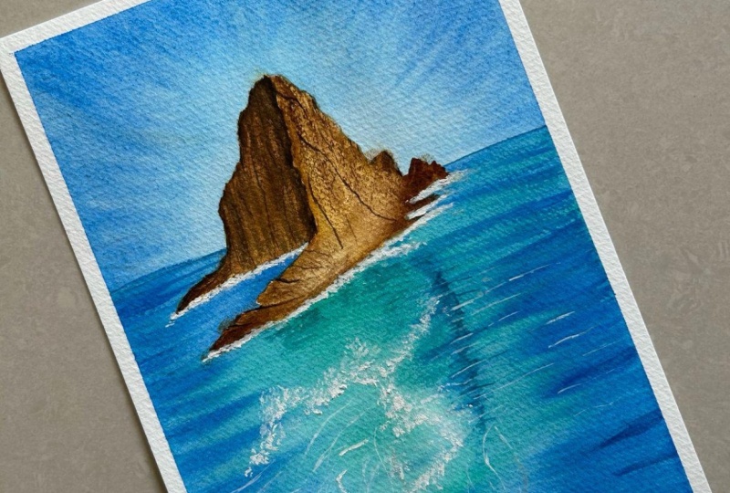
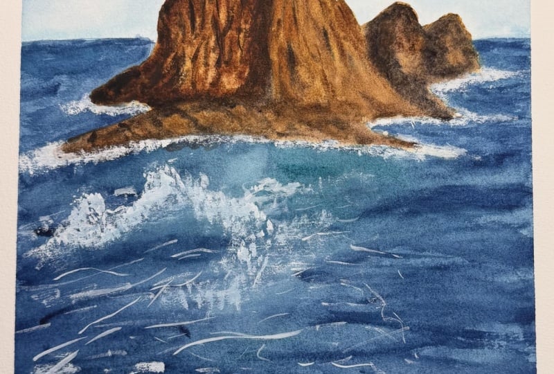
15. Thank You!: All right. So we have
made it till the end. So just take a look
at your own painting and just take some
time to appreciate it. Just take a look
at that blue sky, look at those gorgeous
textures on the rocky island. And finally, look at those
peaceful calming waves. Isn't it gorgeous,
magical and beautiful? You can just describe
it the way you want to. And I must say that I thoroughly enjoyed painting
throughout this class, and I hope you enjoyed
along with me. Having said that, I would
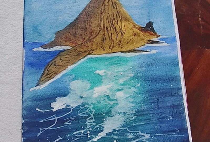
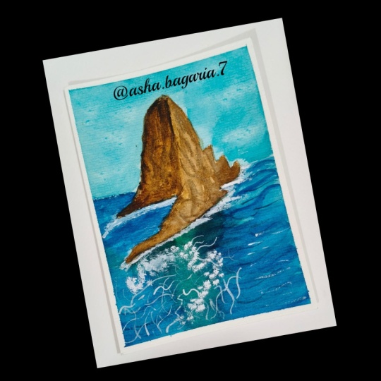
be even more happier to see your gorgeous creations
in the class project section. So please do create your beautiful creations
and post it there. And if you want to
post it on Instagram, then please tag me using
my Instagram handles so that I would be
able to share it with others on the platform. Having said that, this class was a magical experience for me, and I hope I was able to
deliver the same to you all. All right, so that is it
for this particular class, and I would be working on my new class and sharing
the updates with you soon until then stay
happy, stay creative.
 Aishwarya Shetty, my__paint___story | Watercolour Artist