Transcripts
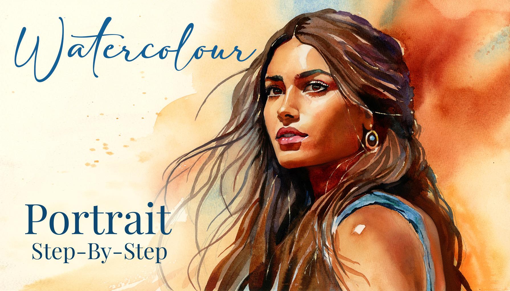
1. Welcome To The Class!: Hello, everyone. My
name is Will Ellison, and today we're continuing
our portrait series with a new watercolor painting
that focuses on warmth, contrast, and tonal richness. Each portrait brings a slightly different
challenge, and in this class, we'll be exploring how to
paint harmonious tones, balancing warmth and shadow while preserving
softness and flow. We'll work step by step, starting with
structure and drawing, moving onto transparent washes and finishing with expressive
confident brush work. The goal is not just likeness, but feeling, capturing
the atmosphere, light, and personality
of the subject. I've been a professional
artist for many years, exploring lots of different
subjects from wildlife and portraits to cityscapes
and countryside scenes. I've always been entranced by the possibilities of watercolor. But when I started,
I had no idea where to begin or
how to improve. I didn't know what
supplies I needed, how to create the
effects I wanted, or which colors to mix. Now I've taken part in many
worldwide exhibitions, been featured in magazines, and been lucky enough
to win awards from well respected
organizations such as the International
Watercolor Society, the Masters of
Watercolor Alliance, Windsor and Newton, and the SAA. Watercolor can be overwhelming
for those starting out, which is why my goal
is to help you feel relaxed and enjoy this medium
in a step by step manner. Today, I'll be guiding you
through a complete painting, demonstrating a variety
of techniques and explaining how I use all
my supplies and materials. Whether you're just starting out or already have some experience, you'll be able to
follow along at your own pace and improve
your watercolor skills. If this class is too challenging
or too easy for you, I have a variety of classes available at different
skill levels. I like to start off with a free expressive
approach with no fear of making mistakes as we create exciting textures
for the underlayer. As the painting progresses, we'll add more details to bring it to life and
make it stand out. I strive to simplify
complex subjects into easier shapes that
encourage playfulness. Throughout this class, I'll be sharing plenty
of tips and tricks. I'll show you how to turn
mistakes into opportunities, taking the stress out of
painting in order to have fun. I'll also provide you with
my watercolor mixing charts, which are an invaluable tool when it comes to choosing
and mixing colors. If you have any questions, you can post them in the
discussion thread down below. I'll be sure to read and
respond to everything you post. Don't forget to follow
me on Skillshare by clicking the Follow
button at the top. This means you'll be the
first to know when I launch a new class
or post giveaways. You can also follow me on Instagram at Will Elliston
to see my latest works. So let's get started and
explore how to build a dynamic portrait with
warmth, depth, and life.
2. Your Project: Thank you so much for
joining this class. This project is a
great opportunity to explore skin tones, facial expression, and hair
in a loose and intuitive way. We'll talk about when to control the paint and
when to let it go and how to suggest complexity without overworking the face. Even if her portrait
feels intimidating, I'll break it down into
approachable steps so you can focus on feeling and
form, not just likeness. We'll start by building up tonal structure with
transparent layers, then using bold contrasts, lost edges, and subtle shifts in temperature to
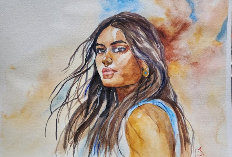
bring it to life. In the resource section, I've added a high
resolution image of my finished painting
to help guide you. You're welcome to
follow my painting exactly or experiment with
your own composition. As we're going to be focusing on the painting aspect
of watercolor, I've provided templates
you can use to help transfer or trace the
sketch before you paint. It's fine to trace when using it as a guide for
learning how to paint. It's important to
have the underdrawing correct so that you can relax and have fun learning the
watercolor medium itself. Whichever direction
you take this class, it would be great
to see your results and the paintings you
create through it. I love giving my
students feedback, so please take a photo
afterwards and share it in the student project gallery under the Project
and resource tab. I'm always intrigued to
see how many students have different approaches and how they progress with each class. I'd love to hear
about your process and what you learned
along the way, or if you had any difficulties. I strongly recommend
that you take a look at each other's work in the
student project gallery. It's so inspiring to see
each other's work and extremely comforting to get the support of your
fellow students. So don't forget to like and
comment on each other's work.
3. Materials & Supplies: Before we get started
with the painting, let's go over all the materials and supplies I'll
use in this class. Having the right materials can greatly impact the
outcome of your artwork. So I'll go over all the supplies I use for
this class and beyond. They're very useful to have at your disposal and will make it easier for you
to follow along. Let's start with the
paints themselves. And like most of the materials
we'll be using today, it's a lot to do
with preference. I have 12 stable colors in my palette that I
fill up from tubes. They are cadmium
yellow, yellow ochre, burnt sienna, cadmium
red, Alizarin crimson, Opramarne blue, cobalt blue,
serlean blue, lavender, purple, ridian, black, and
at the end of the painting, I often use white gouache
for tiny highlights. I don't use any
particular brand. These colors you can
get from any brand, although I personally
use Daniel Smith, Windsor and Newton
for Holbein paints. So let's move on to brushes. The brush I use the most is
a synthetic round brush like this Escoda Purl brush
or this Van Gogh brush. They're very versatile because
not only can you use them for detailed work
with their fine tip, but as they can hold
a lot of water, they are good for
washers as well. They're also quite affordable, so I have quite a few
in different sizes. Next are the mop brushes. Mop brushes are good for
broad brush strokes, filling in large areas and creating smooth
transitions or washes. They also have a nice tip that can be used for smaller details. But for really small details, highlights or anything
that needs more precision, I use a synthetic
size zero brush. All brands have them,
and they're super cheap. Another useful brush to have is a Chinese calligraphy brush. They tend to have long bristles
and a very pointy tip. They're perfect
for adding texture or creating dynamic
lines in your paintings. You can even fan them
out like this to achieve fur or feather
textures as well. And that's it for
brushes. Onto paper. The better quality
of your paper, the easier it will be to paint. Cheap paper qwinkles easily
and is very unforgiving, not allowing you to
rework mistakes. It's harder to create
appealing effects and apply useful techniques
like rubbing away pigment. Good quality paper, however, such as cotton based paper, not only allows you to rework
mistakes multiple times, but because the pigment
reacts much better on it, the chances of
mistakes are a lot lower and you'll be more likely to create
better paintings. I use archers paper because that's what's available
in my local art shop. A water spray is
absolutely essential. By using this, it
gives you more time to paint the areas you
want before it dries. It also allows you to
reactivate the paint if you want to add a smooth
line or remove some paint. I also have an old rag or t shirt which I use
to clean my brush. Cleaning off the paint
before dipping it in the water will make the
water last a lot longer. It's always useful to
have a tissue ate hand whilst painting to
lift off excess paint. Also, you never know when an unwanted splash or drip might occur that needs
wiping away quickly. I also have a water dropper
to keep the paints wet. When you paint, it's
important to have them a similar consistency to what
they're like in the tubes. This way, it's easier to
pick up sufficient pigment. A hair dryer is useful
to have for speeding up the drying time and controlling the
dampness of the paper. And lastly, masking tape. And this, of course, is just to hold the paper down still onto the surface to stop it sliding
around whilst painting. Also, if you plan on
painting to the edge, we'll allow you to create a
very crisp, clean border. And that's everything
you need to paint along. I encourage you to
experiment and explore with whatever materials or techniques you want to practice
in this class. Now let's get on and start
the sketch for the painting.
4. Sketching it Out: So the sketch always starts with a circle and
that's for the cranium. Notice how I'm using
a soft lead pencil, not my sharp lead pencil that's
on the table next to me. Once I do that, I
add a vertical line for symmetry and angle it
based on the tilt of the head. Then I draw a
horizontal line that's halfway down the circle. Then I add a jaw line to that, and that comes down from
the sides of the circle and meets where the chin is, and females tend to have
a softer rounder jaw. I then divide the
face into thirds. So I have the brow line
where the eyebrows are, the base of the
nose, and the chin. And these might vary, but as a general
rule, they're thirds. Then I start placing the
features on top of that. So I don't draw the
final shapes yet. I just block in the
proportions and the angles. So the eyes sit
halfway down the head, and they're about one eye
width apart from each other. The eyebrows rest
above the eyes, of course, following that
eyebrow line that we added. And the nose tip ends
at the lower third. And the mouth sits
roughly a third between the chin and the nose. And the corners of the mouth usually align with the
inner corners of the eye. The ears are quite
obstructed in this drawing, but usually they run from the
eyeline to the nose line.
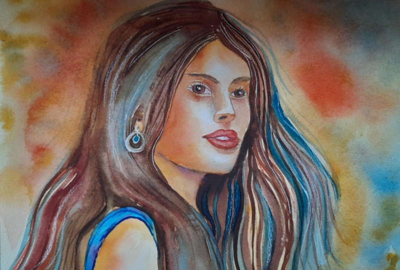
5. Left Background: I'm starting this painting
with a background. So I've just brushed on some
mortar onto that background, but it was a bit
too much, so I use a tissue just to lift
some of that off. And we're going to be
using some skin tones for the background to help
mirror the same pigments. So I'm using yellow ochre and burnt sienna for
this background. I've created a pan for
each of the colors, and then that third one on top is where I can mix
both of them together. I'm also going to incorporate some serian blue because that's a lovely complimentary color to the one we're going
to use with the brown. So I'm mixing that
at the moment, or at least activating
it on my palette, but I'm not going
to put it on yet. I'm just going to prepare
it when the moment comes. So I'm using a larger
brush, a mop brush. It doesn't have to be
any particular brush. Just something that
hold enough pigment and water because the background
is quite abstract, and you can see where
I've wet the paper. It's created a nice soft
edge and where I've left a hard edge to
create some variety. So we're incorporating
that yellow ochre and that burnt sienna, which are lovely earthy tones
and also lovely skin tones. We're pretty much
painting over the hair, not because we want
to layer the hair, but the hair is going
to be dark anyway. So it doesn't really matter
if we go over the hair. As long as we don't go over
the face at this stage, we can just create some nice expressive
background strokes.
6. Right Background: Now let's add a bit
of that blue where it connects from the left
to right at the top. Be careful not to over mix this because blue and
yellow do make green. Adding thicker pigment
into that wet and wet and letting it
just blend by itself. Of course, it doesn't
really matter. If it does make a green, we can make that work by keeping it harmonized
later in the painting. Maybe her earring can be
green or her eye color. Maybe even we can add subtle influences where we don't normally think of green
like her eyebrows. These are ways we can harmonize our palette
and make use of color. Oh making use of wet
and wet at this stage, making sure there's
no harsh lines where we don't want them to be. Maybe creating some dry
brush marks as well. Going right to the edge of
the paper here on this side, so that when we
take that tape off, there'll be a nice clean border, so it frames the painting. See how diluted also my
pigment is at this stage. It's not that thick. That means we can keep on
adding to it bit by bit. You don't have to do anything
particular at this stage. It's just about feeling and expressing and doing
whatever feels right. I'm not thinking about
anything logical, trying to get in touch of my feelings because that's
when intuition comes in, and that's what helps us make decisions once we have a
feeling for something. It makes us reach
for a certain color, reach for a certain texture. And starting off with an
expressive stage like this helps our mind kind of get an idea about what
this portraits about. Adding a few splats
for playfulness. Because we want
to get to a place where we're painting
with intention, but through intuition,
if that makes sense, get to a place where you've had enough practice and
confidence in your medium that you kind of know what you want to
paint with intention, but you don't have to
consciously think about it. You just reach for certain
colors that you want.
7. Pops of Blue: So using a nice clean brush, pure blue pigment, serlean blue, I'm just going to
paint the blue fabric where her little shoulder
strap of her dress or blouses, because we're going
to use this blue, vivid contrast
against the brown of her skin and her hair
to make it really pop. So make sure your drawings clear enough to distinguish
where this strap is. And I want to soften
the edge on top of that I don't necessarily want to have I actually overlapped. I went past where
the blue strap is, so I had to scrub it out. I'm going to use
exactly the same blue for the earring, as well. And I always when I know I'm going to paint
over it with a darker tone, I can overlap it a bit. Don't need to be so
concerned about the border. So I can continue going
back over this strap. Then once we've filled it out, we can start
thinking about maybe adding a bit of
variation in there. Maybe we can add a bit
of thicker pigment in certain places to vary
the depth and the tone. And then maybe we can add
another color in there. Maybe we want to tilt it towards purple because
purple's next to blue. But I think actually, I'm
going to put a bit of green, which is on the
other side of the color wheel next to blue and add a few subtle
strokes of green. Nothing too harsh, still
keeping with the wet on wet, but it just implies some
creases in the fabric.
8. Finishing The Background: I think I want to be bolder with my background on the
right hand side, because I'm going to paint her hair very dark,
black, in fact. So I don't want there to be so much of a contrast
in that area, and at least because it's
black and get away with a darker background and a nice rich brown
background as well. Cleaning that edge with
pure water there because see how when I go
over that blue paint, it actually starts
to look green. But I'm not trying to be
too precious with it. It's only a background, and it's more about trying to feel liberated than
constrained at this point. It's not the major focus point. So even little errors like that, they're barely
noticeable, and in fact, the inaccuracies in them help kind of focus on the things that we
get right later on, like the details on the face. Dropping in more pigment the
closer we get to the hair. This is pure burnt sienna. And it's fun to experiment with different pigments
of burnt sienna. I just have the
main burnt sienna from Daniel Smith
and Windsor Newton. But I know if you look
at the color charts, there's like ten
different variations, and they all have
different characters. So it's fun to experiment. With this particular
burnt sienna or orangely brown pigment, it looks much more vibrant when it's wet to when it's dry. It's easy to think
that it looks very vibrant and alive when it's wet. Then when you actually dry it, it goes more muted. I just mixed a pure orange, actually, then with cadmium
yellow, and cadmium red, and it basically doesn't look too different
from the burnt sienna, but when it dries, the orange will actually
maintain its vibrancy. I just mix that on
the bottom right. Now I'm mixing a
more muted brown, and I'm painting the underlayer
for where the hair will be. I'm just blocking it out. I'm not painting any
individual strands. Because when it comes
to painting the hair, we'll have the wavy little bits on the
left that you can see, but then we'll have the more
mass blocked out section, and that's the bit
that I'm doing the under layer
for at the moment. And it's easy to think that
your painting is very ugly when you just do the underlayer stages because they're just the abstract parts, you're blocking in without any detail or no
anchor at this point. So it looks like it
could be a mess, but we're just
preparing the painting, so it's perfectly fine
for your painting to be a mess at this stage. As long as you know where the structure of your painting is because of your
drawing below, you know which bits
you can be expressive and which bits you
need more precision. And at the moment, we
don't need much precision. So as long as we paint
within those lines, we can be quite expressive. Adding a few expressive
random brush marks at the bottom here. A
9. Starting The Face: Now I completely dried
it with the hair dryer, and it left a few hard
lines that I didn't want the harshness takes
the attention away. So I want to smooth
it out a bit. So using pure water, I just scrubbed it up
where those hard lines are and softened it out as much as I can without
wasting too much time. Now I can completely
dry it again. It's sit bit of a
hard line there, but better than before. And again, it doesn't matter so much because
it's just the background. Now we can start
painting the forehead. Working our way from
the top to the bottom. The colors that I'm using for my skin tones are
always the same. I use burnt sienna, yellow ochre, and a bit of red. And I use these in very different
combinations depending on the skin tone or the color of the skin that
I'm trying to convey. There's a lot of warmth
in this skin tone. So basically, it's
just burnt sienna. And all we'll need the red
for is maybe the lips. We don't even need the red
for most of this painting. There's a little sharp
highlight that I'm trying to maintain the curve
of the forehead there. And you can see how I'm
subtly darker at the top, and then it goes
lighter, and then I'm adding more
pigment as it goes down again because
I'm thinking about where light is being reflected. And when it comes to
composing these paintings, I have lots of different
reference photos. I have a folder
with thousands of different faces that I've collected online
from Google Images, Pinterest, magazine
cuttings, scanning. But I also have mannequin
model at home that, I can hold against the light
in different light sources, and I've done practice
sketches using that to kind of figure out the pose that I want and where the
light is coming from. And I can use that
as a reference, so I can see which bits are light and which
bits are dark. But a lot of it is very subtle. And because it's
subtle, it doesn't really need too much complexity. So far, we've painted the skin tone a kind of
base mid tone color. There's not too much difference. Slightly darker at
the top, like I said, but what's more important is
saving some of the whites. So we've got that shiny
highlight on that forehead, a tiny little highlight on
the bridge of the nose. And we're painting the section
here without going over the eye at all or the eyebrow. I purposely kept the
eyebrow unpainted.
10. Facial Underlayer: And whilst it's still wet, we can start to influence it. So we don't need to
get the tones right. As soon as we put
it on the paper, we can use the brush
to draw out pigment. And often, that is
the way to do it. You can't affect the tones straightaway because
they're going to change. You need to wait for
it to dry a bit. So notice how I've gone back to that
forehead now and I've used the brush to draw out pigment in the center to give it that feeling
of curvature there. It's always a matter
of give and take. And now I've used a very diluted wash to
soften up the cheek. So from where the nose blends to the cheek, it's
going to get lighter. Again, because if we imagine the curvature and where
the light is coming from, it's going to reflect that
light and be lighter. Now I can soften up that edge there because I don't
want a hard edge there. Now, you can see I've
created a hard edge with that brush where the corner
of the lip is on the left, but I know I have
to soften it up, so I clean my brush and
go back and soften. Pure burnt sienna there. See how it's so much more vibrant on my paper
than in my palette. Because we've got
that nice clean white that's reflecting through
that transparent medium. Whereas my pats a bit dirty. Carefully painting around. This is with yellow
ochre, actually. I'm painting the
golden necklace, the ring that goes around
it with yellow ochre. But you can see how the
cheek curves around into the jaw line that the jaw is going to be in shade because it's
a different angle. It's not hitting the
light the same way. And also notice where
I've softened and pulled away the pigment
around the mouth and the nose, the lip area. We'll come back to that.
11. Defining The Forehead: So we completed our first layer, our first parse of the face, and now we're going to go
back and refined it and build that depth starting again
with that burnt sienna, further emphasizing that
the temple on her face, it's not completely accurate,
but it doesn't need to be. It's a good example
of where you can take your artistic license. There's a curvature there on the forehead where
it captures the light. Choosing to keep the
hard line on the right. And I'm looking
ahead to where I'm going and considering
how to tackle it. I've cleaned my brush there, pure water so that I can make a nice smooth transition
rather than a hard line. Darkening it on that
left hand sign. Again, so we've got dark that gradually turns to light and
then back to dark again. Always cleaning my brush,
going back and forth. So I've got a nice
wet, clean brush. It's not overloaded. But
to help keep it even, and then moving down to
the bridge of the nose, squinting my eyes at my
references and my sketch. H. I always do a sketch
before a painting, a tonal sketch so that I can
figure out the tones because going straight into a painting from a group of
references and pictures, it's impossible to work out how you're going to
do it there and then. You have to break it down
into a simple sketch, a thumbnail sketch, just a sketch no bigger than
the palm of your hand, just to get a rough
idea about the tones, and then you can do another
one a bit bigger to further emphasize and
work out the details, and then you can go
into a painting. I'm painting the bottom
eyelid on the left right now, darker at the top,
where you can imagine the eyelid is curving upwards, so it's again, facing
away from the light. And as it gradually curves
downwards into the cheek, the cheek is facing
the light more. So of course, it's
going to get lighter. Always thinking about
the relationship of light and shade of the angles of the curvature. A
12. Bridge Of The Nose: Now we can start
painting the nose, looking at the areas which are darkest and where to
blend them with the top. I'm keeping that little
highlight of the white. Of course, if you miss that, you can always go back with
white guash at the end. On the tip of the nose I'll
keep a little highlight, too. I'm trying to keep
the colors simple. I'm using a burnt sienna, as I always have done. And that means we
can just think about the tones rather than
the mixes of color. Notice how I'm changing my brush depending on the size of
the shape I'm painting. So when I was painting
the background, I was using a big brush. When I was painting
the forehead, I was using a medium brush, and now I've moved
to a smaller brush when painting these intricate
areas with the nose, the eyes, and the lips. But then I'll move again
to a bigger brush when painting the jaw
or the hair later. And you can ask me what
size brush I'm using, but it all depends on the size
of the paper you're using. If I was using If I was painting
double the size of this, they're now double the size
of the brush I'm using. And if you're painting
a smaller painting on a smaller sheet, then you'd probably have to use a brush half the
size that I'm using. Painting the eyelid
on the other side, and I'm acknowledging the
shadows of the eyelashes a bit. Cleaning my brush and blending it out so there's
a nice soft transition. Again, I'm trying to think
where I want those harsh lines and where I want
those soft lines.
13. Around The Eyes: Watercolor painting
relies on layers. And although there's other
mediums that you can work with layers like acrylic or oil, maybe, they don't require layer quite as much
as watercolor. So with an oil painting, although I'm not an expert, I imagine you can paint
your darks at any time. But with watercolor,
you can't paint your darks and then use the white of the
paper after that. So because we're only
starting with lights first and then medium tones and then
eventually dark tones, it can look very odd when you're halfway
through a painting. So at this stage, you can see looking at here
and my painting. It looks very odd, actually. It's hard to judge
whether it's going to work out or not because it
just looks a bit strange. But through experience,
you understand that that's just the way and
the process of watercolor. So you have to have
faith that it will work out and that your judgment is kind of skewed at the moment. As long as you're assessing
your tones and your edges, and the seclon that you're
painting is accurate, then it'll all come together as a complete
package at the end. It's only at the end
we can fully assess our painting as a
cohesive piece. But we can have faith that it's going to
come together because we're using the principles
that always work where we've got our colors harmonized because
it's very simplified. It's a limited color palette. We're using burnt sienna, basically, and Cerlean blue. That's the only color
we've really used. We've used a bit
of yellow ochre, just to influence
the burnt sienna. But apart from that,
it's quite controlled. So that means all we've
got to think about is the tone and the edges. So when you're following along, I suggest you follow the video while you're
painting rather than looking at the image of my final piece because you'll know the process
and the step by step structure of
how I'm painting it because it's a
bit like a puzzle. You got to know the
sequence of events. By just solely using
my reference image, you may forget a few underlayers
that can easily be done. But if you follow step by step, with the video, pausing it, and then going back as
a kind of checkmark, you shouldn't miss any section. And you can pause the
video at each stage to kind of match it to get it as close
as you can to mine.
14. The Nose: And when I say close
as you can to mine, I mean just the
scaffolding, the structure. You can change
things if you want. You can change the skin tone. You can change the hair. Maybe you don't want to use blue as the second
color in this. Maybe you want to
use purple or green. Just things like
these highlights and the shading underneath the nose, you'll probably want to follow along because I don't
think of it as a nose. I just look at this shape, and it's a kind of abstract
shape, but it's a block in. I'm blocking it in. And then I'm softening certain edges of
that shape, like right now. To where that nostril is. Again, it's curving
where the light is. And then there's a
little sharp shadow where that nostril corners.
15. The Cheek: So this is a nice
little checkpoint. Now we finished the nose section because we're about to go very bold with the shadow on
the jaw and the cheek. Starts off nice and simple. We're adding a nice little
diluted line that follows that kind of diagonal line up from the lip to the
bottom of the ear. And that initiates the wash because it'll start with a
wet on wet kind of curve. It's not a hard angle where
the cheek turns into the jaw. It's a nice soft gradient. So we added a nice diluted wash, and then we're going
to add a heavy pigment now that will blend down. Still using that burnt sienna. Even though it's a
smooth transition, there's still a sense of curvature that we
have to be aware of. Make sure you don't paint
over the lips as well because we're going to be
using a red for that later. You can also take
your time, actually, because we're going to
be painting wet on wet. We can just keep on adding
more and more pigment, and the hard line at the moment, is going
to be painted over. So I'm bringing it down to
where I'm actually going past the pencil line because
I'm going to be painting darker over
that pencil line. So we can go over it a bit. As long as we can still see
that pencil line, we're safe. Cleaning my brush
because there's going to be a little
highlight on the chin where it curves up again. But as it curves down, that's the part that
we'll bring into shadow. Some subtle tones
going on there. Painting the ear, but not painting over the
golden part of the earring. You can look at the
finished painting as a reference to see what
we paint over later. I'm also softening up the
top of that jaw again. Using the white of the paper there to really make it shine. Cleaning my brush. And
it's a back and forth. It's adding pigment and then using my brush
to take it away. And during this
wet and wet stage, we have the most control. Eventually, it will dry. But we could actually keep on going if we remember
to soften the edges, and we add more water gradually, not a lot, but,
like, bit by bit. It's the curvature of
this cheek that I wanted to express most in this portrait because it's
like a wet on wet curvature. Of course, with oil, we could go back and forth with different
brushes to blend it out. But with watercolor, we
have to do it with water. So it's a fun little
challenge to do. Using very thick burnt sienna now. Still wet on wet. You can also have a little spray gun to give it a bit more
life if it starts to dry. Because with a
section like this, you can't really re wet
it once it's dried. You have to maintain
the wetness.
16. The Jawline: And that's why paper
quality really helps because although it is
expensive cotton base paper, it allows you so much more
freedom and time and it's that much more forgiving
when it comes to reworking and correcting areas. Because if we're
using cheaper paper, paper that wasn't cotton based, it would
start to crumble. Particles of the paper
would break off, and I basically wouldn't
be to do what I just did there if it wasn't cotton
based paper, unfortunately. But that doesn't
mean there isn't a place for cheaper paper. Sometimes practice
is just practice. We're not trying to
create a masterpiece. So I still use cheap paper outside of classes
for my practice sketches, my practice paintings
for this class. And yes, the end
result isn't as nice, but it almost forces you to
get it right the first time. And because you know
it's cheap paper, you don't have as
much pressure to get it right or you
don't feel the fear, so it makes you a bit
more creative, maybe. So in quite a large
wet on wet area like this, it starts off, of course, very wet and it's in that time where we're doing the larger general
shape of the shadow. But now as it's starting to evaporate and it's
not wet anymore, it's more damp than
moist or sodden. We have a bit more precision, so we can't do those
broad shapes anymore. We have to move on to the next stage and just
add a bit more refinement. So, as it's drying, I'm not walking away
from the painting. I'm going to observe it, do little bits just
to help refine it, bring that soak up a
bit of that pigment as that jaw line from the
chin goes up to the ear. Maybe define that curve
from the corner of the mouth up to where the
top of the ear would be. Of course, I did have pencil
lines to help guide me. Drop a little bit of
pigment in there.
17. The Eyebrows: It's completely dry. I used hair dryer and we can move
on to the next stage. I'm starting to incorporate
a bit of black. And I'm painting the eyebrows, starting from the left. The eyebrows aren't
too difficult to do if you've drawn
them out correctly. We're just filling in that area. Using the tip of the
brush to make sure we're accurately filling in
where the lines are. But you'll see on
this right one, I left the white of the paper. And that's because
I want to yes. Add another color in there, just to make it a
bit more exciting. I'm choosing to put
some green in there, actually, just because
it's what I'm feeling. There's no rule as to
why I'm choosing green. You can put blue, purple, or you can just
leave it pure black. It kind of matches that green
kind of stroke we added in the background at the
top, slightly to the right. It helps make it uniform. So even the eyebrows, they're not a solid black. They're not a solid
tone. They've got some variety in there. And when painting a female, it's generally better to have thinner eyebrows
than bushy ones. But even still,
we're creating a bit of variety it's not
just a solid stroke. We've got some texture
at the ends. Oh
18. The Eyes: Now with painting the eye,
I'm using the black again. Maybe it's picking up some of that brown that we've
got on our palette, but it's fairly thick. It's still very pliable. It's coming off the
brush very easily, but it's not very diluted. We don't want it to dry gray, and using the very
tip of my brush. I want to maintain and
preserve some of the whites, especially on that lower
eyelid, the tiny little bit, where the eyelashes
are coming out, I want to keep white. And then the eyelid on top. I want there to be shadow there. Of course, in real life,
they're not lines. They're just very small shapes, but we as artists simplify
and turn them into lines. Painting the pupil and the outline of the iris and
some of the eye lashes. Again, having your drawing as accurate as possible
helps immensely. If you don't have the pencil
drawing to guide you, it's going to be very difficult
to do it with the paint. Same thing on the other side. Notice how I'm not using the absolute smallest
brush in the world. It's still got the
thickness to it, and it doesn't matter if it's not the
smallest brush as long as it has that fine tip. Trying to get the eyes to
match their positioning. So they're slightly
turned around. They're facing the
corner slightly. Or at least the irises
are in the corner, and the pupils are looking
straight ahead and then using a little bit of
brown to blend out that iris. Though it's so dark,
it could be black, but there is a subtle
brownness in there. And now we can start softening.
19. Adding Highlights: Using the tiff of the brush
to imply some eyelashes. You don't need to paint
every single eyelash, but slightly varying
the thickness. They're all very
thin, of course, but from super thin
to a bit thin. I've cleaned my brush now, and I'm just softening some areas because the whites of the eye aren't
actually white. So I'm bringing some of that grayness and
brownness into there. Make sure you don't touch the iris or the
pupil of the eye. If you're a bit cautious, you should dry it completely before blending out the whites
of the white of the eye. Starting to define
that shadow a bit. Sometimes if the details
look a bit wrong, you can smudge them and rather than actually
putting in the detail, you can convey the detail
with a general tone. That's what I'm doing here
in the corner of the eye. I don't need to paint
out all the details like the tear duct, generalize it. And now that it's
completely dry, I'm using a bit of gouache. I'm not actually using
white guash this time. You'll see just below
the white on my palette, there's a kind of yellow
ochre mixed with white guash. I'm just two tiny dots there. You could put one dot,
but just for interest, I'm putting two dots there, one slightly larger
than the other, but they're both matching on each eye to give it
that glossy feel, the wetness of the eye. And now we can start
the next stage.
20. Defining The Nose: Mixing some yellow
ochre in there. We can start moving down to the nose with a bit more detail. So there's lots of
complexity in the face. But we try to break each step
down into manageable parts. Even if each manageable part is quite detailed and takes
a lot of concentration, we're trying to make
it approachable, so you can pause the video, and it may take a long time initially trying to match
each little section. But after a few attempts, you'll kind of get a feel for it and it'll speed
things up and you won't necessarily have to
follow me step by step, or at least you can have longer gaps between
pausing the video, or you can add your own
personal interpretation to it. Mixing a dark brown here, again using the tip of my brush. Just the bottom corner
of that nostril, not even the nostril, outside of the nose where
there's a sharp, little shadow that looks like a line and it softens out and spreads
out above the nostril. A lot of these things are
common with all portraits. Doesn't matter the
ethnicity or the angle of the face or whether
it's a male or a female or a child
or a elderly person, there's always going
to be a little sharp corner on the nose, where the nostril
meets the cheek because the light just doesn't reach that part in a sharp way, and it always blends upwards. Of course, noses have
lots of different shapes. So you have to
adapt that kind of shadow and light to the various
different types of noses, but the fundamentals of the
shape is still the same. So it's once we get comfortable with painting and drawing multiple different
types of noses, we can start to adapt
it much more easily. So it's a practice
thing, really. And that's the same with
eyes and the mouth and ears. Even though they all vary, once we've practice painting
many different types, we kind of get a feeling an
intuition of how to paint it because we just know where
the commonalities appear. And that's how we simplify a
lot of these complex scenes, it can be very overwhelming to see a human face and know
how to break it down. But once we memorize
the key parts, we can only add those key parts, and it anchors it altogether. It just does take a lot of
time to practice and remember these key landmarks on the face. Uh,
21. The Lips: Now we can start painting the mouth area,
starting with the lips. I'm going to use sarin crimson and even mixing that in with
the burnt sienna slightly. Again, having it sketched out, so I know exactly which
area to block in. I start off with a
thick kind of pigment, and then I can use water to use that pigment that's already on the paper to fill
out the rest of it. So I'm not always going
back and forth from the paper to the palette. Kind of through
practice and intuition, I kind of have a feeling for
how much pigment I need, and I just add it
all in one go and just move it around
on the paper. And like with every
element of the face, I'm thinking about the
curveture and where the light is reflecting and where the light isn't reaching. So as the lip curves down into the middle,
there's less light. So that's why it's darker there, especially in the
corners of the lips. Rather than red, I'm using
brown for the shadows. Then we can do the same
thing on the bottom lip. And when we think
of the top lip, it's actually depending
on the person, of course. It's facing down. So the top lip is
generally darker than the bottom lip because the
bottom lip is curving upwards, facing towards the light. So it's naturally going to reflect more of that
light and be lighter. H. Connecting it with that shadow. Dropping in a bit more pigment
to emphasize that depth. Scrubbing it a bit cause
often on the bottom lip, where it reaches the
corner, it blends. There's not a hard line, there's not a hard separation.
22. Mouth Shadows: Her lips are slightly open, so I did just imply teeth there, but it looked too
sharp and strong, so I just smudged it
out and toned it down, so it's slightly gray in there. But I might come
back to that later. So now the bottom of
the lip curves upward, like I say, but below the
lip as it reaches the chin. It's in shadow. It's in shade because
the lip kind of comes out and it kind of blocks
that light from underneath. It's actually very zigzag. If you look at the profile
of a face from the nose, it just goes out, then in, then out in, and
then out and in. So you can just put these fairly simple shapes like this underneath the lip to
define where the chin is. And, of course, on
the tip of the chin, there's a highlight
there as well. Mixing in a kind of muted brown and just dropping it right underneath the lip there to
make the lips really pop. I don't really want
smooth lines where that shadow is touching
that lip or the chin. So I dry that out completely
with the hair dryer. So now we can go back and emphasize some details without it having the wet on wet effect. Because in the
corners of the mouth, I want it to be
really quite dark. Very small area, but having those little dark points
adds to that feeling of depth and tonal contrast. Again, trying to figure out what to do with
the teeth there. It's just something I didn't
figure out in my sketch, so just kind of getting
a feel for it here. I think I will
darken it, actually. Sometimes the answers
don't come quickly. You have to carry on with the painting
and come back to them. That's a sarin crimson again. Increasing the feeling of
curvature on that top lip. Slightly smoothening it.
23. Darkest Darks: So I decided to smudge
out and darken the teeth, so it's completely in shade and it's less distracting now. I've mixed a very dark brown. It's basically black, but there is actually burnt seen in there. I'm going back to my pencil line and painting where the end of the neck end of the chin is. In preparation to
paint the hair. But before we can
paint the hair, I need to make sure we
paint the outline of the face using negative
painting technique. And, of course,
with such a dark, bold pigment, there's
only one attempt at this, so be very careful. Make sure your pencil
line is clear. You can always re draw on it at this stage before you
commit to this dark pigment. And technically, you can also at the end,
if you do go over, use white squash, but that's just a safety net that we
shouldn't really rely on. Now using that black
to kind of soften that neck line because even though in reality,
it's a hard line. I don't want to create
attention to that area. I don't want hard
edges everywhere. So I'm using my artistic
license to kind of soften where that shadow is
underneath the chin and jaw. Now I'm just about to paint the earring using
negative painting, and I'm continuing this wash
with black and burnt sienna. Unfortunately, my camera
cuts off after 30 minutes, and I didn't notice, so I didn't turn it back on
whilst painting this section. But if you pause the video, you can refer back to it to
make sure you've caught up. Again, I've just used the same colors just
to fill out this area, the little bottom of the
ear and the earring.
24. The Shoulder: Now we can start to
paint the shoulder. And I'm mixing a bit
more yellow ochre into this skin tone because I want
the face to feel warmer. If you think about it, it
makes sense because there's more capillaries and
blood vessels in the face drawing blood and
it makes it warmer than the yellow that you might
have on a shoulder. I'm very careful also to leave a little
white highlight there, just where the reflection of
light might be going there. I mean, there's no reference
for this in my photos, but I'm just adding that little white bit of paper to help give
the illusion of form. Trying to be careful not to paint over into that
blue shoulder strap, although it's not too important. As long as you don't completely paint over it, it
should be okay. Now I can drop in some
darker brown pigment. Not that vibrant, quite muted. Again, building on
that feeling of form. It doesn't need to be detailed because it's not
the area of focus. It's not the focal point. And whilst it's wet on wet, it'll all blend nicely and
be quite ambiguous shading. Now we can start to
do the same above, matching the colors, basically. So this will really
make that blue pop. Using a nice mid
tone to fill it out, and then we can go back over and kind of add
variety to the wash. M making it a bit darker so that we can
really make that blue pop. Mixing a very muted brown now. And I've allowed it to dry. So this is just a
pure sharp shadow where the arm creases with
the armpit, basically. Then I can use a tittue just to soften that
edge at the top.
25. Starting The Hair: Now the skin is
completely painted, and we can move on to the hair, basically, and the
outline of the face. So I've mixed ultra marine blue with the black because I don't want it to
be a solid black. I want to give it
some color in there, just in case it gets diluted. And I'm just using the
tip of my brush to very carefully paint the outline of the face like we did
before at the bottom, where the chin and the cheek is. We're just moving up
where the eyebrow is. Again, I made sure I could
see where the pencil line is so that I know it's accurate. All I have to do is use the brush to paint
up to that line. And a millimeters
difference is fine. You can feel quite nerve
racking with such a bold, dark pigment in such
a delicate area. But as long as you
take your time, make sure your hand
is comfortable and you don't go over that
pencil line, you'll be fine. This is when the face
really pops out now. Starts to anchor it
and hold it in place. At the moment, well, before we had those black lines, the tones were too similar
with the background, and it didn't really stick out. Now we're using the hair to
kind of add to the depth. Considering what to do next, always having it in your
mind where you're going to go before you act
because you don't want to start painting and
realizing you're loss. So you have to play it out in your mind before each stroke. So using the tip of my brush, just to add a few of these
wavy streaks of hair, gradually adding more
pressure as we go closer to make the line thicker. You don't want to do this
with a very thin brush because you won't be able
to achieve the thickness. And So we did the initial curl. Then we did a secondary curl that connected it
to the hair above, and we can start
working on that. Of course, I've already again, used the pencil lines
to map out where I want these streaky hair lines to go. It's just deciding what tone to paint them in and which
order to paint them in, and how thick to paint them in. We could start blending
into that black now. Mm hmm.
26. Connecting The Strands: There's only going to be eight or so little strands like this. We've added four of them so
far connecting some of them, letting them cross over a bit. This creates the illusion of hair because the rest of
it's basically blocked out. As we get closer to the skin, they can be a bit
more concentrated, making sure we don't
paint onto the face. Then we can start
blending it in there. We want to allow some streaks of the background
to come through. Notice how all the
hair is connected, none of it is isolated. And the tones are very similar
as well at the time being. I mean, it helps that
she's got dark hair. If she had blonde
hair or lighter hair, it might be a different story, and we'd have to use a
different technique, but we've got a lot of freedom tonally when she
has dark hair like this because it's all connected and within the lines,
they're quite soft. Notice how even though
all these strands of hair are separate, they follow the same kind
of curvature to begin with. They kind of go outwards
and then inwards, and then they straighten up as they get closer to their hair. And then once they
get to the top, I use the thicker side of
my brush to connect them all like I am now. Connect them almost like roots, basically, or a tree branch. They join and get thicker.
27. Hair Shadows: So that was a bit
more controlled, even though we're trying
to make it feel organic. We took our time and kind of planned out where we wanted
to add those strokes. The next stage of the
hair is to be a bit more spontaneous to contrast that
to make it feel more alive. So keeping the same brush, let's mix more of that color. This time, a bit of cobalt blue, I think, rather than
ultra marine blue. And we can start being a bit broader connecting
that dark shadow, the darkest part
of the painting. Alright. Even though it's blue, you can see the
background is brown. So this blue on
the brown actually makes it quite monotone anyway. You don't really see the blue
directly on the painting. And by blocking
it out like this, it still feels like hair. We just simplify it. We paint hairs in blocks rather
than individual strands, allowing some of the
paper to come through, some of the background
to come through. Now I can start mixing
a richer brown to blend into that, starting
from the bottom. Notice how I'm applying slightly different pressure to affect the thickness
of this hair. It's following the
general direction. But the waviness helps
the hair overlap. Blending some sections,
avoiding some sections, creating a bit of variety, adding some strokes
onto the shoulder, more like shadows from the hair rather than
the hair itself, so keeping it warm. Remember blocking
out hair shapes. Because even though
hair is made up from hundreds and
thousands of strands, they do tend to clump
together or they follow a kind of common curvature. And that curvature is the same way as the
other facial features, some of it is facing
towards the light and some of it's in shadow. So with whatever we're painting, we're using light and shadow to kind of determine
how we paint it, how to block it in, how to convey the tones
and the curvature. We're not thinking of the independent strands or the countless pores on the skin. We're generalizing it. We're making it easier to read. I'm just adding a
bit more pigment to these dark areas
because as it's drying, it looks a bit too light. And these strands aren't blending in the way
they're meant to, so I'm just helping it out
with a bit more pigment.
28. Rightside Hair: Of course, if you look
at this area isolated, it's very abstract and it's impossible to
tell what it is. But within the context
of the painting, we understand it as hair. Starting to move on to the
right hand side of the hair now and using that
curved nature. I'm not being very
specific at all. I can see the pencil line here. I want to allow some of the skin to show
behind this strap. And then I can fill out
the rest with hair. It's just burnt
sienna and black. 90% of this painting
is burnt sienna. We've just used yellow ochre to help make certain
subtle variations, and we've only used black
to increase the contrast. We've used the Cerlean blue to make a dark contrast to that brown because
there's so much brown. We've made use of its complimentary color
blue to really make it pop, likewise, in the earring there. And we've used a subtle bit
of red on the lip, of course, because that's what
we understand as red, our mutual visual language. And also, it adds
a bit of variety. We don't want it to
be all stagnant, burnt sienna, or pure
one color monotone. We want to create a little
bit of subtle variation. Likewise, with the hair, we've added a little bit of
blue into the hair. You can't even see it as
blue once it's on the paper, but it influences the
color in a harmonious way. So zig zagging these hair
strokes as it curves up, trying to think in three D, how the hair is resting
on the shoulder, curving around and then
folding up behind the ear. Not so much thinking about where I'm applying the strokes, but what paper I'm leaving underneath
it, the little gaps. So I'm thinking in
an inverted way, negatively painting the hair. Because it's always easier to
add more and more pigment, but once you go over,
you can't take it back. Of course, we can use gouache, but gouache always takes
away some of the spirit. It's vital for
little highlights. Areas that need expression. We don't want to sacrifice
little gaps in the paper. But when we can allow the lightness of the
paper to come through, we should try and take
advantage of those parts.
29. Blocking in Hair: Now we've got the general
form of the hair. We can start building on it
with extra tone and choosing which bits of the
paper to get rid of and which bits to
preserve a bit more. So I've mixed a
very thick black. But again, it's
not a pure black. I still used some brown
that's in my palette, possibly blue to harmonize
it a bit better. And there's a lot of wet and wet going onto mixing
some blue right now. Thinking about how I
want to connect it. Using broad strokes, using wet on wet to create
clean transitions. I want it to be a bit darker. Make this earring pop, so make it a bit darker there. Start working from the top, trying to convey
the general form and direction of the hair. Always, not just randomly
scribbling it in because then we won't allow the white of the paper to fall in line with
the direction of the hair. We can still be
expressive within the confines of the
area we're painting. Actually mixing a bit
of purple in there. Completing the silhouette
of the figure now. It takes a lot of
faith this stage, because unlike when we're
painting the facial details, where we're taking our time
to make sure it's right. To capture the expressive
feeling of hair, we can't really take
our time with it. We have to kind of take
a leap of faith and hope that our brush
work looks pretty. And that is just something
that takes time and practice, muscle memory, and
pure intuition. And intuition comes
from confidence and knowledge through
repeated practice. And that's why sometimes cheap paper can
have its advantage. If you want to do a final
finished masterpiece, then cotton paper is
ultimately better. But for practicing and
building your muscle memory, there's no harm in
using cheap paper, or even I have something
called a buddha board, which you can see in my materials and supplies video where I'm testing my brushes on. It uses absolutely no pigment. It's a gray slate. And when you using pure
water, it goes dark, and you can practice
all kinds of brush strokes just to build up that confidence with
your brush strokes. Likewise, maybe you're just
getting very cheap paper, using your cheapest
pigments and just practicing these hair strokes before you actually
apply it to this. It doesn't matter what tone you're using when
you're practicing. You can just use a monotone, and then when you come to
paint your actual portrait, you can start
integrating more tones. I've included a bit of purple on the top
of the head there, but that wasn't essential. That was a personal choice. Maybe I could have
kept it brown. Or made it a bit blue. It
really doesn't matter.
30. Tinting The Head: Now, whilst it's still wet, we can add more
and more strokes. As it starts to dry, these strokes will hold
their shape a bit more. So we're creating a
nice range of wet on wet to eventually wet on dry. And that creates the depth,
improves that illusion. Darkening it at the top here where the light is hidden
underneath the hair. But the light's not reaching it, so it needs to be darker. I'm going to further enhance the outline of the hair as it
comes down across the face. I have preserved quite
a lot of the paper, so that gives me
a bit of choice. I don't want to
keep all of them, so I've got to choose which areas I want to keep and
which areas to paint over. Where are the most
important parts that help convey the message, the feeling I want to express. I think the paper
that's coming through the hair underneath the chin and on the shoulder is too light. So I'm just going to
do a bit of glazing. I'm going to mix some brown, burnt sienna and just very quickly and lightly go over it. I'm not trying to
smudge anything here. I'm not trying to affect the
lines that are underneath. Just trying to tone
it down a bit. There's too much contrast there, so glazing is a very
useful technique, but you have to do it
very quickly so you don't agitate what's underneath. Now, painting the hair
on top of the shadows that we painted before
on the shoulder. Now I can start smudging maybe some of the
shadow areas here, purposely agitating some of it. Softening out because
when we first blocked in, there's lots of hard
lines going on there. So we're going over with a second take softening
out some areas. So it's not all uniform.
It's not rigid. Mixing some serlean blue. We've got little touches of Cerlean blue scattered around. And although on the shoulder, the earring and above the
head, it's very obvious. We still want there to be a more kind of
harmonious transition. Not transition, but
we've got pure blue, and we've got brown, and we
need some areas in between. So adding little touches of the blue help balance
it out a bit more.
31. Powerful Details: A few touches to this strap. It's almost a solid blue. So I want to vary it a bit. Add a bit of subtle shading. We're just bringing the
painting together now. A very fine sharp
line sharp shadow that might indicate a
single strand of hair. It's just a few of these
tiny little details. A little bit of finesse gives the illusion that there's
more detail than there actually is filling
out or just implying the shadow of the ear lobe. Assessing what really needs
to be done and what can be left out on purpose. Trying to restrain myself from overdoing it, overworking it. You could easily say that
this paintings done, but there's actually
a few things you can do to really make it pop those few simple
little lines that add that further definition
and create feeling. Because there's not apart
from the details on the face, the rest is actually
quite abstract, not very I was going
to say sophisticated, but I guess I mean precision. It's quite loose and abstract. So just bringing
it together with a few well placed
lines to anchor it, to give it the illusion that there's more detail
than there is. And again, I'm not using
white paint for this. I'm using that yellow
ochre gouache that I've got below the white on my palette because it has
a bit more warmth to it. White is actually
a very cool color. And this gives a feeling
of golden warmth. You can just imagine the sun glistening off these
little strands of hair. I'm also using a dry brush
kind of technique to add to that texture
that natural texture. See, with lines like this
that we're painting, it would be impossible
to just have so much precision on the
neck to preserve the paper. So it's in areas like
this that we have to rely on highlights using quash. Some people might say you
could use masking fluid, but that really
damages the brush. And the painting evolves
as you paint it. So if you use masking fluid, you're often stuck with that and you have to
work around that. But just by adding
this guash at the end, you're free to do
where you want to. You know how much to put, how much to leave out. Also, you can be much more precise because you've got
the tip of your brush here, but you can't be so fine
with masking fluid.
32. Final Thoughts: Welcome back and congratulations on completing this
portrait class. I hope you enjoyed exploring
how warmth, contrast, and transparency can all work together to create a portrait
full of mood and emotion. Every portrait tells a
different visual story, and the more we
practice adapting our palette and brushwork
to suit each other, the more confident and
expressive our paintings become. Remember, watercolor painting is not just about technical skills, but also about expressing your creativity and
personal style. I encourage you to
continue exploring, experimenting and pushing
your boundaries to create your own unique
watercolor masterpieces. As we come to the
end of this class, I hope you feel
more confident and comfortable with your
watercolor painting abilities. Practice is key when it comes
to improving your skills, so keep on painting
and experimenting. I want to express my gratitude for each and every one of you. Your passion for
watercolor painting is so inspiring and I'm honored
to be your teacher. If you would like feedback on your painting, I'd
love to give it. So please share your painting in the student projects
gallery down below, and I'll be sure to respond. If you prefer, you can
share it on Instagram, tagging me at Will Elliston, as I would love to see it. Skillshare also loves
seeing my students work, so tag them as well
at Skillshare. After putting so
much effort into it, why not share your creation? If you have any questions
or comments about today's class or want any specific advice
related to watercolor, please reach out to me in
the discussion section. You can also let me know about any subject wildlife or scene you'd like me
to do a class on. If you found this class useful, I'd really appreciate
getting your feedback on it. Reading your reviews
fills my heart with joy and helps me create the best
experience for my students. Lastly, please click
the follow button Utop so you can follow
me on Skillshare. This means that you'll be
the first to know when I launch a new class
or post giveaways. Thank you again for
painting with me today. I hope to see you all again in another class very soon
until then Happy painting.
 Will Elliston, Award-Winning Watercolour Artist