Transcripts
1. Welcome To The Class!: Hello, everyone. My
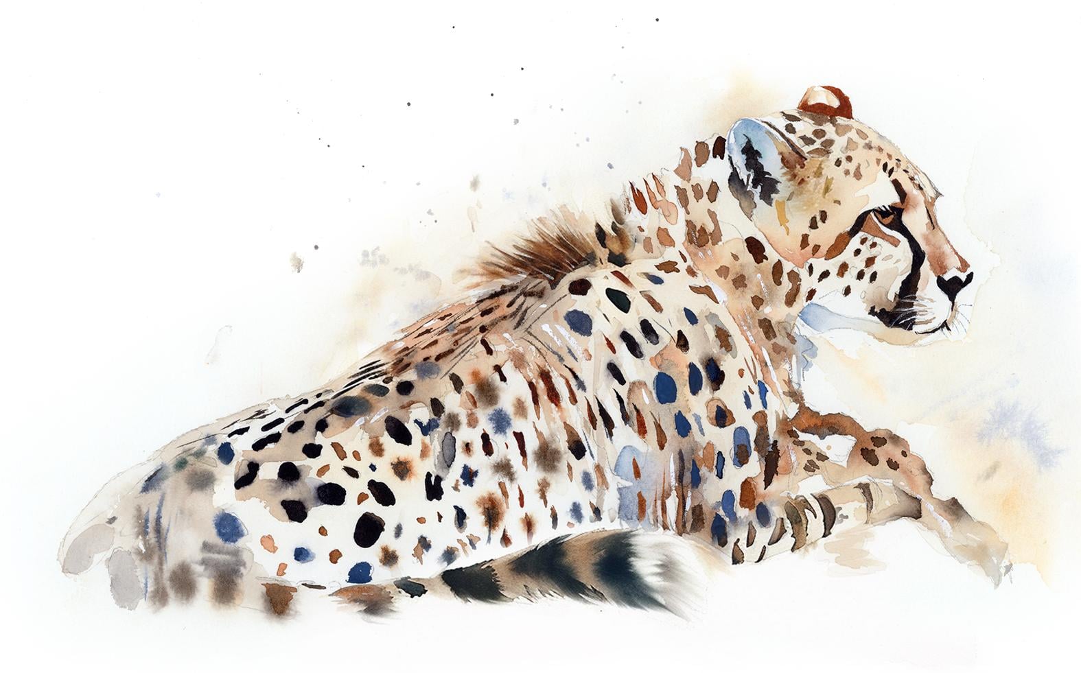
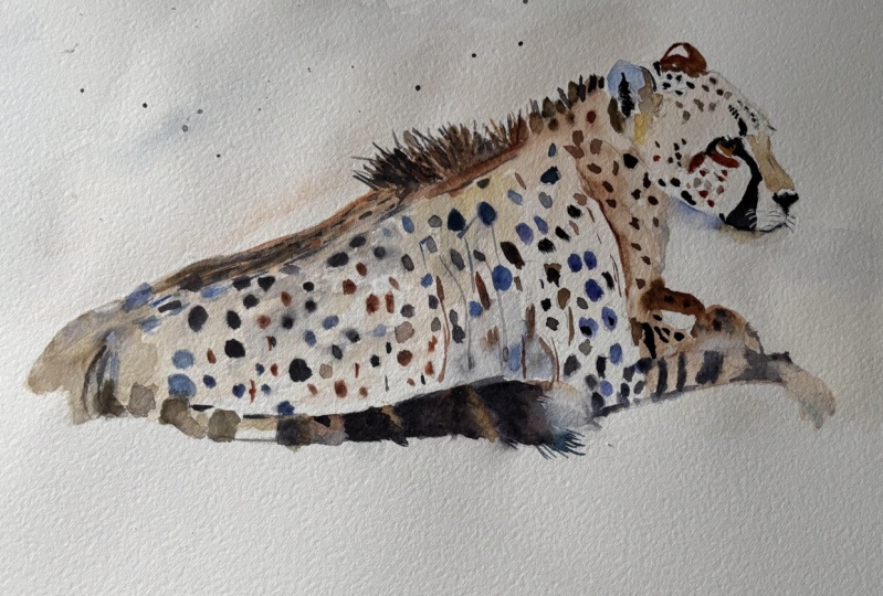
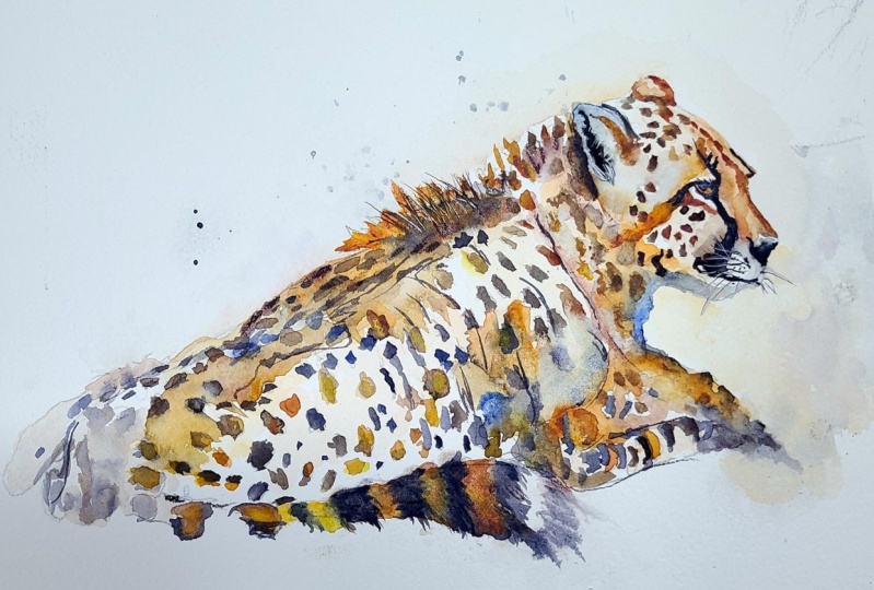
name's Will Elliston. And today, we'll be painting an expressive cheetah
rather than tight realism, we will chase gesture,
light, and character. We will suggest fur with
broken edges and dry brush. Let pools of color bloom
into soft transitions, and drop in inky darks for
those distinctive spots. We'll explore timing from juicy wet on wet
passages to crisp finishing accents
and practice leaving purposeful whites so the
paper does part of the work. This relaxed approach invites
playfulness and ease. I've been a professional
artist for many years, exploring lots of different
subjects from wildlife and portraits to cityscapes
and countryside scenes. I've always been entranced by the possibilities of watercolor, but when I started, I had no idea where to begin
or how to improve. I didn't know what
supplies I needed, how to create the
effects I wanted, or which colors to mix. Now I've taken part in many
worldwide exhibitions, been featured in magazines, and been lucky enough
to win awards from well respected
organizations such as the International
Watercolor Society, the Masters of
Watercolor Alliance, Windsor and Newton, and the SAA. Watercolor can be overwhelming
for those starting out, which is why my goal is
to help you feel relaxed and enjoy this medium in
a step by step manner. Today, I'll be guiding you
through a complete painting, demonstrating a variety
of techniques and explaining how I use all
my supplies and materials. Whether you're just starting out or already have some experience, you'll be able to
follow along at your own pace and improve
your watercolor skills. If this class is too challenging
or too easy for you, I have a variety of classes available at different
skill levels. I like to start off with a free expressive
approach with no fear of making mistakes as we create exciting textures
for the underlayer. As the painting progresses, we'll add more details to bring it to life and
make it stand out. I strive to simplify
complex subjects into easier shapes that
encourage playfulness. Throughout this class, I'll be sharing plenty of
tips and tricks. I'll show you how to turn
mistakes into opportunities, taking the stress out of
painting in order to have fun. I'll also provide you with
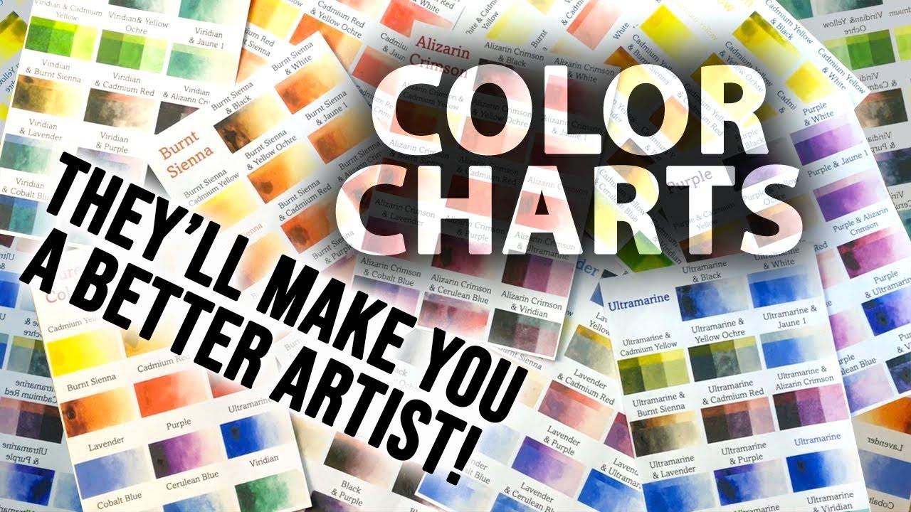
my watercolor mixing charts, which are an invaluable tool when it comes to choosing
and mixing colors. If you have any questions, you can post them in the
discussion thread down below. I'll be sure to read and
respond to everything you post. Don't forget to follow me on Skillshare by clicking the
follow button at the top. This means you'll be the
first to know when I launch a new class
or post giveaways. You can also follow me on Instagram at Will Elliston
to see my latest works. So let's get started painting this loose letter that celebrates
freedom in watercolor.
2. Your Project: Thank you so much for
joining me today. I'm thrilled to be guiding you through this calm and
expressive process. We'll begin with simple shapes
to place the head, back, and tail using warm earth
tones and cool neutrals. Next, we'll float
soft mid tones, then build pattern by
painting around spots and dropping color into wet
passages for natural edges. We'll shape shadows,
reserve highlights, and add a few confident
calligraphic marks, keeping the background minimal
to celebrate white space. This project is
forgiving and playful, inviting confidence
rather than control. To let the water create
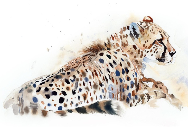
beautiful, spontaneous surprises. In the resource section, I've added a high
resolution image of my finished painting
to help guide you. You're welcome to
follow my painting exactly or experiment with
your own composition. As we're going to be focusing on the painting aspect
of watercolor, I've provided templates
you can use to help transfer or trace the
sketch before you paint. It's fine to trace when using it as a guide for
learning how to paint. It's important to
have the underdrawing correct so that you can relax and have fun learning the
watercolor medium itself. Whichever direction
you take this class, it would be great
to see your results and the paintings you
create through it. I love giving my
students feedback, so please take a photo
afterwards and share it in the student project gallery under the Project
and resource tab. I'm always intrigued to
see how many students have different approaches and how they progress with each class. I'd love to hear
about your process and what you learned
along the way, or if you had any difficulties. I strongly recommend
that you take a look at each other's work in the
student Project Gallery. It's so inspiring to see
each other's work and extremely comforting to get the support of your
fellow students. So don't forget to like and
comment on each other's work.
3. Materials & Supplies: Before we get started
with the painting, let's go over all the materials and supplies you'll
need to paint along. Having the right materials can greatly impact the
outcome of your artwork. So I'll go over all the supplies I use for
this class and beyond. They're very useful to have at your disposal and will make it easier for you
to follow along. Let's start with the
paints themselves. And like most of the materials
we'll be using today, it's a lot to do
with preference. I have 12 stable colours in my palette that I
fill up from tubes. They are cadmium
yellow, yellow ochre, burnt sienna, cadmium
red, alizarin crimson, ultramarine blue, cobalt blue, serlean blue, lavender,
purple, viridian, black. And at the end of the painting, I often use white gouache
for tiny highlights. I don't use any
particular brand. These colors you can
get from any brand, although I personally
use Daniel Smith, Winsor and Newton
for Holbein paints. So let's move on to brushes. The brush I use the most is
a synthetic round brush like this Escoda Purl brush
or this Van Gogh brush. They're very versatile because
not only can you use them for detailed work
with their fine tip, but as they can hold
a lot of water, they are good for
washers as well. They're also quite affordable, so I have quite a few
in different sizes. Next are the mop brushes. Mop brushes are good for
broad brush strokes, filling in large areas and creating smooth
transitions or washes. They also have a nice tip that can be used for smaller details. But for really small details, highlights or anything
that needs more precision, I use a synthetic
size zero brush. All brands have them,
and they're super cheap. Another useful brush to have is a Chinese calligraphic brush. They tend to have long bristles
and a very pointy tip. They're perfect
for adding texture or creating dynamic
lines in your paintings. You can even fan them
out like this to achieve fur or feather
textures as well. And that's it for
brushes onto paper. The better quality
of your paper, the easier it will be to paint. Cheap paper cuinkles easily
and is very unforgiving, not allowing you to
rework mistakes. It's harder to create
appealing effects and apply useful techniques
like rubbing away pigment. Good quality paper, however, such as cotton base paper, not only allows you to rework
mistakes multiple times, but because the pigment
reacts much better on it, the chances of
mistakes are a lot lower and you'll be more likely to create
better paintings. I use archers paper because that's what's available
in my local art shop. A water spray is
absolutely essential. By using this, it
gives you more time to paint the areas you
want before it dries. It also allows you to
reactivate the paint if you want to add a smooth
line or remove some paint. I also have an old rag or t shirt which I use
to clean my brush. Cleaning off the paint
before dipping it in the water will make the
water last a lot longer. It's always useful to
have a tissue at hand whilst painting to
lift off excess paint. Also, you never know when an unwanted splash or drip might occur that needs
wiping away quickly. I also have a water dropper
to keep the paints wet. When you paint, it's
important to have them a similar consistency to what
they're like in the tubes. This way, it's easier to
pick up sufficient pigment. A hair dryer is useful
to have for speeding up the drying time and controlling the
dampness of the paper. And lastly, masking tape. And this, of course, is just to hold the paper down still onto the surface to stop it sliding
around whilst painting. Also, if you plan on
painting to the edge, it'll allow you to create a
very crisp, clean border. And that's everything
you need to paint along with me today and even
beyond this class. Now, let's get the drawing
ready to start the painting.
4. Preparing The Composition: So let's start with the sketch, and the whole idea
of any composition, is to take all the complexity
and simplify it into a nice visual language that's easily readable and
accessible to the viewer. So starting off with the head there, just
to have a circle. Adding a kind of
oblong rectangle where the jaw is and then
connecting the shapes, with a kind of gesture marking. I'm not looking for accuracy.
I'm looking for gesture because gesture has emotion, has feeling, has a
sense of movement. Even though this cheetah is
sitting down or lying down, by using a soft lead
pencil like this, we can be a bit more expressive, and then when we want
to refine the details, we can move to a
finer lead pencil to really create the structure and highlight which
areas we want to detail. But at the moment, we're
just laying everything out. The good thing about
this gestorial kind of technique this way of
drawing in a free, liberating way is that we don't have to have
100% perfection. We're not looking for realism. We're just trying to carry
the message of what it is. So we can do a bit of
refining later on, but at this stage, I need to
convey that it's a cheetah. And we can rearrange or use the rubber to
correct the proportions. But we're just
mapping everything out in a general
way at the moment. Looking at where the front
legs are how it connects. Because a lot of this painting
that we're going to do, this painting in particular, we're going to be using
a lot of implied shapes. We're not going to paint
in a lot of details. We're going to suggest things. And that means this pencil line has to give us a
structure to work with because what we leave out is just as
important as what we put in. And when we do a
sketch like this, we're building our mind's eye about how we're going to
approach it with the paint. We're not just doing it to
help the painting process. We're doing it for our own
sake to plan it in our mind. So it's a useful tool drawing. We're going to use the
white of the paper a lot, but we have to have an idea of the space and the
form of the creature, the cheetah in order
to make it convincing. So that's what this
sketch is all about. So we've mapped it all out now, and now I can go
with a finer pencil.
5. A Gentle Start: Now we have it all sketched out. For the sake of the template, I went into quite
excessive detail with all these spots in case someone wanted to
have a complete guide. But actually, if I were to do this by myself
and the way I suggest you to do it is to not actually draw out every
single one of these spots because it's not like we have to count each and every spot and make sure we have
every single one there. We're going to use these spots more for our visual language, for our compositional
approach rather than being loyal to the
actual subject realistically or scientifically. So we're going to use
these spots to kind of create that illusion of
form because you can see how the cheetah curves around. And depending on the angle that we're looking
at this cheetah, it's either going to
be a perfect circle or from our perspective, it's going to be skewed
a bit or shortened. So that gives it a
feeling of form later on. And we don't really want to
limit ourselves by drawing all of it because
it'll take longer to draw than to actually dab
it with a brush later on. So that's just a
little side note for the sketch before starting or before approaching
the painting. We start off nice and
simple by just pre wetting the paper
in the background, where that line, that contour line where the
cheetah meets the background. We're not wetting
any of the cheetah. We're just wetting
the background, and we're dabbing
in very light paint and making it fade out. We're wetting an area larger than we're actually
planning to add paint just so that when
we add these dabs, it can gradually fade
out into nothing. This is a very subtle
thing because even when it's dried,
it'll look lighter. We're not trying to do
anything bold at the moment, trying to be a bit more subtle, just to loosen up, get into the flow of painting because even for me sometimes, just the white piece
of paper without paint on it can feel
a bit overwhelming, and you can feel the
pressure to paint. So this eases into the painting process nice
and slowly and subtly. I'm using gold colors, so and by that, I don't actually mean
I'm using gold paint. What's going through my mind is I want to convey this
kind of feeling of gold. So then I take that and I look at my
palette, and I think, Okay, well, yellow ochre has that kind of
gold and feeling, and so does burnt sienna, so I'll use those colors, and those are the
colors that I just use, burnt sienna and yellow ochre. And very subtly, I've actually mixed a bit of
cobot blue or you can use ultramarine
blue as well into this burnt sienna because burnt sienna is quite
a vibrant brown, actually, and I don't
want it too vibrant. I want it to be quite subtle. So using its
complimentary color blue, you can use any blue you want, it will make it a
bit more subdue, make it a bit more
gray, so to speak. So it's very subtle. You can see it's
wet on wet as well, so there's no hard
edges going on. This is because I don't
want the subject, cheetah to just be a flat silhouette on
a white background. So adding these
little splats and these little marks that fade out softly convey that
feeling of depth. We don't know what these
things are in the background. It could be anything a bush
it really doesn't matter. It just gives a feeling of depth because if you imagine
photo or a camera, the main subject is
highly detailed, and then the background,
it's a bit more blurred. And wherever I select a color, such as burnt sienna
or yellow ochre, I automatically think
about it's complimentary. I just talked about burnt sienna and incorporating with a blue. But with the yellow ochre I've used on the right
hand side by the pores, I've mixed a bit of a kind
of purplish blue because purple and yellow ochre are
lovely colors together. Just subtle little touches. On the white of the paper, it makes it look a
bit gray because, of course, they
neutralize each other.
6. Soft Background: Now I'm going to do
a bit of a light wash inside the body. Using the same colors that
we used, yellow ochre, burnt sienna, and a bit of blue to bring down the
vibrancy, just to touch. Again, keeping it subtle bit
by bit building up layers. I'm purposely leaving a few gaps of the white of the
paper to come through. This is because I'm trying
to even at this stage, build a bit of
form and shape and these white little gaps
follow the direction, the curvature of the body, even if they're quite subtle. Just for the sake of variety, I'm making this little
area at the back a bit more yellow
ochre, a little warmer. Again, that's just for variety. You don't need to
follow exactly. You can make it any
color you want, any influence you want, you can make it a bit
more bluer, a bit gray. I'm just making some
areas off white. For example, here in the face, it's not an essential thing, or at least it's
not obvious thing, but when we come
over the next layer, it will mean that
it's not too jarring. Breaking the pure white allows the viewer to understand
the form a bit better. Builds the silhouette of
the cheetah a bit better. And you can see on
the left hand side, we've got the dark background
against at the moment, the light of the cheetah and then on the other
side where the head is, the head is darker
than the background. So already we have some dynamics going on light
on dark and dark on light. Even if we're still
keeping it subtle, a few slats I've actually figured out that
using natural hair brushes, instead of synthetic
brushes are the best for splats because natural
hairs are bit softer, and they flick the paint off in a much more
controlled way, it goes where you want it to go. But synthetics hairs,
when you want to splat, the hairs are too rigid, so they're a bit more random and they go everywhere
on the table on the desk. Using a tissue just
to dab away some of them because I don't want
it to come off too strong, just a subtle depth.
7. Mixing The Colours: So that's the base layer done, and we can let it dry
off completely now. We can even use a
hair dryer to make sure it's absolutely dry
before the next stage. So let's mix the colors
we want to use for the spots because I'm going to only use about three colors, but I'm going to use them
in a lot of varieties. So we've got burnt
sienna at the bottom, and in the next panel along, we've got black or neutral tint. And then the one above,
we've got cobalt blue. And my idea with these
spots and the rest of the tonal areas of the
body in simple terms, we're going to use
brown, blue and black. And we're going to create a whole variation of these three pigments to
keep it interesting. But those are the core kind
of colors, the simple terms. Of course, we'll go into what
kind of browns we'll make. Maybe we'll use burnt sienna. Maybe we'll use a bit
of yellow ochre to create variations
within those browns and blues and blacks. But to keep things simple in your mind when
you're painting this, we're basically going
to create a range out of brown, blue and black. And this fourth one, again, it's a brown, but a
bit more vibrant. So you can see I'm mixing yellow ochre and even a
bit of cadmium yellow into there rather than burnt sienna. And then when I mix
black into that, it makes it a bit more subdued. So it's still brown, but you
can see it's a cooler brown. It's not as red as
the burnt sienna. Those our base
colors, basically, and we can keep on
mixing to them and adding them if we run out. But I have them at my disposal now because we're going to be doing a lot of
wet on wet technique, and we want to make
sure the paints are pre prepared on our palette ready to drop in
at the right time. So I'm starting off by
adding a bit more water.
8. Brown Underlayer: Diluting some of these just to start off the
wash from left to right, using pure water to begin
with, just to pre wet it. This whole class is real time. I haven't actually sped
up any of the footage. I've cut off the bits where
I'm using the hair dryer, but other than that, you can get a sense of my
timing. We have wet on wet. Of course, your climate
might be different or the temperature of your room
affects the drying time. So really the best bet is to
build a kind of perception. You can see with
the light against your paper how wet surfaces. And after a while, you can feel and get a sense of how
the pigment will react, depending on the
wetness of your paper. If it's very glossy wet, then you know the pigment
will just run out and spread across merging all the pigments. But if it's kind of more matted, you can still see that it's wet, but it doesn't have
that sheen anymore. That's the sweet spot where
it'll hold its shape, but the edges will be soft. And that's the kind of area
that we're looking for today. At the moment, it's very wet, so you can see I'm
dropping this in and these pigments are
just going to spread out there'll be a slight
bit of texture there. It's not going to
be a flat wash, but no clear shape is going to be held when it's
this wet on wet at this stage. Just roughly filling out that back area where the
tail connects to the body. And then there's some
areas that we can pre wet and we can carry on
painting in different sections. And then I'm always looking
at my painting at an angle to judge how wet or how dry it is waiting
for that sweet spot. And you can actually
use a practice sheet to determine when that spot is just to get a feeling for
it if you don't want to risk it on your actual piece
of art, you're painting. As I'm working my way up, I'm getting a bit more
saturated, a bit more vibrant. So this brown has a
bit more color to it, so to speak, than down below
where it's a bit more muted. Using pure water to spread it
down and soften that edge. I'm using this pure water over the spots where I
plan to go a bit later, but I have to pre wet them to make sure I get
that right timing. With some of these areas, I want a bit more
of a base layer, so I'm dropping in
a bit more pigment, wet on wet to add to that feeling of form because
I can't do it afterwards. I want the dark
spots to go on top. If I were to paint on
top of the dark spots, it would be difficult
to control.
9. Wet on Wet Spots: So now at the back
of the cheetah we've given it a bit more time to dry. I've looked at it from an angle, and I can see if I
drop in this pigment, it's going to hold
its shape a bit more. And of course, the thickness of the pigment on your
brush affects that, too. If you've got a very
diluted wet brush, then it's going to spill out and cauliflower on the paper. But if you've got thicker pigment with less
water on your brush, then it's going to hold
its shape a bit more just because of the
thicker consistency of it. See how those little dots
their shape a bit more. And I'm mixing a
bit of blue now. These marks that I'm doing
now are still spots, but because they're
on the back following the spine and we're
seeing them at an angle, they look a bit more
like short lines. That creates that
feeling of depth because they're skewed, we're seeing them at the angle. If we were looking
at this cheetah from bird's eye view
from straight above, they too will look rounder. But because we're
seeing at angle, it helps that
feeling of depth and perspective that
feeling of form. So I've mixed in these blue
dots now with the brown dots. And you can choose
where you want to place the blue ones or the
brown ones. There's no rule. This aspect of the painting
is open for interpretation. It's not like I'm following
a rigid structure, just trying to
think of a variety. If there's too much brown,
I'll add a bit of blue. If there's a bit too much blue, I'll add a bit more brown. That subtle contrast. And it's not a
vibrant blue either. It's a subdue. There's not much vibrancy going
on this painting. Those soft dots on the
tail at the bottom, on the left are quite important
because I want this tail to fade from wet on wet spots to harder lines once it reaches the
tip on the other side. So we're going to we've
started off on the left using wet on wet spots, and we're gradually
going to go to harder edge spots
as we go along. And that's a good practice as a student to work
on that timing. But it's not essential
for the painting. It's just an opportunity
to practice. I'm pre wetting a
lot of these spots now because I want some
of them to be wet on wet. But I don't yet know which
ones I want to be wet on wet, so I'm just wetting all
of them and then when the time comes to paint
them in about 5 minutes, I can choose which ones to dab. Likewise, with a tail, I'm
pre wetting that bit now. And because it's pure water and there's no pigment in it stage, we have
a lot of freedom. So even if we forget
to come back, it'll just dry off and
nothing will change. That has happened a lot to me. I pre wetted an area with water to come back to it
and forgotten about it.
10. Neck Underlayer: If you think about how
light and shadow works, the shadow areas are where
the light can't get to. So of course, around the neck, where it goes in a bit, there's a bit more obscured from the light. It's
going to be darker. So that's why I'm adding
a bit more shading where the neck area is
wet on wet again, pre wetting the area,
or adding a stroke of pigment and then
extending it with pure water like I am now. I want there to
be a hard edge on the left hand side of this
shape where the arm comes across because the shoulder or the leg kind of
overlaps the neck area. So there's going to
be a hard edge there, and I'm using a
tissue just to clean up that edge because the wash was lending into
the shoulder area. But I want there to be a clean distinction on that edge there. So I'm planning and
thinking about which areas I want to have a soft edge and which areas I want
to have a hard edge. Using a mix of that burnt
sienna and yellow ochre brown. It's quite difficult to
think about these colors in a logical way because
it's so spontaneous and I'm trying to think
about feeling my way through it rather than logically putting it into
words in my mind. I have a warm brown and
I have a cool brown. The warm brown is at the bottom of my palette
almost looks red. And the cool brown, even though brown
is a warm color, you can still get warm and
cool within those colors. So I'm mixing warm
browns and cool browns. Going back to this tail now, adding a bit of a harder edge now that
it's had more time to dry.
11. The Tail: Now for painting the
tip of the tail, we've already added
a bit of brown, and now I'm mixing a kind
of dark, muted blue. Of course, in
reality, it's black, but because we've got
a brown there already, mixing this blue on top
will neutralize it anyway. And even if we still
detect the blue there, it aesthetically looks nice. It's pleasing for the viewer because they're
complimentary colors. We're trying to plan out
the wetness of the paper. I made sure it
wasn't so wet that the blue would completely
mix and spread out. These stripes still have
their shape and form. And if we want to add
even more details, we'll have to wait even longer or use the tissue to dry
it out even quicker. I'm going back and forth a bit trying to
feel what's right, whether I want it to be a softer edge and
adding more water or wherever I want it to be a bit more detailed
and harder edges. Because sometimes
in your mind eye, it can feel right, but
when you actually see it on the paper, it
doesn't look the same. It doesn't have the same
result that you wanted. So that's perfectly fine to edit or change the
vision or the plan. I rarely goes smoothly
painting process. The whole idea of watercolor in particular
is to be comfortable with these mishaps and the problem
solving aspect of it. How to tweak things. And there's usually a
checklist you can go by and comes down
to the elements, whether it's tonal,
whether it's color, whether it's texture,
edges, shapes, you can go through all of them
as a kind of checklist to see what is off and what can be changed to
possibly correct it or make it better. And
12. Abstract Spots: So whilst we were
painting that tail, the neck area had
some time to dry. So now it's time to add some wet or wet
dots on there that they're going to spread out nicely with a soft edge but
not completely disappear. Again, I checked the paper at
an angle against the light, and I could see that it
wasn't shimmeringly wet. It was just damp. I could see there was
still moisture there, but it wasn't soaking wet. So those dots are going to
hold their form quite nicely. Likewise, the body that we
pre wetted with water before, pure water has had enough time
to absorb into the paper, and it's at the sweet
spot now where we can achieve nice spots
with soft edges. And I can choose and decide which areas
I want these to be. I don't want to paint
all of them wet on wet. So I'm not sticking to one area. I'm kind of jumping about back and forth, starting
with the brown. Burnt sienna with a bit of black or blue to
subdue it a bit. I don't want it to
be fully vibrant. Again, if you're finding this wet on wet technique
a bit difficult. If you're applying
a brush stroke and it's bleeding out too fast, it's either because
the paper is too wet or the pigment is
too thin on your brush. It's too diluted. If you're painting from pans
rather than tube paint, it can be even more
difficult because pans are usually rock hard dry. They're solid, they're
not wet at all. So when we try and
get color from a pan, we use a lot of water
to activate it, because we use a lot of water, only the surface of that pan is diluted and it's
diluted a lot, it's actually quite thin. You really got to mix the water in maybe even a couple of
hours before you start your painting process to get that Marmite
Belimte texture, that buttery thickness
that you need. But I'm not saying this
can't be done with pans. Every artist has
their own strategies, their own way of working. And that's what makes the student galleries
so interesting, seeing how different methods and approaches affects
the final result. I know a lot of students and artists don't like
using a palette. They prefer to go
straight from the tube, and that's perfectly fine, too, because a lot of these browns can be bought
direct from a tube. And although I've mixed
some of these browns, you can use pure
Sienna if you want to. You can use pure blue. In fact, my blue looks a lot
like pain gray, I think, because Payne's gray
is basically a very dark blue, desaturated blue. And in fact, there are strengths in using
paints directly from the tube because it limits the palette and
by limiting the palette, it makes the whole piece a bit more cohesive. It
brings it together. It harmonizes everything,
especially as a student. So don't be put off
for the fact that I'm using a palette
here because you don't actually have to use a palette if you don't want to. You can start to see now the way I'm generally
distributing my colors. You can see that I've
got some brown areas, some darker black areas, and some blue areas
and it's not uniform. It's all balanced within
each other and quite random.
13. The Head Underlayer: Now we can start painting
the under layer of the face. I'm going to mix a bit
of blue in the ear area. Not a pure blue, desaturated
monotone kind of blue. And that's because we've
got so much brown going on. I want something to counteract that brown using its
complimentary color. Starting off with
a nice strong dab and then cleaning my brush and using pure water to spread it out the
area I want it in. I've left a little tiny gap between the edge of the
year and the background. The tiniest little
white of the paper. It's those tiny
little subtle details that actually make it
feel like it's got more finness than it actually does
because there's a lot of abstract elements
to this painting. This painting is more about
suggestion and detail, but having little subtle
things like that. Anchor it and hold it together and allow the viewer
to understand what it is without having to explain every single detail because often by spelling
everything out, ruins the feeling
and the excitement. And it actually it's the
way we see the world. We don't actually see most
of things with full detail. A lot of it's peripheral, and a lot of things are
naturally obscured anyway. The perfect lighting doesn't necessarily exist everywhere we look so this subtle background, this shading we're doing
now, the underlayer. I glues and combines
it is the structure. Particularly in the head
area because we're not actually focusing on much of underlayer, the
rest of the painting. We've got a bit on the body, but it's really, really subtle. This head is the focal area, and in every composition,
there's a hierarchy. So we always begin
with the end in mind, and our focal point is the head, the eyes, and the dark
kind of tear like lines. And everything else supports
that moment in the painting. So we need to keep that face sharper with a few
more sharper details. And a bit more contrast. That's why we're using the blue. And the body's looser, so the eye naturally travels
to the character of the eta. This whole composition has been broken down
into larger shapes. So three shapes, basically, we've got the head, the back area, and the tail. The front pores, I'm going
to completely abstract. I'm not going to spend much
time thinking about that. Just a subtle gesture, suggestion of those pores at the front because if
I were to add detail, then it's going to compete
with other focal areas. If these read clearly in a
simple kind of silhouette, the painting will hold
together even when we keep the rest of the
details relaxed and abstract.
14. The Head Midtones: So that's the
initial layer done, and whilst it's still wet, we can actually move
on to the mid tones, wet on wet by dropping in
some of that same pigment, the brown burnt sienna, letting it bleed across I'd like to encourage
you in this painting to explore warm tones and cool tones because it's
not a vibrant painting, so it's a safe
space to experiment with subtleties
without extremes. Because we're keeping the
fur warm with earthy colors, burnt sienna, yellow ochre. But there's so
many other options you can have at your disposal. I'm sure you have
plenty of pigments or tubes or colors that you could use to make this
painting truly yours. For the shadows, we're
leaning a bit cooler. Ultramarine, cobalt blue. And these neutralize those
browns that we talk about. And you can explore
these different blues and browns and how
they make gray, your own unique grays, not a gray that you
buy from a tube, your own personal mix yourself. That makes it truly unique. We used blue for the ear
and a little bit where the jaw line is
where the muzzle, the mouth reaches the neck. Then we use the warm brown. Now we're going to
mix in a cooler brown where the muzzle is around
the nose, underneath the eye. I'm not ging so dark here
because on top of this, I'm going to be painting
a few more spots. Gradually building detail. But if it comes to a point
where the face feels stiff, then we move on to other
parts of the painting, and we can even
remove detail from the body rather than adding
more detail to the head. Less details around
the focal point often makes it feel sharper. Often, when we look
at a painting and we think something is wrong,
something needs more, it might feel strange,
but actually taking away other elements
that are competing with the focal point can actually make
the image stronger, sometimes reducing the detail, taking out detail can build the illusion of
detail in the focal point. Something to keep in mind whilst painting this whole composition, not just the face is the idea that we're
not painting fur. That's not what I'm
trying to think about. We're painting light on form, and the fur arrives as a side
effect of edges and timing. Because, technically,
even the face is fur just thinner fur. A.
15. Loosening Up: Let's take a step back and
step away from the face now because often if we
get stuck in an area, we overdo it and we forget the bigger message,
the whole composition. It's easy to get
caught up into it. And I felt myself getting
into the tiny details there, which is usually a
mistake because it wouldn't harmonize and look cohesive with the
rest of the piece. So we can start thinking about different sections like the
fur on the back and the neck. And then come back to it once the rest of the painting
has a bit more detail, so we know how to
balance it better. So we're jumping from
the detailed section of the face to a very abstract, suggestive part of
the composition where the tail meets the top
leg in the shoulder area. And I don't want any clear
defined details here. I'm just using broad strokes, a whole mishmash of colors. Not so that it's confusing, but we don't need
any details here. It's not the message
or the painting, it's not the highlighted area. Of course, we've got
to paint it out. We don't want to leave it blank, but we want to paint it with the least
amount of attention. That means abstracting it basically and having fun
pressure free really. Having fun mixing these
browns and blues and blacks, we drop a warm and cool into a larger spot
while it's damp, feeling that breath of the
blue on the shadow side, a touch of sienna
on the light side, having these little
temperature shifts. It keeps all these marks and
washes from feeling flat. And all the dots
are quite uniform. You can't have the whole of the cheetah
just full of dots. We have to have
some other element. You have to break up the unity. You have to have a
bit of variation. So that's what this bit is
because we don't really have a wash in this
composition, this painting.
16. The Message: You think about the curvature
and the shape of this leg, there's going to be shading
on the left hand side, and then as it curves
around towards a light, that's where it's
going to be lightest, and that's where we put
the spots and dots. But then after this leg
overlaps the shadow of the neck and the distant leg. So we're using negative
painting to paint the rest of the leg by adding
the shadows behind it. But it's still connected to that wash that we
just painted before. We've just used water to make
it lighter in some areas. But it's all connected. And we're going to keep
this area very abstract. Just filling out
the general shape. I'm not even being that loyal to my pencil sketch beneath it, creating a variety of color. Just a suggestion of shape and tone rather than anything
fully described. We certainly don't need to
paint every toe or joint. Because the viewer will
understand what's happening. In fact, by keeping
them loose and minimal, the attention stays
on the head and the character feeling
the vibe of the cheetah. Notice how just a
few angled strokes, some warm shadows and a break in the edge are enough to
hint at weight and grounding. It's more about creating a
feeling of that silhouette. The legs dissolve into
the background above. But there's a kind
of clean rhythm at the bottom, like a wave, all the way from the tail back going up to
the paw, the elbow. That ambiguity works
in our favor because it keeps the painting
expressive rather than rigid. It's a reminder that watercolor
doesn't demand precision. Sometimes the best choice
is to imply rather than explain and letting the viewers imagination
fill in the rest. That was all done with a midton. But now we can add a few pops
of dark to really set it off and give it the
full tonal range using the visual
language of shape and direction of rhythm. Squinting my eyes every now and again to see if
the general form, the shapes a clear message.
17. Clean Spots: When I say message, I don't actually mean in words like a sentence or an actual story
written on the paper. All it means is the
feeling, the impression, the unspoken idea that I'm trying to bring across when
someone looks at our work. And every painting
carries a mood. Maybe it feels calm, peaceful,
powerful, energetic. Maybe it can't be
explained by actual words. It's just a subtle feeling, a fleeting kind of moment. With this cheetah
maybe the message is about elegance, quiet,
strength, peacefulness, but power at the same time, the fleeting pause of a
fast animal, but at rest. These aren't things that I think about consciously
and specifically. I don't write them
down or even put them into words in my
mind whilst I paint. But you can feel that message without having to specifically explain
it to yourself. And it's usually that what guides your decisions
intuitively. We don't need to spell it out. Instead, it comes
through in how loose or tight our brushwork is, how much white space we leave, how we balance warm
and cool colors, and then that
emotional undercurrent is what I meant by the message. And it's the essence of the painting and what it communicates without
having to use those words. Now I'm going back to the
spot using almost pure black. And these particular spots are a bit more defined
with a harder edge. When we paint the spots, it's important to
remember that we're not just decorating the surface, we're describing the form, the gesture, and the
rhythm, the pattern. If we simply just dot
them out at random, they can look quite flat or pasted on or even out of place. Instead, in my mind's eye, I'm thinking about the
angle of the surface. Thinking about spots
as part of the design, and each one should really be contributing to the sense
of volume or movement. I'm not putting it on without thinking why it
needs to be there. At the back, here, they're quite large, the spots. But when we move
closer to the head, the spots are smaller, darker maybe closer together, which naturally draws more
attention to the face. And then as we move down the
body across the rib cage, the spots open up and they follow the
curves of the torso. And their spacing helps us describe the roundness
and the perspective. On the limbs, we can
let them taper fade, keep them looser so
the eye doesn't get stuck in that
unnecessary detail.
18. Softening Areas: Notice how so many of these
dots aren't clean or uniform. They're quite abstract. They're not clean
defined circles, especially the wet on wet ones. We've got a few nice clean ones, hard edged, just to anchor it. They're just anchor
points to help the viewer understand the
abstract parts of it. We only need a few
anchor points, a bit of defined
correct shapes and then the rest can be a bit more suggestive and less defined. So varying the color, the tone, the edge quality to make them feel more natural. Some we create by painting
around the shape, letting the untouched paper
form the light center. Others, we drop in while
the wash is still damp, allowing it to feather softly. And that's what suggests
that fur texture. And then like we're doing now, placing bold brush
strokes on dry paper, crisp and dark, that gives
it structure and contrast. And this variety makes the spots feel alive and integrated
rather than mechanical. And the golden rule
to keep in mind is that balance clarity
with looseness. Too many identical
marks can feel stiff, but too much softness can
lose the pattern altogether. And we can use scale, spacing, and again, edge
quality with purpose. We're not just painting spots, we're shaping the
character and energy of the cheetah because see how much white space we're actually using
in this composition. So much of these spots are
required to give form. I just used old brush
just to scrub out some that pigment because
it was a bit too dark. That was just an old brush. I didn't want to
damage it with one of my nice ones with a clean tip. I dried it off. I actually using a glaze right now going over some of these
spots on the back. And this will again soften them. So even if you didn't
time your wet on wet spots will and
they've got a hard edge, you can go back over them later
to soften them out a bit. And even within the spots, you can have some spots that are half hard edged and the
other side of them is soft. Agitating some of them. Using brush strokes
in the direction of the form of the gesture. You can even use pure water with no pigment for these strokes, and then the wet on wet will agitate the pigment
already on the paper.
19. Hairs On the Back: I pre wetted the area where the hairs are on the
back at the top of the back, and I'm going to with a thick pigment so that
they hold their shape, paint in these
hairs, wet on wet. So they hold their shape, but they've got a
soft edge to them. But I'm not too strict
on myself with this. I don't mind if they're
too hard edged. As long as they're conveying that feeling of hair on
the back at the top. I don't want it to be so
wet on wet that it all just dissolves and fades out
into a blurry mess. I still want there
to be defined lines. Now we can wait a bit
longer before we go back to those hairs to add more
strokes, more definition. Take a moment to see how much white space there
is in this painting. It's actually one of the
elements I like most about it because it almost feels like cheat is camouflaged
into the background. It seems quite unusual, even quite risky to
leave so much of the paper untouched
within the main subject. But rather than
weakening the painting, I think it makes it
a bit more unique. Watercolor is quite
interesting in that the untouched paper is
also part of the medium. In oil or acrylic, you usually have to apply
white paint onto the canvas. But here it acts as
our light source, the cleanest light
and the atmosphere. It connects it to the
background as well. It's odd because at some aspect, it feels like parts of the cheetah is missing because it's just the
white of the paper. But I think it adds
a sense of mystery. Almost as if the animal is
lending into its surroundings. And also, it allows the
viewers imagination to fill in what isn't there, which makes the painting a bit more engaging because
we're not again, spelling out every
single detail. The spots and the
shadow shapes and a few confident lines are
enough to suggest the form, and our eyes automatically
complete the rest. And restraint is such
an important thing, and it keeps the
painting expressive and avoids the heaviness that might come if we try to cover every single inch
of the painting. Every single space with pigment.
20. Flow and Rhythm: Moving back to the legs, I'm just going to imply a few dark strokes following
the curvature of the legs. Almost like I'm picturing
them as kind of tubes. I'm thinking about the rotation. Of course, they're spots, but if you stretch them
out and wrap them around, they look a bit more like
stripes in this context. One of the greatest
strengths of watercolor is that even after we've
laid down color, we still have room to adjust
and refine it through lifting or softening
corrections. For example, right here, if the wash or the edges have dried a little heavier
than we intended, we can go back to it with a clean damp brush
and gently soften the edge and encourage the pigment to spread out even
more to become less harsh. This also avoids the risk
of overpainting or layering too much color because that could flatten
the sense of light. We can also lift out highlights directly from larger shapes. Creating a thirsty brush by washing your brush
and then dabbing it on a towel or a tissue, and then lightly dragging
it across the damp passage, we'll pull back up
pigment to create soft textures that resemble the light coming through
the hair right now. This is quite effective in
this area along the back where the sunlight might be glancing across
through those hairs. If we painted too much, we can scrape away as well. It gives it a kind of
shimmer and variety to the surface and it stops things from looking
a bit too uniform. I'm adding now a
few guiding lines, subtle little lines
that they're not spots. They're not even actually
part of the cheetah. They're subtle little lines that give the eye direction and flow, adding to that
feeling of gesture. We are filling in this area with a few more spots
to give it form. And what I really mean by
form is giving a flat shape, a sense of turning in space. And with watercolor, we don't do this by
drawing every detail, but managing the edges, the value and the temperature. The variation in the
angle is subtle, but our eyes read it
quite instinctively. And this is why we
don't need to overmodel or specifically paint out all the different strands
of fur with shading. If the spots follow the form, the volume reveals
itself, really. This is a great example of how pattern can serve
as structure in a painting and can
give depth and dimensiality without
heavy moduling. That's why we didn't put that much other underlayer
into most of the painting.
21. The Ears: So we're going to start
painting the face now, and this is where we want to
slow down and be deliberate. The head is the focal
point of this painting. So a few carefully
placed details can carry all the character. And any small shifts in placement
value or edge can quite dramatically change
the expression or the sense of life
in the cheetah. So we begin by reserving
the brightest highlights. We've already done that a bit. We've mapped that
out. You can see the reference image as
you paint along or the completed painting to
help guide you of that. But starting off with
a nice thick black, I've changed to a
very thin brush, by the way, with a nice tip. Just simplifying the shadow
shape inside the ear. A dark black, trying to keep the shape organic
and connecting it. It's almost like a strange
stretched pine tree. And then I'm going to add a quick thin line on
the other side of the ear just to signify that's the end of the year. Nothing
much more than that. Now we can move to the
air on the other side using the same brown color that we've been
using burnt sienna. This is basically a
pure burnt sienna. It's a nice mid tone, not too thick, and
not too diluted. Nice rich, confident
color and tone just to simplify and state
the shape of the ear. I'm trying to break it down into a very simple shape with the
least amount of strokes. It's just a simple shape because one confident shape is
so much more powerful than 20 overworked lines. And that's all this ear is. It's a very weird shape, but it is a shape. It's not a normal shape like a triangle or a circle,
but it's all connected.
22. Spots On The Head: Now we can start painting the forehead, I
guess you'd call it. And there's almost a
kind of direction, kind of flow from the eye going up to
the back of the head. It's not exactly a line, but I'm going to add these dots in a kind of direction
that implies a line. Et's take a slight
little step away from all the refined details on the face and just
start adding a few dots, small dots because
they're on the face. They're still quite random, but I have to be aware, be a bit more careful on the phase because
it's the focal point. And there's definitely a
kind of structure to them. Even though I'm placing
them fairly random, I still need to
think about the form and the angle of them. Luckily, I can still
see the pencil marks. I know roughly where
I'm going to put them. The use of these dots can
again define the shape, the jawline, adds to the flow. Even though they're not
lines within themselves, if you add these dots
next to each other, almost like stepping stones, then they give the
illusion of lines even though they're not
lines, implied lines. And I'm using brown, again, kind of darker muted brown. But there's no reason
you can't make it blue, add a few blue dots in there. Now that most of
the paintings done, you can see the balance
of colors a bit better. You can see how
it's probably 75%, maybe even 80% brown, and then 25% to 20% blue. But you could experiment and
not put any blue in at all, keep it monotone, all brown. Maybe even do it
black and white, or use a color like sepia, which when at full consistency
and thickness is black. But when diluted, it's
actually a brown. And the more I think
about that, actually, the more I want to give it a go because I do like doing
monotone paintings. For most of these classes, I do a monotone sketch with sepia. Or Pains gray, just to make sure that the tones make sense
within the image itself, because a lot of time you can strip the
color away from a painting, and it can read perfectly
fine just with the tones. So you can see the
placement of these dots. Although they're quite random, they fit a strategy. They're quite evenly
spaced up here, and there's an implied
direction with them. They're not absolutely random. I'm not having my
eyes closed and just dabbing as they go further back, I'm also making them
a bit darker as well.
23. The Eyes: Mixing a diluted
brown and just going over some of these areas, help guide the eye a bit better, fill in some of the blank areas. You can see the
direction that comes down from the ear right down to the jaw line using those hard
edges on the washes below. Now we can start
painting the eye, which is arguably the most
important part of the painting because eyes tend to just capture the soul
and invite people in. But even when it comes to this, we can do it step by step, taking our time, not going straight into the biggest part and most detailed part. As this brown shape comes
up towards the eye, I'm transitioning it
to a nice dark black, and then being very careful
with the tip of my brush. Painting right towards the edge so that it just connects
at the tip to the eye. Then we can start
filling out the eye, but leaving a tiny bit
of a white gap there, of course, if you go over it, you can come back
with white wash at the end where the
tear duct would be we're painting a kind
of triangle shape with a curve where the eye is and
work around the other side. At the top of the eye, there's a black strip Again,
simplifying the shape. These are just two
tones, basically, the brown and the black. Maybe indicate a few eyelids
or eye lashes rather. Creating a nice point
where that tear is. So we've got a nice
feeling of rhythm and flow where that
brown is at the bottom, then that reserved white, and then the black tear. And luckily, the other eye is on the other side, so we
don't have to paint that. Following that tear all
the way down to the nose, and then we can use the
pencil lines to guide us. Connect it downwards
to the area we painted before.
It's all connected.
24. Scraping The Paint: It's quite important
for your blacks and darks to be strong enough. You don't want them to be
too weak in consistency or too diluted because
even when black's wet, it can look pure black, but then when it dries,
it turns to a pale gray. So there's a sweet
spot where it's too thick and where
it's too thin. But it's ultimately
better to be on the thicker side because we need that strong
contrast on the face and those sharp details
where you've got these nice white lines and then brown lines
and black lines. Same for the nose. Being careful to reserve some of those whites, rotating the brush so that
the tip of the brush has a nice angle Start off with a nice thick black and if you feel that
it's too thick, it'll be a dry brush mark, so you can just go back to your palette where I've
already got some water, I'm not going to my
water tub to get water. I'm getting the water that's already on my palette
where the brown is and helping spread that
paint along if it's too thick. Twirling the brush around so that the point of the
brush comes together. Now I'm going to
experiment with this tuff pick to scratch
out some whiskers, but it was still too wet,
so it didn't really work. I'm going to use
my palette knife, but you can use
your tuff pick or a pin or whatever
or even straight to white guash to add a few strokes to indicate
the fur on the back, the hair, the longer hairs. The whiskers. Sometimes I put a little white dot where their eyes to make it seem
like it's glistening, but I don't think I'm
going to risk it today. It's not essential, so I'm going to use the power of restraint.
25. Final Thoughts: Welcome back and
congratulations on completing this watercolor
class on painting a cheetah. We've explored gesture,
timing, and negative painting, created soft fur with
a dry brush and edges, and used simple shapes
to hold the pose. We've practiced
building spot patterns with variety and restraint, so the eye reads
realism without detail. Remember how leaving whites, charging colour
and gentle lifting can do so much for the work. Keep your brush moving, allow passages to merge, and finish with a few
confident accents. Remember, watercolor painting is not just about technical skills, but also about expressing your creativity and
personal style. I encourage you to continue
exploring, experimenting, and pushing your
boundaries to create your own unique
watercolor masterpieces. As we come to the
end of this class, I hope you feel
more confident and comfortable with your
watercolor painting abilities. Practice is key when it comes
to improving your skills, so keep on painting
and experimenting. I want to express my gratitude for each and every one of you. Your passion for
watercolor painting is so inspiring and I'm honored
to be your teacher. If you would like feedback on your painting, I'd
love to give it. So please share your painting in the student projects
gallery down below, and I'll be sure to respond. If you prefer, you can
share it on Instagram, tagging me at Will Elliston, as I would love to see it. Skillshare also loves
seeing my students work, so tag them as well
at Skillshare. After putting so
much effort into it, why not share your creation? If you have any questions
or comments about today's class or want any specific advice
related to watercolor, please reach out to me in
the discussion section. You can also let me
know about any subject, wildlife or scene you'd
like me to do a class on. If you found this class useful, I'd really appreciate
getting your feedback on it. Reading your reviews
fills my heart with joy and helps me create the best
experience for my students. Lastly, please click
the follow button Utop so you can follow
me on Skillshare. This means that you'll be
the first to know when I launch a new class
or post giveaways. I hope you feel inspired to paint more in this
expressive style. I look forward to seeing you in future classes until
then Happy painting.
 Will Elliston, Award-Winning Watercolour Artist