Transcripts
1. Welcome To The Class!: Hello, everyone. My
name is Will Elliston. And today, we're going
to paint an expressive, vibrant chameleon in watercolor. This class is all about
playing with color, experimenting with
techniques, and having fun with a subject that naturally
encourages creativity. One of the best
things about painting a chameleon is that there's no right or wrong when
it comes to color. Chameleons change
shades in real life, so we have total freedom to
use any palette we like. It's the perfect excuse
to be bold and loosen up. I've been a professional
artist for many years, exploring lots of different
subjects from wildlife and portraits to cityscapes
and countryside scenes. I've always been entranced by the possibilities of watercolor. But when I started, I had no idea where to begin
or how to improve. I didn't know what
supplies I needed, how to create the
effects I wanted, or which colors to mix. Now I've taken part in many
worldwide exhibitions, been featured in magazines, and been lucky enough
to win awards from well respected
organizations such as the International
Watercolor Society, the Masters of
Watercolor Alliance, Windsor and Newton, and the SAA. Watercolor can be overwhelming
for those starting out, which is why my goal
is to help you feel relaxed and enjoy this medium
in a step by step manner. Today, I'll be guiding you
through a complete painting, demonstrating a variety
of techniques and explaining how I use all
my supplies and materials. Whether you're just starting out or already have some experience, you'll be able to
follow along at your own pace and improve
your watercolor skills. If this class is too challenging
or too easy for you, I have a variety of classes available at different
skill levels. I like to start off with a free expressive
approach with no fear of making mistakes as we create exciting textures
for the underlayer. As the painting progresses, we'll add more details to bring it to life and
make it stand out. I strive to simplify
complex subjects into easier shapes that
encourage playfulness. Throughout this class, I'll be sharing plenty
of tips and tricks. I'll show you how to turn
mistakes into opportunities, taking the stress out of
painting in order to have fun. I'll also provide you with
my watercolor mixing charts, which are an invaluable tool when it comes to choosing
and mixing colors. If you have any questions, you can post them in the
discussion thread down below. I'll be sure to read and
respond to everything you post. Don't forget to follow
me on Skillshare by clicking the follow
button at the top. This means you'll be the
first to know when I launch a new class
or post giveaways. You can also follow me on Instagram at Will Elliston
to see my latest works. So grab your brightest paints
and let's jump right in.
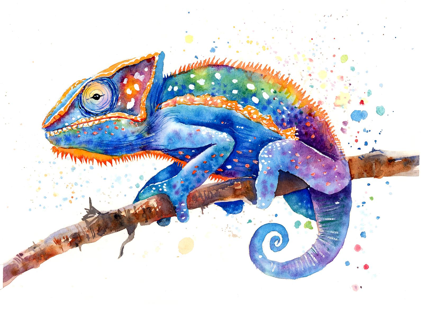
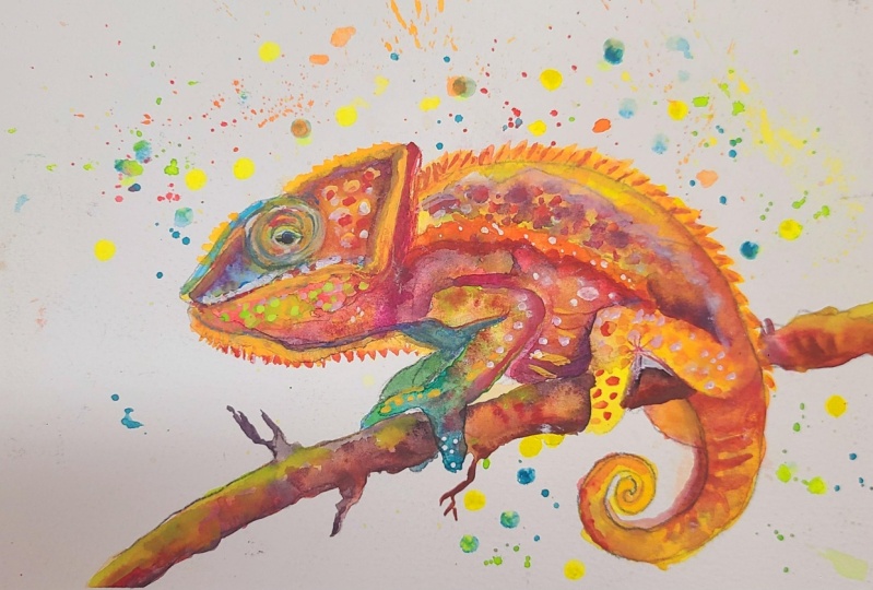
2. Your Project: Thank you so much for being here and joining
me on this class. Today we're going to be
painting a colorful, eye catching chameleon
perched on a branch. The focus here is
on expressiveness, spontaneity and fun, not
precision or realism. We'll explore smooth blending
and color transitions to build a rich,
iridescent body. We'll use loose brush work and layering to develop depth
without overworking. Because chameleons are naturally colorful and ever changing, this subject is
extremely forgiving. You can experiment, take risks, and still end up with
something beautiful. In the resource section, I've added a high
resolution image of my finished painting
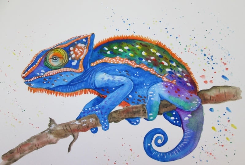
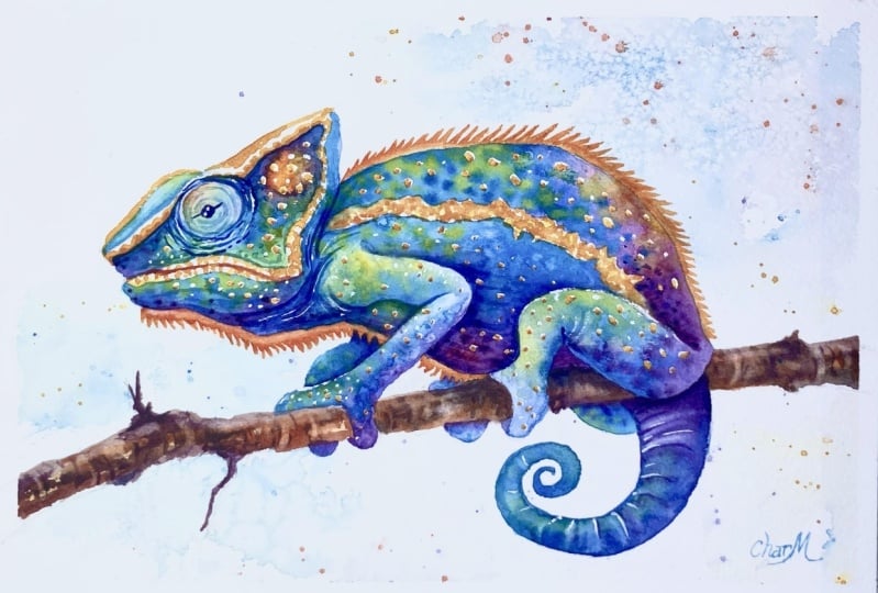
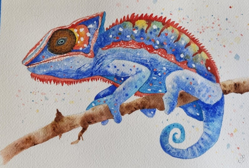
to help guide you. You're welcome to
follow my painting exactly or experiment with
your own composition. As we're going to be focusing on the painting aspect
of watercolor, I've provided templates
you can use to help transfer or trace the
sketch before you paint. It's fine to trace when using it as a guide for
learning how to paint. It's important to
have the underdrawing correct so that you can relax and have fun learning the
watercolor medium itself. Whichever direction
you take this class, it would be great
to see your results and the paintings you
create through it. I love giving my
students feedback, so please take a photo
afterwards and share it in the student project gallery under the Project
and resource tab. I'm always intrigued to
see how many students have different approaches and how they progress with each class. I'd love to hear about
your process and what you learned along the way or
if you had any difficulties. I strongly recommend
that you take a look at each other's work in the
student project gallery. It's so inspiring to see
each other's work and extremely comforting to get the support of your
fellow students. So don't forget to like and
comment on each other's work.
3. Materials & Supplies: Before we get started with
this chameleon painting, let's go over all the materials and supplies you
might want to use. Having the right materials can greatly impact the
outcome of your artwork. So I'll go over all the supplies I use for
this class and beyond. They're very useful to have at your disposal and we'll make it easier for you
to follow along. Let's start with the
paints themselves. And like most of the materials
we'll be using today, it's a lot to do
with preference. I have 12 stable colours in my palette that I
fill up from tubes. They are cadmium
yellow, yellow ochre, burnt sienna, cadmium
red, Alizarin crimson, Opramarne blue, cobalt blue, serlean blue, lavender,
purple, viridian, black. And at the end of the painting, I often use white gouache
for tiny highlights. I don't use any
particular brand, these colors you can
get from any brand, although I personally
use Daniel Smith, Windsor and Newton,
or Holbein paints. So let's move on to brushes. The brush I use the most is
a synthetic round brush like this Escoda Purl brush
or this Van Gogh brush. They're very versatile because
not only can you use them for detailed work
with their fine tip, but as they can hold
a lot of water, they are good for
washers as well. They're also quite affordable, so I have quite a few
in different sizes. Next are the mop brushes. Mop brushes are good for
broad brush strokes, filling in large areas and creating smooth
transitions or washes. They also have a nice tip that can be used for smaller details. But for really small details, highlights or anything
that needs more precision, I use a synthetic
size zero brush. All brands have them,
and they're super cheap. Another useful brush to have is a Chinese calligraphy brush. They tend to have long bristles
and a very pointy tip. They're perfect
for adding texture or creating dynamic
lines in your paintings. You can even fan them
out like this to achieve fur or feather
textures as well. And that's it for
brushes. Onto paper. The better quality
of your paper, the easier it will be to paint. Cheap paper qwinkles easily
and is very unforgiving, not allowing you to
rework mistakes. It's harder to create
appealing effects and apply useful techniques
like rubbing away pigment. Good quality paper, however, such as cotton based paper, not only allows you to rework
mistakes multiple times, but because the pigment
reacts much better on it, the chances of
mistakes are a lot lower and you'll be more likely to create
better paintings. I use arches paper because that's what's available
in my local art shop. A water spray is
absolutely essential. By using this, it
gives you more time to paint the areas you
want before it dries. It also allows you to
reactivate the paint if you want to add a smooth
line or remove some paint. I also have an old rag or t shirt which I use
to clean my brush. Cleaning off the paint
before dipping it in the water will make the
water last a lot longer. It's always useful to
have a tissue at hand whilst painting to
lift off excess paint. Also, you never know
when an unwanted splash or drip might occur that
needs wiping away quickly. I also have a water dropper
to keep the paints wet. When you paint, it's
important to have them a similar consistency to what
they're like in the tubes. This way, it's easier to
pick up sufficient pigment. A hair dryer is useful
to have for speeding up the drying time and controlling the
dampness of the paper. And lastly, masking tape. And this, of course, is just to hold the paper down still onto the surface to stop it sliding
around whilst painting. Also, if you plan on
painting to the edge, it'll allow you to create a
very crisp, clean border. And those are all
the materials and supplies I use in my
day to day painting. If there's anything
you want to use or experiment with,
you're perfectly welcome. This is a great
class to do that. Now, let's get on and
start the process.
4. Tips For The Sketch: So starting off
with this sketch, we're going to roughly map
out where the branch is, and it's quite diagonal, going from the bottom
left hand corner to about halfway up on
the right hand side. And then we're just
going to as always, block out the main
shape of the subject, which is a chameleon
using circles. And then we just
connect them using rough, loose pencil markings. Bit by bit, tying
it all together. And if you're happy with
it, you can go in with a finer lead pencil for
a bit more definition. But if not, you can
rub it out again and make sure it's correct. I use a putty rubber
because I don't want any residue
sticking to the paper, and the good thing about a putty rubber is that it doesn't leave
anything on the paper. And that's why we start off
with soft pencil markings so that we can rub
out these lines that we don't want
to show later on. This pencil work, this outline is just a
guide for the watercolor. We don't have to be
so faithful to it, especially with the little spiky textures on the
chin and the back. Once we know where
the shapes are, we can be a bit more
confident two different types of styles. We've got the loose style
with the soft lead, and then the confident
fast moving style with the harder lead
and the finer lead.
5. Starting With The Head: I'm going to start this
painting from left to right, starting with a nice,
vibrant blue, syllan blue. But you can also use turquoise. And a good thing about
this chameleon painting is that it's so open
for interpretation. You don't have to start
where I'm starting. You can start from
right to left, as well. If you're right handed or left handed, it really
doesn't matter. You can start with
the legs or the eye, and you can start with or choose any color you want.
You don't have to use blue. You can use a vibrant green, a vibrant purple, red, yellow. I'm in fact, dropping in
little dots of purple into this blue whilst it's still wet to increase that texture. Because when you
look at a chameleon, actually, it's full of texture. There's not much smooth, clean texture because it's
so wrinkly and spotty. So it's another
great opportunity to experiment with lots of different ways of
creating texture. Now moving on to the other side, I'm skipping the
eye for the time being because the outside, the edge of the eye is
wet with that blue, so we're going to
come back later. Starting off with a
nice vibrant yellow, cadmium yellow in
the middle there, maybe adding a touch of orange or red onto that
yellow to make it orange. And we can start expanding out. And as we expand out, we can make it
more and more red. And if you find that the red spills too much into the yellow, and we've lost that
orange essence, we can use the brush, clean it, and just draw out some of that pigment to leave
that glow in the middle. And we can touch it up with
a bit bit more yellow. And then once we've
got a nice red edge, we can start integrating
a bit of purple. And we can see we're actually going along the color wheel. Now we've got yellow, orange, red, purple, and
maybe a bit of blue. And that's one of the
most important things to think about in this class when you're experimenting with color. Whatever color you
choose to go with, look at what's next to
it on the color wheel, and if you want to add
a bit of variation, choose the next color
along on the color wheel. Don't choose necessarily
a random color on the opposite side
because it might not mix or transition so well. But if they're next to each
other on the color wheel, they should be quite easy going with each
other, quite forgiving. With a painting like this
with all these colors, the paintings a fine line
between chaos and control. And that's part of what
makes it so fun, actually. We want some colors to
explode into each other. But I also need certain shapes like the eyes and the bodies, general silhouette, like the legs to stay
crisp and recognizable. So as we go through this class, I'll give you tips about how we can think about this balance between expressive freedom
and structural clarity. How you're allowing
blooms and back runs into places where it's
not so important, where you want to encourage that energy and where we can reserve control
of the key features. And you can use borders
like I'm doing now. So this little section here, we can keep it nice
and expressive, but maybe the edge of the
silhouette and the eye, we want a bit more
control later on. So that comes to the refining
section later on. H.
6. Varying The Colours: I've just cleaned my
brush and splatting pure clean water onto the area we just
painted as it's drying. And that's just
going to increase that texture and make it
a bit more interesting. Now, sticking with
the blue theme, I've decided to give blue the main kind of
emphasis in this painting, and then we can
work around that. But you can use
green if you want, or again, any color you want, be interesting to
see how you all have different
interpretations of this depending on your
favorite pigments. You can also use
this cast to explore different pigments
that you want or if there's a tube of paint
you've been wanting to use, but don't know where to use it, this is a perfect
class to try that out. But I'm sticking with
this Turquoise blue, this serlean because it's
so vibrant and exciting. And another reason I think
I always tend to choose blue is because it
pairs well with orange. I think blue and orange are my favorite groups
of color to work with. So later on, we'll be applying more orange around this
composition as well, and the two will work together to make themselves really pop. Now we're painting under
the jaw, that section. And in my mind's eye, I'm looking at my drawing and thinking where
this wash will go, how far I need to paint it. And on the left, I'm a bit more careful
on the edge there. I'm not going to the spiky
area under the chin. And on the right, it
doesn't really matter. I've decided because
I'm going to come back with more shading later. So really, it's just
finding the shape, filling it in with a
nice wash of watercolor, and then creating
lots of nice texture, dabbing in some
purple and green. Notice how this green and purple that I've
just dabbed in, it's a slightly thicker
consistency than the blue wash. And
that means it's going to hold its shape a bit more. It's not going to
completely dissolve. And it's going to allow
for that texture, and putting pure yellow onto this blue actually
makes it look green, of course, yellow
and blue make green. So I don't have to mix green. I can just put it directly
and mix it on the palette. Be careful if
you're using orange because orange and blue
are complimentary colors. So when they're mixed together, they neutralize each other to
make a kind of muddy gray. They look beautiful
next to each other, but on top of each other, they create unwanted grays. Now, this neck area
and behind the head, we want it to be a bit darker. We'll come back a bit later for the definition
of the shading, but because we know it's
going to be a bit darker, we don't need to be so worried about the details on this area. Adding a bit of cobalt
blue into this area, which is slightly
warmer blue than the turquoise blue because
it's a bit more purple. It edges towards purple, whereas turquoise and cerrillan
goes more towards green. And somewhere along here, we can just check mark
this area because we'll come back to it and we can
reactivate it to clean it up.
7. The Front Leg: Now moving on to
the leg section. I'm going to start
with this green, this viridian green
and then mix in a turquoise kind of blue because blue is still
going to be the main motif, the main primary color. But I'm going to start
off this green and then gradually blend more
blue into it as we go. Just seeing my pencil lines, the shape that I
want to fill out, trying not to go over the lines. I can paint the leg behind it
as well with the same wash because we can
always go back later to make it darker and
add more shading later. Using the tip of
my brush along the outside the outline
of the shape, dropping a bit more
water on there, maybe incorporating
another color like purple. Or violet. I'm trying to be a bit messy. That's why I keep on dabbing water and different
pigments in there. But within this section, I'm making sure my brush marks don't go outside
that pencil line. I want to keep the
leg very defined. But within that, I can create lots of
interesting textures. Keep on dabbing
different pigments at different consistencies. At different drying times, if you add these dabs, as soon as you paint them, it'll dissolve and soften more. But if you wait a
couple of minutes and then add the dabs, then it'll hold a bit
more of its nature, its spotty dot like appearance. On the top of this leg,
I make it a bit lighter because if you think the
light's coming from above, then it's going to have the highlights on
the top of the leg, and then as it bends around into that shadow,
it'll get darker. But we can also emphasize
that later by lifting off some pigment to create the
highlights, if needs be. But we want to create interesting
texture at the moment, not focus on shading,
so to speak.
8. The Back Leg: I've given it a couple
of minutes to dry, and even though it's
not completely dry, I'm going for the area
above the leg now, because, like I said, I'm
not being too precious, and if it spills out
into the leg and we lose that highlight
on top of the leg, it's not the end of the world. We can deal with that later. I'm trying not to paint
too restrictively. I want to kind of
enable myself to feel the expression and free myself because that's the
fun part of painting. Still working with
that blue color. But as the purple on the legs
is making it a bit warmer, I'm going to make it a
bit greener, just above. You wouldn't necessarily
call it green, but it's a bit more turquoise. It's tinted, a bit more
green than the legs. But actually, it
doesn't really matter. As long as the tonal difference at the end of the
painting helps you differentiate where the
leg and the body change, then it will be fine. It will make sense. It's all about tones that
brings it together. The colors can be nice and expressive and
changing everywhere. It's tones that make
sense of things visually. I've added a nice
sloge of purple on that belly that doesn't have much or any blue
mixed into it at all, but it's got a nice soft
gradient into the blue. And I know I'm going to add more purple to the rest of the composition on
the right hand side. So I felt like I needed a bit more purple
to help balance it out. I didn't just want pure purple on the right hand side without it appearing anywhere else. I noticed just then, now that that first
leg is dried, I just used the dampness
of the paper just to draw out some of that
pigment and bring out that highlight on
the top of the leg. And I missed that area there. So I'm just scrubbing
the pigment and bringing it to the
pencil edge again. So working with some thick
purple, like I said, I wanted to add
lots of purple on this side and making
it a very warm purple, actually adding a sarin
crimson into there. And then I can use pure water
on my brush to actually mix it on the paper and decide the consistency
that I want for it. Notice how I didn't even touch that purple or risen
crimson on my palette. I'm doing it purely
on the paper. And then as that blue on the
left is already still wet, I can merge it together,
wet on wet painting. Not being too precious at all, but trying to avoid sharp edges.
9. Adding Green: Before we paint the
top half of the body, I just want to point out
this obscure kind of stripe, this squiggly line that goes
on the side of the body that already on the
right hand side, you can see I've
negatively painted or left white where this line is. And you can see
with pencil marks. My light pencil
markings on the paper. You can generally see it's there and when I'm filling
in this area, I don't want to go over that area because it
might be a little detail that gets overlooked or forgotten about in the chaos
of this expressive stage. But we'll need that to
stay white because I want it to be a vibrant orange, and to get that vibrancy
from the orange, it needs a nice, pure
white background. But anyway, let's get
on with this green. I started off with a nice light diluted lime kind of color. And then as we went to
the outskirts of it, I dabbed a bit of a darker, more Viridian green to it. And now we're going back with the classic Turquois blue
to merge that into it. So before I start a section, I figure out where exactly
the whole section leads to, because I need to know
where I want there to be a hard edge like
this white line at the bottom and where everything connects
because I don't want to create
unwanted hard edges. With this expressive stage, nearly everything needs to
be connected in a soft way. Even though there's
lots of expression and range of texture, it's nearly all soft textures. There's no really hard lines there except the ones
that we actually want, and those are the ones we've got to plan for and think about. It's something easier
said than done. But if you fill out
the area as fast as possible with water or pigment, then at least that
areas covered, and then you can
work from there. You can take out pigment with an empty brush or you can drop in more
pigment wet on wet. But if you hesitate
halfway through a wash or a section
and deal with a few corrections in tone or
consistency halfway through, then you'll create a hard
edge where you don't want it. So it's best to fill out
the area that you want completely first and then deal with adding more
pigment like I am now or taking away more pigment, getting the overall shape and
outline filled as I kind of blocking is usually a safer bet. Of course, if you do end
up creating a hard line, then you can use your brush
to scrub it a bit and get rid of those harsh lines. A
10. Creating Texture: Going back to what I mentioned before with the
orange and the blue, because they're
complimentary colors, we don't want them
to mix together. That goes with any other
complimentary color with yellow and purple
or green and red. I haven't used any
direct red on this, so that's not an issue with me, but if you are
planning to use red, that's something that
you might be concerned or something you
need to be aware of. But I have used yellow, and I have used purple, and you've seen that if I put
those two colors on there, I don't want them to
directly connect. So I make sure there's
a color in between them like blue in between the yellow and the
purple because the blue will turn
the yellow to green, and the blue is already
harmonious with the purple, so it'll blend in naturally in a aesthetically pleasing way. Whereas if the yellow blended
with the purple directly, it would I would go
gray or a muddy color. I'd go kind of
brownish muddy color. So as long as you're not mixing complimentary
colors together, everything is fair game and you can mix whatever color
you want on there. And it will harmoniously look
pleasing and connect well, and it won't look out of place. I'm adding a few drops
of orange on here, being very careful when it's across the
blue and the green.
11. The Tail: Now painting the tail, and this is the area that
requires most precision. So use a brush that has a very good tip and make
sure your drawing is clear, because when painting a
spiral like shape like this, it can be difficult to
make sense of it all and spend that extra
few seconds to make sure the tip of
the tail is spiky. And evenly spaced out
as it curls around. Because it's these
little tiny details that anchor it and make
sense of all the expression. Just a few more seconds
of concentration and precision add to that
feeling of sophistication. Notice how I've created a
little checkpoint for myself. I've graded or
transitioned that blue out so that it gives me time to mix a color without
creating a hard edge. Whenever you need
to take a break or mix colors and you haven't finished the shape because it's quite a long
shape that tail, you have to kind of blend it out rather than just stopping
and leaving a hard edge. And now I've reactivated it, and I can go back
in there without brrring there's going
to be a hard edge. Added quite a lot of
water into that I can stretch it out and use the brush to move that
water all the way up. I'm not necessarily
using the tip of my brush to paint
in this section. I know how thick my brush is when I apply pressure and I use that along the side of the
pencil to fill out that area. See how I actually used a bit of orange there over the blue, and it's slightly muddied, but that doesn't matter
because I'm going to go over it again with a thicker purple, and it's going to be in shadow anyway,
so it doesn't matter. I've already painted the leg, but I still see the pencil
line underneath that paint, and I need to create a definition between
the leg and the tail. So I'm just going to add
a darker pigment here. It's still very diluted. But it's a dark pigment, so it's going to blend out naturally into that
wet wash below. And with this pigment to this wet on wet kind
of brushstroke, I'm almost following the
curvature of the tail, but because it's so wet on wet, it's going to have a
nice softness to it, so it'll be barely perceivable. Also, cleaning my brush
with that sponge and sucking out the water in the middle to create
a kind of highlight. And even a tissue to bring
out even more texture, rolling it up into a point and then dragging it
along the paper. Flickering a bit of water, clean water onto it as it dries. Every now and again,
I am flicking the whole composition
with water to increase that texture because water
agitates it as it's drying. And because the
splats aren't even, some areas remain dry and
some areas remain wet. It creates an inconsistency, which is what we want when we want to
create more texture.
12. Splats: Now I've dried it
out completely, and this next step is optional.
You can do it at the end. I'm deciding to do it
now because I've got my main color scheme down, so I know what colors I
want I'm having there. I'm using vibrant orange
to start off with, and I'm flicking my brush to get a few small splatters
of water of pigment. But then when it comes
to the larger ones, I actually paint them in myself. I squeeze them from my brush, and I use my brush to make them larger or more controlled. Because the chameleon is blue, at least my one's blue, I'm using these orange
tones as the main splatter, because, again, orange
complements blue. I've got a bit of
green in there, so that's why I'm using a bit of red to complement
that green now. And then maybe we'll
add some yellow to complement the
purple after this. But if you're doing
a different color, if you've chosen your iguana, you can mix up and
change the slats that you want to help complement the color
that you've chosen. Notice how I'm not splatting
the chameleon itself. I don't want the splats
to land on there. So if you're unsure
about splats, you can always use a few tissues to cover
up the chameleon. Or you can skip the
whole splat phase because splatting is
deceivingly tricky to control. It also depends on the brush. You don't want to
use a small brush. It needs to hold a lot of water. It needs to be fully
saturated so that it's almost ready to fall
off the brush as it is. It just needs a few little taps for the water to fall off. So there's orange splats on the top and blue
splats on the bottom. And the blue splats will complement the orangy branch
that we'll paint later. It'll be a brown branch, but brown is actually
a burnt orange color. So the blue works well
with brown as well. Get a few green
splats in there too. A lot of the splats from the
brush are the smaller ones, and all the larger ones
I paint in myself. I try not to go overboard
because there's definitely a sweet
spot between there being too many splats
and not enough. And it's better to go
on the not enough side. And also some of them
can appear too dark. So once I'm generally happy
with it before they're dried, I leave it for about 3 minutes, and I actually use
my tissue to gently
13. Orange Pops: So after dabbing
away the splatters, they're much lighter
and less eye catching. They're more of a secondary
element rather than an attention grabbing
part of the painting. And now, it's completely
dry. I use the hair dryer. I can put my hand on
the painting without being worried about touching
any of the wet areas. And I'm using this mix of cadmium yellow and camium red to create a very vibrant orange. And we can go over
the white areas now. That border the blue to really
make these contrasts pop. But you've got to be very
careful not to overlap the orange and the
blue because again, the complimentary nature of their relationship will mean
that they don't mix well. I'm relying on a bit more
precision to do these parts. So I'm not exploring with different ranges of
tone and color with this. I'm basically keeping that
same orange tone throughout, and even within
these brush marks, I'm leaving little white lines of the paper beneath
to further enhance that feeling of precision
because that contrasts with the expression we painted
before and grounds it. We can't have all the
painting all abstract. And as we reach the top and come down this white stripe now, I'm actually adding
little rings and circles rather than
blocking it out completely, creating texture just
from the tip of my brush. Little rings or hoops. A line right across
where the seal of the mouth is not lips, but where it connects. But it doesn't have
to be too precise. Just gittering my brush to create that kind of
organic texture. I'm not trying to make
it too contrived. Now I can paint in that stripe along the side of the body. Starting off in the middle, far away from the edges. And then we can go back and get as close as
we can to the edge. Sometimes we will
naturally overlap it, but we can always scrub it and clean it up if
we need to. It's too much. The face is the area that required most of the
detail, more precision. This little stripe here, it doesn't matter so much
if we go over the lines, and if it gets
darker, that's okay. It just adds to the
texture a bit more. Leaving a few random white
gaps of the paper underneath. Then I'm just using some pigment I already
had on my palate. Mixing in some Asarin crimson into that orange
and dabbing that randomly into some of this
wash so it bleeds out. Using that as a dark pigment
to emphasize some of the edges and the lines where the fine shadows will be crease of the mouth. Um,
14. Under Spikes: Now I'm mixing a bit
more of that orange, and I'm painting the
little orange spikes that run from underneath
the chin down to the belly. These are nice little details
because they break up the smoothness of the body with a bit of
texture and rhythm. I've chosen a bright, warm orange to contrast with the
cooler colors around it. This helps them stand out without needing to
be overly detailed. I'm also being careful to keep their edges a bit
broken and irregular, so they feel natural
and organic, not stiff or outlined. It's these little
moments of contrast that can bring so much
life to a painting. Notice how I haven't
joined them yet. I didn't paint the
blue bits to the edge, and even with the orange here, I'm not going towards the blue. I'm gonna blend them
in softly later. These bits aren't so technical. They just require
a bit of precision and patience just
to get it right. Something I'm thinking
about as I paint these tiny orange spikes is the contrast between
staccato and smoothness. And sigato means it's
like these sharp, precise, rhythmic, short
punching notes, like in music. They interrupt the softer more fluid areas
of the painting, where the colors blend and
drift into one another. And the contrast between these two visual textures is part of what gives the
painting its energy. If everything were
soft and blended, the whole piece might start to feel a bit hazy or passive. On the other hand, if everything
were crisp and detailed, it could become overwhelming
or feel overworked. So this balance between sharpness and softness
between what I call staccato marks and
flowing transitions helps to create visual
rhythm and variety. These spikes almost
work like punctuation. They give the viewer's
eye something to land on, a little burst of energy that
keeps the painting alive. And because they're
such a different kind of mark from the rest, they naturally draw
attention without needing to be large or complex.
15. Top Spikes: Now we can start painting the
little spikes on the top. And these ones are a bit
more obvious, a bit longer. So we have to be slightly
more precise with them. But just using the
tip of your brush, having a brush with a fine tip makes it infinitely easier. First of all, I actually
put a single line, a single thin stroke. And then once I've
done that a few times, about ten times, I go back
and fill them out a bit. Fill them out at the base. And not all of them
have to be perfect. You only need one or
two perfect ones, and then the mind
fills in the details and understands what
it's meant to be. H. Earlier on, I used
the term staccato, which is actually
a musical term. But in fact, a lot of
my favorite artists, artists that have
helped teach me through their explanations
and concepts, use musical terms in order to express what they're
trying to convey because there's actually
a lot of similarities between musical concepts
and artistic concepts. And in my learning, it really helped having
that kind of metaphor. That's why I tend to use musical terms quite a lot
when I describe painting. Words like rhythm,
even tempo or harmony. They're not just
poetic sounding. They actually help me make sense of what's happening visually. Because just like music,
painting is about contrast, repetition
and variation. You can have a quiet
little passage or section like a
soft blended wash, followed by a sudden
burst of intensity, like these little
orange spikes were. Or you might repeat a certain shape or color
like a musical motif. In fact, I think at the
beginning of the class I said, the blue a motif is the
motif of this class. Slightly varied each time
to keep it interesting. And in some sense, timing and flow in watercolor
relates and feels very musical because we
have to work with the wetness of the paper and
the way the pigment moves. And when everything
comes together, when all the marks
and transitions feel like they're in sync, it does feel like a well
composed piece of art. So thinking in musical terms
reminds me to approach painting not just
as an image making, but kind of a work
of art, a perform
16. Starting the Eye: Next, we're going
to paint the eye, and to start off, we're just going to basically do a nice little
color wheel almost. Just a combination
of random colors, starting off with a
yellowy orange and then as we rotate around, we can incorporate more colors. This layer doesn't
have to be too dark. In fact, it should be quite light because it's
just the base layer. See how I'm making sure that
blue and orange don't mix, even though they're
next to each other. Just making it lighter where
they mix together there. So, nice and smooth light
colors, nothing too sharp. And I just used a tissue
to just blot the center, so it's extra light
in the middle. Now, I'm using the
tip of my brush and I loaded my brush with dark pigment. It
doesn't matter what. I happen to use green because there was some of
it left on my palette. And now I'm mixing some
ultramarine into there. And these are the little I don't know the
technical terms, the little wrinkles or the
eye, like the eyelids, the circle bits that
just rotate around. But because of the
nature of their shadows, the crinkles, they just
look like little rings. So I'm just painting lots of
little rings in a circle. Making sure that it doesn't touch the center that
we just painted. Mixing a bit of purple. Again, 'cause it's a dark color. It's not too vibrant. Now just doing little lines, horizontal lines either
side of the eye.
17. Defining The Shadows: I'll just let the eye
drive for the time being. We can go back to it later. Now I'm going to
emphasize the shadows, and this will make
the form come alive. So starting on the top half of the belly
underneath the legs, by painting in these shadows, it actually defines
the shape of the legs. And if you think about the nature of the
shadows and the light, where the light is hitting,
it should be slightly darker the smaller the
creases of the shadows get. So where it's open,
it's quite light. And then as we tuck
into the corner here, it gets a lot darker. The adding a little
bit of pigment here doesn't need to
be that much darker, but just to emphasize
the edge of the top leg. Just doing one confident stroke, and then we can go
back and soften it out the darker it is, the more contrast that will be and the bigger the feeling of depth there will be as well. Because we already have
a blue background, it's not that difficult
to blend out. If it was a different
color, then it might look a bit distorted, but it actually melts quite nicely into that previous
watch we painted. Similar thing with
the back legs, too. First of all, adding
a precise line where the outline
of the legs are, and then we can fill in the rest of the
shape with pure water. I link the two sections. Bit more purple in there. Remember that dark pigment like this dry is a lot lighter. So when it's wet like this, it looks a lot darker than
it will be at the end. So you've got to compensate
a little bit for that. Using purple up here? Try to roughly match
the same color of the first layer because it's just that much
easier to blend in. Using a clean brush
just to transition that pigment out little crease, little few wrinkles
and the little I don't know what
that is the knee, the inner knee section.
18. Finishing The Eye: And now we can let that section dry and move back to the eye, continuing with the
same idea as before, adding multiple rings, but this time going into the
eye area itself. It looks like amusing
a large brush, but again, I need to emphasize that it
has a very fine tip. Don't attempt this on a brush that doesn't have a fine tip. There's Scoda brushes that
have very, very fine tiffs, and they're synthetic brushes, but they can be expensive. They're not expensive
for one time purchase, but the tip can wear away
after about seven paintings, depending on how
rough you use it. So often actually, I use these cheap brushes that
are sold in my art store. They're just kind of they're
also synthetic brushes, but they have a very fine tip, and they're half
the price of coda. And I'm not worried
about replacing them every time I lose a tip because it
naturally happens. And they're synthetic. They're not natural hair. So I don't feel too bad about having to replace
them all the time, of course, natural
hair uses anal hair. And synthetic brushes
actually last longer than natural
hair brushes. So adding that black dot on
the eye finishes the eye. And now we're using this blue
to just add little streaks, following the rhythm and helping to define the
depth of the chameleon. Imagining where the bends in the form are and following that. But they're not too obvious. It's a very diluted and
translucent blue that I'm using. Now, very carefully,
painting in between these yellow spikes to paint the shadow on the foot to the other
side of the body, the leg rather on the
other side of the body. That's in shadow. Remember when we first painted this
on the first wash, we didn't actually differentiate
it from the other leg. We just did one clear wash, and now is the time where we can make a clear difference
by adding that shadow. I'm also deciding to paint the chameleon before
I paint the branch because I'm okay overlapping it. And I wanted to make sure the
chameleon was right first. If I painted the branch first, it would limit how I'm going
to compose the chameleon.
19. Legs Behind: Continuing on with the other
legs on the other side, I'm using the same
serlean turquoise color. The reason I keep on jumping between saying serlean
and turquoise is that I actually always mix up
my pigment in that pan. Sometimes I squirt a little
bit of serleon in there. Sometimes I squirt
turquoise in there. So I never really know the consistency of that mixture because I like both colors, and they're both similar
on the color wheel. So I just put them in the same. And there's lots of
different my purple, I use multiple
different tubes of paint in the purple
family inside that, likewise with my reds, my yellow ochres, because to me, it's not about the
specifics of the pigment. It's about the temperature and the relationship
of the color wheel. Blending a green into this
one just to add a bit of diversity
and variation. And then softening
that transition. About leaving a hard
edge where the tail is. And whilst it's
all wet like this, you can keep on dabbing in more and more pigment with thicker consistencies just to make sure the tone is right. And if it's too dark, you can take away, and if
it's too light, you can keep on adding flicking pure water on it
every now and again to match that texture
of the textured skin. A little bit of toe or hand creeping through the
other side of the branch. That's actually quite dark. So I'm drawing some
pigment out and go to put a bit of blue in there
because it was a bit too the color wasn't matching, it wasn't vibrant enough. Using the tissue to bring
out some pigment as well, and add more texture.
20. Branch Underlayer: Now we can start
painting the branch, and we're following
the similar procedure as how we did the chameleon W, mixing an underlayer
to begin with, and we're going to use
a few variations of browns starting off quite
vibrant and orange. And then as we mix
in a bit of purple, it neutralizes it and
brings the vibrancy down. And we don't have
to be so clean. I'm not even painting
to the pencil lines, just painting the center,
maybe trying to get a bit of that dry
brush effect in there. A rough little blocking. Using the same brush.
I think I've used the same brush throughout
the entire painting. If my paper was larger, I'd be using a large brush, and if my paper was any smaller, I'd be using a smaller brush. So it's not so much the size
of the brush that I'm using. It's what size is the painting that you're doing and how it relates to that. The size of the shapes
you're planning to paint. This is a very versatile brush
size for my size of paper. And now I'm going back to the second layer whilst
it's still slightly wet. And see I've mixed two
kind of colors there. I've got a purplish
kind of brown, kind of subdued purple, and I've got a burnt sienna
mixed with yellow ochre. And the two of those together
neutralize each other. And in fact, I'm adding nice little warm gray
as well to go on top. I'm just filling in
little abstract shapes, and then bit by bit, I'm joining them together. Using broad strokes for
the horizontal strokes that go in the direction of the branch and then
using fine lines, fine brush strokes for the
vertical ones that follow the curvature of the branch. And there's always making sure there's a bit of variation. So you can see there's
a variation of color, temperature, texture, thickness,
thinness, consistency. Cross hatching a bit. Going right to the edge
of this blue chameleon. Using the same color so that
there's a visual connection, even though they're not touching
this side or the other. We want to make
sure those colors are the same on either side, so that they visually connect. M.
21. Branch Colours: Mixing in some serlean blue or you can use ultramarine blue or cobot blue as well
on top of that brown, and it makes it a less vivid color because
like I said before, brown and blue are
complimentary colors, so they gray themselves out. Especially with this vibrant
orange spikes so close by. We don't want the vividness of the branch to compete
in this section. Oh When picking colors for the branch, the same thing applies
as to when picking colors for the iguana
or any subject. It's not just about
picking any random color. It's about looking
at the color wheel and choosing a color
that's next to it. So you can see I've got brown, which is an orange color. And I'm using a bit of red, which is next to it
on the color wheel. And after red on the color
wheel is purple gradually. And we've got a little
bit of purple there. It's a very warm purple. So in this context, it almost looks like a brown. It's like a brown
it kind of purple, 'cause it's very monotone. I've used orange as the kind of base color for the branch because we've got so
many blues going on, so it complements it very well. It wouldn't really
make sense to make it a greenish kind of color, even though you could easily have a green
branch in nature. I wouldn't necessarily
work in this composition. However, if you decided to paint your chameleon more red,
then green would work. I'm not just playing
around with hue and color, I'm playing around
with saturation, so vibrancy and dullness. You can see some areas
of this branch are more vibrant and some areas
are gray or black. So that's another
kind of contrast and variation you
can experiment with. Um. At the back here, I've blocked in a
few organic shapes, and now I'm just going
back with pure water, and you can see because there was so much
pigment on there, it all just fills out by itself. But it's a bit too orange,
so adding a bit of blue in there to bring down
that vibrancy. I could use black
to bring it down, but it would still keep
that brownness there. By adding blue in there, it neutralizes it in a
much more harmonious way. And now the other side has
had a bit of time to dry. I'm just going to
lightly go over it with some gray, a
light wash of gray, just to soften it
slightly and to fill out the top parts of the branch just to distinguish
it from the background.
22. White Spots: Now we're coming towards the
final part of the painting. So we've finished
the majority of it. Now we've just got to pull it together and bring
out some highlights. So I'm using the white guash
directly from the tube, just to bring out
some of the spots. Trying to keep it
nice and organic, not too round, quite oblong, following some of these
rings around the eye, too. And you've got to
think about the section that you're painting. In the larger
sections like here, we can paint larger dots. And in some of the
smaller sections, the dots will have
to be a bit smaller. And the spacing of them, too. If we're painting large dots, they'll have a larger
gap between them, and small dots like this can
be a bit closer together, a bit more huddled together. And I'm not doing them
absolutely everywhere. I'm choosing a few
selected areas. And then it implies
a kind of texture that the viewer's eye
can fill in the rest. I when you're painting
this with the white wash, it's very white when it's
wet but dries lighter. You can always go
over a second take. I'm also planning to go over
some of these white dots with orange because
like in this area here, where it's dark blue, it would have been impossible
to keep a little dot and paint it vibrant orange during the wash stage,
the underlayer stage. So just by doing a
few dots like this, waiting for it to dry, we can go back over it
again with vibrant orange, and these orange dots against
the blue will really pop. So I'm doing a few more dots than I want so that I can
add a few more colors. Adding a few highlights on the edges of the
arms and the legs. Also did a couple of dots
on the black of the eye itself to convey that feeling
of wetness and reflection. A few huddled dots on the
knees or the elbows. M.
23. Finishing Touches: And even on the tail, we
can use highlights like this to emphasize the curvature and the little wrinkles
that would appear on the inside of the
curls or the bends. And I'm using a
thick consistency. So there's almost dry
brush marks going on. A few directional
strokes as well. Trying to achieve a dry
brush kind of feeling. And now we can mix in
some color on top of these white dots,
just to select a few. And you can see the
contrast difference between the blue and the orange really pop adds to that glow, that almost iridescent feeling. Trying not to
overlap. I don't want to touch the blue areas. I'd rather leave a bit
of a white gap than go over into the blue because if I paint
over into the blue, I'll just look too dark. So as we're almost finished now, you can see we've gone for
a blue primary base color, and orange as the kind
of secondary contrast to that whilst adding
variations on that theme, a bit of bluish
green, bluish purple. Of course, you're welcome to follow exactly how I've done it, but I'd be interested to see if any students experiment with
different color schemes, shifting the hues a bit. But
24. Final Thoughts: Welcome back and congratulations on completing this
chameleon class. I hope it gave you
permission to explore, play and enjoy the expressive
side of watercolor. We leaned into color
freedom, texture, and dynamic techniques
to bring personality and vibrancy to a
truly fun subject. The magic of painting
something like a chameleon is that you can
use your own voice and style, and it'll still feel authentic. Have fun exploring
this medium with it. Remember, watercolor painting is not just about technical skills, but also about expressing your creativity and
personal style. I encourage you to
continue exploring, experimenting and pushing
your boundaries to create your own unique
watercolor masterpieces. As we come to the
end of this class, I hope you feel
more confident and comfortable with your
watercolor painting abilities. Practice is key when it comes
to improving your skills, so keep on painting
and experimenting. I want to express my gratitude for each and every one of you. Your passion for watercolor
painting is so inspiring, and I'm honored to
be your teacher. If you would like feedback on your painting, I'd
love to give it. So please share your painting in the student projects
gallery down below, and I'll be sure to respond. If you prefer, you can
share it on Instagram, tagging me at Will Elliston, as I would love to see it. Skillshare also loves
seeing my students work, so tag them as well
at Skillshare. After putting so
much effort into it, why not share your creation? If you have any questions
or comments about today's class or want any specific advice
related to watercolor, please reach out to me in
the discussion section. You can also let me know about any subject wildlife or scene you'd like me
to do a class on. If you found this class useful, I'd really appreciate
getting your feedback on it. Reading your reviews
fills my heart with joy and helps me create the best
experience for my students. Lastly, please click
the follow button Utop so you can follow
me on Skillshare. This means that you'll be
the first to know when I launch a new class
or post giveaways. Thank you so much again, and
I hope to paint with you all again soon until
then happy painting.
 Will Elliston, Award-Winning Watercolour Artist