Transcripts
1. Introduction: Hello and welcome to my class. Watercolor Pastals
For Beginners. An introduction into
the wonderful world of Karen Neo Color Two
Aquarelle pastels. These lovely pastals are an absolutely brilliant
medium to use. And I only recently
came across them, so I wanted to test them out to see whether
they're any good. And when I started using them, I was absolutely obsessed. And as you know, I generally get obsessed on all traditional
mediums in art. This one was another one that I started to build my
own collection with. And I started using it
on a daily basis to produce lovely little sketches
in my own whimsical style. And that's what I want
to explore with you by introducing you to this
fantastic little medium. This class is for anyone who
wants to learn and delve into the adventures of using
these wonderful pastels. In this class, we're going
to quickly dive into the class supplies
that we're going to need to complete the
lessons of the class. Then we're going
to quickly delve into the ins and outs of what these wonderful aquel
pastels are all about. We will then look at the
different application methods on how to apply these pastels using three
different techniques. We will look at how to darken our colors and
lighten our colors within our limited sets or limited numbers of colors
that we have in our palette. We will then finally look at
how this wonderful medium interacts with other mediums like graphite, ink and markers. And then we're going
to go straight into a step by step
sketch and produce a lovely little illustration by implementing the techniques that we learned in the
previous lessons. And on completion of your lovely little
step by step sketch, you will be ready
to start jumping in straight away with
all the techniques that you've learnt and the experience that you've gained to produce your very own beautiful painting and illustration for
your class project. So what you're waiting for,
grab yourself a nice drink. Get yourself a
nice little treat. Get your neo color pastel ready, and let's get started
with the class.
2. Class Supplies: Okay, welcome back. Let's now
quickly run through some of the class supplies that
we're going to need in order to complete the
lessons of this class. Firstly, if you
look on the screen, we've got our wonderful
neocolor aquarel set of our watercolor pastors. So I've got my 15 set over here, which is the one that I
initially started with. Whichever set you have, just get it ready so that
you're all motivated and all excited like me for
the lessons in this class. And we're going to
delve into what these are all about in
the next lesson. Then we move on to our standard pencil that
we have over here. So whichever pencil you have, just grab hold of it. If you have an erasor and a sharpener, that
would be great. So moving on to the next item, we just have a watercolor brush. So whichever
watercolor brush that you're comfortable with,
just grab hold of it. Make sure it's nice
and clean and dry, and then we can get ready to start using it in this
wonderful adventure. And then we have a fine liner, a black ink fine liner. Now make sure that with the
fine liner that you have, it does contain waterproof ink. Because we are going
to be using water and paint from these
neo color pastors. So what we don't want is it
to smudge any of the ink. So having waterproof ink, fine liners, is quite
important for the class. However, if you don't
have it, don't worry. Just use whichever
one you have at hand and there can be
workarounds on that, which I will explain. And then on the right hand side, at the end, we have
our paint marker. So I've just got
a standard posca, white paint marker,
and that's just to add in some highlights. If you don't have a paint
marker, that's absolutely fine. You can use a white gel pin. But again, if you don't have a white gel pin,
don't worry about it. This is just a nice to have additional medium for the class. Moving on to the
top left hand side, I've just got a little
container for my water, for my watercolor pastoral. So just make sure you have
a nice clean container and fill it up with clean water. Over here on the
top, I've just got a nice little roll
of washy tape. If you don't have washy
tape, don't worry about it. It's just nice to create
clean edges when we're doing our little illustrations with our color pastels
and water color. If you've got that,
get it ready. And then finally moving on to our surface on
this side here. And I'm going to be using watercolor paper
throughout this class now. You don't have to use the same watercolor paper
that I've just use. Whichever grade of
watercolor paper you have, I do recommend that you
use watercolor paper. Otherwise, you're going
to get all sorts of kind of sogginess in your
paper when you're using this. When you apply water, you can use thick cartridge
paper with these pastels. You can actually use these
pastels on various surfaces. However, for this class for sketching and
painting with these, I would recommend that you
stick to watercolor paper. And I'm going to be using cold pressed watercolor paper
throughout the class. So get your watercolor
paper ready. And then lastly, if you have
any other mediums at hand. So for example, if you
have any colored pencils or if you have any markers, do get them out
because we will be testing the interactions
with other mediums, with these lovely pastels. Whichever other mediums
you have at hand, maybe there could just be some normal crayons or just some ink. Just
get them ready. Have everything nice and set
up on your desk or table. And that's about it. So again, the class applies
very small and limited, so you don't need
to worry and they don't really take
up that much space. So let's now move on to the exciting world
of neocolor aquarel, watercolor pastels, and dive into what these are all about.
3. Neocolor II Aquarelle: Okay, welcome back. Let's
now quickly go through what neocolor two aquerl
pastels are all about. Like the first generation, the neocolor two water
soluble wax oil pastels foster the spirit of freedom, freedom of style, in
the choice of colors, and in the scope of application. The brush stroke provides
the finishing touch, presenting the pigment
in a new light. That's what they say on the
Car Neocolor two website. So check that out. What are these
pastels all about? A little bit on the details. Pastels are water
soluble wax oil pastels. They are soft, velvety
in texture creating, and they don't produce any dust. They have superior
covering power. They have excellent
light fastness, so they won't fade over time
and they have bright colors, and they have a diameter
of 8.65 millimeters. When using these pastels, we do have to make
sure that once the pastel dries after
the application, then it is not permanent. Re, wetting it again will reactivate that particular
color on the surface. But we will delve into that
the later part of the class. The techniques for
use are dry or wet drawings on any
type of material. For example, paper, cardboard, even glass wood, leather fabric, and even stone
watercolor coating. Glazing, scraping, soaking, doing an ink wash,
monotype solid painting. Rainbow technique and
application on light panels are all the different types of techniques that you can
use with these pastels. However, we're going to just be concentrating on the simple
technique of applying these pastals with water and a watercolor brush on
standard watercolor paper. So that sums it up for
what neocolor pastels are. Just ensure that you've got
the correct neocolor pastal. Because this is
neocolor two aquarelle, these are water soluble, it's not neocolor one, which were the normal pastals that were not water soluble. So just ensure that you've got the correct pastels before
you start this class. Oki Doki, let's now move on to the application methods of
these beautiful pastels.
4. Application Methods: Okay, welcome back.
Let's now start off the class by
going through some of the application methods for our lovely wax aquel,
color pastels. So on the screen over here, I've got a nice little
sheet of watercolor paper. And again, I'm using cul
press watercolor paper. Throughout this class,
I've cut this down into five size and I've
just divided it up into three different columns. So column 12.3 and then I've just divided it
further into rows. So I've got one to three rows here that are equally
the same size. And then I've just
got a little bit of space on the top with
a row at the top, which I'll put
down for labeling, what we're going to
do in each column. So let's start off.
So for this exercise, what we're going to
need is two colors of our wax pastels. So I'm choosing a nice blue that I've got here
on the screen. And then I've also
got a lovely purple. So just grab hold of a bluish
shade and a purplish shade. If you haven't got the
colors that I've got here, then just grab hold of
any two colors because it doesn't really make a
difference what colors you use. It would be good if you have
similar colors like me. If you've got that standard
tin that I've got, then you're most likely going to have a blue and a
shade of purple. Just grab hold of your
blue and purple shade. Or if you have a red shade, just get hold of a
blue and a red shade. And let's get started. They're going to look at three different
application methods for using these lovely pastors. The first one is going
to be dry and then wet. Let's just get a lovely pen and write down what
we're doing so we don't forget the first
method is going to be dry. I'm just going to write
this down over here. Dry then wet. And all we're going to do here is we're just going
to grab hold of our colored pastels or else maybe start off with the blue. So we've got the blue and
I'm just going to layer down a nice swatch of
color just like this. Just like using a
crayon and just fill in this little
rectangular shape like. So adding in a
couple of layers so that we have a nice bit of
pigment there on the paper. And you can see it just
folds off so easily, especially on co, pressed watercolor paper because of
the texture that it has. So with that one, I'm just going to add that swatch and that's looking good. And then I'm going to go
onto my purple color, and I'm going to go ahead add my purple color in the next box, underneath just like this. I'm just going to go in and
add in my purple color swatch over here that's
looking fantastic. Just like add that
purple color swatch. Then what I'm going to
do is just get a bit of a zoom back on
this, you can see. Then I'm going to use my blue again in the
third box over here. Just add that blue swatch. What we're going to do
with this third option is basically add in
the purple on top. So I'm just going to
grab hold of my purple, that same purple
that I did here. And then I'm just going
to go over it like so. So we have a mixture of colors. So you can see that
just like that, the dry pastel on the paper, it just looks fantastic. It's just like a
crayon, isn't it? A very well saturated crayon. So that's about enough
there so we can move our pastels out of
the way so that they don't come in our direction. So what we're going to
do next is we're going to get our watercolor brush. So I've got my silver lined watercolor brush
here. Get some water. So I've got my water over here in my lovely little holder. And I'm just going to dip
in my brush like this. As you can see, I'm
giving it a good dip. I don't want a little bit of water and I don't want too much. I just want enough
that will cover the area and bristles of that brush. You
can see over here. If I move this across, you can see that I've got a nice bit of water over
here that covers it up. It's nicely saturated. And just like that, I'm
going to go straight in onto my Swatch. And you can see
that water is just melting away and going backward and forward
onto that color. Just like that,
it's melting away, that beautiful wax pigment. And you've noticed
that you have some of the wax pigment texture
still underneath. If you want to melt it all away, go over it again, just use these circular
motions and you can see it's completely
melting away, that beautiful textured wax. And you've effectively
got a vibrant, gorgeous swatch of
water color there. Look at that gorgeous,
isn't it nice, an opaque, beautiful,
vibrant saturated color? It looks absolutely fantastic. Now, the amount of water
that you use on top of this dry pigment will depend
on the results that you get. And we will explore
that later on when we start looking at the illustration
that we come up with. But this is just a great way. Of going in and
seeing the type of results that you can get
with a particular color. So again, I went in with
a fully drenched brush, so I'm going to do that
all the way across, that we can compare the results. And you can see it
just creates this gorgeous, fantastic,
lovely swatch. So I'm going to
clean my brush now. So you're just going to go
in here, clean my brush, make sure your brush
is nice and clean, and then make sure you have a nice amount of
water on that brush. Again, it would be ideal to have another pot container with clean water where you can
pick up some clean water. But for this exercise purpose, I'm not going to bother
with that because I'm not going to really muddy
the water too much. But I do recommend if
you have two pots, go and use two pots, one with clean water and one
with normal murky water, as you would do with
your normal watercolors. So just like that,
I'm just going to pick up some of that water now, and then I'm going to do the
same again for the purple. So you can see we started
with dry and then we added in the water solution
and it's gone wet. So it's produced this beautiful, vibrant watercolor swatch. Look at that.
Gorgeous, isn't it? You wouldn't even know
that this was from a pastal or a watercolor crayon. You wouldn't have a clue
once this Swatch is done. So see it produces this gorgeous, beautiful,
beautiful swatch. So give that a go. And this is basically the first application method of dry and wet using
single colors. And then what we're
going to do is we're going to
move on and do the same for this one where we had the two colors that were mixed. So we've got the blue and
the purple to come up with a third color
just to see how it works when you're
blending two colors together on the dry and
then wet techniques. Again, I'm just going
to go ahead and I'm going to clean
my brushy brush. Fantastic. Just pick
up a little bit of that water to make sure that
the brush is nice and moist. Then again, just going to go
straight in over here and start adding in to activate
that beautiful color. And you can see it's
produced this gorgeous blue, which is a combination
of this one and this one that just looks
gorgeous. That doesn't it? So much variation in
color by just using these crayons and
two different colors to produce this third color. Again, that indicates that
you don't necessarily need loads and loads of colors to produce a
variation in color. You can just go ahead mix the colors to create your Swatch and have a beautiful result to look at that gorgeous
color. That blue, isn't it? Oh, I think it's
a new color that. Should we give it a name?
What should we call it? Should we call it, I'm just going to call it
Beautiful Blues. There you go. Have as much fun
as you want in it. That's nice and wet. So again, I'm going
to just clean my brush to make sure that
I've got a clean brush. Always a good idea to clean your brush after
you've applied it to your watercolor pastors or any other type
of water color. I'm just gonna put
that to the side now. And I'm going to let
these dry so you can see that the final result
will be nice and matt. So what we can do is
while that dries, we can move on to the
second technique.
5. Wet Then Dry: Okay, let's now move on
to the second technique. And the second technique
is wet first and then dry. So this is basically a reverse
of the first technique. So wet then dry. And this is an
interesting technique that produces very
different results. So let's just put my pen away, keep that to the side. For this one, what
I've done is I've got myself some fresh water. So I made sure that I
didn't use the murky water that I did when I was
doing the first example. Got myself some
fresh water there. And for this one, what we
need to do is we need to just go in with our
clean water like this. Get a nice bit of clean
water onto our brush. And we're going to go
ahead and just add in a little swatch of
water here first. So we want the wet on first. And then we're
going to basically work fairly quickly because we don't want the water to dry. We need to keep it nice
and moist quickly. Move the brush out
of the weight. And then I'm going to get
my crayon color pastol. And then I'm going to go
in, and I'm just going to lightly just add
that onto the water, and you can see that it
produces this gorgeous result, this beautiful textured
result, just like that. Create that switch
to finish it off. And you can see how highly
pigmented the color is. It just adds this beautiful marbled effect into the water. And it effectively, exactly the same color as
we did in the first one, but we have a completely
different result. How fantastic is that? Do be aware that
with this technique, when you're using the crayon or the pastel onto
the water itself, onto the wet liquid, that you're going
to have the tip of it to be still a bit wet. So just be careful that you
don't just throw it anywhere. Otherwise, you're
going to get pigment everywhere because it's still
going to be wet and moist. I'd advise you to maybe put
this in a separate container or just keep it on a piece of paper so that it
dries off naturally. So I'm just going
to move it onto the side where I've
got a bit of paper. I'm just going to
leave it there. And again, I'm going to do the same now for this next one. Then just again, just add
that swatch of color quickly. With this technique,
you do need to work a little bit
quickly because it does depend on the humidity of your room or area that
you're working in. I've got a lot of lights
in my studio here, so the water does tend to
dry out pretty quickly. So just like that, roughly
the same size as before. Move the brush to the side
and then using my purple, it's going to go
in just like this, very light, not pressing down
at all the actual pigment. The moment it touches,
the paper starts melting away with
the water liquid. So just like that, you can
see how beautiful that is. It's very relaxing to do this. It can get quite messy to do. Be aware have a few tissues at hand just in case you start dripping this
all over the place. But it's just a really nice, interesting way of
applying water colors. So just like that, that swatch is done and the tip
is nice and wet. So let's put that on the
side and look at that. That looks fantastic,
doesn't it? So let's do the final one. And again, we're just
going to go ahead and just add in a nice swatchy, swatch of water, make sure it's nice and
moist like it was before. And then we're just going
to go in and just quickly use our two crayons pastel to
keep calling them crayons. Crayons, it pastels. I'm just going to
go in and adding that beautiful blue that we
had on top just like this. And you can see my water is
drying out pretty quickly, so I'm going to
have to work fast. So then with the purple, I'm just going to go in with
the purple like this. And you can see it's created
that lovely blend of color. You've got this gorgeous
marbling texture that's appeared and it
just looks fantastic. That's about it for that one. Keep that crayon on the side and if we have a look back
and compare the results, I know they're still
a little bit moist. So we've got to really
wait until they dry, till we compare and
contrast properly. But just from the
initial look of it, you can see you have two
complete different results. And you're using exactly
the same materials, You're just applying
them in a different way. So that was the
second technique. We've done the first
one dry then wet. Second technique, we've
done wet then dry. Let's now let these dry away completely before we move
on to the next technique. Otherwise, we're
going to have paints going all over the place. So let's just wait until these dry out and then move
on to the final, and probably the most
interesting technique. So let's do that next.
6. Away From Paper: Okay Doki, welcome back. Let's now move on to
this final technique. And I'm just going to write down what this final technique is. This technique is called
away from the paper. Away from paper, and I'll explain what
this one is all about. But before we do this one, we're going to need
an additional tool. And that tool is
a mixing palette. So this is a bit of an odd tool. It's actually not
a mixing palette, it's a flat palette. So with this one, this one is produced by Randash. Again, same brand that we
have for our neocolors. And I think this is absolutely
fantastic for this. It really enhances
this technique. So we'll just get a zoom back on this so that you can
see this a bit better. I don't want to lean
this on top because we still have a little
bit of paint that's wet. We don't want to make a mess. No, we don't. So this is
basically a flat palette, and it's a double sided palette. So we have this side over here, and then we have another side. And if you notice
that this back side of it over here is very glossy, it's smooth in texture, and this kind of main
side is nice and matt. And this actually has a bit
of a grit texture to it, so it effectively works
like a bit of sandpaper. And this is where this next technique
really comes into play, because what we're going
to do is we're going to use our crayons past doors, and we're going to apply it
to the actual palette itself so that we have a
little bit of pigment. And then we're going to mix that pigment with the
water on the palette. And then once we've got a color solution that
we're working with, we're going to pick that up and then put it onto the paper, and therefore, I've named
it away from paper. So let's do this now. I'm
just going to hold this at an angle because I don't
want to lean on my sheet. So just like this, I'm
going to hold this at an angle and I'm going
to get that blue color. And all I'm going to do
is just add that on, scribbling this
onto the palette. Now if you don't have
one of these palettes, you can still go ahead
and do this technique. Even if you have just maybe just a paper plate or, you know, a ceramic plate,
it will still work because the pastor
will still come off. But having this
particular one over here, this kind of flat
textured palette, it just helps that pigment
come off a lot easily. So don't worry if you don't have this or if you want
to get one of these, then have a look at the
class resource sheet where I'll show you exactly
where you can get these from. They're absolutely
fantastic and I in fact, use these quite a lot when I do my illustrations
with this medium. So just like this, I'm basically creating a swatch on here. I'm going to do the
same for the purple. Again, just creating a swatch. Just make sure that
your crayons are nice and dry and there's no kind of residue of water on them from this previous
technique that we did. So otherwise, you're
just going to get this murkiness from the color
itself going onto this. So let's just do this. There we go, We've got
both of them here. And then all I'm
going to do now is I'm just going to move
this to the side. So let's just move that
as a side for now. I've got my clean water. So with my clean water, I'm just going to
go ahead and add in a nice swatch of water onto
the actual palette itself. So let's just move
this back over here so you can
see this properly. So just like that, I'm
just adding in water to effectively create a
kind of watercolor ink. So we've got this wet water
color and that's about it. So I'm just going to make
sure that I just dab the excess off it from my brush so that I have
enough to play with. And then I'm just going to go ahead and I'm going
to clean my brush. So just get this on
the side over here, Clean my brush to make sure I have some nice
clean water on there. So get a bit of clean
water and then just add it on to the blue, and you can see you've got this gorgeous, melty, melted color. You've got this ready to use water color for your exercise. So let's just do, maybe move this out of the way. And basically what's
happening here is that the water color
is going to stay as moist as possible
because you've got a lovely texture however,
it will dry off. But you've got more
chance of using this in this wet form when you
use it on this palette. It won't dry it immediately. So if we just grab hold
of this blue from here. So I'm just going
to pick off blue. I'm just going to really get that swatch into my
brush over here. And then I'm going to go ahead, just put that on the side. Go ahead and just add that
swatch just like I would with normal water color so you can
see how beautiful that is. You've got this
gorgeous even swatch of color and it just works fantastically well
and it produces a wonderful result to look
at that gorgeous stuff. Isn't it beautiful result, using exactly the same color but just applying it in a
different technique. I'm going to clean my brush now. Get a nice cleaning, cleaning on my brush and then
I'm going to go ahead and I'm going to
pick in my beautiful Purple color over here. I'm just going to add that
purple color in nice, clean, purple color
swatch over here. Now again, it depends
how much water you add onto that mixture
that you produce. The more crayon pastole
that you put on, the more saturated
you're going to get and the more
water that you use, the least saturation
you're going to get. You're going to
get a light tone. But we will work into
that later on in the coming lessons
where we explore how to create different
saturation levels. So let's now do a nice mixi
mix of both of these colors. So let's just do a
nice mixi mix on the board to produce
our third swatch. You can see we've got
this gorgeous blue shade over here by mixing
the blue and purple. And we're just going to go ahead and we're just
going to add that on, and you've got this
beautiful shade of blue. What a gorgeous shade that is purple and blue
makes it fantastic. Look at that. So there we go. We've got our third
shade, nice and light. It's just going to put my
brush onto the side here. And now if we have a
look at the whole thing, you can see that we've produced three beautiful swatches with two colors using exactly
the same materials, but we have three
different results. So I'm going to let that dry, and then I'm going
to have a look at what the final
result looks like, kid Oki, welcome back. Now, I've given this
a little shaky shake in the air to try getting
it to dry quickly. So you can see over here
on the right hand side, the ones that you mixed outside the paper have
completely dried. They look fantastic. The ones in the middle, the
wet then dry technique, they're still a
little bit moist, so they're moving around when I was shaking
it in the air. But again, you can
see this is what they're going to
eventually turn out like, you've got this beautiful
textured marble effect. And then the first technique, the dry and then wet
produces the most saturated, beautiful amount of color. So you can see three different
application methods. And what I tend to do is
I usually do a mixture of maybe the dry and wet
and then away from paper. Sometimes if I'm in the mood of using the wet
and dry technique, you can produce some
really gorgeous effect. But I do tend to use this in isolation because it does
have a very unique look. And again, I'm going to be doing an illustration using each one of these techniques
when we come to do that in the next
part of the class. So let's leave it at that. Now, practice this exercise. Try doing this technique
with different colors, add some colors and mix
some different colors. Maybe mix two or three colors together and see what
results you get. This will give you a
nice introduction how to use these beautiful
wax watercolor pastors. And then that will just give you some more ideas when it comes to producing your illustrations and your wonderful class project. To give this a try, try it with different colors and see
what results you get. I'm sure you're going to have
a lot of fun like I did. So let's now move on
to the next lesson.
7. Tonal Values: Okidoki, welcome back. Let's now look at how to produce different tonal values with
our beautiful color pastels. So if we look at the
screen over here, I've got a nice little
grid system set up. This is just the same
paper that I used before. Five coal press,
watercolor paper. I've got this divided into three columns and then on
the left hand side I've just got a smaller square on the top with a bigger space
underneath the middle column. I've just got it all plan. And then on the end I've got the columns split up into
four different rows. So if you're
following the example exactly how I'm doing it, then just divide up your page
like I've done over here. You don't need to draw in the
lines, I've just done this. So it makes it easier
to follow for myself. So I'm going to choose a nice
little color from my set, and I've got this
beautiful orange color. This one is called vermillion. So grab hold of a
nice deep color, maybe an orange, a dark orange or a nice dark
red that you have. And we can start by adding in the swatches in each
one of these boxes. So let's start off on
the top left here. So all I'm going to do is
I'm just going to go in and I'm just going to add
a nice little swatch. So what I'm going to do
is I'm going to just add in these swatches initially in all of the areas so that we can start working on
them immediately. And we don't have to use
any more of the pastel. So I'm going to quickly
go ahead and do that now. Just ensure that you
use the same color for all four of these swatches so that we can
compare and contrast. And I'm going to
move my pastel into the box again so it doesn't start rolling
all over the place. And next what I'm going to do now is I'm just going
to get my brush, make sure it's nice and clean. And then just go ahead and
with the water, fresh water, just give it a nice
little drench in fresh water just like that. What I'm going to do now
is I'm going to work on this top left area first. If you have a look at
the top left area here, I'm going to just add in my
water on top of the Swatch. And you can see this
is exactly what we did in the previous
lesson when we were looking at the different
application methods. And just like that with
the same amount of water, what I'm going to
do is I'm going to drag with my brush
and bring it down. I'm going to do that. Then
I'm going to drag it down. And then drag it
down a bit more. Drag it down a bit
more like this. And you can see
that we have this very saturated look over here. And we've got a few lighter
tones as we bring that down. And that was just with one
kind of dip of the brush, so we didn't go in
with any more water. So you can see it just gives
you a bit of an idea where the tonal values can be added in by the water saturation
on your brush. So again, as I mentioned in the previous lessons that
it all depends on how much of your pastel
you use in order to produce the deepest,
most saturated color. So again, compare and contrast. What we're doing here is we're using the same color and we're using the same amount of color roughly in each
one of these examples. Again, we'll let that one dry, and now let's move on
to this one over here. So what I'm going to
do is I'm going to go ahead and I'm going to
clean my brushy brush. And again, I'm just going to get that water from the top of it, make sure I've got
that same amount. And then I'm just going to go ahead and do exactly the same. But this time I'm going
to drag the actual color. Once it all melted away, I'm going to drag that color
further down like this. And then again from the middle, just dragging it
further down like this. And again, further down
all the way to the end. Now you can see it produces that lovely, nice lighter tone. Now on the screen, it's
going to be quite wet, so there's going
to be quite a bit of reflection with the light. So we'll let these completely dry so we can
analyze them later. What you can also do is if you want to just clean your brush, if you've got these kind of
like bottom areas over here, maybe just pick up some of that bottom
area with your brush. Twist it around
so you don't have too much saturation
at the bottom. But again, have a play
around with this example. I'm only showing you
these examples so that you can have a bit of an idea of how to really stretch out these colors to produce
various tonal values. We'll let these ones
dry and we can move onto this middle
one next, The same. Again, I'm just going
to add in my water. And then just going
to go ahead and bring this in really nice,
just like that. And then this time what I'm
going to do is I'm going to stretch it out about up
to this point over here. So about halfway through, I'm just going to pull
that color down with my brush so you can see I've got that nice
bit of color going down. And then I'm going
to clean my brush. And then I'm going to just
pick up some clean water. And I'm just going to add
that in this area over here. Now you can see that the water
is slightly a bit muddy. It would be ideal to use just
another pot of clean water, but for this example,
it'll be fine. I'm just going to add the water
at this bottom half area. And then I'm going to
slowly just merge it in with the edge of
what we pull down. You can see over
here. That's just going to bring it
in further down. And then I'm going to
clean my brush again. Then from the top,
I'm just going to drag it very lightly into this lighter area to produce this nice gradation
of tonal value. And you can see that it
looks absolutely fantastic. So just bringing
it down like this, leaving the bottom part
of it nice and clean. That's the second example
in the second column. Let's now move on to
the one at the end. Let's just do a nice
little clean on the brush. Then again, with this one, what I'm going to do is I'm going to go ahead and I'm going to just melt that
lovely pigment away. And just leave it like that. Make sure I get all that
pigment melted away. I don't want to
leave any speckles of dry pigment on there. Just keep it nice and moist. And then what I'm going
to do is with my brush, I'm just going to roll my
brush into that solution. And then I'm going to bring
it to the next box over here. You can see I've just picked that color that we
produced in the top one. And all I've done is I've
just brought it down, not added any more
water, just like that. And then I'm going to
go ahead and bring the solution that
I had from this one down into this box here. And you can see that the
less solution we have, the more lighter the
color is going to be. For the final one,
what I'm going to do is I'm just going
to do a dippy, dip in my water. Just bring that across
over here that will have the least amount of pigment
in it because we've got more water to pigment
in our ratio. And just like that. Going to go ahead and do that
then with a nice tissue. Just a clean bit of tissue. I've just got a bit
of tissue here. I'm just going to dry
off my brush like this and then move that
tissue to the side. And then with this
one at the end, what I'm going to do
is I'm going to just dab that dry brush on it so that we don't have
too much pigment just like this to get
rid of that pigment. And what this will do is
this will just produce a nice light tone
once it's dried. And it will show
you a variation in tonal values from the same color and it's just going
to look fantastic. So just like this,
I'm just picking up those kind of speckles to
just dilute it further. And that's about it. So I'm just going to
give my brush a clean, clean and put it to the side. What we want to do
now is we want to wait for this all to dry up. And once it's dried, we can analyze and see what
results we get.
8. Analysing Tones: Okay. Okay, Now we've got a nice little dry
area over here. You can see that a lot of
the swatches have dried out. Some of them are still a little bit moist, But that's fine. We can still look at what
the results are like. So for the top one on the left, you can see we had a nice bit of saturation
on the top where we had most of that
beautiful pigment from that wax pastal. And then we just dragged
it down very loosely. We're not using too much water, just whatever water
was on the brush. And you can see you've got this nice little
lighter tone areas over here and where the brush
actually touched at the end, you can see you've got a few
splodges of more saturation. So what you've got
to remember is that when you're trying to do
lighter tonal values, especially on the paper or the surface that
you're working on, then you've got to
make sure that you use minimum water
to pull it down, especially if you're
working in a tight space. So if we have a bigger
space over here, like in this rectangle
area or at the bottom, you can see what we did
was we pulled down using the same amount of water
at a further distance. And you can see that
the tonal values stretch out much more. And again, we've
got a little bit of blooming there
because I just added in a little bit of brush stroke and the paper started
getting a bit wonky. So do bear that in mind. It depends on the
paper that you use. If you're using
paper that's really kind of susceptible
to kind of warp, then do bear that in mind. Better quality paper is less
likely to warp as much. However, if you
want to know more about the way to kind of
stretch watercolor paper, then do check out my watercolor
class for beginners, where I go through how to stretch a piece of
paper perfectly so that you don't get any of this warping thing that
goes on over here. But that's for another
class and another time. So coming back to this, you can see in the middle we've got this beautiful tonal gradient of values where we had the most saturation on the
top, we pulled it down. And then what we did
different was we added water at the bottom. And then from the pull down, we just slightly merged them
together with the water. And the color has
spread beautifully to produce this wonderful
tonal difference. And then on the right hand side, we just used the
Swatch as it was pure, beautiful color
saturated Swatch. And then we just
lifted that off, bought it onto the next box, then brought that
onto the next box, and then brought another
swatch onto the next box. Each level it was diluted
slightly and we added a little bit more
water and picked up some of the excess
with our brush. So give this a try, try it out with
different colors. Maybe just do this
on a bigger sheet so you can see how far you
can stretch your color. Alternatively, what you can
also do is you can also, actually you can
use your palette. So if you have a palette, you can go ahead and actually use the
colors on the palette. So if I quickly
demonstrate this, if we have the
palette over here, and I've just got my
lovely orange color, if you start off with a nice
orange color down here. And then maybe with the water, let's just add a little
bit of water to this. You can just add a little
bit of water so you've got your most saturated
spot over there. And then you just want to add a couple more
spots like this. And then with your brush, just add in some more water
to dilute that further. And then again, clean my brush. Dilute this one further. And what will happen
is, the more you keep diluting the lighter your
values will keep becoming. So try that out if
you've got one of these palettes or if you want to try to do it off the paper, like in application
method three, give it a go and see
what results you get. What will happen is it
will kind of open up the options of the results
that you can produce. So I'm just going to put that back onto the side over there. And that's it for this lesson. So try this out with
different colors. Try it out on the
palette if you want. And bring it onto the paper, give it a go, enjoy
the exercise. And we can now move
on to the next one.
9. Darkening Colours: Nutty chocolate, a
taste of that one. Not bad. Not bad at all. Okay, welcome back. Let's now continue the class. I'll put my lovely
coffee on the side. Take a few sips, of course, take a break while you're doing the class to energize yourself. We don't want to get lost in the wonderful world of these
pastoral, magical crayons. So no, we don't. Let's
get back to the topic. So, in this part of the class, what I'm going to do is I'm
going to go through some of the techniques to use in
how to darken your colors. Now, you may have a
limited color set, that's absolutely fine. Usually with most color sets. In most materials, you tend to get the primary and
some secondary. You more often than not,
always get black and white. And these are the two main colors that we're
going to focus on. And then we're going
to come up with some other colors
that we can use to enhance the darkening aspect of colors and maybe the
lightning aspect of color. So let's dive straight into it. So on my sheet over here, I don't have any nice funky little grids or
anything like that. I've just got a plain
sheet of paper, because we're going to
keep it really simple. So I've selected a nice green that I'm going to use
to demonstrate this. And this one that I've got
here is my favorite green, which is emerald green. This is a nice
medium based green, so it's not a very
dark green and it's not a very light green. So grab yourself a color from your set that's similar
to the one that I've got. Just make sure it's not
too dark or not too light. So now with this, what I'm going to
do is, firstly, I'm just going to go
ahead and I'm going to add in some color
swatches over here. So just like this,
I'm just going to add in a nice strip of color and I'm going to
bring it down to maybe halfway length of
the actual paper itself. So I'm going to
start at this point, it effectively just
creating this rectangle. And then I'm going to
go ahead and maybe make it a little bit more
thicker over here. And I'm just going
to repeat this now three more times
across the page. So let's quickly do that now. Okay, dog. Now I've
got four swatches of the same emerald green color in a nice little rectangular
shape separated. So what we're going to look at first is how to darken colors. So as I said before,
black and white are usually the most common to
darken and lighten colors. So let's look at the
darkening side first. So I've got my black neo color. This is just a standard
black from my set. So grab hold of
your black color. And all we're going to do
is we're going to very carefully just add
a few speckles of this using this circular
motion like that onto the top part of that
rectangle that we've done on our first swatch on the left
hand side, just like this. Just very gently and lightly, we're just going to add
in a layer of color. And you can see just
with the dry layer of that black going onto
the dry layer of the green, we've already started
darkening that green already, even in this dry instance
without adding any water. So just like that,
adding a little bit of black will automatically
start to darken your color. We don't want to add
too much of the black, because it will
overpower the color. And you'll just get a
really muddied black, grayish type of shade. We effectively want to
just create a nice shade, darker tone of that
base green color that we've got in the middle. So I'm just going to
leave that as that. And I'm going to move
my black to the side. And then I'm going
to go ahead and I'm going to look at
this one over here. So for this next one, we're going to look at a
little bit of color theory. We're going to look at
complementary colors. So what you can
do is if you have a base color on the color
wheel that you select, you can look at the opposite
color on that color wheel, which is known as the
complementary color. And use that color to darken
up that base original color. So if you have a look at the
color wheel on the screen, you can see for green, the opposite color on
the color wheel is red. So what I'm going to do
is I'm going to grab hold of a red now from my set. And this particular
red that I've got in my set is called scarlet. This is a nice
medium shade of red. It's not too dark and
it's not too orange, so it's a nice color, that one. And again, with that, I'm just going to add the
similar amount that I did with a black onto the top part
edge of that green swatch. And you can see it's already
started darkening it again, just like it did with a black. So just like that going
to darken that up a little and that's
looking fantastic. So do try this out with
the complimentary colors. It's absolutely fantastic. I won't get into too much of
details of the color wheel and color theory
because we don't really need to know too
much at this stage. We just need to understand that sometimes when you have
a limited palette, you can use the colors within
that limited palette to produce different shades
of a particular color. So let's move the
red to the side now, and let's look at our third one. So for the third one I'm
going to go ahead and use a dark shade of
blue that I've got. Now, all being this
one wasn't in my set, this particular
blue that I've got. But I'm just going
to show you this to demonstrate to you just in case you have one of these
or have another darker, bluish shade that
you can actually go ahead and slightly darken the color hue of green or any other color with
another dark color. It doesn't have to be a pure black and it doesn't have to
be a complementary color. You can have other
options that will slightly darken your primary
color that you have. And what I mean by
primary color is the initial color that
you put on the Swatch. Because we know green
isn't a primary color, green is a secondary color. So when I say primary, just for the purpose
of this class, I'm talking about the initial
Swatch that you're using. So the initial swatch, the primary Swatch that you're
using in this is green. So just grab yourself a dark
blue shade from your set, whichever darkest value
of blue that you've got. And then go ahead and do exactly the same as we did before
with the red and the black. Just add a nice
little light layer on the top edge of
that rectangle. And just like that you can see it already started to darken it. We'll see what the results look like when we start
adding the water. So moving on to the final one. For the final one, what
I'm going to do is I'm going to add a little
bit of purple. Purple again, is another
nice dark rich color that can be used
to darken colors. It might not always work with all different types of colors
that you use initially. But for green, sometimes
purples can be used to darken the
actual color itself. So I'm just going to add
a nice layer of that purple on top of the green. So again, it's not effectively
creating a shade of green. It's creating a kind of darker tone and darker
value of green instead. Whereas with the black, we're looking more at the
shade of green. And with the other colors, we're looking at
different tones, darker tones, to make that darker green a little
bit more rich. And that's what
ends up happening. So you can see we've got a bit of a darker area on the top. So with this purple, I forgot to mention
what it's called. This one's called violet, so you don't want to be
using a light purple, like a lilac or
anything like that. You want a nice deep purple. So if you have that in your set, then give that one a go. So I'm just going to move
these onto the side now.
10. Adding Water: Okay. Dog. So now
it's time to add in our water to see
what results we get. So let's just get a little bit of cleanly
clean water on our brush. Make sure your brush
is nice and clean. And in order to do this
exercise effectively, what we want to
do is we want to, initially, we want to
wet our green first. So over here you can see it.
We've got our green swatch. Wet the green swatch first. Don't go into the
dark color yet. Get a nice little blendy
blend on that wet. Melt it out like
butter is melted. So just like that,
we've got this gorgeous, velvety water color. And then we want to start slowly blending it
into that darker area, just like this,
and blending it in circular motions into
the darker area. And you can see that the black
has started combining with the green to produce that beautiful shade
of darker green. Now, you might think that it's not as dark as I want it to be, but that's absolutely fine. This initial kind of
blend that we do is very, very subtle. It's minimal. We don't want to overpower
it with the black. So what I tend to
say on this exercise is blend it into the black
that you've added on. Then get your black again, or whatever color you've
got for darkening. And just add a
nice thick line on top so you've got this nice
thick line of black on top. And then what we can do is
we can go in and start, maybe add a little bit
more water to this. Now, just clean the brush. Then we can go in
and start blending the edge of the black with the edge of the
green that we've got. And I can see look at that, look, how nice that looks. So we're just blending
this in just like this. Very gently and lightly
bringing the brush across. Just bringing my hand
on the other side to make it easier. Just like that. Do a nice, very gentle tap on it so that it starts
spreading into the green. And now you can see we've
got this beautiful, super dark color on top
and it's melting away into the medium dark color that we've just produced with the
emerald green and the black. And look at that, that
just looks fantastic. So I'm going to leave
it like that with just that nice heavy
line of black. You can kind of wash it out
a little bit if you want, if you really want to bring it down more, you can
just pull it down. Drag it down as much as you
want to just experiment and see how far it'll go and to produce the results
that you're after. So just like that, if you're going to give
it a little bit more, double dabble with the brush and looking fantastic, isn't it? Again, get a nice
cleanly clean on the brush and we're
going to go ahead and we're going to do exactly the same with all of these three. So just like this, I'm
going to quickly go ahead and just wet the
main part over here. And then go on the
top area down here, and just blend it into that red. And you can see with the
complimentary color, you've got this beautiful, rich darkness of that green. It looks so nice. I do tend to use
complementary colors to darken when I'm
doing my illustrations. I also use black a lot as well. But sometimes if I
want to more deep, richer look to the color, then again I use
complimentary colors. Do test this out with different colors on the color wheel, and you'll be surprised with
the results that you get. That's looking fantastic. Again, all I'm going to
do is I'm just going to get the red just
to be consistent, just adding in that
line of red on top. And then I'm just going
to go ahead and do a nice melting melting of the mixed green with that red
line, just like that. You can see we've got
more of a deeper, more rich blend going on
on the top over there. Look at that. Fantastic.
That isn't it. We've created a
beautiful tone and rich, vibrant gradient of dark green to a nice mid tone green.
And we've used red. And nobody would have
even guessed that you used red to make this dark. No, they wouldn't. So unless
they've watched this class. So let's just
continue with this. And again, what I'm going
to do is I'm going to do exactly the same for the
dark blue and the purple. And then we'll see
what results we get. Koki, now we're done, you can see that we have
some gorgeous results. They're very different. In the final finish, I mean, the paint
is still a bit wet. Once it's completely dry, you'll be able to realize how beautiful and unique
these results are. So initially we did the
black blending into the green and we've got this beautiful shade
of that emerald green. You can make it as
intense as you want. But do be careful with
the amount of black that you use because it will
be very overpowering. Do it slowly and
add it bit by bit. That's the best way to get
the shade that you're after. And secondly, we went for the complimentary color
and we added red to it. So again, same process. Do it nice and slowly add a little amount of
red and then slowly build it up by increasing the level of the
saturation of the red. And blending it in
nice and slowly. Don't rush because when
you rush you'll just get splodges of a certain color
going in one direction. Just take your time
with this exercise and you'll get some
wonderful results. And then we did the same with the dark blue shade that I had. Again, if you don't have
a very dark blue shade, just try it out. With blue, you're most likely to get a turquoise green color. But it will slightly change that tone of the green
to produce a gradient. So again, you've got so
many different options with these beautiful watercolor
pastors that you can just experiment and
create some gorgeous effect. And then finally, we
went onto the purple. And with the purple we got some really nice subtle results. Darkening that green and making it look
beautiful and rich. So again, four very
different finishes. Let it dry and you'll
be able to appreciate what you've actually done in all the four different examples. So that was the darkening
part of this lesson. Let's now move on to how
to lighten our colors.
11. Lightening Colours: Okay, welcome back. Let's now look at the next
part of the lesson. And we're going to
be concentrating now on lightening our colors. So if you look at the screen, we can see our
darker colors that we darkened have dried
out beautifully. And they just look
fantastic, don't they? So what we're going to
do is we're going to continue on this sheet. So what I'll do
is I'll just move this a little bit higher up. And what I'm going to do is
I'm going to grab hold of that same emerald green
color that I had over here. And then all I'm
going to do is just adding another
swatch that's close. So the tip or the end of the previous one,
just like this. So we're not doing
a huge swatch. We're just going to put a
small little swatch over here. And I'm going to repeat
this all the way across. So let's quickly do that now. Okidok. Now you can see that I've got a nice little swatch of the emerald green just below
our previous swatches. So on the left hand
side, if you remember, we did black to just produce
a nice shade of green. So what we're going
to do on this opposite side is we're going to just use white, suffer white. I'm just going to get
my white color pastor like I used in my
previous lesson. And with this one, I'm going
to go ahead and add in a swatch over here just
below the green one. And I'm going to
probably make it around about three times the length of that green swatch
that I adjusted. So just like this, I'm just
going to add in that white. I'm not going to overlap
it because we don't want to get a puge kind
of like swatch of color. We just want to demonstrate how we can lighten color with white. And again, I use
white quite a lot to produce a nice lighter shade
of any color that I'm doing. And it works absolutely great. So just about up to here, it's difficult to see on the
camera because it's white, effectively on white paper. But just like that,
a nice good swatch of white going on over there. And then I'm going to move across and I'm going to
do the next one as well. So for the next one I'm
going to go ahead and select a color that's lighter in
value than the emerald green. So I've got this nice little yellowish green
color over here. This one's actually
called yellow green, so just grab hold of a lighter green that
you have in your set. If you don't have
a lighter green, if you just have one green,
don't worry about it. Just skip this one and
just observe what results I get on the screen with my
lighter green over here. I'm just going to, again, just adding that swatch, so effectively it's similar
in size to the white one. And again, with
this one, you'll be able to see this a lot more. So just going in over there
with my lovely light green. That's enough on that side. And then for the third one, what I'm going to do
is I'm going to go and use a color that's
close to the green on the color wheel to make it slightly lighter or change
the tone of that color. And that is yellow. So grab yourself a yellow. You will most likely have
a yellow in your set, regardless of the size
of set that you have. So I've got this yellow, which is actually actually
just called yellows. This is a nice middle
yellow over here. And I'm just going to go
ahead and add that swatch in, just like I did before. So that's looking fantastic. I've got a little bit of
green on there already. So what you want to make
sure is there's a tip for you to just clean out your
crayons once you've used them. So if you've used the
wet on wet technique, you may have some residue left of the previous color
on your crayon. Best thing to do is get a piece of paper and once
the crayon is dry, just rub it off so that you don't have
any of that excess on. And you can clearly
see, I didn't do that, and that's why I've
got a few splodges of the previous color, but it's all good. We're not going to
stress. No, we're not. Okay. So for the last one, I'm going to leave that as it is and do the ones that
I've got here first. So what I'm going to
do is I'm going to get hold of my brushy brush and give it a nice little whirl
in that fresh, clean water. And for this we're going
to start with the white. So I'm just going
to go ahead and I'm going to activate
that white area. So just like this, I don't know if you can see this
clearly on the camera, but what's happening here is
it's just getting activated. And I can see this under
my lights, with my eyes, But on camera sometimes
it can be a bit difficult to see just
like this with the white. And then I'm going to go
ahead and I'm going to start blending it in into that green
swatch that we did before. And you can see it starts
creating this beautiful pastel like color of that
emerald green. And that's looking great. I'm not taking it all
the way to the top. I'm leaving a little
bit of it dry there. So we have this in stages, So I'm going to
drag this down now, the top just like that,
I'm going to drag it down. I've got a little bubble
bubble there over there. Let's pop that bubble, right? Don't want these bubbly bubbles, so I'm just going
to drag that down. And you can see it's
getting lighter as we mix in more towards the
pure white solution there. So there we go. That's
about it for that. And you can see already, it's just created this gorgeous, wonderful, lighter
tone of that green. Now, there's quite a lot
of reflection on there. I'm going to see if I can
just move my light a little bit away from there so that
you can get a better idea. And I think that
looks a lot better. I've got the light
in my face now. Right. Let's just
move that light on the side so you
can see over here, we've got this really
nice pastoral green. What I'm going to do
is I'm going to go ahead and clean my brushy brush. Now to clean the brush and
get that water and now I'm going to activate just
this little green strip on the top over here. So just the emerald green. I'm not going to touch
it into the white yet. I'm just going to add that water to activate the emerald green. And then just slowly
and circular motions, I'm going to start bringing
it down so you can see over here bringing that emerald
green down in stages, we've got nice, darky,
dark emerald green. And then it starts
lightening out and creating that wonderful transition
into standard green, to a beautiful light green. So again, I'm just going to give a little tip tab with my
brush into the white area. So it's a nice smooth
gradient, smooth transition. And look at that, that's
fantastic, isn't it? So let's just do a nice
cleanly clean on the brush. And basically I'm
going to go ahead and do exactly the
same for these two Ok. Okin. Now you can see
all three of these have been done and you can see that you have different results
with each of them. With the white, you
can see you've created this nice little tint of that original emerald green
and that looks fantastic. White is the color
that I use all the time and you
can use white to create a tint of your standard
color in any variation. So do give that a go. Practice that with white, with different
colors that you have in your palette or in your set. And then we went on and used a lighter version of that green. So if you have a lighter green, kind of like a lime green color or even a slightly
lighter green, try that out with
the base color green that you have and see
what results you get. And then we moved on to
the yellow over here. And that was just a color
that's close to the base color that you have on the color wheel to try out whichever
yellow you have. If you're using green and
see what results you get, it's all going to be completely different from three swatches. And that just gives you
so many opportunities and options for
you to just start creating beautiful
tonal variances and gradients in your artwork
with a limited palette. So moving on to the last one. And the last one is going
to be something that we've already looked at before,
worth mentioning. So if we just get a nice
bit of clean water on here, all we're going to do here
is we're just going to add clean water at the end and we're just going to go and drag our green into that clean water. So just like that, I'm just
going to wet my green. And again, this is
just a nice way to get a different tonal value of
that green, a lighter tone. So just like that, I'm going
to tap it into the water, and that effectively gives you a lighter version of the
color that you've got. And that's usually the
similar principle with any water colors that
if you add more water, you're going to get a
less saturated color. But you can use that at your advantage by adding
more saturation on top, and then adding more water at the bottom and
letting it merge in. And then you've effectively got a nice little blend
of dark to light. So that was it for
the final one. If we have a look at
all four of them, you can see that the
results are very different. The water and the white look
quite similar at the end. And the ones in the middle where we've added another color, they actually look
quite similar too. So you get similar results
with small little differences. So give this a
practice to lighten colors with the color that
you have in your set. And that's it for this
part of the lesson. So let's move on now
to the next one.
12. Interaction With Other Mediums: Okay, welcome back. Let's now
do a quick little exercise and see how our lovely pastorals interact with different mediums. So if you bring your
attention to the screen now, you can see I've got six lovely little swatches
of a particular color. And the one that I'm
using here is Oka. Try doing this exercise if
you want to follow along with one color at a time rather
than different colors, because you'll be
able to see how the effect of a particular
medium will be. But do test this out
with different colors. So I'll just move my
crown on to the side. And this has been
nicely switched out and it's lovely and
dry to the touch. Do not use wet mediums
on top of wet paint, otherwise you're going to
have an absolute mess. So ensure that the swatches
that you do are nice and dry before you start
adding on the mediums. Now, it depends whichever
mediums you have at hand, just test it out. This is just an exercise
for you to just find out how this medium interacts with the other mediums
that you have. So let's get started. So let's concentrate
on the top left here, and we'll start off with
our lovely humble pencil. So over here I've just got
a standard HB pencil and a four just to see what
difference we're going to get. So, I'm just going to
see how this works. You can see as I'm
doing the HB on there, it's coming on quite nicely. My pencil is nice and sharp, so if I just do a
little shady shade on top of those lines, you can see that it
works fairly well. So HB pencil works
absolutely great. Let's just get a
darker tone now. So for the four pencil, you can see the darker the
gradient and the tone of graphite on top will
work absolutely fine. Just like that. You can see graphite works great
for the first one. Graphite, we can say
absolutely works fine on top of a dried
watercolor pastoral. Let's move on to the second one. And the second one
is, let's do ink. So I've got a couple
of fine liners here. I've just got my micron
pen and then I've just got this Uniball micro pen, this really fine tip. Let's see how these work out on this using
the middle one. Let's just do the same, a couple of lines down, and you can see this works
absolutely fantastic. Now this is a nice 0.8 nib, So it's a thick nib, it
works absolutely fantastic. So again, you're just
going to work in circles. Now you'll notice
that you're getting a bit of skipping over here, so you do have to work
quite slowly with fine liners in order to
get a decent flow of ink. That's probably because
of the material that's in the pastors
that it's mainly wax. And wax does have a
slippery surface to it, so do bear that in mind. Again, if I go over this
really slowly over here, you can see that
the ink does flow on but there may
be areas that it doesn't adhere to that wax
surface of the pastors. Fine liners do work, however, just make sure that you've
got a nice thick point, because a thin point will probably skip a lot
more than this. Let's just test it
out with the Uniball. So this one is a very fine tip. This one, again
with the Uniball. The ink flow of this
pen is actually a lot more than the micron
pen that I add. That's also another factor, the flow of ink of your fine liner or pen
that you're using on top. So you can see
here, the ink flow is so much better on this one, you can add a couple of dots
on the top and you do get a little bit of slow
ink release on the wax, but that's just
the nature of wax, so fine liners generally
work very good. Let's just move
them to the side. Let's now move on to
my favorite tool, and that is fountain pens. So I've got a couple
of fountain pens here. Let's just look at the standard fountain
pen, my Lamy Safari. This is with a medium nib, with a medium nib fountain pen. You can see, look at that. We've got no skippy skipping
on this one, have we? Because we've got that
beautiful flow of ink from the fountain of that
reservoir in the pen. And it's working great. So you can see that the ink
flow is absolutely fantastic. You've got this beautiful
sharp contrast of ink on top of your wax pastel,
watercolor crayon. So this one works great, and this is the one that I
use more often than not. But let's just move onto
a more thicker point. And this one is my
favorite food pen, so this one has a
lot of flowing ink. You can see there, look
at that beautiful stuff. Look how nicely that's
flowing on to that swatch. No skippy, skippies. So look at this
beautiful wiggle, wiggle, lines there
and a couple of dots. And I use this food
pen quite a lot. If you want to learn more about fountain pens and food,
a nibs and all sorts. Then do check out my class. Fountain pens for beginners. I cover a lot of things in that ought to do
with fountain pens, But let's get back
to this class. Let's now move on
to this one over here and we're going to
look at colored pencils. So for colored pencils I've
got two types over here. I've got my prisma
color pencils, which is a wax based pencil. And then I've got my lovely
fabric castel polychromos, and that is an oil based pencil. So two different types
of materials that we're going to use
within colored pencils. Let's use the prisma colors. This is wax on wax, basically. Wax on wax. So let's just use this. And you can see this works
really, really nice. It slides on perfectly, it adheres beautifully
to that wax pastel. And you can see you've
got these beautiful, lovely lines with
the colored pencil. So prisma color will work
absolutely fantastic. Let's move onto the polychromos
and see what we get. So this is oil. So
remember this is oil. Now you can see that it's not actually going on
very well at all. It's hardly coming on and that's because this is oil
going onto wax. And you're going to get a lot of slippery surface
movements on this, so you're not going to
get much of this kind of color adhering to that wax
surface of the pastor. As you can see,
it's hardly coming on and I've got to press really, really hard onto this. So I would say avoid using these polychromos
oil based pencils, Stick to the prisma
color wax based pencils and you
will be good to go. So that was the
colored pencil sample. Let's now look at another
one of my favorite tools, and that is lovely markers. So I've got two markers here. I've got a water based
standard creola marker, and I've got a brush marker
from Windsor and Newton. So let's start off
with the water marker, the creola, and let's
see how this works. So just like that, you can see that's
looking great. So there's no problems with
the water based markers. They come on beautifully. So water based
markers, fantastic. Let's see how the alcohol
based markers do. Let's get that brush pen and let's just add it
on and there we go. I didn't think there
was going to be any issue with the brush pen, sir, with the alcohol markers. These work fantastics. You can see it
adds on adheres to that lovely surface
of that wax pastels. So that's markers. Markers work absolutely fine. Finally, let's now move
on to our paint markers. So I've got a nice, lovely Posca paint marker. You've seen me using these
in a lot of my classes. If you watched any
of them before, one of my favorite go to, especially to add highlights, let's just give
this a shaky shake. And then I've also got a
standard jelly pen over here, just a gel roller
pen for white marks. And we'll see if
that works as well. So let's just move
that one to the side. Use the paint marker first, look at that beautiful
with the paint marker. The paint marker works
absolutely fine. So you can use all sorts of colors with paint
markers on top. If you want to add some more interesting details
and highlights, you can see the paint
marker just flows beautifully on that
waxy wax surface. For the paint marker, it
thumbs up and then let's see, the roller jelly
pen, does this work? You can see that this
actually is working. It's not as free flowing
as the paint marker was, but you do get
some nice lines on it and you can see you're getting a little bit
of skippage there, but that's sometimes
just the nature of these roller pens. You've got to roll them around a little bit in order
for that ink to flow. It's not necessarily just because you're on
this wax surface. This sometimes happens on
other surfaces as well, but I wouldn't say it's as free flowing as the paint
marker, so it does work. So if you have one of these,
that's absolutely great. You will get some
lovely little details. So that's just a
nice little summary of how different mediums interact with these
beautiful wax colorful aquerl,
neocolor pastors. So that's a nice little
exercise to complete. Give it a go. Try it out
on different colors. You may get different
results on lighter tones of the wax pastor compared to
darker tones. Give it a go. Get yourself nicely familiarized with your beautiful
colored wax pastels, and now we could move on
to the exciting stuff.
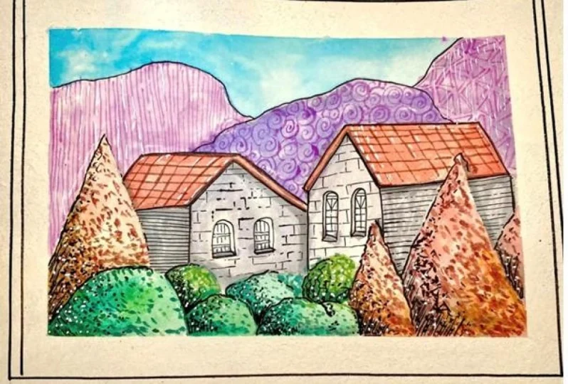
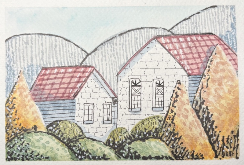
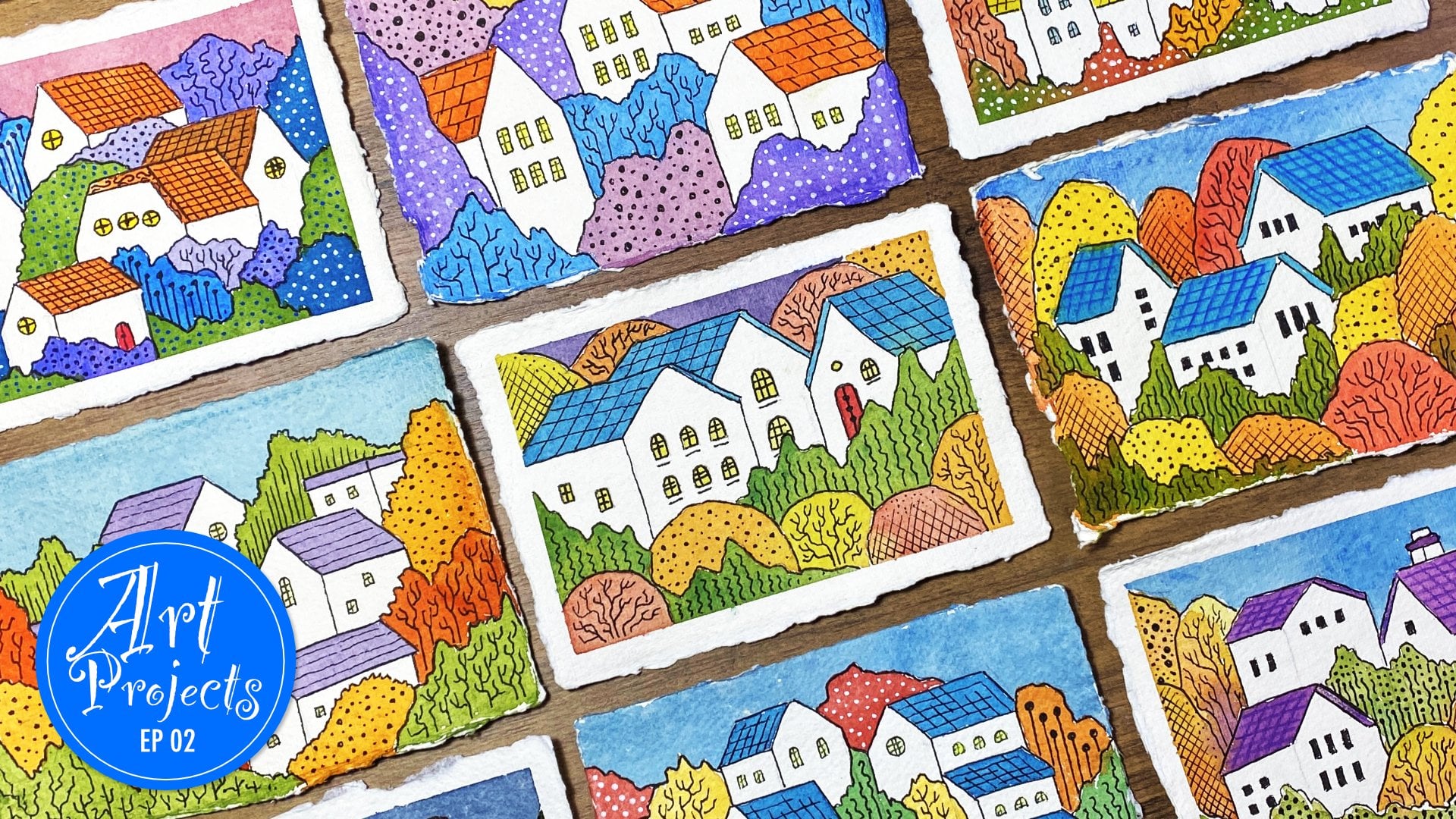
13. Artwork Examples: Okay, welcome back.
Let's now start doing the exciting stuff and start building a beautiful
little illustration. And incorporate
the techniques and the methods that we learnt
in the lessons before. So if you bring your
attention to the screen now, I've got a little example of a nice little quick
sketch that I did with my beautiful
neocolor pastels. And you can see over here, there's quite a lot of detail. It's a very loose
style of sketch and all I've done in this is used
pencil to do the outline. And then I've got
a nice little bit of base color with my
beautiful pastors. And then I've used the tips
of the pastors to just go ahead and create these
lovely texture marks. And you can see that you
can produce wonderful, vibrant, gorgeous results
with these pastors. So the application methods, if you remember
that we did earlier on in the lessons, can vary. And you can choose whichever application method
that you like. Initially, I tend to do
the colors off the papers. If you remember the third
method where we were doing the color
application off the paper, on the palette, I
do tend to use that probably about 80% of the time. However, I let that dry and
then I build some textures with the pastels themselves
on top of the dried paint. And then you can produce
this gorgeous little effect. And then you can do
some nice brush work from the paint on your palette, or even the paint that is
actually on the paper itself. So you can produce these beautiful little
sketches like this. So if we have a look on
the right inside here, I'll reveal the
one on the right. So on the right over here
I've got another sketch. This one is done in a similar fashion to
this one over here, but we've got more flat colors and less texture from the paint, and I've done more
texture work using my ink liners and
my fountain pens. You can see this is a very
much outlined drawing. So again, with this one, the application
method is just to place the actual color itself from off the paper
and then just use it to apply onto the paper itself. And then just let it all
completely dry and use black and white marker ink to start creating a lot of texture work like you
can see over here. And building a lot of this hatching work and cross
hatching and stipling to produce a different effect
that we had from this initial one on the left
hand side over here. Again with this one, this
is all done with paint. Very minimal pen work. In fact, there's no pen
work in here at all, there's just pencil outline. And then we just go straight in with the pastels and apply them off the paper and then
directly onto the paper. On this one we've got
the application of the pastel away from the
paper using a palette. And then we let it
dry and we just go ahead and do some outlining
work and some highlight work. Again, this is a quick
method to do a sketch. And this one takes a lot longer
because we're building in these different values and shadows using the
paint off the paper, and then using a little bit
of the crayon on top of it to produce this wonderful cozy,
lovely, vibrant effect. So let's just have
a look at the other one over here on
the left hand side. So over here I've got a nice mixture now of both
of these techniques where I've got a lot of
layering like I had over here into the kind
of elements over here. So you can see in this
green area and in this red area we've got
nice build up of layers. But also in addition, I've added some outlining with my black markers and my fine liners and also
my lovely fountain pens. And then I've got some nice highlight work that I produced with some beautiful white
marks using my Posca marker. So again, this one on the left is a
combination of both of these styles and you can go ahead and use whichever
combination you like. Again, this is just to give you an idea of the type of
results that you can produce. So let's just maybe look at a bigger drawing to
emphasize this a bit more. So as you can see
on the screen now, I've got this nice
one over here. So if I just get a zoomy
zoom back on this, you can see this a little bit better to move that
one out of the way. And you can see over here, we've got a really nice, lovely little drawing, nice square drawing with a lot
of details over here. So again, this one, I've got no ink work at all. This is all just
pure pastel work and the majority of
it is off the paper. But then I bring
in a little bit of those details by using the pastel on top
of the dried paint, and then a lot of
fine brush work using the pastels off the paper, like we did in
application method three. And you can produce some really
nice, beautiful results, like you can see over here with the markers and with the
actual paints themselves. So just a little bit of Posca
marker for the highlights and the majority of everything else is just done
with the pastel, so you can see how
versatile these are. They are so vibrant and they
can be so opaque as well. A bit like acrylic paint, so it's not necessarily
just purely transparent. You've got a nice bit of opaque, beautiful textures of paint, and that's where the advantage
of these pastels kick in. So that's a nice
little sketch there. Let's have a look
at another one. And on this one you can see
I've got that similar format. So on this one we've got
more of the line work. And on this one I actually went in with the pastels first. So we did the dry and
then wet methods. So we went in with
the dry pastors and I blocked in a lot of the colors
that you see over here. And then I wet the
pastel with the brush, just with the dry and then wet technique like we did
in method number one. And then once
everything was dry, then I went in and started
adding in some details with the black fountain pen and then some nice white highlights
with my Posca marker. So that was an example
of going directly onto the paper and then wetting like we did in the
application methods. And let's have maybe look
at another one over here. So another one that
I've done here is more using the paint off the paper and then applying it again and then letting
it completely dry. And then we've got some
nice inkwork over here. So a lot of inkwork to produce the textures compared to
the other ones that we did. And you can see you can have
some wonderful results. And finally, let's
just have a look at the last example that
I've got over here. So you can see this
one is nice and vibrant with a lot of
beautiful details going on. So this one is all done in
absolute pure pastel work. So the neocolor
pastels have been used to do this entire painting, so I've not used
any white markers. So you can see these
little white areas on the mushroom heads over here. What I did on that was
I left them white, so that's just the
white of the paper. This example is just
pure pastel work. So again, it's off the paper initially and then a
little bit of texture on the paper using the dry pastel and then
just slowly building it up. Now this type of application and method for painting is
the most time consuming. This one took me
quite a long time to do so for your initial
sketch that you do, I would not maybe spend
too much time on it, just do a small little
painting like this, like a little kind of
rectangle or square. And we're going to
actually do this and once we've spoken through
all this artwork, we're going to go ahead and do an example of one
of these styles. So just give it a go for your initial sketch
and painting, and then maybe for
your class project. After about two or
three attempts, you can try doing a nice big, more complicated
piece like this, but it's entirely up to you. So that was just a quick
little run through of the artwork that I personally produce using these pastors. And now we can move
on to producing a nice little
sketch that you can follow along and get
all excited about. So let's move on
to that one next.
14. Starting The Sketch: Okay. Okay, welcome back. Let's now do our
exciting little sketch with our neo color pastel
watercolor crayons. So on the screen over here, I've got three simple
little materials. I've got my wishy washy tape, I've got my standard HB pencil, and I've got a nice little piece of co, pressed watercolor paper. This is the one that I've been using throughout the class. So what I want you to do
is I want you to just go get yourself
these three items. If you don't have any washi
tape, don't worry about it. All you need is your
paper and your pencil. So just get that nice and ready. So let's just use our
washy tape to just quickly go ahead and tape
down our piece of paper. And then we'll start
with the sketch, Oki Doki. Now we've got our lovely piece of
paper tape down. I've taped it down onto my board over here so
that it doesn't move. And this will produce a nice little white border once we've finished our painting and illustration to give
it a nice clean edge. But again, if you
don't have washi tape, then that's absolutely
not a problem. Just follow along
the best you can. So for this one
I'm going to come up with a little sketch. So just have a look at the shapes and designs
that I'm coming up with. I'm going to keep it really
simple like I usually do in my classes so that you can follow along in an
easier fashion. And then at the end, once I've done the sketch, we'll start doing
the exciting stuff. And remember the
actual outline of the sketch will be available
in the resource pack so you don't have to worry
about following me at the speed I'm going
because I'm just going to make this
a little bit fast. So just have a look at the reference image of the
outline of the sketch, so you can just copy it down and then you're ready
for the next step. So let's quickly
do the sketch now. Okay, do key Now we've
got a nice little sketch. As I said before, have a look at the resource sheet
where I'll give you an image of
just this outline. You don't have to have the
exact same sketch as me. If it's similar, great if it's not, that's
absolutely fine. It's all about just putting
all the techniques that we've learned in the lessons into
a nice little illustration. So what I'm going to do
next is I'm going to go ahead and start
selecting some colors. So I've got myself a nice
bunch of colors over here that I've selected already
for this initial stage. So basically what I'm
going to do is I'm going to use these
colors to start laying down a little bit
of a foundation layer underneath everything
so that we have a nice, clean, crisp color. Now, I like to always do this off the paper like we did in
application method three. However, if you don't
have a palette that you can use to do it off
the paper, that's fine. Just go ahead and use
it directly on it. So you've got the dry and then wet method like we did
in application number one. So what I'm going to do
is I'm just going to get my palette over
here on the screen. And I'm just going to
go ahead and start swatching my lovely
colors over here. So I've got this lovely
olive green color. So this one is actually
called moss green. It's called moss green. This color, if it's a color
that you want to use, then this one is
called moss green. And let's just put
that to the side. And then my other green
that I've got over here is called chromium oxide green. So this one's
chromium oxide green. It's a slightly lighter
color than the one before. So I've got a nice little
balance going on over there. And remember, you don't need
to have these exact colors. You can use whichever
colors you have. And then I've got this
lovely gray color. So this one's called light gray. And you're just going
to go ahead and swatch my light gray over here. And it's effectively, this
first stage is just doing a color palette of all your colors that you think
that you're going to use. Because what ends up happening
is that once you start, you'd like to add a
few more other colors, a few more tints of
a particular color. And that's all it is. It's just emerging
as you go along, and that's the fun of it all. So I've got my next color here, and this one is turquoise blue. So for this one, let's just put the little swatch down here. And that's why this
palette is so good, because it's completely flat. And that texture
allows you to just get a nice little swatch of
color onto the palette. So you can effectively
use it like water color. So the next one I've got here is this beautiful crimson algerin, huge, nice, dark,
deep red color. Let's just put that down here. So just like that nice bit
of dark crimson over there. And then I've got two
really nice light shades. These peachy light shades,
the first one is called. Desert rose, so a bit of
desert rose over there. That will give us a nice swatch. So a nice light, kind of peachy color, I think that'll work
fantastically well. And then I've got
a darker shade, which is an Apricot. So this one's called Apricots. Just next to that one, I've
got my Apricot over there. And that's about it for the
initial first layer of color. So I'm just going to get my
color wet with my water. So just a little bit of
water on each one of these. And what I'm going to
do is I'm just going to wet them on the
palette as it is. And then just going
to spread out that color so that I've got a
little bit to pick up from. So again, clean the brush and then I'm just going
to wet that color. Just add a little
bit of water to it. And then again
cleaning my brush. And I'm going to do that
for all of them now. Okay? Okay. So you can
see my little swatchy, swatches are nice and wet, so they're ready to use. Just get my pencil
out of the way. So let's just slide this
onto the side over here. In fact, we could
put this over here on the top so we
have easy access. So what I'm going to do
now is I'm just going to go ahead and I'm
going to lightly wet the areas that
I want to put this on so that we have a
nice, smooth gradient. So for this area over here, for the sky area,
I'm just going to add in a little
bit of that water. And you can see my water
is a little bit murky. So do have two pots of water. It's always a good idea. But again, I don't have
much space on table, so I'm just going to stick
to my one pot of water. So I'm just adding in a
little bit of water there. And then I'm going to
pick my blue color up and I've got blue on
there now from my swatch. And I'm just going
to dab that on, to just like that, dab it on, and then maneuver it around. It's effectively this wet on wet technique that we normally
use with watercolors. And I just want this
really nice pale, light blue shade that
goes on the top. I don't want it to be too
saturated at this point. Just like that, I'm
just adding in my blue. Maybe I pick up a little
bit more color there. I've added a little
bit more color from that blue, from my palette. And I'm just going to
literally just drop that in. What that will do
is it will spread across wherever you
have the water. Just like this, we're
doing this lovely wet on wet technique to
produce a nice, subtle, beautiful shade for
the sky area in our made up little
illustration just like that. I think that's enough. And we're going to let
that one dry off now, but we can start working on
some of the other areas now. What I'm going to do is I'm going to give my brush a clean, clean, make sure
it's nice and clean. And then from my palette now, I'm going to pick up some color directly from the palette. I'll just bring the
palette over over here so you can see that red
crimson color that I had. I'm just going to
go into that and do a little round motion
there to pick it up. And then from that, and we're just going to go
straight into this roof area. You can see that gorgeous,
beautiful crimson color. Nice and vibrant,
absolutely fantastic there. Just like that. I'm
going to spread this as the base color. And once you've done the base
color part of the painting, then the exciting thing happens. And then you start
adding in details. But then again, this is
the exciting part as well. How can art not be exciting? Every step is exciting
as the other. Of course it is, right? So I'm just going to repeat
that and do that over here. Now, I'll quickly
get that one done. Okidok. So now I've got
my red of the roof. Let's now start filling in
some more of these areas. So I've got my lovely, peachy peach color over here. So I'm just going
to grab hold of that peach color,
nice and moist. And again, with
that peach color, what I'm going to do
is I'm going to go ahead and start adding that peach color to these
triangle elements over here. So I'm just going to quickly
go ahead and do that. 0 ki dokes, you can
see now we've got some nice light shades
going on over there. And just like that, I'm going
to go ahead and I'm going to use my green for
these areas over here. My lights are green for these little bumpy
bumps over there. And then I'm going
to use my gray for these kind of
backdrop areas there. And I'm going to leave
the actual frontage of the house and the
side of the house white. So I'm not going
to color them in. So I'm going to quickly
go ahead and do that now. Oki Doki. So now you
can see that we've done a nice base layer of undertone using really
nice light colors. So just remember
if you don't have the light to shades in your set, then just add a little
bit more water to them on your palette or wherever you're mixing them outside your paper. And that will produce
a lighter tone. If you remember in the lessons, were produced lighter tones of a particular color
by adding more water. That's all you need
to do to create a nice light base color for this particular
drawing that we're doing. We're keeping it nice and
light for this initial stage. And if you've gone really dark with your color at
this first stage, don't worry about it. No stress at all. We're just going to keep
moving on and learning from this practice sketch before
you do your class project. So let's let this
completely dry now and then we can move
on to the next step.
15. Building Layers: Okay Oki, welcome back. So we can see now that
our lovely base layer has dried out and it looks
beautiful and light and crisp. So what we're going to do now is we're going to start building in some more values to
create that beautiful, intense look with some details. So the next step will be to
use the same colors that we had initially and start
building in more texture. So what I'm going to do here
is I've got my three colors, my two greens and
my peachy color here for these
foreground elements. And basically all it is, is a case of selecting
the same color. So let's start off
with the peach, peach and make sure there's no bits and bobs on our sheet. And we just need to
basically go in and lightly using the
dry on dry method. So we're just going in dry
with our crayon pastel. And you can see I'm
just coloring in this right side area
of this element. I want this area to
be nice and light, so I want the dark to
come in from here. So we're going to effectively build up color layers
to produce this. So again, that's about
enough for that part. And then maybe have a little
bit on this side over here just to create
a visual difference. We don't want everything
to look flat and the same. So again, just a little
bit on this side there. And then I've got that one
on this left hand side. So we'll just go in with the left hand side to add in
a little bit more colorer. Just about that much.
That's enough for that. And then I'm going to
get the green that I did for these bumps
at the bottom here. Again, I'm just going to
go in with that green. And you can see
when you go in with the dry crayon over the paint
that's already dried out, the first layer of paint, you can get this beautiful
kind of difference of a darker to lighter tone just with the crayon
itself just there. I'm just adding in
a little bit there. And then maybe a little bit on this section over here again, Just follow along
the best you can. If you're adding your
color in different areas, it makes no difference. Just do it how you prefer it. I always prefer to have nice dark bit of color
towards the bottom, left or right hand
side and emerge it into the lighter tone on top. Again, that's enough for
that green for that part. And then we've got this kind of more paler green color here. And then I'm just
going to do the same for these elements here. Very lightly, not pressing hard. That beautiful pigment of that pastoral just comes
off beautifully. And then again, on this side, maybe have a little
bit on this side, I don't want to over
saturate it with dark. And then on this element here might have a
little bit down here. And I think that's about it. So now all we need
to do is we just need to get our
nice clean water. Get our brush nicely saturated. And then we're just going to start maybe with the
right hand side here. We're just going to activate that color that we had on top. Now remember, this
color isn't permanent. So once it's dried, we can reactivate it again. So do bear that in
mind when you're putting dry on top
of the paint that's already dry and then you're re wetting it or reactivating it, then you're also going to start moving a little bit of
that color underneath. So do bear that in mind. It's not like normal professional watercolor
paints that you have the pans or the
kind of tubes that go permanent once they're dried
and you can build layers. That's kind of the main
difference between these and standard
water color paints. You have to just
bear in mind that you're going to end up
reactivating what's underneath. So just like that, you
can see I'm just slightly wetting that crayon
that I put on top. And you can see it's created this beautiful gradient from dark to light. How
easy was that? So again, I'm just going to go ahead and do that
again for this one. So just like this, just
going to go in very lightly. Don't use too much
water for this, otherwise it's just
going to go all over the place and it's
going to start blooming. We don't want to have
those cauliflower blooms in this section, we just want it to
be nice and gentle. A very mild gradient going
from dark to the light tone. And try not to press too hard or brush it in really deeply, otherwise you're
just going to be lifting that color
from underneath and then it's just going to start causing you some problem. So again, I'm just using the
brush to just tap it onto this lighter area just to
create a speckled effect. And just like this
now I'm going to go ahead and continue
doing the same for all these elements
and then we'll see what results we get. Okay? Okay. Now you can see that
we've melted away the dry crayon that we added
in as the second layer. And you can see
how that enhanced the look of these elements. It's effectively
added a gradient from a darker tone
to a lighter tone. And how easy was that? That was so easy to do. Just
a little bit of crayon on the dried initial paint and then we just wet
it with our brush. If you notice over here on this particular one that
I've got down here, I've gone ahead and
spread that color out a bit too much
so this can happen. So you just got to
be a bit wary not to use too much water
on your brush. Otherwise, you're
just going to layer that color on the
entire element itself. So don't worry if this happens to you
while you're doing it, especially on this
practice sketch. It's just for you to
get used to handling these pastels and
the water content that you use to
build these layers, just keep going even if it
covers the entire shape. So what ideally you want is you want it to be
like this over here, where you've got that
second layer, a dark, deeper color on this
left hand side, and the remains of the
first lighter layer on top. So you've got this gradual build of texture from dark to light. So let's let this
now completely dry. It's really important
that we let these layers completely dry before we
move on to the next one. So once this is completely dry, we can start working on
adding in more darker tones.
16. Darker Textures: Okay, now our lovely
little paint has dried, so you can see the
effect that it produces. It looks really nice,
that doesn't it? So the next step is now to start adding in
another darker layer. So it's entirely up to you. If you want to start building the layers gradually and
slowly, you can do it. But for this example, I'm going to go in a little
bit fast and I'm going to go into the darker
tone straight away. So ideally on a
normal illustration, if I'm spending a
lot of time on it, I would basically go in
with the same colors and slightly darken them like
I'm going to do right now. But with this
particular example, I'm going to go ahead with the most darkest
version of each color. So let's start going ahead and
creating our dark version. So initially what
we need is we need our color that we used for
the actual shape itself. So for these shapes, the triangles, I've
got my peach peach. So I'm going to add in that
each peach color over here, get a good amount of
that, each peach color. Just make sure I don't
get it all shaken off and onto my paper and
ruin my illustration. So that's a nice bit of a swatch there on
that peach color. So to darken this
color, if you remember, what we said was
to darken colors, the best way is probably just to add a little
bit of black. But for this instance, because this color is
a very warm color, I'm going to go ahead and use a darker orange
that I've got. So I've got this really nice
dark orange color over here. This particular one I
think is called Vermilion. So with this one, I'm
just going to add in a little swatch of
this vermilion color. And what that will do is it
will intensify that apricot, peachy color that
we've got rather than going in immediately
with the black. So with that I've got
a nice bit of peach, and then I'm going to add in a little bit of brown as well. So for this one, I've
got this lovely, it's called Toledo Brown. A bit of Toledo Brown over here. That will give it more
of an earthy darkness. And then just at the end, I'm going to have a little
bit of black. Good old black. Just to kick in a little bit
of beautiful, rich darkness. So just a little
tip of black there. So what we're going to do now is we're just going
to get our brush, clean brush, and start
creating this color. So I'll show you this
on the screen here. First we want to go
in to our base color. So we've got our base
color over here. Just make sure you can see that. Just like this, I'm going
to drag in a little bit of that orange just to make
it a little bit more vibrant. To effectively just change its composition a
little bit and tone. And then maybe bring
in a little bit more. So we've got this
new color over here. Just dragging it down, should move that out of the way. So just dragging that down
over there so you can see that it's a lot different
from the original tone. So with that then,
with the same brush, I'm going to bring in a
little bit of this brown. So we're just going
to go over the brown like this and just
add that brown. You can see that
with that brown, we've started creating
this more darker, more deeper Apricot color. And that's what I'm
looking for, a darker, deeper color of this Apricot. Rather than just go
straight in with a black, I want to have a
nice deep version of this color to give it a
beautiful, rich, dark look. So finally with the black, then I'm just going to
go in with my brush, just tap it on the black, and then just bring
it in gradually just to give it that
element of darker tone. So again, maybe just
a little bit more. You can see I'm only using
a little bit of that black. I'm not going in
fully with the black. Just a little bit
will take you a long way and I think maybe add
a bit more of that red. Just have a play around with
the color that you have. Add a nice vibrant red or an orange to
this apricot color. A bit of a dark brown
if you have it, and then a bit of a black. Now, if you don't have
these colors that I've got, then that's no problem at all. Just add a little teeny weeny
bit of black to your color, and that will give
it a darker tone. So you can see there, I've got this really nice darker color and I think I might just
add a bit more black to it. I want to go in quite
dark at this stage. I'm not really that
bothered about building ever really little
tone like I normally do. Otherwise, we're going to
be here forever, aren't we? So let's just quickly go
ahead and use this color now. I think I'm happy
with that color. Just move that palette
to the side now to make sure that it doesn't
go all over the place. And let's start off
maybe with this side, so you can see, there we go, We've got this nice
kind of like brownish, tinty shade onto
our peachy color. Actually, I'm going to add
in a little bit more of this red color just to make it a little bit more on the orange
side like that. That's a lot better. So let's just get that now. And just dabbing it on to
the bottom left hand side, you can see that beautiful, vibrant red is coming out and
just going over the areas. And this is all I'm
going to do now. I'm just going to create
this nice stippled effect now with the tip of my brush, using a lot of the paint on
the bottom right hand side, on the bottom corners and where
it joins the other shape. And then as I'm going upwards, all I'm going to do
is I'm just going to add these little
stipples in like this. So just follow along
the best you can with whatever color
that you've created. And that will be
great, just like that. Just a few stipples
over here and spreading the stipples out wider as
we go towards the top. Just like that, I'm going
to leave that as it is. And then I'm going
to go ahead and do the same for this area. So for this area, just get a bit more of that paint on my brush, that beautiful color that we've
just created on my brush. And then just go in into this left hand side with those stipple
movements, just like that. And then just bring
it in over here. And for this, I want this
area to be nice and light. So effectively, it's like light coming in from the top part of this made up lovely little
scene just like that. I'm just adding in
these broad strokes, the nice thick,
heavy, broad strokes. And then as we're
going this way, I'm just going to
go ahead and make them little stiples a
lot smaller and tighter. And then that will
create this kind of like illusion that we have some texture going on in
this triangular shape. It could be a nice pile of sweets or candy
floss that's just laying around
outside these houses for you to just have
a little snack on. So be whatever you want. But let's get back
to the lessons. So let's not wander
away in wonderland. Let's just enjoy this process. You can see I'm just building in this little stiff stipple. Now again, you might
end up building it in, in a different way from me. That's absolutely fine. So for this one, all I'm going to do is just
continue and we're going to do basically the
same step for this one. So if we just continue
with this one, and then we'll
quickly move over to that one and see
what results we get. Okey Dokey. Now you
can see we've got this nice little patterned
texture building up dark from the bottom sides all the
way going to the top and dispersing into a lovely
little color shape. So what we're going to do now is we're going
to go ahead and do exactly the same for these
other elements over here. So what I'm going
to do now is I'm just going to go ahead
and I'm going to give my palette a quickly.
17. Foreground Elements: Before we do the green
because we don't want to have murky murkiness on our color
just with a clean tissue. I'm just going to go
ahead and give that a wipe that's looking great. Move that to the side. Now we can start building
in our green colors. For the greens, I've got
my medium green over here. And then let's
just get the board back on the screen
with the greens. What I'm going to
do is I'm going to add in the green over here, just like I did with
that orange color, just like this,
adding in that green, nice deep swatch of that green. And then I'm going to go
ahead and I'm going to use a darker green that
I've got for this one. I've got green that's actually
just called dark green. And I'm going to go ahead
and add this on over here. Nice bit of dark green here. We want this to be nice and dark to create this
beautiful texture. And then I'm going to go
ahead and add in my black. So just a little double
double of black over there. Again, we don't want to
overpower with the black, but it is very useful to
create a darker tone. So let's get our
water on here now. So just like before
wet the first color, get a nice spread of that
initial color over here. And then with the same brush, just wet that second color. And you can see that
green is quite vibrant. So just add it in very gently, so you're just going to scrape off a little bit of that green. Just add it in very gently
to that initial green color. And you can see it's kind of
livened it up a little bit. So you've got this
other shade of green that we've just created. Now we want to basically
go in with the black. Now it's going to darken
it with the black. And you can see that's going to intensify
it even further. So look at that gorgeous,
that green, isn't it? It's a beautiful, like
foresty green that we've just created with
just a few colors. So that's looking really nice. Maybe just a little tip, more of black in there. And then just mixing
it in between both of these colors to get our
color that we really want. So I think that color
is looking really nice. That one over there,
it's going to balance the whole image very nicely. So just like that, make
sure I've mixed it in well, so you got yourself a beautiful
swatch of dark green. So let's just move
this to the side. And again, what we're going to do is we're just going to go in and start building in this text, just like I did before. It'll start off on this end. You can see we've got this
beautiful shade of green. Take your time with
this. Don't rush. I'm doing this fairly fast because I'm recording
this class, but you just want to take your time with it and
don't worry if you get a big splodge like
I've just got over there, it's absolutely fine. Don't stress about this. This is just a little technique to just enhance
your illustration. You don't even have to
do this technique if you just want to go
straight in with color and leave your
illustration completely flat or just add in
bold stripes of color, That's entirely up to you. This technique. I do
this personally because I just love creating
these textures. It just gives this next
dimension to your illustrations. And it's just my
particular style. So it's just interesting to
try out different styles. So you can see how quickly
that's just changed the look of that little item we've just added
in the stipples. And then I'm going
to go back into it and darken this area, make the kind of marks a little bit more broader with my brush, just to make sure that we have a variance
just on the edges. Just going to dabble it
onto the edge there. Just like that, keeping
it nice and sharp. That is looking fantastic. Just on the edge,
on the top there, building that in,
just covering it up. And you can see
that lighter shade that we have is coming
through the gaps. And that just looks
fantastic. That doesn't it? Look at that beautiful stuff. Didn't think you could
do this with pastors? A no. You can do this with these beautiful, magical,
aquaal pastors. The kind options are limitless, just keep going with this. And then once this is done, we'll move on to
these other ones and then we'll see what
results we get. Ok, now you can see
that we've created these beautiful elements with these gorgeous little designs. And it was just a simple case of just doing these little dots, making them darker
from one side, and letting them become lighter on the top
by spreading out our beautiful paint with
little teeny weenie stipples. So you can see just these
little techniques can just enhance the shapes of your illustrations and make them look absolutely fantastic. Let's now let this all completely dry and
then we'll move on to the final three little
shapes that we have and use a little bit of a different technique
for that one, so I'll see you when
this is all dried up.
18. Painting Details: Oh, that was really nice. That oh, I think this new blend is really
hitting the spot, that one. Oh, very good. Okay, De ke, welcome back. Let's just get the
coffee on the side. That lovely new blend of aromatic Arabica,
beautiful coffee. Anyway, let's get
back to the class. Let's now have a look at our three little
elements that we've got left to do our beautiful pastoral crayon
design work into. So what I'm going to
do now is I'm going to go ahead and grab hold of that green that I used for these three little round
shapes that I've got. So it was this lovely
green over here, and that was chromium
oxide green. And I'm going to darken
this color with a red. So if you remember, when we
looked at darkening colors, we used complimentary
colors to darken our green. And that's what I'm going
to do with this one, to just give it a
more rich darkening of that green color. So just get the palette on here, make sure the palette
isn't wet from the back. We don't want it to murky up our lovely sketch.
So just like this. So I've got my green over here. Maybe put the green
on top down here. Nice bit of green. We don't need too much for
this because we're just going to be adding in some
lovely, lovely details. That's about it for that one. Now I'm going to get the red, and the red I'm using is my crimson red that
I did for the roofs. So a nice dark red over here. That should be enough for this. So let's just move
that on the side. Get myself some nice
clean water on brush, and let's start
melting this away. So I'm just going to add in
water onto that green there. And then I'm going
to bring in my red slowly into that green. And you can see it started
darkening that green. So just like that, I'm going to bring in maybe
a little bit more red. And you can see we've got this lovely olive darkened
green color into the mix. Now what I might do is I
might actually go ahead and add in some dark green
to this as well. So if you remember, I
had some dark green that I used for these areas. So maybe adding a bit
of dark green because that green oxide
color that we've got it more towards the yellow side, so I don't want it
to be too yellowish. I want it to have a little
bit more of a sharper green. So you can see
here now we've got this nice green,
dark green color. And then if we add
the red now to that, we'll get much more
of a darker shade. So you can see that
beautiful that isn't, it's a lovely, lovely, dark shade of green. Now we can mix it
into the olive, and you can see now
we've got ourself, a gorgeous, gorgeous color. So what I'm going
to do, I'm going to bring the rest of that green in. I really want to intensify this. I'm not using black at all, I'm trying to keep
it nice and rich. So again, bringing the red. And now we're going
to get ourself, a beautiful, dark
shade of lovely green. I'm just going to add a
little dip of water to this solution to just make it move a little
bit more better. And you can see it's
nice and opaque. Just mix it all up.
Beautiful stuff. So just like this, I'm just going in with the
tip of my brush. So that's about enough. Let's just move the actual
palette to the side. We don't want it
to interfere with how painting to just
move that to the side. And what I'm going
to do differently here is we did a lot of stipple work and
a lot of pressing the brush down to
get these textures. This time what we're going
to do is we're just going to draw in some lovely lines. So if you just have a
look on the screen here, what I'm going to do is
I'm just going to go ahead and I'm just going to draw in some beautiful lines
coming in like this. Just like that. Broken
up lines effectively branching into the
base of this shape. And that will just add
that visual difference. I do this quite a lot in
my illustrations using these pastors and just
generally using water colors. I like this effect and I
think it looks rather nice. You can see here
and just creating these wiggly lines
overlapping some of them, just filling in the gaps, and it creates this
lovely weavy pattern. And then on the edge there, I'm just going to add
a bit more of the green and where the shape
meets the other shape, I'm just going to
fill it up with a bit more of that dark green. So there we go.
How easy was that? Quickly just added in some squiggly wiggly
lines and look, it's completely changed the
composition of that shape. So I'm just going
to go ahead and I'm going to do that now
for the other two, and then we'll step
back and have a look at the whole picture.
Let's do that now, okay? Okay. Now you
can see we've added this beautiful little
pattern with our brush, using that gorgeous
color that we came up with from our pastors. And it's looking really nice. We've got this nice mixture of different patterns
and textures just growing in
towards this kind of for mid ground of
our illustration. So now what we're going to do
is we're going to let that dry and we're going to think
about these roof areas now. And we're going to basically
go in and start adding in some details on these
beautiful red roofs. But before we do that, what I'm going to do is
I'm going to go ahead take this paper off my board that
I've got on my table. Because I need to rotate
the sheet to just make the whole thing
easier for me when I'm doing more straight
lines on the roofs. So I'm going to quickly
go ahead and do that now. But make sure that if
you're going to do this, don't remove the tape from the corners of the
actual sheet itself. Just fold them in and
that's what I'll do. So let's just get a zoom
back so you can see what I'm doing. Oki Doki. Now you can see that you
have folded back my tape. What part? It was stuck on
the actual surface itself. So just like that, I
folded this towards the back so that I have
a free moving sheet now. So just make sure if you're doing this that you'd
be careful not to remove the tape from the
actual paper border itself. So now I've got a
nice sheet that I can maneuver according to the angle
that I want to work into. Again, if you've watched
any of my classes before, you'll notice that
I love to just tilt the paper towards the angle that's most comfortable for me. And I suggest you
do this as well, especially for this next.
19. Roof Design: What we're going to
do is let's just move the painting a
little bit towards the side and let's get
our colory colors out. So I'm going to wipe out
that green color that I had. I don't need that anymore. Don't need none of that.
Lovely, gorgeous, dark green. So we'll just move
that to the side, and what we're going to
do is we're going to go ahead and we're going
to use our red, because for the actual roofs we used this beautiful
crimson red. So, we're going to
go ahead and we're going to get ourself, a nice swatch of this red. Move that to the side, and we want to intensify this, so I'm going to go ahead
and just use black. So little bit of
black over here, and maybe we could
add some blue. So if I could just find
a nice dark blue color. So I've got myself a nice
dark blue color over here. This one's called indigo blue. You can use whichever
blue you have, whichever darkish blue
shade you've got. This is actually a little
bit more on the purple side. So I don't know why they
call it indigo blue. This is a bit more purple, but it is a nice
darkening color. So I'm just going to
get my water now and let's start creating
this lovely shade. So first of all, again, we're going to activate our red. So adding your lovely
water to your red. And then we'll start adding this indigo color into the red. And you can see that started
to darken it fairly quickly. It's nice and sharp, and that's looking fantastic. So let's just drag
most of that in. So just dragging that in so you can see we've got
this beautiful, lovely, dark shade of red now. So with our black, I'm just going to maybe add a little bit of black in there. We don't want to
intensify it too much, we just want to have
it nice and dark. And you can see how
gorgeous that color is. Look at that beautiful, dark shade of red. Now, I think that's
about enough. Let's just get ourselves a
nice amount on our brush. And again, this technique where we're just drawing
in these details, it all depends on your kind of level of brush
that you're using. If you're using a brush
that's too thick, you might find it
difficult to do this. So if you have a brush
with a nice thin tip, then you'll find it easier. But again, you don't
need to go ahead and follow these details the exact
way that I'm doing them. If you're more
comfortable just going in with a colored
pencil or a pen, just doing these details,
that's absolutely fine. Do whatever you're
comfortable with. I usually just like to use the medium that I'm working with and maybe just add in ink
effect towards the end. But that's entirely up to you. So I've got myself a
nice bit of that paint. Let's now move this
out of the way and let's get our lovely,
lovely illustration. Get them crayons out of the way. Let's get organized. So I'm going to hold my
paper at this angle, because this angle works
for me pretty well. Actually, let's just go
completely vertical with this. So I'm going to start
off on this one, so I'll see if you can
get a zooming zoom in. You can see this a bit better. And that started curling up. Let's move that little
one at the back. It's trying to peep
out, isn't it? Let's just have a look at this. So what I'm going to do is now I'm just going to go
ahead and I'm going to start drawing in
some nice thin lines across the top part
of this shape. So if you're going to do
this the way I'm doing it, just follow along, but
take your time with it. Don't stress if your lines
are getting too thick, don't worry about it. We just want this to
be nice and flowing. So again, just like that,
I'm just going to go ahead and repeat these
lines going this way. Okay, so now you
can see that we've got these nice lines coming in. I've left some of
the parts broken up. It just adds to
that organic look. So I'm going to go ahead
and I'm going to repeat that for this next
one over here, because we're in
the same direction, we might as well do
it at the same time. So again, I'm just going
to go ahead and I'm going to start doing the lines
for this one quickly now. Oki Doki. So that
one's now done. Let's just turn our
piece of paper around. And now you can see
just by adding in, those are lovely lines, it looks like we've just got these beautiful beams going
across the roof area. So what I'm going to do
next is I'm going to go ahead and start doing lines
that are coming this way. So let's quickly go
ahead and do that now. Looky, Okay, that's looking
fantastic. That isn't it. We're just going
to continue now, doing the same on this one now 0 ki Doki. Now you can
see how just adding these lovely cross
hatching lines with our dark color
on top of the light, has completely enhanced
the look of these roofs. And they just look fantastic. So in addition to this, what I'm going to do is
I'm going to do a line on the edge of the other side of the roof using the same color. So I'll just quickly
do that now. Okidok. Now look at that. That looks beautiful.
That doesn't it? It's actually all
coming to shape now. So what we're going to do
now is we're going to let that dry up to make
sure it's nice and dry. And don't worry if
you've done this and your lines have
gone won key Again, I've got some gaps over here that are actually
left on purpose. Because I like to have
this to look organic and not so like ruler
like, perfectly straight. And again, you don't need to stress about making
little mistakes. There's no such thing
as mistakes in art. It's a learning experience. So let's move on. So what I'm going to do
is while that dries up, I'm going to go ahead
and maybe just see if there's some areas of this that I can just
quickly touch up. I can see over here we've
got a little bit of an area that's left
a bit too much. So I'm just going to
go ahead and just darken that, just like this. For this, what I'm
going to do is actually I'm just going
to leave it as it is. I'm not going to
bother too much about it and I don't want you to
stress too much about it. But you can keep going on and on in a painting style like this to just keep
adding details, but then you're just going to be at it for hours and hours. And that's not what
this sketch is about. But if you want to spend
hours and hours on it, then you can save that
for your class project. So let's move on. So
let's get a clean, clean on the palette now. So I'm just going to
clean that palette. I don't need that paint anymore. Let's quickly clean that now.
20. Background Elements: Oki doki. Now I've got
a nice clean palette. So what I'm going to do
now is I'm going to focus on these like hilly
hilly areas now. And if you remember, we used this lovely light gray color. So whatever color you used, just get that color out. And let's start creating
a darker shade of this. We can add a little bit of just horizontal or
vertical texture lines on it just to make it balance
out within our picture. So I've got my gray hair. So again, I'm just going
to go ahead and I'm just going to add in a nice
amount of that gray. And this gray, what was
this gray card again? I think this was called
light gray here. So this one's just light gray. So if you've got the same color, then just create your
lovely light gray swatch. And with this one,
what I'm going to do is instead of adding black, I'm going to just add a
little hint of this blue. So we got this indigo blue. So I'm just going
to add a little teeny weeny hint of this indigo, bluish purple shade
and see what we get. So let's just add in
some water to this now. So we've got this beautiful, pale, light gray color. And if we start
bringing in some of this indigo blue tint
of purple into there, you can see it started
to darken that up. So you can see it, effectively
becoming a violet color. And I don't actually
want a violet color. So what I'm going to do is I'm just going to go ahead and I'm going to go and add
in some real blues. Let's get some real blue out
of here from my palette. So I've got some nice standard
ultramarine blue here, and I think that's
going to do the tricks. So we've got, no, this one's actually
called night blue. I think this blue is
rather nice as well. So if I'll just show
you on the screen here. Yep. That blue is going
to make it really nice. So let's just add
that blue to it, and you can see we're getting that gorgeous blue shade
from that light gray. So you can see we've
got this lovely kind of light shadowy type, shade of bluish gray mixed in. And it's just fantastic because these pastors are
so nice and opaque. You can just create
so much texture and color with them and that
just looks fantastic. I think that probably
enough intensity for the blue might have to add a little bit more of
that gray into it. So let's just get
a bit more gray. Let's just add in
some gray over here. We don't want it just
to be blue lines, we want it to be nice
grayish blue lines, just adding a bit more of that gray to mute out that color. Let's just go ahead, do that. Make sure we don't get any
drippy drips on our painting. I don't usually tend to blend colors on top of
my painting like this. But look what I'm
doing for you guys. I'm doing this so that you can see what I'm doing
with the colors when I go ahead and blend them
so you don't miss a thing, the things I do for
my lovely students. So let's just do this now and get ourself a
nice bit of that blue. So we're going to move
this back to the side now. And then again with my brush, just make sure that we don't have too much water on there. We don't want too
much water on it. Otherwise, it's just going
to splodge all over. So a nice amount that's within
the bristles will work. And we're going to go
ahead and do a tilted tilt on this so that it's nice
and comfortable for me. But before we do that, we
just need to make sure that this area is nice
and dry and yeah, that's all dried up so we
can start working on this. What I'm going to do is
I'm going to start on this with the left
side over here. And I'm just going to
follow the line of my side edge of my
paper and tape and all it is is just a case
of just drawing in these lines coming
down like this. Just like that, broken up. They don't need to be straight, just nice and broken up. Then all we're going to do is we're just going to keep them as and tight as we can together. Again, try keeping them as thin as you can with
the tip of your brush. And what that'll do is
that'll just create this beautiful texture
in the background that won't interfere too
much with our midground. And just like that,
I'm going to continue and follow this pattern
all the way across. And then once we're done, we'll see what results we get, okay? Okay. Now we're done on that one. So that was a nice little
therapeutic exercise. That wasn't it. I
enjoyed it a lot. But as I said, if you
don't want to do this, if you think it's going to take too much time or, you know, if you don't like to
do these fine details, then absolutely skip
this part and just leave the color as it is for
this practice sketch. So now let's now move
on to the next one.
21. Shadows: Okay, welcome back.
Let's now have a look at our lovely
illustration, which is completely dry now. So on the screen you can see all our beautiful
textures and patterns that we've created
look absolutely fantastic. The next stage now is
to add a little bit of a shadow to the different
elements of our illustration. So what we need is
a shadow color. So basically what we're going
to do is we're going to grab hold of a blue and a brown color to combine together to produce
a lovely gray. So grab yourself
your blue and brown. The ones that I've got here
are ultramarine for my blue, and for the brown I've got that Toledo brown that I used before. So let's just move
this to the side and see what we get with
our lovely swatches. So I'm just going to add in
a bit of blue over here. And what we want to
do is we want to have a nice solution
of our gray tone. Because effectively what's going to happen is it's going to layer on top of our
illustration and patterns. And it's just going to
add a nice subtle tone of shadow work to just give
it that other dimension. So just like this,
I'm just adding in my two swatches so we can put them to the side now
That should be enough. And then make sure my brush
is nice and clean and let's start getting a bit of
color moisture on there. So a little bit of blue
on there on that one. And then I'm just
going to go in to that brown with the same
brush, just like that. And you can see as I'm using a bit of that
blue onto the brown, the brown consistency
and color is changing. It's changing to a
more dulled out brown. So we're just going to slowly start adding that into the blue. And you can see there
we've got ourself, a really nice grayish blue tone. So that's just
looking fantastic. I'm going to bring that
blue into it a bit more. So just like that, I've got
this lovely gray color. So again, it all depends on
the type of blue you have, what shade of blue
and brown you have, You will get different
shades of gray. So again, there's a bit
more blue in that one, so I might just bring
in some more brown to kind of effectively
mute it out. I want to have like
an earthy gray tone, so a nice earthy gray tone
will work absolutely fine. Now if you have a crayon
that this particular color, you can just go ahead and
use that pastel or crayon. So just grab hold of a gray if you want to
just use a gray. I mean, I've got a
nice gray over here. This warm gray that I had, which was actually called Bage. We could actually add in
a little bit of this. So if we just add in
a little bit of this, it will give it more of
that warm gray color. And I've also got
this color here, so this one is actually
called light gray. With the light gray,
we can even add in a little bit of light gray
maybe here on the side. And then just drag them in into the actual
colors themselves. And that will give
it a bit more of a rich color by adding in some actual pigment of grays themselves.
Just like this. I'm just adding that in, you can see it's brightened
it up a little bit, so that's looking
great, just like that. Just keep mixing your colors and once you're happy with the
type of tone that you've got, then we can start adding
in some water to this, because we don't want
this to be too sharp. We want it to be
nicely watered down. So it looks very subtle in
our pictures, just like this. And I'm going to water
this down fairly heavily, quite a lot of water onto this. Just like this, you
can see we've got this lovely grayish tone. Now the best thing to do is grab yourself a little bit of paper. So whatever paper you
have, some spare paper, and just test out your gray tone before you put it
on your picture. So I've just got this kind of Swatch paper here, so we'll see. You can see that
actually quite dark. So what I might do is
I might go ahead and add in some white
to brighten it up. So let's just grab hold of me. White. So I've got
some white over here. So I'm just going
to go ahead and add some white into this
area just like that. Just adding in a nice bit of white down there
in the corner. You can see that nice bit
of white gray on there. And then I'm going to go
ahead and wet that white. And then slowly bring
that in so you can see we've got this nice grayish, light gray tone over here. And then you're going to
mix it in a little bit more into that solution, and you can see it
brightened it up. We'll have a look and
see what that looks like on the paper before
we start applying. The worst thing is
that once you've done a beautiful illustration and you started adding shadows
in this next stage, and then you've got
a color that you didn't like or it was too dark, or it kind of wasn't what
you preferred it to be, then you're going to be a
little bit disappointed, because once it's dry,
then it's dry, isn't it? Even though this isn't
permanent color, you can still really mess up your illustration
at this stage. So if you don't want to do shadow work onto
your illustration, you don't need to do it at all. So that's entirely up to you. But I just thought it was
worthwhile showing you that you can still add shadows
to your illustration. So you can see this was the
first one we did that was quite dark and that's so much better. That
isn't it? Look at that. Nice bit of light
gray on that side. So a bit more water
to the solution, and then we'll
just test it here. Lovely stuff. Look at
that gorgeous gray. So let's just move
this out of the way so we don't start throwing
things on the floor. Okidok. What we're going
to do now is we're just going to pick up that gray
color solution that we had. Then we're just going
to slowly start adding this to our
illustration like this. I'm just going to
have a little bit over here where I've got the side of this house just
a little bit down here. And again, not going in
too heavy with the color, Just going in nice and light. We don't want to
use too much water, we don't want too much blooming
again, just like this. Then I'm going to bring
in this shadow down here. You're going to drop
in, effectively shadow coming in from the
back of this shape. And then another shadow line coming in from the
back of this shape. That's looking great,
just like that. Just adding in these
shadow lines here. Then a little bit
more of the paint. We've got some shadow
coming in from this side that's looking great. And then just a little bit of shadow coming in from the
side of that building, which is effectively creating
a cast shadow onto this. And then maybe just a
few shadow lines where the windows are not really too bothered about the
windows at this stage. Just like that, you
can see we've added some nice shadow work
again on this house. Now what we'll do is we'll
do exactly the same. So just nice bit of
shadow over here. And then just make
it come out so that we don't have too much
concentration in one area. And then once this dries, this is going to look
absolutely fantastic. So again, some shadow over here. And then that's about
it for the houses now, maybe throwing a little bit of shadow over here on the edge, just very gently, lightly. You don't need to
press down hard. Again, this is entirely up to you whether you
want to do this or not. I just like to do this to add that extra dimension
to my illustrations. So if you don't really want
to do this, if you think, oh, I don't want to add any more to my lovely illustration that
took me so long to do, then absolutely fine,
just leave it as it is. So just like that bit
of shadow on there. And now we can add
some shadowy elements to these small foreground parts. So we've got a bit more of my lovely gray colors
just over here. I'm just going to
add in that shadow. And you notice I'm not rubbing my brush into
the actual paint. I'm just lightly
letting it glide. So again, nice bit
of shadow there. Little bit of shadow
onto this end. And then again with this one
nice little bit of shadow. Just keep it nice and gentle, don't want to murky up our
beautiful design work. Then again, over here, a little bit of shadow in this
recess part at the bottom. And then the same on this area without trying to murky up, then beautiful
details that we had. Just keep it nice
and a little bit more on this area over
here, just like this. Then again, a little
bit down here, keeping it very subtle and
light not going into hard. Then in this area we've got some nice bit of
shadow going on there. And then maybe just a little bit down here, just like that. And that looking great. We're going to let that dry now. And then maybe add
a few bits over here where we've got
this backdrop down here. Just a little bit of shadow
going up into this area. Again, you don't need to do this because
if you don't want to go over your beautiful
lines, that's absolutely fine. We are going to do a final bit of detail work with some
ink right at the end, which will really
make this all pop. If you want to just leave
this part and just do that, that's entirely up to you. And again, we may have a little
bit of shadow going onto the roof here to just throw in a little bit of
gray like this. And then maybe a little bit of gray like this on this area, just from the cast shadow. And then maybe a little
bit darker down here. Now you can see as I've
dragged that down, it's brought a bit
of that red down. So you've got to be
careful not to drag over the color that you've already got, but
that will work fine. What I'm going to do is I'm just going to use a little bit of water and then just blend
this out just like that. So that's the advantage of the water color not
being permanent. So just like that,
I've just blended that out so it's
absolutely fine. So just remember that the color underneath
will get reactivated. So do be careful when
you're doing this stage. And again, if you don't
want to do this stage, if you think this is going
to mess your drawing up, then just leave it. So just watch me do it on this. And then maybe have a practice before you do it on
your own illustration. So that's about it
for the shadow work. Just adding in a
little bit more depth. Now we're going to wait until
this completely dries out. We've got to make sure
there's no moisture here. We just want it really nice
and completely bone dry. And then we can
move on to adding some more details with
a few other mediums.
22. Inkwork: Okay, welcome back. Now we have a nice completely dry sketch of our lovely little
illustration. And you can see it's
looking fantastic. So these final steps
now are going to be to add in just a little bit of detail using black ink
and white paint marker. My Posca paint marker. So for the inks what
I'm going to do is I'm going to use my micron pen, my fine line and micron pen to bring out
some of the details. And then I'm going to
use my fountain pen, which is a medium tip,
this lamy Safari. And that will just give it
that extra depth and detail. So let's firstly start off
by using the fine liner and adding in some details to the front part
of these houses. So what I'm going to do is I'm
just going to tilt my page like this to make
that angle easier. And again, if you don't
want to do this stage, that's entirely up to you. If you want to
leave it as it is, you can go ahead and do that and just watch me filling
these details. Or if you want to follow along, then that's absolutely fine. So let's now add in some nice lines that are going
across like this that will represent some kind
of bricks that are going on the front part of the panel of this
house, just like this. All I'm going to do is
I'm just going to add in these nicely spread outlines, like going over the shadow
part as well that we added in. And that now what you can do on this is you can
actually vary it. You can have some thin ones
with a little bit of gap, some bigger ones
just to vary it, make it look organic, they don't have to be straight. Just keep it nice and simple just to add a little bit of
that additional texture. Then what I'm going to do is tilt it back and
then I'm going to add in some brickwork lines
that are going vertical, like this, just
randomly dropping in. Then brick lines to represent
some kind of layering of bricks or these kind of like panels or wooden panels that you get in front
of some houses. But again, you can do
whatever you like, design whatever pattern
you want on this. It's entirely up to you. So that's it for that one. I'm going to do exactly
the same for this one, and then we can start working in some details on the side. So, let's quickly go
ahead and do that now. Ok, Okay, now what I'm going to do is I'm going to go ahead and start adding in some really
thin lines on these sides. Let's start off with
this one over here. And all it is, is a
case of just adding in some really close lines that are going in the same direction
of the side of the roof. What that will do
is it will just add extra bit of texture to the drawing and
make it stand out from this other end of the
house, just like this. I'm just going to add in these
lines with my fine liner. So let's just quickly go
ahead and do this now, Bucky. And now let's just continue on the other one and do
exactly the same like we did before, Bucky Ok. So you can see now we've added
that extra bit of texture on the house with our fine
liner and it looks fantastic. So what we're going to do next is we're going to go
ahead and we're going to switch our pen and actually
go to a thicker pen. So we've got my lovely
little fountain pen here with the medium nib. And with this what
I'm going to do is I'm going to go ahead and start outlining and designing in
these windows just like this. I'm going to follow the
shape of the windows and I'm just going to come
up with a design for the windows quickly. Now, just like this doesn't
have to be accurate, just follow the lines
that you put in. Maybe add in a few more lines. It's entirely up to you. So I'm going to quickly
go ahead and do that for this and for
these two windows, and then we'll have a look
at what it looks like. Okay, I can see
we've come up with a nice little patent
designed for the windows, So just do your windows
with a thicker pen. If you don't have a
fountain pen, that's fine. Just use the same pen that you had with the brickwork that you did to the fine liner or whichever black
pen that you have, it will work absolutely. Great. So what I'm going to do now is I'm going to go
ahead and I'm going to Outline these edges over
here with my thicker pen. Just like that drop
in these outlines. And what I want is I just want
a nice edge to it so that it stays prominent and it separates the shape
from the other shape. And then again, I'm just going
to turn this to the side, give it a thicker
outline over here, thicker one down there. And then just basically
follow the outline. You don't have to do this,
but I personally like to do this because I always
like the outlined look. What I'm going to do is I'm just going to go ahead and start outlining each of the
elements within the house. And then we'll have a
look and see what we get. Ooky dog. Now you can see it
looks so much more nicer. We've got this nice, clean, black outline to the shape
of our lovely houses. Now you can add in as much or as little
detail as you like. I want to actually add in some more lines with
my thin fine liner. So I'm just going to
quickly just tilt this up like this and
on this edge I'm just going to drop in a couple of lines coming in like
this so that it covers the shadow part that we added in so that the shadow part
doesn't look too abstract. And just like this, I'm overlapping the
actual line itself. So this shadow line
that I put in, adding in a couple of details
just over it so that it blends in to the
actual design itself. Just like that, throwing
in some more brick lines. Just have a play around and see how much detail
you want to add in. Or if you don't want
to add in any detail, then that's absolutely fine. So what we want to do now is we want to go ahead
and start looking at these elements and see how much more we can bring
out with some ink work. And for this I'm actually
going to use a thicker point. So I've got myself
a lovely food pen, so with this food nib pen, we can get some really
nice thick lines. And if you've watched my
class on fountain pens, I've demonstrated this pen. If you want to check that out, go ahead, but let's
get back to the class. So with this, I mean you're probably not going
to have this pen unless you are a fountain
pen enthusiast like myself. But if you do have
this pen lying around, then do grab hold of it
because this is great to add some detailed texture
work onto bigger elements. But again, if you
don't have this, then skip this part or just use any black fine liner
that you have at hand. You can also use a black
felted pen for this as well. So if you have a brush pen
or a black felted pen, grab hold of that and see if you can follow along with that. Again, don't worry about getting the same results
like I've got here. This is just a
practice sketch for you to just practice
those techniques that we learned in the
earlier lessons and have a go at experiencing how different mediums interact with this wonderful
colored pastel.
23. Heavy Strokes: With my food in a pen. Now what I'm going to do
is I'm going to start off over here on this side. We'll start with this element. And I'm going to
darken this line. So I'm going to go ahead
and darken this line. You can see we've got this beautiful thick
ink coming out. And I'm breaking up the line because I don't
want a solid line. And then just tilting my pen, I'm just going to
go ahead and just adding some broken lines. And you can see with this pen, you can just have
so much variance. The flow is great, it works beautiful on
top of this pastel work. And I'm just going to add in these beautiful random dots over this darker area just to
bring it out a bit more. So just like that, what
I'm going to do is I'm going to go
ahead and I'm going to outline adding more
texture on the left side, on the darker sides of these
elements with this pen. And then we'll see what we get. Okay, Do key. Now you can
see we've got a beautiful, nice bit of contrast and ink
texture going on over there. It looks absolutely fantastic. So just use whichever
black ink you have. And if you don't have it,
that's absolutely fine, just leave it as it is. So what I'm going
to do now is I'm just going to go ahead
and do a little bit of outline on the kind of
areas on top over here. So you've got these hilly hilly areas that we've got down here. So let's just tilt
this to the side because my ink is still
a little bit wet. So what I don't
want is to have it all muddied up, just like that. Just a nice thin little
line over there. And then we can just
follow this line all the way across just
to neaten it all up. So just going to drag
that down just like this. A quick little line
going across there, and then another one going on top over here, just like that. Follow the design that you have. It looks really nice. Let's just give that another
turnaround, fantastic stuff. What you can do is
you can actually go ahead and start
adding more details, but we'll leave that
for now and just do some finishing
touches at the end. Let's now move on to adding in some lovely white highlights.
24. Highlights: Okay. Okay, welcome back. Let's now adding some highlights with our white Posca pen. So grab hold of your
Posca pen if you have it. If you have a white gel
pen, grab hold of that. If you don't have either of
them, that's absolutely fine. Just watch what I do here
to show you how to add in some nice little white
highlights to some of the elements of
your illustration. And then maybe if
you decide to get yourself one of these
markers or a gel pen. A white gel pen, then you can
try this out for yourself. Again, all the resources and all the items that I've
used in the class supplies. And in addition to
the class supplies, the extra items are all going to be listed in
the resource pack. So do check that out
and refer to it. Let's get our Posca
pen out and we just need to do a nice
shaky shake on this. Now open this up, make sure you don't
open up your pen over your illustration just in case you get some
leaky leaks on it. So I've got a nice thin
posca pen marker here. And what I'm going to do
is I'm just going to start adding in a few dots of white, beautiful marks just like this on these
elements over here. I'm just dropping in
some nice white marks onto the dark areas just to give it more
visual interest and to make it pop a little
bit more just like this. Again, you don't need to do
this, it's not necessary. But I just like to do this
in my style of sketching. Again, just a few white
marks in those areas. And just down here,
just a few white marks to show some little dots of jewels and sweets
and beautiful candy that's just floating around
in our illustrations, that white dots down here, just to break up the darkness that we've got from the ink. Again, just a few
more down here. And then just on the left
hand side over here, just a few little whitey, white dots down here
just to give it a bit more interest and make it look fantastic,
just like that. Then over here on this section over here where
we've got the roof, what I'm going to do is I'm going to go ahead and
I'm just going to add in some white dotted lines that go across the tiles to
effectively just add a bit of a highlighted edge to
the edge of that roof, just like in this row
that we've got of tiles. And then maybe in
the second one, I might just adding another
dotted line like this, just following the
shape of the tiles. And you can see that just adds a little bit
of a high light. Then again, maybe just on the top ones and maybe a
few in the middle just to show that we've got some
light coming in from the top and it just makes
it look a bit nice. We're going to do the
same on this one here, so I'm just going to tilt this around so that we don't get it all murky with the
ink because the ink is still a bit wet like this. What I'm going to do is we're
going to go ahead and do some nice little dotted white
lines going across the top. Don't want to do too many. We don't want it to
be too over powerful. We want the eye to have a
look at the whole picture, at a glance with some nice
little elements popping out. Just like that. I think
that's enough for there. It's very subtle with the white gel pen or
the white paint marker. Again, in this area over here, I can see I've got this
highlight area that I can use to just go over the
shadow that we painted in. Again, just a couple
of dots there, maybe a few dots here. Just adding in those lines, what you can do is you
can effectively use this as a correction medium. You can correct any
areas that you may have some overspill paint and you just want to kind of
add in some highlights. Like again, in this shadow area, it was quite heavy with the
shadow that I put here. So I'm just going ahead
and I'm just kind of like blending it out with
my white marker. And then it looks like that I meant to do it on purpose,
but, you know, I didn't. So that's just a great
way to go ahead and just fix up those little areas
that you may want to fix. So again, over here I'm going
to just turn this around. I know this is
getting very spinny, spinny on the screen with me
turning my sheets around. But it just helps
me with my lines. So just like this again, I'm just going to go
ahead and just adding some of these lines
just to make it blend in to the
actual background or the texture of what I've got. And it just adds another nice little effect and gives it a nice
overall sharp look. So again, just turn
around and have a look at this again
on the screen. Look at that fantastic stuff. So that's it for the
white paint marker. I think I'm going to
leave it at that. And we've pretty much
finished our sketch. So I hope you enjoyed
doing these steps. Again, if you didn't have the materials like
the white marker or any dark incliners or fountain pens or anything
to do the outlining with, don't you worry about it at all? No stress at all. It's just an exercise to
give you an idea of how different mediums interact with these wonderful
neocolor pastels. So the only thing we've got
left to do now is remove our lovely tape to reveal the gorgeous white
border that we have. So let's quickly go ahead and do that. Oki Doki. Now we have a beautiful,
complete illustration. I hope you followed
this illustration step by step like I did, but if you didn't,
that's absolutely fine. Just give it a go,
try it out with whichever mediums or
materials you have. That will just give
you a practice because that's what this
sketch is all about. It was a practice run for
the more exciting part. And yes, that is
your class project. So let's now talk through what your class
project is all about.
25. Class Project: Kidoki. Welcome back. Let's now quickly
run through what your class project is all about. So we went through what
neo color two pastels are. We went through how to apply them using the different
techniques that we demonstrated. And then we looked at the different levels
of saturation and how to dilute your lovely colors to produce different
tonal variances. And then we looked at how to darken our colors and lighten our colors with the
limited palette or the limited colors
that we have in our set. And then we looked at how
other mediums interact with these beautiful wax
oil pastels that we've got. And then finally, we did a
beautiful complete sketch where we incorporated
all the techniques that we learned in the lessons. So your class project is to, number one, follow all the lessons that
we did in the class. So follow all the
exercises that we did, the different techniques,
the saturation, tonal level exercises, the ones on darkening and
lightening colors, and then testing out
whichever mediums you have. So follow along with those exercises for part
one of your class project, and then part two of
your class project is to do the complete sketch that we did step by step on the screen. So give this an attempt to follow the best you can
to get this practice run. So that was number two. And then finally, number three, design your own
beautiful illustration from what you've learned in
the lessons in this class. And then once you've
completed all of that, take some gorgeous pictures
of your beautiful work. All of the work that you've
done, the exercises, the practice sketch, and your
own class project sketch. And then upload it onto the class project
gallery so that we can all see and
learn from each other and experience
your wonderful journey into Neo Color two
Aquarelle Pastors. So that's it, That's all you need to do for
your class project. I bet you can't wait
to get started. I can't wait to see what
beautiful stuff you produce. Some gorgeous artworks. I can already imagine what
you're going to produce. So let's get started. So make sure you get
yourself nicely hydrated. Get yourself a little tree to
get yourself a little cake. Make yourself a nice warm drink, and get them pastels out, and start your class project.
26. Final Thoughts: Oki, Oki. We have now come
to the end of the class. So hopefully you
would have enjoyed this lovely little
journey. You know, I did. You know, I'm absolutely obsessed about my
traditional art materials, and this was a new
one for me as well. I've only recently started
using this material, so jump onto this
adventure with me. Start exploring this lovely
little pigment rich material. Aquarelle, Watercolor pastels. Absolutely fantastic stuff. So thank you so
much for your time. Please make sure that you upload your class project to the class project gallery
so that we can all see your wonderful artwork. And do leave a review on
the class once you've completed your sketches
and finish the class. Because that will help
other students like yourself find the
class and so we can build this wonderful
little community and enjoy this
adventure altogether. So again, thank you so
much for your time. Thank you for your
continued support. Keep sketching, keep well, keep focused and stay positive, and I'll see you
on the next one. Take care of yourself and peace.
 Imran Mughal, Graphic Designer & Illustrator