Transcripts
1. INTRODUCTION: Hello, and welcome.
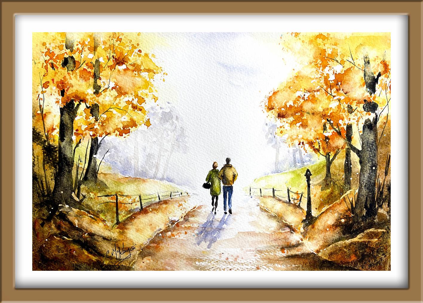
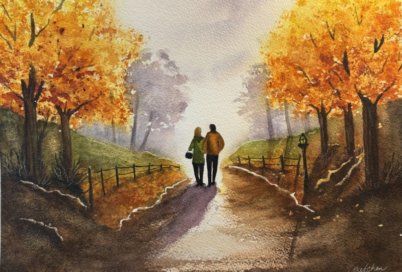
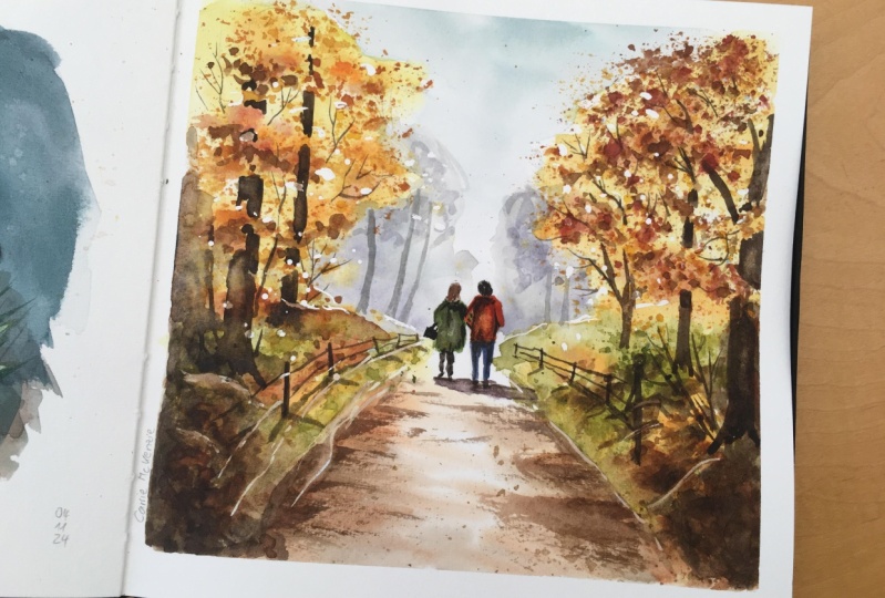
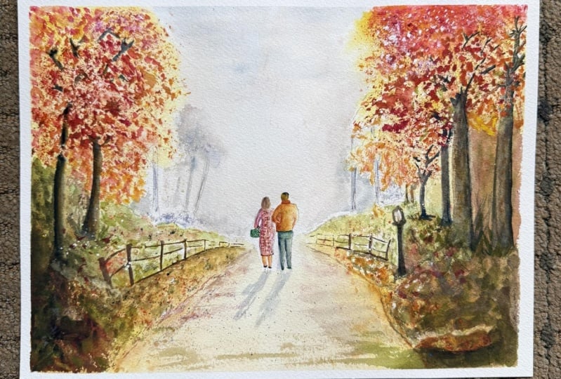
In this class, we're going to paint a
glowing autumn landscape filled with warm color, soft distance, and
beautiful light. You'll learn how to build your
painting in gentle layers, gradually adding texture
depth and detail. We'll be using plastic wrap for organic tree textures and a vignette effect to
guide the viewer's eye. We'll be adding tree
trunks, branches, a pathway, and two small figures walking into the distance. By the end of the
class, you'll have a finished painting
full of glow and atmosphere with techniques that you can use again and again
in future landscapes. It's suitable for all levels, including beginners because I'm going to be guiding you
every step of the way. And I'll be sharing all
the techniques, tips, and tricks that I use in
my own professional work. I've included a copy
of the drawing in the project resources section so that you can download
it and trace it, and then not worry
about the drawing because this is a
painting class. I am a professional artist, author, and tutor,
and over the years, I've sold a lot of work
across the world and helped hundreds of people to
learn more about watercolor. You can see examples of
my work on my website. My style leans towards
impressionistic and contemporary rather
than photorealistic. I like to explore loose approaches that
bring out the color, light, and essence
of my subjects. I've tried to
replicate this across all the many other videos
that I have on Skillshare. I'd love to see your
own finished painting, which you can upload through the project and resources tab. I'll give you some
personal feedback on it, and you'll be able to
see the artwork of other students and
get their support. At the end of the
class, you'll have your own beautiful artwork
to be very proud of. So let's swizzle our brushes and get on with the painting.
2. Materials, Drawing & Masking. Apply masking fluid to preserve important highlights : The flowers. I know you're going to love
creating this painting, and I'm sure it will
put a really big smile on your face, too. For this class, these are the colors and materials
that I'm using, but do feel free to use
any that you already have. For information on brushes
and paper, et cetera, do check out the basic
materials document that I've added to the
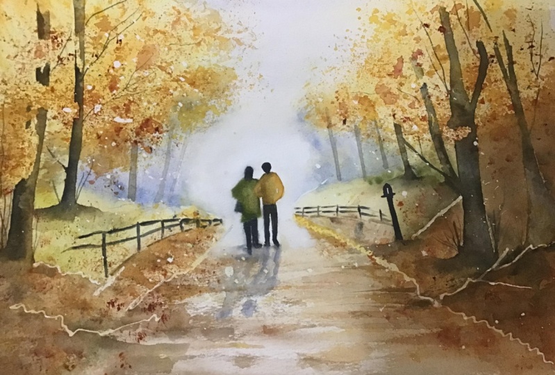
project resources section. As you can see, I've taken a few liberties with the
reference photograph, and that's the great
thing about creating art. You paint with your
memories, senses, and imagination, as well as
what your eyes literally see. Now you can see that I've
kept the drawing very simple, minimal detail so
that we get a nice, loose free flow painting. And I've included a
copy of the drawing in the project resources section so that you can download
it and trace it, and then not worry
about the drawing because this is a
painting class. You can apply masking fluid to the shapes where you want to reserve the white of the paper, either for highlights or to
paint over by hand later on. Now, you do need to
wait for the fluid to dry fully before applying
paint over the top of it. When it is properly dry, you can just rub
off the hard gum either with a clean finger
or with a putty rubber, and you'll see that it leaves behind crisp defined
white shapes. If the white shapes
are a bit too stark, you can soften them
with a damp brush, or you can even paint over it. Now, don't use your
good brushes for this because the gum
will spoil them. So use an old brush or even
the handle of the brush. I also use rubber tipped applicators because the gum is very easy to clean off them. You can get a ruling pen, which varies the
thickness of the line, but I tend to use an unwound paper clip for
very fine lines and dots. Now, although we don't have an exact reference photograph
for this painting, you can see from the one
attached how the light is filtering through little
gaps in the leaf canopies. So in order to preserve some
of those white light shapes, I'm spattering
some masking fluid on with my rubber
tipped applicator. Now, as well as
spattering it on, you can use the point to create
some more random shapes. If you don't have a
rubber tipped applicator, you can use the handle of a brush or even an
old cheap brush, but definitely not one
of your good ones. The advantage of spattering is that you get a much
more random effect, which is very true to nature. And, of course, if you get any spatters in places that
you don't want them to be, you can always wait
until it's all dry and then rub them off. I'm using the tip of
my applicator to add a few thin lines just where the edges of the little
bushes in the foreground are. Now, because these are bushes, you want them to be very
irregular in shape. I'm also using an
unwound paper clip to add some even finer lines. And as you can see, I'm putting
them on in a very sort of wiggly wobbly fashion going along the edge of
the path border. And I'm adding a very, very thin stroke just along the edges of those bushes in the distance. And then finally, I'm using
the tip of my applicator to make some slightly larger random irregular shapes
in those leaves. You need to let the
masking fluid dry completely before going
on to the next step.
3. 1st Layer: Soft atmospheric washes of watercolour wet-on-wet, sky & early landscape glow : For the first layer, I'm using the wet on
wet technique and I'm applying clean water with a clean brush over
the entire paper. The wet on wet technique is
simply putting wet paint onto wet paper or paint that is still wet and let it spread
into the wet wash. This results in a lovely
diffused effect with soft edges. Because the paint mixes into
the wetness of the paper, the color is diluted
and the tone is paler. You can see this
happening now as I drop some light yellow paint into the tops of
the tree canopies. You can paint over
the tree trunks because we're going to be
painting those darker later. Don't worry about
going around those. You don't need to
keep exactly inside the pencil lines that we
made with the drawing. You can go over them here
and there or miss bits out. The idea is to get this irregular random leaf
shapes in because I've pre, wet the paper beforehand. I'm getting some really
nice soft diffused paint spreading across the areas that I'm touching
the brush with. I'm bringing the yellow color
down over the bushes in the foreground and also the area lines the side of the path. Then I'm moving over to
the left hand side and repeating what I've just
done for the shapes here. Now my paper is still quite
wet and I am working quickly. But if you're not
such a fast worker, there's no reason why you can't do this one half at a time. So pre wet one half of the paper and apply the
yellow color there. And then go on to
the second half while the yellow
paint is still wet, I'm now adding some
quinacdone gold. I don't want to lose the light yellow color
that I've just put on. I'm just touching the gold
in with the tip of my brush. You can see how the
two colors are very nicely mingling and
blending on the paper. You do want to keep the
overall color stronger in the foreground where the shapes are disappearing
into the distance. It needs to be lighter. Have your paper towel to
hang in case you need to mop up some of that color where
the shapes are further away. I've moved over now onto the right hand side and
doing exactly the same, just touching in the quinace, gold here and there, and letting the colors blend. If by any chance your paper did start to dry
during this stage, you would be best to leave it
dry completely and then go over it again with a wet
brush and re, wet the paper. I'm still able to work
wet on wet because of course I've put two
layers of wet paint on it. I'm now touching
in a little bit of my transparent orange because it's going on top
of the Nacion gold. It's not going to be quite as bright as it is in the palette, but it is going to give me those nice orangy gold shades that we see in the autumn trees. Now it's quite a
strong color again. We just want little
touches here and there. You don't want it to obliterate the two shades of yellow
that we've just put on. Just as I did with
the yellow colors. And moving over to the
right hand side and adding the transparent orange to
the leaves in that area. Then just to break the
color up a little bit because there will still be some greenery around
in the autumn, I'm using some of
my green appetite, touching that in not
on the leaf canopies, but more on the ground. And the bushes again, just be careful
that you don't let this color overtake all the other colors
that we've just put in. We still want to retain those nice rich autumn
shades of golden orange. You do quite often get very fiery shades of red in
the autumn trees as well. I haven't used red
in my painting, but if you want to really
strong autumn feel, there's no reason
why you couldn't a little red into the
trees here and there. If you get any paint
that's not blending quite as much as you
wanted to, then use a dam, a clean, damp brush
to just smudge the edges and blend the paint
into the underlying wash. Now, I'm not putting a lot
of color into the sky. I want it to really
be one of those gray, almost white skies that
you get in the autumn. But I have mixed the blue
and move gray color. I've mixed ultramarine with a touch of Alizarin crimson and a tiny touch of black
just to gray down a bit and very
watery consistency. Putting that into the
top area of the sky, I want to use the same color for the distant
trees in the background. My paper has actually dried. I am pre wetting this area
again with some clean water. First, I'm wetting the
paper further than the area I intend to place the
paint so that it gives the paint some room to travel without
getting a hard edge. But I'm not taking it as far as the figures because I want the area just around them to remain very
pale and white. I'm just dabbing in
that blue, gray, mauve color in or
around the trees, keeping it quite random. No strong defined shapes here, it's in the background, your eye will not see a lot of detail. You're just really
trying to suggest the shapes of bushes and
trees in the background. Again, you can go
over the trunks. It doesn't matter, we'll be painting over them
at a later stage. The path area has
also dried again. I'm going over it with some clean water before
I apply the paint. This time I'm using
burnt sienna. It's still quite watery,
thin consistency. I'm just touching that in down the sides of the
path with the tip of my brush and it's
spreading quite nicely into the wetness
that I've just put in. Just go underneath
the fence areas just to give a little
bit of shape there. Then with quite a dry brush, I'm dragging the paint
that I've already put down across the
path horizontally. This will give you what's
called a dry brush effect, where when the brush touches the little rays dimples on the paper, the paint will catch. And where there are
little dips in the paper, the brush will miss the color. So you'll get this
bit of a broken look. I'm using the burnt
sienna to add some linear strokes to
define the lay of the land, on the borders, at
each side of the path. I do want the foreground
to be darker in tone and color so that we
create a vignette effect. And that will lead the viewer's
eye into the painting. I'm stroking on some
more burnt sienna into the bushes that are at the foreground on the left and right hand sides and just
strengthening the tone there. Then the last thing to
do for this section is just to add a little bit
more texture to the leaves by spattering on a little bit more quinacdone gold and a little bit of orange,
but not too much. At this stage, then, it's time to stop
fiddling and let it dry.
4. Add organic texture with Plastic Wrap to trees, bushes and pathway. Create a Vignette Effect. : For the second layer, we're
going to add more texture, particularly to the
leaves in the trees. I'm using exactly
the same colors, The light yellow,
the quinacdone, gold, and the orange. But to apply it, instead
of using a brush which would take ages to paint
all those little leaves, I've used a little bit
of scrunched up plastic and I will dip that into
each color and stamp it on. The beauty of this technique
is that you can build up the texture quite
quickly and easily. And also it gives you
some very random shapes, instead of them all
being very uniform, which again, mirrors nature. I've stamped on some
Quinacone gold, now I'm stamping in some of
my light yellow over the top. You will always get the
lighter colored leaves on a tree at the top and at
the top of the canopies. And the darker colored will be underneath where the more in shadow do bear that in mind when you're applying these three different
colors of the light yellow, the Rnacodon gold
and the orange. Working my way around
the paper stamping in some texture to the banks either side of the
path and the bushes, I'm going to introduce
a little bit of burnt sienna to the
foreground bushes. I mentioned earlier that I
wanted the painting to have a vignette effect
to create that I need to introduce some even stronger color
to the foreground. I've mixed some burnt umber
with some ultramarine to give me a very dark brown and added a little
touch of black to it. I'm using that mix
now to paint over the foreground bushes and going up behind the trees at the
left and right hand side. Although it might
feel a bit scary to be going over this way
with this dark color, you can see that
my paint is quite thin because it's allowing
the underlying colors, the yellows and the oranges
that we put on earlier, to actually glow through
that dark color. You don't want your mix so
dark that you can't see them. Of course, water color
does tend to dry about 20 to 30% lighter
than when you put it on. It won't be quite so
dark when it dries. I'm working my way
around the tree, but it doesn't matter if you do go over it because
we are going to add an even darker color to
the tree in a future step. To liven that dark color up, you can drop in a little
bit more Bert sienna or orange in with
your very dark mix. Just to give a little
bit of variation of tone and color in
these dark shapes. As you move upwards towards
the leaves of the tree, you want to add a little
bit more water to your brush so that
the tones blend into each other
and you don't get a hard edge or a stop
and start effect. I'm using a damp brush to drag the color out into
the area across the path because my brush is only damp and not soaking wet and the paper here is dry, You can see, again, I'm getting that dry brush
effect where we get a mottled broken
line that again, helps to create some
texture on the path. Because all the paint
is still very wet, I can now drop in some
even darker color. So it's the same mix of the ultramarine and burnt timber and a bit of black,
but stronger. I can strengthen the tones
here and there again, to give me more of
the vignette effect, because this really
dark color is going on the top of already wet paint. It is spreading and
lightning as it goes. So it's not quite as
dark once it starts to spread into the underlying wash as when you first put it on. I'm just going to
work my way around the foreground of the painting, adding some more shadow here and there where
I think it needs it.
5. Trees, Branches & Fence - add structure & contrast to strengthen the composition.: I'm going to paint the
tree trunks wet on dry, so wet paint on dry paper. I'm using that dark mix again. The ultramarine blue plus burnt timber and a little black. Now, I did leave gaps in
the drawing in the trees where the canopies of leaves are crossing over in front
of the tree trunks. But do feel free to improvise. There may be clumps of
leaves that you're not expected to appear when
you drew the scene. You need the trunks to
go behind or oppositely, there may be gaps in the
canopies of leaves that, where the trunks will appear. What you don't want is completely straight edges when the trunks disappear and
reappear between the leaves, because that would
look very unnatural. You do want to raggedy
edge where the trunk disappears into a clump and
then reappears further on. Now you can see here from my painting that this dark color is much stronger
than when we put it on previously in the
surrounding area. This very dark tone on
the foreground trees will push the distance back and create depth
in the painting. Having said that, you don't want the whole trunk to be
one constant tone. You want some variation of tone even within
this dark color. Remember that these
are organic trees, they're not black planks. There will be some
variation of color and tone in the bark depending on where the
light is hitting it. I'm making the left hand side of the trunks that I'm working on now slightly darker
than it is on the right. That also will help to convey the rounded form of the trunk. Also how I've made them lighter at the top
than they are at the bottom as
they're disappearing upwards into the sky
and out of view. You can use some paper
towel to dab off some of the color here and there to
create that random tune. Also, if your paper towel has
got a slight pattern in it, dabbing it on a
bit scrunched up, we'll give you some
bark texture as well. I've added just a couple
of branches at this stage. I'm going to come back after
I've finished the trees on the right hand side to add
more detail with branches, because I'll be changing to a much smaller brush or a rigger with a very
fine point for those. I'm painting these trees on the right hand side as I
did those on the left. The difference being that this time the darker tone will be on the right hand side of the
trunks because the light is coming from the distance in
the middle of the painting. In fact, as I'm speaking, I'm keeping an eye on the trees
that I've just painted on the left and strengthening that tone there on the
left hand side of them. Anyway, back over to the
right hand side trees. Now what you don't
want to do is make them identical to the
ones on the left. You want them to
disappear and re, emerge in different places. In fact, this one that
I'm painting now, I've decided to split off the trunk so it forks
a different way. Again, I'm adding just
a few more branches using the tip of my brush. Do remember that branches get
thinner as they get longer? We've got a smaller tree
growing next to this one. The trunk is going to disappear behind the branch
that I've just painted in. Again, I'm having a
look at where the trunk disappears behind the canopies of leaves and then re, emerges. Then we've got a third
tree on this side of the painting in
that dark tone, but it's further away. So I'm painting it slimmer, thinner than the first
tree that we painted. Now they're all looking
a little bit too dark and dense on this side. So I'm going to get my
paper towel and dab over to lift some of the
color and vary the tone. As well as using
the paper towel. You can also use what
I call a thirsty brush to lift the paint off. That's a clean brush. And then wipe it on some paper towel so
that it's just damp. Press that into the paint and it will lift
some of that off. When you're happy with
your tree trunks, you can add in a few branches. Now, just like the trunks, these are going to
disappear behind clumps of leaves and
then emerge again. This is where
you'll need to have a look at your own painting, to where your canopies
of leaves are placed. And painting the
branches accordingly, I've switched to a rigger brush, which has a very fine point, so I can keep these
branches very thin and twig like I've attached a photograph some trees in winter now
they are completely bare, they've lost the
majority of the leaves. But I thought it would be useful for you to have a look at the skeleton of a tree and
see how the branches grow, the direction that they grow, and how they fork off into finer branches and eventually
really small fine twigs. Don't worry, we
are definitely not putting all of this
detail in that you can see in the photograph because our trees haven't
lost the leaves yet. We just want one or two here
and there just to indicate the skeleton of the tree that's hiding underneath those
canopies of leaves, as well as the branches
that are growing out from the tree trunk above. You'll also get a few branches coming out from the
base of the tree. I've added a few
of those in here, and there also a
few little flicks that represent
some dark grasses. It's also important
to pay a bit of attention to where the trees are growing out from the ground. You just need to
smudge the color in a little bit because although the main roots
go underneath the ground, there will be some
that lie on top of it. I've switched to a small
round pointed brush, now I think it's the number two. I'm painting in the fence posts with my very dark
brown, black color. You don't want these to
stand up like a row of soldiers or matches
all exactly the same. Vary the tone, the angle
that they are set at. You will need to make them lighter as they move
into the distance. They will of course, need to be a little bit thicker
where they are placed in the foreground and nearest to the viewer's eye and a little
bit similar to the trees. You'll need to just smudge
that color at the base where they go into the because they will have
disturbed the soil. And there'll be little bits of grasses growing up
around them as well. To paint the chains in
between the fence posts, I've switched back to
us as in my rigor. Very fine point. And I'm
just flicking that across, not necessarily following
the pencil lines. I can always rub those out later to paint the distant trees. I've gone back to my
very pale gray move, blue color a little bit
more on the gray side. This time I'm just painting in those tree trunks there on the left and right hand
side that are far away. Although I've got three on
each side of the painting, they are different in height and different in angle
from each other. We've got some variety. I'm using the same
color to paint a few more loose
canopies of leaves. Very faint and very
abstract shapes. You're not really
trying to define individual leaves here
because you wouldn't be able to see so much detail in these trees that are further away as those that are
in the foreground. That's the distant
trees sorted out. I'm turning my
attention now back to the foreground and there will be a little bit of shadow underneath the fence posts. I'm just running my brush
along with some burnt sienna. And then dragging that color out across the borders
that meet the path. Adding a little bit
of extra tone here, especially using
these linear marks that are moving
towards the figures will help to throw the focus on the figures and that central
area of the painting. Just little touches,
you don't want to overdo it and cover up all those lovely
light golden shades that we put on earlier. I'm also adding
some burnt sienna to the sides of the path itself. Putting the paint on and
then using the side of brush to drag it across towards
the center of the path. But note that I'm
using a hit and miss effect with
my brush stroke. So I'm not putting one long line or outline
in the path as it were. I'm missing little bits out. Hitting it here and there so that we get a more
random effect. Again, as the paper is
very dry here and there's not a lot of paint
water on my brush, we are getting that nice, broken, dry brush effect. Well, the burnt
sienna is still wet. I'm touching in some of that
dark brown color again, just to add more contrast and
more depth in the painting. Then finally, you can just add a little bit of spatter with the burnt sienna to represent
fallen leaves on the path. Then I think I'm ready now
to move on to the figures.
6. Add simple figures to add life & narrative. Deepen darkest tones, lift colour with magic sponge. : Now I'm going to use
the same colors that I've used in the rest of the
painting for my figures. But there's no reason why you can't choose to use
different colors. If you prefer, I'm
starting off wet on dry, wet paint, on dry paper. But when I come to start
adding the shadows, it will be more wet
on wet, wet, damp. And we will need to
add darker colors to the left hand side of the figures where they
are more in shadow. The figures are quite small in relation to the
rest of the painting. We won't be adding
too much detail here. Keep it nice and loose. If some of the colors run into each other, don't
worry about that. It does help to actually unify the figures and
bring them together. I'm going to let you
watch this part of the video uninterrupted by my musings and I'll add some
text prompts when needed. My painting was completely dry, so I rubbed off all
the masking fluid with a clean, dry finger. It's often the case
that the white paper that's been revealed is
a little bit too stark. You can either go over
it with a damp brush, and that will drag some of
the surrounding color into the white shape and lessen
the starkness of it. Or you can even use
another color to paint over it and blend it in to the underlying wash. That's
exactly what I'm doing now. In some places I'm going over
with a damp brush where I want it to stay not bright
white but still fairly white. In other places I'm
touching in with some rinaclone gold or some burnt sienna just
to lose that starkness. I particularly don't want any really stark
white highlights in the foreground area because
this is where it's in shadow. I'm fairly happy with the shapes that have been left
in the canopies of trees, so I'm not going to do
very much with them there. But you need to assess
your own painting. Have a look where
you've got any gaps, any white highlights
that are just a bit too stark or a bit too large and
knock them back If needed. I'm now using my dark brown, black mix to just tidy up this little post on
the right hand side, give us a little bit
more definition. Now that I've rubbed
the masking fluid off, I think there's a few more
places in the foreground that could just do with a little bit of a darker tone here and there. Again, this is where
you need to make some decisions and judgments about your own piece of work. Because it might be that
your tonal values are absolutely fine and you don't need to add
this darker color. I think at this stage, the important thing to
remember is not to overdo it. I'm just adding a
few dark shapes and strokes here and there, blending them in, but I
don't want to completely overpaint the lovely
autumn colors that I've already got there. I'm just strengthening that vignette effect
that I wanted, particularly in the bottom
right and left corners, so that the viewer's eye
is drawn towards the path in the middle and
the two figures that are surrounded by light. Having got my really
dark darks in place, I'm now considering
where I might want to recover some highlights from
the rest of the painting. You can lift paint
off with a brush, by wetting the area and then dabbing it
with a paper towel. But I do like to
use magic sponge. It is a quicker and
effective little tool. I'm just lifting some
paint from the borders, at the side of the
path where they are disappearing into the
light, into the distance. Exactly as I said before, this is where you need to make some judgments
about your own painting. Whether you need some more light bringing in
here and there, or whether it's absolutely
fine, just as it is. I know it's not always easy to make a judgment
about whether to add some fine details or remove some paint or whether in fact you're in danger
of overworking it. I think that that comes
largely with experience and practice we've already seen. If you do lift off more
paint than you wanted to, you can always paint it back in. In my case, I'm just
softening some of the areas in the tree canopies and knocking back a little
bit of that texture. I'm doing that mostly
on the tops of the tree canopies because where anything is
flooded with light, you won't be able to see
a lot of detail in it. But where things are in shadow, you can see the
detail more clearly. Finally, for my painting, just a few little touches
of highlight to recover in that foreground area to increase the contrast between
the dark and the light. Then I think it's time to say it's finished and stop fiddling. I do hope you've enjoyed this painting and that
you've learned some tips and techniques along the
way that you can incorporate into
your own paintings. Why not pop it into
a mount and a frame and you'll be amazed how good
it looks when you do that. I would really love to see
your own finished painting, which you can upload to
the your project section. If you could just take a moment to leave me a short review, that also would be really great. I do hope you have enjoyed this video and it's
encouraged you to have a look at some of my other
classes in the meantime. Thank you for joining me, and I look forward to seeing your next time. Happy Painting.
7. FINAL THOUGHTS: Well done on completing the
class and also the painting, if you've been painting
alongside of me. We've covered quite a few
different techniques. We've simplified the drawing
from the reference photo. We use the wet-on-wet
technique for the first layer, which gives us a lovely, loose, free flowing background. And we use light medium
and dark tones of color to convey a
rounded three D effect. And we also looked
at how to lift off paint and
recover light areas. We use scrunched up
plastic to apply lots of texture and leaves in a
very quick and easy way. Now, don't forget to upload your own painting through the
project and resources tab. After all your hard work,
I'd really love to see it, and I'll be sure to give
you some personal feedback. And if you've
enjoyed this video, do have a look at my other
classes on Skillshare, which are packed
with more tips and techniques to help you
on your own art journey. If you click the follow button, you'll be able to follow me, and then you'll be the first
to know when you upload a new video or any
exciting updates. And if you could
just take a moment to leave me a short review, that also would be really great. In the meantime, thank
you for joining me, and I look forward to seeing you next time Happy Painting.
 Carrie McKenzie, creating painted visions