Transcripts
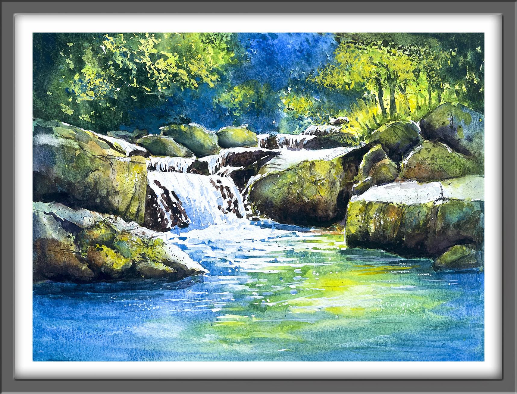
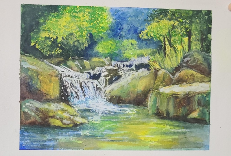
1. INTRODUCTION: Hello, and welcome. Oh. In this session, we're going to paint this beautiful little
river waterfall tumbling into a splashy
splashy rock pool. I'll also be showing you
how to use a small piece of plastic or foil as
a stamp for foliage. We'll also be layering
color and mixing color, and I'll show you how
to add texture in the nooks and crannies
and cracks of the rocks. We're using lots of
different techniques like wet on wet and wet on dry and how to spatter paint on in a
controlled way for texture. There's something joyful and mesmerizing about waterfalls. They just sparkle with
light, sound, and energy. It's suitable for all levels, including beginners because I'm going to be guiding you
every step of the way. And I'll be sharing all
the techniques, tips, and tricks that I use in
my own professional work. I've included a copy
of the drawing in the project resources section so that you can download
it and trace it, and then not worry
about the drawing because this is a
painting class. I am a professional artist, author, and tutor,
and over the years, I've sewed a lot of work
across the world and helped hundreds of people to
learn more about watercolor. You can see examples of
my work on my website. My style leans towards
impressionistic and contemporary rather
than photorealistic. I like to explore loose approaches that bring
out the colour, light, and essence
of my subjects. I've tried to
replicate this across all the many other videos
that I have on Skillshare. I'd love to see your
own finished painting, which you can upload through the project and resources tab. I'll give you some
personal feedback on it, and you'll be able to
see the artwork of other students and
get their support. At the end of the class, you'll have your own beautiful artwork to be very proud of. So let's swizzle our brushes and get on with the painting.
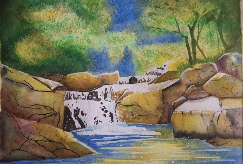
2. Materials, Composition & Drawing. Background & rock pool wet-on-dry, let colours bleed naturally.: There's something rather calm and magical about waterfalls. So I know you're going to
really enjoy this painting. For this class, these are the colours and materials
that I'm using, but do feel free to use
any that you already have. For information on brushes
and paper, et cetera, do check out the basic
materials document that I've added to the
project resources section. Now you can see that I've
kept the drawing very simple, minimal details so
that we get a nice, loose free flow painting. And I haven't stuck rigidly
to the original photograph. Not only have I hyped up the colors in my
photo editing suite, but I've also moved some
rocks around and altered the background and foliage to suit my own idea
of the composition. And I've included a
copy of the drawing in the project resources section so that you can download
it and trace it, and then not worry
about the drawing because this is a
painting class. We can easily simplify a waterfall by thinking
of it as a skirt. It's just got a waist, some folds, a ruffle a
train, and a bit of lace. And the first thing
we're going to do is to paint with
some masking fluid. You can apply masking fluid to the shapes where you want to reserve the white of the paper, either for highlights or to
paint over by hand later on. Now, you do need to
wait for the fluid to dry fully before applying
paint over the top of it. When it is properly dry, you can just rub
off the hard gum either with a clean finger
or with a putty rubber, and you'll see that it leaves behind crisp defined
white shapes. If the white shapes
are a bit too stark, you can soften them
with a damp brush, or you can even paint over it. Now don't use your
good brushes for this because the gum
will spoil them. So use an old brush or even
the handle of the brush. I also use rubber tipped applicators because the gum is very easy to clean off them. You can get a ruling pen, which varies the
thickness of the line, but I tend to use an unwound paper clip for
very fine lines and dots. As you can see, I've been using an old brush to paint the
larger areas of masking fluid and then an unwound
paper clip to just pull that masking fluid
down into some finer lines. And these final lines are important because you
don't want the water to be tumbling down like a row of regimented soldiers
or matchsticks. So do vary the length
and thickness of your tumbling rivulets of water that are splashing
over these rocks. Later on, when the
masking fluid has dried, we will be painting the areas of unmasked paper in between the masking fluid with
dark rocky colors. And then when we finally remove
the masking fluid itself, we'll be left with
this illusion of lovely white water splashing
and tumbling over the rocks. I do like using this PBO blue masking fluid because you can see the color
easily where you've put it, and also it does rub off very well later on without
tearing the paper. Having said that,
there is a time limit, of course, to how long you
can leave this gum on. I do usually try to remove it after 24 hours or 48
hours at the latest. After that, it does have
a tendency to harden and be more difficult to remove as it sinks
into the paper. As I'm working my way around the rocks with the
masking fluid, I'm also adding some
little dots and dashes where the water might be
also splashing against them. And don't worry if you can't see exactly where I'm placing the masking fluid in
this video because I've included a document in
the resources section. I've been able to exaggerate the color of the blue
a bit more so that you can quite easily see where I have put all this
masking fluid on. Some artists don't like to
use masking fluid at all. It can be a bit of a
nuisance sometimes tidying it up when you actually do reveal the white paper. So if you are proficient in
painting very small detail, there's no reason why you
can't paint the rocks in between all
these little areas where the waters coming down. The danger of that, of course, is that you paint too much rock and not leave enough white
paper for the water. So you don't end up with
much of a waterfall, and it's a lot harder to lift off color later on than
it is to put it on. When you move to this pool
area where the waters settled, it's really important to use
horizontal strokes and have left some white
spaces in between those horizontal strokes to create the illusion of ripples. I'm also using the spattering
technique to spatter on some masking fluid
so that we get lots of splashy splashy effects. Some of those spatters
are going on the water, and other spatters
are also going on the rocks where the water is
splashing up against them. Spattering is really good for creating a natural
random effect. But if there are any little areas that you
think are missing, then you can always
dot them on with an embosser or with the
pointed end of your brush, the wooden end of your brush. The last thing that
I'm going to do with the masking fluid is to add it to some of the rock edges where they
are catching the light. And when everything's finished
with the masking fluid, I have to leave it
to dry completely. Now, depending on the
temperature in the room that you're using or how thickly you've applied
the masking fluid, that can take anything from between 15 minutes
to an hour or so. So you'll be able to
just test it with your finger to see if it's
tacky or if it's dried. So have a little break
with a cup of tea, and then we'll carry
on with the painting. I'm using the
wet-on-dry technique to paint the background. Now, that's wet
paint on dry paper. And that's because
I want to create some very specific
shapes of colours. It does mean it'll
probably go through what I call an ugly stage
on this first layer, but all will be
well when we come to add a second layer later on. I'm starting off with my
handsome yellow light. You can use any other
light yellow to paint these little areas where the foliage is going
to be lightest. And then I'm going right over this little area at the
far right hand side. I've also got a little pool
of mid green color mixed. Now, I've just added
a little bit of my green appetite genuine by Daniel Smith into my
handsome yellow light to give me that mid green. But again, you could
use any green that you have to make this sort
of a spring green, really. But the reason that
I absolutely love this green appetite is
because it granulates. It's one of the few greens
that actually does granulate. So very, very useful for
imitating texture in foliage. You can only afford one expensive professional
tube of paint, then that is one that I
would highly recommend. Mix it with yellow to
get a lighter green or with a blue or indigo
to get a darker green. So it's very versatile, and the pigment is
really intense, so a little goes a long way. As you can see, I've
just spattered that mid green color into
my yellow shapes, and now I'm just touching in
a little bit of the green along the top above the rocks
on the right hand side. And because the yellow
paint is still wet, I am getting some
nice soft blends of the two colors and a little bit of the
illusion of foliage. Then going back to the
painting wet-on-dry technique, I'm painting my darker green, my green appetite genuine
straight onto the dry paper. I'm painting in between the yellow and mid green
shapes that I've just painted, and some of the paint is
still a bit damp or wet, so some of this darker
color will blend, but I don't want
it to take over. I don't want to lose my nice yellow and
spring green colors. I'm going carefully around the
rocks and then just taking that paint over from this left hand side
over to the right. And if you leave any little
tiny bits of unpainted paper, so you can see the white of the paper here and there, again, that's absolutely fine
because that will look like the light shining through
some of these dark leaves. I've also got ready mixed
a pool of mid blue. Now I've used a little bit of cobalt blue and a little bit of cerulean blue to arrive at this sort of mid blue sky color. I'm using that now to paint the central
area of the painting. Again, wet paint on
dry paper so that I don't get too much blending in between these
different colors. It might seem a bit
counterintuitive to paint a background
using this method, and I have to say it does look
rather ugly at this stage. But if we're going to create all this lovely foliage
in the background, we need to be thinking about
some different techniques. And I'm going to show
you exactly what they are a little bit later on. However, for those of you
who feel a little bit daunted by painting such
a complex background, then you could
actually just paint a very pale blue sky
across the whole area. It is your painting, so it's absolutely your choice, but I do want to show you to
demonstrate that there are some different techniques
you can use if you want to try something a
little bit different. I I'm going to add a little bit more blue
to the top of the sky. I'm trying to create
a little bit of a vignette effect by
having the far left and the far right and the top here where the sky
is a little bit darker. And that will help to
draw the viewer's eye into the center of the painting
where the waterfall is. Whatever you're painting needs to have a variety of light, medium and dark tones. Otherwise, that's
when the painting begins to look a bit
insipid and bland. One way of getting
some textural effects and foliage effects is to just dab some paper
towel very lightly into some dark paint and
lift it here and there. I think I've done enough
of the background now, so let's move on to
the pool of water. I'm going to use exactly
the same colours that I've used in
the background. But this time, I'm using
the wet-on-wet technique, so wet paint on wet paper. And pre wetting the
whole area of the pool. I got a large brush
and some clean water, and I'm using
horizontal strokes. Then still using
horizontal strokes, I'm applying my lightest colors
first, the light yellow. I can paint right over the masking fluid because
that's completely dry now. And then I'm going to stroke
in some of my mid green, that spring green color
that we mixed earlier, and just edge that
in to the yellow. Where the two colours meet, I will get some nice soft blends to some different
shade of green again. And then as I move on to the unpainted paper,
but it's still wet. I'm still getting that nice
soft watery appearance. Moving over to the
left hand side, I'm painting my blue color immediately beneath
these rocks on the left. And then I'm taking
that color up into the area where the waterfall
cascades into the pool. Applying the blue color into those spaces between
the masking fluid that we put on earlier. And I'm letting that
trickle and blend a little bit into the
yellow and green. So what we're actually
doing is painting some very loose reflections of the colors in
that foliage above. In actual fact, water
doesn't have a color. It's clear, isn't it? But what it does do is reflect not just the
colors that are above it, but also any colors that
are below on the river bed. So any silt, any stones, any underwater foliage
that's growing down there, all of this will come together to make up the colour in
the actual still water. And I'm just going
to remind you again about the importance of using horizontal strokes because
water doesn't go uphill. It can go down if it's going
down a waterfall or a slope, but it doesn't go uphill. It finds its own level
and it is horizontal. So do make sure, even if you've got your paper at a slant that you actually keep them horizontal
to the horizon line. As you can see, I'm going back and forth with my brush and different colors
trying to create the impression of
ripples in the water, some darker, some lighter. I'm taking the blue color
now over to the far right. So I've got some balance. The overall aim is
to keep the tones darker at the far left and far right and along the bottom, and lighter in that sort
of just off central area. And I'm going to
just let you watch the video run now as I continue to build up these horizontal watery
strokes in the pool. But I'll hop back on
with any other bits of information that you might
need to complete it.
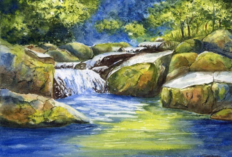
3. Rocks: First Layer
: Block in the rocks, usE tonal values to shape form, apply salt for texture.: For the rocks, I'm using the same colours that
we've used so far, plus some Bersiena and
I've got a very dark brown mixed with burnt
umber and ultramarine. We're going to paint the rocks
in two layers, two steps. So this first layer,
this first step, the paint needs to be quite thin about the
consistency of tea. We're aiming for some
quite light tones with a few mid and dark
tones here and there. With a thin wash of
my light yellow, and I'm just dropping
into that a little bit of very watery bir sienna and letting those colors
blend and mix on the paper. Then where that
rock is in shadow because it's behind the
rock that's in front of it, I'm dropping in a little
bit of my dark brown that I'm mixed with the
burnt umber and ultramarine. And then to add some more
interest and depth to the rock, I'm going to drop in
a little bit more of the Bert Sienna color over
at the left hand side, particularly where it's darker and a little bit of the blue, where, again, it's more in
shadow at this left hand side. I and because rocks around water do tend
to get quite mossy, I'm also adding
in a little touch of my green appetite, and again, letting that blend into
those other colors so I get quite a soft
mutedefect at this stage. As I said, we're going to add a lot more depth and texture and cracks in the rock when we do
the second layer later on. But if you do this
first layer too dark, then it won't have
the same effect. So keep this first layer
quite light and loose. So pretty much the same process for this large rock
that's at the front. This one's actually
quite craggy. It's sort of lots of
little rocks that have all fused
together as they do. I've started again with
my lightest color, the light yellow, and then dropping in some of
the birthsienna color. And I'm just dropping that
rsiena colour in between the crevices where there are dips and bumps in
this very large rock. And again, adding some of the
blue on the left hand side, where the rock is more in shade. Remember, we're trying
to create a sort of vignette effect so that the viewer's eye goes
more into the middle of the painting where we want
the main focus to be. I'm also touching in a little
bit of the green to give the illusion of moss and other greenery growing
out of the rock. To add a little
bit of texture to these rocks in this layer, I'm going to use
the salt technique. Applying salt is very useful for creating the
appearance of snowflakes, foliage or rock texture. Just sprinkle some grains
of household salt into the drying paint just as the sheen is going
off the wet paper. Leave it to dry,
then gently brush away any excess salt
with your finger. And you'll find that
the salt has absorbed the paint and left behind some lovely little
sparkles of light. And you can use different
salts for different effects. Try some rock salt or sea salt or even some
dishwasher salt. Finally, for these two rocks, I'm spattering on
a little bit of my dark brown color using a small brush because
I want small spatters. I'll be using exactly
the same process for all the rest of the rocks,
varying the colors, particularly where the rocks are in shade because they
are further away, or if one rock is
behind another. The only change will be when I'm painting the rock that is peeping out between the rivulets of water that is
falling over them. And that's where I will be just using the dark brown color. So I'll let you watch
the video along as I continue to paint the
rest of these rocks, but I'll hop back on with some reminders and any other
useful bits of information.
4. Background: Second Layer.
Build foliage & depth using plastic wrap technique.: I'm using a small
piece of ulipane the sort that birthday
cards come wrapped in, or you can use a piece
of foil or paper. As you can see,
I've scrunched it up into a fairly
tight small bowl. I've got a piece of
paper towel to hand, and I've already mixed a
dark green and a dark blue, two large pools of
paint in my palette. I don't want to disturb the underlying paint
in the foliage, so I'm using a
water sprayer just to sprit some water
over that area. And then I'm using
my paper towel to just lightly blot
some of that off. I want it to be damp
but not soaking wet. For this technique,
we're using wet on damp, so that's wet paint
on damp paper. I've dipped my
little plastic bowl into the dark green paint, and now I'm just dabbing it over the surface of the foliage. Because the surface of the
plastic is very uneven, you'll also get a
very uneven transfer of paint onto the paper. So it's very hit and miss
where the paint actually goes. And if you keep twisting and turning your little
plastic bowl, you'll get a very variegated, mottled, and natural effect. Where I want it to
be a dark color, but the plastic hasn't
actually touched it, I can fill in with my brush. So I'm doing that now going around these
rocks at the back. And it's by adding this
really dark tone of green that makes the lighter one really pop and stand out. To darken it even further, I'm just dropping
in little touches of my very dark blue as well. Even stronger contrast. I'm using the tip of my brush
to dance around the paper, added little touches of this
dark green here and there. Then I'm going back in with this little stamp
that I've made and stamping in some more of the dark green in and
amongst the yellow area. And building up that texture, so the dark foliage
doesn't actually obliterate all the yellow but does allow it
to shine through. You can see the
effect more clearly. Now I've just moved
my hand away. And I'm not just stamping
with the dark green. I'm also using some of that mid green that we
mixed earlier as well. And then I'm using
exactly the same process over on the right hand side. A I've switched to a small pointy brush to paint a few dark grasses in
and amongst the yellow. I'm using a flicking action to push that paint
upwards and outwards. Again, I'm not having them all the same shape or
length or direction. Grasses grow quite randomly, so you don't want them all
in a line, exactly the same. And then using my
very dark blue paint, I'm going to paint in a
few thin tree trunks. Now, I say thin because these
trees are in the distance, so you don't want
big thick trunks or that will bring
them too far forward. And again, vary the shape
of your trunk and branches. You don't want them all
regimented looking the same. Yes. And then just as I did on the left hand side, I'm just adding some more
color where the stamp has missed off some of the darker foliage that I
want to have at this side. And although I want
it to be quite dense, I am still leaving
little touches of the yellow showing through the light filtering
through the dark leaves. Y the central area of my background has
dried quite a lot, so I just given it a
quick sprit before, just dabbing some of that water off so it's damp
and not really wet. And then I'm going in
now with my stamp, but this time, I'm
using my dark blue. And I'm going around my
foliage with the dark blue, darkening that sky area, and with probably even some
very dark blue foliage in some areas as well. But just so that that dark
blue isn't too overpowering, I am stamping in just some
ultramarine on its own. And you can just keep
playing like this, really, using the stamp to add more color where you
think it's needed, and don't forget
to twist and turn your little ball of plastic
or foil so that you get these random marks and they're not all in
exactly the same place everywhere until you get the effect that you think
is pleasing to the eye. And although I'm
taking, you know, a little bit of time
to get this right, it certainly wouldn't be as
time consuming as painting all these hundreds
and thousands of little leaves in individually
by hand with a brush. But for now, I think it's
time to stop fiddling and let it dry before
going on to the next step.
5. Rocks: Second Layer
. Paint wet-on-damp to define rock shapes, cracks, shadows, and structure. : Off camera, I've removed all
of the masking fluid with a clean finger so you can now see the white of the
paper where the water is. We'll tackle that later on. First of all, I'm going to turn my attention back
to these rocks. I think the two large ones
at the left hand side with some clean water
and a soft brush so I don't disturb
the underlying paint. Go to let them dry for a little minute or two
so they're not too damp, and I'll paint these rocks
in the background first. I'm applying these
darker tones of paint in the areas where
they are shaded the most, so that's at the left hand side of each rock and
towards the bottom. And I'm using the blending
and softening technique to get rid of some
of the hard edges. To blend and soften a hard edge, you need to use a clean
damp brush to pull the paint away from the hard
edge and blend it softly until the color disappears
into the white of the paper or the underlying
wash. You may need to clean and dry your
brush and repeat the process several
times in order to get that gradual gradation of color until it disappears
into nothingness. These two large rocks on the left have dried
a little bit. They are still
damp, so I am still getting these nice
blends of color. A my very dark blue, the blue that I
mixed with a bit of indigo at this left hand side, and also some of the
dark burnt umber. Now I'm using my black
watercolor pencil to draw in some of the cracks and crevices that appear
in the rocks. This a lot easier to do with a pencil than it would
be to do with the brush. Plus you get a nice
crisp, fine line. Now, of course, even cracks
in rocks have shadows in them and some more wider
or thicker than others. So I'm going over some
of those lines with a damp brush to add a little
bit of variation and to bed the line in to the
underlying wash. And particularly darkening
this bottom area of the rock because it is
behind the one in the front, so which will be casting
a shadow onto it. And I've added a few
more little touches, particularly of green
where it might be mossy, but I do want to keep edge, the right hand edge of this rock lighter where
it's coming into the light. Moving on to the rock below it, the one that's in the front. It's in exactly
the same process. Now, I did just have
to wet it again a bit because it had actually dried more than I
thought it would. And again, I'm adding
some more lines, more cracks with my
watercolor pencil. I notice where the lines
meet, where the cracks meet. There's always like
a little fissure, so you need to add
a little bit more color in those areas. There's no particular
set formula for this. I'm pretty much making
it up as I go along, looking at where my colors
have dried and where there might be little dips and mounds and putting in
the cracks accordingly. So don't worry if yours
isn't exactly like mine. And the great thing
about painting rocks is that they are rough. They don't have to be perfect. In fact, they don't
want to be perfect. And really, what you're doing
now is using your brush and the dark color and the pencil to add some
structure to the rock. And of course, we
can't really sculpt a flat piece of paper, but that's the impression
that we're trying to give. We're using our brush
to kind of carve out all the nooks and crannies of
these centuries old stones. Again, I'm being mindful to keep the edge at the far
right of this rock, fairly light where it's
going into the light. And I'm going to add some
of my dark blue colour to create a reflection into
the water underneath it. This doesn't have
to be too precise. Just a few horizontal
lines just like we used before to
add a bit of depth. Now that I've done
these two large rocks, I don't think I've added quite enough contrast to the smaller ones
in the background. So I'm adding just a little bit more darker color here and there just to get the separation between them a bit more
clear and obvious. I'm going to be using exactly the same process for these rocks or on
the right hand side. The only difference will be that their right sides
will be in shadow, and their left
sides as they move toward the center of the
painting will be lighter. So I'm going to let you
watch the video along now while I complete the
rest of these rocks, but I will hop in with any information or
reminders where needed.
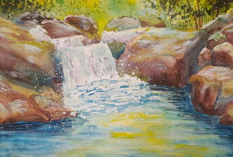
6. Waterfalls & Final Details.
Lift paint, add opaque highlights; use spatter for rock texture.: Although you can use a brush and some water to lift off paint, I want to introduce you to
magic sponge eraser because this little tool works miraculously to remove
unwanted paint. You can use it to
lighten an area that is too dark or even
strip the color right back to white paper depending
on which colour you've used because some colours do stain the paper
more than others. Just tear a small
piece of the sponge, dip it in some clean water, then squeeze it to
just damp and rub over the unwanted paint until
the color is removed. Use a paper towel in between to blot and get the last
bit of paint off, and keep rinsing your sponge
out during use to keep it clean or even throw it away
and use a fresh piece. Now, your painting might be absolutely fine just as it is. But I want to just
lighten the tone, lift some of the color
on a few areas of Mox. So as I explained, I've just got a
little piece that I've dipped into some
water and squeezed it out and then rubbed it over
those areas that I want to lighten and remove the
color with my paper towel. I don't want to go right
back to white paper, so I'm not scrubbing
really hard, just a little bit of
pressure here and there. The other thing that I want
to do is just tidy up some of these areas where
I've had masking fluid, and I've not left enough space for the
dark rock underneath. So I'm using a small brush and the very dark
brown paint that I had earlier just to add
a few more areas of dark color underneath
the falling water. And this is where you really
need to stand back and assess your own painting to
see whether this is needed, if at all, or any other
little areas that you want to tidy up before we move
on to painting the water. So I think we're ready
now to paint the water. And the first thing I'm doing
is just softening some of these white
horizontal lines that have been left by the removal
of the masking fluid. The edges are a
little bit stark, so I'm just softening
a few of them in with a little bit more blue color and also a damp brush to blend
and soften those edges in. I'm using my cerulean and
cobalt blue to paint in some more horizontal
streaks of water across this large area of
white unpainted paper. Two I'm going over to the water right
at the back of the little waterfall and adding a little bit of blue shade
to some of that water. It's too white. It's too stark, and even the water has some shadow where
it's tumbling down. I was talking earlier
before about the color of water because
it isn't colorful, being affected by the color in the sky above and
whatever it's below. But what about waterfalls? Because they are
amazingly white. And this is due to the
scattering of light by tiny little air bubbles and water droplets created
by the turbulent flow. When the water falls
with high velocity, it breaks into numerous small
droplets and traps air, forming a frothy mixture. And these tiny little droplets, which are a little bit larger
than the wavelength of visible light scatter all
colors of light equally, resulting in the
appearance of white. So there you go. If
you didn't know it, a little bit of
science thrown in. But science aside, personally, I just absolutely love going for a walk where there
is a waterfall. I find them just absolutely
mesmerizing and enchanting. Area of Yorkshire,
where I live is full of hills and dales and
waterfalls abound. You don't have to walk
far to come across one. And I can't think of
anything better than packing a picnic and sitting beside
a beautiful waterfall, listening to that splishy
splashy water while the birds sing overhead on a sunny day like the one
that we're painting. And I think that's why
I've really enjoyed creating this particular
scene so much. And getting back to it, now that I've finished all the
shadow areas of the water, I'm just going to spatter some blue across this pool area, little bubbles of light
appearing here and there. And whilst I'm in
a spattering mood, I think I'll add a little
bit more brown spatter to the rocks, the
ones at the front. You won't really see it on
those ones in the distance, but these just lean a little
bit of extra texture. I've masked them so
that I don't have any brown spatter going into
my lovely blue rock pool. A Okay of the yellow colour that I put on earlier has
seemed to just sink in a bit. So I'm just using some almost
neat yellow paint to add a few more yellow ripples and little touches of
the plant color that I put on earlier
on the rocks. Again, yours might be absolutely fine and not require this, so don't do it if
it's not needed because otherwise it will
just become overworked. No. But one little technique
that you might like to try is using some
professional white gouache. Now, gouache is an opaque paint, which means you can't
see through it. And I don't like
using opaque paints, but there are occasions where
it comes in really useful. I think could be one of them. And you can mix
some white gouache with any of your
other watercolors, and not only will that make them lighter in color in tone, but it will also make
them quite opaque. A yellow paint. So I've now
got a much lighter yellow, and it is more opaque. So I've got a clean
piece of plastic, which I've scrunched into
a little ball again, and I'm dipping that into the lighter opaque
yellow and just going over the
background area where the foliage is to add
some lighter yellow, brighter color into
those trees and bushes. Use this little
technique whenever you're painting
trees and you think they've gone a little bit
too dark and you want to add a bit of lightness
and spruce them up. As always, the
challenge is not to get carried away and overdo it. But I think I like this effect so much that I'm
actually going to add a little bit of this
stamped on yellow to the rocks. I'm also going to use a very
thin rigor brush to add a few more yellowy
grass shapes at the back and maybe some coming out from in
between the rocks. A I think I'm in danger now of not heeding my own advice and
overdoing it a bit, so I'm going to stop
the light yellow, but I am going to show you another little technique that
we can use for the water. You could use the
white gouache again, but it does tend to
dull a bit on drying. I prefer to use doctor PH
Martin's bleed proof ink. Come across, but you could also use some white
acrylic paint. I'm also going to
show you how to use some sandpaper and a scalpel. If you want to add a few more
white ripples to the water, then the bleed proof white is almost as white
as the paper itself, so it will make a
really good job of it. I'm using my very fine pointed rigor brush to
paint in these lines, these fine ripples
here and there. And if you do want
them to be less white, you can always add a little
bit more water to the mix. If you need any more white
on your little waterfalls, you can use it there as well. Another way of adding some small ripples
is to use a scalpel. It's got a very sharp point, and you just scratch that across the surface of the paper. Because the surface of the paper does have a little
dimples in it, you will get a hit
and miss effect. And again, that
resembles even more closely the way that
the ripples occur. And you can get a similar effect with some coarse sandpaper. Just rub that across, and the sandpaper will
catch the heads of those little dimples and leave little white
sparkling lights. You could also use the sandpaper on your
rocks if you want to create some
little speckles of light shining on them, too. Like all these little tricks, they can look a bit gimmicky
if you overuse them. So our word of
caution less is more. And on that note, I
think our beautiful, colorful river
waterfall is complete. I do hope you've enjoyed this painting and that
you've learned some tips and techniques along the
way that you can incorporate into
your own paintings. And why not pop it into
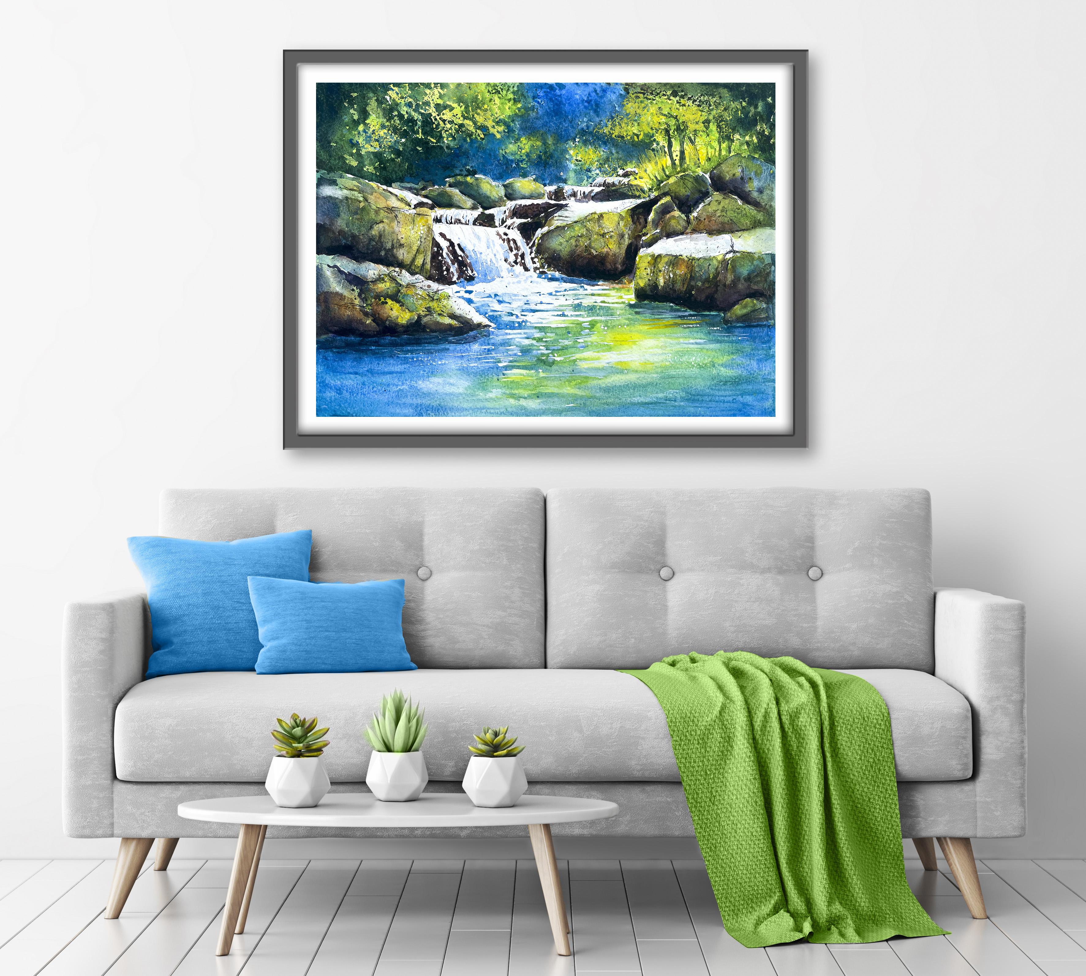
a mount and a frame, and you'll be amazed how good
it looks when you do that? If you've enjoyed this class, it might encourage you to look at some of my other videos. I've got lots of lovely
subjects loaded with more tips and techniques to help you with your own
exciting art journey. I'd really love to see your
own finished painting, which you can upload to
the your project section. And if you could
just take a moment to leave me a short review, that also would be really great. In the meantime, thank
you for joining me, and I look forward to seeing you next time Happy painting.
7. FINAL THOUGHTS: Are very well done on completing our joyful and beautiful
River Waterfall painting. We've covered quite a few
different techniques, as you've been following
alongside of me. We use the wet-on-dry technique, putting wet paint on dry paper. We use the wet-on-damp
technique, putting wet paint on damp paper, which came in very useful when we made a stamp to
add the foliage. We used a water soluble pencil to add some cracks and
crannies to the rocks, and we used the
spattering technique to add some extra texture. We looked at a few
different ways of adding some white ripples and
sparkle to our rock pool. And all of this came together to complete our final painting. Now, don't forget to upload your own painting through the
Project and Resources tab. After all your hard work,
I'd really love to see it, and I'll be sure to give
you some personal feedback. And if you've
enjoyed this video, do have a look at my other
classes on Skillshare, which are packed
with more tips and techniques to help you
on your own art journey. If you click the follow button, you'll be able to follow me, and then you'll be the first
to know when you upload a new video or any
exciting updates. And if you could
just take a moment to leave me a short review, that also would be really great. In the meantime, thank
you for joining me, and I look forward to seeing you next time Happy painting.
 Carrie McKenzie, creating painted visions