Transcripts
1. INTRODUCTION: Hello, and welcome. We'll paint an
abstract foreground to keep the focus
on the elephants, and we'll add some extra glazers of color for dynamic effect. We'll also look at
how we can simplify painting all those wrinkles and ridges on the elephant's skin. And we'll be using the
wet-on-dry technique where we want stronger color and
some hard crisp bedges. We'll be using
some vibrant color to represent our
beautiful elephants, and we'll be using the
wet-on-wet technique to blend and soften
those colors together. I can't wait to show you my interpretation in watercolor of these fabulous animals. It's suitable for all levels, including beginners because I'm going to be guiding you
every step of the way. And I'll be sharing all
the techniques, tips, and tricks that I use in
my own professional work. I've included a copy
of the drawing in the project resources section so that you can download
it and trace it, and then not worry
about the drawing because this is a
painting class. I am a professional artist, author, and tutor,
and over the years, I've sold a lot of work
across the world and helped hundreds of people to
learn more about watercolor. You can see examples of
my work on my website. My style leans towards
impressionistic and contemporary rather
than photorealistic. I like to explore loose approaches that bring
out the colour, light, and essence
of my subjects. I've tried to
replicate this across all the many other videos
that I have on Skillshare. I'd love to see your
own finished painting, which you can upload through the project and resources tab. I'll give you some
personal feedback on it, and you'll be able to
see the artwork of other students and
get their support. At the end of the
class, you'll have your own beautiful artwork
to be very proud of. So let's swizzle our brushes and get on with the painting.
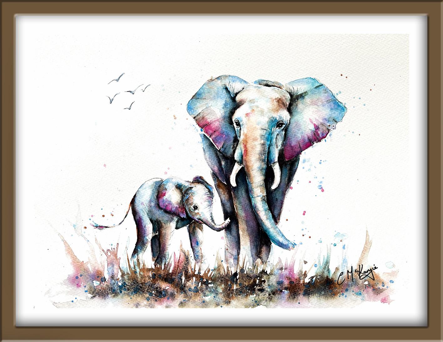
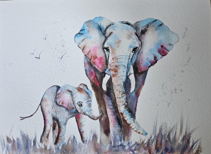
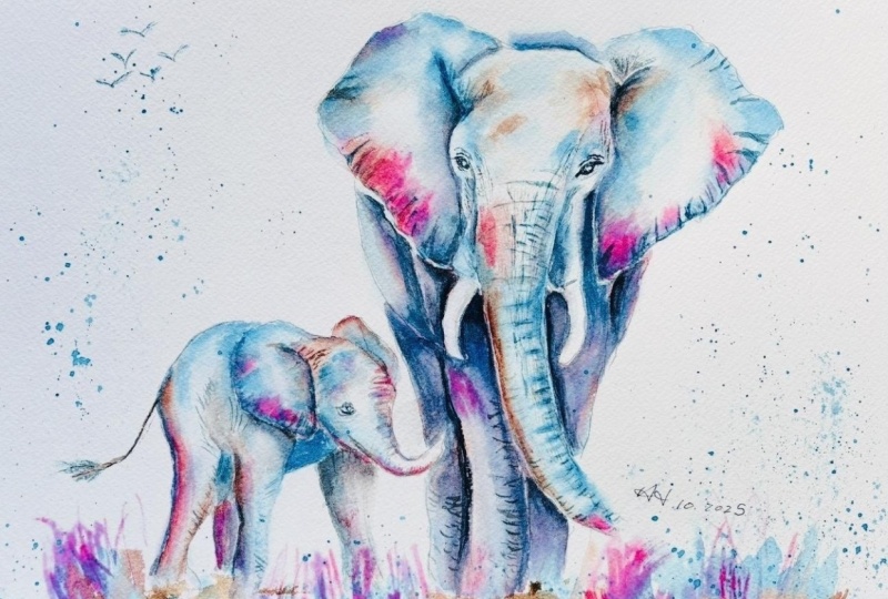
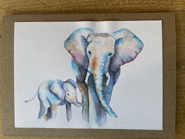
2. Materials, Composition & Drawing. Elephants First Layer: wet-on-wet underpainting: Watching a huge mother Ellie
gently guiding her baby with a trunk stirs a deep sense of tenderness and the timeless
beauty of connection. And I'm sure you're
going to really enjoy creating that special
feeling in our painting. For this class, these are the colours and materials
that I'm using, but do feel free to use
any that you already have. For information on brushes
and paper, et cetera, do check out the basic
materials document that I've added to the
project resources section. Now, the reference
document is made up of several different
images merged together because I couldn't
find a photograph that exactly matched the idea
that I had in my head. I've also converted the color
image to black and white, because it's much easier to see the different tonal
values using gray scale. Now you can see that I've
kept the drawing very simple, minimal details so
that we get a nice, loose free flow painting. And I've included a
copy of the drawing in the project resources section so that you can download
it and trace it, and then not worry
about the drawing because this is a
painting class. I'm making a start with
a largish brush and some clean water to use
the wet-on-wet technique. The wet-on-wet technique is
simply putting wet paint onto wet paper or paint that is still wet and let it spread
into the wet wash. This results in a lovely
diffused effect with soft edges. Because the paint mixes into
the wetness of the paper, the color is diluted
and the tone is paler. I'm going to work a
section at a time, because if I wet the
whole of the image, by the time I come
to actually add some paint to the last bit, it'll have dried by then. So I've just wet her ears
and her head and a trunk. With the paper now nice and wet, I'm dropping in some of the turquoise color that I
mixed earlier in my palette. It's about the consistency
of tea or milk. And I've used the term
dropping in because I'm not brushing hard against
the paper with my brush. I'm just allowing the
water on the paper to soak up the colour
from the tip of my brush, almost like a
process of osmosis. And you can see that
the color is spreading nicely softly into the
underlying wet wash. It looks a little bit
on the strong side, the tone of this turquoise, but remember that
watercolour does tend to dry about 20 to 30% lighter than
when you first put it on. I'm going around the
outer edges of both ears, letting that color just blend and running
towards the middle. But I don't want it to
go right into the middle because that is where
the tone is lighter. And it'll help to give us this more rounded
three D effect. And then to just liven this
color up a little bit, I am a little bit
of a color junkie, that is part of my style. I'm adding some cerulean blue, touching that into some
of the spaces in between the turquoise and also over the top of the
turquoise itself. So I get another mix of color. I should point out that
this is the first layer, and I will be adding another
layer of darker color, darker tones later on. However, even in
this first layer, I'm conscious of where the light medium
and dark tones are. So I'm applying stronger
mixers or more paint in those darker areas and
thinking about where the light tones need to
be left alone, really. If you don't have this mixture of light medium and dark tones, your painting will look
very flat and boring, and it's one of the
most important aspects of any painting that you create. If any of the color does flood into a light area that
I don't want it to, I've always got a
piece of paper towel in my left hand ready
to dab that paint off. So you're always in control. I'm coming down the right
hand side of her trunk now, adding the turquoise and blue in the same way that
I did the ears. And this side, of course,
is more in shadow, so it is going to
be a little bit darker down that right hand side than it is in the center. And I'm using the tip of my
brush to just drag some of that color into the wrinkles
that go around the trunk. And when you're doing this, do keep in mind that that
trunk is very round. So you want your strokes to
be going around it, too. You don't want them completely horizontal like a row of
match sticks or soldiers. And you don't want all
your little wrinkly lines to be exactly the same. You want some that
are a bit longer, some are a bit shorter, and you want to vary
the space between them. Now, whilst all this
paint is still wet, I'm going to add in a little
bit of the permanent rose. Because at this stage, whilst everything is still wet, I'll continue to get
these nice soft blends. If you're a slower worker
and there's a danger of the paper drying too quickly,
you could, of course, just do one here at a time and the front of her head
and trunk separately, as well, instead of doing
it altogether as I am here. Now, as you can see,
I'm putting some of the pink in some of
the white spaces, and other bits of
pink are going over the top of the blue
or the turquoise. There's no precise
science to this. It's just really intuitive. So it's a case of looking at at your own painting and thinking about where you'd like
this extra color to go. Now, I'm taking a bit of a risk here by adding
this burnt sienna, because I don't want the painting to
become a muddy brown, but I do feel that with the pink and blue
and the turquoise, it's in danger of looking a
little bit too whimsical, so I'm hoping that the
more earthy burnt sienna will just tone that down. And again, I'm thinking about where the dark shapes are and pretty much using my brown for those darker areas,
the darker tones. Although, as I just
said a few moments ago, these are not going to
be the darkest tones. They will happen
in the next layer later on when all
this has dried. As I'm adding a little bit
more paint here and there, I'm noticing that the colour
is starting to go quite far into that middle area
that I wanted to keep pale. So with my paper towel, I'm just going to go in
now and just dab some of that paint off from the middle and also
the center of a head. It is actually quite
warm in my studio today, and the trunk has actually
dried quite a lot, so I'm just adding a little bit more clear water on that trunk area before
I add some more paint, and that will mean
that I'm going to get this nice wet-on-wet
soft blended effect at the left hand side, as well. Putting this darker color
down the left hand side of the trunk and then dragging the paint into some of the
wrinkles as I did before, will help to convey this three D rounded effect of the trunk. As is often the case, I've got a little bit distracted from the
trunk and adding a bit more paint and detail to the ears around
those outer edges. I wanted to do that while the
paint was still wet there. And I'm also finding
that because I've wet that left hand
side of the trunk, it was actually
spreading too far, but I can go back to it now. It's still wet but
not as wet as it was, so I can add the detail without it spreading too much
into the center. You don't need to add every single wrinkle that is shown on the
reference photograph. Just by adding a
few here and there, it will allow the viewer's
eye to fill in with the rest. If you don't like the colors
that I'm actually using, there's no reason why you can't choose some different ones and just follow the process along with the colors
that you want to use. I think I might be
in danger of putting too much color on in
this first layer. So I'm going to move on now to paint her legs and body
on the left hand side. I'm using exactly
the same technique, the wet-on-wet technique that I did for her ears
and head and trunk, painting over the body and
legs with clean water, going carefully around
the mother's tusk, and also the little
baby's trunk, which is overlapping
her rear leg. And then dropping in my colors, pretty much in the same
order that I did before, starting with the turquoise, and then I'm going
to add in some of the cerulean blue and the
pink and bird sienna. And just a reminder
to be careful where you do place all
these different colors because what you don't
want to do is overlap them too much and
get the dreaded mud. And I'm still
thinking about where the light medium and
dark tones need to be. So, particularly, for instance, where the back leg is behind
the one at the front, there'll need to be a
darker tone immediately behind that front leg in
order to separate it out. It's also important not to
add any additional colors in. It wouldn't look
right if I started to put in some green or some red because that color is not anywhere else on the painting
that we've done so far. And I'm trying to achieve
a harmonious look between all these different
areas by using the same colors
and similar tones. Quite a few years ago, I was once criticized by a rather elderly
gentleman artist who felt that I
should be painting my elephants in sole
brown and gray colors. But actually
experiments with light and color go right back to the early 19th century when the impressionists like Mondrian
and Besaro and Van Gogh, all started to use palette that was not
atypical of reality. A noteworthy example of that was the red tree painted by
Pierre Mondrian in 1908. So it's certainly not
a new or radical style that's just emerged recently. The impressionists certainly
have had a big influence on my own personal development
as an artist because they tested the boundaries of what
is possible with color and demonstrated that
subject matter is not the be all and end
all in a painting. They also demonstrated extremely successful that you can paint something just because
it's beautiful. It doesn't have to have
an underlying meaning. It can be just a lovely
thing to behold. And testimony to the fact, are those wonderful and well known vibrant water
lilies buy Money. Anyway, I digress, though,
back to the painting. I've now gone over to
the right hand side of the legs and body and doing exactly the same
thing as I did before, pre wetting the paper first with some clean water
and a clean brush. This area is smaller than the one that
we've just painted, so I haven't overwt it. I'm not wet it too much. But I'm applying the colors
in a similar sequence, so starting off with the turquoise and then some
cerulin blue, some pink, and a little bit of
the burnt Siena, keeping that harmonious
consistency of color and tone. I am using a bit more
of the Br sienna, which is the darkest color I've got of the ones that
I'm using currently, just underneath her right ear and behind the tusk and trunk. Although the tusks are
generally white in color, they will actually
have some shade where they're turning
away from the light. So I'm using a little
bit of cerulean blue, little touch of very,
very pale birth sienna, just on the insides of them. I'm fairly satisfied now
with the first layer of um, so I'm going to turn my attention to our
little baby Ellie. Before you start this, it's worth taking
a little bit of time to consider
where the light, medium and dark tones
are on our baby Allie. One aspect to be mindful of
is the different positions. Our mother is facing
front full on, whereas the baby is
almost sideways. So there will be some differences
in where the light is falling and where you've got those dark medium
and light tones. So, have a good look at
the reference photograph, but also watch closely as I paint along where I'm
placing my different values. Because all the techniques
and processes are exactly the same as the ones
that I've just explained, I'm going to let you
watch the video along, and I'll hop on if I have
anything more to add.
3. Elephants 2nd Layer. Build depth with wet-on-dry, lift paint, soften edges, mix a rich dark: Although you can use a brush and some water to lift off paint, I want to introduce you to
magic sponge eraser because this little tool works miraculously to remove
unwanted paint. You can use it to lighten
an area that is too dark, or even strip the colour
right back to white paper, depending on which colour
you've used because some colors do stain the
paper more than others. Just tear a small
piece of the sponge, dip it in some clean water, then squeeze it to
just damp and rub over the unwanted paint until
the color is removed. Use a paper towel in between to blot and get the last
bit of paint off, and keep rinsing your sponge
out during use to keep it clean or even throw it away
and use a fresh piece. If you accidentally get a
blob of unwanted paint in the middle of your painting or you just want to lighten
the tone of an area, give it some highlights, this little piece of sponge
will become your best friend. Because it's normally sold as an abrasive
household cleaner, it does tend to rough up
the paper a little bit. So take extra care
if you're painting over the area that you've
sponged with another color. Whilst I've been
explaining magic sponge, you can see that I've
been using it to lift off color wherever I think the
toe needs to be lighter. But this is where you need
to assess your own painting, have a look at the tonal values, and decide for yourself
if you need to lift off any paint anywhere before we
proceed with the next layer. If you don't have
any magic sponge, you can use a brush
and some clean water. Just wet over the area
that you want to lighten, leave it a second or two, and then dab with some paper towel. You might need to
repeat that process several times to lift
off enough color. In this second layer of color, I'm going to be adding
some very dark tones, and I'll be using three
different techniques for this. I'll be using the wet
on damp technique, which is very similar to
the wet on wet except that the paper is more
dampened than wet, so the paint doesn't
spread as far or as much. I'll be using the wet
on dry technique, wet paint on dry paper, which means that the color will only go where
the brush puts it. And inevitably, you will get hard edges where
the paint stops. And it's very useful to
have some hard edges in a painting because they
provide definition and focus. However, you don't want
everything to be soft and dreamy, and that's where
the blending and softening of hard edge
technique comes in. To blend and soften a hard edge, you need to use a clean
damp brush to pull the paint away from the hard
edge and blend it softly until the color disappears
into the white of the paper or the underlying wash.
You may need to clean and dry your
brush and repeat the process several
times in order to get that gradual gradation of color until it disappears
into nothingness. It may sound like quite
a simple technique, but in fact, it is quite a
difficult one to master. So do practice it
because it will make a massive difference
to all your paintings. I've mixed a dark blue black with ultramarine
and burnt tumber. I rarely use black
straight out of the tube because it can be a bit of a dead flat color when it dries. But before adding
this dark color and prewtting the area around each dark tone that
I'm going to paint, and that gives the paint
somewhere to travel. You need to dampen the area very gently so that you don't
disturb the underlying color. Touching the dark paint at its very darkest
point and let that spread into the damp
wash. As it does so, the dark tone
should lighten from dark to medium and then light. However, it won't
spread as much as when we use the wet on wet technique
because in this instance, we've just dampened the paper, not thoroughly wet it, and we're using thicker paint. But if it doesn't spread quite as much as
you wanted it to, that's when we use the blending
and softening technique that we just looked at. And as you can see, I'm
juggling with two brushes. One is to add this dark
color onto the painting, and the other one is just
a clean damp brush that I can use for the blending and softening
technique if I need it. I'm using this dark color
to add more depth and definition and roundedness to the elephant's head and body. I can also use it to add
the creases and wrinkles, particularly those
around the edges of our ears and on
our legs and trunk. And even wrinkles have
shadows and highlights. So, again, this is where the softening and blending technique comes in because when you
add the dark wrinkle, you need to soften that in, give it a little shadow
with your damp brush. At the moment, I'm just using this dark blue black color to add more depth and intensity, darken the tonal value. But you'll see later on that I'll actually be using
some of the other colors, my turquoise and my
pink, my Bersiana. Even when you layer the same
color on top of itself, you'll get this
darker richer tone. I'm sticking with the dark
blue black for the moment, but watch out for me using
other colors later on. Because I'm going to let you
watch the video run now, and you'll be able
to see how I work my way around the
elephant's head and body, kind of sculpting
the different parts of her with these dark tones. And then I'll be repeating exactly the same
process on Baby Alli. But I will hop back
on before the end of this section to see
how you've got on. I hope you found it
useful to watch me using these darker colors to increase the range
of tonal values, which have been
instrumental in defining the roundedness of
different parts of the elephants bodies. And it's also added more depth to the
overall composition. Now, your painting may be
absolutely fine just as it is. In my case, I think
I've got a little bit heavy handed with the dark
color here and there, so I'm reverting back
to my magic sponge. And I'm just lifting out some of the highlights that have got
a bit lost along the way. Sometimes it can be
just as much about lifting paint off as it
is about putting it on. But I think I'm in danger
of fiddling a bit too much, so I'm going to let it dry before moving on
to the next step.
4. Eyes, Wrinkles & Details. Add character through eyes, subtle wrinkles, and small defining details: I don't usually use black straight from
the tube on its own, because it can look rather
flat when it's dry. But for such a small
area as the eyes, it doesn't really make
that much difference, and it's more convenient. You could, of course,
mix a black with your darkest brown
and your darkest blue if you want to do. You can see here that I'm using quite a small brush
with a very good point. So I can paint
these small details quite easily just
using this one brush. In relation to their bodies, the elephants do have
quite small eyes, and they're usually quite hooded and have quite a
lot of eyelashes. I'm working around the
eye and trying to leave a very small dot of white
paper for the highlight. Now, if you don't
quite manage that, you can always add
a little dot of white gouache or white acrylic later on when the
black has dried. I've added a few little
wrinkles around the eye, and note how these
are contoured. They're not straight,
they're not horizontal. They follow the
shape of the eye. I'm going to do
exactly the same thing with the eye on the
right hand side. Again, just using the
points of my brush, working quite slowly
to get the detail because the viewer's eye
will be drawn to this area, particularly because we've got the lightest light and the
darkest dark going on here. Again, I'm trying to
leave a little white dot, little bit of unpainted
paper for the highlight. It's important to
try and position the highlights on the left
and right in the same place. And again, I'm adding a few wrinkles above and
below the eye, following the contour of
the eye and the skull. With just this one eye on the left hand side of baby Ally, again, I'm using a small brush, working quite slowly to get
the shape right and leave that little important highlight
in the pupil of his eye. A few little wrinkles
going around the contours as we did
with the mother elephant. Okay. I'm also going to use the black to define the line where his mouth is just underneath
the trunk there. Keeps saying, but could
well be a little her. And I'm also adding
a little bit of black around his chin area so that that brings the head forward and the rest of
the body goes backwards. But to paint some ridges
and wrinkles on the trunk, I've mixed some black with
the cerulean blue and a little bit of the
turquoise because I don't want a really
strong dark black. I don't want the color here
to be as dark as the eyes. So I've got more of a
blue black going on, and you'll also notice
that I'm using a rigger. Now, the beauty of
a rigger brush is that because it's
very, very pointed, you can paint very
fine lines with it, but it's got long hair
which holds a lot of paint, so you don't need
to keep dipping in quite as much into the paint. Because the hair is so long, it is actually quite
difficult to control it as much as you would
do a short hair brush. And that really
works in our favor when we're doing these
wrinkles and ridges, because we don't want them to be too uniform, too perfect. So if the line
goes a bit wiggly, then that actually looks more
authentic on the elephant. If you study the lines or the ridges that have
already painted, you'll see that they are
not uniform in terms of distance between them that is varied in terms of
the length of them. There's some shorter
ones, some longer ones, and they're also following
the curve of the trunk. You don't want to
paint them like a row of soldiers or a
row of match sticks. I've also added a
few very fine ridges to the top of his ears, to the sides of his face, and the lower face
where his tusks emerge. You don't need to overdo
it here just a few to indicate how weathered and worn and wrinkly
these animals are. Then I'm going back to the
trunk again and just painting a few vertical
ridges coming down across those horizontal
ones that I just painted. Again, I'm making
them quite random, some smaller, some shorter,
some group together. So trying to keep it as
natural as nature has it. Take note of how dark or
light these are as well, because I've watered
down my paint mixture, so it's pretty much the
consistency of tea because I don't want these lines
to stand out hugely. I don't want them
to be as dark as the eyes or the area
behind the tusks. I want these lines
to kind of blend in to the other skin colors
that we've already put on. If I were to use a strong black or even a strong dark gray, it would look as though
they were stuck on, not actually blended into
the underlying wash. If you look at an elephant in real life or at a photograph, you'll see that they're
absolutely covered in wrinkles and ridges
and skin marks. But we don't want to actually paint all those in great detail. We're going for more
of an impression than a hyperrealistic painting. So we're just really suggesting, and the viewer's eye will
fill in all the rest. I'm going to add a few ridges and wrinkles on the
elephants legs. Now, it's important, again, to consider the way that
the leg goes round. It's a round form.
It's not flat. So again, we don't want to be painting these
perfectly horizontal. We need to follow the
contour of the body. And even though
he's a little baby, even he is going to have
lots of wrinkles and ridges, so I'm going to paint a few of those on his body, as well, thinking about where
they are most prominent and where I can place
them with best effect. Elephants have the
longest pregnancy in the whole of the
animal kingdom. A mother elephant is pregnant
for about 22 months, and they have very
strong family bonds. Baby elephants aren't just
raised by their own mothers, but also by lots of other
mothers, aunts, sisters, and other females in the herd, who all help to care
for and protect them. And baby elephants can't use the trunks
properly at first. Newborns often trip over their own trunks or
suck on them like a thumb until they
learn to use them skillfully for drinking,
feeding, and communication. The babies usually rely on their mother's milk for
up to two to three years. And there is a saying that
elephants never forget, and the mothers
particularly are known for their remarkable memory and
emotional intelligence. They can recognize
their calves cries even from a distance and
show that protective, nurturing behavior throughout the whole of the baby's youth. I keep talking about a
baby elephant, baby Ellie, but in fact, when they're born, they weigh around 220 pounds, which is about the
same as a grown man, so they are born big, and they can stand within
minutes, unlike human babies. They'll be a bit wobbly, but they're usually
able to walk within about an hour to keep
up with the herd. One area where they
are a little bit like humans is that
you will often hear mother and other
female elephants rumbling softly to
their baby allies, almost like singing a lullaby. And I think one of the reasons that we all love
little baby allies so much is because of the
time they spend playing, playing with the trunk,
splashing water, throwing dirt, and wrestling
with the other kids. And that actually
helps them to build strength and social skills. And although elephants are
the largest land animal, we often refer to
them as gentle giants because they show feelings like joy, grief, and compassion. They have strong family bonds, the mothers and calves
are inseparable, and the herds protect
and care for each other. Well, I think I'm
just about done now. I'm painting all these wrinkles, so it's time to move
on to the next step.
5. Paint abstract foreground, using spatter for texture; add birds to suggest movement: I don't want the foreground
to dominate the painting, so I'm going to
be painting it in a very loose and abstract way. You're wetting the paper with some clean water and
quite a large brush. I'm not completely
covering every single bit. I've left little bits
of dry paper here and there and made it more wet in some places than others. And to give the painting
a harmonious feel, I'm using exactly
the same colors that I've used for
the elephants. If I were to suddenly introduce
green for grass here, it just wouldn't be in keeping. It would kind of jar on the eye. So to keep the painting more sympathetic in color and tone, I'm starting off with
my cerulean blue. Just flicking that up to
resemble grasses here and there might be a few
stones in the foreground, and then adding some
of my pink color, letting that blend
in in some places, putting it in the white
areas in some places. And just like I did
with the elephants, I'm also using some of my brown color to give it a
more earthy natural feel. There's no set process
or method for this. A lot of it is going
by your own intuition and allowing the watercolor
to do its own thing, as well. I think the important thing is not to pile on
too much paint, not to let it clog too much, try and keep it
fresh and simple. And as you've just seen, I've also picked my paper up and given it a good old shake to encourage some
of those colours to blend a bit
more on the paper. I'm using the small point of
my brush to flick up some of the paint that's already on the paper into fine
grass like shapes. And you can just keep
adding bits of paint, flicking some
grasses up until you feel that you've got the
effect that you want. A I need to add a little bit of depth
to this foreground. So I've mixed some brown black, quite dark brown color. And I'm just dropping that in to this wash that is
still wet on the paper. And I'm just dropping it
in here and there and letting that blend with the colors that I've
already placed. The consistency of this
darker paint is a little bit thicker than the first
paint that I put on. So it's not moving as much, so let's give it
a good old shake and encourage it to do that. Because everything's
wet into wet, the dark color is lightning as it blends into the
previous colors. So I am having to add a little bit more of
this dark color, which should stay a
little bit longer in one place because the paint
is beginning to dry now. I'm taking some of the
foreground further up just over the bottom of
the elephants legs because, of course, I want them to
look as though they are walking in this undergrowth. So just going over the
bottoms of the legs, which creates that
impression that they are not standing on top
of the flat surface, but standing in all
this undergrowth and grass and foliage. For the rest of the background, I'm adding in some spatter. So using my brush
loaded with paint and flicking that onto the
paper around the elephants. Again, I'm using
the colours that I've used for the
rest of the painting. So I've started off
with my cerulean blue. I'm just patting it lightly with some art paper towel because
I don't want the color that I'm splattering
into the background to be as strong as the
colour on the elephants. I want it to recede and look
as if it's further away. If you use a small brush, you'll get smaller spatters. If you use a large brush,
you'll get larger ones. You can also vary the amount
of water that you put in the paint mix before you
use it to spatter with. So if you add more water, you'll get lighter
toned spatters. Now, not everyone likes
the effect of spatter. So if you're one of them, then just miss this step out. Personally, I find
it really useful when you don't want to paint a really detailed background, but you feel it's
just a little bit too stark without something in it. Now, to balance the composition, there's quite a lot of
space above the baby i. So I'm going to add a few
little birds in this area. Now, I find it easier to draw
them in in pencil first. Then if I don't
like where they've put them or if I
don't like it at all, I can easily rub them out. And again, just a little
bit like the wrinkles. You don't want them all to be exactly the same size or flying
in exactly the same way. So vary the shape of the wings, vary the size and the direction
that they are flying. Remember, these birds are
flying far away at a distance. So what you don't want is to be painting them with dark black. I'm using that same faint, pale light blue
black color that I used for the wrinkles in
the elephants trunks. If even that is a
little bit too dark, I can just dab it off, lighten the tone with
some paper towel. In the next step, the last one, we're going to be looking
at what enhancements are still needed to really bring
this painting to life. So it's probably a
good idea when you've finished this step to
take a short break, have a cup of tea,
a cup of coffee, something to eat, and come back to it with a
pair of fresh eyes. Because when you step away, you return with a
clearer perspective, and you can spot your shoes more easily in proportion, color, or balance that you
may have overlooked. O
6. Glazing & Final Adjustments. Glaze to enrich colour, deepen tones, and unify the painting.: Watercolor does tend to dry about 20 to 30% lighter than
when you first put it on. And what you thought was
a really vibrant, rich, colorful painting can
sometimes appear a little bit dull or lighter in
tone than you'd expected. Although my painting has still
got quite a lot of color, I think I can boost it
a little bit further. Using the glazing technique in watercolor is a great way to
build richness and depth. Because watercolor
is transparent, each glaze allows the underlying
color to show through, and multiple layers create a luminous effect that a single flat wash
just can't achieve. So what exactly do I mean
by the glazing technique? Glazing is simply adding
multiple layers of thin, transparent washers of
paint on top of each other, allowing the layers
below to shine through. So you need to identify which of your colors are
transparent and which are opaque and just use the
transparent ones for a glaze. Glazing is used to add
richness, visual interest, or depth of color,
and your layer of glaze may cover all or just
a portion of the subject. The important thing is
that each layer of paint must be completely dry before
applying the next one. Otherwise, you will get
the pigments coming together and creating
the dreaded mud effect. When you're glazing, try to use soft gentle strokes so that you don't disturb the
underlying layers of paint with too much pressure. And you can apply a glaze at any point in the
painting process or as a final adjustment to increase color
harmony or mood. You can just run a
clean damp brush along the edge of the
glaze to soften it. And watercolor
glazes can be soft and subtle or strong
and dramatic, depending on the effect
you want to create. This is where you need to pause and assess your own
painting to see where it's needed to have some extra glazers
of color because, of course, everyone
has different ideas, different views on
just how much color they actually like to
see in a painting. If you watch the rest of
this section through, you'll see how I'm using
these glazers of color, using the same colours
that I've used previously to build up that richness
of tone and depth of color. You'll see that I'm not adding these glazes
absolutely everywhere. I'm still wanting to retain the contrast between the tones, some light tones,
medium, and dark tones. So I'll be thinking very
carefully about where I put this extra color that will enhance the painting
and not overwork it. Well glazing all
that extra color has actually only taken
about 15 to 20 minutes, and I'm really pleased
with the result. The color looks much
richer, more vibrant, and the elephants themselves seem more solid and structured. I know some artists will
glaze five, ten, 15, and even more layers of
paint on a painting, that can raise the risk of the painting looking
overworked and fiddly. And there's a danger that you'll lose that lovely
luminance and radiance, which is what we so
love about watercolor. So I'm going to
put my brush down now and call this
painting finished. I do hope you've enjoyed this painting and that
you've learned some tips and techniques along the
way that you can incorporate into
your own paintings. And why not pop it into
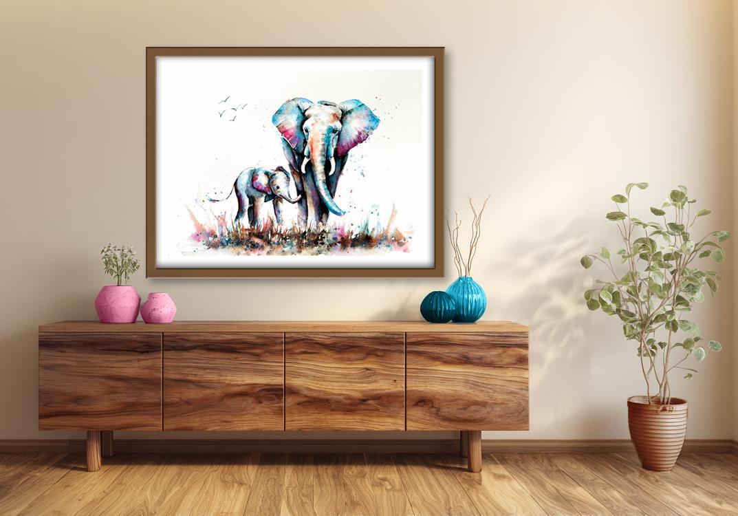
a mount and a frame, and you'll be amazed how good
it looks when you do that? If you've enjoyed this class, it might encourage you to look at some of my other videos. I've got lots of lovely
subjects loaded with more tips and techniques to help you with your own
exciting art journey. I'd really love to see your
own finished painting, which you can upload to
the your project section. And if you could
just take a moment to leave me a short review, that also would be really great. In the meantime, thank
you for joining me, and I look forward to seeing you next time Happy painting.
7. FINAL THOUGHTS: Well done on completing our lovely mom and baby
elephant painting. We've covered quite a few
different techniques, as you've been following
alongside of me, and we've developed our own interpretation of
this lovely scene. Instead of just copying
the reference photos, we've used them in a more
loose and imaginative way. We used artistic
license to add lots of different vibrant color
to our elephants. And we use the
wet-on-wet technique to soften and blend all that
lovely color together. We also used the
wet-on-dry technique where we wanted stronger
emphasis and definition. We simplified painting
all those wrinkles and ridges on the
elephant's skin, and we painted extra
layers of color to add richness,
vibrancy, and depth. Now, don't forget to upload your own painting through the
project and resources tab. After all your hard work,
I'd really love to see it, and I'll be sure to give
you some personal feedback. And if you've
enjoyed this video, do have a look at my other
classes on Skillshare, which are packed
with more tips and techniques to help you
on your own art journey. If you click the follow button, you'll be able to follow me, and then you'll be the first
to know when you upload a new video or any
exciting updates. And if you could
just take a moment to leave me a short review, that also would be really great. In the meantime, thank
you for joining me and I look forward to seeing you
next time happy painting.
 Carrie McKenzie, creating painted visions