Transcripts
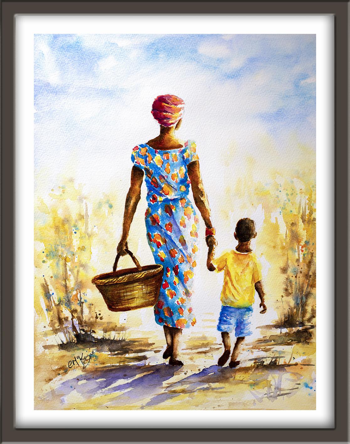
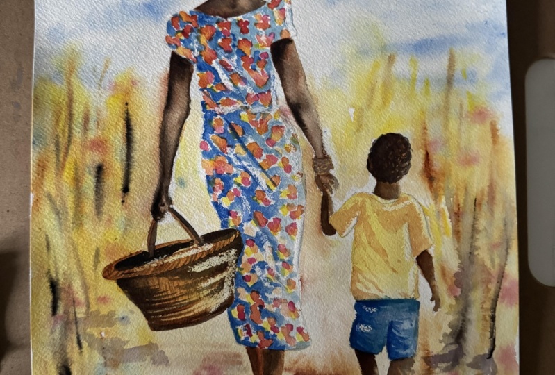
1. INTRODUCTION: Hello, and welcome. Today, we're going to be
painting this fabulous scene of mum and child walking in
the African countryside. We'll be focusing on light, atmosphere and
believable skin tones. We'll build the painting
together in clear stages, starting with broad
atmospheric washers and then moving on to the
skin tones and clothing. You'll learn how to use
tonal values to create form, how to preserve highlights, and how to unify the painting
through glazing and shadow, all without overworking it. It's suitable for all levels, including beginners because I'm going to be guiding you
every step of the way. And I'll be sharing all
the techniques, tips, and tricks that I use in
my own professional work. And I've included a
copy of the drawing in the project resources section so that you can download
it and trace it, and then not worry
about the drawing because this is a
painting class. I am a professional artist, author, and tutor,
and over the years, I've sold a lot of work
across the world and helped hundreds of people to
learn more about watercolor. You can see examples of
my work on my website. My style leans towards
impressionistic and contemporary rather
than photorealistic. I like to explore loose approaches that bring
out the colour, light, and essence
of my subjects. I've tried to
replicate this across all the many other videos
that I have on Skillshare. I'd love to see your
own finished painting, which you can upload through the project and resources tab. I'll give you some
personal feedback on it, and you'll be able to
see the artwork of other students and
get their support. At the end of the class, you'll have your own beautiful artwork to be very proud of. So let's swizzle our brushes and get on with the painting.
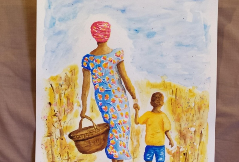
2. Materials & Drawing. Sky, Background & Foreground. Wet-on-wet washes for atmosphere and depth.: I know you're going to love
creating this painting, and I'm sure it
will put a really big smile on your face, too. For this class, these are the colours and materials
that I'm using, but do feel free to use
any that you already have. For lots more useful information
about brushes, paper, and other art materials, take a look at the
document that I've added to the projecting
resources section. You'll find that really helpful. And I've included a
copy of the drawing in the project resources section so that you can download
it and trace it, and then not worry
about the drawing because this is a
painting class. Now you can see that I've
kept the drawing very simple, minimal details so
that we get a nice, loose free flow painting. We're going to make a start by painting the sky background and foreground first using
the wet-on-wet technique. The wet-on-wet technique is
simply putting wet paint onto wet paper or paint that is still wet and let it spread
into the wet wash. This results in a lovely
diffused effect with soft edges. Because the paint mixes into
the wetness of the paper, the colour is diluted
and the tone is paler. I've made a start by
wetting the sky area, going carefully around the
mother and little boy's head. And I want to keep that area around their
heads very pale, if not almost white. So I haven't gone
right up to the edges. And now I'm dropping
in some cerulean blue, just letting that blend into the wet wash underneath and
disperse across the sky. Now, you don't
need to completely cover the whole of the
sky with the blue paint. Leave little areas unpainted, and they'll look like nice white, scattered billowy clouds. My paint is quite watery. It's about the consistency
of tea or milk, but I am adding a little bit
extra color here and there, so I've got some variation
of tone in the sky. And to increase that variation, I'm also adding a little bit of cobalt blue over the
top of the serlem. So I'm getting some nice
blends of the two blue colors there that's just giving a bit more interest
to the sky colors. I'm bringing the paint down
the sides of the paper, sort of vignetting the
mother's figure at the moment. And as I said before, I want
that central area around her head to remain fairly
pale or even white, so I'm not going right up to the edges of
her body or head. I've got a nice loose and
airy sky now, not too fussy. So I'm moving on to
paint the background. Just as I did with the sky, I pre wetting the paper
with some clean water. Again, going carefully around
the images of the figures. I want the background
to be nice and soft, sort of a bit blurry as well, so that the main focus will remain on the
figures themselves, and there'll be less
detail in this background. I've got a thin watery
mix of quinacadone gold. Now, if you don't
have that color, you could use a mid yellow
and just add a tiny, teeny touch of Bersiena to it. That will just gold your
yellow up a little bit. Now, as you can
see, I'm painting some very abstract
vertical shapes. These are going to represent a bit indicative of the bushes and foliage that might be in the background as they're
walking along a dusty path. Doesn't matter if you
go over the basket because that's going to be a brown or yellow color as well. So we can add that as
we're going along, not worry about going
around that too much. Again, I am leaving little gaps of white paper here and there, where the light will
be coming through. You don't want big,
solid clumps of colour. Remember, these are bushes and the sunlight will be
filtering through the leaves. And if you get any color,
why you don't want it, just blot it off with a
piece of paper towel. Now, I've also gone
over her left arm, and that's because this side of her body is going
to be in shadow, so I don't really
need to preserve any whites over on
this left hand side. And then I'm using
horizontal strokes to just stroke on the same
color along the foreground. This is going to be
where the path will be painted a bit more
strong later on, but we need this
underwah of gold. I've also got some handsy
yellow medium in my palette. It's a mid yellow, strong, bright sunny, sunflowery
colored yellow. And you can just splash
that on and just add a few strokes here and there
of the yellow color as well. And then I've got
a little bit of Bert sienna mixed in with the quin gold and
a bit of yellow to give me a darker
orangy kind of yellow. And again, using the
vertical strokes and little bits of dib dabbing strokes to indicate foliage and bushes
in the background. And as you can see,
because the paper was very wet and pre wet it before
I applied any paint, and it's still wet,
all those colors are nicely merging and
blending in to each other. So we're getting
this really nice, soft, diffused effect
in the background. And already, you
can see that that's helping to make the
two figures stand out. And then I'm switching
to horizontal strokes, but using the same, slightly stronger
tone of color to paint more detail
in the foreground. You don't want to be too
precise with these strokes. You want to keep
them quite random, just replicating nature,
which is very random. You don't want all the
strokes lining up in exactly the same position
like soldiers on a parade. And now I've got some
burnt tumber mixed, and I'm just spattering
that on and then flicking some of
the little spatters up with the point of my brush. I've switched to a smaller
brush, if you haven't noticed. And again, this is
just trying to create this illusion of these bushes and a little bit
more depth in them. Now, the paper, it's
beginning to dry now, so I'm getting a mixture
of hard and soft edges. Still getting some
nice little blends, especially where I'm putting the brown over the
top of the yellow. And, of course,
where I've dabbed it off with paper towel, that paper will be dryer, so I'm going to get a few
more hard edges there. And then just to add a
little bit of color, I'm spattering on a little
bit of permanent rose. And, of course, when that's
spattered onto the yellow, it'll softly diffuse into a
nice pinky, orangey color. And then I'm using
my cerulean blue to spatter a little bit of
color onto the bushes. And that, of course,
will look more green because it's mixing in
to the yellow below. Same with the cobalt blue. I'm getting a slightly
different shade of green when I
splatter that on. But again, that's
helping to give me this variety of
color and tone. I've switched to a much
smaller brush now. I think it's either a
size two or a size one. It's got a really good point. So I'm now able to use
my dark brown color, my burnt umber to paint
some stems and twigs in between these
foliage shapes that I've created with the yellows
and the other colors. Now, again, you need to keep
these strokes quite random. We don't want any big tree
trunks going in here, just small bushes, small twigs, little branches, and not all going in exactly the same
direction or the same length. And I can use this
same dark brown color to paint some strokes in the foreground that will make it look like a dusty,
soilly earthy color. And as soon as you've painted
the horizontal lines, you can use the point of
your brush to just flick up some dried grasses
that are along the way. Now, although it
might seem that using a lot of strokes and a lot of paints in different
colors here, do remember that
this is all being put on in a very light way. So nothing too heavy, nothing too dense, little
touches here and there. And all these little touches are blending into each other, creating this nice soft
diffuse background, but adding also
little bits of detail here and there that help
to give them some form. And also watercolour
does tend to dry about 20 to 30% lighter than
when you first put it on. So all this color is going to lighten and
soften as it dries. When it is dry, I
can always go and add a little bit more
detail if I want to do. But for now, I think
it's probably about time to stop messing and
fiddling and leave it alone, and we'll come back to the background and
foreground later on to see if it does need any more little
details added into it.
3. Skin colours and tones; use tonal values to convery 3D rounded shapes.: I've mixed four different
colors for all the skin areas. So I've got rinocrodone gold. You can use your mid yellow with a little touch of burnt sienna. I've got burnt
sienna on its own, and then I've got brown madder. Now if you don't
have brown madder, you could add a little bit of alizarin crimson to
your burnt sienna. And then I've got burnt
umber as the darkest tone. The process for painting each body part where we can see the skin is
exactly the same. The first thing to know is that the light is coming
from the right, which means all
the body shapes in the left will be darker
than those on the right, where the light is hitting them. And by using these
different colors, these different tonal
values, where lighter, some darker, that will also help to convey
the roundedness, the three D of all
our body shapes. Now, I suggest that you paint one or maybe two body
shapes at a time. The first step is to pre wet
the shape with clean water. Have pre wet the arm on the left and the arm on
the right of the mother. I've also made a
start on painting the mother's neck with quinacridone gold,
which, as you can see, is darker on the left hand
side than it is on the right, because I've lifted
some of the color off that right hand side
with a damp clean brush. Then while those two arm
shapes are still wet, I'm stroking in a little
bit of the quin gold just down the left
hand side of each arm, and letting that quin
gold spread across the wet wash underneath to
the other side of the arm. Okay. Now, as it spreads across, because it's going
into wet water, that color is diluting, so it stays stronger
on the left, where you've positioned it
than it does on the right, where it flows across. And that is part
of the process of helping to convey this
rounded three D effect. Because the little boy's left
arm is such a small shape. I've also stroked the quin
gold down there and just dabbed off some of the paint on the right hand side
with some paper toll. Then whilst that
paint is still wet, I'm going in now on the
left hand side again of each shape with
some burnt sienna. You can see that it
is still wet because I'm getting a nice blend. I'm not getting any hard edges, that paint is spreading
across again, but not quite far over
to the right hand side. You do need a nice pointy
brush for this because you only want to catch that outer edge and
not the whole shape. I'm doing exactly the same
thing with the right arm. So stroking a little bit
of the burnt sienna down that left hand side and
allowing the paint to just spread across
towards the right, but not right across. So I'm keeping some of that light quin gold down
the right hand side. You don't have to do it
down the whole edge. You can miss bits
out here and there as if the sun is just catching, especially on this
right hand side. And then to warm the
skin tone up a bit, I'm adding a little bit
of my brown madder color. As I said before, you
can mix a little bit of azarin crimson into burnt sienna to get this sort of
ready brown color. But again, I'm just putting that color in down that
left hand side again. The paint is still wet, so I'm still getting
a nice blend spread. And then on to the fourth color, my burnt under, my dark brown. Now, this mix is a little bit thicker
than the other three, because I want it to stay a little bit more
over to the left. I don't want it to spread quite as much as
the other colors. Otherwise, I'll lose all the lovely colors
that I've just put on. And if the paint is a bit, then it won't spread quite as far as if it was a thinner mix. I've put some of my dark brown just underneath her
turban and just above the top of
her dress because those areas are going to be
in shadow from the material. I'm also stroking it down the left hand side
of the left arm, and I've just a a little bit more underneath the sleeve area. Now, I'm working on
three shapes at well, four shapes because
I've included the little boy's left arm. So I'm working on multiple
shapes at the moment because I am a quick worker and I've painted
this scene before. If you're not such
a quick worker and you want to take your time, then just do one
shape at a time. And if you haven't used
this technique before, you might want to practice it first on a bit of spare paper. Just draw out a shape
that resembles an arm. It doesn't have to be
anything detailed. And just practice, adding
these four colors from the left hand side
of the shape and watch how they merge and
blend over onto the right. Don't forget to pre wet the
shape first, of course. Going back to the
arm on the left, now that arm is going to
be more in shadow because her body is in front of it
than the arm on the right. So you can see now that
I haven't got as much Quin go showing on the right
hand side of the left arm. These are little
judgments that you need to make as you're
working through the painting. Where is the light coming from? Which shapes are going
to be more in light, lighter tone on that
right hand side, and which shapes are
going to be darker because they're on the left
and not receiving the light. When you're using this
wet on wet technique, you do find sometimes
that the dark color that you put on does tend to
sink in a bit lighten. So I'm just going back over
with my very dark brown, adding a little bit more shade, a little bit more shadow
to those left hand areas. I'm going to repeat
the same process for all the other body shapes
where the skin is showing, including the little boy's head. So the process is the same, pre wet the paper. Add Qin gold as your lightest
tone on the left hand side, add some b sienna down that left hand side and let the colors blend
and spread across. Then a little bit of your rose, and finally the
dark burnt umber. Oh. Oh Oh. Oh. Oh. 00 Oh. O. O O O. O
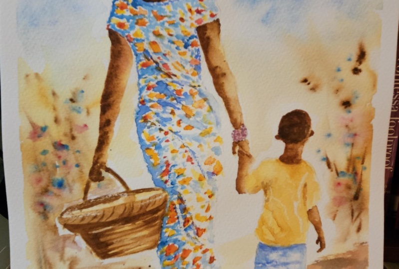
4. Paint the clothes and basket; use clear wax to preserve white paper; wet-on-dry technique.: I'm using a small
clear wax crayon. It's quick and easy to
apply and stays invisible, so no need to wait
for its dry later. It does repel the paint. So when we paint over
the top of the wax, it will preserve the
white of the paper and we'll get some nice little
highlights in the center. If you don't have a wax crayon, you can use a chunk
of clear candle wax. So here's what the
wax crane looks like. I want to add some
creases to the material, and there will be
a little areas on these creases where the light
will just be catching them. So I want to reserve the white
paper where that happens. I'm using the pencil lines that were in the drawing of
where those creases are. And I'm just placing
the wax just slightly above and to the
right of those pencil lines. So not actually on the
pencil lines themselves. If you put the wax on
top of the pencil lines, then you'll be encasing
the pencil and you won't be able to rub it
out afterwards, and that won't actually reserve
the white of the paper, you'll just be reserving
the gray pencil lines. So just above the pencil lines, where you've put those
crease lines on the drawing. You also want to
make them very thin. So again, use the
point of the crayon, or you could even use
the lower side of it, where there's a round sharp rim. Or if you're using a
piece of candle wax, use a knife or a scalpel
just to get a point on it. You don't want big
thick tram lines. It really will look
very unnatural. So some very thin wax lines, And it's probably better
to underdo this step than to overdo it because as I've
said, once the wax is on, it's on, you can't take it off, so you don't want to overdo it err on the side of caution. I'm also just stroking
a little bit of that wax crayon on the rim of the basket
on the right hand side, where it will catch the light, and also on the
folds of the turban, where they will just catch the light at the
top of each fold. If you're at all worried
about using the wax, but you have used
mask in fluid before, then by all means, use mask in fluid in
cell instead and wait for the fluid to dry before you start
painting the clothes. I'm talking about
painting the clothes, I'm now getting on with
painting the mother's dress. For the pattern, I'm
using three colors. I'm using my mid yellow, permanent rose, and
transparent orange. I'm not pre wetting the paper, as we have done before, I'm painting straight
on to dry paper. This wet on dry technique allows more control,
stronger color, and crisper hard edges
where the paint ends, and the paint will only go
where the brush takes it. First of all, I'm adding
some blobs of yellow. Now, you can see that these are not all the same size or shape. I'm just putting them randomly over the whole of the dress. I don't need to
worry about the wax. I can go straight over any
wax that I've already put down because the paint will just go over the top and
the wax will repel it. Now, wherever I've
put a yellow blob, I'm now adding a little
orange one next to it. Where I place the orange
onto the dry paper, where there is no paint, it will stay perfectly orange. Where it touches the yellow, it'll just merge a little bit
with that yellow and we'll get a yellow orange mix. And again, I'm not being
too precious about these. It's a very abstract
pattern that I'm creating, so I don't need to do
everything exactly the same. Now, if you feel a
little bit nervous about doing this
patterned material, there's absolutely no reason
why you couldn't just use one color and do
a very plain dress. Just do what you feel
comfortable with. And now I'm adding some little pink blobs to each of my clusters
of yellow and orange. So I'll end up with a little
cluster of three colors, the pink, yellow and orange. Some of those colors
will merge together, and some of them
will stand free. And of course, if
you've missed any, any white spaces that
are a bit too large, then just go back and dab a
few more colors in there. Just a word of explanation
about why I've chosen to paint the colors much brighter on the mother's dress than what is shown in the
reference photograph. I think this is due
to several trips I've been fortunate to
have to the Gambia. And my recollection is that the colors of the
materials were brighter, so much more exciting than what is shown in the
reference photograph. The whole image is much lighter and brighter than the reference. And that, again, is
because my memories of the Gambia is the most
wonderful sunshine, bright colors, and this
extraordinary bright white light. And that is one of the wonderful
things about being able to use artistic license
with our paintings. We can include our memories, our perceptions, and our emotions and feelings
in what we are creating. Before the paint
dries completely, I am mindful of what
I've said before about the light coming
from the right hand side. So the light will catch that dress all the way
down that light hand side. To convey that, I need
the little clusters of color to be lighter in tone on the right than
they are in the left. So I'm just using a bit of paper towel to very lightly dab over all those little clusters on the immediate right
hand side of a dress. That will just help
to lighten the tone, and again, help to give this
three D rounded effect. None to the little
boy's clothes. I'm not going to paint the
very pattern shirt shown in the reference photograph
because I think there's enough pattern going on
with the mother's dress. I'm just painting this T shirt, just a plain yellow, but keeping the
colors again more saturated on the left
where they're in shadow. I'm using the same yellow to
paint the mother's turban. Again, keeping the color more saturated on the left hand side, where it's in shadow, and lighter on the right, where the light is hitting it. Then while the
paint is still wet, I'm drizzling in a little
touch of permanent rose, applying this along the
folds of the turban. I'm letting those two colors
blend and mix a little, but not covering up entirely
the yellow underwh. I've used the same yellow and pink that we used for the dress. Of course, the two
colors blending are giving me some orange
tones as well. I'm not going to bother applying any of the orange
that we used earlier. I'm adding a little bit more, bit more saturated color along the lines of the
folds of the turban, just to define those
folds a little bit more. Then I'm applying most of this pink down the left
hand side where it's in shadow and leaving
the right hand side more pale, yellow and white. Now, the time I've taken
to paint the turban has given the yellow T shirt a
little bit longer to dry. When I now go in with Man blue
to paint the little boys, I'm not getting the blue spreading into his little
yellow T shirt too. Now, we didn't really see
the effect of the wax that we put on earlier when we
painted the mother's dress. But painting the blue shirts and probably on the
yellow T shirt as well, you should now be able to see the effect of
stroking on that wax, which has preserved the
white of the paper. If you find that you actually
haven't put enough wax on and you're not getting
these white creases showing, then just simply miss some
paint out here and there and leave some white paper
that's unpainted. O. I've got my rolling
blue nicely applied to the left hand side
of each short leg, and I'm just spreading a
little bit over to the right. But to emphasize the shadow
on the left hand side, I'm adding a little
bit of cobalt blue. Just a few little
touches here and there down that left side and
just below his T shirt. To emphasize those creases
that we want in the material, I'm using the very tip of
my small brush to just drag some of the cobalt blue
across in very fine lines. Now I'm going to add another layer of
color to the basket. If you remember, we did actually paint over
the basket when we did the foreground in some
very pale quin ace gold. I'm using quin gold
again because you can paint over the same
color again with itself, and that gives you a
stronger tone of it. It state, darkens the color, so it'll give it a
bit more structure. As before, because the light
is coming from the right, and I know I've said this
several times now already, but it is worth keeping in mind. We're going to keep the
color stronger and darker on the left hand side and lighter on the right where the
light is hitting it. I've used the quin gold to paint the handle around the rim, and I'm now starting to
use horizontal strokes, following the direction of
the way the straw will be plated around the basket and
using lots of little lines. Some of these will join
up, some of them won't. We're trying to create
a woven effect, and that means we
need to leave gaps of light in between
these platted braids. Then switching to burnt sienna, I'm adding this darker
color along the bottom, the back of the handle and just where it emerges
from the mother's hand, those areas are
going to be darker. The inside of the basket, of course, will be darker, so I need to separate
that out from the front rim using
this darker shade. Just below the rim
of the basket, again, that's going to
be a little bit darker. Add in some bert
sienna there as well. Just running the tip of
my brush underneath it. Then coming down
the left hand side, and also a little bit down the right where it
meets the dress. Because as it pushes
into the dress, that little area will
also be a little bit. Then still using the burnt
sienna and following the little lines that I put in earlier that are
going around the basket, adding some lines
of burnt sienna, but not obliterating the
quin gold underneath. We're going to add some more
detail in the next step. But for now, I
just need to leave everything to completely dry.
5. Add detail to the clothing and basket; blending & softening technique. Paint the shadows; glazing : I'm using the wet on
dry technique again, wet paint on dry paper. And because I've allowed
a little time for the pink yellow and orange blobs that I put on previously to dry, there's no risk of the color
that I'm now putting on, which is can blue. There's no risk of
that running into them and blending and getting
a muddy sort of color. I'm only painting the blue into the white spaces in between the little clusters of color
that I put on previously. I'm not painting over
the top of those colors. Otherwise, I would end up
getting a muddy brown. Importantly, I am not
trying to paint right up to the edges of each
little cluster of color. I'm letting my
brush dance around, just going into those
white spaces and also leaving little bits of white around the
clusters themselves. We don't want it to look like a children's coloring
book where you are just filling in
between the lines. Leaving these little flashes
of white here and there will give it a much more
summary and vibrant appearance. By using the same cerulan
blue that we use for the sky, we'll lend some harmony
to the painting. With any painting, you want to mix of harmony and variety. We need variety so that the painting looks
lively and interesting. But we also need some
harmony so that it doesn't look too
busy and overworked. It's for exactly the same
reason that I've chosen to use cerulan and cobalt blue
for the little boys shorts. And we've used the same
yellow in the T shirt as we did for the yellow in
the turban and the dress. We're not using a
strictly limited palette, such as just three colors, but we're only using a
few more in the painting, and some of those are actually darker tones of a lighter one. And that helps also to give
the painting some unity. If you flood a painting with too many colors,
dozens of colors, then again, it
will just look too busy, manic and overworked. Now, notice that I've worked my way down the left
hand side of the dress, going towards the center, but not over to the far right. The reason for that is because before that
seran blue paint dries, I want to drop in
a little bit of cobalt blue down
this left hand side. Again, I'm mindful about where
the light is coming from, and so I do want
this left hand side to be a little bit darker
than it is on the right. Again, I'm only adding the cobalt blue on
top of the cerulu. I'm not painting over the little clusters of
pink yellow and orange. But because the cerulu
blue is still wet, I'll get some nice
little blends between the two blues without
any hard edges. I don't need to cover the whole of the cerulu blue patches. I can just drop a little
touch here and there of the cobalt blue in and just
let it spread and mingle. And as we're starting to add
more color to the dress, you should start to see the
effects of those strokes of wax that we put on earlier where we wanted some
creases in the material. The material will
be darker where it's touching the
edge of the basket, so I'm adding a little bit of extra cobalt blue just around that area and towards
the bottom of the dress. Now that I'm happy with the
left hand side of the dress, I can move over onto
the right hand side, but now I'm only using the cobalt blue because this
side is more in the light. So I don't need that
darker cobalt blue again. And I have added a
little bit more water to my seran blue to make it a thinner mix and much
lighter in tone. In fact, I think you can
already see now quite clearly the difference between that right and left
side of the dress. I have speeded the
video up a little bit here because what I'm
doing is quite repetitive, and I think you've probably
got the general idea by now. Although I have kept
harping on about keeping it light on
the right hand side, there will, of course, still be a few areas that are in shadow. An example of this is
where I'm now painting the area that's in shadow
from her right arm. Because her elbow is
bent slightly back, her right arm will be covering some parts of the dress and
obscuring it from the light. I'm adding a bit
more of this blue, little bit more
cobalt blue just down that area around the w
on the right hand side. And in fact, it will be
a little bit darker just underneath the waistline where the material is folding over. I also want to emphasize
the creases in her dress. So I'm using my darker
color just to trickle underneath those white areas where the wax repel the paper. I'm stroking the color down
underneath and then just softening it at each end of
the case with a damp brush. The noticeable
thing about adding these creases is that it adds some movement so we
can almost feel a walk in now because the material
is swaying in the breeze. You don't need to
overdo these cases. We don't want and lots
of them all over. Just a few will suffice. To add some detail and creases to the little
boy's yellow T shirt, I'm using my slightly
darker shade of yellow, the quin acon gold. Because I'm applying this now, the yellow that we're painted the T shirt with earlier
is completely dry, so I am getting hard edges where I'm applying
the quin gold. You can use the
blending and softening a hard edge technique
where you simply use a damp brush to pull the paint away from
the hard edge, blending it softly
until the color disappears into the
underlaying wash or white of the paper. It might sound like a
relatively simple technique, but it is actually quite a
difficult one to master. If you haven't already done so, I do suggest that you
practice the technique because it will make
a massive difference to all your paintings. Moving on to the little boys, I'm using the same
process to define the cases in the
shadow in the boys. But I'm using cobalt blue, of course, for this area
of his clothing. H. To add a bit more
detail to the turban and emphasize the
folds in the fabric. I've added a little bit
of cobalt blue to my permanent rose to make
a purple pink color. I'm using that to go over the bottom line of each
fold with the purple color. I'm just going to
soften and blend that in to the underlying color using that softening and
blending technique that we used for the little
boys shirt and trousers. For the bracelet, I'm using the same colors that I
use for the turbans, so some yellow and
some permanent rose. Now I'm just doing
these on quite randomly to give the
effect of beads. But if you want to
do a plain bracelet, that's absolutely fine. The last step of this
section is to add some detail and
shadow to the basket. So I'm now using my number, dark brown and emphasizing
the shadow on the handles, and also in the
inside of the basket. There's a shadow underneath
the rim of the basket, so I'm using my burnt
umber to paint that in. Just going around in not
quite a horizontal stroke, but more of a curved
horizontal stroke, following the line of the rim and bringing that
dark color down the left hand side
of the basket where it's in shadow and
also the underneath. Then using the tip or the
point of my small brush, I'm adding in some
more dark lines, following the ones that I placed earlier in yellow and quin gold, adding some depth
to that woven bred. Unlike the other shapes
that we've been painting, the right hand side of
the basket will also be a bit in shape because it's pressing against
the mother's body. The light will be hitting
it just as it moves out of that area almost off
the far right center. To increase the appearance
of woven straw, I'm also adding a few
vertical lines on the basket, and then some diagonal
ones going around the rim. We've added plenty of detail, and now it's time to
let the painting. Before getting on with the
shadows and final details, I do want to add a little bit of hair onto my
little boy's head. So I'm using my very
dark brown again. I've added a little bit of cobot blue to it to not make it black, but more of a black brown. And I'm using a very small
brush again and just kind of that darker
color on his head. So it looks like he's got
a little mass of curls. And I'm also adding a
little bit of darker pink to the left hand
side of the bracelet, where that is also in shadow. Now, for the shadows
of the actual figures, I've mixed some cobalt blue with my permanent rose and added just a tiny little
bit of mars black just to darken that bluey
purple color a little bit. There are a couple of
important things to note about painting shadows. One of them is that they are always darker nearer the source, and as they move away
from the source, they become lighter and softer. The other point to
note is that they will follow the direction
of the light source. If the light is coming
from the right, the shadows will
fall to the left. If the light source is
coming from the left, the shadows will
fall to the right. Now, in our painting, I've kept reminding you that the light is coming
from the right, and so you can see
now I'm painting the shadows going diagonally
towards the left. The shadows for both figures need to start immediately
below the feet, in fact, touching the feet, otherwise they will look as though they're floating in air. However, the mother's left
foot is raised upwards, so the shadow won't
start touching her foot. It will be at the same
level of the right foot. I hope that makes
sense and I haven't made it sound too complicated. And having said all that, you will also, of course, get shadows immediately
underneath the bushes where the foliage or the
branches are overhanging. The shapes of the shadows for the figures need to be
very roughly in line with the shape of their actual
bodies and anything that they're holding such as the
mother hold in the basket. Where you've got spaces
in between, for example, in between the mother's
dress and her left arm, you'll also need to leave a corresponding
space in the shadow. And this is where you
need to stand back now and analyze
your own painting. What final details do you need to add before you can
say it's finished? In my case, I want to strengthen
some of the shapes in the foreground
because I feel that they're too similar to
those in the background, so I do need to add a little bit more detail
and interest here. I've mixed some blue into my burn number and also added
a little bit of Mrs black. I'm just going over some of the shapes that I've
already painted, but strengthening the tone, and that will help to push
the background further back. Will also help to make the foreground feel more
solid and earth like. Again, these are just little
touches here and there. I don't want to over paint all my lovely light
colors and overwork it. I'm using the spattering
technique that we used previously to add a
little bit more interest in the bushes and
on the foreground. When we spattered before, we did it into wet paint. So the little droplets softly diffused and blended and
weren't too obvious. This time we're spattering onto dry paper where
the paint is dried, the spattering little droplets are much crisper and hard edged. The last thing I'm going
to do before I call this painting finished is
to glaze over some color. Because it looks as though
there's more color in the background in the bushes than there is in the foreground, which is not really
as it should be. Glazing is simply
applying extra layers of thin transparent washes of
paint on top of each other, allowing the layers of
paint below to shine. To add richness, visual
interest and depth of color. Do need to use soft, gentle strokes so that
you don't disturb the underlying layers of paint with too much
brush pressure. As you can see, I've
glazed over some of the foreground with a little bit of quin gold and mid yellow. Time has come now for me to sit back and call the
painting finished. I do hope you've
enjoyed this painting, and that you've learned some
tips and techniques along the way that you can incorporate
into your own paintings. And why not pop it into
a mount and a frame? And you'll be amazed how good
it looks when you do that. Really love to see your
own finished painting, which you can upload to
the your project section. And if you could just take a moment to leave
me a short review, that also would be really great. I do hope you've
enjoyed this video, and it's encouraged you to have a look at some of
my other classes. I've got lots of
lovely subjects, loaded with more
tips and techniques to help you with your own
exciting art journey. In the meantime, thank
you for joining me, and I look forward to seeing you next time. Happy painting.
6. FINAL THOUGHTS: Well done on completing the
class and also the painting, if you've been painting
alongside of me. We've covered quite a few
different techniques. We've simplified the drawing
from the reference photo. We use the wet-on-wet technique, putting wet paint on wet paper, we use the wet-on-dry technique, putting wet paint on dry paper, and we use light medium
and dark tones of color to convey a
rounded three D effect. And we use the glazing
technique to add a little bit more
richness and depth of color to the overall
look of the painting. Now, don't forget to upload your own painting through the
project and resources tab. After all your hard work, I'd really love to see it, and I'll be sure to give
you some personal feedback. And if you've
enjoyed this video, do have a look at my other
classes on Skillshare, which are packed
with more tips and techniques to help you
on your own art journey. If you click the follow button, you'll be able to follow me, and then you'll be the first
to know when you upload a new video or any
exciting updates. And if you could
just take a moment to leave me a short review, that also would be really great. In the meantime, thank
you for joining me, and I look forward
to seeing you next time Happy painting. O.
 Carrie McKenzie, creating painted visions