Transcripts
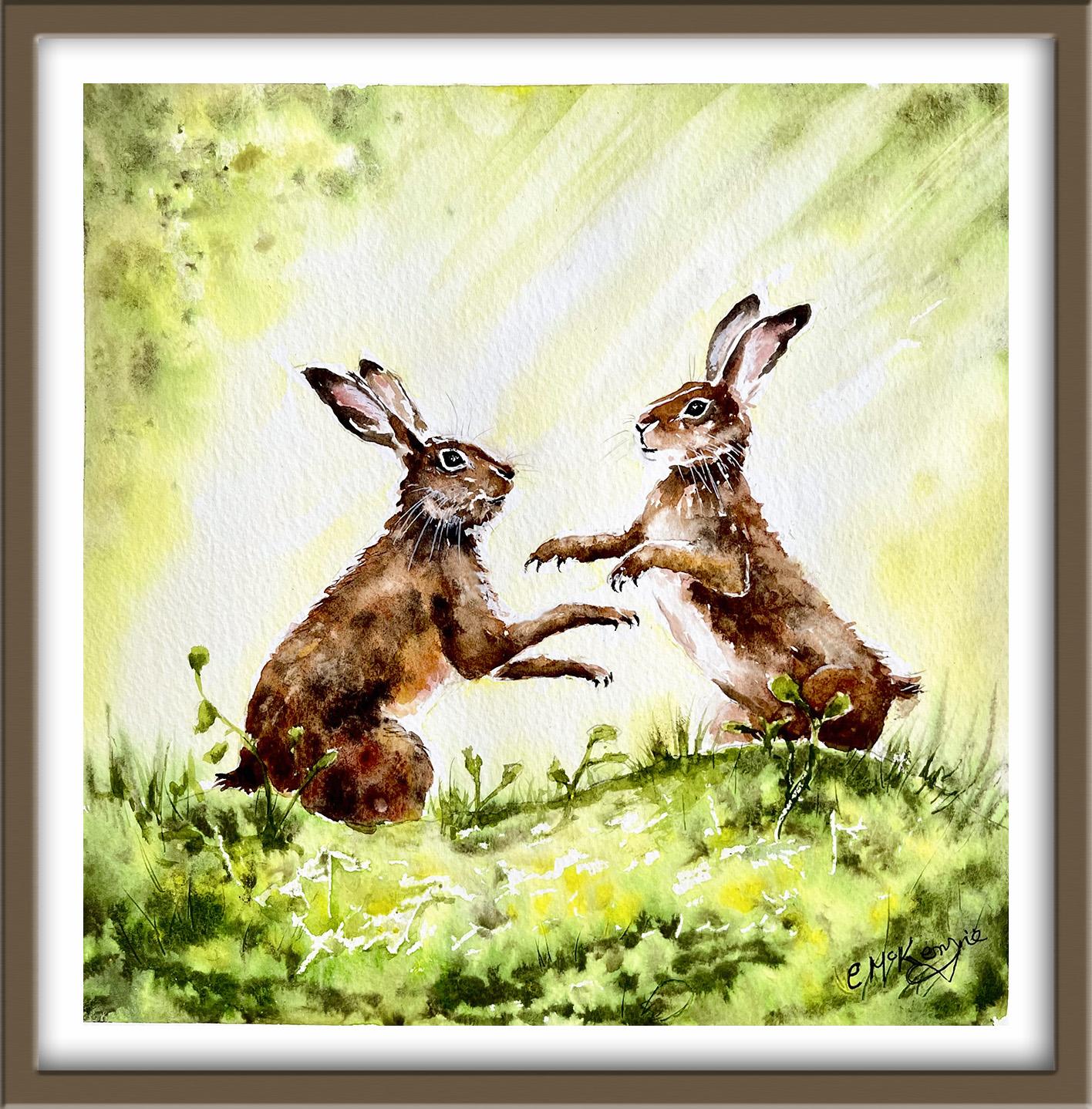
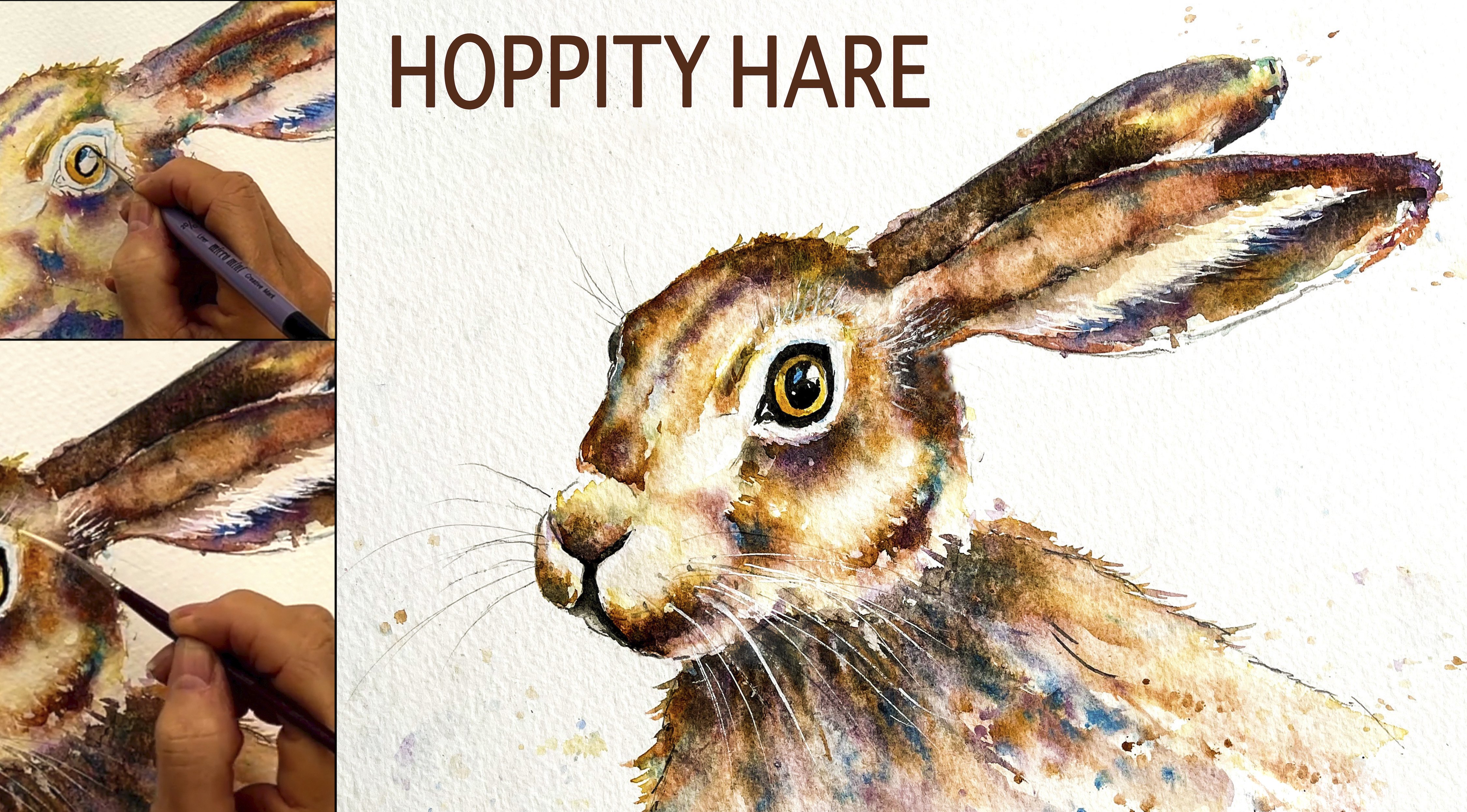
1. INTRODUCTION: Hello, and welcome. Going to paint these lovely
sunlit boxing hairs. It's a lively wildlife
scene full of movement, texture, and glowing light. We'll create soft
shafts of sunlight, using wet-on-wet
techniques and paint an impressionistic meadow
with simple texture tools. You'll learn how to
bring the hairs to life with layered fur
and expressive detail. We'll focus on using tonal
values, and by the end, you'll have a lovely
boxing hairs, wildlife painting,
bursting with atmosphere. It's suitable for all levels, including beginners because I'm going to be guiding you
every step of the way. And I'll be sharing all
the techniques, tips, and tricks that I use in
my own professional work. I've included a copy
of the drawing in the project resources section so that you can download
it and trace it, and then not worry
about the drawing because this is a
painting class. I am a professional artist, author, and tutor,
and over the years, I've sold a lot of work
across the world and helped hundreds of people to
learn more about watercolor. You can see examples of
my work on my website. My style leans towards
impressionistic and contemporary rather
than photorealistic. I like to explore loose approaches that
bring out the color, light, and essence
of my subjects. I've tried to
replicate this across all the many other videos
that I have on Skillshare. I'd love to see your
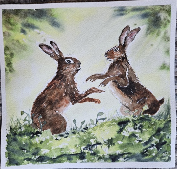
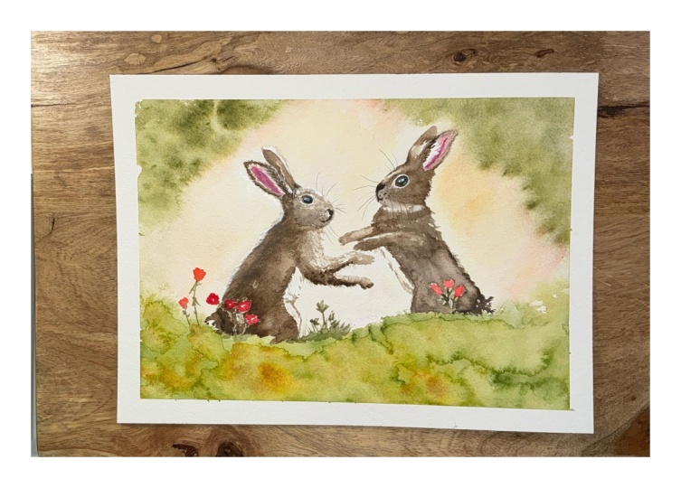
own finished painting, which you can upload through the project and resources tab. I'll give you some
personal feedback on it, and you'll be able to
see the artwork of other students and
get their support. At the end of the
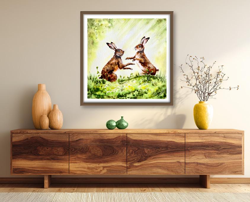
class, you'll have your own beautiful artwork
to be very proud of. So let's swizzle our brushes and get on with the painting.
2. Materials & Drawing. Preserve white paper with wax crayon. Paint a glowing sky with sunbeams: For this class, these are the colors and materials
that I'm using, but do feel free to use
any that you already have. For information on brushes
and paper, et cetera, do check out the basic
materials document that I've added to the
project resources section. Now you can see that I've
kept the drawing very simple, minimal details so
that we get a nice, loose free flow painting. And I've included a
copy of the drawing in the project resources section so that you can download
it and trace it, and then not worry
about the drawing because this is a
painting class. One method of preserving the
white of the paper is to use a clear wax crayon or a
chunk of clear candle wax. The amount of pressure
that you apply and the texture of the paper will
affect the finished result. It's quick and easy to apply. It stays invisible, and there's no need to
wait for it to dry. Results in a rougher and
more textured appearance, but it can be useful for dapple, sunlight, or sparkling water. And in fact, I'm using
it now to create a dappled sunlight effect
on this foreground. I'm dotting on some very
small abstract shapes and just one or two linear
marks for grasses and stems. It's very hard to see where you've put it after
it's applied. You can only see the full result when the pins is
applied on top of it. Unlike masking fluid,
it's not removable, so once it's on, it's on. And because it isn't removable, you can't easily touch
up your mistakes. So use it with caution
and maybe have a little practice with it before you apply it
to your painting. I'm going to paint the sky using the wet-on-wet technique. First of all, you
wet the paper with clean water and then
apply wet paint on top of the wet
paper and let it spread into the wet wash. Now, this results in a lovely
diffused effect with soft edges. And because the paint mixes into the wetness of the paper, the color is diluted
and the tone is paler. If several different colours
are used in this way, they will intermix and
blend with each other. So when you drop some
blue into a wet, yellow underwash that will
result in a blended green. As you can see, I'm going quite carefully around my hair shapes. But if I do leave
a little sliver of unwet paper around them, that'll be fine because
these hairs are backlet, so there will be a little bit of a white halo around
them because of that. I'd already mixed the
colours that I'm going to use before I wet the paper, and it's really
important to do that because if you mix
them afterwards, the paper's going to dry by
the time you apply them. I'm starting off with
handsome yellow light, and you could use
any light yellow like aolin or
transparent yellow, as long as it's not an
orange yellow like gamboge. And I'm letting the wetness of the paper soak up the color
from the tip of my brush. So I'm not really dragging
the brush around. I'm kind of dancing
around with it, trickling the paper
with the tip. Put a little bit of extra yellow on that top
left hand corner. That's where I'm going to be adding some more green
foliage colours. I haven't painted everywhere. I've left a few little
gaps of unpainted paper, but because the paper is wet, the color will just
spread into it naturally, but I'll get some paler tones, and that'll give
me some variety. Now over on this
right hand side, you can see that I'm using my brush in some
diagonal strokes, and I'm leaving unpainted
paper in between them. Now, as I said, the paint
will spread a little bit, but if I leave enough gaps in between the diagonal strokes, it will look like
shafts of light coming down across the haze
from this right hand side. Now you've probably already
noticed that I've got some parallel lines drawn
around both of the hairs. There is a reason for that. I'm going to try to
leave the space in between the parallel
lines unpainted, and that will leave some white, unpainted paper
that will resemble a halo effect that comes
from a back subject. As an example, I've
just popped on a little photograph
of a girl's head. The back lighting is much more exaggerated than it's
going to be on our hairs, but I thought it helped
to demonstrate the point. Another thing that's
important to mention here is the amount of time it takes
to complete this background. It really does need to
be less than 10 minutes maximum because once the
paint starts to dry, I'll no longer be
able to get this lovely wetting wet,
soft blending. I'll start to get hard
edges here and there, and that won't be the
effect that I'm after. So if you're not a
very quick worker, you need to take your time. I suggest that you do this
background in stages. So do the left side first, and then the right side, and
then this bit in the middle. You'll need to pre wet
each section first before you apply the paint and move on to the next section. And if you wet the
area a little bit further over than where you
plan to apply the paint, then you won't get any hard
edges in the middle of it. You can see that
my paper is still wet because the mid green
color that I've dabbed onto it has softly blended into the underlying wash. And now I'm just adding a little
bit of brown colour, brown umber, not very much, and it's very watery. I don't want the brown
to overtake the green. I'm not actually trying to paint a physical tree or
bushes or leaves. I'm just giving the
impression that there's some leafy foliage
in the background, all very blurred because
it's in the distance. And now I'm adding
some of my dark green, which I've mixed
my green appetite genuine with a little bit of indigo to give it
that extra tone. So mostly using the
two green colors, and dabbing the mid
and dark green on the left and right hand
corners and along the top. Now, if it gets a bit dense, you can just do what I'm doing. Dab a bit of paper towel
and lift the paint off. Then using the side of my brush, can you see how
I'm dragging some of that paint that
I've already put on into those areas where I
diagonally brush the yellow. You need quite a light touch
for this because you want it to get paler the further
that you drag the paint down. So as it goes
towards the center, the tone should be
lighter than it is at the top at the
start of the stroke. So I'm essentially going in between those shafts
of pale light. And if you do accidentally go over what should
be a light area, then just twist up
some paper towel, scrunch it up into a long
thin sausage light roll, and just dab that on
to lift the paint off. It probably looks a bit on
the dark side at the moment, but do remember that
watercolour dries about 20 to 30% lighter than
when you first put it on. So I am hopeful that it won't be quite as dark as
it is at the moment. I've switched to a small brush to add a little bit of spatter, the suggestion of
leaves in the distance. Again, very blurred, not trying to actually paint
anything botanical. And then again, I can use it on its side to just drag a
little bit of that color, exaggerating some of those
pale shafts of light. Perhaps a little
bit more spatter, and then I think it's time to call this particular section done because it's been about 7 minutes now since
I started this background, and the paper is
starting to dry.
3. Paint a loose, impressionistic meadow with tonal values.
Add grasses with cut-up plastic card: Going to use the same colors in the foreground that we used previously for
the background. But this time, you want
slightly thicker mixers, so more concentrated color, and we're going to
paint more detail. And that will bring
the foreground forward and push the background
further into the distance. So once again, I'm starting with my
handsome yellow light. In watercolour, we
usually do always start with the lightest color and
work from light to dark. I'm painting wet
on dry this time, so wet paint on dry paper, so we will get some hard
edges and a lot more control. In horizontal strokes this time and going from
left to right, not filling in absolutely
every bit of paper, so leaving a few
little white patches. And, of course, wherever
I've placed that wax crayon, that will repel the paint, and so that will be left
looking white, as well. I'm now adding my
midgreen color, and I'm not obliterating
all of the yellow, I'm leaving little bits of it showing through in
between my brush strokes. I'm aiming to convey the
appearance of a sunlit meadow, but I don't want to be painting every single blade of grass
or every single leaf or stem. This is into botanical painting. So we're going for a more semi abstract appearance that doesn't overshadow the painting and allows the has to
be the main focus. To add the dark green, I've scrunched a small piece of elifane into a tight ball, and I'm now dipping that into the dark green colour and using it as a stamp to add very, very abstract shapes into
this mid green layer. You need to keep
twisting and turning the little balls so that you
get a variety of shapes. You don't get all the same
uniform patterns stamped on. You can see this is a very quick way of giving
the appearance of a lot of vegetation and foliage without having to paint every
detail with a small brush. Now, I'm getting a mixture
of soft and hard edges. Where the dark green
is going on top of the previously
painted mid green, then yes, I will get
some nice soft effects. But where it's hitting
the dry paper, then I'll get some harder edges. And that, again, is giving me a good variety and interest. And still see some
of the yellow color, and you can definitely
see some of the mid green color that's
underneath this dark green. So you don't want to obliterate those two colors that
we put on first. When you discover a little
technique like this, it is quite easy to get
carried away and overdo it. So a little bit of restraint. I want to add even more depth and shadow to this foreground. So I've mixed up some
indigo with my dark green, and now I've got a
very dark green. Using the tip of my brush
to just.it on very gently, allowing that wet paint
that's already on the paper to soak up this
dark color from my brush. I'm kind of dancing my
brush around, really. Don't want to paint lots of straight lines or
uniform shapes. So just using the very tip of it to trickle in
this dark colour. And as you can see, when we
had the really dark color, the light colors and the
whites stand out even more. Other natty little
tool is to use a piece of cut up credit
card with a sharp edge. And I'm just using that
now to scrape into the wet paint,
scoring the paper, and that will give me the
impression of some grasses, because when you score
the paper like this, the paint runs back into that dent and makes
it appear darker. Then you don't want
to overdo this, sometimes less is more. And when you do do it, make sure that you're
scratching in a variated way. So you don't want
all your scratches to be like a line of soldiers. Grasses grow this that
way and the other. So keep everything non uniform. I've switched to a very
small brush now to flick up some grasses that are sitting on the top
of this foreground. Now, it's actually
a makeup brush. It's a nail brush. It's used for painting
very intricate patterns on people's nails. But I found it a really
good little tool for these very, very fine lines. You could use a rigor
brush, of course, which has also got
a very fine point, but they do tend to
have longer hair, so not as much control as
this little nail brush. I am adding a mixture of colors, so I'm not just adding
the dark green grasses along the top of
this foreground. I've also got some of the
mid green color as well. So just strengthening now
the edge of that foreground, so we get some delineation between that and the
hairs behind it. Don't worry at all if
your foreground doesn't look exactly like mine or
even anywhere near it, because this type of approach
is very experimental, and the results are
certainly not predictable. If I was to paint
it again myself, I would get a very
different look. You've just sometimes got to go with the way that
the watercolor goes, give it its own head, and let it do its own thing. And definitely, that is the only way to approach
this kind of loose work. If you haven't painted
like this before, it might be useful just to have a little practice on
some spare paper. Use the wax, use the
cutup credit card, the plastic wrap for stamping, and just get used to how all these little techniques work. There are a few leaves and
stems in front of the hairs, so I'm painting those now with my mid green colour
and little touch of the dark green at
the base of each leaf. I now need to leave
everything alone, let it dry completely before
going on to the next step, which will be painting
our lovely hairs.
4. Paint hares wet-on-wet for fur effects. Use tonal values to create form, light and shadow: I've added a tiny touch of burnt sienna to
some permanent rose to give me a kind
of flesh color for painting the inner
of the hair's ears. Because the sunlight is
directly behind the ears, this part of them
where there is just very thin flesh and bone
will be quite translucent. So you don't want this to be
too thick, nice and watery. I've also got ready
mixed in my palette, some burnt sienna,
some burnt umber, which is a darker brown, and a very dark black brown, which is burnt umber plus
a little bit of indigo. Whilst the pink
color is still wet, I'm touching in a little bit of my very dark brown black
just around the edge of it. Where it touches the pink, it will blend into it and create a nice soft shadow
on that inner ear. And I can also use the
tip of my brush to just drag some of that paint inwards
and create more shadow. I'm mindful that there is white hair growing
in this inner ear. So I need to leave some
unpainted paper as white. But because that
white hair is very wispy and we need the
dark tones underneath it, that's quite
difficult to achieve in such a small
area as the ears. So I'm planning on using
some white gouache or white acrylic or ink later on when the ears
have completely dried. I'm moving over to the little
hair on the right hand side and going through
exactly the same process but his lovely long ears. To paint fur, we need to use
the wet-on-wet technique. I'm using a clean brush. I think it's about a size eight, and I'm using that to brush some clean water over this
little hair on the left. I'm being mindful to only
wet up to the inner line of those parallel lines
that we talked about earlier that were going to
be used for the halo effect. I'm also being mindful
of the white areas of hair and fur that are on the hair's little
bodies and faces. And I'm leaving those unwet. In particular, we've got
some whites around the eye, just underneath the nose and also underneath the
mouth on the chin area, as well as on the front
chest of the body. And before that underwash dries, I'm dropping in a color made by Daniel Smith called Lunar Earth. It's quite a unique,
transparent, granulating watercolor
that offers earthy, reddish brown tones,
similar to burnt sienna, but with very
distinctive granulation, and that creates
wonderful textures, especially when mixed
with other colors or water to reveal its yellow
brown base and reddish tint. Now, I know Daniel
Smith watercolors are much more expensive
than student quality. But if you can afford one or two of their different pigments, then they really are
a good investment. The colors are much more
vibrant and intense, and they contain less filler and binder than student quality. So actually, a little
goes a lot lot further. It's also hard to find student quality paints
that actually granulate. So if you're really
keen on painting fur and other things like foliage or rocks where you need texture, then granulating paints do tend to do half of
the work for you. But if you don't
have it to hand, then by all means,
use your Burks, I know, if you have
that and maybe add a very tiny little
touch of red into it. I'm dropping the lunar earth
color into the wet areas. I've been careful not to go over those white shapes on the face, around the eye, under the
nose, and under the mouth. And I've also used an unwound paper clip
to just flick a bit of that color along the back fur into that parallel
line white area. I've worked my way around the leaves and stems
at the bottom, and now I'm just working my way down the neck and
into the arm area. Which to a smaller brush, I think it's a number
two or a number four. It's got a very good point. And notice that I am using very small strokes in the direction that
the fur is growing, and that is really important. Keep the brush strokes
going in that direction, following the form, following the way
that the arm is bent, and where it goes on
towards the pore. Because the paper is still wet, most of those little
strokes are actually joining up into small clumps, and that's exactly
the appearance that we want when painting fur. Around the stomach area, the temperature will be warmer. So I'm also dropping in some pale orange here and letting it mingle
with the lunar Earth. Because I've added another
wash of wet paint, I'm still able to carry on using the wet-on-wet technique
because the paper is still wet. If by any chance it
had dried or if I was leaving it for a while and come back later
when it had dried, I would have to re wet this whole area that I've just done again in order to proceed because we do still need this wet-on-wet effect to
create the appearance of fur. So while it all is
still very wet, I'm going in now
with my burnt umber, my darkish brown, and I'm checking with the
reference photograph where these darker
tones need to be. Along with shape
and composition, tonal values is one of the most important
elements of a painting. Tone simply refers to the lightness or
darkness of a color. And despite the simplicity
of the definition, it can often be confused with color and quite
difficult to assess. If you strip out the color of an image by converting
it to black and white, the different shades of gray
would be the range of tones. And a good balance of lights, darks, and mid tones
can turn a flat, lifeless painting
into an exciting, dynamic work of art. And as I've said,
it's absolutely essential for painting
convincing fur. I'm just going to summarize
this technique that we're using for painting convincing
fur with watercolour. Basically, we have to
layer from light to dark while strictly following the direction of
the hair growth. You need to start
with a base wash, a pale watery underpainting to cover the white of the paper, and that acts as
a sort of skin or the deepest layer of fur visible
beneath the top strands. And then we can build
the texture with layers. Following the growth, we always
pull our brush strokes in the direction of the fur in the way that it
naturally grows. Using a small pointed brush for precision to create multiple
thin lines at once. It's important to
vary the strokes, stagger the placement, and
vary the length of your marks. Avoid straight rows which
look artificial and instead painting small
overlapping clumps. Use darker paint to
layer the mid and the dark tones to build contour and give the animal
some shape and form. And regarding this
particular painting, that last stage is
where I'm at now. I've switched to
burnt umber color, and I'm using that to strengthen the mid
and the dark tones. For the very dark tones, I've added a little bit of
indigo to my burnt umber, so I've got a really
dark brown black. And I'm switching between
all of these colors, the lunar Earth, which
is a lighter tone, the dark brown, the burnt umber, which is a medium tone, and the burnt umber with indigo, which is a very dark tone. And by checking with the
reference photograph as where to position
each of these, I'm able to build up the depth and a three
dimensional form. And I should just mention
quickly what I'm doing here. I'm using a pencil
to flick out some of that dark brown color into
the parallel line area, so we've got the impression of little clumps of fur
coming out from its back. And, of course,
the tone is darker towards the bottom of
the little hair's body. So I'm using my
darkest brown here and going in between the leaves and stems that I
painted earlier. And then moving on
to paint the arm, I'm again using those little
tiny directional strokes, following the line that
the fur naturally grows, and again using my pencil or
the tip of a small brush to flick out the little clumps of fur as they grow
along the arm line. Hares are actually one of my
favorite animals to paint. They are so full of
life, energy, and humor. And I like to walk in the local woodland
near where I live, where I'm especially
fascinated by the dazzling light when you emerge from the
shade of the trees. It's actually quite magical and partly what inspired this
particular painting. Boxing is a famous
springtime behavior of hairs that has inspired the
phrase Madison March hair. But this displays more often
the female dove fending off overly persistent
male suitors rather than males
fighting each other. So if you're ever lucky enough
to see some boxing hairs, most of the boxing will actually
involve the female using her front paws to strike out at a male who's not taking
no for an answer. And this is actually believed to test the male's
strength and stamina, ensuring that only the
fittest get to mate. The courtship ritual
actually involves less romance and more
frantic changes, animals leaping over each other, kicking and biting, and, of course, brief boxing matches. But European brown hairs are actually quite
solitary by nature. They don't get much
enjoyment from company. So after the frenzy
of courtship, they do tend to disperse back
to their old solitary ways. Although this behavior
is most visible in early spring,
particularly March, it actually can occur throughout
their breeding season, which can last from
February to September. Hares are actually the
UK's fastest land animal. They can reach speeds of
up to 42 miles an hour, especially when
evade in predators. They've got really
powerful hind legs and they've got an ability
to turn very quickly, which helps them to
outwit pursuers. Unlike rabbits, hairs don't actually live in
burrows or warrens. They rest in very
shallow depressions in the ground called forms. And when the babies
are born above ground, they have a full coat of fur. They've got their eyes open, and they are ready to face the world within
minutes of birth. Another remarkable
biological fact is that a female hare can
become pregnant with her next litter while still
carrying the first one. That's a phenomenon
called superfetation. And probably gives rise to that old saying breed
like rabbits or hairs. Anyway, back to the painting. I've been building
up the tones between the clumps of fur on this
little hair on the left. And I'm going to carry on
now finishing this one off, and then I'm going to paint
the little hair on the right, using exactly the same process. So I'm going to let you
watch the video along now, and I'll hop back on if
there's anything that I need to add. De
5. Paint expressive eyes. Lift highlights with magic sponge.
Add whiskers with pencil and op: To paint the eyes,
I'm using black. Now, I am using it
straight out of the tube, which wouldn't normally do. I would normally
mix a black with my burnt umber and indigo or another dark
brown and dark blue. But for a very small area
such as this, it works okay. For larger areas, it's definitely better to
mix a black because you get a more lively colour on its own straight
out of the tube. In a large area, it would look very flat and
uninteresting. Because we are painting with black against an area of
white surrounding the eye, that is going to be the strongest contrast
in the painting. And because of
that, it will draw the viewer's eye in and
become the focal point, which is what we want it to do. It's a very small area
and a bit finicky, so do take your time. As you can see, I'm using my very small pointy brush that is used for painting
patterns on nails, but it just serves me well for an intricate
detail such as this. And I've tried to
leave a little bit of white unpainted paper for
the highlight in the eye. Now, if you don't manage
to do that, don't worry. We can always add a little
dot of white paint shortly. Repeated the same process
for the hair on the right, and now I'm just tidying
up some of my lines. Characteristically, we've
got some very dark, shadowy fur, just around the edges of the white fur
that surrounds the eyes. So I'm just touching that in
now with my little brush, lots of little feathery strokes. So it creates a more
rougher raggedy edge around that white fur instead
of it being in a dead straight line
and looking unnatural. It's often a good idea
when you come in to do these sort of last
finishing details. Step away from your painting, maybe have a cup of tea or have a walk in the
garden or something, but just come back to
it with a fresh eye, and then you can
quite often see more clearly any little additions
that you need to do, or if you need to actually lift any paint if you've gone
too dense somewhere. Still using the same
black color and painting the nose and mouth now on this
hair on the right. Again, you wouldn't see a lot of detail from this distance. Over onto the hair on the left, same thing, adding the black, where the nose and the mouth is. This is where you need
to have a look at your own painting and
analyze are there any areas that you
do need to add some darker shadow to anywhere that you need to
lift some lighter tone. So I'm going to show you a natty little technique for lightening the tone of our shafts of light and a few places on
the hairs bodies. Although you can use a brush and some water to lift off paint, I want to introduce you to
magic sponge eraser because this little tool works miraculously to remove
unwanted paint. You can use it to lighten
an area that is too dark, or even strip the color
right back to white paper, depending on which colour
you've used because some colors do stain the
paper more than others. Just tear a small
piece of the sponge, dip it in some clean water, then squeeze it to
just damp and rub over the unwanted paint until
the color is removed. Use a paper towel in between to blot and get the last
bit of paint off, and keep rinsing your sponge
out during use to keep it clean or even throw it away
and use a fresh piece. I need to add a little
bit more detail and color to the greenery along the top of
the foreground now. So I've gone back to
using my green colors, my mid green, my dark green, bit of yellow if needed, and just filling in some of the empty leaves that I've
got along the top here, adding a few more
grasses here and there. And I definitely need to paint these leaves and grasses
in between the two hairs. Um hm couldn't do that
earlier because I needed the background to completely dry before
adding them in. And I also want to strengthen the toe along the top of this
foreground so that there's a clear delineation between that and the haze further back. And just a gentle little
reminder when you're painting these grasses to keep them very thin and going in
different directions. So not all straight lined
up like a row of dominoes, but some going to the left some straggling
over to the right. And they tend to
look better painted in small clumps
than individually. The last thing that I want to do is to add some white whiskers. Fattest white I've
come across is doctor PH Martin's
bleed proof white, and I'm also using a white
gelpin made by Hart and Fly. You could use white gouache, but I find that tends to
dull down when it dries, so you need a
second application, which is rather tricky for
these very fine lines. But you could also use some cheap acrylic white
paint that would do, as well. I'm using the white
gel pen to add whiskers where they are
going over a darker tone. But where the whiskers
are going over the very light tone
in the background, I'll use ordinary HB pencil. The gray graphite
color of the pencil looks much better than if
you were to use a black pen, the black would be much
too strong for whiskers. You can also use
the gel pen to add any little highlights that you think might enhance the
painting here and there. You can also use it to
dot a little highlight in the eye if you didn't manage to reserve the white
paper for that. For painting the white
whiskery hairs in the ears, I'm going to switch to my
doctor PH Martin's bleed proof white because the gelpin wouldn't be strong enough
to add that color there. I'm also using my really
tiny brush because, of course, these are
extremely tiny hairs. Another method that
you could use, if you don't have any
white paint to hand, would be to scratch them out with the point of an
artist's scalpel. That would reveal the white of the paper
underneath the paint. Or if you do use the
acrylic white paint, then do remember to
wash your brush out immediately after you've used it because once it's
dried on your brush, it's virtually
impossible to remove. And I have ruined so many of my brushes for
getting to do that. I've just used the
white paint to define the fur at the front of this arm on the hair at
the left a little more. I'm definitely coming to the
end of this painting now because you can go on and
on adding final details, taking a bit of paint off
here, adding a bit there. But the danger is
that the painting starts to become overworked. And you lose that
freshness and spontaneity. So just a final tidy up of
the eyes using a black pen, and now I'm going to call
the painting finished. I do hope you've enjoyed this painting and that
you've learned some tips and techniques along the
way that you can incorporate into
your own paintings. Now, don't forget to upload your own painting through the
project and resources tab. After all your hard work,
I'd really love to see it, and I'll be sure to give
you some personal feedback. You can follow me on Skillshare to get to hear
about new classes. And if you could leave
me a short review, that would be really great. If you've enjoyed this class, it might encourage you to look at some of my other videos. I've got lots of lovely
subjects loaded with more tips and techniques to help you with your own
exciting art journey. In the meantime, thank
you for joining me, and I look forward to seeing you next time, Happy painting.
6. FINAL THOUGHTS: Well done on completing
the painting. We've covered quite a few
different techniques, as you've been following
alongside of me. Learned how to
create those lovely, soft shafts of light
in the sunlight, using the wet-on-wet technique. It was great fun experimenting
with the wax crayon to create dappled light in
a very colorful foreground. We reflected on
the importance of tonal values to create depth
and form in a subject. And we practiced
the technique of painting fur using the
wet-on-wet technique. An easy way of adding those very fine whiskers
with white ink and pen. Now, don't forget to upload your own painting through the
project and resources tab. After all your hard work,
I'd really love to see it, and I'll be sure to give
you some personal feedback. And if you've
enjoyed this video, do have a look at my other
classes on Skillshare, which are packed
with more tips and techniques to help you
on your own art journey. If you click the follow button, you'll be able to follow me, and then you'll be the first
to know when you upload a new video or any
exciting updates. And if you could
just take a moment to leave me a short review, that also would be really great. In the meantime, thank
you for joining me, and I look forward to seeing you next time Happy painting.
 Carrie McKenzie, creating painted visions