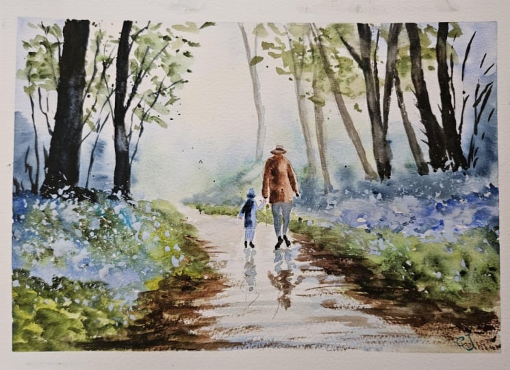
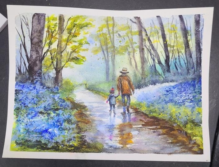
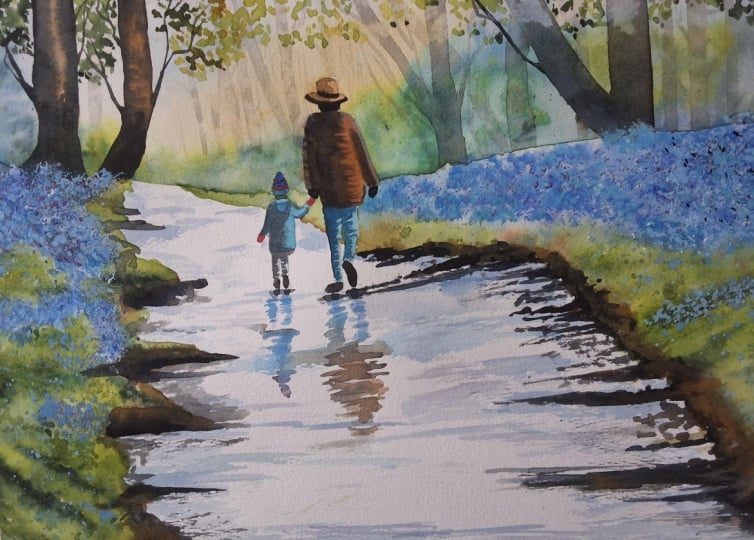
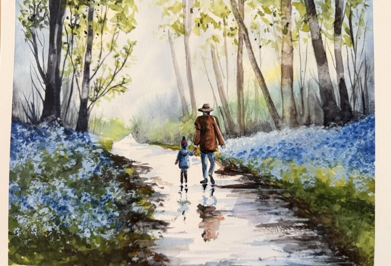
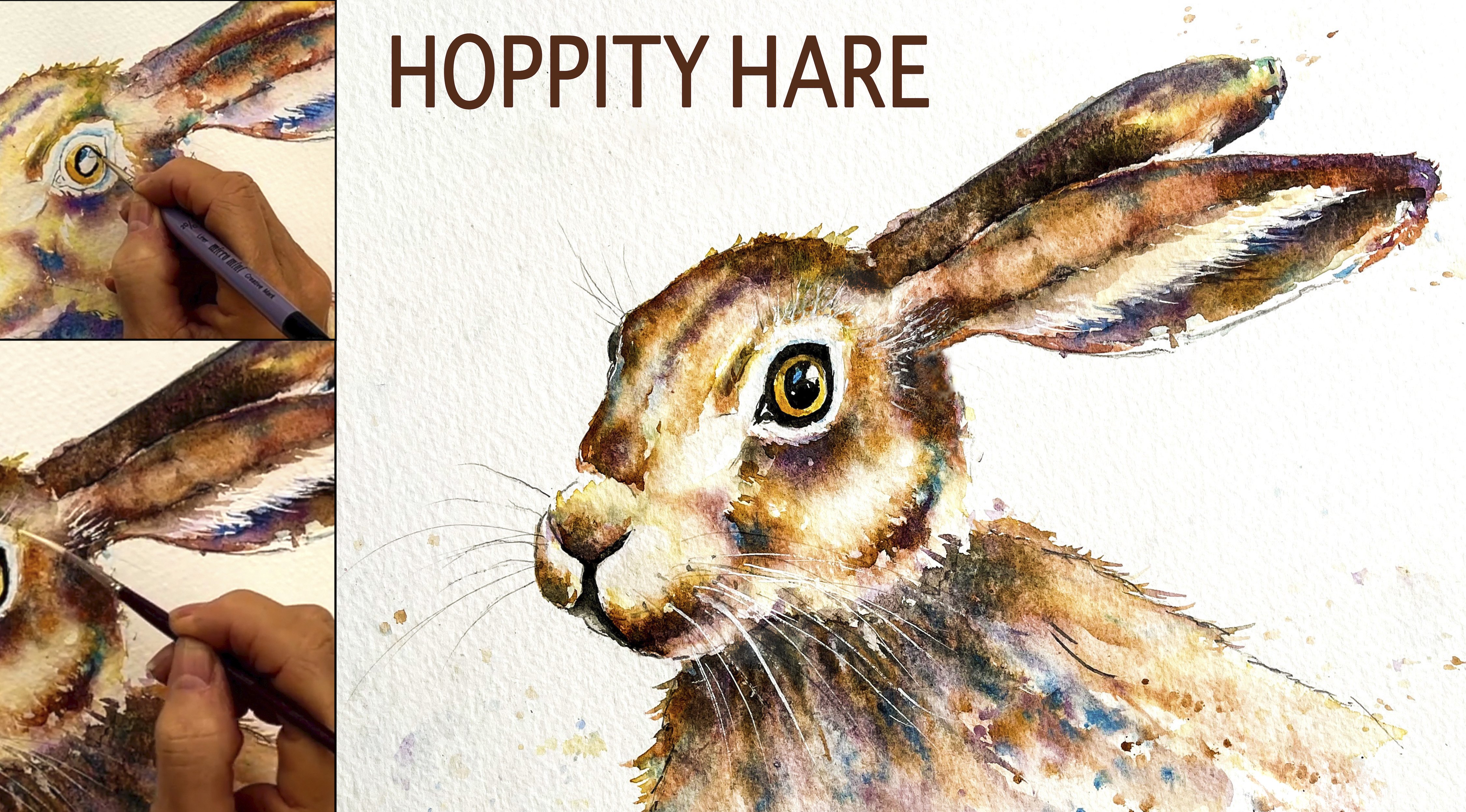
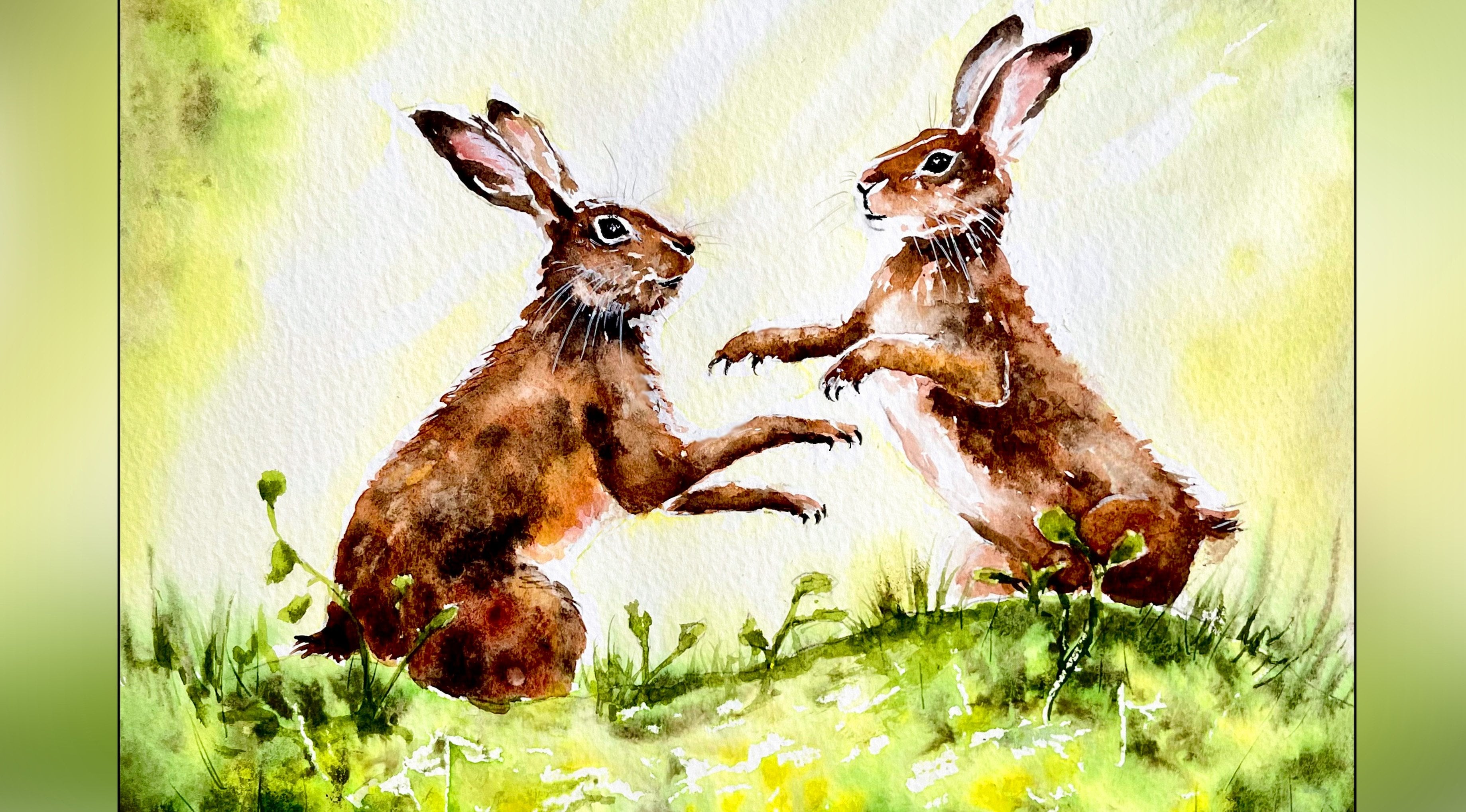
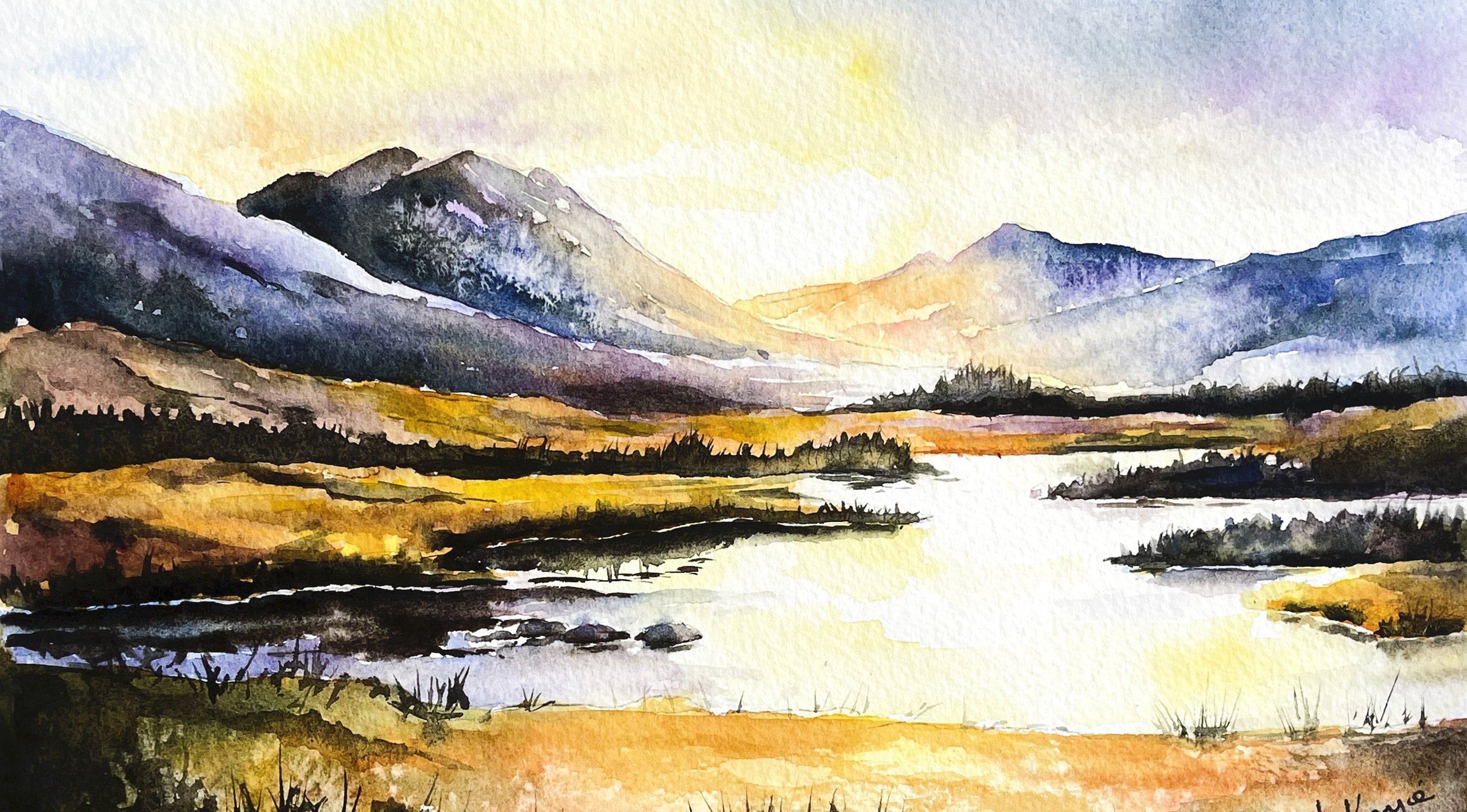
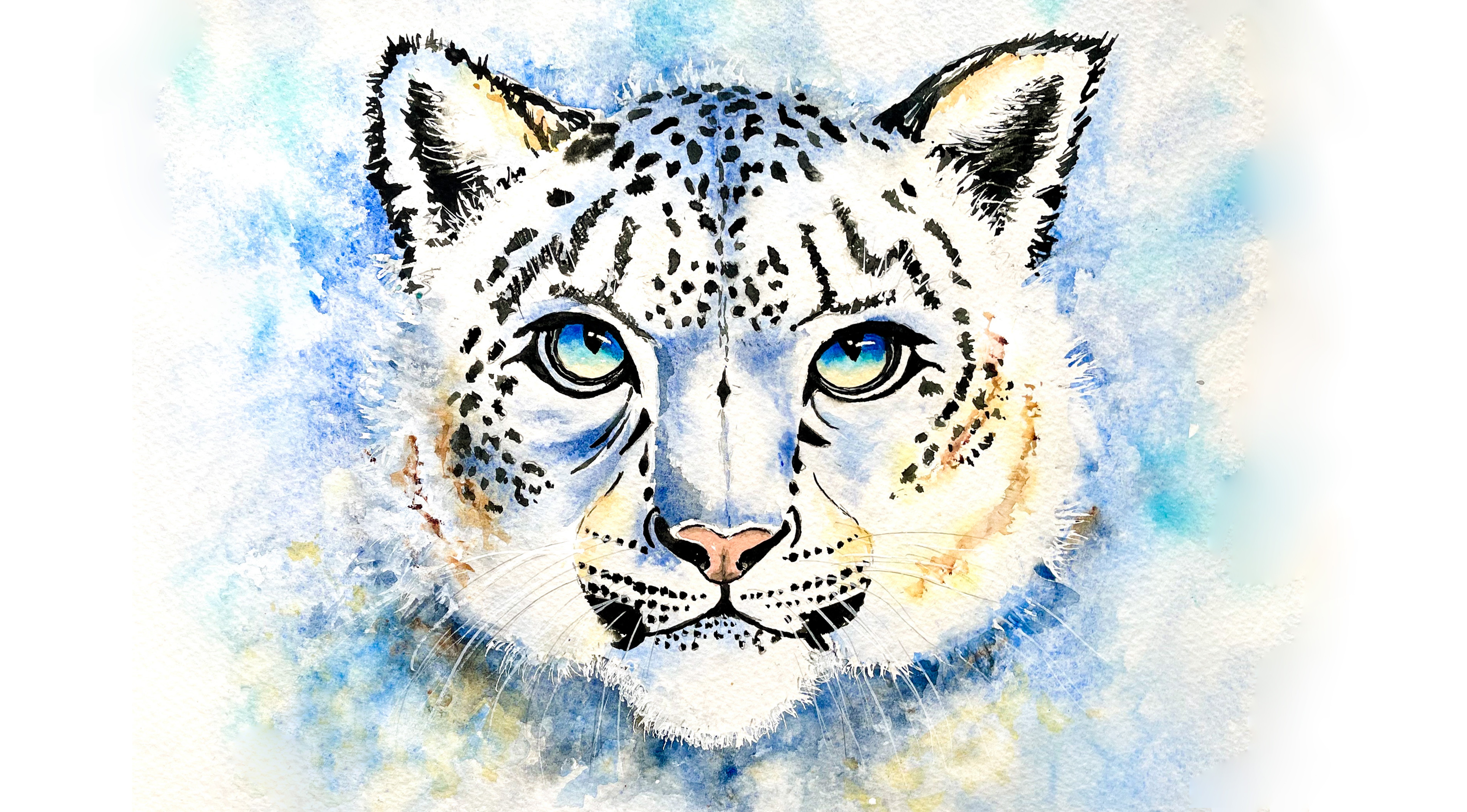
Transcripts
1. INTRODUCTION: Hello, and welcome.
In this class, we're going to paint a
luminous spring woodland scene filled with soft light, fresh greens, and a carpet
of glowing blue bells. We'll build the painting
together in layers, and you'll learn how to let
colors mingle naturally on the paper to suggest distance and light
filtering through trees. We'll paint simple but
expressive figures, and we'll layer blueblls to create richness
and dimension. By the end of the
class, you'll have a vibrant spring landscape full of atmosphere and movement, along with techniques
that you can use in many future
landscape paintings. It's suitable for all levels, including beginners because I'm going to be guiding you
every step of the way. And I'll be sharing all
the techniques, tips, and tricks that I use in
my own professional work. I've included a copy
of the drawing in the project resources section so that you can download
it and trace it, and then not worry
about the drawing because this is a
painting class. I am a professional artist, author, and tutor,
and over the years, I've sold a lot of work
across the world and helped hundreds of people to
learn more about watercolor. You can see examples of
my work on my website. My style leans towards
impressionistic and contemporary rather
than photorealistic. I like to explore loose approaches that
bring out the color, light, and essence
of my subjects. I've tried to
replicate this across all the many other videos
that I have on Skillshare. I'd love to see your
own finished painting, which you can upload through the project and resources tab. I'll give you some
personal feedback on it, and you'll be able to
see the artwork of other students and
get their support. At the end of the class, you'll have your own beautiful artwork to be very proud of. So let's swizzle our brushes and get on with the painting.
2. Materials, Composition and Drawing. Paint Sky and Background wet-on-wet.: This class, these are the colors and materials
that I'm using, but do feel free to use
any that you already have. For information on brushes
and paper, et cetera, do check out the basic
materials document that I've added to the
project resources section. As you can see, I've taken a few liberties with the
reference photograph, and that's the great
thing about creating art. You paint with your
memories, senses, and imagination, as well as
what your eyes literally see. Now you can see that I've
kept the drawing very simple, minimal details so
that we get a nice, loose free flow painting. And I've included a
copy of the drawing in the project resources section so that you can download
it and trace it, and then not worry
about the drawing because this is a
painting class. We're going to start using
the wet-on-wet technique, but you can see from my palette in the video that I've already mixed the colors that I'm going to use in this background sky. I've mixed some
handsome yellow light. A light yellow will do some cobalt blue,
turquoise, and indigo. First of all, you
wet the paper with clean water and then apply wet paint on top of the wet paper and let it
spread into the wet wash. Now, this results in a lovely diffused effect with soft edges. And because the paint mixes into the wetness of the paper, the color is diluted
and the tone is paler. If several different colours
are used in this way, they will intermix and
blend with each other. So when you drop some
blue into a wet, yellow underwash that will
result in a blended green. It's important to
mix your colors first before pre
wetting the paper, because if you do it afterwards, by the time you've mixed them, that paper will be dry. So when I drop in some of
my light yellow paint, which I pre mixed, you can see that I'm getting this nice soft
diffused effect with the color because the
paper is still very wet. Now, notice that
I've left gaps in between the places that I
placed the yellow paint. So I've just put some
little patches of yellow. I want this look of sunlight to be glowing through the trees. Now I'm adding some
cobalt blue in the right and left sides
of the composition, and that'll help to
create a sort of vignette effect and force the viewer's eye into the
middle of the painting, which is where I want
the focal point to be. I left a large space of unpainted paper in the center in between my yellow colors, and that's where I've just
added some cobalt blue, again, leaving gaps in between my little strokes so that
we've got some white, cloudy areas in
between, as well. I'm also going over
the line of bushes in the distant background
with my cobalt blue. It's not very easy to
tell from the video, but the consistency of all
the paints that I'm using so far is about the
consistency of tea or milk. You don't want it any
thicker than that, or you'll get quite a
pasty, overwork sky. We want a nice,
light and airy one, so thin paint for this stage. But whilst the
paper is still wet, you can keep dropping in little bits of color if
you think it is too light. As soon as the paper
starts to dry, that's when you really
do need to stop adding your color because you will
start to get hard edges. I'm now adding some of my watery turquoise color
over the top of my bushes. That's mingling in with the cobalt blue
that I put earlier. So getting a bit of a
variegated effect here. And it helps to separate out
the color that I'm using for the bushes against the cobalt blue that
I'm using for the sky. I've been using quite a
loose approach so far, but I'm just
tightening up around this area where the
path is because I want that path as it disappears into the horizon to stand
out quite lightly. I've also taken more care when painting around my
two figures as well. I also had pre mixed
some light green. Now, I used green appetite, genuine from Daniel Smith and added some yellow color to it to get this sort of light green. If you don't have that color, you can use sap green or any other green really
that you've got to hand. You want a sort of a
meadow green color. Reason that I use the
green appetite genuine is because it's one of the very few green colors that granulates. That means is that as it dries, instead of getting a
single flat color, I'll get a more
granulated, mottled, dappled appearance, which
resembles foliage in nature. So the paint does half the work for me if I'm actually
painting foliage, bushes, or grasses or trees. It's a professional watercolor, and I know that they
are a little bit more expensive than student quality, but the pigments are
much more intense. They don't contain as
much filler or binder. So actually, a little
goes a long way. If you're going to
treat yourself to just one professional
watercolor, that's the color that
I would recommend. I'm adding some watery indigo now just along the bottom
of that background, and that'll give it some depth
and help to settle it in. It'll also create these
abstract shapes which, again, could be darker bushes
or the darkness, the shadows beneath the bushes that we've already created. You can see from the way that the indigo color is blending into the colors
that I previously laid down that the paper
is still very wet. So I'm still painting
wet and wet and getting this nice soft mingling
and diffusion of colours. So it goes without saying
that you do have to work quickly to achieve
this sort of effect. However, if you're
not a quick worker, then what I suggest you do is maybe work one half at a time. If you are going to tackle it in one go and you're not used
to working so quickly, I suggest you set
yourself a timer. No more than 10 minutes, really. I'm hoping to achieve this
in about seven or eight. If you do happen to
run out of time, the best thing to do is to leave it to one side
for an hour or two, let it dry completely, and then pre wet it again with a soft brush and
some clean water, and you'll be able
to carry on then using this wet-on-wet approach. As you can see, I've taken
that color that I've used for the background and
the distant bushes over the top of my trees. Now, that's not a problem
because they're going to be painted a lot
darker later on. The paper is
starting to dry now, so I need to leave well alone
and let it dry completely.
3. Figures & Path 1st Layer. Establish figures and begin building the path with light tonal values.: To paint the first layer of the clothes on the
figures and the path, I'm using the wet
on dry technique. The wet on dry technique is simply putting wet paint on top of dry paper or painting on top of paint
that's already dry. And this results in
a stronger color and a more defined edge
where the paint ends, and the paint will only go
where the brush takes it. So you have much more
control with this technique. I've used my thin wash, still the consistency
of tea to paint the coat of the child and
the trousers of the adult. And and now I'm using the same cobalt blue to add
some shadows to the path. Now, I notice that I'm using horizontal strokes to
add these shadows. So just make sure
you haven't got your paper at a tilt
or you're not sitting at a tilt because
these do need to be horizontal to the
edge of your paper. I notice also that I'm not taking these
strokes all the way across the path and placing the color around the
edge of the path, mostly now on the
right hand side, and then using the
side of my brush to drag the color
across the path. It's the opposite side, but not actually reaching
right across to it. Because I'm painting
wet on dry and using the side of my brush to skim
the paint across the paper, I will get quite a
dappled sort of effect, so there'll be a hit and
miss where the brush skims across the little dimples
on the watercolor paper. And this is called the
dry brush technique. If you look closely
at watercolor paper, you'll see that the surface
has a rather dimpled effect, like a series of small
peaks and valleys. The dry brush stroke
lets the color catch the peaks but miss the valleys so you get a broken
textured defect. I've mixed a gray, purply
color in my palette, again, the consistency of tea, and I'm just using that now to paint the hat on the adult. I've left a couple of
tiny little patches of unpainted paper where the hat might just be catching
a little bit of light. I'm darkening the left
hand side of the hat with just a very tiny
little touch of indigo. Though this is a
very small shape, we still need to be aware of where the light and
shadows are coming from. And now I'm using some
burtsiena to paint the jacket. Again, it's a very
thin wash of color. Remember, we are just painting
the first layer here. And I'm going to try and
leave a very thin sliver of unpainted paper on the right
side of the right arm, again, trying to catch the light that may be coming
from the background. To give the body a little
bit more form and shape, I'm adding in a little bit
more of the birt sienna. It's a little tiny
bit thicker than the previous layer and just positioning that down
the left hand side. And over the top of that, on the left hand side, I'm adding a little
bit of burnt umber, so really strengthening
that dark tone there, but being very mindful that
I'm painting wet on wet, so controlling that
that darker tone doesn't go too far
over onto the right. Returning to the little child, I'm adding a little blue
bobble on the top of the hat and also some blue stripes
using some cobalt blue, a little bit thicker in consistency than when I painted the first
layer on the coat. And then still using
my cobalt blue, I'm now adding some detail
to the coat itself. You don't always have to use a different darker color to
add darker tone to a subject. Using the same color over
the top of a previous layer, that will still help to darken the tone
and create a form. So adding that extra layer of cobalt blue has given
me some nice mid tones. To add some really
dark tones and give an even more three D
effect to the figure, I'm now using some indigo, just down the left hand side, which is the side
that's in shadow. To paint the child's feet, I'm just touching in very tiny
little shapes with black. And using the same black color to paint the boots of the adult. And because they are
such small shapes, you don't need to be
concerned about adding a lot of detail here,
the general outline. Now, all the paint on the
figures is actually quite wet, so I won't really be able to add any more detail
until it's dried, so I'll return back to the
figures at a later stage.
4. Bluebells and Grasses - 1st Layer.Let colours mingle on the paper to create lively bluebells & grass: You'll be very relieved
to know that we are not going to be painting hundreds
of tiny blue beells. Painting bluebells
from a distance involves capturing a
hazy carpet of color, and we need to shift from
abstract pale blues in the background to more defined vertical
strokes in the foreground. The key is to focus
on light, shadow, and color masses rather than
the individual flowers. We can use techniques like the wet-on-dry and
wet-on-wet that we've already been practicing and
dabbing and broken color. So instead of painting individual flowers and blocking in larger shapes of color. And I'm leaving small
spaces in between where I want to add some grasses and
also some lighter color. So instead of painting
individual flowers, I'm blocking in larger
shapes of color, and I'm leaving small
gaps to represent the light hitting the
woodland floor in between, and some larger
gaps where I want to include some
grasses and foliage. Where the blueblls
are furthest away, I'll be applying the cobalt blue in very light pale washes. Where they are a bit
nearer to our viewpoint, I'll be adding a little
extra cobalt blue and a slightly thicker mix. And where they are
nearest to us, I'll be adding even stronger
mixes of my cobalt blue. Where they are the
furthest away, they'll be almost, if
not completely white. If you squint your eyes whilst looking at
any reference image, you'll be able to identify the main shapes of light and
dark and those in between. It's important to keep it loose, avoid overworking the painting, because the goal is to
capture the essence of the bluebells rather than all those hundreds and
thousands of little petals. Notice also that I'm using a dabbing
action with my brush, and this is helping to
convey the impression of clumps of flowers rather
than individual stalks. Sometimes blue
bells do have a bit of a pink or a
lilac cast to them. So if you did want to break
up this blue colour a bit, there's no reason
why you couldn't add a little touch of
pink into the mix. I'm not going to do
that in my painting. I'm a little bit nervous
about adding too many colors, but I have seen it done
effectively by other artists, so I'll leave that
one up to you. But what I am doing now is
adding in some ultramarine, little touches here and there. Now, you might think, well, that's just another
blue, but in fact, ultramarine is much nearer to red on the color
wheel than cobalt blue. So although it doesn't have
that obvious pink tinge, it does have that
underlying shift of color. It's also a darker toned
pigment than cobalt blue. So it'll help to
show some depth and shadow in between the
clumps of flowers. And if I add little touches
of indigo, as I am doing now, which is a very dark
blue black color, I'll create even more
depth and shadow. But be careful not to
overdo this color. It's a very strong color. You don't want to lose
all your lovely blues. I've already got mixed in my palette three different
shades of green. Using my green appetite genuine, I've added yellow to get
a light green on its own, just to create a
mid green and with some ultramarine or indigo to
create a really dark green. And now I can use those gaps
that I left earlier to add these green colors for the grasses and foliage in
and amongst the bluebells. To avoid getting muddy
colors and placing the green side by side with the blue rather
than on top of it. Because the paint is still wet, you will get some blending, some mingling of color. Where the green
overlaps the blue, you'll get a sort of
a bluey green look. But in the main, I'm keeping
them quite separate. I'm well aware that at
this moment in time, the painting doesn't
look right by any means. In fact, it's going through
what I call its ugly stage. But if we trust in
the process and possibly keep all our fingers
and toes crossed as well, it will come right in the end. You can see that I'm keeping the green a bit lighter
and paler where it's nearer to us and darker where it's in the middle
of all the blueblls. I am going to add
some darker shade and depth to this area, but it's a bit too
wet at the moment, so I'm going to whiz over
to the right side of the painting and add some of my light green over
this side, too. I want the band of
blue above it to mingle a little bit with this green whilst
it's still wet. So if I leave it too long, all that blue colour that put on this right hand side will
be too dry for that. I got a brush with a
really good point, and I'm just using
that to go very carefully in between
my figures and continue this green strip of foliage along towards
the end of the path. That's just given
the green that I placed on the left hand side, time to dry a little bit. It's not fully dry. It's quite damp, though. So when I'm adding my dark
green color in to again, give it a little bit more
depth and more structure, I'm still getting sun blend, but the color this darker
color is not running away into the lighter green
and covering it over. I do think timing is really
important part of watercolor. Being able to judge the
wetness or dryness of the paper and match that against the effect that
you're trying to create. Unfortunately, it's
not a precise science and not a technique that
can be just easily taught. It comes really with
intuition and probably, you know, many months
of experience. Like everything else, the
more that you practice it, the better and easier
it will become. You could even try
practicing it on a bit of spare paper before you
apply it to this painting. I'll just zoom in
quickly to show you the lovely granulating
effect that you get from the green
appetite genuine pigment, which does half of
the work for you. Remember to try and keep
it loose and fresh. Just like when we
painted the blue bells, we were looking at mass
and color and light and shade rather than all
the individual petals. And so it is with this
greenery, this foliage. We're not trying to paint every blade of grass
or every leaf. We're creating the
clumps of grasses, the shadows and depth
in between them and leaving lighter colour where the light is catching
the top of them. And part of it is letting the watercolor do its own
thing to some extent. It's often referred to as
embracing happy accidents. Watercolor is by its very
nature inherently fluid. So if you allow it to flow and bloom and granulate freely, it kind of brings a
sense of life and spontaneity that you can never achieve through forced
meticulous brushwork. If you allow the pigments to just do a bit of
mingling on their own, it can create some
lovely, organic, unexpected effects that you couldn't possibly
replicate by hand. Even if you make a few mistakes, as long as the overall
effect is visually engaging, that will encourage
the viewer's eye to complete the image. So we're not going for
perfectionism here. We're allowing the
paint to be messy, and that will help shift
the focus from trying to get a perfect result to
enjoying the process. And allowing the paint to
just be more free often results in a much more impressionistic and
light hearted piece. There is a saying that
goes planned carefully, but paint freely,
and I think that's particularly appropriate for
this part of our painting. And on that note, I'm dropping
in some little blobs of Bersiena color
representing the soil in and amongst the greenery. Again, letting those colors just blend and
mingle quite freely. I need to leave
all those banks of color settled down and dry now. So I'm going to turn
my attention to adding a few more details
to our little figures. I'm using my cobalt blue
and ultramarine to add some darker tones at the left hand side of the
trousers of the adult, adding creases particularly
where the knee is bent. I've also decided to give
them some blue gloves, partly because I don't want the complication of
mixing flesh colours, which I think will just look too fussy and insipid
on the painting. And also because using the blue colour on the
figures helps to tie them in with the blue
of the blue bells and create more harmony
in the overall scene. I'm adding a very thin
sliver of black to the ribbon trim on the hat
and around the edge of it. I'm also using this dark color for the hair at the
back of the head, which will be in shadow
from the hat above it. And I can even strengthen the tones on the left
hand side of the jacket here with my dark color to give even more depth
and rounded form. Similarly, I'm looking at the child figure
and thinking about, where do I need to
strengthen some of the shadows and definition? I this is where you
need to look at your own painting because
you might already have got sufficient depth and shadow from when you painted
the layers beforehand. I am going to add a little
touch of pink to my painting to the stripe on the child's
hat and also the gloves. Adding this little
splash of color will help to draw the
viewer's eye into the figures and become the focal point which is exactly where I
want it to be. Y.
5. Trees, Branches & Foliage. Use tonal contrast to denote distance and light; add directional strokes : To paint the tree
trunks and branches, I've got a black
that I've actually mixed from ultramarine
and burnt umber. You can use black
straight out of the tube, but it does tend to give you a rather flat,
uninteresting appearance. Whereas if you mix it, you'll get a much livelier
and colorful black. I've also got some burnt
umber and, of course, my different colours of green
for the foliage later on. I've used a flat brush for
this first tree trunk because it's just easier to fill in the color for
this particular shape. To pull the color away at the base of the
tree for the roots, I'm using a smaller rounded
brush with a very fine point. Here, I've turned
the brush around, and I'm using the wooden
handle to pull away the paint that's already there to
represent twigs and branches. Using the handle
instead of the brush, gives me a much sharper
sort of twiggy look. I've also got a
Chinese brush that I use for painting
branches and twigs, because Chinese brushes
tend to have a very, very fine point, but they have
much thicker bellies than, say, a rigor brush, so
they hold more paint. And that means you
don't have to dip in to your paint well as much. Also, because the hairs are a bit longer than
most other brushes, you tend to have a
bit less control, and that lends a more natural
and organic appearance to the branches and twigs. I've switched back
to my flat brush to paint this second tree. I'm also using some
paper towel to just dab very lightly here and there on the trunks and lift
some of the color. That will then help to look as though there's some
light catching them. Although I'm painting
the trees quite dark in this particular
composition, I don't actually want
them to be strong, solid black structures that dominate everything
else in the painting. So although I'm
keeping them quite dark at the left and right, far sides of the painting, as I move towards the center, the tones are going
to be a lot lighter. That will help to create
the vignette effect that we talked about earlier
when we painted the sky. I'm just spattering
on a little bit of the light gray color that
I've got in my palette. The spattering, you
could always put some paper towel over the areas
that you want to protect. Then using the
light green color. I'm using my brush to just
gently roll over some of those spatters with
the light green and create some abstract
foliage shapes. Again, we're not trying to paint lots of individual
little leaves. We're just creating
some abstract shapes that resemble foliage. And now that the light
green colour is on, I can add a little bit of the
dark green here and there, touch it in on some of the light green shapes
and give it some depth. I'm going to repeat
this same process for the rest of the trees. For on the far right, the
trunks are going to be darker, pretty much as they
are here on the left. But as they are positioned
more towards the center, they're going to get
lighter and lighter. So I'm going to let you
watch the video along now as I complete the
rest of the trees, but I'll hop back
on whenever I need to annotate or remind
you of something. H you h you oh,
6. Bluebells 2nd Layer. Mix an opaque light blue using white gouache, ink or acrylic to add highlights : I've mixed a very opaque,
light blue color. I use doctor PH
Martin's bleed proof white because it's the whitest white that
I've come across. You could use some
white gouache, but I've found that
that does tend to dull down as it dries. Alternatively, you could use some white acrylic ink or
cheap white acrylic paint. I've mixed it with
some cobalt blue in this little plastic tub. I don't like to put
white paints on my watercolor palette because it would make all the
other colours choky. To apply it, I'm using a small piece of stainless
steel dish scrubber, which I'm going to
use as a stamp. I know it's a bit
of a weird one, but I do like this little tool because it gives me
lots and lots of little abstract
shapes that are more defined than if I were to
use a piece of sponge. And as you can see,
I'm just dabbing it lightly over the blue area. And because the color is opaque, it sits on top of
what's ever underneath. It doesn't matter if you dab some over your green
foliage shapes, because in the real world, you would get little blue bells poking out from the
grasses and foliage. You can even dab a
little bit in front of your dark tree
trunk because that would look like the bluebells were growing up in front of it. As with all these little
tricky techniques, there's a danger
that you can get carried away and overdo it. So I'm just going to have to rein myself in at some point. Hopefully, you can see just how easy it is to add
the light tones on our bluebells and suddenly the little grass verge
comes to life with them. So let's go over to
the right hand side and add some light
tones here, as well. I won't need quite
as many because I've already got quite
a lot of light tone, and obviously, along the top of this drift of blueblls,
it's almost white. I'm going to dot
some of the color, some of this opaque blue
over my green verge, my grassy verge,
so that we've got some blue bells poking up between the grasses
there as well. And if you think
you've gone a bit too heavy handed with the opaque, light blue color, you
can just spatter on a little bit more
of your cobalt blue or your ultramarine. You can also use the tip of your brush to
just.in any more of your darker blue colors where you think it might be
needed over the top. One thing to be very
mindful of, though, is if you are using your
brush to dot on some color on top of the opaque color and your brush picks
up some of it, do wash it out straightaway afterwards because if you leave white acrylic paint or ink to dry on your brush,
you'll never get it off. I'm just going to add
a little bit more of my darker blue colours to
this far right hand side, which needs a little bit of darker tone as it's
coming towards us. And I think I'll add a
little bit just along the bottom edge where the blue bells will
be more in shadow. Don't just copy me
for the sake of it. Do what's right for your
painting, and most importantly, let's not lose all those
lovely pale blue highlights that we've just put on. T.
7. Path: 2nd Layer & Reflections. Deepen shadows and wet reflections. Use stamping technique: We're on the home run now. We just need to paint some convincing shadows and reflections on the
wet woodland path. There are many different ways that you can paint reflections in water because it may vary
from a fast rushing stream, a calm lake, a raging storm
or just a shallow puddle. And in this case, we're
just dealing with a few shallow puddles after
a spring shower of rain. Unlike a shadow,
a reflection will always appear directly
beneath what is above it. Reflections are not actually in the water, but on its surface. So the reflection wiggles following the movement
of the water. And that's why you can
see now that I'm painting the reflections with
wiggly horizontal strokes. I'm leaving little gaps in between those horizontal strokes and also using much
lighter duller color than in the figures above. And importantly,
what you're painting is a mirror image of
those figures above. I'm using very
thin watery paint. And if I do get too
much paint anywhere, I can just dab it off
with my paper towel. So keeping everything
light, loose and fresh. Finally, for the last step, you need to take a deep breath
and be a butterfly with steel wings because
we're going to be using some rather
strong contrast. I've got a pool
of burnt umber in my palate and another pool of very dark brown where I've mixed the burnt umber
with some indigo. I'm using these two colors along the edge of the path on
the right hand side. We learned the technique of
how to do dry brush strokes, and that little technique is going to come in
really handy now. I was in both the tip and
the side of my brush to drag some of that dark color across the path
towards the center. And because my paint is
thicker and my brush is dryer, you can see the effect of
those dry brush strokes, leaving behind some dappled
light on the paper. To make sure that these colors don't look kind of stuck on, I'm also using a
clean damp brush to just gently
soften the edges of them into the underlying layers of color where we
painted the foliage. I've added a touch of brown to my cobalt blue to get more
of a blue gray color, and I'm using that to underpin
some of these strokes. So we're trying to convey the impression of
puddles and wetness. I got a bit distracted
here because now that I've got the dark color going
down the edge of the path, I think I've gone
a little bit too light with the adults jacket, so just adding a bit
more birth sienna to strengthen that tone. So to get back to
the task in hand, I'm now adding some of my darker colors to the
path at the other side. Again, alternating between
the very dark black brown and the burnt umber and
blending both colors into the underlying wash of
green that we put on earlier. And now I'm using
that little piece of steel wool that I use for the
light colored blue bells. But this time, I'm dipping
it into my dark brown and my burnt underclours
and using it again as a stamp going over
some of these strokes. And this is helping
me to create a rather rough, muddy,
textured appearance. There might be stones, bits of grasses, bits of mud going along the
side of the path. So the contrast between light and dark isn't quite so strong. I am just adding now some light blue and
blue gray strokes leading in from that dark color towards the lighter colour. Having these darker tones at the front of the painting,
at the front of the path, that leads the viewer's eye to jump across into the figures, which is our focal point. And from there to follow the light along the curved
path until it disappears. And at that point,
the viewer's eye will return back again to
our lovely figures. I've still got some of the pale blue opaque color that I mixed earlier
for the blue bells, and I'm using that now to
spatter just a little bit over these dark contrasting colors
to break up the denseness. I think I might have
been a little bit heavy handed with
the dark color, so I'm just using a
little bit of sponge to rub some of that color
away before it dries. And as I've said a couple
of times beforehand, you do need to look at
your own painting and see whether this is something
you need to do or not. If you don't need to do
it, then leave well alone. Your painting will have turned out quite different to mine, I'm sure, because we're using this loose abstract
impressionist approach. Sometimes it's useful
just to walk away, leave it alone for
half an hour or more, have a cup of tea, and come back with a
fresh pair of eyes. I think I've reached the
point where I'm in danger of overworking the painting
and fiddling too much. So I'm going to put my brush
down and call it finished. I do hope you've enjoyed this painting and that
you've learned some tips and techniques along the
way that you can incorporate into
your own paintings. Now, don't forget to upload your own painting through the
project and resources tab. After all your hard work,
I'd really love to see it, and I'll be sure to give
you some personal feedback. You can follow me on Skillshare to get to hear
about new classes. And if you could leave
me a short review, that would be really great. If you've enjoyed this class, it might encourage you to look at some of my other videos. I've got lots of lovely
subjects loaded with more tips and techniques to help you with your own
exciting art journey. In the meantime, thank
you for joining me, and I look forward to seeing you next time, Happy painting.
8. FINAL THOUGHTS : Well done on completing
the painting. I hope you've enjoyed having
our lovely walk through the Blue Bell woods
and that you've learned some tips and
techniques along the way. We practice painting
a soft ethereal sky using the wet-on-wet technique, and we looked at how
to use tonal values to create depth and
form in our figures. Then later on, we looked
at how we could paint convincing reflections
of our little figures in the muddy wet puddles. And were you as
tonal values again when we painted our
trees in the background? You in dark tones
for those that were nearest and light tones for
the ones furthest away. And who would have thought that a humble pan scrubber could have produced such lovely highlights on our beautiful blue Bells? Now, don't forget to upload your own painting through the
project and resources tab. After all your hard work,
I'd really love to see it, and I'll be sure to give
you some personal feedback. And if you've
enjoyed this video, do have a look at my other
classes on Skillshare, which are packed
with more tips and techniques to help you
on your own art journey. If you click the follow button, you'll be able to follow me, and then you'll be the first
to know when you upload a new video or any
exciting updates. And if you could
just take a moment to leave me a short review, that also would be really great. In the meantime, thank
you for joining me, and I look forward to seeing you next time, Happy painting.
 Carrie McKenzie, creating painted visions