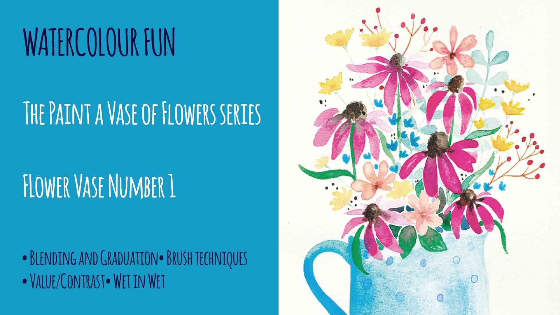
Transcripts
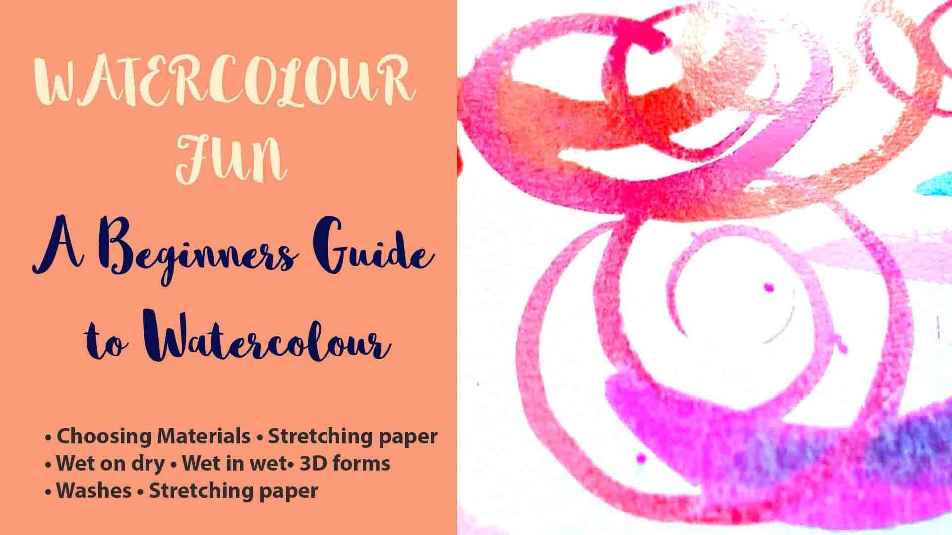
1. Introduction: this class will be continuing without painted files of flowers. Siri's on this painting is number two. Before some students have asked me how they can begin to loosen up their paintings on this class will start to explore this. As you can see, this painting is a mixed off some loosely painted flowers. So much so. This class should give you a little taster of least painting without taking you too far. Have you come?
2. Materials: the materials you need for this class are your watercolors, some water watercolor paper, some carbon paper, kitchen towel and three round brushes in sizes zero three on six, a pencil and some white gouache. If you don't have white gouache, a white gel pen will do the colors that I have used. Our cerulean blue, ultra marine blue, purple Elizabeth in crimson rose pink cadmium orange, purple lake fun Dik Browne sap green and Floridian green. If you don't have thes colors, please don't worry If you have a light blue, dark blue purple a dark red, pink, orange, brown and green that will do just find.
3. Trace your Image: first print off either of the two versions off the template. The 1st 1 shows all the flowers in the vase on the 2nd 1 shows just the flowers on their separated his elements so that you can arrange them within the walls yourself. So arrange your template on the top with the carbon paper underneath, with the darkest side face down onto the watercolor paper. When you draw over the template, make sure you're using really faint pressure. You don't want the line to come out to dark. I'm going to draw the line quite darkly so that it shows up on the camera. But when you come to draw it, make sure your line is really faint so that you can hardly see it.
4. Painting the Vase: So now we're going to paint the walls for this. I'm going to be using a number six sable brush. This is a round brush on the biggest one of all the brushes that we're using today before we start to paint. It's a really good idea to look at what we're painting and break it down into simple shapes . So at the top here we have a sort of cylinder or rectangle at the bottom. This is sort of like a doughnut shape. It's really helpful just to keep that in mind. Whilst you're painting, I'm going to paint my walls pink. But if you want to choose a different color than, of course, that's fine. So when we paint of ours, it's really important to know where the light is coming from. On this occasion, the light is coming from the right, so we know that the vials will be lighter on the right hand side on the left. But because of the bulging shape of the vowels, the light will also wrap around the broadest part of the vase here. Okay, so we're going to start with all pink, and we're going to start from the left hand side the darkest area with a course of strongest color going to pay right across the vast, being careful not to paint where the flowers would overlap. Huh? Okay, So I'm going to add some purple Ultra Marine to this side of the Valles. I'm doing it on the left hand side of the bars because this is where the shadow would pay. This is going to make our vase it really three d Don't play about with his color very much . Just put in and then let it bleed. Now we need to work with just pure water wetting the area on the right hand side of the pink, trying to drag the pink across the balls on what we want is for the pink to get lighter and lighter towards the right hand side. So we're not adding much color here. We're really just using a lot of water, and we're letting the paint do exactly what watercolors do, which is to bleed into one another so that the left hand side remains darker. And as we add water and dilute paint, it becomes lighter on the right hand side. And now I'm just adding a little bit of pink to the bottom here, but you can see that the right hand side is definitely darker than the left. Whilst the paint is still wet, we're going to make the highlights. So basically, you just need a water filled brush and you taking the color out on the right hand side, and I'm wiping on a paper towel to make the brush a little bit drier. And then I'm picking up the color with the brush, and that's making M or three D. Now we need to put the band in here, so take your fairly dry brush again and sweep that color out. I'm just cleaning my brush with some water, sweeping it on the top Eva as well when I hope you can see where those areas are now getting lighter. But this will only happen if you work quickly. Onda Watercolor is still wet. It's going to add a tiny little bit more pink right on the edge to give the illusion that the vases three D and there's a slight bit of shadow just on the edge. So just have the final bit of detail. The bulging doughnut shape of the walls would be casting a shadow on the little room at the bottom, so I'm going to darken this using a little bit of purple and ultra marine. Just bleed it in from the left again. The left hand side needs to be darker than the right hand side, so we're going to add the decoration to the vials with our smallest brush. A size zero on the paint we're going to be using is this white gouache. This gives a lovely opaque look to the paint. We're going to use it at the decoration onto the vowels. If you don't have to wash, you can use a white gel pen instead and get a similar effect. So take a little bit of the gold rush pop in your palate. You're going to need to add some water to this just a little, just to make it workable. Your brush position will be really important during this because you want to produce a fine line, so hold your brush really upright and not like a pencil. Just follow the lines that you've made with the carbon paper, of course, here, minor very dark so that they can show up on the camera But yours will be much fainter said that you should just see the white wash and not any black line, and then just fill in the patterns. And now you should have a three D falls and so we can get on to paint the flowers.
5. Painting the Flowers Part 1: So this painting has five loose flowers, three blue flowers and then also to orange and pink flowers. So now what we're going to do is have a go at doing a bit of loose painting. Now this will be wear. Your brain will be telling you to paint every single petal so that you feel like you've put in every bit of detail. So what you need to do is not listen to your brain at all. Instead, what we need to pregnancies is seeing the silhouette of the shape, the shape as a whole. So trust that, and not what your brain is telling you to do when you're starting out with this loose painting technique, what can really help you to train your brain to see the whole shape is to take a separate piece of paper and draw out some silhouettes off the flowers, Take a step back and really look these shapes from afar. We're not expecting anyone to memorize thes shakes, but just to notice how simple they are. And these are the shapes that we need to keep in mind when we're painting on these flowers . So let's get started painting the flowers We'll need three colors for the blue flowers. A light blue, a purple and a pink. When you're painting, try not to overthink it. This is really the secret to these painting that lots of practice. I filled my brush with a good supply of water and now what I'm going to start to do is paint the blue flowers in with just pure water. You need enough water to make each flower nicely damp. What you don't want is a great pool of water across each of the flowers. Because what will happen then? Is it the colors? When we drop them into the water, we'll merge too quickly. So as you can see, I have my three colors ready and I'm just going to randomly drop in these three colors. I've chosen to start with the base of cerulean blue for these flowers, and I suppose it helps when making ALS the flowers that consistent with each other to start off with a base color like this, because then they all it related to one another. Even after you've dropped the other colors in and I'm just wiping my brush on, I'm removing a little tiny bit off this color said that some of the white shows through, it's just going to give it some like to do that. I am taking some purple, and I'm just going to drop it into the top off this flower owned, um, adding some more water because the purple didn't move very well are there You go now. The color is spreading really nicely. I'm not not been too fussy about this. I'm just dropping in, and then I'm going to let the what water do the work. As the paint dries and the water moves around, it will produce a textured colored surface, which is just enough to suggest the form of the flower without resorting to painting each individual petal. Show you the difference here. I've painted a similar flower, but I've painted each off the petals. I've listened to my brain. I've decided I have to describe every single part of that flower, and so I've painted each petal. And really, I think this flower, although it's rather nice, it doesn't look very riel, and it looks flat and rather lifeless in comparison to our looser flowers. So I'm going to go ahead and start the pink and orange flowers or pink and sort of a prick cock colored flowers. I'm using this rose pink, and I'm using cadmium orange mixed with the bishop pink to make the eight picante color. I'm just going over the flower, as we did with the blue ones with pure water. You want the color to be quite dilute of the pain that you're using. So at a fair bit of water into the mix and just don't the color around and let it spread. I'm adding in the stripping Connor around the edges, perhaps describing the folds of the flower where the shadows are, um, going in between whether petal falls. Oh, let the flowers dry slightly and then put a dot of quite strong purple into the centers of the blue flowers. Don't worry. If the centers like to pay, let the states you can always add more. Later on
6. Painting the Flowers Part 2: The next stage is to paint these red flowers. I've loosely based them on a flower called the Chocolate Cosmos flower. Agree them once, and amazingly, they really do smell of dark chocolate. Pensa name. You made some littering crimson to paint this, but if you don't have any, then you can mix up some using a red, a dark brown and a tiny bit of dark blue. And that should give you the same sort of color. When you're painting a flower with pickles, you begin at the center of flower with petals will naturally radiate out from the center like spokes, the wheel or a starburst. If the flower your painting is directly facing you, then you can use this type of structure to help you get the petals in the right places. If we want our painting to look realistic, we're going to need to paint some flowers at different angles. They can't all be front facing, so some will be viewing from the side, or maybe facing down or just angled toe one side. If we look at the shape off the daisies, type flour from the side and we simplify the shape. It's actually an inverted cone on. We can clearly see the stem below. However, if we view it the flower from face on or from above, we can't see the stem, all the underside of the petals. And so it looks like this. The center of the flower is in the middle in this diagram on the petals radio outwards. I've used the black lines here as a grid to illustrate how the flower itself is a circle shape and how the blue petals radiate from the center. Now, when we're painting a flower a different angle, we need to show that the flower petals are for shortened on the nearest side to the viewer , the circle around the flower becomes an oval and notice how the center point has shifted to one side on the four lines coming from the center point, a slightly curved to describe how the center of the flower is lower than the tips of the petals. So I hope that many tutorial helped, and now let's get on with the painting. I've made up a really light wash of Eliza in crimson. It's very dilute, and I'm just using it really to wet the shape of the flowers and then I'm adding a bit more pigment into the mix. Tiny bit of ultra marine blue as well. Just a dark in it. I'm going to put that towards the center of the flower and let it bleed out. Notice how I'm leaving. A white circle of paper in the middle of the flowers will fill that in later watercolor dry , lighter. And I've noticed that these blue flowers have dried quite light in the center, so I'm going to add some depth into them. The reason that watercolor dries lighter is when the paint is dry. It becomes a map surface just like the paper, and the light bounces off the paint and paper so it looks much lighter. So do bear that in mind when you're painting with water color that inevitably your colors are going to lighten as they try. Now we need to finish off the centres of these chocolate cosmos flowers. So I've mixed up Eliza ring crimson in a little bit of brown and dark blue to make a really dark, solid color. I'm using a number six brush here to fill in these centers. Now I can also see my orange and pink. Loose flowers on the centers have dried really pale again. So I could really use this same color too dark. And those offers well. But just with the very tip of the brush holding the brush quite upright, add a little bit of darkness just to give a bit of depth. Perfect. Now what I've done is I've wiped off my brush, cleaned it and wiped it off on the kitchen town. And I'm taking out a little bit of the color on the right hand side to show that that's where the light is falling. So just you can either use a bit of water to do this or just a perfectly dry brush. Lived out. Wipe on the kitchen towel, as I'm doing here, and then you'll see it gradually gets lighter and lighter. If your color has dry, don't worry too much. You could go back in with a bit of water and lift again. The next thing I would choose to paint are the bluish leaves involves one I painted the background leads last, but on this occasion I won't do that. And the reason for that is that the ultra Marine blue that I've used for these leaves. It's very dilute and pale, and this means that it's easier to paint over the blue when you come to paint something in front, because the blue is a very faint color. Also, we can see that the areas which will be painted on top of the blue leaves are made of quite opaque and solid colors, and therefore they're less likely to show the blue through them now. If we were painting transparent flowers over these, then we'd have a problem with them showing through his layers. You'll come across this a lot more to color, but as you do, you'll become much more confident in which layers to paint first. So I've mixed up a really pale ultra marine blue. I'm just putting on very dilute Lee. I'm going to color in all the blue leaves on the stems, and when you come to paint the stems, remember to hold your brush really upright and just use the tip. That way, you'll get nice fine line. - I'm using a number six brush to paint these big leaf shapes. To be honest, I'm not sure why I chose a blue to depict the leaves but I think it works with the overall feel of the painting. But of course, if you'd like to use a pale green or even experiment with another color, then of course, dude. And here you can see I'm just adding in the eucalyptus. I mixed a light blue on a green together to get this bluey green. It's also mixed with quite a lot of water to keep the paint fairly dilute. To get the leave shape, we using a thin, fat and then thin stroke. So start by just using the tick. Flatten the brush and bring the tip back up again. Tip. Flatten up. Tip. Flatten up using your number three brush. Make a slightly darker green. You could do this by adding some ultra marine blue. Um, use the tip of the brush did stem, and then these leave shapes have a rounded end to the leaf, so I paint that with a small curve, and then I fill the rest in using a fine line, - now adding the blue flowers with a number three brush and cerulean blue or a light blue. So, using a number three brush on a dark brown, use the tip of the brush to put in the line off these seed heads. The stem, the line of the stem that goes down. That's right. And then, with a flicking action, you can add the actual seed heads and then the little round seeds at the ends and then for the green leaves. We're mixing a nice grass green color and then use the tip of the brush and then flattened the brush and then bring it up to the typical one more time. Use the tip of your brush flat in your brush and bring up the tip again and then carry on adding the remaining details. When you get to the end of your painting, move the painting away from you and check it at a distance. And what I'm always looking for is that I've got a good balance between dark and light colors because personally, I prefer water kind of paintings with some really strong contrast. The areas of darkness here are really small, but they really add dimension and deaths to your finish painting
7. Final Thoughts: Congratulations on painting fans. Number 24 If you'd like to share your work, then do feel free to take me in on Instagram. Denise, he's designs. I hope you enjoyed this painting. And I hope you picked up some useful tips along the way. So happy painting. And I'll see you in the next close, huh?
 Denise Hughes, Illustrator, Designer, Tutor