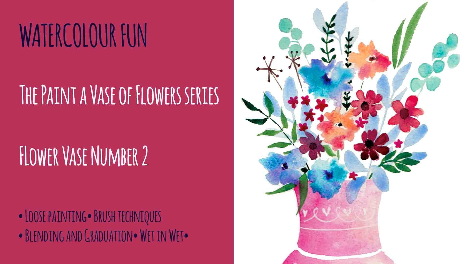
Transcripts
1. Introduction: All your paintings lacking depth and distance. In this project, I'll be teaching you a simple way at distance to your watch County's. Hi, my name is Denise, and my aim is to help you learn the skills to grow and develop your art practice. I want to show you how to create beautiful paintings. Whether you are learning for pleasure or you want to build your own business of teaching art to others. Now a question that I get asked all the time is, how do you stop your paintings that can flat? And it's a great question. And it's an important skill to master because when we are painting, we are trying to create the illusion of three dimensions on a two-dimensional surface. So how did we do it? Well, the truth is, there are lots of different ways to achieve this. But in our project today, I will be focusing particularly on teaching you what I believe is the most important technique. And that is learning to vary your values. We'll be achieving this by building up our painting inlays. On this project, we'll be painting landscapes getter, which is probably the best subject to use when exploring. Depth in a painting, is going to be one of my all time favorite subjects to paint. And that is a woodland scene for the folks. So let's look at the process.
2. Creating Depth and Distance: So how do we add depth and distance into a landscape painting? Well, there are a number of techniques you can use, but the most important one is to vary your tonal values. So what are values? Well, values are crucial in drawing and painting. And a tonal value refers to how dark or light something appears. But you might also hear artists talking about tonal value, value or just tone. It all means the same thing. These terms all refer to how light or dark something is. Tonal value describes how light or dark color is independent of its actual color. In order to explore values thoroughly, it is helpful to work monarch chromatically. So for this painting, we are only going to use just one main kinda. Some black and some white goulash. Painting with a limited palette will help you to get to grips with understanding why tone plays such a large part in creating depth in a painting without at this stage having to consider which colors to use. The key point that I hope you will take home from this class is that ends in the foreground will be darker and elements in the background will be lighter. So let me show you how this works in an example. In this photograph, you can see how the tones get generally lighter towards the top of the image, which is the area in the distance. As the land gets further away, it will usually appear lighter and hazier. This phenomenon is called aerial perspective. It is an optical effect caused by the atmosphere on objects viewed at a long distance. So here's a painting that I did a while ago. Again, you can see that the dark colors are in the foreground and the lighter colors are in the background. So the darker colors I've, where I've described this off brambles and the berries and the lighter colors are in the, in the background of the landscape. So that's what's giving it the illusion of distance. But also there's something else in this painting that's giving it the illusion of distance and that is the perspective of the trees. You can see that the trees in this painting much larger towards the foreground. And they get smaller and smaller as they go into the distance. There are lots of other ways that you can create the illusion of depth. For instance, color is usually brighter in the foreground and bluer towards the background. And we can do this by adding a touch of cool blue to our washes. Backgrounds so that they get further away or by adding the opposite color on the Callaway. Either of those techniques will create a grayer version of your original hue, which will neutralize the color and knock it back into the distance. Of course, sizes and other ways to create the illusion of depth in your paintings. Naturally, things in the foreground will look bigger than the same sized object in the background. You can also use detail or the lack of it to describe distance. When you look at leaves and flowers close to you, you can naturally see lots of details. However, if you look at this photograph, you can see that the flowers in the foreground are really detailed. But that the detail lessens the further back we go. So in the distance, the flowers hardly have any detail at all. You can see the same thing happening in the sunflower photo. The flowers in the foreground have more detail and the ones in the background have less. And then again in this landscape photo, you see here the liken covered wall at the front is really quite detailed. But as our eyes traveled to the distance, we obviously can't see the same amount of detail as it can in the foreground. So the way that we can recreate this in the painting is by making sure that we paint objects close to us with more detail than those that we are trying to describe as being in the distance. The final additional way we can give the illusion of depth is by using composition. We can use what is called an S curve to describe the journey from the foreground to the background. In this watercolor painting of mine, you can see that the river travels in a backward S curve from the background all the way to the foreground. And as we get to the foreground, though, refer gets wider. And that gives the illusion of depth and distance. The top of the river being further away. And as we come to the bottom of the painting, the river is nearer. So as you can see, there are lots of techniques that you could use to create the illusion of depth in your paintings. But as I mentioned earlier, today, we are going to concentrate on the first, and in my opinion, the most important technique, which is varying our values using darker colors in the foreground and lighter colors in the background. So let's go through the process together.
3. Materials: So you will need watercolor paper, a wash brush, a median size brush. This is a round brush and a small around brush with a nice fine tip. You need your paint. I'm going to use Prussian blue, but Payne's gray or a dark green would do just as well. You'll need some black and also a tube of white goulash. The white goulash is optional though if you don't have it, don't worry. You'll of course need a jar of water. Some tape. This is what she taped, but you can use masking tape just to hold the paper steady. And I like to have some tissue at hand just felt blotting watercolor or wiping out mistakes. And a good old washing up sponge. I'll show you what we're going to deal with that later on.
4. The First Layer The Background Wash: You'll find the reference photograph for the painting in the resource materials. And with that, you can choose to either use the photograph as a reference to create your very own Brooklyn backdrop, or you could use my pencil drawing and transfer it to your watercolour paper. You can enlarge it to any size you like on a photocopier. So you're painting can be large or small. You can either draw it out by copying example or Tracy onto your to kinda paper. But remember, do use lights, pencil lines as you don't want your drawing to show through the paint. For this painting, I will be using a Prussian blue color. But if you don't have that, please don't worry. A deep violet, an aqua marine, a dark blue-green, or even a Payne's gray will work just as well. But whatever color you choose, it needs to have a naturally dark tone that can be mixed with water to create a much lighter tone. When working with watercolor, we always work from light to dark. So you always paint the lightest tones first and then the medium tones, and lastly, the darkest tones. If we look at the reference photo, we can see that the central background is the lightest part of the image. And so we need to make this the lightest part of your painting. And we also need to paint that first. So just before you start painting the background, taped down your paper at the corners to stop it getting to bring Kelly. We're going to use the wet in wet technique to do the first layer of the background. Load your brush with lots of water and then apply it directly to the paper. Make sure the whole surface is covered. To check if your paper is completely wet. Look at it from an angle at one side. And that enables you to see the Wet Water reflection and check if you've got the whole area covered. And so now we're going to start at the paint. And for your first wash. You want the paint to be really dilute. So mixed much more water in the paint. This is going to be one of your lightest values. So go all around the edges in this first layer. And because the whole paper is wet, the pigment will start to spread into the center of the paper. You can see here some of the edges bleeding in work at Brown with your brush though. You can add a bit more water if you need to, or a bit more pigment on the sites. What we're aiming for is to get the very edges darker than that central circle. You see here how I'm blending in that paint into the center. And I do remember when you're painting this, that watercolor always dries lighter than it is when it's wet. So that's something to bear in mind. Now I'm not quite happy here with the depth of this color. So just around the edges, I'm going to add a little bit more pigment. And you might want to do the same. And you can see because we're painting wet in wet, it all bleeds in nice and gradually you don't get any hard edges. But we're still going for it being dark around the edges and lighter towards the middle of the painting. And I'm blending in again, working the paint round. Now I'm going to try and define this light circle in the center a bit more. So I'm adding a bit more paint, paint and pigment towards the central area of the painting. And then I'm adding a little bit of clean water to help it blend in. Now I know I did say that I was only going to use one color. But on this occasion, I just wanted to add a little bit of darker green, which you can do the same just a tiny bit. I think it just gives the painting and little bit more atmosphere. So like if you're working with a blue, you could perhaps add a tiny touch of purple, but you want that color to be not too dissimilar to the color that you've already used. Now I'm, but is it the bloom again? And the thing is at this stage not to worry too much about how you're applying the paint because it's way too wet. It's going to have a lot of its own anyway. So let that happened, let the paint move about the paper as it wishes. To just speed this last bit up. That's the first layer of your painting finished. It should look something like this. And as it dries, it will dry, lighter. Make sure this less completely dry before moving onto the next stage.
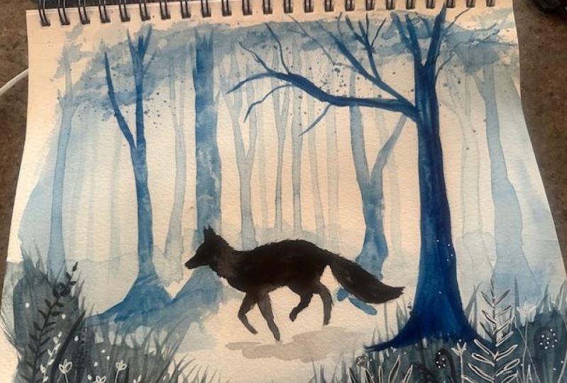
5. Painting the Trees: So in this video we're going to paint the trees. Remember what we said about some paintings looking like they've been effortlessly painted. And actually there's been quite a lot of planning that's gone on behind that painting. Well, we're going to look into that a little bit now. We're going to paint three different layers of trees, starting with the lightest to the darkest. And each layer will dry before we work on the next one. So to paint the first layer of trays, the lightest love trees, we're going to need to mix and nice light wash. So do that, add lots and lots of water to your paint. You want this color to only be a touch darker than the background layer. So before you begin to paint, Have a look at the trees that you've drawn and decide which trees are going to be the ones that are farthest away and which are in the middle ground. Which ones are closest to you? We're going to start painting the trees that are farthest away first because these trees will be the lightest. And in water color we always paint, as we said, from light to dark. You can add a little more paint to your original wash at this stage so that you have a wash. That is just a little darker than the background color. You only want it to be slightly darker though. As we are painting the trees that are right in the background. And remember that things that are in the distance will appear lighter than the objects in the foreground. Objects in the background, we'll be lighting tone. And as the objects get closer to the front of the painting, they will become darker and density and color. And this is what's going to create the illusion of depth. Remember that because these trees are furthest away, they will also have the lace detail. So just paint them with a very plain light wash. There's no need for any texture or any sort of shape to the bark or anything like that. What we're looking for here is just a hint of a tree in the background. And just remember not to use too much pigment in this mix as you want these trees to appear to be disappearing into the background and have a hazy, out-of-focus feel. So once you've painted your lightest value trees, it's really important to make sure that this layer is dry before we move on to the middle value layer of trees. So now we're ready to move on to our middle layer of trees. This time we need to mix a little bit more of the pigment into our wash. These trees need to have a midterm value, darker than the first layer we painted, but lighter than the very final layer. Because we want this led to be a little bit more detailed than the first. I'm going to choose to use a small brush and a medium brush. So for this lay, you want to be painting the trees that are a little bit further forward than the first layer. So have a look and decide which ones are going to be in your medulla. We're painting the trees, try to vary their shapes a little. They will look much more realistic if they have ferrying width. And bear in mind that often trees do not always grow up in a perfectly straight line. They might grow up at a slight angle or split into separate chunks from the base. Also one thing to remember when painting trees is that they are always at the thickest at the base of the trunk and then attach as you work upwards, each subsequent branch will be getting thinner and thinner than the last. To achieve this, you can lift your brush tip until you get a really fine line. Again, this layer of trays is still quite fall back to say we don't want to add too much data. Then similarly to the trays on the first layer, only a bit darker. We're still painting the middle layer. I've added a little bit more pigment to get a slightly darker tone for these next trees. I'm going to pick which trees I'm going to be painting before I start the painting these trees in the same way as you painted the last ones. But this time because these trees are a little further forward, we're going to use a piece of tissue paper to blocked some texture into the trees. I'm tending to do this on the right-hand side of the tree on this side, because the light is coming from the right hand side for this tray. Because we're adding a bit more texture. We're adding detail, which again gives the illusion of this trade being little bit nearer. You want the trees to the grounded on the forest floor. So remember to paint in the routes. How I do this is I paint in a line with a small brush going outwards horizontally. There too, have a few wiggles in it so that it looks natural like a root would match the ground, that Washoe brush off with clean water and go underneath with the brush and just let that line that youth painted previously soak into the water and bleed. Gives it a nice natural look. And the tree then looks grounded into the forest floor. So again, we're using the tissue paper to lift a little bit of the color of show some of the texture on each of the trays. Just topic, ready, ready. Like they just want a tiny bit of texture. And remember, old trees by straight up, This one's got a real curve at the base. And you'll find that some trees have that sort of bulbous curve right at the bottom. So as you're painting the branch is, is you've got upwards towards the topmost branches. Lift your brush up a little bit so that the line of the brush becomes much finer. Whilst the paint is wet, you can keep going back into the texture and whacking on it again. And now we're going to start painting the dark shaped, as you can see, I've added more pigment still. And this is a much darker shape and the last one. And because this tree is much further forward than the other trees, I'm going to start actually using the brush to paint some texture on. I'm going to use of linear brushstrokes vertically to show where the grooves at the bar car. And here I'm just putting in the grounding roots of the tree that we did previously. So let's remind ourselves that the rules of tone, size, and detail that applied to the elements in the front of the painting. Because the trees are right in the front, they will be darker. And although the trees might all be around the same size, the trees in the front would appear larger because they are nearer to the viewer. You should make the trunks of these trays thicker than the previous two led to give the illusion that they are closer to you. So you can see now that this tree is already standing forward in comparison to the other trees. And that's mainly because of the slight texture at the bottom of the trunk. And also of course, they're much darker and brighter color. You can lift out some of the watercolor by getting a tissue and scream it up into a small point. And using that point to soak up the water color. So you move it vertically up the tree trunk and it was soak the color up, leaving a slightly lighter line behind it. Now because for this tree, the light is coming mainly from the left. On concentrating on the left side of the tree as if the light was catching the graves of the Bob. I'm gonna go back and work on this tree on the right hand side because I think it's getting really lost in the background. So I'm just going to add a bit of a dark shape to it. And I also think it needs to be grounded More on the floor of the wouldn't it doesn't need much, but just a little extra to make kick come out of that background. So it's fine to go back in and reapply paint to areas. Don't forget to dry everything ready well, before you go into the next layer.
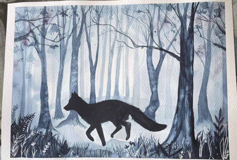
6. Painting the details and the fox: Now it's time to paint in the details. And the folks, you're going to need your Blackboard color and the white goulash, if you choose to use it, mix up your pain, but a little bit of black to get a slightly darker shade. And then let's start painting in foreground. You don't have to be too specific with this painting, but basically you're just going to try and get a hint of some grass. We are going to add more details to this, but this is just the background of the grass. So take your medium or small size brush and just make some shapes in the corners of the bottom of your watercolor paper. And then use the tip of your brush to fan out some of the watercolor to get the sort of hint of some, some grass. Use the point of your brush to make those graphs marks. If we do one in the corner here, that will nicely framed the painting. Don't worry, we are going to work into this. So just feather the edges around. It doesn't have to be too neat just to so it gives a little hint of the grass. Now working wet into wet and adding a little bit more of the pigment on top. Grabbing my smaller brush. Just using the point to pull up some of that pigment into the fine lines of the grass stems. Just use a flicking motion to do this. And you'll end up with a nice point. As you flick, lift the brush up. If you want, you can try this on a piece of set per paper first. You're going to need to mix up a little bit of your original color in a light wash. So now black is needed for this bit because we need to put in just the hint of the background landscape. So what we're trying to do is just illustrate that there is some kind of ground behind here. Such as very gently, it don't be too specific and just make a horizontal line across doesn't need to be straight. It's actually better if it's got little curves and as if it was a little hills in the ground. Now I'm going back in and I'm adding some details with the darker color. I'm going to paint some detail in the front of the painting. It's going to be the branches that are hanging from the trees in front. So I'm mixing up some black and I'm using are fine tip brush. Apply the paint. Now, when you do this, you want to use the very tip of your brush. And you're going to have the, halt the brush quite upright. And as you move the brush, what should do is just twist the brush slightly. And what this does is it takes away the control of the brush and you end up with a slightly wiggly allowing. This might be another thing you might want to practice before actually trying on your painting. And I'm going to let these branches go right across the painting. Because these branches are in the front. We want them to have more detail than the rest of the painting. And just using that very simple twisting motion enables you to add the detail to these broad. She's ready AZT. So now mix up some dark blue paint. And what we're going to do is add a sort of splatter effect to give the illusion of some leaves or movement amongst the trees. So to do this, just tap your brush and you'll find that you get this fine splatter. It's quite, quite a nice textural effect. I'm going to show you what we're going to do that washing up sponge next. But before we do this, let's dry the surface of our painting. We're going to create some leaves with our sponge. So tear off a section and mix up a nice light wash. When you dip your sponge into the paint and mix it well in, make sure the sponges quite well covered and then give it a good squeeze out. It works best if the tone of the color is fairly liked and the sponge isn't too wet. You might like to try it on a scrap piece of paper first, but when you're happy with the effect, then choose some areas too lightly apply some sponges, leaves. It works best if you very gently dab and tap the sponge on the paper, joy not to press it down really hard. We just want to suggest the leaves. So less is definitely mobile here. Next we'll be painting the folks and the growth in the foreground. The folks on the grass or the very nervous objects in the painting. So these need to be painted at the darkest value. And for ease. The folks in this painting is a silhouette. So he needs to be completely blacked throughout. We're going to be painting the folks in black. Or if you like, you can choose a very dark version of the color that you very bored use, but I'm using black here. Now when you mix up the paint, it's really important that you mix just enough water to make your mixture quite fluid. You don't want it to be dry. The reason for this is that when we're painting the folks who are going to add some nice brush flexing to describe the fervor of the folks. And for this we need the paint to be wet, not dry. So now using your small brush with the fine tip, painting your folks, as this is a silhouette, we want this to be a pretty solid color. So just paint all in with exactly the same tone of color all over. Let's speed this up a little. For the last part is the tip of your brush to add details to the fair along the back and tail. You want to show that the fire is moving as the folks is running. And the best way I find to do this is to use small short flicks at the brush in the direction that the favorite delaying. This will give your painting a sense of movement. You have nearly completed your painting. Just the final details of the grass to add. So using the same mixture of paint, paint thin lines upwards to describe the grass. Let the lines overlap in places as this will make the finished result look much more realistic. The last thing we need to do in order to complete the painting is to put a shadow under the folks. For this, you will need to mix a light midtone wash. You can see that one of the foxes feet is touching the ground. For this fit, the shadow should, but right up to the bottom of the foot. For the other Fate, all of which are off the ground, the shadow should be positioned living a slight gap between the foot and the shadow. This will create the illusion that the fox is running in midair. For the next stage, we're going to paint some more detail into the grass that is in the corners of the painting. For this, I've mixed up some very, very dark blue with simple black. And I'm again using my smallest brush, small round brush with a fine tip. And I'm just adding just some random shapes of grass leaves, flowers. For this one, I'm just doing one central stem and putting leaves either side. There are lots of variants and I'm sure you can think of lovely ideas for this. If you get stuck. Here are some ideas to help you. Now again, to be painting with white go ash. So it's a great time to change our world. Now the last part is optional, but if you like, you can add some fine detail with white goulash over the top of your watercolor. Once it's dry to describe some of the grasses, flowers, or leaves on the forest floor. For this, we'll use white go ash because it's a much chalk here paint that water color and the white pigment in it is nice and strong on top of the watercolor. So mix up your goulash. Said that it's quite thick, but again, fluid and agile finishing details as I'm doing here. Yes. We've got to show painting is now complete.
7. Final Thoughts: So congratulations on creating or painting. Every painting you do teaches you something about the complex process of watercolor painting. And the more you practice, the more you'll learn. So today we learned how to create depth and distance in a painting. Hopefully you have learned a lot of skills and techniques that will be useful for you in your future paintings. So let's recap on the skills that we've learned. We learned about the five techniques that you can use to create depth and distance in a painting. For this painting, we concentrated particularly on point number one, which is varying your values. We learned the objects in the foreground are larger, more colorful, and have greater clarity in detail than those in the distance. Objects in the distance, on the other hand, are smaller, have a duller blue, a color, and a blurred and hazy with little detail. You practice the technique of painting in layers from light to dark and how to mix your washes correctly. You now know how to use tissue to blocked out color and achieved the illusion of light. We practice blending using the wetter wet technique. And we also learned how to use the sponge technique when painting leaves. All these things are important and if you keep practicing and your techniques will get better and better. And the single most important piece of information that I want you to take away from this lesson is that to create depth and distance in your paintings, you need to vary your values. I really hope you have enjoyed this class. Keep practicing and happy painting.
 Denise Hughes, Illustrator, Designer, Tutor