Transcripts
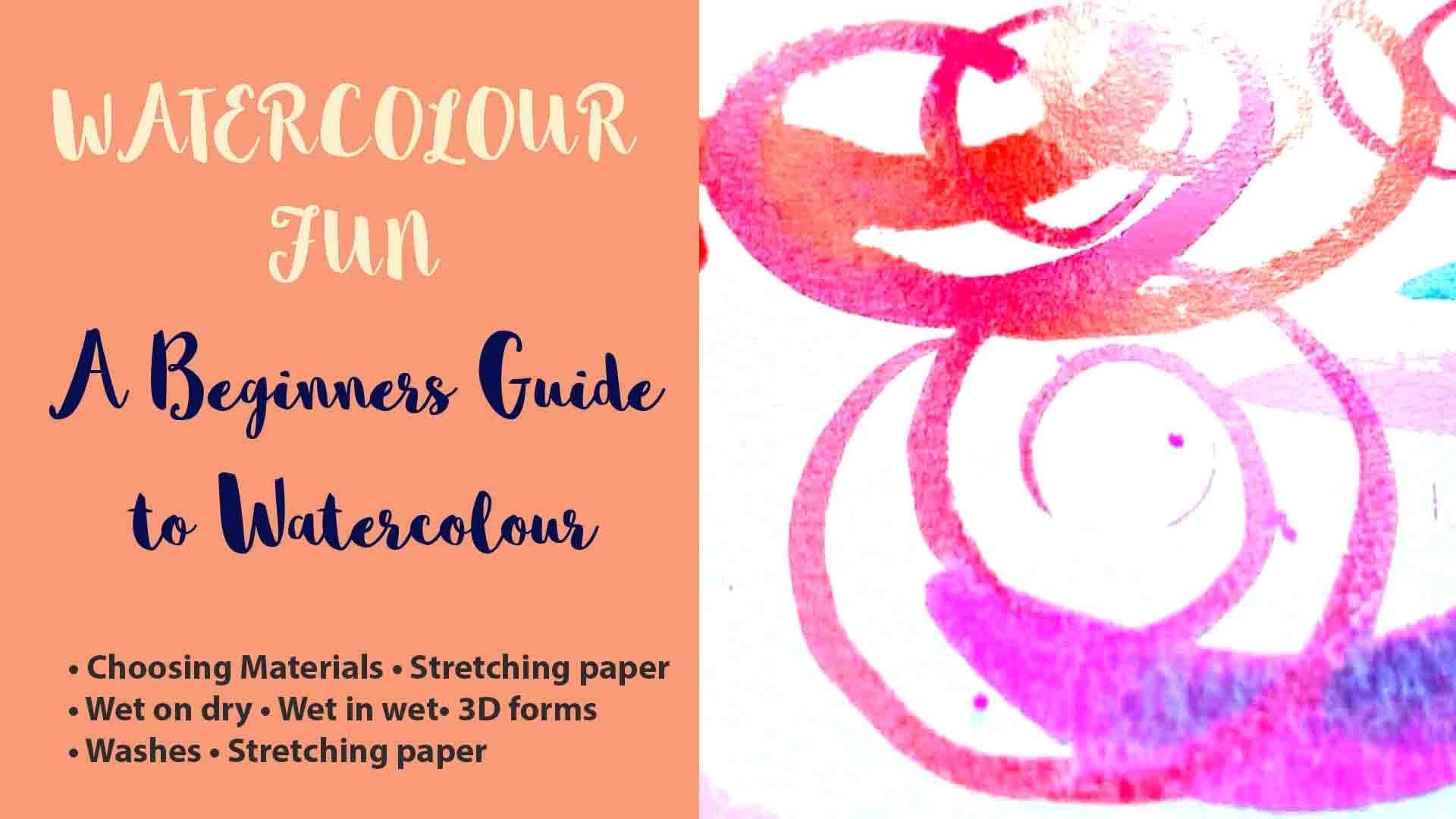
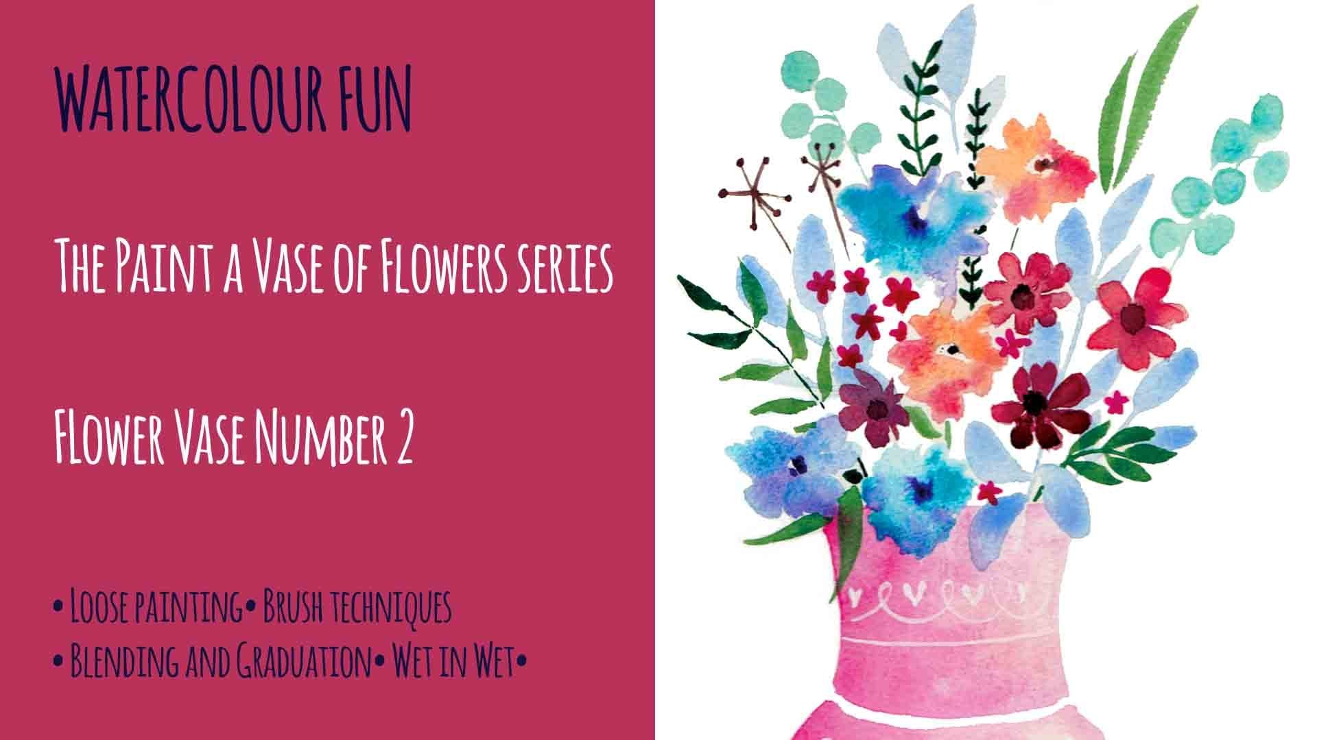
1. Introduction: when Instantly season. Welcome towards through this class, we're go to painting a vase of flowers. In fact, this is going to be the first in a series of four classes about painting modern florals in vases. So I hope you can join me for all four classes, but this one is number one. So let me show you what we're going to be painting. So he reduces on I getting maybe some of your thinking Well, it's a bit complicated. I don't if I could do that Well, let me assure you, you really, really can pay this. You combine this. Definitely. Um it's not as complicated as it looks, honestly, but I'm so to make it easier, what I have done, if I have sort of set up three different ways, you compare this. So for those of you who are maybe complete beginners also returning toward to color, you might want to stop and use one of my templates. So I've done to templates. First is before wild flowers that there's a link to these and you can put them off. Um, so you can use this Teoh to start you off to give you an outline of the shakes. If you're feeling like you might want to maybe use the same shapes, you might want to kind of mix them around your in sort of arrangement. You can use this one. This has all the same flowers in it, but, uh allows you to use them as elements again. You could. There's a link to this on. You can print them off on this allows you to sort of make own arrangement on peace, the flowers together, as you'd like because, remember, this is your painting, So it's nice for it to be a little bit individual if you if you're already experienced in water color, you feeling quite confident you might want to listen to the tutorial on, then maybe just go off on use your own style to interpret. So that's three different ways you could use this tutorial. So for those templates, you can trace them with a pencil very lightly. Or what I like to use is carbon paper now for the colors. What you're gonna need is I'll give you a list of the actual names of the colors, the water colors that I've used, but if you don't have them Please don't worry. You can get rather's. It's it's really your painting. You could choose the colors. It's fine. So but here is what I've used. I used to do this. I use cerulean blue for the vast with an ultra marine blue. For the spots of of us, I used a origen green, which is like a kind of bluey green for some of these areas up here. Can you see here the these daisy like flowers? ECN, OSHA. I think they are done with Purple Lake. Um, there is some cad yellow in here. There's some had read all the tops of these parts here. Um, I think these days is also have some kind of light of pink in it, like a rose color on. Also, there's an emerald green, so those are the property color names. Also, there's a tiny bit of burnt sienna up here for these storks. Don't have these colors. Peas. Don't worry. That shouldn't stop you painting this if you've got a light move A dark blue green, some kind of pink, yellow, red and brown. You'll be fine. The brush is under knees. I'm gonna be using a number three on a number six. These winds and Newton Serious seven. But there, if you any round brush that you have in these sorts of sizes. So a slightly bigger one on a slightly smaller one, both with nice points at the end. Okay, Well, if you're ready, let's get started.
2. Transfering the template: So for those templates, you can trace them with a pencil very lightly or what I like to use is carbon paper. So when you're using carbon paper, I remember that you need to hurt the carbon paper black side down on top of your watercolor paper and then put the template on top. Maybe attach a little bit of sticky tape to the edges so that it doesn't move around just to keep it still. And then you can trace over the elements on you. You'll get a sort of an outline off the flowers themselves. But the thing to really remember when using carbon paper is that you need to just very, very light pressure, really hardly anything at all. Otherwise you're gonna end up with black lines, render watercolor, and we don't want that so really, really like pressure. You know, something carbon paper. It lasts forever. And sometimes I think the best carbon paper is the sort that you've used over and over and over again, because that introduces a really, really, really light line
3. Painting the Vase: we're going to start painting are Farr's first. It's really important that we establish a light source right from the beginning because light and value are what gives objects form on. Without it, a painting would appear completely flat. You'll need your number six round brush to paint the walls. So for this you're going to need to mix up a good quantity off cerulean blue or a light blue. I want to fill your brush. I'm nice and full. And then I've decided that my light source would be coming from the right so my shadow will be on the left. So this will be the darkest area, and this will be the lightest area. And this is what's going to give all of our some shape so you can see I'm filling in the handle off the Basel Jug. Um, with quite a solid color of cerulean blue on, I'm being quite careful to paint around the foliage on the petals of the flowers. I don't want to go on today's and just paint with nice broad brush strokes all the way down , adding more water if you need to. I'm thinking now how far I'm going to take this quite solid blue color out. I think I'm gonna take out about an inch. Maybe a little bit more. Still being careful to paint around the foliage and the petals. I'm trying to work quickly before the paint dries, so to change from a dark to a light value in water color, we just simply add water. This graduation from dark to light will suggest the mass and contour off the vases surface . So I'm going to add some water to the brush, just with vertical lines just white. The brush. They're up and down, picking up some of that lovely blue saree liam a little bit more water again and do the same again, working right into that wet line. And you can see now that the color is becoming paler as we add the water. So with some paints, you need to add white Teoh make color paler, not with watercolor. You just add water. You can see just going around the, um, village at the top curve. Fatih, when we get to the other edge where the light is falling and it's really very pale now, one thing to remember is, just keep working at it quite quickly so that the paint remains wet while stood working on it. I think I need to just carry over this dark blue line a bit further into the center of the jug. But you can do that, you see, because the paint still wet so it will bleed. It would just bleed into it and make it home a gradual variation of tone. Now I'm going to work on this edge because of I left it like it. Waas. I don't think you'd see where the edge had finished, and as the jug curves around to the side, you'll lose some of where the light is hitting it, so that area will be slightly darker. And also, I'm now putting in some dark areas underneath the petals on the foliage as it comes over the top of the jug, because there will be a bit of shadow there underneath the leaves on the on the flowers. Now, another way, you can do a highlight or show that light is falling on. Something is just by dropping water into a dry color. They're here on the handle. I'd like to make her a little highlight right on the top of the handle show. The light is shining from the side and above, and just by adding a drop to falter into that paint and moving around, I've managed to achieve that. I think this just needs to be a bit darker on this side just a little bit. Okay, so the next thing is, we need Teoh. Let all of this paint dry before we go on to the next stage, which is putting the dots onto the vowels or jug. So for this part of the painting, I'm going to be changing brushes and using my number three wins and Newton series seven Sable brush. And the color that I'm going to be using is ultra Marine. Or, if you don't have that, a dark blue. Adding a little bit of water into the paint and mixing up to be a slightly lighter shade is adding water into the color. Now I'm going to start painting the dots. I notice how I'm holding my brush. You'll need to hold your brush really upright to do this so that you can use the very tip of your brush. I'm to paint the detail of the spots now if we painted all the spots the same color. What it would do would be to have the effect of flattening our image. So what we need to make sure off is that our spots correspond to the same value as the surface of the joke by that's my main. On the right hand side, the spots will be lighter, and on the left hand side, the spots will be slightly darker. Now, this is bothering me slightly. I think some of my dots have become a bit too dark on the right hand side. So what I'm going to do is I'm going to remove some off the paint out of them. They're still wet, so all I need to do is white. My brush clean and just work into the dots on the brush will pick up that color. There are several ways to do this, though you could, in fact, just blocked them with a piece of kitchen towel. But I'm choosing to do it with my brush. Just taking a little bit of the pain out of them just to make them a little bit more subtle . Are the ones on this side on the let on the left hand side. I don't think they're dark enough. Um, so I'm darkening those up a little bit there. That's better on that one of the top. Yeah, that's much better. So you can see from the left inside their darker, and as we go over to the right hand side, they're much lighter. So now we need to put the line in right at the bottom of the jug. So quite a dark, ultra marine blue to start off with. I'm just painting the line that's quite dense. Now I'm going to just add some water and move that paint along with my water in my brush, just up to the right hand egx. But it makes a different color. I simply just added water. I'm darkening the left hand side a little. They're think that's finished. You need to leave that to dry before you get onto doing the flowers
4. Painting the Flowers (Part 1): so we're going to do now is going to paint flowers and if you look at the sample here, we can see that some flowers are clearly in front off other sailors. And it's really important because water collects transparent that we get that order of painting right, so we should be painting the things in front before things behind you. See if I painted the background lease all the way out from the bottom of the last of the top and then tried to paint 1000 the top the days would show through the flowers on. We don't want that. But But having said that sometimes in watercolor painting, that layer and technique of transparent watercolor comm produce really interesting results . So and it's a great technique, it's just not for this painting. I'm getting steadily whilst I think about. If you're using the template with the individual elements on, it's a good idea when you're positioning them in your bouquet of flowers to Teoh, place the larger flowers first on, then fiddling with the small 1000 background foliage afterwards. So it's a similar order to the painting, so now we're going to get on with painting the flowers. So if we look at the sample, we can see that, as we mentioned before, some of the flowers and leaves are in the front and summer behind. And as we mentioned, because watercolor is transparent, it's really important to get the order of painting right. I don't want to put all the background leads down and then paint the flowers on top and have believe showing through the flowers. So what I like to do is to look for the flowers that are in front and paint these first. So I'm going to mix up a pink with some purple lake and the rose color. You'll need your number six brush for this because we're after nice loose brush tricks. So fill your brush to the brim with color, and then we'll start. So when you're starting, a painting is a good idea if you can to start from the top and paint downwards just ensures that you're not leaning on any of your work or smudging any wet paint. So I'm going to start with this top daisy flower here, and I'm using nice broad brush strokes to fill in these petals. You can see here that This petal gets lighter towards the right hand edge, just towards the tip of the petal. Andi, I'm going to do that by the first, dropping in some of the usual pink color with my number six brush and then changing over to a number three brush on with a little bit of the rose, the lighter pink color just dropping that into the end edge off the tip of the petal and just letting the paint spread itself. I'm not gonna mess about with it. I'm just going to let the watercolor do its thing and then back to my number six brush for the next petal. We don't want to mess about with these petals too much. Just paint them on, Really, Just let the watercolor flow. That's the way you're going to get some check texture in there. Now, these top two petals at the back much lighter. So I'm going to wipe some of the paint off my brush, dip it in the water to dilute the color on just paint them, the much lighter that they're a bit too light. So I'm going to take a little bit of the color out of one of the other petals and just drop that into the wet paint as better and do to get on this one working towards the center of that petal, because you can see that as we go towards the center of the flower, the petals become darker towards the middle part, just adding a little bit of the lighter pink onto the edges, just mainly onto the right hand edges. No, that's giving the pedals a bit more depth. Now that's going too dark. So I'm wetting my brush and I'm using the water to remove the paint, then just wiping on the town. You see how that's just taking the paint out there. That's better. So now on to the second flower, this one is slightly brighter. So there's more off the rose color with this one just painting in the petals with the rose . Make sure you've got enough paint on your brush to give you nice, even strokes. I was just swapping back to my number six brush. I didn't realize I was using the three. Like I say, you don't want to mess about with the water color too much. Just paint it down and let it do its thing that my outlines for these flowers are quite dark. But that's so that they show up probably properly on the video for you. But when you do them, try and make them a lot lighter than this because you don't want to see the black lines in your paintings. I'm just working with Cem Lake into the center, off the flowers to give them a some form. When you're doing this, you thinking about again where the shadow is falling, so shadow is more to the left than the right and the light is at the right. And now I'm going to do the center cone of the daisy, all the neck in Asia. Time for that. I'm using a don't brown. I'm darkening up a bit further with a touch off ultra Marine that gives a nice, neutral brown. It's it on. I'm painting in little short strokes to try and give the effect off the rough texture off the center of the daisy. So use your brush to make those little marks. And don't worry if the brown touches the pink and the pink is still wet because it'll bleed in on, and that's what we like about what color? It does its own thing. And I'm just darkening up that brown a little bit more with the ultra marine blue just to make sure that we have a difference in value between, um, one side of the family other. I'm letting the brown color bleed into the middle of the of the petals and then on to the next one onto the next one in the same way. So once you filled in on your petals with the Purple Lake, I'm not gonna grab a bit of ultra Marine. Just mix into the Purple Lake to create slightly darker shade. Andi on the left side whether shadow is falling, just going to very likely with the very tip of my brush, go around the left side to give it a little bit of form. We're on the left hand side of the petal in towards the center. I think this area isn't quite dark enough because it's dried a bit lighter, so I'm going to go back in with a darker shade, almost black. I just use my brush to drop some dots in, just to give it a bit of a texture. We're trying to describe the texture off the top of the cones of these flowers, but we don't want to draw. We don't wanna paint every single little line. It's just enough to drop a few dots in. Just gives the viewer the idea of the texture. What can happen sometimes if you try and make things too detailed, Um, is that it can completely flatten your painting, so it's always better to be a looser and just make a suggestion of the detail rather than paint every individual petal leaf you name it, they're on to the last one of these purple days is again just putting all the petals in first using a number six brush, I'm just gonna grab some of the rose and drop the lighter pink into the Purple Lake to give it a little bit of texture, a bit of light. I think this area needs a little bit more color as well, and then going in with the brown, as we've done before, making sure that the left side is darker than the right and making sure that we describe the texture of the cone flower. I think we're pretty much done for these flowers, so we'll get on to the next stage in the next video
5. Painting the Flowers (Part 2): So we're onto a painting. Flowers, part two. So here I'm painting. Although big flowers first on this one is a sort of eight Picot colored flour, which I've mixed using a bit of rose and a little bit of cadmium red and a touch of yellow to make this quite light Apricot cover. Andi, I'm just filling in all the petal shapes quite quickly so that all the flowers remain wet and then I'm gonna work back into them to give them some form. I'm gonna dry my brush and just clean it. And I'm just gonna use some water to drop into the ends of the petals to make the end of the pedals a bit lighter immediately. You can see that gives him some form. I'm going to do that on the rest of them as well. Simplest is adding a bit of water, wiping a brush in the kitchens. How it couldn't be simpler. There we go. So now we need to do the center part of these flowers. And I'm just changing to my number three brush on. I'm mixing up a little bit of the rose and whilst the paint is still wet, I'm just going toe drop a little bit in near the beginning of the petals, so all the center of that flower is just a bit darker, and I'm going to do the same with the other ones. So now I'm mixing up her through a dark brown, and I'm going to drop this into the very centres of these flowers just little bit, just with the tip of my brush letting it bleed into the other colors. Our next job is to paint the yellow flowers, so mix up some cadmium yellow and then really loosely just put plain water onto the flower shapes. No color at this stage. Take your color and then just drop it in. No need to really paint it. Just let the wall to do the work. Drop it in. Let the color bleed. If we do this with much, much more likely to get some nice textures, I'm just taking a little sort of orangey cadmium red, dropping that in on the shadowed side. Give it some form on, then on to the next set of yellow flowers, take a little bit more of the cadmium red orange mixture. Drop into the shadow side and keep going until they're all painted. Yeah, these flowers, I'm not sure about them. I think they're a bit dull in color. So what I'm going to do on do you can do this too? If you make a mistake is just take a little bit of kitchen towel on block them whilst they're still wit that will remove some of the color, and then I'm gonna work back into them with a brighter cadmium yellow. Yes, that's better and just work on top of them. So if you make a mistake, don't worry. It's not the end of the world. It is just a painting, after all. So don't don't ever worry if you make a mistake on the next thing we're going to do is we're going to put in the little tiny blue flowers in the center here, and we're going to do that using a mixture of cerulean blue, your light blue on your dark blue ultra marine. It's a mix that up. You wanted to look quite right and quite solid. We don't want this color to be too wishy washy and just using the tip of your brush. So holding a brush quite upright. Just used three strokes to make this shape of the petals. All going in towards the center do like a sort of triangle with three petals sticking out. Now we're going to answer more detail to these eight Picot flowers with our number three brush. I've waited until they're completely dry to do this because I don't want the colors to bleed. I want what I'm going to paint on to be a really crisp line. So I'm doing little lines from the center of the flower right down the tip. I'm not going all the way along on some of them. Some of them adjust halfway down just to give a bit of texture to the petals. Little striations in the petals. And you don't want this color to be much different than the eight Prokoff color of the base of the flower. Just a little bit darker and then do the same with the other ones. Sort of use your brush in a sort of flicking motion from the inside of the flower to the outside, just to give a little bit of detail to the surface of the petals. And they were going to paint these leaves along the front of the bars. All the jug, and I'm picking up some emerald green on by making a bit darker. You can just add a bit of ultra Marine. If you want to make it darker, that will work just fine. And then I'm adding a sort of yellow hue to them a little, just a tiny bit. I'm going to paint these leaves all over with this great in color. I'm gonna need to darken up because I want these Elise toe. Add a bit of contrast to this painting, anything to sit behind the flowers. I don't want to them to be the star of the show, so they need to go back a little bit. So in order to do that, if you want a color to go back, always add a blue because that will sort of neutralize the color and push it right back, which is what I've done here. Just as I'm adding some sort of shadow underneath the petals of the apricot flower just to show that it's the leaves are completely underneath the flower. I'm just also adding some shading on the left side off the leaves as well I was a little patch here that's also leaf just hidden underneath this pink daisy. I'm adding a bit more ultra Marine and a bit of a radian to make a really greeny blue, and this will. A greeny blue will go really far back. Where is there? Because it's a kind of cooler shade, So I'm using a cooler shade because I'm painting underneath the pink daisies. So I wanted to look like it's in the background, just dropping in a little bit of ultra Marine as well, just to push it right back. So we're going to paint these really fine storks on the yellow flowers on. I'm going to get some green on. Then what? I want to make a point on my brush. I just wipe it on my palette a couple of times, and that makes the point really perfect. And then, with your brush position really upright, just very carefully used that tip of the brush to put in the lines and under each of the flowers, there's a little sort of what looks like a sort of round ball, which would be where the seeds are held in the flower. I'm just putting that in here and then adding the fine line of the stork to do that for all the yellow flowers as well, making sure to allow the starts to go behind other flowers if need be. So now, with the slightly brighter green, I'm going to add the leaves and stalks off the off the daisy flowers. I'm using a number three brush and I'm pushing down on the brush toe, widen it at that point and then just going back to the tip to do the fine line of the stork , using the fine tip to paint the stork just going behind these blue flowers more than adding the leaf, which is also behind the blue flowers. So, Peyton this very carefully. It's taking off a little bit of the paint on my brush. I think this is a little bit too bright because it's behind the blue flowers, so I'm going to take some of the color out of it by blotting. So I'm going to paint the pine eight leaf on the right hand side at the back. I just learned that term Pine, Italy for hope. I'm saying that right? Apparently it's a leaf that resembles a feather having leaflets on either side of a Commons access or stalk. So that's what that is. So I'm gonna paint this using a mixture of green and blue. But I wanted to air on the side off a light blue more than a green jack tape of the brush full. The stem and each of the leaflets fill each one and gently. I think I've got a little bit too much color on this. I've just added a little bit of water to try and dilute it. I'm adding a little bit of brown because I think I I think this color is too bright s Oh, what I would always do if I want to sort of neutralize the color, sort of bring it down. A shade or two is just add a tiny bit of brown, and that really helps toe make push the color back. Be careful to be painting behind the other flowers. This is the really tricky bit. You have to be very careful. You're not painting on top of any flowers that should be in the foreground. So the final thing that we need to do is at the details, and you can see how to do that in the next video
6. Details!: So we're onto the finishing touches. Dylan. Any off the light? Greeny blue background leads? Make sure you keep this color quite pale way Don't want you to stand out in front of the flowers. The next what we're going to do is we're going to mix up a brown to paint the little stocks at the top with the little red Berries on. So I'm using, um, some bunts. You need to do this a little bit of red mixed in. I'm just going to white my brush on my palette again, so I've got a nice point to my brush on. My brush position is very upright. Just going to fill in the woody stems off this plant Very fine lines. With this. We want them to look sort of twiggy and remember, with any sort of branch or twig, their branches that are furthest away from the central stem will be thinner. Then mix up some red. I'm just darkening the red here a little. You can do that with a bit of ultra Marine that works really well, and then and then just paint the Berries again. The brush position is really vertical. It's going around in little circles to finish off super. I'm just finishing off here with some dark brown dots made by just placing the end of the brush down on the paper. Andi, just adding to the contrast of the apricot flower, are now. Look, there's a mistake I've made. I've smudged one of the Berries, so I'm just blotting it with a bit of kitchen roll. Don't worry. If this happens, happens to everybody Now I need to let it dry before I complaint that very back in again. Let's just carry on with these apricot flowers. Also wait for it to dry, and I'm gonna add a bit more contrast a few more dots to the textures off the cone flowers . Yeah, that's better. Good to have some nice contrast in there. There, that's lifted it quite a lot. I think I'm just gonna go back over these, make sure there's enough contrast in these. Yeah, good, nice, solid color. And I'm gonna add some little lines down the leave on down here. So just adding darker shades, whether needed and you can see now, just by adding a little bit more contrast colors already starting to pop. Now that Berry has dried, so I can repaint it in without any fear of it. Bleeding. And there are painting is finished on. I hope you enjoyed painting it.
7. Final Thoughts: so thank you for joining me on this class. Remember that this is class one off a series of four off these water colors, flowers in vases. So I hope you can join me for the next three, which I'll post up as soon as I can. Um, but I just wanted to say little thing about, um, Watercolor is It's a bit of a dance between the perfect and the in. Perfect on. I don't want you to worry about that. This is always gonna be bits of your painting that perhaps you're no, not that keen on perhaps a body. But you know, that's us is the creator, but the viewer probably never sees those things. So be encouraged by that, Andi. It probably just stands out to you because you made it. But don't let that put you off, Watercolor. Just keep going on and let that naturally imperfection show through because, you know, that's why we love to color. And I hope you're going to join me for the next
 Denise Hughes, Illustrator, Designer, Tutor