Transcripts
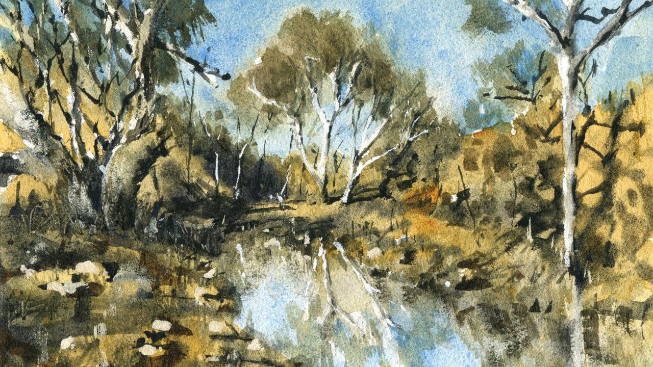
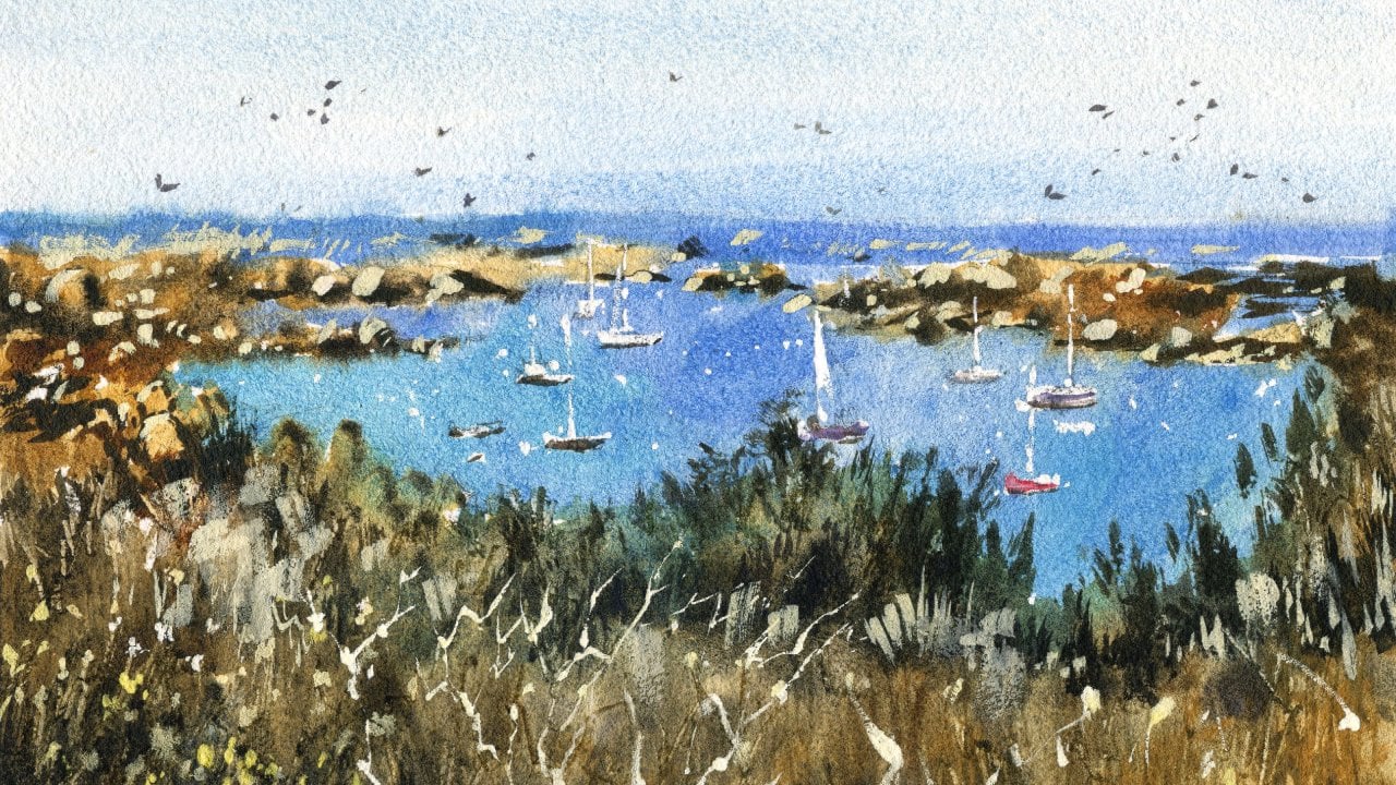
1. Introduction: In this class, we'll be painting a classic Australian
bush landscape using a variety of wet-in-wet techniques and
wet-in-dry techniques. Creating and combining
soft and sharp shapes can be tricky when you're
learning watercolors. We're gonna be
using wet-in-wet in order to paint a
lot of this scene. Often Wet where does associated
with a loss of patrol? Without understanding,
timing, really create a mess. But don't worry, I'm
going to show you the importance of timing
and painting wet-in-wet. I'll show you how to gain
control and layer effectively to create soft and
atmospheric landscapes. Wet-in-wet techniques bring
up the natural strengths of watercolor is essential for
you. Your watercolor journey. Creating fine and
sharp details are just as crucial when
you painting trees, rocks, and grass creates a sense of contrast
and interest. But understanding when to
add them in is crucial. Before we start
with the painting, I'll show you how to simplify shapes and sketch
in large words, such as sky, water, reflections, trees, and lead. Getting in those
large components accurately is essential for
your painting to make sense. So join me in this class. I'm looking forward
to showing you the secrets natural
landscape painting
2. Materials Required: So just wanted to
spend a little bit of time talking about the
materials I'm using. And here I'm actually using a bit of 100%
watercolor paper, 100% cotton watercolor paper. It's in medium,
two rough texture. And actually this
one is in medium, or sometimes you
use rough medium is a really good texture to use because you can get these nice kind of
wet-in-wet effects. Paint takes a little
bit longer to dry and there's more
of a spread of paint when you're using
flat hot press paper, it tends to pull in areas and
just doesn't dry smoothly. So really recommend you using some paper even if it's not
hundred percent cotton paper, but just checked surface of it, make sure that there's a
bit of texture in there. Brushes. I've got a whole
bunch of them here. The main ones, I want to
separate out these three sets. So I've got mop brushes. And these mop brushes are
used to get in large areas. So things like the sky, bits of the land at the back, even some of the trees and darker shapes out there as well. Do you use these mop brushes? Turns with the size
of the mop brushes, you really want to
pick one that is large and pretty much the
largest that you can use, but still be able to
get in enough detail. This one is probably too big. So these two here, my detailing brushes, they're just a flat brush
and a round brush. So we're looking at details
in this particular painting, we are talking about
this shapes in the back, eight bits of these shrubs, rocks here, the trunks of the
tree and use these as well, bits of details and darkness. The branches, these
darker branches as well. I'm using the same
smaller brushes. And my third set
of brushes here, kinda like my specialty brushes. And this is a fan brush
creates these marks, as you can see
here, these sort of upward lines that are
running in one direction. So it just makes it easier
to get in these kind of indications of shrubs, grass. This here is a
little rigger brush, and I've used these
to get an indications of trees and smaller branches. Really useful brush. And this is a filbert brush. Didn't really use it here,
but sometimes you use a filbert brush to
blend edges together, creates contrast, lift off a bit of paint
in the background, but that's basically about
it in terms of my palette. You can see here that
to large mixing wells, quite important because I like to make sure I don't
have to keep going back and mixing up paint again
because it's very difficult to get that same mix, especially in watercolors. So if I'm planning to do a sky Wash and this is cerulean blue. I tried to mix up
as much of that civilian blue as possible so that I don't have to go back again and try to
work out them mixes. It's not always perfect as
sometimes you have to go back, but it's just best practice. I use a lot of this color
here, a bit of yellow, which is basically this stuff
called quinacridone yellow. I've also got a little bit of yellow ocher in
there, great colors. When we want to imply that sort of golden Australian landscape. A lot of the rocks around
here have that sort of color. You have this here as well, which is a bit of burnt sienna. I use some of that
burnt sienna to get some earth and darker
colors in there. Also good to use them
for parts of the trees. Apart from that,
the rest of it is just some little bits of green. So I've just got a
dark green there. You can use whole bunch of
doctrines, use hookers, green, you can mix up your own green by mixing a bit of blue
with a bit of yellow. Choice is up to you. And if you want to create
some lighter greens, just add some more
water in there. My final little
trick is that I use this bottle of gouache to bring out
highlights in the end. And often the I prioritize
getting in a nice cohesive and often I prioritize getting in a nice coherent Wash over
leaving out those highlights. I find that overall the painting looks just a
little bit more connected, rather than me trying to constantly cut around
things when I'm painting. I'll do my best, For
example here or cut around that tree of life,
some highlights on there. But I felt that I lost a whole bunch of
highlights here at the back with this, this
country in the back. And I wanted to bring out some of them in detail, bit more. Bit of this opaque white
gouache works like magic, can see just getting that
strong sense of light. The left-hand side of the tree. The problem that,
That's all you need
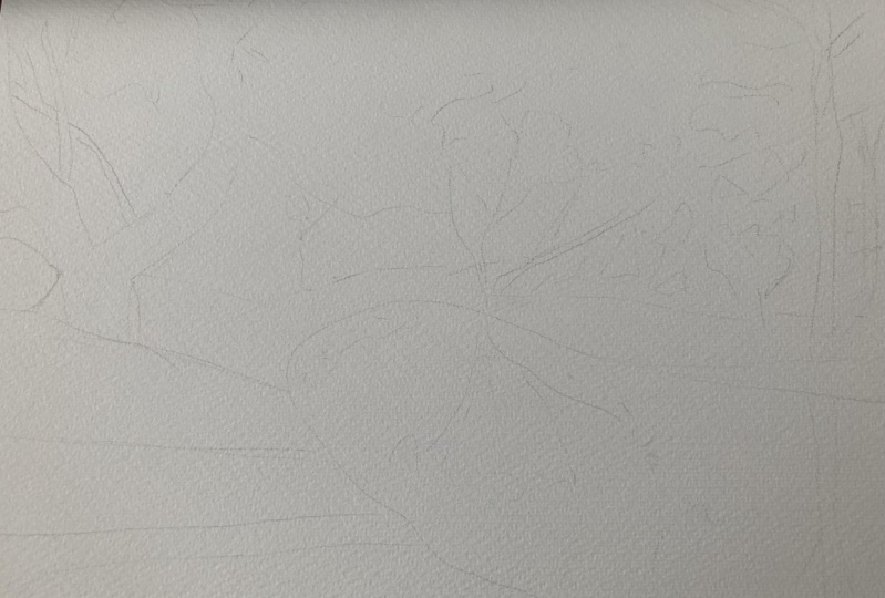
3. Drawing: Alright, so let's go ahead and get started on this drawing. And the first thing I'm
gonna do is penciling, pencil in this area
out in the back where we've got the separation from
the sky and the terrain. These rocky hills and areas
where we've got trees, foliage just touching
the sky as well. So the way I'm
doing this is that I'm just marking the
edges of the paper. So about here in here, just having a look to see roughly how much sky I
want to include in here. And I'm going to
bring this down. Obviously, you know, it
might change later on, but I'm just kinda
tentatively putting in some of the details,
just this separation. And actually I've gone
a little bit too low. There should be about here. Okay. Same thing about here. So coming down like that,
leaving enough sky, of course you can
change it around to putting more sky if you'd like. But I'm just going to
keep it like this. And I'm still having a look, I'm thinking even there could raise this up a little
bit further like that. That's the great
thing about just making sure you've got an, a decent sort of planning here because you
can change things up and you don't have to
deal with all this later on. You deal with the planning now, so then you can focus on actually the
Watercolors afterwards. So we've got a nice
amount of sky here. And probably the
next easiest bit, I think the pudding is the lake. So we've got a bit of
that light coming in there and it just exits
out roughly about here. So if we mark the center
part of the paper here, it's just on the
right-hand side. So just going to
draw in that body of water and it exits
out like that, goes all the way
to the back there. And just going to pencil in roughly where it exits
out somewhere here. Somewhere there. Lots of reflections and
things in the water. And I'm going to do my best
to simplify these down. And it's gonna be quite
an interesting one. So let's have a look, which further I'm just thinking, why didn't this
attached like that? Just this lake. Again, I'm still on
the planning stages, so you've got a bit of wiggle room to do what
you need to hear. Okay. So it really often the distance
I'd say we've got I mean, there's lots of rocks
and things around here, but you've also got like
something that these trees, I think the trees are
going to be, I mean, for me anyway, some of
the most important part, parts of the painting. So just going to
draw in this one holding the pencil on the side roughly and just getting
in a bit of this branch. And these are white gum trees
and so they're going to be, I'm going to leave them as
the whites of the paper. Make it a lot easier that way. And I find that just look and
they have better contrast. I want to use much quash
if I don't need to. You can see here
just these branches. And I'm just mimicking the
branches a little bit, just using that reference
photo to help me out. Again, the great
thing about trees is that you don't have
to be perfect. This one's just go straight
up and down really. It goes all the way here. Need to the river or
the Bank of this lake, the edge of the lake. And there's bits of grass
and things in years. Well, there's large rock. While I'm here, I sometimes just getting a bit of tea towel. I'm little bits and pieces of detail helps so that since
I'm already in this area, and of course some of
this will change around, fiddle around with
it a bit more later. In the background, we've
got these kind of lodge, eroded boulders that form
part of this hill here. And I'm going to
draw in a few them. I want to leave most of this for the actual
Watercolors afterwards. So I'm just going to
indicate some of these sort of break off and squarish
or rectangular type shapes. But for the most part, they almost just this rusty, orangey and brownie color. This is some shrub here. Okay, so just pencil
that in like that. You've even got a tree
just coming out like this. I'll just put that in over in the hills to remind me
to get it in later. Some smaller ones here. You've got this you've
got this kind of smaller gum tree all the way back here and this forms a
reflection in the water. This is, this one's
quite important. So you're just going in and
put in the details of it. Here we can see just goes up. Be careful with some of the
detailing here as well. Kinda goes up like this
and then you can see branch there and then
another branch there. So to just splinter off onto
their own little sections. And this one just goes
up, splinters off again. And of course, the top which
just all this and large, not large but slightly denser foliage do farm with Australian gum trees
they don't have, they're not super leafy. The kind of like a
desaturated green as well. They're not really super
green and that's enough, I think for that
area of the tree. Oh, actually find that later on. You can actually put in
some more of the detail. Most of it through
the Watercolors. That's one. Let's get into the side of this. Is actually a branch
or part of the tree or perhaps even another
tree I think that's growing in roughly the same
spots being blown over. And going towards the
right-hand side of the scene. This is kind of shaped
angle like this. And you can see just some of the the branches also
joining on a touch. More leaf, leafy
bits and pieces. Okay. Some of the stuff
we'll have to get it in the Watercolors afterwards. Another thing I wanna do
is just kind of imitate this tree in the water,
the reflection, okay? The main thing is just
getting in the branches. So they mirror the
tree up the top there, these branches, as you
can see in the water. Okay. And then the branches and things just sort of go
out and a bit of a, in a general copying
that one as well. Then you've got the foliage, bit of the reflection
of the foliage here. Okay? This one here as well, just a bit of this reflection
of that tree like this. I think that's decent enough. You've also got
this reflection of the rocks and things
off in the background, which is gonna be very
interesting indeed. Actually this bush is
probably further up ahead. Drawing it to low down. It's just a bit more
further up like that. I think a lot of these rocks have to just doing
with the watercolor. Afterwards. I don't want
to spend all day trying to draw all the little rocks
and things, eroded rocks. There's little shadows
all over the place. I love this scene
because you've got some sharp shadows and we've
got some soft shadows. We've got some shadows on this
tree on the left as well, which is an important part. You can see here even this
tree forms of shadow hits the wall here and then
just goes directly up, casting a bit of a
shadow like that. These ones as well. Little bit of a
shadow to the right. So we've got to
think about that. Certainly going to think
about that for later. I'm a little bit of a reflection here with this tree
and the water, the tree trunk
anyway, like that. Just getting a
little bit of that. There's a mirroring of
this shrub here as well. Really mirroring over
everything in there. Okay, try and get in
the obvious stuff. Right here. Just a little shrub in the background is little
ones all over the place. And it's a little bit more. Over here. I'm going to draw in a
few rocky like shapes. In the distance. Actually there
is some type of contrast. There's more darkness there. Really that there's
also just sort of areas of light running through. So that's going to form some
nice contrasts in this area. But this tree is really one
of the main players here. You can see that shadow cast all across and then up here
as well as gigantic tree. So I'm going to pop that
tree and roughly here, here is this edge of it. Large trunk. There The other bit kinda
comes up like this. Like this treats really
got so much character. There's even a bit in
the center here that looks to be part of it, like burnt even the motor
been a bush fire or something that had gone
through this area in the past. But that's like a burnt
area of the tree. I'm just going to
draw this in quickly. Okay, Just a little
bit like that. Then we've got this other
side of it on the right. That's where it sits,
near the river. And then it comes out like this. A round a limb that looks like
it's cut off or something? Yeah. Yeah. And I could add it just
disappears off to the edge. Like that. There. A lot of this, this is
kinda like foliage and smaller branches running
through as well. So I'm not going to spend all day figuring that stuff out. Again. Let the Watercolors do a
good amount of the work. Here is these little reflections
in the water as well. Just picking up bits and pieces on this side of
the tree as well. I just wanted to maybe
reemphasize that area of it. That sort of comes in
more in this pitches, juts out more like
this, like that. That's better. Not only that, there are branches that run off
in the background. So you can see this one just comes off and then disappears. There's another branch
that goes directly upwards and exits
the scene like that. A lot of overlapping branches. And just going to draw a few of these in
and exaggerate them. Make these made a little bit thicker than what they
actually appear in the scene. I just want to exaggerate
some of them more. All kinds of foliage and things like that
in there as well. But most of this stuff
we'll have to be, has to be done with a bit of extra bit of extra color and the shadowing editing
as well afterwards. Okay, There's some grass here, looks like good
shrub here as well. Rocks, large rocks. These are great light adding in these
boulders and things. They help to just
add some interest. Even if they're
not exactly there, I like to put them in sometimes. Even For example, I
might put one in here, a rock or something like that. Some of them near
the foreground. That hopefully be an
opportunity for me to get in a shadow as well. Running in the same
direction as you can see, some trees and things off also running to that right-hand
side of the scenes. So shadows kinda
run up like that. And then here it has to go. I think this is a
decent drawing. Let's go ahead get started
with the painting now
4. First Wash: When choosing a brush
for this first Wash, she wanted choose a brush
that pick up a lot of water. That's why I use
these mop brushes, as you can see here, they've got a large belly. Another option is
even a flat brush or even a larger
brush like this, but this is probably too big. You want something
around about the size. So just the largest brush. And I'm going to go
in and I think I'll probably use me have a look. I think I'll probably just use this one almost the same size. And I'm gonna go in
and grab a little bit of the warmer color first. So certainly just trying to replicate what is going on here. I've got some orange here, which has got this
quinacridone orange. I've also got a little bit
of Australian red gold, which is quinacridone
type color. So you get that golden
top of loop to it. But I'm going to add in
some yellow ocher to subdue this down because otherwise I think it's
gonna be too much. And also a little bit of brown or Burnt Sienna
running through here. So I'm just going
to add that in and using a lot of water
as well helps. Okay, so let's just put it in. It's probably about 10% water, our 10% paint, and 90% water. So I'm just putting in all that golden color hitting the rocks in some places
that might be more brown. And so that's why I've
picked up a little bit of brown there. Just added it in. Get a lot of this
kind of golden, golden looking color all
over the place here even. Let's just bring that over. And I'm not so fast as well
that getting it 100% correct, I just want to make
sure I've got enough of this Goldie looking color
running through the scene. It really permeates
through everything. And so most likely back
a background color. And if you get some on the trees and things like that
as well, It's no big deal. And the reason why is
because it's because it's yellow once we put in some
green in there anyway, it's just going to merge with the green and form a
slightly lighter green. So it's no big deal.
That's just the shadows thinking that was
branch or something. Here we go. Look at it. I'm just
cutting around that tree. Often the distance as well. We've got this gum tree here and I'm just leaving
a little bit of white, little bit of white like that. I've actually, I've actually
should've left more white for this country,
but it doesn't matter. We will, we'll make
do here more here. That just permeates through everything and bring it all the way through
to the front as well. Here. Got just enough I think
to to carry this washout. Little bit more brown in there. Touch more brown. Okay. Going near to the
edge of the water. Okay. But a tissue paper here, I'm going to lift off a
touch of color there. Some running behind
the trees as well. You're gonna notice
that there is actually some little bits and pieces of this kind of golden color
running in the background. Just going to getting
a little bit of that, cutting around those
trees and touch as well. Okay, fantastic. So in the water now what I wanna do is try to mirror what's
going on up the top. So I'm going to actually bring in a little bit of this
gold into the water. Just drag that down
a touch like this. Write that down a little and it's actually darker
in the water itself. So you might want to
add in a little bit of gray is what I'm doing, just a touch of gray. And it will just subdue
this a little bit. And also here just drag a
little bit of this down. And it's not all this color as well because we're
actually going to put some green and I'm going
to mix up a bit of this green up the top. Really like a granulating
type of green. And here I'm gonna just drop
the green in, in some areas. And it's again quite a
light. Wash up the green. I'm using mostly
water in here to get in these bits and pieces just
to touch their bit here. You can see bit here
and this trees, well, just some
softer areas of green I'm doing this now so that it
will merge with the yellow so that it doesn't look
too sharp afterwards. Okay, there we go. Also, I want to actually try to get in some of the
shadows if possible, wants this is
almost, almost dry, but look at that which is dropping it a
bit of this green. It's a darker green but
there's a lot of water in it. Okay. And going up near to the tree line all the way
in the distance as well. It's important. Even here, you'll notice there's
bits of green and things off in the distance
with the orangey color. So that going on in there. And then of course, in the water, you've got some
of this reflected green. And again, we'll mix
this up with some of these gray to dull it down. So it's not like a really saturated green and it's
slightly darker as well. Okay. I'm just gonna do a little bit of cutting round work very, very quick cutting around work for these branches in the water. This leave, leave a bit
of that reflection white. The branches anyway. Okay. Here. Green here as well. Here. Here, just kinda mirroring
what's going on on the top. Alright. Bit more of these gold
running down and green, golden green color like that. Okay? The next step really
is just starting to pick up a bit of
this ultramarine, ultramarine, but a bit of this
cerulean blue for the sky. I'm going to just go for it. Okay. More kinda thick on top. And I'm using this brush to cut around the tree a bit like this. Simple quick outline
of that tree. And we're going to
leave that part of those branches white. Okay? And this kinda just comes
all the way across. You can see joins
a bit onto the, a little bit onto the the
trees and the mountains, rock and things
often the distance. Okay. The right-hand side, it's a bit, It's kinda just dried here, so you're not going to get
too much of that effect, but everywhere else you're
gonna get a little bit more of that joining on effect. And also you've got some of that green on the branches of these, this tree as well. So I'm going to drop that in, in just a moment. Let me just pick up a bit
of green while I'm here. It's troppo bidding for
these branches and it's just a soft indication of it like it's not the end product. It's just gonna be
enough to provide a quick lighter green color
for what's happening. But everywhere else I'm just looking at that
and just cutting around the tree to just leaving indications
of these branches. And what you leave out. In terms of these branches, these white branches, they really makes a huge difference. So you want to be very purposeful with this and
mindful of what you're doing. And cut it leaving gear, just cutting around
a little bit of that will do it here as well. Just to highlight
that again, here, in a cutting around
these tree branches like that, like that downwards. It looks some of it
just joins on to the to the bottom part. Oops, too much. It should be lighter as
we head down as well. So you want to make
the top a bit, perhaps a bit darker
in terms of cerulean. But as you move downwards, it should lighten up. Let's bring this around. They're just having a
look at that reference as well to make sure
I'm on the right track. There. That's another branch there. There. Excellent. Bit darker I think
at the top would be better. I'm good. This will mix together
nicely, right? And I'm going to
move into the water. I just want to join
on some of these blue with the green
further down. And this is important because
we want to mimic that sky. But I'll use a spray bottle
quickly in this bottom area to rewet this part. That Just allows the blue
to merge a bit better. Okay. Drawing on nicely. That yeah. Okay. Looking good. So what don't wanna
do now is I want to start getting in perhaps some of the soft details in
the background when we talk about the rocks and
all that sort of thing. So I'm just going to spray spray the paper down a little bit with this little spray bottle. I know, especially on
that right-hand side, we've lost some of the paper
is really started to dry. So I just need a soft
and let down and touch. Okay. Let's have a look at
what's happening here. So I'm going to pick up
some brown and a bit of black, mix them together. Let's see what we
can potentially do. I'm just looking to imply what's going on here with some of these
rocks and things. I'm not by any means trying to add in a huge
amount of detail, but you can see the general
shape of the rocks and things that I'm trying
to emphasize in here. Notice all the shadows as well. They're really subtle and
they're soft looking shadows. So there's not a whole lot
of sharp shadows in here. Just trying to let me make a bit of this detail and complexity that's going on in
the background. They just rocks, really
just on the wall. Even here, this large shadow which joins on with the tree. You can see it just runs
all the way up like that. I can do that. Wet into wet there. This will spread out
a touch as well. Okay. Good. This is kinda like the river, the bank anyway here. So I'm going to put in
some more darkness, bit more brown in the just
some of these softness, soft, darker areas,
often the background. These we'll just look,
I'm hoping rocks, just part of this wall. Without me having to do
too much work in here is like shadows even of the
branches on the tree just you can see it just creeping through the
rocks in the background. Okay. Alright. Some more indications
of the shadow. And you know, you've got all this time because the paper's still wet to actually
getting these details. And more importantly, join
them on with the tree itself. You can see here, for example, you can add shadow goes
towards the right, like that. Going to use a bit
of purple and a bit of black mixed together. It's quite a dark
shadow, so you can see, I'm just going to try leave
maybe a little bit of yellow in that section. There. There, there. Here we can just bring
that across like that. Here there's like
a softer shadow. You can see they just run
up like this around here. And the great thing
is that a lot of this will actually dry, lighter, slightly
lighter shadows also helped to form the edge of this edge of
this lake as well. There, There's even
this tree which has a shadow running
upwards like this. Very slight sort of
slither of shadow, but that carries up into these
hills and things as well. So little by little, just adding that on. Let's have a look. Here. We
played around this shadow, bits of shadow here on the right-hand sides
of these trees. And there's even this large area at the back which is quite dark. It has probably the sharp is contrast in this
scene over there. But also here you got
really dark dark contrasts. And some of these
contrast funny enough, just like reflect in
the water a touch Okay, but I'm trying to
just drawing these on a bit and getting this nice
wet-in-wet approach. This tree here has
like these kind of part of the tree
going up there. I'm going to leave
that left hand side of the tree as well, the branch three, so that I can get in a bit of a
highlight there. Okay, Look at that. You've got to touch a light
on that left-hand side of these little tiny little
branches like that. Good bit of darkness here. And probably with
the rest of it, I'm going to mix up
a grayish color. Let's try this. Just a bit of gray. Maybe with a bit of
Orangi, not orange, but just a little bit of
this brown in there as well, gray, but mostly just gray. And I want to just merge some
of these on to the tree. Really light gray. In fact. And there are some really warm highlights which I'll just quickly get in. Here. For example, just on the left
sides of these branches, you see just a bit
of warmth in areas. I'm going to, this is
what I'm just picking up a yellow rightfully, since some of that and
then I will just merge it on just merge that on with the gray areas because it's
not exactly pure white. In this section. You get more yellow
contrast around here. Even in the branches
that slightly warmer quality of light like that. Then we'll pick up
some of the gray and just merge it on
budget on like that. A bit more of that
yellow perhaps here. Or I could even leave
most of that just white. Soften that edge a touch. More of this gray
color that I've got. And grays are just mixed
from your three primaries. Nothing special. I do have
a pre-mixed gray though. It's called a neutral tint. And we're still using very light concentrations
of colors here. But I want this beautiful
kind of wet-in-wet effect with all these
branches if possible. And I'll go over the top
of it again afterwards, maybe with some darker paint and some sharper brushstrokes. But really at this point, just want to get a bit
of color in there. Okay? I will notice, I've
notice here also in the foreground there are
some softer looking shadows. I'm going to spray
that down a touch, spray that down with
a bit of water. Let's go ahead and put in a
bit of these darker shadows. Just got some grayish color. Oops, probably some more. Spray that down a bit more as even some green
back here actually, I guess I'm a little
bit of that in here. Look, here's that
large sort of shadow that runs towards the right. And then you've got
little ones like this. Just cutting around these rocks, these imaginary rocks
that I'd put in before. Now suddenly they've,
they've come in handy. And they help to imply these shadows as well
running towards the right. Actually whole bunch of them. There's so many shadows
just coming in. Like a large one there even. I spray this down a bit. Them to be soft. Kinda goes often to the edge
again of the of the lake. More darkness at the base, I think would be good. Okay. So having a look at this
quickly from a distance, I'm just trying to put in some more shadows that
might make sense. Further down here, for instance, these little bits
of sharper ones. Even here in the mountains
and not the mountains in this area here it's kind of darkness running
through there. Here. Even in the water you can
see there's a little bit of the reflection of
that darkness as well, which are probably
getting later. Okay. But a bit of softness in the water if I can just
re-wet that a touch. And a little bit of
that reflected in the water came just
having a look around, seeing what else I
need to perhaps do. I might add in a little bit of gray for parts of the tree. So like here, like that, just a little bit of gray on elements in some
parts of the tree. It just kinda quite stark white, which I would leave
for later anyway. At some parts more have
this grayish tinge to it, even this one in the back. But again, it's, this is, can be a stylistic
choice to like. You might want to add. You might want to
make it look really, really, really, really stark
white. So I'll try that. We'll leave it, but I'll make these little reflections dollar because they're in the water. Normally speaking, the
reflections going to be darker. But at least you can
see a little bit of what's happening there
in the water. Okay. I'm gonna go add in a few
indications of this tree. Let's just put in some of these. So I'm just scumbling
around with a bit of green and putting in some
of these leaves. Gum trees here. Here they just go round and this works well when
you have an old brush, you can do this
kind of thing too. You don't have to think too much about the the brushstrokes. They because the bristles of the brushes
just coming off in all kinds of directions. The actual clump of tree with the foliage
looks quite natural. Just don't want to overdo it, but bits and pieces
you can leave in some of that previous
green there as well. So something like,
something like that. Even here a little bit there. You see there's a little
bit here as well. With this kind of tree
or whatever it is there. Even on this top part, might be some leaves
we can indicate. Okay. Look with this one
some little bit too green at the top as
well. The foliage. I'm going to give this a quick
dry and we'll go in with some of the extra details.
5. Second Wash: So time for all
the final details. So we're talking about
the reflections, some of the sharper reflections, details on the trees, and some other sharper
bits and pieces. So I'm gonna go in, I firstly, let's pick up a
bit of this black and brown. I'm just going to
mix up a bit of black and brown together. Get a nice sort of
Earth and tone. That's not two, not too dark, but CS2 has some elements
of that Browning's in it. So this tree here
in the distance, I'm just going to
go in and killing. I've got a little brush here. This is a flat brush. With this flat brush, I can just getting some brief
indications of this tree. It comes down like that. And I'm using still
a lot of water in this Wash because this
tree is further back, further back the object or
thing that your painting, you really want to
make sure that you've, you're going a bit lighter. One, once we hit this
stuff in the foreground, we can afford to go darker, leaving a bit of this light on the left-hand side of the
branches of the trees as well. Okay. Like that. There's also this tree here
which we'd almost lost out. Kinda comes up there and then
you've got another branch that just comes up
like that as well, which I'll indicate
briefly like there. You can just use this
same brush to further elaborate on the limbs
and the branches. If it starts looking to to, not to detail but too dark, I just quickly rub
it out like that. Continue on. Some of this stuff. I'm actually going to work on using using some white
gouache afterwards. Okay, bring out a bit
of the bottom part of this tree there that
I'd lost previously. But you know, you've got
things like this shadow here, running cross behind the
trees and they form small, sharper, sharper sort
of parts on the wall. It'll be more, it'd be
more darkness in there. So this stage of
the painting really takes probably the most
amount of time, my opinion, because you're thinking about these finishing touches and you also you also don't
want to overdo it and have a situation where there's too much going on and you lose the intention of
your of your painting. I just want a nice
loose indication of those trees in
the background. And that beautiful sense
of light that comes off. There's even a small brush
that I have, a rigger brush. This Brushes excellent for getting in tiny little details. And in this case
branches, small branches. So I've got a bit of this
brush here just dried off a bit so then doesn't
drip all over the place. And you know, for
example, let's try here. Might be something
we will branch or something there that
want overdo it, but I'm just picking
up a few little things that might help to add detail and
complexity to this tree. As you can see, there's
actually tiny little branches that come off the sides
of the trees as well. So this helps to wages join it up and
give it more detail. Because you've got all these
other detail in here anyway. Good. I'll do the same
here for this one. Here's that other brush I got little flat brush
and little rigger brush. Okay. I'm just using a grayish
color for this shadows Will the, the limbs
of the tree anyway. And because this tree
now is becoming, in getting quite
close to the front, I can afford to go
slightly darker that you just a bit more
darkness on that limb there. But the same time, I want to preserve some of
that white color on the tree. Okay. Soften that down a
bit here as well. As well. Soften that edge, soften
that edge and this edge here in the water, I'm just going to darken down this tree bit, this, the reflection of it. Okay, let's have a look at
this tree here and left and then we've got a lot of
darkness there already. But I'm going to want to just
emphasize this a bit more. And in terms of the darkness,
especially, you know, I wanna get into some
of these edge of that tree that hits the
ground like about here. That Okay. No, just feathering it over to that right-hand side
part of the tree. There. You can see that darkness over the right-hand side of
the tree, bit more brown. Okay, so it's really
sharp details. And I'll soften
this edge as well. A touch filbert brush here, which is a brush designed more for softening
areas but you don't need. It's just one of those
specialty brushes that I keep from time-to-time. I've had more more that there. Okay. Good. Some more up here. Here is even a branch
that runs upwards. I mean, it's all kinds
of stuff going on. This one runs up here and kinda
disappears off like that. This branch, that
branch up here, there's a darker sort
of branch here as well. That sort of comes out of
that section and sharper, looking like that. There. We'll look at some more
of these branches. Here in the background. I'm just dulling down, just watering down
this color that more of these limbs
trying to leave in a lot of that light,
if possible one, the branches often that down. I get some more sharper looking, sharp looking shadows
here as well. I'm going to mix up
a bit of purple, wouldn't bit of brown
and a bit of black. Okay, and we'll notice
there's actually some this darkness here. Extra darkness like this. Like a really sharp or
shatter. Some leaves. Shadows are a lot
sharper than you think. Also, I'm just trying
to use this to, I guess cut out a few
rocks are indications of rocks through this
background area. Okay. Darkness at the base of this tree forms part
of this shadow. You're joining it
all on together. You've got this
large kind of shadow that goes all the way messed up until the lake there. Okay. That one looks pretty good. So really at the
moment, as you can see, I'm just adding in
little details. Maybe some sharper shadows
would be good as well. A few them just join on. Perhaps like there. Something here, perhaps the got a fan brush and this
fan brush is great for adding in some subtle details. And I'm going to
use this to get in a bit of green shrubs, green and kind of
yellowy green shrubs like grass and things just
running through in the areas. I think this is necessary, especially with
Watercolors when we're removing details at times. It helps to just add in a little bit more
complexity in some areas. So she knew this bank, I'm thinking like maybe
a bit of grass would be nice to help bring it forwards. Especially here in
the foreground. Just a few little
bits and pieces. I mean, the more golden
color it actually like this. Just some little shrubs
and things in here. Grass really. A bit more here. Just feather it a bit over
the top of everything else. I'm just getting some of these. It's kinda like the reflections of the trees in the water, but I'll do it now just to
join it up all at once. There we go, just a bit of
that reflection of the tree. The leaf, leafy areas
be here as well, but that reflection,
just making it up a bit, but get the idea
bit here as well. Looking at just these
little leafy reflections of what's going on above. Because there's actually
some trees up here. Just indications
of them like that. Soft enough. It's too sharp. Even on the trees you
will find there are some slightly darker
bits on the right side. Okay? Just shadows, really
indications of the shadows running on the
right side of some of these. It's in pieces. Let's put a bit here. Be more green, dark green there. Pick up that other
brush, this one here. Some more of this stuff. It's in the front as
well. So I'm making this intentionally and a
little bit darker. And bringing this over the top of that previous Wash as well. We've still got in
some of that light, the same time. Black. To indicate the shadow is one small bit of it in the trees as well. Extra contrast. Some sharper shadows running
across like this as well. Want to just get in a
nice balance of shadows. There are some that
look a bit more sharp. Some more detailing on this
tree here in the foreground. I need an extra one on the
right-hand side of that tree. Good. And more
that shadows will. Because this tree is quite
close to the foreground, as I mentioned before, a extra darkness with some of these little twigs and things, little branches coming up. It's going to help to
bring it forwards. So that's what I'm
trying to do here. Dry brush perhaps in
the trunk as well. This is a kind of a darker
part there for this tree. The rigger brushes good. Also for these bits. Get more little bit more detail in exaggerations of the darker areas
of the branches. Lot of this just layering,
overlapping shapes. Especially in these
tricky in the foreground. I'm quite obsessed with it because it's just
the closest thing. Little bit of a little bit
if something in here. Oops. There we go. Darkness in the inside of this tree
as well. Like that. Too much. I just yeah. Do this kind of thing again. Spray at the base.
I want to scratch off perhaps a touch
of paint in there. Here, here as well. Quite a dark shadow. For some parts of this
area, the front as well. I just want to
emphasize that better. I do use a little blade
at times like this, and I'll use this to just
scratch off as you can see, little indications of detail. So like grass and
things like that, you can just do
this sort of thing. I'm here, just bits in the
shadows and things like that. And it can be a bit
messy at times actually. And this is like a texture I'm trying to just indicate on
the tree as well. The base, some tiny
areas like that. This little bit more of these bits of grass
and things as well, just put on some more
in here and there. Some sharper beats anyway. Scratching out off as well. Let's get into some of the shadows for this
tree here on the right. Flat brush. That greyish
coloured paint here. And just goes up. That. And more darkness below. This darkness around
there as well. Roughly where we've
got the lake. I will just form a
little boundary, I suppose, in areas like this. Very, very basic boundary. Okay? So you can see even
here on the left-hand side, I can do this kind of thing. Just putting a quick little
edge to it like that. I want to put in a bit of
darkness with this tree. On the left-hand side of it. Right hand side, sorry. There are some smaller
trees often the background, which I can indicate
that he was my rigor. And doing that same sort
of thing as before. We're just picking up
a bit of black paint. And I'm drawing in the indication of some
of the branches of them that there might be
something there here. Here. Especially where we've
got areas where there is like a bit of light. Suppose just breaking that
light up a bit helps. That may not actually be
there, but it doesn't matter. Just some little darker bits. Small details Maybe some rocks
just indicate like some edges of these
rocks spec again. It had disappeared off before. Maybe this is flat edge brush
would do better like that. Some spots that can
really bring out a touch. My even use a bit of gouache
in there afterwards too, wasn't my intention,
but a little bit of gouache probably will help. Sometimes you get a log or
something in the foreground. So just, I can pick up a bit of brown and mix it with some black and just change
things up a bit. Put that in,
something like that. Because we've got these shadows and low than just running
the same direction. So by putting something like an opposite direction
like this, I don't know. I think it just
balances it out that these two bits that
I've just added on, of course, some of
this other stuff, sharp a bits and there could be anything really. But I will bring out
some of those rocks. Why don't have a few
over this side as well, just to balance it out. Pick out some bits
on nearly the water. You didn't notice
even some of it just comes down
through the water, just these little reflections. And, um, this is how
I'm gonna do it. Just a few downward
brush strokes like this. So suppose, okay, and I'm draw that brushes
pretty dry as well while I'm doing this so that it doesn't overwhelm the scene. Extra darkness around
the back like that. More here. Lining the this area. Use the filbert brush. Again. If you don't have filbert brush, just Use any other
type of brush. I'm just pick up a
naught some water. And this is what we're
gonna do, soft and pick a few areas to soft
an app like there, I think that was just
too hard of an edge. Like that. These as well just soften up some of those
edges on the trees. Just just add a bit of water and scrub a touch helps
to blend it better. Here, for example, think
that's too much of a hard edge and distracts. Some hard edges are really nice. I just wanted to leave
some of them as well. It's just some of the foliage. You can go in. Darken. Some bits as well. Just continue detailing. More green. You can
do this forever. Long you think is necessary. There's also some of
these shrubs and stuff in the in the rock. And I'm simplifying it down, just dabbing here and there. Extra contrast perhaps in here just to get in some of these, this tree shape better and indicate perhaps like a some
rocks and things there. Some sharper bits here
in the back as well. Just just putting these kind of rocky areas that we're
missing out before. Some yellowy color. I can maybe use with these
shrubs or something. They're using this little brush now, there are some smaller
trees often the distance. Just picking out things that
I want to draw a painting. Not much at all. Filbert brush again, I'm
going to soften this. Let's paint on wet brush. So that edge was be to sharp. We can soften it a bit. Even though you didn't
even on the reflections. This shadows the branches
6. Finishing Touches: I've got a teeny bit
of white gouache, and I'm going to use
this to bring out just a few little highlights and bits that I've
lost out before. So just being straight
up on the brush. Now, I think part of
this reflection here, I've also got to
just fix up this a little bit of
white kinda coming up through here and joining up it's part of the
branch like that. So just going to
do that quickly. And even on the
edges of the trees, things like that, I can just, so just kind of bring
out an extra bit of highlight that I'd
lost perhaps before. But you want to be quiet sparing when you're
doing this too so that it's not all
over the place. And nice little rigger brush. This would be better
for that actually. Little rigger brush. And I'll pick up some of
these white gouache, opaque. And I can actually
get in some of these, there's like a tree here. That's like a part of Part of that tree that's
just in the light now, maybe this one here. Notice how I started
just skip areas as well. At times it does actually help. I'm another one here. You don't want to overdo it. That's the important thing. I'd actually lost out part of the highlights with this area, so I can just hold that brush
further down and look at that like magic
comes back. Yeah. Is it a crisper sort
of edge and branch that just comes all the
way out like this as well. Just here and there will be here. So important to just
use it sparingly. Even in this little tree is
a reflection. The water. Can you see that little tiny bit in here as well?
Little bit there. Yeah. Let's work on this
tree on the left. Don't want to overdo
what with this one. I find that closer
to the foreground, you can just have to
be careful with it. And I might actually
switched to another brush, mixing a bit of yellow year, just a little bit of yellow into their to that gouache
to create a golden one. Wash color. I think this will work better for some of
these rocks like here. Little bit of that. Crisp edge spots. Good for indicating
some grass as well. Little bits and pieces
of it like that. Here. A little bit of it. Again, you gotta be sparing
with the application, but basic little highlights
here and there. More white spots. We can bring out some details. Okay, and I'll call
this one finished
 Watercolour Mentor (Darren Yeo Artist), Art Classes, Mentoring & Inspiration!