Transcripts
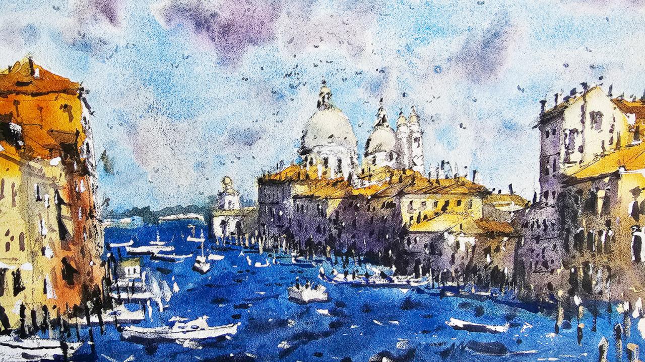
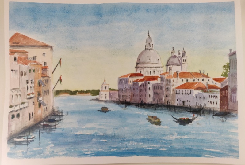
1. Introduction: Urban landscapes are interesting and rich subject full of life. The perfect subject for
watercolor painting. In this class, we'll be painting a detailed scene of Venice from the Grand Canal
using a variety of wet and wet techniques and
wet on dry techniques. We'll start from the ground
up and learn how to compose, planned, and draw your
landscape scene in pencil. First, we'll go through how
to emphasize and emit areas in your reference
photo to create a more interesting
and unique painting. In this scene, we use wet and wet techniques to paint the colors and soft details. And the first one, this can
be a challenge for beginners. But don't worry, I'm going
to show you how to time your brush strokes to
create soft blended washes. Supply lines. Learn how to gain
control in layer effectively to create a
loose atmospheric seen. It's easier than you think. Creating fine, sharp
details are just as crucial when painting
urban landscapes. Create shadows,
contrast, and interest. But understanding when to
add the mean is crucial. I'm excited to get started. So join me in this class. You'll be painting
this beautiful scene of Venice in no time at all.
2. Materials Required: Alright, let's talk a bit about materials before we get
started in this class. This is a bit of 100%
cotton watercolor paper. It is a medium cold
press textured paper, so it does have some texture. It's not as rough as a
rough textured paper. You can use that stuff as well. I tend to go for
cold press paper because it's a nice go-between. I can get in a lot of details
without too much struggle, but at the same time
get the benefits of that textured paper. And the benefits include
things like seamless blending. You can wet an area, drop in some extra color and
it will just spread evenly, dry roughly at the
same time when you're using hot press
paper, that doesn't happen. Often hot press paper which
will have puddles in areas, warps can be tricky
to work with. So do recommend some
textured paper, even if you can't get
100% cotton paper, some texture on it
is very important. Cotton paper or some makes it much easier to layer because the previous layers don't come out when you go over
with the second wash. Whereas if you're using other types of paper
that's not cotton, it definitely going
to get some kind of lifting in-between layers. So the size of the paper, this one's a quarter sheet. And I recommend using at
least one eighth sheet. You want to go too
small because there's a lot of detail here. It's just going to
make it difficult for you to imply detail, especially when you're going in with some of these windows
and stuff like that, It's gonna be a lot easier. Use a larger sheet of paper. So I want to go through just
some of the brushes that I use to show you
what's important. So I've got these
larger brushes here, these watercolor mop brushes, they have a large belly and they actually hold a lot of water
and come to a fine tip. Really important
when you're painting large shapes and especially
in that first wash. If you don't get
that first washing, Right, Everything else
is not going to work. So for these buildings, e.g. I've used probably
this larger brush or even this medium-size mop brush, just gone over the
top with a lot of those warmer colors
in the sky here. Larger mop brush makes it easy so you don't
have to keep going back to your palette and mixing things up over and over again. You can, of course,
you've got to go back and top up your brush, but you do that less often. Okay. Let's go through some of the
other brushes that I have. This one here is a little
synthetic round brush, good for small details. So when we're looking
at little windows, details on the boats, these little wooden
poles in the water, a bit of detail on the
roof, things like that. The small synthetic brushes are great because they
don't hold a lot of water, but you get control with
every brush strokes doesn't go spread water
all over the place. A little rigger brush as well. I don't use that so
much in this session, but I do use this one here. This is a little flat brushes. Flat brushes are also great alternative to just
a normal round brush. And I actually use this
one because it makes it easier I find just
to get in the windows. So the shape of the
windows are kinda squarish or rectangular looking because this brushes
of that same shape. So if you look at
these windows here, look a little bit
squarish on the edges. Okay, so really good
alternative as well. You can also use
this brush to get in some of the shadows
and you can see what I've done here in these areas at the back and just topped up the brush with a bit
of this darker paint. And I'm able to get
that in because again, it's quite a small area at
the back here, so it's fine. This brush can do the trick. And at the same time getting nice sharp edges
on the buildings. So that's about it
in terms of brushes. Let's talk a bit about
paint now here in the sky, but some cerulean blue
haze this color here. And I've got a little
bit of purplish color mixing with gray. Now I've got a few
different purples here. Can mix up your own purple, you've got a blue and red. We can brought by
pre-mixed purple. I just want to dial it down a little bit with
some neutral tint. Neutral tint is just
a pre-mixed gray. So if you've got a blue, red, and a yellow
mix them together, you're gonna be able to
get that color anyway, it's initially general
grayish color that I tend to mixing with other colors,
too, dull them down. I don't want these
colors to be too vibrant up here in the
sky with the clouds. So that's why I dial it down, touched by adding in
some neutral tint. Same goes for some of the
shadows and the buildings, but I didn't want
these buildings, the shadows should
look a little bit more vibrant and cooler. So I did add more blue in here. Okay. But also for the darker
sections of the buildings, It's just pure black
or neutral tint just to indicate some of
the details there. Got some yellow ocher and
a bit of orange here, pyrrole, orange, bit
of burnt sienna, grateful rooftops,
power orange here, the yellow ocher is more
of a desaturated yellow, especially here
in that building, really makes a big difference. And it doesn't look
through Gaudi, You didn't have really
highly saturated areas that can at times distract from
what's going on in the scene. Saturated colors are great, but I do use them
sparingly these days, just on areas of contrast. Here in the water,
just got a bit of cerulean blue as well. I've mixed in, I think a little
bit of here in the water, I've got a bit of
ultramarine blue. And I think in
areas I've mixed in a touch of cerulean
blue as well. And you can see here
I've dropped in a bit of this neutral tint in the water. Areas like the
shadows underneath the Burke's Reflections
on the boats. We will get to these waves
I've just dropped in while the paper was still wet. Mars thing I want to mention
tons of colors is this. Here, it's a bit
of white gouache is opaque watercolor paintings. Great for getting in
little highlights. So you can see here just on the edges of the windows
and things like that. Little touches of
white there just to indicate maybe some
light reflecting off. It just adds that extra
little finishing touch to the end of your paintings. I also mix that white sometimes with a bit
of other color here, bit of a warmer
color because these are wooden wooden poles, pylons taking up water. So I just thought I'd put in a bit of a
warmer color there, but if yellow bit of brown. And you can see here
if carry that down the side so it still
sticks out near the end, but it's not as obvious
as save this boat here. You can also just errors, e.g. cut around the boat
and you've forgotten to leave some of the white. And actually going back
with that whitewash, bring back some of those
white in there as well.
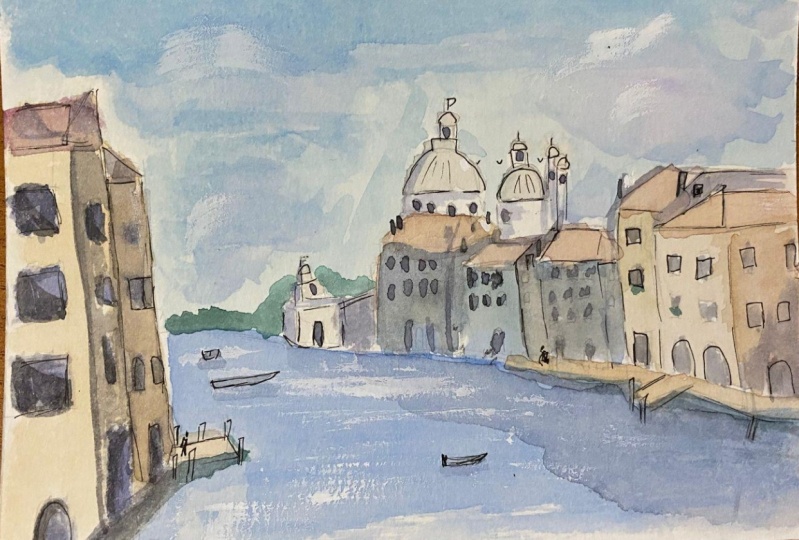
3. Drawing: So we'll start off
firstly with the drawing. And I'm going to put in
the horizon line just underneath the middle
part of the paper. So if we mark out the
middle roughly here, I'm just going to draw a
line just underneath here. Like that. And connecting it
to the side of the scene. Pretty straightforward
like that. It doesn't have to be perfect. This just marks out
the area of the water. Now, let's see. We are going to need to put in all these
little buildings. And the way I
wanted to start off with just in the
center area here, you can see if we look
just around here, maybe a third of the
way into the scene, about a third of the
way into the scene. We've got this little
structure here. I'm just going to put that
in for the rest of it. I'm just going to put it in a kind of
silhouette of the buildings. I'll change this up in a second, but I'm just going to roughly indicate where the
buildings are. Okay. And we'll fix that
up in a moment. And this side on the left, we do have some
buildings coming in. We've got 11, sort
of about here. Large one in the background with the triangular
rooftop like that, coming down like that. And there's a bit of
space in-between as well. We've also got a few
other buildings that just run next to it in front
of it, like this. Okay. I'll add some more
details to this later on. I just want to get something
in there first, okay. To roughly pudding where
the buildings are. So let's start around here and I'm going to just add
in little more detail. All the way at the back, like that little section
there, little pass underneath. This is kinda like a
little way or something. This is fairly far off in the distance so you don't
want to make it too detailed or have too much
going on in there. Look at it a bit closer as well, and actually see that there
is a side of it that's kinda darker, like on that side. Okay. Good. I might make these arches
a teeny bit smaller. Just a tad smaller. Touch smaller. That top part like this side of it here that's
exposed or darker here, darker on that left-hand side. We're remembering
that light source is coming from that
right-hand side. So we want to emphasize that you've got this
structure here. It's like a bowl or something
on the top like that. There we have it. That's really not much else. I think we want to put in
there, simplify that down. There's a little and again, another bit of an archway
or something like that door opening up the top. There we go. Let's put in some of these
other buildings now. Here's one here. Let's make sure we get
these lines incorrectly. And the big thing to remember
is that these are just, if we look at them
where they are, just rectangles,
boxes on the side. If you treat them as boxes, they become easier to
draw the rooftop as, you know, you've got these
triangular bits over the top. This one here, there's
another rooftop like that. And we've got the sides
of the building here, and that's the sides
of the building. And we've got another one here coming down just like that. And I'm just taking out
few bits and pieces, making sure that
we've got some light on this sides indicating a
bit of that light as well. But let's get into
this one first. I want to get this in a bit
sharper like that. Okay? Remembering that on the
left-hand side of the buildings, you're going to get
darkness there. I'm like that. So little
shading in pencil helps. At some point it really gets quite complicated
where you're looking up in this scene and
you're thinking to yourself, what, what is it actually that
would do these roots form, but just simplify them down. Just try to draw these repeating
shapes as you can see, another rectangle here,
maybe another one here. The background,
another building here. And simplification. And a lot of these rooftops
are just going to have, I'm just going to be a little touch of light
over the top of them. I don't want to introduce
too much detail. There's a dome here. We can just put in roughly
where it is, like here. Okay. Dome shape like that. And we can start putting in
a bit of the details on top. Okay. Now the top part of that dome there. Okay, I please have it. That's part of the dome. And you can see these little, little pillars that are running
downwards and you've got little darker spots
in there as well. So at them in that okay. Let's have a look here
in that right-hand side is another dome that's a little bit further
down, roughly here. I'm just gonna put
this one in as well. Comes pretty close
to that larger dome, but finishes roughly about here. So I'm going to just try to get the top of
that dome like here. Like that. Then again, just putting a bit of
this top section of it. That top part of it There. We have it. We've got another part of that
dome, smaller one anyhow. Coming down, this
is kind of just white. Next section as well. Not much detail. But we do have to
just make sure that the dome is accurate. So I've just noticed
I could do that. Touch better, give myself some better guide for
when I'm painting. Now that There we go. Good. And you've got all
these rooftops of buildings like that
one just runs all the way towards the back there
and you kinda just comes down like that and this is part of that
building in the front. We've got this
section like that. All these little buildings
that just kinda connect up. Okay, separate out. All this has really,
it's trying to form a bit of a silhouette. I don't want to over
detail in here. Let's just another rooftop. Here is another,
another rooftop here. Let's get into the lead with
tau is there is actually another building here and let me just getting indication of it. That and here we've
got these towers. It's kind of at the bottom. It's more of like a side. Little longer rectangle,
rectangularly shaped like this. Just a longer rectangular shape. The left side, dark, darker. And there's one
also on this side. It's top get that top
part of it in like that. Okay. And then little
dome-shaped top as well like this.
Something like that. We can do the same thing
for this one here. Yeah. I just connect on with
each other a bit. Okay. This would just be uniform. A bit
of that silhouette. I don't want to
detail too much in their bits and pieces here in the background there's
little chimneys you can see just on top of
these buildings. And I wanted to just put in a
few little bits and pieces. These chimneys can
be quite helpful. Funny enough to imply some small details and things
of what's going on in here. So eliminating a bit
of detail as well. Okay. But we're going to
leave the lights on parts of the buildings. This is just me figuring
out where to leave the white were to leave the white and some of
these bits and pieces that rooftop a little bit
more accurately like that. Again, this part is
going to be in darkness. A lot of this stuff here is
just gonna be in darkness. Alright, so that's most of it. We can now just work on this building here in the
back and the front, sorry. And you can see it sort of
comes out roughly here. We compare the dome. I'm just putting it was
putting a few little bits, some pieces in the dome. But if we compare the dome, it mostly just starts in
the center of the dome. It is building out here
in the foreground. I can roughly that section
like that, bring that down. This is actually a couple of
chimneys or something there that I'm up come down in
the front of this building. Actually, this is the side of
the building we can get in. But actually these forms out of this building
here as well. So I can just get that
out in like that. Just getting the
side of this one properly can be confusing. Let's met side. Then the front of the
building. Draw that in. So that's the side, the front. And then here I
can now start just working on the rooftops. Like that. Better. Yeah. Okay. What are we doing here? That out? Chimney bits and pieces
and things here as well, then this disappears
off like that. But of course in the
background we've got some more, another rooftop. Okay? So you're going to
notice there's a bit of darkness here and
darkness over here. Coming down like that. Softer shadow here and the building as
well we can get in. I'm just having a look
what's in this section. I'll leave a bit of
light on the building. In a lot of it will
just be in darkness. Okay. Good. So that's that
right hand side done. Let's work a bit. On the left-hand side is larger
building finishes above, roughly at the top
section of the tower. So this triangular shape for the rooftop down. This. And let's put in some
details for the buildings. That comes all the
way down really to the front of the
page, like here. This one's quite close to us. So I want to follow that
perspective coming up there. Okay. Sounds good. A period like
a rooftop or something like a tiny section of the top
part of the building. This okay. So just work on the perspective
of it as we're drawing. This is another rooftop. There is a rooftop here
as well that comes down and forms like a side of
another building like this. This smaller building coming out here. Oops. Halfway here. Okay. Can always fix this up and add some more details as
we move on later. I'm going to add in more of
the side of this building, the left-hand side
of that building, and now it's not so visible, but I just want to do it makes things look a bit
more three-dimensional, better, something like that. All these lines is not
completely straight, but we'll make do
the bottom attach. The rest of it is
just getting in small elementary
details like e.g. these little buildings
off in the distance, like just some squares
or what have you like they're off
in the distance. Who knows what's going on there. We've got also some boats
and I like this one here. This just going into the scene. I can work on that, a touch like this. Some people in there as well, which we can you
can add in. Okay. I'll do that later, but
I just wanted to put in an indication of them sitting in the
boat maybe like this. And it's a gondola
here, like that. And just kidding, that general
shape of that gondola. This, It's all you need. Some people sitting in there. There's actually probably to gondolas just lined up actually. So now I can go ahead and
simplify it down and again, adding some people,
there's another boat. The good thing about
birds is that you don't have to be
perfect with them. You just have to get
in a little shape like this and it will
look like a boat. We've got all these highlight,
highlighted bits in. There is also a gondolas
running in like this, off in the distance and other
boats here in front of it. A lot of this stuff does not
have to be really accurate. It just has to help indicate to the viewer
that they are boats. Give it a bit of life. This is some type of
boat facing forwards. We go, it looks a bit better. And then we've got ones here
as well that are closer. So I'll put in a touch of
the front of it like that. That's part of it. Just sitting
in the water like that. It's like the advisor
the front here. We'll put in another
one like this. That another one here as well. Just a gondola in the front. And it can be the case that you also add in some other
ones if you'd like. I just thought I'd put in
this gondola indication of one anyway like that. Maybe some people on there just looking at the
composition and seeing whether you want to
change anything. But apart from that, I
do think this is looking pretty good already
just for drawing. And you see a lot of these, like wooden poles sticking
out of the water as well. These are very useful to add in. There is also some kind
of like structure here. Middle, something. I don't know what that is. I'm just going to
add it in there. Okay. Now, I think we're
ready to get started.
4. First Wash: Okay, so the first thing
we wanna do is put in some color for all of
this, all the buildings. And I think making sure that
we have a lot of light, warm colors is
quite crucial here. I don't want to add
too much vibrancy. And also remember we can add in, we can leave out the light. I picked out a bit
of color here. This is just a beautiful
color called buff titanium. It's a kind of milky
color, off-white color. And I'm going to just
drop some of it in here to the buildings and a lot of the
buildings actually, I'll just leave white. Like especially you
can see the tops of those buildings leading white. There's no problem there. But for some of them you like, you can see here it's
got an off-white color. So I can just drop some
of that in like this. You can also use a brush. I'm using just this brush
which has some kind of a smaller mop brush. Okay? The other one was using the force is not small enough to get in those colorant
cutting around details, such as adding in some of these color to the
left-hand side of the buildings like that. Just to give it a bit
of a backing color. Again, not too vibrant. I'm using a bit of yellow ocher in here in some
parts of the buildings. But apart from that, not much going on
in there at all. If this building
you've got maybe a little bit of darker
color in there. If we'd gotten this
this one a bit of again, this yellowy color, drop that in getting more contrast actually
with a darker blue, not a darker blue sky, but with high concentration of
cerulean blue in the sky. The rooftops, I can pick up a bit of this stuff
called burnt sienna. Little bit of burnt sienna mixed some of that up here
on the palette. It's a kind of Goldie brown
color, reddish brown color. And this works very
well with the rooftops. This particular scene. So look at that, just
drop in and drop in that color in the areas of the rooftops that you want
to indicate some of this, it's mostly just water. Mind you don't add too
much paint in there. Just a little bit of water. A lot of water and a
little bit of paints. So 90% paint. And just getting those
rooftops quickly like that. Here as well. We can add in a bit of
that side of the rooftop. And notice how I'm working
wet into wet as well. No worries, just
have to get it in. And this one at the
back there is some kind of rooftop like
that there as well. Okay. Some of this will spread into the buildings, but don't worry, bit of yellow here
with the yellow ocher. Just drag that down a touch. Maybe just darken the roof
top a little bit like that and hear some more darker
colors running through. Just warm colors still
though, a lot of warmth. Let's have a look at the
top of this building. I'm going to pick up a bit
of this grayish blue color. It's mostly just gray
from what I've left, What's left on the
palette before. But I'm just adding in
a touch of this color. And slightly, like I said, slightly cooler to indicate
the tops of these domes. Just drop that in. Not much at all going
into their more, so just on the top of the domes. Put some more back in here. Okay. The kind of almost
like a teal color, slightly bluish teal
color, very desaturated. And what we'll do is indicate
the boundaries of the dome. Bring that down a
bit maybe here. Just to get it to
blend down, touch. I mean, apart from that, I'm just going to
leave it. Okay. Get rid of that. Bring that down a touch as well. Oops, too much yellow. Gone into the two, it just drop in some more blue. Basically just a
cool gray color. I'm kinda like teal color,
I suppose in there. That off. Let's have a look
at the top of the of it. It's starts to warm
up a bit more, putting a bit of brown
and a bit of the blue. Just to touch of
it up at the top. And color, just adding
a touch of that color. That's not really
that saturated else, just lift off touch of
it, something like that. Maybe. Yeah. Perfect. These two as well, just to
touch a warm front top there, but the rest of it,
I'll just leave. Okay. Good. I have to get in that water
as well in a moment, but let's just put
in a touch of this. Water here at the
base so that we can come back to it
in just a moment. I find that adding a bit
of water at the base helps to just keep it wet for longer. While I just work on
this left-hand side, touch of yellow up to the
top here, very light yellow. I'm going to leave the whites on the on the right-hand side
of the building though. This is the roof and
there's more stuff going on in here as well. Just chuck that in, let it melt into
the lighter yellow. Just going to keep going a
bit more of this yellow, a little bit of this burnt
sienna on the rooftops. Little bit of that white, just leaving touch of
that white exposed. They're coming down on the page. Now. I'll pick up more
of this kind of white, off-white color to drop in here. I don't want there to
be too much vibrance. See, in that section, lips and it's kinda moved up. Here. We have orange, tiny bit of this orange for this building here they're
a bit more vibrant. Orange. Drop that in. Okay. Remember to keep your
washes real light. Mostly just water color for
those buildings in the back. But apart from that,
there's not a whole lot. You need to put in
there little bit of this burnt sienna at the
top of that roof here. That maybe a touch
up here as well. Yeah. Okay. Good. So again, I will just perhaps spray
down the bottom parts. Just with a touch of touch
of water at the bottom. We'll come back to
it in a moment. But I want to get the sky in. Firstly, I will use
a larger brush. This is a larger mop brush, but I have this big brush here. You can use whatever
large brushy gut going to mix up a lot of
cerulean blue in here. Okay, let's start off
right at the top. That's a good consistency. A lot of this is just water. But I find that with
truly in blue it doesn't, you're not able to get a
really dark wash of it anyhow, this is the darkest you, you're probably going to be
able to get it. If possible. Just mix them up
yourself by using a bit of straight from the tube. So I'm just going mixing this carrying this
wash straight down. It's going over the top
of the roof and look, some of it might mix in
like that, don't worry. I tend to leave a little edge, see how I've just left the
touch of the white and the paper that will cut around. So the water just
doesn't mix into much. There. Look at that. Okay. I mean down more blue. Nice little cerulean blue. Once I get close, get close to these buildings. I really want to pay
attention that I'm not going into them much. I'm cutting around
them as you can see. I'm going to switch
to another brush. Just a moment. See how much I can
do this like that. So here I'll switch to
another little mop brush. This. And let's shift some
of this paint around. Let's go with these
little weird bubbles. Just move them around a little. While the paper is still wet. You got a lot of
wiggle room here. Okay. Where is the mop brush? This will work best. Smaller mop brush. And I'm just going
to cut around. Touch like that. Okay. As long as the sky
wash is just a touch darker, you'll be okay. Look at that. Cutting
around there. There. Okay. Padding around the domes. You can also make
this area a little darker near the domes. Higher concentration of
cerulean to really bring out the contrasts that these leave out some of these
chimneys and things. I'm just going to
leave them white. And look at that just
carrying this down page. Some pods it will mix, but really you don't
have to worry. Okay, That's looking
pretty good to me. I'm going to redo, just go over with this larger
brush that helps to flatten out some of
these inconsistencies like little bubbles
and things like that. Okay? Um, another thing you can do
is add in some darker mix is just up the top to help create a better
sense of contrast. Usually at the top of the scene, I will darken a bit
more like that, just dark and the top of it and feather feather reading
as we move down as well. That's up to you if
you want to add in also a cloud or
something in here, I'll show you how to do that
just while we're in it. Pick up a bit of purple color. So just a darker purple
color we can find. And what I wanna do is pick
up some of that purple, dry off the brush a touch. Then you can do stuff like this. You can just add in a little cloud or
something like that. It's, it's, it's
quite a dark cloud, but it will soften
off a touch there. Here's another one like that. Try to keep the
shapes randomized. Here's another one. As we move down the page, the clouds become a touch
lighter and also smaller. Not like the ones up the top. If they if some of them look
a bit too much and it'd be afraid to go in and just
shifted around a bit. That one there. That's probably you'd be
big but doesn't matter. Another one up here. There we go. There. How about we add a bit here? Little one there,
little one here. They're just melting
nicely to the page. The point where it starts
looking good, just leave it. I love adding clouds
in wet into wet. So I'll just add
some of these in. I'm good. Some more here nor there. Okay. Good. So now let's move on to
the water further down. And when I do, I just want to lift off
some of this paint to wet. Some of this stuff is going to bleed too much into the water. I don't want that.
So I'm just going to lift off some of this paint of dried off my brush and just
using it to mop up the water. Okay. I'm gonna be using
some cerulean, not so really in blue
summer, ultramarine blue. In this section. Nice ultramarine blue. And also cerulean
mixed together. So cerulean, ultramarine. Now this water is pretty dark. It's almost the darker spirit of the painting part from
the shadows on the back. This water is almost as dark. A bit of turquoise, you
can mix up some turquoise. I've got some pre-mixed up
at turquoise is just a bit of it's just a little bit of yellow ocher and a bit
of green mixed into it. Get a nice turquoise color. Okay, I want to
mix up a fair bit of this stuff. Actually. I'm always, always run to
the issue of not mixing enough paint and we can
just play it by ear. This should be, hopefully, it should be hopefully enough. Good. Start off at
the back. Here. Let's test that out. That dark enough. I think that's I think
that's about dark enough. Let's continue on. And we can see here some of it's not
completely dried yet. I will dry the paper just to
touch with some hairdryer. This is a flat brush. Just use that to help
get a sharp edge hopefully in there. Okay. Cut around this
structure like that. Okay. Yeah. Let's just keep on
moving this down. And you can see the boats and just cut around
them like that. You leaving the
white on the page. Kinda like what we've
done with the building's. Be careful with this
and just make sure you leave out what you
need to leave out. Because of course we
can go in later with a bit of gouache and bring
out some of these highlights. But I just find it looks
better if you get it. Get it in the first place. And don't be afraid
also to leave little bits of white speckles
and things in the water. Sometimes you miss out an
area or something like that. Don't worry, just continue
on, just leave it. And you see, look
at these buildings. Some of it just the
blue just melts into the buildings attached because the buildings aren't
completely dried. And that's okay, just
let it do its thing. As long as it doesn't
mix all the way up, That's why I use that
hairdryer for a bit. This is that gondola. Couple of those gondolas. We got in there before we go, just move that down
a touch like that. They're just putting in. And there's actually another
boat here which I'll add in the silhouette off like that,
cutting around again. These little bits of water
actually help to up to water. But these little
highlights of the on the paper really helped to
give this little sparkle. Doing this all just
cutting around everything that
we see like that. At some point I'm
going to switch over to a larger brush because the detailing isn't quiet
required anymore here. So we can pick up another
bigger brush like this. And because that just
makes it easier to do this at the bottom, those buildings and we
like that. Like that. Cut around this
something he used. Well, I'll just leave
a bit of white there. Bit of white here. For instance. K Coming down, some more ultramarine,
some more cerulean. It's predominantly
cerulean in here. The ultramarine just helps
to darken it down a bit. Okay. This is another boat, a gondola, I think that I'd put in there
will have to reshape that later with some gouache. But look at that simple. Hear some more. Base. Yeah. I'm actually mixing in a little bit more purple at the, at the, as we move down to the front to help darken it a little more. This creates, again, this sense of perspective and
depth in a painting. You get more darkness
here at the front. Skipping over bits of
the paper as well. I try to leave some bits of
white in there if possible. I've got some little
bits here and there. That's looking decent. Okay, so another thing that I will do is pick
up some darker paint. I've got a bit of
dark purple here. And what I can do is pick up that brush and some
of that dark paint and just flicking
a few little waves and things in the water. Just as just like this. So you can get in just these like indications
of waves really. Um, they come in all these
different angles really. So I will try to keep them a bit more
erratic here and there. In the background the
ways becomes smaller, so don't add them in really
much in the background. It's more just a bit here in the foreground while
the paint is still drawing so that you can get in. I don't know. It just feels like
there's some movement going on in here rather than it being completely
still and be one color. A little bit of something
in here does help. Okay, I can add little bits, tiny bits of paint, bringing things to life. As you can see. Look at that. Amazing. Okay, good. Even spray the paper, but if you want it to
spread a touch more. Okay. Good. I'm now let's start working on the shadows
of the buildings. I will dry them
off a little bit.
5. Second Wash: I'm going to use this
same flat brush. And the mixture I'm
going to use is mostly bit of ultramarine. Bit of a bit of a lamp, black here as well. Touch a brown, but it's mostly
kind of a cool gray color, which tends to work at best if you use either a neutral
tint and a bit of blue, or you just a bit of lamp
black or Lunar Black. Some kind of granulating Black, essentially with
some blue in there. Let's have a look
how we want to also use a very light wash. In fact, these buildings
are quite dark, so they actually
darker than the water. So I want to make them
march little bit, little bit darker
than the water. Okay. I think that's going to that's going to do
the trick like that. That's the shadow
underneath here. Get that in. You only need to do
this once and try not to fiddle around
with it too much. And these are just little bits of the chimneys and things
that I thought I could indicate here as well
because it is a bit of that purple and the and that
side of the building. Little bit of purple
for the shadow. Nice and sharp. I would say the mixture
is 40% paint, 60% water, but because I've got a lot
of dark purple in there, it's quite it's
quite dark, still. Little shadows for
the areas like that. Here. We can go back into that later. I'm just going to do this building here and
get that to come down and don't be afraid
to also leave in some highlights like little bits of yellow peeking through. Let's get in this building. This flat brush makes
it quite easy to get in sharper shapes
are the buildings. It is shaped. Nicer for that same sort
of shape as the building. Is getting this side
of the building here. Well, just joins
up with the water. Alright, can I need to darken this paint a little bit
more? Little bit more. It's still going to dry,
touch darker than the water. Here. We can just get
indications of like a light bouncing off the side, creating a touch of contrast. The building here, like
they're a bit darker. Just drop in another
bit of paint. It works better if
you just get it the right consistency the
first time around that. This part of the
building as well. Let's see, what is this
building under construction, but I'll just darken
this down like that. Bit more grayish color in there as well as to
perfectly at the moment, some more black in that mixture. Doesn't matter that
this building here, this building is
actually lighter. So I'm going to add in some
more water or this one, the shadow is not as dark
as the ones on the left. I liked the sexual contrast. The shadows are not
all the same tone. It's very tricky to figure
this out as a beginner, but look carefully at
how dark shape is. And that's how you
able to figure it out. Even the top of this
roof I've noticed is more brown and darker. So I can just try my
trying to get in touch of that brown at the top for
this roof here. Okay. I mean, it's not certainly is not the most
dark, super dark. What is darker than how
it looks at the moment. So I thought, why not
just putting a bit of that indicate up
the top like that. Most of it though
is just leaving, leaving it in and I'm allowing it to create
some contrast for later. Small bits on the roof top. What have we got ten here. Okay, Again, this
part of the building. Has shadows, just
purple shadows. I'm going to put in running
down the side and leaving in some of that color
from the previous wash. Like that. I find like making
it darker down the base helps as well
to ground the buildings. Here. This one here as well. This sort of like it could be winning here
in the background. And as we're moving closer
into the, into the foreground, adding more paint, just a
touch more paint on some of these buildings like
this one here you can really get in this shadow. This is a great one
to do good fun. Just that side of the
building like that. Even on the chimneys, you can pick out like a
touch of slither of light. They're little slither of light for this chimney or
running up the building. You've even got like windows and stuff that you can indicate on there like that. This joins on here. There. Everything just joins on
this big shadow shape. Okay? Would own one kind of go. That is a softer shadow here. Actually, I'm just going to
get it in quickly like that. Maybe spray it quickly. Every little spray. And that that color, that purple permeate through a bit to purplish at the top. I'm going to add in
a bit more brown and I'm going to be to brownie color and just drop
it in darker color like that. There. You that bring this down
to the bottom here. Notice how I've left some of these warmer colors
showing through as well. That's really important. Keeps it looking interesting. Now, let's have a look
at the other bits and pieces of the
building and see if we can perhaps adding extra details for the rooftops and things. And one thing I've noticed is just some of the
rooftops and not really as lot as I've made them. So I can actually go
ahead and darken a bit, just a little bit of
brown a lot washer brands mostly just water in there. The roofs like here. You can get in a little
bit of brown paint, for instance, like that. In areas. I don't want to do it
all across the board, but like parts of the
rooftops like that in here, even these bits of
brown and things are, I don't know what that
is really button, it's just a touch
darker color in there. Hopefully it's mixing, get
it to just mix and blend a bit with the
purple in there too. While the paint is still wet, you've got a lot of time to fiddle around
with this top stuff. Okay. But I don't want to I
don't want to overwork it or start to start to
overthink things too much. Just in places, bits and
pieces like here for instance, this should be darker. Rooftop in the background, it's brown, it's a bit
darker back there. Okay. This one here a little
bit darker as well. And soft and it just
quick spray like that. I find sometimes spraying
on top of the page and just getting a few droplets of water
create tiny micro blooms. And I don't know,
I think it makes the wash look more interesting. So I purposely just
flicking some water every time I read a bit like this
and let it do its thing. Okay. It looks mad, but
it actually works. Let's put in a little bit of this part of the chimney
or whatever it is, like. The you know, even back here, these two this part
here is actually darker like that. Okay. Good. Let's work a bit on this. These ones to the left, I'll leave this to
dry just quickly. I'll start putting
in some little color here for underneath the rooftop. There's some shadow. Okay, that's really all I think I need to do for that one. There's not much at all. The rooftop is actually lighter, not managed to get the bottom of it in
completely lighter, but I will just leave that. I don't really want to
color the top into much. Best we can do is something like just a little light wash of color for the roof like
this. Something like that. Nothing more. Little bits of shadow, e.g. here, you're gonna get a dark
section of the roof here. And the top of the
roof still going to be slightly sunlight. But I want to just emphasize that right-hand side
of the building like that. I'll figure that out there. Hear bits and pieces to
be the darkness here on this roof top here
as well, like that. Then this middle section, that touch of detail for the sides of the
buildings like this. You see underneath the buildings these little shadows
running under the, the top part of the roof. That really helps. You can even put in like
little windows here. Just using the brush tiny
little indications of windows, not much effort really. This is little flags here. I'll just maybe indicate them. I don't want to
even get in much of the detail of what that flag is, but something like that. Some indications
maybe the floors of this building and I
don't know if you can get in a couple of windows and a couple of windows on
the side of it like that. That's sufficient. I'm good. I'll just start
putting in a bottom of these buildings and merging
it with the water or touch. Really with the buildings. As you can see, these dark areas in them, which is what I'm
trying to create. Just some little windows and bits with the
brush like that. The tops of the roof like that, or the sides of the buildings, whatever you want to call them. Just quick. Bits of information. You've got these kind of shade cloth almost
like that as well. You can see them on the
side of the building. You can just indicate
them like that. Shades or whatever. My main aim is just to preserve pretty much
all the light there. So just to touch of
detail will be fine. In fact, I would have liked
for this to be lighter, but this is still good. Now the right hand
side of everything, it should really be
just about dried. I'm going to put
in a little touch of color underneath these boats. And you can see the reason
why I do this is because it, it brings out the detail
like the anchors it more to the ground and
brings out the detail of it when you do this. Okay? So it looks more like
a bird or a shape there. The too far in the
distance really, and especially at this
vantage point to see the ripples and the reflections
of them in the water. So there's no point
doing too much there. That could be a boat
that I forgot to put in, maybe one here as well. Just guessing. Gonna give this a quick dry.
6. Detailing: Alrighty, So time to add
in some finishing touches, all the little windows
and bits and pieces. And for this, are we
using a small flat brush, maybe a little
round brush as well to aid me in getting in
these little details, I'm gonna be using mainly
black neutral tint. You can mix up your
own docs as well. I'm just going to use
a really dark color and dry off that brush. First thing we can do is work on some of these see
bits and pieces here. Tiny little areas
where you can just dry brushing like a window indication
of a window like that. You can see there these
kind of like, I don't know, like floors but the kind of see these tiny little bits like this and if
you do it quickly, it actually just looks better. But I know there's like
three looks like this, three or so floors
running through their touch that in like that. This is really dark paint. It's mostly just paint,
just a little bit of water, 90% paint really
this darker color. To put in the indications of the really the final
highlights of the painting. It's important to
have the brush quiet. Quiet. It's important to have the
brush quite dry as well. For this little bit of this figure on top
of there, the dome. You can see here these
sections that are quite dark, that just dropping in that touch a detail. I'm
just feathering it in. Not much line work
there at all. Okay. Little bit on the left
side of the of the dome. Like that. Little bit in the
center like that. Okay. Let's have a look.
Sometimes underneath the buildings you might get like the underneath
the rooftops. I mean, you might get a
little bit of darkness there. But let's focus more on
these windows again, just these little
windows that we can feathering then get in
touch with vindication. Them. Some of them are bigger. Mind you so creek indications, I don't want to spend
too much time on this. Here on the water as well. You noticed it's quite dark. The base of the buildings
becomes very dark and you want to add really a dark colors
back here to help anchor the building to the
ground to touch, okay. And work like that. Even this building
you can see there's a few kind of
windows that pop out their new here
indications like that. Remember the dark area
underneath the buildings. Sometimes you also got
like a little separation. That's a separation. There were buildings that you get a bit of darkness
running through in areas. Separation like that. I'm coming through some more of this building is
a touch darker as well. But again, this dark area
underneath the buildings. Just doing my best to indicate
some of this in here. That's the darkest
part of the painting just underneath the
buildings itself. I would have liked to
get the buildings in a little bit darker, but because we weren't
able to do that, I think this is one of the most important things to get right. Overdo it Darren. Actually little
shadow running across that cost on to this part of the white
area of the building. Just I thought I'd
add that in quickly. That still leaves a sharp
edge here for that building. To the right. Can also start playing around with the chimneys and things like we, we did we did them. That before, but here, we can just drop in
some more contrast. The chimney is just little
darkness in areas to indicate the parts of the
chimneys that stick out, but I don't want to overdo it, but at the same time, I think this helps to
give it a level of detail and complexity through indication of what's
actually there. You'd be surprised how little, a few little vertical marks
like that will suddenly add some detail and
create situation. It looks like there's more
in there than meets the eye. I wanted to outline just some of the buildings have touched
more like a little bit of darkness underneath the
rooftops of areas like that. Just tiny little bit
of that's too much. But I like this soft detail like that underneath the
rooftops and things. Here, a little bit
there as well. Outlining some bits in pieces. We've also got these
little windows wherever on that on the towers. And I can just go ahead and
indicate that it's putting a bit more bluish color for this side of the side
of the tower like that. There we are. This is just a little shadow. Shadow like that. Um, and funny enough, we do have a little shadow on this dome, on the right-hand
side of the dome. So I can put that in
like that as well. It's actually it's actually
caused by that one, but I don't want to I don't want to connect it up too much. Something like that
should be okay. Shatter. It is a sharp shadow, so I'll leave that I was
going to soften it a bit. We might we might want to, but just to put a
shadow like that. There we are. I might add in. I watch this often some of this
stuff as well if I can just, well, this is looking
a bit too harsh bit of water in here and just
soften this little line. Maybe this one as well. This little modifications like this that you will do
from time to time. If you've got a paper
towel like that, you can also just
lift off some paint. Let's just try that
one more time. That wouldn't be too overboard with the
darkness in there. Soften that lift-off. That that's nicer. Shift some of that
color upwards. Picking out a few more areas
of some shadows as well. So here are not shadows
but little windows. I can just drop in
just this subtle, subtle hint of these windows with the flat brush and dry it off a little bit as
well as you can see just a little little
windows there like that. I'm good. The windows, if you do it right, helped to form the
boundary between the buildings as well. That helps. I do see a touch
of shadow on this building. And I could go ahead and put
in a bit of it like that. So often that down
and touch like that. Here we are. That's good. So often that I don't want to get rid of that lovely light, that little section of that
that's peeking through. Maybe soften this part as well. So it's like a softer
purplish shadow running through this mix. This is nothing I might want to just
change your own as well. Like for instance, this
building in the background. It is lighter, but I want to darken it down just
to touch with some purple so that the building here to the left appears
a little bit lighter, forms a better contrast. That more purple in there. Like that. Good. Some more little bits
of neutral tint. For the tops of these towers. Like that. We need just a
little indication, not not, not much at all really. It's really just a lot
of this touch and go. I find that the longer you spend in there trying to
identify everything, they just, you lose the plot. Okay? I'll put a little window on this dome and then just
underneath that area. Okay. Softer. I'll put another
one on that side. Just a little occasion
of one like that. Really depends on the angle
that you're looking at these you're looking
at the domes and some of these chimneys
and things as well. Not forgetting them. Redo some bits and pieces
sticking out here and there. Again, this helps to
create the illusion of details and it's in here. Maybe I'll stop
putting a few here actually on this building. Like touch on top of this one. That's about it. I feel like it will
make the make it pop out that the lights on
that side of the building. There are in fact actually little bits on the
roof here anyway. The darkness under
there, there should be. Alright, I don't want
to overdo it. Here. She will clock here.
I can barely see it, but there's a
little clock there. Okay. Good morning. Darkness there. Oh, there's actually some maybe some railing
at the top here. It's so subtle, but I thought I could just put in a
bit of that like that, a bit of separation
also top of the dome. And you paint these with this touch and go technique
like I'm doing now, you just, Let's spend
too much time in there. Here we go. I'm just working on these buildings
to the right now. We're almost there in terms of the buildings,
chimneys and things. We can spend all day
just doing this. Which is can be a good and a
bad thing at the same time. Here are some more
windows and things. I thought I'd add some more
in here on this one here, and you're using a
very dark paint, as I said before, with
not much water in there. Because all these
previous area of the peers areas have dried off. You're not faced with
any of this stuff, just running and
creating a mess. So you really just
using the brush to detail and create structure. The key or you can
even draw in like the sum of the floors as well. Not drawing paint in
some of the floors, but this is a little bit of shadow underneath
the rooftops. Yeah, Qia little bit
something here as well. There's a window here
which I can just indicate. I could indicate another window just underneath like that. Just a quick thing. There. Some more larger
areas at the bottom. Well, these archways and
things as so much in here, all I'm doing is just
indicating I will go in with a touch of gouache later on to indicate more details. But for this part, all you gotta do is just
make sure you've got a few vertical lines running
through to indicate windows. Some more. Again, because
it's touch and go technique. And In this chimney or something
near another one there, there are the rare you
put in actually before, but this darkening
it a little more. Even some more bits and pieces
on top of the roof here. There's I mean, there's all
kinds of things going on, but it's up to you how much you want to
detail and add in. I'm just gonna do some
more for this one. Actually, this is a
window here as well. Make it more squarish shaped. This is a window, isn't it there? At
the end of the day? I don't want to spend too much time adding in all these tiny
little bits and pieces, but the same like this. I find that it can get really drawn
in and have a bit of fun practicing all
these little details. Some of the chimneys may cost a little shadow as well
on top of the roofs. Roofs are areas that
you can see here. Even a light wash of purple underneath here
indicate like a shadowing. Just a light little shadow. Windows as well, getting a little shadow area around
the windows like that. More shadow on the left
of the windows and the arches and things. Okay. All right. Let's work on
these buildings to the left. I'm going to do the
same technique, just some more darker colors. There's not a whole
lot to do here because we are predominantly working with working with a
lot. In this section. I can spot a few bits
that we can just add in. Just underneath there. I want to get it
to match up with just a few more darks in there to match up with
the right hand side. Touch and go. Just touch and go. And what are we, what else do we
have in darkness? And here, here. What I might do is actually
put in a little shadow, a little lighter shadow running underneath something
like between these buildings like here. I just want to experiment
and see how that looks. And it's just a softness
because there's just too much the same tone in here. This might help. A little bit. Good. I think that looks
better actually. Base of the water here
where it hits the ground, just a little bit more
darkness and bits that I do notice behind the
buildings and over there, there is a little bit
of this greenish color for the the trees and things. I will actually, I
think I'm just going to use a little bit of blue
mixed into the green. If I can do this, I can get the blue-green color and really keep this
quiet light as well. I don't want too much
going on back there. Just a light wash
to push it back. This kind of tree
line or whatever. We get that c tau, it's
just soft, softened. This little tree line. Just soften that off, feather that in and get it
to connect on as well to the building here like that. And suddenly you've got a
negatively painted shape. Without too much, too
much of a contrast. But it does look like it's
in the background and it's a sharper shape as well. So what we want lost
those buildings, but we'll try to bring
them back later. Okay. Some little effects here
for chimneys and things in. I know they're not really
there for this building, but I want to. Just put in a few
here and there. And there's actually some
kinda like balcony here. I forgot to get that
in, but doesn't matter. Like this. The sides
of the buildings. I'll just getting some
little indications of these. You can see these little
tiny little windows. I'm hoping if I can get
a few more of these in, it will actually make
the building appear darker or lighter, sorry. Redo some of this stuff here. More darkness on some
of the bottom parts of these boats that you even see. Some over here like these, like gone to this maybe just
underneath this section. Just dark. It's in pieces like that. Don't want that one there. Dry brushing, just a lot of these dry brushing
stuff as you can see. Other stuff going on in here. There's even like some
wooden pylons which have that kind of darker
color unknown as well. Just picking up more brown. Drop this in. Really, I think if I could just
get quite a dark color, it might be better. And just drop it in. Just neutral tint. Some
darker looking pylons. In this mix. As we move
into the foreground, the they become taller as well. So I'm just trying to increase the size of them here
in the foreground. Foreground. That and there's actually
a few in here too. I thought I'll, I will get
some here and some in here. Just a few verticals will actually use the gouache
later on to getting extra details and some
highlights on the pylons. A few more just in the myths. Maybe a smaller brush
would make it easier. Little round brush like this. Mostly just paint. Really not much water
in here at all. Just a little bit of water
only to activate the paint. Otherwise it'll be dry. And look how it's
just all kinda like these little dry brush strokes here and there. Some more with this side. Because I'm gonna
get in actually some lighter ones anyway. Maybe large one
here coming through the scene just right in
the foreground like that. This helps to create, again, that sense of depth and a feeling of maybe
moving into the scene.
7. Final Touches: This is just some
pure white wash. And I'm going to use to bring out some details on
what we see in this scene. Just a little water
to activate it. Alright. Let's have a look around. So one thing I do notice
is that there's actually so much so many of these
little frames going on. You can see just the frames of these windows and
things in here as well, which you can indicate, but I can, I don't want
to do all of them. Just pick out a few. You might want to bring
out of the darkness. But I don't want to overdo it. The temptation here
is really to get everything in all these
little windows in, but we can also a bit of a
mess if we do that, suggest. Now you can see I've drawn
off the brush, just going in, in little areas in the
corners and stuff, maybe picking out a few
areas I want to get in here. This is like a
little bit of white from the window frames. I'll do notice actually on the left-hand side is
much more of these, much, much more apparent. I can even just go in here
and getting some areas of the window is make it
look a bit better. Use the gouache very sparingly. I think you can. It's easy to go
overboard. The shore. Oops. Kinda like that. Didn't want that
dry off the brush enough so that it doesn't
spread everywhere. Some more details on the dome. And again, touching
go touch and go's the best policy here because I lost a bit
of light on the dome. So this is why I'm trying
to just bring it back, touch a bit back like
that with some of this white touch of it, only hope to clean up some of these areas. You get little bits
of light that hit the corners of the
buildings and the windows. So these little sparkly bits, I mean, they, they really help. So it just touches of
that quotient there. Not too much, just
an a here and there. Yeah, they can outline the
frames of the windows as well. Not only that, but here
you can see in the water there's actually
some lighter ones. These lighter pylons that
stick out of the water. And not only that,
these ones here were all the way
in the background, they're not completely white, but I'm going to just put
them in a touch of yellow. This is a bit of yellow ochre
war to just warm it up. A touch of yellow ocher and
white wash so that it's still very light but
has less contrast. And using pure white. Here, I am just putting
in a few of those. I got myself one of those
smaller rigger brushes like these pick-up that rigger
brush, it's got one here. This will make it easier. It gets some tiny
little bits like that. Katie reinforce these little m, which you may call it wooden
poles sticking out of the water that just gone a little bit too far
out the back actually. But there are a few
there doesn't matter. You just sticking
out of the water. Kind of just not much detail, but tiny ones like that. They're slowly just doubled down a bit as well
as we as it dries. Just putting in a few
little bits and pieces. We've got all the dark
areas in already. So this is really my chance at getting a little
bit of a highlight, I guess on some of the pylons that I want to draw that
brush off that's to shop. Some of these, these
marks pick-up. This is the flat brush. Easier for these bigger ones, especially that doing it for some of these
ones as well. Okay. Yeah. Maybe more white as well
for some of them like this. To just be more
white here and here. Shape these boats, touch better. Well, this, I think this was meant to be a gondola or
something here in the front, but I'll just change it up
to make it look like in a larger boat, maybe like this. This is a boat as well. I have to get in some
more detail on in just a moment and
just bring this out. Touch as well.
This is a gondola. You get an a bit of
light on that gondola. Here. This is another boat. These two are boats
here as well. So pretty much I can do
there for them anyway. This one here, I can just bring
out the top of it better. You can even invent
some, I mean, you can do something like this. Create some little ones off in the distance and
aren't really there, but just be careful
how much you do this. Well, I'm gonna get a few little sparkles
or something here in the in the water, a little bit of white like this. Bring back some of it. My client. Because there's just not much
contrast here in the water. I'm going to be careful
with this as well. I don't want to I
want it to look too. There's too much in there. What I'll do is just work a bit on getting in some
color for the boats. Some of this shadow
area on the boat, like for here, I think this side of the boat is
gonna be in darkness. I'll just add a bit of purple
color in there like this. Okay. Shadow to the left-hand
side of the boat. Not only that, but
we do have other, these gondola like shapes. I'll pick up some
real vibrant blue. This is ultramarine. And I can go ahead and
getting that just a bit more. Just described this one a
bit more. Here and there. Like that. I mean, this could mean
that was a gondola, but I don't need to I can't
do anything with it anymore. But here, just underneath. That is another one. This vibrant blue
that we can get in. Another one there.
Maybe. This is just indications of
what's happening. If darkness on the left
side of that boat. Maybe bit here as well. Softer than that. Oh, yeah. This is some kind
of hot whatever. They're just getting a bit
of shadow to the left of it. And some brownie
color for the roof. That couple maybe
like a window here, something couple of
little windows like that. I'm good. This is all the tiny
finishing touches that bring together
the painting. And you want to spend time, I think on this, on this part, depending on how detailed you
want your painting to be. The more detailed
you want it to be, the more you should
spend extra time here. To put in these little
shapes and things. I mean, these boats as well. There's actually a like a
bit of a line there and this is a gondola are actually
here in the foreground. I didn't recognize that one. But I'll get into some
more of these blue this more vibrant colored blue like that indicates that it could be maybe to gun dealers
or something. I don't want to stuff it all up. Yeah. We need a bit
more going on in there. Underneath this boat. Sometimes you gotta pay
extra detail like that. These blue parts like that. Sometimes think what we
can do is maybe add in some people just little
indications only I don't want to get the bodies
and then a head or something for people in very difficult
to see what's going on. But you will notice there's
little bits of dark, darkness, the boats and things. And this is going to help imply that
there's some people in their little darker waves running across the water. Little bits of sporadic knows. Some more areas here
where you buildings. Okay. Little bit more. Tiny bit
of darkness on the top of this building to get in the indication of the shadow to the left of it, like that. Okay. Some parts of these buildings in the background
just darken off attach and you've got this little, tiny little line
work areas as well that you can do on the domain. I want to just smudge
some of this off so that it's not too apparent. It's more that gouache in there. Vertical is running down. What else do we have? Lightening bit of whitewash. White in there as well. Just a little bit of extra
detail for the dome. Spots, bits and pieces. Why not play around
with that a touch. Extra white. Again. Some more details on
the boats like this. Just bring out the final white finishing touches on the boats. Kind of like the light hitting, hitting the front of the boats. Here. Maybe this one's got a bit
of a top part like that. That's better. A fishing
boat or something. Alright. I'm gonna put in some
finishing touches, just some little
birds up in the sky. I'll pick up a light
bit of purple. I've just got some really
kind of a grayish purple. And let's put a few up here, just these little v
shapes in the sky. They help to indicate these little birds and
they tend to hang around. I find near the towers and the buildings and a bit
hit and miss with this. But I think this should
work out nicely. Just a few here and come
around in clumps as well. Some spots. I'm hoping this will make it look a bit more
joined onto the sky. Just get an a few like
there might be some here. Yeah. The odd ones off in
the distance like that. Yeah. Yeah. Pick off a few. Some of the top as
well, near the clouds. And these little v shapes
appearing in the sky. I think they sort of draw
attention to the dome as well, which I like. And we're finished.
 Watercolour Mentor (Darren Yeo Artist), Art Classes, Mentoring & Inspiration!