Transcripts
1. Introduction: Welcome to the thrilling
and captivating world of watercolor painting. As a beginner, mastering
the art of creating a loose yet accurate painting can feel overwhelming
and daunting. Where do you start? What
techniques do you use? How do you bring your
vision to life on paper? Natural landscapes
are fascinating. The combination of
trees, water, wildlife, interesting objects and people make the perfect
subject for a painting. In atmospheric natural
landscapes and watercolor, you'll discover all the
essential processes and techniques you need to turn any natural landscape photograph into a loose and
atmospheric painting. With my guidance, you'll
learn how to create a masterpiece that not only captures the essence
of the scene, but also showcases a
unique creative style. With my guidance, you'll
learn how to create a masterpiece that not only captures the essence of a scene, but also showcases your
unique creative style. I'll demonstrate my entire
process in real time, from the initial drawing and
composition of the scene to the careful layering
of light and shadows and the final addition
of details and highlights. Join me on this
exhilarating adventure into the world of watercolors. And you'll learn how to create all inspiring paintings
with ease and precision. Whether you're an
experienced artist or a curious beginner, this class will equip
you with the tools and techniques to unlock your
full creative potential. I'm excited to get started. Let's unleash your
inner artist together.
2. Materials Required: All right, so before
we get started, I want to go through
some of my materials. And what I've got here is my
palette right in the center. It's a porcelain palette. I barely clean this thing,
but as you can see, I've got all the colors
around the edges. There's two large mixing wells, and if you're going to get a
palette, always make sure, preferably to have larger
mixing wells because it just makes it a lot easier to
get larger pools of paint. Don't have to keep going
back remixing the same wash. It just gives you a
lot more freedom, especially to combine
different colors on the palette as well. Now starting off from the left, I've got a bunch of
different colors here. So this is Cronacodone gold. I've got yellow ochre, Perrellene orange,
Rinacodone orange over here. I've got over here, Pilin red, Hanz yellow, light,
cerulean blue. A couple of other
interesting colors here. This is a color called lavender, which is like a lilac color. This is a cobalt teal,
ultramarine blue, burnt sienna, burnt umber green. This is a color called
undersea green. But you can use
anything, basically, any dark green could be Hookers green, it
could be olive green. You can even mix up
your own green by mixing your ultramarine
with any yellow. We've got a bunch
of purples here, as well as neutral
tint and of course, a bit of white guash. This is opaque water color
that helps you to get in some of these little high lights as you see right at the end, on the rocks and on the people. That's basically about it. But if you have basically
just your primary colors, if you've got your
ultramarine blue, a yellow, preferably
a yellow ochre, that's going to be
a lot easier to just create duller yellow tones. And also a paraline
red or permanent red. This color here, neutral tint, is just a convenience color. It's basically a
convenience gray color, but you can mix up
your own gray if you combine your three
primary colors together, red, yellow, and blue. The paper that I'm
using in this class is 100% cotton paper and it's also textured
so it's cold press. Okay. As you can see, it does have a little bit
of texture on the surface. It's very important and I think when you're
starting out as a beginner and even a lot
of professional artists, most of us use cold press paper, especially when we're
looking at landscapes. If you're using hot press paper, it's very difficult to control the water pools
and you don't get these incidental marks on the paper where the
brush skips over. Recommend that 100% cotton if you have that available
where you're at. But again, you can
use other types of watercolor paper as
well, that's not cotton. It's just that it's going to be more difficult to
layer over the top without lifting off the
previous layers of paint. Now, in terms of brushes, these are the
brushes I recommend. These are a bunch of
watercolor mop brushes, and they have larger bellies, which allow you to hold a
lot of paints in the brush. But they also have
a sharp tip which allows you to cut
around objects. Very crucial when you're
painting water colors, so you can leave some of
that previous wash behind. The larger belly
allows you to pick up lots of paint and lots of water without
having to continually go back and forward
between your palettes. So these are absolutely crucial. These are what I call detailing brushes here. Synthetic brushes. Synthetic round brush. I've got a synthetic flat brush
here in the center. I've got this special one here. It's a little fan brush
which allows me to guess, just get in little bits of
grass very quickly without having to do individual
strokes with a round brush. These are very important
brushes as well at the end. But probably you can get by if you just
have your mop brushes. It's just not going
to be as detailed. You could probably
just get by maybe with a little round brush or a flat brush along with
a couple of mop brushes.
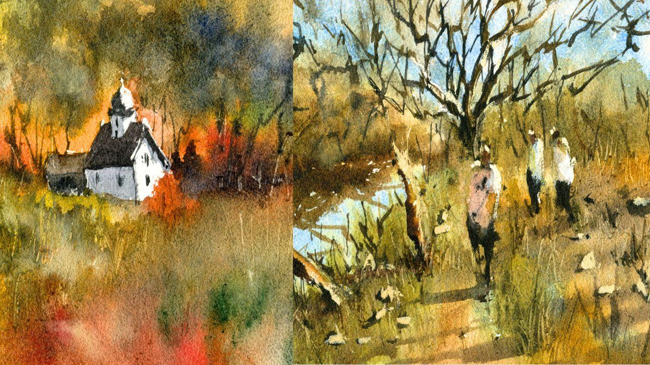
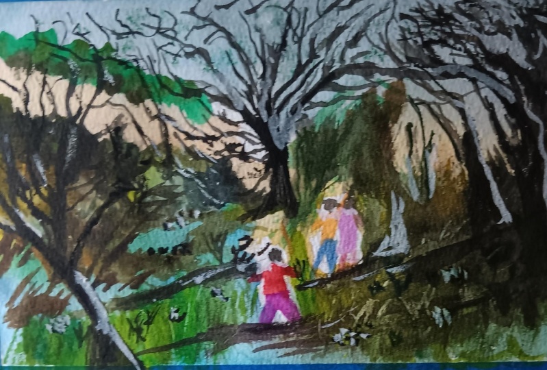
3. Bush Landscape - Drawing: We're going to go start
off with the drawing. What I want to do as always, just separate the horizon
line with the ground. Ok, let's put it
around about here. Just above the center
part of the page. We've got enough
sky left in here, just a little bit
above the center line. To simplify this
down, I'm going to go straight for this
mountain up in the top. This goes all the way down to about the center
of the page here. It's like a hill really
coming down here. Lots of yellowish
sand and shrubs growing on an angle
downwards, even over the top. You don't have to get
all that stuff in, just the line that goes through
like that hits the sky. Okay. Another shrub here or
a tree in the background. You can see as they
get closer there, this path as well. We know that it comes in
roughly from the corner, then winds all the way
through to the center of the page like that
everything here to the left is just water. But we do have a
bit of these shrubs across onto the water
as well like that. But the rest of the rest of the same thing,
this is a reflection. I'm getting here as well. Just a little indication
of the reflection. That will be blue
water down the base. There's a strip of
grass and then you can see some dirt running
around this grass. But you do have a line of grass running through the
center of the scene here. And I'm just going to
indicate that like this, not much, but just
something like that. Remind myself to get in those
strands of grass there. But you do have tufts of
grass and things here. Even like a shrub that's here as well over the right hand side. Same deal, just
indication of that there. And a larger tree there
again, in the background. There's another tree there. There's a larger tree also here that just runs up
going off like this. You can see some branches also wind off to
the left hand side. I thought I'd emphasize
this a little bit more because the tree is
mostly out of frame. But I want to make
it a bit more, add some more branches
in there like that, give it a bit more presence. It's darker tree like that. There's even a tree here that I'll just draw in
quickly, dark branches. But here in the
background we do have one that comes up
there and it forms, it's like a central point of the scene that it just goes up, disappears off to the top
of the page like that, comes back down, you've got, there's really a couple
of Y shaped parts here. Just branches the turns into
a couple of other branches. This one here you can see
branches off as well like that comes down is like a
larger also branch that just runs up like this. Two. That's what you'll notice with the pattern
with these trees is that they just
branch off into these y shaped patterns. The great thing about these landscapes is that
you don't really have to bother getting in
exactly what you see, You just use it as a generic structure and all the branches follow
that same structure. Even though they may vary by a degree or just by a
little angle here or there, it's still going to look
like a tree as long as you follow that main structure
and don't overthink it. As you can see, I'm
just drawing it in, but I'm not spending a whole lot of time because
at the end of the day, we're going to go over this
same thing with the brush. And I find that even
the intricate details, you will have to redo them. Anyway. The main thing is
just the trunk of the tree. You really want to focus on making sure that you have
enough detail in that trunk. Okay? Because that's
going to form the basis of the
rest of the tree. You've got a solid trunk
and it's going to make it a lot easier later on. Okay. There's branches, just one branch that goes
across like that, of course, another, a larger one that
goes off to the left, like I have to get
this one into that. Again, this y shape pattern of the branches just
going up like this, O. I can just emphasize this
one a bit more as well. You can see it
just going up near the mountains in
the left hand side. Again, certainly something that you want to imply at this stage. Once we get into the
actual brush work, it's going to be a lot easier. Yeah, a little bit
of that going on. You can see there's like
leaves and that as well. These trees off in
the background, they have lighter trunks. We can put maybe a think
whether we want to put in a figure
just walking around here in the distance like that, Just ahead of a figure, another person here, perhaps. It's a nice little
walking trail. Okay. Maybe make
the body a little larger, Something like that. Okay, good. I may actually lower those
figures down a touch. The heads are a bit too high up. I want to pop the heads around about the horizon line here. Okay, That maybe a couple
of figures like this, just walking through the scene, whether we want to put
someone here or not, that's a tricky one. I'm thinking maybe let's just try add someone
in there like that. Now, here in the
foreground, we've also got some of these branches, trees, and this one
is snapped off here. This will make a nice
shadow that I can put in. I want to get that shadow
coming in on an angle. This tree here is going
to be useful as well because we'll be able
to get in a shadow. This is very loose shadows
that I'll get in afterwards. Soft shadows that go over
the top of all this grass and what have you here. We've got another
tree, like a branch. I like the framing of this because it comes
through and then it disappears off on the left
side of the scene like that. It just makes things look
a bit more interesting. Bits of grass as well
running through everywhere. It's going to look a little bit messier in this
left section here. Okay? But I think this is
going to be good to go, So let's go ahead and get
started on the painting.
4. Bush Landscape - First Wash: The first thing
I'm going to use, I'm going to go over the top
with some of the yellows. First I've got over here a
bit of this yellow ochre. I'm going to mix a bit of
conacrodone gold in it as well, just to create a
bit more vibrant. Do have some other Hansa
yellow there as well. I think a bit of Hansa yellow plus the yellow ochre
is just great to get a general nice yellowish in there that doesn't look too over saturated all the
way through there. That's really where the edge of the mountains
finish like that. The hills, what I like to do is really go
over almost not all of it, but most of the scent except
for that part of the water, which is just bluish color. Okay, we'll do the reflection
a bit later as well, but as you see Flick the brush all the
way through because I want to get a
soft color, nice, soft yellow is running through
this scene because when we go over it afterwards with a bit of green paint or a bit of blue, you'll find that this is just
going to turn green anyway. But a touch of warmth in here really balances out the greens and the
cooler colors later on. It's very hard to get in those yellows afterwards as well. If you've missed out a part, you tend to find that I accidentally mix
up some other colors, greens the yellow in. If you get more yellow
in, especially in areas where you don't anticipate
there being too much yellow, you can always turn it
into green afterwards. Anyway, in the ground, I'm picking up a
little bit of brown, brown ochre here on the
side, dropping that in, in sections you can do, notice that some of it in
the background as well. You can drop in a little
bit here and there. All right, a bit of brown. But you do have a
little reflections of blue as well in here, which is interesting, just
soft browns running through. And I'll go over the
top as well with some of the green in a moment, but I just want to get
in this muddy look. In some sections, maybe add
in a bit of other color, like a bit of this
grayish color as well from my last mix. Okay, so you've got some darker
bits and pieces in here. Okay, running through that. Okay, let's have a look
as well at the sky. I want to start putting
in some of these blues. While we've got a chance to
do so, let's have a look now. I'm going to pick up cerulean, a bit of cerulean
with the mop brush. Let's just drop that
straight into the sky. I think this is the
easiest part to do first. Actually, what
I'll do is perhaps wet down a bit of
some portions of the sky just to
put a bit of water here and there, just like that. And then I'll go
in with the blue that it just mixes in a bit better still the trunks
of that tree as well. We just got to be
careful with that too, so that we've left a
bit of white on there. It doesn't matter.
Not a big deal. We can go over it
again afterwards. I don't want to
ruin a good wash. It's such a light blue color, it's easy to go over
it with some brown afterwards. There we have it. I'm trying to just join that
sky on as well a bit with the distant mountains
and things. Of course afterwards
I'm going to redo mountains and hills just to
give it a bit more strength. Simple like this here it goes around the trees and simple are that part is actually brown, but
it doesn't matter. Very light blue. You
don't want to overdo it. 10% 10% paint. And the rest of it's just water here in the water as well. Here to the left, you'll see there's a lot of these blues. I'm just indicating a bit
of those blues there. Okay, drop it in, and then simply just move on. That, remember only getting in, we're just getting in the, these really light colors first. Don't worry about the details, just get in the light colors. You'll notice here as well
there's some puddles. And these puddles here, because they did rain a
little bit earlier, you'll see that it
reflects the sky as well. A little bit of blue
here and there. Where these figures are walking. You might even want to add in a bit here or
something like that. Let's just see, it's easy enough to get rid of afterwards. If we've overdone it, let's
pick up a bit of green. I have this color here which
is called under green. It's a dark green basically, and I mix that up with a
bit of yellow to create a lighter green color. This is where I'm
going to pop in some of these green bits here. Just the grass
hits parts of the, the water here, encouraging
it to blend together as well, that get some darker
bits. Why not? And then lighten it up with
a bit of yellow if it's too strong that goes through
the water like that. But we don't want to
eliminate that blue as well. If I can leave a fair bit
of it in, that's ideal. Okay, over here to the left, we're going to get in some
more greens mixing in with those brown and things
like that here as well. Dropping that in here, there are some darker
browns actually in here, but I'm not going to worry
too much about that. Let's work our way through this dropping it in because
the paint is still wet. We can play around with all these nice wet and
wet effects as you can see leave those
nice blue puddles and stuff in there as well. I will pick up a bit
more brown ochre and drop some of this
in here as well. Just to mix it up so
that we've got some additional brown and green
mix them together like that, because they do blend
together a bit. Now the whole bit of paper that you're painting
on should be, as you can see, almost
completely filled with color. This is the point where we can start putting in some detail, some small little details. I'm going to pick
up a fan brush. What else do we have
here? Fan brush, like a little rigger brush as well. That tends
to work well. So these two brushes here, they help to create finer marks on the surface
of the paper without, without adding too
much paint and disrupting that previous wash. But I do like to let
it dry for a bit, so I'll sit there for a minute or so while I search
around from other brushes. This is another brush
I'd like to use, a little tiny little flat brush. Okay? And we're still
in this sort of wet and wet stage
of the painting, where we are doing our best, doing our best to put
in little details. So I think what I'll do
first is go with the, I'll go with these two brushes, the flat brush and
the little fan brush. And it's important to let this dry a little bit and
check the paper. Look at it on an angle
and see there should be a little sheen on
the, on the paper. It's still wet depending on
where you live in the world. If it's hot, you'll find that the paper will
start to dry quickly. You might have to go in faster
than what I've done today. I'm going to pick up a
bit of darker green. Let's have a look at what
sections we want to imply, what we want to get in
here in the background. I really think we can
start off there first. Let's just start with
a bit of this color, a bit of this green. It's mostly, still just water, But because it's
quite a dark paint, you'll find that you don't
need to put too much of it in. Just pick up a bit
of that dark paint. Drop it in where the
edge you can see the edge of these
trees touch the sky. Just give it a, just give it a little touch there and
let it blend in that. Okay. And you can see
that God goes all the way down to the back like that, just a bit of darker green. That's all you need in there. And then you can see as
you know, these shrubs, as they come down
the hill especially, you can mix in a bit
of brown as well. In here, it's not
just the same green. You might get little tufts of other brownish bits of grass and things
coming down like that. Okay? But again, I just want
to really monitor this to make sure I'm not putting
in too much paint. Okay, As I moved down
through here as well, Let's get back to
that green again. Back to that green bit of
yellow in there. Okay? And here you can see it get
onto the edge of the water, but as you can see, I'm leaving bits of this yellow. It's nice yellow still
showing through in the back. Okay. But it touches
the water roughly here, but you've still got a bit
of that yellow in the, soften, this edge of touch
over there in here as well. Okay? So you can see it
just hits the water. Right there. This is where I'm going to probably start
to make it a bit darker. But before I do that,
before I do that, I'll give this a second
because I want there to be a sharp reflection in the water. If I go in there now, it's going to just spread
into the blue and cause a bit of a mess. I can leave that
for now. Let's move on to the right hand
side of the painting. A bit more of that bit of
light green mixing here. And drop that in here
to the right hand side. I'm still using this flat brush. You can also use
this brush as well. It's a, a little fan brush. This helps maybe to get in some different brush strokes
and things like that. Okay, it's always
important, in my opinion, to use different brushes
to get in shapes. A variety of shapes creates a more interesting
looking composition. But again, not to overdo it and use too many
brushes as well. Here the, I'm just still dropping a bit of
that green into the sky. And that sky, it's still wet. It's still slightly damp. It allows me to do this without making a sharp edges
in the background. Even when the paper is a little bit damp, you can
get away with it. All right, as we move down
into the front of the scene, I'm going to pick up some
little bits of green. Let's just drop in a
bit here Here some vertical strokes
contrasting with that lighter yellow and
stuff in the background. The shrubs as well here can drop in a bit of
that paint more green. I also have some purples
mixed in here as well, and that helps to further
darken down this section. This tree is, it's actually
quite a dark brown as well, but I'm going to work on just darkening some
of these greens, especially when we get
closer to the foreground. You notice these trees that
are closer, they're darker. You want to just darken those trees a
little bit as I'm doing here to show a difference between the background
and the foreground. But we also want to leave in, as you can see, bits of
that yellow there as well. You don't want to get
rid of all that yellow, the contrast between the
yellows and the darker greens, That's going to make the scene look a lot more interesting and more convincing than if you just make
everything dark. Self control is
very important at this stage, probably
for beginners. Anyway, for myself, I found
that I was just going in and overworking things
to the point that I'd, I would accidentally get rid of all those beautiful high
lights in the first wash, and if you do that, you're
going to regret it. Make sure you're leaving
in these little bits, but there are a contrast
between light and dark still. All right, let's have a look down the
center of the scene. That's another thing as well. We've got some tufts of grass, and this is going
over the top of it, even though it's
still slightly wet. The paper is beginning to dry. This makes the
grass look softer, fluffier, this nice yellow
through the center. Again, I don't want to
get rid of all of that. I just got to be so careful that don't eliminate
it entirely. But we want to
have this seamless integration of the grass, this green grass with the browns and things
in here as well. And see these little tufts and sharper bits of grass here. That's good too. That's also good because we
want to make sure that we have a variety of different brush strokes
this side here. I better start
working on this side because I've forgotten
about it already. But a bit of yellow
and a bit of green. Okay, To get a light green
color running through here, this area has
already started dry, but at the same time,
we're still pretty good. We still have time
to go in and add in a bit of that green
into that mix. And it will still go
through and blend nicely and some darker
greens as well. Why not add in a little
bit of darker green? It will mix in, don't worry. And remember to leave bits of the previous
wash there too. Don't color the whole thing in here where it
meets the water. You'll see that there are some sharper edges
and things like that. Just leave it in. Just leave
some of those sharp edges. Don't turn it all
into the same color. Okay, so we've got a couple of bits and pieces like
that. What else do we have? Really, it's, again, just the same old technique
that we're using. I'm going to start working on this background section and
put in some darker colors. Let's have a look around
here. Let's get in. It's like a brownish, a brownish green, isn't it? Like a brown green. Touch on to the edge
of this section like that, you can see here. I can just touch on to
the edge like that. Work my way through,
bring this shadow down. Of course there's a
branch here as well. I'm just going to try to
cut around that branch. Not make it too neat, just blend it, but
not worry too much. It goes all the way
to the back and you can see it just come down there. And that's why that
little outline of the shadow I did there
in pencil before really helps because I don't have
to think too much now as to where the edge of this
reflection on the water is. It's like a brown and green mix. A brown and a green
mix, pretty dark. A lot of it is just pure paint. I would say it's about
80% paint, 20% water. As we come down like this. It's a sharp shadow reflection here that forms on the water. But I've left little bits. Can you see just little
bits of the yellow and the previous wash
in there as well? Okay. Don't worry about
getting it all in. Some of these tiny little, the tiny little sharper bits of light in there of the previous wash actually
makes it look more realistic. I'll bring some of this down as well here. This reflection. There could be something else
just getting in the way. You can see that these reflections
are not like the most, you got some bits of this like a tree branch or something
going over there. You got shapes
like tree branches and things that are
out of the scene. Maybe out in the back end. And they are creating, creating a little bit of a
shadow as well in the water. Reflection in the
water, implying that help using that split up, bring that reflection
through the water. Without it, is there still a separation between the
water and the reflection, but there's still these little parts that
join the water on. I think that's going
to look better if I do it that way. Okay. Looking again at that
reflection and seeing whether it's the color that I want,
I can put in a bit more. I think it just needs a
little bit more green in some areas underneath
this part as well. Here you see actually noticed
it comes in a bit more like that and then
disappears off like this. There I do think a little bit more green mixed into
the top would be good here. A little bit more darker green. Just join that on with the. Yeah, join that on with that
reflection a bit better. Look bit more green. Oops, that is too
dark. Doesn't matter. Just put a spit some water
in there and that will help. Maybe some darker greens running through
the bit of yellow. Okay. This is again, just to indicate
the fact that there are there are basically some darker shrubs
here in the front. I'm mixing in a little bit
of white guash as well here because I find that I think it will just help to
indicate the edge better. The edge is a little
better like that. See how it blends into that reflection nicely like that and just let
it do its thing. Okay. What else do we have
out in the background? Yeah, there's not all that much. I think I'll leave
the background. I'm getting too close to the back and I'll
let that spread downwards and do its
magic over here. Some more of that green
mixed in with yellow. Let's have a look here on
the right hand side as well, We've got, what else
do we have here? Yeah, I think I'll be
just mixing in a little bit more green up here to continue that edge of
that bush there that's a bit more towards the front
here in the foreground. This is a great time
to just continue on with that fan brush. Notice how a lot of this
area is now starting to dry. You'll find that you
can just feather in. Bits of color. And you can
use a rigger brush like this, a smaller rigger brush as well. If you don't have a fan brush, these rigger brushes
are fantastic. But a little bit of this
fan brush to create some lighter tops of grass
running through here. Another thing you
can do as well, if the paper hasn't completely
dried off, is to pick up, pick up a pocket knife like this or a credit card and you can actually scratch
out little tufts of grass. I'm going to just
get that ready, but first while
that's happening, I'll put in some of these
darker tufts here to the left. Again, we're going to remember where the shadow is coming from. It's coming from that
right hand side. We're going to get in a
little bit of shadow shape. If I go ahead and do that, then I can go and put in some softer shadows of this
tree there afterwards. I may or may not do it. I'm just thinking
whether we want to even bother with
that shadow or not, But I think it would
be a good idea to give it a touch more contrast. Okay, Touch more
contrast here and there, leaving some of that
blue as well in there. You can see even here, there's like these darker sections, a little darker sections here near where the tree is.
Even just like here. Important to get some of
this stuff in as well. I'm going to go right into the tree with this darker color. This is a bit of brown. I'll mix in a bit. Maybe
grayish color as well. Just a bit of black at the top. And dilute that down to touch. Keep things looking a
bit more interesting. Yeah, I'm still using
this fan brush. I think I will actually switch
over to this brush here, which is a, which is
a little flat brush. Okay. Like that here. There I've left in, see on the tree trunk, a little bit of that
yellow, doesn't matter. I think that actually
looks better if you leave, leave out bits and pieces. Okay. Looks like
there's a bit of a high light on that
tree like this. But the base of it I
do find make the base just connect it to the ground like that.
There we have it. There's another branch or something there that's
connecting onto that tree. Can you see that?
Just like that. Look, the rigger brush
here would be perfect. Where is it just this
little rig brush to emphasize some
of these small, tiny little details
without overdoing things? That flat brush before
was just a bit too much. You've got this part
of the tree branch that comes off the tree
as well here to the left. Let's just get that in. I think the flat brush will be better for this edge
of that flat brush. Some of this stuff here as well. Join that on make
the left side of that tree a touch darker
to indicate the shadow. I guess on the left
side of that tree, there's another branch or something coming
off to the left. That there we have it.
5. Bush Landscape - Shadow: This shadow that I
want to put in here, I want to make it
a little darker, a little bit purple as well. I'm going to spray down this section of the paper a
little bit with some water. That's going to help
everything to blend together. We'll go across some
darker purple here, but I'm going to mix
it in with a bit of brown and a bit of that green so that it doesn't turn into like a completely
different color. But it does have
purplish hues in there. Let's just do this
across like that. Maybe I've got actually
a larger brush, This is going to be better. I feel having a small brush that have to fiddle
around too much here, look, we can just get
in this soft shadow coming across like
that of this tree. Of course, there are other trees and shadows and things in there as well that I can blend
through like that. Make it look a bit better. Okay. And of course, the shadow
of this tree here, oops, it's actually running the wrong direction. Should
be running this way. That soft shadows and this is
running to the left there. Sometimes you just got to alter these shadows a bit
as well as you go. Only that we can have some
shadows that are coming from another direction
outside the scene like this. Okay? Into the foreground. Okay. That coming
across the scene. I think this will make it
look a bit more interesting. I've made the
shadows pretty soft. I don't want it to
imply strong sunlight, but just some light source
from the right hand side, the little branches that you sometimes get that cross over between the shadows as well, using this smaller brush, look at that, just
a tiny touch there. It's all done wet and wet. The paper is still wet.
Okay. This is crucial so that you Yeah, crucial, so that you don't really make anything
look too harsh. Okay. There are some
sharper bits here, but that's actually good because we've got all the
softness in there. A bit of that sharpness
is going to help. We're going to continually
work on this, this section. Like I was saying before,
there could do with a bit more fan brushing.
Let's have a look. Some yellow, put
a bit of yellow. And this is really
just going to be green now because of putting a lot of the previous bit of the previous greens in there. A bit of that green, okay, Like this, that in here as well. This section here could do with a bit of sharper greens
there in the background. You're going to
just feather that in nicely so that there's a difference contrast between the foreground and
the background there. But you've got a
nice bit of yellow still showing through
that clearing. Let's have a look here,
a bit more of this. Again, this darker color. I do want the background of this section to be a
little bit darker. The only way to do
that is to yeah, basically drop in slightly darker layer
of paint through the back. Running like that. I do have
a little bit of guash mixed in there as well. Okay. But you can see the
trees right in the back. There's not really
much happening there. Okay. Just another layer of
paint here in the foreground. Let's just continue to work on some of these
bits and pieces. Purple, purple shadows. I just want to jig some
of them like this, redo them a little so that
they cross over a bit more, cross over the scene
and appear darker, especially in the
foreground here, I think a little bit more
color would be good. It's still wet, so
you're going to be okay, darker greens. Let's look at some tufts of grass
that are darker here. You can put in a few
quick brush strokes there for some of these greens. That section that there's little tufts here that have
a darker section on them. Can you see just these
little tufts of grass here as well that have
a darker shape? We can emphasize the. Near the base of the
tree, you know, look, there's all this stuff lying
around in the darkness. That's going to be
handy to indicate. Okay, good. Just trying to make
these branches on this smaller tree a
bit more noticeable. Even see some little ones
here in the background as well that you can just use that, a smaller brush to indicate even a righ dropping that
rigger brush through there. And bring that brush up to get the vertical branches like this just run up
out of the scene. We've got this one in the middle that I really want to do now. I'm going to use
some brown maybe. I'll do the sections of, I'll get the light in afterwards on the right hand side with a
little bit of gas. I don't want to
bother with that yet. Just get in the darkness of the branches that and see how,
like I was saying before, it really pays to
just a quick sketch initially and then
do the rest of this afterwards so that you're not drawing half the time, okay? You can see just so much, so many of these branches
all coming off in different directions and you can only get to a certain point, can only apply part of this,
can't get all of it in. Okay. Skip over the paper in sections
as well so that you're not drawing every
single line in, leaving some broken
edges for those lines. And that actually helps
a lot to indicate the, indicate the light hitting
parts of those branches. Okay, look, here's more. They really just go branch off from this tree is
gigantic tree and just go through in here and
what have you as well. Okay. The trick is yeah, to fiddle around
too much it into the point where you
feel like it looks half decent and then just refine
what you've painted. But I do want all this
to melt in nicely with everything you can
see here as well. There's like some branches that just go over to the right. There's a branch, even from this tree that I
didn't get in before, but it actually goes all the way across to the left hand side
of the scene like that. I'll emphasize it a bit more. Maybe with a branch going
upwards like that as well. Joining on it helps to join
on the rest of the scene. Paint in another few little bits and pieces there as well. Because I've noticed there's not enough darks running
through that section, so I can paint in a bit there. Just through that section. Okay, we are certainly
getting there. Tufts darker bits here would
be good to add in a bit. What I mean, like these
little tufts, darker grass, shrubs and things like that, just makes it look
more realistic. Because you do have
different values in here. Not just the same
colors and same values. A little bit of that running
through left the water. I think that looks pretty good. Got a bit of that
shadow running in. Can I scratch off
a few of these? There we go. So I can
actually scratch out a little bits of grass and
things in here as well. Okay. But it's a continual work in progress and you can
just get more paint, really, and feather
it in as you go. Like for instance here, I want some more
sharper bits of grass. I can just feather in like
that feather a bit in like that bit of gas in here as well. Just sharper tufts
of grass and things. Some darker bits as well that you might get just on the
left side of these tufts. It's really important to have
contrasts with the grasses. Drop 80 in that there are some, these trees here as well, which I will get in
a bit of color for. Let's put in brown on
the right hand side. Maybe a bit of yellow ochre, bit of yellow ochre or
something on this one. Then we'll do the same here. Bit of yellow ochre on the
right hand side like that. I can even just drop in a touch here on part of this treat. No big deal. I can actually, my initial plan was just to get some gash in
and finish it off. Afterwards these figures, I need to put in some
colors for these figures. You can even leave
the shirts white, but I do want to put
in maybe a bit of, maybe blue for this, one, bit of blue for that one. I might just leave that
one that same color, maybe touch of purple around
some parts like here. A bit of purple or
something there, but leave the shirt white. This one here, maybe a
little reddish color. I was thinking
orange or something. Something warm
running through here. A bit of warm color for a
shirt or something like that. You can put in the person, the head of the figure
a little bit later. But now we're okay just
to keep it like this. Trying to blend
that tree in a bit. The trunk into the
background or touch it was just a bit too much
of a hard edge there. Any hard edges that you
want to flatten out? Just pick up a bit of water and then rub on the paper like this. You can actually smooth, remove some of these
sharper edges. You can do it afterwards
or you can do it now. I find doing it just while
the paint is slightly damp, It, yeah, it just
looks a bit better. It's easier to do it this way. Okay. Now let's again, just work on these
trees to the left, bit of darker color here, behind that tree branch
running to the left, it's basically just brown
and black mixed together. Okay. And it comes down to that. You've got this bit of
branch or this tree there, the left side of it
here as well there. Of course the shadow of it is going to be somewhat
important if I can. Yeah, just getting a bit
of that shadow like this. Same with this one. I've already done it in the previous wash, but it's just re emphasizing it. I suppose here I don't want
it to be too dark as well. O there we have it got a couple of trees just
running through like that. What other areas can we
potentially emphasize? We've got, again, this rigor
brush that I just love using for detailing and picking
up small little details. I'm using just like
the darkest color. It's just, it's neutral tint, really dark, neutral tint. Okay. To get in some slight
details in areas, you look at these branches
and spend time doing this because the tree is
actually very detailed. There's so much
going on in there, The longer you spend on
it, it's really up to you. You can spend lots
of time on it, or you can just keep it
looking pretty basic. I do want to extend
this potentially. I want to extend it over
to the left a bit more because there's
nothing over there. There's no trees or anything joining this up. It's
looking a bit bare. This big tree and you notice
there's some areas that it just starts to bloom
here. Don't worry about it. Just let it do its thing here. I can just potentially get in a branch or something coming in from the edge of the scene. Look, making it look like
there's something in there. This is helping to
create contrast. So crucial to create contrast so that the background appears separate
from the foreground. Of course, you've got
all these softer, lighter areas in
the back as well. Just being wary not to
overdo it too much. Okay. To overdo it and want to leave in enough
enough running through there. Even I've probably
done it a bit here. So you can just
lift off and scrub away at bits if you feel like it's like
you've overdone it. These branches coming over to the left hand side like that. We still have the leaves
to put on there as well, deciding we'll make those
leaves basic as well, because I don't
want it to get in the way of the sky and all that. But notice how all
this dark color, this really dark black
color that I'm using, the contrast that it creates really helps to bring
out the light in the scene even like sticks
and rocks and stuff as well. You can just bring
out like some, touch it on the paper and
create a little rock here and there just with a bit of brown and a bit of
black like that, just in areas like here. They're not really in
the reference photo, but you'll find that this makes it look more
interesting in parts. There we have it just a
bit more of that tree there trying to join it
onto the ground better. It's touch and go and
sparingly adding in details. And you notice here
as well there's other branches that go, grow up near the water and
then they just disappear. This is another opportunity,
I guess you could say, to put in some darker
spots in there as well, near the water, sharper bits of grass and details. Where is the fan brush? Let me grab that fan brush. Just over here, brush again. I want more texture. A little bit more grass, tufts of grass or like just
upward showing through here. That I will actually add in potentially a touch
of guash afterwards as well. See if it's time if
I can scratch out, there we go, we can scratch
out some highlights here. Now see little tufts of grass
and little bits and pieces, even the edges of this
trees and things like that, we can scratch out like
that quite easily. Some parts are already dried, so you're okay. You
can't really do much. But here for example, see there's little leaves
and stuff on the ground. You can paint them
in and guash later. And you can also do this, I just do both. This makes the scene look a lot more interesting,
creates extra contrasts. It's easy to overdo it though, so be mindful, okay? And that's what happens
when you do it too early. You get these parts that
run through the painting. You do it later,
like I'm doing now. You manage to scratch off a bit of that paint
and it looks better. More like high lights and things you remember
with grass as well. I always keep forgetting. But it does grow in
these different angles. When you scratch, scratch off in some slightly different
angles at times so that it doesn't look all
completely the same. I would have liked to get
some more down the bottom. I'll have to put in, yeah, I'll have to get in
some gash to get in some of those other
bits actually. Okay. Especially shadows
and little bits of the grass running
through the shadows. It makes the scene look
a lot more convincing. Breaks up those shadows. A touch like this that just
scratching in a bit of that. Some of this stuff going over to the left in the foreground, especially you get detail
and stuff going on. If you imply it using this by scratching
off, it really helps. Okay, I'm going to put
in a little bit of, I'm going to put in a little bit of the color for the back.
6. Bush Landscape - Final Touches: I'm going to start
putting in a little bit of the green for the trees. The background trees
just pick up a bit of green and a bit of yellow and a bit
of that darker green on this old brush. My aim here is just to
get in a few tufts, tufts of leaves here. Just by dragging
the brush through, the brush is damp. Okay. One thing I really
don't want to do is get rid of that amazing sky. It's a risk that you always, when you're putting
in these leaves, how I mitigate is just using
a dry brush technique. I'm picking up a
bit of that paint and just feathering
it through in areas, but making sure that I'm leaving enough of that sky in
there as well because it's so easy to get rid of it a little bit of that
green is important because it indicates that
there's obviously leaves on these trees.
Okay. That's all you need. I don't even need anything else that I think I'm
pretty okay so far. And if you've gone overboard, dab the tissue
paper there and you can redeem yourself
for a second. If you've gone overboard, put too much green into the sky. Okay, what have we
got left here to do? We're almost done. The final touches really
are just looking at some remaining high
light dark bits and remaining highlights.
The figures here. I want to get in the
legs just quickly by a bunch of lines like this. Okay? That's just for the legs. Okay? And I make the front leg go forward. A
little bit more like that. So it looks like they walking 1 ft forward and 1 ft backwards. Okay. It doesn't have to be much,
just something like that. Looking like the figures are walking in that same
direction into the scene. And remember the shadow as well, we've forgotten about that. But just the same shadow running in that
direction to the left. This is tricky as well. I want to make it not too dark, but join it onto the figure. That same with this
one and this one. Join it onto the
darkness of the legs. Okay, there we have it. So that the shadows just
appear more organic. Good. But we've got
some darker shadows. We've got some lighter, sadder ones cast by the figures, The lighter ones
cast by the trees. Like softer ones by the trees
here in the background. Different combinations
of shadows are so important and they
create contrast. And they make a painting
look more convincing. Okay, here I've just
noticed there are just some dark tufts of
things here on the ground. And I just want to get in some extra additional dark spots near the base of some
of these grassy areas. Okay. Not to overdo it as well. I'm just being so
careful because I'm known to just overdo
it if I'm not careful, but oops, See, I didn't
mean to do that, I didn't mean to add that
larger bit of grass there, but it doesn't matter.
We'll leave it in there. Okay. But some dark marks here. There could be grass, there
could be, as you can see, just kind of like there could
be rocks or even you just use that as like a high
darker side of a rock. It's really your
opportunity to get in the remaining darks
in the scene. This tree here in
the back as well, I always like to redo
some little areas of the trunk like this to re, emphasize it, get the
detail of that tree in on mainly the left side of some of these branches. And that's going to emphasize more light and make that
tree appear darker. The contrast of
that tree as well, I want the viewer's eye to go
towards that tree a little. Some upward brush
strokes like this. There's even smaller tree or something here I can
just emphasize or just paint in quickly like that
near the river bank there. Another just making
some of this stuff up. But this helps to break up the uniformity
within these regions. Like even there you can
see some small trees, like branches of small trees just growing on the river bank. If you look really closely, and this is another
opportunity for you to go in and break that up with a
few lines here and there. These trees here in the
foreground as well. Again, you can just emphasize
some of the darker bits, darker twigs and stuff like
that in there to Okay. But yeah, the big thing
is I just want to get in some potential rocks, imaginary rocks that I put
in here and then I can bring them out with
guash afterwards. Not many rocks in this
particular scene, but it will help to make it look more
interesting, I think. Anyway, if I have them in there, the heads of the figures, I'm
going to pop in a touch of red for the heads. Catch a red there, faces or the back of the
heads like that. Maybe a little bit of
brown for the hair or just darker color that I can actually put in a bit of highlight afterwards with gas. Okay, oops, this figure here. I just wanted to darken, darken the shirt a touch, but I've darkened it too much. This paint brushes just, I've got too much paint on it. And the reason for
that is so I can really emphasize that
shadow afterwards. The sorry, the highlights
on top of the figure. Okay. Blend that black in
bit to the rest of the body. The pants or the legs. We're almost done here.
I've just, again, just picking out some
smaller rocks and things at the base
of the tree that, you know, over here potentially. Almost done. Let's get in some final touches of, uh, I'm just squeezing
out a bit of white wash here on the
edge of the scene, started to harden up
inside the tube that okay. What I'd like to do is pick
up usually a flat brush. I need to clean this
one off because I had too much dark
paint on it before. Just really make sure I clean this one off. Okay. I'm going to pick up that, uh, and I actually mix
two different parts. I have like a yellowish
section here, I think I'll work on that
yellowish section first. A bit of yellow ochre, even a bit of Hansa yellow. Do well, a bit of hanzayellow
yellow ocharodone, whatever you want
to put in there to get it to be a warmer color. Really, this point here, we can start to bring in a little bit of light
onto areas of the painting. Like for example here, that could be a bit of light on the rock there,
something like that. Have to darken part
of that rock again. But here for example here, just bring little bits of high lights back into the scene. And you've got to do it in, in such a way so that it's,
you don't overdo it. Just bringing back little bits of warm highlights
here and there. I just flat brush makes
it look a lot more realistic on these trees. You can see these little
branches and stuff like that. I can put in a bit more of
that guash even on the tip. You can see here
tip of this tree, there's like bits of bark that's been stripped
off from the tree, just being broken off probably by a storm or
something in the past. I can just back see that nice
sharp detail of the yellow. A little bit of that
going on there. Let's do it on this one as well. Just little bits of white or something
running through can also just be like
an indication of these little highlights
that you get. Okay, I'll leave part of it the previous wash
and I'll also just augment it with a bit of this really white but
like yellowish colored. Okay. Some more on the tree like that. Just a little bit of the
tree on the branches, the right hand side
of the tree like this and some of the
branches like that. Not to overdo it, but just enough. Just
enough in there. Okay, one of the highlights
for these figures. Let's put a bit of color on the. So here, the head of that figure here and the shoulder in the back of
this figure here as well. Again, just brings that
figure out of the scene. These two look like they could just be standing and looking at the river on the
left hand side as well. All right, and we are finished.
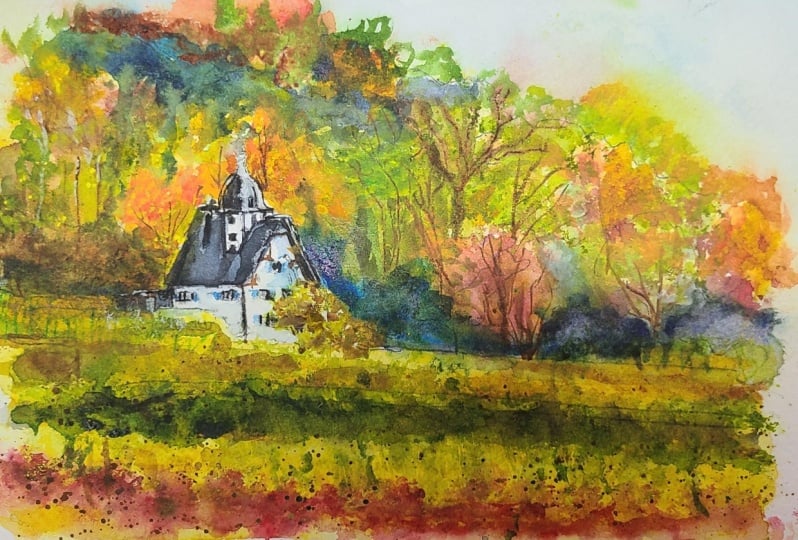
7. House Landscape - Drawing: All right, let's get
started with the drawing. The first thing
that I will do is divide the scene about
halfway through here, and that's where start some of these crops start popping up and just behind
the house as well. Okay? Then you notice that the land starts to go
downwards like this. Slope downwards a bit. Okay? But it does start off
a little bit higher there. This is the most important bit, really, of this
scene, the house. We can change up a few
things here and there, but I do want to make sure the structure of this
house is fairly accurate. This is the side of the
building, it's like, it's a white building but bluish on the left hand side
because it's in shadow. I'll put a dot up
here and a dot here. This is to just form a little
guide for this triangle. Top of the house.
This triangle part there, coming down here. Okay? And in front of the house there's actually some trees
and all that here as well. But I'll extend part of
that house down anyway. But you can see here,
it's just part of this, like a tree there in front. And there's a bit of
another tree here as well. Let's take a look at the
top part of this house. She got more complicated
than I thought it would be, but you have got this top section here
and this section here, which is like a little
top part of the house. It's just I'll actually extend
that down a little more. Yeah, It's pretty nice part
of the house like that. And you can see the side of this tower just
going up like that. It's just a rectangular
shapes, I guess. A cube shape like this here, the top part is
just like a dome. We'll draw a circular
sort of shape first. Like this, I will make it go up to this
point like that there. The rest of it I can
pretty much just sort out as we go
in the painting. I think that's good
enough for the top part, back end of the house here that it just comes
down here like that. That's just a downward
slope for the rooftop. I'll extend the back
end of the house a little bit more like that. We pretty much have the
gist of this house. There is some
windows. I'm going to simplify these windows
down like this. Some simplified
windows like that. There may be there is a little
house behind here as well. Just the roof top of that house there and
then coming downward. It's not a house, it's
more of like a I guess at the back section of the house
or a storage area there. Okay, good. There's some larger
trees, this one here. Just mark that one out. These larger reddish looking
trees and another one here. Okay. Just these larger ones
that I want to mark out. There is a tree line out
in the back as well. A lot of this stuff
we can just get in. Okay. I'm not even going to
get in the sky for this one, I'm just going to leave
this little section of the sky just
showing up there, but I'm not going to
bother with that.
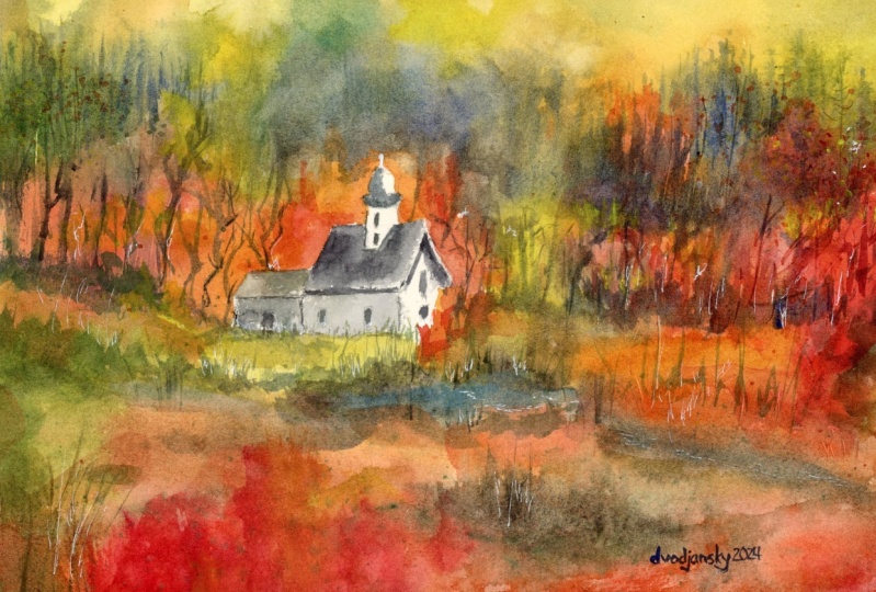
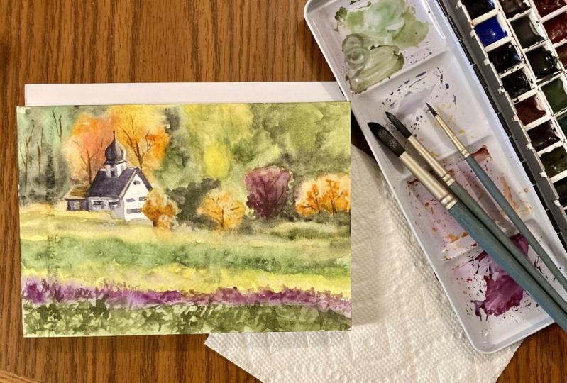
8. House Landscape - Painting: But let's go straight
in with the painting. And we'll go in
and just get some, going to get some bit
of red and orange. And really light red
and orange as well. Just up in the front like
this, a reddish color. And I will mix in a little
bit of burnt sienna as well, just to dull that down. Okay, In the front like this. Yeah, near the front, there's really a few
mixtures of colors here. You've got red,
you've got oranges. You some greens
in there as well. Sometimes what helps
is that if you spray part of the scene down, makes it a lot easier. But I'll cover up
that house first. And then just starting a bit
around the scene like this, this is going to
just a lot easier. Okay? Get that to sort of the paint to spread around a little bit. Got some yellows. I'm going to drop in
here just like a line of that yellow yellow ochre that a little bit of that
yellow that spread in there, little bits of yellow there. There's some greens and a
little bit of yellowish green back here as well. I've got a undersea green color that I can pop in
just over this side, mix that in nicely. There are some little
bits of greens as well in here that I
can just go ahead and drop in a bit of
that color like that. Okay, The important
thing is just to let it mix together so
that you've got some nice, nice, beautiful gradients
going on in here. Bit of yellowy green up
here, perhaps in there. Let's just drop in a bit of that yellowy green
color right up here. I'm using probably
that 50% paint, 50% water at the moment. But up the front I've diluted that color down a touch
a little bit more. Okay. I'm going to just go into some of this area as well because I do find
there is some golden, orange, and reddish colors
here for some of these trees. And if I can get in
some of this stuff, if I get in just a little
bit of this stuff first, it's just going to
be easier later. Okay, Just drop in a bit more. Just a bit of orange
and a bit of yellow. Okay. Notice how a lot of
it is just spreading in. Because I've wet the
paper previously, but I did not wet
around the house here. And that is, so I
can get a nice, crisp edge to the
house like that. Okay? I don't want it to get in the way that there is a tree or something
in front of there that, but I'll just quickly
indicate that. But you can see there that the great thing about these
mop brushes that you can cut around everything quite
easily like that, Okay? And the paper is all completely wet still on the
right hand side, but over here you can see
it's pretty pretty damp. Pretty dry. I go over, let's just go over here. Cut around this roof like that. You got to be so
careful with this to preserve preserve
that color in there. White. And that way we can get in some other
highlights later on. Okay. Look at that. We've done it. There we go. That's the house and
the back end like that. From now on we can
just pretty much relax a bit and
just go in and add in a bit of color here
and there in the side. Let's put a bit more green, little bit more
yellowy green in here. Maybe let's get some red. Just drop in a little bit
of this red mixing in with those trees and
parts back here as well, loosely basing these colors
on the reference photo. But we've got mostly bits
and pieces from the scene, some more greens and here as well that I want
to just mix in. Not really implied
too many of these, but there are set
bits of green here, just weaved, woven
into the yellow. It's the paper which
makes it so much easier to do this and you're picking up pretty dark paint. Which it. Just blend nicely. Okay, that let's go
up into the top part. I reckon I'll just use
more greens up top here, darker greens here and
there. Blend that in. See how we've got this darker
section of the greens. And then hitting the
nice orangey color does help as well. Sometimes you might
get a sharp edge. For a sharp edge
where you want it to, you can just lift
off paint like that. Encourage it to mix
around a little bit more. Let's go up to the top.
Some more yellows, some more yellows up here. I always like to every
especially scenes like this in yellow first. And then I'll go
over the top with some other colors
here in the left. Okay, So all this will
start to dry off a bit, and I'm going to pick up
some smaller brushes. A bit of a couple of
these smaller brushes. I've got a fan
brush and I've also got a little flat brush here. These are going to be great
to get in some darker colors. Okay, let's mix up some greens. I've got a few
different greens here, but as long as
you've got one dark green, you should be fine. Okay, let's have a
look that's dropping a bit of this darker
green up here. There is a separation in the background and it's
actually a bluish color. I'm going to pick up
ultramarine as well. Drop that ultramarine there. Maybe some purple
would be good too. Ultramarine purple for some of the section here that
separates out the background. Drop that in. Drop that in
there nicely like that. It's all just mixing nicely. Some more blues here. Feather this upwards
like that here, Father that upwards there. Some light greens dropped into this section as
well, up the top. Okay, more darker colors here. To again, just mark out that tree line of
the darker trees and the lighter trees as well. The more bluish color in here. Okay, I'm going to start feathering a
little bit of green and things in this section as well, especially near the foreground, just to build up a little bit more strength
out in the front. Tiny little sharper
brush strokes, as you can see here,
does help as well. Gives it a bit of texture and
like three dimensionality. If you leave some of the tiny brush strokes just running
through like that, it's not all the same color, not all the same values as well. Some purple and blue
mixed together. I'm just noticing here that
there is a separation. You can see just a little
separation between parts of the house and the background. I can just imply some of that
using this darker color, blue and purple just mix through here and carrying that across like this to form
a bit of a border. I suppose there here is well, just behind the house that can see just all those
little rows that you can imply while the paper is still sort of wet
as well like that. Yeah, just move that
around a touch. I'm just going to start
working a little bit on the house and put the
left side of the house, I'm going to pick
up a cooler color. So just a bit of
ultramarine blue. And I'll do that down. Just mix it in with a bit of this grayish color that's left over on the palette to have
a really light gray color. Just testing that outlets. See, you just want to
get a little bit of that gray color on the left
side of the house like that. That looks good. This will go straight
into that wash like that. Same with this back
end of the house, there can get in a little
bit of darkness like that. Not only that, we do
also have a bit of this gray cutting across
the side of the house here. Let's just get this one in. See, cutting across like that. Let's see, what else can we do? We can get a bit on
this side as well. Light sources coming
from the top right. So this is, you're
going to get more of this shadow on the left
side of the building. And I do think I'm
going to have to darken some of these
shadows a bit more as well. But as a general indication,
I think this is good. Okay. Even the rooftop underneath is actually
a lot darker, but we will get
that in afterwards. Everything else makes sense, may even leave a
lot of it white. That right hand side as well, I think it actually looks nicer. Keep it white, keep
contrasting color there. Okay, let's have a look. What else do we have to do here? Probably I would like to perhaps mop up a
touch of this color. And in here, just to
lighten up some sections, just tissue paper
off a bit like that. Okay. Just lighten up some, some parts of this so that it
doesn't look all the same. Okay. That make it look
a bit more atmospheric. And also it helps to make the paper dry a
little bit faster as well, because I mopped up
some of them puddles. One thing I've noticed is
you do see some trees, like some little branches and stuff in here that
are coming through, just upwards like this. So I can just test the paper and see if it is
time to do it yet. If it's going to spread, it
does spread a bit too much. There can maybe just
try it over this side, because I do want
it to blend in. But at the same time, I don't
want there to be too much. Too much spread of the color.
A little bit like that. As you can see even
behind this house, you see it's like a tree or something reaching
up like that. This is really going to help create a bit more
interest and detail, especially because
there's so little going on right now in the
actual painting. These small details, you
need to put these in. If you don't put these in, I find that it just tends
to look a little bit boring in ways the trees help to frame the
houses as well. You can add them in where you feel where you'd like to
have them in essentially, but just a little bit like that. Have a look here on the
right hand side did test that bit out a bit
before it was a bit too wet, but I can pick up
some darker paint and make sure you don't put too much water onto
your brush as well. If you put too much
water on your brush, it's not going to those
marks will not stay. Put some more branches, just some trees here and there. I'm not going to overdo it. We can also start putting in a little bit more color if
you think that's necessary. Like a little bit
more extra darkness and things in the
background in some spots because the paper is
still slightly damp. So we can feather in
other colors in here and just move them around a bit to create texture
in the background, but we have to be careful,
we're not doing it as well. This is a bit of extra
darkness up the top. Here's a bit of purple and a bit of neutral tint
and blue mixed in. Sometimes if you
pick up an old brush like this old mangled brush, it does help to just get
in little trees and things without overdoing it because they are already the
shape of the tree. If you think about it, just
the brush around places, I just want to have some more contrasting parts
out in the back, not just the same old bits and pieces and showing
previous washes as well. Nicely rub this bit off a
touch so that it blends nicer. I'll continue to add some more color into
the foreground and greens just build up a touch
of detail like this here. This will to make this part of the painting
look a bit more interesting. Even a bit of spray
like that does help to create this mottled like effect. Just some little bits of
green inconsistencies, really just bits of green here. You can continue just
wetting the pepper, rewetting it here and there, and continuing on a bit of lighter green that I've
got just mixed up already. Drop that in, flick that around, try to create some other brush, sharper looking brush
strokes as well. And here you can see it
almost looks a bit grassy, it's a vineyard as
you can see it. Just the slight variations in value tone really helps make
it look more interesting. See some darker bits here. We do need some of
these darker parts. Just feathering it around while just looking at that
reference pict. See how there's like a
darker line or whatever. The just copy a bit of
that and see what happens. Remember this will melt in
anyway into the scenes. Worry too much about
getting it right. Yep. Some more green. Maybe up here as well. Some just dark bits
and pieces of green. Some sharper parts as well. This now I'm going to go and just work a
bit on the house. Now I haven't got in parts
of the roof that need to be. I will do that
just by putting in some neutral bit of brown
and neutral tint and blue. Okay. It's kind of like a nice gray color,
dark gray color. This is going to be darker
than this shadow as well. Okay? So let's get this in. Let's just do this
all at once, Okay? There, here, I want to make this pretty dark so that it looks like the shadow is the shadow of that roof section is darker
than the rest of the house. Just mixing up some more paint, using the edge of
the brush as well. For this, let's go down, let's do this part here, that pretty dark sort of color. Good. Now let's go over
the right hand side. There is a little bit of sink, a little bit of darkness on this side of the roof like that. I think that's really all
I need to do for that. But you see on the sides of the buildings there's tiny little
details like, I don't know what it is,
but this little frame has a bit of something. You got some windows as well, you can try to imply and
I'm also doing my best to keep the light windows there. Again, little details
of this part. We will just need darken this top part of
the rooftop here. The touch Kate. This smaller one here as well. Funny enough, the bottom
part is actually darker. Let's just get an indication
of that darker part there. And the roof, top brown, actually getting a little
bit of brown like that. Okay? And we've done
it all at once. And let's have a
quick look back at everything that looks okay. Some more darker bits here. I want to make sure that
this is balanced out little bits of darker parts here in the bottom areas here. The last thing I
really want to do is get in highlights, highlights. I already have a bit of guash squeezed out on the palette. The reason for this is I
want to get in some softer, opaque effects running
through this whole scene. I've got a bit
mixed up over here. Let's mix a bit of yellow
yellow into this guash, this creamy yellow color. We can just drop
it in like this. Look, I can bring back
some of what you call it, the grass, not the grass. These yellowy plants running
across here like that, okay? This milky color stuff here, just running across like that, can also just spray it a bit. If it looks too overpowering to encourage it to
move around a touch, a little bits and pieces
off in the back as well. You shift some of it down. It's important to help it almost like it doesn't
just start immediately, but it does permeate through the scene in ways a
bit more white here, just in a bit more of
that yellowish color. You can even put a bit
down here as well. Bit up the top here, See where the trees are just flicking through a
bit of that color while the paper was drying. I just scratched
out a little bit of paint here and there, and I'm going to put in a touch of wash to bring out some quick highlights
on the building. But really this is just
using a credit card, a plastic bit of
plastic or the edge of the blade to scratch out some
of those bits and pieces. Yeah, this is just to bring out tiny little high lights that
I have noticed on the house. We can just bring them
out quickly like this.
 Watercolour Mentor (Darren Yeo Artist), Art Classes, Mentoring & Inspiration!