Transcripts
1. KINGFISHER INTRODUCTION : Hi there. My name is Carrie McKenzie
and the professional artist, author and Art you to live in, in the beautiful
countryside of Yorkshire. This class is suitable
for All Levels. If you're a beginner, and
I've never painted before, I'll be guiding
you every step of the way throughout
the whole process. Will look at how to blend
and soften a hard edge. How using complementary colors
together, Nicholas pop, how different brush strokes
can create feathers, and many, many more. So that at the end of the class, you'll have your own
beautiful little painting to be very proud of. I've discovered lots of tips and techniques and shortcuts
over the years. So just as in my in-person
face-to-face classes, I'll be sharing these
so that U2 can get the same benefits enjoy from painting that have helped me. A big believer in
learning by doing, rather than reading
lots of written theory. You'll be painting right
alongside me and my studio. As I demonstrate each process step-by-step and make
your learning a happy, Smiley, and practical
experience. Or if you prefer, you can
watch the video the whole way through and how they got
the painting afterwards. Of course, you can pause
and rewind it at anytime. I provided a reference
photograph and also the drawing for
you to download. Now don't worry about
trace in the drawing because this course is about
painting, not drawing. You can see examples of
my work on my website. My style leans towards
impressionistic and contemporary rather
than photorealistic. I like to explore
loose approaches that bring out the color, light, and essence
of my subjects. I'm delighted to be
able to share with you, may experience tips
and techniques that I've learned along the
way in my own Art journey. Importantly, the
most valuable asset is your own time,
patients and enthusiasm. There's no such
thing as right or wrong or failure in Art. It's all about
learning and growth. Learning what worked well, practicing what you
need to improve on, and moving forward
with each step. Please don't worry
if your painting doesn't look exactly like mine. Lowry never worried
whether he's look like Van Golf or Picasso's. We all have our
own unique style, just like our fingerprints. And with that understanding, it's time to get on
with the painting
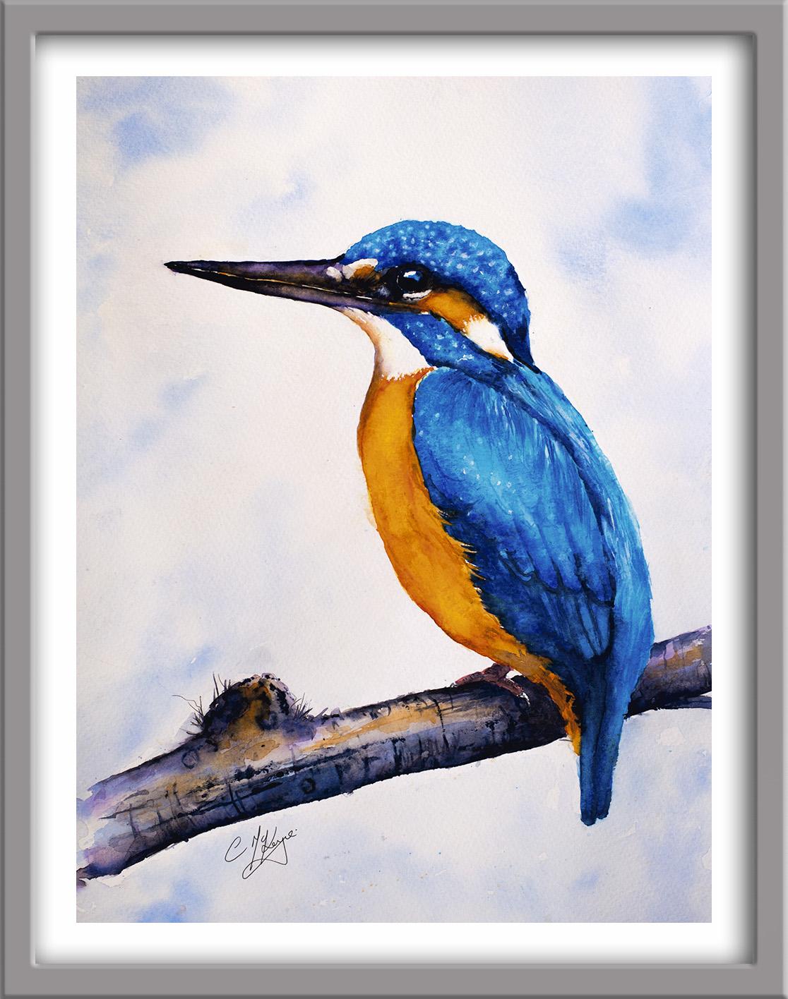
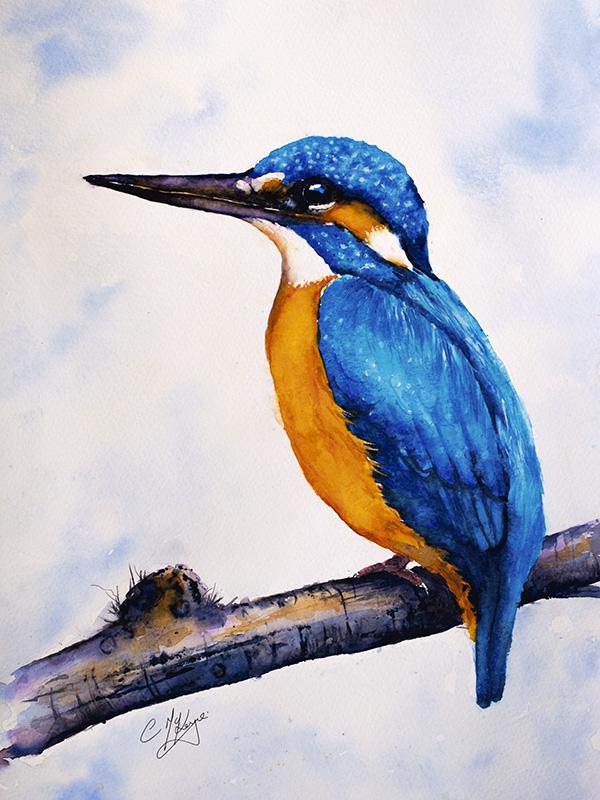
2. Materials, Composition, Drawing, Masking Fluid, use 3 different methods to paint the f: Hello and a very warm welcome to my studio where I'm going to share with you my
tips and techniques. The painting, a
beautiful Kingfisher. You can either watch
the whole video through and have a go at
the painting afterwards. Or you can pause the video at anytime whilst you paint
right alongside me. As I share the
Step-by-step process. I've listed the materials
that I'm using, but please feel free to replace any of them with your
own if you wish. Here is the reference photograph and my simplified drawing of it, which I'm using to
base this painting. The first thing
to do, of course, is to transfer the drawing
to your watercolour paper. You can do that free hand if
you're a competent drawer. Or you can use some graphite
transfer paper or even rub the back of the drawing with a pencil turnover the sheet, placed it on the
watercolour paper, and then go over the
drawing outlines with a ballpoint pen. The first thing that
we're going to do is apply some masking fluid. It's useful on the
shapes that you want to reserve the white
paper for highlights. So to paint by hand later, I'm using PBL masking fluid. The blue color lets
you easily see where you've put it and
it rubs off well later. I'm using an unwound paperclip, which is very useful for
fine dots are fine lines. Also a rubber tipped applicator. These very easy to
clean afterwards, so ideal for masking fluid. I've also got an SAA
masking fluid brush. But you can use any old brush
that you have to hand as long as you don't use a good one because it
will just run them. I'm using my paperclip
first of all to draw a very fine line of masking fluid in-between the
upper and the lower beak. Notice that my line
is quite ragged. It's hitting a
missing in places. So you don't need to
be too even about it. We don't want it to look
like a trampoline or a matchstick running
between the beak shapes. I'm also adding a little
highlight to the Kingfisher. I about three-quarters
of the way up in the eye and just a
little blobby shape there. And that means will be able
to paint the eye later on without worrying about
going over that highlight. There's a very fine line just to the right of and below the eye. So again, I'm using
my paper clip for that very fine shape. They're just checking my
time to get that detail. And now I'm switching to my
rubber tipped applicator. For the slightly bigger shapes. These come in all different
shapes and sizes, but you can also use the
hard end of your brush. If you don't have
an applicator or even an old twig
or an old stick. If you make any mistakes while
you're applying the gum, don't try and rub it
off straight away. It'll just merge and look messy. So you've got to wait
until it's dried. It takes about 10:15
minutes to dry. And then you can save for a bit often reapply, if
you need to do. I'm just coming down now under the lower beak and just painting a few very fine feathery lines
underneath where it joins the neck and coming down now over the left
side of the wing. I've applied the masking fluid a bit too clumpy along here. I suggest you make your
spine are in shorter and show you how I
rectify mine later on. I've switched back to the paperclip because
I'm now going to paint in some very fine
feathery highlights that are running along the top. That way. Make sure you
start these very wispy, fine lines from the very
top edge of the wing shape, just bringing them down, dragging them into
direction of the feathers. Again, you want to vary the
distance between the lines, the thickness of the lines. And keep having a quick check at the reference photograph to have a look at where
these are placed. We've also got
some highlights on the feathers that are running down the little
King Fishers back. So again, I'm using my unwound paperclip to paint these in a bit of
a crisscross fashion. We don't want to
like match sticks or tram lines running
down the back. Keep them looking as
natural as possible. Some people don't like
to use masking fluid. When you remove it. It does leave very crisp
white define shapes, but we can blend them in. And I'll show you
how to do that. I'm not too precious
about using it. I am of the view that use whatever tools you can to
get to the end result. It would be pretty
difficult if neon impossible to paint around
all these little highlights. So this is a really good example of where masking fluid
comes into its own. Am I didn't a little touch of the masking fluid to
the bird's talons. Again, this will just
help later on when I come to paint over that dark branch. It will take about ten or 15 min for the masking fluid to dry. The tricky part
here is to portray those very tiny little
light highlights that appear on the
King Fishers head and on his wing areas. I know you'll be itching to
get into the full painting, but it really is worth
spending a minute or two just looking at how
we can best achieve that. There are several
ways of doing this, and I want to show
you three methods that I like to use now. I've prepared three patches of cobalt blue paint and
left them to dry. On this first patch, I'm using a very small
brush with a fine point. And I'm just dabbing little
tiny circles of clear water. And just using my brush tip
to dislodge that pigment. Just working into a little bit. I keep wiping my
brush though that don't keep putting
paint black on. And then blotting with my paper towel to remove
that excess paint. And you can see now just how effective that
little Technique is. On this second patch. I'm just lightly
wetting the surface of the paint that's
already on there, not flooding it with
water, just dumping it. And then I'm dropping
in some little dots of white gouache
because the surface of the paper is slightly damp, it will just spread
a little bit. Instead of being
a hard white dot. Gouache does dry a lot lighter than when
you first put it on. So you might need to
repeat this again. The third method
is where you apply the paint while it is still wet. You take a little
cotton buds stick, remove the cotton
from the end of it so that you just
slept with this Jake. You could use a
children's lollipop stick or even an old twig, and then takes and
paper towel and wrap it around the end of
the stick, the pointed end. You're going to use
this like a dapper. Just twist the paper
towel nice and tightly around the end
of the little stick. Try not to let the point goes
through and then just dab it onto the paint
which is still wet. The paper towel will
soak up that paint and leave little
white patches behind. If the parent is very wet, it might run back
into the why areas. So you just put some clean paper towel over
your little stick and redo the I think this is the most effective and
natural looking method is the one that we're going
to within the painting. But I wanted you to stay
the other two methods so that if this doesn't work
out for you in the painting, you've got those to
fall back positions. I hope you've had a
little practice with those three different
methods and readied now to get going
on the full painting, I'm using cobalt blue
and Winsor blue, which is a bit more turquoise. I'm just painting with
some clean water. The top of the little King
Fishers head, the crown. My clean water does
look a bit tinted actually when I've
mixed my colors. But it'll be alright, nothing to worry about. I'm just dabbing around that crown area will not brush because it's not a smooth shape. They reached feathers. Make it look a little bit
crinkly around that top edge. I'm just dropping in
some of the Winsor blue onto the crown of the head
using the tip of my brush so that the wet water
that's already on the paper kinda just soaks up
that paint from the brush. Bit like a process
of osmosis really. I'm coming around the bottom
edge now of the crown Not actually painting
the eye itself. Just going round
those little shapes. Moving some of
that paint further up into the middle of the crown. Just taking the time
to keep that sort of crinkly edge that's going
round that top edge. He was in a sort of, uh, uh, dabbing motion to
try and convey some of that texture that's
in the feathers there. And now using my cobalt blue, which is a darker color
than the Winsor blue. And just again letting
that dropping and mingle with the underlying Winsor blue
that's already there. So that some of that Winsor blue shows through the cobalt. And we've got a nice to
tone mixture going on here. Mixed an even darker blue using some ultramarine
and indigo. I'm dropping that in
to the inner edge of the crown to convey the
rounded shape of the head. The darker blue is
still blending into the wet cobalt at Windsor blue. So we're getting some
nice soft blends. It's important to
work quickly so that you do get a softening
of all the colors. I'm checking with the
reference for you to just look and see where
those dark shapes are. Following the
contour of the head. Just going into the front, there's a little dark accent right at the front edge there. Now I'm going to come around
the back of the head. It is darker there, so I'm dropping in a little bit more of that darker blue paint. Dab dabble in it in again, trying to come there that
texture ticket Lamarck's over and across following
the lines of the feathers. Bit hard to see because
my hand is in the way, but I'm using that little stick covered with paper
towel to dab onto the wet paint and
lift some of it off to reveal those little highlights
on those rich feathers. Just like I showed you in
the demonstration earlier. It's important to keep putting clean paper towel over the
tip of the steak so that you are continuing to lift paper off and not putting paint back on that you
lifted off earlier. I'm going to repeat
exactly the same process in this blue shape in the
lower part of the head. So first of all, I've gone
over with some clean water, then drop in the Winsor blue, turquoise color into that shape with a sort of a
dip dabbing motion. Adding the cobalt
blue and letting those two colors,
Ronan blend together. Going in with the
darker blue around the edges to give
that shape some form. And then ask before using some paper towel over the
tip of my little stick and dab in the into the wet
paint to lift some of it off to show the highlights on
those little feather areas. And don't worry if
your paint is dry at this point because
you can use one of those techniques that
I showed you earlier to lift off the paint
when it's already dry
3. Paint the back and tail feathers, Paint the beak and wing, Bleed colours into each oth: I'm brushing on
some clean water. Over the back of the
little kingfisher is quite a narrow shapes, so I'm using a small
number two brush. Going into the tail feather. I have my paper I
disliked till upwards. So the water is flowing down. When I put the Winsor
blue and now it won't run backup into the head because the paper is at a
tilt downwards. So that Winsor blue is just nicely blending in
with the water. And coming down
round the wing area. Still using a bit of a dip
dabbing motion with the brush. Nothing too heavy at this stage. I'm bringing that color down
into the tail feathers. The masking fluid is completely dry so I
don't need to worry. I can paint right over it on a bit dark just
in that area there. So I'm just Some of the pants
off with a thirsty brush. And now I'm dropping in
some of the cobalt blue, coming around the wing area, letting those two blue
colors mingled and blend. So we still get a little
bit of the Winsor blue, the turquoise blue
showing through. And again bring it back down into the tail feather shapes. Little bit darker just on
the tips of those feathers. So I've added a
little bit neater. Cobalt blue. Again, just using a
thirsty brush to just lift off some of that color
on that back edge. Using my very dark blue mix now, the indigo and ultramarine. And just coming around that wing area where
it is in shadow. With my dark blue. I'm using my mix of ultra marine and indigo for
that very dark blue to come around the top edge of that wing shape where it's
casting a shadow on the back. Notice that I'm using a series
of unbroken lines rather than one long straight line
that looks more natural. And because the paint
underneath is still wet, quite a lot of that dark
blue is blending in nicely. But where it is still
leaving a hard edge, I am using a damp brush to pull the paint away from
that hard edge and blend it softly until the color disappears
into the lighter blue. It just helps to create that more natural
look. In effect. There are some places, however, where you do want a
slightly darker edge or a harder edge. And that would be, for instance, between the tail feathers to help them stand out
more and more distinct. So we're making
decisions along the way. Where do we need to keep the
feathers softer and blended? And where do we
need hard edges to create some definition
and distinction? I need to wait for the
back and tail feathers to dry before I can
paint the wing shape. So I'm moving on now to paint
and under wash on the beak. I'm using transparent orange, which is a lovely shade by shrinking and is
very transparent. If you don't have this color, you can use any orange or mix
one with a red and yellow. I'm stroking it along the
under side of the beak. Not already been much about the masking fluid
because that will retain a sliver of white between the
upper and lower beak. Just again, using the
points of my brush to get into this shape. Moving up now to the upper beak. And again, looking at
the reference photo to see where the orange
color appears, working my way
around a couple of shapes that have
mass previously. Using a slightly
stronger orange. On this The beak. And then just a touch above the masking fluid on the upper beak. But not all the way to the top. There is a little shape that's orange just to the
right of the eye. However, I'm not
painting that right now because that shape is feathers. And that will require a
different technique to the orange that I'm
applying to the beak shape, which is a hard texture. I also want to get
some purple on before that orange
paint gets too dry. I've just mixed them
dioxazine, purple. If you don't have that purple, you can use a mixture of red
and blue or pink and blue. Before I apply it, I'm just stroking on some clean water onto
the upper beak area. And in a little
touch to the orange just to get a nice blend. Then I'm going in
with my purple, just touching it along that top edge of
the upper beak and letting the paint runs down and mingle into
the wet wash below. Just running it now along the lower edge of
the upper beak, just to build the masking fluid. Taking that purple in-between the little shapes
that I've masked. And further along, the dividing line between
the upper and lower beak. I'm just adding a little
bit more pigment to get a stronger purple to
stroke the under beak, the lower beak, just
along that bottom edge. And then again just below the masking fluid
on that lower beak. Because the pigments
is stronger, it's not blending in as
much as I'd hoped it would. So I'm just taking a dump brush and stroking across that line of purple to encourage it to just mix a little bit more
with the orange below. Don't want to obliterate
the orange altogether. I want it to glow through just tidying up the
tip of the beak. And then I think we're about ready to go onto the next step. I'm going back to using the same blue colors
that are used for the head and the buck. To complete this wing section, you do need to work more
quickly because it's a bigger area than when we
painted the head and the back. And we need that paint
to still be wet. When we dump out. The little highlight this with
our stick and paper towel. I've just applied
some clean water to the whole area of the wing. Again using a dab in
effect with the brush, rather than a lots of long
strokes to try and portray all those little soft
feathers in this area. And now I'm dropping in my
Windsor blue turquoise, the blue color along the edge of the wind at the right-hand side, letting that run into the wet wash. And then coming down the left
side of the wing. Following the lines
of the feather, the direction of the feathers. Again using little
short strokes. To indicate this soft
feathery texture. I'm leaving a few
little white areas, letting the paint
just run into those. So that would get again some variation of to one
even in this under wash. Just got a little
pool of paint there. So I'm just dabbing
itself with not brush, wiping out some paper towel. And now I'm going in as we did before with the cobalt blue dropping that in over the top of the Winsor blue and the
turquoise you blue. And just letting
those two colors mingle and blend
into each other. Again, I don't want the
cobalt blue to completely obliterate that lovely
turquoise color underneath. Again, dib, dabbing just to try and indicate some texture. It won't look too
harsh at the moment because it is all very wet. So it's going to have
nice soft effect. Just got to little
pool of water. So I'm just dabbing that out
with a bit of paper towel. And then going in with my
mixing ultramarine and indigo to get that
much darker blue. I'm going to just dab, dab that in around
that left side of the wing and leave
it a little gaps. Not putting everything
in one straight line. Using the very tip of my brush
to just touch in that very dark blue to indicate the shading in-between
our feathers. Because the paints on the
wing is still quite wet. Unable to use that little
technique that we did before. Putting a little bit
of paper towel over the end of the small stick. And just dab in those
little highlights off. And following the direction shown in the
reference photograph. Remember it's important to keep using clean paper towel so that you don't put back the paint that you've just
taken off previously. If the paint is still very wet, you might find that
it does run back into the little dots
that you've highlighted. So you might need to do
them a couple of times. On the other hand, we don't want to get carried
away with this, ends up looking like a colander. So sometimes less is more. And just use your own
judgment as to when to stop
4. Paint the eye, strengthen the beak, add detail to back and wing.: I'm using pure ultramarine to paint the top
part of the eye, and indigo to paint the
bottom part of the eye. It's important to
give some variety, even to a small area like this. And there is an old saying
that the ayes have it. So I think it's important
to spend a bit of time now work slowly
and carefully, just getting the
eye shape right. This tiny little bird can
actually catch It's fish in the blink of an a because
it has very good eyesight. In fact, the Kingfisher
has monocular vision, in which IH HI is used
separately in the air. And binocular vision, in which both eyes are used
together in water. When the Kingfisher is
actually underwater, it protects its size by
closing the third eyelid. Although it's not
actually buying because this eyelid is transparent. Now that I've finished doing what he wanted to do with the, I am moving back
to the beak again. I'm stroking it with some
clear water very gently so as not to lift off that paint that I've already applied
in that last step. And I've mixed some very
strong dioxazine purple. Quite neat. I'm just going to
drop that dark purple along the top of the upper beak. Just letting that
blending nicely. So that underlying wash
that I've dampened. And doing the same along the lower edge of
the lower beak. Just taking a bit more
care around that tip. Stroking in a bit of that dark color around
the masking fluid. Now I'm extending
that dark color further on into the head. Touching in around
those little shapes that we've already
got near the eye. Taking the time, not
rushing this bit. It's not a botanical study. But on the other hand,
I do want to get a good likeness
around this eye area. You need to use a
brush with a very, very good point on it, or even change to a
small brush, if not bit concerned that the beak
is looking a little bit too dense in that
dark purple color. So I've rinse my brush
in some clean water, dabbed it off on a paper towel. I'm now just stroking it
along that upper beak, lifting off some of the paint to allow some of the light
color to show through. Again, that's going to just
make it look more rounded, give it more form. And I'm gonna do the same
along the lower beak. I want some of that orange wash that I've put there
to show through. So again, just lifting
off some of that paint. And what it does using this
technique is it leaves the darker lines on the upper
and lower edge of the beak. The big concern
that's have lost than the color in the upper beak. So I've just touched in a little bit more of
that transparent orange, blending it in a
bit more purple. And then lifting it off again with a damp
brush to blend it in. This is where you really need to look at
your own painting now and decide what to
do with this beak area. Do you need to add a
little bit more orange? Do you need to add a
little more dark purple? Does it look rounded
and has it got form? The lower and upper
beak separate enough. You will see more definition, of course, when we remove
the masking fluid. These are all
little fine details that I feel I need to
add to my painting. But yours might be perfectly
alright without them. So don't feel that you
have to follow slavish, let every single
step that I make. Make sure that the painting
is completely dry. And then on the back and
the top of the wing only remove the masking fluid using a clean finger
or a potty rubber. You can see that the result
looks very stark natural. So I have clean my brush
in some clean water, just wiped it on some
kitchen paper towel to take some of
that moisture off. And then I'm just going
over with my damp brush, softening in those
stark white lines. Just blending them in to that underlying wash. During
under to keep cleaning your brush and wiping off on some clean paper
towels so that you don't reapply the paint
that you've just taken off. I'm just working my way
down the back area, just softening and
blending that in a bit more color at the tip of the neck there
where it is darker. I'm doing exactly the same thing now to the top of the wing. Blending in those
little highlights so that the appearance
is much more subtle. They do it stand
out quite so much. You've just got to make a judgment where
enough is enough fund. It looks nice and
natural without obliterating all the lovely highlights that you've created. The next step is to
add some more detail to the feathers on the
wing and the back. So I've mixed a very dark blue with my indigo and ultramarine. I'm just darkening up the
back of the neck there, which is very much in shade. Again, using a very
fine tipped brush to just dotting those
tiny little feathers. Coming down now
onto the wing area. And painting in the
very fine lines that differentiate the feathers
that are growing there. Again, using that brush tip to follow the direction
of those feathers. Looking at the I am looking at the reference photograph
every now and then. I'm not been a slave to it, but I am using it as a guide. If you don't have a brush
with a very fine tip, then use a rigor. Just pop it in a few more of those curved wing feathers now, then as always, so that
they don't look too stark and trying to embed
the painting as a whole. I am using my damp
brush, clean damp brush, and just softening in some of
those lines that I've made. So it's a constant
process of adding paint, lifting paint, blending paint, adding a bit more paint, and just looking at
your own paint and see what needs tightening up, what needs softening down. I've switched to a rigor
micelle for this next step, I'm using cobalt blue and just flicking these wispy feathers
over the top of the wing. I don't want to
completely obliterate the highlights that
are underneath, but with the darker
color all the to top. It does actually accentuate
them a bit more. Doing the same thing coming down the back of the
little kingfisher. Just softening one or two
of those in a little bit. I'm having a look
where there are any areas that need a
bit of extra colours. So the tip of the wing here at the bottom that is
darker in color. The lower down it's
more in shade. So I'm adding a little
bit of Windsor blue. Some of the feathers. Michelle dabs of cobalt blue, just burying it up
there in that colour. Just using that dib dab in
action again to blend it in so that it doesn't look
like a jigsaw puzzle. I didn't some more color down on the tail feathers to
strengthen that tune. They're unaware that I'm
starting to fiddle now, so I'm going to leave
it alone, let it dry. And how the cup of tea
5. Paint the chest and other orange areas, add detail to the head, eye, beak and foot.: First of all, remove all the masking fluid apart
from the Italians. I'm switching my color
palette now to paint these lovely vibrant
orange shapes on this little fellows
head and breast. I'm using transparent
orange by shimming key, which is a lovely
vibrant orange. Some Winsor yellow, which
is a lovely bright yellow, and some burnt sienna. If you don't have the orange, then you can use a red and yellow to make an
orange or pink and yellow. I'm just touching
in first of all, some bright orange
along the beak area. And just to the side of the little nostril is bringing the orange
color down where the beak joins the head. And then going into that, started the first orange
shape on his little head. I'm adding in some
Windsor yellow. Just being careful not to
go into the white shape. Little bit of orange just at the bottom of that white area. I'm just touching that in. And then whilst the
yellow is still wet, I'm dabbing in some of
the transparent orange. Little bit like when
we use the blues, just keeping the tone
and the color variation. And the yellow just helps
to brighten that orange up and make it look
more alive and vibrant. And then using the
same technique that we used with
that dark blue, I'm just dropping in some burnt sienna around
the edges of that shape. Again to give it some form and make it appear more rounded. Zero little bits
of shadow just at the bottom of the head area
where it joins the breast. So I'm just touching
in some very pale diluted yellow and a
little touch of orange. For that shadow area. Nothing too strong will
go back to that layer. But I just wanted to get
some underlying color while I've got my colors out. Chin to a big brush, I'm wetting the whole
of the breast area with some clean water and then dropping in some
of the yellow paint, letting that run down again. I've got my paper
on a slight tilt. So the paint will run downhill. Still using little
dab dab strokes to try and indicate some
feathers using my rigger, just to pull it into
those feather shapes are overlapping. The wing doesn't matter if you leave some little
touches of white highlights. I'm pulling that color
down into the tail area. Then while that is still wet, going over with the tip
of my brush so that the underlying wash silks up this orange pigment and
letting it blend and mingle, allowing some of the
yellow to show through. So we get nice
variation of tones, some areas a bit stronger, or there's a bit lighter. Blue and orange are
complimentary colors on the artist color wheel. When you put complimentary
colors side-by-side, each one makes the other see
more intense and bright. The colors that we've got
naturally occurring in our little kingfisher are
giving you a powerful punch. A bit stronger round the
edge of the breast area. Keeping that shape
nice and crisp. And of course darker down
by the tail feathers. Lift up your paper
and just give it a little til if you need to encourage the
colours to spread. And then just adding
some little touches of orange into those wispy
feathers going across the wing. I'm painting a little
touches of burnt sienna now to emphasize the
shadows in-between some of the feathers and
also the roundness of the breast area of the
little King Fishers body. There's a shadow underneath
at the bottom end. So I didn't really feel a little touches of
burnt sienna there. Taking a little bit puts that shadow area defined in
the neck a little bit more Again, softening and blending so that nothing is to stock. Now with a dump, a clean, damp, thirsty brush, and again, lifting some of that color out. Dragging it away into the area where the
feathers overlap, the wing. Lightening the tune. Some of the orange
paint will run back in. So you might need to do
that a couple of times. Just thinking about where the brush shape is
catching the light. If you think you've
lifted off too much, gosh, you could always
puts a bit back in. Now we need to let it dry. Now that the paint is dry, I want to add some
more definition to the feathers in the breast
area less than burnt sienna. First of all, I've just
dampened the area down, not wet it so that
the color wheel, Ronan blend and mingle as it did before and the last step. But just slightly
dance so that I will get some softening. But I will still get
some definition. And using my rigger, I'm just dabbing in a
few little strokes, bringing them down
into the lower part of the breast area where
the tail feathers sit. Some of the little
lines are joining up to indicate tips and hollows
in that breast area. You want to keep these
nice and light and fluid will thing to have a new thing that
stands out too much, but strong enough to indicate the shadows in-between the
feathers on the breast. If you've think you've puts on some lines that are too dark, just take your
paper towel and dab it off quickly and
and do it again. I'm just softening them
in here and they're not everywhere using a
bit of orange color. Again, just to embed those dark shapes
into the main body, trying to make it look
nice and natural. If you heeded my
warning earlier on, you probably won't need to
do this step that I made these little overlapping
feathers a bit too clumpy and long when I
applied the masking fluid, I'm using my cobalt blue paint, which is semi-opaque, and
we'll cover the orange nicely. I've mixed that
with a little bit of indigo and ultramarine. So I've got quite
a dark blue color. And I'm just going over into those little feathers
that are overlapping the wing. Just reducing the length and the width and the
uniformity of them. This is where you need to look
at your painting and just assess whether you
need to do that or whether it's completely
unnecessary. I'm using the tip
of my brush just to keep those little feathers we
spin across nice and fine. But I think that looks on my paints in a bit
more natural now. I'm softening in
that shadow area. I'm bringing that shadow down into the tail
feathers again. I'm using the very dark
mix of blue, indigo, and the ultramarine to define some of these
feathers in the tech, particularly in the tail area. Coming around the
tip of that wing. I think I've lost
some of the shadow underneath these
curved wing feathers. So again, I'm just using
the tip of my brush on the very dark blue color
to emphasize those Have a look at your
own painting and see where you need to
do this or not. As the case, maybe
as the saying goes, if it's working, doc fix it. Just pay a little
bit of attention. Take a bit of time looking
at the fine details, a little bit of dark color at the tip of those
tail feathers. I did not there. Wherever
you've gotten too dark, you can use a thirsty
brush to lift some pain to and keep
that translucency. A lot of it, it just playing really until you're happy with the effect that you've got. I've just switched
to the burnt sienna. And I'm tidying up some of the shapes here on
the top of the head. Add in little touches here and they're just given a
little bit more definition where I think I've missed it. Defining under the beak. I'm once again, I'm in
danger of fiddling. So it's time to
sit on the hands, leave it alone and let it dry. I'm adding a little touch of cobalt blue to the
highlight in the eye. The King of Fishers is
very dark, really black. But adding that little
bit of blue just makes it look a little bit
more lively and vibrant. Turning my attention
to the beak again, I've made a black color with
indigo and burnt sienna. And I'm just going to strengthen that beak with that black color running along the top
of the lower beak, giving it more definition. Also reducing the
white highlight that was left by
the masking fluid, making that a
little bit smaller. So I'm taking my time using a very pointy brush edge in into that Masking
Fluid shape. They're in little touches of that dark black color
to the top of the beak. I don't want to
completely obliterate the color that I
do want to define. The beak is a stronger
color than it was showing. Running my black color along the lower edge, the upper beak. So again, just making sure that that white highlight left by the masking fluid
is a little bit reduced and looks more natural. Take your time. Don't rush. These little fine details
as you move in towards the end of the painting
can be a bit fiddly, but they do also make
such a lot of difference. I'm using a diluted solution
of the black to add some gray shading to those little white shapes
there at the end of the beak. I'm back to my very dark color, no, defined in the eye going around the
top area of the I. Notice that I've turned
my paper sideways somewhat so that I can reach this little area more easily. Coming back into
those smaller shapes around the head area. Glancing at my reference
photo every now and again. Again, just to check
where those dark, really dark shapes occur. I'm kinda dancing around this
area with my little brush. Just dab in in when needed. Little tiny strokes so
that I don't go too far. Although you can lift
paint and remove it. If you've got some dark
pigment staining pigment, it can be more difficult
to lift and remove. So that is why I'm just taking my time trying to get
it right round here. I want the eye to be the
focal point of the painting. So this is where
I've got my darkest dark and light is light. So the very dark, black, I will stand out
very crisply against that little white highlight and draw the viewer's attention. I'm taking my dark color right down along the bottom
line of that crown area. Again, that helps give them more rounded effect to the head I've mixed my dioxazine
purple with a little bit of indigo to get to bluey
purple shadow color. I'm using that to paint
the little shadow underneath the beak coming
down the neck area. I'm dabbing my brush every now and again on
some paper towel just to maybe remove
some of that pigment so it's not too dark in places. And bringing the shadows down just still the top
of the breast area. Using a damp brush
to blend in with. Certainly done a lot of blending and softening
Technique in this painting. And all. It's have you paper
towel to hands so that you can quickly dab off any areas of paint
that are a bit too heavy. I've added a touch
of permanent rose to my orange to paint
the little thought. Using a very small brush. I think it's a size
naught actually, just to paint these
really tiny shapes. And although it is a tiny shape, we still need to vary
the tune in places, so it's not a solid
block of color. I'm using my purply
blue shadow color to paint the shadows
underneath his little feet. Again, we need to convey
that his toes are rounded and give them some form. And again, I've got
to blend and soften the shadow lines in so that
they don't look too obvious. It might not be
apparent on camera, but I've got a couple
of little muddy areas. So times get out in
the magic sponge. Now if you haven't
used this before, It's a wonderful little tool
that works miraculously. Remove unwanted paint. You can use it to
lighten an area that's too dark or even stripped colour back completely to white paper depending on the color that you view is because some colours Dustin paper more than others. Just dampen the sponge
with clean water and rub the unwanted paint gently
until the colour is removed. Using a paper towel
to plot in-between Robbins to get that
last bit of paint off. For small areas or tear small bits of sponge
off the foam block. You can also use stencils or plastic mask to control the areas that you
want to arrays. You can die this amazing
little sponge tool from specialist start
retailers or even from the cleaning departments
of supermarkets and pound shops because it is
sold as a household cleaner. It is an abrasive. So if you overuse it, it can refer the paper. But if you take care, you
can get rid of those anions. Brushes have Paint,
lightened, dark areas, and it really will become the best rescue tool
in your market.
6. Paint the branch, Paint the Background Sky: I'm going to be using all the same colors that we've already used for the Kingfisher, for the branch that it sits on, that I'm not going to
make the branch as light as it's shown in
the reference photograph. Because I'm not
going to be painting that dark gray sky around it. I'm going to make my
branch a little bit more colorful and darker Intune. And that's the beauty
of artistic license. Having wet the whole of the branch area with
some clean water. I'm now just dropping in
my orange color here and they're just letting it blend into the into the
under wash. Then going in with some
of my purple color along the lower edge and the
upper edge of the branch. And this again will just
help it to look rounded, give it some form. Putting the shadow color
underneath a little bird. And just letting those
colors mingle and blend on the paper. Going over to the right side and getting some shadow
color over that side. Now I'm adding a little bit of the cobalt blue using the same colors that we
used in the Kingfisher, kind of gives the overall
look of the painting. Some harmony. I don't want the branch to compete with the little kingfisher and
draw the viewer's eye away. So using the same colors like this gives us sorts of an
aesthetic feel and keeps the interest focused on the Kingfisher unaware that the light is coming from above. So again, I'm using a thirsty
brush to lift some of that paint where I know the light will be
hitting the branch, but also the underside
will be dark. So I'm going in there with my
struggle mix of indigo and ultramarine and work in that along the lower
edge of the branch. I'm adding a little
touch of dark color to the far side of the
knots in the world where it will be in shadow and also to the inside of the naught where there are some
holes in the bark. Underneath the little dirty, it will be in shadow. So taking my dark color under there and letting that spread out underneath
its little body. Touching a little dark on
the top side of the branch. I'm just blending that
smoothen the end. I'm continuing to add some of the dark shadow color where needed even little
touches on his vote, which needs to be
put in for detail. And also adding some of
the colors and again, that I've been
using to strengthen the color on the branch. As I've said before, do
keep having a look at your own painting to see which
colors need strengthening, which colours need darkening? Which part of the
branches in light? Which parts of the
branch is in shade? Whilst the paint is still wet, you can keep dropping
more colours into it or lift colour off of it. But once it starts to dry, you need to leave it alone
until it is completely dry and then re-wet it and do some
more work on it then. But I'm going to leave
mine to dry now. Once it was dry, I remove the masking fluid from
the little talons. And then I've Nixon very
dark blue black paint with my indigo and then sienna and a little of the purple because some of the
bark just have hard edges. We've been very busy trying
to avoid hard edges, but we do want a few hard
edges on the branch. I'm using a rigger brush with a very fine point to paint on those fine
lines in the bark. These needs to be rather random, so you don't want
them to be uniform. You don't want
them to be even in height or width or length, but just met them natural, just as you would
see in real life. I'm turning my paper
upside down because although I've said that
we do want hard lines, I do want the shadow color at the bottom of the
branch to be blended. Shadow colors are stronger at the source and fade as they
move further away from it. So it's just easier
with the paper at a tilt to get that effect. I'm now I'm going in with
some stronger colour, again, putting in
those bark marks. I'm making it up really
know as I go along. I'm not religiously following
the reference photograph. I'm just looking at what is needed to make the
bar look a bit more realistic
without detracting, as I said earlier from Little King fisher himself and Cris crossing over
some of the lines. Adding little dots and dabs
just as you would see embark. Just paying a bit of attention
to the not in the world, strengthen in the
dark holes in it. And as you can see, my brushes kinda just dancing
across the paper. So much of painting
is intuitive. But I hope that by observing
the way that I am building up the layers of
color in the shapes, adding random marks,
blending and softening, using some hard lines. I hope that helps to deepen your understanding of how
a painting is built up. I'm adding a little
bit more shadow underneath the feet
and the talents now. And also just to touch of the purple shadow coming
down on that tail feather. I'm using the tip of my
brush just to flick up a few little twigs or grasses that might be growing out
of that not in the bark. And imagining a twig at
the right-hand side, really just to balance the
shape of the not on the left. It isn't on the reference photo. But again, artistic license, you can you can add
these things in and who would know if you want. So do you could have a couple of leaves sprouting out from, maybe from behind the null. That would look quite nice. But I think I'm not
going to force anymore, I'm going to leave it as
it is and let it dry. Before we get into the
actual painting of it, I just want to spend a minute or two talking about backgrounds because this does seem to be a cause of concern
for a lot of people. And there is worry about
whether they're going to spoil their beautiful painting with and they're in this
your background. You can of course have
no background at all. That's usually use
the sturdy pieces. Or if you have a
very strong subject that you want to draw a
complete attention to, or you could have a
partial Background. So for instance, just a
bit of Spata here and there to give some
context and contrast. And that can produce a
rather painterly effect. And it can be effective
for folks in subject. A detailed background can produce really stunning results. But it is difficult
to pull that off. If it works, you'll have an intricate painting which has got lots of interesting parts. But if it doesn't work, you'll have a rather
confusing paint in which lacks focus. In this Photoshop version, I've actually blurred
a lot of the detail. But I still think for me, it is too busy for this object. A fallen heavy Background can work for some paintings that there is always a danger
that it will actually overdominance the main subject, as you can see from the Photoshop version
that I've provided here. So I'm going to go
for what I call a fallen simple background, which will provide
context without drawing attention from melanin subject. And switching the gray
background shown in the reference
photograph to a soft, dreamy cobalt blue sky with some nice
fluffy white clouds. To achieve the soft blended
out-of-focus effect. You do need to work very
quickly and thoroughly pre wet the paper all over Apart from the Kingfisher
and the branch shapes. And then just trickle the paint into that wet paper with
the tip of your brush. So avoiding any
harsh brush strokes. Lift you paper if you need to encourage the paint to flow into those pretty wet areas and just let it all
trickle and meld. Don't try to control
it too much. Notice that I am
applying most of the paint in the corners and far edges of the paper to create a sort of
the vignette effect. The middle of the paper
is still relatively wind, which allows the beautiful, vibrant colors by our
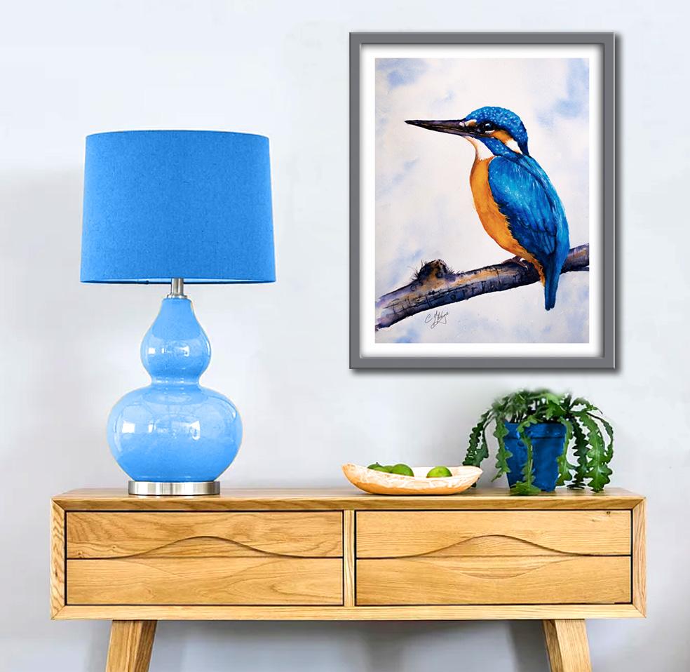
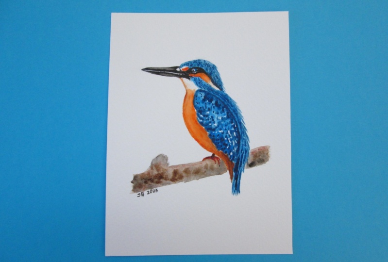
lovely kingfisher to really stand out. I would really love to see
your own finished painting, which you can upload to
the Your Project section. If you could just take a moment to leave me a short review, that also would be really great. I do hope you've
enjoyed this video and it's encourage you
to have a look at some of my other classes. In the meantime. Thank
you for joining me and I look forward to seeing you
next time. Happy painting
7. KINGFISHER FINAL THOUGHTS : Well done on
completing the class. And also the painting. If you've been painting
alongside of me. We've covered quite a few
different techniques. We've simplified the drawing
from the reference photo. We use the wet-on-wet technique for the
first layer of colour. Use the little
cotton buds to pick out the textured
feathers on the crown. We use the wet-on-dry
technique on with can paint in a little bit beak. We looked at how
to blend colors on the paper instead of in the palette for a more
lively appearance. We use directional brushstrokes to create the
appearance of feathers. And we just trickle the paint on some thoroughly wet paper to
create a really soft Sky. I would really love to see
your own finished painting, which you can upload to
the Your Project section. If you could just take a moment to leave me a short review, that also would be really great. I do hope you've
enjoyed this video and it's encouraged you to have a look at some of
my other classes. In the meantime, thank
you for joining me and I look forward to seeing you
next time. Happy painting
 Carrie McKenzie, creating painted visions