Transcripts
1. INTRODUCTION: Hello, and welcome.
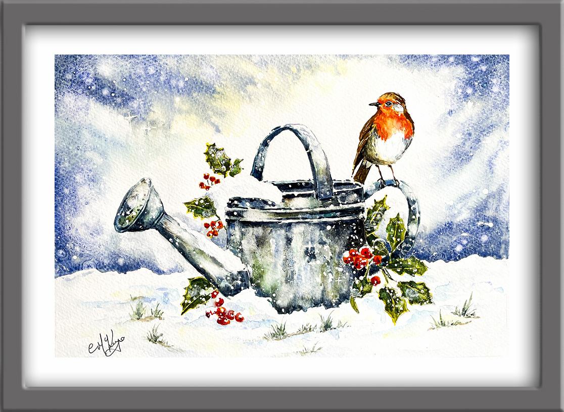
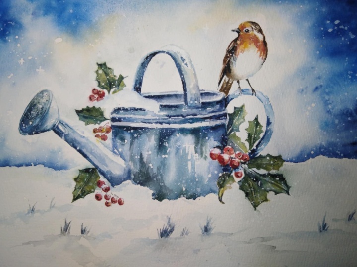
In this class, we're going to paint a bright
little robin perched on a snowy watering can surrounded by holly and falling snow. You'll learn how to create a
soft winter sky and how to add snow effects using
salt for organic textures. We'll build the robin in layers, increasing color tone, and depth to bring the bird to life. And you'll explore how to
paint convincing metal using granulation medium
and how to balance cool winter tones with
warm focal colors. By the end, you'll have a lovely winter painting full of glow texture
and sparkle. It's suitable for all levels, including beginners because I'm going to be guiding you
every step of the way. And I'll be sharing all
the techniques, tips, and tricks that I use in
my own professional work. We've included a copy
of the drawing in the project resources section so that you can download
it and trace it, and then not worry
about the drawing because this is a
painting class. I am a professional artist, author, and tutor,
and over the years, I've sold a lot of work
across the world and helped hundreds of people to
learn more about watercolor. You can see examples of
my work on my website. My style leans towards
impressionistic and contemporary rather
than photorealistic. I like to explore loose approaches that bring
out the colour, light, and essence
of my subjects. I've tried to
replicate this across all the many other videos
that I have on Skillshare. I'd love to see your
own finished painting, which you can upload through the project and resources tab. I'll give you some
personal feedback on it, and you'll be able to
see the artwork of other students and
get their support. At the end of the class, you'll have your own beautiful artwork to be very proud of. So let's swizzle our brushes and get on with the painting.
2. Winter Sky & Snow Effects with Salt. — Robin, Holly & Berries: First Layer. : I know you're going to love
creating this painting, and I'm sure it
will put a really big smile on your face, too. For this class, these are the colours and materials
that I'm using, but do feel free to use
any that you already have. For information on brushes
and paper, et cetera, do check out the basic
materials document that I've added to the
project resources section. Now you can see that I've
kept the drawing very simple, minimal details so
that we get a nice, loose free flow painting. And I've included a
copy of the drawing in the project resources section so that you can download
it and trace it, and then not worry
about the drawing because this is a
painting class. To begin with, I'm
going to reserve the white of the paper
with masking fluid. You can apply masking fluid to the shapes where you want to reserve the white of the paper, either for highlights or to
paint over by hand later on. Now, you do need to
wait for the fluid to dry fully before applying
paint over the top of it. When it is properly dry, you can just rub
off the hard gum either with a clean finger
or with a putting rubber, and you'll see that it leaves behind crisp defined
white shapes. If the white shapes
are a bit too stark, you can soften them
with a damp brush, or you can even paint over it. Now, don't use your
good brushes for this because the gum
will spoil them. So use an old brush or even
the handle of the brush. I also use rubber tipped applicators because the gum is very easy to clean off them. You can get a ruling pen, which varies the
thickness of the line, but I tend to use an unwound paper clip for
very fine lines and dots. So as you can see, I've been
using my applicator to just spatter on very randomly the masking fluid over the
whole of the painting. And when that's
removed later on, it will give the appearance
of tiny little snowflakes. As I said earlier,
you can't rub off or remove the masking fluid
until it's completely dry. So if you do get
any little blobs in places that you
don't want them, just wait until it's dry, and then you can
rub them off later. For instance, I've got
a rather unseemly blob right next to my
little Robin's head, so I'll wait until it's all dry, and then I will remove that one. I'm also using the tip of my applicator to just
go over the tops of any drifts of snow that are next to the watering car or
the leaves or the rubbing. Because when I paint later
over the top of those, they will act as a
boundary as sort of a stopgap for that paint
to end and give me a nice, white, crisp outline
for the snow shape. And remember, if you don't
have an applicator like this, you can use the
handle of a brush or a cocktail stick or an
unwound paper clip. Anything that's got
a bit of a point really for those edge shapes. Because the spattering
technique is very random and unpredictable, you'll probably find some
little areas that have missed out having any
little blobs for the snow. So you can always use the tip of your applicator to just add them in here and there wherever
you've needed it. I have also just added a little tiny dot of masking fluid in the pupil
of the little Robins eye, where you get that
highlight in the pupil. If you don't manage to get that in now, you can, of course, add it later with a little touch of white
gouache or white acrylic. And I've just photoshopped
the final result and exaggerated the color of the masking fluid so you can
see it more clearly here. The wet-on-wet technique is
simply putting wet paint onto wet paper or paint that is still wet and let it spread
into the wet wash. This results in a lovely
diffused effect with soft edges. Because the paint mixes into
the wetness of the paper, the color is diluted
and the tone is paler. So I'm using this
wet-on-wet technique in order to obtain a
nice, soft sky. As you can see, I'm using a large brush and
brushing clear, clean water over the sky area. Now I'm going as
near as I can to the watering can and the robin, but I'm not going to be painting color
right next to them, so you don't have to go
right up to the very edges. I am going to want the
central area around the robin and the top of the
watering can to be white. But I'm still painting clean water as near
as I can around them so that when the paint flows towards
that central area, I'll get a nice, soft, graduated blend instead
of a hard edge. To create a soft snow
flaky effect in the sky, I'm also going to be using an alcohol based hand sanitizer, which I've mixed in a palette
with a little bit of water. This was a tip that was passed on to me by another artist, but I don't know
over a long period of time how it will
affect the paper. So leave it out if you're
at all concerned about it. To begin with, I'm just dotting in a little bit of
quinacodon gold, which I've mixed to the
consistency of watery tea. You can see that
I'm just kind of drizzling it in around
that central area, but keeping an eye on
it so that it doesn't spread too far into the area
that I want to keep white. And now I'm adding in a few
touches of cerulean blue. If you don't have cerulean, you could use cobalt or
any other light blue. And I'm just letting
that mix and blend with the quinacnon gold
where it joins and also into the right
and left corner areas. That's just spread
a little bit too near the robin for my liking, so I've gone in and just dabbed
it with some paper towel. I'm just bringing
that ciruin blue down nail towards
the horizon line. I'm not filling in
the entire paper with color and leaving
white space in between. The paint that I'm putting on is diffusing nicely
into those areas, so I'm getting some good
variations of tone. And then I'm going over with
my dark ultramarine mix. Now, ultramarine on its own is just a little bit too garish, too bright for a winter's day. So I have added a
little touch of burnt tumber to the ultramarine to dull it down a little bit, and I've even added a tiny
weeny touch of Mars black. Everything is still
nice and wet, so I'm able to go over the colors and get all
these three colors now blending together
nicely whilst not actually overpainting
them in entirety. I still want little shades of the yellow and shades
of the lighter blue, the cerulean blue
to show through. Also notice how I'm using
directional brush strokes. I'm moving the brush at the right and left
sides of the page, pulling that color in towards the watering
can on each side, that's going to help focus the viewer's eye on the central area of the
robin and the watering can. I'm using this darker
color mainly in the two top left and
right hand corners down the sides and
along the horizon, that's creating a
vignette effect. Again, with the
light retained in the central area and keeping
the viewers focus there. It is really, really important to paint the sky very quickly. Make sure that the
paper and the paint on it is still wet while you
continue to work on it. As soon as that
paint starts to dry, you really do have to stop. Otherwise, your sky
is going to start looking muddy and overworked. If it needs a little bit
of encouragement to flow, then don't be afraid to pick your paper up as I am
doing here and give it a good shake from side to side to encourage that
paint to flow more. And the other thing
is, to some extent, let the watercolor do
what it wants to do, because this sort of painting wet-on-wet is very
unpredictable. So don't worry if your sky doesn't look exactly like mine, because if I were
painting this again, mine wouldn't look
the same, either. So just try to discipline yourself to a little bit looser, a little bit less controlled, and allow the watercolor to produce its own
wonderful effects. Whilst it is still wet, I'm going over some of
the dark blue color with some more dark blue
color because as that color has spread
into the wet underwash, of course, it has
diluted in tone. Yours might be perfectly fine. You might not need to
do this if you've got some very dark color on already. But this just goes
to prove what I said that as long as that
paint is still wet, you can continue to work on it. I'm happy now with the color. So I'm picking up with my
brush some of that hand gel, that diluted hand gel I
mixed earlier in my palette. And I'm just spattering
that over the sky area. And you can also use the tip of your brush to apply
the hand gel as well. From this close up,
you can see more easily the effect that the
hand gel is producing. The effect is not
as strong or as white as when we remove
the masking fluid, but it does give us
that nice flurry of snow in the background.
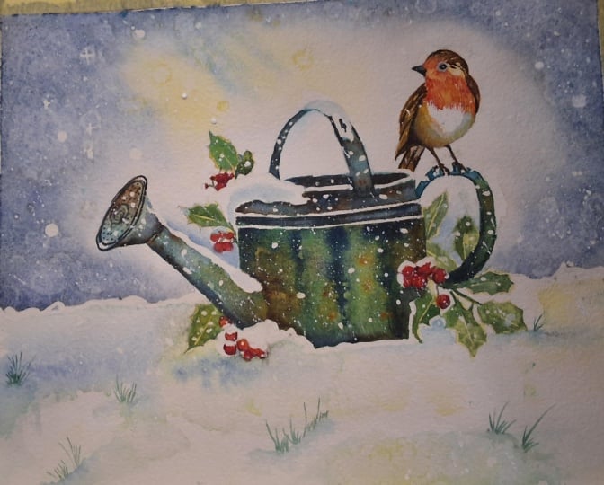
3. Watering Can: 1st Layer with granulation medium. Robin & Foliage: 2nd Layer to build depth: The wet on dry
technique is simply painting wet paint on dry paper. It allows for more control, stronger color and crisp hard
edges Where the paint ends, the paint will only go
where the brush takes it. Although we call the little
bird a robin red breast. In fact, when you
look more closely, the breast is made up
of yellows and oranges, as well as some fiery reds. For this first layer, I am brushing over some
handsome yellow light. You could use aureole
or transparent yellow, any other light yellow will be fine brushing that
over his head, over his breast and down
the wing and tail feathers. Then for the top of his head and his wing and tail feathers which are going to
be brown later. I'm just touching
in a little bit of the Rinacodone gold
that I use for the sky. I'm also using this
color to just paint the shadow of his
white underbody where it's below the wing. Then going back to
my yellow light, I'm just going to dot this color over all the
little holly berries. I don't stress too much about
filling in them in exactly, because we're going to
be over painting them with another color
in a minute or two. If you do leave any little white bits,
little white shapes, that'll be also
fine because it'll look as though there's a
few snowflakes on them. I've got a few
little berries down here that have got some
snow on top of them. I'm leaving those areas
white and just painting half a berry to paint the
first layer of the leaves. I've added a little bit, just a touch of
green to the yellow, to give me a lime green color. Because if you look
at holly leaves, they do have this central vein running through them that
is almost a yellowy green. And also around the outer edges, again, just like the berries, you don't need to be too
precious about filling these in. Exactly. The main thing is to get that central
area where there's going to be the yellow vein and around the edges
with the color. And I'm just working my way
now around the watering can, painting all these leaves
with this first layer. Don't worry about it not looking right at this point in time. Because water color is built up in layers and it will
look right in the end. The process is the same
for all these leaves. I have speeded the video up
a little bit at this point, but if you are painting
alongside of me, then do feel free to press the pause button and give
yourself more time to do it. Don't forget to paint
the little stems and stalks from the leaves in the berries in exactly
the same color. And use the tip of your brush, the point of your brush, to push the paint into the little spiky
parts of each leaf. Now, the paint on my yellow berries and
leaves is still quite damp. I'm dropping in some
little touches of transparent orange on
top of the berries, not filling them in entirely, leaving little touches of
yellow showing through. But the two colors, the
yellow and the orange, are blending still quite nicely. Again, don't worry
about being too precise with this orange color, because when this layer is dry, we will be going over with
another layer of red. And the yellow and the orange
will glow through giving some nice variations
in the red color. Because I have found,
when I painted berries previously
just with red, that when that red color dries, it does look rather flat. And a bit uninteresting. Having an under
painting of the yellow and orange just adds a little
bit more life into them. Now, the yellow paint on my little robin has
actually dried. The orange that
I'm painting now, on top of it, is not blending like it did
with the berries. But that is the effect
that I want a I'm painting wet paint on dry
paper or dry paint. That's allowing me to
give a little bit more of a distinguished marking
to the feathered area. Coming down here on the breast, I'm using the points
of my brush to paint very tiny little feathery marks in the direction that the
feathers are growing naturally. I'm leaving tiny
little slivers of the yellow paint showing
through here and there. Again, that adds more interest. It also gives depth and
variation in the tone. I'm using a clean, damp brush to just soften that color into the central area of
the breast where I want it to be lighter
than these sides. And that helps to
convey the roundedness, the three D effect
of his little body. I'm using the same
damp brush to lift a little bit of color
on his cheek area, again to convey the
roundedness of his head. Then I'm just
dragging down some of the color where it
meets the white area of his little body so that we get a more natural blend between
the orange and the white. I've also softened the
orange above his beak, where it's just meeting
the top of his head. That is going to be
painted brown later. But I still need a sort of
a soft transition there. And then I'm made a little bit more darker orange color again, round the sides to intensify
that rounded appearance. Then it's time to let it dry before moving on
to the next step. For this next step, I'm going to be using granulation medium. I'm just going to
spend a little minute telling you what it
is and how to use it. Granulation medium is used to create a mottled
textural effect. When added to water color, it separates the
color from the water, and it allows the
pigment to settle in small grain like particles on
the surface of the pay pot. This results in a granular, dappled effect that can add depth and interest
to a painting. Now, some artists love
the mottled appearance of granulation and use it to
replicate textured fields, beaches and mountains,
landscapes or brick old wooden doors and concrete effects
in urban styles. Other artists do
prefer a smooth, non textured look and
don't use granulation. It's all a matter of
personal preference. Now, some colors, such
as ultramarine or burnt umber are already
naturally granulating colors. If you use those with
the granulating medium, it will increase the
impact even more. To find out whether a color
is naturally granulating, have a look at the
manufacturer's color chart. There are a few
different ways that you can use granulating medium. One is to mix a small amount of the liquid with your watercolor
paint in your palette. It's a good idea to experiment
with different amounts to see what works best with
different paint colors. Another method is to paint the granulation medium
directly onto the paper, and while it's still wet, drop the paint color into it. A third way is to trickle the medium over the top
of a blob of wet paint. And tip your paper up
at one end and let the medium flow down the paper with the paint as it separates. A fourth one is it's
available in a spray bottle which can sprats over your wet paint that's
already on the paper. Don't worry if you don't
have any granulation medium. The colors that I've
mixed to start painting, the watering can are
ultramarine and vidian, both of which have naturally
granulating properties. You will get some
granulation effect just with the paint
colors themselves. These colors and the
granulation medium if you are using it will help to give our watering can a rather old and
weathered textured look. To begin with, I'm not using any granulation medium at all, I'm just using the two colors. Ultramarine and vidian which are mixed together
in my palette. The reason that I have added the vidian to the ultramarine is so that I get a color which is different to the
background sky color. Obviously, I want
the watering can to stand out proud away
from that background. Hopefully, we'll get that old metal
aluminium steel finish without actually
painting it gray. Although there's no reason
why you couldn't actually use some blacks and gray if you
would prefer those colors. I've got two mixes of the
vidian and ultramarine. One is a bit weaker and the other stronger
to give me a little bit of variation in tone as I'm working my way
around the watering can. You can see this in the top handle that
I've just painted. The underneath of it is in the darker tone,
the stronger tone. And the top of it
that is nearest to us and in the light is using the lighter tone for this handle At the back of the
can that I'm painting now, I first of all blocked
in the shape with the lighter tone color and then I'm dropping
the darker tone on the inside and outside edge. That will just help,
again to give it this feel of being a
rounded three D shape. You've probably seen
that sometimes on aging metal you get
a ver degree patina, a light green, rusty
color appearing. I've mixed a little bit
of yellow in a pool of my blue green color to make
it a bit of a lighter green. I've also mixed a little
bit of burnt umber, which will be useful for
adding some touches of rust. I'm going to be using
these two colors in addition to the
blue green colors that have mixed for the spout. Just as I did before, I'm using the light tone blue green color to fill
in most of the spout end. Then I'm using the stronger
tone where it's in shadow. I'm using a damp brush
to just lift any paint off on the top of the spout
where it's in the light. I'm adding a little
touch here and there of the burnt umber where
it might be a bit rusty. And also a little touch of the light green where we might have that
ver degree pattern. The important thing is to keep these little touches of
additional colors subtle. You don't want big
streaks of brown, so it looks as though the
clumps of earth on it. Use your brush to blend
those colors in to the blue green color
so that you don't get too many harsh
separations or hard lines. I'm working my way down the spout bearing in mind
I've got a little bit of snow creeping over the top of it and there's sitting in a little bit of
snow at the bottom. I'm just making sure that I keep those white and I
don't paint over them. I'm still varying the tone in this particular
shape as well. We don't want one
flat area of color. You need to leave
some little areas of white and then dampen
them in with a soft brush so they are much lighter
and keep some of the under part of the spout darker where it's in shadow, away
from the light. Then I'm adding a
few little touches here and there of
the brown umber, rusty color and the
green verdgree. All the paint is still very wet. Those colors are
nicely blending and mingling in with each other to give a nice natural effect, to keep things consistent
in the overall shape. I'm adding little touches
now of the brown number and the rust colors to the handle which are
painted earlier, if the paint is dry by now. Then just use your damp brush
to soften that coloring to the underlying wash for the main body of
the watering can. I'm using exactly
the same process, going in with that
lighter blue green color, trying to leave the two ridges that are on the can
much paler if not almost white while the
paint is still wet. I'm again dropping in
my burnt umber and ver, degree green to add
touches of rust. And using all these colors
intermittently to build up the shape and tone of this main part
of the watering can. Having got all the color on, I'm now using the pipette
to trickle some of the granulation medium over the top of the paint
that I've just applied. I've lifted my paper up at the top so that the
granulation fluid trickles down through the paint and dispersing the
pigment as it goes. As I said before, if you don't have the
granulation medium, you could just try this with
some plain water because the pigments that we are using already have some
granulation in them. I'm using a damp
brush to drag some of the color into the white spaces that have been left behind. That's giving me a nice variety of tones going around the can. Then while everything
is still nice and wet, I'm going back to
my darker toned, blue green color and just adding that in where there
will be more shadows just underneath the rim of the watering can and just
underneath those ridges. You can't see it from the video, but I am also lifting my
paper up a little bit with my other hand so that the paint does run down towards
the bottom of the can. When this first layer dries, I will be adding some more
dark color in a second layer. But because water
color does tend to dry 20 to 30% lighter than
when you first put it on, it is useful to actually try and add a few darks
here and there. Now, I've just added
a little bit of my darker blue green
color to the bottom of the can and tilted the
paper the opposite way, so it runs towards the top of the can to get a consistent appearance with
this slightly darker tone. I'm now adding a
little bit more of that darker color to the spout, particularly the underneath
of it where it's in shadow. Finally, a little bit of that darker color
on the rear handle, particularly where it's peeping out between the holly leaves.
4. Robin, Holly and Berries - second layer, increase colour, tone and depth.: I've mixed some burn
timber in my palette, and I'm using a very small, pointy brush to paint
in the little feathers, going over the top of
the little robin's head. I'm using short
directional strokes, so that is the
strokes are going in the direction going
around the robin's head. To indicate the form, using a dump brush here
and there to just soften a few of those feathers into
the underlying yellow wash. I want the overall appearance of the head and the wing and
tail feathers to be brown, but I equally don't want to lose some of the
underlying color. I'm working my way down the right hand side of the
little robins wing feathers. And then moving over to the
left hand wing feathers. And repeating that process, little directional
strokes, letting some of the underlying yellow
wash show through. And dampening and softening it. In other places that we get a mixture of
hard and soft edges. There's a small shape
here where the wing feather curls back round
behind his little body. I'm just painting that in
the darker, burnt umber. It's also a little bit darker, just under his chin,
below his beak. I've added a little touch
of burnt umber there. And then I'm going
back to strengthen the dark shape
that's going behind his body and also
his tail feathers, which will be darker because
they are further back. I'm using the same dark
brown color to paint his little legs
and the claws that are going around the
rear handle of the cam, now they are quite spindly, their little legs with just a little bit wider
right at the top, adding just a little touch of black here and there
to darken the tomb. Although his lower body
is predominantly white, we do still need to add some shading colors to
again make it look rounded. And three D, I'm using
some burnt umber, some ultramarine, and
a little touch of a purple blue here and there just to convey
that shadow color. I'm still using small
directional strokes to show the direction that
the feathers are growing. I'm applying these
strokes wet paint, on dry paint or dry paper. But then using my damp brush
to blend them together. So there's a nice
gentle transition between the different colors. Between the clear white
and the shadow colors. There's a small white shape to the right of his
little eye that also needs a little bit of shadow color adding so
it looks more natural. There's a couple of little
feather shapes just in front of his tail feathers that
also look too stark, too white, that need some
shadow color adding to them. Also, I've used ultramarine blue and some vidian
and some yellow to mix a medium green
and a darker green. Using the medium green, I'm painting into the
leaf shape but leaving a tiny sliver of yellow running down the center
where that central vein is. I'm also trying to leave a very thin sliver of yellow going around the
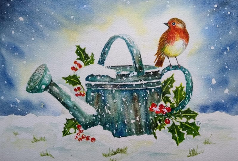
outer edge of the leaf. You can see this in the reference photo
that I've attached. I'm dropping in a little touch of the darker green
here and there. Particularly where a
leaf is in shadow. Then before the paint dries, I'm using a little bit of
scrunched up paper towel to just lift off a little bit of that pain where I
want to highlight. I'm going to work
und the rest of the holly leaves using
exactly the same process. I'm using cadmium red. Now to paint over the yellow and
orange color that I painted previously on the
little robin's breast, I don't want to completely obliterate the under
wash of colors. I'm using little
directional strokes, using the red paint, leaving a little bits
of yellow and orange showing through and glowing through where I have
placed the red. Although the little robin in our painting is not the same as this
reference photograph, it is useful to see that, in fact, the red breasts
are not completely red. There's lots of orange tones and yellow tones going
on in there as well. I'm blending the red paint into the underlying
wash of orange and yellow so that we get an overall appearance of
soft, orangey red feathers. Although this little area is a very small part
of the painting, it is actually the focal point where the viewer's
eye will go to first. Don't rush it. Take
your time and just get these little red strokes
in all the right places. I'm using the same cadmium
red color to paint over the little berries where one
berry is behind another. I'll be using a touch of a lizarine crimson to just
paint that shadow color. A lizarine crimson is
more of a purply red. So it's ideal for
painting shadows. Sometimes people do make the mistake of painting
shadows with gray. But if you look very
closely into shadow, not only can they
be purply blues, but they can include lots
of other colors as well. You don't need to be too
precious painting in the little round shapes
because if you do miss any little
bits out of white, that will look like snow.
5. Watering can 2nd layer. Paint the snow. Paint the robin’s eye and beak.: For this next layer
on the watering can. I've mixed a dark blue black mix with ultramarine
plus burnt umber, plus a touch of Mars black. I'm going to use this dark color to add contrast to
the watering can. Particularly where
it is in shadow, in between the raised ridges
underneath the handles. And for the holes on
the spot for instance, I'll be adding more touches of the brown burnt
umber and the ver, degree green where needed to increase the
weathered aged look. I'll be painting wet to dry. So I'll be using the
blending technique to soften and blend some of the hard edges that
occur when I do this. I'm using thin, watery
mixes of cerulean, blue, ultramarine, and
yellow to paint the snow. Of course, most of it will be completely white,
untouched paper. But we do need to paint the little drifts in the
snow and shadows beneath the berries or leaves and also where there are any
reflections from the sky. But do be careful not to overdo it or your snow
won't look very snow Like blend your
colors in so you get some nice transitions between the color and the
white of the paper. Simple and crisp. White is
actually a colorless color. Mixing red and green
and blue light together is what gives
you white light. Now because it is white, snow can appear a difficult
subject to paint. With water color, it
isn't really a color, but some consider it to be so, because white light comprises all hues on the visible
light spectrum. Therefore, as it comprises all other colors in the rainbow, you can effectively paint snow with a palette of
all these other colors. Because snow reflects the sky, it can often incorporate
a lot of blue, particularly where
the shadows fall. However, especially
when the sun sets, the sky can radiate a variety of other colors that
you can add for depth and visual interest
to the composition. For instance, it can be useful
to add a touch of yellow to areas where the shadows transition into the
brighter areas. It may seem counter intuitive, snow isn't meant to be
blue or yellow or pink, but it will all work beautifully
together in the end. Another point to note is
that when painting white, it's all about tonality. So don't be afraid to use some medium and very dark tones because this will
bring impact and emphasize your
lighter whiter areas before the different
colored paint dries. Sprinkle, just a little
household salt over it. As it dries, the salt pushes the water
color pigment away, creating tiny little
sparkles of light. A wonderful representation
of tiny snow flakes. You can use your paper
towel to dab off any color that's a little
bit too strong in places. Don't forget to add a little bit of shading to the patches of snow that have fallen on
the watering can itself. I'm using Mars black to
paint his little beak, And now you can
use any black for this if you don't have
a very steady hand, because they are very
tiny little shapes, you could use a black
waterproof pen. However, do be aware
that you can't erase the waterproof pen
like you could the paint. Whichever method you're using. Do take your time. Take it slow, because
the black against the white will be the biggest
contrast in the painting, will be the focal point of it. I've tried to leave
a tiny sliver of white paper in between
the upper and lower beak. And if you don't quite
manage that dirt worry because you can always use a white pen or some white gouache or acrylic
afterwards to paint it in. Did put a tiny, teeny dot of maskin
fluid in the pupil. When I erase it after
the paint is dry, I should get a tiny white
high light in the eye. If that doesn't happen for you, again dot worry because again, you can add it with a white pen or a little
touch of white paint. I'm using the same dark
color to strengthen a few of the shadows in his
wing and tail feathers. But I'm softening
those in so that the end result is not quite as dark as the beak and the eye. I do want the beak
and the eye to be the absolute darkest color
in the whole painting. I'm also darkening a
little bit of his body, not too much where it's under
the shadow of his wing. And then finally we've just got a few little gray feathers at either side of his body
and below the wing.
6. Remove masking, soften shapes. Recover highlights. Spatter white paint for more snow.: I've removed all
the masking fluid using a clean, dry finger. To begin with, I'm just
using the dark blue, black color that I used
in the previous step. And adding a little dot to
each of the holly berries. Try not to put each.in the same place on
every single berry. Try and vary the
position so that it looks as though they're all growing at different angles. This is the time
where you need to assess what's happening
in your own painting, what's working,
what's not working, what you've missed out,
what you need to add in. I've noticed that I've actually missed out
a little bit of the background sky in between
some of my holly leaves. I've just mixed up a little bit more of
my background color. And touching that in here and there where I
should have put it earlier, it's particularly
noticeable where there is some snow lying across the top of the spout
because you can't tell the difference between the snow and the background sky. I'm just using that
very pale wash, nothing too dark in this area. Just blending it nicely
into the white background. Now it might be that you
don't need to do this, that you got it right
first time round. Just have a look at your
own painting, as I said. And tidy up any little areas like that that you
think you've missed. On the other hand, if you
don't need to do anything, then leave it well alone. What you don't want to do
is start fiddling with something that's fine as
it is, and overworking it. Although you can use a brush and some water to lift off paint, I want to introduce you
to magic sponge eraser, because this little tool works miraculously to remove
unwanted paint, you can use it to lighten
an area that is too dark or even strip the color
right back to white paper, depending on which
color you've used. Because some colors do stain
the paper more than others, just tear a small
piece of the sponge, dip it in some clean
water, then squeeze it. Just damp and rub over the unwanted paint until
the color is removed. Use a paper towel in between to blot and get the last
bit of paint off. And keep rinsing your sponge
out during use to keep it clean or even throw it away
and use a fresh piece. If you accidentally get a
blob of unwanted paint in the middle of your
painting or you just want to lighten
the tone of an area, give it some highlights. This little piece of
sponge will become your best friend because it's normally sold as an
abrasive household cleaner. It does tend to rough up
the paper a little bit, take extra care if
you're painting over the area that you've
sponged with another color, you can either purchase it from art retailers or
you can get it from the cleaning section of
local supermarkets or thrift stores where it is sold as a general
household cleaner. I'm using the sponge to
lift off some color, where I think I need to recover some highlights in some places. I've just simply lightened the tone in a couple of places. I've almost gone
back to white paper. Now, you don't want
to overdo this, but if you do find you've taken a little bit too much
paint off anywhere, of course, there's no reason why you can't just add that back in. I've got a little before and
after picture so that you can see the difference that recovering a few
highlights has made. Just to show you
that it can be done, I'm adding a little
bit of paint back in where I think I've gone a bit heavy handed with the sponge. I've mixed some
white acrylic paint with a little bit of
water in my palette, and I'm spattering that
on for some more snow. Now, you can use white gouache. The thing to be aware
of here is that white gouache does tend to
pale a little bit as it dries. So you might need to
do it several times. I'm just spattering it on with a flicking
action of my wrist. Using a small brush, if you use a large brush, you'll get larger spatters, a small brush, smaller spatters to get a really
fine spray of snow. You can put some paint on the bristles of
an old tooth brush, and then rub your finger over the bristles and spray
the paint onto the paper. Now as you can see, I'm going for quite
a snowy scene here, as well as spattering the
paint over the background, I'm also spattering
it over the watering can and over the leaves and
even the little berries. Another little trick that
you can try if you want to create the illusion of frost on the leaves,
for instance. You can just dip your
finger into the paint and then press that onto the surface where you
want the frost to appear. The ridges in your fingerprint will create that frosty effect. If you haven't used this
little technique before, I do suggest that
you try it out on some practice paper before actually applying
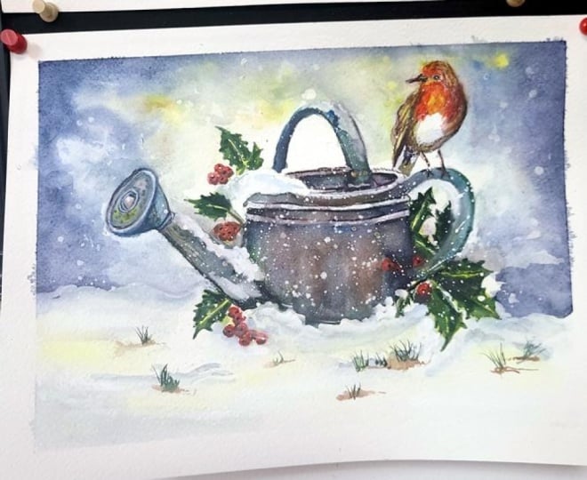
it to the painting. Now, I did actually
think at this point that I'd completed the painting
and it was finished. But when I looked at it
a couple of days later, I felt that the foreground
was too sparse and empty. I've added a couple of little grassy shapes
here and there. Just flick them up using the same color that I use
for the holly leaves. I bedded them into the soil, peeping out beneath the
snow with some very, very pale, watery, burnt umber. It's often the case
when you look at a painting a few days
or weeks afterwards. You're looking at it with
a fresh pair of eyes and can see something else
that needs to be done. But I think I'm happy now to
say that the little robin on the watering can in the
snow is finally finished. I do hope you've enjoyed this painting and that
you've learned some tips and techniques along the
way that you can incorporate into
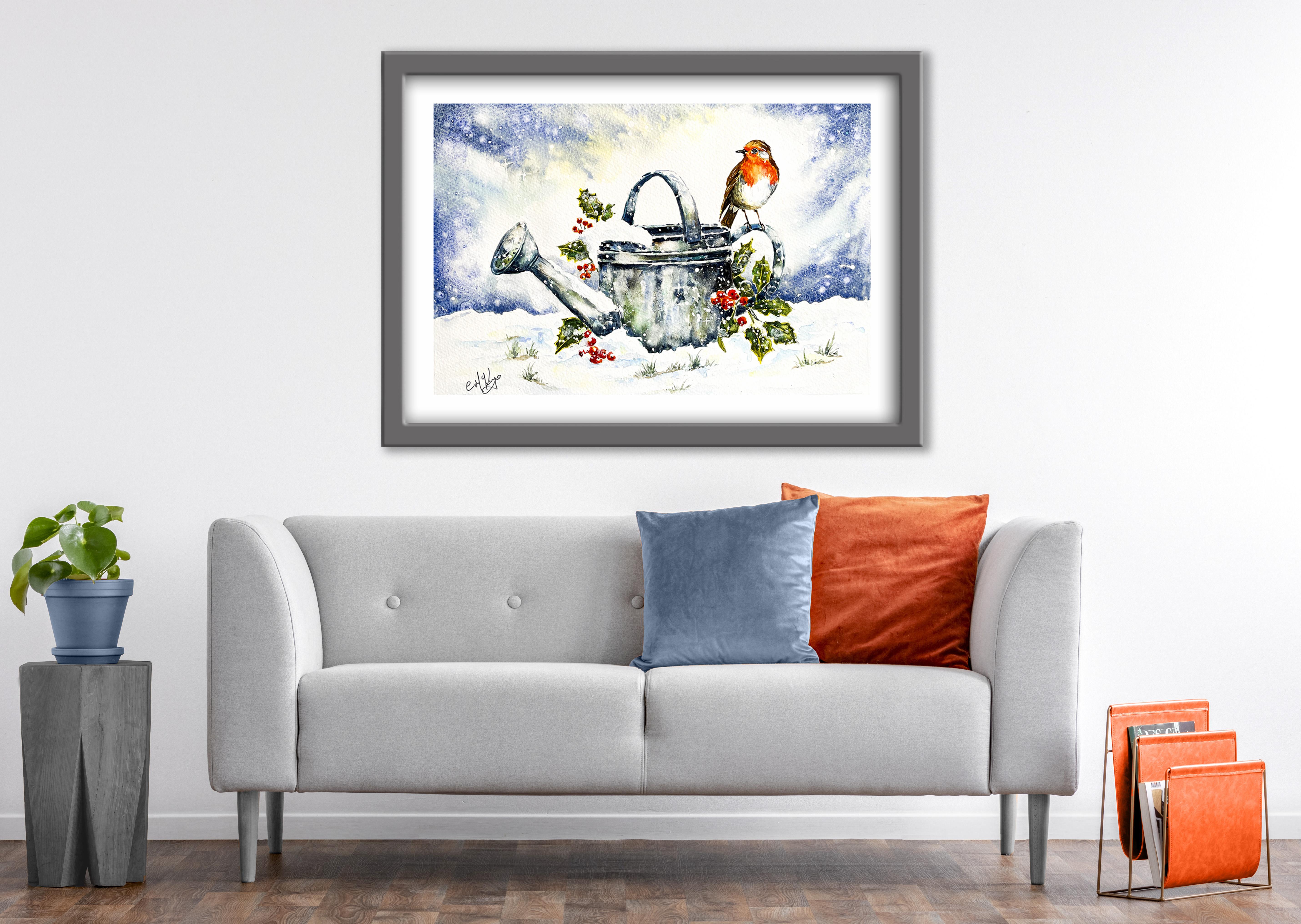
your own paintings. Why not pop it into
a mount and a frame and you'll be amazed how good
it looks when you do that. I'd really love to see your
own finished painting, which you can upload to
the your project section. If you could just take a moment to leave me a short review, that also would be really great. I do hope you've enjoyed this video and it's
encouraged you to have a look at some of my other
classes in the meantime, thank you for joining
me and I look forward to seeing you next
time. Happy Painting.
7. FINAL THOUGHTS: Oh. Well done on
completing the class, and also the painting, if you've been painting
alongside of me. We've covered quite a few
different techniques. We've simplified the drawing. We use the wet on dry technique, putting wet paint on dry paper, and then we used the
wet on wet technique, putting wet paint on wet paper. And we use light medium
and dark tones of color to convey around
a three D effect. And we also looked
at how to lift off paint and
recover light areas. We looked at how to introduce
granulation medium to obtain interesting
mottled texture in some areas of the painting. And we use several
different ways of creating snowflakes and snow. But forget to upload your own painting through the
project and resources tab. After all your hard work,
I'd really love to see it, and I'll be sure to give
you some personal feedback. And if you've
enjoyed this video, do have a look at my other
classes on Skillshare, which are packed
with more tips and techniques to help you
on your own art journey. If you click the follow button, you'll be able to follow me, and then you'll be the first
to know when you upload a new video or any
exciting updates. And if you could
just take a moment to leave me a short review, that also would be really great. In the meantime, thank
you for joining me, and I look forward to seeing you next time. Happy painting.
 Carrie McKenzie, creating painted visions