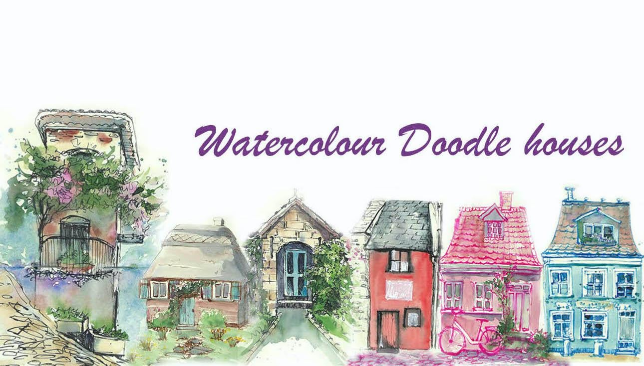
Transcripts
1. Introduction: Doodling is one of the most relaxing and
rewarding ways to draw. It lets your mind
to be preoccupied with something else
while you're drawing. Simply put, doodling is also
called mindless drawing. In this class, I will
show you how to draw cute little houses and cottages using a line
and wash technique. And we will be using
watercolor and ink to doodle. We're going to try
our best to keep our hands really free as
they move across the paper. And also to keep our sketches really simple
and yet too colorful. I will show you a few
tips that you can use to come up with
your own style, as well as encourage
you to try out your own style while
you are drawing. I will also talk
to you about where I draw my inspiration from. And also give you a
little warm-up to the materials in case you
are new to this medium. Later on, we will begin by doodling cute little cottages
and terrorist houses. In the end, I will
show you how I doodled a house
from my local area. I will talk to you
about how I used a photograph and what
things are changed in it. And what I did include
from the photograph. It was such a great fun creating cute little houses and cartridges in line
and wash technique. I hope you will enjoy this
course as much as I did. I see you in the next video
where I will talk in detail about how I draw my inspiration from
the things around me.
2. Things that inspire me: As a full-time mother, I always find myself stuck in my studio
whenever I want to paint. It is really hard to
get out and find things that I like to paint or even
new plane sketches at all. And so I depend quite
a bit on photographs, either photographs that I
chose from the Internet or the photographs
that I take myself while I am on my walks
with my children. Most of, most of my
doodle idea comes from the photographs
that I have taken while I'm out and
about for this class, particularly, I
was also inspired by some of the books that
I read to my children. It always inspires me when I read about little
fairy tale houses. But occasionally,
I also refer to pictures in some magazines
that I find interesting. As we start doodling
little houses, I will talk to you
more about how I was inspired to draw
these little houses. I will also be
doodling from one of the photographs that I
took of my local area. During this time. I will talk to you in
detail about how I used the photograph and how I created a composition
that I really liked.
3. Suggested Materials: Hello. Let me introduce you to all the materials that you
require for this course. Let me start off
with the sketchbook. It is one of my larger
sketchbooks, A4 insights. I've also got
smaller sketchbooks, which I like to use
when I'm out and about. The weight of the paper in
this sketchbook is 140 GSM. And I think that's
more than enough for our line and watercolor wash. Next up is ink. Today I'm going to
be using mapping pen with a mapping nib
and Indian ink. That's for inking and
for watercolor wash. I have a range of
watercolor pans, as well as watercolor
from tubes. I personally prefer using
watercolors rum tubes, as they remain really fresh. But it's not necessary that you do for this
particular project. And for the brush, I'm only using one brush today. This is a mop series. Brush size is zero, is somewhat similar to round
pointed brush size eight. So that's the kind of
size I'm looking for. You can even go up to say is ten if you are
comfortable with it, or go down as size, it really depends on what
you are comfortable with. But this one brush is more
than enough for today's work. I am also going to
be using one jar of water here just for
my watercolor wash. I don't need it
for anything else. And you can also
keep some tissue handy in case you need
something or lift out color. That's about all the
materials for today. See you in the next video
with more practice sessions.
4. Watercolour and ink warm up: In this video, we're going
to try out our materials. Starting off with ink. This is exactly what we will be doing in our project as well. We will start off with
ink for today's project. So I'm using mapping pen. If you're using a mapping
pen or a dip pen like me, you can relate to
what I'm talking now. I'm using a mapping pen. You are free to use a micro
tip pen or a fountain pen, or any pen that you
personally prefer, um, or even a brush
pen should be fine. So with the pen, I'm going to try out
different lines. Starting off with some
squiggly lines for foliage. Just a way of depicting foliage without having to draw
a lot of details. But at the same time, if you
want to have a few details, you can also add
leaf-like shapes as well. It might look nice
for some sketches. But again, that's
a personal choice. So that's one thing that
we can do with ink. Let's also try doing some
miniature versions of houses that we can draw
for today's project. So you don't really have to copy what I'm doing right now. You can just do anything
that gets your hand moving. So I'm just doing little
versions of houses that I can include
into today's project. Um, I'm also going to experiment a little
bit with my lines. So especially if you're using
a dip pen or a brush pen, this will work
really well for you. So with the dip pen, if I am just lightly moving
it across the paper, I get very light or
very thin pen lines. But as I increase the pressure, you can see that
they are thickening. And you can, you can get these thick characteristic lines with the one pen
that you're using. So let's try something else. We are going to try a mixture
of thick and thin lines. Going up. It's going to be thin and then I can make it thicker if I want. Thin, thick, thin and thick. And then you can
keep practicing that until you get a hang of
the pen you're using. You can also try adding thick and thin lines for the things that you're
going to doodle. So e.g. if I am going to start
doing a little window here. So I'm going to have
thicker lines for the top where there is
a chance of shadows. And you can shade an area with
the pen using shot lines. And this is called hatching. Now let's try putting a
little shutter window here. So that's just a shattered
opening for the window. And the thick and thin
lines really helps us to identify the light and
dark areas as well. So I think that's enough
practice with the pin onto. You can continue doing
all your practices in pen until you're really
comfortable with using the pen. Once you've finished with that, we can now move on to
experiment with watercolors. I'm going to get
my watercolor pan and my brush, and my water. I'm going to start off using
any color for that matter. So let's start off
with a nice red. Watercolor activates
by just using water. You simply rub over it and
it starts to activate. And I'm going to get
it onto my palette. If I want to make
it more diluted, I can add more water or if I want to make
it more thicker, I can add more paint. So at this stage, this is very, um, it's not very diluted. It's kind of a
medium consistency. I'm going to try that
out on the paper. So that's a medium consistency. Now let's try adding a little bit more pigment
straight from the pan. I'm going to start dropping
that in to that swatch area. And you can see immediately
the difference between the first layer output and the second layer of pure
pigment that I put over it. Now, if I'd like to make
it a bit more diluted, what I'm going to do is I'm
going to add a few drops of water into this mixture
that I have here. And if I try that here, you can see it's a little bit lighter compared to
what I've painted here. I can keep adding more water
to make it more light. And that way I get a gradation from a darker
area to a lighter area. And you can bring it all
the way down to very pale. And this is something
that we will be using. This technique is
something that we'll be using for our project today. You can also overlap
one color with another. You can either do it while
it's completely dry. You can do it while it's still wet and you can see
the difference. It kind of spreads
and feathers out. So these are, these are
the different effects that you can do with watercolors. You can experiment
and make sure that you are comfortable with the medium before you
start the project. So we're just going
to simply try out giving some color
to the shutters here, I think which is dry now. I'm going to go into a color, Let's see, yellow, just
straight from the pan. I just need to make sure that
it is a medium consistency. So I'm going to try that out at the edge of the palette here. And I'm simply going to just add some color
to that shutter. For lighter areas, you can leave light over here without
painting that area. And for darker areas, you can choose to
give a darker color. In this case, I'm going
to give some brown. Because how much of a
darker I make the yellow, it's not gonna get
any more darker. I'm just going to
add another color. In this case it's brown. But otherwise, you can also add the same pigment like how
we did here with the red. So I just simply added
extra pigment straight from the pan for making that swatch a bit more
darker in this corner. So I think that's worth all the warming up with a watercolor. We're going to dive
straight into doodling. Are little houses and cottages.
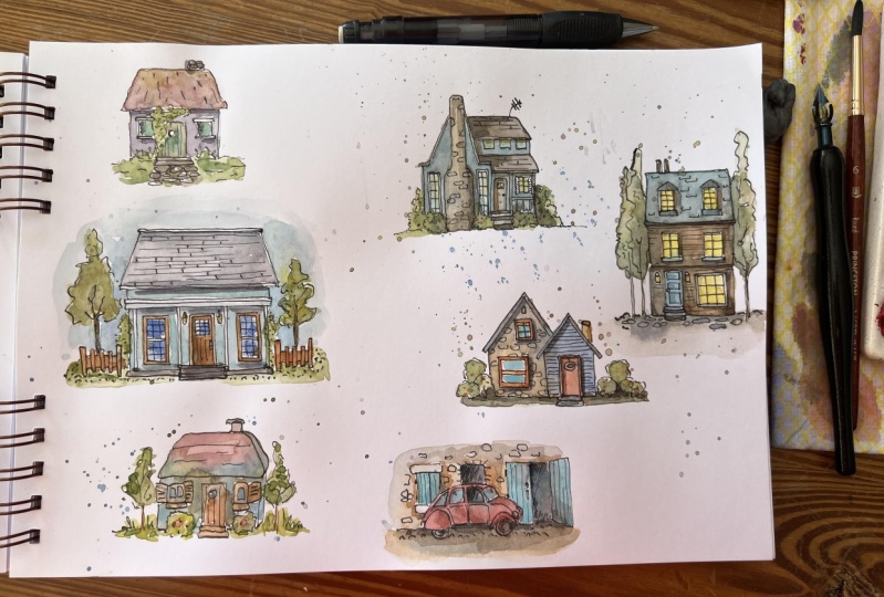
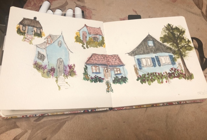
5. Watercolour and ink cottages: Hello, We're going to
start off our project by sketching or due to
link little cottages. I'm going to start off with I'm about four or five cottages on this page and we're going
to make it about this size. So we can fill in
the page width, a few more other
cottages as well. The things that I'm going
to draw here today are not from any photographs
or references. This is purely my
idea and you are free to include your
ideas in your doodles. So starting off with
the first cartridge, and I'm going to start off with the roof of that cartridge. You may notice that all my
lines are very uneven and squiggly and I am deliberately
making them like that. You asked to give
a little bit of extra character to the lines. That way, my sketches
are going to look a little bit
more characteristic. So I've just done the
roof off the cartridge. I've got little squiggly
line on the left side. Maybe I'll develop that
into a creeper later on. Now for the body of the
house, with the details, you can decide to add as many details as you like
or as little as you like. It's completely depends on your ideas and on
your style as well. So here I'm adding a little
bit of a roof detail. Details of roof tiles. As you can see, I'm not really defining each and
every roof tile. They are merely some
scribbly lines just to show or just to give the
impression of roof tiles. Now with the body of the house. So I'm going to start
off with placing a window on one
side of the house. And perhaps I'll do another window on the
other side as well. And adore in the center. Again with the window. You can see that none of my lines are really
perfectly straight. In fact, we don't need to look for perfectly
straight lines. All we need to remember is that when we are placing two windows, like how I'm doing now, I just need it in more
or less same level of the house so that it
doesn't look too wonky. So you can see, I measured or I looked where the first
window was placed and, um, I have tried to place the next window in level
with the first window. And now for the
door in the middle. Just placing a nice
rectangular shape in the middle for the door. Before finishing off the bottom of the house where
the straight line, what I can do here now is
to add details like bushes, flowers, anything that you
like near to their house. Again, would you like a step for that door are not as
completely your choice. You can add a step if you like, or just choose to leave it. Again. The window details, again
completely your choice. I'm just adding
some details here. And for the door, I think I'm going to make
it into a wooden door. So I'm going to start drawing lines for wooden planks
to depict wooden planks, that little peep
hole, and then donor, then everything or extra details that you may want
to add as well. Some nearly at the end
of the first cottage, just finishing off with some doodles with
some plants in front. And again, you can see that I haven't really defined the
leaves or the flowers. Flowers. I've just
scribbled around that area. Just to make it all
look all come together. For that little
squiggly line that I left at the left
side of the roof. I'm now making that
into a creeper that's going up the side of the house. Just another thing that I'm really interested
in personally. I do look at little
cottages and houses like this with a lot of
foliage around them. And it's something that I really love to look at personally. And this is what
I'm putting down in my sketch book as doldrums. Now moving on to
the second cottage, I think I'm going
to start off with a similar shape of the cottage, but maybe with little
variations are differences. So this time I've started
off with adding a chimney. And I think I'm going
to go for attached to Ruth instead of Ruth details. So I'm not really sure how to
go about it at the moment, but I think I got the idea from the fairy
tales I read to my children. And I, as a little girl, I used to enjoy
reading fairy tales, and I still do. And especially when I'm
reading to my children, I like to imagine it visually. That is something that
I really loved to do. And this cottage probably comes from one of the stories
that I read to my children. So this house has
attached truth. The structure of the House
remains more or less the same. So like how we did in
the first cottage, I've just done the roof as
well as the body of the house. The extra thing that I
have there is the chimney. Now for the windows. I think I can change
the windows here. Maybe give a little bit more. Cottage like windows. Maybe not with the railing
detail or anything to plane windows and
a door in the middle. I think with this
one maybe I can have a creeper just
beside the door. I'm going to add
that detail fast. So that area is completely
covered with a nice, lovely creeper that's
going up to the roof. And then I'm going to place
the door just behind that so I can't really see some of the areas of the door because
the creeper is covering it. Now for the bottom
of the house, again, I can begin to add
details or foliage before I do the
bottom of the house. So I've just finished the door continuing with the
creeper and then maybe add a little bit of bushes at the bottom
there as well. Now, it doesn't have to just
be plain creepers or bushes. You can even add details
of flowers if you like. So if you look closely, I have added little impressions
of flowers over there. It could be any flower,
could be poppies, two lips, Butter Cups,
anything is fine. It doesn't have to
look like a flower. Merely some circular shapes
or petal shape is more than enough for you
to depict flowers. Especially because our
illustration is really small and there is no room
for details at this stage. And finally, to finish off, I'm going to place a little pavement in front
of that door of the house. Just another little
detail that I always like to include
in these pretty houses. I can also add a
little bit of dark and light in this illustration, especially with the
creeper and the door, I'm sure that the area of
creeper near the door would be a little bit more darker with all the shadows
falling on it. I've just made that area a
bit more darker with my pen. You can choose to do it with
pen or with watercolor, whatever is best for you. And with the windows itself, I'm going to add a
little bit more detail like window panels. And finally, before I finish
off just adding a little bit of lines to show the
texture of attached truce. And finally, before
I finish off, I just wanted to add a little bit more dark area
just under the touch truth, just to show the shadows falling on the windows and on the body of that
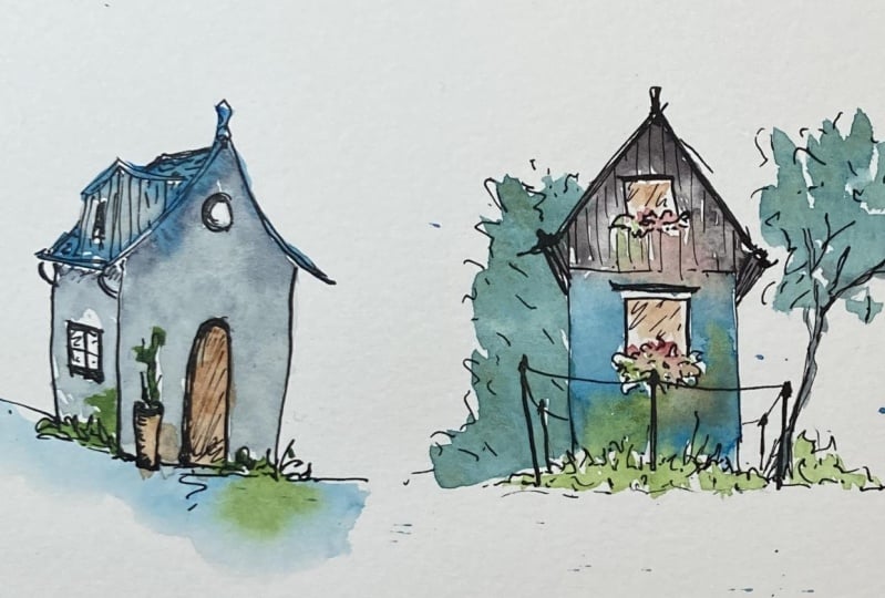
house from the roof. And with this, we're finished with the second illustration. Moving on to sod cottage. I'm going to place it in
the middle of the paper. I'm starting off with
the roof of the house. This is just my personal way
of starting off the doodle. But if you are comfortable with starting it off
in any other way, you are free to do so. So this time, the house is going to look a little
bit more different. Maybe a bit more longer. Perhaps have two stories
instead of just one. This particular house
or cottage is inspired from one of the
little cartridges that I saw when I was
listing Switzerland. I think this one particularly
caught my eyes because it was on a hillside and there was green
pastures all around it. And I really loved the way
it was placed on that hill. Now I'm just finishing
off the edge of the roof. And that area where
I'm shading it in depicts that there is depth to that building and it goes beyond the facade that we're
just drawing right now. Now at the top of that building, I have a little window. I can put foliage there. As always. That's
what I love to two. And instead of a door, maybe I'm going to
add another window. So this is just one
side of the house. Maybe the door is
on the other side. But I just particularly loved this particular
scene that I saw, why I was walking along. And I think it might look better if I make it into like a little wooden cabin. So when I start painting, I might give a little bit of details for it to look like
a wooden cabinet as well. And again, I'm just
adding some extra bit of details like a small
fence around that hot. You can also add more
details of grass in front. And now for the little
wooden cabin like look, I'm going to give details
of wooden planks. Just straight lines
depicting wooden planks. I'm going to leave it only at the top part of the house and the bottom part is going
to be a plain color. So this house is
purely from my memory. Just a glimpse of that house I got while I was just walking by. I don't remember what was
near their house or anything. So I'm going to improvise and maybe add a little bit of
foliage in the background, just so that it doesn't
look too plain. I can also add a tree if I like, on the other side, just to make it look
more beautiful. Just how I like it to be. You don't have to do the
same things as I'm doing. It's just how I felt
that it should be. So this is the time where you can add your own ideas
into your doodles. If you are somebody who loves to look at little huts
and houses like this. Or if you may have noticed
a little hot like that, then feel free to
add in any details that you would like
in your illustration. Moving on to the next cottage. Again, I'm only going to give a slight variation from what
I have been drawing so far. I think I'm just making up my own ideas of little cottages. For this one. As I started off with the roof, I realized maybe it
might be good if I could give a little attic
room for that little cottage. So I'm drawing like an other little roofs on
the side of that heart. And also adding a little window for that little structure there. And now I'm going to carry on with the rest of the cottage. So before I do that, I'm just fixing the. Ruth. So that's the main
roof and there is a little roof or Lewis
structure on top. And obviously I can see the the end of that roof
on the other side as well. Now for the main
structure of the cottage, going to try and keep
it quite simple. Maybe add a little
bit different to this cottage with a
different type of door. And maybe I'll add another
potted plant here. That's something that I haven't done for the other cottages. So very simple. Just a few scribbles, not going into any details
of flowers or anything. Just finishing off the
side of the cottage. And now for a little
window over there as well. And we finished with
that cottage, I think. Finishing off with a
little ventilation above the door and maybe some details of wooden planks on that
little extension on the roof as well. I think we're done
with our illustration. The next cottage is going
to be slightly different. So I'm going to start off with a roof a little bit
towards the center. So I can give like a little extension to
the other side as well. When I do the roof, I'm also going to give
a little extra layer just to show the
depiction of roof tiles. Obviously, you cannot see the roof tiles in at this angle, but you can see the
edge of the roof tiles. And now I'm going to draw another Ruth to the
side of this one. So more like an extension
of that cottage. And if you'd like, you can add details of roof
tiles here as well. Or if you wanted to make it
a two attached Ruth, um, or just a plain
roof or even if you wanted to add in a different
type of roof tiles, that is all possible. Um, it just depends on what you really want in
your illustration. I'm going to add a door there. And maybe for the
extension area, I'm going to add a window. I'm not doing the bottom bit of the cottage yet because I'd
like to add in some foliage. So I'm not finishing it off with a straight line and probably finish it off
with some foliage. And maybe at the doorway, I'm going to add a little
bit of paved stones or a path just to show some details of the
path at the doorway. That's just again,
what I love to do. You don't have to do a path. If you are not too
interested in that. You can just just
leave it like that. Now just for the
frame of the window. Those are like the extra
details that you can add. And finally, a little bit
more detail on the door going to go with the
impression of a wooden door. And, um, I think we are
done with the illustration. Again, just to add any sort
of detail that you like. It could be anything. It can be a potted plant
or just some flowers. It could be anything. You can even add a
tree if you like. It's completely your choice. And with that, we're done
with a cottage illustrations. Checking if they are dry. If they are completely dry, then I can go on and add
some watercolors over it. I think I'm going
to start off with the first cottage
that we illustrated. That is the top right one. Come and join me
in the next video, if you'd like to add a splash
of color to these cottages.
6. Watercolour and ink cottages( watercolour wash): So I'm going to start adding watercolors to these
illustrations. I'm going to start off with the first house, the top right. I'm going to use a pigment
called aqua green. It's more of a blue-green color, which is one of my favorite
colors and which is why I'm using it
for the cartridges. So starting off with the main part of the
house in aqua green. And you can notice that when as I paint the main
part of the house, I'm going to leave
a few white specks of unpainted areas just
to reflect off light. And also, we will go
back into these areas to make a few areas darker for showing light
and shadow as well. And I am also using the tip
of the brush mainly that way. I am able to leave
unpainted areas. And I'm trying to go work around those bushes at
the bottom as well. Now for the darker areas
are the shadow areas. I'm going to use the
same color, aqua green. But this time I have
very little water, but more of the pigment. So I haven't used
any water here. I've gone straight into the
pigment and you can see the consistency is pretty thick compared to the first mixture. And I'm using that to define
the area under the roof. So that definitely is going to be a little bit more
darker because of the shadow falling
from the roof and also a slight shadow under
the windows as well. Now, I don't really need to stick to the
inside of the lines. I can go outside the lines and get the color to spread to
the other areas as well. That way, my watercolor wash will look a little
bit more loose compared to being very
strict to a particular area. So for that, I have
used a little bit of water to just print
that paint across to the outside of the hut
and onto the roof as well. For the roof itself, I'm going to use venetian
red or Indian red. Anything that's
your palette has. Just gently giving a quick wash with the brush
onto that surface. And you can see, I
have deliberately let the blue and the
Venetian red mix. And you can see how beautiful that transition is from
blue to finish and red. And I'm using that
same brush with a little bit of extra color
green mixed with finished and read to add some deeper tones onto
that roof tiles as well. So that way it's not just a plain color and it's got some dark and light areas, which makes it look more
interesting and more realistic. For the door itself. I don't think I'm going
to add a lot of color. So probably I can
leave it white. But just with a wet brush, I'm pulling the color down from the blue areas so that the door has a
little splash of color, but it will remain
white largely. Now for the foliage
around the cottage, I'm going to use sap green and only using the tip of the
brush to do some stippling. Just to get the
impression or haulage. I'm not going to go
into any detail. The reason is because I like
to keep it very simple. And the reason why I
add watercolors is only because I like the
flowing nature of it. And I would like to watch the colors blend
into each other. So we always try to keep my watercolor
washes quite simple. And for some final touches, I'm mixing a gray color
with the two colors, aqua green, Finishing red. Just to add in some deeper color next to the door
and on the foliage, just to show an extra sense
of depth to the painting. This step again, is only my
personal choice because I personally enjoy giving a little bit more
depth to the painting. Another thing that
I also like to do is to splash some color. Here I have used a bright
red called Permanent red, just lashed some colors just to show or indicate that there
could be some flowers. They're going to start off with the next cottage
and mainly with the door. I'm going to give the
same color, aqua green, which I used for
the first cottage. Again, it's just
my personal choice of using the same colors because I have about five
cottages and the same page. I just thought it
might look nice if I had a color to connect
each of the cottages. So that's a blue door. And now for the touch truth, I'm mixing up a gray with vanish and read and
Prussian blue or in, down through in blue. And I get this very
grayish color. I can also add a little
bit of Venetian red purely from the pan and
let it mix on paper. And I'm going to use the
tip of my brush to add shocked lines towards the
end of that touch truth, just to show texture
of touch roof. I think that looks
good enough for me. So I'm going to stop there
with the touch truth. Now for the foliage that's
just above the door, again using a very deep green, this is a mixture
of sap green and in-depth green-blue to
give me a very deep green. So I'm just doing
a little bit of scribble and also letting the color mix with
the dashed Ruth, as well as the door, letting them bleed
into each other. Only because I personally like the way it looks after that. It looks very flowy and this is exactly
what I'm looking for. And finishing off the foliage or the vicious at the bottom
of the cottage as well. Using sap green. If you want to leave some
white unpainted areas, the best way to do is
to use only the tip of the brush and also note the
way I'm holding the brush. It is well away from the tip. And that way you get your hands to move
a bit more freely. As I mentioned earlier, this is a doodle practice
in our sketchbook, and we are meant to
keep it quite simple, as well as experiment with the different things that you really want to try out. If there's anything
that you wanted to try out with your doodles today, I encourage you to try, try it out and to add on any things that interests
you in these doodles. For the main part of the house, I'm going to use a very
light wash of Venetian red. And again, getting it to mix with the other
colors as well. And with line and wash, the good thing is we can let
the colors mix into each other a little bit more
than just using watercolor. And this is mainly
because we already have our subject defined by lines using that we
did by using ink. So we have more freedom to
get our colors to bleed into each other and enjoy
the flow of watercolor. And finally, for some
finishing touches, I'm going to add a
little bit of color for the flower-like shapes that
I sketched using my ink. And I've gone ahead and
used some cobalt blue. You don't have to
use the same color. You can use another
color that you prefer. I'm also splashing a little
bit of yellow as well, just to add some interests with some contrasting colors
for the flowers. And I think we're nearly done
with this cottage as well. One final touch would
be to add a little bit of shadow under
the attached roof. That again, is only
my personal choice. Mainly because I am so
used to having a light and shadow in everything that I paint and it just comes
automatically for me. This does not have
to be your case. If you do not prefer
to add these shadows, you are free to leave it. Another area where I'm
going to add shadow is just on the door
where the creeper. And you can obviously
understand that when there is a creeper that's
going over the door, there is a high chance
that area is going to be a bit more darker
because of all the shadows. Moving on to the next house, which is the one in the middle. I'm going to start off with
the wooden cabin like area. That's the top
part of the house. And I've already
given the detail of wooden planks using lines. And now I'm going to add
some color to make it look more like a wooden
cabin lake area. For this, I'm starting
off with deep brown. Mixed with Venetian red
and in-depth or in blue. You can see how
deep that Brown is. It looks almost like
a grayish color, which is very, very
common color that you can see with old wooden
cabin like buildings. And you can see I'm
leaving a little bit off white areas just to show some reflection of
light on those wooden planks. So I'm done with the
top part of the house. And now I'm going to deepen the areas that has a bit more shadow that
is just under the roof. Just adding a little bit of line and get it to spread with the the color that I gave
for the cabin area as well. So it's the same
combination of color, venetian red and green blue. But this time I've added
a little bit more blue, as well as more pigment
and less water. Now for the bottom
part of the house, I'm just going to use
aqua green again, just in line with
the other two houses that I've already finished
on the same page. So it's just adding
that color in. And before that dries out, I'm gonna go ahead and add some color to the
foliage as well. That way the foliage
color will mix and bleed into the house
color as well. Now for some color, for the foliage on
the top window, I'm going to use very
little paint because it is a tiny area to be painted and it's best to
leave it quite simple. So just using the
tip of the brush, I'm just adding a few dots
for foliage, flowers. I'm using permanent red and another few dots of
green for the foliage. It is going to mix
into each other. So it doesn't really matter. Next for the inside
of the window, I'm going to prepare
some deep gray color. Again, the same mixture
of finishing read and in-depth in blue will
serve the purpose. Adding a little bit of
shadow under the foliage on the top window and using the same color for the inside
of the Windows as well. For the foliage in
the background, I'm using cobalt blue with
a tiny bit of sap green mixed with it just to
make it less brighter. And that's it. I'm just adding a very light wash and
a very quick one, not really worried
about any details. And also for the tree
in the background. If you did doodle these things
for this particular heart, then you can add
some color to it. For the tree, I'm adding
a bit more sap green, so it's not completely blew. The use of blue color actually
gives a sense of depth. Moving on to the next cartridge, starting off with the
cottage on the left. And I'm going to
use a mixture of Venetian red and
green blue again, to create a very great
deep gray color. Deep gray to brownish color. You can vary the
amount of brown and blue to create the
color that you like. And I'm going to use that for the little attic extension
on that cottage. You might have
noticed that I use very little color from my palate so far in
this whole page, we have only used about
three or four colors. I prefer to keep it that way, mainly because that way I don't need to worry too much about
the color combinations. And I can enjoy, I can enjoy more of the
flow of color on paper, which is one of the main
reasons why I do these totals. So saying that, I also
would like to encourage you to use your own
color combinations if. You have a preference. You don't have to stick to mine. As I said, this is a
session where we are trying to bring out
our ideas on paper. And you don't really
need to stick to the same colors are the
same techniques that I use. And I haven't used the aqua
green on this cottage yet. I realized. So I'm just going to add a little bit to the
end of the roofs. I can't really see a
lot of the roof here, but I'm just going
to add a few lines and also a little bit
of color for the pot, as well as the front of the house with a mixture
of green and blue. Again, basically just a splash of color that could be
any color that you like. It doesn't have to
be the same colors. To finish off, I'm
just going to add a little bit of gray for that little ventilation
just above the door. And I think I'm done
with this cottage. That was a pretty
simple cottage. She didn't have a
lot of color in it. And I'm moving on to
the next cartridge. I'm going to add the aqua green for the
main part of the house. I think I'm going to
add a little bit of Venetian red for the door. Again, just placing
the color there. Not too much of details. I can probably add a little
bit of deeper color. I'm adding a little bit more
extra in dense rain blue for that deeper color for the door
as well as for the window. And I can add the same color
combinations for the roof. Now for the shadows
under the roof, again, I'm using
the same vanishing red and in dancer in blue, butterfly vary the amount of pigments and they're
using more of blue to create a more gray
color instead of a brown. And finally, for the foliage, I'm just using plain
sap green from the pan. Again also leaving a little
bit of white unpainted areas. And I can also add
some splashes of color for flowers as well. With this, we are finished
to width of five cartridges. And in the next
video we can move on to doodling more terrorists like structures and look at other types of houses
for us to paint. I hope you enjoyed this session. If you really enjoyed this, please hop on to the next video. Do consider this as
therapy that you can do every day and you do not have to finish
this course in one go. You can probably choose to do one cottage a day or
one little house a day, just to keep it very
simple and enjoyable.
7. Watercolour and ink terraced houses: Hello and welcome to our next session of
watercolor doodle houses. I'm going to just start off
with a terrorist house. This one is inspired by one of the famous houses called
the Charleston house. If you look, if
you search for it, you can find the house. It is a very pretty pink house. And it's called the Charleston house in Charleston in USA. So this doodle is
inspired by that house and it will look more or
less similar to that house. So starting off with
a roof of the house, I'd like to add a little
chimney over there. Again. The chimney can be any sort of Germany
that you like. You can have your own style
of chimney if you like. So adding the roof of the house, you can add as much details are asked
and details as you like. This is a fairly
simple structure and which is why I
chose to structure. And it definitely looks prettier when we add
some color to it. So just finishing off the roof, I'm going to stop the roof
halfway through because there is little tree on the right
side of the building. And because of that, you are not able to see the other half of the building
as much as this side. So I'm just finishing
off the windows. And for the shutters as well, I'm going to add
some shadow details. Now, I've done the window. I'm going to move
on to the dole, which is right
below that window. Again, along a rectangular
shape for the door. And you can add any amount
of details on the door. You can create a
door of your choice. It doesn't have to
be the same as mine. You can add all the
decorative bits on the job if you'd like. And that is the bottom
end of the house. And after that,
there is going to be a little pavement or a little foot path right
in front of that house. Now we've got this
much of details. I'm going to start working on that tree that is in
front of the house. Again, I'm not going to
stick to the same shape of the tree as I
saw in the picture. I'm just working from my own imagination,
creating a tree. Like how I like it to be. So it's lots of branches
and with a lot of foliage. Now for some details
on that door, I'm going to start off with
the frame of the door, just going around the
rectangular shape, creating an extra frame. And also little knob
and a little letterbox. Like a typical door off
an urban structure. Now for the window, I can't really see a lot of it because of the tree in front. So I'm just going to add only the bits that
I can actually see. The only thing that I need
to be careful is that the window is in line with
the window on the left side. So it doesn't look
all too wonky. And then you can choose to add how much effort details
you'd like on there. There is also another window
just beside the main door. Again, I can see a lot of it because of the 40
age falling over it. But it is going to look
similar to the windows on top. And now I can finish
off the rest of the roof as well as the
bottom of the house. Now that I know where
the tree is going. So this looks very similar
to the Charleston house. But if you'd like to change
a little bit of the house, you are free to do so. Just going to add another
extra feature on the roof, which I can see in the
photographs as well. Adding that extra little detail of little window could be like. Room. And when I sketch the things, I automatically think about what could be inside that room. It could be a whole new
other picture, if you like. But it is, for me personally, it feels cozy to think
about things like these. Another little variation that
I'm adding to this house is an extra touch him money
on the left side as well. Again, just my personal view. I also like to add a little
TV antenna on the roof. Only for the sake of these
characteristic lines. It has. But if not, you don't
have to add it. It's just because I like to use a lot of lines. With this. I'm finished with the house. I can now move on to 1
mol terrorist house, just at the bottom of the page. So moving on to the next one. The next house is
inspired by one of the photographs I took when
I was visiting Venice. That definitely has a
water body in front, but we're not going
to paint that today. It's just the terrorist house
that we're going to paint. I haven't provided a
reference picture for this, mainly because I'd
like you to listen to what I'm saying and try and
doodle a house of your own. You can obviously look
at what I'm doing, but at the same time I
encourage you to think of what types of things
that you'd like on a terrorist house and bring
that into your doodles. And other thing that
you can do is to observe the different types of houses in your neighborhood or from some of the photographs that you
may have taken when you were traveling and you can bring those ideas into your
doodles as well. So here I've started off with the top part of the
terrorist house, adding a little roof
and a little structure. It could be part
of a roof as well. It could be like a little
attic extension of the roof. And now I'm going to
draw the main roof, which is just below that
little structure that we drew. And again, I'm going to
add a little chimney. Now that I've
finished the chimney, I'm going to finish
off the roof as well. So just trying to figure out where the
roof is going to end. And that's the end of the roof. I'm going to give
another layer of another line just to depict a little gutters
at the edge of the roof. Now for roof tiles, I'm going to draw a little curved shapes
for the tile details and longer lines to
show the root rho of roof tiles arranged
neatly on the roof. Just finishing off that
extension or the attic room with a little window shutters
or the window openings. And I'm going to also
place a little bit of foliage or like a little
hanging pot by the window. I can't really see
the hanging pot, but I'm just only going to give a little detail of foliage. You may have noticed that I did stop the detail
of the roof tile halfway through and continued on with the little attic extension. This is only because this is some mindless doodling in my
sketchbook that I'm doing. And it is so easy
to just go along with what my heart feels
right at that time. If you're finding it
hard to follow along, I highly suggest that you try this mindless
doodling or to create something off your own
as you are drawing. Or if you just wanted to
copy these little houses, I suggest that you watch the video first before
you try it out. So you have an idea of
how to go about it. And also when you have
watched the video first and you're trying
to do it yourself, there is a higher chance
that you try and do it in your own style rather than
copying what I'm doing. Which is why it's
very important to try and observe first
before you start drawing. Now I'm finishing off the
main part of the house. As I started to
doing those lines, I thought it might be a good idea to do
like a little pipe on the side of the
building just to add more character to it
or more line work, which is one of the things
that I personally love to do. So I'm just doing a little pipe along the
side of the building, drawing a line right
down the middle for differentiating
between the top story and the ground floor. And I'm going to put some doors and windows
on the building. Feel free to add doors and windows the
way you like it to be. It doesn't have to be
exactly like mine. So why not watch what I'm doing first and then
you can carry on. After you have looked
at what I've done. I'm adding a door and
maybe to hanging baskets. The door. Now for an a window on the side
with shuttered openings, which just drawing
the window frame. And now the shattered opening which goes behind
the hanging baskets. So I'm working my way around that little squiggle
I gave for hanging basket. And another one on
the other side. You can see again
the rough lines. I'm not really worried about straight lines or too
much of perfection. A little bit of wonky illness makes the illustration a
bit more characteristic. In my personal view. Doing another window
on the other side. The similar thing with shuttered windows,
shuttered openings. Again, the other
shuttered opening goes behind the basket. Now I'm going to add two more
windows in the top story. Similar designed
for the windows. Or maybe you can change
the shutter opening. Just finishing off the
bottom of the house as well. As I go along adding any more details or darker
lines where I need it. And we're nearly
done with our house. And adding a little bit of paved pathway front
of the house as well. Just for extra details. There little knob on the
door for final details, and we're done with
the illustration. Now, in the next video, we can move on to adding some
watercolor wash to this. Once it's completely dry.
8. Watercolour and ink terraced houses (watercolour and ink): We're starting off with a watercolor wash for
these two terraced houses. And I'm using a rose color
for the first house. So the color that I'm using
here is a mixture of crimson, red and maybe a touch of permanent rose,
but very diluted. And that's how I get this nice
pink color for the house. Just giving a quick wash on
the main part of the house, making sure to leave
the area where the tree is a little bit blank. And I will come back to it
with some green for the tree. For some highlights. I'm going to give
a little bit of lemon yellow to begin
with on the tree. And then add a bit
of green as well. And let those two colors
blend into each other. And you can see I'm only
using the tip of the brush, **** some paint over the tree. And also I can use a little
bit of paint splatter. Just to give it
more dynamic look. Again, this is just
my personal style. You don't have to do
it exactly like this if you're not a big fan
of splattering paint. Now for the roof, I'm using finishing read like how we've been using for
the cottages as well. So just adding some
finishing read, making sure to leave a
few areas, unpainted, little little specks of areas, leaving them white
and also darkening some areas where I think needs to be a little
bit more defined. So for that I'm using in
dancer in blue along with finishing read to get a very
deep color, more grayish, and just adding it just at
the bottom of the roof tiles, as well as the bottom of the roof where the shadow could fall on the main
part of the building. I'm going to use the
same mixture to add a little bit of shadow
under the windows as well, where there could be a little
bit of shadow falling. Again, using the same mixture for the inside of
the Windows as well. Just a very neutral gray tint. That's all I need for the
inside of the windows. Now for the window openings, I'm going to use another color. Before that, let me finish
off the chimney area as well with the
same rose color. Now for the Windows or
the window openings, I'm using aqua green, the same green that we used for older cottages
that we painted. I have kept my
palette very limited. Again, just a personal thing. I didn't want to break my head over so many color combinations. But if you are somebody
who likes to try another color for your
windows and doors, you are free to do that. You don't have to stick to
the same color as I do. Finally, using some industry in blue with the tiny bit
of vanishing dream, vanished and read to create a very bluish gray to finish off the bottom of the
house or the path. Mainly. I think we are done
with our illustration. Before that, I'd like to do
a little bit of splatter to fill in this space on
the left side of the house. Just to create some
kind of balance. I think we're done with
the illustration now, moving on to the next
terrorist house. I'm going to start painting
it with some blue, very simple cobalt
blue this time. Just filling that space in, making sure to leave
a little bit of lighter areas if I can, because it's such a
small illustration. Sometimes it might be harder
to leave unpainted areas. Filling that bottom
part as well with blue, as well as the topmost room, or the attic room as well, with the same color. Now moving on to the shutters, again, I'm using aqua green. Just keeping things simple, just enjoying the process of adding watercolors Institute. Now have to be a little
bit more careful when I'm adding the color to the shutters behind the openings behind
the hanging basket. While all of this
is still quite wet, I'm going to start adding
the other details as well. So starting off with the
hanging basket itself, I don't have a large
area to work with, so I'm going to keep
it quite simple. Just adding some rose color and also letting that mix with the other colors
in the background. We're going to do the same for that little potted plant at
the window right at the top. And also adding a
little bit of shadow at the bottom of
that potted plant, as well as to hanging basket. I don't think I have
room for sap green. It will not show and it
will make a huge puddle. So I'm going to
leave it that way. And again, some
details of shadows. The same color, venetian red and blue mixed together to
get a grayish shadow color.
9. Doodle houses inspired by local area: In this session, I'll be
totaling and painting a house that I was inspired
from my local area. So I'm going to start
off with the roof. Again. It's quite a complex
house and it's got a lot of foliage
in front of the house. So I'm going to try and make
it as simple as possible. Thinking only about
the main parts of the house and thinking about the main shapes of the house. So the first roof is
triangular in shape. It's got a little
ornamental detail to it. So I'm going to place
that here right now. Thinking of it in terms
of simple shapes, I think the edge looks
more like a zigzag lines. So I'm just going to
place a zigzag line here. It may not look
exactly the same, but in the end, we're only do tiling and just
trying to get an impression of the structure doesn't
have to be exactly the same. You can change it if you like. And the same sort of design goes on the
other side as well. Now, moving on to some more details as
seen in the picture. I don't know what it's called. Perhaps it's some kind of a
frame that holds up the roof. So I'm just going to
place that there as just simple lines or it could
just be decorated as well. Just simply placing
some lines there. No moving down, I can
see two pillar like shapes on either side in
between comes to Windows. So I'm just adding a very rough shape that
looks like a pillow. Again, it the lines
look kind of wonky. Um, and I haven't really
done a neat line. It's a little bit scribbly in nature as well,
which is okay. It adds more quality, more character to the doodle, and a little bit of
detail of brick as well. Next I'm going to mark out to where the next pillar on the
other side is going to be. And now I'm just doing
the same sort of lines for this side as well
and adding the brick detail. The only thing I am a
bit careful here is to make sure that the two pillars sort of ended in the same level. And that one wasn't longer or
shorter than the other one. And now adding the
windows in the middle, they also have, the
window frames also have a sort of
ornamental detail. More like a pillar. All these extra details, all these decorative details
of the building is what really attracted me to
draw this big building. Just adding some details
on the window as well. If you do not like
adding so many details, then you can keep
it quite simple. For me personally, it's all about adding these extra lines. Making it look as sketchy as possible is just one of
the things I love to do, which is why I keep
adding extra lines. So now moving down to the
bottom part of the building, just a little area or
plain brick or plaster. And then coming down, there's going to be
more windows there. And the pillar like details
continue there as well. So just adding onto
those pillars, defining the bottom part
of the building as well, there is a little
bush that is there. So which means I can't really see the other side
of the building. I'm just placing that big bush there and I'll work
my way around. The bottom of that big bush
is like a little planter. I think it's more
like a stone planter. Just adding all that
cobblestones details to it. Yet another thing that I
personally love doing, a lot of details with lines. You can add the dark and
light or the shadow area of the bush width pen, or you can just do it
when you are painting. It depends on your
personal choice of how much lines you
like on your sketch. Now, I'm going to finish
off that window now. They, they are similar
to the windows on top. Again with that
little pillow detail. I think that's all I
can see on that window. So just adding the other
details on the window. And obviously the other
bits go behind the bush, so I don't need to add
any details there. Now I'm going to draw the
roof behind this main roof. There is also another
extended part of the house, I guess, which is which we can see
beyond the main roof. So that was the part that I drew first and then now
I'm going to add the main roof goes behind the structure
that we first drew. And this is actually part
of a terrorist house. The house on the edge
and there is a line of houses adjoining this house. So I won't be
drawing all of that. I'm just drawing this one house. So just placing
the chimney there. Maybe I'll add just because
I like lots of lines. So I'm going to
finish this side of the building first before I
move on to the other side. Just adding a bush there. So it doesn't look too plain. And you can add any
sort of details there. Now, finishing off
the main roof, I think that's about
where the housing and the other side is going
to be the next house. But I'm not going to
go into all that now. I'm probably going to
stop the house here. And then only finished the
details of this house. I'm going to add all the details on this part of the house now. So starting off with a chimney, just a little suggestion of
one side of the chimney. Moving on to the main part of the house and placing
a window there. So I think this is a
pretty simple window. It doesn't have it after details compared to what is
on the other side. But if you did want to make
it a bit more ornamental, like the right side
of the building. You can do that as well. But for now I think
I'm going to keep that window pretty simple. So all that attention is on the right side
of the building. And now for the main
door of the house, there was a little
roof detail there. Now for the main door
part of the building, just placing that line, the vertical line, and
the bottom of the house. Just trying to make
sure that it is in line with the other side
of the house as well. Because there is a bush there. It's really hard. It's easy for us to just
get that line wonky. So the main structure of
the building is finished. Now I'm going to
add the front door. And it does look like a double door to me
because it's quite wide. Though. That is quite
interesting for me as well. So just placing
these wooden planks and the rest of it
goes behind the bush. So you're working
my way around it. Defining that door
a little bit more by adding central line. Or it could be like a double door where that is
going to be the opening. And finally, for some
details on the roof, just adding a little bit
of framework on the roof. Because this is part
of a row of houses. I'm going to add those lines on the roof just to suggest that there is there are
more houses there. And now I can go ahead and
add any details that I like. So just adding some brick
details on the building. It's not necessarily
you do that, but if you really like bricks, then you can add that. And finally finishing off
that stone planter with the big push over
there and there is a pavement right Nick
in front of the house. So I can either choose to finish that off or just
leave it like this. I think I'll add the pavement detail in
front of the house, just the indication of a
pavement by few stones. Now adding another line for showing the footpath
in front of the house. And on the leftmost side, I'm going to add a little bit of a tall tree or a
bush as well, um, so that I can cover up the area where there's going to be another house because as I said, it's part of a terrorist house there originally and other
house adjoining this one. I'm and just to avoid that
free empty space over there, I'm just going to balance
it off by simply adding the detail of a tall tree
or a bush in that area. So again, just scribbly
lines for foliage. Not a lot of details. Just to indicate that
there is a bush there. To finish off the page, driveway in front of the house. And also, I might
add a little bit more of dark and light
on the building itself. So I'm just starting off with the pipeline that's
running down the building. Again, I'm adding
this only because I like the amount of lines
in an illustration. And also on the other side, there seems to be a
little bit of shadow. So I'm just going
to shade that area using sharp lines,
pleased together. And it's called hatching. As you can see,
I'm just literally coloring that area with my pen, making that area a
bit more darker. It looks more like a shadow. And finally, adding some texture to the wall behind the house. And we are done with the pen
doodling off this house. If you'd like to collaborate or add some watercolor wash to it, please go to the next
video where I'll show you how to add a
watercolor wash to this house.
10. Doodle houses inspired by local area (watercolour wash): So now we're going to start
adding a little bit of watercolor to this
house illustration. I'm going to start
off with the roof. And again, I'm using finishing
read and for darker areas, I'm going to mix it with a little bit of in-depth
green and blue. So starting off with the
top part of the house, with the chimney and the roof. And I'm kind of leaving
it quite loose, trying to add colors on paper and letting it blend
together on the paper. And also leaving some
white areas unpainted. Just to bring in the flow
equality of watercolor. Now adding some color to the
big main part of the roof. Again, you can see it's
the same combination of color in density in
blue and Venetian red. This time it's very light and
I think it's got more blue. But again, I'm going
to mix it on paper, adding a little bit
of Venetian red, just getting them mixed
together on paper. And you can also see
that there are lots of areas that's left white, little, little areas of white
on the roof as well, just bouncing off light. I can also add any amount
of detail on the roof. And it's best to add it wet in wet while the
paper is still wet. That way it has sense
of flowy quality to it. Moving on to the main
part of the house now, I'm trying to pull
the color down from the roof using
the same colors. But as you can see, I did not mix it on the palette. I am mixing it on paper, or rather letting the
two colors mix together. I'm also going to add
some extra pigment onto that surface just to
show texture of bricks. So I'm adding Venetian red straight from the
pan in onto that area. And you can see that there is a little bit of texture that
I was able to create here. And it does look very
loose and flowy as well. Now, moving on to
the other side, I'm using the same
combination of colors. But as you can see, I'm not mixing it
on the palette now. I'm mixing it on the paper. So rough place to finish
and red first and then simultaneously played some
indent three blue next to it. And the colors sort of
bleed into each other. I have also left
some areas white. So I'm painted areas
bounces off light and it adds interest to
the painting as well. Now for the roof, I'm just adding a plain color, just in dancer in blue. I think it's got a little
bit of finishing red in it, but more of blue, so it's that deep blue color. Now, you may have
realized that I have worked pretty quickly
on this piece of artwork. It's mainly because I like to keep it quite fresh and simple, not overthinking the colors. So, so far we have just used dilution rate and
in that frame blue. Now, for some parts
of the house, like the inside of that Bruce, I'm going to give more
vibrant color service time. I've used a little
bit of raw umber. Again for the door, I am going back to Venetian
red and in dancer in blue. Again, as you can see, mixing them on the paper, just getting the colors, both the colors on paper and
letting them mixed together. And it's sort of
adds interest when the two colors blend and bleed
into each other on paper. Now for the foliage, I'm going to use a deep green. So it's a mixture of sap green and in, down through in blue. So it gives me a
very deep green. Started off with the deep color. And I can use some water to make it
lighter towards the edges. I'm adding some
water with my brush and making it a bit more
lighter towards the edge. And adding the same color, all the same green to that
tree on the left side as well. Again, I can start off dark
and then use some water to make it lighter and then build over it with
darker color if I like. You can also vary the
green that you're using at more sap green for a much
brighter green, if you like. While that area is
still quite wet, I can go into that area
with some deeper pigment. So this time less
water, more pigment. Place that color. On top of the wet area. You can see how nicely it blends into the lighter
area underneath it. I can also splatter. Again, that's something
that I love to do. Clustering helps me
release a lot of energy and just enjoy
that flow of color. Or just to be free with paint makes me feel so
much more happier, which is why I always choose to splatter paint
across my paintings. Now moving on to the window, I'm going to play
some color there. This time, choosing cobalt blue, just making it nice and fresh. Also adding a little bit
of deep blue or green, blue or indigo,
anything should work. Just placing it at the bottom
part of those window panes, just to add some
interests to that area. So it doesn't look
like a flat wash. If your window frame area has accidentally got
some color to it, you can always lift it out
using a very damp brush. I've washed my
brush clean enough, taken out all the extra
water on a tissue, and just use it to rub over the area where you
want to take the color out. Finishing off the windows
in the ground floor. Again, adding a
block of dark color. That dark color sort of suggests that there is depth
to the building. There's something
inside the building. But we're not really going to define what's inside
the building. We're just going to
place that corner there. Let my mind imagine what's
inside the building.
11. finishing touches and final thoughts: And finally, for some
finishing touches, I'm going to add some
more color to the pillar, like structures by the
side of the window. And also add some shadow areas, especially under the roof, where it's going to
be a bit more darker. Using again, the
combination of Venetian red and green and blue. This time there's a
little bit more blue, making it a bit more gray. And that is perfect for shadows. That shadowed definitely makes
the whole thing I'm alive, just makes it look more natural. And just finish off a little bit more shadow
on the side of the roof. And the ornamental structure
of the roof as well. Just adding a bit of
shadow under there. Just immediately makes it
look as if it's popping out. And also a little bit
on the chimney as well. And with that, I think we're nearly done with
our illustration. I hope you really enjoyed illustrating this house
from the photograph. What you can do is you
can always take pictures of the buildings that inspire
you in your local areas. It doesn't have to be houses. It can be on two buildings
in yellow color areas. And you can give it a try
working from photographs. Or if you are able to, The best thing to do is to work plain air that is on
sight of that building. And it definitely makes a huge difference when
you're working plain air. And besides that,
it's so much more fun to get outside
when the weather is warmer and to get to painting just to enjoy
painting in your local area. Another way of
doing it is also to find friends who are interested to do the
same things with you. And you can sit around in
your local area to paint. The good thing about doodling in your sketchbook is that
you do not have to stick to the exact
same composition as you see in front of
you or in the photograph. You can ship and
change the things and add on more elements that
interests you in your doodles. The main idea is for
us to enjoy what we're doing and to enjoy the process
of creating something. Especially when they mean something to us or something
that we can relate to. And sketching from
your local areas, getting from the things
that you personally prefer creates this
opportunity for you to enjoy your own artworks and to also be proud of
what you have created, especially when you
can relate to it. I hope you have really enjoyed this project of doodling
houses in your sketchbooks. And I really hope that
you will try it out. I'd also love to see your work and just see what different
people are interested in. You might be interested in completely new and
modern buildings. And I'd love to see how that are turnout when you're
doodling them. Or if you have even more
older buildings than these, your local area or historic buildings such
as love to draw from. I'd love to see them as well. It'll be really fun to
see the different types of works that is produced
by different artists. Also, please feel free to ask me any questions or doubts
that you may have. Happy painting everyone.
 Suzanne Abraham, Artist