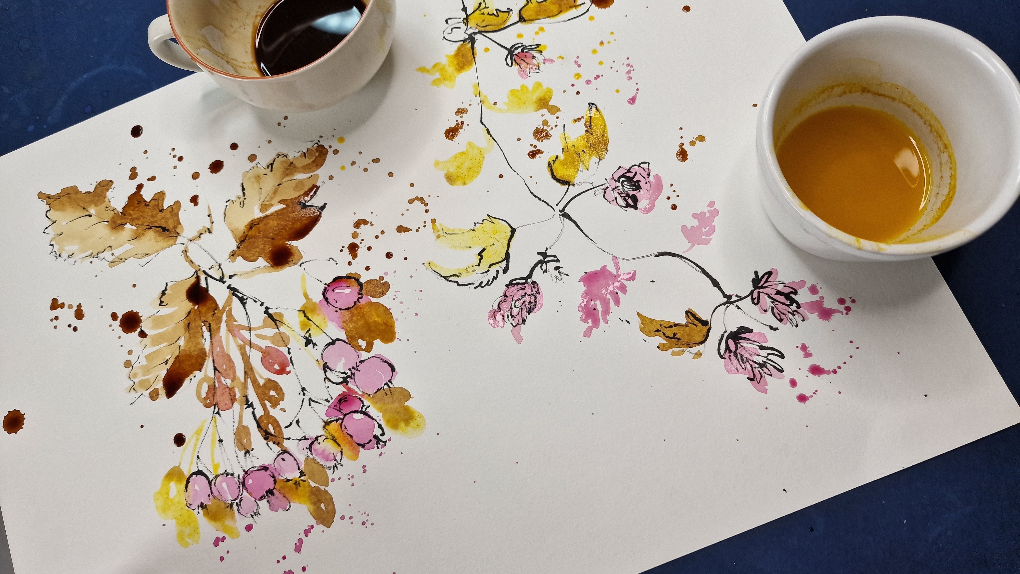
Transcripts
1. Introduction to Sketching: What is sketching or drawing? Sketching or drawing is a way to visualize the ideas
you want to convey. It need not be a
finished product and you do not need to
show it to anybody. It can be a very
personal activity that you'd like to enjoy. As a hobbyist. For many of us, sketching
would have started off as me as scribbles
when we were children. Later on, women have done little scribbles on the
side of farm notebooks or our classwork while we were listening to
a boring lecture. And some of us would have passed that stage and signed up for art classes where we jumped into larger projects
like painting, sculpture, collage, and things that you would have felt a
little bit overwhelmed about. And I feel that it is perfectly normal to feel overwhelmed about the art that you see around you and to feel that you are not able to do or convey the
idea is the way you want to. If you are somebody who feels
this way in this class, I'm here to help you trace your way back into
simple sketching. It does not have to be
overwhelming and you can choose the simplest
of things to sketch. And it can just be a simple
activity where you are allowed to go wrong
and experiment and explore the different ways
you can do sketching. And most importantly,
you do not need to have any previous
experience with art. You can be a complete
beginner to do this course. So in the next few videos, I'd like to introduce you some basic tools
that you can use for sketching the different ways that you can go about it. The idea behind exploring these sketching tools is only
because this will help you to explore the
medium without fear and to develop a style that
is very personal to you, just like everybody has a different handwriting,
Wiley, right? You are going to have a different style that
has unique to just you. The good thing
about sketching is that there is no right or wrong. And each and every person
has their own style and their own way of describing
or visualizing an idea. However, there are
some simple tricks and techniques that you can learn which will
help you to gain more confidence and to
explore the medium off-field, less stuck while
you're sketching. The great artist, Pablo
Picasso once said, learn the rules like a pro so you can break them
like an artist. And when we break those
rules as an artist, let us do it in a unique way.
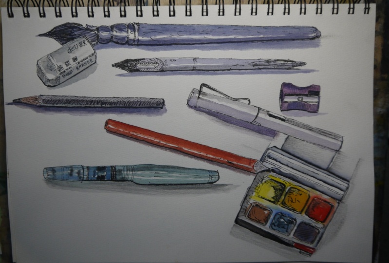
2. Suggested Materials: There are a lot of ways to make marks and develop sketches. It is very unique to
each and every person. Drawing tools can be as
simple as a pencil or a pen. It can even be a brush, and it always depends on
your personal choice. For this class, I have kept the materials to the most
simplest I can find. And it starts with a pencil. It can be any pencil
that you have with you. What I have here
is an HB pencil. It's just one of the pencils that I like using personally. It doesn't have to be an HB. You can even go down
to two or four. Or even an HB pencil should
be fine for a quick sketch. Another material that I like
to use, a fountain pens. I normally take fountain
pens when I'm out and about. If you would like to
use a fountain pen, I would suggest that
you experiment with the fountain pens that you
have and see what suits you. In the studio. I also like to use depends. With the ink. Here I have Indian ink and I've got some
sketch ink as well, which can go with the dip pens. I use the same sketch ink for
my fountain pens as well, but definitely not the Indian
ink for fountain pens. If you're using fountain pens, please do find the right sort of ink that goes in fountain pens. If you do not, fans are
using fountain pens. All depends. You can just
stick to fine liners. Here I have a couple of fine
liners of different sizes. You can always keep an eraser handy if you're using a pencil. But I can assure you that this wouldn't
be necessary at all. Apart from all these materials, we need some paper. The paper that I use normally
is a watercolor paper. I usually go for watercolor paper and it is normally cold
pressed or not people. If you look at the paper, it is slightly more texture
than a smooth paper. The paper I have
here is a 300 GSM. It's A5 size watercolor pad. You can also use a mixed
media sketchbook with a similar texture to the paper
and a similar thickness. The reason why I stick to
watercolor paper is that it gives me a nice texture line when I'm sketching on the paper. Another optional
material is watercolor. That is only if you would like to add some color
to your sketches. You can have a basic
box of watercolor. And for brushes, you can
have just one brush, which is round,
pointed, medium-sized. Again, having watercolor
with you is optional. Main idea is to do a lot
of sketching today and watercolors only if you
would like to give a nice washed your sketch
as a finishing touch.
3. Developing unique sketching style: Most of us like to
scribble mindlessly, and sometimes that helps
to relieve tension or to concentrate on a
task that we're at. And that's when sketching
becomes a therapy. This mindless sketching
is called doodling. Another way of sketching is to visualize an idea that
you have in your mind. And you are trying to
put that on paper. And it could be in any style and in any way that
you'd like it to be. Another popular way is
to record a memory. People, places, or even for
more passionate artists, sketching becomes the base
for a more elaborate artwork, whatever your style or topic. It all starts with making mark on a surface via two paper sand. Would anything that it may be. Making market is the
most important thing. When you begin sketching, a sketch can begin as a
little dot, a scribble, a little squiggle on the side
of your paper before you move into a more
elaborate sketch. The sketching tool, which is the pen or pencil or whatever
you may have in your hand, is what is going to make that mark on the surface
that you have chosen, the ideas in your mind is
translated into your arm as a movement which the pencil helps to
put down on paper. So just like how every
idea can be unique, your hand movement is
also going to be unique. And as a result, when the pen that
you have held in your hand makes
mark on the paper, sketch becomes very
unique as well.
4. Lets Warm Up: Tips for effective sketching: Let's explore the different
ways of holding a pen or pencil or any drawing
tool that you may have. So there are different
ways of holding a pen. You can start by simply
holding it normally, like when you would write. Let's start making little
scribbles, marks on paper. It doesn't have to
mean anything at this stage, just simple dots. Maybe move into
larger squiggles. At this stage. You can make them
longer if you like. Tried to do lines and don't
worry about wobbly lines. Embrace the wobbly lines. And let's continue to
making horizontal lines. You can try vertical lines. You can try to do
some uneven lines. Almost like scribbling
across your paper. You can just scribbles as well. So right now we've been holding the pencil quite
close to the name. Now, it feels comfortable. You can move your hand away from the tip of the
pencil or the pen. And let's try and making
the same type of marks, but with the pencil held a
little bit away from the nib. And if you see my arm, it's not resting on the table. It's actually away
from the table. And if it's comfortable
for you to do so, you can always stand up and
see how that works for you. And this gives you
more movement as well. So let's do lines. Horizontal lines then. What lines? You can have squiggly lines, you can have scruples. So you can clearly see
that these lines are more free flowing
compared to the ones that we made in the
beginning when we had the pencil held
right close to the nib, most of us would
have accidentally kept hand resting on the paper, which means our
movement is restricted. And we would be making a
little bit more precise lines. Because this is all
our hand would move. Maximum. It would move just at the wrist. Whereas if it's lifted away and if you move your hand
away from the nib, you have more area to explore
and your hand moves freely. In fact, your whole
arm moves freely. If you are unable to stand up. You can always have
your sketch book. Or if it's a paper, you
can tape it onto a board. If you're unable to stand
up and try out these lines, you can always have your
sketch pad in your hand. We can keep it at
a distance and try sketching away from the tip again and make
marks on the paper. Try to move your
arm more freely. And that whole arm movement will create very beautiful
characteristic lines. You can continue to do these different types of
lines, dots and dashes. Every time you feel
you want to warm up. And always be mindful of how
you are holding your pencil. It doesn't matter that you'll
hold it near to the nib. You can even move
it away either way. Find your comfort level and
see how it works for you. Another way of getting a better view of
your sketchbook or your Sketching
surface to prop it up in a slightly
slanting position. So find something that
could go underneath your sketch pad or
your drawing board. Here I'm going to use
this masking tape. I'm going to leave it
there underneath so that my sketchbook is slightly propped up at a
slanting position. And this way, you, even if you're sitting down, you get a better view and a better angle while
you're sketching. Whereas if it's flat
down on the table, there is a chance for your view or your angle to
be a little bit distorted, which can affect your sketches.
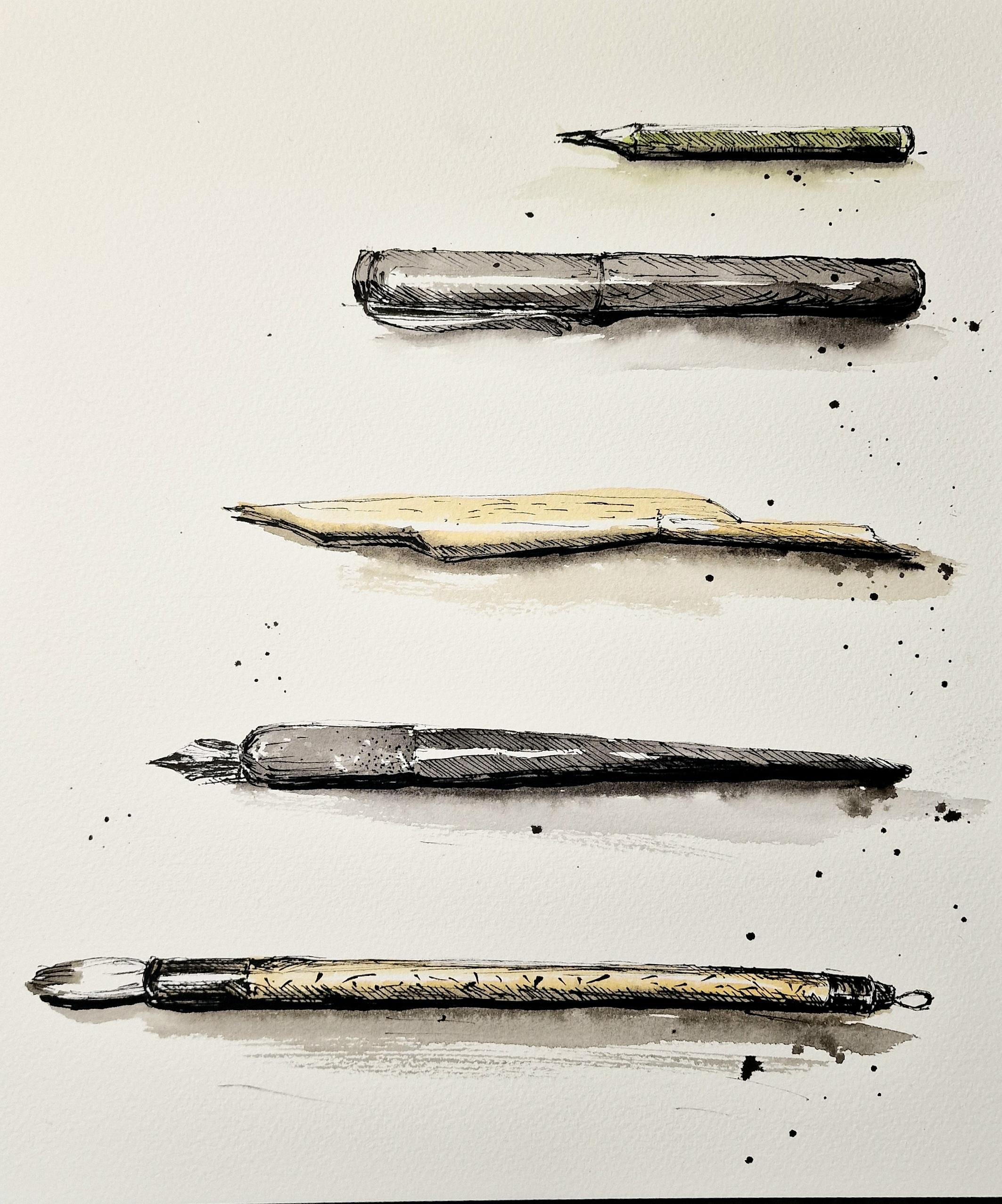
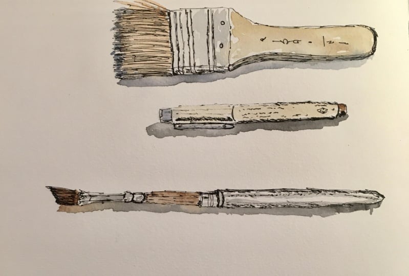
5. Project 1:Sketch your materials: If you are a beginner
in sketching and not sure what
to start off with. The best thing to do is to
look around you and find the simple things that
you can see around you and try to sketch them. So today we're going to sketch the simple tools that we will
be using for this class. So I'm starting
off with a pencil, my fountain pen, couple
of dip pens or brushes. Anything that I can see
around me on the table. The reason why I have
chosen these materials is because they are very
simple to sketch. It's quite straightforward. There's not a lot of technical drawing that
you need to know. To begin sketching
these simple materials. I'm starting off with large sheet of
watercolor paper today. You do not need to have such
a large sheet of paper. And you do not need to have watercolors sheet
at all if you are intending to do just sketching
and not using watercolor. However, if you like to use
watercolor at a later stage, than it might be better
to start off with a watercolor sheet or
mixed media paper. You can start using a pencil to have some
initial sketches done. Or if you are confident, you can always start off
straight away with a pen. Today I'm starting off with my pen and I'm using
my fountain pen. If you do not have
a fountain pen, you can substitute it for a fine liner or a ballpoint pen, anything that works for you. You can also find a reference picture
of all the materials we're sketching today in the projects and
resources section. So I'm starting off
with the little pencil that you can find at
the top right corner. If you start sketching anything, the first thing that
we need to do a stew, observe the object that
you're going to sketch. And here are the pencil is
long and cylindrical in shape. And I'm going to start off
with the length of the pencil, drawing a long line. Next, I'm going to sketch
the edge of the pencil, which is a little bit curved, and then a long line getting
the shape of that pencil. Now, next we need to finish
up the nib of the pencil. And it's quite sharp
as you can see, and it tapers off more
like a triangular shape. So I can put a little
triangular shape at the end and then tweak it to look a little bit
more like the pencil. Now for the nib off the pencil or the
length of the pencil. And finishing off that
triangular shape. Now we've got the basic
shape of the pencil here. The next step is
for us to add in all the little
details that makes it look like the
pencil in the picture. So I'm starting off with the sharpened edge
of the pencil, giving it that extra details. So you can see the zigzag lines, whereas sharpen the pencil. On the other side, I've got a little yellow band or a
different color on the pencil, just making that mark there. If you look closely, it's not a cylindrical shape. Really. It's got like different
phases of sides to it. So if you look closely, you can see all those
lines that make it look like it's got
different sides to it. Let's add a few more lines. Now finally, I can add in all these details
where you can see the writing on the pencil and the little bar
code at the bottom. You can add all those details. If you're not really
keen on that, you can always leave that bit. That is completely up to you how much details that
you want to include. Let's move on to
our next object, which is the fountain pen, which you can see at the
bottom of the pencil. So looking at it in
relation to the pencil, I can see that it's slightly
longer than the pencil. So I'm going to
make a longer line just so I know that the pen
is longer than the pencil. And now I'm going to draw
the edge of the pen, just like how we
did for the pencil. The line on top as well, getting the shape with the pen. Make sure that you are relaxed
during these sketches. And if you do have
wobbly lines like I do, then it's a good
idea to embrace it. These Rob Lee in
lines will eventually become the unique characteristic
of your sketches. So make sure to develop them, embrace them, enjoy
those wobbly lines. You can also deliberately
make those lines wobbly. You can have little
scribbles at each point. And you can also create
extra thick and thin lines. Let's finish the top of the
pen or the cap of the pen. I'm darkening the corners, giving it a bit more character. And at this stage, if there's any sort of correction
that you'd like to do, you can do this now, here at the top of the pen. I'd like to make it
a bit more wider, so I'm doing that now. I'm also adding a little
bit more details. Now, when I'm doing that, you may notice that I'm
not using clean lines, straight lines to
depict those details. I'm using little squiggles
and little dots and dashes. My lines itself are thick
and thin at the same time. These are the different types of character you can
bring to your lines. And when you do it, it's going to be completely different to what I'm doing now. But that will be your unique
style will eventually. Now I'm just finishing
off the clip of the pen. And finally, if you look
at the reference picture, you can see that there's a nice highlight on
the body of the pen. I'm just going to mark that out. So when you begin to render or shade the pen or the object, then you can leave
that area untouched. The next material
that we're going to sketch is a bamboo pen. It's one of my
favorite materials, especially because of
the characteristic lines that it gives me. So I'm going to start off
first by observing the object. And I can see that it's
not a straight line. It's got its natural bends
because it's bamboo pen. And it's made from a natural
material which need not be like a manufactured pen. So I'm observing
very carefully how the bend of the pen is
right at the middle. And now let's move on to
sketching the shape of the pen. Again, squinting your eyes will really help with getting
the shape of the pen right. So I have observed that it's
quite wide where the nib is, and it kind of tapers down a little bit before it
becomes a little bit more wider towards the middle. And then the other end, the nib is wider and larger than the one that
I've just sketched. I can see a little bit of the inside of the
nib on this side. So when I'm sketching it, I'm going to try and
keep that in mind. Again. Squint my
eyes a little bit briefly so I can get
the basic shape. So the main idea is to get the basic shape and then I
can add in all the details. So that's the inside of the nib that I can see in
the reference picture. Don't worry if you think
you cannot get it right. Try your best to just get
the basic shape right then. And it doesn't matter
if it looks different. We are here to experiment with sketching and using
different types of lines. And let's concentrate on how different types of
lines can be used here. Once I've got the
shape of the pen, I'm now going to
add in the details. Like there's a little
bend at the middle, which I'm adding
in and darkening the underside of the pen as well where you can
see there's a shadow. And the inside of the nib, I can see a little space where
it's a little bit darker. It's like a little groove in the nib where the ink can go. And that's how the ink flows perfectly onto
the end of the nib. And again, I've just made that area darker because I
know it's like little groove. And when I squinted my eyes, that's all I could see. The basic shape and the main light and
dark is all that we need to make an object look similar to how
it is in real life. It's optional for you to add in some texture of the
bamboo as well. So if you look closely, you can see a few
lines and texture. You can add that in. And an extra step that I'm doing here this time compared to the other two
pens that we did, is to add in a darker area. And you can see I'm using the hatching lines or sharp lines placed
closer to each other. Just creating a sense
of darker area there. So just placing
that darker area, just making sure that I know where it's going to be darker. And immediately it kind of gives the whole object a 3D look. Our next object, or the pin, is a calligraphic dip pen. One of the longest that I have
in this reference picture. I'm trying to get the
length of that pen. And if you see the end, you can see that
it's a tapering off. It's narrow and widens as it
comes towards the other end. So I'm making that wide line, almost like very long
sleeping V-shape. And the other end
is slightly curved. And that's where the nib starts. And the nib again is really
pointed at one side. And it almost looks
like a leaf shape. So again, if you
squint your eyes, you can see the basic shape and you can create an
outline just like that. We've got the basic
shape of the pen and then let's continue
doing the same thing, like how we did with
every other object here. So if you think you want
to make a few corrections, now is the time you can
add those corrections in. And don't worry if
you have been using a pen and then you needed
to do a correction. All those lines that
you started off with are still there and
I know it's not erasable. But don't worry about that. All those lines that
you did initially, like the infrastructure of
the object you're sketching. And it's got a special
charm when you leave those lines there and
try not to erase it off. Let's add in more
details on the nib. Rendering a little bit, making it look more 3D like. And you can choose not to add all these extra details
on the nib if you like. So if you just want
to leave it as a normal nib without any extra
details, that's also fine. Probably if you just add that
little slot in the center, that should be more
than enough for it to look like a nib. Again, I'm darkening
the areas where I think it's a little
bit in the shadow. Showing those highlights. That again comes with
observing the object. And you can place those darker areas where
you think you can see it. So again, now the
body of the pen, I'm going to do the same thing. Adding in some extra lines, darkening the bottom where
the shadow is going to be. Our last and final
material is the brush. And I'm starting
off with the brush. Again, the same
rules apply here. We're observing first, squinting our eyes to get the basic shape. And I'm starting off with the, the back end of the brush. Just getting the shape. It's pretty much cylindrical
shape if you look at it up until where
the bristles start. So I'm making a very long line and the same on the other side to get
the cylindrical shape. Now let's add in the
bristles of the brush. The bristles again
taper off at the end. So I'm creating that
leaf-like shape. And then I can add in a few more extra lines to create the texture of
the bristles as well. Now I'm going to add more details on the
body of the brush. So making that
mark where there's a color difference on
the body of the brush. So that's the black
bit on the brush. You can just make that mark where there's a nice highlight. And you can render it to
make it look more 3D like. Because it's dark
color in that area. The only thing that it quite
pops out is the highlight. So I'm leaving that highlight
making sure that I'm not adding any lines over that area. And the other end looks
quite similar as well. So I'm going to finish that off.
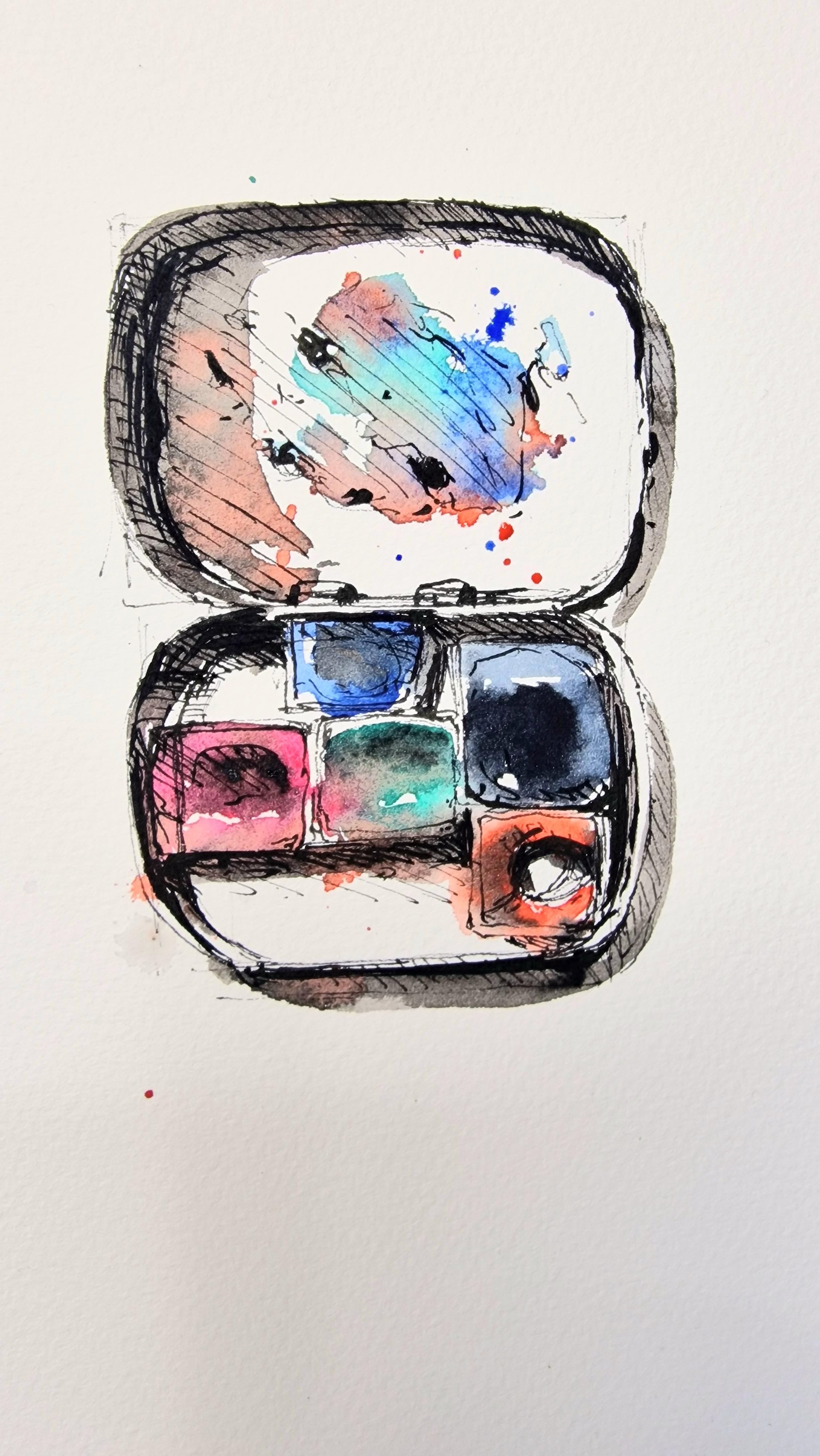
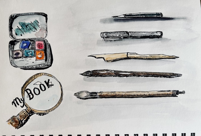
6. Project 1: sketching watercolour set: Okay, now let's move
on to our last item, which is the tiny pan
of watercolor cakes. So just to get an idea, I know it's two
rectangular boxes. I'm going to create the two
rectangles where I can walk. I can walk inside it. So two rectangles placed close to each other is how
I'm going to start it. One rectangle and another
rectangle about here. The same size for both of them. So that's two rectangles are
more or less the same size. That's my first initial rough
sketch for this object. And I can see the ends
of which is curved. They are not so much trade
at the edges either. So I'm going to make that
slightly curved edges. This is more or less straight. And then again it curves again. So you can see how
the rectangle, which was the simplest
folder shape. The first thing that came into my mind was that the palate, the pan looks
rectangular in shape. But when you look more closely, it's not so much of a rectangle, but I got a nice basic
shape to work on. So that's the main
contour or the outline. And let's do the same
thing for the next one. So about the same
distance, length twice. And then I'm going to cough and trying to keep
the same distance. He ever as well and curve. Okay, Now the next thing is if you can see inside this shape, starting from this corner, you can see the
inside of the box. And this is the line that
makes it look more 3D, especially on this side. And it curves and stops
just about there. I can also see little details
of the hinge of that box. Very slight line over
there to connect. It. Could have been a bit
more here, which is okay. And the same thing happens to
the box underneath as well. But because of the watercolor
cakes sitting inside, we can't really see it. But if you follow the
curve on this side, if you follow it along, it should go this way and
stop somewhere about here. So we're going to make
that line anyway. Very light marks. Then I know it curves and stops. Here. You can see the wobbly
lines that I have. We're going to embrace the
wobbly lines and so that we can keep it nice and
natural looking. And now there's a
watercolor cakes sitting just about there. Which is why we
couldn't see this line because it's been occupied
by something else there. That is S1 watercolor cake. I can see a little
bit of the bottom. They're almost immediately over here. I have another watercolor cake sticking right next to this one. Again, embrace
your wobbly lines. Watercolor cakes are kind
of crowding around here. There's another one here. Stops about here. So again, this line,
it's not necessary. But that's okay. That's, that
can be our basic sketch. And it's okay to
have it like that. Then we have another
watercolor cake here. We are only trying
to do a quick. Sketch. And it's not necessary
that you need to keep the exact position
or the shape or the size of the
watercolor pans here. You can just make
an impression of how it looks
generally in the box. And don't worry if it doesn't look like
the reference picture, please consider the
picture only as a guide. You don't really need
to worry too much about the size of each
watercolor cake here. There's a big hole where the paint has been
used quite well here. I'm just going to
add that detail. And then inside, obviously, you do have shadows. You can make those
markings if you like. So you know where to
place your shadows. There are shadows here as
well as blobs of color here. You can, you can make little scribbles to
depict blobs of color. And then there is
shadow. Here as well. You can see the side
of the bottom pan. And obviously there are some
shadows going around here. And little bit of
shadow here as well. Using hatching technique
to show shadows. And now I'm going to
stop with the alkaline. This is a basic sketching of the things that you
can see around you. It need not be
exactly like this. You can use continuous line
if that's what you like. And you can also continue with your rendering as well if
that's what you prefer, it's completely up to you. This is just a guidance
of how you can sketch daily things that you see
around in your household. That's the best place for
you to start sketching your personal space
where you do not need to be judged by anyone. You can just try out
your sketching skills and begin to observe the
things around you to sketch. In the next video,
we're going to go into a little bit
more detail Sketch. We're going to render this. Are we going to shade it, giving it a more 3D look? We're going to use the same pen. Or if you do have the pins, you can also use depends for
a more characteristic line. Or if you're not keen on using depends and other option
would be a brush pen.
7. Project 1: Make you sketch look 3D: Okay, so now we're
going to move on to giving these sketches a
little bit more 3D look, making it look more
effective as a sketch, which means that
we're going to look for the light and shadow, the dark and light areas. And we're going to use
different types of lines to render it or shaded and
give it a more 3D look. So I can use my fountain
pen and start rendering. Or if you'd like to use a
little bit more thicker lines, more expressive lines, you can use a brush pen
if you have that, or something with a flattened
to give it more character, if you do like using depends, you can use a different pen
as well. What didn't pen. You can use either Indian
ink or sketching Ink. I use sketching Ink for the
Inuit in my fountain pen, and I'd like to stick to the same ink for
finishing it off as well. Let's start off with the pencil. Now is the time
where I can be very expressive with thick
and thin lines. I'm going to start off
with thick lines here. I know there's a nice
shadow over here as well. So I'm going to make that
line a bit more thicker so as to show this jargon. Now, the next thing
that I'm going to do is to squint my eyes briefly, look at the light and dark. I can see it's quite
dark on this face, this side of the pencil. You can add these little
lines called hatching lines. All that side of the pencil, just to show the
light and dark there. Now, let's move on
to the next one, which is our pen. Again, I'm going to start with the areas where I think
it needs to be darker. You can even render
it if you like, with scribbles, dots, lines. Anything that you think
is good for your sketch. Now is the time for you to
explore the different types of lines that you'd like
to use a new sketch. There is a nice shadow there. Just finishing off this little
detail of the pen thing, I can do, my curve little
shadow here as well. I'm trying to
locate the shadows. Then, maybe adding a little bit more
darker lines as well. Now let's move on
to the next one. This we have already
rendered a little bit. I just need to add some
darker shadows here. And if I want, I can add some texture of
the bamboo pen as well. I have done a little
bit of rendering here. I just need to add
some darker area. Especially for this one. I can see a very nice highlight. And then everything
else is pretty dark. So it's up to me that if I wanted to render
the whole thing, just need to be
careful here that I don't go over the
highlighted area. Darker this area. So any sort of
line work for you. I'd like to add a few dots here. So the, the texture of the pen. And then expressive lines again. I'd like to show it like this so that I can differentiate between this side of the pen and the pen which is a
different material. So it's just my choice
to render it like this. Now for adding some shadow,
shadows talks about adding more texture here using stippling or just a series of dots showing that
texture of the material. They're not finish off this one. You can use a series of dots and lines to create lots of texture. And if you remember, the reason why I
did that highlight, just because this is a completely different
material competitor than the texture
is also different. So I wanted to show
the highlighted area. Now I'm going to render
the body of the brush. I'm using hatching
technique for this purpose, but that's just my
personal choice. And if you'd like, you can use other types of lines to render. It could be little
dots or stippling. It can be scribbling or very expressive lines of
thick and thin lines. Anything that works as
your personal style. You can choose to
have little dots and dashes to show the
texture on the brush. Again, that's
completely your choice. These as little
details that you can do away with if you think
that's not for you. Finally, move on to
rendering this paint box. I'd like to put
emphasis on the lions, the thick and thin
lines if I can. And then for rendering, again, I'm going to use hatching. And also give a little
bit more emphasis on the inside of that team. Fatigue dark area as well. So I can add extra line
as Jim make it more dark. There's a little
blob of paint there. Now let's move on
to this tray here, showing a little bit of shadow. I personally like giving a lot of details
while I'm sketching. I'm going to start working on the individual
watercolor cakes. So if you look into
the reference picture, you can see that the watercolor
cakes have been used. I'm going to use some lines
and some rendering to show the ups and downs
inside that watercolor pan. Just giving it a little
bit more realistic look. So just shading that area
because I feel it's darker. And again, if you want to
look at the light and dark, then the best way to do is to briefly squint your eyes and you can see whether the shadow or whether there's a little
bit more darker area. And you can use some scribbly
lines to depict that. We now have nearly finished
with the watercolor box. But before I finish it off, I'd like to add all the shadows that I
can see here because those darker areas is what makes the object almost
leap off the page. So I'm just finishing
off with the shadows. And if you are in doubt, where to add the shadows, then the best way to do is
to briefly squint your rice, where all the details
just goes off. And you will immediately see the dark and light
areas on an object. And you can continue
experimenting with this process of
squinting your eyes and observing the object
that you're sketching. Be at a reference picture or B, It's something that you
see right in front of you. Squinting your eyes or
closing one eye always helps you to see the lightened dark and the basic form of an object. Instead of seeing all the
details all in one go.
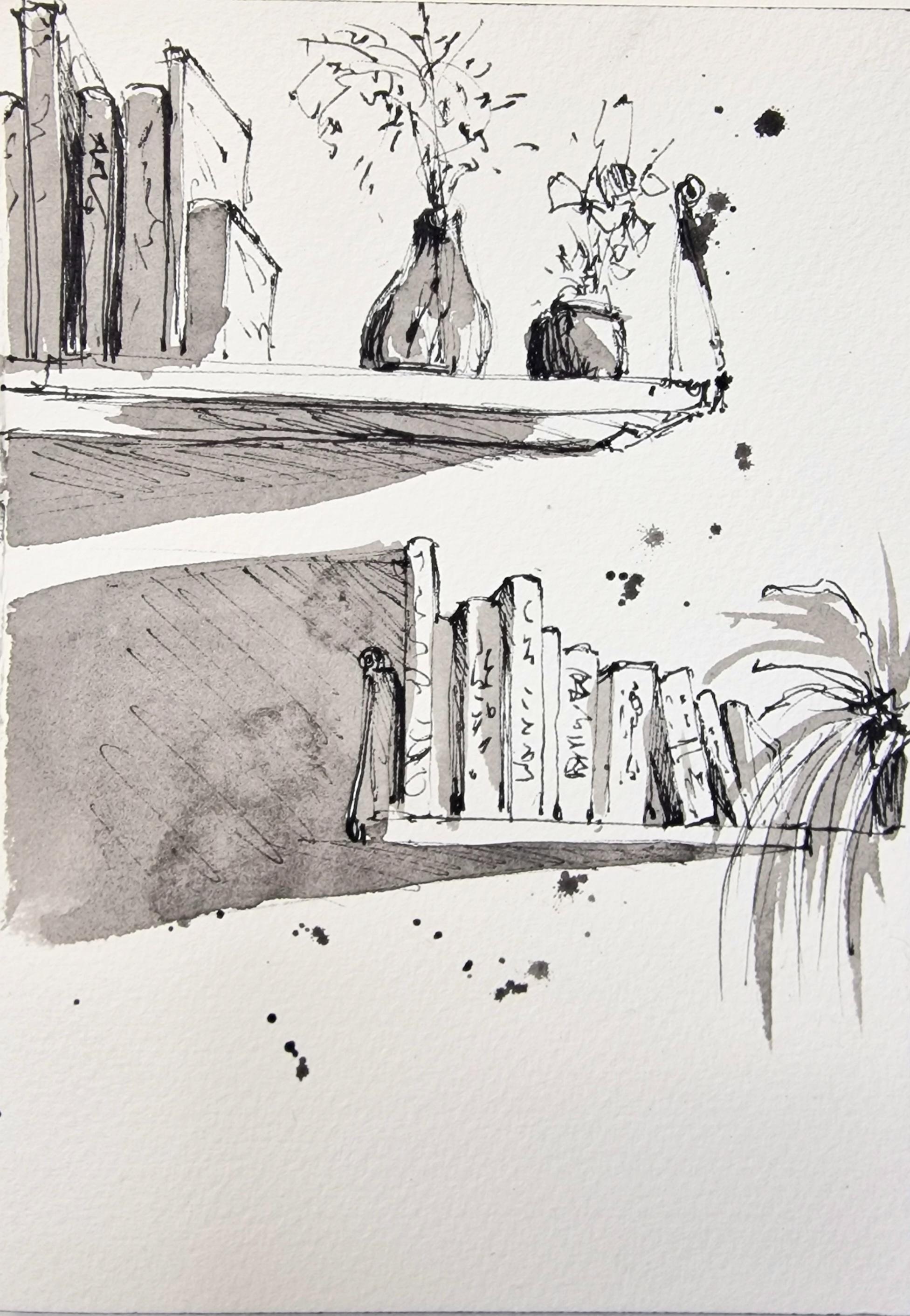
8. Project 2: Sketch scenes around you: There are a lot of
things around us that could look
great as a sketch. One such thing is a
bookshelf or anything in the interior of your house or your office
wherever you may be. It is a great way to
sketch shelves and to sketch the things that you
can see inside or on a shelf. So now we're going to sketch
a couple of bookshelves. The reference picture can be
found in the projects and resources section. The class. If you look at the bookshelves, the one below is
at our eye level, which means you cannot see the top or the bottom
of the bookshelf. Just the front of the bookshelf, that little narrow wooden piece. And a few books kept on top of the bookshelf along
with a potted plant. So let's start off with
sketching the shelf itself. So I finished
sketching the front of the shelf and a little bit of the hanging fixture
that I can see. You do not need to sketch
it exactly the same way. Just you can just give a
few lines that would give an impression of
a hanging fixture on the side of the shelf. And then let's start
off with the books. I'm only giving a basic shape of the books and how
they are on the shelf. So basically the
height of each book. And also a little bit of details like if you can
see the side of the book. Here, I have rendered on the side of the
book a little bit more darker, as you can see. I'm doing the same thing
for the next book as well. Again, rendering that area
where I think it's going to be darker because
it is in the shadow. It's that gap between two books. The next one, and you can
just keep on adding in books. It doesn't have to be exactly the same way as
the reference picture. If you want to stop
at some point, you can do so and then add
the potted plant as well. It is a good idea to add a range of books
like tall books, short books, a little bit
fatter ones like this one, a slanting one at the edge. And when it's
slanting like this, you can see the inside
where it's really dark. So you can use dark lines to render it and make
it darker and lighter. And darker really
goes a long way when you start to
sketch something. And it makes the objects
standout as well. Now for the last book, you can see the front
of the book here, because that's the last book and there's nothing
else beyond that. So I'm going to draw the front of the book and you can see the top line of the book
is actually slanting down, giving it a little
bit of a 3D look. I'm just going to extend
my shelf so I can house a little bit of
foliage there as well, so I don't need to add in
the whole of potted plant. I can just add a few foliage just to suggest that there
is a potted plant there. And again, you can stick to the type of
foliage that you like. It doesn't have to
be the same thing. This is just an idea. And the reference picture is only going to act as a guide. You can chip and change anything that you
like in your sketch. That I feel is where the
artistic ideas come in. Now let's sketch the
bookshelf that is above. If you observe carefully, you can actually see the
underside of the bookshelf. So there's going to be a little bit of
perspective drawing there. So I'm going to start off with the front of the bookshelf, just like how we
started the first one. Now from the edge of
that long rectangle, I'm going to place a line
that is slanting downward. And then another long line to complete the underside
of the bookshelves. Now once we're done with that, let's go on and some hanging fixtures I can see on the side
of the bookshelf. Again, just give an impression
of a fixture there. It's got a slanting line, which is probably a
suspended rope or something. And then I'm just going to add a few lines just to
give it an impression on some hanging fixtures or like a bracket on the side
of the bookshelf. Now let's go on to adding some details like
the flower vows. Or if you want, you
can swap it with another potted plant or anything that comes
into your mind first, you might want to add in some details from
around you as well, or something that you can
see in your own household. Feel free to do that quickly
adding some details. And again, if you can see the lines are just simple
scribbles on its own. These scribbles will together
make meaning and make it look like or given
impression of foliage. So please feel free to be very expressive with your lines. Now is the time to
explore the type of lines that you
want in your sketch. And also, just like how I did, it is a good idea to
give some light and dark shadow to the objects
that you're sketching. So you can see that
the light is coming from the top right side. So which means the flow of Rs and the potted plants
and the books, e.g. they all have a shadow
on the left side. Let's continue adding
a few more lines, dots and dashes again, as you can see for foliage. And you can see
that I'm trying to darken the left side more
than the right side, especially with
this flower vases. Well, I'm just giving
it a darker area. Again, you can see it in the
reference picture as well. And the best way again to
look at the light and dark, would be to simply
squint your eyes. All the details
disappears for a while. And then you can see and observe that where
the dark and light is and place your rendering
or pen marks accordingly. Think of it as simple shapes. Don t think of it
as a flower was. Instead of that, you
think of it like a simple shape that
you're trying to render, that you're trying to bring
in some light and shadow. Now to place a few books
on this bookshelf as well. So I'm starting off
with the first book. I can see the front of the book here because
that's the first book. And then the edge. And I can stack a few more
books on the bookshelf. Now we're finished with the basic sketch of
the bookshelves. It's a good idea to give a little bit more
details if you'd like, like the details of that in
some names of the books. You don't really have to write
in the names of the books. And maybe a little
scribble would do the job. You can also give in
some shadows as well. Just going to add a
few dots and dashes. Maybe like little
scribble to show that something written
on the books as well. So these are like
little details which you can choose not
to do as well. This is completely optional. It depends on how much details that you want in your sketch. Finally, I'm also going to
give a little bit more shadow. If you look at the
reference picture, you can see the
light is coming from the top right are more or less the right
side of the picture. So you can see there's a
considerable amount of shadow under the bookshelf and also on the left side
of the bookshelf. So I'm just going to
quickly mark that out. You can also add short lines placed close to each
other or what they called hatching to mark those shadows
make it a darker area. Let's add some darker lines on the underside
of the bookshelf, enhancing it a little bit more, making it stand out and just showing that there is a shadow under the
bookshelf as well. And now our sketch is complete.
9. Final Thoughts: I hope you enjoyed
sketching with me. The things that we chose
to sketch today are the most simplest things
I could find around me. Please do have a look
around you and see what interests you to sketch. If you have been using
a pencil to sketch, you can now try to go
over it with some pen. And this time when you try
to go over it with pen, try to be as expressive
as you like. Keep your lines very dynamic and see how that works for you. Or if you would like to add
our watercolor wash to it, that is very optional. I personally like
having a little bit of a splash on my sketches. If you are somebody like me, you can try giving your sketches are
quick watercolor wash. For this, you will
need a basic box of watercolors or any
basic color is fine. You can even stick to
one color and one brush. Along with that, you will
also need one jar of water. If you are a beginner
to watercolors, please check out my
next video to see. I've done a quick watercolor
wash on our sketches. If you really enjoyed giving a watercolor wash and would
like to know more about it. I have more courses
on watercolors that explains in detail about
how to use the medium. Thank you for joining
me in this course. I love to know how you get
along with this course. Please feel free to upload your process and your
finished projects in here. I would love to see
some of your projects if you found this course
helpful and enjoyable, I would love to hear from you
happy sketching everyone.
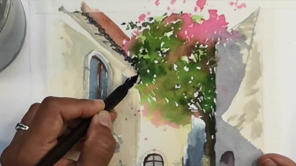
10. Optional: Adding a Watercolour Wash to your sketches: Now let's try adding
a little bit of watercolor wash to our sketches. So I'm starting off with the
last sketch that we did. And I'm going to add
just one color to it. And I'm going to try
and find a muted color. So let's get our
watercolors out. Along with this,
we need one jar of fresh clean water and one brush. You can use any brush
that you have with you. I have a round pointed brush and that is the basic
that you can have. But if you feel like using a flat brush or any
brush that you have, please feel free to do so. This is just an experimental
part of the project. The color that I'm using
today is called CPR. It's a very muted,
neutral color. I felt that was the
best color to use. If we were to use
just one color. If you do not have
this pigment with you, you can even use
something called a neutral tint or Payne's gray. And if you do not
have any of these, you can even use
the basic Deep Blue called indigo or Prussian blue. Any deep muted
blue is also fine. So to start off with, I'm going to activate it to my watercolor cake
using some water. And I'm transferring
that pigment onto the mixing area where I can mix it with a
little bit more water. We're looking for
the consistency of ink or something like
the consistency of milk, which means it's not too watery and it's not too
thick, like cream. So something in the middle. So if you were using
dip pen and ink, you would know the
consistency of ink. And that is a similar
consistency we're looking for. Once you have that ready, you can now start
with working on just the shadows of the
objects that we have sketched. So for the shadows, if you remember that
we used our pin to do some shading or rendering in the areas where we thought
was a little bit more darker, which had a bit of shadow. So we've already marked
that outer with our pen or pencil or any drawing
tool that you are using. So I'm just going to
place the pigment or the watercolor that we
just mixed in that area. After that, I'm going to
quickly dip my brush into the water jar and drag my brush along the area where
I just placed some color. Now you can see
that my watercolor is diluted the minute
I added some water. Let's continue to add
some more pigment. You can just go back into the watercolor pan and continue
to add some more paint to where you think you need a little bit more darker area or like a little quick
splash of watercolors. Don't worry if you think that
you are just coloring in. That is also fine. If you are a beginner
in watercolor, you can just experiment
with just coloring in. But if you are starting off with the shaded area or
the darker area, it would definitely
immediately give a very nice effect
to your sketch. We work in a similar way. When we're working with pen
as well as with watercolor. We always render the
shaded or the darker area. And we're doing the same thing
with watercolors as well. So if you can see, I
am using the paint only where I think
there is a shadow or if it's slightly
darker and the areas where there can be a
light hitting directly, I'm going to leave it as it is. So e.g. the books, the light is falling
from the top right. And so I am going to leave the front side of the
book without any color. And I'm only painting in
the edges of the book, which is facing us. So immediately you can,
immediately you can see a very nice effect
to the whole sketch. Let's continue doing
the same thing for the bottom shelf as well. So I'm just coloring
in or simply painting in the area that I
marked out as a shadow. And that is mainly
under the shelf and a little bit spreading
onto the wall as well. And with the books on the shelf, we can do the same. We can add in a little bit of color for the edges of the book. And we can just be with
that you do not need to add any color to every
book that you see. You can leave a few
of them on painted. And that immediately gives it a very dynamic and
interesting look. And finally, adding
a few brushstrokes with the tip of my brush. For the foliage. You can also add little
splashes of color. For this, you would
need to load your brush with paint so that brush
would be full of paint. And once you have that, simply tap your brush, holding it like a stick
flat over the paper and the paint will just
simply fall onto the paper. Giving it a nice flashy look. Let's also do the same thing to the materials that
we sketched initially. So let's use the same color, CPR or the neutral tint
that you have been using. Along with that,
I'm also going to use a little bit
of another color. So if you look at
the photograph, you can see the colors
of the materials. The pencil is a very deep green. So if you prefer, you can try using a second color along
with your neutral color. So I'm using a very muted green. This is olive green
from my watercolor pan. If you do not have this color, you can use any
color that you like. Our main idea is to try and
use different colors here. So I'm painting the pencil, trying to leave a lot of
unpainted white areas. And also I'm using sepia just to give it
that extra shadow. It doesn't matter if the
colors mix with each other. It is still okay. Try giving it the two colors together and see what happens. If you can see I have
left a highlight area at the top part of the pencil where I haven't painted at all. And you can see the white
area or the unpainted area. The white and the watercolor
is the unpainted area. And I have kind of let the colors spread outside
the pencil as well, giving the whole getting a
little bit more fluid nature. Now, if I want, I can add extra pigment, make the shadows a
little bit more deeper. For this, all I need to
do is without dipping my brush in the jar of water, I can go straight
into watercolor pan, gets some sepia and simply drop in where
there is a shadow. And because the paper is wet, the pigment is just
going to spread nicely, giving it a very nice effect. Let's continue to do
the same thing to all the other objects that
we have sketched here. So I'm using sepia again to
color in the fountain pen. And if you notice, I am leaving the highlighted area unpainted. So if you remember, when we were sketching that
we left our highlighted area, we marked it out and we rendered everywhere
else except that area. And when I'm using
the watercolor, I am leaving that area
without being painted. And it immediately gives
a very nice effect. I'm letting the
color mix and spread onto the outside of
the pen as well. Here we have just used
CPR and nothing else. Again, if you'd like deeper
shadows under that pen, all you need to do is take your brush back into the pan of CPR without dipping it
into the jar of water. And then get some fresh
paint out of the pan. Just simply drop that
into the wet surface on the paper where you think you need a little bit more shadow. And you can see immediately
how it's a little bit more darker compared
to the first wash that you placed over the pen. Now let's move on to
the next material, which is the bamboo pen. And I'm using some
fresh yellow ocher, which is one of those
nice golden yellow for the bamboo pen itself. I'm just placing a
little bit of color. You can also again leave some highlights on
here if you like. So you can see there
are some areas that I have left
unpainted as well. Immediately I'm going to
place a little bit of sepia or the shadow color
that I used as well. So I'm just going
to place that at the bottom where there is a
shadow where it's darker. You can let it spread
outside the pain as well. So it gives it a shadow
as well when you do that. And again, if you want
to darken your shadow, you can go back into
your pan of CPR or the shadow color that
you have been using without any water on your brush. So you do not need to go
back into the jar of water, but goes straight into
the pan of watercolor, get some fresh paint
and drop it into the area where you think
you need a darker color. Next object is the dip pen, the calligraphic dip pen. And I'm using sepia again just to show the dark and light, making sure to leave
the highlighted area. So you can see I'm
actually going around the highlighted
area with my brush. So I'm not painting it and
blocking out the light. And I think that'll
be it for our pen. There's nothing much to do here. If you'd like, you can add another color and
see how that works. But again, that's
completely up to you. And for the last brush, I'm going to use
yellow ocher again. The very nice golden
yellow in my palette. Just painting it in again. Again, leaving our highlight. The reason why I'm
leaving a highlight is these are all
rounded objects, more like cylindrical in shape. And when the light
hits on this object, there's going to be
a little bit of area where the light reflects. Those are the
highlighted areas where I don't need to add any color. If you are using another
medium like an acrylic or oil, you can always use
the white paint to go over it to show
the highlight. Whereas in watercolor, we always leave the
paper unpainted, so the white of the paper
acts as a highlight. Our last sketch, which
is the watercolor set, you can use any different
colors that you like inside your
watercolor palette. So I'm starting off
with a bright blue, a little bit of rows. And you can see
I'm leaving again, some highlights, also adding some color only to
the shaded areas. Now you can experiment with
your watercolors if you like, and a little bit more water into your wash on the paper
and see what happens. Observe how your
watercolors spread. These are little things
that will help you to learn something yourself about
watercolor as a medium. Now, let's use
some neutral color as well for the next palette. Again, you can see I'm leaving
the highlighted areas. You can start with a very diluted wash or where there's a lot of
water inside your pigment. And then you can
add into it with some fresh paint
straight from the pan. Finally, some orange for
the last watercolor cake. Now let's go on and
add some shadows, just like how we did for all
the other watercolor washes. So I'm using sepia again, or you can use any neutral color that you like for your shadows. And if you remember, we have already marked out the areas where it's
going to be darker. So all you need to do is
to paint over those areas. So all these areas
that have been rendered or shaded by your pen, you can just place some darker or shadow
color over there. You can even play
some shadow colors inside your watercolor. And if that paint is still wet, it's sort of tends to
spread around as well, giving it a very nice effect. Don't worry if your watercolors is not behaving the
way you wanted it to. It is a mysterious medium and
it takes a lot of practice and effort to get
watercolors, right? So if you just wanted
to give some color or a splash or a quick
wash to your sketches. Please use watercolors
only for that. And you can always learn to make shadows and make different
effects in watercolors. If you are learning about
watercolor on its own.
 Suzanne Abraham, Artist