Transcripts
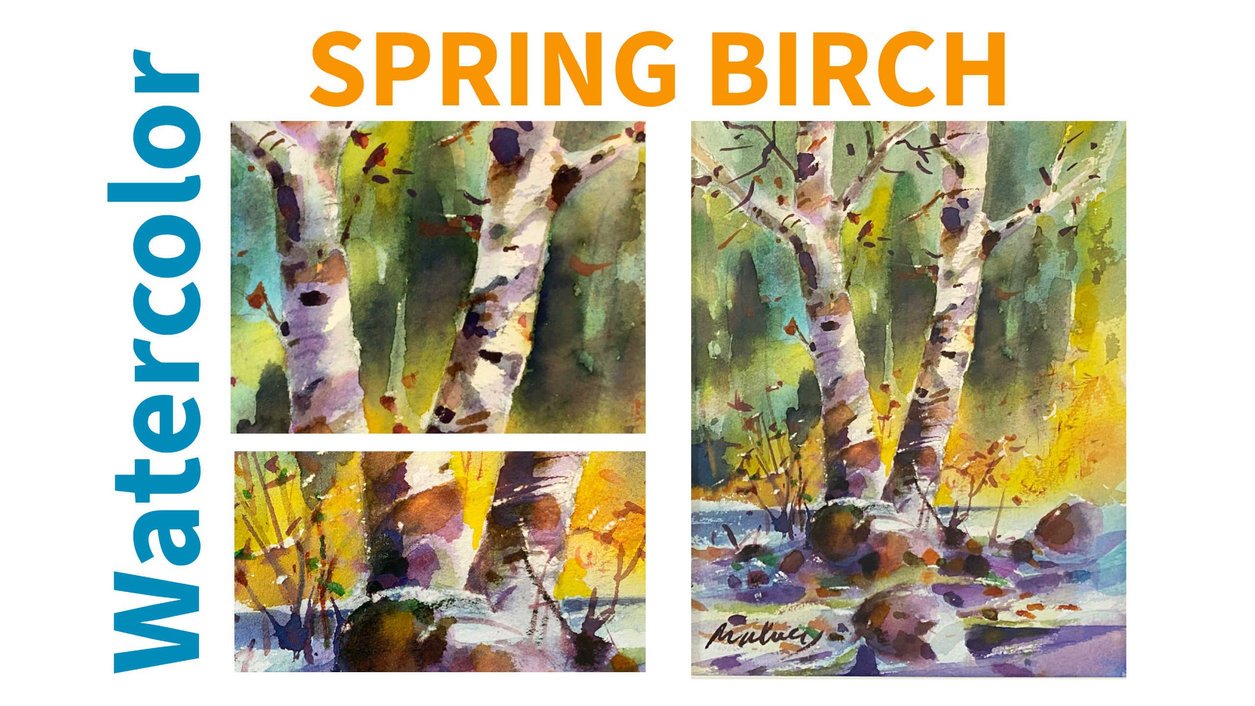
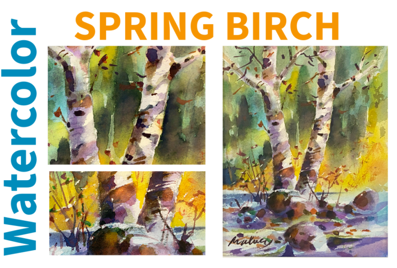
1. Intro: Paint A Spring Birch : Hi, welcome to Watercolor
a spring birch. Paint beautifully, even if
you don't have a lot of time. My purpose in this class is to bring a greater awareness to your watercolor technique and also your watercolor practice. I'm a landscape painter. I have been for
many, many years. I specialize in watercolor
oils and acrylics. I have many solo
exhibitions over the years, supporting myself as a
living working artist. That's it. Let me
introduce myself. I'm Ron, and I'll be with you every step
of the way today. I love teaching. I like to share my experience with
you. That's my gift to you. Your gift to me is your attention and your
desire to improve. So whether you're new to watercolor or you're looking
to grow your skills, this class will give you
practical techniques so that your goals will be reached and
your confidence will grow. Nobody forgets
where they started. That blank piece of paper, that piece of white
watercolor paper, just waiting for you to
put something on it, and then you don't like it. I'm going to show you
today how to overcome those hurdles and
paint beautifully. My focus today is on these
specific techniques. We'll start by looking at
how watercolor behaves. How to layer soft washes. Pre texture, control
the water and pigment. Step by step, I'm going to guide you through these
techniques that help bring your birch trees
to life while keeping the process relaxed
and enjoyable. This class is perfect
for all levels, beginners picking up watercolor
for the first time to experienced artists
who want a more relaxed and a productive
way to create. Good materials make
great paintings. We'll go over exactly what
you need for this class. It's all covered in the
second video on materials. Remember, I like to see what
you do when you're finished. Okay, so we got two
little projects today. We have a warm up project, which involves wet in wet. Should get the ball rolling, and then we have
our major project, which is to paint
a spring birch. You're going to
take away a lot of skills when you do this project. You're gonna be using
them in future paintings. You're gonna be practicing them. Eventually, you'll put your name and say, I own these skills. Jump into this
class with me right now, and let's watercolor.
2. Class Materials and Use: Show you the materials
we're going to use today. I'll just run through them right here and take a peek at them. A very simple class. All you're going to
need is some paper, some paint, a pencil, some good watercolor paper, and an undivided attention to learning what a true
watercolor should look like. Everything's important when
you're doing a watercolor. Let's go over some
of the basic things. When you buy a paper,
you're looking for cotton, 100% pure cotton. The quality of the paper,
if you look carefully, you can see with the
little panes gray and fallo Look at the wonderful
precipitations of paint. Cheap paper makes a
very poor painting. 140 pound paper is the best paper all around.
I got a nice surface. That's a cold press.
This one is rough. Rough is really good because
it gives you texture. Rough paper or cold press. Cold press has been pressed. Rough paper has
not been pressed. Now, let's say you
have your paper, and you put water on it because we're talking
about papers right now. If you put water on this
side, it's going to buckle. If you put water on
here and on here, the paper will not buckle, but eventually the
underside will dry out. So you can do several things. To keep it from drying out, you can have some celluloid, piece of glass, something
really smooth underneath, so the wet underneath stays wet. The other way is
to buy your paper so that it has got
wax all around it. That's called a block, and you just open it up, you paint on it, take a razor blade and cut around
and pull the paper off. No buckling or very little
on a small size paper. Once you get big, big paper, you have to do
something different. So let's say you
tape this paper. Well, you can't wet it. If you wet it, this won't stick. In the old days, we
had postal tape. You'd wet the paper, damp it off and put the
paper tape on it, let the paper dry so it would be stretched and then
it wouldn't buckle. If you don't have
the block paper, you're going to tape
your paper onto a board. Doesn't have to be
waterproof, can be anything. Piece of cardboard made. You're going to tape your paper and we're still talking
about paper now. We haven't even talked
about paints, brushes. So there's your picture taped. This is not rough, but it's cold pressed
soap. What do you do? Well, you want to put
some water on it. Putting water on it allows the water to soak into
fibers of the paper. There's something in the
paper called sizing. And usually alum and few things. That makes the paper
not super absorbent. Different papers have
different absorbencies. Now, once you've got that on, you have to let it
sit for a minute. If you wait too long, it dries. Having a little spritzer bottle
is good. You'll see that. Lots of people keep the paper
damp with spritzer bottles, but it's not going to buckle. Here's the size I
think we should use if you're just starting
out something about this, like 4 " by 7 ", something of that nature. You can see when you remove the tape, you got
a nice white edge. It actually looks quite nice. Pigments make the color. A different pigment makes this and this and this
and this and this. So pigments basically are
what the colors made of. These are called Viviva colors. These are really, really high
quality staining colors. Get a transparent yellow, like azo yellow or hansa yellow. Get a transparent blue, like thalo blue, palocen blue. You can get by with Cotman. Cotman is a good brand. There's nothing
wrong with Cotman. They're fairly permanent. They're a lot cheaper.
This is the burnt sienna. You got a burnt sienna
and a burnt umber. Another one is the cadmiums, cadmiums very heavy paints, very good for accents, and they do work okay if
you thin them properly. This is a cadmium yellow. Light. You can get
cadmium yellow. Medium, cadmium red. I use a little bit of it at
the end of the painting. So cadmium red, cadmium yellow. Always take a little
water, clean water. One waters for
cleaning your brush, and another water is for
mixing into the paint. We want clear water to mix. You're just going to need a
very simple a round brush, you're going to
need a black pen, going to need maybe a pencil, you're going to need an eraser. All the basics, water. If this is your very first
water cloud color class, I suggest you take a couple of my earlier classes to get familiar with some
of the materials. What do I do with the blender? Well, let's just say we're doing the birch tree, and
we put it like this. And, you know, I'm
going to quickly just put in a little
birch tree, okay? And put another one here. See nothing fancy. Okay. Maybe it's on
the side of a hill. There's a little lake
down below. There we go. There's a little birch. And there's a little
fir tree here. With my stump, I can get
a little tone in, see? See that little
bit of tone there? On the left side of the birch, there's the sun shines
going this way. There we go. A little
shadow this way. Look at that? The paper stump. Well, that's about
it for materials, as you can see,
they're all being put to use there in the little video you're
watching right now. You know, you can
add a few things like a couple different brushes or you can add a few of
your favorite colors, some Pains gray maybe or some bit of ivory
black here and there. I just want you to get
your materials ready now, and let's start the drawing and get on with the painting and
have a really good time.
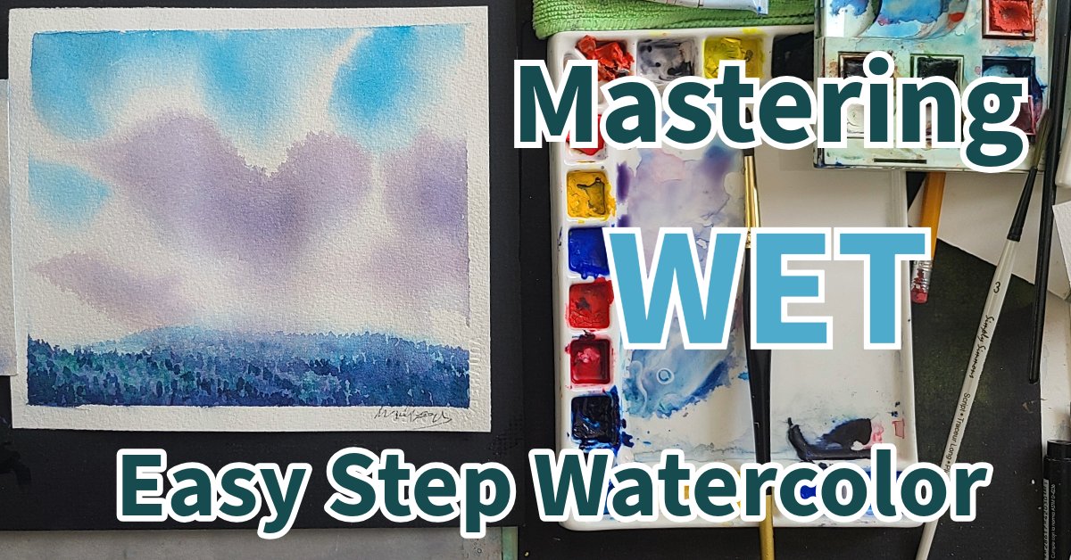
3. Wet into Wet Warm Up: Hey, let's do a quick little wet into wet demo. Get warmed up. Before we jump into the project, now that you know about all the materials
and why you're here, let's get started with
this fun little exercise. It's a good warm up. All you do is get your
favorite watercolor paper, tape it on a board, tape
it on a piece of glass, whatever you'd like.
So it doesn't buckle. So don't make it too big. And I'm going to show you a
few of the tricks that you're going to need to do the project. This is just a
really good way to start a little jump start
before you get going. Putting water on it.
Allows the water to soak into fibers
of the paper. I'm going to take a little
bit of this color right here. Now, one, two, three,
out. Paper's damp. I barely touched that. And let me just do
oh, I don't know. Let me do a little flip
here. Look at this. Don't go back and touch
that little spot. Once you've done it, leave it. That's called a wash. And
just from experience, most of the paint came
out in the beginning, and as the rest of
the paint came out, the water in the paper
allowed it to spread. So that's a staining color. Once that's dry, though, you're not going to get
it out of the paper. You can't lift it. I'm going
to now take yellow ochre. Now you notice I had
to go a little longer. Let's see what this looks like. I'm going to put it from here. Okay? Now, I'm right handed, so if I want to do
the same thing, I go turn my paper a bit. That's the nice thing of
having a board here we go. Once again, remember,
the paper is wet. Now, right? See, keep it going, keep it
going, keep it going, keep it going right into
this wet wash here. So now we've got two Oh,
see what it's doing there? See, there's water on the paper. Oh, so it hasn't
soaked in completely. That's okay. Here's
a little trick. We're talking brushes
and paint now. Take a dry brush, tilt it, run this along, and that will pick up
what we call the drips. These are basic
watercolor skills. This is where you're painting and something like this
happens and you go, you get all nervous
from experience. You realize nothing's wrong. Okay, there we go.
This one's heavier. It sits on top. This
one penetrates, and we're going to take that
same brush as we just used. We're going to clean
it. Why? If you don't clean your brushes, your paints will be dirty. You don't want dirty paints. Color right here. Let's
see what this color is. It looks blue. It's green.
You know what we call this? This is called palo green. But look, it's pure
and clean, not pasty. I'm going to get a blue now. Paints come in tubes. These are graham
paints. Excellent. They have honey in
them, and they're always soft. They
don't harden up. If you have some brands, once you don't use them,
they turn very hard. Okay, so here's some This is
manganese blue, very pasty. I wouldn't use that
as a staining color, but I would use This, this is a Prussian blue. It's a very strong blue
mixed with the green. Whoa. You get a beautiful green. That's a lot of
green. You know what? I'm going to just put one
swipe across the bottom. Paper's still wet. So far,
I've used three strokes. I'm experimenting. I'm
learning about my colors. There it is. That blue is not
quite the blue that I want, what I want is, oh,
that's manganese. Don't want that. Oh, that's
ultramarine. Don't want that. Ah, Palo blue. Watch. This is the most
powerful blue in the world. Watch it. Just touch
it with the brush. Just touch it. Okay, see that? That's the blue we're looking for. We'll get a little more. Come from both ends. I
never throw a tube out. I'm very thrifty. There's always
something in there. There it is. You see
that? See that blue? We take a little bit of water. Watch. I just touch I
see the water there. I'm just going to touch the
water and add the water here. Okay, there now, I don't
want too much water. I'm going to add this blue W. Well, I think what I'll do
is I'll avoid the middle. I'll start over here
and I'm going to give it what's called a
swipe. I can swipe up. I can swipe down. I'm
going to swipe down. Dispersion. Palo blue disperses. It just goes. So did the Palo
green and Prussian blue. Now I can do it with less
paint using a smaller brush. So I just kind of
put it in there, and I'm going to
put a baby bear in. This is, I'll call
this papa bear. Let's put a baby bear, but we don't want fence posts. Let's let's put it
right beside Papa. You ready? That's pretty small. Now, if I want to increase
that, I got to be careful. I can drop drop
the painting, see? Maybe I'll make
baby bear a little bit darker or to be careful. This is wet. What's
gonna happen? It disperses, you see? But it makes a nice little
baby bear. L of that. Oh, it's going up. I put
a little more in there. There we go. What if I put
a little more in here? This is where you want to
start to be careful because too much can ruin the
effect. There we go. Now we just need a mama bear. Let's add a bright
green for that. Let's see what it
does. And let's put it over here on
the yellow side. Because if I put it here, green and red cancel
each other out. But a green with
a yellow is nice. I'm going to do a wiggle
down on this one. See the wiggle? Now, this doesn't
disperse as much, does it? A little tip on it? Look at this. Beautiful. Why, this green
is more granular. If I want to make a green
that's really, really pure, that's not going to be grainy, sit on top of stain. I have to take some thalo blue. There we go. Thalo
blue, clean my brush. And then I want to really stain or yellow like this.
See this yellow? Take a pinch of the
blue. Now, look at that. Now watch this. I'm gonna
add that in here. You see? It complements this.
What do I do next? I don't think I want
to do anything. I think that picture
is just fine. No when to stop. But a little trick. I I put my name here, This is wet at the
end of the brush. I put Move Look, it goes dark. Scoring the paper. All these little tricks are going to be in
the class today. Now that I gave you a
little demonstration, even if you've never
watercolored before, you practice this little trick, notice how I pull
the paint away? I don't pull it like this. I do not pull it this way,
you'll rip your paper. Sometimes you get lucky
and it won't rip. So there you go.
Fun little project, just to start with today. You can even make
it birch trees.
4. Plan and Draw Spring Birch: Our first step is to explore and plan our project with
preliminary sketches. I love doing birch trees, and of all the trees, many people also love
to do birch trees. They like looking at
them. There's something very magical about them. I have a little sketch here. I wanted to do it with two. So I did an ink sketch here, and I have a rock, something in the foreground.
This was my first one. Then I wasn't quite sure
of the shape of the tree, maybe come down like this. I'm just going to give
you the basic deal here, maybe a little bush behind here, snow snow coming down like this. I like this little section here, which I did again over here
in a smaller thumbnail. One little vertical here
because I did it here, and I like the
slope on this one. Birch trees tend
to grow in threes or twos or all by themselves. There's a little forest behind. I don't want this limb here. I like this particular
drawing here. It has more excitement.
You can see that it has a lead in
with a rock here. A one little rock, the second rock, and a little third rock
probably over here smaller. You get one, two, three.
These are pretty much the same size, but I
link it like that. We have two here and three here, one, two, three.
Background here. I'm going with this one.
I'm going to draw it, and I'll use some of
the details from here. Probably this limb
here or this one. And let's get started.
Here's my paper. So I'm not going to tape it because this papers on a block. This is wax type of waxy sort
of whatever it's made of. And you just open it up from here and peel it off
when you're finished. If your paper buckles a lot, tape it down really well, and that should be okay. Keep the size small. You know, this is a great
size for students this size, not too big, not
too small, right? You don't want big paper. It takes too long to do, and it's easier to mess up. I'm going to put
this one right here. This is about the
middle. So I'm going to put this tree started about here and there's the round
snowbank and the little jog. And that's the rock that's
buried in the water. Oh, wait a minute. I want
to look at this one. This was my first
one. Oh, right. So I turn. There's the rock. I made it more prominent here. I'm using a very light pencil
just underhand like this, just to get the general
shape of things. So when you have a winter scene, the snow makes shapes. So I want a little
more round here. Also, I have my helper with me. It doesn't get rid of mistakes. It helps me draw. So I'll be
erasing these lines later. And keep an eye on here. The next one a little closer, leads me into the
picture, and there we go. I'm working some shapes here. There's the little one
here. I got one big one. Put the big one here and
the medium one here, and I can crop the edge
of the painting later, so I'm not going to worry
about filling all the space. This one comes down like that. This one's over here.
I'm creating levels. Beautiful. Okay. Let's take this one just from this
little sketch, right? Bring it up. Let that pencil just fly over the paper lightly. By the way, I'm using den paper, very good paper, and
it's reasonably priced. I've got this one
up. It's straight, but I can fix that in a minute. And this one I'm going to sweep over a little
bit like this. You see? Looking at my little sketch, and I'm going to
bring it like this. You see, it's
important not to make your trees look like
they're fence posts. And, you know, birch, you know, they kind of they're not
completely straight. And I like this right
halfway up is here. So just above the middle, I'm going to bring this
little branch out like that. And another one. I'll leave the other one. I
won't do another one. A couple little marks in there. I'm losing my lead
here, so I just give a little tap. Here we go. And I might do a
little bit of smudging on this one with
my finger later. So I don't want the
two the same level. So I want this one up a little higher swinging
up like that. And I do like that little
one coming off here. Usually in a forest, there's not much at the bottom of the tree. There we go. This
one's going to be in front and this one's behind. I'll show you how I do a shadow, and then we come up maybe give it a little
bit of a turn here. See that little turn?
Just a little bit. And this one comes over here. And now I can consult the
other sketch in a minute. Then there's some more
forest is back here. Actually, this tree
was in my yard. It took it down because it
was starting to die off, and it made some great firewood. Okay, so I'm going to look
at this one here now. You can see birch. This is a very good little study of
what the limbs looked like. So they kind of come
down like this. So now I'm adding a little detail from one
of my sketching trips. Ooh, I like the way that
goes. You see that? See that little branch
there? Comes over there. Oh, I like this one, too. See? It's always good to
have more information. I don't usually use photographs. I find that photographs, um, tend to look
at the photograph. And you don't really
get the idea. Oh, look at that.
Beautiful. See, it doesn't get rid of mistakes. It helps me draw very lightly. Don't ever make your eraser rub hard because you'll
score the paper. See, isn't that branch more
interesting like that? And I like the shape of this kind of comes
over like this. So I might change this
a little bit. Light. There. It's got a better shape. This one's kind of
tall and proud. So maybe I'll come up with Oh, there's a little jog there. See that little
jog? A little bit. A straight line is very boring. What do you need if something
happens in the line? We call it an incident. You know, it could be like that. A straight line,
it has its place, but it's not always
the best kind of line. Okay. I'm sort of liking
this now. Okay. Well, that's a great limb
there. Let's put that one here. So it comes down,
curls, and then over. Well, a little more lead. I just started using
these mechanical pencils. Kind of like them. You see that? And that little round
shape starts to echo. Now I'm going to
look at my picture and see what the
design elements are. I'm not too happy
with this tree yet. What does it need? This
one's coming down here. Maybe I'll make this one
come over like that. No, then I got the
same thing here. So I mean, you can design
things on the small paper, but then when you get
to the bigger paper, sometimes it does
oh, there we go. Just a little change there, and this is too heavy here. The way it works is
that the width of the trunk diminishes by the
amount of limbs on each side. So I'm going to go straight
with this one. Let's see. That's not too bad. I like that. Everything's right here, though. I'll probably need a couple. Let's go back to
this sketch here. I think I might need a
couple little things flicking out here there. And the little tree here. I think we're ready to go
now. Let's take a look. Okay. This is good, but it's too much in the middle.
See, this one's better. It's over here. And there we go. And then this one comes
like this like that. This one's got a side. Let's
add a little form now. Let's put our sketches over here and we'll take our eraser, and I have a blending
stump, which I like. So I'll put a little
form at the bottom here. And just go to dirty it up a little and leave some
white marks here and there. So watercolor and lead,
very good combination. So I got some light
coming through here, see? So I'm just going to take a
light eraser, brush it off. These are going to
be my light areas. I got to remember that the light is spilling
through here. So I get rid of anything
that's too heavy. There we go. And, I like this lead in here. There we go. Clean it off, and let's wet it up, and
let's throw in some color. So now you can review your
drawing, take your time, go to the next part of the video and start painting or
come back tomorrow. There's no rush. You feel
really inspired right now. Let's do another
ten or 15 minutes and complete the first
stage of the lay in.
5. Paint a Spring Birch lay in 1: Welcome to the lay
in. This is where we get our materials
all ready to paint. Okay, we're gonna wet this, so we're going to need some water. Let's see how clean
this water is. Ah, lucky run. Look at that. This paper has sizing on it, so you want to just
go over it lightly. There's a little bit of a
blue cast to the water. Probably has a
little blue in it, which doesn't bother me
one bit. It's winter. So I wet it. Actually, I think my brush has
some blue in it. Oh, I'm going to make use of that to put the
shadows over here. And I have a few
nice colors here. I don't even think I have
to use these to start with. Paper's kind of wet. I
got my great brush here. I'm going to wet this up. I put in a little bit of
burnt Siana there. A little bit there,
maybe a little there, a little bit here and there, just to get some warmth. Now this picture
is in the spring, some of the buds are
going to be showing. I'm going to put a little
bit of green here and there. I'm us thinking of the season, little green here and there. Not too much in bottom
because that's the snow. But in the forest, we
want to warm it up. If the water gets too much, you can just drain
it off like that. A little more green. Look at that. Nice sweep there. Okay, let's get some
warm colours here. You can use a hansa yellow, yellow ochre. I'm
going to take this. It's called orange,
but basically, it would be a very thin
almost an Indian yellow, or you could use a hansa yellow, a light cadmium yellow. And what I want to
do is I want to I want to get some light
coming through like that. See? It's a very strong color. There. I'm going to watch that for a nice
little light spots. You see how I do that,
I just take my finger. To lift it off the tree here. Be careful with
the viviva colors. They're pure staining colors, once they're on, you're
not going to get them off. Now I lift off some of
the color from the tree. I'm going to have the shadow
going this way or that way. Just mop it up. This cloth underneath is from
the dollar store. It's $3, and it's a
synthetic paint drop cloth, a drop cloth for when
you're painting a house. Great a great surface
for working on. Now, let's take some blue
and cool up a few areas. See, it still pretty
yellow there. So what I'm going to do is add a little extra water
there like that. There we go. Tap it on the table, and I'm going to take
this blue here. Sal blue. I'm just looking at
things and letting them blend, put a shadow here. That looks like it's
going to be a lot, but seriously, it's not
going to be that much. It's going to dry and I'm putting in some
of the shadow areas. You feel it sweeping by? Isn't beautiful there. Take a little more. I think there's a little bit of
ultramarina here too. I'm going to come
up right beside a light area of the tree. You see? There's gonna be
some vertical strokes here. I leave that white. I don't want to get rid
of my whites too quickly. Oh, look at getting a
movement like this. Do you see it? Like this here. It looks like an evergreen tree. That's going to dry very light. And maybe I'll put
another one in here. And it's going to go right up to the top right up
to the tippy top. First I'm going to
address the edges. They're getting a little hard. So take a little water
on my brush, pad it. Another one of these
sable brushes. Yeah, look great.
Soften the edge. See that? Soften the edge. We don't want any hard
edges in the snow. Snow is crystal. Kind of
like clouds on the ground. This is working out
nicely, very nicely. Okay, so let's address the sides of the tree where
the shadows are going to be. This side's going to
be cool, warm, cool. I'm going to take my
little brush, this one, I'm going to put a bead
of violet down the side. Gonna take some water. Put
it in the zarin crimson. Here it is. Now, you
know what I have here? This is I don't know
if you ever use this move a few things
over here. Sax paper. Well, it's kind of
it's a palette, disposable palette for acrylics, but you can get the same
thing with wax paper, see? And you take a little bit
of this blue and violet. Look, these things,
they come right back. So if you can't afford
a good palette, you can use a little
of this wax paper. This is pretty
strong. I don't know. The paper's probably drying, but let me give it a little
sweep and see what happens. See how I wiggle the brush? See? Especially near the
bottom here, wouldn't it? It's gonna put in a
swipe and here too. I'll put it up here too.
A little bit of violet. Touch a violet in here too, see? Touch a violet here. Violet is the shadow color.
Touch a violet. This is dark, I don't want
this dark. This is dark. I think I'll keep
this light for now. Once you've gotten rid of your lights, it's hard
to get them back. Oh, there's a nice move. See that? That looks birchy. Let's even get a birchy look
here. Just hold a brush. And this paper has a bit
of texture, so look. Oh, that's a good one. We'll get even smaller brush here, see? Just add a little water to it. Now we're going to
soften the edges, see? Some of them. See, this is where my shadow
is going to be. The sun's coming down. So I bring it up like this
and soften the edges. This little sable brush. You can use a synthetic
brush just soften the edges. Nice and soft. Maybe I'll just do
this little tap here, see? I need a little more. I'm going to show you something in a second
you're going to like. We're going to introduce
a dark. I like that. Remember, the colors
will dry lighter. Let's put that one down and take our little brush and a
little bit of the blue. Let's add a little
bit right here. See the paper still moist? I don't want to go up here too much because it's
probably going to bleed. Let's put in one of those
little birch things. They have little holes on them. I got a little
picture of the birch? Here we go. See, look at little holes.
Sometimes they're brown. Let's keep this here
as a little reminder. I like using a little
brush halfway through. A little spatter
here. There's always a bunch of junk all over
the ground in the forest. I shouldn't say junk, biomass. Living right in 27
acres of paradise here. I've done a lot of birch trees. Most of them have died off now, so I still have a
few big ones left. I don't know. This
is looking good. So basically, I've just put a little bit of color
over the whites. Oh, that was bold. We're
going to keep that. Next step, let's pop some verticals in here at the
side of the brush. You see? Look at that. Just pop in some
verticals here and there. Just random strokes just to mark it up a little bit
because the papers drying. Birch trees have a
lot of dark spots, so we're going to make a
really dark color here. The best way to make a dark color is to get a little water. Let's put this little over here. Start with the green. Now,
green is red and yellow. So if you add green is
not red and yellow, green is blue and yellow. If you add a red, a transparent red, that's
a transparent red. Cadmium is not. We don't
want to use cadmium yet, so we're going to take
some red, clean the brush. I always clean my
brush in between. And let's have that
there. Let's bring it over here and see
what it looks like. That's pretty green, isn't it? You want to neutralize
green, add red. Let's see what this looks
like when we drop it in. See? Isn't that just amazing how that just
jumps out at you? Now, I noticed in
my little drawing here that the dark section, birch trees are dark limbs. This is white, but the limbs
are usually quite dark, as opposed to poplar trees
where everything's the same. So I'm adding a little
dark here and there. Being careful here because
it's pretty wet, look at that. That's wanting to spread, but I'm not going
to worry about it. See that nice misty soft little
bleed there. I like that. Oh, look at the greens
coming through. That's great. Maybe there's a little bit of rock
showing down here. See what I mean? We have
to soften the edge. It's too hard. A little
bit of water on the brush. Soften the edge. I'm going
to take some darker blue. You could even use
a little black. Look at that birch
texture there. Now I've got what's called
a neutral or a gray. You might say it's gray. Put a couple spots up there. Remember the branches are dark. Okay, you can take a little
break, let your paper dry, maybe dampen it slightly when
you start the next section, or watch me closely. As I put wet paint
down on the paper, I'll also be adding more paint into the wet areas
and showing you how to keep the edges soft or hard, depending
on where it is. Intensifying values
and just putting those juicy colors in that
make spring so wonderful.
6. Adding Layers Form and Tone: Well, it's getting
pretty exciting here with our little birch tree. We're gonna learn a few tricks. We're going to add some value, some depth, and some
really nice colors. I want to do one for you that's easy and you
can't mess with it. You take the end of the brush
into the wet paint, see? And just pull some
of the color over. Or you can mark in the wet part. Be mindful, though, as you get
higher, the curve is more. It's more rounded. Or
if you have a branch, it's going to be round, see? So these little marks will
show up when the paint's dry. The other way is to
take your brush. And flip it like that, see? Just pull it over like that. Yeah, like that. You have to
have rough paper for this, a little bit rough,
not too rough. Even just go like that, see? See how that works? I'm going
to do a warm color in here. The sienna or the brown
Sienna is a brown. I love it. I'll show up on
birch trees a lot. I'm just playing
with shapes here. I mean, is it going to turn out? I don't care. I'm just
having a good time. Of course, it'll turn
out. It always turns out. Sometimes I don't like
the way it turns out, but it turns out, we're back to dropping colors in
the background now. We do like cadmium yellow, and I'm going to put it
right on the paper like here in a shape because
I want some warmth. I'm gonna go with
the cadmium red. Oh, yeah, look at
that cadmium red. Just throw that in. Don't
lose all your white areas. And some water around
the edges, see? 'Cause the paper's
drying now. See that? See how I blend it in nicely? Nicely blend it in. Now we're going to
contrast the orange with some palo blue
at the bottom. Blue. I like that blue. Bring a shadow in here. Ooh, there's that other rock. Be mindful of what you're doing. This is where it's
coming. So let's put a shadow over the rock. These are shadows from the
right side of the picture. We don't see the trees, but it creates an interesting
foreground. Soften it. There'll be a
couple of shadows there. Throw a little bit of blue into the orange, neutralizes it. And now the background
is being darkened another layer of palo
blue over the dry paper. Notice the contrast. The palo blue against
the white of the birch. Now, the edge is hard, so now I fan it out with a
little bit of water. And here's where you can use a little pains gray or a touch of black mixed into your palo
green and your umber. See, don't be afraid to be bold. This is the light area here, so we're going to come
right up against that. Look at how that shows up now. This paint will pull itself together because
the papers damp. I'll cover that right
over. See that limb? Little halo green and a little
bit of lazarin crimson. Get some dark in
here, little red, add it to the green.
Really darkens it up. And now we're going
for a little pain gray and a little bit of thalo blue gives us
a cool shadow color. And now I'm going to soften this up because I don't want
to get rid of all of it. It's in the background, so I
don't want it too strident. Don't want it sticking
out too much. Same with that, soften all
the edges. Just a little. Maybe add a little more of
this little green here, more this yellow. There we go. You have a little dark here,
little warm color here, little cool color,
little smoothing, little wetting,
dropping, adjusting, contrasting, giving
value and depth. This is where I score
the paper when it's wet. I'll leave some nice vertical
lines in the painting. Add a couple last juicy darks
before we stop, let it dry. Take a good look at it,
assess what you've done, and move on to the next part or accept what you've
done and stop there. You can always wait and
finish something later. Maybe it doesn't need finishing. Yeah, you might like
it just the way it is. But I'm going to go
a little farther and push forward in
the next section. So come and watch or
join me and finish.
7. More Layers More Impact: Let's find out how to
fix a few things up. Especially the two limbs on
the top of the birch tree. This is how they're
going to look, and I'm going to show you
what they look like. By referring to other sketches, I've learned that you need to be artistic when
you add limbs to a tree. You can leave broken limbs out. You can do all kinds of things, but you must make
your limbs artistic. They have to have a
balance and a design. And sometimes nature just doesn't do that. You
have to do it for her. Sometimes you don't see things. This is a little bit
not quite right. I got to get rid of
the two triangles. This one probably I'll
bring over down a little more like this.
How do I do that? Well, I take a look
at my little drawing and see if I've got something. What I should have
done is staggered them, but that's no big deal. What I can do is bring this one down a little
more like that. Let's add another one here. I can do that by lifting. Take a little brush like
this, take a little water. I'll just see if
this will come off. More than likely it'll just
take a little bit of going like that and then
touch it with this. You can do a lot with lifting. Now, the green is probably
not going to come out. But that's okay. So that will I'll add another
vertical here. I we'll see how
that comes out when we start darkening things. Maybe a little one off here. It's a matter of balancing things and getting it
to where you like it. Boy, I like that lifting. We'll do a couple in here, see? Just gives a ghost effect
in the background. I got a couple little guys
coming off here. I like this. As you can see, you can take a pencil and add a
few little details. This one seem to be
coming up a little more. There we go right out. Okay, what's next? Well, take a little bit of your
favorite color. I'm going to use a little
bit of the burnt sienna here to warm it up a little
bit of burnt sienna hair, a little drop of water. Now, some birch trees are called red birches and they have
quite a bit of red in them. That's probably why they
call them red birches. I want to go dark here.
Take a little brown, mix a little bit of green
into it, make it darker. See how you get a nice dark. Now, right here, we need
a good strong adhesion. We want to make sure
that the tree looks like that limbs really on there. Same with this one. I'm going
to bring it down like here. Here's a little detail now. I'm going to add a
little brown to here. Bring this over
this like a shadow. I'm going to add
some shadows now. Violet's a good shadow color. We're going to make it
very light to start with. Here we go. Put some shadows on the tree it describes
the shat of the tree. Mm Looks like there's another tree over here
creating the shadow. Half the limb is
in shadows, see? Leaving little white
spots. Here's the bark. Bring it over a little bit. Doesn't have to be
dark. Just putting in a few little shadows. I see what I have to do here
I'm going to lighten behind here simply by taking some water and put it right
over the whole thing. Let it sit for a minute. I like this effect here, but the branch won't show up because it's too
dark behind it. So I'm going to take that,
let it sit for a second, and then lift it right off. See? Not too much coming off. Might have to do a little more. Might have to just tap
it a little bit to, uh Mm soften it up. So
it looks more like that. Oh, yeah, it's coming off now. That's better.
They're about equal. Let's get some shadows
coming through here with I'll take
a little blue. Let take a little bit
of this blue here. Put it right here. Salo blue. A lighting effect. We'll see that in the forest. The light streams. See, nice. It more water, a
little more blue. A little more water,
a little more blue, and bring it through. Balancing dark and light. I like this here. This is nice. Notice I'm keeping
the blue going. I want the birch trees to
be the star of the show. You got a beautiful
green there, eh? No, you don't want
your light to be hard, so you want to soften
the edge there. Keep the edges soft.
This is intense here. I like this intense orange. Where else can I do
a little orange? Let's make a nice orange, a pure yellow to start with.
Let's add that right here. It's spring. There's
a little snow left. And we call it the
first blush of spring. Little bits of red. Okay, time for some darks. Think a little bit of this blue. It's green, so I need
to take a little bit of red, more blue. Getting down to the end of this, so I'm not even
cleaning in between. Yeah, that's getting nice
and dark. And here we go. I'm going to start putting
in some little dark spots. You remember those
dark spots I put in before? They've all got light. I think the real secret,
especially with watercolor, is you can go after
it really fast and furious, and that works. But it's more of an
immediate sort of thing. Or you can take your
time like I am and just adding some little
accents as you go. And here I can get that bark that's kind
of falling apart. Good. See little bits at a time. No, I usually take a little
break, let the paper dry. Come back a little later, maybe 15 minutes or even the next day, assess what I've done and move forward with the next part, which is usually
enhancing shapes, darkening things, and adding those juicy little color notes. So I'll see you in
the next session. O
8. Details Create Engagement And Interest: Okay, let's finish
up our spring birch. One of the things I
want to mention is, as we soften the edges
from the last session, if your papers dried, give it a little spritzer
and soften it up. Okay, here we go. We're gonna
finish up this painting. And we're going to start off with a little bit
of dry brushing. A little dry brush there.
Now my paper is pretty dry. So as I add paint
in certain areas, the water from right here
where I'm adding on the rock, that's dampening the paper. And in a few minutes,
I'll be coming back. You see, adding water,
then the paint. Great way to do watercolors. Add some water,
drop in some paint. Okay, now we're going to put
some darks in the rocks. Notice, I'm using very
transparent paints. I like my darks to
be transparent. If you start using some
cadmiums, they'll get too heavy. A little burnt umber
there, a little green. And then we'll take that
and we'll drop it into the wet paper and
watch what happens. The advantage of sketching
outside in the winter and all the seasons is
you start to see things. In the spring, the snow
melts off the rocks. So half of them are capped with snow and the rock
shows underneath, and of course, it's wet. And it's the same
with the trees. The bark becomes wet, and so the darks are very dark. And You always have to keep your eye on your painting while
you're doing one thing. Another thing is happening. So here I'm softening the edges. Okay, time for some bushes. So why I gonna do some bushes? I'm gonna use the
end of the brush. W a nice dark color here. I'll put it right
in here like this. Maybe behind here. Yeah, I've got a couple little bushes here. Maybe I'll use my
fine brush here. Yeah. Puddle. Push up. M, Lots of stuff lying
around the ground. Sometimes a very bright orange. A little dry brush. Now, we're gonna crop this bring a good shadow in like that. Accent those white shapes there. Notice how the rubbings gentle. And then the stroking
is like a flick. Just don't go over it, put it down, let it sit. If you need to soften an
edge, soften the edge. Watercolor is a gentle art. At times you can
be bold and rough. Covering the whites at the right time when
you don't need them, that's a decision you make. I think that adds the same color on both sides of the tree, going back and putting
dark against the light. No sense having a branch without the beginning of
the spring buds. And we need some
very dark things up on the birch
trees here, you see, 'cause they're always there's lots of stuff on
them, stuff leftover, maybe a little orange up there, stuff leftover from the fall. See? Spattering and
lot of dark here. I'm going to get
some green in there. I'm gonna go some green. You see what I mean?
It just alleviates some of that crimson. And I don't think I'm
going to let it dry after one more little bunch of
dark leaves branches, some branches, some dark
little branches. Let's see. Especially birch trees there. They love little branches. What are you thinking
here? Maybe an orange. A little bit of orange in there. Spring. Orange and
green together. Fabulous. Combo. There we go. I think that's good.
One good dark. I got to find a good
dark here. There we go. See what I mean when you get some really amazing
dark sections, holes the picture together. And last but not least There we go. That's good. Putting a matter a frame shows that you
respect your work. And if you respect your
work, other people will. So respect your work?
9. The Final Magic: Okay, we're coming to the end. This is what we
stopped at before. Adding all those little
details makes a great picture, but let's go a little
farther this time. I'm going to show you what
it looks like in a frame. I'm going to take it
out of the frame, and then I'm going to add some real good watercolor magic to bring it to completion. Here we are with it in a frame. These are at the dollar store. Eight or $9. Easy to get
in, easy to get out. Plastic won't break.
Little clips like this. Just pull them up, can't
do it too many times. But once you have it in
there, this comes out. Always put a protective paper between the artwork
and the frame. And this is acid free
paper, acid free tape. There's different ways to tape, and I'm taking this off
just to show you the mat. See, it's non acid tape, comes off very simple, cols off. Here we have a very
simple little mat. If it's white in the middle, not brown, then you probably
have a fairly decent mat. Or you can pay $250 for a really top quality frame which someone doesn't like then
they'll just change it anyways. Okay, let's take a look at this. I'll just save the tape
for later, take it off. After giving it a
quick little frame, notice how quickly I got
it out of the frame. It's a little on
the purple side. We have several things
we can do here. Let's just put some
water on them first. If your color is too
what we call strident, it's too red, too purple, too blue, put a little
bit of this on. Wait a couple seconds and with a soft brush, wig
a little a little. Not everywhere, in one
little spot. One there. And of course, these are
staining colors I've put on. What I'm trying to do is take a little of the
surface color off, see if I can expose
what's underneath. It's a lovely texture there. It really looks
like a field rock. Difference between river
rocks and field rocks. Field rocks have a
lot more texture because the water isn't
going on them all the time. That's pretty good. Now,
let me just knock that down with this and you
see the difference. You almost create a glow. These are rather
advanced techniques. What do I mean by advanced? It means somebody who wants
to get something right, and some things just
don't happen right away. Lifting paint very
important in a watercolor. What I feel it does is it adds more depth to your
glow or luminosity. See just that little bit
there and up it comes. Let's give it one more. Let's see if we can
bring this out quite, make it brighter, which will
make the rock look rounder. I've used this
side of the brush. Now I flipped the brush
on the other side. You can spend hours doing this. Some of the English
watercolors from many years ago,
did exactly that. They would put the
paint on lift it off. Actually, I have quite
a nice little class on the English style watercolor. You can look that up and find out exactly
how they did it. Now, the purple or red, I was going to say orange,
but I don't think so. I think what I'll do is take a small amount of green first. Now, that's pretty strong green. Let's see what happens
when we put that on. See, the green turns the purple almost gives it an orange
hue. I like that green. Could be like a mossy
green in early spring. The moss starts showing on the rocks after being
dormant all winter. There we go. Okay, this has got a little
more life to it now. I'm going to lift off
a little bit here too. So, the best colors
are in the shadows. Your shadows have the
brightest colors. See what I did there?
Maybe a little one here. So I want you to play
with your picture and practice lifting the paint. Let's make the orange
and see what it does. I'm going to take some handsy yellow or Cadmium yellow light will work. They're very similar. There's a cadmium yellow medium, and we'll take a
little cadmium yellow, red, cadmium yellow, red. We'll take a little cadmium red, mix it with the cadmium yellows. Let's see what we can get here. This is rather
thick. And let's see what happens when we put
that on, say, the tree here. So what we're trying to do is alleviate some of the purple. Oh my goodness. You know when something all
of a sudden says, that's it. It's only through
experimentation, sometimes, look at that. That's exactly what
this picture needed. It's a little bit
more of the orange. Now, you don't want
to get carried away, but I'm thinking it's a
little too purple up here, so let me just give a
little bit of orange there. Oh, I don't know if you've
seen birch trees a lot, but they can have a tremendous amount of
burnt sienna or the orange. Now, we don't want
to go the opposite way and make
everything to orange, so I'm going to be
careful with that. But I'm just adding a
little bit of that here and there on my painting. Okay. What do you think? Last thing I want to show
you is the razor blade. No, I use the razor
blade on here, you don't see this limb, so I'll probably add a little bit
of scratch here, see? Now you can see it
and also right here, I'm going to flatten out
the top of this rock. You can use opaque
watercolors to do this too. But the paper is so good. The white of the
paper is perfect. Very good. See, I want
to get rid of this here. I want to get a little
shot over behind it. Putting white paper beside dark is very good.
Especially here see here. See that dark spot is a little too dark
for these two areas, so I put a little white
in here. Like that. Bring this is too dark here, so I'll put a little white
in there, little touches. And I can see that I need to
alleviate this area here. I need to put a little bit
of snow in there. That's it. Little sparkle here, a
little sparkle there. Snow sparkles, you see? Yeah. Little sparkle here.
Little sparkle there. If you have a dark spot, give
them something to look at, and it could be a bright color. It could be anything,
a little sparkle. Sparkle up your painting,
with a little razor blade. Can't do it with poor paper. It has to be good quality paper, at least halfway decent. Little sparkle in here,
a little sparkle there, and a little sparkle there. Sparkling it up. I'm not going to worry about
that little part there. It's a nice curve. Excellent. There you go. I encourage you to put in your
attempt and let me see it. Oh, I'm going to put a little one right
in the middle here, just a little one
there. There we go. Let me see what you did
with your birch tree. I had a good time doing it. I better stop doing
it. There we go. Once it's in the
frame, I can't touch it, especially if I sell it. Okay, thanks for
joining the class, and I'll see you in the
next class very soon.
10. Paint a spring birch outro final ending: I've always believed
in getting outside. Nature is the great inspiration behind every landscape painter. This class was inspired
5 minutes from my house. Tree, little birch
tree by the river. Inspirational. Get outside and get inspired. Well,
now we're finished. I'm so glad you
joined this class, and I look forward to you
taking other classes. Don't forget to How could you forget if you've
watched this class, you're probably going to do this project or
something similar. So post on the
students gallery so I can see it and comment on it. There's always something good in what you do, and
I'll point it out. And if you need
some tips on what to improve, I'll do that also. And always remember nature is the greatest teacher
and you'll always come home happy. So
 Ron Mulvey✏️, Artist / Art Teacher