Transcripts
1. Intro Mastering Your Tree Skills: Nature is my first teacher. That's where I go to find
inspiration, joy, and purpose. My name's Ron Mulvey, and I'm a landscape painter
and an art teacher. I work in acrylics
and watercolors. I love giving seminars
and talking about art. But most of all, I like
giving classes and helping you find your inspiration
and develop your talent. Our class today is
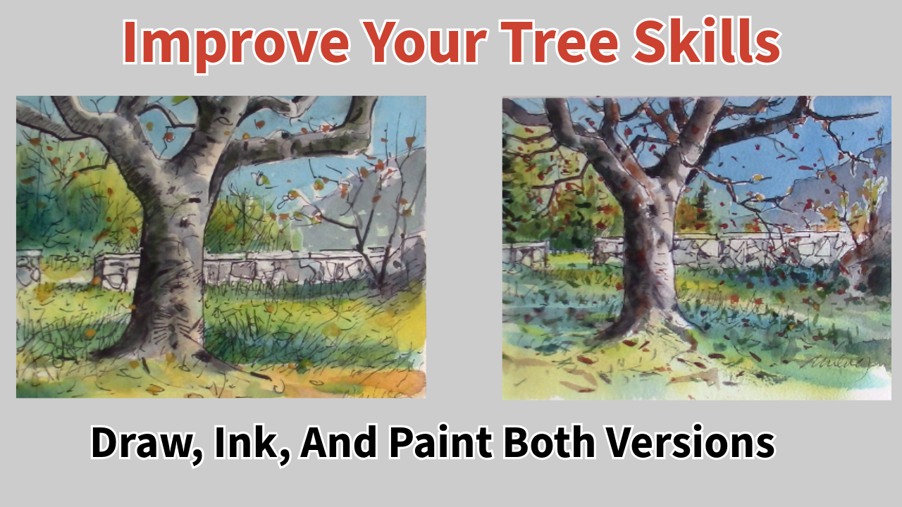
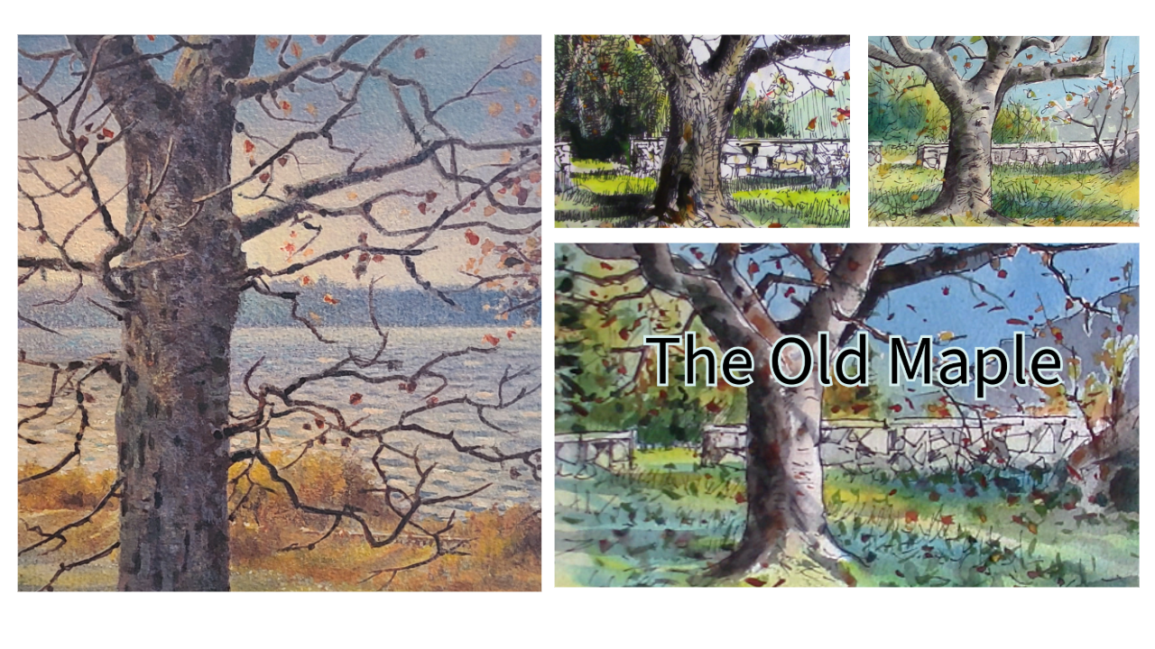
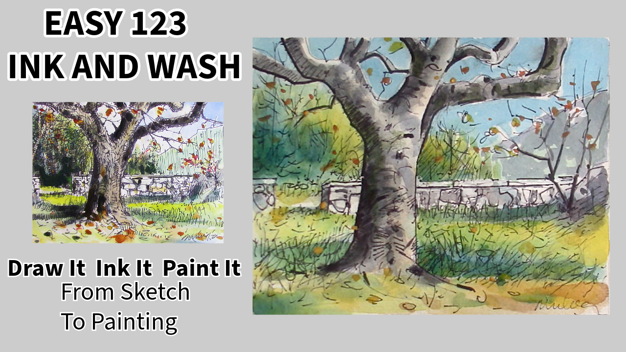
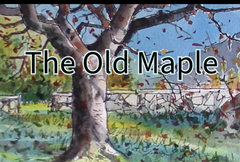
going to start with a sketch of an old maple tree. I'm going to show
you how to draw it. I'm going to show
you how to ink it. And then we're going to develop some new skills for painting. As artists, we
always have to find a place to be creative. My place is outside, and it's in the studio with you. I think the most important thing you'll learn in this class, whether you're a beginner or intermediate or just wanting
to improve your skills, is you'll embrace the
medium's fluidity, how to make water work for you. And even more
important, at times, what kind of papers respond differently to the amount of water and paint you put on them? So take the skills you
learn in this class, whether you do a little pencil
sketch, or you go outside, do a painting or follow
me in the class, learn the skills that
I'm going to show you, and apply them to your project. Whether you're a
complete beginner, you want to take your
skills to the next level, this course will transform
the way you approach this beautiful art form
called watercolor. Okay, let's get going.
Let's go to the next video, find out what materials
we need, and get started.
2. The Old Maple Materials: Here are the tools
and the materials I'll be using in this class. We start with burnt sienna. It's a warm red brown, and it makes wonderful
neutral colors. A hansa yellow or a
cadmium yellow light, palo blue, and some
manganese blue. So alysarin crimson. And some pins gray. Four brushes, a flat brush, a mop brush which holds
lots of water and paint, a smaller sable
brush for details, and, of course, the
rigor or script brush. Here's the Kansen paper. It's 140 pound cold press, and it's a smooth surface. Here's the meden
watercolor paper, rough 100% cotton acid
free, an HB pencil. And of course, a sharpie or any other permanent
pen to do the inking. And away we go,
let's get started.
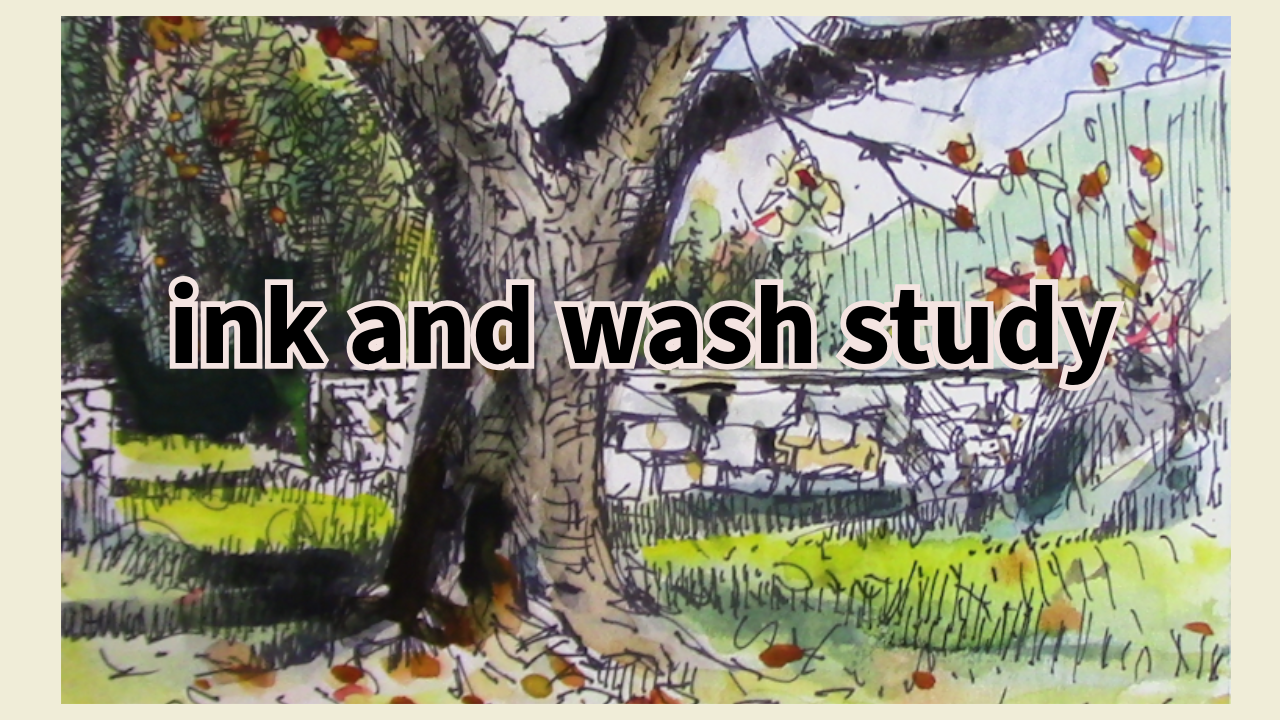
3. Draw Old Maple: The old maple ink and wash
study. That's the study. And we're going
to draw it today, and I'm going to help you
every step of the way. I'll be using for this
project, 100% cotton, Madn watercolor paper, reasonably priced and a
fairly decent quality. I'll be using an HB pencil. It's all purpose,
and it works fine. We're going to find the
middle of the paper first, and then we mark it, and we want the tree
to be off center. We don't want it to be
right in the middle, simply because for
design principles, it's better to be a little
bit over to the left. Now, you can correct
this later just by cropping your picture and
taking it off the center. But I'm drawing it to
the left of the center. So it's not right in the middle. And you can see I've created
two sides to the tree, and we're adding feet. A lot of people just stick the tree like a
fence post in the soil. We need to create a balance at the bottom to balance the top. I give it a few contour lines to make it look round there, gives it the general shape. So basically what I'm doing here is just searching things out, trying to get some flow, and the left side
of the tree trunk is going to be the dark side. The light will be
coming from the right. Now we have a lot of
confusion at the top. So let's simplify that
down to a couple letters like Ys and s. You can see the trunk
continues right up to the top and I'd
lightly put in a line, change it a little
bit at the top, give it a little bit of a curve We don't want a straight line. We want something that
has a little niche in it. You see? A little incident. A long line sometimes is boring. Now we're looking at the
left side of the tree. Really, the tree has two
main branches and a middle. There's that little
cusp in the middle. We're checking out all the
branches. Where do they go? Where does one
start and one stop? Some are behind,
some are in front. We're going to take
that left branch. And you can look at the tree
above as you're drawing, you can stop this film anytime. I'll put this into
the resources too. You can take your
time drawing a tree. If you don't get
it the first time, you'll get it the second,
third, fourth, fifth time. Pretty soon you'll have
a good understanding of how these old maple
trees or oak trees, whatever kind of tree you think. Now, on the right
is going to be the finished drawing all ink. That's where we're heading
in this picture here. So we have a ways to go
just follow me along. It looked a little
odd for a while. But all I'm doing
is analyzing what I've already drawn when I went sketching and found
this tree on a street. Then I created a little world
for it with a rock fence, little forest behind.
Now, watch this. Come around and we keep that line going right
to the edge of the paper. Now, if you've taped your
paper, that's fine too. But I'm just going
right to the edge. And then we come over
just a little bit more. It makes that branch
look like it's behind that main branch. You see how I did
that? Stop the film, maybe rewind it and take
a look at how I did that. There is a branch behind
the one on the left, and now I'm going to do
probably more than likely, I'm going to bring that
branch up on the far right. See, it's right down
on the other side. I'm going to bring
it over and up. I'm going to put a
little bump in it. That's probably where it
was trimmed at one time. This was a city tree, so it's been pruned a few
times and has a nice shape. If you see a tree,
you don't have to draw it exactly the way it is. Okay, now, we've got a
little limb at the top, which I change in this drawing. It's a little bit on
the foreshortened side in the top picture. So I just simplified it mostly because I think I ran out a room at the top
of the picture. So you're always going
to have something in your picture that might
stall you or stop you. Just keep moving along
from one area to another. Adding the little limbs, making them criss cross
or go behind each other. I'm drawing very
lightly with a pencil. I'm not pressing hard. If I have to erase the HB or the two H pencil will
erase, and there we go. See? There's a little erase. I like those white erasers, and then I take my finger,
give it a little shading. This paper is lovely because it has first of all, a
really good price. To, it's 100% cotton,
which is what you want. You want a good paper
to draw and paint on. Here we are put a
little bit of lead on the drawing and then we just fade it out
with our fingers. I also like to use a
smaller bristle brush and a two B pencil will put a softer lead down once you're not going
to be erasing anything. One of the softer pencils, HB is in the middle and
the two B is softer. Use your finger, use a brush, or even a blending stump. Put a little bit where
the curve is, see? Wherever there's a curve, one side of the curve
has to be shaded. That's how you get volume
or what we might call form. Here I am just putting a
little two B here and there. I'm consulting my
little color wash because that's where I got
the idea in the first place. I'm just modeling my tree. Modeling means giving it form, its shape so that it
isn't two dimensional. If you look to the right,
you'll see what it looks like after you've put ink
over the graphite. So now we're going
to do the wall. We bring the wall up to the rock or we might
call it a mound. It's just an intermediate
shape in the middle ground. It makes a pleasing composition
with the straight wall. The round curves of the rock echo the round
curves in the tree, and the wall echoes the
straightness of the tree. Now notice where I've put the little gate I've put
it just past the tree, and it's definitely covering at least two thirds
of the painting, which is a good rule of thumb. We call it thirds. So one third and two thirds is usually more pleasing than
one half and one half. Now, I'm just scrambling in some rocks here and
there, different shapes. I've done several rock walls, and you could use round shapes or angular shapes
or a combination. Once you've put some
random ones in, you can design your
little rock wall. And the trick is, they
sort of lock together, but they don't sit on
top of each other. Otherwise, the rock
wall would fall over. So they kind of lock together
in a random pattern. Now, here comes the
faraway mountain and the middle ground trees. I'm just throwing in some little dark lines
at the bottom in between the two places
where a gate might be because we're going
to be doing grass there. But it's a little
more than that. What I'm doing is I'm giving
myself a good oblique angle. It's nice to have
a diagonal through your painting gives it a thrust and it keeps the
viewer in the painting. Okay. You know, if you
sign it, basically, that means you're ready to go. Okay, it's time
for some branches. I'm switching to an HB pencil, and I want to bring
one of the branches or limbs right in front of the tree to give
it some more depth. Layering different
aspects of nature, such as branches or rocks, putting them in front
of each other and behind each other
gives you more depth. Now I'm adding just some
little darks here and there. Darks unify a picture. When you have your picture full of just medium and light values, there's nothing really
dramatic about it. Some well placed darks
are very important. That's what I'm using
the branches for. They'll turn into
well placed darks. Now I'm going over the painting. Well, not really a painting yet, it will be, and I'm thinking
out some forms and shapes, skirting across the paper, darkening a few things, looking up at my other picture, which is the
original ink sketch. I notice and you do too, there's a little
rock wall there on the top that has some dark
spots in between the rocks. We make those little bush
a little bit more darker. And I didn't like the
look of that branch. That's why I switched
to an HB pencil, much easier to erase
than a softer B pencil. We'll just finish up
with a few more darks, and we're ready to ink. I like adding a little
top to the wall and a few little branches
on the little bush. And you can get
your sharpie out. It's time to ink. We won't be inking this fast. So follow me in
the next section. We'll ink it, and
then we'll paint it.
4. Ink The Old Maple : Welcome back to the old maple. This is the second part
of the three steps. Number two is ink it. I want to make sure that you
can see my hand as I ink. Notice I keep the
pen up straight. And I'll try to keep
my hand out of the way so you can see how I do it. But a pen usually works better straight up than on an angle. So if you see me angling
my pencil, I mean, putting an angle on my pen, it's purely so that
you can see it better. But normally I would have my pen perpendicular
to the paper. Now, watching somebody ink a drawing is kind of
like watching paint dry. It can be a little boring. So what I'm going to do is I'm going to
speed it up in areas. And give you some tips on
what I do when I do inking. Notice my pen is up straight.
That's the first tip. Keep the tip of the pen
perpendicular to the paper. Turning the paper can also allow you to get at different angles. And sometimes we like to push the pen
instead of pulling it. So turning the paper,
good little tip. When you're inking the branches, it's a really good idea to make a continual line rather
than a lot of little lines, try to get from A
to B with one line. Your drawing should
have ink marks pretty much all over the place. Otherwise, the painting when you're finished won't
look quite right. So I just throw a few
little lines in the forest. For twigs, I don't really
try to draw a tree. I'll paint those in later, but I have to have a
substructure of ink. The sky is going to be
fine because I'm going to have lots of little leaves here and there and little branches. But the grass, I'm going to work it up with a lot
of little strokes. So watch me as I do that. Hopping all over the place,
adding little strokes, not really cross hatching, just adding character
lines on the shadow side. Some branches get a full
treatment, some just partial. An ink and wash with
a weak underlay of ink will not give a
very strong picture. So I'm adding some
darks here and there. Also consulting my little
colour sketch up top. Now what I want is I want
a little trick I use, sometimes my finger, sometimes
a piece of hard board. And that'll give me the bottom. It gives me a nice
straight line. Not so much straight. It can be an oblique line or a straight
line, whatever I want. And notice the pen is still
being held up straight. And there's always one
more little thing. I didn't like the
way those two lines were exactly the same, so I extended the
one on the left. Well, I don't know about you,
but I am ready to paint.
5. Old Maple First Wash: Well, now we get to paint
the old maple tree. I've got my little
mop brush hair. It's a neptune and it's
actually a natural hair, and it holds a lot of
water and I'm going to wet everything but the tree, and I'm not going
to wet the wall. Basically, I'm going to be just concentrating
on a few things. As you can see, there's a
lot of water in that brush, and I have not soaked my paper. I'm just surface wetting it
and leaving the tree dry. Going to put a little
bit on the wall. When you wet your paper, you'll get a very soft effect. But remember, the paints will disappear basically
into the fibers. So it'll go about 50% lighter, don't be shy with your paint. Get a goodly amount. But and yellow always looks
green when you photograph it. I don't know why, but
it's quite yellow. But it does have a
greenish tinge to it, at least it does on my monitor. There we go. I'm warming up
the bottom of the foreground. That's called basically a
flat wash using wet paper. I'm consulting my original
sketch for some of the colors. Keeping my brush clean, adding more water with
my little squirter and more of the yellow. That's just a light cadmium yellow or a yellow,
a hansa yellow. I added a little bit
of yellow ochre to it. The yellow ochre warms
it up even more. Notice, I'm just coming up underneath the limbs of the tree because there
is sky behind there. I just keep adding that little darker yellow to the paper. Then I add a little bit along
the bottom of the wall, yellow ochre, added to the cadmium light or handsy
yellow, if you'd like. There's the swipe. Once the paint's wet, you can swipe in a more
full bodied color, and everything blends nicely. So don't rub the paint too much. Just put it on in
strokes and swipes and dabs and let the
water disperse it. Mix it. I mean, the difficult part
here is not to fuss around with it,
put it on and leave it. Let the magic happen.
Clean the brush. Use a big brush to start with, and then you won't fiddle
with a little brush. Little brushes are
for little things, big brushes are for big things. I'm really cleaning that brush. And now I have some thalo blue, one of my favorite blues. I like to also add
other blues to the thalo like manganese or
cobalt or even ultramarine, tapping it with the big
brush, mixing it in. I don't want it too weak and
I don't want it too strong. Remember, the sky is dry paper, so I don't have to
use as much paint. Oh, there I go. I'm
adding some manganese. Manganese is a great warm blue. A Palo can be a little cool. But manganese will
warm it up a little. If blue can be warm, at least to me it seems warmer. Here goes the blue onto the meden rough 100%
cotton watercolor paper. Notice it stays put. It doesn't bleed, and it penetrates right into
the paper right away. I'm just going around things
and doing little sections. I have enough paint in that brush and I'm painting right down into
my mountain a little bit. Watching it, bringing it down
around the little leaves. I don't mind if it bleeds
a little bit in the wet. I want that and I leave little specks of
white here and there, thinking, I can add these and make them
into leaves later. Now, it go right
over the top there. Where the green was,
and I just poke and pull the brush around
some of the branches, even go over some
of the branches, especially the ones that I've inked because they're
in the shadow anyways. If I get blue on them,
that's a good thing. You can see, there we go. A word of caution though, when you finish that flat wash, don't go back and
start adding paint. I will ruin everything. Just leave it alone. Now I'm putting some
of the blue into the wet portions of the painting where I put
the yellow in before. And I see in my
little sketch that a shadow is crossing right across in front of the tree and behind
it, creating a shadow. I'm just sweeping the brush gently with a little bit
of paint on the brush. Stroke here, stroke there, wash the brush, actually add
some water to the brush. When you add the
water to the brush, it thins the blue down. And you can judge how
much blue is left in the brush because I'm going to be doing the
mountain and I'm thinking, I better wet at first. Now be careful I don't go
too high on the mountain. Because the water will
bleed up into the sky. But even if it did, I would accept it there I'm
softening the edge. The mead and paper absorbs
paint very quickly, so you don't get as many bleed
marks if you're careful. I'm going to use
some burnt umber. If you don't have any,
take a little bit of halo and add some burnt sienna
to it and you'll get it. I want to test out a little
burnt umber. On my tree. It's a great little
neutral color. And I put a little
bit on the rock wall. I want to see what
it looks like. Now, because the
rock wall is wet, if I don't like
it, I'll just tap it with a towel and
it'll come right off. So let's see what I decide
here. Am I going to keep it? I'm looking at it,
and I'm going, No, it's not too bad. Not a vibrant color, but it's taken over on the wall, so I tap it off
with a paper towel. I leave it on the
tree, and I leave a little bit on the
bottom of the wall. Just a little bit of the umber. Okay, now I'm going to be adding some really bright greens, a little bit of halo, and
some of that handsome yellow. You can use cadmium
yellow light. They're all pretty
much the same. As far as their intensity, they make great greens. It's almost a candy green. So adding that right
into the yellow, I'm just using the
pure cadmium light right into the paint
that's already there, adding a little bit
of the blue to it. Strengthening the color,
increasing its intensity. And just a few well
placed strokes. That's all you need.
Another look at the sketch, and we have a shadow. I've put it in there
with a bit of palo blue, swiped it in, and
then I'll swipe another one on the
right side of the tree. Going to be a shadow
there. You'll notice the paper is starting to dry. So I have to be careful. I don't add too much water
or will start to get a lot of bleed marks
completely to carry on. Now I'm working on more
dry paper and I'm being very careful still
getting in a few swipes, but I'm not over swiping. That's when you swipe somewhere and then you swipe again and again and again and
that makes it muddy. Now I can soften the
edge of those swipes with a dry flat brush and
it's a natural hair brush. So it's going to absorb some
of the excess moisture. I'm going to be making a shadowy color with pains
gray and lyserin crimson. So you put those two together. Pains gray has some blue in it, so I'm going to give
the mound a swipe. The first swipe on the mound. We're going to see what happens. Now we're going to go
to the tree. It's dry. So if I'm careful, I can control the flow, and I'll have it to soften
the edges in a moment. Here comes the little brush. I need a little bit
of water on it. That's my rigor brush, and I'm going to use that to
soften some of the edges. Let's zoom in on this and see what it looks like up close. Just a little gentle stroke with the damp brush will
get the job done, leaving the left side
darker than the top side. I've taken a little
burnt sana now, changed to my sable brush, a little bit more
of the paints gray, and I'm using a little
less water and more paint. We're getting a very
juicy dark here. Lots of strong pigment
going into the damp paper. You'll see it just pop a little in here, pop
a little there. This is very important
because you're establishing your darks. Once you've
established the darks, you can manipulate the dark and light and midtones to create drama or you can create a quiet feeling depending on
what part of the day it is. Now I can get rid of that
raggedy bleed edge with a little paper towel so
that it's not so strident. As you add more darks, you are definitely getting to the next part
of the painting, establishing darks and
lights. Very important. So let's continue on the next video to
establish the darks, soften edges, and go to the next level as we finish painting this
wonderful old maple tree.
6. Old Maple Finishing: This part's all about developing
your finishing skills. Adding darks and developing contrast is
extremely important. And the best way to develop this contrast is by adding
darks against light. That's basically one of
the ways to contrast. We can contrast size. We can contrast cool and warm. But right now we're
contrasting dark and light. So the dark on the left
and the dark on the right, the right one really shows up. So dark against light. The light rock or the mound, whatever it's going to
be, is in a mid tone, so we add some darks to it. Putting darks into your mid
tones and with your lights, but also darkening
the dark spots. How dark can you go and adding a little
warmth to the dark. See the burnt sienna
is going in now and warming up the shadow areas. You don't want your
painting to be too cold. So poke around, put some little spots all
around the place, some scattered darks
and let's see how we can get this little section
here up to the next level, learning how to finish. We are now going to add
some bright color notes. So some cadmium and the
zarine makes a lovely orange. We put it on our white spots. But as it hits that
little mountain, the blue turns the orange
into an orangy green. Same with the trees
in the midground, putting orange over green. Give us a warm effect
in your forest. And just scatter those
little warm spots all over. Now, I take my bigger brush, and I take a bright green, some pure yellow with
it, a little palo, and I get rid of that
bottom of the mound. I make it melt into the grass. We don't want the rock or
the mound looking like it's sitting all by itself.
Planted in the ground. Add a little bit of birdsiena
and pains gray to it. And now what I'm going to
do is I'm going to let this sink in and take a look at it
after a couple of minutes. Sometimes it's better to
look more and paint less. Take a look on the right
where the mound was, how it's dried up now. Everything's blended
into the picture. I gave it about 5 minutes, and now I start to
add more darks. I've put a little mat
around the picture. It kind of tells me I'm going
in the right direction. This painting is going
to look very nice. So here I've put on some paint, and then I soften the
edge with my brush. Keeps the limbs of the
tree looking around. Now, because I've added a
little bit of moisture, I can drop in some more or I can work on the dry paper
in the shadow areas. Notice how the paint
stays right where you put it and absorbs right
into the paper. The paper's fairly dry now. I'd almost say it was
pretty much completely dry, and that's when my darkest
darks really show up. So now I'm taking some
very strong yellow, two yellows, cadmium
yellow and handsy yellow, and I'm enhancing the yellow and turning the blue into a
I call it a tasty green. What's a bit of yellow
without some violet. Violet and yellow, violet and
green, violet and orange. Violet goes with everybody. Here we go. We have to make the mountain
darker than the sky. The first coat is
definitely going to wet the paper, it's light. I leave a little
edge so that you can see how much darker this
will be in the end. That edge is on the
right hand side, and I want to work the shape of the mountain right into
the midground trees. I don't want the shapes
bumping into each other. I want them interlocking. Now a little bit darker. You can use any combination of your favorite red and blue. Just make sure
they're transparent. I'm going to drop the
paint in now right into the wet first coat and that will give me a
darker coat of paint. Now I have good contrast between the sky
and the mountain. I'm just dropping in the paint. The water from the
first wash is blending. Now, you see how that shape on the left mountain looks like
it's banging into the trees. I'll be blending
that in in a moment. All those little blue specks
and white specks will become leaves at the
end of this picture. Okay, we're going to
come in and see how we soften the edge
with a damp brush, my little sable brush. I just dampen it out and lift off a
little bit of the paint. Time to darken, back to
a little more violet. Violet is the best
distance color and good color for shadows. So even more I darken it. Now, if you can remember what it looked like a
few minutes ago, now the mountain has
come closer to us, but it's still in
the background. It's not in the midground. Trees the foreground, rock wall and bushes behind
it or little forest. That's the midground, and the mountain and the
sky are the background. A little violet on that
little bump or mound. And here comes the shadows coming from the
right to the left. We're going to make some
round shadows on the tree. And that really tells me
that the tree is outside. The shadows are produced by
the light hitting something, and then it hits the tree. Shadows on the rock
wall, just a few. Good way to study shadows is
go outside and look at them. Shadows on the ground. Shadows under the mound. These are obviously tree limbs, shadows going right over the bottom of the tree
and out the other side. If you study shadows outside,
you'll know how they work. They envelop things. They create a sense of
light in your painting. Now, coming up is something
very important right there. By darkening the wall, I make a contrast
with the left side of the tree using the
shadow to do that. See, dark light. Dark again, little bit of the red,
little bit of ivory black. Gives me a rich color. And I'm just popping
these darks back in. It's all about dark and light. At this point, you're
doing your darks. The light colors are done in the beginning
of the painting. Now we work the shadow
up a little bit, darkening everything
a little bit with a transparent wash. And then I redistribute those
darks, just touch them out. Add a little bit here
and a little bit there, a few darks here, well placed
darks, scattered darks. And then we get ready
to pop in some of these beautiful little oranges and reds to finish
up our painting, we're going to be adding
very colorful color notes. The cadmium red here, I like to keep a tube of
cadmium red because it's great for adding those wonderful
little variations of red in the painting. Look at those reds show up. They're warming up everything, contrasting the green, bringing the viewers
attention to color. It's almost like all
the other tones have set the stage for the last
little peppering of color. Aren't you glad you saved those little bits of
white in light blue? Look at the brushes just
dancing across the painting. Oop, a little bit too much,
touch it with your finger. And there we go. We've
done a good job here. There's always a little
dark at the end. A couple little twigs. We're going to
work the twigs up. Cadmium red with a
little pains gray. Now we take that
little fine brush, put in a couple dark branches, little things sticking
out here and there, filling little spaces,
adding little details. Details are interesting
to look at. And by scattering
all these colors, you're creating a
unified painting. You've given it a surface
texture and tension, adding some green
here, more darkening. Why not add a very deep
green in the shade? It wouldn't be in
the light because the light more or
less weakens color. So in the shade,
I've put dark green. This comes from being outside, sketching, observing nature. Notice how the rock
wall is standing out now because I've added the
dark green next to it. Then I take a little water
on my little brush and push the colors up into the
top part of the trees. It's quite amazing
how you can just keep adding layers of paint, especially on this great paper. This rough paper really
likes to receive the paint and bring it
deep into the paper. Now I'm taking pure ivory black, or you could use pains, gray or any dark mixture, and I'm reinforcing the
original ink lines. There's my rigor brush. Just adding a few little
spots and branches. The final details. I've got the mat back on, which tells me I'm appreciating my painting and I'm adding the final
loving touches to it. Little spatter. Then we
finish up with a flicker of red here and there over the surface of the old
maple tree in the yard. I want you to remember all
landscape start with a sketch. You take it home, work it up, and discover hidden talents.
7. Country Lane Maple Draw Ink Wash: Okay, now we're going
to try the old maple on 140 pound Canson paper. Here's the original sketch. And underneath this is the
KansenPject halfway through. And what you'll do is do another drawing using
our first lesson, which was on the
MidnPaper and then just continue along with that drawing with this
class right here. We start with flat washes, some burnt sienna, and we're going to be
dropping the paint in. You will see how
this paper reacts differently than rough paper. Cold press means the
surface is smoother. Not only that, it's
less receptive to the penetration of water
because of the sizing, and it's not 100% cotton, so it has wood fiber
or cellulose in it. It's perfect for
some applications, and that's what you're
going to find out here. See, when I drop the paint, it doesn't disperse
as quickly as the rough unpressed paper. So here goes a swipe notice how it sits on top and
doesn't spread out quickly. Now, granted, we're using very, very dry paper here
because I want to show you what happens when
you put the paint on, and how long does it take for
it to penetrate the paper? So here's some
cadmium yellow light. It's Cotman, which is a medium grade. There's
nothing wrong with it. If you can afford more
expensive paints, go for it, and if you
can't will work fine. I have my mop brush here, which holds lots of
water and lots of paint. Here comes the cadmium. If you thin it properly,
it's fairly transparent. I'm consulting my sketch, and here comes wash. I call this a rub wash. You just rub it all
over the place, and because the
paper is so smooth, it doesn't leave any texture. There's very little texture
on cold press paper. But if you like to do washes,
this is the paper for you. Clean your brush. One of the most important things
is to use a clean brush, keep your paints very pure. Notice, I haven't
really mixed anything. Here comes the thalo blue. Thalo blue is a wonderful blue because it's very,
very transparent. Now I mix the thalo
with the cadmium. Put it onto the paper, and you'll see it
doesn't spread anywhere. So I have to clean my brush
and soften the edges. Coal pressed paper is not as
absorbent as rough paper. Now I drop some painting. One good thing is when you do drop the paint into
the wet areas, it doesn't go wild and
shoot all over the place. Canson paper is, I would
say, easier to control. You don't get so many
magic moments with it. It's fairly predictable. Make sure that you don't cover everything when you
paint with watercolors. Those whites are precious. Once the paper
starts to get wet, it becomes more receptive
to dropping in paint. Here comes the violet, which is a mixture of the
Alizarin crimson and the palo. And I pop it into the side mound and a little bit here and
there on the rock wall, and I distribute it wherever
I have a shadow area, mixing up some stronger,
darker colors here. I'm going for a neutral color, which is basically
a combination of the three primaries,
red, yellow, and blue. Now, I haven't put yellow in it, but the burnt sienna will give
it that neutral look what I'm looking for is a warm
brown, a dark warm brown. The Canson paper is less
absorbent. Watch this. Even though that was just wet, it doesn't really
spread too quickly. My advice with Canson, put the paint down and
then soften the edges. With the rough paper, the edges basically a lot of the time will soften themselves because of the absorbency of the paper. The paint tends to sit on top when you do the Kansen paper. So herein, we're
moving in closely, and now I'm softening
all the edges. Look at that. The effect with
Canson will be very smooth. The transitions very smooth. There'll be no rough edges. It's very good for
illustration or when you want something that looks
very tidy and tight. We're looking for
warm darks again. You'll notice that
I continually put layers of dark into this paper, and it's starting to absorb. So this paper is really,
really good for layers. As long as you let
the layers more or less sit and
settle for a while, of course, if it
gets out of control, get a dry brush and lift
off anything that bleeds. So the paper is starting
to absorb the water. And now we can be a little
more careful about bleeding, but we still have to keep
softening, softening, softening the edges, wet the left side, soften
the right side. Notice how that paint picks up nicely and spreads
out to the right. So cans and paper is wonderful if you know how to use it
and keep the edges soft. But if you want a hard edge, you'll get a really
hard edge with cans and paper, razor sharp. So I had some blue on my brush, and I'm going to be doing
the most important part now, which is a flat wash.
Paper's bone dry, and I skirt over the paper
quickly close to the tree, but I leave a little
lacy white edge around certain things. I don't want to
cover all the white. I want to just get
a flat wash on the paper so that it's
even from left to right. We'll be darkening that later, and now I'm going
for super darks. Just look at see the paper
is getting wetter now. It's slow to sink in, and look at it actually
dripping on top. If that was rough paper,
it'd be all over the place. So like I said, a
little more control with the cold press paper. It's great for layers. If you want to put multiple
washes over each other, the papers durable and tough. It also likes you
to lift paint off. Once again, because
it's cold press, the fibers are tighter together, and lifting is very simple. Spotting a few little darks here and there for
the rock wall. You can see how
they spread because the paper has been
wet for a while. Then a very thin green wash
over the faraway mountains, leaving spots of white. Leave those little bits of white for the bright colors
that are coming later. Now, see how easily it
drops into the paper, and you don't have to
rub all over the place. Once the paper is saturated
or at least damp, it'll spread on its own. Okay, we're getting busy with some really strong cadmium here. Notice I very little water. Because the Ksen
paper now has been soaked a few times or
at least dampened, the water's gone
into the fibers, and now it's being
very receptive. So you have to be
patient with Ksen, but look at how smooth
everything looks. Because it's not rough paper, you have to create the
illusion of roughness, maybe with little
choppy strokes. Drybushing doesn't
really work that well on cans and paper, so choose your subject well. Now it's time for the second
flat wash in the sky. I'm adding a little
manganese blue, which is a very pasty color, and what I'm going to do is
I'm going to mix it into the palo blue to
create a more well, I call it a warmer blue. It's just a different
hue of blue. So there's the
subtle difference. Now, this is very important. Watch the bead of water, the puddle of water that ends
up. See the droplet there? That's the most important
part of a flat wash or even a grated wash. Notice
I'm coming up to the tree, but I'm leaving a
little lacy edge. Those little bits of
white are important. I'm very confident the puddle is not going to run
away on me because the dry paper stops the water from going any
farther than the bead. So leaving white paper
right there, see? I'm going to go around
that in a moment, pull the bead and
let it drip down, tilting the paper and
directing the bead of water to the end of
the wash. Continue replenishing your
brush with fresh paint so that you can keep nourishing the bead and keep
the bead flowing. If you run out of bead,
then you're in trouble. The idea is to let that
bead wash over the paper, and the dry paper always stops the bead from
going too far. And of course, tilting the paper just the right amount allows the water to flow downhill,
which is what you want. If there's one very
useful technique in watercolor that you're going
to bring from this class, the graded and the flat
wash on dry paper is one of the fundamental aspects and ways of painting
watercolors. It's been around for centuries. And And now you've finished the second flat wash, pick up the drips. You don't want to leave
drips of water anywhere. I'll leave a watermark. So I take a dry brush and just tilt the paper
and look at that. Isn't that You got to admit
that's a beautiful blue. Okay, now we can put the finishing touches on the
old maple on Canson paper.
8. Country Lane Maple Finishing : Well, welcome back. Now
we're going to finish up the country road maple. The paper's bone dry, and because it's Canson and
it's 140 pound cold press, washes and layering
is what it does best. It gives you that beautiful
little illustration look where things are nice and
smooth and controlled. And by layering on different
colors, cool colors, warm colors, you can
effect a change in what's already there and bump
it up to the next level. So there's barely any
palo left in my brush, but I just green up the yellow a little bit with
little short strokes. Now we take my rigor brush and some paint gray and a little bit of yellow to
warm it up, some palo. And I'm going to be
doing the pen lines, treating the lines just
like I would a pen line, using the brush to stroke in what I've
already put in there. Then I just distribute a
few little trunk lines in the distance to simulate the trees and I
add some branches. The branches are dark. I am establishing my darks. When you put the darks
onto the Canson paper, they stay put and they
don't sink in so much. The papers, as I said, bone dry, adding details,
the little rock wall. I'm not being fussy, I'm not
even looking at a picture. I might consult my sketch, but I'm just designing
something as I go. Okay. And the rigor brush is
perfect for this job. I'm now going to be
strengthening my drawing. I take a fine point sharpie, which is a little heavier than the extra fine that
we used to ink. And what I'm doing is putting
in some strong black lines. This will give the
tree a solid feeling. And I can't just
put one or two in. I have to put a
number in so that the thick lines don't conflict with all the
skinny thin lines. I need a good balance of
thick lines and thin lines. If you're going to be inking, make sure if you use more
than one thickness of pen that you balance out
the number of lines. Notice I'm keeping the thicker
lines in the foreground. They wouldn't look
right in the distance. They'd be too strident.
Here's the best part. I've taped the
picture down and now with my handy dandy little
portable water brush, I stroke very softly. Over the entire surface, then I pad it with a towel
and now I'm ready to do what most people never do with
their watercolor and that's start to layer and glaze. I pick a very strong yellow and I just put
it here and there, gives me a feeling of spring. Or fall. Spring
and fall can have pretty closely related
color schemes. There is a nice cadmium yellow, and it looks like
a medium cadmium, but a light would work too. Because the paper is wet, but it's not soaked, the paint just sits right on
top and starts to penetrate. Now, you'll notice that big
blob of palo blue green. That I just put on in different places is not
flying all over the place, nor is it sinking in
to the paper deeply. It's just sitting
there and taking its time to settle into
the fibers of the paper. This is something you get
used to if you go at it gently and don't
scrub your picture. Just drop little sections
in and watch what happens, tap, tap, tap with it. Little spots of dark go everywhere and they
sink into the paper. Now there's a very good green. It was a little ivory black, a little palo, and some
cadmium yellow light. I drop it all over the place and start looking and watching. Look how it's dissipating
into the paper now, then I get a really dark violet and I start dropping that in. It's quite amazing how the
paint does lighten up. I'm taking a dry brush now and I'm just
distributing the paint. I'm working two brushes. This one has the paint on it. This one has to paint. It's hard to tell. They
both look the same. You drop the paint
in and then you tap it out with another brush. It's quite a good technique. G two brushes going
in your hand. I pick up a little more
paint, drop it in. Keep dropping the paint in. It's just the right thickness. It's not too thick and
it's not too thin. Notice the feet on my tree. I want the tree to appear to be really locked into the ground. You notice I keep adding dark to that left hand corner
above the fence. And it just keeps
disappearing, but that's okay. We'll check it later.
Here comes the violet. Go over the mountain
in the distance. Notice I'm leaving the white. The white is going to be
bright oranges later. And once I've lost that
white, I can't get it back. Now those little bits of
green showing through, they will be leaves
that appear to be in the shade green is a cool color. I carefully make them out
and look like it disappears behind the little forest on the other side
of the rock wall. Back to the tree. This
is the best part. Watch the shadows give
form to the tree. And that part of the tree is
pretty dry. It's not wet. So there we go. We put some round shadow
shapes on the tree. Just look at that
tree for a moment. It really looks like
there are shadows on it a little bit
behind the rock wall. There's the mound. The mound
gets some shadow color. You wouldn't want it
to be the same color as the mountain behind it. So we darken it.
Violet and green are complimentary colors.
They work well together. So here we go. This
part I really like. It's more of an orange. I took some cadmium red and some cadmium yellow,
but not too thick. And I'm adding this color because the green is everywhere. And by adding orange, I make the green greener and the green makes
the orange oranger. You can always reclaim a few of the whites
or where some of the colors have spilled over to where you
really don't want them. Just take a razor blade on
a little bit of an angle and scrape a bit into the
paper, especially the Canson. It works really well. And there's that
little left corner gets its last little
shot of dark. Little tree on the right,
little bit at the bottom here, just a few scattered darks
to pick up the picture. Give it a little bit of punch. All from one sketch done
on the side of the road.
9. Outro Your Project Is Important: Two of my favorite things
to do paint outside, capture nature, and share
it with my students. I really encourage
you to get outside. I started out many
years ago sketching. First couple of
times I'd come home, and I'd say, How come that
shadow didn't turn out? Then I started looking
at shadows more clearly, studying them, and then putting them in my paintings,
just like we did today. Black and white monochrome
studies of trees and lakes, little sketchbooks where
you throw colors on. These are all part of
what an artist does. Gathers facts,
translates nature, and makes it something special
for people to look at. I want to look at what you do. Your work is special to me. I don't care if you
think it's not any good. How would you know if it's good? I've been doing this
for over 40 years. I think if I tell you you're going in the right direction, I think you can trust my
opinion about your ability. Just start making
little sketches, throwing some color on, using the ideas from this class, and then we can get together, and we can be creative
and have a lot of fun. Thanks for joining this class, and we'll see you
in the next one.
 Ron Mulvey✏️, Artist / Art Teacher