Transcripts
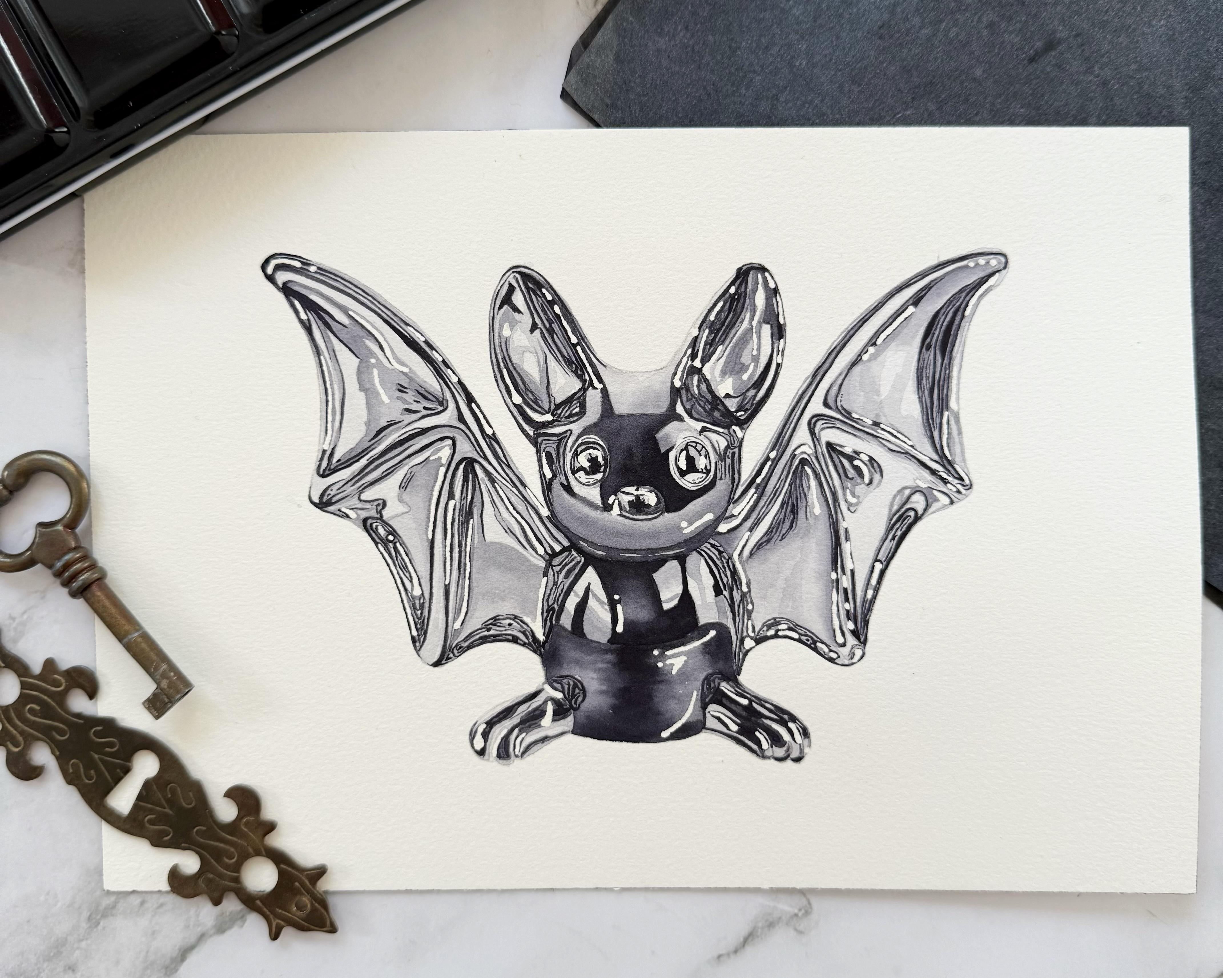
1. Introduction : Hi, welcome to this course. Today we're going to paint this fun little
transparent crystal bat. This is a course
that will just allow you to unwind and
relax a little bit. So if you're interested in doing something that's a bit
more unique and special, this course is for you. It is very beginner friendly. I'm going to walk you through
everything, materials, the first steps and all of that, and then we're going
to paint it together. So I hope you're going
to enjoy this course. Just do it at your
own pace, relax. Don't stress about
the perfect result, and I'm sure you'll
have a good time.
2. Materials: Okay, so let's go over
materials quickly. I have my watercolor paper. This is 100% cotton
cold pressed paper. Then I have my
outline printed out. It's the size. So it fits on my kind
of like a five paper. Then to trace my outline, I'm going to use
this charcoal paper. Um, I also have this
tape that I'll use to tape my outline onto the paper so that I can trace it and
it doesn't move. We'll be using masking
fluid for this project. This is a monochromatic picture, so I'll only be using one color, my gray, and then
some white quash. And for brushes, Um, I have a size four
round brush here. I think, excuse me, if these are the biggest areas that I'll need to
paint wet and wet, or actually, I
might use this one. As well, this is a
size 12 round brush. And when it's wet, it has
this really, really fine tip. And I might be using this to do an overall first wash because it holds a lot of pigment
and a lot of water here. And this becomes a
really fine tip, so I can use the fine tip to make sure I don't
paint outside my outline. So I might be using this one. And then, of course,
smaller brushes, 30, a size two and a size zero, and this is the size four, I always have these ready. These are more or less the
only brushes I use these days. And then I also always
have my eradicator brush, should I need it too, if I sometimes I paint outside
my lines a little bit, and then I'll use this brush
to clean up the edges. But this is I just
always have it ready. I don't always use it. And then here I have my
mechanical pencil, which I'll also be using
to trace the outline. And then water and
a paper towel. And that's pretty
much it, I think.
3. Tracing the Outline: Okay, so I'm just going to show you how to trace your outline. If you already know
how to do this, you can skip. You
can skip ahead. So I'm placing my outline in the middle of my
paper where I want it, and then I'll take
some of that tape. And I'm taping the outline onto my paper so that I can check where I've already traced and where I haven't
without the paper moving. Then this is the charcoal,
the tracing paper. It has a mat side, and it has a shiny side. And the shiny, I don't know if you can see
the difference. The shiny side goes
down because that's where the pigment
is attached to. And then you place it and since
this is cold press paper, not hot press paper, No, my pencil isn't working. This is great. I'm going to
use a bit more pressure. Then I do when I paint
on hot press paper. And then I have a
mechanical pencil, and I'm just going to
draw over my lines. Like this. And then because
we've taped it to, to the paper, we
can always check. Sometimes with these
crystal illustrations, when there's so much detail
and so many lines, um, I need to check every couple of seconds if I've done this one
and that one already. So, yeah, this is the process. I'm not going to show
you all of this. I'm going to do this because I don't want
to waste your time. But yeah, this is how it's done. So I'll do mine,
and you do yours, and then I'll come back when
I'm finished with this.
4. Color Mixing: Okay, so let's get
our color ready. Like I said, this is a
monotamatic painting. Um, so I'll just
use my gray color, which is neutral tint. I prefer neutral tint
to pains gray because Panes Gray usually has
such a blue tint to it. Also, depending on the brand, some are a little bit less
blue, some are really blue. But just use the gray that you already have
in your palette. Don't feel the need to buy a neutral tint just
for this tutorial. So I'll just get it ready
here in my palette, and we're going to use
different concentrations of it. So for the first wash, which we'll do all over, we're going to use a very,
very watery, transparent wash. And then as we build the layers, we're going to use more
concentrated versions. And then since
this bat is black, we're going to use it
more concentrated, and then the neutral tint
will look like it's black. So here I have just a
scrap piece of paper. So this is like a
medium concentration. And then if you use
it more concentrated, it really just becomes black. And then like a super watery version
is something like this. So we'll just play around
with it and adjust it. And then if we do need
to use white highlights, I'm going to use whitequah
for that in the end, but we're also going to
block in the highlights with masking fluid so that we don't lose all of our white. And that's it for color mixing, very quick and easy.
5. Applying Masking Fluid 2: Alright, so this is the masking fluid
that I'm going to be using for this painting. This is B sneer. Um, I purchased it because
it has this needle tip. Um, and I'm still
on the hunt for a masking fluid that
allows you to like, work with really fine details, and this one is not as
bad as the other ones. But one thing I've learned
is do not shake the bottle. If you shake the bottle, you produce like 1,000
little air bubbles in here, and then all that comes out
of your needle point is, like, air bubbles, and
it is a nightmare. There'll still be air
bubbles coming out of it, but not as many as if
you shake the bottle. So if you see that
there's kind of, like, residue on the bottom, depending on how
you put it down, I just, like, slowly move
it around like this. Like, for a minute or so so that everything it
mixes up again, but I'm not shaking
the bottle anymore. That gives me a migraine. So, okay, let's get started. If you look at the
reference photo, you see that there's like
10 trillion details in it. And I've decided to
not paint all of them, to leave most of them out because it would be
just, like, tedious. And I think we can get the nice glass looking
effect without painting, like, every little detail. But I am going to block
in some white highlights. And if you have the same type
of masking fluid by chance, I'm just holding the bottle. I'm not even squeezing it. So I'm not applying
any pressure to this. I'm just, like, moving
this needle over my page. And then the amount that
comes out just by gravity is the amount that
I'll that I need. So I'm just gonna I don't know. Do some little dots, maybe, and some fine
lines here and there. But maybe some here. I'm just trying to scatter
these around, really. Usually, I try to follow my
reference photos exactly, but this one is just too much. And also, I don't want to make the tutorials too complicated because it would be intimidating for you to even
get through it, I think. So I'll try to simplify. But this is also something that's that I'm
still learning is, um what to include and
what to not include in a realistic painting because
you don't have to paint every little detail
that you see in a photograph to create
a realistic painting. And there are some
artists out there who are excellent at this. And when I see one
of their paintings, I'm thinking, Oh my God,
this is photo realistic. Then you zoom in
and you realize, oh, it's actually
not that detailed. But I think as you
gain experience as an artist and as you just
keep painting over the years, you you learn and you
develop an intuition about what a painting actually needs in order
to look realistic. So here are the eyes.
I'm going to include more masking fluid
in the eye, I think. And then there's the nose, maybe, like, a curved
something here. Um, so, yeah, we're
all continuously learning So I don't know, maybe here. I'm just putting
these. I'm just adding these pretty randomly,
to be honest right now. Make sure your masking
fluid is completely dry before you touch it,
because if it's, like, semi dry and you smear it, you have this, like, super
thin film on your paper, and that's hard to get off. And also, if you start painting before it's completely dry, you'll you'll get problems. So the only thing that
I'm trying to do when I add the masking fluid is I'm trying to follow the
direction of form of the shape. So in the reference
photo, there's, like, a sharp line, and I don't know
where that's coming from. It's some kind of reflection, but I decided to put this one down curved
because I'm thinking, Okay, it has a round belly, so I want to do the light
reflection round as well. Just let's just be random
and quick with this. Maybe one more here. Um. Something like that? I think. Yeah, I think
let's leave it like that. Some of my drops
are pretty thick, so it might take about 20
minutes or so for it to dry and then we'll continue with
the first base layer. A
6. Base Layer: So that's the masking fluid dry, and I'm going to take my
big brush and dip into this very transparent
gray mixture because even the lightest areas of this painting are not
as white as the paper. So I'm going to test it again
on my scrap piece of paper. Yeah, I think this is a
good good consistency. Okay, so there's really
not much pigment, and it dries even lighter. Okay, so um what? I'm going to protect this.
We can paint in sections. So I'm going to start
just by painting this wing on the
right hand side. I tend to start on
the right hand side of a painting because
I'm left handed. Um, you are statistically more
likely to be right handed, so you can also start
on the opposite. Page. Okay, um So, like I said, this brush comes to
a fairly fine tip, and I can just move
it along here. And then feel free to turn
your page as you need to. I sometimes try not to move
my page around too much when I film for Tutorios
because I don't know, I thought maybe it's not very
pleasant for you to watch. But it's always easier, and it's easier to paint
accurately when the tip of your brush is pointed towards the edge of
your illustration. So I'm just soaking up
some excess moisture on my page here. And then I'm taking
it up to this line. And if I get a hard water
line here, when it dries, I'm not going to care
much because Yep. That's totally fine. We
have some uneven this here because the masking fluid created a bit of a
barrier for the paint. But that's really not an issue. So if I feel like
it's a bit too dry, I can swipe my damp brush over the paper and soak up
some more of the paint. And then once it's dry, it's going to be even
lighter than this. And then once we add
the darker colors, this will in relation to the dark colors
appear very light. Okay, I'm going to
continue with the head. Same thing. Go to start here. So this just gives us a base
color to start off from. And I think it's also always nice to already have
some color on your page. So it doesn't feel
so empty anymore. I think I always
find it's easier to keep painting and to continue when there's already
something there. Like the blank page.
Sometimes it's a bit scary. So again, soaking up like some excess paint there
that's pooling here, I can smooth out
that unevenness. So I don't know if you
can see if I can zoom in. But like this little
mistake here, I can easily correct with my eradicator brush
once it's dried. So that shouldn't be a problem. Okay, then I'm going
to do the body here. Could also do this
step on wet paper instead of on dry paper if you're maybe a bit
unsure if you can cover larger areas quick enough before the
paint starts to dry. But in this case, we don't need a super even wash because if you look
at the reference photo, there are so many lines and sections that
will go over it. So should you have a
paint line somewhere, it's probably not
even going to show. I mean, like a hard water line. And also, this is such
a transparent wash, and you can see how much
water I'm putting on my page. It doesn't dry that fast. But if you did want to
do this wet in wet, just remember that the more
water you have on your page, the more pigment you need in your paint mix because
the water adds up. So if you already have
water on your page, you need less water
in your paint mix, otherwise, you're not gonna have not enough
pigment on your paper. So here, I can correct
the edge a little bit. Soaking up any extra
water that I don't need. Yeah, all of this I
can easily scrub over, but the edges aren't
too bad, actually. This is a really handy brush. Okay, and then so now I need to make sure
that my hand doesn't cover the part that's
still a little bit damp, so I'm trying to place it here. Okay. And again, I'm just soaking up
any extra pigment. All right. So we're going to let everything dry completely
before we add another layer.
7. First Layer: Okay, so now I'm going to keep painting on the right wing here. And let me just see if I can, can you see without
the lamp distracting? Okay, so I was thinking, I'm going to start here in the middle kind of like dent
of this section of the wing. And you can see how there is, like, another
transparent layer here. So I'm thinking to continue
with the same wash that we used now and just add a
second layer of it on top. So it's still the same
super transparent wash. And, um I'm just again, this is on dry paper, and I'm just gonna try to just paint some irregular
lighter shapes. And I paint the light shapes by adding dark paint around
them, if that makes sense. I'm having a bit of a hard time explaining what I'm doing
while I'm doing it. Usually, I used to
record the tutorials without speaking
at the same time and then added voice
over afterwards. But because that prolongs
my editing time by so much, I decided I'm gonna switch and paint and
talk at the same time. But then I'm concentrating
on the painting, and I'm a bit lost for words. Okay, so something like this.
Do you see what I mean? Um, and I'm going to do
this for down here as well. I really don't think we need to stick exactly to the
reference photo. I think that would just,
like, give us a headache. So I can see that
this part is light, and then it's darker here, so I'm just going to
add I'm trying to, like, keep a loose
and relaxed wrist. And the more relaxed you are, maybe grab your
brush a little bit more towards the middle
and not here at the front. If you hold your
brush like this, it's easier to paint loosely. And then this one here is darker except for the highlight, but that has masking fluid on top of it, so we
can just cover it. And then There's gray here. And then there are
these like lines here. So I don't know if
you've noticed, but I'm also painting
this for the first time. So I'm really just,
like, closely looking at it for the first time
while I'm doing this. I just saw it and I
thought, This looks cool. Let's try and paint it. Oh. That's my mom
calling. Hold on. Alright. Sorry about that. Um, okay, where were we? Here. Okay. I'm picking up some more of the
transparent mix. And moving down here. So one very important thing, and that goes for any
type of painting that you do is that contrast
is key, basically. And if you do your own, like, concept, maybe
like a landscape, and you're thinking about, okay. Where do I put what?
And you're placing your focal point and your
contrast and your color scheme, everything very systematically. The key to painting contrast, and that's what I'm
doing right here is the masking fluid, we're
going to take it off. So below this is going to be
the lightest, whitest point. And this is only going
to pop if we paint, like, really dark around it. So I'm already placing
the second layer around the highlights here
and here as well. And we're going to add some more like the darkest
colors, like, a little bit of black
around it because if we keep a light around the highlight, we're
just going to have, like, and it'll be like
white of the paper here, where the masking fluid is, and then this is the
color next to it. This is not contrast. This is like, so the highlight
is not going to pop, whereas if this is like
our white highlight thingy and then black
is right next to it. Here you have contrast. And then the highlight
is really gonna pop. So, wherever you place
your masking fluid, it's probably in, like, it's not exactly the same as mine, but that's totally fine. Just paint over it with the
second layer a little bit, because you don't want
to take it off and then be disappointed
that disappointed that it doesn't really have, you know, that light effect
that you want from it. I hope I'm making sense. I
feel like I'm just blabbing. Okay, so I'm also gonna
paint around here, like I said, around
all the masking fluid. Bits and pieces,
and then actually, like, this whole area is actually darker now
that I'm looking at it. Like, something like this. If your shapes aren't exactly the same as mine,
don't sweat it. I wouldn't even
call it a mistake. Like, nobody can look at a glass illustration and tell you that the
reflection is wrong. Because, like, depending on where the light's coming from, what angle the photo
was taken from, those light reflections always
look completely different. So, if yours doesn't
look exactly like mine, it doesn't matter at all. As long as you get, like, the general shapes and everything, right, I wouldn't worry
about it too much. Which is why contrary
to popular opinion, I do think that these
glass illustrations are actually beginner
friendly because it's not like botanicals, it's not like when you're
painting leaves and then you get the lights and shadows completely wrong and the leave just
doesn't look natural. This can barely happen with
an illustration like this. Because all you're trying to
do is paint transparently, which is hopefully what
I'm able to teach. And then the rest, like,
nobody can tell you, Oh, but, you know, here it's
supposed to be light, and here it's
supposed to be dark. It's so random. That even if you don't get it right
the way I'm doing it, it doesn't mean that
you're getting it wrong. Um, I think this is looking actually pretty good
for a second layer. I'm not unhappy with it, and it's moving fastly
along. Um, okay. I'm looking at this foot, and it is looking very dark. So I'm I'm coloring. I'm painting all over it. Um, I'm staying inside this
little section with it where, um, I added an outline. And then I'm looking
at this section, and there's there's a
lighter bit in the middle, which I'm going to leave out. I would really love to see your paintings here in
the project section. Like, not many people upload their stuff. I don't know why. Because, for one thing, I would love to be
able to give feedback. And then I'm also, like, I'd be really
interested to see how your Sorry, I got interrupted. My phone was ringing
in. Um, it's a weekday and
people are calling. I forgot I completely
forgot what I was saying. Um, Okay, I'm looking
at this section here. And, um, so it's lighter here, and then it gets darker
here in the middle. Um, Let's do it wet and wet. I'm wetting the paper
below this line here. And I'm painting the
water around the foot. It's okay if it if it goes into this foot,
there's no paint there. And then I'm picking up
some more concentrated gray because there's already
water on the page, so I need more I need less
water in my paint mix. And then Let's paint here
and a little bit here. And then it's salt darker here. And then it's darker at
the bottom, as well. And then I'm cleaning my
brush and I'm dabbing it off. And then I'm picking
up the paint that's bleeding a bit too
much for my taste here. This is where I prefer
a stiffer brush than the these black velvet brushes. I don't think they're the best for lifting because
they're so soft. Ah. Let's let it dry and see. This is very much the ugly phase of the painting, I feel like. But I've learned to have
faith and keep painting, even though things tend to look a bit wonky
in the beginning. Okay, so I'm back with
a more transparent mix, and I'm looking at
the reference photo. There's a white line
towards the edge here, but I'm taking it around
this bit of masking fluid. And then there are,
like, small highlights that separate the
toes a little bit. So I'll try to keep that. I'm looking at the photo,
and there's, like, so much going on
in this foot with white lines and Different
concentrations, different hues of
black and gray, and this is not looking great. I am aware of it, and I'm also, as I'm doing is this aware
of the fact that I did not leave out any lighter
separations for the toes here. So this is great. Let me
see if I can lift it. Okay, so I'm taking my eradicator brush
and I'm dampening it. Mm hmm. Okay. Let me take
a different brush. Let me let me try
this round brush. I'm just trying to lift
some color, basically. Oh, this has yellow
on it. Jesus. But this is what it's like. This is what happens when you, you know, when you do stuff. Okay. Okay, so this is not lifting. Like, not at all. Good to know. Is it the paper or the pigment? Yeah, this is not working. I'm just adding yellow from whatever's
left on that brush. Okay, I'm I'm gonna ignore
this and deal with it later. Okay, moving on. So this
whole thing is pretty dark. But this is only
the second layer. However, um, let's use some slightly more
concentrated gray and paint around these bits. When I paint diamonds, which are still my favorite
things to paint, um, I also find, like, the first and the
second layer are the the ones that are most
time consuming because you just keep staring at
your reference image and trying to figure out
the reflections and the hues and because there are
so many detailed, um, fun. So many detailed
bits and pieces, and I like to call it the
what goes where phase. And once that layer
is down on the paper, everything just gets so much
easier because you just know the reflections and the gradients and the
colors and everything. But it's just that
first and second layer. That's a bit of a headache
because it's so easy to lose orientation in your painting with all the glass reflections. So here, I'm just like, again, I'm trying to
keep a loose wrist. And I'm adding just
some random strokes here and we'll deal with the
details of it all later on. Okay, so I'm looking at my image dark light,
dark and light. All of this between the eyes, except for here, it's dark
as well, up until here. So let's start with
that. Let's start with the mix that we had here
just to save us some time. So I'm going to start here. This is looking a bit
more concentrated, so I'm picking up
water on my brush. And you see how I'm just
adding a bit more water here. And you can oftentimes mix paint on the
page on the paper. So here I'm diluting
paint that's already on the paper. I know. I'm trying to erase this little mishap by squatting water on top of
it and then soaking it up. When you do this, when you have a paint
splash accidentally, like I just did,
most of the time, you can fix it like that. Now, because I've
been busy down here, I'm gonna have hot
water lines up here, which is great. Look. Okay. Anyway, Yeah, that's a hard water line
already there. It's fine. Mm. It's darker here as well. And then there's a
light area there. If you feel like
you would like to switch down to a smaller
brush, by the way, please do. This is still my size
number four brush. This is what I'm
using right now, but it doesn't mean that this is the brush that you have to use for these
sections and areas. You should and I keep saying
this in every tutorial, you should always use
the utensils that you need and that you're
most comfortable using. So if I use a size,
number four brush, but the area is
actually a bit small, and you feel like you should you want to use a size two
or maybe even zero. And then just spend
a bit more time in that section, doing whatever. Then please downsize or
use a bigger size, like, whatever you can achieve
your best results, with is the type of brush
that you should be using. So, um, I'm just giving
you suggestions. I'm just showing you
what's good for me here, but it doesn't mean that
that's what you have to use. And that requires, of course, a bit of practice and
getting to know your, your materials and everything. Okay, so here let's again use the super diluted mix from the beginning for
this area here. This is again a bit random. Let's just paint around that, and then the rest
is maybe like this. And then this whole area
here is slightly darker. Again, I'm going to paint slightly outside my line because I want to cover the masking
fluid from both sides. Um, like I've just
explained earlier, here it's bleeding a
little bit. That's okay. Okay. Let's move over here. This area is quite light, and then we have, like,
a medium dark here. Maybe going to
leave a little bit some small lighter spaces
in between this section, and then we'll come
back to it and add more shapes and everything. Um, This is, again, the very diluted light mix, and I'm trying to, again, cover the masking
fluid from both sides here and then keep it
a little bit random. This area here is quite dark. What helps whenever you
try to paint something. Sorry, my camera stopped because it does that when
one memory card is full, it switches to the next one, but it doesn't make a
sound or anything. It doesn't alert me. Um, I
hope you didn't miss too much. So I was just finishing here. And, okay, now let's
move on to the eyes. And let's take, let's
use our smaller brush. I'm going to use my
number zero brush, and with the very diluted paint, I'm going to cover the top
two thirds of this eye, and then we'll come
back again with more concentrated
black for details. And then for the nose, we're going to do
the same thing. So there's, like,
a cross section. It looks like the reflections
of a window in a tree. Let's just cover it here and then we'll
add more detail later. The other eye, little
bit different. I'm going to paint
this one like that. And remember this and this is going to be
the white highlight. Okay, and then the mouse, let's use the diluted version again and paint the bottom part. And then I'm cleaning off my I'm cleaning up my brush
and dabbing it off, and then with a
clean damp brush, you can smooth out the
edges a little bit, so it looks like you've painted wet and wet, but you didn't. So cleaning brush,
dabbing it off, and just scrubbing along
the wet paint line here, and then you have a
little bit of a gradiend. We'll see if it even makes
a difference in the end. So I'm going to do this wing on the left side just
in the same manner as I did all the other ones. And I don't think I need
to explain anymore. So I'm just gonna
go ahead and do it, and then I'll be back with more instruction
once that's done.
8. Second Layer: So this is what the bat
looks like right now, and I'm going to come back
to this right wing here, and I'm basically going
to do the same thing. So it's quite easy
because it's repetitive, and I'm just going to mix
up some more of that gray. I'm going to keep it a little bit stronger
than I just had it. So this is the it's
almost the same. Let's make it a
little bit darker. Yeah, like this kind
of consistency. And since we're
building up layers, and the layers are on
top of each other, the color is gonna be a bit darker because of the
layers underneath. So I'm using this
towel to protect my painting here so I don't get any grease from my
hands onto my paper. And then I'm just looking at
the reference photos photo, and I'm identifying but let me just this area right here
needs to be darkened. This whole top area of the wing. And then this area is darker. We have some darker spots here, and then here on the inside of this little
indentation, as well. And then there's detail
around these areas. So I'm just going to start by doing the exact same
thing that I just did. Which is paint on
dry paper with, like, a semi diluted mix. And I'm just building
up layers, basically, and I'm still trying to keep a very loose grip on my
brush and a relaxed wrist. And I'm just adding color, and I'm trying to paint in, like, interrupted wobbly lines. And maybe this mix is
a little bit too dark. I'm just going to add a
little bit of water to it. And like I said, I am looking
at the reference photo, but I'm also not painting strictly from it because I think it would be
too complicated. So I'm just I'm just identifying where the medium and
the darkest areas are, and I'm just trying to, like, loosely copy the types of
shapes that are in the photo. And yeah, I think
anything else will be just too
complicated to paint. So and then sometimes
I'll start with, like, a smaller line here
and then push down on my brush and then
lift it off the page again to get a bit of variation with the sizes
of the brush joke. Here now lifting it up again. And I want to encourage you to also come up with your own
little patterns on this, and I want you to look at the reference photo
and try to paint off the photo as much as you can and not only off
my instructions here. I think the best way to
learn and to get better at painting is to start painting from reference photos
as early as you can. And then if it's a tutorial
that you're doing, come back to the
tutorial whenever you feel you're stuck a little bit. But now with a section
like this where I've explained the technique and the technique is
not going to change. It's just diluted
paint on dry paper. So you don't need
to you don't need to copy exactly what I'm doing. And I'm also not copying exactly what I see in
the reference photo. So I really want
you to encourage to kind of make it your own because this is the best and the most effective way to learn and to get better. To not copy the brush strokes of an instructor or a tutorial. But to look at the
reference photo and then realize what you
can do on your own, and when you get stuck, you
come back to the tutorial. I wish I would have
learned that way. I didn't for, like, the first year and a half
when I was painting, and just like afterwards, I realized, I could have
made much greater progress, not necessarily faster progress. And it is like, it's a little bit harder
in the beginning. But then if you keep
at it for a while, then suddenly you
make this, like, huge jump in your skill set, and you have much more
confidence in your own ability. And I just stuck with copying artists and painting
exactly after tutorials for, like, a bit too long, I think. Um, so that's the only
reason why why I'm saying this because I know that there's a more
effective way. Anyway, um, so, yeah, you
can see what I'm doing. You can see it and I'm um just trying to create
little shapes here, and I'm trying to add some more mid tones right
now while at the same time, I don't want to paint over my lightest tones because I
don't want to lose the light. So I'm placing the
mid tones over the second layer
that we painted. And you can already see this is what I said in
the beginning that our first layer may have looked a little bit
dark in the beginning, but now in contrast to
these medium tones, the mid tones, this is already looking much
lighter than it did. So it's all relative And then, here's a darker area, as well. That had lots of
little wobbly lines, and we're going to add
our darkest colors. Towards the end, we're going to add very, very
concentrated gray. So it'll be black. You can also use
black, of course, but I think it's Yeah, easier to just stick
with one color. But if you want to
use lamp black, for example, if you have that in your palette, you
can, of course, do that. You can also add the smallest lines of black at the end with
colored pencil, for example. That's a very handy and easy way to finish your paintings. So I'm just trying to keep
with the shapes here. I'm trying to I'm painting
around my masking fluid bits because I want to increase the contrast around them even more so that they pop when we take it off in the end. Um, so I think I'll just continue to do this on this wing and
then on that wing, and I don't think I
need to bore you with my talking for much longer. So I'll just speed
this up a little bit. If you want to watch
it in real time, you can just toggle in the settings and just
slow it down again. But, yeah, for those
of you who want to move along a
bit more quickly, I'm going to speed it up, and I'll see you in a little bit. Okay, so I just recorded a couple of minutes without
actually recording it. Um, I'm sorry. That sucks. What I did was I wetted
this area with clean water, and then I added some
concentrated neutral tint, and I started painting from
this side into that side, and then I cleaned off my brush, dabbed it off on a paper towel, and then I was blending the pigment that was already
on the page into the, like, top left side over here. Um, so that's what I did, but it wasn't recording,
and I apologize for that. Um Okay, that sucks a bit. I'm sorry. Um, but it
is what it is now. Um, so maybe I need
a new paper towel. Just to protect my page here, because I have some
hand lotion on my hand. Um, let's continue up here, and I just really wanted
to show you this. This kind of annoys me now
that it's not recorded. Um Okay. Um, let's continue here
with the ears or actually, no, actually, hold on. I'm going to show
you the same thing here with the body of the bat because that's
also a similar darkness. And if you look at the photo, you can see that it's not the
same dark black all over. Like, here, it's a
little bit lighter. Here, it's a bit darker. Here, it's also lighter, and then here it's
a bit darker again. So I'm gonna wet it
with clean water again. And the reason I'm painting this wet and wet is because there are subtle color
variations in it, and I think that's the easiest
way to recreate that is to do a wet and wet wash and then have it more
concentrated like down here. And then up here again, again, I'm trying to not recreate
the photo exactly, but I'm trying to capture
the essence of it. So I'm just applying
a lot of color here. And then I'm applying a lot
of color here because I want to create a stronger contrast between the light and the dark. And then maybe here as well. And then I'll leave
the middle part a bit lighter hoping that that
will make sense to the eye. I'm just dragging
the color down here. And then this bit
is really dark? I'm going dark now
straightaway because these are the blackest
areas off the bat, and I think it's just
gonna save us some time. There's no need to do
another two layers here. It's still wet, so I can
still drop in some more. But when it starts
drying a little bit, you should stop painting. And then if you want
to get it even darker, just wait until it's completely dry and then just
add another layer, which we might do at the end. Okay. Yeah, I think that's
alright. So this is exactly what I did over here. While we're already here,
why don't we do the I, and I'll switch down
to a smaller brush. This is my number zero, and I'm dipping in some
concentrated neutral tint. And then I'll add a dark area around the masking
the masked highlight here. Oh, there's a piece
of fluff on my brush. And then there are
some shapes in here. Just some reflections. Now, I'm painting
a super fine line. And then on this side,
it's slightly different. Mm. I love it when artists do
animals in watercolor. And then I just do the
eyes absolutely perfectly. Like Louis DeMasi, for example. I haven't watched her
tutorials in ages, but I used to do them a lot
when I started out painting. And like, whenever she
does eyes of the animals, it's just like it doesn't
look much in the beginning, and then suddenly, it's the most realistic
accurate thing. So, but this is different
because this is not an actual life animal or human. However, when you
do eyes, it's like, really important that you don't get the general
shape of them wrong. For example, this one here now, it's a little bit more
flat than this one here, which already annoys me because it'll look like he's bonkers. So I'm just trying to adjust that without messing it up when you mess
up the shape of the eye, just like the whole thing
looks like slightly insane, which can be adorable if
that's what you're going for. But if it's not what
you're going for, I don't even know
how to correct it. Once it's messed up,
it's really hard. So that's why I'm, like,
painting super slowly right now. And then I'm also going to
add some little details here. And I think that's it. And I'll come back to this once I've removed the masking fluid, and then I'll see exactly what it looks like
with the white reflection. Can't really tell right now. Okay, um let's let
all of that dry, and I don't want to do
the ear now because I don't want to touch
this area with my hand. So I'll move down
to the foot here, which also has some
really dark areas. But let's start because they're overlapping
with the mid tone. Let's do the mid tone first. And then and then we can cover it with the darkest of gray. So I'm mixing up. I just added a bit more water
again to my gray. And There's a lot going
on in these little feet. I'm remembering that I forgot to save those little
highlights here. It's just one of those things
that nobody might notice. Um, okay, so I'm starting
I'm starting down here. Like those toes are
a bit pronounced. And then, again, I open
my brush like this, and then I press down,
and then I lift it again. Um Okay, and then this is a little bit complex because the foot
kind of, like, stops here. And then there's
more reflection. Happening on top
of this here. Oof. I didn't want to add
too many lines in the outline because I mean, it's helpful, but then it's also not helpful because, like, when you're tracing
it, you're like, going crazy because there's, like, 1,000 lines
in the outline. So I'm trying to keep them relatively simple thinking that you can add the detail later. I'm looking at this
foot, and I'm thinking, What is going on in here? Okay, I'm just Um, sure. Okay, let's pick up some
more concentrated gray. Sorry, I'm just
like, I'm really not used to talking while
I'm painting yet, so I'm staring at
reference photo. I'm trying to figure
out what to do and explain it in a coherent
way at the same time. So this is very
concentrated gray. It's pretty black, actually. And, um, I'm just going
straight in with it. There's the white
highlight here. And then there's, like,
a whole black area here. I'm going to leave out
a little line here now for the separation
of the toes. And then it's got the toe shape. And then this is
all like one block of black, more or less. Um, And then there's a bit of black around
this highlight. Again, I'm saving a
little light line here. And then there's wobbly lines
happening at the back here. Okay, let's cover that. Okay. It's a bit darker here, as well. Okay, now it all makes
a bit more sense. I think, does it? Who knows? Um, okay. I'll leave it like that and then come back to it
when we do details. Um, I just added a bit
more water to my brush. So this is slightly lighter. And then there's black
happening in here. Um, so there's weird lines
in the reference photo here. Like Jeeps. Okay, go like that. I don't want to include them. I think if we replicated that, it would look odd
and a bit strange. So this is, again,
not the darkest. This is, like, medium dark gray, and I'm painting this here. And then, again, with
the medium dark, I'm painting below this little highlight
that we have here. Um and then there's
a larger dark area. I'm leaving a tiny line here. There's a larger dark area
that covers half of the foot. It goes down here
where the toe is. I'm just staring at the photo and at my paper every
couple of seconds. Me dark here. And then we can add detail. I have more
concentrated gray here. I'm just dropping
that in right away. And then ops. This extends down here. And then there are two
small lines which will do like this and
they'll be separated by the masking fluid. Okay. Okay, then the body of the bat. So this will stay
lighter than this. This is still not as
black as it needs to be, so we'll darken this, and then we'll also
darken that later on. Let's do this wet and wet again. So I'm switching to the number two brush,
slightly bigger, and I'm wetting the center of
the belly with clean water. And then with a smaller brush, picking up concentrated,
pretty concentrated gray, and it's darker
here in the middle. Let's bring that
all the way down. Take your time when you're
touching the edges. And just dropping in some color here before
it starts to dry. Cleaning off the
brush, dabbing it off, using it to smooth out these water lines
that are forming. Mm. Okay. I hope it doesn't bother
you that I sometimes, like, make little mistakes. Like, I'll drop my brush and, um, or have a little mishap or sometimes I'm just not quite sure how to
do something yet, and then I try what could work, but this is just I haven't
rehearsed this painting. I haven't painted it before. I recorded for the tutorial. So what I want to do
and what I think is just more authentic
is to just, like, bring you along to how I paint and how I
approach things and, you know, how I try to correct when I make a little splash
where I'm not supposed to. And so this is just the real authentic
painting process of how I do things. There's always different
ways of doing something. I'm not saying this is
how it has to be done. This is just, like, how I paint. It is by no means the only way to approach
illustrations like this. So yeah, let's let it dry. And let's do the ears here. I'm actually, let's
also look at the nose. We've done the eyes. Why
shouldn't we do the nose? I'm again, concentrated,
neutral tint, almost black, and I'll
just do the same thing. I'll add these dark shapes here. Just like when I did the eye. Okay, I'll let that dry and then probably come
back to it again. Okay, I'm going to do the ears in the exact same
way that I did the wings, and I might also already pick up some slightly more
concentrated gray than I did here or here. But you'll see
that when I do it, and I think I'll just go
ahead and paint for a bit. And again, if you
want to slow it down to really follow me
stroke by stroke, you can just slow it
down in the settings.
9. Detail Work: Okay, so now we can move
on to the detail work. And I'm going to start again on the right wing
at the top here. And on my iPad, I'm zooming into the
reference photo. I encourage you to do the same. And then on the side here, I have my neutral tint again, and I'm going to make one more concentrated
little puddle. I don't know why I mix my
color with my smallest brush. And then on the other side here, One puddle that's a
bit more diluted. So we're going to do mid tones, some more, slightly darker ones, and then the darker colors. And I want to finish it in
this last layer or step. So I'm looking at
my reference photo. I'm looking at this
area right here. And let me switch to
a different brush. So I have my size
two brush here, and I'm dipping into the
semi concentrated mix. And, um, I'm going to
start here at the top. All of this is on dry paper,
cleaning off my brush, dabbing it off, and then just pulling the
color a little bit. To get a bit of a gradient here. And then I can see that this area is also
slightly darker. We're doing this
in separate steps because when you
look at the photo, you can see that there's, like, different layers overlapping and different
segments overlapping. And I think that's what makes this what creates this
transparent look. And if you do it all in
one or just two layers, I don't think you
can achieve that. So then I'm looking
at this area here, which is, like, much
darker overall. So I'm giving it a glaze. This is called a glaze. And then we'll go in here with
more concentrated details. And then all of this
is darker as well. I'm switching down to my
size zero brush again. Again, I'm using the
semi concentrated mix, and I'm going to start here and then paint a
darker line on the outside. Or actually on the
inside, sorry. And then the same
thing on this side, but I'm not going
right up to the edge. Because there's a light
line or stripe in between. Then here, we also, um, have some darker lines. Let's start around here
and carefully go down. Then there's a lot
going on here, and I'm going to try to follow
the lines that I already have because I don't want to
create too much confusion. So I'm not covering it
completely, but just partially. These lines are getting a
bit intricate and thin now. So if you want to I'm holding a size zero brush right now, but if
you have, like, a 20 or 30, and you
want to use that, feel free to size down. It makes sense at this point. I have smaller brushes. I just don't have
them handy right now, so I'm I'll keep using this one. I don't want to go
look for them now. So all of this is on dry paper, of course, just in case
you were wondering. Okay, let's come back to the top here before we move
down too much. So there are I'm going to
actually, I will size down. I don't know what I'm talking
about. M30 is right here. Okay, taking my 30, and, um, I'm dipping into my
darkest gray mix here, and I'm looking at
the reference photo. And I'm just adding
detail lines now. So again, you can
also create a bit of variation by holding
your brush like this and paint with the very tip and then press down and then
lift the brush up again. And I really want to
go super black now, so I'm making a
really creamy mix. I think I can go even
darker right away. Yeah. So now if you
want to use black, you can also use black. Okay. Maybe you can create a little bobbly. That looks like a sperm. I apologize. That
was not intended. Okay, and then here
at the corner, there is a there are some
little, rounded interrupted. And then at the top here, it curves. And then I'm going to go over these
ones again this time with the Black Mx. Okay. And this is just how we move along the different segments. I find it easier to tackle intricate illustrations
like this. And by intricate, I just
mean it has a lot of detail. Segment by segment, just
compartmentalizing what you see. And now that we're
adding the darkest, the darkest of dark, and I think it is starting to look what we
want it to look like. Okay, this area is lighter. And then we have some
more black here. Then it gets a lot
darker, down here. So here, again, I'm trying
to follow the lines that I already have on the paper because I don't want to create, um, a whole mess on the page. Then we have a lot
of lions and like these oval shapes here. No, I'm making a mess. So I'm really just moving
down the wing here, painting with concentrated
gray on dry paper. And I'm I'm trying to follow the reference image but not copy it exactly
like I mentioned before. I'm trying to stay within the shapes that we created
with the midtones, the medium dark gray. So that I don't have too
much going on there. This is why I like to add
midtones in the beginning. I mean, first of
all, it makes sense for the layering process
of light to dark colors. But then it's also, I like to call it the what
goes where stage. It gives me a sense
of orientation, and then I have my areas
blocked in, so to speak. And then within these
areas, I can add detail. So it just helps me
not to lose my sanity. Um now I'm picking up the
slightly more concentrated. So the lighter gray that
I just used up here and I'm going to add another layer of
midtones here in this area. And then maybe I can
blend that out a little bit with a cleaner
brush a little bit. Then again, with my black
with a concentrated gray, I'm continuing down
here while this is drying. And there's
a little bit. There's like something
happening here. Around these white
highlights as well. And then, again, with
the medium dark gray, I'm filling in this bit here. I can see that it's darker, and it also makes sense because
there's probably shadow falling on it from
the side of the face, and then picked up some
water with the brush, and now I'm just dragging
it up until like here, and then it disappears. Maybe I can add some
more here just for contrasts sake This should be dry. So we can add some black
lines there as well. And then with the
medium gray again, I'm adding a little bit here. I'm pressing the brush down onto the paper because
it's a small brush, so I need the whole belly and
then with some clean water, which is not so clean anymore. I'm smoothing that out again. Adding a little bit more. I just want a bit
more shading on this. And then with the dark mix, I'm trying to be
very intricate here, only using the tip of the brush. To add some chaos. Um, okay, I think that could be Let me just come back up here and maybe add B now these are
so fine and concentrated. Let's add some more up here
so that it's, um balanced. But then I think this
is it for this wing. And I'm going to do the second wing and
speed up the video again. And again, I want to encourage you to do
the second one on your own, and then just match it to the
one that you just did and then come back to the video and see what
I did and how I did it. But I want to encourage you to do the second one on your own. If you do want to paint
the way I painted, you can slow down the
video, like I already said. And then I'll come back and
we can do the head together. Okay, so those two are done, and I think the glass
transparent effect is really working quite well, so I'm quite happy with it. And really, we're just gonna keep doing here
what we did just now. Let me grab my paper towel. I've made a bit of a mess here. I should probably cover
all of this. Like that. Okay, so I'll just continue
with the concentrated gray. And I'm looking
at my image here. I like to start at the
outside and then move in. You can also do it the other
way around and start at the inside and then move
towards the outside, but I think it's
just always good to have a bit of a method. So you know where to
start and then it's a bit less overwhelming when
you have a clear method, okay, always outside
in or, you know, always left to right or
something like that. And we're going to keep
this edge light here. There's reflective
light bouncing off it, so the outside edges
of many objects are much lighter
than the insides. Also when you paint
fruit, for example, it's a very popular subject
amongst botanical painters, and then the outside of the cherry or the
tomato or the eggplant, whatever it is, has, like, a light gray, whitish line or rim, and that's reflective
light bouncing off it. And that just happens when
you have round objects. Um, this seems pretty
straightforward. So I'm still using
my number 30 brush. I'm painting on dry paper, and I'm using very
concentrated neutral tint. And then there are some
darker areas here. I'm going to use the
slightly more watery, less concentrated gray and
give this here a glaze. I added this highlight. It's
not in the reference photo, but it was there, so I
decided I'll keep it. Okay, then there are
more black lines here. Then again, with a
more watery mix, I'm going to go over this area. I guess the inside
of an ear are just darker because there's
less light reaching it, so I suppose that makes sense
to darken it a little bit. Now, again, the black mix. Just adding a bit of. These are not really
random enough. They're very straight. I wanted them to be
a bit more random. It is difficult to paint something that's
supposed to look random. But you're doing
it intentionally. That's quite hard. It has a lot to do with the way you hold your
pencil, actually. One artist, I forget who recently
posted something about, like, Don't imprison your brush. And I suppose it makes sense
for people who do, like, loose illustrations But I'm a bit of a control freak
when it comes to my brush, not just my brush, actually. It's it's a character
trait. I'll just be honest. Okay, I'll paint
more black around this masking fluid bit here. And then this gets darker as it morphs or moves
into the face. Now, I'm cleaning up my brush, and I'll just try to
soften this a little bit. Um Is this black enough? Is the question. I feel like this black is
darker than this one. I don't know. Sometimes, when you stare at something
for too long, you get a bit blind and you
don't really see anymore. Um Okay. And I'll do the other ear again, like I did with the
other wing before, so see you in a little bit. A All right, so the ears are done, I think. And let's move to the
center of the face again. I'm going to mix up some
more thick gray or black. I'll be using my number
two brush, I think. Mm so we can see that we need
a lot more darkness here. We need more darkness there. We need to add detail
around the eyes, and we need to darken
the mouth inside. We need to add detail here, there, but that's easy. That's just a couple of lines. And then this gets
darker as well. So I'll start by by
wetting this area up here. And then dropping in a
little bit of color. I don't want to
darken it too much, but I do want a
bit of a gradient there because I think the way it is now, it
looks a bit boring. Also, when I paint
jewelry and when there's a larger segment
that doesn't really have much on it in the photo, I usually add more detail
when I'm painting. And one way of doing it is just to add subtle color gradients in an area that otherwise
would just be a bit blank. And then, now I have the less concentrated
gray on my brush. And it's still
pretty concentrated. I'm painting on dry paper here, cleaning up my brush and then dragging the color
or smoothing it out because this area is too small for me to
do wet and wet now. And I'll do the same thing here. I'll pick up some of the
medium concentrated gray, and I'll add some color here, clean up the brush, dab it off, and run the tip of the brush alongside the
edge of my pigment. Okay, and then we'll do the same thing for
inside the mouth, medium concentrated gray and so my brush is fully loaded now. And then quickly, clean it out. Turn the paper so that
the tip of the brush faces the edge of your paint. And then you just run it along there and you smooth
it out a little bit. If you're not comfortable
with this technique, you need to practice
it a little bit, Um, you can do so
on scrap paper, and you can for practice sake, draw through a few squares or rect angles and then paint on dry paper in one corner and then practice
smoothing out the edge. Just It's just one of those practice things like when you're watching TV or something, you can do it on the
side without having to, like, commit to a
whole painting. Okay, this is still not
dark enough for my taste. So again, this time, I'm only adding some more
paint on the outside, like on the bottom
of the mouth there. Okay, we'll let that dry
before we touch this area. Now, the here and there
needs to be darkened. So again, with the medium
or the lighter gray, I'm painting on dry paper. I'm not painting over
these highlights that I have here because
they come in quite handy. On this side and then
on that side as well. And then when that's dried, we'll add black lines. Okay. Then with my smaller brush, the 30, I'm dipping
into the dark black. And I'm painting over this inside here because I want
to be pitch black dark. And I'm being careful not to thicken the lines that
I have there already. If yours are already
black black, then you don't need to do this. So this is the stage of the painting where
you kind of, like, look at your own painting, and you make a judgment call of what you need to
darken or keep lighter. Here, I'm not painting over the whole thing because I do see a bit of variation
there in the photo. So I'm not covering the whole
nose with the dark black. Okay, I think this is dry. So with the black again, um I'm coming in on this side. And I'll just add more
like spaghetti lines. This one is quite thick, so I'll add some
more tiny ones here. And then on this side, as well, I'll paint black around
the side of the highlight. All right. I think that's okay for detail. Now let's move on to
the center of the face. I'm going to switch to
my size two brush again. And on dry paper, I'm going to add
some black here. Okay. I'm cleaning out my brush, and I want to So now I want to smooth
it out a little bit, and this is less
concentrated gray. It's not super black. So more black here. Or, actually, now I'm thinking maybe we should just
cover the whole thing. Let's cover the whole
thing. Sorry, you guys. This is what happens sometimes. I just felt like the bat needs some solid some solid
black in some areas. Now, down here needs a
bit more black, actually. And then there are like
one or two tiny lines around the eyes. Don't want to add any more. And then continuing with
the black down here. I'm leaving a little
lighter line. We might need to adjust this
and darken this as well. Okay, now I'm loading my
brush with a medium dark mix, and I'm moving swiftly
towards the belly here. I'm covering everything
with medium, dark gray, and I'm trying
to work quickly here. And then I'm picking
up the black, and while it's still wet,
I'm dropping that in. Yeah. That looks good. While this is drying, let's pay some attention to those two little
adorable feet. There's not much to
do there, I think. Let's just darken
some of the areas. Are always just like
these weird body parts. Also, when you paint birds, and then you get to the what do you call
them feet and claws? I feel like this is always
where the bird gets strange. So I don't want to, I think maybe one shouldn't do
them too detailed because do you really want to drag attention towards
the weird claws? I don't know. I think feet
are just a bit weird. Animal feed anyway. I don't paint humans,
so I don't know. I don't know about that. So, yeah, I'm just adding
a bit more detail here. I'm not I'm trying not to
obsess over this right now, and I'm just trying to
let my brush do the work. Just making sure that
it's really black. And then this is
just to excuse me, I have a bit of a sore throat. I don't know why. So here, I'm just adding
some more random lines, but this is just to
adjust the tones so that, you know, the darkest
colors there are the same as the darkest
colors anywhere else. But I don't want to,
like I said, um, pay too much attention
to the feet. Okay. Looking good. I'm using
my number four brush, and I'm loading it up
again with diluted gray. We're going to do some wet and wet again, same
way we did there. So I'm wetting the
whole thing with color, not with water, with color. I turned on the heat yesterday, and now the humidity has changed and everything
dries much quicker. And then quickly
before it dries, coming in with the dark gray, I hate it when people say that. Now I'm coming in
with my gray or with my black or it's obnoxious
and now I'm saying it. Anyway, this is not quite
dark enough for my taste yet because all the darks
need to be the same tone. So I just grab some more gray from the
straight from the pan. Let's maybe connect
that up there a little cleaned off my brush a
little bit so that I can smooth that out. Yeah, let me take a step back. Um, what are we missing? We're missing here and here. Okay. Smallest brush. Now I need to make sure
I don't touch this area. Here is black. I can maybe clean
this up a little bit. This is just generally darker, so I'm dipping into
the diluted gray, and I'm glazing over this. Letting it dry and glazing
this side as well. This needs to be darker. But And we want it to
darken the mouth, as well. Let's do diluted gray again, and I'm turning my paper
so that the tip of my brush touches the
outside of this mouth. This is careful layering, similar to what we did
in the very beginning with super diluted layers. We can slowly adjust
and we don't need to be scared about
messing it up. Dipping into my water, cleaning it off on
the paper towel, smoothing over the edges. Okay, now it's getting messy,
so I need to get out of it. Okay, now for over here. Hmm. It's like 80% dry. Okay, let's add a little
black shape that we see here. Actually, there's
also stuff going on in these reflections. They're not completely blank. Let's do that while
the rest is drying. So this is the diluted
gray mix again, needs to be quite diluted. These are just more
reflections and random shapes. Then there's one here. Maybe you smooth that
out a little bit. Too late for over here. It's already drying.
That's a game. Okay, so now this should be dry, and I'm I have the black
on my brush again. And now I'm pressing down to get some variation in the
strength of the brush stroke. That's a tongue twister for me. Brush Stroke. These are coming in from the side
like this a little bit. Then here we have
some curved shapes. Okay. I feel like
I've been rushing. Um Okay, let me have a look. Let's just go through
the whole thing because I think
we're about done. This looks done. We added detail here. We added detail. Oh, we've made
this way too dark. Compare it to the belly. Is that a problem,
is the question. Um, I don't think
it's a problem. I think it's fine. Uh,
no, I think it's okay. It looks different. The belly should have remained
much lighter. But okay. Can we maybe darken this
even more is the question. Because what I'm not
like I don't mind this being darker than in
the reference photo, but what I do mind
is this waterline, if I'm being honest. So on dry paper, let's go back in there. Did that make a bit of
a difference, maybe? Um I do want to darken
the mouth a little bit, so I'm picking up some
very diluted gray, and I'm painting
another layer on top here cleaned off my brush and smoothing out those
edges a little bit. B.
10. Removing Masking Fluid: So we're pretty much
done with the Well, what I mean pretty
much we are done with the painting part of this
fun little Halloween guy. Now I'm going to take
off the masking fluid, and I have this little
rubber thing here. You can also do it with your
fingertips, if you like. Just make sure that
everything you've painted on is completely dry. And really just try to only pick up the masking fluid and not to to rub over all of your
paint and everything. You don't want to
damage the paper. So I'm just trying
to make it stick to my my little rubber cement or cement rubber, I
think it's called. And then it, like,
collects here at the end, then I think you have to peel
it off. I'm not quite sure. Um Okay, so that's the masking fluid off. And now I'm looking
for my eraser. I'm just trying to clean
up the page as best I can. There are some little
marks here, but, you know, stuff happens. What are you gonna do? Get
that in the trash so I don't have to vacuum. Okay. So, um This is our
little Halloween bat. I hope you had fun
painting this with me. I hope you weren't too overwhelmed with all the
little lines and details. And please do share your final painting here
in the project sections. And please, please,
please do give this class a rating
here on the platform, it helps the class to stay
on the platform, actually. It helps it not get deleted. So please do give this class
a rating if you liked it, and I hope to see
you next time. Bye.
11. What's next?: Thank you for completing
this course with me. I hope you're happy
with your result. You can turn this into an invitation or a Christmas
card, whatever you want. It's just a good illustration
for the winter season. And I really, really hope
that you'll just take a super easy quick snapshot of your painting and
then post it here in the discussion section so
that we can all have a look. I can also give you feedback if that's something
you're interested in. You can also contact
me on social media, on Instagram or my
website or here on the platform if you
want just any additional painting tips or
advice or feedback. I'm really happy to
get back to you. Yeah, thank you for doing this course and I hope
I see you next time.
 Sophia Neumeister, Watercolour Artist. Published Author.