Transcripts
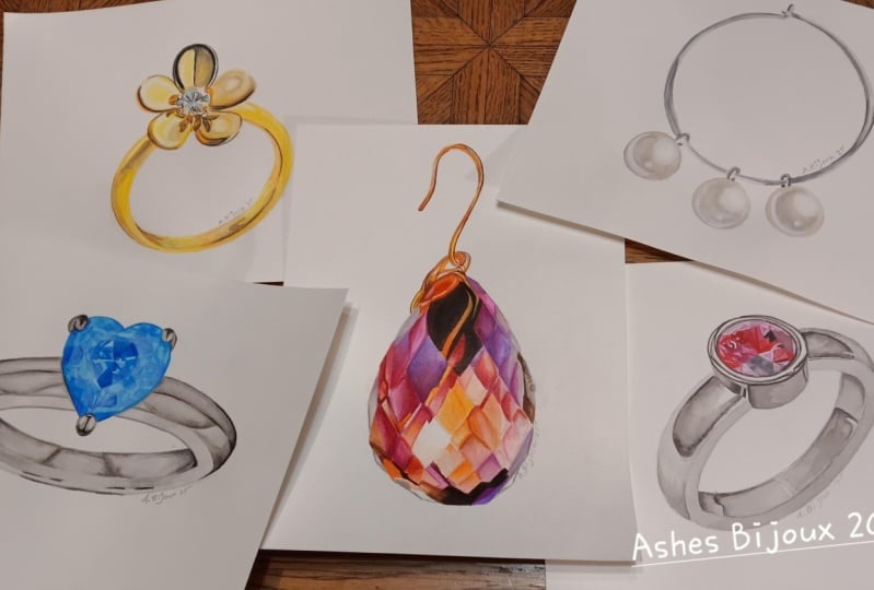
1. What You Need To Know: Hi, thank you so much
for joining this class. This is a jewelry
painting class. I have a couple of
illustrations for you where I'm going to cover everything
from how to paint gold, silver, different types
of gemstones and pearls. There's a lot to do and
learn and I hope you're just as stoic as I am because
I love painting jewelry. You don't know me yet,
my name is Sophia. I'm a watercolor artist and author based in Munich, Germany, and I specialize
in anything that is jewelry paintings, glass, crystals, anything
that is transparent, luminous and shiny, I am
completely obsessed with. When I put together this class, I wanted to include
a lot of variety, not just with the type of jewelry that we're
going to paint, but also with the media and the types of paper
that we're going to use. Some of the illustrations are on cold press
watercolor paper. And painted just
with watercolors, and then there's a
few where I paint on hot pressed watercolor paper and I'm also going to
incorporate colored pencils. You'll see the
difference and the type of effects that you
can create when you either use only watercolors or you combine them
with colored pencil. We're just going to go
over materials really quickly and then start
with the first painting.
2. Materials: Materials. Since we do have a bit of a mixed
media approach here, we have two different
types of paper, cold pressed and hot
pressed this time. Then your set of
watercolor paints and different sizes
of round brushes, and then also a set
of color pencils. Then your basic supplies
like masking fluid, white gouache, and
the charcoal paper to trace the outline onto
your watercolor paper. Paper towels, glass of
water, all of that. I'm listing everything for you, so you can just hit
pause and look at it, make sure you have
everything ready, and then we can start painting.
3. Golden Flower Ring Mixed Media: So before we begin painting, let's just have a look
at our materials again. Here's the finished
illustration that I already did as a testrun and then
I need my pencil, a couple of different
size brushes, watercolors, and the materials
for the colored pencils, the sharpener eraser, and then
here are my color pencils. I always match them to the
watercolors that I use. And before I start
mixing the colors, I just wet all of my paints so that it's easier to mix them. And we're going to start
with the first color, which is lemon yellow. I'm just mixing it up
again in my palette. All of the colors that I
use are Windsor and Newton, but you'll find the same colors by different brands as well. And this is cadmium yellow. Then some yellow ochre, which will be the main color
of this ring, actually. And then burnt sienna. We're also going to
need our dark brown. Mine is always Van **** brown. If you don't have that,
you can also use Sepia. And then you'll need some gray. I use neutral tint. You can also use Pains
gray if you have it. And then there are some
light blue reflections which you can use
Cerulm blue for. Here are all the colors again. You can hit pause and make
sure you have everything. And then we'll continue by tracing the outline
onto the paper. So I have my outline
printed out, and then below it, I have charcoal paper
shiny side down, and then I just trace it
with my mechanical pencil. I always take my time doing this because it's very hard to erase the lines of the charcoal paper from
the watercolor paper. It's not exactly the same
as a regular pencil. So I'm making sure
that everything is nice and straight
and I don't make any mistakes while tracing it. The main thing for
this golden ring is basically that to paint gold, you don't need any
golden pigment. So gold is always
a mix of yellow, yellow ochre, brown and black. And this ring is a very
simple and good way to show you how to
paint gold in general. Now I'm just rubbing out some of the lines to make
them less prominent because it's very
hard to rub them out once you've started
applying some paint over them. And since we're painting
with yellows and ochres, all of which are
very transparent, the pencil lines and the charcoal lines
tend to shine through. So I'm trying to
erase them as much as possible so that I don't see them when I've
started painting. First layer on dry paper, we're going to use lemon yellow. This is a very, very watery mix. And this is just the base color for the whole illustration. I'm painting this on dry paper
with my side four brush, and I'm going to apply it all over the whole illustration, except for the middle part, the center where
the diamond goes. So you can just do
the same thing, and I'll meet you
when we're both done. I'm almost done. I just need to add some details
for the middle part here. And then I'm going to
let everything dry completely before applying
the second layer. Now, everything has dried and I'm using my kneadable eraser to rub out some more of the pencil lines because I really don't want
them shining through. And then I'm going to
paint layer number two on the bottom part of
the ring with yellow ochre. So you can get your
yellow ochre ready. I'm still using my
size four brush. This is pure yellow
ochre on dry paper. And this will be the main
color for the golden ring. This mix is slightly
thicker than the very watery lemon yellow, but it's still
quite transparent. Here I'm just leaving
out that one highlight. And I'm making sure that my
edges are nice and clean. And then the inner
part of the ring is also going to get a coat
of the yellow ochre, except for that highlight
part in the middle as well. This is on dry paper, too. So a While the bottom part is drying, I'm going to get
started on the petals. And the first one, I'll be
painting wet in wet, actually, because if you look at
the reference photo, you can see that there are softer blurred lines between
the different colors. So in a second, I'm going to put down a layer of
water right here. Not too little, not too much. You just want an even shine on your paper, but no puddles. And then with the smaller brush, I'm using the size one brush, I think, and some
pure yellow ochre. We're going to start
painting there. And then some slightly more
concentrated yellow ochre goes in the middle here. There are some shadows,
some reflections, whatever is around the ring that reflects in it will also
be depicted on the paper. And here I'm just
smoothing out the edges. I don't want any hard
lines on this petal, so that's why I
painted wet and wet. And then I like to put down some paint, clean off my brush, dab it off on the paper
towel a little bit, and smooth out the water lines and the paint lines that I have. Here, too, I'm putting
down some clean water. The technique is the same
painting wet and wet. I always take my time
putting down the water, sometimes even more so than
with the actual paint. This is slightly more concentrated
yellow ochre as well. There's also this roundish
oval shape there. Cleaned off my brush, and now I'm smoothing out the lines a little bit because I want
soft blends everywhere. So because the reflections
on each petal are different, I'm going to use a different
method of painting. Here, I also put down
some yellow ochre, but on dry paper, and then
I cleaned off my brush, made sure it was clean, but
still damp and then used it to soften the edges
like I'm doing right now. And then the top petal here, the yellow ochre goes on the
dry paper because I have a sharp edge where it
meets the black part. The black is also a reflection. You'll find that both gold and silver will always have
black reflections in them. It's just part of how the metal looks when
it's being photographed. And here I'm just
painting around that highlight on dry
paper, like I said, And now I'm going to add
some more yellow ochre on dry paper on the outside
edges of these petals. Okay, so this is
pretty much done. And up next, we're going to
use some cadmium yellow. Also for the center part, if you look at the reference photo, you'll see some deeper
yellow reflections around the diamond. And that's what we're going
to get started with now. So use some slightly more
concentrated cadmium yellow, also with a smaller brush
and on dry paper as well, and I'm just going
to paint them in. So now and again,
while I'm painting, I like to use my
eradicator brush to soften some hard lines that I get while I'm painting
like I'm doing here. And then I also like
to use it to clean up the outside edges of
illustrations. This is optional. If you don't have a stiff brush like this, you don't
have to do it. And you also don't have
to meticulously clean up your outside edges and
lines like I'm doing here. It's just something that I
personally prefer to do. I find that the eradicator
brush works really well for softening
up these hard lines. And it's just better
to do it now and again while you're
still painting instead of at the very end when there's much more
to clean up and it's eventually harder to do. But like I said,
you can skip it. This is this is optional. And And now I'm just finishing up the yellow
parts for the middle here. Although this is some
more yellow ochre, actually, that I
have on my brush. And then around the diamond, it just needs a bit
more cadmium yellow. And then I'm going to continue
with the petals again, painting wet and wet. So this is my size
four brush again. The previous layer
is completely dried, so I can rewet it with
some clean water. And then using the dark brown van **** brown
or like I said, if you have CPI,
that's also fine. I'm going to deepen the shadows and get some more
reflections onto the petal. This is a smaller brush, and this is Van **** brown. I'm going over the
shapes more or less that I've previously
painted with the yellow ochre. And I'm cleaning off my brush and softening the
edges a little bit, because I still don't
want any hard lines in this petal that hasn't changed. It's looking weird right now. It doesn't look like
gold at all yet, but towards the end, it tends to come
together quite quickly. So have some faith. Now I'm also wetting this part because I need
to darken it quite a bit, and I want to be able to
take my time with it, so I'm putting down some water, so I don't have to rush
and I don't have to worry about water lines forming. This is my gray, neutral tint. Like I said, if you
have pains gray, that's also completely
fine. You can use that. And this is like a semi transparent
concentration of gray. If you look at the
reference photo, you'll see that
there's a gradient, so I'm not going full concentration
with the pigment yet. I am adding more paint
on the outside now, and then I'll blend it towards
the center of the petal. I'm cleaning off my brush. And it's just slightly damp, and I'm blending the dark
gray with the semi dark gray. And then it continues
over to this side. Now, I'm going to let that dry. It doesn't look perfect
yet, but bear in mind, we are going to use
colored pencils as well. And I find that that's a
very neat way to really get the smoothest gradients and transitions when you combine watercolor with colored pencils. Here I'm again using
my gray on dry paper. And the same thing down here. And over here as well, neutral tint on dry paper. And you can already see with
these dark spots and shapes, it already looks a
bit more like metal. And so now I'm going to leave the flower
part alone and I'm going to come back to the bottom
part of the ring again. This is some more
yellow ochre on my brush and I'm painting in a little
detail on dry paper. The method for this illustration or any other jewelry
illustration, basically, how I
do it is firstly, I try to identify the colors. So when it's gold, I try to
really look at it and see, Okay, where is it yellow? Where is it brown and where
is it gray and black? And then, secondly, I
look at it and I try to find where do I need hard paint lines and where
do I need soft lines? And that's a deciding factor on painting wet and
wet or wet and dry. So here at the
bottom, for example, there's this middle
section where I have soft lines, paint lines. If you look at the reference
photo, it's quite obvious. So that means I
paint wet and wet. So I just put down some
clean water again, and this is yellow ochre. And I'm just adding a bit
more in the middle there, and then cleaning off my brush, dabbing it off on
the paper towel, and then softening the
paint lines again. And then while the
color is still wet, I'm dropping in some
transparent gray. This is quite diluted gray. I don't want it to be too dark. And then also some gray over here after the yellow
ochre has dried. I'm continuing with
the petals again. So this is more
concentrated gray, and I'm painting
on dry paper now. So I always use the neutral
tint as black as well. Looking at the reference photo, you'll see that these
details and the big one, especially in the middle part of the flower is actually black. But I find that when I use, super concentrated neutral tint, it looks basically
the same as black, and it saves me some
space in my palette. I don't need an extra color. Then using the colored
pencils later on, we're going to use
black and go over it, so it will look pitch black, lamp black or whatever
you want to use. Now I have some burnt
sienna, fairly diluted. It's not very concentrated
and I'm painting over the cadmium yellow sections
on dry paper as well. You can also go ahead and
fill these in on your own and then come back
to the tutorial and see how I did it
and then compare. That's maybe also a
good way of learning. I'm still using the
size one brush here. I actually didn't need
to use a smaller one. I did include in
the material list, I said, double zero, which is basically a
super fine detail brush. I always say use the tools
and brushes that you need. It always depends on
your skill level. Some more skilled artists
will use a bigger brush for super fine details because they have
more brush control, but it also very much depends on the type of
brush that you're using. There are size ten
brushes that come to a super fine point and you can actually use it as a
detailed brush as well. Then there are
other brushes which are a size two or a size zero, but they don't come
to a very fine tip, so they're not very suitable
for small detailed work. So always use the brush that you need for whatever
it is you're painting, even if it's different from the recommendation that
the teacher gives you. The reflections on the
diamond are finished, and then I'm just
continuing with the Bnciena on the outside
parts of the petals. Again, this is on dry paper. A So there are just a few more lines on dry paper as well on the
bottom part of the ring. And then another one over here. This is yellow ochre again. Just one smooth line. And then we're going
to continue with detailed work on the
petals of the flower. I'm just cleaning
up my lines again. Maybe I'm being just
overly critical with my own paintings. All right. So this is very
concentrated neutral tint, and this is where
I use it as black. And I'm just following the lines of these little
reflections here. I'm just looking at the
reference photo again and again and trying to
see what goes where. And then I just painted
in on dry paper. It's very straightforward. It
doesn't need special skill. If you manage to stay
inside the lines, which can be a challenge
even as an adult. But if you manage to do
that, you're totally fine for these types
of illustrations. So now the lines are actually getting smaller and smaller. This is where I probably should
have downsized my brush. I don't know why I didn't. So if you have a smaller brush, use the smallest one that you have for these intricate lines. And if you're not
confident that you can paint the smallest lines
in with your brush, you can also and draw them in with colored
paint slows later on. Also an option. So
it's quite flexible. I'm just going to go around
the center part with these fine lines on dry paper. It's going to take some
minutes, not too long, though, but you can just paint after me, and I'll be back with
more instructions when I'm done with this section. So now I'm going to get started
on painting the diamond. So the diamond is
basically colorless, but it reflects a lot
of colors that are in its surrounding
when it's being photographed or just
looked at, actually. So diamonds are usually
just a mix of a bunch of irregular shapes and
forms in gray black. And then there's the occasional
color in there as well. And we're going to
use a light blue, seruleum blue or manganese
blue, whatever you have. If you don't have a light
blue, you can also use, I guess, a light
green or something. It really doesn't
matter. The point is just that there is always
a bit of color in there. Now I have transparent
neutral tint on my brush and I'm going to where I am painting in just
a few of those gray shapes. It's mostly triangles and a few wrecked angles and
then some connecting lines. I guess you can do this without a reference photo, actually. Because there's no right or
wrong way of these shapes as long as you have some
triangles that suggest the cut of the diamond,
you're good to go. And now with the light blue, I'm just going to add
a few tiny highlights. And then after that, with more
concentrated neutral tint, I'm going to go over
the dark reflections that I just painted. So even though these
reflections are very small, they still have dimension in them and they
still have depth. And creating depth with transparent objects is usually done best by layering color. So there's more
transparent color, and then there's richer
color on top of it, and it always suggests that
there's something else underneath the surface
at which you're looking. So yeah, adding darker color on top of the light gray just
creates that sense of depth. So now I'm looking at
the reference photo, and I'm thinking that all of the hues and tones are
more or less in place, and it's a good time to
switch to color pencil. When I do combine watercolor
with colored pencils, I use the color pencil as a means to complement the watercolor that's
already on the paper. And it's just such
an easy way to create soft paints
transitions, smooth edges. It's just much easier than painting another two layers at least with watercolor to
achieve these results. It's much more
beginner friendly. It's quicker, and it's just the two media
go together so well. So now, this is black. And I use Faba Castel
for colored pencils. I guess it's the same with more or less all the brands
that do color pencils. But with the ones I use, the color names are the same ones as the
watercolors by Windsor Newton. So I'll find a cadmium yellow. I'll find a yellow ochre. I'll find a Paine's gray
in my color pencils. So I match them to the watercolors that
I've previously used. So here I'm using black and then a light gray to just go over the reflections that we just painted
with watercolor, intensifying them a little bit, adding a few more details, not next to them,
but on top of them. And I always make sure
that my pencils are very sharpened and I have an electric sharpener to do that. It's just much easier
than using a regular one. So I recommend that if you use or if you plan to use
color pencil more often. So here we can just
add just a few more, tiny lines, just making those reflections a
bit more detailed. Then continuing with the black on the top petal in a second. It's really just solid
black on the outside. And then it does soften
towards the inside, and I'm going to use a paper
smudger in a second to blend the colors and soften them towards the
center of the petal. Here I'm applying quite
a bit of pressure. I really want this solid black. So this is the small paper
smudger that I have. I also have a bigger one, but the smaller one is better. And here I'm just going over the entire bit to really
smooth everything out. H and this is how I usually
layer color pencil. I'll paint a little bit on, then I'll smudge it
with the paper smudger. If there's excess
pigment on the paper, I use a dry brush
to just brush it off and then add another
layer with the same color. I never properly learned
how to use color pencils, so this is just how I do it. I don't know if
there's a proper way or a way of doing it
completely different. I'm not sure. This is a I think terra cotta is
the name of that color. And here's a bigger smudger. Here I'm just darkening
the whole petal using almost no pressure
at all and just running the pencil across the section here and then always blending
it in between layers, and that makes for a very uniform and smooth
layer of color. So now I'm just
going to go around the flower using the light gray, the black, the medium
brown and lemon yellow. I'm going to apply strong
pressure for the black and just light in medium
pressure for the lighter colors. And then, like I said, paint in circular motions
for a little bit, then smudge the color into the paper and then
continue painting. So I'm going to do
this for a while, and you can just follow me
and I'll see you in a bit. So now we're almost done
with this illustration. We just need to work on the
bottom part a little bit. Also because all the colors need to match across a
whole illustration. So the brown of the flower petals needs to match the brown that's on
the lower part, of course. So otherwise it would
look off and incomplete. So I'm just adding a
bit more down here, and I'm using the bigger
paper smudger because the area is just larger
and it's easier and less time consuming. A I'm adding a bit more yellow
to match the top part of the ring and also because it's looking a bit flat
and bland down there. So just a faint layer of yellow and then some
more of a medium brown. And then just like
I did on the top, I'm just going to go
back and forth with the different colors and you can just match
what I'm doing. Yes so I think I'm almost done. I'm looking at the
reference photo again, trying to find areas that
I still need to improve. I have some pencil dust around the illustration that I'm just picking up
with the eraser. And then using the white, I'm going over the white highlights just
to bring them out a little bit and to perfect the transitions
between the colors. So I'm painting the white into the color that's next to
the highlight as well, just to make it a bit smoother. And then it's really just taking a very close look at
the reference photo again and finding the last little details
that I can still add or areas like down here where I can still improve
the color a little bit. Lastly, I'm just going
to add a bit more of the bright yellow on the
petals here on the top, because it does look
very faint on my paper, and I want it to be a
bit more yellowish. And that was the last step
for the golden flower ring. I hope you had fun. I hope
you enjoyed painting it. I hope you learned how to paint gold if you didn't
know how to before. And if you feel like it, do take a quick photo of your artwork and post
it on the platform. I would love to see
how you got out.
4. Pearl Earring Watercolour: So let's mix our colors. For this illustration, the
palette is pretty simple. We just have a couple of colors. Here I have neutral tint
in a pretty diluted mix. So this is like a medium gray, and we're going to paint
the silver in just grays. So we have a medium gray, and then a darker one. This is also neutral tint. I also use neutral tint as black whenever I need it at
its full concentration. So the silver part
will be medium gray, very dark gray, and
then white highlights. And this is yellow ochre. This is for the pearls. They do have even
though they are white, they do reflect some
colors in them, mostly beige in my
photograph that I have here, and this is Van **** brown, which I didn't actually really end up using and
some white gouache. I found this new white
gouache, calligraphy gouache, which I think is a bit whiter than the basic one
that I used to have. Okay, let's start
painting in the pearls. I'm going to show you
two ways to do this. The first one, I'm going
to paint wet in wet. And then the other two, I'm going to paint wet on dry. So you can see that you can use both techniques
to paint them, and you can pick whichever one suits your preferences
and skills better. So now I'm just
wetting it. I had a bit much water
on my brush here, so I'm just picking it up again, making sure my paper
isn't too wet. And now I'm coming in with some yellow ochre
for the first layer. You can see that
the color is fairly concentrated because I already
have water on my paper. I have less water
in my color mix. When I paint the other
pearls on dry paper, I'm going to dilute my
yellow ochre a bit more, otherwise, it would be too dark. So here I'm just making sure that everything
is nice and even. And then I have a paper towel. I'm sorry, you can't
see. I'm going to show you from the
side in a little bit. I have a paper towel and I'm just creating
this highlight by just blotting it on the paper and sopping up
the color that's there. And you can see on the
reference photo that there is each pearl has a pretty
big white highlight there. I thought that that would be the best way to do it
because you can pick up you can lift off a lot of color from your paper while the
pigment is still wet. And then I have some neutral tint here on
my small detail brush. And now I'm using the I think
this is a size one or size two brush that's
just clean and damp, and I picked up some
of the pigment. And now in this half moon shape, I'm painting some more of the
very diluted neutral tint. And then I'm lifting
some off again from the side because the
side has reflective light. So it's a bit lighter than the center of this round shape. And whenever you paint
something round, you always want to I mean, you generally want to paint
in the direction or form. So in this case, we're painting
circles in round shapes. And now here, I'm painting on dry paper while the first layer of the first pearl is drying. So again, this is yellow ochre, and then in a second, I'm going to have my
paper towel ready. You can also probably use like
a tip, like a cotton swab. That would also
work really well, especially for the highlight and the size that we need here. Am I here, I'm just
blotting a little bit. I need a bit more. And then again with
a smaller brush and some neutral tint, I'll paint another half
moon shaped stroke here, like a sea curve, and you can see how it easily
blends into the yellow ochre. Then with a slightly bigger
brush that's clean and damp, I'm lifting some of the
gray off because I don't want it to spread all the way
to the edge of the pearl. Then here I have some
more of the gray. I'm going to do exactly
the same thing for pearl number three in a second. Then I have a side view there
and you'll be able to see better how I use the paper towel to lift
off that highlight. Okay. If you've never
painted pearls before, this was actually also the
first time that I painted one. That earring that I have is really a good exercise
because you can paint three of them in one go and practice while creating a neat
little illustration. So I thought it would
be a good example. Right. So now I have
the paper towel here and I'm just
blotting it off like this and then the color lifts
and I get my highlight. H. I thought painting wet on
dry works really well here. If you printed out the
outline a lot bigger, which you can, of
course, you can paint this as big or
small as you want. Wet on Wet is maybe a better way to go
because it buys you more time to get that
first layer down. But when the pearls
are this small, there's no real reason why you'd have to
paint wet on wet. So now I'm just lifting
off some of the color there around the edges because I don't want the neutral tint to spread, like I said, and then when that's done, I'm already using white gouache to bring out the highlights even more and get that nice shiny
look that the pearls have. Usually, I only use whitewash at the very end to create
highlights in my illustrations. But in this case, I
use it almost from the very beginning
interchangeably with the other watercolors. So I painted this on
dry paper right now, and now I'm using the
small brush to just smooth out the edges a little bit because I do
want smooth edges. There's nothing on these pearls that would break the
light in any way. So we have smooth transitions
from one color to the next. And then, again, this is white
quash on my little brush. And I'm painting a very
fine sea curve right there. I'm not going all the way. I am going all the
way to the edge. No, not quite. Not quite going
all the way to the edge. So I think you can
already see how the circle is taking shape and becoming a bit more
three dimensional. Here I'm just smoothing
it out again. I did speed this process up for the remaining two pearls
because you just saw me do one, and I'm going to
do the other ones in exactly the same manner. So whiteqh in the middle. Then clean off your brush, smooth out the edges a little bit like I'm doing right here, and then add another scurve close to the edge of the pearl. So I'll meet you with
more explanations once I'm done with all three
pearls in this manner. Thing with white quash
is that it often needs a couple layers until you get that
whiteness that you want. Sometimes it can look really
chalky or gray almost, although the calligraphy quash
that I found in the shop the other day is a bit whiter
than the one I had before. I think it is. So we're going
to do some layering here and build up the whiteness
and the colors as we go. So I'm just adding another layer here and then smoothing it out
so that I have soft edges. I'm also adding some more here on this more
central highlight, and it's just getting
wider and wider, as you can see, smoothing
out the edges again. I find the squash
very easy to handle almost easier than watercolors. It's like you can work
with it when it's on the paper, you can
push it around. You can soften the edges, but it's still super
easy to control. I'm just making sure that I like the edges that I have here. I wanted to kind of,
like, blur out in a way. So I'm adding another layer here and then on the
third one, as well. A we've already adjusted the highlights, we need to adjust our
other colors as well. So this is neutral tint
again on my brush, and again, I'm painting a
little sea curve there. Oh, I'm sorry about the light. I don't know what happened
there with my camera. I didn't change the light or anything. I just moved my hand. I don't know why I did
that. And then I clean off my brush and I soften
the edges like I did before. And then the same thing
for the other ones. It's like I really
think the best way to practice and to learn is just do the same thing over and over a couple of times. So having three
identical pearls in one illustration is really
excellent practice. And then maybe if you're not
happy with your first try, you can do it again, then you'll already have
painted a pearl six times. Cleaned off my brush
again, soften the edges. And then, again, here, little sea curve on dry paper. If you've painted
something white before, but anything that's white
actually has a lot of color in it because it reflects everything
that's surrounding it. So these pearls are a bit beige because I was taking the reference photo myself because they're
actually earrings that I have. So I was bending over
them, taking the photo, and then I think the
yellow ochre color is just like my skin tone
that reflected in them. But if you had something
red around it, the pearls would have a
reddish tint in them. So now I'm just going over
them again with white. This is just a layering
process and you can do this as often as you want until you're happy with the shape and the overall
intensity of the colors. Again, here I have a bit of
white wash on dry paper. It's just the same
process over again. Well I'm adding another
highlight to them. It's just a little dot there
in the gray sea curve. I just cleaned off
my brush and now. I do want this highlight
to remain fairly small, so I'm trying not to
make it bigger and bigger and bigger as I
try to soften the edges. So I'm doing this
quite carefully. I'm just blending
it a little bit. And then this one I'm
placing here just for some diversity, I suppose. O. And this one
goes right there. It's a tiny little sea curve. You just keep adjusting. At some point you also need to stop and stop fidgeting with it. Otherwise, you can be, like, stuck in this stage for
another 30 minutes. Oh Okay, so I think I'm
happy with the pearls, and now I'm moving on to the silver hoop and
those little hooks. So now I have not very
concentrated neutral tint. It's fairly diluted because this is going to
be our mid tone. So then this is the mid tone, and then we add very
dark neutral tint and then white guash
for highlights. So here, I'm really
just painting them in. I am looking at my reference
photo carefully to figure out what the shapes are
and where the color goes. This is on dry paper. I'm just looking at
the reference photo. There's a lot of reflections
and stuff going on, so I was thinking, Do
I simplify it somehow? I'm just painting this hook in. And then the last one as well. There's an extra little
bit here at the top. I'm also painting in separately. And then it's just
even coverage with neutral tint for the
whole hook Hop, not hook. Sorry. A It's not a perfect circle
because the earrings actually aren't a perfect
circle. They're a bit uneven. And I actually liked it. I didn't want to correct it for the sake of this
painting because I thought it makes it look a bit more livelie
and interesting. And that's just how they are. So that's how we're
painting them. I'm not painting over
the little hooks. I'm making sure that I'm
painting just in between them. Slur. And then I have more concentrated
neutral tint on my brashnal and we're going
to do the darkest areas. And here I'm just trying
to not mess it up. I'm trying to create
contrast and shadow. But it's such tiny areas. It's easy to make it look
just confusing for the eye. I'm holding my brush at almost a 90 degree angle because I want to paint
with just the tip. So I'm sorry that I'm blocking the view here a little bit. But you see in a second
what I painted in. Because I don't want to paint outside the lines of the hoop. So I'm just going carefully and slowly and painting with, like, the very tip of your brush, it just gives you more control. And you can see that. Also, please keep looking at the reference
photo for yourself. And if you do, you can see
that the darkest colors, they're not evenly on one side. They're interrupted
a little bit. So it's not like one side
of the hoop is dark, and then the other
one is completely white because that's how
the light shines on it. It's a bit, it's a
bit interrupted. I'm adding some shadow
on the left side of that little metal thingy there, and then moving
over to this side. I'm painting fairly slowly here. I was thinking about
speeding it up a bit, but it's not going
to take too long. I just like to take my times when details or areas
are quite small, because then yeah, I have
more control over my brush. And there's a lesser chance of messing it up a little bit, just for the sake of being
done 2 minutes earlier. So it's already starting to take some shape
and form, I think. Now I'm coming down here
to the little hoops again. And I'm painting
the dark gray on the inside of this little hoop. Here, I'm just looking
at the reference photo. Whenever you see me, pause or hesitate for a
couple of seconds, I'm looking at the photo,
trying to get it right. And here the shadows also on the left side of
this little hoop. And it's going to get a
highlight in the middle. Whenever you add your
first round of contrast, be that with highlights
or low lights, you can really see how the
illustration is starting to look realistic and
much more three D. So it's already coming
out quite nicely. I'm quite happy with this. Here, I'm just going
over those segments, again, darkening
it a little bit. This is super detailed work here right now
because I'm adding shadows on either side
of the metal ring. I'm really doing
this very carefully. And this is, again, the same more concentrated
neutral tint. And I'm just going
to add shadows to the rest of the
silver parts here. Also painting on dry paper. And you can just watch me paint and then maybe hit
pause and paint after me. It's the same technique
that we did just now, so I'm just going to paint around the whole earring
and meet you when I'm done. So the mid tones are in, the darkest tones
are in as well. And now we just need some more highlights
for the silver part. I'm already really
happy with it. I think it's coming
out really nicely. So now I have some
more whitewash here, and I'm adding highlights
here and there on dry paper. There's no magic to
it. We don't need to soften the highlights. We don't need to lift
anything this time. We're just adding some
white paint here. So I'm just going to go around
the whole coop like this. And usually highlights have the best effect when
they create contrast. So it's going to
look it's going to pop more when you put
a white highlight next to one of the darkest areas in your painting
compared to when you have a highlight that like swimming a little
bit in your midtones, there's less contrast,
and then it pops less. So I always try, even though when it's not exactly like that in
my reference photo, I always try to put the
very lightest areas next to the very darkest
ones because it's that contrast that makes
it look more realistic. So that's what I'm doing here. So I'm almost done with this. I'm just going to make, like, one or two final adjustments. Like I said, sometimes
you need to go over your ahiget to make it look
like super, super white. So I'm just looking now
and I'm seeing, okay. Do I need to layer it a
little bit here and there, just to make it even brighter. And that's what I'm doing now. Other than that, the
illustration is finished. So I also hope you
finished yours, and as always, I would really actually really like
to see your paintings. So if you can take a quick snap and maybe
post them here on the platform or share them on social media so that I
can see what you made. And yeah, thank you for joining, and I hope to see you next time.
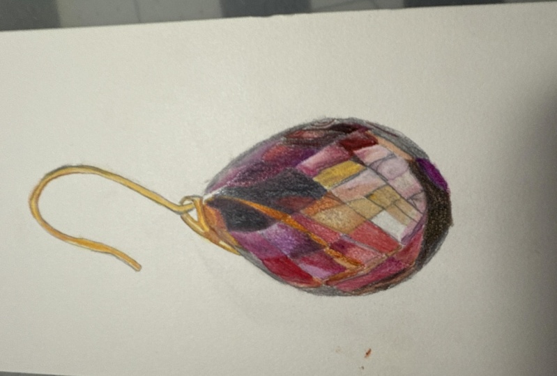
5. Brown Topaz Earring Part1 : So we're going to start
by mixing our colors. If you have a larger palette, use that one because
we're mixing quite a lot of colors
for this project. I'm starting with some
pure dioxsen violet here. And then up next is
some quin violet because I wanted to have
a cool and a warm violet. This is Venetian red. It's a red that is almost
like a rust color, somewhere between red and brown. And then similar to that, I'm going to use some
light red as well. The two are very similar
when they're wet, but they do dry differently, so I thought best to have both. This is winds are orange. And this is a mix of yellow
ochre and some white gouache. And then I have a
mix of yellow ochre, white gouache, and a
tiny bit of opera rose. And the next mix is going
to be Venetian red again, mixed with some van **** brown. And then again, Venetian
red with quin violet. Then I have some
pure Vandyke brown. This is neutral tint. If you don't have
that, you can use Payne's gray as
well as your gray. Then up next is burnt sienna. I'm going to label
everything in a second, and then you can hit pause
and make your own mixes. So don't stress. Then
some pure yellow ochre. And last but not least
some lemon yellow. Alright, so you
can hit pause now and make all of your mixes, get everything ready, and
then we'll start painting. Alright, so I have
my outline ready, and I'm just rubbing out some of the pencil lines that are a bit too prominent here
on the upper part. This is the metal hook,
and I'm going to paint with yellows and burnt sienna, and I don't want the pencil
lines to shine through. So I'm just trying to
rub it out nicely. And the first layer
for the metal part is going to be very
transparent, lemon yellow. So you can see it's just barely visible here on the screen. This is really
super transparent. And I'm going to paint the
whole metal part on dry paper. I hope you're not
intimidated that this is a two part tutorial, each with over an hour
of video material. It's not that this earring is more difficult to paint
than the other ones. It's just more time consuming. So the topaz is I don't know
how many layers I painted. Each little segment is at
least three or four layers, and then watercolor
and color pencil. So it's not the most difficult. It's just the most
time consuming of all of the jewelry tutorials
here in this bundle. So I hope you're not
discouraged to try it. You also don't have to
paint it all in one go. But yeah, it's definitely
not an advanced tutorial. So you can really see just how transparent the
yellow mix here is, and I'm taking my time
painting it all in. I am going to speed some
of the painting process up a little bit just because
I'm very slow at painting. And I didn't want to make you sit through my very slow painting process and
have to watch it all. So some of it is, I think, at 1.5 speed, but it's still slow enough so
that you can easily follow. This is burnt sienna
on my brush right now. I'm using the size one brush. I'm going to use it for most
of the painting, actually. And the lemon yellow
has dried already. And I'm just applying the burnt
sienna here on dry paper. And towards the top
where the metal bends, I'm just blending it out
and adding some more here, I want a completely
smooth surface across all of the metal. And because there's
a reflection of light hitting the top
part of the hook, the burnt sienna doesn't cover the whole
thing when it bends. And then towards the bottom, the metal is more in the shade, so it will be darker there, and I'm covering it
all with burnt sienna. Now, with some slightly more
concentrated burn Sienna, I'm going over it once more, covering only the areas where I find that they're the darkest
in the reference photo. So the bottom part of the hook here and then also the
bottom section here. Uh, uh, uh, uh, uh, uh, uh, uh, uh, uh, and now I have some very
diluted neutral tint on my brush because I can see in the reference
photo that there's a slightly grayish hue to the gold on the top where
there's a reflective light. So I'm just adding that in. Some more burnt sienna
at the top here. I'm just mixing up some more
colours and then going to continue to paint this
lower part off the hook. I'm not sure if it
has its own name. This is burned Sienna
as well on dry paper. Oh, the Chinese neighbor
downstairs is being quite loud. I hope you can't hear. So what I'm more
or less doing for the first two layers
or maybe even three of an illustration like
this is I paint very transparently with
very diluted colors because I'm looking
at this earring, and I can just see, like, 1 million different
sections and segments, and they're all different reflections and
different colors, and it's very overwhelming and not easy to get a
sense of orientation. So I put down the first
colors that I see, and it doesn't look
very sophisticated yet. It doesn't look very much like
gold at all at the moment. But that's okay. So the first
step to tackle a jewelry, a piece of jewelry
like that for me is to just identify the base
colors and then put them in. But transparently
enough so that I can still paint over them,
I can still refine it. I can still add layers. But I know which
color goes where, and that helps me
to then be able to paint it calmly step by step. So now I'm just looking at
the reference photo again and I'm going to continue with some more diluted neutral tint. And like I just explained, I'm just putting it down
where I see it. There's no special
technique that's necessary. It's just wet on dry. But being careful that my colors aren't too concentrated
at this step. Some more gray over here. Now, the lower part of this metal hook is pretty
much completely in the shade. So I have some Van **** brown on my brush because it's going
to be quite dark down there, so I'm putting that in. Okay, we can get started on the actual gemstone with
some winsor orange. This is like a medium
concentration. It's not too diluted because this top segment
is actually going to be mostly black almost with just a few areas where the
orange shines through. But I am painting all of it in orange and then
covering it mostly with some super concentrated neutral tint towards the end. And I'm painting on
dry paper as well. There is not too much wet on
wet for this illustration. So I don't know if I
need to mention it every time that I'm
painting on dry paper. So I'm looking at
the reference photo, and I feel like I'm missing
a pencil line here. So I'm just drawing that
in so that you can see, and then I'll continue
with the Windsor Orange. H. And then there's a tiny little spot of orange peeking through down
here in the middle. And then the next
color I'm going to use is the Venetian red
and Quinn Violet mix. As you can see, also
not too transparent because the colors are pretty intense throughout
this whole gemstone. I just cleaned off my
brush here and I'm smoothing it out towards
the edge of the stone. The edges are going to be slightly lighter than
the middle part because of the reflective light that's bouncing off the edges of well, any round object, basically. So the edges are usually
slightly lighter. Sometimes they have
a gray hue to them. So I'm painting the color on this side of the segment and
then cleaning off my brush, dabbing it off on
the paper towel, and then smoothing out the paint edges towards the edge
of the illustration. Just like so you can see how I'm just feathering
it out a little bit, and then I have a
soft gradient there. The segment is just too
small to paint wet on wet. I mean, I guess you can, but it's just so small that
it's easier to paint on dry paper and then just smooth out the
color a little bit. Now I have very diluted
neutral tint on my brush, and I'm painting this small
little section right here. The next color that I'm going to use is some quinn violet. And you can see how my gradients
are still pretty messy. Like I said, this first
layer is merely there to just give us a sense of
what color is actually wear. But we're going to go
over everything at least twice and then we're
going to use colored pencils, it's going to look much
nicer and much more refined as we continue painting. So if your squares and segments look as messy as
mine, don't worry about it. Don't worry about painting
perfectly smooth. It's fine just the way it is. Next, the Venetian red and
quin violet mix again. Make sure every
segment is dry before you continue painting on
the one right next to it, because we want them
to be quite separate. The colors are not supposed
to bleed into each other. So just make sure
everything is dry. But since we're
painting on dry paper, the paint dries really quickly. Next segment is slightly bigger, so I'm actually
painting wet and wet. I'm putting down
some clean water. Not too much and not too little. It's always great advice. Just enough water so that
everything is nice and glossy, the surface, but no
puddles of water. This is light red. Quite diluted, not too strong. And painting wet and wet
just gives me more time to make sure that my edges are nice and clean and
I don't have to worry about hard paint lines in
the middle of the segment. So I'm going to let this dry and move over to the other side of the stone with some
dioxys and violet. This is on dry paper again. And then I'm going to
paint wet and wet again, although I probably could
have done this on dry paper. If you're quick enough
with your brush, you can paint this on dry paper. This is going to be
light red again as well. And now I was just looking
at the reference photo and realized just how much
darker I need this area to be. So in a second, I'm going to go in with another
load of paint this time, a bit more concentrated
while it's still wet. So I'm just charging
this area, as they say. And then when this area
is just dry enough, I'm coming in next to it with some quin
violet on dry paper. A at the top here is burn Siena,
I think this is. It's hard for me to
tell, to be honest, because I'm doing this
voice over, like, at least three weeks after I actually painted
the illustration, and I made so many
color mixes for it, and they're quite similar. So it's hard for me to tell, but this is, this
is Bern Sienna. And then right next to it
goes diluted neutral tint. Now I'm going to continue
with the yellow ochre, white quash, and Opera rose mix. The white quash makes
it slightly opaque, but not a lot, so it still counts as a
transparent color, I think. And now I've actually mixed some light red with a
tiny bit of white quash, and I'm putting this down here. I'm going to show
you in a second. Just add that to
our color chart. This is light red with
a bit of white wash. Don't forget to label your
swatches. Always important. I don't know how many
times I've not labeled my swatches and then completely forgot what color mix I made. O. Up next, I'm going to use some more
concentrated burnt sienna for this very narrow
segment over here. And then after that, again, I'm using the mix that we just made with light red
and white quash. I'm just painting
this one down here first so that the other one
can dry in the meantime. So this is the new mix. And then next I'm using the yellow ochre
and white quash mix for this little area over here. Then on wet paper, right next to it, over here, the Venetian red and
quin violet mix, I accidentally deleted the part where
I put down the water. I'm sorry about that.
But as you can see, it's obviously on wet paper. Again, if you're
fast enough with your brush and your paint, you can also do this
on dry paper, I guess. I just decided to wet it first. And now I'm going to use the Venetian red and
Van **** brown mix. Sorry, my camera I had
a little hiccup here. Sometimes I lose a minute or two of material when the
camera switches from one memory card to the next
because then the recording stops and I don't constantly look at the little
screen of the camera. And then I just need
to press play again. It doesn't do that
automatically, unfortunately. I'm going to add yet another
color to our color mix. Alizarin crimson. This is pure Alizarin
crimson. No mix. But I feel like I need it and I somehow didn't
think of it before. So this is lazarin
crimson over here. As you can see, also
fairly diluted. It's just about the
same concentration as all the other mixes. And right next to it, some
diluted neutral tint. I Up next is the Venetian red
and white quash mix for this narrow
segment right here. And next, the Venetian red
and Van **** brown mix. Next to it goes some
pure Venetian red. Now the next segment right
below it has two colors. The top part is pure
Van **** brown, and then the bottom part
will be Venetian red. So this is the
pure Vandyk brown. And then I'm adding
Venetian red, and the two are just
blending into one another. And then there's a slight
gradient of color. We're going to
intensify that and bring it out in
the coming layers. I'm adding a bit more
brown right away. And I'm continuing
to paint the edges of the stone in
very diluted gray. Like I said, this is because
of the reflective light. It just takes some color away. And I was looking at
the reference photo and realized I'm missing
another pencil line here, and I'm just drawing that in. Then I'm continuing to paint
with pure azar and crimson. Next, I have some
pure Bern sienna. This is burn sienna down here. And this narrow segment again
is diluted neutral tint. I always say diluted
neutral tint, like all of these colors
are very diluted. This is neutral tint. Next is the slightly larger segment
on the bottom here, because it's a bit bigger, I'm putting down
some clean water first and I'm going
to paint in wet and wet and I'm painting the left
side with Windsor orange. Then from the middle onto the right side will
be burnt sienna. This is just Windsor orange. And here's some more
concentrated burnt sienna, and it's just going
to blend into the orange and then get
darker towards the right. And like I said earlier, really don't worry about things looking a bit
messy right now. Mine does as well. It's just the hot press paper
tends to do that to you. But we're going to
add more layers, and then we're going
to add colored pencils which will smooth
everything out perfectly. So don't worry about
perfectionism. I'm just trying to blend the
colors in a bit better here, and then I'm just
going to leave it. Next to it goes the Venetian
red and white gouache mix. How next to the
little orange square is the yellow ochre
and white quash mix. I'm going to paint the next
segment in wet and wet. I don't know why I did that, to be honest. It's
completely unnecessary. So feel free to paint
that on dry paper. It's the Venetian red
and white quash mix. Even more diluted because
I'm painting on wet paper. Like I said, I don't
know why I did that. Looks like I started to
have a thought there, and then just stopped
or something. So yeah, feel free to
paint this on dry paper. It doesn't matter at all. And then when this is dried a little bit,
right next to it, I'll paint the yellow ochre
and white quash mix again. Um, So this is yellow
ochre and white quash. And then the same goes onto
this narrow little area here. And I'm continuing with the Venetian red and
white quash mix. And the next segment, I'm
going to paint wet and wet because I do want a
gradient there already, even though it's just
the first layer. So I'm adding some water, and then the Venetian
red and white quash mix. I'm starting on the left side, making sure that my edges
are nice and crisp, and then I'm cleaning
off my brush a little bit and just smoothing the color out towards the
middle, just like so. And then I'm adding a bit
more because my paper is wet, so the color will
dry even lighter, so I need a bit more
pigment on there. And then I'm just cleaning
it up a little bit. When that's dry
enough, the same mix, so that's Venetian
red and white quash goes onto the segment right
next to it on dry paper. It's funny that the mix the
color mix that I didn't even think of in the beginning is the one
I end up using the most. And then I'm just
dropping in a bit more. Now I'm looking at the reference photo and trying to decide where to go next and
what the base color is. This is neutral tint. And I feel like now
the whole thing is already much less daunting. Like, now I can look
at it and feel like, Oh, yeah, I can totally paint
that. Oh, no, it's fine. So that's why I always like, the first layer is always
the most, the most daunting. But once that's
down on the paper, you can just relax
and paint calmly, and it might still take a while, but it's totally fine. This is Venetian red and
white gouache again. Yeah, it took me a few hours
to paint that earring. But I was watching
Loves Blind, I think, on my iPad while I was
painting it, and, yeah, it was just a super
relaxing painting session. This is the yellow ochre, white quash, and Opera rose mix. And now I'm going
to move down to the bottom with
some zarin crimson. Well, not quite the bottom. So this is Eliza and crimson. And then some really
concentrated quin violet because these segments at the bottom here are going to
be really dark in the end, so I'm not afraid to go in with stronger color right away. Coming back to the
right hand side with some more diluted
neutral tint again, like I did with all
the other segments that are on the side. Just picking up some more. I think I had some quinn violet left
on my brush right there. There's a slight
purple tint to it, which is totally fine, actually. The next one, I'm going to
paint wet and wet right here because there is a color gradient in that little square. So I'm wetting it first and then going to drop in
some zarine crimson. So that's a zarine
crimson right here. I'm making sure that the
edges are nice and clean, and then I'm just letting it bleed out towards the middle. And then I'm just cleaning off my brush and softening
the edge a little bit. A next, I'm coming back to the Venetian
red and white quash mix. So that's going to be
this little segment and the next one as well. And now that the Alizarin
crimson has dried, I'm using the Venetian red
and quin violet mix to paint in the little
area down here. I'm looking at the
left side again, and I'm finding two areas that I'm going to fill
in with burned sienna. So that's this one right here, and then just below
it is a tiny, tiny little wrecked angle that I'm also going to paint
in with burn sienna. This one right here.
And then next, I have some more
gray on my brush, and I'm painting in
this area right here. I wanted a hard line between those two little areas because they appear separate in
the reference photo, so that's why I didn't paint
them in in one go. Two. And now I have the yellow
ochre and white guash mix. And now I'm starting to paint in the second layer while
completely overlooking that there is still
an unpainted segment on the earring, which is fine. I'm going to fill it in later. So now I'm wetting this area, and then I will drop
in some of the gray. And I'll paint it in from the
outside towards the inside and drying off my
brush like this so that I don't have too much water and too much
pigment on it. This is also a smaller brush. I think this is a 20 brush. So now, also, feel free
to downsize your brush. It just makes it easier to
paint in more precisely. And I'm just going really
slowly cleaning off my brush and then just smoothing
out the color like this. I'm adding some more gray. And then I'm going to do the
same thing for this segment, wetting it with water first. And then I have some quite
concentrated quin violet. The colors are going to get more concentrated and more intense now that we're painting
the second layer. So don't be afraid to really
use concentrated mixes. And here you can see just
how careful I am not to mess up the lines here. So that's why a smaller
brush is really helpful. And then it just bleeds
out towards the middle. And again, I'm just going
to clean off my brush, dab it off on the paper towel, and then smooth out
the paint edges. A a So this square is dry
enough so that I can paint some more gray on
the one on top of it. This is on dry paper. Next, I'm using pure
Alizarin crimson for this area right here. Now, the next one is the
slightly larger segment, and I'm using the
number one brush again. To add some clean water. This will go wet and wet. And this is some Venetian red. I'm just topping it
up a little bit. You can see how much more concentrated the colors
are that I'm using now. Now I'm using two brushes. I have the smaller one
to drop in the color and then the slightly bigger
one to soften the edges. I don't want to
bleed out too much, helps me to gain a little
bit of control here, and then I'm just
letting it dry. This one will be on
wet paper as well, adding some more water here. And then adding
Venetian red again. I'm being very careful when I drop in the color
first because sometimes I don't know just how much and how quickly
it will bleed out. And here I'm just
softening the paint edges. I smaller segment right here. Also wet and wet will
get some quinn violet. Oh, that's actually a 30 brush that I'm using now, I can see. Again, softening the edges. The paint edges are far
from perfect at this stage, but like I said before,
I really don't mind. I'm not worried
about it too much. I'm just trying to get the tones and the intensities
of the colors right, and I'll worry about blending and smooth
gradients much later on. And then here I have the Venetian red and
Van **** brown mix. This is a very tiny area. And I'm continuing to paint
wet and wet right over here. This is clean water, and then I'll drop in some
more quin violet. As I was looking at the
reference photo, again, I realized I'm not actually happy with all the color
mixes that I made, so I'm just going
to add one more. And I want some kind of, like, dark red, rusty ox
blood kind of color. So I have the
Venetian red there, and I'm adding in the last bits of A lazarin crimson
that I have. And then some dioxys and violet. And this is some Bern Siena. I'll actually know this
is Van **** Brown. Sorry. And I'm going to label it in a second and
you can hit pause again and also do the mix yourself. Let's continue painting. I always have these tissues and paper towels ready so
that I don't accidentally splash some color on it
while I'm busy mixing or moving things around just
to protect the illustration. I'm continuing to paint
down here with the new mix. I'm also going to add it to the area next to it, right here. I'm just leaving a very tiny white line
between the two of them. And I'm also using
the same mix to paint this kind of,
like, linear pattern. That's all the way on the
right side over here. All of this is on dry paper. So the Alizarin
crimson square right here is going to get
another coat of red, pure isarin crimson because
I find that you need to layer it quite a bit to get a
certain intensity of color. So this is pure
Alizarin crimson again. And then on top of that some of the I don't know what
I should call it, rusty Ogblood color
that we just made. So that's that right here,
just dropping that in. And again, cleaning off my brush and smoothing
out the edges there. So I'm letting that dry, and I'm just continuing to jump around the whole gemstone. This is burnt sienna for the tiny area that I've
previously overlooked, just on dry paper. Then on dry paper with the
slightly bigger brush, but feel free to use the
smaller one as well. This is pure lazarin crimson. Now I'm going to use the most concentrated
gray I can get, but because this is going to be basically
black in the end, if you want to use
black right away, if you have that in your
palette, feel free to do so. I will go over it at a later stage with a
black colour pencil. For me, this is just
super concentrated gray. But I did want a kind of, like, warmer undertone and not a
cool gray for the segment. So that's why I had some orange brownish colors
down there previously. So now I'm applying some
water to the area here. But do look at the
reference photo right now, and you'll see that
this segment is not entirely dark gray or black. So I'm leaving out
a little area on the lower left side where I'm just not
applying any water. I did not draw that in
with a pencil line. I don't know why, maybe I
didn't think it necessary. And then in a second, when I'm coming in with
the gray here, you'll see exactly
where I didn't apply any water because that's where the paint
is going to stop. So that's this area. And then for the rest,
I have enough water on the paper to give me some time. I don't need to rush here. So I'm leaving this area, and then I'm also leaving, like, a tiny line up there at the top, where the orange is
going to shine through. And the other gray area
has dried completely. So I'm coming right back with some more concentrated
gray on dry paper this time, and it's going to get me a
much more opaque uniform look. Looking at the reference photo, I found that I'm missing
a pencil line here. So I'm just drawing that
in and then I'm wetting this lower section with water, and then I'll drop in
some pure Venetian red. So this is Venetian
red on wet paper. Once this area is dry enough, I'm starting to paint
one right next to it. Again, this is wet and wet, so I'm putting down some water. I'm just making sure
that I'm not touching the dark gray that's next to it, because that tends to bleed out quite ferociously
when you wet it. So I'm just very
careful that I don't touch the gray
with my wet brush. And then this is the Venetian
red and quin violet mix. It's funny how I'm still
managing to completely ignore the two white areas in the
bottom left of the earring. So I'm just continuing to paint up here again with
some pure quin violet, a bit more diluted again than
we just previously used. And while that's drying, I'm giving this area another
coat of concentrated gray. This is on dry paper this time. A So this narrow area between the two gray segments also has some color
gradient in it. I am adding a little
bit of water, but really not a lot because, like I said, I'm trying not
to touch the two gray areas. And then I'm dropping
in some burnt sienna, dabbing off my brush and smoothing it out
there towards the top, adding a bit more color. This is pure burnt sienna. And I'm also going to
adjust the intensity of this area here going to
do that wet and wet. So this is clean
water on my brush, and then I'll be dropping in the Venetian red and
Van **** brown mix. But I'm continuing to paint wet and wet here. And then I'll be adding the Venetian red
and quin violet mix from the top and then smoothing it out towards the bottom. The super tiny area there in
the middle is going to get some pure burnt sienna.
This little bit here. So also wet and wet, I'm going to add new
the latest mix that we made with the Alizarin
crimson in it. Again, I'm trying not to touch the gray area that's
on top there. That's the last mix,
quite concentrated, making sure the edges are clean, and then I'm going to clean off my brush
and smooth it out. It's more or less the same
procedure all the time, which is good because that means you can practice
it over and over again. That will be a nice
color gradient there. Here, I'm just going to
add the same color mix, the yellow ochre
and white quash. I could have done this on
dry paper, to be honest, there's not really a need
to do this wet and wet, also, since it's the same color. So that was a bit unnecessary, but it also doesn't matter. And here I have way too
much water on my brush. I'm just sopping it up again. And then with the smaller brush, I'm adding the
Alizarin crimson mix. Nice and concentrated
from the top, and then it'll be
a nice contrast to the light color
that's underneath. These color gradients between the super dark colors and the
lighter ones are in the end the pieces of the illustration
that are going to create this transparent and see
through luminous look. I always try to create as much contrast between
the colors as I can. It just adds so much more
to the illustration. Here I'm going to paint
wet and wet as well, just adding some water. And then I'm adding the same mix and letting it bleed out again. Okay, so down here,
I'm also going to add the Alizarin crimson mix, although slightly more diluted. It's not going to be as
dark as the one I just painted before. So here it is. H I lost a few seconds of
video footage here. This is just pure burned
sienna on dry paper. My camera switched to a
different memory card again, and I didn't catch it soon enough, but you
didn't miss anything. I just added some
burnt sienna there. And this is Quinn Violet. I here I'm adding pure
Alizarin crimson. Then this narrow segment here is going to get some burnt sienna, dropping it in from the top and then smoothing it out
towards the bottom. And this is Van ****
brown on dry paper. Here, I'm adding the
same colors as I did on the narrow area
right next to it, just from a different direction. So this is Benziana as well. And then just to increase
the contrast a little bit, a tiny drop of Vandyk
brown at the bottom. And here I'm also going
to add Van **** Brown. Moving back up
towards the top here, there is also a
little color gradient in that section there. So this is on dry paper, burnt sienna, and then at
the bottom Vandyk brown. And then I'm just going to blend the two
together like this. And here I have some pure
lazarin crimson again, just because the square is starting to look too pale
compared to the other ones. Here I'm adding some more of
the Alizarin crimson mix. Then continuing down here with
burnt sienna on dry paper. And this is also burnt
sienna quite concentrated. And the small area
just below it, the one that's gray
is also going to get a partial coat of burnt
sienna just at the top, and then I'm blending
it into the gray with a clean brush, just like this. And here I'm adding
another pencil line that's been missing. My brush is really I should
have cleaned it better. This is water. And then some more danciena. Now I have the yellow ochre, white gouache and opera
rose mix on my brush, and I'm creating this
wrecked angle right here, and then I'm going to drop in some of the yellow ochre and white quash mix right
at the top there. It's quite opaque. I'm
cleaning off my brush. I had a bit too much on there, and then again, just
smoothing it out. Sorry, I'm holding my brush
at a very steep angle. And now, this area and the one right next
to it in a second, are going to get another
coat of yellow ochre, whitequah and Oprah
rose mix as well. A And still using the same mix, yellow ochre, white
quash, and opera rose, I'm painting wet and wet here because I want to lend it
out towards the right side. Here, I'm just adding
some clean water, and then I'll drop in the Venetian red and
quin violet mix. So I was looking at the
reference photo and I found that on the
right side over here, the gray is not really prominent enough after I painted
the dark mix on it, so I'm just adding
some more gray there, hoping that I'm not going to
disturb the darker color. But I have quite
good quality paper, so I think I'm good. So coming down to the quite messy looking
large area down here, I'm going to do the same
thing that I did at the top, wetting it with
water, and then I'm going to add very
concentrated gray. And, of course, looking
at the reference photo, it's obvious right away that this is going to be
a super dark area, and that's why I didn't
even really bother with blending my colors
nicely underneath it. And I'm continuing to use
the concentrated gray on dry paper for two very
small areas down here. And because I adjusted the
gray just above this area, I'm doing the same down here. This is gray with,
like, a tiny bit of quin violet, I think, in it. It has just a bit of a tint. This is on dry paper. And while everything at
the bottom is drying, I'm coming back up here with
more concentrated gray on dry paper because this is
going to be really black. So I'm just adding
another layer before I start painting with the colored
pencils in a little bit. We are almost done with the
watercolor part, by the way. So I'm just making
sure I'm not going to lose little orange
highlight there. So I've let that dry completely, and I have the Venetian
red and Van **** brown mix on my brush again on dry
paper, fairly concentrated. And here I'm blending it
out towards the bottom. And here I have some more pure
quinn violet on dry paper. I've picked up some of
the zarine crimson mix, and I'm just intensifying
what I've got over here. I just want it to be darker, so I'm adding another
layer on dry paper, making sure I'm not messing up the fine lines that I
previously painted. So I do want to stay
within the lines. I don't want to make them more. I don't want to make
them wider or bigger. Then comparing to
the reference image, this section is looking
a bit too pale, so I have some quite diluted
pure quinn violet here, and I'm just giving
it a light coat. And while that's still wet, I'm dropping in some more
concentrated quin violet on And lastly, for the watercolor, I'm just going to
add a bit more of the Venetian red and
Bandyk brown mix here, a bit more diluted on dry paper. So this is it for
the watercolor part. Part two is up next
with colored pencils.
6. Brown Topaz Earring Part2 : Hi, and welcome back to
part two of the tutorial, the easier and more
relaxing part. This is only colored pencils. The first thing you
should do is match all of your colored pencils
to the watercolors that you have on your paper. So find the right oranges, browns, purples and reds. And then what we're
going to do is we'll just match the colors
that are on the paper. We're going to increase the color intensity
and the contrast, and we're going to smoothly blend everything
so that it looks nice and shiny and we get that super smooth glossy
surface that this gemstone has. So I'm starting here
with a light purple. I'm applying very light
pressure onto the paper, and I'm just matching
what I have on the paper here and doing the same
thing with the light gray. So I'm just drawing over the colors that are
already on the paper, and then I'm using the
small paper smudger here to blend everything
into each other. This is more or less what we're going to do for the
remainder of this tutorial. So here you can see that I'm
drawing in circular motions, working my way across
the segment like this. So I don't think I'm going to give too many instructions for the remaining part of the tutorial because there's
not much to explain. The only thing that I just
mentioned is really not to apply too much pressure when drawing with the color pencils and be confident that you can add another two or three layers of color onto the paper if
you have good quality paper, so you can work
your way slowly up, and that will just increase the quality of your
illustration towards the end. A Here I have a bright pink that is more
or less like opera pink, and I found that it's
a good addition and a good match to
the yellow ochre, white gouache and
opera rose mix. Again, I'm applying
very little pressure here and always using the
paper smudger in between. Then with the
segments that I want to be a bit more
opaque and whitish, I layer the color with
white in between. Now I'm applying some white, then I'll use my
paper smudger again. And then adding some more color. The orange here is also a good addition because
in the initial paint mix, we had, like, yellow
ochre and also some rose. So you can just match
your colours like that. So here for this next square, you can really see
how color pencils are used to create new colors or color mixes because you can mix colored pencils just like
you can mix wet paints. The way it's done is
just by layering them. So I'm starting with
some orange here, again, very light pressure. I'm not drawing a lot of
paint onto the paper. Then I'm smudging it to make sure that I have a
very even surface, and then I'm adding another
very thin layer of white. And because both
layers of colors are quite transparent, they Kind of like blending
to each other. And then when I add a bit of
more rose on top of that, that will complement the
orange and the white. So that's how you mix colors
with colored pencils. So this purple that
I have here by Faba Castel is called
Crimson number 134. And it's a pretty exact
match for the Quinn violet. So I'm going to use
this to just, like, really refine and smooth out the violet that I
have on the paper. So there really isn't that much explaining
that I need to do. I was thinking about
adding music to the parts where I'm just
not going to say anything, just because otherwise
it would be super quiet. On the other hand, personally, I don't prefer it when music is added to tutorials
because I just like to put on a Netflix
show or a movie on my iPad and have that running simultaneously while
I'm watching a tutorial. And then when the painting
class has music in between, it just gets in the way of me enjoying my own
entertainment. Yeah, so you can
just paint after me and just watch what I'm doing because I don't need
to explain a lot. The only thing that I would
maybe say at this point is that when I started
painting jewelry, I didn't find any class online that actually taught
how to paint jewelry, so I just tried and failed until I kind
of find my method. That I was content with. And I found that as soon
as you create contrast on your page between
the little segments and areas of a gemstone, that's when it really starts
to pop and to come to life. So by contrast, I mean, when you look at the segment
that I'm smudging right now, the top is really light, and then the purple segment above it on the left
side is really dark. So I have contrast there.
And I'm going to try to create that type of contrast throughout the whole gemstone. So here I thought I
would just show you from the side how I'm
holding the pencil. It's not at a very steep angle. The steeper the angle, the darker and more intense the lines that
you're going to draw. So I'm holding it quite flat, and that allows me to apply a little pressure
and just, like, run it across the page and
then using the paper smudger, create those really soft
blends and surfaces. So here I'm actually starting
to use black to deepen the purple because I think black and purple go
really well together. Again, I'm applying
a little pressure to my pencil here so that the purple shines through the black and it's
not too opaque. And then I'm using another
purple pencil to blend it into the lighter area of
the segment and create a nice soft smooth gradient. Now, these fine lines that we have here
on the right side, they also need to be a bit more intense and a
bit more pronounced. So make sure your pencil
is super, super sharp. For that reason, I prefer using an electric
pencil sharpener, and then hold your pencil
at a steeper angle towards the paper because that
allows you that gives you even more control over
the tip of your pencil, and then you can paint
over those lines without making them
thicker or wider. And here I'm also going
to use black to deepen the color of this red segment because if you look at
the reference photo, most of the segments around these two larger black
ones are also blackish, so it just reflects onto them. And I'm just replicating that after the white here
for the right side. Like I said, in the first
part of this tutorial, these two areas need to be, really, really
dark, black black. So I'm applying a lot
more pressure here. You don't need to
be too careful, make sure you don't lose the light highlight
at the top there. Don't paint into
it. Otherwise, you can use a lot more
pressure here. It saves you time
so you don't have to paint another two
layers on top of it. A Here, this segment is a
good example of how you can really create
those transparent layers with colored pencil. I'm adding on top of
the purple watercolor, I'm adding browns, more purple, dark brown, lighter colors. And then in the end,
the original watercolor still shines through, and that creates a lot of depth, and keep in mind the
gemstone is a round shape. It is a solid body. Some of the light shines through
it from all directions, and creating this
depth by putting one transparent
layer of color over another is really the best
way to bring to life. So this next segment
that I'm going to paint is the one
right below this one. And if you look at it,
you can really see how sloppy I was
with my watercolors. I mean, we are painting on hot press
paper on hot press paper. It's not very forgiving, but now I'm just
using colour pencil to make up for any mistakes or sloppiness that I
created previously. I'm just adding a
few more layers, dark color on the top,
light colour on the bottom, just for the sake of contrast. I would have done
that even if it were different in the reference
photo, actually. Because sometimes I do draw from reference photos where I
don't see a lot of contrast in the diamond or a sapphire or ruby or
any type of gemstone. And then I will just create contrast within each
little segment, and then my illustration looks much more vibrant than
the reference photo did. So here I'm just
smudging it all out, and I'll end up with a super
nice smooth surface and the fact that my
watercolor is anything but nice and smooth underneath it just makes no
difference at all. Here in this segment, there
are a few spots that have really dark color
brown and there's also a black line that we didn't
prepare for with watercolor, but that's totally fine
because the black and the dark brown is going to cover any lighter colors
that's underneath it. So I'm painting in
these more detailed, smaller areas over here, and then my camera
stopped unfortunately, I'm jumping to
another memory card, and I lost about 2
minutes of materials. But all I did was paint in that slightly curved purple line that's right above where
my pencil is right now. So you didn't miss anything. Up there, it's a
bit more fidgety, but depending on how large
you printed out your outline, it's actually not too detailed and should still be
easy enough to do. I feel like I should
add more instructions, but I don't really have any. In part one, I had so much
more to say because we had so many different paint
mixes with the watercolor. And I needed to tell you, like, which one I'm using
because it's probably not obvious just by
watching me paint. But here, there aren't
any color mixes. It's just, this is
a brown pencil, and then this is a
purple pencil. And, um, yeah. The way I'm coloring with the color
pencil, I already explained, little pleasure and then always, always smudging in between
the different layers. But yeah, maybe actually, if somebody is still
listening to this, please let me know if you prefer music in tutorials because I have no idea what
other people prefer. I only know my own preference. So maybe in the comments
here on the platform, just write me a quick. Actually, music would have been nice or no music
is totally fine. Because then I know, yeah, so that's the survey. As a little add on. I would
appreciate your opinion. I'm generally adding
a bit more white here in these lower middle
sections because the light just really seems to shine through it and
also bounce off it, looking at the reference photo. So they are a bit more Patel. But that's also really makes the popcmp supra
the bottom there to Now, at the top here in
the reference photo, see the riff of
light is really hang across a couple of
those segments. So I may lie across all of them to create a more
uniform refinant area. So the hook of the
earring is a bit more detailed in the
reflections that it has. So I'm making sure that my pencils are
always super sharp, and I'm also holding them at a slightly steeper angle because
that makes it easier for me to paint in tiny
lines and that fine detail that we see here
in the reference photo. And if you've
watched my tutorial on the golden flower ring, which is primarily about
how to paint gold, you'll know that gold always has black and dark gray reflections in it, mostly black, actually. And since this is a
rose gold type of hook, we also have black
reflections in it. Don't be afraid
to paint them in. It's part of what gold looks like when it's
being photographed. So that makes it look
more realistic, actually, even though at this stage, it looks a bit strange, but trust me, it'll come
together in the end. Okay, so now we are almost finished with
this illustration. And usually the last step for me is to put in
highlights either with white gouache when
I'm only painting with watercolor or here
with the white pencil. Oh I decided to use white pencil instead of gouache
or maybe even a gel pen. I do see people using gel pens, but they never really seemed to work for
me for some reason. I don't know why. Maybe I'm buying the wrong
brand. I don't know. So here, it's the
white colored pencil. It's very sharp, and I'm just painting
white highlight lines between the segments
because that's going to create the effect that
there's reflections in it, and it's just going to I
always say make it pop, but it's such a
stupid expression, but that's what I feel
like is happening. So yeah, I'm not putting them in everywhere, here and there. I'm trying to make
it look random, which is always a challenge
when you're painting intentionally and you try to make it look not intentional. So there's not really a rule of where to put the highlights. I mean, there is the
reference photo, but you can also move away from the reference photo at some
stages of the painting. And here, the only thing
that I'm looking for is to paint my white line
next to a super dark area. Again, this just comes
down to contrast. The white is just going to be more prominent and more
visible when it's right next to a dark red here or
the dark purple over there. That's the only thing
that I'm trying to find. We can I add white, where
it's really going to show? Because if I add a white
line between two of those super light squares
in the middle section, it's not even going to
come across, really. So that's the only thing
that I'm doing here. And then we're done
with this earring. I really hope you finished it, and I really hope that you're
happy with your results. I would love to see
your finished painting. So if you have a
second and you can take a quick picture of it and post it here
on the platform, I'd be super interested in
seeing how you got and, yeah, I hope you'll meet me
in some more of my tutorials.
8. Sapphire Ring : Welcome to this
jewelry tutorial. There is not much color
mixing that we need to do. So here are all the colors. You can hit pause and mix
them up in your palette. We don't need any complicated
mixes or anything. So this is more of a
beginner friendly tutorial. This one is on cold press paper, and I'm starting with painting the silver part of this ring. Painting silver means
painting grays and blacks. That's all it is. There's no actual metallic
pigment involved. So I am putting down
a layer of water here on my paper because I'm going
to paint this wet and wet. Wet paper means I have more
time putting down my color, and I don't need to
rush and I don't need to worry about getting
hard paint lines. So I always take my time
when I'm putting down the water because I don't
want to go over my outline. I don't want the
water to be anywhere. It's not because when I start painting with
the actual pigment, the pigment is going to end up where I don't want it to be. So taking your time with
the water is just as important as being precise
with your pigments. And this is very
diluted pains gray. You can also use neutral tint. Any, neutral or slightly
bluish gray will be fine. Doesn't make much
of a difference. And this is a very
transparent layer. As you can see, it's going
to dry even lighter, but this is just going
to be my base layer, and I'm applying it all over the silver
part of this ring. And while the gray is
drying completely, I'm mixing up some
of my lightest blue. You can use cerulium
blue or Manganese blue, whichever one you have
is completely fine. Make sure it's
quite transparent. So there's quite a bit
of water in the mix. And then we're going to
paint this on dry paper all across the heart shaped
surface of the sapphire. And I'm painting
this on dry paper because my brush is big enough, and I'm confident that
I'm painting quickly enough and there won't be any hard lines forming
while I'm still painting. So I waited until the blue was dry enough so
that I can paint the little silver segments that are holding the
stone right next to it. I have a smaller brush
here and, again, some diluted gray, and I'm
just painting these in so. Everything has dried now, and I can add more detail
to the silver ring. So I'm referring to
my pencil lines here, and I'm starting to paint
different segments wet and wet. Here, you can see, I have a
slightly bigger brush again. I think this is a
size two or four, and I'm just wetting this
area on the top there. And then with a smaller brush, I'm going to add some more
gray and I'm going to just run my brush along the outside lines
of this segment. Just like this so that I have hard lines on
the outside and then the color is going to blend and bleed in towards the
center of this little area. Now I'm cleaning off my
brush and dabbing it off on the paper towel
and I'm just pushing the pigment around a little
bit to make sure it's in the right place and exactly
how I want it to be. Now I'm doing exactly the
same thing on this side. I'm putting down some
clean water first, and then with my smaller brush, I'm going to apply
diluted gray in the same way that I did on
the right side just before. S. Looking at the reference photo, I can see that the gray
on the lower part of this area only goes
up about halfway. So I'm not painting it
up until the very top. It's just how the
reflection is on this side. I'm dropping in some more color so that it matches
the other side. Again, I cleaned off my brush, and now I'm just smoothing
out the color a little bit. I'm making sure that my
edges are nice and clean. There's a small section here, and I'm using my smaller
brush to apply some water, and then I'm picking up some
more of the diluted gray, and I'm painting along the
top line of this area. And then I'll clean
off my brush a little bit and smooth out
the paint edges. So now I'm coming over
to the right side again, and this is where the
silver is curved, so we need to add
a shadow that is stronger on the
outside and then fades out towards the inside to create that three dimensional look of the shape that
we're painting. So I wet it with water,
and then, again, with my smaller brush, I'm coming in with some
medium diluted gray. It's the same concentration
that I used before. Here I'm making sure that
my lines are all neat and crisp because I don't want to mess up the round
shape of the ring. Otherwise, the ring would look
like wonky and distorted. Yeah, so I'm painting
really carefully here. And then I'm pushing the pigment around a
bit towards the middle. And I'm adding a bit more on the side here because the
shadow is quite pronounced. A And now I'm doing exactly the same thing on the left side with my
slightly bigger brush, I'm applying some
water to the page. I'm making sure that I have enough water so that the
color can run freely, but not so much that
I get puddles on my page because then I'm just going to lose
control over the color. A so while the section on the left side is drying, I'm coming back to the right
side of the silver ring, and I'm wetting this
middle section here. Refer to your outline to see exactly which
area I'm wetting. I did draw it in for you, but it's not really
visible on my paper here because my pencil lines
are not very prominent. And then, again, with
the smaller brush and the semi diluted gray mix, I'm running my brush
just like this. Across the outlines
of this area. And you can see how I'm not
painting a line in one go. I'm interrupting
it now and again, and that helps me to distribute the pigment evenly
across this area. If you paint in
one smooth motion and then you lift off your
brush at the end of it, you're going to get
a big blob of paint. But if you paint in
an interrupted line, the color spreads
out more evenly. I Okay, so I'm just going to
continue painting exactly in this manner
with this technique, and you can just watch what
I'm doing and paint after me. And then I'll be back with more instructions
for the next step. So now I'm coming back to these silver sections that
are holding the gemstone. They're also round, so they
need shadow on the outside. I'm painting this on dry paper because the area is
actually quite small. So I'm just applying
a bit of gray here, and then I'm dabbing off my brush on my paper
towel and then I'm smoothing out the paint edge towards the middle of this area. I'm going to do this for
the other ones as well. Painting the diluted
gray on dry paper. So now I'm going to start
working on the actual gemstone. And I find when I look at a diamond or any type
of gemstone like that, and I see all of these many, many irregular geometric
looking shapes, it can be quite overwhelming. So what I do is I
just pick one color. Here, I'm picking
the medium blue, which in my case is cobalt blue. If you don't have cobalt
blue, that's totally fine. You can pick any other mid blue like ultramarine, for example, and I just keep looking at the
reference photo and I pick out the shapes and areas
that are that color, and then I paint them
in slowly and calmly. I know that this is going to be a bit of a time
consuming process, but there's no need to rush. I can watch a movie on the side or listen
to an audio book, and I'm just
starting to paint in these mid blue
sections on dry paper. And once I have many of them
or most of them in place, the whole thing already
looks much more manageable and less daunting
than in the beginning. So I'm just going to keep
doing this for a little bit, and you can just copy where
I placed the mid blue, and then I'll be back when
we switch to the next color. Now I'm going to keep painting
with indigo on my brush. Again, I'm painting
on dry paper. This is a medium
concentration of the color. Painting with medium
paint concentration at this stage allows me to deepen the color later
on should I want to. I'm not making it too dark. I think I'm going to skip
ahead a little bit and paint the rest of them
in on my own time, and then you can hit pause and just copy where I
place the Indigo. So that's the indigo done, and I'm going to continue painting in even more
of those shapes. Only this time,
I'm coming back to the lightest blue,
the cerulem blue. I'm using a thicker
concentration than I did for the
very first layer, so the color appears
darker and more intense. And in the end, we'll have four shades of blue with
three different pigments. I'm still painting on dry
paper with my small brush. Now I'm going to use some more of the cobalt blue,
the medium blue. Now I'm using the lighter blue, the cerulean blue again. Next, I have cobalt
blue on my brush again. These are very small areas, so I'm painting carefully, and I'm taking my time. Then I have the
ceruleumblue again. Now I'm coming back to the smaller silver pieces
on the side of the stone, and I'm painting on dry paper. This time, my gray is a
bit more concentrated, and I'm just painting in some more darker details just according to
the reference image. Now I'm adding a second layer or actually a third
layer to the ring here. Again, I'm wetting this
section with water, and then I'm applying another layer of the
gray like I did before. And this is just to
deepen the shadows and bring out the three
dimensional form a bit more. And also, I need to increase the contrast between
the darkest areas and the lightest areas because that will give us the effect in the end that we have
reflections on a shiny surface. I'm continuing to repeat the steps that we
previously did. Again, I'm wetting
it with water, and then I'm dropping in some slightly more
concentrated gray where I painted it before. Doing it in different layers
and not just all at once just creates a better
sense of depth. So that's why I'm doing
it not all at once, but in different layers. And then I'm cleaning off my
brush on the paper towel, and I'm pushing
the pigment around a little bit so that I have a smooth gradient
towards the center. And I'm going to do the
same on this side, as well. Then there's the slower
section on the bottom here. I'm also going to
paint it wet in wet and then apply the medium concentrated
gray from the side. A a Now I'm done with
the watercolor part, and I'm continuing to paint
with colored pencils. The first thing that I
do is I pick a few blues that more or less match the watercolors that I
already have on my paper. And then I'm using the
small paper smudger to smooth out the surface. So here I'm painting in small circular motions
with medium pressure, and the idea is to create color gradients within
all those little squares because that's going to
create the effect that there's depth to the stone
and light shining through it. So I'm adding more
color at the bottom of this triangular shape, and I'm smoothing
it out, and then it's going to be lighter
at the top of it. So here you can see how I'm adding color to one
side of the square and then smoothing it out so that it blends into the lighter
watercolor that's underneath it. And I'm just going to continue doing this now with
the medium blue. I'm increasing the
intensity of the color, and I'm creating
gradients within all those little
geometrical shapes across the whole gemstone. So now the heart is already looking much more
like a gemstone, and I'm just going to continue
building up the layers and the colors and especially increasing the contrast between
the different segments. Now, to bring out the shape of this diamond a
bit more clearly, we need to add highlights
in certain areas. And the shape of this heart shaped sapphire
is such that the surface, the top part is completely flat, and then the sides
are at an angle. And the sides with an angle are where we
have reflective light, and the light bounces off A way that makes the diamond
appear almost white. So that's exactly
what I'm going to do. I'm just going to add a coat of white paint across these little segments
on the sides here, and then that's going to make it look much more like
a diamond already. Now, I'm coming back
to the blue colors to intensify some of
these areas a little bit, and that's going to
increase the contrast, and that in turn is
going to make it look even more
realistic in the end. Now, coming over to the
silver knobs on the side, I'm using a medium light gray, and I'm basically just painting over the shapes that
we already have in place. And now I'm adding the darkest highlights
with my black pencil. I could have
sharpened it a little better because these
are very small areas, and then having a super sharp pencil
just helps immensely. Now I'm coming back
to the ring itself, and I'm more or less just deepening the colors
that I already have. I'm painting with very
light pressure and then smudging everything over so that I have a
super soft gradient between the darker gray
and then the light areas. That's going to create
the effect that there's a smooth shine of
light over the metal. And I'm going to continue to
blend the medium gray with the light gray pencil
because that's going to make the transition from
dark to light even smoother. And same thing down here,
deepening the shadow, and then softening
the transition and the gradient with the lighter
gray and the paper smudger. So you can already see
how the increase in contrast is helping
this illustration immensely in becoming this three d realistic
looking piece of jewelry. And I'm going to deepen the
shadows even more now using my actual black pencil
only on the very sides, and then I will keep trying to blend it
in towards the middle. But now that I'm putting the
darkest colors in place, I feel like the ring is
really coming to life. And it usually is that way
that it takes a bit of work, and then only until
the very last step or almost the very end
of the painting process, you'll see the realistic
effects really taking place. So I'm just continuing to add
some more details in black. And I'm making sure
in between that my pencil is always
super sharp and has a very fine tip that will allow me to actually draw
some detailed work here. Here, I'm just making sure I'm not making these
lines too thick. I just want them a
bit more intense. And then I'm adding some black here just like I
did before on the right side. So it's the same process. So now I'm just looking at my illustration and
I'm trying to find little bits and pieces that I maybe still want to add
or change a little bit. But overall, I'm quite happy, and I think I'm finished. I hope you're happy with
your result, as well. I would love to
see it, actually. So maybe take a second,
take a quick picture of it, and post it on the platform, and I hope to see
you next time. O.
9. Last, But Not Least: Thank you so much for
joining the class. I hope you had fun and
I hope you're going to share some or all
of the paintings. Share them here on the platform, share them on social media. Here's my handle and my
website. Do get in touch. I'd really love to connect with you and I hope to
see you next time.
 Sophia Neumeister, Watercolour Artist. Published Author.