Transcripts
1. Introduction: Hi, welcome to the class. This is our fun little
project for today. I am going to walk you through the whole painting process
from beginning to end, going to show you
everything step by step. All the materials that
you need to paint this are attached as
well as the outline, so you can get
started right away. If you don't know me yet,
my name is Sophia Nomisa. I'm a watercolor artist
from Munich, Germany, and I particularly
enjoy painting everything that is made
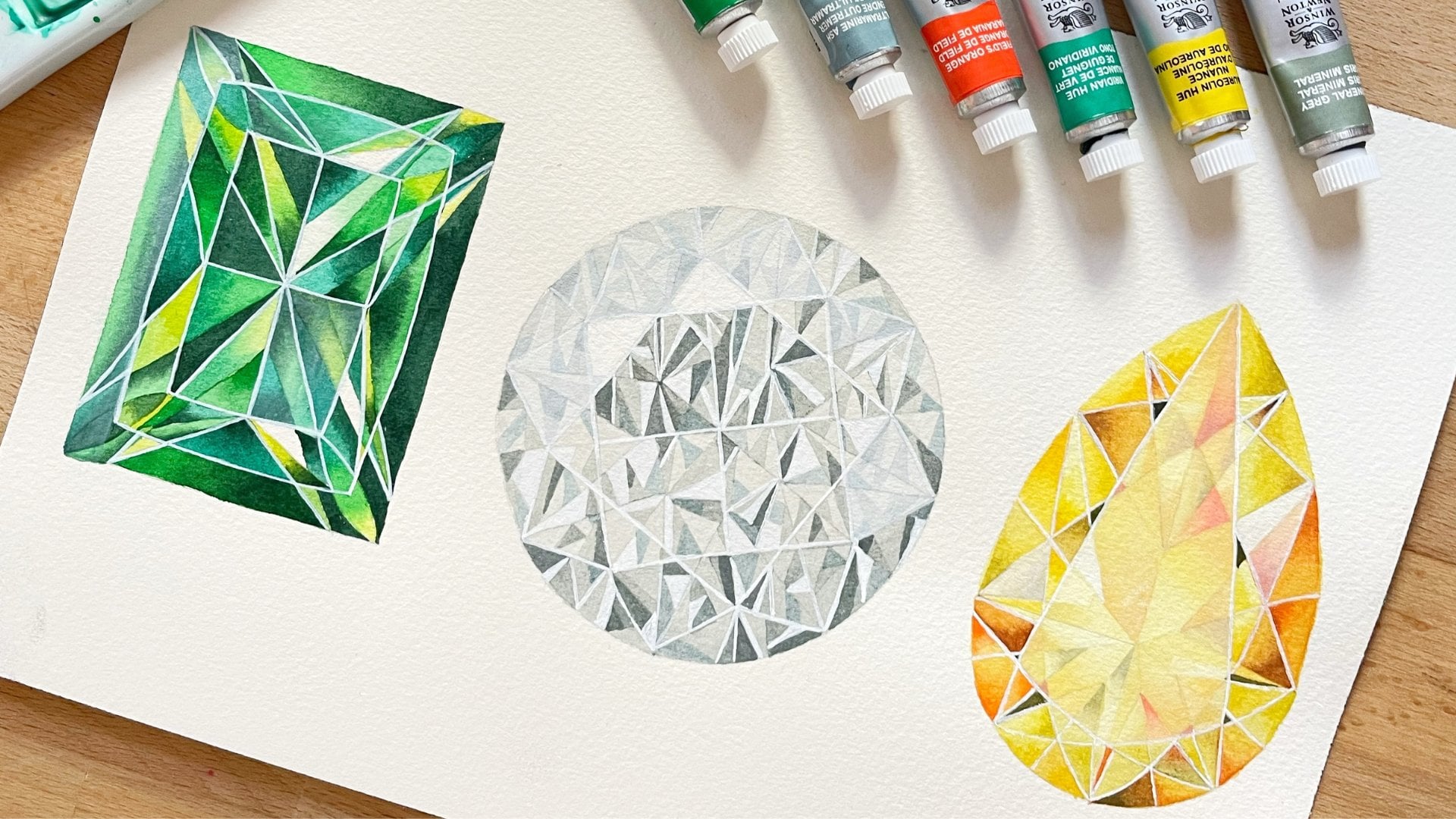
of crystal or glass. I love painting jewelry. I thought this would be a fun little experiment
for us to try.
2. Material and Mixing the colours: All right. Let's started
with our painting. Here is a list of
materials you need. You can hit pause and see
if you have everything. I'm going to start mixing
the colors right away. This is a very simple color palette
for this illustration. We're just going to
need a couple of colors in different concentration,
saturations. Here I'm starting to mix
up some new gamboge. This is going to be the main
yellow for this mushroom. I'm going to need quite a bit, so I'm mixing up a fair amount. And then I'm adding
the tiniest bit or not so tiny of neutral tint. And I'm realizing
that it was too much. I just wanted to knock
it back a little bit to have it not
so super bright. So I'm just adding a bit
more new gamboge here. Now it really just has a small amount of
neutral tint in it. I'm adding a bit more water, and this is just fine. Then we're also going to
use pure new gamboge, more concentrated, and it has this really deep
yellow golden look. If you don't have new gamboge, most people or many people
have Indian yellow. You can also use Indian
yellow. It's very similar. Yeah, I'm just
swatching it out here. Then we will need a
bit of cadmium yellow, in some areas, very diluted, and then in a few other areas, a bit more concentrated. Then this is yellow ochre. The whole mushroom
is like yellows and browns and yellow ochre is
always a good in between. And we're going to
use yellow ochre. Yeah, and more or
less the saturation. I'll always tell you
which color and which mix I'm using while
I'm painting. Then this is brown ochre. Not many people use brown ochre. It is one of my favorite
light medium browns. I use it quite a lot. Mixing up more. Then I'm adding new gamboge. We'll use yellow ocher on its own and also mixed
with new gamboge. Of that, we need more, so
I'm making a bigger puddle. If you compare with the pure
new gamboge at the top, you can see how it's just
deeper and a bit darker. Then we will be using
pure burnt sienna. That's right here. And then my dark brown will
be Van **** brown, which I also prefer to CPA. But that's really just
a personal preference. That's like a medium
concentration of brown. I'm just trying to
figure out which concentration I'll be using. Let's just see what it looks like at full capacity up here. I'm looking at the reference
image as I'm mixing, trying to get the colors right. So If you look at the reference image
while I'm doing this, maybe that will make
more sense to you. Then this is neutral tint to paint with paints
gray for gray, switch to neutral tint
because I don't always want that blue hue in it. Then I also use
neutral tint as black. There will be some
black areas and I just full concentrated
neutral tint. Here are the colors
and the mixes again. Like I said, I'll be telling you what we use while we paint. Transfer your outline and
meet me in the next chapter.
3. Mushroom First Layer: So here I have my illustration on the paper and I'm just using my eraser to rub out
some of the lines so they're not prominent when
the illustration is finished. When I'm done with
that, I'm going to use some masking fluid to mask of some of the
highlight areas where I want to preserve the
white of the paper. So I usually do this by pouring some of the
liquid into the lid, and then I have this metal pen that came with the charcoal
tracing paper that I ordered. But if you don't have that, you can use an old
synthetic brush and apply the masking fluid, and then let it dry completely
before you start painting. Now that all of
my highlights are preserved with masking fluid, I'm going to start
moving to the top part of the mushroom and
I'll start painting. The first layer is going to be an underpainting
or under layer. It'll be wet and wet, so I'm starting
with clean water, mine is not 100% clean. It's a little bit yellow from mixing the colors,
but that's all right. I'm using quite a bit of water and I'm
applying it all over the top part of the
mushroom except for this very big highlight
on the right hand side. And I'm taking my time here. I'm using maybe a bit more
water than I actually need. But this gives me a
lot of time and allows me to make sure that
I have clean edges. I'm bringing it all
the way down to here. There are also some highlights on the lower part of the cap. They're not as big
as the big one, but they're still big enough
so that I can paint around them and I don't
feel like I need to cover them with
masking fluid. You can also cover them
with masking fluid, but I felt like
they're big enough. So we can paint around. I'm making sure I'm
not covering them. So the first color is very, very watery,
diluted, panes gray. This is going to be applied
towards the edges of the cap, especially where we'll have
some reflective light. The center part of the mushroom, as you can see on
the reference photo is going to be very
dark and very colorful, and the edges where the
light reflects and bounces of the glass are going
to be almost colorless. They just have a
slight gray tint. I'm applying, I said pains gray, it's not pains gray,
it's neutral tint. I used to only paint
with pains gray when I used gray and I switched
to neutral tint recently. I'm still used to
saying pains gray. This is the neutral tint. Also applying it on
the right side here. Try to keep the edges
as clean as you can, but if they're not
100% clean like mine, for example, it's a bit
messy on the left side. We can and we will clean them up with the adictor brush
and I'll show you how to get rid of some small
mistakes or accidents, as Bob Ross used to call them. Here I'm just move pigment a, making sure it's everywhere
I want it to be. Also, feel free to turn your
paper whenever you need to. I used to try to not turn
it at all when I'm filming, but it's easier when
you move it around. Now, also very diluted. This is cadmium yellow. I really don't have a lot of pigment on my brush and I'm just gently moving it
across the paper. Do this while everything is
still really wet because we do want the yellow to really blend in and
merge with the gray. There are supposed to be no
hard lines, no water blooms. Make sure you really still have a wet paper when you're
putting in the cadmium yellow. If not dry it off completely and then re wet it and
then apply the yellow. There's yellow in
the center here. Zooming. Now I'm
having a small brush. I think this is my number
one or a zero brush. And my paper and my paint
is still really wet, so it allows me to
still move it around and clean up some of the edges. Now I'm using my number
four round brush again. It doesn't have any color on it. It's just clean and damp and I'm using it to still
move around some of the pigment because my paper is still wet because I've used so much water
in the beginning. Here, I'm just feathering
the color out a bit to make sure I don't get a
hard edge when it dries. And then on the bottom here, I'm applying some
neutral tint this time on dry paper because the
area is quite small. So I'm only applying
it on the bottom, just making sure that I
keep the shape there. And then I'm rinsing off
my brush and I'm just feathering it out towards the upper part of
this little segment. Some people only
clean up their edges at the very end of
an illustration. I like to do it now and again
while I'm still painting. Here I'm using the
adictor brush, which is just like a
very stiff flat brush that works or functions like
an eraser for your paint, and you use that by
dampening it a little bit, and then you just move across the parts of paint
that you want to erase. You just scrub it over and then blot it off with a paper
towel or a tissue. And you can just make
small corrections wherever you feel
like you need to. If you don't need to do
this, then just don't. I've just been a bit
messy with my painting, and I like to keep everything
super clean and neat. So I'll be doing this throughout
the painting process. So now we're going
to leave the top and move towards the bottom
part of the mushroom. Again, the underpainting or underlayer is going
to be wet and wet. So just as I did before, I'm laying down some water
across the whole area, except for the bigger high
lights on the right side. So it's more or less
the same process that we used in the top. And the first color I'm
using is new gambage. I'm starting to paint
from the middle and moving towards the
outsides of this area. The color is a bit more concentrated than the
ones we used before. So this is kind of like a half
water half pigment ratio, and I'm just spreading it out making sure I don't paint over the highlight here
on the right side. But, I'm dropping in some neutral tint on the
edges of the segment, like we did for the
cap of the mushroom. Because again, this
is where the light hits the glass structure
and bounces off it. So it's just very faintly
gray and not yellow. While I'm still at it,
I'm going to make use of the fact that my
paper is still wet. I'm dropping in some
brown ochre right away because that actually
needs to blend in with the first layer
and it's just easier or it saves me time
if I do it right away than in an extra step. So this is brown ochre. I'm tiding it up a bit here at the bottom so it doesn't
sp all the way down. And dropping in some more
and feathering it out a bit towards the top to make sure
it's even a nice blend. So before moving to the
next step of the painting, I've decided to add another
very transparent layer to this bottom third part
of the cap of the mushroom. And it's the same process again. I'm starting with clean water, and I'm making
sure I don't cover the little white
highlights that are there. And I have some diluted cadmium
yellow on my brush now, and I'm just running
it across this line. And I want to give the
mushroom a bit more structure, even though it's quite
faintly before I start deepening the colors
and creating shape and form. While the paint is still wet, I'm using my number
one brush again, just to push the pigment around a little bit lift it off here and there and make sure it's exactly in the place
where I want it to be. Then once I'm done with that, I'm going to let everything dry and move on
to the next part.
4. Mushroom Second Layer: In this part of the painting, we are going to layer different colors on
top of each other to create depth and form basically
of this illustration. The bottom part has
dried completely, and now I start by rewetting
it again with clean water. Just applying it all over. I sped this process
up a bit because I do take my time with
laying down water, and it would be very
boring for you if you had to watch me
do this in real time. So but you're not
missing anything. So here, I'm starting with much more concentrated new
gamboge than I used before, and I'm just sweeping it across. Not all the way to the side and not all the way down
just until here. Again, I'm making sure I don't
paint into my highlight. Then while that is still wet, I'm just cleaning it up, making sure it doesn't move too much down towards the
bottom of the illustration. And now while the
paint is still wet, I'm applying the brown ochre
and new gamboge mixed. It's fairly concentrated,
and it has a bit more brown than
yellow in the mix. I cleaned up my brush and I'm moving it around
a little bit. I do want smooth blends always throughout
this illustration, basically, except
for the end where we apply details wet on dry. But here, I want the brown mix to blend
in with the yellow. Then in a second, I'm
going to add even more brown in the middle
of the segment. Before that, I'm just
cleaning up the edges again, making sure I don't
get any hard lines. And here, I have the brown
Ochre new gamboge mix again. And I'm basically doing the
same thing I did just before. And I do this while the
paint is still wet. So for the next
couple of minutes, I'll keep painting wet and wet. This is concentrated
burn Siena now. My paper stays wet because I keep applying wet paint to it, so that allows me to
blend color with color. Here, I'm making
sure I don't paint into my highlight again. I'm just going to move the
burnt sienna around and I keep looking at my
reference photo to make out how much
pigment goes where, and then I drop it in
carefully like here, and then I feather it out just making sure
I don't put too, paint, maybe I want a bit
more transparent look. Here I'm just lifting some color off again where I feel
like it's too much. Then I'll come in with more and I'll keep doing
that for a little bit. While the bottom part dries, we're going to do more or less the same thing
on the top part. I switched to around
12 brush to put down some water because
for whatever reason, it just takes me so
long to do this. Bigger brush solves
that problem for me. You can still use your
number six brush. Of course, if you like,
the choice of brush is not essential for
a layer of water. I'm just doing that. Again,
I'm making sure I don't apply it onto or into
my big highlight here. Now that I have an
even layer of water, I'm switching down to my
number four brush again. And again, I have the
Brown Ochre new gab in the same medium
concentration as before, and I'm applying it evenly, making sure I don't get
any hard lines anywhere. And when I say, make sure you don't get any hard
lines anywhere, what that actually means is, be sure to paint
quick enough while your paper is still
wet so that the color blends in and doesn't dry out
and it creates hard lines. So this is some of
that brown yellow mix. I'm just making
sure my edges are clean because if
they're too messy, it'll be harder
to clean it up in the end and then it just
doesn't look right. This is some cadmium yellow,
fairly concentrated. Because now we do really want to get some color onto this paper. Otherwise, we'll have to
apply like ten layers and that would
take way too long. I'm blending it into the
brown mix over here. I cleaned off my
brush just now and I'm feathering it out,
smoothing it out, blending it to make sure that
everything is even here. I'm picking up some paint
and also on this side, because we do want
that reflection of light on the outer edges. Now this is some burnt sienna. Looking at it now, I feel like I could have used a bit
more concentrated color. Unlucky I didn't get any blooms here because there's a
lot of water in this mix. Now it's a bit
more concentrated, and that makes more sense. Looking at the reference image, you can see that
the center part of the cap is really, really dark. So my paper is still very wet, and I'm coming in with basically a full concentration
of burnt sienna. You can see how much
pigment there is because it doesn't spread out
quickly or easily, which is good because
that gives me more control over
where the paint goes. So I'm layering the colors from light to dark
in this painting. We started with the brown
yellow mix, then burn sienna. And now while my
paper is still wet, I'm going to drop
in some **** brown. This is the concentrated
ban Dig brown. It doesn't move too much because I have very little water in it, which gives me more control and helps to deepen the
colors more quickly. We'll need to do less
layers. Here's some more. I, I'm just dropping
it in and then I wait a second to see what
happens, and then I know, I can do some, can
add some or now it's time to clean off the brush
and clean it up a bit. Now, what I didn't want
to happen happened. I got a hard line where I wanted the brown to smoothly
blend into the light gray. So I'm going to do
some damage control with the adict brush again. The brush is wet and clean, and I am running it across this e trying to
make it disappear. So I'm running it across the edge and then
cleaning off the brush. So you can see I just
erased that hard line. And I'm doing the
same thing over here. I also wanted some
reflective light on the top part there, which disappeared during my hour long wet and
wet session just now. Now, looking at the
reference photo, I can see that the
cadmium yellow was not strong enough
in the corner here, so I'm just adding
some more and then cleaning off my brush
and smoothing it out. And then, again, I'm using the eradicator brush
to clean up the edges. I'm just having a
messy day today. But it's okay because you
can do damage control. And then again, here on the side because I'm still not
really happy with it, so I'm trying to take to lift off some more paint without
damaging the paper. So now I'm starting to
put in some details with my 30 brush and some
diluted yellow ocher on it. I'm starting to put in
some of these lines here. I'm using quite diluted paint again because we will go over this at least two more times, I think, and darken and define the edges and the
shadows and everything. So this is just a first layer
of paint for these details. And when I'm done with
the yellow ochre, I'm partially going over it with some diluted neutral tint to add a bit of
shadow on each side. And again, with
some yellow ocher, I'm doing the same
thing on this side. Just following the lines that I already put in with my outline. Moving down to the
bottom part again, I use my adictor brush to lift off some
color here and there, where I feel it's necessary before I start
painting wet on dry. With all the blended
and smooth colors down and dry on my paper, I can now look at my reference
image again and identify the areas of reflection where the color is
much more defined. So I'm using my round brush and some diluted burnt sienna, and I'm painting
these in on paper. Similar at the top here, there's a bit of a
shadow from the cap. I'm using the small 30 brush. And I'm starting
by just putting in some streaks and somewhat abstract shapes
with Burnt Sienna. And then I'm going over them right away with Bandig brown. So the two browns blend in
with each other a little bit. And I'm going to do this for
this whole shadowy part. Here you can see a
bit more up close. I'm trying to smooth out the Vanda brown that I have
on there that's still a bit, and then I'm continuing
to paint with Burna. It doesn't really matter what thing he is that
I'm painting in. I look at everything from the reference image more
as abstract shapes, and I try to replicate
them more or less. So there's just something there that has a bit of texture
and a bit of structure, and that's what I'm
just trying to put in. Yours doesn't have to
look exactly like mine. Just make sure that
there is a bit of texture that is darker than the rest because because there's a shadow falling on it from
the cap of the mushroom. As I'm recording
this voice over, I'm trying to wonder if my
analysis of things make that much sense when I'm
trying to explain to you how I paint and
why I paint that way. But thinking about it, I'm just realizing that I
don't actually think about analyzing a painting
that much before I start. All I do when I have a new reference image
and I try to plan. My painting is I try to figure out which color goes
on to the paper first, and then what colors
I layer on top of it. So just the order in which
I put down the colors. Then the second
thing I wonder is, do I need to paint
wet and wet or wet on dry and in what order. Then the rest is just looking at the reference image and seeing, there's a blown blob there, so I put a brown
blob on my paper. There's a black line here, so I put a black line on my
painting in the same place, and then the reference
image has a highlight, so I make sure to preserve
that highlight in my painting. But for me, it's more
really just copying, abstract shapes onto the paper that I see in the
reference image. And I don't It's not a
very intuitive process, I think, but it just
works for me that way. Now with all the colors
thoroughly dried. I look at my illustration
and I see that the yellow, the cadmium yellow that I put in when we painted wet on wet. It dried a bit too light, which can happen when
you paint wet on wet, the color dries lighter than
when you paint wet on dry. On the dry paper, I'm just giving
this another code of cadmium yellow because it's not very luminous in a way. I just want the color to be
a bit more intense here. Goes for these darker areas. They're not strong enough,
not deep enough for me. So I'm painting some
more burnt sienna, quite concentrated burnt
sienna onto the dry paper there and blending it into the yellow that's still
wet that I just put in. Remember, I don't want any hard lines here
towards the edge, so I'm cleaning off my brush, and I'm running it across the paint edge to smooth it out. Paint is still wet, so I'm now coming in with some more concentrated
van **** brown. Like I said in the
beginning of this chapter, we're using this to
really deepen the color, to really create depth, and that means using some
very strong pigment, even though it might
be scar ale bit, but you can see that
I'm really ing. Looking at the reference image, it's also justified because
the mushroom is really. And it's just going to help
the whole illustration pop a little bit and make it seem
more three dimensional. The more contrast you have, the more life your
painting gets. So don't be afraid to put really dark areas next
to super light areas. For me, that just
makes any painting, any illustration
really come to life. Now, I'm letting
all of this dry, and I'm coming down
to the lower part of the cap of the mushroom. And I have my size one brush now and some quite
diluted neutral tint, and I'm putting in
these lines to suggest the kind of texture that
the mushroom has there. We did the same thing earlier on the on the wall on
the back part of the lower part of the
bottom of the top part of the mushroom I don't know. You know what I mean? So now I'm not using yellow
ocher and neutral tint, like I did earlier. I'm just using neutral tint, and it is the faintest
amount of color. I'm wondering now
watching it again if I maybe could have
used a bit more color. And yeah, but I didn't
want to come in with more color on this part than on the other part.
I wanted it to match. And also, I'm being I tend to be quite cautious with my layers. So because I always think, if I need more color, if I need more shadow
or more contrast, I can always add it. But if I have too much, it's so hard to take it off and not ruin
your whole painting. And since I filmed this, it would have been frustrating if I messed it up right here. I would have needed to
start it all over again, which would have been
quite frustrating, so better safe than sorry. Now, coming to the back
side of this section, again, I'm using my 30 brush, and now I have some more concentrated yellow
ochre on my brush, and I intensifying those lines, making them a bit, a
bit more pronounced. Not too hard, so I'm
putting in some paint and then I'm slightly smoothing
it out but not too much. And I'm just going to strengthen these lines and
give it a bit more texture. Also, the hues across your whole painting
kind of need to match. So if I have something
like super super dark like the top part of
the mushroom cap, and then its bottom part
is very, very faint. It doesn't really match. So Coming in with a different or
another layer also sometimes means just adjusting it to the rest of the painting. Regardless, this needs more
depth and more shadow, so I'm putting it in over here, and then I'm also going to do the same thing on
the other side. So now that I've adjusted
the color on the back side. I'm looking at my
reference image again, and I can see that
I need to deepen or darken the color on the
front a little bit here. So I have my size brush and the very diluted
neutral tint, and I'm just giving it a
transparent of that on paper, painting around those
highlights as previously. The lines of yellow ocher
down there have dried. And since we deepen those, we're also going to
deepen the lines of neutral tint that we have there faintly, but
we have there. Like I said, sometimes
I put in a bit two in the first wash, but, like I said, better. So I am also adjusting the neutral tint here and
on the other side as well. A. Now, that's left to do for this part of
the painting process for this mushroom is to paint in these little white bits
that I left untouched. They're not actually
white, as you can see, or as you probably already have seen in the
reference image. I just didn't want to
paint over them with gray because it would have
just muted the ye, them yellow here and would have just made it
look a bit more muddy and I wanted the full brightness
and color of the yellow, so that's why I left it white. So I'm just painting this in here on dry
paper fairly easy. And then we can
move on to putting in all the details that are
left for the illustration.
5. Mushroom Final Details: So the main colors, textures, areas,
whatever are done, and we can now move
on to putting in details and the last finishing
touches on this mushroom. If you look at the
reference image, you can see that the cap actually has some
white spots on it. I could have covered those with masking fluid in
the very beginning, but just decided not
to because that I thought would have looked
too harsh and unnatural. So instead, I am
lifting off some color here to get those light almost
white little spots back. And I'm doing this by
taking my number one brush. It only has clean water on it, and you can see clearly
here in the close up. I'm just applying the
water onto the paints, scrubbing it slightly, and then blotting it off
with a paper towel. And you remember how much
pigment we put on there. It's like four or five
layers of paint there. There's a lot of pigment
to be lifted off the page. I always say page,
I mean, paper. Lifted off the paper, sorry. So that's what I'm doing here. This is a really easy job. So just apply a
little bit of water. I'm really not scrubbing a lot. I'm just barely touching
the paper, actually. And you can see
how it comes off, and then just blot it
off with a paper towel. I could have made those
a little bit smaller. If you managed to
make them smaller, do, because looking at it now, I feel like they're a maybe
they're a bit too big. But yeah, this is an easy way
of lifting off highlights. When you think it would look a bit too unnatural
with masking fluid. You can do both. It's just
a very different look and comes down to
personal preference, the method with which you get your highlights
in the paintings. I like to do both just depending on how I think it's going
to look afterwards. Yeah, I'm just going
to go over those again to make them a bit bright, a bit more pronounced. There are some on the side here, but because the
color is lighter, yellow is also not
easy to lift, I find. So the difference there, the contrast there
is not as striking, but it's still visible. Let's focus on this area. Again. Here, I'm just smoothing something out that
was bothering me. You don't need to do
that necessarily. And so we're going to add more shadow and
contrast to that area. So I'm using the
number one brush. I guess I didn't like the
hard lines that I got there. But you really don't have
to go over this section. This is just what
happened on my painting. So here I have some
more yellow ochre. I'm painting on dry paper. I'm just giving it
a bit more color because that's what I see
on the reference image. And then I'm doing the same
thing on this side here, same color, same
technique, on dry paper. When you see me
hesitating with my brush, it's because I'm painting and looking at the reference
image at the same time, and while I'm painting,
I'm trying to decide which way
to move my brush. And I've decided to go back to this side and add
just a little bit more. There is a lot of back and
forth in this painting, but I find it quite calming
and meditating, actually. I know I don't need to stress whether or not this
is too much color, and Oh my God, this is critical because
if I mess this up, the whole thing is ruined, and it just gives me peace of mind to paint
slowly, bit by bit. Now I think I have burned
Ciena on my brush, and I'm giving those a darker color according
to the reference image. A. And now with more concentrated burn Siena, I'm going over the
edges again just to make them a little bit more. So looking at the
reference image again, I'm deciding that this is actually a bit more
brown than just gray. So this is some diluted
brown ocher on my brush, and I'm just sweeping
it across quickly. I'm really doing this or discovering this
illustration as I go along. So this is the Brown Ochre. I didn't practice it
before I filmed it. So there's always a few things when you look at it again or when you do it
for a second time, where you realize, k, this is what I could
have done better or this is an unnecessary step. It's a learning curve
for all of us, I think. So this is just,
I'm trying not to disturb the burnt sienna
that I just painted on, so I'm painting around it. Smoothing it out
there a little bit. And now you can see that
the tone in the hue match, and it looks fine. The detail work that follows
now is quite simple. It's a bit fidgety and
it's a lot of fine lines, but it's a simple
painting process. Actually. Here I
have neutral tint, semi diluted on the 30 brush. A I'm going to do now for the
next couple of minutes is look at my reference image
and put if it's a black line, I use very concentrated
neutral pint. Okay. And then I
paint that in and where I see a hue
of orangey brown, I put down burnt
sienna and I try to replicate the shapes
and everything. I paint slowly
because I don't want to mess up the outline
of the mushroom. It would ruin the
whole thing now. I'm just going to go
back and forth with burn sienna and neutral tint
in different concentrations. This is a very calming
process because just putting in these little bits and pieces on dry paper is super easy and you can
just do it at your own pace. And there's nothing
to watch out for. You don't need to make
sure you're painting quick enough because your
paper is drying. So even though you need a bit of patience
for all the detail, it's actually quite
simple to do. I. So I find that these details that go
on during the last part of a painting on dry paper usually make the
biggest difference. I do like everything,
you know, transparent, glass, crystals, diamonds, pieces of jewelry,
and stuff like that. And a lot of my paintings have an insane
amount of detail in them, especially when I paint on on hot press paper because then I can sometimes combine
it with colors pencils, and that allows for
even more detail. And I've gotten compliments
for it, like, Oh, my God, it looks so insane and
that must be really hard. And I'm thinking, not
really because all you need to have all of these super tiny details in your illustration
is patients. You don't need any
particular skill because you're just putting on tiny amounts of paint on
tiny areas on dry paper. And if you have the
patients to do it, then that's all you
need. You can do it. But the effect that it has is usually greater than the skill you actually need
to paint it in. I'm just like I said, I'm always looking at
my reference image and I'm looking and thinking, is this like a semi
transparent area of color. Do I need to put it, do I need to dilute
my burns and I here? Yes, do I need to use it more concentrated over here
and then I do that. While I was painting
this, I was listening to an audio book, some crime novel, and I just sat there
for I don't know, a good half hour and painted all of that in was
super relaxing. If you can muster the patients, then you're really good to go. Now I'm coming back with
some more concentrated sia, and I'm giving this
irregular shape on the bottom here a
stronger outline. I'm just making sure that I'm not ruining the shape
of whatever this is. It's just a reflection
in the glass. The cool thing is also with
these glass illustrations that once you've managed to
do the most important thing, which is get the areas of light and dark right
so that you can see, this is something transparent
that I'm looking at. And this is usually like the
first one to three layers, the wet and wet work. Once that is somewhat correct
and realistic looking, then you can't really
make a lot of mistakes because what follows is just these little details
that I'm painting in now. But I mean, I'm trying to copy the reference image
exactly as I see it. Also as an exercise to being able to replicate what you
see in a reference image. But if these lines here
on the bottom left, for example, if I painted
them in differently, then they're depicted
in the reference image, That wouldn't have
been a mistake. No one can look at
that and tell me, oh, but this asymmetric weird
abstract reflection shape in the glass is incorrect. Now it doesn't
look good anymore. It can look that way or I
can look a different way and no one can tell you that
this is right or wrong. Even when you do make a mistake in the detail work here
in the last stages, they're not a mistake
because there's no right or wrong
way that a light can hit a piece of crystal
or a piece of glass. Whereas when you're
doing botanicals, people usually have an
idea of what a leaf looks like and when the light hits it, what that looks like. And when you're painting something that's actually
natural and you make mistakes, and then it looks
unnatural, that's visible. That's something that
people can identify. But when you're painting
something that in itself, like this glass
sculpture is artificial, Then all of the light and all of the shadow is also going
to look artificial. And then when you have a
light slip up or you just, you know, putting a shape differently than
it's in the image. It doesn't look like a mistake. So now I have neutral
tint on my brush here, and like I said before, I use neutral tint fully
concentrated as black, and I'm just putting in the shapes and lines
like I see them. Continuing with some
burn sienna here again. Going back and
forth and checking where I need to darken
the color a little bit. H. Now with neutral tint as well, I'm moving towards this area that's in the
shadow right there, and I just cleaned
off my brush a little bit to smooth out the color. Continuing to do
that down the side here. Here's a closer look. I'm just deepening these lines just to increase the
shadow look of it all. I hope you don't
mind that I have some minutes here in this video where I don't say
anything at all. But when there's nothing to say, I struggle to think
of things to say. This is neutral tint. This is a bit scary to put in, but it's very diluted and you can see on
the reference image, there's just this streak
or block or line of gray. Now I'm taking off
the masking fluid. You can do this with
this rubbery thing. Lots of people have that. I did not find that
in Germany anywhere I bought it in the
states in an art shop. But you can also
use your finger. Usually, I take it
off with my finger. And you don't actually need
this piece of rubber plastic. Now this is a super
super tiny brush. Now I'm going into
detail that I mean, no one would actually see
this unless you really zoomed into a photograph
of this mushroom. But I do like these
these tiny fidgety, bits and pieces of a painting, so I don't mind doing this. Here's some more burnt sienna. And I'm going to add some more tiny black lines
with neutral tint again. There's a construction
going on outside. I close the windows, but I have no idea if you can hear it. They're drilling
something in stone. I don't know. I hope
you can't hear it, and if you can, I hope
it doesn't disturb you. My apologies, but I can't
make them stop now. I was thinking of adding
music to this video because like during all
of this detailed work, I don't actually need to
say or explain anything. But then I was thinking
that I actually preferred when I watch
tutorials, which I do often. I preferred when
there's no music in it because that
allows me to put on a Netflix show or an audio book that I
want while I painted, and if there is music like repetitive piano
sounds or something, I find it gets boring
quite quickly, and I can't really tune it out. So I prefer if there is no music and no
pointless talking. Apologies. So with the
size four round brush, and again, some very
diluted neutral tint, I'm painting a little bit into
this highlight after all, because it's not
completely bright white across the whole
section of the highlight. So I'm just giving it
a a slight shadow. There's a bit of color in there. It just makes it look more natural because in
some highlights, there's color in shadows,
there's actually color. And I'm going to do the same
thing for this big one here. At the top, I'm
painting on dry paper. You can see how
diluted the paint is. It there's almost no
pigment in there, but I feel like it's going
to make a difference. Maybe it won't. I don't know. It's just what I see in
the reference image. Yeah, you can see it's almost
disappearing on the page. Paper. I keep saying
on the paper. So now I'm going to do
something super controversial. I am using white quash to
enhance my highlight areas. Some artists will snub at this, saying that the only white allowed in watercolor is
the white of the paper. I think I don't care. I'm going to do what works. For me, and for this
painting, it works. So I use the number
one brush to put in the white ah just Yeah, not a lot on the outside here. And then I'm using the damp
clean number four brush to just blend that into
the yellow and the brown. Here, I'm blotting off my brush. I'm taking lifting a bit off because I really
do want that tiny line of reflective light on the glass is just
going to make it more realistic and more three
dimensional looking. I'm also painting in some white between those lines that we have in this section. It's just going to
increase contrast. I always find when I do
increase contrast in the late stages of a painting either by painting the shadows, you can also do that or by using white wash to
enhance the highlights. It just makes all
the difference. I'm painting on dry
paper, as you can see, and I'm just painting a
little bit in and I have a second small brush that
just has some water on it, and I'm refining it a bit, smoothing it a bit out, painting some more in until
I'm happy with it. Yeah, that is just the type of final detailed work
that I usually do. Here on the side, I'm going
to enhance the white even more just because that's how I see it on the
reference image. I'm going to add a bit more here and then between
those two as well. Again, painting it
in and then using a damp brush to smooth it out. The guh also doesn't
that quickly. It's actually quite
easy to work with it. And then this is the 40 brush. I think this is the
smallest brush that I have. And I'm going to paint
some more white along the bottom edge of this section. I'm continuing to just
keep doing the same thing here in between the lines
of brown and ocher. I'm just adding the
tiniest bit of white, but it makes such a
difference, I think. It really makes the
look transparent. And you can see how there's
reflections in it now. It so often happens for me that I do paint something
that's like realistic, crystal looking or
diamonds or anything. And it looks fine,
but I'm not like, really happy with it until like the last 15 or 20 minutes of the painting where I start putting in the highlines
with white roach. And then I'm also adding white
gash in the shadow area. That is a bit of
a contradiction. But that's just how I see it in the reference image.
But I'm using less. So you can see that I'm like diluting all of it on the page and smoothing it out, blending
it in, whatever. So it's not as pronounced, but there's still
light bouncing off it, even though it is
technically a shadow area. Because we spoke of contrast, it is always a good idea to have something really dark next
to something really light. So here goes some more very
dark lines with brown. This is actually
neutral tint, isn't it? I don't have my glasses on.
It's really hard to see. And the frame when I'm
recording audio is so small. But I'm sure you
saw it correctly. Yeah, I'm just
suggesting the hue here. This is where you look
at your own painting, maybe take a step back, maybe take a photo of the painting, and look at the photo
for some reason, that really helps me to see
what it actually looks like. And then you can
think and decide, k, do I do I need to
do this, for example? Do I need to pronounce
certain areas? Do I need to make them darker? Do I need to add more white
and more highlights here? This is where
everyone's painting is going to look
a bit different. So you need to make that call. So now we are moving
on to a fun part. So if you look at
the reference image, just like there are
white spots on the cap, there are also dark spots. So I'm just sprinkling
color on it. By loading my brush up
with some and brown. I covered every area with paper that I don't want
the sprinkles to be on, and then you just spray it on the paper with your
finger like I just did. You can also use a
tooth brush for that. I've seen people do
that. There's a tiny bit in my highlight,
that is frustrating. But if I try to
eradicate it with the eradicator
brush, I'll ruin it. I'm just leaving it and down
at the bottom here as well, covering everything that I
don't want the spots to be on, and then I'm just
flicking my brush. When I tried it the first time, no paint landed on my paper, and then I I loaded the brush up with more concentrated paint
and then it worked. This is just a fun thing to do. I've actually never
done this before. This is the first time that
I needed this technique. Then I spotted the last bit of masking fluid that
didn't come off previously. And we are done with
this illustration. I hope you finished it. I
hope you're happy with yours. Thank you so much for watching.
6. Last, but not least: Thank you so much for well, getting to this section of the video for finishing
your painting. I hope you really enjoyed
it. I know I did. If you do have any
questions about anything, if you want me to look
at your painting, if you are unsure
about how you did, if you want me to
give you feedback, I'm more than happy to do that. You can send me an e
mail via my website. You can hit me up
here on the platform. You can reach me on Instagram. I'll respond as soon as I can. And I would really,
really appreciate it if you could give this course a good rating if you enjoyed it. It helps the course stay on the platform and it helps
me more than you know. Thank you and I hope
to see you next time.
 Sophia Neumeister, Watercolour Artist. Published Author.