Transcripts
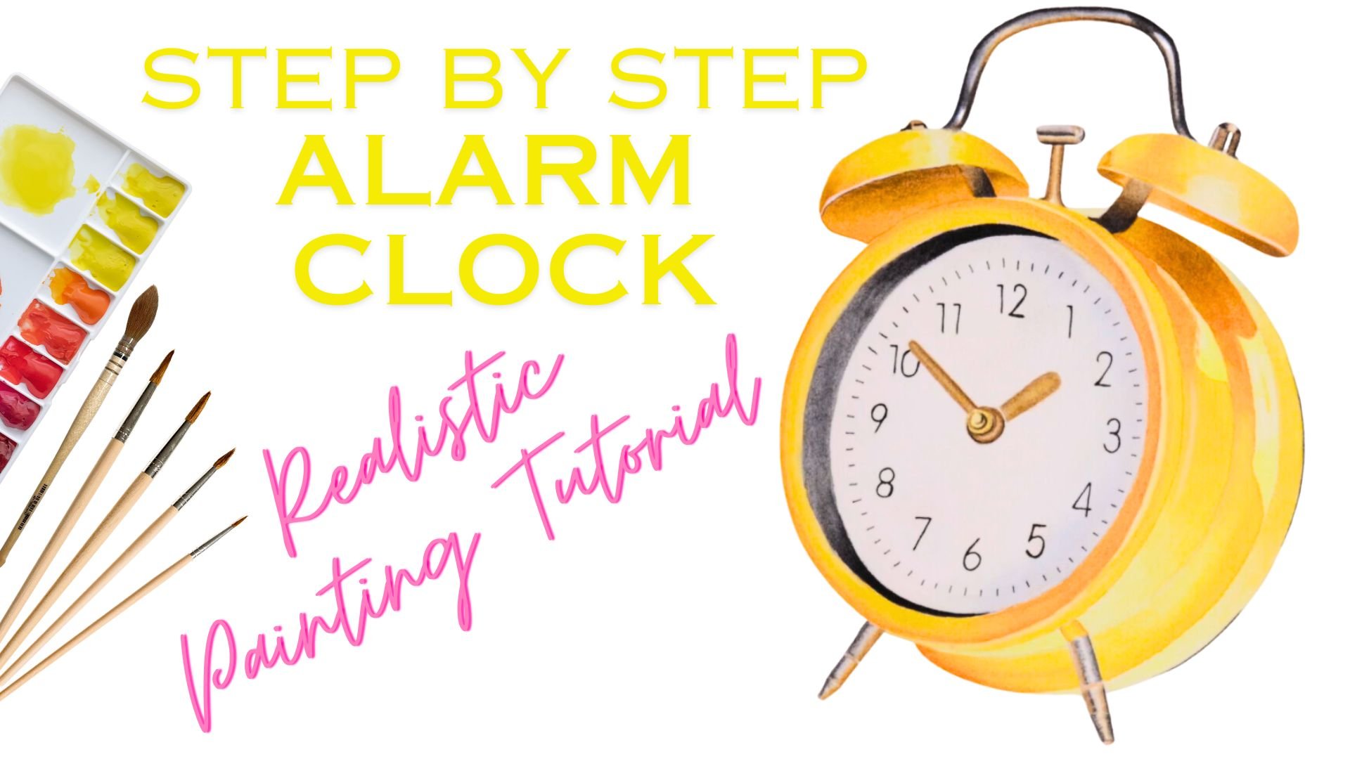
1. About this class: Hi, and welcome to the class. Thank you so much for joining. Today, I have three fun little Halloween themed
projects for you. I have a pumpkin, a witch's hat, and
a little ghost. What makes these
three illustrations special is that they're
all made of glass. You're going to learn how to paint glass and how
to create that sense of transparency and luminosity that these crystal
sculptures have. The materials and
everything you need is included in the project
section here on the platform. I'm also going to show
you in the next video, and then you can get
your colors ready and trace your outline onto your paper and get
started right away.
2. Materials : The materials you need to paint these projects is just your
basic watercolor supplies. So cold press watercolor paper, a set of paints,
different size brushes, and then whatever you need to trace the outline
onto your paper, I listing everything for you here so you can get
started right away.
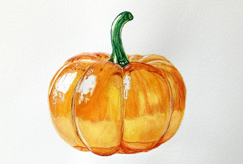
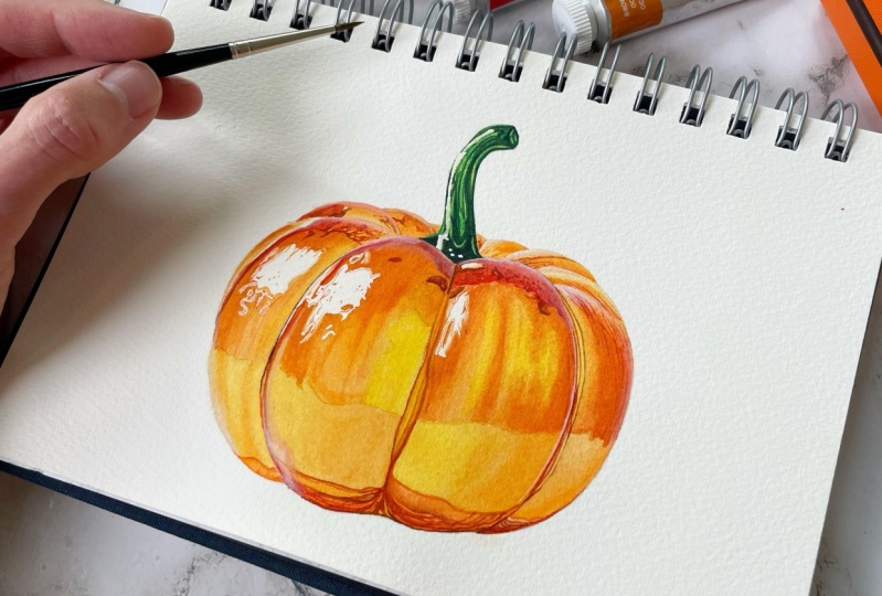
3. Pumpkin Part 1: Okay, let's get started. We are going to mix our colors. So I thought I would paint this pumpkin with a
very limited palette, meaning only the primary
colors and some burnt sienna. So I'm starting to mix
up some windsor lemon. If you don't use Windsor Newton, it's probably called
just lemon yellow. I'm just watching it out here. We're going to need
quite a lot of the lemon yellow because it's going
to be our underpainting, and then we're also
going to use it to mix the oranges and
also the greens. Now I'm mixing an orange. I'm going to add
some scarlet lake. You can also use Quin red if
you have it in your palette. Generally, I'd say just use whatever pigments and
colors you have rather than buying new ones to paint a specific painting
or do a tutorial. You can always just
use what you have. If you're wondering why I
am mixing my orange here, when I have it right
there in my palette, I took the liberty of doing
a little chart here for you. It's a bit complicated,
but it's really not. I just wanted to
quickly show you that when you mix your
secondary colors. When I use my lemon yellow, which is the PY 175 pigment, it's going to give me my yellow, my orange, and also my green. That creates a lot more harmony
overall in your painting. Whereas if I used pre mixed paints like a
different orange that's PO 62 here or a sap green and a darker
green by Windsor Newton, I have all of these
different pigments. It might still look good.
It might still look okay, but it just looks a lot
more harmonious when you use less colors and especially when you mix
your secondary colors. Also, always my top tip, move away from SAP green as soon as you can and
mix your own greens. They come out so much more
brighter and more beautiful, so I always advise people or make suggestions to
mix your own greens. So coming back to
our color mixing, Like I said, we're going to need a lot of
windsor lemon here, and this is again scarlet lake. I'm just mixing another
batch of orange. This one is a bit more
thick and a bit darker. Let's see what that looks like. I want it a bit darker yet, so I'm just adding more red. I think this one looks good. Then we just need
a tiny amount of burn Ciena just as it is. This is the pure burnt sienna. You've seen it. I'm
swatching it out anyway. Then I'm just looking at the reference photo
and I'm thinking, do I need another
shade of orange. So I did mi another orange again with
Windsor Lemon and Scarlet Lake. That's the scarlet lake again. Then I thought I
wanted to dull it down a little bit, just
like neutralize it, so I added some cobalt blue to get like a very
dark, looking orange. I don't think I ended up using
it in the actual painting. Sometimes I do mix a bit
more colors than I actually need so that it doesn't hold me up during
the painting process. I'm just adding a tiny bit of
blue and a bit more water. The complimentary color always
neutralizes a color a bit. If you have a super
bright orange and you just want to knock
it back a little bit, you just add the complimentary
color, which is blue. Yeah, but I don't think we'll
actually need that one. Moving on to mixing greens. We're going to mix two shades, one very bright and light
one and another one that. This again is Windsor Lemon. I keep repeating myself. And then I'm adding a
tiny bit of cobalt blue. Oh, that's Phil blue,
actually, my bed. Sorry. I just gives
this beautiful, I love this like super
aggressively bright green. And it's just so easy to mix it. There's absolutely zero point. I do have four or five greens in my palette. I don't
use them a lot. It's just so easy to mix it. That's a lot more yellow again. If you are painting with
Windsor Newton color, there's also in the student
grade range of colors, there's one called intense blue. I think that almost
identical to Phil Blue. If you have that one,
just use that one. Thee yellow and the same blue, just a and that makes it. One. I almost looks
like cobalt green. I'm just holding up because
the shine of the paper, I couldn't see clearly
because it was wet. I am adding a tiny
bit of neutral tint. If you don't have neutral tint, you can also use paints gray. That wouldn't be a problem
because paints gray also has a bluish hue to it and since there's also blue in
that mix, that will go well. That is the darkest color
that we're going to use. I also use neutral
tint as black, by the way, for just
some black low lights. Then also white quash. You can hit pause and look at that color chart again to see
if you have all the mixes. I'm just rubbing out
some of the pencil lines because they tend to shine the yellows and the
oranges and it's almost impossible to get rid
of them once you've painted over it with
yellow or any other color. So I'm just rubbing
out most of them. A. That that's done. I'm getting my
masking fluid ready. What I usually do is I just pour a little bit of the liquid into the lid of that
little plastic container. And then I have this, I don't
know what it's called it, like ancil or like a metal pen. It came with the
coal tracing paper that I ordered three years ago. And I'm just using that to
apply my masking fluid. If you don't have
something like that, you can just use an old
synthetic brush, probably. The easiest way to not ruin
it forever and ever is to put some liquid soap over
it and then dip it into the masking fluid and then put the masking
fluid on your paper, and then that kind
of, like, saves your brush from using it. Ruining it. I mean. This
is just how I use it. There's probably a
more sophisticated way to use masking fluid if
there is such a thing. Then I'm just applying it to the little areas that
I want to stay white. I'm going to show you from
the side in a second. There are a few
areas that are going to be bright white where the light hits the
glass and it's just easier to cover it than
having to paint around it. Some people don't like
using masking fluid. I don't know why. I don't
see anything wrong with it. I apologize if the colors of the video here are a bit off. I tried to match them to the other lens or camera
and I tried my best. It's not exactly the same, but I hope it's good enough
so that you can see. I'm just applying
it here and there. When I'm done, you
can just hit pause and copy where I put
the masking fluid, and then let it dry completely. It must be really, really dry before
you start painting. If you don't have the
patience to wait, I usually just make
a coffee or do something else for 20 minutes
and then I come back. You can also use a hair
dryer and dry it off. But just make sure
it's completely dry, otherwise, you'll
have to start again. Alright, so that's the
masculine fluid done. Mine is completely dry. So now I'm using my big brush. I think that's around 12. If you have one that
size ten or eight. That's also fine. Just
use a bigger one. And I am wetting
my entire pumpkin. I did speed this process up
a bit because I'm usually like super slow when I'm
applying my water to the paper, and I didn't want you to have to sit through
the whole thing. So just put water over
your whole pumpkin, make sure it's nice and even, and then pick up some of
the pure windsor lemon. It's not super thick,
it's fairly diluted, and I think that's
a size eight brush that I have there in my hand. This is the under
painting under layer, first layer, whatever
you want to call it. I am painting just yellow across the whole thing because I
do want that brightness to shine even through the dark and the green parts that
we have in the Pumpkin. And the lemon yellow just
gives me that opportunity to add more brightness because when you do work with oranges
and especially reds, it's like sometimes it can
be really difficult to make them to get that intensity
out of red colors, and then people layer and
layer and layer them. And a good way to start is to
have a yellow under layer. So I can take my time here doing this because I'm
painting on wet paper, so that allows me to make sure that my
edges are nice and clean. And I'm not going to have
any hard water lines because this is wet on wet. This is some more windsor lemon. Now that the first layer
has dried completely. I'm switching to
a smaller brush. This is a size one round brush, and I picked up the first
mix of orange that we made. This is the, the
brighter orange, and I'm going to paint in the different segments of
the pumpkin. Bit by bit. This is another
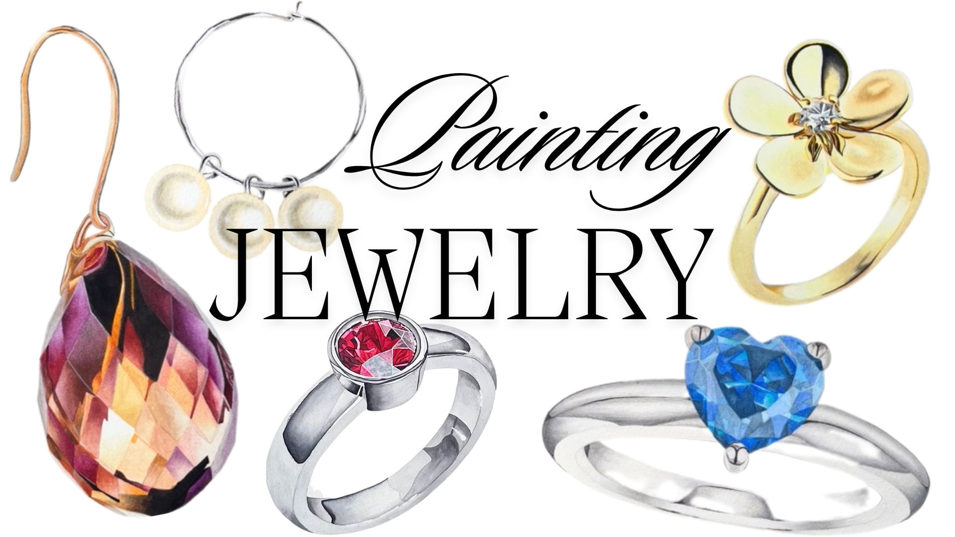
transparent layer. As you can see, When painting these glass sculptures or crystals or also jewelry it's more or less
the same thing. I found that working slower is usually
the best way to go. That means painting maybe
an tra two layers with another and yet another
transparent mix of colors rather than using super thick dark
colors right away because then it's just easier to get that transparent
look that we want. It just means you need
a bit more patient because you just do need to add another layer of paint
and then be a bit more patient until you get the
result that you want, but it pays off to paint more transparent when doing
these glass sculptures. When you do have
different segments like here on the pumpkin or
maybe when you paint. I'm just making sure
painting inside the lines. It's always a challenge. When you paint
something that has different segments
like this one, paint them bit by bit and always leave one
free in between. Paint every other
segment that allows it to dry and prevents the
color from bleeding over. Here I have the
stem in the middle between the two parts that
I've already painted. So I'm just going to go around the whole pumpkin and
you can paint after me, and I'll meet you
when we're both done. The first layer of
orange is down and while the rest of
it is still drying. We can move on to the stem, and we're also going to add a first transparent
layer of green. That is going to be the
light green that we mixed. I'm just picking it
up on my palette. Then we can paint
this on dry paper as well because the area
is small enough. We can get the paint on there
fairly quickly and we don't have to worry about
getting any hard lines, which we don't want
this painting, sometimes you do want them. I am really taking my time,
picking up that green. All right. Probably
dried in the meantime, so I just needed to add
some water in. There it is. This also goes across
the whole stem. That's more or less the
base color and then we're going to add low lights, and then get that glass
crystal look hopefully. I used to try and
not turn my paper at all when recording a video,
but now I'm thinking like, whatever, it's just easier, and it allows me to paint in
a fairly normal position. I'm already somewhat hunched underneath the lens
of the camera. And it's easier to
paint neat when the outline of the
form or segment, whatever it is, your painting is where the tip
of your brush is. So I'll always be turning
my paper so that the tip of my brush runs across the
outer line of the shape. Okay. So the stem
is done for now, and I'm now moving on to the pumpkin part
of the pumpkin again, and now it gets a
little bit trickier. So you can see I have
two brushes in my hand. One of them has paint on it. That's the smaller
brush. What is it? Size zero, and then I have a size one that has
no paint on it. It's just stamp and
has clean water on it. First, I'll use the small brush to get the paint on and then immediately After I'm painting, I use the slightly bigger brush to just smooth out the edge of the paint so that I
still have a soft line, even though I'm
painting on dry paper. Here you can see I'm
just softening the edge, just pushing the pigment
around a little bit. Make sure that the second
clean brush that you're using is not too wet because if it has a
bunch of water on it, the water ends up on
the paper and then it creates like a
backflow or blooms, as it's generally
called, I think. Here with the clean brush, I'm just running across the
edge and you can see how that's softening the paint edge. Then we get that
smooth transition from the darker part of
the pumpkin to where the light hits it and then
the glass immediately goes super bright in color and
white around the edges, but we're going to do that
with white gh at the very end. Here I'm just adding a bit
more orange there as well. The main focus here is really to not get any hard
lines and to make sure that it's a smooth transition
from dark to light. Actually, this
isn't the darkest, this is the medium tones
that we're painting in now. Whenever I pause for
a couple of seconds, I'm looking at the
reference photo, and I'm just trying to
figure out what goes where. I did no try run or practice
run with this pumpkin. I'm looking for a
long time there. This is my first time
painting this as well. That's the orange mix again on dry paper and I'm just running it across
the outline there. Then with the clean brush,
scrubbing a little bit. Just making sure I get like
a flat wash a flat wash, but just like a smooth gradient. Then when we're moving toward the bigger segments
towards the center, we're going to use
the darker orange and also some more yellow because if you do
look at the reference photo, you can see that there's some really deep yellow
shades in there as well. We're just going to
add that on top. I was thinking about
speeding the whole video up and make it twice as fast because I just
paint really slow. I wasn't sure if other people have the patience to watch me paint in this
incredibly slow manner. This is pure windsor lemon, again, but this time
it's quite thick. When we used quite
transparent wash on for the underpainting, this is almost winsor lemon
at its full intensity. Then this is the
darker orange that we mixed on a slightly
bigger brush as well. I'm painting it
next to it and then I'm I'm smoothing it out again with the
clean damp brush. But this also shows
you because this is in real time that you do have quite some time
when you're painting. You don't need to
be super stressed. Oh, my God, the paint is down, now I need to smooth
it out and is it drying you have a bit of time and there is no need to not be completely relaxed
while doing this. Now, with the darker orange, I'm holding my
brush at a really, like a 90 degree angle. So I'm just adding
some lines there. I'm sorry, you
couldn't see properly. If you look at the reference
for there is texture in the pumpkin, there are Oh. The camera stopped
there for a moment. It does that sometimes when it goes from one memory
card to the next and when I don't constantly look at the display,
I missed it. This was just
painted on dry paper and it was the darker orange, and there was no
magic to what I did. I just painted it on
that little segment. I'm sorry that it got lost. I think that happened once or twice while I was
doing that pumpkin because I don't
have a clear look onto the camera display, sometimes it just stops
and then I don't see it. Yeah. But this was
just two, 3 minutes. I am wetting this section with water first because I
want to paint wet on wet. Because I want everything in that segment to be super smooth and just the colors
flowing into one another. This is very concentrated
windsor lemon again. You can see that actually
it does get quite dark. If there is no need to
use cadmium yellow here. I'm just picking up
some more. Orange. S. This is the lighter orange. I'm adding these lines that
go up and down the pumpkins, just the natural
structure of the, this is a glass figure
that we're painting, but in nature, you've
seen a pumpkin. We do want a hint at the
natural texture that this sculpture is still
trying to imitate, and we're trying to
imitate the imitation. That's always fun. Like I said, this is the first
time that I painted the pumpkin and probably it's going to be the only time
I'll be painting it. So I will be making some
mistakes here and there. For example, I'm going to try to soften that hard line
that I'm getting there. From the top section
that I'm painting right now to the one that's dry that we're not
painting at the moment. Then you see what I mean when I say I don't want hard lines. This is giving me obviously, this is giving me a hard
paint line and then I'll use the eradicator
brush which I love, and I'm so grateful
that I found it online. I'll just rub out some of the paints and it
just works wonders and you'll see how easy it is to get rid of hard paint lines when you have them and
you don't want them. So there are quite
some ways in which you can go back on mistakes
that you've made. This is the side zero brush
and the orange again. My paper is still wet. The paint is still
wet on the paper, and again, I'm just adding some of
those faint lines there. They're very faint. I just want to break up that block
of yellow that I have. Also, it is what I see
on the reference image. And here I'm using the size six brush again.
This has no paint on it. It's just clean, but a bit damp and I'm smoothing
everything over again. Whenever you do this, the most important
thing really is to just add no additional
water to your paper. Because then you get blooms and it just turns into a mess. But once you figured out how damp your
brush is supposed to be when you're smoothing
out paint, It's not magic. It's quite simple. This
is some more yellow. Trying to get a bit more
intensity to save us additional time with extra
layering layering. Sorry. This is some more orange. Yeah, I'm just going back
and forth here a little bit. Moving towards the
bottom of the pumpkin. Again, this is the dark orange. And I'm painting on paper. A Do look at the reference image while you're painting along
with me because it'll make much more
sense to you and it gives you the learning path
is going to be much shorter and more
efficient for you if you constantly look at
reference images and then see what the artist is doing and how they
are interpreting this section of the painting, whatever it is, rather than just copying
what they're doing. That's the light orange again, also on dry paper. That segment is still wet. I'm picking up some of
the dark orange and I'm dropping it in at the very
bottom of the painting. This is called
charging, by the way, painting a second color into an color that's on the paper. Then the two are just going
to blend into each other. Again, I'm running my brush across the edge of
the dark orange. This is just one of
those dents that separates the pieces
of the pumpkin. So you can see how
my painting process is rather slow ish, and it's a bit more meticulous. O. I always admire people
who paint loosely without any outlines and they're
super expressive and then things come out
perfectly in the end. I just have a different
process and a different style, I guess. This is water. We're going to do the
same thing on this side, like we just did
on the other side. Also, again, I'm wetting
only the top part of the pumpkin because it's just like the reflection
on the glass. This is the pure winds lemon
again, very concentrated. Adding some more. And then I'm just pushing
around the pigment. This is the light orange. I think that's a
size four brush. I don't know. Brush sizes
don't matter that much. Pick up a brush
that suits you the best for whatever it is
you're trying to do. If you need a smaller brush, if you need a super
fine tip for this, for example, use a
size zero brush. It really doesn't matter. You use the material that you need and not always the one that someone else is telling
you that you should use. Here, I'm already painting
in the directional form. I'm suggesting these
vertical lines So now I'm switching to
a smaller brush again, and I'm just going to push the orange
around a little bit, adding some more of these lines. This is the dark orange. So there my yellow wasn't
wet enough anymore. I just went back on
adding more of the lines. Here, I'm just making
sure everything is nice and even and smooth. This is more yellow that
goes in the middle here on the dry paper and the
light orange mix again. So I'm going to
finish this layer in exactly the same manner for the remaining parts of
the pumpkin that we did now. I'm just going to go
ahead and do that, and you can, of course,
paint along with me. I'm not going to
add any music to it so that you can have
your favorite show on in the background, and I will meet
you when I'm done. H. So now I think we're
already seeing some shape and form and
some sense of transparency. So I did mention earlier
that I'm going to use this adictor brush to
smooth out, sorry, the camera is moving a bit, to smooth out some of
those hard lines that I got there while I was painting the upper
part wet and wet. So maybe you've used
a brush like that. If you don't have
a adictor brush, you can also just use a very stiff brush
because that's all it is. I'm using the brush by
dampening it with water. It has no paint on it.
It's just slightly damp. Then what you do is you just
scrub along the edge or the piece of paint that you want to eradicate or
erase from the paper. Then you have a
paper towel ready, so you scrub a
little bit and then you blot off with
your paper towel. Then you scrub again
quite carefully, and then you blot off
again and then you do this until you're happy and you managed to
erase your mistake. But this is also a great way
to lift out some highlights. Here I'm actually using it
like an eraser on the paper. There was a bit of a splash. Yeah, the eradicator brush is also great for lifting
out highlights. That's probably one of
the best ways to do it. Besides lifting while
the paint is still wet. So now I have more yellow
on my brush there. I'm changing my mind. Still yellow, smaller
brush though. This is pure Windsor
lemon on dry paper. And then coming in
from the other side with it's a bit
more concentrated, the light orange that we have. Coming in from the
other side and I want to meet the yellow
while the yellow is still a bit wet so that I can
create a smooth gradient. I just cleaned up
my brush ale bit and I'm smoothing out the edges. The process of painting
is very repetitive. If you're new to water colors, I don't know if you're
a beginner or if you've managed to get in a
bit of practice already. But once you've managed to blend and smooth
out the colors, the way I'm doing,
then that's really the only technique
that you need. More or less, this is again the light orange
mix on dry paper. That's why I like focusing on illustrations that use one or just one or two main
painting techniques, and you just repeat
them over and over and over again
in the same painting. It's just a way of practicing, but while doing something
fun and not just doing bland practices
on scrap paper. You can practice here and you're also creating a nice painting. It's how I taught myself to paint and how I managed
to stay motivated. I appreciate all the
technique exercises in the books on everything. I included them in my book as
well, but I never did them. I just learned through
watching and doing tutorials. Again, this was Windsor
Lemon on dry paper. And coming in with the light orange mix while
the yellow is still wet.
4. Pumpkin Part 2: So now I think we're
already seeing some shape and form and
some sense of transparency. So I did mention earlier that I'm going to use
this adictor brush Let's move the cameras for a little bit of
those hard lines. I got there there was
this and red that we. So mash that. If you don't lie definition
Eadicate a brush, you can also just brush
because that's all it is. I'm going to zoom
in in a second. So I'm using the brush as well. Dampening it with water.
It has no paint on it. It's just slightly damp, and then what you do is you
just scrub along the edge or the piece of paint that you want to eradicate or
erase from the paper. Then you have a
paper towel ready, so you scrub a little bit. I'm block and I'm really
just you scrub again, quite careful creating
block off again and then what I see you're happy and you've managed to with these erase
your mistake. Crystal sculptures,
there are but so many way to In the
glasses highlight. If you in your other
reference photo and more on the paper. You can find just like a does the dict brushes highlights
shapes and bits and class. So Sotes that help to look in the reference photo
and try to figure out to the paint so that you
don't have to paint in every single little bit because that would
just be overwhelming. Mess on your paper. So
sometimes you need to look at it and you need
to my brush there. What can I leave out or
what should I leave out so that it benefits my
paint ow smaller brush. But in a way that is dry paper. Create a sense of
realistic painting. So sometimes that's easy. In this case, it was very easy. Sometimes it's a
bit more difficult, but that really just comes
with experience, I guess. I'm continuing to work on the stem with the
dark green again. This is the dark green that has a little bit of
the neutral tint, like the very dark
green that we mix. Again, I'm just continuing to look at the
reference image and wherever I see a blot
in a certain shape, I try to put that blot on my paper and that's
how I work my way. Forward, I suppose. This is on dry paper as well. Yeah, you can see it adding the neutral tint definitely
gives it a different ue. But I don't mind
it because where the stem meets the pumpkin. It really needs to be
like super super dark, so the darker we
can go right away. The better is just
saves us time. And of course, with the
masking fluid in place, we don't need to worry
about preserving any highlights or anything. We can just paint over them and we don't have
to worry about it. So a good rule of
thumb is that I mean, you can look at paintings and try to see for
yourself if that's true. But most of the time, if you have a very, very bright or white high
light right next to it, you'll find probably the
darkest area of the painting. So the very lightest is usually right next
to the very darkest because it's just a contrast that makes the
highlights pop and really makes it look
realistic and just s lively. So I'm using the dark
green here and I'm painting right along
the masking fluid. And then when we
rab the mask out, we'll have the white of
the paper right next to a green line, and that'll just give it
a real cool cool look. So contrast just brings any
painting to light to life. Sorry. And contrast is just nothing more than super
dark next to super light. Hey. I'm continuing to paint
here with the medium green, the one that's darker but doesn't have any gray in
it, any neutral tint. I'm just filling in the
middle part of the stem here. I'm trying to paint light and do thin strokes so that I don't have a massive
blot of paint there. Try to paint super fine lines, as much as I can manage. This is a 30 brush even, feel very free to pick up the smallest
brush that you have. And then try to do these
intricate fine details. I'm just continuing to give
the stem some more depth. And it's always one
of those tips, right? Try to give it more depth. Yeah, great, how. I try to give it more depth by really looking closely
at the reference photo, and I'm just repeating
myself here at this point. Um I try to make sure that the darkest areas are really really as
dark as I need them. Then I try to make sure that I have some mid tones in there. Ideally, some soft
color gradients, although that stem is
like super small and there's enough going
on there already. So just a good mix of light, and then at the end, we'll have the white
highlights even more and then midtones
and super dark. This is the light orange
mix again on dry paper. Now we can work on
really bringing out the shape and
the form some more. We do want to paint a
three dimensional object, but since it's natural material, it's not a natural pumpkin, so it doesn't have
that shadow that you would get on a natural ob, piece of fruit or
a piece of veg. This is also I think this is
the light orange as well. Bit more water in there now. Also on dry paper. I just cleaned off
my brush and now I'm just smoothing
out the edge again. Because on the top
part of the pumpkin, like horizontally the top. We do want super light edges because that is where we
get reflective light. Reflective light is
where the light that shines on your object
is reflecting. It looks as if the
edge is almost white. Usually it's like a bit grayish. And that increases this like transparent
crystal glass look. But it also makes
the object look more realistic because you do have reflective light on
most smooth surfaces. And now I'm moving
towards the bottom again. This is the light
orange on dry paper. Cleaning off my brush and
just smoothing it out. Again, looking at
my reference image. Now, the top is still
a bit wet, I think. This is the darker orange. Again, cleaning off my brush. And making sure it's
nice and smooth. Cleaning off my brush. And smoothing everything over. Again, this is the light
orange on dry paper. I'm going to paint for a little bit in
exactly this manner. There's really not that I
need to do at this point. So just follow along
with me and I'll be back with more explanations
when they are needed. Now in a second, I'm going
to use the dark orange, but I mixed a little bit
of Burnt Sienna into it. Burnt Sienna is not too
far off from orange, and they are in adjacent or in the same
family to a degree. So I just wanted an
orange that was like, almost leaning into
brown a little bit. So I mixed it with a
bit of burn sienna, and you'll see how
the hue is different. So that's that. Also on dry paper. And I'm continuing to use. Let's call it the brown orange. Here on this bit. Just making sure I don't paint entirely over
the yellow because we do want that yellow glow
that's coming from within. Again, this is
fairly concentrated. It's like a medium
concentrated mix of paint. It's not super thick, but it also doesn't have a
ton of water in it. Again, I'm just painting it on, also painting over the
masking fluid there, and then cleaning off the brush quickly and feathering it out, smoothing it out so that
the gradient is nice and even I'm dropping in a
bit more color here. And also on the edge there. Moving on to the back part here, I could have switched
to a smaller brush, feel free to use a
smaller brush there. This is also the brown
orange on dry paper. Again, this is the brown
orange on dry paper. I've been moving my
paper in a direction, so I don't paint into the edge of that little
segment there because that's where we'll
want to create that reflective light
look, so to speak. Again, just painting
on dry paper, then cleaning up my brush, d it off on the paper towel and then just
moving it out here, I'm dropping in some more paint. Cleaning off my brush and
running across the edge. I'm realizing down here, I have a pretty rough edge
that I'm trying to soften. This is the brown orange
again on dry paper. So again, I'm just going to keep painting like this for
a little bit longer. I have the orange, the very dark orange. I'm going to paint on dry paper, then clean off my brush and smooth out the edges so that I don't get any
hard paint lines, and I'm going to do that for the remaining segment
of the pumpkin there. I'm done with that step
of the painting process. Everything is completely
dry. I've waited for a bit. I have this rubber
thing here that I use to take off the masking fluid. If you don't have that, I don't even know
what it's called. You can just use your
finger and take it off with your finger just by it. That's how I usually
do it actually. I almost never use this. Now all the white highlights are coming to life, so to speak. They don't look they're
not super precise right now because I mean,
maybe it's possible. I've just never managed
to put paint down the masking fluid like in a super delicate way
with the perfect edges. It just doesn't happen. Here, I picked up the
eradicator brush again. It's damp and sorry holding my hand at a
very steep angle here. And I'm just rubbing
across the edge of the high light so that it just
looks a bit more organic. So I'm just softening
the edges a little bit, trying to create
a smoother look. Okay. Now that I've worked a bit on the highlights,
they do look better. I have this like
teeny tiny brush. I think it's a 50 brush. There's a bit of paint. It only takes up a little bit of paint of the dark orange on it. I'm also going to zoom in
from the side in a minute. And I'm adding the
tiniest bits of details alongside
the outer edges of those white highlights, just to break them
up a little bit. It makes them look
more natural and it just adds a bit more
interest to the painting. Most of the time highlights also have a lot
of color in them, just like shadows usually
have color in them. The color of your if this
were a natural pumpkin, and I had taken a photo of it and there was
a cast shadow on the floor like that cast shadow would also have
some of the color of the pumpkin itself in it. So here you can see how
tiny the detail is, and you can just like
wiggle your brush along. There's no right or
wrong with these shapes. Just make sure they're as small and fine as
you can paint them. So I'm just going to
continue doing exactly that, just breaking off the edge of the white highlights for
this one in the center, and then the slightly smaller
one on the right side, and you can just watch
and follow along. Now we're really in the final
stages of the painting. Looking at the reference image, I can see that there's a lot of detail on these top parts. It's mainly just
maybe some bubbles that are captured in the glass, and then the light and
color reflects differently. Here I have the orange. This one has more
scarlet lake in it. T. I have my 30 brush and I'm
painting on dry paper. If you look if you hit pause and you look at the
reference image. Again, you can probably do
this part even without me. You can just see
their little blobs and shapes of very dark paint, and that's what we're
going to paint in. This is burn Sienna with
just somewhere orange, red, and burn sienna. Then those details
are going to add to the overall look that this is actually a
glass sculpture. So all of this is Brancana. Then these little shapes, I did not paint them. I did not put them into
the outline that I made because it would have
just made it more complicated. I think you would have had to trace so many more pencil lines. Also, there's not
really a right or wrong with these shapes because
they're just random. No one can tell you
that, this blob of color in the glass is incorrect and now it doesn't
look natural anymore. That just doesn't happen. You can just really feel free
to add random shapes there. The only thing to watch out for is to make sure that you have the right
intensity of the color. If all of this is like is the darkest bit of the orange part of the
fruit part of the pumpkin, then they should
all be the same. They should all have
the same darkness. That's really the
only thing and here, I'm intensifying those lines. That also helps to create a bit more of a three
dimensional form. Whenever there's a dent in the glass in the middle
at the bottom there. We're going to make it darker so that it retreats visually. This is burn Sienna still. You can also mix burn
Siena with red actually. This is pure burn Sienna. There are going to be some
horizontal lines there. They also don't have
to be exactly the same as they're in the
reference photo, mine aren't. I can just paint as if. Yeah. So if you managed
to do really fine lines, that's always a plus now. The finer and more intricate, the detail, the better, depends how much
patience you have. Now there are some
really dark details. This is just pure neutral tint. I find that if I
use neutral tint at its full intensity without
any water more or less, then it just looks
completely black to me. That's why I don't
have a separate black. Many people also mixed blacks. I haven't started using that because whenever I
need to use black, it's just in those small
details like here, for example. Here, I'm also just
with some more burns Na just darkening the areas that I feel need to
be a bit more dark. Adding more interest. Yeah, I'm going to go over
these small areas and Paint these random
shapes until I'm happy with the intensity
basically because I did look at the reference
photo and found that this top part is
just the color is just so much more intense
than the rest of the pumpkin. And I was thinking,
Okay, how do I do this. Yeah, I'm just going to add small details with Burn
Ciena moly on dry paper. Now, this is the
orange mix again, and I'm also going to
use the dark orange mix on the right side of the top
part of the pumpkin there. Now, this is the dark orange again or burn sana, actually. H. I'm sorry, you can't see properly. I'm just using the
very tip of my brush, so I'm holding it at
a 90 degree angle. Unfortunately, my hand
covers what I'm doing. But it's just the dark
orange and I'm just adding more fine
details on lines and in a minute or in a second, you can just hit pause
and add what I've added. Yeah, you can see
by the movement of my hand that I'm
just adding some of those fine horizontal
lines to give it a bit like a more
interesting texture. Then I'm coming in with
some more pure burn sienna. For the bottom part here, do mix some burnt sienna with the red that you used
to mix the orange. I don't know if you also have the same red that I
have or maybe you used croon red or
maybe Alyson crimson. But it's just more at the
bottom and brownish. I thou. And I'm picking up some
of the dark orange again. And I'm adding more lines to
this segment at the bottom, just like we did on the
left side previously. Now I'm just going to glaze
the top a little bit. Glazing just means adding a
very transparent layer of paint on top of your
almost finished painting. Actually, you can do
glazing at any stage. It doesn't have to be the
final stages of a painting. This is pure scarlet
lake, pure red. I could have done this earlier. I think. I don't
know why I didn't. I could have painted
this bit red and then added the details with
darker burnt sienna. I don't know why I didn't. Sometimes I also don't see everything the
first time around. Then I look at the reference
image and I'm like, Well, this is a completely
different color. Why didn't I use that one? So that's a little bit what's happening here.
This is also red. Now I'm looking at
my painting and I'm thinking the details with Burnt
Sienna that I painted in. They're looking a bit faint now, so I have pure burnt sienna on my brush and I'm just going over them again a bit because
I do want them to be more. I'm just adding a
bit more paint. But it's a quick fix, really. So I think I'm pretty happy
with how it looks now. Now, the last stages of painting are usually white
gah for me if I do use it. So the process is the same. I have white on my 30
on my small brush here. And then I have another brush. That's just clean and wet and I try to smooth out the white guage so that
it blends in with the orange. Then we get this look of there being light reflected
in the surface, and it doesn't cover all of it and the color does
shine through, but we do need those
smooth transitions. And sometimes it depends on
what kind of gah you have. I did switch to a different
brand with this one. And sometimes white
gah can look very, like, grayish,
like chalk almost. And I was very unhappy with the one
that I previously used. I went to the shop and I was
looking for a different one. I found this one and
It's just wider. But sometimes or oftentimes, I find that white
coach needs layering. If you have your first layer and you're applying
it like I do here, and then you're using a wet brush to feather
it out a little bit, and then it dries and it looks too transparent, you
just need to layer it. That's completely normal. And it's always also
best to go slow. Even if that means that you need to go over
it once or twice. Again, it's better to
be on the safe side and use less color first when
you're not sure how it dries, rather than using too much
and then getting that off the page of the paper
is not going to be easy. Yeah, just use less and have a wet brush here and
I'm feathering it out. I know it's going to dry
lighter, but that's okay. So I'm going to do exactly this for all of the top
areas of the pumpkin. And there's not much more
that I need to say about it. I think you can just
watch and paint along. With the lightest
areas all in place, more or less, I'm looking
at my painting again, and I'm looking at
the darkest areas. If they need adjusting, and I that they do, especially at the bottom there. This area just looks unfinished. I have the red with I honestly I can't tell if it if it has burned Siena in it or if
it's just a pure red. I think it has a little
bit of burn Sienna in it. Shouldn't make too much
of a difference though. I painted this three weeks ago, and now I'm on holiday with my family in Italy and I'm
doing the voice over. So, this area at the
bottom needs to be way. So I'm just painting
over it again. I in the bottom segment there, I'm going to add some more lines with like red and burn Sienna. I just I must have completely
forgotten it earlier. So this is red, and, just some more wobbly
horizontal lines til that's also done. I think this looks good. That left middle section
right here is going to get another code of white because
in the reference image, it has just more
reflection on it. It's just more prominent, and I felt like I needed a bit more. But look at your painting
and figure out if you're ha with it or if you need
to adjust here and there. Then here on this side, I'm also going to add
a bit more white. Again, adding it and
then smoothing it out like we did so many times. Smoothing it over
with my bigger brush. That helps when it's
not such a tiny area. Then on this side as well. This is white ge on dry paper. And then we're done
with the pumpkin. Thank you so much for
watching, for painting along. If you finished your painting, I hope you did,
please do post it. I would love to see your result.
5. Happy Ghost : Let's start by looking at the
colors that we're going to use for this fun
little glass ghost. I already have a fairly
diluted transparent mix of neutral tint and
cobalt blue here. It has a bit more
blue than gray, so you can just mix that up and then This is pure neutral tint. If you don't have neutral tint, paints gray is also good because it has that
blue tint to it, and this is more
concentrated neutral tint. We're just to use those
two colors for this ghost. The gray, the neutral
tint is also going to serve as black in a very
concentrated version. This is the pure cobalt blue. If you don't have cobalt blue, you can also use ultramarine. I just didn't want to use ultra meolen because
it granulates and I just want to try to achieve a really smooth look
for this glass ghost. We're already painting
on cold pressed paper. The structure of the paper
already takes away from that super glossy perfection. I didn't want to add a
granulating pigment to that. That's why cobalt blue
instead of ultramarine. I'm just rubbing out some
of the pencil lines here, so they're not so prominent
when I'm painting, and then this is masking fluid, I usually pour a little bit
into the lid of the cup that it comes in and then I have this metal densel that
I use to apply it. If you don't have that, you usually or you most likely just have a small old brush like a synthetic brush that you can use to apply
the masking fluid. Just make sure you clean it
o after because once it's dried on the bristles in a
bruh synthetic or natural, it just ruins the whole brush. Then you can do this two, three times and then you
have to throw it out. This little like metal pen came with the tracing
paper that I got online, and it turned out to be
a really useful tool to apply masking fluid. Yeah, this is not
exactly a time lapse, but I did speed the video up a little bit because
I take my time applying masking fluid and you don't have to watch
me do this in real time. When I'm done, you can
just hit pause and then take your time applying
it everywhere that I put it. There are a couple of highlights
that I want to preserve. No super big areas, but just tiny ones. Masking fluid seemed like
a handy choice here. There's some more on
the bottom there. This is all of my masking fluid. Hit pause if you need to
see exactly where I put it, and let it dry completely before you start painting
the first layer. Really make sure it's very dry. Leave it for 20 minutes or
dry it off with a hair dryer. But just make sure it's very
before you start painting. Then I have this
big round brush, and I'm going to use the
transparent blue gray mix. And I'm going to paint
across the whole ghost. This is like it's not
really an under painting because it's not really
an illustration where you'd need such a thing
as an underpainting. But this is just the
first transparent layer. It's like the base color
of the little ghost. It's just light blue. It's almost completely
see through. It just has this slight
blue, grayish tint. I'm just making sure I
have clean edges here. It could also be a jellyfish, actually like a fun jellyfish. But it's Halloween, so
it's not a jellyfish. It's a. Then I'm
turning my paper. Like, I'm trying to be
precise with my edges, but I'm also trying to paint fairly quickly so that
the paint doesn't dry because I don't want to get any hard lines in the
middle of my ghost here. Anything that's
like smooth glass, should or could also be painted with wet on wet for
the first layer. I just thought I'd get the
paint on there quick enough. But if you want to take a bit more time doing
this first layer, you can also paint wet and wet, that would mean putting a first layer of
water on your paper, and then you can really
take all the time you need to put down
that blue gray mix. So when this is done, I'm going to let
it dry completely before I continue with
some of the detail areas. This is actually a fairly
simple illustration. We have the base layer here, and then we're
just going to move across the whole ghost and add little bits
and pieces of detail. There's this bottom under
section that has more detail, and I start painting that
with diluted neutral tint. Now I have the blue grayish
mix again on my brush. I'm painting on dry paper. Because the underside
of the ghost has more deeper colors and
also more details, like I just said,
I'm just giving it another coat of this color
that we just used before. Whenever I pause
for a little bit, I'm just looking at the reference
image and try to figure out where the paint goes. Now this is gray and it's just bleeding into the blue gray mix. In the beginning, these
glass illustrations can be a bit of a headache when
they have a lot of detail and everything
is just very intricate, and you don't know
where to start. My advice is to start painting slowly and
start identifying just the biggest areas
of paint and then getting those in and then move your way towards
the smaller areas. It just gives you a
sense of orientation. If you break down maybe it's
also a piece of jewelry, maybe you want to paint
a diamond or something like that where they have just 1,000 reflections and so many different areas
and little segments, just moving from big to small is a good way to not get
lost in your painting, and also not to get frustrated because it can be
overwhelming sometimes. Now, I have a flat brush here. I never use a flat brush. You can also use a round
brush to wet that section. There's a smooth gradient there. I can see it in the
reference image, so I want to wet
that area and then drop in some of the blue gray. It's not necessary to
use a flat brush here, just any brush
will do literally. So this is neutral tint. It's not very concentrated. It's fairly transparent. But it doesn't spread
across the paper like crazy because I didn't add that
much water to my paper. And I also wet it a
slightly bigger area then I'm going to add paint that prevents the paint from creating hard
lines where it dries. This is some more of
the cobalt blue there. So it's just for the whole gos, the gray and blue are just going to blend
into each other, and it's like a
smooth transition from blue to light
gray more or less. Here, I'm just working over the water line so that it doesn't
dry as a hard line. I don't want that.
Then down here, I'm painting on dry paper. This is neutral tint now. You can also look at
the reference image for yourself and figure out look at the little detail segments
and just paint them in and then meet me again in the video
when you're done with it. That's also a good way to learn. Just do it the way
you think you do it and then see how I do it and then decide which
method you prefer. This is pure cobalt blue now. The gray is still a b, so it's going to
blend into that, which is exactly what I want. Here, I just wanted to show
you really close up how I use wet on dry and wet on wet
technique in one painting. This is cobalt blue
on the dry paper. Painting carefully
so that I don't paint over my little
segments here. I was dabbing off
my brush and now I'm just pushing the paint
around a little bit. Now this little segment, this is also a super small area. But there is a gradient
within that area. So that's why I'm wetting it, and then I'm going to drop
in some of the neutral tint. This is pure neutral tint. You can see that if you don't use a ton of water
to wet your paper, that the color,
even though I also have lots of water
in my gray mix here, the color doesn't
spread like crazy. It's not uncontrollable. So you can still have control in small areas when you're painting wet and wet,
you can do that. Just don't use as much water as you would for a bigger area. And then I was just adding
some more blue there, and now I clean off my brush and I'm
smoothing out the edges. Making sure paint doesn't go
where I don't want it to go. Cleaning up the lines there. So for the rest of
this bottom section, I'm just going to paint
it all in cobalt blue, still very transparent
mix on dry paper. So if you look at
the reference image, you can see that on the lower left side
of the ghost here, there's a gray area, and then there's
some wavy lines, and it's just
suggesting the shape of the glass or maybe
even the movement of the ghost and those
are more bluish. So I'm just starting to get the general shapes in
with neutral tint here, and then some cobalt
blue again on dry paper. Now I'm going to start
painting in the face, the eyes and the mouth, and since this is
not a natural being, it's not a person,
it's not an animal, the eyes, of course,
are also way less intricate and
way less complicated. The only thing that I always
think is really important to watch out for when
you're painting eyes is to not mess up the
general shape of them. Because once, even if it's an artificial figure
of a ghost here, even if you like mess up the shape a little bit and you paint outside the lines, and it has a bit of a wonky eye. The whole figure just
looks weird and crooked, and it's really hard to
correct that mistake, and then you want to correct it, so you end up making the eye even bigger and
then it gets worse. Yeah, just I use I think this is a 50
brush that I'm holding. So the smallest
brush that I have. And I'm painting on dry paper. This is a media mix
of the neutral tint. And I'm just painting
in the first layer. And then after we're going
to paint another layer over it for the bits of the eye
that are completely black. And then coming
down to the mouth, this is even simpler. So I switched to
a size one brush. Again, s of gray on dry paper, and I'm just painting
in the entire mouth. This just really makes
this a very beginner friendly illustration
and tutoria. But I was still so happy
when I was done with it. I thought it came out looking
really cute and really fun, but it's not complicated
at all to paint. Yeah, with the mouth,
same as with the eyes, I'm just making sure I get the shape right
and I don't mess up. The outlines of the mouth. So I'm just jumping back and
forth here a bit first the face and then painting
down here again and then up where the head is. The reason is that A, I want all areas to dry completely before I
go near them again. Now this is pure neutral tint
on dry paper down there. Also, I didn't do
a test painting. I didn't try it out
before I filmed it. I thought I can just go ahead
and film it straight away. This is just my intuitive
way of painting, and sometimes I do
jump around a little bit in the picture
in the painting. And if I do like, if I try it out first,
just for myself, then I know exactly what to do and where to do it
and when to do it, and then the tutorial maybe
is a bit more methodical. But I think this is fine. I think it's easy
enough to follow. So this is Cobalt blue over
there in this egg area. And then we're
going to come back to the head again and
do some wet and wet. Okay. So the eyes in the mouth and everything
is completely dry. If you look at the
reference image, you can see that there's a bit of a color gradient coming
from the top left of the head, and then it disappears
towards the middle. I'm just wetting it with
water and I'm making sure that I don't paint that I don't put any water over the eyes that are already
painted because I don't want to disturb that paint
and I don't want it to bleed into the
rest of the face. I'm really being thorough here, making sure I don't
touch any of the gray. If you want to be extra short, maybe just don't paint the water right up
until the eye at all. Then I'm leaving out
this segment on the very left of the ghost because I can see a bit of a hard line
there on the reference image. Then we're just going
to give the head a bit of a bit of a shadow, and that will help create the illusion of it being
round and three dimensional. I'm going to go back and pick up my gray blue mix from
the very beginning, and I'm just dropping it here and letting it
flow a little bit. Then while the paint is
doing its own thing, I can focus on the edges
and make sure they're all nice and crisp and clean
just how I want them to be, and the pigment can just flow
wherever it wants to go. This is like I said, it's the same transparent mix that we used in the first layer. You can just see that if you put two or three coats of
that onto the paper, it just gets darker and
darker each time, of course, and it's a really neat way to create those really
soft gradients and that transparent look. There's really just
hints of color. The more I look at it,
the more I think that the ghost is actually
completely colorless. But as with anything, so when you paint white things, like white botanicals,
flowers, for example, you'll hear right
away that there is no such thing
as a white flower. It's always gray, it almost
has lots of color in it. So the ghost here
is quite similar. It is more or less
colorless and transparent, but we do need to paint color to make it
visible on the paper. Also, there's a lot of color
that reflects in glass. So even Though the glass can
be completely transparent. There's just going
to be a bunch of colors that reflect from it because they're in the light that hits it from
its surroundings. Yeah, long story short,
the ghost is blue. Sorry. I'm going on and on here. Now, there's this
transition area where wet and wet
meets wet on dry. I'm still using the
blue gray mix here, and I'm filling in this section. And then on this left
side of the figure, there are some like fine lines. Some of them are very faint, some of them are going to
be a bit more pronounced, so I'm just
introducing them with this transparent wash of paint. There's also a line
that goes from the top And then really,
you can just yeah, this goes all the way
up. That's what I meant. You can really just so look at the reference image yourself and look at what's there and then paint it in yourself
and come back to this video whenever you feel
like you've completed one section and then what
I did and how I did it. And that's also a really
useful way of learning. Just doing it yourself
first and then seeing what the teacher did and then comparing techniques. Maybe you prefer
the way you did it. And then you're on
a really good path of creating your own art style and your own method of painting. So now I'm already
starting to paint in some, like, super fine details. I don't know why I didn't use a smaller brush
for that one. This brush that I'm holding does come to a very small tip, so I was okay using it, but feel free to use like a size zero brush for that part. A. This is the blue gray mix again. It is becoming a bit more
concentrated because as I paint the paint mixes in my palette are also
starting to dry a little bit. But that's totally
fine because as we move forward in the
illustration, I do want more. I do want darker colors. Also because this is on paper, it's a bit darker anyway. Yeah, this is just really
looking at the reference image, figuring out what goes So coming over to the right bottom part
of the ghost again, now I have my small brush, my 30, and this is neutral tint. And I'm just continuing to paint in more details on paper. Now I have much more
concentrated gray on my brush and I'm going to paint right next to the masking fluid that's on
top of that little segment, and that's going to
give me a nice contrast when we rub out the
masking fluid at the end, I'll have the white of
the paper right next to a super dark segment of paint, and that contrast is going to increase the effect of
this being a glass sculpture, and contrast just always makes
a painting come to life. Even when there is
sometimes There's not a lot of contrast where I feel
like I wanted to be or I feel like this could look like
much cooler if there was. Sometimes I add it
in my painting, especially when I paint jewelry, when I paint gemstones
and diamonds, I usually add a
lot more contrast than I see it on the
reference image. It just makes it look
cooler and more vibrant, I guess is the right word. Here I'm just painting on
dry paper and you can see that this is already
super detailed work. I'm painting a bit more slowly because I want my
lines to be very thin. And one cool thing about
painting something. I mean, it's not abstract, but it's just artificial. Is that you can make a lot of mistakes and
get away with it. For example, when
you're learning to paint super realistic
botanicals and leaves, and then you don't
get the shadow right, you don't get the veins and the leaves right,
that's visible. People can tell that that's a mistake that you
made or you've been a bit sloppy painting or the
hue isn't slightly correct, no leaf is going
to look like that. But with these artificial
sculptures and figures, there's no such thing
as a correct or an incorrect reflection
of light So for example, those fine lines that I just did there at
the bottom right, you can just paint them more or less completely different and nobody will be able
to tell you that that's not the right
way you've done it. It's more about creating
a general feel of this bleeding glass than
painting 100% correct. If you do want to copy everything exactly the way it is in a reference image. I mean, that's very admirable to do if you have the patients. I do sometimes, sometimes
I don't have the patients. But then that's more
an exercise of am I able to replicate exactly what I'm seeing, no
matter what it is. Okay. So now I'm
just continuing down here in the same manner
that I was before. There's not much that
I need to exp here. This is on paper again with
more concentrated gray. So remembering what I just
said before about contrast, I'm now putting some more color over this little bit that we masked off
with masking fluid. Because I was
looking at it, and I was thinking, if I rub it off, then the white of the
paper will almost have no contrast to the
super transparent blue. And then having a
highlight there, you know, it's not going
to be very visible. It's not going to
have an effect. Surrounded it with a
bit more darker pigment so that the highlight is
going to be visible at all. Then it's going to
make a difference because there will be
a bit of contrast. This is again neutral tint. I keep wanting to
say paints gray because I've had paints
gray in my palette for like four years and I
just recently switched to that different gray because
I don't always want to have the blue tint that
Pains gray usually has. Although the one by
Windsor Newton is less blue than other
pains gray versions. Anyway. Here again, I'm using a super small brush
and I'm taking my time to make sure that I'm painting the finest
lines I possibly. I'm just trying to create interest here by either
of these details. Now I'm continuing
with some cobalt blue, more concentrated this time. Again, painting on paper and
just adding more details. I'm just switching
from gray to blue. Now I'm picking up
some more gray again. There's a gardener
now working in the background here,
making some noise. I hope you don't hear it
through the microphone here. If you do, I apologize. But I also don't think you can hear the ocean that's
in the background. I'm in Sicily right
now recording this. Maybe you also won't
hear the gardener. Yeah, there's not
much explaining I need to do at this point. You can just watch me add more details and add them
likewise in your painting. Then let's meet when I'm
done with this intersection. Now I have the very transparent blue and gray mix
on my brush again, and I am painting into those like semi
highlights that we have there just around the outside
of them more or less. So I'm just trying to
break them up a little bit is all I'm doing. This is the
transparent mix again. Then coming back to the
bottom section of the ghost. I guess the feet even though
it doesn't have feet. Again, with some more
concentrated gray, the rest of this bottom part
needs some more detail, like the first half that we did. Again, I'm painting
very fine lines and details and wobbly bits on. Again, I keep switching
between gray and blue, the way I see it on
the reference image, so this is blue again, and I'm just working my way
across this area. D. Here there's a slightly
bigger segment in the middle there that
has a gradient in it, where the color smoothly
moves from darker to lighter. Because it is such a small area, I'm not wetting it beforehand. I'm just cleaning
up my brush here and moving it across
my own paint line, and that just smoothes it out. I have a soft color
gradient here. Then I'm just continuing
to paint down here. This is transparent gray. I know, this is the blue
gray mix again, or is it? It's hard to tell right now. Sorry. I think this
is the blue gray mix. I'm just looking at
the reference image, trying to see what
I still need to do. Here again, this is the transparent mix
from the beginning, neutral tint and cobalt blue. I'm just strengthening
the lines a little bit. Then this area here, if you remember, we did paint this wet and wet in
the very beginning. Now that it's all
dried and I have my mid tones and my
darkest tones in. I feel like the color that we put down there
is almost not visible. Again, I'm the blue gray mix on dry paper and then
I'm cleaning off my brush and I'm
smoothing it out. When I'm done with
this in a second. Unfortunately, my camera
stop because it does that sometimes when it switches from one memory
card to the next. Then when I don't look at the little display in my camera, which I don't really
while I'm painting. I sometimes miss the moment when it stops and then I just
need to hit play again. But you're not going to while stop was remove
the masking fluid. I waited and I just rubbed
it off with my finger. You're done painting details. You can also take off your masking fluid and then
we'll continue together. Then we can focus on the face and the eyes again because we do need to make
them like super black, and they need to pop and
make the whole ghost more fun and more lively and vibrant. So mix up some super
concentrated gray. You can test on a piece of
scrap paper if it looks black. And then with a
very small brush, again, make sure you
paint inside the lines. It can be a challenge,
even as an adult. And I'm going over the mid
tones here and the eye, really painting carefully, so
I don't mess up the shape. Before you cover everything with black that we previously
painted in with gray, look at the reference
photo again and you'll see that not actually the whole
eye is completely black. It has three different tones. Then we're just
going to continue in the same manner for
the left eye as well. Now that the eyes are done,
it makes such a difference. It's such a friendly
ghost already, Having fun, living
his best ghost life. So we're going to
paint the mouth in. I switched to a
slightly bigger brush. This is my size one, and I have the same concentrated
dark gray on it. I'm painting the mouth
and it's quite simple, except for a fine line
at the bottom there. Other than that, there is
no detail in the mouth. Oh. With my 30 brush. I'm an outline and then that's that. All right. The face is done. Brace yourself for even more
detail on the bottom there. I have a look at the
reference photo and you'll see that there is much
more that we need to do. So same procedure as before. I'm darkening some of
the gray areas that we already have with the
darker neutral tint mix. And I'm just looking at my photo and deciding
where I need to have more intense
color areas, so to speak. I don't know what the correct
term is or if there is one. So I'm darkening here and there. So we're close to being finished
with this little ghost. I'm just going to adjust
some of the shadows like I did on the lower
right hand corner, where I said, I need
to deepen that shadow. I'm going to do the
same thing on the lower left and then for the
head of the ghost as well because I'm looking
at it now and it doesn't have any roundness to it, and we need
to change that. So Here I'm adding
pure cobalt blue. It's like a medium
thick concentration. I have my size four brush there. Then I'm cleaning off my brush and I make sure I'm
smoothing it out. I might need to add a
bit more paint there. Training the paper
is a good idea. Yeah, because the glass does
have quite a few folds, and we need to make them appear with and we do so by
creating shadows. So that's already a lot better. Just dropping in
some of the blue. So here as well. I'm just continuing to do the same thing here
at the top of the head. This is the blue gray
mix from the beginning, and I'm applying it
on the dry paper. Then again, cleaning up my
brush and with the damp brush, I'm smoothing it out
towards the middle. Then it just looks more
three dimensional, I think. And then at the
bottom there as well, it's going to need just
a bit more shadow again, with the same blue gray. And I'm also applying it on dry paper and then
smoothing it out like that. I'm just making
sure that I don't disturb the concentrated gray that's in that right
corner there right there. I don't really want
to touch it with my wet brush because it might just bleed out and then
create a bit of a problem. So I keep it dry. Then this little section here,
I'm also darkening. Just with some gray. And with that, we're pretty much done with this little
fun Halloween ghost. I really enjoyed
painting this one. I think it came
out really nicely. And I hope you also finished yours and you enjoyed the video. And as always, I'd love
to see your result, so please do take a quick photo and upload it so that we
can all have a look. And I hope to see you next time.
6. Witch's Hat: All right. Let's start by
getting our colors ready. For this, which is hat, it's going to be really simple. We're only going to use
one color, which is gray. I have neutral tint
in my palette. If you don't have that, you can use any other
gray that you have, paints gray, for example, is also a good choice. I'm just going to swatch it out on a piece of scrap
paper that I have. We're just going to use this in a very diluted berry watery mix and then more concentrated. Here on the side,
you can see, we'll just have neutral tint and then white gash for some
highlights at the very end. I almost never paint
anything monochromatics. This is quite relaxing
when you don't have to worry about color
mixing and all that. All right. Let's get
started right away. I have a quite watery mix of the gray on my I think this is a size brush
that I'm holding, and I'm starting at
the top of the heat. I'm painting on paper, and this is just the
first base layer that we're going to put down. There are highlights that
I'm going to paint around. I did not cover them
with masking fluid. It didn't seem necessary
for this illustration, so we're just going
to paint around them. Here I'm zooming in a little bit so that you can see better. Also, if you don't mind
because I'm curious. Maybe you can let me know in
the comment section if you prefer the frame to
be really zoomed in when you're doing tutorials or if a slightly
more zoomed out, picture frame is also fine. I'm like switching
back and forth, but I don't know what
you actually prefer. I hope you can see
everything that I'm doing. Here, I'm just painting all
the way down to the bottom. And now I'm switching
to a bigger brush. If you look at the
reference photo, you can see that there is
a really big highlight on the right side
of the hat there, so I'm just painting around it, and I'm using a bigger
brush so that I can get more paint on quicker
so that I don't get any hard water lines in this area because
with anything, that's crystal or glass, it's always good to have
a really smooth surface. When you get hard lines
where you paint dries, it disturbs that effect
we're trying to create here. So when I'm done giving this a first coat of
gray in a second, I'm going to let
everything completely. And then we're going
to continue painting some wet and wet segments. Okay. So the first layer
has dried completely. And now I'm going to wet this middle section
here with clean water. There's no paint on my brush. But I'm not wet it until
the very edge of the hat. So there's a line there and
I'm staying inside that line. You can also see that
on your outline. All this hat is basically
just different shades of gray and we just need to figure out where there is hard
transitions hard lines, where there are
smooth gradients, and that will determine whether
or not we're painting on wet paper for smooth
color gradients or on p for hard lines, we're going to do both here. This is also a
really good exercise when you're just trying to get in a bit more practice
for both techniques. I am taking my time
with the water here. I usually do. I'm quite slow when I just put down
the water. I don't know why. But I'm trying to make sure that I'm staying
inside the line, that I have the right amount of water on the paper,
that it's all even. Yeah, I could probably
speed this up a bit, but it's not going
to take too long. Just making sure I have
everything covered, also a little bit
at the bottom here. So now, I switch down
to my size brush. You can also use a size
two brush if you want, and I have a more
concentrated mix of the neutral tint on my brush. And you can see that it does travel across the paper but
not like super super quick, and it always comes down to your paint and water ratio when you're
painting wet and wet. If you have a wet
paper and you have a very diluted mix of
paint on your brush, which means less
pigment and more water, then it's going to travel
super quick across your paper. Whereas if you're painting on the paper with the same wetness and you have a much more
concentrated mix on your brush, then it just travels slower because there's
more pigment in there. And the sotom part is
going to be almost black. So I am going in with a
fairly concentrated mix. And you can see how I'm not
sweeping my brush across the paper in one long motion. I'm always lifting it
off as I paint along this line because that will make the paint
spread more evenly. If I do just one
sweeping motion and then lift off my brush at
the end of the hat, I'm going to get a
blob of paint there. If I lift it off, I'm going
to get little blobs of paint, and then it just gets
easier and more even. Now I'm just pushing the
pigment around a little bit. I do want it to spread smoothly towards the
middle section of the hat. I can see that the paint is
not traveling very fast. I'm just pushing it
around a little bit. Make sure it goes
where I want it to be. And then I'm dropping in some more color while everything is still wet
at the bottom here. And then also while
everything is still wet, and adding more paint
on the sideline. Again, I have concentrated
gray on my brush. I'm painting this part
on the right side here. This is on dry paper
because the area is really small and there's no need
to paint wet and wet. I'm just adjusting the tone and I wanted to bleed into the other part that
we just painted. This is also on dry paper here. So at the top here, we have some bits and pieces
that are a bit fidgety. It's where the hat just bends
and has folds in the well, leather or f, but this is glass. But we still do want
to create that effect. I'm not making a
huge deal of this. I am going to paint
in some detail there, but I'm not going to go crazy. So I thought, let's just try
and hint at the shape and then see if that gets us that realistic transparent
glass look that we want. Here you can also please do
look at the reference image. I know it's always easy to
just paint after the tutorial, the video that you're watching, but it's going to help
you so much more when you actually also look at the reference image
while I'm painting. Now I'm just looking myself
and I'm trying to figure out where the paint
goes more or less. This is like a
medium concentration of the gray and then
we're going to go over it again with almost black to create those
shadow bits there. So this is more or
less done for now, and I'm coming back down
to the bottom here. This is where the glass
sculpture is not 100% even. And we're going to try to
imitate that by applying. This is also quite a
transparent mix again. This is the same that I used in the very beginning
for the first layer. So now I'm just
layering that on top. I have a size I think
30 brush in my hand. So do pick up the smallest
brush that you have. K. And I'm painting
on dry paper here, and what I'm going to do
for the bottom part of the hat is I'm going
to put down some paint and then clean off my
brush and then just feather it out and smooth
out the paint a little bit. So that I get the hard paint
lines where I want them, and then a smooth transition
on the other side. I thought that would be a
good technique to hint at the slightly unevenes of the glass where just the
light breaks different, and then you get
some shadows and some lighter areas. That's
what I'm doing here. I'm adding some more gray and then smoothing
it over again. Here you can see
from the side how I just move the tip
of my brush across like one edge of the bit
that I just put down there. Then I'm adding some more paint. Now it's a little bit wet, so
it does flow a little bit, and then I can come back with with the brush and smooth
it out again if I want to. These are just super
tiny strokes of paint, and we're going to add
another layer there in a little bit to make
them more pronounced, but I thought it'd be
better to start out fairly transparent and then work my way towards the contrast
that I want in the end. Like I said, we're going to add another layer and I'm
doing this straightaway. Again, this is fairly
transparent mix of gray, and I'm just deepening that fold a little bit that I can see
there on the reference image. And this is my clean brush again that I use to feather
out the paint. This is the size brush, I think. And this is also fairly
transparent gray. It's like a medium. And I'm giving the right
side here another. This is on paper. So at the top here, I'm switching again to a size 30 brush to add
some more detail to it. This is more
concentrated gra now, and again, I'm
painting on dry paper. Here I'm in a little bit so
that you can see better. I'm not painting as all of the gray sections again
so that there are going to be layers where a lighter gray peaks through and then it's
completely dark, and then it's like super
white for a white highlight. So I'm trying to create
form and depth in the glass by just switching between the intensities of
the gray that I'm using. I. Here I'm trying to preserve that little white
line that we have there. So I'm painting slowly and carefully so that
I don't lose any of my white highlights
as we didn't use any masking fluid to mask
them off in the beginning. If you look at the
reference image, you can see that this
whole right side of the hat is
really fairly dark. I'm just giving it another coat of more concentrated gray. I could have done this from
the very beginning, I guess, but I wasn't sure how
transparent I want it to be. M go two method is usually to
just paint more carefully. Even though that might mean
that it's going to take another one or two layers in the end and just like
slightly more time, although this is not very
time consuming right now. But, yeah, that's just
like my general method in painting to move slowly and do more layers because that
assures you that you are going to achieve the result
that you want in the end. This left side of the middle part is also going to get
another coat of paint. But we do want the gray to slightly fade out
towards the middle. Again, I'm giving it a
coat of clean water, and the color is
not going to lift off because it's completely
dry in that area, so I can just ret it again. I'm doing that just like I did before and then adding
another coat of gray and make sure I have a smooth gradient towards the middle where my
white highlight is. Thank you. So while this is drying, I'm coming back down here again. This is on dry paper, more concentrated gray, and I'm painting a fine line
around the outside. Here because on the
reference image, you can see that it has a
really what's you called? I don't know what you
call that part of the at. I'm trying to paint thoroughly and slowly because if I
mess up that line now, it's going to lose
its general shape, and then it might be hard
to correct that mistake. So I'm painting a bit
more slowly here. And also not in one go because that gives me more
control over my brush. Now that I have the line down, I can give it another coat of more concentrated gray to create that
really dark black, and now it's easier
to do because I already have line down, so I can just go over it. Because the hat is transparent, even though it does have color, we can see that part of
the heat through the top. More faintly because we're
looking through the glass. I'm picking up some very
transparent gray here. Often when you have glass
and you're looking it, the stuff that's behind it, the lines and shapes
are distorted. Because of the way that
the glass breaks it. This is why this
line is not aligned 100% with the one that's
on the outside of it. I hope I'm making sense. I'm
sure you know what I mean. It's a bit hard to
describe right now. Anyway, the line does
not align 100% and here, I'm continuing the stroke, but with even more
transparent gray, And then I'm just
going to go ahead and add a bit more
detail on dry paper, and you can just hit pause whenever you want
to and just follow along. I'm again holding
my very small brush and moving over to this
section on the left side here. I'm just giving it a
thin coat of water, not too much because the
area is quite small. Then I'm going to
paint it in, but I'm doing that because it's quite a long segment
and I don't want any hard lines while
I'm painting it in, I'm just we it a little bit. And now I have the
medium dark mix of gray, and I'm just running my brush along that
side of the segment, picking up some more paint here. So you can see how
it just buys me a little bit of time painting
on damp paper here. Adding a bit more
color to this line. And now let's look
at that highlight. So this at the moment is just like a really big
area of just white, and there is shade and
shadow in the highlight. So I'm wetting the area, and then I'm going to
give it a bit of color. It doesn't need a
lot of water and also maybe make sure
that you don't put the water until the very edge
of the highlight because that will just increase
the chance that you get a really hard line
there once it's dried. T, I'm just making
sure I don't have too much water on it. This is the medium mix of gray, painting it along the right side of the high light
fairly quickly, and then it spreads a little and then I can push the
pigment around. Dropping in some more color. On the reference image, I can see that there's a really dark fold in the hat there. I'm just preparing
for that and adding more gray to that section
of the highlight. Here, I'm just lifting off some pigment that
spread a bit too far. Then I'll make that
der in a second. My paper is still from the water and then
from the paint, of. I can take my time here. And push the paint
around and add more until I'm happy with it. And while that's drying, I'm coming back down here again. This is also a black area, as you can see in
the reference image. So I'm painting on dry paper. I'm adding very
concentrated gray then cleaning off my brush and smoothing it
out a little bit. I'm just trying to create smooth shadows across
the whole hat. That's more or less
all I'm doing. Adding some more paint, and again, smoothing it out. And then coming back to
this highlight again. Now, this is more concentrated, gray, as you can see, and I'm now painting on dry paper as the area has
dried off completely. And then I cleaned off
my brush really quickly, and I'm just running along
the edge of my paint line. Smoothing it out there. Side of the highlight. I feel like I need to adjust
the other side as well. I'm going to pick up my biggest brush round
brush and I'm going to pick up really transparent gra you can see my brush is fully
loaded the, of water in it. I'm just painting across
that whole side of the hat. A Again, not until the very
outer edge like before. I'm just doing this just so
that the tones are adjusted. I want all of my darkest
Tones need to be the same darkness and
all of my mid tones need to have the same
medium darkness. Otherwise, the whole
illustration is going to be all over the place and you're not going to know
what you're looking at. That's why I'm adjusting
that side as well. Then I cleaned off my
brush and I'm running it across my paint line here and you can see how easy it is to really smooth
out that paint. It's like a completely
smooth gradient. So that works really well. Back to this lower part. Now adding some more
details again on dry paper with different
concentrations of the gray. This is a more concentrated
little area that I'm painting in and then cleaning up my brush again and
just smoothing it out. Really, it's the same
technique all over. It's quite repetitive, but that also means that
it's good practice. If you have to do the same
thing 35 times in one go. That makes it a good
piece of practice. I'm just going to continue doing that for the
lower section here, and you can just paint with me and hit pas whenever you
want to and catch up with me. And then I'll be back with explanations for the
top part of the hat. A All right. Now for the top here, we need to create a
lot more contrast to really bring out those folds and create that illusion of
the glass being folded over. Creating contrast, all it means is really having your
lightest colors. In this case, it's the white of the paper next to your
very darkest tones, which is the almost black
of this gray shade. So I'm looking carefully
at the reference photo. I have my smallest brush. This is a 30, and I'm
painting on dry paper. And I'm just adding I'm just darkening some areas of
the medium tones there. Then down here, I'm also
darkening some lines. We don't have a lot more to
do for these illustrations. Now I'm just moving to
the detailed work really. What I do at this
stage of a painting is just continuously keep looking
at the reference image, and I keep looking
at my painting, trying to figure out,
where do I need to darken? Then when using white
as in a little bit, where do I need to
add white highlights? I'm just darkening here as well. Then the edge of the hat or
the rim. I really don't know. I need to look up
what that's called. I'm also carefully giving
that another coat of gray. I don't want to make
that light any thicker. So I would advise to paint slowly because when you
go over thin lines, you always make them a little bit stronger
because we're not robots. We can't paint in
exactly the same manner. Yeah, just go more slowly where there's more
attention needed. Now also on dry paper, I'm adding some wavy lines
there also to create the illusion that that the class structure there
is not completely even like I explained
in the beginning. Now, I'm happy with
my gray areas, and I just mixed
up some white gas. I'm adding highlights. Little bits and pieces of white paint here and
there on dry paper. And then the left side
of the heat also get some white highlights
in the form of vertical lines
that go up like that. The reason why I'm using
white gash here is because I would not be able to lift these fine
lines out with a bruh, maybe an adicate a
brush like that would be I'd never be able to create those super thin
lines and using masking fluid. It's really difficult to paint so intricately with
masking fluid. You can do detail work and you can put down really fine lines, but it's just so difficult and masking fluid would have
made it a bit more messy. That's why I thought, I'm just adding them
with white guash. Some people don't prefer whitewash because they
say it just creates a totally different look than compared to using the white
of the paper, which is true. But I still don't think that's
a reason to not use it. Like a different look is by no means necessarily
a worse look. I do use it
frequently. I do both. I preserve the
white of the paper, and I use white ash and I feel like both are good ways to have highlights
in your painting. Here also white
lines, a bit wobbly. It doesn't have to be exactly straight because like I said, the glass is not
completely straight. So this line is interrupted
here and there. And then it's more strong in some areas and then a
bit lighter in others. So this imperfection in the reflection is also what's going to give us that
look that we want. This is it almost
with the white gash. I'm just I'm just
finishing this line here. Then I was looking at my painting and the
reference image again and thought I do need
more black details, a few, not a lot,
just like one or two. This is the very
concentrated gray and, and I'm just adding very small wobbly lines
at the bottom. And then we're done with
the witch's hat in glass. I hope you enjoyed painting it. And if you finished it,
which I hope you did. Sometimes it's easy
to start something and not finish it, but
I hope you finished it. And just take a quick picture of your painting and share
it here on the platform. It'd be really cool
to see what you made. Thank you for watching.
7. Last, but not least!: Thank you so much for
joining this class. I hope you really enjoyed it, and I hope you painted
all three illustrations. If you did, do share them
here on the platform, it'd be so nice to
see what you made and connect with me here on
the platform or on social. I'd love to get in touch and
I hope to see you next time.
 Sophia Neumeister, Watercolour Artist. Published Author.