Transcripts
1. Introduction : If you think it's
impossible to create realistic and impressive
looking watercolors at your current skill level, I'm here to tell you, No. You can absolutely draw
and paint like this. If you follow the steps and methods I teach in my classes. I'm Sophia, and I teach
watercolor and mixed media art. I've been painting
for years and also published a book on how to
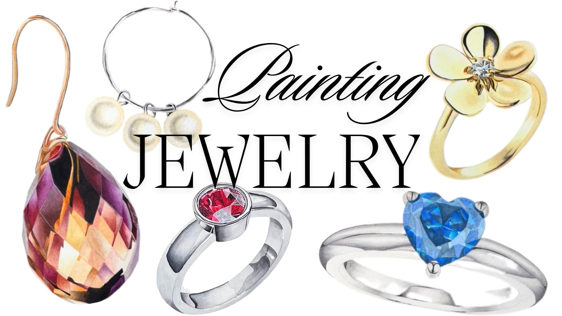
paint with watercolors. If you're interested in painting reflective objects like
crystals or jewelry, you might have already
come across one of my other classes I
had on Skillshare. In my class, introduction
to painting jewelry, I cover different
metals, stones, and pearls to give you a compact overview on how to paint most pieces of jewelry. Some of the pieces
in my previous class are suited more for
intermediate skill level. So today I want to take a step
back and teach you how to paint three different stones and cuts in a very
beginner friendly way.
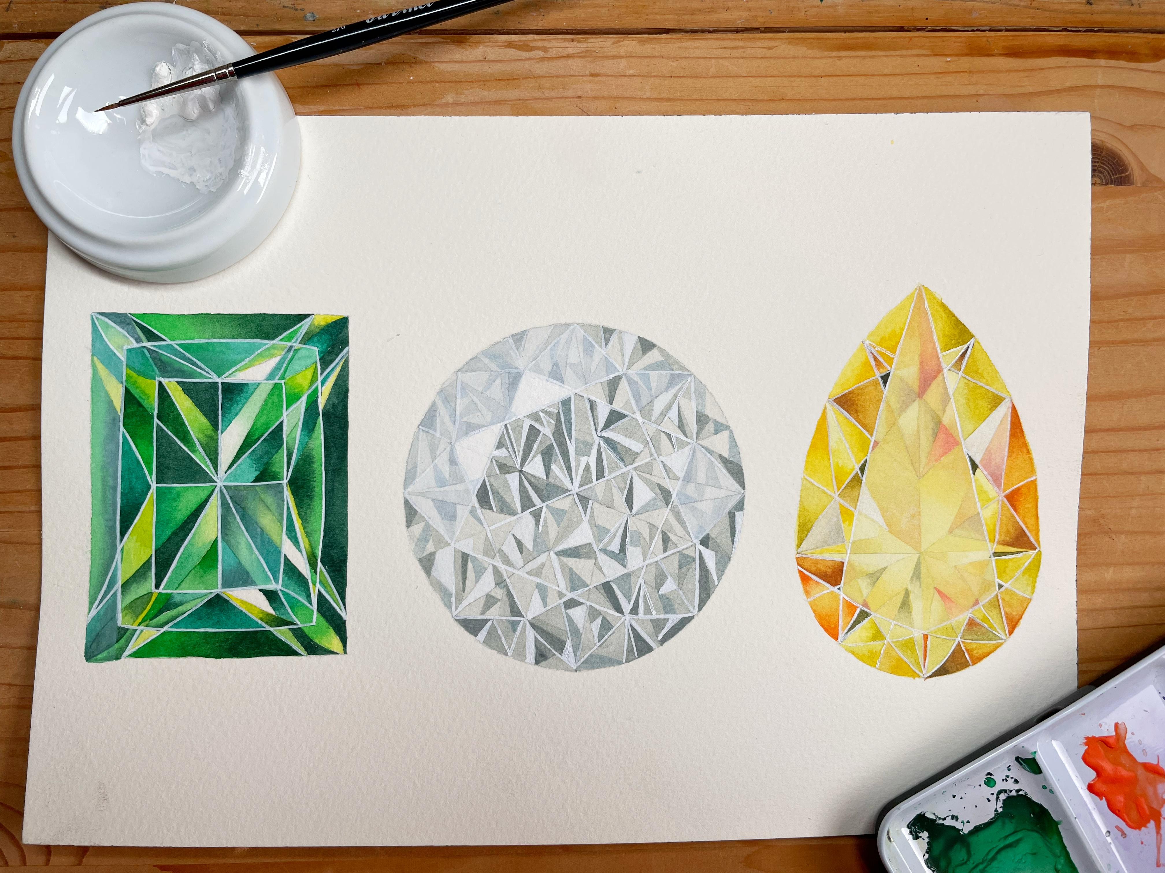
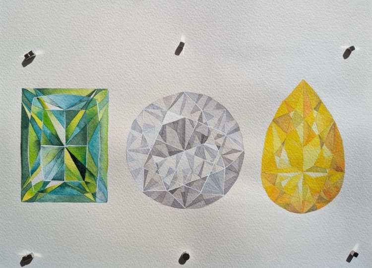
2. Your Class Project: Your class project, you'll
be painting these 3 stones. Not only will you learn
about the different cuts and how light reflects
differently on each surface, but also what colors are
shown in each stone. An emerald is not just green
and a diamond is not white, but actually gray
and blue and black. So I will walk you
through all of that, including things like how
to trace your outline, the whole process from beginning to end. Let's get started.
3. Materials: Okay, so let's go
over our materials. This is the watercolor
paper that I use. It's cold press paper,
300 grams heavy. And then here I have
my tracing paper, charcoal paper to trace my
outline and also some tape. And then my pencil,
a regular eraser. And these are my watercolors. We're not going to use
all of them, of course. And then this is
the white quash. I always keep it in a separate palette so it doesn't get dirty. This is the one I use. It's called calligraphy quash. Most people use a color called titanium white or just
regular white quash. It doesn't really matter
which one you use. And then for brushes, this is my eradicator brush. This is a very handy tool. I always have it ready in
case I make some mistakes, draw outside my outline, or it's very stiff,
the bristles. So it's also used to lift color of the page
to create highlights. And then I just have a
couple of brushes ready. This is a size four round brush, and then just get all of
your detail brushes out. Size zero, 20, 30, the smallest ones you
have just grab them, and then you'll see which ones you actually
need for this painting. But I think it's always good to have everything ready in
case you might need it. And then this is a white gelpen. I'm not going to
use it, but you can use it if you have one to paint the white lines for
the highlights at the very end of each gemstone. I'm going to do this with the
white gouache and a brush. But if that's too
difficult for you, you can do that with the
gel pen if you have one. So it's optional. You should
always use the tools and utensils that you're most
comfortable working with. And so this is pretty much it. I always have a piece
of paper towel ready, and of course of glass that I'm going to fill up with water. And then we can continue
with tracing our outline.
4. Tracing the Outline: Okay, so the way I trace my outlines onto my watercolor
paper is very easy. If you've done this before, you don't need to
watch this chapter, but if you haven't just
going to show you quickly. So here's my watercolor paper. I printed the outline to the size so that
it fits my paper. You can, of course, also for
the purposes of this class, print the diamonds and the
stones smaller or bigger. That's up to you.
And then here I have regular tape just any type
of tape or scotch will do. And then I tape it on one
side to the paper so that it doesn't move
when I outline it. And then I have
the charcoal paper here, charcoal paper here. It has a shiny side, and it has a mapped side. And the shiny side is where the pigment is I don't
know how you say. It's where it's got pigment, so shiny side down, always. And I don't know if
you can see, but I've used this like plenty. So one of these sheets
will last you for, I don't know, 20
paintings, maybe. So I place it between the outline in the watercolor
paper, shiny side down. And then I take my smallest,
which is this one. Smallest mechanical pencil. And then I apply, like a light to medium pressure. I don't want to
press down too hard because then the outline
is very dark and very strong and it'll be
difficult to rub it to erase it from the paper because
this charcoal stuff, I mean, you can erase it
just with a regular eraser, but it's not like normal pencil. It's a bit harder to erase it. So I just apply, like,
medium pressure. And then boom, boom, boom, boom. I just draw over the lines
that are on the outline. And you can check in between.
So it looks like this. And I have it taped onto the paper for that very
reason so that I can check, if I'm happy with
the intensity of the outline and so I can,
like, move it like this. And especially when you
have an outline that's very detailed and has a lot of
little bits and pieces. Like every couple of seconds, I go like this and I check, like, have I already
done this one? Have I already done that
one? That's why you should tape it to your watercolor paper
so it doesn't move. And then, yeah, it's just it's just
outlining it like this. I'm not going to
do the whole thing now because I've already
outlined it on my other paper. This is just to
show you. So yeah. That's it. That's how you trace your outline onto your
watercolor paper.
5. Yellow Pear Cut: So for the yellow gemstone, I'm using three
colors mineral gray, ale in hue and fields orange. And for brushes, I
have a size four, two, and a size one
or a size zero brush. You can choose the
brushes that you're most comfortable painting
this size illustration. Mine are just a suggestion. It's just what I'm using. Now, I'm starting to
wake up the yellow. I'm just placing it in
between the yellow and the orange there so that I can make a mix of both of them. If you don't have
the specific yellow, the aolin hue that
I'm using here, you can just as well use a cadmium yellow or hansa
yellow, for example. Those are also options that
would work perfectly fine. And I'm making a mix
with the orange here. For orange, you can also use transparent orange
or Windsor orange. All of my colors are
by Windsor and Newton. But whatever you have, just use it and don't think
that you need to buy new colors or
supplies just because I'm using certain ones
that you don't have. I'm adding a bit more yellow
because I'll need it. Here, I'm just making a
slightly orangy yellow mix. It's like a sunset yellow. Nice, warm and deep. What we want to do is to have
different hues of yellow, have different hues of orange, and then mix the gray
into it so that we have a nice variety of
these colors that will make it easy to paint these
slight differences when the light hits the
stone and you have all these reflections and it's just different
variations of a color. So I'm just trying to mix up as many different
shades as I can. And I'll also be using the
yellow pure, of course. So pure yellow,
then yellow orange. And now a mix that's more heavy on the
orange than the yellow. My gray is dried up here. I'm adding a little bit of
the gray to kind of, like, knock it back a
little bit to mute it so that it's a little
bit dirty or muddy. I like to have both in
a jewelry painting, like, really bright
and shiny colors, and then ones that are more muted because it just adds more interest and variation
to the piece, I think. And then you can also layer them on top of each
other, of course. Here I'm adding a bit more gray, and I'm swatching them out on the paper so that I can
see what they look like. A So now I'm mixing the yellow and the gray. When you mix yellow and gray
and it turns slightly green, then you know that
there's blue in the gray because blue and
yellow mix green. And this is a pure yellow, just to show you and
then the pure orange. And then the pure gray,
and then that's it. And we'll also be using white squash for all of the stones. I didn't include that
in the color mixing. So I'm starting by
applying a layer of clean water all
over my diamond. Making sure that I
don't paint the water, paint the water, so to
speak, over my edges. So I do like to take
my time with this. This is a little bit
of a speed up version because otherwise it would take too long for you to watch. And this is the size four brush. You can use a smaller brush, but it would just
take much longer. So a slightly bigger one than
you'd use for detail work, for example, is preferable here. So I'm just moving
the water around, paying attention to the edges, as you can see, and I'm making sure that I have just
enough, but not too much. And now I'm painting
the pure yellow, a watered down version, and I'm applying it
all over the diamond, and this will be the
base wash or base layer. And I decided to do this
wet and wet because the wet paper gives
me enough time so that I can move
the yellow around, and I don't need to
worry about having hard paint lines in my diamond
where I don't want them. So here, I'm just making sure that my wash
is nice and even. If it's a little bit patchy, don't worry about
it because we'll paint over it, obviously. So if your wash is
not completely flat, as I say, it's nothing
to worry about. Just let it dry and
then we'll paint the different
segments afterwards with another two layers, so it won't be visible. This is just to give everything a nice uniform look
to start with. And now I'm coming in with the yellow that has a little
bit of the gray added, and I'm painting it
while my paper is still wet on the, like, lower right corner, and then upper bit and
to the sides a bit. So we're imagining that the light is coming
from the top left. So the top left of
the stone will be lighter and the bottom right
of the stone will be darker. It's just how the
light and shadows fall due to the
shape of the stone. So I'm already putting
my shadows in place mostly so that I don't forget
where to put them later on. So my first wash is
establishing a base color, and also it's kind
of a blueprint for where light and shadow will go later on
in the painting. Because these jewelry paintings,
they're so intricate. They have so many segments and detail and
different reflections. And I do tend to get
lost in painting, especially when I don't
record for tutorial, and I just paint for
maybe a commission or just something for myself. I usually listen to an audiobook or I watch a movie on the side, and then I just get
lost in my painting, and sometimes I
forget, like, Oh, this is where there was
supposed to be a highlight, or now I forgot to put a shadow. So I use my base wash to direct me later on so that I don't forget where my
darkest colors will go. Now I've let everything dry and I'm continuing
with the second layer. This is the yellow again, and I'm starting to fill in
the individual segments. All of this, I'm
painting on dry paper. I have the size a size
zero or size one brush. Smaller detail brush, use the size that you're
comfortable with, and I'm trying to erase some
of the pencil lines already. I tend to do that quite early when I'm painting in
yellows because they're so transparent and
I don't like it when the pencil lines shine through a
yellow illustration. And the more
watercolor you put on top of it over the pencil, of course, the
harder or eventually it's impossible to erase it. So I try to do that very early. So right now, I'm just
painting in some of the segments with the yellow. It's a fairly watery mix. I don't want it to be too dark because I'm going to add
more layers on top of it, also at some point, adding a gradient to most of
these individual segments. So I don't want the color
to be too strong right now. And I'm just looking at the reference photo
and identifying where this shade of yellow
that I have here should go, and it's more or less
paint by numbers, really. Y. I realized that I forgot to paint in one of
the lines from the outline, so I'm just drawing that in. And I'm continuing to paint
with the pure yellow. So now I want to paint some more concentrated,
stronger pigments. So I'm going to use
the same yellow. It's the pure yellow, but
it's just more concentrated. So the mix is a
little bit thicker. And again, I'm
painting on dry paper. And I'm also painting the
pure yellow down here, which is in the shadow area, because I do want the
colors to be uniform, even though some are in
the light in the shadow. But my shadow color that
I've put down previously will peek through the
transparent yellow, so they will be darker anyway. Now I'm going to switch
to the more orange color. So I'm mixing up some
orange and yellow again. My palette has dried
since I mixed it. And I'm continuing to fill
in more little segments. I'm trying to achieve
an even number of more yellow and more orange little
triangles and shapes. I think now that we have three different colors spread out somewhat equally
throughout our stone, you can see how it's
already starting to get a bit more
depth and interest. So it's definitely worth not
just using one pure color, but to mix up different
hues with two, three colors and get a
variety of values and tones. Now I'm switching back to
the pure yellow again. And still, all of
this is on dry paper. Here I'm dipping into
my yellow and gray mix, the one that's
slightly greenish. Here I have the mix that has a little bit of all
three colors in it. So this is the stage
where you just want to produce different hues,
like I already said, different shades of
the yellow and orange and just add more interest
and variety to the stone. If your mixes aren't
exactly like mine, and you're getting a
little bit lost with, Oh, is this the grayish mix? Is this the one,
which one is it? It doesn't really matter as much as long as you're consistent
in your own painting. So if your mixes vary from mine, it doesn't really matter what
matters is that you have consistency and a uniform look
in your own illustration. A Now I'm taking some orange again that has a little bit of yellow
in it, I think. And I'm continuing to add
layers and paint on dry paper. Picking up some
more pure yellow. So I'm really just alternating between the different
colors, the different hues, and I'm just looking
at my stone and trying to evaluate this is the
yellow and orange mix, trying to evaluate where I need one color to be a bit more present than
the other, maybe. So you don't have to
paint exactly after me. You can also just look at your own gemstone
and assess where you might need a bit more orange
or where you might need a bit more deep yellow. So it's really up to you to also make these decisions
for your own painting. Some more orange with a
little bit of yellow in it here. More orange, though. So you might wonder why
we've bothered with two layers if we then put a little bit stronger
orange on top of it. I just does make a difference. It's more work, of course, to work in layers, but it
just makes a difference. It creates depth in the
stones and in the diamonds, and you do have the previous
layers shining through. Watercolors are transparent. Most of them, they're not opaque like gouache or
acrylic, for example. So if you build
the colors rather than just slapping one thick
color onto your paper, it just gives your illustration dimension
is what I'm trying to say. This is some more pure yellow. And I'm looking at
my reference photo, trying to decide
where to place it. A So you can see that I've started to paint over a few segments in one go. I'm trying to start to combine them to bring
everything together so that it doesn't look like
it's just a bunch of random triangles and shapes
that are next to each other. Now I'm actually adding a color. This is called Ostwald gray. It's a warm, dark gray, excuse me, has a bit of
a brownish tint to it. You might not have that
because that's part of a limited palette that I
used by Windsor and Newton. If you don't have Ostwald gray, you can use a
regular gray and add a tiny bit of dark brown to it. And I'm starting to
place my darker gray. It's still a very
transparent consistency, so it's not at all
thick and super dark, but I do want to add it over
a couple of those segments to start adding more shadow and a bit more darkness to it, because the lighter parts of the diamond are really
only going to start popping when I put in
some darker values. And these can also be like really small little low
lights, so to speak. And you can see it
just brings out the shape and the cut of the
diamond in a different way. So there's the table of the
diamond has a certain shape, and it's becoming
much more visible now that I'm using
this darker gray. So I'm using a transparent
mix, like I said, just to darken some of
the little triangles. And if I want to put a
really dark low light, I just use a thicker
consistency. Now back to the yellow area. I'm using the yellow
and orange mix to darken this segment
again on dry paper, and then I clean off my brush and smooth out the
edges a little bit. This is pure yellow now, but it's still more
concentrated than the more transparent mix that I put underneath this layer. So it still darkens it, but it's just less orange. And then up here, some
more yellow, as well. So I just want to create a
color gradient in each of those little segments where there's a light area
and a darker area. And if we make sure that every segment,
except for the super, super small ones, have some
type of color gradient, it can be a gradient
in the same color. For example, I'm here from
lighter yellow to dark yellow, or it can be a gradient
in a different color, where the base layer is yellow, and then we add some
orange into it, and that's still a color
gradient when we smooth out the wet colors with a
clean wet brush like I do. So here still, I'm
painting in pure yellow. And this type of technique
to add color gradients, even though you
don't see them in the reference photo is something I started to do a while ago because I realized that this is the key element in creating those really sparkly and
shiny reflective effects. So even when I paint a piece of jewelry, any type of jewelry, just from a regular photo, and there are just
some reflections. So there's, like, a
super dark segment, and then a bright white segment, and then some mid tones, I still add color gradients to each of the little segments, even when they're not
there in the real photo. So that's not a super
complicated process. It is time consuming. But you can look at it
as a relaxing exercise, and it's not something you need to think about a
lot when you do it. You just have to go
through that motion. It's time consuming,
but it's not difficult. So here, I'm mixing up some more gray with a bit of yellow
and some orange in it. So this is a bit of a muddy, dark orange color that
I'm mixing up here. So I'm wetting this area first. And then I'm dropping the
color into onto the wet paper. There are different
techniques to doing this. In the next diamond,
for example, I mainly paint on dry paper, and I don't paint wet and wet. And it still works. You
can paint on dry paper. We've done this here as
well. And then just use a clean wet brush to smooth out the edges or you can
paint on wet paper, and the color bleeds and moves on its own through the water. It's a matter of practicality. When the segments are bigger, it's usually easier to
paint on a wet paper. And when the area
is super small, it makes more sense
to do it wet on dry. But also it comes down
to personal preference. So you can achieve the same or a very similar result
with different techniques. You just need to try
it out a bit and practice and then figure out
which one you like best. So now I'm back to
the yellow just to deepen some areas again. And I'm jumping back and
forth across my diamond. So now this is just
clean water again. And then I'm adding some yellow. And here I have the
muddy orange mix that I just made on
dry paper this time, and then smoothing out
the edges like that. I don't paint with one
consistent technique. I play it by ear, basically, but I also want to show you different ways of
doing the same thing. So here, this is on
wet paper again. This is pure orange,
very concentrated, so I have a nice contrast from the lower end to the
top end of this triangle. Wet and wet versus wet and dry also depends on the color and
the pigment you're using. So I don't have this
down to science, but there are some pigments
that I frequently use, like the neutral
tin, for example. And when I apply that on wet
paper, it just explodes, and it just travels so fast
that I already know, okay, I need to limit and control very much the amount
of water I put on my paper, or I try to paint
it on dry paper. This is just this varies
from pigment to pigment. It varies from the brand
of colors that you use. It's just something you
pick up along the way as you consistently
use your colors. You get used to them
and you get a feel for how the different
pigments act. Also switch to a smaller
brush when you need to. The size of these triangles
and shapes varies, and when you feel like I need a smaller brush because
it's too fidgety, then do switch to a smaller
brush even if I don't. H This is dark orange again. And I'm switching to yellow. And I'm also using
orange down here, even though it's
a yellowish area, but I think I just
I feel like I need a bit more color and
contrast down here. I don't want certain
areas to be too uniform, like only yellow or only orange. So as I go along and as I paint, I constantly look at
my whole illustration and then sporadically and spontaneously
decide, Okay, here, I actually want to
switch it up and add some orange just so that it's not too consistent and too
boring for the eye to look at. And I'm coming back to this area again and adding
some pure orange. Some pure yellow right here, keeping the top part of this
little segment fairly white, just for the sake of contrast. And also why you paint
your illustration, it's probably not going to
look exactly like mine, and it's totally fine.
It doesn't have to. Just bear in mind that you
do want to paint light, and in order to paint
light, you need contrast. So you need the
very lightest areas to be next to the very darkest, and then you can get that
effect of light reflection. So So this is the Muddy orange mix again. It's slightly more yellowish than the one I used previously. I'm mixing up such
tiny amounts on my little plates that I
need to redo my mixes, and then each time they're
a little bit different. Which I also like.
I think it's a bit more natural when
there's such a variety, but subtle variety in the
mixes that I use here. And this is like I already said, this is not a hyper
realistic illustration. It's somewhere between
realistic painting and a technical
rendering of a jewelry. But I still want to think
of it as a natural stone. So natural looking colors and natural broad variety of hues is something that
I do want to include, so I don't want it to
look too artificial. So don't worry when you have to make more of a certain colour mix and
it's not exactly the same. That can actually
be a good thing. I'm a fan of not
stressing too much about these things that don't matter and also that no
one else is gonna notice. So now I'm back to
pure yellow up here. And you can see,
I'm really jumping from top to bottom,
left to right. And even though I'm not
done with the zone at all, I'm already in the kind of, like, adjusting phase of it. So now I'm up here
with some more orange. I think you get the
gist of it. I think you get the idea
of what I'm doing. And if you want to be a
bit more, how do you say? Organized with your paint, you can also just look
at what I'm doing and then go from top to bottom
in your illustration. I really want to encourage to make this your own
and not to try to copy 100% of what I'm doing and feel like you need to get every
brushstroke, right? This is just a general
guideline on how to do it, and then you can use
your own color mixes. You can use a different
type of gemstone. If you don't want to do tear
shaped, do something else. And then when you're done, you really have something
that's like your own painting. I think that's a lot
more encouraging than copying from a tutorial. So here, I'm adding
some orange into this yellow segment because I felt like the center part of the stone was just
too much yellow, and the orange was almost
only on the sides. So I'm adding a bit more
in the center here, and this one up there
is not strong enough. So I'm just adding
some more color again. One thing that's a general
tip for all kinds of painting doesn't matter if it's
landscapes or portraits or jewelry or botanicals. In order to make your
painting look more harmonious and put together, you always need to make sure
that your darkest hues are the same darkness and
your lightest hues are the same lightness and
your mid tones are also, um, the same hue and tone. So that's why I think
I keep saying that. But it's something that
you're not really aware of when you start
out with painting, and then you look at a
painting and you think, like, something it just doesn't look really something is
not right about it. And that's because your deepest shadows aren't all the same. And that's why when I add
some more orange in one area, I go back to, like, the very top where I also have concentrated
orange and I adjust it because I need all my
deep orange to be the same. And that's why it's a
bit of a back and forth. So this is the muddy
yellowish mix again. And here I have
some pure yellow. And some pure yellow
down here as well. Now, I'm looking at it,
trying to decide where to go. I'm adding a little
bit down here, but still I do want to keep the top part of that
segment almost white. And then the same thing here. Now I'm making more of
the gray and yellow mix. It really has a
greenish tint to it. So now I'm just
painting mainly on dry paper because I'm just
making some tonal adjustments. This is kind of like the
last phase before I start painting the highlights
with white quash. So the main colors
are locked in, and I'm just trying to increase the contrast
a little bit. Get the saturation that I want, and I mainly do this on
dry paper because I don't want to re wet the same area three or four
times because at some point, the color will start
to lift off the page. So as you move along
through your painting, you need to be mindful
that when at some stage, you already have a lot of
pigment on your paper, and then you rewet
it again with water, there's a risk of the
pigment just lifting, and then you have
your color floating about and you get
hard water lines, and it'll be a bit of a
challenge to correct that. So when I when I'm almost
finished with a painting, I paint on dry paper, and I also do that carefully. And as soon as I
feel like, Okay, the paper is just
too saturated now, it can't take any more pigment, then I leave it alone. So this is, like I said, the final stage before
starting with the white wash. So I want to encourage you
to look at your own painting and make your own judgment about where you need to
play some more color, where you need to
increase contrast. If you have several segments right next to each other
that are all very light, for example, you
should maybe paint the one that's in
the middle dark so you have a contrast
between light and dark. Otherwise, the light
won't even show up. But this is where you need to look at your own
painting and make that decision based on what's
happening on your paper. I'm very happy to
give you feedback. I wish I could do
that live here. But if you just quickly upload your finished project in the discussion section
or the project section, then I'm really happy
to have a look at it and give you very
concrete feedback on technique and on overall
looks and what you've done. So please really do
upload your paintings. It's not about showing
off perfect work. It's about think
of it as being in a classroom and submitting
your homework, basically. So I wish more people
would do that, so we could all learn
from each other. That's a very efficient way of bettering your technique
and your abilities, not just in painting in
whatever you do, I think. But anyway, so, yeah,
super final adjustment. I am pretty much done with the color part of this
pretty yellow stone. So now I'm moving on to
placing my highlights. Like I said, I
have my gouache in a separate palette to keep it safe from stains
from other colors. It's already dried up,
so I'm wetting it and making sure I have a fairly
transparent consistency. So white gouache
dries very light, but I don't want to go in
too strong in the beginning. So this is a very watery mix, and I'm using a slightly
bigger brush now. And I'm painting on dry
paper because like I said, there's already so much
pigment on the page. I don't want the pigment to start floating around
and start lifting. And I'm doing this
as quickly as I can. So I've looked at
my reference image previously and identified, like, the center, the
table of the stone, it's called, where
exactly it is. And then I go in
with my transparent make sure it's really watery. And I place that, and now it's already dry. I'm just adding a tiny
more bits of color here, and you can see how
light it's dried, but you can see sorry, this is a dark gray again because it was too light
next to the white highlight. You can see how
light it's dried, but it already
makes a difference. So this is some more gray here. I meant to have the
stage finished, but now I just
looked at it again, and I realized, Okay, I need
more darkness, actually. And this is exactly the thing
that I mentioned earlier. You need to always adjust
your lights and your shadows. So now I just placed
some white gouache, so everything brightened up. And then I realized, Okay, I'm actually
losing contrast here. So now I'm going
back in with color, dark orange and gray, and I'm creating
more low lights, darkening my darkest shadows. And that will make the white
gouache pop even more. So it's light and dark. It's always relative
to each other. They're like a pair. So you
can't just paint something. You can't just add white and to your painting
and then expect to get that effect of
a light reflection. So you will only
achieve that when you darken your dark colors. So that's why it's, you always need to work on both
simultaneously. Now I'm back with
the white wash. I have my smallest brush, and now I'm starting to
paint some white lines. This is more um from a
technical jewelry painting, this is where I'm leaving the
realistic painting alone, and I'm incorporating
these details from technical
jewelry rendering. I think it just
adds a nice touch. It adds a nice artistic, stylized illustration
touch to the painting. So that's why I
decided to do that. And I'm outlining the
table of the stone, and then I'll keep adding lines between the
different segments to, like, separate them and to create some more interest
for the eye, basically. But when you look at a
photograph of a diamond, you will not see
those white lines. You will see them in
professional jeweleRndering. But yeah, I do it that way because I don't
think I need to do either or I think I have as much artistic license
as I want to have. And I can and that
goes for you as well. You know, you can
do your paintings the way you want to do them. You don't have to do it this way because
that's the rule for technical illustrations
or that way because that's the rule for
hyperrealistic paintings. And I think in the end, that's what defines
every artistic style. It's highly individual, and
you can do whatever you want, and there's no one who
can tell you like this is incorrect. No,
this is my style. So that's how I like to do it. If it's too difficult for you
to paint these fine lines, especially since the
quash, like I said, dries very lightly,
so you'll have to go over them at
least one more time. And the more times you
go over a thin line, the thicker it gets eventually. If that's too tough for
you to do with a brush, you can use a white
gel pen to do this. The ones I have, unfortunately, don't really work so well. I think I just bought the
cheapest ones at the store and they don't they don't
really work for me. So I do it in white quash, and I've been meaning
to buy a better pencil, a better gel pen for years, I think. And then I never do it. And then each time, I'm like, Oh, man, you meant
to buy a new one. So I do it with the white quash. But again, this is a case of use the material and the utensils and the type of paints
that works best for you. Like, you need to
think of paints and brushes and pens and pencils, whatever you're
using as your tools, and they're meant
to work for you. And it's just a matter of picking the ones that
work best for you, regardless of what somebody else who's doing
a tutorial uses. So I'm not going to do the lines between all of the segments. I will try to do them more like geometrical so that the left and the right side are a
bit more uniform looking. So I also use the white highlights
in the end to kind of tie it all together. H And then again, depending on how strong
your white highlights are, you might or might not have
to go over the center part, the table again and give it another transparent
coat of quash, depending on what yours look. Here, I'm painting a
segment completely opaque. You do with every
piece of jewelry, have like one or three
elements that are completely white because so
much of the light that hits the stone bounces off it that it just
looks completely white. And again, you can see just how transparently the guash dries, the color underneath and still visible, which
I think is good. Here, I'm just going
over those lines again, really trying my best not
to make them too thick. If you need to turn your
paper to do this, please do. I keep mine steady because
I'm filming a tutorial, usually, I turn in my
paper all the time. Now with the white, I think the stone is really starting to pop and to get that shiny
look that we were going for. It's always until the
very last 5 minutes of the whole painting process that this really starts
to come together. Here I'm placing white
next to the darkest areas. Very last final adjustments. You're painting some
white lines next to the dark areas again
to get that contrast. So I hope you've
enjoyed painting this beautiful yellow
stone with me. Please upload it here
on the platform. I would be thrilled
to give you feedback. And this is the final
coat of whitewash. Like I said, it dries
so transparently. So, congrats on finishing
your piece of jewelry, and I hope you'll keep
painting with me, and I'll see you in
the next chapter. So
6. Round Diamond: Okay. I start with
mixing the colors, and that's probably the easiest color mixing I've
done in a while. I'm only using two
different pigments. One is called mineral gray and the other one
ultramarine ash. They're both part of this limited collection by Windsor Newton called
the revival collection. So I'm just using those colors. If you don't have those specific
ones, it's totally okay. You can paint this diamond with just using the gray that
you have in your palette. That's probably a pains
gray or a neutral tint. And if you mix two
different consistencies, one that's more watery, you'll get a light
gray and one that's more like a little
bit of thicker, you'll get a dark
gray, and then you can absolutely
paint this diamond. So I'm starting
here on dry paper, and I'm doing the same thing I did when I started
with the yellow stone. I'm locking in the shadows
and the lightest areas. Because we do need shadow
and light areas, of course, but also because it will make the following steps easier when I know where my shadow
is supposed to be. So I have a very watery mix. And I'm using I think
this is a size two brush. It's a little bit bigger. It's not my detailed brush, but I do want to get this paint on there quickly before
it starts drying because I want an even wash and not any water lines that would form when the
paint starts to dry, so I'm doing this quite quickly. I'm just loading my brush with enough water and pigment so
that I can do this in one go. And I'm being very
mindful of my edges. I don't want to be sloppy here. So if you need to
turn your paper, it's always best to
turn your paper so that the outline is where the
tip of your brush lies. So here I'm just
twisting my hand and my wrist so so that the tip of my
brush touches the outline. I would usually turn my paper, but I just want to
keep it steady. I think it's easier for you to watch the
tutorial that way. So I'm slouching and bending
underneath the camera. And a general tip for
painting something like this, if you realize, okay, you're not really
fast enough to paint a larger area like
this in one go, you can do two things. You can, of course,
paint it wet and wet. So you put clean water
on your paper first, and then you come in
with the pigment. If you do that, you
need to keep in mind that if you already have
water on your paper, and you're using
a mix that is as transparent as mine that
when I use it on dry paper, you'll have too
much water overall, and your pigments will explode
and it'll be too light. So the water to paint ratio doesn't just play a role
in your actual paint mix. It also plays a role in
your painting technique. So when you do wet and wet, you need a slightly
thicker paint mix because you need to keep in mind that you're
adding water to it, even if that's the water
that's on the page. I'm hoping I'm making sense.
So if you paint wet and dry, you can have your mixes more
transparent and more watery. And when you paint wet and wet, you'd have to make your
paint mix a bit thicker. And if you paint
wet on dry here, for example, but
for some reason, your paint dries
faster or you're not quick enough to
cover a larger area, and just paint up to the next
line of the next segment. And when you get a
hard water line there, it doesn't matter as
much and it probably won't even be visible
anymore when you're done. So here, I'm just rubbing out the lines of where I did
not paint any color. These are my, like, super light highlights
that I want to keep, and I also don't want
any pencil lines there. And I'm also erasing the Oh. Oh, I'm racing over
there. Trying to rub out as much of
a pencil as I can. And now everything has dried. So before you move on
to the next layer, make sure everything
is really dry. And a good way to make sure
is to touch your paper with your fingers and when they're not cool
to the touch anymore. So when your paper has the
same temperature as your hand, then you know it's
really, really dry. And as long as it's
still a bit cool, it means it's still
a little bit damp, and then you should just wait
a couple of minutes more. This is still the
same type of gray. It's more or less the
same consistency, but it gets darker now
because we already have a base layer on the paper. Watercolors are transparent, so you can build up color
and you can build up depth and values by adding the same type of
consistency on top of each other. They add up, so to speak. I'm not using the size
too brush anymore. As you can see, I switch
to a smaller one. Please do use the smallest
one that you need. And I am going to just block in a number of triangles and
shapes in the same color mix. It's very straightforward. It's very beginner friendly. So with this one, this one is also a bit less complicated than the yellow one. So here we really just
have paint by numbers. And if you want to do your own thing and
maybe watch a movie, you can also skip ahead
when I'm done with this color around minute 14 and then hit pause
and then just block in all of those segments
that I'm painting in now. If you don't want
to watch me do it. It's all the same
technique on dry paper. A if you're new to painting something that's
actually colorless or white, then you maybe don't know that painting colorless
and painting white actually means painting in
different tones of gray. So also white flowers, for example, like a
lily or a white rose. They're also very
popular subjects for watercolor illustrations, and the way to paint them is to paint
different tones of gray, and that will actually
make a white flower. And with this diamond here, the diamond itself is colorless. But when you
photograph it or yeah, look at a photograph of one, you'll see that the way
the light reflects on it, it's just a bunch of light gray, medium and dark
gray little areas, white highlights, speckles
of black here and there. And then depending on the
surrounding of the stone, there are also some little colourful, tiny
colorful reflections. So maybe like speckles of
yellow or blue or something. But that's basically it. So a colorless stone will
be painted in hues of gray. So I'm just working my way
all around my outlines here. I find that this is a very
relaxing painting exercise. You can practice painting neatly and staying
inside the lines. But there's not much you
have to think about. There's not much
to watch out for. You can't really make any
huge mistakes here right now. It's just placing
triangles on dry paper. So you can really switch
off your brain and just keep doing this and it's more meditative these
types of paintings than, let's say, landscapes, for
example, I find personally. And you can clearly
see here how, even though I'm using the
same consistency of paint, it just gets naturally darker because I've already
blocked in my shadow. So I'm jumping back and
forth a little bit, just because I keep looking
at the stone overall, and then as soon as I identify an area where I need
to add a little more, I just do it right away. And I've started as I move
down towards the bottom right, I started painting like
smaller triangles, than the ones I did in
the very beginning. So now I'm also adding some smaller ones here on the opposite side so
that it all matches. And I didn't paint all of those in in the
outline because it would have been too overwhelming
to trace them all, and it's not necessary, especially since we're painting all of them in the same color. So I included more segments in the yellow stone
because there we have, like, color gradients and almost different color
in every segment. But here, since I'm painting in just two
different colors, you can really draw in more random triangles and shapes in the outline
that I provided you with. So you have a basic grid, so to speak, and then you
can just add your own. And the only thing
that you need to kind of keep in mind is to have an even spread of smaller and slightly
bigger ones across your diamond so that it
looks nice in uniform. But it's also good not
to have everything in your outline because
the reflections are random and they're
supposed to look random. And it's very hard to try to paint something that's
supposed to be random. So this is kind of like a good
exercise in letting go of the rigidness of trying to plan everything
in your painting. So that's why yeah, this one is not loose, but here you have to
just add your own. So all of our stones, everyone who does this tutorial, they're all gonna
look a bit different. And I think that's really nice. And it's also a good
representation of reality because every stone looks different depending on how the
light hits it in that second when you
take a photograph of it. So yeah, this is an exercise in deliberately
painting something that's supposed to look random. It's harder than it
sounds, actually. So now I think I have a good
coverage of my mineral gray, and I'm just adding the
last ones here and there, and then I'm going to switch to my other color, the
ultramarine ash. It's not a super dark gray. It just has a slightly
bluish tint to it, which I thought I like, and I'll just wanted to try it out how it looks on a
jewelry illustration. But like I said, you can also just use the gray that
you have and you can maybe add a little bit of blue and and you'll get
a different hue. So now what you can do and what I'm doing
is I am, of course, starting with the
different gray in areas where I only have
the base layer down, but I'm also painting them
over the second layer, the one that we just
did previously, because I don't want to
lose all of my light areas. So that's why you
can see how I paint over the ones that we
just did, and that way, I'm adding a bit more shadow, a bit more depth, but I'm not
losing my highlight areas. The ones that only have
the very first wash. So I do want to
preserve the light because as soon as
you lose the light, especially in a colorless stone, it just doesn't good anymore. You're not going
to get that effect of light being reflected. So I'm being mindful of not
losing too many light areas. And also, just, bear in mind that you want to spread
these out fairly evenly. And that's why it's
also maybe good to jump back and forth
in your illustration. Because if you start in
one area and then you go maybe clockwise, by the end, you're three quarters
of the way done, you realize Oh God,
I painted way too many, but that's already done. And when you jump across
your illustration, you can add it here and
you can add it there. And then you can just build a uniform spread of little
segments that you're blocking. So it's already getting
quite busy here. And I think you can
really see how there's a general geometric grid
or structure in the stone. That's the outline
that I gave you. And then there's a nice
variety of random reflections, and those are the triangles that I didn't put
into the outline, but that I just painted
as I went along. So that's a really nice balance that I have here
in illustration. I'm quite happy with it. So I think that's about it
with the ultramarine ash. And now I'm going back
to the mineral gray, the one I used previously. And Now, this makes a little bit more concentrated than the one
I used in the beginning, and I just need to
create some darker tones so that my highlights will pop and really come
to life in the end. So we're again,
building contrast. But I don't need a
different color to do that. I can just use the same one, but a thicker consistency. And that's really
one of the things I love about watercolor is this transparent look that they have compared to,
I don't know, acrylics. I mean, some acrylics are
also semi transparent, but they're mostly opaque. And if you have an opaque color, that's
just what it looks like, whereas when you paint with transparent colors
like watercolor, if you use a thinner
consistency, it almost looks like
a different color. It's so nice and see through, and then you just use a
thicker mix of paint, and it's much darker. And so you can use
the same paint, the same pigment, but really paint light and dark
with them. I love that. And you can build
color and yeah, I think watercolors are really the perfect medium
to painting jewelry. Guache is also transparent when you water it
down, of course. They're in the same family. Watercolors and Guache. So here I'm just looking at my reference photo and then comparing it
to my illustration, trying to see where I need to add more contrast
and a bit more depth. And again, I am painting over the already darker
triangles because I don't want to lose
my lighter areas. So I think my stone is
looking busy enough. I have nice lighter areas. I have some areas that have a slightly bluish tintllin and I have medium and dark gray. I still have my
shadows blocked in on the upper middle left area
and the bottom right area. That's still visible, even
though I've painted over it. So I think everything
looks nice and even, and I can start with
the white quash. So here I have whitewash. It's not super watery because I'm trying to
paint white lines here. So it's like a medium,
thick consistency. And what I'm doing
is I'm drawing over the lines that you'll
find in your outline. And that will do two
things that will create some high highlights and get that sparkly look going
that we want for a diamond. And it will also give us back a sense of orientation
because we're like, reintroducing a bit of symmetry after we've painted so many random little triangles. So I'm just bringing
those lines back. It's the square in the middle. If you want to do this
with a white gel pen, that is probably the
easier way to do it. So you're very welcome not to do this with a
brush but with a pen. And now there's a second square that's overlapping
with the first one, and then we get this
star formation. If you're doing this with gouache and a brush like
I'm doing and not a gelpin, make sure your consistency is not too watery because
if it's too watery, then you won't even you'll barely see the white
paint once it's dried, it dries very transparent. So I have it just watery enough so that I can
paint it on a thin line. And I will have to go
over it again, I think. And then there's
this cross there in the middle that divides the
triangle, the squares, sorry. So I'm not adding white lines between all the little different
segments, of course. I just want to get that
sense of symmetry. A, and then adding more up here. And here I'm going over the lines because they've
already dried and I can see that they're not
really visible enough. These are two triangles
that I've kept white, so they are the
white of the paper. I am painting them
with white quash still because the white
of the paper is not the same white
as the white quash. It has the slightest yellowish
tint to it, the paper. So I just want to
make it really, really super white, so I'm painting, adding some whitewash. Now, this is a bit more watery and because I want the layers underneath
to shine through. I'm painting on dry paper. Here as well. And now
with these reflections, I feel like the stone is
starting to sparkle a bit. You have to be
patient until you're finished with your white
garage at the end. Don't get discouraged
when you feel like, Oh, I'm doing all of this, but it doesn't really look
like it's sparkly. It usually is just until
the very last 10 minutes when you add those
white highlights that it really comes to life. So I feel like with jewelry, you're much longer stuck in the so called ugly phase of your painting than with botanicals, maybe
your landscapes. But as long as you
know that, it's fine and I don't worry
about it anymore. So here I'm adding
white gouache over my lighter areas as well because I really
want them bright white. It Here I'm adding white next to between
two darker segments to increase contrast. Now I'm just looking at my
stone and I'm thinking, Okay, where can I place white so that it really
creates contrast? Usually, that's between
two darker elements. Here I'm just going
over this one because it dried too lightly. Here I'm placing white
next to a darker area. I'm just going over
these lines again. So now it's more or less just about making
final adjustments, and you need to look at
your own diamond and try to decide where you need more highlights and where
you need more contrast. And you can also when you're
busy with the white wash, go back to your gray colors and maybe darken the
darkest areas again. If you feel like you need to make your diamond pop a
little bit more off the page. So here, I'm just brightening this whole area because we said the light was going
to come from the top left, and the stone is like, curved on the outside edges, and it's just flat
in the middle, what's called the table. So I'm brightening up
the whole top left side, where the light hits it,
and then right next to it. In the top left of the table, it's a bit darker
because that's where that light casts a
shadow inside the stone. So I'm just going over some of the areas that I've already dried and are a bit too
transparent for my taste. So I'm just making them
a little bit stronger. And I'm usually done with a
painting when I look at it. Sometimes it helps to just
step away from it for a minute and then look at it
from a bit of a distance. And then when I feel like I have a nice even amount
of highlights, midtones and shadows
or darker colors, that's when I usually
decide that I'm done. So, yeah, you can
see how my brush is starting to wander
over the illustration. I'm trying to decide
where I need a bit more and where it's okay. So I think I am about
to be done with this. If you finished yours, which I hope you did, I would love to see it in
the project section. So please upload it and especially do so if you
want feedback from me. When you have the opportunity to ask someone for feedback, I think you should
absolutely do it. It speeds up your
learning curve. So, yeah, this is
pretty much it. I hope you're happy with your white diamond
and I hope you will paint another
stone with me in the next chapter. A
7. Emerald: Welcome back. We're
going to paint the last of our three gemstone, which is a beautiful emerald. So as you can see, I switch
to a different palette, and I already have a
bunch of greens here. I have a light green mix, which is cinnabar green
and orlein yellow. Then I have a darker green, which is viridian hue
and cinnabar green. Then this is the
pure viridian hue. It's a beautiful
turquoise color. And then I'm going to
mix a very dark green, and I'm going to
mix viridian hue with the orange that's in
this revival collection. And as you can see, two
complimentary colors make a very dark mix, adding a bit more green here
because it's too orange, and this will give me
a very dark green. Now, if you don't have those precise colors that I
have to mix a light green, you can, for example, use sap green and then
add lemon yellow. For a medium green, you can just use pure sap green or sap green dark or
hookers green dark. And then for the darker green, you would use maybe hookers green dark and add a little
bit of orange to it. So you don't have to use the
exact colors that I'm using. Now, I'm starting here
with the darkest green, which is my viridian
green and orange mix, and I'm painting on dry paper. I have a bit of a
different approach to painting this emerald
because I want to give you different
ways or I want to show you different ways of
painting those gemstones. So with the yellow gemstone, we had an approach where we had a first light wash and then
added colors and added depth. It was a bit of a more
a slower approach, but one that guarantees you result and you
don't have to take any risks with going in with a super dark
color right away. Then we had the round diamond, which was just two
colors and white, and I showed you what you can achieve with just
two different grays, or even just 1 gray. And now with the emerald, I thought, Let's do it
different one more time. And I'm going in
with my strongest, darkest color right
on the white paper. I'm not going to do
an underpainting or a base layer or a base
wash, as people call it. And I'm just let's
just go for it. And let's see if we can achieve a really good result
in just one or two layers. So this is just to illustrate
you that you can really have different approaches to
achieving the same result. So I'm starting with
my darkest colors, and then I'll go from there
and base my midtones and my lightest colors according to or in relation to
my darkest green. And I am, of course, looking
at the reference photo. I could also freestyle this one. And that's one reason why I actually think that painting jewelry, even though
it looks, like, super complicated when you
don't know how to do it, it looks like, Oh,
wow, I need to be, like, super advanced to do this. No, you don't the reason why I think jewelry and
gemstones are actually a really good beginner
friendly subject to paint is because the
light reflections are so random that you can't really make a mistake
in painting them. So even though even if
you painted, for example, your darkest colors, like in a completely different
area than I did just now, your emerald would come
out just as nicely, and no one could tell you, Oh, but the dark green is supposed
to be in this corner, and now it's looking all wrong, and you have to
start over again. So that's why randomness
and reflections are your friend because
nobody can tell you they're supposed to
be this way or that way. Here I have my light green mix, and I painted it on dry paper. And now, while it's still wet, I'm going in with
my dark green mix. This is called charging, dropping one color into
another one that's still wet. And I'm smoothing it over, adding much, much
more dark color here. And there I have my contrast, which for the yellow stone, took me at least
two layers to do. So if you're quick enough, if you've got your colors ready, you can do this in one go. And again, I can't
stress this enough. Everything is about contrast and about light and darkness. So place your lightest colors next to your darkest colors, and then you're more
or less good to go. So this is the dark
green mix again while my light green mix is still
wet, dropping it in there. And then I'm cleaning off
my brush a little bit, and I can smooth out the colors. Adding some more Here, I'm adding some water first because it's a
slightly larger area. And I want to make sure that
my wash is nice and even. This is the light
green mix again. So for me, this is cinnabar
green and Oelein yellow. For you, it might be sap
green and lemon yellow, depending on what you
have in your palette. And doing this wet
in wet allows me to really get an even coverage there and it's still wet
and I have enough time to drop in some very
concentrated dark green. If you have a wet
surface to paint on, make sure that the
color you're dropping in is really
concentrated and not too watery so that
it doesn't spread uncontrollably across the area
that you want to paint it. Now I'm painting in pure yellow. Leven yellow would be
my choice of color if I didn't use this
special collection. And then I'm dropping
in some light green. It's almost like a neon green. Like, I love the
vibrancy of this mix. And then I'm smoothing it out. Here I'm using my
smallest detail brush because I want to make sure that my edges are nice and clean. Here I'm dry paper now. The area next to it has dried. And this is the dark
green mix again. Always make sure you let
one area dry or one segment dry before you
paint right next to it so that the colors don't
bleed into each other. Here I have the light green
mix again on dry paper. And while it's still wet, I'm
dropping in the dark green, cleaning off my brush
on the paper towel, and then smoothing out the dark into the light so that
it's a nice gradient. This is pure viridian green. I like that it's almost
like a turquoise green. It has a bit of an
aqua look to it that I think works really
well when painting emeralds. And here, again, while it's wet, I'm charging it with
my dark green mix. Adding some more viridian Up here, again, this
is pure viridian. Next to the dark green, that makes for a nice contrast. Then while it's still wet, I'm dropping in some
more dark green. The dark green on top of the
viridian will look a bit different than just
the dark green on its own because both
colors are wet, so they do mix with each
other on the paper still. So it'll be still my dark hue, but a slightly
different tint to it, which I think it's just nice. It increases variety and just adds a bit more interest
to the painting still. Now this is the light
green mix with Vidian. Here, I'm just painting
some more pure yellow. Even though an emerald
is a greenstone, there are different
colors in there still, so there's also yellow in it, just like our yellow stone had hues of browns in it
as well and grays. And then I'm dropping
in the light green mix. Between those two
super dark ones, I'm deciding to
paint pure yellow. And I already love how this
stone is coming together. I think this one will be
my favorite one out of the three just because the colors
are so nice and vibrant. And then charging it with
some dark green again. And you can adjust your greens. So some artists like to mix
all of their own greens, and they don't have any
green in their palette. I do have like two
or three greens, but I still adjust them. So for example, like I did here, or like I said in the beginning when I was mixing the colors, if you have, hookers green dark, you can still darken that by just adding a tiny
amount of orange to it. Or if you have a sap green, you can brighten that up
by adding a bit of yellow. So even if you have ready
made greens in your palette, think it just adds so
much more interest to a painting when you play around with them and change
them up a little bit. So here I'm painting wet
and wet because, again, this is a slightly larger area, so I'm putting down some water
first with my small brush. And then I'm adding
the light green mix, just like I did before
with the triangles, and now I have enough time
to really make sure my edges are nice and clean and I
can move it around and make sure it's all super smooth. And then I can add
the dark green like in one go on
that side of it. And then I can clean it
up and smooth it out. Adding some more light green just to adjust the total value. This is pure viridian, just to add some
more bluish tones into the side of the stone. And adding the dark green
again into the pure Pyridian. Now, this is the light green
mix again on dry paper. H. So more pure viridian here. And while it's still wet dropping in the
dark green again, oh what's very useful about just repeating
the same technique over and over again is that it's really the best
type of practice. So what you're doing here
is the same thing 45 times, you're dropping a dark color into a light color and
then you're smoothing it out and you want to
achieve a soft gradient. And the more often you do
that, the better you feel for, okay, how concentrated or how watery does my dark
mix need to be? How much paint do I need to still control it,
all of that stuff. And so this is
repetitive exercise. While you're working on
an actual illustration, so it's not just on a
sheet of exercise where you're just filling out random squares with this technique. So I think this is a really good way to practice charging. But it's not just for
the sake of practicing, it's also for the sake of actually painting a
nice illustration. So it's a good two and one. This is pure cinnabar green
and then yellow next to it. I'm not using the
cinnabar on its own a lot here because I just
like the mixers better. I think mixing it
with the yellow to get this, neon bright green, it's just a more vibrant color than the cinnabar
green on its own. Like, I also wouldn't use sap green on its own here a lot. I think it would look a
bit bland and boring. This is the light green
mix on dry paper. And I'm dropping
in the dark green. Adding some more because the contrast wasn't strong enough. And then down here, I have
the light green mix again, which has a bit
more yellow in it. Then I'm adding some
pure yellow there. And this is a dark green mix on dry paper for the little corner. So for a symmetric
illustration like this, I like to sometimes do the opposite of what I
have on the other side. So on the other side here
on the bottom right, I have, yellow and light green. So on the bottom left, I'm painting it in
dark green so that it doesn't look too boring because the
shapes are the same. The shapes are the same shape. And so I want to just add variety by painting
them a different color. This was Viridian and now
the dark green mix again. Cleaned off my brush and I'm
smoothing out the color. This is pure viridian. A, And then I'm
adding the dark mix. You can see that
it's very creamy and a thick consistency. It's barely moving. So the more water you
have in your paint mix, the faster it
travels, of course, when you add it
to a wet surface. Here, this is my light green
mix again on dry paper. And then some pure viridian. And adding in the Tarquin mix. Up here, some more viridian. And then I'm adding
some cinnabaGreen. And some more yellow
on this side. Man. Now I'm going straight in
with the dark green on dry paper because the segments left and right to it
are both fairly light. So I decided for to
create more contrast. I'm going to go super
dark in between. That will make the light
one stand out a bit more. So up here I have the light green mix again. Quite concentrated. A And then I'm dropping
in the dark green. Cleaning off my brush, smoothing it out a little bit, adding more pure
viridian up there. Now I'm just looking at
the reference photo. This is the dark green
mix on dry paper because the segment left
to it is very light, so I'm contrasting it with adding a super dark
little segment. And then, again, this
is pure Verdean. It's shaping up to be the
main color of the emerald. And I'm adding a bit more of the dark green cleaning
off my pasion, then smoothing it over again. Then over here, also going straight in with
the dark green mix. Just cleaning up that edge. And then we're back
to pure viridian. Uh, then down here, some light green
because the segments left and right to
it are very dark, so I need a little bit of lightness in between
there, down here, same thing. Now I'm looking at
the reference photo, deciding where to go. There's a tiny little
triangle there, and then some pure yellow. And then some dark green. Blending the dark green mix with the yellow is a bit
more challenging than blending it with the
light green mix or viridian. It's hard for me to pronounce
for some reason, viridian. It's a bit of a tongue twister. And then up here,
I keep going with the yellow and adding
some light green. I'm saying light and dark green, but on the top left corner, I'm giving you the name
of the colors because I think one has to get
used to the color names, the names of the pigments and not just saying dark
blue and light blue. So that's why I keep giving
you the names up there. So here, again,
there's the contrast with yellow and dark green, and I'm trying to smooth
it over as best I can. And then I leave it alone, and I let it dry the way it dries. And I know not to fuss with it. And if I'm not happy with the transition of
dark green to yellow, I'll just add another layer
to smooth it over a bit, but I know not to fuss with it too much
while the colors are wet because then it
would look messy and it would be
harder to correct. So that was a super
light wash of Bridian And then some
more light green mix next to the yellow
one down here. And adding the dark green. Is that more aridian? If you don't have aridian, I'm just trying to think what
else you could have used, maybe, like, a cobalt turquoise. I'm telling you now
after we're almost done. This is more of a meridian here on dry paper. And some more dark green. So as the segments are shilling up with colors, you can already guess
that we're almost done with the color
part of this emerald. Then we're going to continue and finish with whitewash like
we did with the other two. Here I just adding more
dark green on dry paper. I'm leaving a tiny
little stripe of white here to separate the two
dark green segments. Here I'm adding some
very concentrated dark green and I'm smoothing it
out into the light viridian. And then down here, I'm
adding light green, and then I'll also add contrast, but this time by adding more light green on the top so that I have a nice separation between the light segment that's next to it
on the left side. So here this is the
same light green but very concentrated,
which makes it darker. I'm continuing with
this down here. And up here as well. And dropping in some more
dark green blending it I'm looking at the
reference photo. So just a few more to go, and then we can continue
with whitewash. Here, I'm dropping
in some dark green, but it's a bit more difficult because the segment
is quite small. So I'm just using a
tiny amount of color. And then I let it be because I don't want
to fuss with it too much. A bit more some more
yellow highlights. And I'm dropping in a bit more of the dark green, but I'm being careful because
I don't want to mess up the bright yellow that I have on the top of
this little stripe. And then it's viridian up here again. This
is quite watery. So it's very transparent. And here, I'm putting
down some water and then dropping in the
light green mix. And I actually want to keep
it white towards the middle. So this is basically
it for color, and now I already have
the white wash. And I have a very
transparent mix for now. I've waited until all of my
green was completely dry, and now I am carefully. You can't see how careful I am, but actually I am carefully
just placing it on top and I don't want to wake
up my dark green colors. I feel like darker pigments, dark colors, they lift a bit more easily than lighter ones. So for that reason, I'm being cautious with
the white wash. I don't want any of the green to lift and then mix
with the white wash, and then it will just be a mess. So I have a
transparent mix there. A going over several
segments in one go. I'm just cleaning up the edges, but I'm trying not to
fuss with it too much. Really, leave it alone, let it dry and then see if you're
happy with it once it's dried. And up here, I'm also adding a wash of transparent gouache. And now I have a
thicker consistency, and I'm going to paint some white lines as
outlines and to, like, reinforce the symmetry
of the cut of the stone. It's the same thing that I've done with the previous ones. And again, I'm making sure that I don't paint
them too thick, because that would
kind of, like, take away the elegance
of the illustration. And I'm doing this carefully. I don't want my lines
to be too thick. I want them nice and thin.
And then in a second, my camera is going to start because the memory
card was full. And so there's a few
minutes of footage lost, but all I'm doing is
adding these lines, and then you'll see in a second. So this is all of
the stones done, and I hope you're happy
with your illustration, and I really hope
you're going to upload a picture of it in the project section here.
Thank you for watching.
8. Summary and Next Steps: And that's your diamond
paintings finished. I hope you're not still
intimidated by painting jewelry. Now that you know how to
paint precious stones, you can also check out
my other class and learn how to paint metals
like silver and gold, and then you're
already not a beginner in jewelry painting anymore. Please do give this class a
rating if you enjoyed it. That really helps me
more than you know. And if you'd like any feedback, just upload your project
here in the course section, and I'm very happy to
have a look at it. I'll see you in the next course.
 Sophia Neumeister, Watercolour Artist. Published Author.