Transcripts
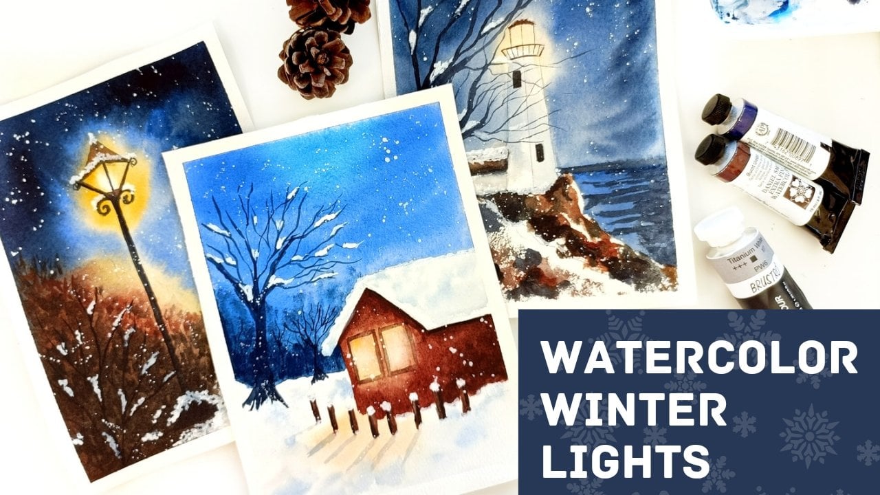
1. About this class: Winter is such a beautiful
time of the year. All the glorious
colors from autumn converging into these
flawless white landscapes. That's what this
class is all about. I'm Anita, I'm an artist
and educator from India, currently based in Canada, had, in this class we try to capture the beauty of light,
it mental landscapes. This is a big enough
friendly class. So even if you're new to the medium and you've never
tried watercolors before, feel free to join in. We cover all the basics that are needed to get started
with these projects. Then dive into
beautiful landscapes as part of the class projects. As part of the
techniques section, we'll be covering all the
basics related to watercolors, including washes, painting,
those soft flowy backgrounds, as well as all the detailing that you need to do
on the foreground, will be also covering
how to paint snow and how to capture the sun and
the glow in your landscapes. So I hope you'll join me on this creative journey to winter wonderland. Let's get started.
2. Materials Needed: So let's get started with
the materials of this class. To start with, I
would go with paper. Now, people I feel is the most important thing when
it comes to watercolors. And I'm using the Ba
Hong Kong hundred GSM, 100% cotton paper. Now, I highly
recommend going for something that is 100%
cotton because it helps with the techniques
using the wrong people can give you a very
different result to what I'm doing here. And it's not because the
technique is not right, but it could very well be
because the paper is not right. So I have cut this into this slightly less than
equals size of people. But you can go with any size of paper that you're
comfortable with. Even a smaller one or
bigger one works just fine. But just make sure that
it's at least 300 GSM and hundred percent
cotton so that it can help you with the techniques
that we're going to use. Now come into brushes. We won't be using a lot of
brushes for this class, mainly a few round
brushes so that you can use them for the detailing. Like the trees, the branches. So a few round brushes, including a size six
and a size four, works just fine based
on size of the paper. If you're using a bigger paper, you may need a bigger
size of the brush, but just a few round brushes for all the detailing
work just fine. I've also used this
model of brush for wetting the paper
or covering the washes. Now, it really helps if you have a bigger paper to have
a modular brush because it covers a larger area than your normal flat or round brush. But it locally depends if you
are using a smaller paper, you may not really
need this crushing. It just helps in covering
more areas in one cool. Now coming to the paints, I'm using the Daniel Smith
professional grade paints. You can use any brand
of watercolors. That's perfectly fine. I'll be sharing the
colors that I'm using in each class so that you can match it up with whichever
brand you're using. I just recommend going for something that's sees
artists grade because the pigment that is
used in these veins is very different from
the student grade paints, but any brand of artist
grade paint works just fine. Apart from this, you need a
board and a masking tape. So since we're going to
use a lot of wet-on-wet, will need to tape
the paper down to a bolt so that the
paper does not buckle. Now, even a 300 GSM paper may buckle depending upon
how much water we use. But taping it down really helps then keeping it
intact to an extent. And also there are a few places where we need to give
direction to the paint, like when we are painting the backgrounds and
the Blur crease. And in that case, having it taped onto a boat helps
because you can really move the board and
give the paint a little bit of
direction of wet. But that's about it.
That's all the materials that you'll need for this class. Let's move to the next section.
3. Basic Techniques: In this section,
I'm going to cover the very basic techniques
of watercolor. So that even if
you're a beginner and you're just getting
started with the medium. You can use these
techniques to paint the beautiful projects
that we're going to try out in the
subsequent sections. So to start with the techniques, we'll start with wet on wet. Wet on wet is when you
have a wet layer of paint or a plane wet layer of water
on the paper like this. And then you add another wet
layer of paint so it could be the same color and it could
be another color as well. So basically we
are trying to add wet paint to an existing
wet layer of paper. So you can see that, in this case, watercolor
does its own thing. Once you are adding
it to a wet layer, it could also be a
plain water wet layer. So I'm trying that
out here as well. So once you add color to it, you can see that it spreads, it bleeds and blends. And that's the beauty
of watercolor. It has a life of its
own and you get to see it the most when you're using this wet on wet technique. Wet on wet is what
helps you achieve that soft, flowy look. And we're going to use this technique for
all our backgrounds. So this is what we'll
do for the backgrounds and we'll use the wet on
dry for adding the details. When it comes to wet on dry, It's all about adding
the dry paint, wet paint onto the dry paper. So that is what
practically we did in that first wash
that we tried out. I directly added the glue paint. So this is the wet on dry. Wet on dry is what you use
to add all the details. While wet on wet is what gives
you that soft background. Just to compare it with what we have done
in our projects. If you see here all the
background that is there, all these washes are
done wet on wet. So it helps the colors blend in. Whereas everything that
is in the foreground, all the detailing, etc, is done wet on dry. So we use this technique
mainly to create that kind of a contrast and more detailing for anything that is
there in the foreground. Whereas the background is all
blurred and flowy and soft. So that's what we've used. That's how we have
used these techniques, wet on wet and wet on
dry in our projects. Now, coming to some
other techniques that we're going to use in here. Now, let's talk about creating
depth in the paintings. Now since we are
painting landscapes, It's really important that
we have this kind of effect inbuilt into the
painting so that you can give the illusion of depth. For this, mainly we'll be
following few simple rules. So anything that
is closer to you, like right in front of
your eyes is going to be much darker and
much more detail. Whereas anything that is
further away from you in the background is
going to be blurry and light with not much detail, just like what we
have in real life. So anything, when you're looking at something and distance, you will be able to make out the overall shape of things like there are
trees or mountains. But you really wouldn't
be able to see the exact details that are
there on those objects. Whereas something that is
right in front of your eyes, you'd be able to get all
the details on that. Like maybe a tree.
If it's three, you can see the branches, you can see the shape
of the leaves, etc. But that's not the same for
something in the background. So let's try it out here. So e.g. I'm just
wetting the paper a little crying to create these
blurred shape of the trees. So since we already
wet the paper, you can see that the strokes
also get kind of blurred and blended because
on wet paper, so you're adding wet on wet and that's the
reason it is softer. So that's how we're going
to achieve this effect. So you can see here that it gives the illusion
that there are some trees. But you cannot really see the
details on these trees like the branches of the leaf or
the shape of the leaves, etc. But you know that there are
some trees in the foreground, will be adding a lot more
detail in the foreground, e.g. we'll have a bit of snow, so we'll add the shadows. So I'll come back to this topic of how to
paint snow in a minute. But we'll just be adding
the details here and then adding the foreground trees with a lot more detail
and darker pigment. So just to compare this
with what we have done in our projects and how
we have included this kind of depth or
flow in the projects. Let me just show you
what we've done here. So here you can
see that there are a few layers in the background
with the trees and shrubs, etc, are quite blurred. So because of the
way it's painted, you know that there is
something in the background. There are trees or
the restaurants. They're very thin,
they're very soft. But you can still make out that there's something
in the background. Whereas all the trees
that are towards you, towards the foreground,
there much darker, they're much more detail. So that's how we're
going to go about this. Now coming back to the snow, since it is white and
our paper is white, painting something
wipe becomes tricky if you are going to paint
it with white color. So how we go about it in
watercolors is painting around it or painting the
painting it negatively. So it's like here
for in terms of snow will be mainly
painting the shadows. So whenever you look at snow, you'll always be able to see some shadows that
are like bluish, grayish color, very light, but you can still
see those shadows. And that's how you kind of emphasize that
there is no there. Because once you
paint the shadows, the area around it, the white paper
becomes highlighted. And that's what we're
trying to achieve here. That's the effect that
we're trying to achieve. So for this, you can use any light value of a
Payne's gray or blue. And once you start painting
it like I just drew a box here and I'm starting
to do these random strokes. And you can see that
the white part kind of gets highlighted and gives
this effect of snow. And that's how we're
going to paint it because you cannot really paint
white for the store. But you can always
paint in the shadows, which gives the
illusion of the snow. And because your paper is already bite anything
that you paint around it will automatically make it get more highlighted. So that's how we'll
be painting snow. Now, coming back
to the foreground, once your paper is dry, minus still a little wet. But let's go with it. So you could go with an
Indian thrown glue or any darker value or
a darker pigment. By darker value, I
mean you can use the same ultramarine that
you used in the background, but you put in more
pigment and less water. And then you can add
in the details here. So the exact branches, or maybe some shrubs
in the foreground. But you do this with
a much darker values so that it is more prominent. It is closer to your ISO. You see much more clearly than whatever is
there in the background. So that's how you're going to go about painting these landscapes. Now just one more thing to
cover here is how we create the glue or how we capture
light in these landscapes. So that's what we're going to
cover in the next section. I'll see you there.
4. Painting Light: Alright, last part of the basics before we
dive into the projects. In this section, I'd
cover how we pin light or the glow of the
sun in these landscapes. So it's a very simple technique. Wherever you have
the source of light, once you identify
the source of light, will make sure that, uh, we gradually increase
the color around it. So the main source of
light would be very light. Whereas once you start
going away from it, the colors become
slightly darker. So we'll have a blank
white or yellowish center. And then as we
move away from it, will add a darker
yellow or an orange. Or in this case, since
the sky is pink, we add an a pink as well. So that's how we go about it by gradually introducing the color. Again. All of this is going
to be done wet on wet. So we are going to wet the
paper and then add these. But mainly you can
make sure that you have source
of light decided. Then paint around it. So it's again kind of
negative painting. But to create the blue, we need to have
that gradual flow of colors from light to dark. Here I'm going to create, I'm just wetting the paper here. And once you have
the source of light, so I'm going to have the
source of light in the center. I'll start adding the yellow. I'm adding around it. So I'm just left a little
bit of white there. Now, since the paper is wet, that is a good chance that
the pigment will flow into the circle that we have
created, which is fine. You can always lift the
paint of the people. So lifting is when
you use a tissue or a clean brush to just
pick the pigment from the people back
into the brush. So this helps in creating that
white glow at the center. And if you're not
able to do this, there is a good chance
that the pigment that you have used a staining. There are some pigments
that are staining, which means that they get absorbed into the
pupil much faster. So in this case,
you may not be able to get the similar effect. You may not be able to lift the paint completely
off the paper. So you just have to do this
on a trial and error thesis. But mainly you can either
leave the center part or you can leave the
pin from this so that you get that kind of glue. And once you have done that, once you have that
source of light decided there's a
little bit of glow there and you've added
yellow around it. You can further enhance
the globe by adding a darker yellow or a
dark orange or pink, whatever color your sky
is around it like this. So as you can see, as soon as you add in
the darker color here, it is giving that illusion that there's something
at the center. This is light blue at
the center and it is slowly moving towards
the, a darker pins. So just that. Similarly they've done it here. We have left this whitish, whereas we've created a slightly
darker color around it. Now, coming to painting
the trees as well, It's important that when you're painting anything in
the path of light, you have the similar effect on freezes when so just like
what you'd see in real life, when you're looking at a tree that is right
in front of you and there's a source of
light at in the background. You'll see that there's a
certain blue that comes onto the branches that
are in the way of life. So that's what we're trying
to achieve here as well. So whichever branches are
there in the path of life, we will first paint
them lighter like this. You can lift up the paint or you can just start
with a lighter value. And then anything
that is away from the light we need, the darker. It is the same approach that
we've taken here as well. We have a lot of trees
that are closer to the light and those were
painted them lighter. And the ones that
are further away from the light, they
are much darker. So that's just the effect that you create by going
from light to dark to suggest that there are
things that are closer to the light source and there are things that
are further away. So the words that are further
away would be much darker. So that's how we're
going to treat it. So let's get started
with our first project.
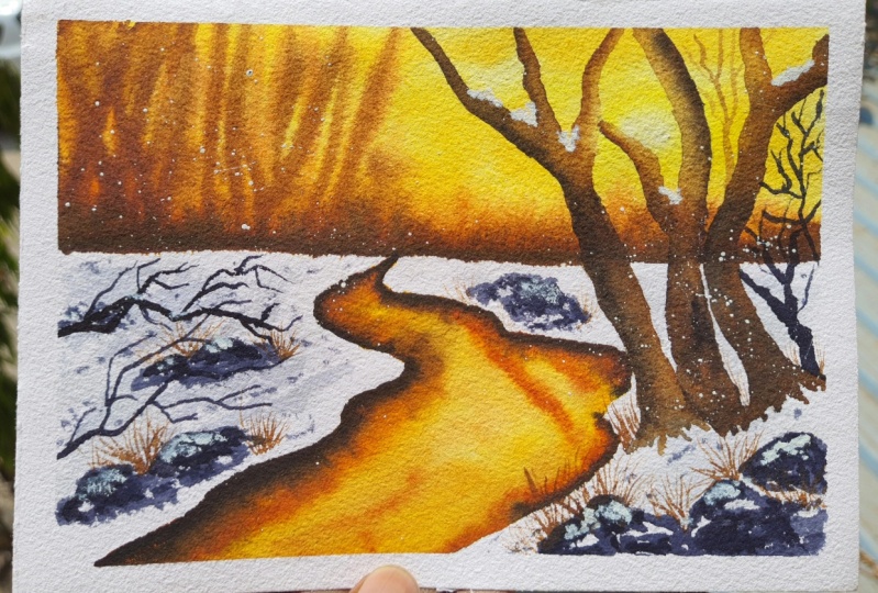
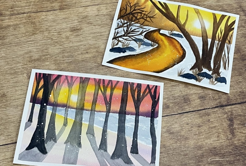
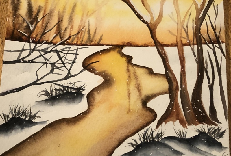
5. Project 1 : Golden Glow: Alright, starting with our first project and this one will paint a warm yellow
brown kind of landscape. So I'll start with
a simple sketch, starting with our
horizon over here. And we had a little
stream like this. Next we'll have a few trees. So this is our source of light. So we'll be trying
some trees here. Most of them are
in the foreground. As the background, trees that will be adding
would be lightened, blurred, and blended
with the background. So I'm just mainly drawing
the foreground trees here. And when drawing these trees, you need not worry about the
perfectly lines even nature. You'll see that these trees have imperfect edges
and that's normal. So you can just go loose
with the strokes here. We have one more tree over here. And those are the main trees. Will have a few more
added in the background. Maybe you're not too dark and a few branches coming
up towards the foreground. So that's something
we'll add indirectly, maybe with the pain later on. And also on the foreground, I'd like to add a few rocks, just placing them here, we'll add the details later on, but for now we just placing these rocks had a few shrubs that will add directly
with the paint. I just want to place
one more branch here, which would be in
the foreground. So slightly darker as well. To add a little bit of depth
to the side of the painting. Because on the other side we
already have those trees. But for this side, I'm adding a few foreground
branches. And that's it. I'll quickly just erase
the darker lines over here and we'll get started
with the painting. So since we're going
to have the source of light towards the top right, I do not want any harsh
pencil box there. So that's reason I'm just
erasing it so that we can have that soft glow of light painted directly
without any lines here, just erasing that part
and we should be good. Now, let's get started
with the background. I'm using MyMathLab brush and clean water to just wet
the surface a little bit. We're doing this just
for the background. The top part from where
we drew the horizon. So just that part. Then we start with the
painting of the Sun. So I'm just leaving that
little bit of white and painting around it with
the lighter yellow. So here I'm using
Hansa yellow medium. And near the source flight, I'm using a lighter value and just making sure
that it gets blended. And towards the outer side, I'm using a much darker
value of the same color. So this totally depends. You can also use an orange
mix and maybe a red as well. We'll be trying the pink yellow
sky in the next project. For this one, I'm sticking to
meet the yellow orange sky, just making sure that the
source of light is highlighted. And towards the outer
side we're making slightly darker pigment yellow. We'll also be adding brown here. So that's the reason I'm not putting in a
lot at the base. So before we start with that, I'm adding a dark
orange color here just at the horizon and giving
it a little bit of shape. Some things have
led to the trees in the background,
distant background. So that's for the first layer. And I'm just turning
my board a little bit so that the paint
flows towards the top. Next we will start
adding the brown. So I'm using the burnt sienna
and just dropping it in. So you can see that it kind
of spreads on its own. But in case it doesn't, you can just give
it a little bit of direction using your
brushes so that it creates those small bleeds
in the backgrounds, which kind of give the
effect of background trees. And I keep adding a slightly
darker value of burnt sienna itself and towards the source of light and making sure
that it's not as dark. I'm using a very light value. And while it's still wet, I'll add a darker value
of burnt sienna here. And just let it flow like this so that it
creates those soft, flowy trees in the background. Again, all this will become
much lighter once it dries. So just making sure that
it will still show up. And for the final layer, I'm adding in burnt umber. So this is the darker brown. So I'm just again adding it at the base and then letting
it flow towards the top. Again, making sure that
the central part is not as dark as the others because we have the
source of light there. So we do not want a lot
of dark color in there. But for the rest of it, I'm using the same mechanism. I'm just adding the color
at the base and letting it flow using a slightly more pigmented
value of burnt umber. And just dragging it towards the top so that it gives
the illusion of trees. I'm not making all
street trees like that. Just making sure that it's
not a monotonous background. It's just adding a
few strokes here. And then we'll let this dry. And in the meantime, we can get started
with the screen. So just as a final touch, I'm adding the darkest
possible value of burnt umber. You can also add in a bit of
indigo or a darker blue to brown that you have so that
it has this kind of shape. But mainly I'm trying to use the darkest brown at the base. So it creates this nice
gradation in the background. So we started off
with an orange, added a burnt sienna, burnt umber, and then this
darkest value of burnt umber, which is mixed with blue. So you can see that it creates
a very nice background, flowery background,
and violet tries. We can get started
with the stream here, since it is not really touching. We can get started with this part and let it
dry in the background. For the stream I
started with, again, Hansa yellow medium because
that's the color of a sky. So I wanted to retain the
same color for the stream. Now here you can start
with a lighter value and then drop in some
darker value like this. So that closer to the horizon, we're going in with a
slightly different value. And as you come closer
to the foreground, we are having this
slightly darker value. Now near the edges, closer to the banks. I'll be adding some burnt sienna will be enhancing this further to create that
effect of the bank, but closer to that
just next to the snow, I'm adding in burnt sienna, slightly darker
value at the edges. As you move towards the water, it gets slightly lighter. And I'm trying to paint the
reflection of the trees over here on this wet, on wet. So a lot of it will get
blurry and that's fine. We'll be adding a lot more
detail to this part later. Just one final round
of darker brown. You can use a darker
value of burnt sienna. If your stream is already
looking quite dark, you can go with burnt umber
as well, just at the edges. So you can see that as
soon as you add that, it gives quite a distinct look to that snow that
is right on top. While it's still wet, I'm adding round of burnt umber. Just had the edges
right next to the snow. So here again, my
paint is still wet, so I don't have to
do much of blending. It's more or less
happening on its own. Now we'll get started
with the snow. So for the snow, I'm using
a light value of indigo. And you can see that I'm just
adding in the shadows here, just like what we discussed
in the technique section. So I am going with
a very light hand, just adding these random strokes so that we can
create some shadows. And in the process,
highlight the store. Now while everything
else still crying, I'm trying to add in some
elements in the foreground, starting with these rocks. So I'm using a dark value
of indigo for this. So we are done with the rocks. So now that my painting
has dried a little bit, I can get started with the
priests and the fulcrum. Be starting with a lighter brown like this because
we want to add in the details and the depth
using a slightly darker color. But wherever we are
in the path of light, I want to go in with a
lighter color like this at first and then slowly
add the darker colors. Now, I want it to be
slightly lighter in the CTO, which is in the
path of sunlight. So I'm just lifting
a little bit of pain using a clean brush
and a tissue. And then we move on and
added the darker brown. So again, we're just adding
it to one side like this. And we let it blend
in and spread. So now you can use a clean
brush and blend it in. So this creates the effect of a darker shadow
on the other side. Whereas towards light, you are having a much lighter view. So same thing we'd repeat
for the other trees, especially for this one. As it's directly in
front of the sun, we will be doing a much
lighter color over here. So what I'm trying
to do here is just paint the branches top and the base part and then using a clean brush, just
blending it in. Even this looks a little dark, so I lift up the paint
from here a little bit. And we'll continue to add in the darker
colors at the BCE. Now as the previously that repeat it is in
the process of drying. I'm just adding a little
darker color at the base. Same thing for this one, but lifting up a little
bit of paint from the top part and making sure
that the beast is darker. We continue with the same
process for the next three, starting with a
darker brown towards the edge that is not directly
in front of the light. And then using a clean
brush with a little bit of water to spread it out
towards the lighter part. And once it's wet, we can add in a
slightly darker value towards the other part
at the Edge as well, like this towards the
base and this edge. So we tried out both
the techniques. One is to start out
with a lighter value and then adding the
darker value at one end. And then previously, what we did was to lift up a little bit
of color from one type. So both work based on the
kind of pigment you're using, the kind of paper you're using. You can try out both
the techniques. And while that is drying, we are adding some
final branches and smaller trees
in the background. For this, I'm using a slightly
darker value of indigo. You can also use a burnt sienna if you want
to continue with the brown. Or you can go with the Payne's
gray or black as well. For all the dark apart, I usually prefer using indigo. Again, the branches that are
right in front of the sun. Here. I'm trying to go in with a lighter value as compared to the ones
that we did previously. So I feel it's still a
little bit too dark, so I may just lifted
up with a tissue. This looks much better. So anything that is
closer to the light, I would like it to
be much lighter. And while that's drying, I'm starting with
the foreground part. So little shrubs
here, small plants. So again, for this,
I'm using indigo. You can use any of the grounds. I need darker color. That'll show up as a contrasting foreground
to the snow that you have. Just adding a few more here. So all the rocks that we added, I'm adding the smaller
plants over there. Now we add a few more
shadows on the rocks. So I'm using a darker value of indigo and just adding
it in like this. Mainly to create some
depth on to this. Now, we have drawn some
poor ground branches here on the left side. So I'm just working on that. So for this again, I'm using the indigo a dark value
because this is for ground, so this would be the most
detailed and the dark is clear. I'm just directly going in with a very dark value of indigo
and adding in these branches, I'm using a smaller brush here. If you have a rigger
brush or a script liner, that would be fun to
try out these branches. You can use a smaller
round brushes. Well, I just enjoy painting
these branches so much. Sometimes I get carried
away and add way too many twigs and
branches, but it's fun. So I'm trying to add
those foreground, a darker branches here. And we can see that it adds a nice contrast with
the background. We're almost done
with this project, some minor details remaining. So just adding a few
more branches here. Like I said, sometimes it's
just too much fun to stop. I'd like to add more
depth onto the trees. And for that, I'll go
in with a darker brown again and use a clean
brush to spread it out. So I'll start with this one. I'm using a burnt umber
just on the opposite edge. So this is the part where we
are creating those shadows. I'm just adding the
darkest brown here. And then I'll just use a clean brush and blend
it out a little bit. We'll repeat the same
for the other trees. For this one, it's mainly
at the base because most of the top part is right
in front of the sunlight. So just blending it in
with a clean brush. And for the last one, same. We start with the dark brown on this side, because
the other side, and it's right in front of the sun and musically
brush to blend it in. Next, we'll let this dry
and then get started with adding a little bit of
snow using white gouache. I'll write my paper is dry. So I'm just adding few strokes here on the branches to show some snow
that's been deposited. Same for this part. Just a few places
where you want to show that this snow stuck in there. See you on the rocks. We would like to add in some
details in a similar way. Just a little bit of snow
that is there on the rocks. And once you're done
adding these details here, you can go in for a splatter to add in
the remaining snow. And that's it. That's our project. Dan. And I really like
how it turned out, the glow that's there. And your overall mood of this yellow brown
kind of landscape. So I hope you enjoyed it as well and you'll give this a try. I'll see you in the next one.
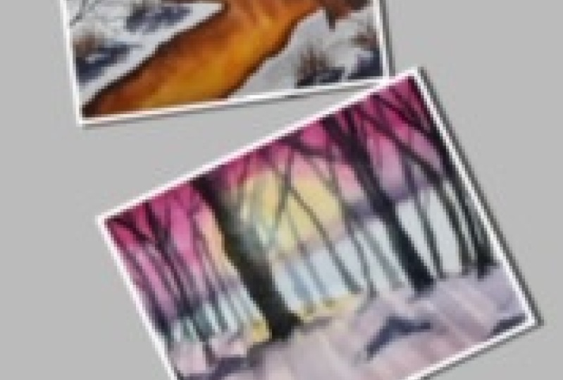
6. Project 2 : The Sky is Pink: Alright, let's get started
with our next project. So for this one we're going with a slightly more vibrant sky. So we'll have a hint of pink
and of course yellow in it. So I'll mark my horizon here and get started
with the sketching part. So here we have a slight
change in the background, like a mid-field here. And then we have this for slope where we have
all our crease. I've just mount the
placement for the trees so that we know
where to paint them. Towards this side, we'll
have smaller trees. And of course towards
the background we have thinner and smaller trees. And we have a few trees
in the foreground that are much more detail,
broader as well. So this one's, one of them. This is going to be our main
tree in the foreground. And then once we've dealt
with the source of light, will be adding the
shadows here accordingly. Based on where your
source of light is. You have to add the
shadows for these trees. But right now, let's just
place all the crease here. Adding a few more here as
we move towards the right. So on the right side again, we'll have one more tree that's kind of prominent
in the foreground. Whereas we have
more thinner crease in the background here as well. Adding the mean for ground
creaked towards right here. And that's I think that's it. Maybe few more trees
on the right here. So I'll just erase this dark one in the foreground because I wanted to be lighter and
blend in with the others. Although we'll be painting these trees with a
darker color later on. But just trying to make sure
that the sketch is aligned. Now we'll get started
with the background. So here we have the
source of light, which is the sun, will be
painting mainly around it. So let's get started
with the sky here. I'll wet the paper
with clean water. So start with the light yellow
hansa yellow medium here. And I'll paint around
the source like this. Although the white
is no longer there, it kind of blend it in
because it's wet on wet. And I'm adding a darker value of Hansa Yellow
Medium around it. I'll just quickly lift up a little bit of pigment
from the center because I still want it to be
slightly lighter and lighter. And words the other side, we simply added a Hansa
yellow medium like this. Since the paper is already wet, I'm just adding these strokes to let it blend with the water
that's there on the paper. Next, while it's still wet, I'll add in the opera pink. So this is adding so
much color to the sky. And since it's wet on wet, blending right into the
yellow that we added earlier. So again, we are using
the same strokes and letting it blend
in with the yellow. Adding in a little more pigment. And if you want, you can
tilt your paper like this so that the beads starts
flowing towards the bees. And you can use this to
your advantage to let the bead blended together and cleave that blue
in the background. Adding one more layer of
slightly darker pink. So I'm using the grid grows here and just dabbing
it in a little bit, creating a little
bit drama and Sky. And now while it's still wet, I'll add the shrubs or the small patches that
are there in the background. And for this, I'm
using shadow violet. You can use any
dark bluish color, maybe a Payne's gray as well. And we just add it at
the base like this. Since the paper is still wet, you can see that it is
trying to spread towards the sky and it's giving the illusion of trees
in the background. So again, this is going to be
a very flowy kind of layer. It's not going to be too detailed or the pilots
in the backgrounds, we want it to be soft and flowy. We just adding this page here at the BSW and tilt the paper
a little bit if you want, so that the paint flows
further towards the sky. And by that movement, it's automatically creating those soft trees
in the background. And we'll let this dry before
moving on to the next step. Now, once your paper is dry, you can start with
the foreground part. So again, since it's
not touching directly, you can also start while the
background is still drying. So I'm adding the
foreground here and here please try to mimic
what we see in the sky. So even though we're
painting snow here, we want to capture that color, or rather the
softness of the sky on the reflection of
the sky on the snow. So we go ahead with
the same colors, but a much lighter value. We're kind of tone it down with water using
these brush strokes. So I started with yellow and I'm adding
a little bit of pink. Again. This looks quite
vibrant right now, but we just blending it
in with a clean brush. And once it dries, it will become much lighter. While it's still wet. We'll add in a little bit of
texture on the front part. So this is the foreground,
this is closer to you, so you'll be able to see
a lot more detail here. So we're just building up
the texture on the snow. I'm using again, same shadow violet that I
used for the background. I'm using the same color
here, maybe light value. And also because
it's wet on wet, it's kind of blending in. It's super light right now. We'll give this a
minute to dry and then get started with the
middle ground here. So for this, we're going
to paint the snow, or rather the
shadows in the snow using a very light
value of indigo. I'm just adding these strokes so that we have some
highlights where you can show the snow and
all these shadows which kind of helping
highlight in the snow. And again, we let the
paper dry completely. Now once your paper is dry, we can get started
with the crease. So I'll start with the
main tree here going in with a very light
value of integral. So you can see that it's
almost transparent here. I'm doing this because I need to have that kind of glue here. The, for the tree that is
right in front of Sun. So I'm starting with a very
light value like this. Then the buildup on the details, just like we did in
the previous project. We added the darker color later. But for now, we start with
a very light value of MDP. Now, once you're done
painting the outline, we added the darker value. I'm adding the
integral 21n here. And since the previous
layer is still wet, I'm just letting it blend in. You can use a clean brush and help it with the
blending part as well. But we mainly relying on
the previous layer that we painted and making sure that
we let the flow of light, red LED glow of light
pass to the screen. If you feel that
at any point you have gone darker than
you intend it to, you can simply lift it
up with a clean brush or use a tissue to
just lift it up. But we're making sure
that the area that is directly in front of the
sun, we painted lighter. Now we continue painting the other crease following
the same approach. The ones that are
directly in front of the sun or closer to the sun, we paid them lighter. And as you move away from
the source of light, you start painting
those trees darker. So I'm just lifting up some paint here so
that it's lighter. We do the same for the
trees on the other side, going from light to dark. So you can see that
I'm frequently lifting up pigment
from the paper. So anytime that I feel that it's getting too dark
closer to the sun, I'm just trying to lift it
up with a clean tissue. Now we slowly start adding
the darker crease here. I'm using the same color but slightly darker value more
pigment and less water. And we continue
painting these trees. We already had them
marked with pencils to be just making sure that
we paint around them. So as we move away from
the source of light here, I'm making sure that the
crease also get darker. Similarly on the other
side we go ahead and be slightly darker, crease. These are still pretty
close to the light, so I'll repeat that slightly
lighter pigment over here, the same color, indigo,
but lighter value. And now that we're trying to
go away from the sunlight, we are going further
towards the right. You start adding crease that
are slightly darker as well. Now, all this while, except for that one tree that we painted in detail
in the foreground, we've still been painting
the background trees, or rather the trees that
are further away from us. So now we start painting
the foreground trees. But this, of course,
will be using a darker value of indigo
because this is closer to you, this is closer to your eyes, so you can see this
in much more detail. And also these will be darker because they are closer to you. And we have one more tree
towards the right here, which is going to be
in the foreground. And slightly more detail than
what we have done so far, except for that main creek, which is directly in
front of the sun. So for this one again, I'm
using a darker pigment and painting it slightly broader because this
is closer to you. Let's become too dark. So at least for the
left side where we can see that there'll be a little bit of
light from the sun. Let's lift the
pigment a little bit. And I'll fix the right side
here with some more pigment. And left with one more query on the right in the foreground. So we have a total of five
P's in the foreground. And rest of them are
in the background. Some of them are closer
to the source of light. Some of them are away. And accordingly, they tried
to create the blue here. Next we start with
painting the shadows. For this, I'm using
a light value of the same shadow violet that
you used in the background. And note the direction in which we are
painting the shadow, because this totally depends on where you source of light is. So all your shadows will
be pointing to that. So notice that as
we go towards the right and changing the direction
of the shadow slightly. For the shadows,
you can either use a very light value of Payne's gray or maybe mix a light purple using the ultramarine
and opera pink to give a similar purple
kind of shadow over here. For this bigger tree will have a much bigger
shadow as well. We continue towards the right, changing the angle of the
shadows, the Match Source. And we're done almost
with the shadows. After this, we'll
let this layer dry completely and then add some
more details to the program. Once the paper is dry, we can start adding
some small rocks, some sort of variation in
the foreground so that it does not look all blank. I'm just adding in some details
closer to the regroups. Some texture on the snow. So I'm not using a very
loaded brush here. It's quite dry as you can see. So I'm getting those
dry brush strokes. Mean the like I said,
we just trying to add a little bit of texture
onto the foreground. Adding a few strokes closer
to the background creases. Well, not a lot, just a few strokes
here and there. Once this is dry, we can sprinkle in
a little bit of snow using white gouache. And we are done with
this project as well. I really like how the
sky looks on this one. It creates a beautiful
effect and the reflection on the snow is what makes it
more beautiful for me. So I hope you enjoyed this project and we'll
give this a try. I'll see you in the next one.
7. Thank You and beyond!: So thank you for joining me on this greed adventure
to Winter Wonderland. I hope you learned
something new and you enjoyed the projects
as much as I did. And I do that. You give
these projects that drive. If you do, please do upload
them in the project section. And if you're on social media, you can find me as that crazy dude blur on Pinterest, Instagram
and peaceful. I would love to know your constructive feedback
about this class. So if you have one, please do leave a review, positive or negative,
both welcome. It helps me in creating
better classes and I do hope to see you with another one super soon in the new year. Until then, stay creative
and keep painting.
 Vinita, That Crazy Doodler