Transcripts
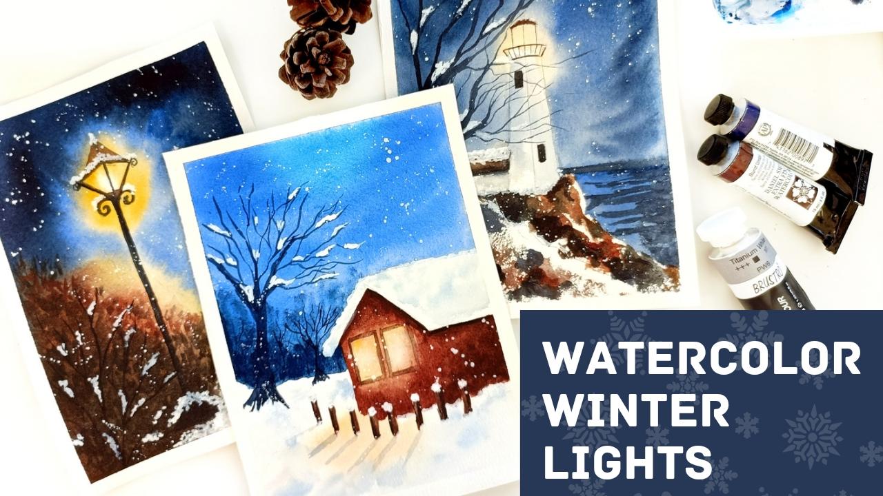
1. About this class: Winters are so magical. As an artist, I've always been fascinated by
vendor landscape. I love painting the snow
and beautiful night skies, as well as the glowing lights. And this is what this
class is all about. And we need that. I'm an artist
and educator from India. And in this class we'll be building beautiful
when the landscapes, with the focus being
on glowing lights. This is a beginner
friendly class. So even if you are
new to this medium, you're welcome to join in. We'll be covering on the
basics of watercolor, along with some special
tips and tricks on how to get that blue light. And then we want to create
three beautiful projects, glowing lives and winter skies. So I hope you'll join me
on this adventure and give these projects
try. Let's get started.
2. Materials Needed: For the materials of this class, you'll be watercolor paper. Now, you can go with
any plan I am using or Hong Kong and ridges and
100 percent cotton depot. And I've cut them into
these five sites. Again, you can go with any science that you're
comfortable with. Preferably something that is
300 GSM, 100 percent cotton. This is because we are
going to use a lot of wet on wet techniques for
the background washes. So you'd need something that can hold up those techniques. So for that, it'll be great to have something that is 300 GSM. And the, a 100 percent
cotton paper really helps in there with the
techniques will be used. I highly recommend
going for something that's represent carbon brushes. Again, based on the size
of the paper you're using. Repeat one day cram brash about pressure or
the background washes. And smaller medium-sized brush. A little bit of a feeling and all the smaller
portion, second half. And then I'm going to be
using a regular pressure. Again, this is not
really the same brush, but this one kind
of makes it easier. Even smaller brush with a very good tape
will work just fine. Or if you're comfortable
group brush that you're using an ACE
has a good day. We can use the same technique, all these smaller
branches, Israel. Now, watercolors, I'm using
Daniel Smith watercolors. I have a separate
section where we discuss all the color
palette for this class. And we'll be going through the colors in
detail in that section. And then we so washes for all the snow that
is these buildings. So a lot of it is just in the
end we have snow blizzard, as you'll see in the projects. So for that, I'm using
the brush stroke washer. You can use any brand
or washer for this, but I recommend using quash
and stroke watercolors. But if you don't have it, then you can always use the
white watercolor instead. The only couple of that, the watercolors are not as happy and hence they
can get diluted. When you're painting
on top of the, already painted the darkly, a second tab over here. So I do recommend going
over all these flowing and mask to get all
these crisp white edges. But that's about it. That's all the materials that
you need for this class. So let's get to
the next section.
3. Watercolor Basics: In this section, I'll be
sharing all the details about the basics of watercolors in case
you're new to the medium, don't worry, we have
everything in here. So to start with, the basic techniques,
we'll start with wet on, wet on wet is when
your paper is wet and you add in a wet
paint on top of it. So this is fair watercolor
takes its own course. It has its own light and
it spread like crazy. And sometimes it's
hard to conclude, but that's fun
about this medium. And that's what for
ANA backgrounds. So in general that on that
is what will help you create those creamy flowing
backgrounds that has wet on, dry is what we had to
get the details on. So all the backgrounds
that you see over here created using the
wet on wet technique. So that's what will
give you this kind of flowing and help
you create that, do the backup as opposed to the light
glow in the foreground. And then you have it on dry, which is about having
a cry people or dry hair and adding overtly
or paint on top of it. So this is what we use
for all the deep feeling, and this is what you'll be using to add clears or the
foreground details, etc. And also a good technique
for these rocks. You can use a dry
brush technique. So again, this is a
wet on, dry technique. And what we do over here is use a brush that is
kind of salad dressing. You can just dab it on an
issue or on your hand and do this motion so you
can see that there's a rough for green texture
that comes onto the paper. And that's what we crank, that dry brush effect. So this is easier when you have a textual people,
like for example, if you have cold press paper or even more so at
recruiting people, it's much easier gritty disobey. But if you are using a hot
pressed or smooth paper, then you have to
do it a little bit of extra effort that you just have to dab your brush
a little bit more, that a lot of pain
just get right into the tissue and you just
have a little bit of the Internet and
the pressure semi dried to get that effect. Another technique I want
to share is this DZ. So to create a DEP, like we have in the room, we cry out this technique, then we just add a layer
of paint like this. Again, this fattest,
wet and dry, and then use a clean
brush to spread it out. So instead of printing,
the whole idea is just painting a part of it and then using clean
brush to spread out against the remaining area. So this gives an
indication of debt. So that's on the basic techniques
that I wanted to cover. Now let's go to
the next section.
4. Painting glowing lights: Now since this class
is all about being the lights and I have a separate section to just share some quick tips and tricks
about how to get there. When you are painting nitrogens. So the idea is to start with a very light center and then progressively
darker colors around it. So when you're starting
out, you just spread the people and
political right there, which means that you
won't do anything there. And then as you move outward
from the source of light, you start adding yellow. So let me just share
a quick example here. So we can have a
circle like this. And now let's imagine that the source of
light is at the center. So when people completely
around the idea of light, and then start with a
lighter value of the ALU. And we try to avoid that
central part because you want to show a glue but
there is a source of light. So you start sort of
building a bounded. So we'll start with
lighting and low and then progressively add darker
values of yellow. Now, if you knew that the colors blending and all the values are getting mixed up
because of the wet on wet. But you can do is for the second part where you
have the source of light. You can use a clean
brush and just pick up some paint from there so you can lift up the beam from there. And based on the color
that we're using, the elliptic will leave a white badger slightly
yellowish best. But the idea is to have the central portion or
the source of light, has the lightest value. I'm close to white. And then as you move out, it becomes slightly darker. Now in this case, in
the case of the slab, we have wet on wet background
here along with the blues. So when you mix yellow with the likely end up
with a greenish tint. Now to avoid this, what you can do is to
use the yellow which is not really mixing with
you to give you a green, which is Naples yellow. So Naples yellow is a color that doesn't mix with blue like that. So you can use this
color alternately. If you don't have,
what you can do is to wet the paper
completely and leave a little bit of space between
the darker blue colors and the yellow so that
they don't really mix up. And we were batches so that you don't really end up having that greenish blue hue. But there's a workaround
for that as well. You can simply make
sure that you're using these two colors in separate
layers and MAC mixing them. That's all about life. See you in the next section where we started off as project.
5. Color Palette: Coming to the color
palette for this class. Now this is the
speed of identity in class and you can
think light and night. So we will be using
a couple of blues which kind of helping us in
creating the modal reserve. So I'm using the
ultramarine blue now, ultimately is a granulating
color in most of the brands. See that it gives a very
beautiful background. And since we'll be using blue in almost all of
the backgrounds here. So it's important that
you have a good mix. And the other blue
that I'll be using is indigo because we need a
darker blue sheet as well. So at, avoid using black. Even for the ages, I've used the darker values of
indigo separately. Use these to boost our
crumbling and indigo and creating all these
night sky background. Now coming to the light
and using an equal yellow. So again, I'll be sharing
the details about how you can create the
glowing effect there, then it comes light. But just to, just to
share the codons here, we have Naples yellow
and start with, and then we'll be
adding grounds here. So in case of this cottage
and also the lamppost, you have trapped there. So for that, you'll be
using a burnt sienna. Then again, another
darker ground which would be like
a burnt umber. So if you do have a dark brown, you can always use the
same bonds here and add it into the integral of u to make it slightly
cooler like this. But we need a darker
brown as well. And using these three colors, you can create that blue goods. For example, like this, you can create the blue and so also for creating
the shelves. All the lighthouse is very
friendly for the rocks and the ground of using
these grounds. Those are all the colors that
you need for this class.
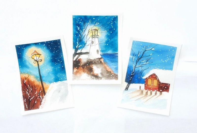
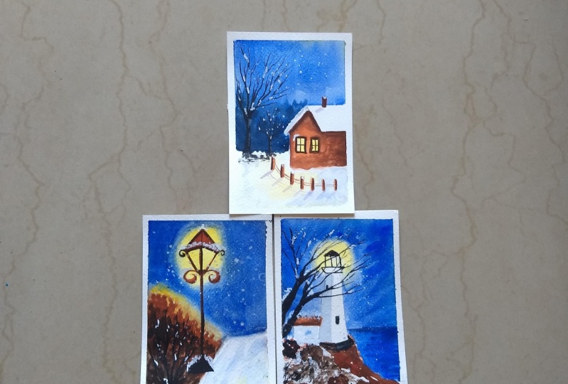
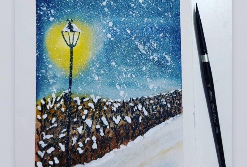
6. Project 1 : Glowing Lamp: So for our first project, you're going to be a
beautiful and simple lamp, glowing lamp at night. So at start with my room and
I'm going to have Colombo. I'm using a ruler so that
I can get the lamppost. So yes, so good. So we're going to have a
bit of detail on Lampert, have the lamppost and
Lampert services and goods. The focus here is on how we get light and the glue properly. So I'm just adding some very minor details
onto the lamp over here. Maybe a bit of fancy
curves over here, just to add to the
campus where that land. Now at the heel, we're going to have some shrubs. And again, they are at an angle. And here also we are going
to have play of light. So I'm just adding an outline and we'll be
painting it directly. So I'll just erase
this and get started. So I'm reading the
whole paper for now, except for the root. But it really doesn't matter. You can just read
the whole people. Let the water so can a bit so that we can walk wet-on-wet. And now as discussed
in the live class, we'll start with the lab. So I'm leaving a
little bit of white, these apps and where we inhabit source of light
and the yellow around it. So here I'm using an equals hello because
here we have the sky, which is going to be blue. I didn't want to mix up a green. I'm using the Naples yellow. But if you're using
a yellow, green, blue, then maybe we can
try and avoid mixed. So let us layer
dry completely and then read the paper again
and do the rest of the sky. So that's one work-around
that you can do. But here, since I'm
using Naples yellow have started directly ultra marine. And I'm adding it at the edges, starting with the
answers and then moving slowly
towards the center. Now you don't want the center to be very careful because you still want to show the area around the light to
be a little lighter. So I'm leaving a little bit of space at the center as well. And then next, while the blue is the
ultramarine scroll back, I'm starting with indigo. So this one again, I'm adding that on the NADHs and non-coding
towards the center. Much. I just want to have the agents where we want
to show the dark sky. Now, you have to make sure that we're still working wet on wet. So in PTC, paper is drying up, especially at the
BSW with Sweden, start working on that, but you might just
want to read it. In this case, I'm
just continuing to add the integral at the edges. And if you feel that it's kind
of flowing down like this, and just use a tissue
and just swipe it. Now in this area, again, this part is going to be darker, so I really don't mind a bit
of PPE includes this part. I'm going to add the
darkest brown over here, but that's it. That's about it. That's all Skype
art that is done. Now, you start working on the truck that is there
at the piece of land. And for this again, I
start with the yellow. Again, if you're using
not using equals 0, you might want to be too dry and then start
to disrupt secreted. End up mixing greens. In this case, I'm
using Naples yellow and I've now added
the burnt sienna. So you're going to have kind of clue from yellow to brown. So I started with maple
syrup and then add enough. And then at the edges and bring, add the burnt umber. Here again, we are working
mostly wet on wet. So I'm trying to finish
complete in one go. You can see that
we did the sky in one go and then continuing with the shrub by the
people is still that again, you might have to do a bit of variation based on the
yellow that you're using. The yellows are not mixing and you're fine to work
with it in one group. Then this helps in getting
that background effect. So I'm trying to
add in a little bit of shrub by using a
darker value of a number. You can also mix
a bit of indigo. If you do not have a dark brown, just mix a little bit of
indigo on to burnt sienna, you should get a
nice dark brown. And at any point,
if you see that A color from the edges
that acapella that he had. It from the edges are getting
towards center where we had a clean brush and lift a bit of color here
and just trying to add in. And also the graduate law of light by adding the darker
colors at the edges. So this is again, all wet on wet, wet on
dry and wet on dry. But right now you're doing
all of this wet on wet. So after this, we're going to let this layer dry completely. And then we'll start
working on the details. Right now the people has
dried completely and start adding some
details onto the truck. At this, again, I'm
using those same colors, but now that we're
working on cry, you'd see that appeared much darker because
previously when we were working wet on wet
and you'd all be added on that layer of
water on the paper. The colors will get go getting diluted and kind of mixed up. So I'm trying to add in a
slightly darker value of the same color and added these little strokes
that we can choose kind. Rather just adding a little
bit of detail to the SRA. Also follow the same techniques. So starting with a lighter brown and then as we move
towards the edges, we start adding a darker ground. So this again shows
the flow of light. So we start with a lighter color closer
to the source of light. So just under the
land you'll see that the color is much lighter. And then as you start
moving away from it, as you start moving towards the edge of the
people that I love, starts becoming
darker and darker. So just using simple
strokes like these. Okay. Now for the bees over, since we need a
much darker color, I've added a hint of
indigo to two bonds here. So you can see that it almost shows up as black over here. But I wanted a darker color. And words was kind of getting close to the
base layer as well. So just added a hint of indigo to make it
slightly darker. So it gets, it looks good now, the variation of the yellows
and browns look nice. So this part is done. Now, moving on to the
rule where we have snow. We won't be being
tick mark school because you just kind
of most of the crate. But just to show the reflection, just to show a little
bit of variation in the deck shoe VDB adding US like the
lighter blue like this. So people snow, that's
what you're going to do. You're just adding
a lighter blue or a very washed-out value. And that will kind of help
ensuring the shadows in the snow and effectively
cookie painting the snow. So next we move on to the labs. So for this, I'm
using the wet on dry technique through my people
and this part is crying. But I hope by the time we
start painting the lamppost, the shrub will be dry spell. So for this, I'm using
burnt sienna to start with. So again, for the areas
that are near to the light, just around like
they'd be slightly. And when you start moving
downwards towards lamppost, it starts getting darker. So we'll just play with
the values of worms here now and maybe add a hint
of burnt umber as well. So you can see here
that at the top, the ground is much lighter. And as I'm moving downwards
towards lamppost, kind of becoming
darker but number. So again, to see
variation in the values. Hi. It looks a little
bit more beautiful. So it's almost black color, but it's again burnt umber
mixed with a bit of indigo. So we just wanted to stand, stand out when the new
compared to the shrub. Next, I'm going to use my rigor and add few
branches over here, some branches off
another shrub maybe that just grayed out
because the winter season, Sam using indigo here to add
in the details of the shrub. Since we already used burnt
umber in the background, you can see that a darker
color to show up on this. So that's the reason
I'm contracting for integrals so that
it shows up on this. You can also use black for this, just so that it shows up
on the darker background. So that's all the
watercolor part. Now we start with the snow for which I'm using my white quash. So I'll start with adding
snow manually on to some specific parts
where you know that it'll get collected. Like these edges of the Lamb. Definitely go for a plateau. But till then, just first make sure that all these
little details are added. Some using a smaller brush
and just adding snow, white quash wherever
you can expect the snow to get deposited
on these edges as well. Here as well, at the
base of the root was quite a very sharp edge that
we did with the shrubs. So just trying to
tone it down by adding some uneven snow. And we also added to the base of the Lamb and onto
the dry branches. Just adding a
little bit of snow. Now I always try not to go overboard with this
or for that matter, stars in the night sky. It's just so much fun adding these little white
spots of snow that I kind of end up getting too
much snow onto the paper. I'll just stop
having it manually and just go for
the splatter some time with this, now, just a little bit of diluted. And this flatter. Again, we try not to go
overboard with this. So you can just use a simple hand movement like
this to add this matter. I've seen that a lot of artists also use two
pressures for this. So if that's more comfortable
with that as well, the idea here is to add
kind of a snowball effect. So that's the reason we're doing this last step so that this
shows up in the foreground. Just adding final round touch-up to this part. Done, We're done. This project and current
loads of snow and life. So enjoy this and
you'll also get a cry. So see you in the next one.
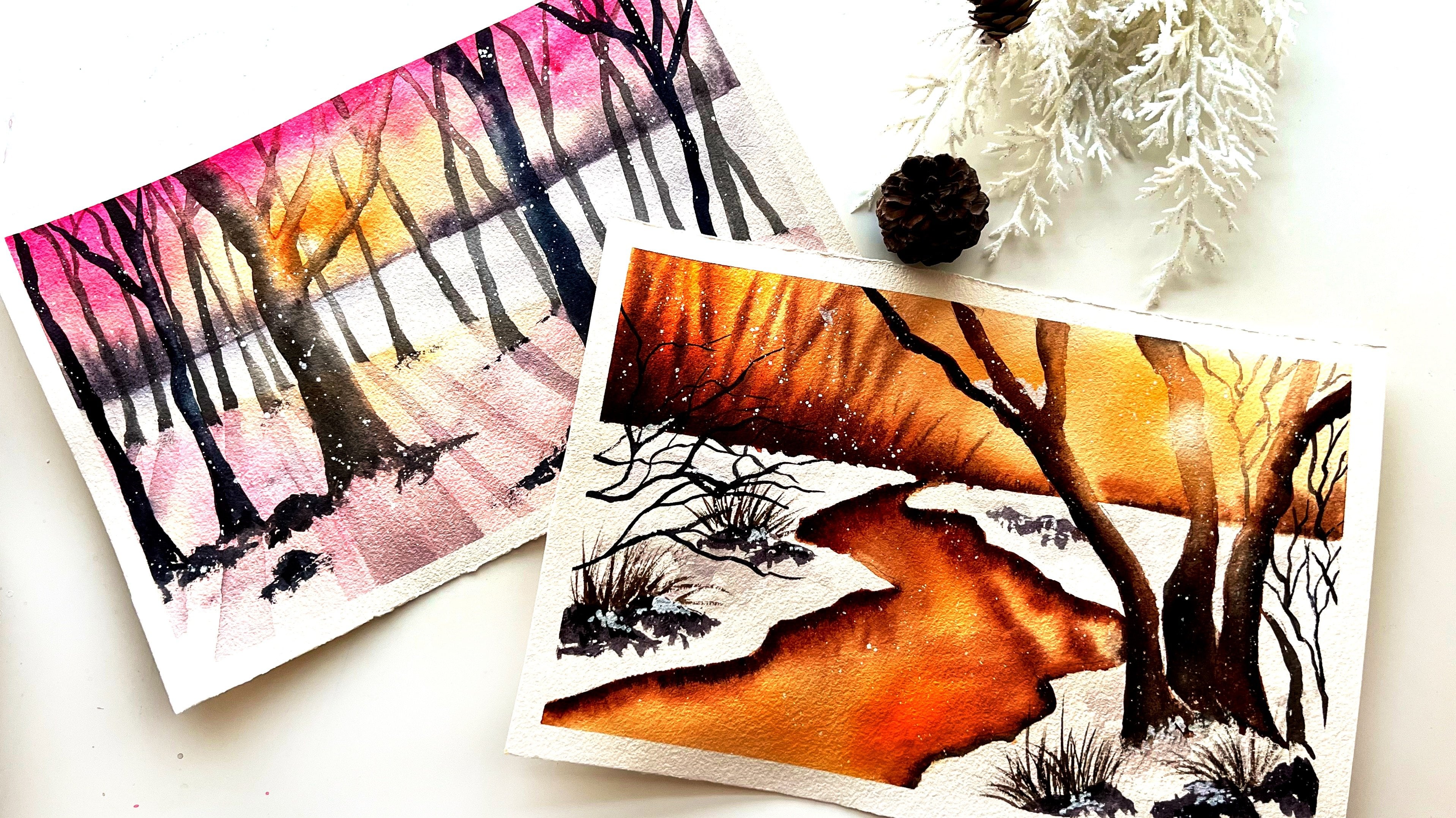
7. Project 2 : Lighthouse: For our next project, we're
going to be beautiful, glowing Lighthouse with a
window, snowy background. So we have a rocky
edge over here and a few branches may be afraid of having another or demand over here. Next we have the
lighthouse over here. So since the lighthouse
is in the background, whereas the fulcrum, the rather the size
of the lighthouse and embarrassing would
be slightly smaller. So we just go with a very simple structure
of the lighthouse. Now, I do have a
separate class on just being lighthouses with different backgrounds
on Skillshare. So do check it out if you
enjoy being delayed houses. In this one, we won't
be diving into a lot of detail on as to how
to be lighthouses. And the focus here would still be on the stone and
the glue of light. But we try and capture the
beauty of litres as well. So this is kind of the
top area where the actual light light sources there. And this is going to
be the lightest part of building the
lighthouse itself. We will keep it right, or rather short bit of shadow
onto this but mainly white. And then we have a
small shed over here. So I'll just add this pencil. And then the edge of
the water body here. So that's that sketch, Dan, I will just erase this and get started with painting. So again, we'll start
with the background. Now in this case, so
we break the people, but we'll try and why the lighthouse walls
are going to be white, so we don't want the blue from
the sky to seep into that. So I'm trying to avoid that area and just
being around it, mainly pot sky and make bread to people completely first and then we'll start adding
the colors over here. So he started with a
yellow very light value just around the source of
light at the top of the tower. So I'm still leaving
a bit of white there and just
painting around it. And then we start to sky. So adding the ultra marine and then the integral
over here as well. Now since we are working
with on where there's a chance that the colors
will seep into each other. So in this case, I'm
just going to use a clean brush and just lift up the color
a little bit from the center so that the
source of light still remains the brightest
part in here. And also from the edge of the people in case you
see that the colors are pulling up the edges so
you can use a clean brush. Just take care of that. Sum starting with the ultramarine
over here for the sky. And then I'll add in a
little bit of indigo, but not like what we
did for the project. This is slightly
different because we want to show a
very dramatic sky. So that's adding a
slightly different manner. But I'm just trying
to be careful here. Good. Lighthouse. We want
that to remain right. So I don't want the blue
to seep into those walls, so I'm trying to avoid that. Next we add the indigo, but instead of just
adding a grid on, I'm using these strokes
so that there's a bit of the sky so that we can show the movement of
the clouds, so to say. So that's the reason I
said that it is slightly different from what we
did in the lab project. So that's for the sky. For the water body here, I'm directly adding a
darker blue indigo mix. And this is again ultramarine
with a hint of indigo, but it's slightly darker than
the base layer that we used for the sky so that it shows
up separately over here. And once again, we are
careful with lighter. So that's it, That's
the sea and the sky. Now, for this rocky mountain that we have in the foreground, the dry brush technique and
adding in the details here. So for this, I'm using burnt sienna and
burnt umber, Congo. So like I mentioned in
the technique section, if you are using a CP
or rough grain people, the dry brush technique
kind of comes naturally. You don't have to
put in much effort. But if you're using an
HB smoother people, you might want to just dab your brush onto a tissue down so that it kind of becomes semi dry so that you can get the
same kind of prepared. Some music mix of burnt sienna
and burnt umber over here. So you see that there's a little bit of variation
in the lecture as well. And also while it's still bad, strokes, brushstrokes that he
cried out there still wet. I'm adding in a slightly
darker ground like this. So basically just
trying to build up the texture buildup a little
bit of mediation over here. Next, we'll paint the shed over here again using
the same colors. I mean, the stick into the burnt sienna and
burnt umber combination. And not going in with a lot
of different colors for this, these projects in this class. So most of the land part will be done using a mix of
these two browns, maybe a bit of indigo here to add in a little
bit more shadow. Now for this lambda
mu to the water body, using a mixed saw
the grounds again. But here I'm using kind of a return wet technique
where you starting with a stroke but adding
in a little bit of darker values or darker
brown over here. And let it mix them. And then it creates a
nice contrast as compared to the blue water that is
there in the background. Now, what you can
create a bit of light and shadow, Right? We're done with this. So I see that there's a bit of color that is flowing into the sky mainly because
of the vec people. So I'm using a clean brush
to just fix that bug. And next we move on
to the lighthouse. So keeping it right and you don't want to add in
a lot of color to this. But just to show the
shadows and using a very light value
of the integral, you can see that
it's almost closer to people color and just using it to create these little
shadows so that you have a bit of contrast to the light
that is there at the top. For this. I'll just add in a slightly darker brown for the Sheriff's ensure
bit of shadow. And then we start
with the branches. Here, I'm using the brush
and you can see that it's so much fun just using this brush to create all
these lovely branches. So that's the reason I said
that can give this pressure. But again, if you are using a round brush with a
good works just fine. I'll be adding a few branches, branches and then
adds on to them. Just like what we did. Adding another similar to
what we did for the postman. And a few of the branches overlapping
that lighthouse that we've been doing
in the background. So if I wanted to go for a lighter color,
I'm using indigo. But when I'm adding
the details or the branches on in front
of the lighthouse. I'm just trying to use a lighter value using
the same dark value. This is again the light. When you have that light
source in the background, you'd want to show a
little bit of light, reflect on the things
that we'll be adding, nor do all this. So it might just skip code. But for now I'm adding
on the branches I want. Next we'll start adding
in the lighthouse. All the branches are still wet. Let's get started with rocky for ground-up
have over here. So all the area
that I'll be using, the wet on dry
technique and adding the details or the
shadows in this part. So you can leave, right? Because we are going
to show that no, deposited on the rocks. So you can leave a bit of light. And that's the reason
that I went for the dry brush
techniques that were actually leading the
people right as it is. And we're just going to
paint the shadows on trust. White snow, bad state is now adding the shadows because at this point
you already know the lights and shadows. So just adding goals. Now that my branches
have to start working on the details for
the lighthouse, the top part. So adding the links, etc. So again, I'm using brown
indigo mix for this. So that is closer to
the light source. You'd want it to be
a little lighter. So I'm using a light brown. And as you move away from it, you can go slightly darker. So either a dark brown
integral would work just fine. Also have those two
little windows. Searches, moves integral
and then the bat. Then we'll just let it dry
and that gets started. A goal or the snowpack. All right, let's get
started with the snow. So I'll start again adding
a bit of it manually. Like instead of going
and just add it, we have all these branches. So the deal here, just adding snow in-between those branches will also do the same for the bass
part of the painting. And of course that
has been collected. Crank it more dynamic. You can just do a scatter of snow. So I've added a nice black
robes nor everywhere. And in case you value-added have become a bit down
because of the background. Maybe doing a test
for those parts here, adding a bit more snow. Done with this project. So I hope you enjoyed. This was slightly grim than what we did for the
book, cause it. But I hope you had fun and
we'll see you in the next one.
8. Project 3 : Cozy Cabin: So moving on to
our last project. In this one, we're
going to go beautiful, glowing lights and
snow all around. So I'm going to use
a very simple method to describe escape in the center here. And then I just
rounded with the rule. And then this will be the front part where
we have two windows. And these will also be showing
this was applied for us. So here we have the windows. We follow the same technique
when painting light, starting centers as whitish and then moving out the yellow. And then for this, in
particular around, these windows will be playing
with values of Brown's. We'll start with a
lighter brown and then add a darker
brown at the edges. And then we have this
little pencil over here. And we are done with the fence. Now we have a couple of trees in the
background over here. That's about it. That's
all the sketching really need for this class. And get started with
the painting part now. So again, we start with the sky, so will be having a
dark background sky. So in comparison, we would want to look much
brighter in contrast, also, there's snow on
the roof of the cadence, so you'd want to
avoid that area. So I'm not wetting
the paper there. I'm trying to avoid that area. Mainly just trying to wet the area that is
there for the sky. Now we start with
ultramarine again and be simple strokes. I'm trying to build up the sky. So you can see that the water is helping the mics on its own. So the blending happening
kind of on its own. You don't have to
do much over here. And just trying to avoid painting the roof
of the cabling. I don't want to mix that up with the blue that we have and
just trying to wipe tag, but mainly via just
been in the sky. And then we add a
slightly darker value of the same color so that we create some
variation in the sky. I'm not using a
lot of indigo over here in this particular sky, which is mainly using
that for the background. So I'm using ultramarine itself, but slightly darker value than what I used
for the background. And just using the same strokes to create some
variation in the sky. Alright, so we're done
with the base layer of the sky and ultramarine, beautiful granulating color
in all, almost all grants. So you'll see that
it's giving that matching beautiful effect for
the sky in the background. Now, for the background, I'm using the wet-on-wet technique and dropping
in the integral. So I'm not trying to
hadn't defined the sheep. Since these are in
the background, they are going to be
pretty much blurrier. So that's the reason
I'm working wet on wet. Again, I'm trying to
avoid painting the house. But apart from that, we are just adding go onto ADP
and just letting it blend. A slightly darker color, indigo, but a darker value. As you move towards the sky. Now to gain the rest, we need this layer to dry, so we'll start with the snow
and the snow white as it is. We try adding a little bit of shadow so that it looks magical. And also, we need to show the lighter income
from escaping. So we'll start with that. I'm starting my
Naples yellow and affect people with the idea
for the ground completely. And then we start the yellow, where we have the reflection of the light from the gaping
insight onto the snow. So this again is going to get
lighter as we move forward. Now, I'll be adding a
little bit of ultramarine, very light value of
ultramarine tissue, the shadows in the snow, and also spread into class. I'm just going to lift it up
with a clean tissue because the reflection is only going to be close to the source of light. And so I'm just limiting
the adding that light, ultramarine blue to the
shadows in the snow. So this is a very light value, and once it dries, it will
be crying much lighter. So we don't want
a lot of color on smooth cell just to
show a bit of shadows. So I'm also using a
clean brush here, which is blended in. And now let us try complete. Right now maybe I'll start
with the light inside. So I'm just using a clean
brush to just wet the area and then simply part or the
source of light as it is, and just being rounded. So I'm using a lighter
yellow to start with, so that we can just
beamed around the light. Now since radon, which is kind of making it
all blend together, I'll just use a clean brush
and lift up a little bit off from the central part where we have the
source of light. Right next we start
adding the bond sienna. So this is going to
be the lighter brown. Again. Let it blend in yellow so that we can show
a gradual floor flight. So we start with
the top part here. So I'm leaving so that
we can know that. But around the crank to
go from yellow to brown, dark brown kind of flu. Now towards the,
towards the light, I'm using a much darker
value because these are the areas where we have the
shadows or the darker parts. Whereas anything closer to
the light source and in front of it is going to
have a much lighter color. So this is just one part, Maybe adding a bit more darker brown
towards the edges again. So this is just the
first particle. Now we walk wet on wet. I'm adding the darker brown. So you could call
a darker value, but sienna, burnt umber, bit of indigo mixed
burnt sienna. So these cleaning want a darker brown so that we can
show that flew off light. Now you can see that
as soon as you add that darker brown kind of
automatically lifts up. And that's what we will see much more clearly
in a few minutes. So again, put central part, I'm using a very
light brown because this is again closer
to the source of life. And while you start working on the trees
in the background. So since these two
are not connected, I thought I'd just go
ahead with this one while keeping the first
layer of Christ. So I'm using my
rigger brush here to create these branches. Are you going to have a couple of trees in the background. So this kind of more towards us. So this is going
to be another one, slightly smaller than one. It's just so much
fun. The brand. I think we will run that now because we just added. So you just make it
smaller than the street. Just adding a few more branches. Now rendered price will walk on the small
part of the rule. So here again, we're going to just work on the
shadows for that, we use a very light
value of ultramarine, but most of it will be left. Why? Because we're just going to snow little bit of shadows here. Next we start with the fence. Now here again we start
with a lighter brown, and then we add in a few shadows are darker
and of course known top. So I'm just using MSN
have to start with. Now for the friends that is
right in front of the room, since it's in front
of the light source, there will be shadows as well. So for this, I'm using a very light value
of ultramarine and adding the details here. You can see that it
adds to the painting. It kinda makes it
look more magical. So I'm trying to prepare
effect over here because we know that
the light will be on the fence over here. So just creating the shadows
to add to that effect. Next week, go back
to the window, and this time I'm using slightly darker brown for
the edges of the window. I'm just going to lift up
a little bit of brown. I'm just used to clean up. Now getting back. So for that, I'm using a slightly
darker brown, just under half the snow. And I'm using the glazing effect to the blended in like this. So we start with a very dark
brown, just unbelievable, and then blend it in and cut the spark on the right side
where we have the shadows. Again, I'm using
the same technique. I start with a darker brown, and then the rest
of the painting. This part is done so
I'll add the shadows. The darker brown, one side
on the opposite side. Now we let this dry
completely before adding my people as I'll
start with the snow. Again, we'll start
with the snow. Snow gets deposited on the
brand and also on the fence. So I'm just going to add
a little bit of snow on the snow getting
collected on the fence. Also, since it looks like just adding a bit of
an edge for the snow, just under the house
where it's collected. And of course we
add the splatters. And we're done with
that last project. I hope you enjoyed this one. This was slightly different from what we did
in the other two. I hope you enjoyed it and
see you in the next section.
9. Thank you and Beyond!: So thank you once again for
joining me for this class. I hope you enjoyed it. And I hope you had fun painting the beautiful gluing lives
with great backgrounds. I hope you get the
projects surprise. If you do, please upload
them in the project section, I would love to see the magic. And if you upload them on
social media and you can find me on Pinterest,
Instagram, and Facebook. So I'd love to connect with us. Please do reach out to me. And if you have any
feedback positive or negative about this class,
I'd love to know it. So please do leave a
review about this so that I can work on
my glasses better. And that's it. So I hope to see you again soon
with another class. Until then, goodbye.
 Vinita, That Crazy Doodler