Transcripts
1. About this class: Paul is such a beautiful season. The crisp air, the
glories trees, and of course, all
things pumpkin spice. I'm Anita, I'm an
artist and educator. And over the years, I've tried to capture
the essence of autumn, two watercolors many at times. I have two other classes on
Skillshare where we cover some fun patterns and all
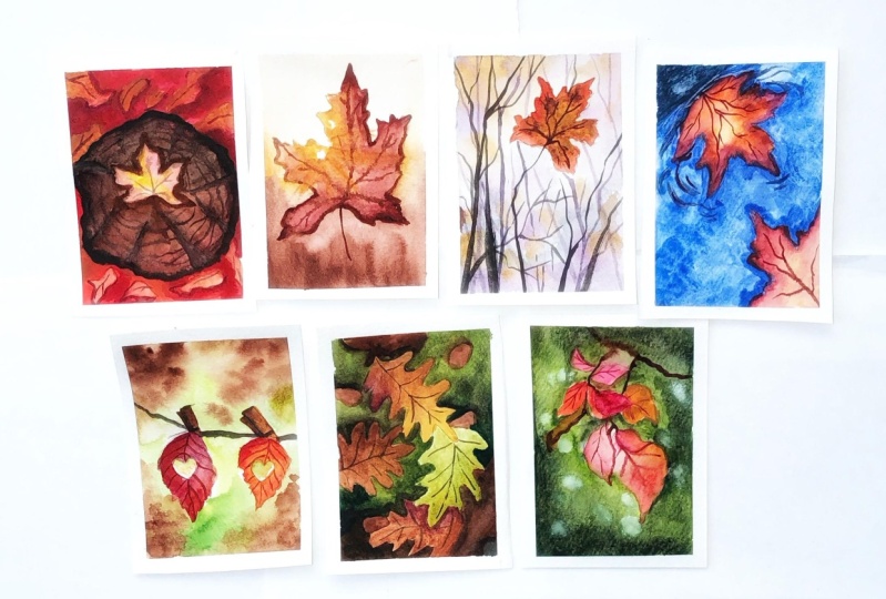
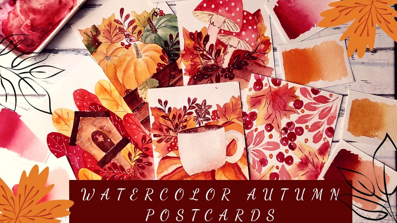
postcards in watercolors. But in this class, I share with you seven
beautiful projects that are all things fall. This is a beginner
friendly class, so we'll be covering all the basic techniques
that are needed to get started with
watercolors before diving into this lovely
pile of four leaves. I'll also be sharing my
color palette with you so that you can match it with
the brand that you're using. And over the course
of this class, we will be painting
seven fun and easy projects showcasing
the beauty of fall. I hope you'll join me on
this creative adventure. Let's get started.
2. Materials Needed: So starting with the
materials for this class, I'm using dash three and GSM hundred percent
cotton paper. So you can go with any brand, but I highly recommend
going for something that is 300 GSM and 100% cotton. Because this will help you with the techniques that
we're going to try out. This little wet on wet involved. So going for a thicker
paper will really help. And it's one investment
that I think is good. If you have to like
splurge on something, I would always say
splurge on people because people makes all the difference when it comes to watercolors. Now, coming to the beads. Daniel Smith watercolors here. So I'm going to share
all the shapes that I'm using in a separate section
so that you can check it with your own brand
that you're using and try mixing the colors are matching the colors
that I'm using here. So I'll be sharing all of
that in a separate section. Now, come to the brushes. You will need a lot of them. I'm using an API size paper. So you need one
good round brush or a mop brush for putting
all the background, layers, the washes, etc. One medium-sized
brush like a size four for adding the details. And I'm using a
script liner brush for some final details
like these trees, the branches are the
veins in the leaves. For bees, I'm using this
script liner brush because it really helps and creating
those extended long lines. Then you lead a pencil for the initial sketching part
that we're going to do, add a tape to tape
the paper down. So since we're using
a lot of wet-on-wet, it will be really helpful for the people to be taped
down to surface. I'm using a board
and a masking tape to tape it down. So that's it. That's all the materials that
you'll need for this class. So let's get to
the next section.
3. Basic Techniques: Alright, so starting
with our basics, I'll start with wet
on wet technique, which is mainly as
the name sounds, adding wet paint to wet paper. By wet people, I mean, it could be a layer of clean
water like in this case, or another layer of paint. So when your paper
is already wet, you add another layer
of paint on top of it. So this helps watercolor
come to life. You can see that it
spreads a blend. So this is where you can
do all the blending, any sort of soft, glowy background effect
that you want to create. It has to be done in wet on wet. Once the watercolor dries, you cannot really
blend two colors. And so this is where you can do all the kind of
gift watercolors, a little bit of direction. And here I'm trying to add another color and
you can see that it can just start flowing
along with the previous layer. So you can use a clean brush
to blend it a little bit, give it a bit of direction. But this is what we'll be
using for the backgrounds. Now coming to wet on dry, wet on dry is when your paper is dry and you add a layer
of paint on top of it, which is the normal
painting technique. Wet on dry, you would mainly be using this technique
To added details, create subsequent layers
for depth, etcetera. But this is mainly for
the detailing part. Wet on wet is what you'll use for all your soft backgrounds. And wet on dry is what
you'd use for adding the subsequent layers are
the details on to that. Now, when we talk about
adding the details, there's a concept of glazing, which is what I use for adding
depth to the paintings. So there are a few
projects where we have a pile of leaves or
leaves on water. So to bring out the
depth and the painting like to bring out this
leaf that is on top. It could be on any surface, on water or on another
pile of leaves. But to create that
kind of a dip, we use the glazing technique. It's basically adding
a layer of paint and then spreading it out with
a clean brush is e.g. this leaf that I
painted earlier. I'll add in another layer of paint right next
to it, like this. And then I clean my brush and use this clean brush to
just spread out the paint. So here we are not painting the entire surface
below the leaf. I'm just adding that
darker color there and then spreading it
out using a clean brush. This instantly
creates the illusion that there's something beyond this leaf or behind this leaf. And that's the kind
of depth that we are trying to create
using this technique. Next thing I would like to
cover is the value scale. So when I say value, it basically means how dark or how light or color can get. So this is a fun
exercise that you can try out with your paints. You can start with a
very darker value like this and then keep adding
water to lighten it. So when I see a lighter value, it means that it has less
pigment, more water. And when it's a darker value, it means that it has a lot of pigment and very less water. Using these terms going
on in the projects. But it's just a helpful
thing to try out your colors in this space so
that you know how dark or how light
to color can get. The last technique that I would like to try out as lifting. Lifting is basically picking the pigment up from the people. So as you can see here, I, this paint was still
wet and I used a clean brush to just
lift the pigment off. Now, how how much of
a pigment comes off the people totally depends on how staining the pigment is. So some of the colors
are very staining. So you'd see that even
when you lift them up, you get a very stained
kind of paper. That's because the
pigment itself and some papers absorb
pigments very fast. So even in that case, you'd see that the paper does
not give up the pigment. And because of that. So we're using this
lifting technique in a few of our projects like in this one to create
the bouquet effect, and in this one to show the light coming
through the leaves. So this is where
we're going to use the lifting techniques to lift off the peak of the paper to
create that kind of glue. So let's move on to our next section where
we explored the colors.
4. Color Palette: So let's get started with the colors that we're going
to use for this class. So mainly for the leaves, I'm using a mix of yellows
and reds and browns. So that's the autumn
color palette that we're going to use. But that's it. We have a few projects where we use
in green in the background. So these are kind of signifying the genes
that is coming up. So there is greenery around and the leaves are slowly
starting to change colors. And you have all these vibrant colors of the leaves as well. Then we have this
one where we have water body and the leaves
have fallen on top of it. For this, we'll be using
a couple of blues. And for the leaves
again, it's the same. Continue using the
yellow, brown, red mix. So that's about it. That's all the
colors that we need. A little bit of
blue, a little bit of green for these projects, and then a lot of yellow,
red, and grounds. So let's get started with the mixes and share
the colors that I'm using that you can match it with the colors that
you have in your palette. So I'll start with
the warm yellow. I'm using Hansa
yellow, medium hue. Any yellow that is kind of towards red or towards
orange works just fine. Just something that is
on the warmer side. I'm using a nice bright red. So this one is a pile of red. You can use any scarlet or
vermilion color that is, again, a more vibrant,
brighter red. Then I'm also using the same
mix for creating oranges. So if you mix a nice Scarlett
with the warm yellow, you'll create some
vibrant oranges as well. So I'm using the same
mix to create oranges. And then I'm using
this Alizarin crimson. So any dark maroon niche or
pinkish red works just fine. For the browns. I'll start with burnt sienna. So you'll find this in almost
all palettes, All grants. So it's a nice warm brown. And then for the
darker shade of brown, I'm using the bond amber. So this again is for
the darker shadow areas are drawing the reins
on top of leaves, etc. Now for the greens,
I'm mainly using just one green that
is the sap green. I'm not going to use
any other dark green. We can simply makes
indigo or darker blue to create a more
dark shades of this one. But this one is a nice
and vibrant green. So that's what we're going
to use for all our projects. And for the project where
we have the water body, I'm going to use two. A blues. One is the
ultramarine blue. Again, a very common color
in all pallets or brands, and then an inner thrown blue. So this, again, is a
very dark blue compared to the ultramarine and creates a beautiful blending effect
when mixed with ultramarine. And lastly, for all the
dark areas are shadows. I'm going to be using indigo, some avoiding black here. But it's a beautiful
color and you can use it to mix it with the green
and create a darker green, mix it with a brown and
create darker brown. So I'm using this for all sorts of shadows are darker
areas in our project. And that's it. That's all the colors that we're going to use
for our projects. So I hope you can try these out, mix the colors and match it with the palette that you have. And get started with
our first project.
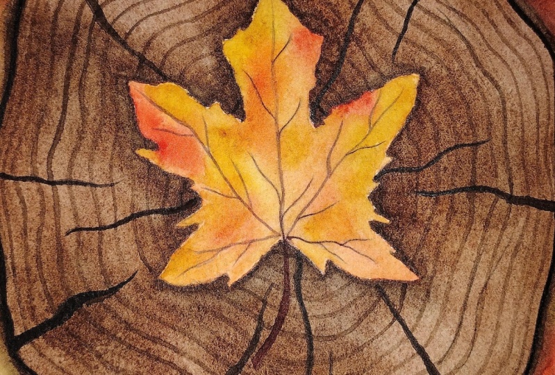
5. Project 1 : Leaf on a log: In this project, you're going to paint some beautiful
maple leaves, mainly one in the foreground. And the rest of them will be kind of blurred
in the background. So we draw a tree
trunk over here. Just rough shape,
nothing to detail. And then we draw the
leaf on top of it here. How I go about drawing the
maple leaf is simply to draw the central vein like this and then build on that with
the remaining veins. So all of them kind of
converge at one point. And then we draw the rounded. Once you have the
weeds drawn out, it's kind of easier to draw the leaves because you're just building out
on that shapes who? You are just building
the leaf around it. So it's, I think the
key here is to draw that central vein and then build up on it sideways and
then added the leaf. Now drawing just
another outline here, just trying to create a
slightly bigger trunk. And now we'll go about
adding the leaves around it. So for this part, we do not need to add
in a lot of details. They will be like
shapes like this. Basically dried crumpled leaves that have fallen on the ground. So you need not follow
a certain shape or pattern like you need not even draw it the way we
drew the main div, shapes like this to outline crumpled
leaves on the ground. And then we paint around it. And then that's it. That's all the sketching
that's needed. So let's get started
with the painting part. So I'll quickly mix
my colors here. I'll start with this warm yellow and we need a bit of red. I'm using the pile Scarlett. Next I mix my browser. So I'm using the
burnt sienna over here and a slightly
darker brown burnt umber. So this would be the main D, the colors that we
use for the tree, the tree trunk at all. And then a little bit of maroon. So I'm using the perylene
maroon integral. So those are all
the colors that we need for this project. So let's get started
with the central leaf. First. We start with
this one and while it's drying with the
background leaves, I'm wetting the Leaf fully
and starting with the yellow, just dropping it in. So you can see that since
the people was already wet, I'm just using my paint
directly to blend in. Now, if at any point you feel that the paint is not blending, you can always use a clean brush and help it out a little bit. Now while this
layer is still wet, I'll add in the spiral scarlet. And you can see
how beautifully it starts bleeding into the yellow. So you need not stop here. You can add in a little
bit darker red as well. And also you can go in with
another layer of yellow like I've done here because
I felt that at places this was too bland. It was mixing a little too much. I wanted to retain that yellow. So I kept it like this. Now, after this we'll go about painting the
background leaves. Now the background is
going to be a mix of colors and we'll be adding
in all the details later on. But to start with, we'll start with a simple wash. Let's wet the people first. Sum using clean water here
to wet the background part. I'm avoiding the
trunk at the moment. It won't really matter because the trunk is going to
be a much darker color. So you can always correct it later on since it is
going light to dark. But I'm trying to
keep it uniform here. Once you've done with
wetting the paper, you can add in the colors again. So I'm going with the
same kind of mix. I'm starting with
the yellow here. And while it's still wet, I'll start adding the red. Just drop it in here and there. So you still need that yellow to show up from the base layer. So I'll still leave a
lot of yellow around and just mix a little
bit of red here and there and just let
it blend on its own. Now, again with the same
wet on wet technique, I'm dropping in a little bit
of maroon here and there. So all these details about the leaves or everything
will be doing it later on. Using glazing technique, using a little bit
of wet on dry. But for now, since this
is the first layer, the first background layer, I'm just dropping in the colors and letting them blend
into each other, creating that nice vibrant look. And we'll let this dry. Now, as you can see, once dry, watercolor has
become much lighter. So that's something
that we need to keep in mind while starting out. Because while you're painting, it may seem that the colors
are too dark or too vibrant. But once they're dry, they're going to turn
up much, much lighter. So at times you may need
multiple layers to bring out that depth or that color. But in this case, for now, we'll go ahead and paint the trunk and then we work on the background
a little bit more. So I'm starting with
a lighter value of burnt sienna and then mixing up darker
values here and there. You can also mix of
burnt umber right away, or we can keep it for adding in the details in
the second layer. So I'm just being
a little careful around the leaf because
you want to retain that shape of the leaf
and don't want the brown to go into the leaf part. Just being a little bit extra
careful around the leaves. So this is where a
good brush helps, like this one, despite
being a mop brush, It's got a great depths. So I can clearly euro just
paint around the leaf. Remember to play with
the values here. Helps in creating
a little bit of texture and variation in the
first layer itself will of course have multiple
layers here to build the details and the
depth of this trunk. But when we're starting out, it really helps to have some variation in the
first layer itself. And B, let us pray. Now, once you people is dry, we start with the next layer. For this, I'm using
a burnt umber. I'm adding in patches like this. So this is the darker brown. If you do not have burnt umber, you can use a little bit
of indigo and add it to the burnt sienna to get
a darker brown as well. So here you're adding pigment
and patches like this. And next, I take a clean brush. No more pigment, just plain
water and blend it in. I'm just trying to blend
in and create kind of a continuation in these patches and remove those hard edges. So for this, it helps to have a clean brush with
just water like this. Now, violet still bed, I'm adding in some more
pigment here and there. And now around the leaf to
create a little bit of depth. I'm adding in that darker brown just next to the leaf like this of creating an outline
with that brown in a way. And while it's still
there, still wet. I use a clean brush
to blend it in. So it's like the
glazing technique here. We are simply using the
darker color to start with, kind of create an outline and then use a clean
brush to blend it in. Now we are done with
the foreground leaf. Now, we'll add more to the
background for the background, but we're going
to do is to paint around the leaves that
we have set in here. So I'll avoid inserting
on the leaf for now. I'll just paint around it. So I'm using this darker red and my overall leaf
shapes are still visible. Like the pencil drawing that
I've done is still visible. So I'm trying to paint
this red around it. So in a way kind of highlights
the previous layer. So you can see that as
soon as I paint around it, it kinda shows up
this leaf further. So we're doing that
negative predict technique. We're painting around
the mean subjects so that it kind of
gets highlighted. And for these patches as well, while they're still wet, I'm adding the darker maroon. So we working wet on
wet here as well. We're trying to make sure
that it's not monotonous, it's not a plain grid. So that's why we are adding in these little layers and missing in the maroon line,
it's still wet. Now the key here
is to understand your paper and see
how soon it's trying. So if it is drying super fast, you'll have to work
in smaller batches. If it is not drying fast. If you have time,
then you can go for an extended area in the light red and then
dropping the darker red. So it is quite dependent on where you are and what
kind of people you're using. If you are in a super hot area, there are chances that two people won't
stay wet for long. In such cases, I recommend
going for smaller batches. Or if you can wet the back of your people and
maybe use a plastic or a glass board instead of taping it down.
That works as well. But since it is
mostly wet on wet, you will need to make sure
that your paper stays wet for a little longer so that
you can blend the colors in the, continue with
the same process in the top part as well. Painting around the leaves, starting with the
lighter red or Scarlett, then dropping in the darker
maroon red over here. So the idea here is to keep these leaves
in the background, not to details so that they
stay in the background. So your focus still remains on that main leaf that's
there on the trunk. So that's your main subject. And all these leaves,
fallen leaves, the background add to the overall composition
of the picture. So we are done with the first
layer of the background. And now we let this dry before moving on
to the next spot. All right, Once my paper is dry, I'll start with creating
depth for this trunk. So I'm adding the
darker burnt umber around it like this
and place it in. So we start by adding the pigment right
next to the trunk, and then using a clean
brush to spread it out. We repeat the same
around the trunk, adding in the darker pigment around it and then using a
clean brush to spread it out. Doing the same for the top part, using a burnt sienna, dark burnt sienna, and then using a clean
brush to spread it out. So we don't want a
lot of goods here now going on to the
leaves as such. So I'm taking care
that I'm still just dabbing my clean
brush around it, not letting the brown spread onto the leaves
completely a little bit is fine because there may be old dried leaves as well. Next we start adding the
details onto the trunk. So I'm using my
liner brush here to create these cracks
in the trunk. I'm using indigo here and I'm betting the thickness of
the cracks here in this. Some of them are quite thick, some of them are
thinner like this. And we kind of continue
around the knee like this. So you can see that
slowly building in the detail onto the trunk. Next we add the circular
pattern on the trunk. But this again, I'm using
my script liner brush. This brush the way it does. It really helps and
holding a lot of pain while at the same time giving
you this super thin line. So it helps it creating shapes
and patterns like this. I'm going around the leaf and creating these
circular patterns. Here again, you can play
with the values of bit. You can make it
darker in some areas and slightly less
pigment in it others. So that it creates
a bit of variation, a bit of drama around the leaf. Adding a few more cracks here. Right up to the leaf here. And I like how the
trunk looks right now. It looks more lifelike. Well, not really because the
tree has been cut, but yeah, it looks more closer to what a real trunk
would look like. Next we add in a bit of
depth in the leaf again, we did this one while doing
the first layer of the trunk. So now I'm adding
the burnt umber around it and I'll glaze it out a little bit
so that it gives the illusion that
the leaf is on top. There are a bit of
shadows around it. Next we add in the details on the leaves using the darker red. So I'm using the
perylene maroon here. And I'm just building on
whatever we had drawn earlier. So we already have those
pencil marks in here. So I'm just adding
on top of that. You can see that once we
have the central vein, we can just build up on the remaining ways and then add in a bit of
detail like this. Now for the background leaves, I'm not going to add in a lot of detail because I want them
to be in the background. But we can add in a few
veins here and there so that the kind of
look like the leafs. So again, not too much detail but just a few
lines here and there. Now we're done with the
veins on these leaves. Now, I'd like to add in a
little bit more depth around the leaves that it gives the illusion that these
are on a pile of leaves. So for that, I'll again
use the glazing technique. So I'm starting with
darker maroon here. Once you have applied the
maroon around the leaves, we use a clean brush
to blend it out. So mainly just following
the same thing, just adding the darker
maroon around the shapes. And then using a clean brush to blend it a little bit,
the glazing technique. So this is creating further
depth around the leaves, kind of giving the
illusion that it is in a pile that are
mowed leaves below this. And that's what we're
trying to create here. We already did a lot of
work on the background. We added a lot of
wet on wet layers. This is just the final
finishing route. Wherever you're
creating some depth with this glazing technique. And that's our
first project done. I hope you enjoyed this and I hope you'll
give this a try. I'll see you in the next one.
6. Project 2 : Lights and Shadows: In this project,
you're going to paint another beautiful maple leaf with some gorgeous play applied. So we're going to try out
the lifting technique and create that glowing light
peeking through the leaf here. So we start again with a sketch. We'll start with
the central vein, and then we'll build up on
it with the other sites. Once you have the
wind structure, we start building on the leaf. A simple drawing like this. We continue with the
leaf on the other side. Drying outline of
the leaf like this. And we'll also add
some holes here so that we can show the
light peeking through. I'm just adding in
the Google take this and we're done
with the sketching. So we'll start with
the painting part. So for painting,
I'm starting with the background first and reading the background with clean water. And we try to paint
around the leaf, weed not want the water
to go on to the leaf. So we try and paint around it. A bit of it has gone
here in my case, but I'll maybe just wipe it off before we
start with the background. Now for this project
we're going with a very soft Louis
kind of a background. It's mostly wet on wet. So that's why we're reading the whole background
with clean water first. And then starting
with the colors. For this, I'm going
to make sure that the flow of the beam is
in a certain direction. So I'm going to keep
a basking deep at the back here so that it
can help with the flow. So now I'm going to make
sure that the paint flows downward and we
start with the yellow. So I'm starting with the
Hansa yellow medium, painting carefully
around the leaf here. Now since we did not wet, you do not really have to worry about the paint
seeping into the leaf. But if it does, you can always use a clean brush
to wipe it off. And I'm using the same yellow and letting it flow like this. You can always give a bit of direction to the paint
while it's still wet. You can tilt your board and let it flow
upwards like this. Now while it's still wet, I'll start with a
slightly darker yellow. It's the same wholesaler
medium, but more pigment. And I'll add it somewhere
around the middle, like this. So it kind of blends into, into the earlier yellow
that he had painted. And next week go with the brown. Again while this is still wet, I start adding the burnt
sienna and let it blend in with the yellow
around the leaves. I'm being a little careful. Once the leaf part is done, you can go and look. You don't have to worry about
the pin going in any way. So now that I'm
done with the leaf, I'm able to paint
much more freaky. So I'll keep adding in a slightly darker
color toward the base. So we are trying to vary
the overall sheets here. We started with a
very light yellow, then added in slightly more
pigment, Hansa yellow medium. Then we added the burnt sienna, and now at the end we are adding a slightly darker pigmented
value, burnt sienna. This is at the BSW. And since the paper
is still wet, I'm not having to do a lot of work with the blending part. It's mostly blending on its own. Now while this is still wet, I'm going to add
in burnt umber at, the bees were trying to create this beautiful mix of
yellows and browns here, going from a very light
yellow to the darker yellow and then do the burnt sienna and then adding in burnt umber, which is the darkest brown. And letting it flow. We're letting the
pigment flow in cases that it's not mixing
properly anywhere. You can use a clean brush and helping with the
blending a little bit. You can influence the
flow of the paints and pigments by moving the
board a little bit. So I'm trying to create this kind of a balanced
in the background. And next violet still bet, but not like
completely with now, all the pins are in
the process of crimes. They are cried a little bit. I will add some splatter. So for this, I'm
using a clean brush, this plain water, and
just dropping it in. So even if it falls of the leaf, It's fine because it's
just plain water. I'm adding in a little
bit more splatter here. And next we'll let this dry. Now, once you people is dry, you can see that it's become
much lighter the background. So we'll start with
the foreground leaf now this time I'm not
reading the entire leaf. I want it to be much more
vibrant, much more dark. So I'm going indirectly
with the pigment, starting with the
Hansa yellow medium, directly painting on
the leaf, wet, on dry. So here I'm painting around those holes that we had drawn. Because we will be painting
light flowing through these. And around these goals, we want to go in with a lighter
value or the same yellow. So towards the edges, we will paint in
a darker value of the yellow bile
around these halls. Specifically, we
are going in light. So that's how we will
be creating light, the glue of the light by
painting in a lighter color around these holes and then going darker towards the
edges of the leaves. So here you can see
that I'm going in with a darker yellow now
towards the base. So to create light, essentially you will have
to create darker areas, which kind of compliment
that because once you have a darker area right next to a light
source like this, you'll see that the flow of light is very clearly visible. And to help with this, we'll also use the
lifting technique. So we finished
painting the leaves first and then we will
go about the light bulb. All right, you're done with
the leaf, the first Leo, and next we'll add in a
slightly darker brown. While it's still wet. We'll work wet on wet and adding the burnt sienna
like this, just drop it in. No need to do much here. Since the previous
layer is still wet, it will blend on its own. Next, while it's still wet, I add in the red. So I'm using the viral Scarlett. And you can see that since
the colors are all still wet, the bleed or the
blend happens on its own so you don't have
to do much here, just dropping the
color and let it flow. And that in a way, it's the beauty of watercolors. It has a life of its own. It at times hard to control, but that makes it equally fun. So now that we're done with
this part of the leaf, will use a clean brush to lift the paint out
in some areas, especially around these holes. So this is where the
light is peeking through. So for that, we need
to have this area to be much lighter than
the rest of the leaf. And that's what we're
trying to do here. We're trying to lift the paint
from around these holes. Next week, try to create the
rays around these holes. So for that again, we're going to use the
lifting technique. You have to make sure that
every time you lift the paint, you clean the brush and dab
it in the tissues so that you don't end up putting pigment back into
the lifted areas. Every time you
lift it like this, you'll have to clean
it or rather dab it on a clean tissue and
clean your brush often. Because you want the
pigment to be off your brush only then you
can lift more pigment. If your brush already
has a lot of pigment, it will be difficult
to lift anymore. And also remember that
the way the pigment gets lifted depends on the
pigment that you're using, on the color that you're using, as well as the taper. So some tapers absorb
colors faster. They may just eat up the
pigment and UP not be able to lift much of
pigments sustaining. So even though you're
lifting them off, then still leave a little
bit of color behind. Once you've lifted from
the leaf like this, we'll try and enhance
the whole light part, the flow path by making the
rest of the leaf darker. So this is kind of
goes hand-in-hand. So why do you agree trying
to create the light here? You also have to make the
other areas darker so that it does reflect in a way that the light is peeping
through these holes here. So that's what we're
trying to do here. We're trying to make the
rest of the leaf darker now. So for this, I'm using the
perylene maroon and I'm painting the outer part
of the leaf like this. So we have to make sure that the edges of the leaf or darker, while the central part and the area around these
holes is much lighter. And I also love how
the sunlight is coming into picture
right here on my table. So it's kind of adding to the overall glow effect that I'm trying to
create on the li. For the edges here, I'm adding in the darker maroon color and then using a clean brush to
spread it towards the center. So I don't want the leaf to be very dark towards the center. And that's the reason
that I'm adding it at the edges and then using a clean brush to just
spread it inside like this kind of a
glazing technique. But making sure that those rays that we painted still remain. Now, once you're
done with this part, we lift a liquid mode pain
from around this area. And I'm trying to
make the edges softer so we don't want any
harsh edges here. So I'm using a clean brush
to just blend that in. And then we lifted a little
bit more pigment like this. The same way we
use a clean brush. Lift the pigment, dab it in
the tissue, clean the brush. So you'll have to do
it a little few more times so that you can
create that glue. And now that we already
have the darker parts here, you can see that the area around those holes
is already lighter. And then you blending it in, lifting these colors out to
create that glow effect. Next we add in the veins using so I'm starting with
a darker color at the base. And then towards the top, we'll go and lighter. So you can either paint
it with a lighter value or use a tissue
to dab the color. I'm painting all the
veins first and then I'll use a tissue and
just pick some color off. So the idea here is
to make the wings lighter around these holes from where the light
is peeping through. So that's why I'm dabbing
the color out from there. And then we added a few more details
with a lighter maroon. One final round of the
tailing around the edges. So I'm using again
the perylene maroon and just adding it
to the edges here. So again, we're building
up on the blue of light. So the edges here
would be darker. And any area basically around those goals from where the
light is coming through, it'll be slightly darker. So that's what we're
trying to do here. We are adding in
the darker maroon at the edges and then using a clean brush to
just blend it in a little bit so we don't
want any harsh edges. So once I add the pigment, I'm using a clean brush
to blend it in a bit. We continue with the same
for the other parts of the leaf variable B to not have that light flowing through just at the
edge like this. And using a clean brush, we blend it in a bit and be done. So I hope you enjoyed this project and I hope
you'll give this a try. I see you in the next one.
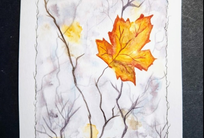
7. Project 3 : Last leaf: Onto our next project, and this one will
capture a soft, flowy kind of a background. And then we'll have one
leaf in the foreground, which will be the
main focus point. So we'll draw the branches
here from the tree. And we'll use the rigger brush
to later on beat them out. But I'm just placing
the main leaf here. And for the rest of it, we just use a paintbrush. So we have RBDPO, level Q, whole branches, some of them being in the foreground,
so they eat darker. The ones in the background
will be slightly lighter. So we repeat them according
the varying the values of the colors so that we can have some dog and
sunlight are branches. And be done with
the sketching part. Not a lot to do here. I've just marked the main
branches and the leaves here so that an overall
placement of things. But most of the work would be done in the background itself. I'll start with the
mixing of colors. The colors, in addition to the
usual red, yellow palette, I'll be using some muted
colors for the background, so I'm using a
shadow violet here. You can ultimately
mix ultramarine and crimson to get a
light purple color or use Payne's gray as well. For the trees, the darker trees, I'm going to use indigo. You cannot neatly use
black as well if you want. I prefer to avoid
black in the painting, so I'm using an
integral instead. So we'll start with wetting the paper completion
using clean water. Now, we are aiming for a soft
background here and that's the reason we be
wetting the paper first and then adding the
colors or net wet-on-wet. And also we'll keep in mind that this is
going to dry lighter. I'm P, I'm adding the water
around the leaf here. I don't want it to
seep into the leaf. Although the
background is going to be much lighter than the LEA, I still want to leave to
retain its vibrant color. I don't want to
mix an increase on to clear the leaf itself. That's what I'm trying
to avoid being degree. So I've just added
to water around the leaf on the
rest of the paper. And even if you do end up adding a little bit
of water or belief, you can use a clean
brush to lift it out or use a tissue to just pick
up the water from there. And next we start
adding the colors here. I'm starting with
the shadow violet. I'm just dabbing it
in and letting it blend in because the
paper is already wet, so I don't have to do much here, just adding the colors in, leaving a little bit of space and then adding
the color again. I'm using a very light hand and just random screws are not trying to create
any pattern here. A background, like I said, it'll dry, much lighter. So by the time of Christ, you wouldn't be able to
see much of this color. But we're trying to
create that flow. So that's the reason I'm adding it around
the leaf like this. Now, while the
paper is still wet, I'll add the next colors. So here we're trying to show that there are leaves
in the background, paintings that are kind of
somewhere in the background. So that's the reason we're
still working wet on wet. So we don't want these to
be defined shapes as such. So in case your paper is dry, you can use a clean brush and
spread it out a little bit. But we want these to
be in the background, not the primary focus. So that's why we are just
creating these blurred shapes that are going to represent
leaves in the background. So I think we've added
enough leaves here, just cleaning up the
edges here with a tissue. And just to add a little bit
more fun to the background, I'll use the splatter technique. For this. I'm using
a clean brush with some water and just dropping
it in here like this. So it creates those little loop that adds so much
to the background. And I noticed that there's
a little bit of patch left in the background that I
did add anything to this, no background added here. And we're going to have
that leaf in-focus here. I would just blend
it in a little bit here so that it's all uniform. I don't want to
leave a white patch. I'm just adding a little
bit of color here. And now we'll let this dry completely so that we can
start with our next step. Right now my paper has dried, so I'll start working
on the foreground leaf. So again, reading
the leaf a little bit so that we can
work wet on wet. So just apply the
clean layer of water. And next we'll start
dropping in the colors. I'm starting with the
Hansa yellow medium. And I'm starting it at the
edges here, like this. Now, as you can see
from the background, once the watercolors
cry The Prime much lighter and it's giving a nice
effect on the background. But for this leaf, we want
it to be the main focus. So I'm using a slightly
pigment it value of yellow. And we'll also be adding many more layers to
this with other colors. I'll start with
the burnt sienna, just dropping in burnt
sienna like this. So it kinda shows the leaf
turning from yellow to brown, dropping in a little bit
more pigmented yellow. Just add the edges. Next, I drop in simple dots
or maroon like this. You can use a
crimson, red as well. Trying to show the beautiful
colors on this leaf. We then start with adding the
branches in the background. Now, the background,
once we be lighter because they are further
away from your right. Whereas the foreground
branches would be much darker. So for the lighter branches, the ones in the background, I'm using the same
shadow violet, and I'm using the
script liner brush to just create these branches. Now we'll play with the
values of bit here. So I'm adding a hint of
indigo to the same color. And we'll add a
few more branches. Now these are slightly coming
towards the foreground, so they kind of become darker. So as you can see, once
we cleave these values, once we create this
kind of an effect, you can already see that the lighter branches in
the background tend to give the effect of depth because you're creating these multiple layers
with different values. So this one, again is a
slightly darker value than what we used in the
previous layer of branches. And then we'll add another
one with the darkest layer. For the branches itself. I'm not pulling any
specific pattern. I'm just going with the blue. As you'll see in the nature, the way the branches are. Just adding them in here. And my people crying nicely. So by the time I'm
adding the next layer, the previous lighter layer of the branches is already dry. But in case your paper is not
drying if it's still wet, I'd suggest letting it dry, letting the previous
layer off branches dry before we move on
to the next layer. I'll give this a minute
to dry and then we'll start with our next
layer of crunches. So this is going to
be in the foreground. So I'm taking integral, which will be a much darker
value than what we have here. And I repeat the same motion
creating those branches. Not trying to create any
straight lines here. They're all kind
of curvy, zigzag. I really enjoy using the script liner brush for
creating these details here. And also the smaller
branches like this. It kind of adds to the overall detailing that
we're doing here. And sometimes it gets tricky knowing when to stop because it's
just so much fun. I'm trying to limit the
whole ground ones here, just adding details so that
it looks more realistic, more closer to the nature. Adding a few more branches in the foreground with
the darkest color. So now you can see the kind of tech that has been
created because of the different values we used for these branches
in the background. So it really gives the
impression that there's a lot more happening in
the background here. Now, coming back to the li, we'll add in a few more details, including the weeds, a little
bit more color to the leaf. So I'm using the
crimson to add in the details of the veins on the leaf using a smaller brush. Now adding some final
round of color to the leaves at the edges. So what I'm doing here is
using a darker paint at DHS and then using a clean
brush to just spread it out. Glazing technique again. So we're not trying to
color the whole league, mainly adding the color
at the edges like this, and then using a clean
brush to spread it out. So all your previous layers stay intact because you're not using a lot of water
here are a lot of pain. It's mainly of pigments
value at hedges. And then a clean brush to
just even adult across. We repeat the same at the
other edges like this. Adding the color and spreading it out using a clean brush. We let this layer
dry a little bit and then do one final
round of touch up on the veins because
I kind of blurred them out a little bit while
doing the glazing technique. Just on the main ones, I'm adding a little bit
more color and we're done. So that's another project done. I really like how the soft
background looks here. And I hope you enjoyed this project and you'll
give this a try. I'll see you in the next one.
8. Project 4 : Leaves on water: All right, moving on
to our next project. This one has a little bit
of change in scenery. So here we're going to pin
two leaves all-in on water. So it's going to be a lot
of blue in the background. And like the previous projects. And this is probably
the only project in this class that has so much
blue in the background. So we're going to have
some fun with it. So I'm just sketching
out the leaves here with the very basic skeleton outline. And we are done
with the sketching. So we'll start with
the painting part. For this one, we're taking a
slightly different approach. For one, we're starting
with the leaves, which are the main subjects
here and not the background. And I'm going to start
directly with the yellow because I want this to be a
much darker, vibrant color. Because the blue
and the background is going to be much darker. So we want the yellows
here to stand out as well. So we'll still be
working wet on wet, but instead of using a clean layer of water
for the first layer, we directly using the yellow, a very pigmented, vibrant yellow as the first
layer of the leaf. So based on how we go
about painting the leaf, like whether we use a
watery layer to start with, or we use pigment
like this directly, it will change how
wiping the leaf looks. And in this case, I want
it to be full of color, vibrant and opaque as compared
to the blue background. And that's the reason I'm going indirectly with the yellow am also varying the
values here and there. So you can see that in some patches that
is slightly darker, which is fine because
we're going to work on multiple layers
on top of this leaf. So it will all
blend in together. So while this is still wet, I'm adding in
scarlet color here, parallel Scarlett, any
vibrant, bright red color. This is going to mix wet on wet, and you can see that
the combination already looks so beautiful. Again, this is going to dry
much lighter right now. It looks like there's a
lot of pigment in there. So we will need to
add layers later on, more detailing,
Wet, on Dry, etc. But for now we're aiming
at the first layer. So for that, I'm adding in these dots as well with crimson, a much darker color. And we work in the same way
for the other leaf as well. Once we've done
with both leaves, we'll let this dry. And once the paper is dry, we can start working
on the background. I'll write my paper is dry and add mix some ultramarine here. So this is the main color that we're going to
use in the background. We'll add in some
different values and also a hint of a different blue as
well in the background. But we'll start first with wetting the
background completely. I will try and avoid wetting the leaf because I don't want
the blue to go in there. Just being a little careful
around the leaf here. And once again, even if you do end up wetting it
with clean water, it's fine because you
can always pick it up with a clean tissue
or a clean brush. But we need to make sure
that the water does not seep into the leaves so that the color does not end up
seeping into the leaves. I could see that there are a few patches where the water
has gone into the leaf. So I'll just use a clean
tissue and dab it out. So we don't want any of the
water to stay there because the blue that we add now will seep into the leaves
in that case. So just making sure that
the edges are clean and I just picked up some water
from the leaf like this. And now we'll start adding the blue ultramarine in almost all brands is a
beautiful granulating colors. So you can see the
way it spreads and the beautiful effect
it's creating already. So this is again wet on wet. We already wet the
paper with clean water, and now we're using this color. And we'll add in another
color on top of this to create some
shadows and depth. But we'll start first with the ultramarine and
then build upon it. And again, when I'm closer
to the edges of the leaves, I'm being a little bit
extra careful that I don't end up painting
the leaves blue. Now I'm done with
the first layer. Now I'm adding an
Indian thrown blue, which is a slightly darker blue as compared to the ultramarine. And while the paper
is still wet, I'm dropping it in like this. So we'll let it
blend in on its own. You don't need to do much. If you feel that the
colors are not mixing, you can definitely use a clean
brush and help them blend. But closer to the edges of the leaves will have a
slightly darker patch. And as you move away, you will see that
there are ripples and some lighter patches of the
water as well. The shadows. We will be painting them
with indigo later on. So this is just the first level of detailing that we're
adding onto the water. For the shadows under the
leaves as well as the ripples. We use indigo and painted
later wet on dry. So this one is just
the first layer of detailing that we're adding. So I'm just adding this darker blue right
next to the leaves. Just being a little careful
around the edges here. We already left a lot of
room for playing around, around these edges because we made sure that these are not where the
leaves are not wet. So there's scope for
having fun here, adding in those shadows. Using a smaller brush and
just putting the pigment in. This is indigo and you
can still see that it spreads because the
remaining part is still wet. The water part being still wet, the pigment will
try to spread in that direction. As you can see. We repeat the same
for this leaf. Again, my paper is still wet so I'm able to play
around with this. So we just add the
pigment like this and let it spread
onto the water side. And before this
dries completely, I'll just use a clean brush
and add in a little bit of splatter onto the area
where we are painted water. And then we let this layer dry completely before we start
with the shadow part. Alright, once my paper is dry, I'll work on the shadows. So for this I'm using
indigo and I'll pin the ripples and shadows under the leaves
using this color. So we're doing this wet on dry. So the paper is already tried and this is a much
pigment it value, as you can see, it is giving a beautiful contrast with the
blue and the orange leaf. We also have some
detailing left to be done on the leaves itself, but for now, we'll just work on the ripples around this leaf. So I'm trying to mimic
the movement of water here as it would be with this
leaf floating on top of it. So creating those little
ripples around it. Along with the repulse, we also work on the shadows
just under the leaf. So in the same VP
already had created that additional depth by using a darker pigment
around it, wet-on-wet. Now we spend in it
further with this indigo. And B. At the same
time I'm using a clean brush to
just even it out. So I don't want a
very harsh edge here, just trying to create
the shadows and then smoothen the edges
using a clean brush. Now we'll repeat the
process for the other leaf, using indigo to add in the shadow and then using a clean brush to
just smoothing it out. Now we are done with the
overall shadows on the water. So we'll get back to the leaf. So I'm going to use the same technique that we
did in the previous project. We added the darker
color at the edges here. Oh, much pigment it value. And then use a clean
brush to just glaze it. We will repeat the same
for the other leaf, adding in the darker
pigment at the edges, and then using a clean
brush to spread it out. So this creates a little
bit of drama on the leaf. As you can see, even
though we applied a lot of pigment in value, right in the first
wash, it's dried-up, much lighter and it
kind of looks boring. So adding these layers of darker color helps in creating
a little bit of depth, a little bit of
variation in the leaf. So I really like how
my leaf looks now. So once it is dry, we'll start working
on the veins. So I'm using the
dark red color here and adding in the veins
with smaller brush. Same for the other leaf. Just adding in the weeds
using the dark color. We're almost done as a final
round of finishing touches. I'll just add a few
more dots here. The darker red color. And smooth blending it
out using a clean brush. Same on the other leaf. Just adding a few dots
and smooth them out. Adding an, a last round of shadows with the darker indigo. So it helps in creating
the depth, as you can see, it gives the illusion of
this leaf floating on water. So for that we are adding one
final round of the indigo. In the same way, we just
add the pigment ID value at the edge and then use a clean
brush to spread it out. And we are done. So this is kind of different from the
projects that we've done so far in this class because it has a very
blue background, which we haven't used in
any of the other projects. So I hope you enjoyed this one and you'll
give this a try. I'll see you in
the next project.
9. Project 5 : Fall Hearts: Starting with our next project, this one is slightly different from what
we have tried so far. It's got a very vibrant,
colorful background. And it's a mix of
yellows and greens. And also it's a super cute
project because these, there are these two leaves
with hard cutout in between. And I really liked this
when I saw the picture, it was slightly different. The picture I saw
was for me please. But I thought I'd looked
like change it into this kind of leap
because we have already tried maple so far. So I'm just quickly
sketching the outline here. So we have these
two pins holding those leaves and the
crowd the leaves now. And of course, the cute little
hard cutout in between. So that's it. That's one leaf. I will draw another one here. So while painting, our main focus here
would be on these leaves and most of the
background would be just nice and colorful. Blow. Really quickly wrap up this
drawing and get started with the background and with dads. So I'll quickly
erase this and get started with the
background wash. So we'll start with clean water and wet
the paper completely. And I tried to avoid the leaf here because I still
want to retain its color, its wide prints when
you print it out. So I don't want it to
have any greens in there. I'm painting around it. But this is going to be
a wet on wet wash again, really let the colors
blend into each other. Give us that soft, glowy look in the background. Now for the colors
in the background, I'll be using lemon yellow. And we'll also make
some green and brown. So this is more of a cooler yellow than
what we've used so far. And I'll also be using a sap
green for the background. Just little bits here and there. So let's get started. I'm just dropping this in, avoiding the deep, just
dropping it randomly. You can add in this
color in patches. And then as the
paper is still wet, we can drop in the other
colors and let them blend. So while this is still wet, I'll add in some reds
and some greens. So I'm not really
putting any effort to blend them in here since
the paper is still wet. Just letting watercolor
do its thing. And next I'll drop in the green. Sap. Green is another
color that just spreads like crazy.
You can see it here. So I'm trying to achieve that soft look in
the background. Remember that the colors are
going to dry much lighter. So if you want, you can add in a bit
more color to this. My aim here is to keep the
focus on the leaves so the background is going to be more or less a blur
once it completely dry. So I'm letting the
colors blend that way. Next, I'll add some browns. So trying to get this reddish
brown in the background. And even though it looks
much darker right now, it's going to dry much lighter. So just adding some
patches here so that there are some color
variations in the background. And you can see that
it kind of gives that feel that there's a bunch of leaves in the background that are still green patches
and then again, drying out and all
brown in practice. Just making sure that the color doesn't go
into the leaves yet. You paint them separately later. Once this background is gray, adding in a little bit more green since the
background is still wet, I'm just trying to add in
a few more colors here, making it darker in batches. And just a hint of red
and brown here to there. Now my people is on. It's way too dry. So I'll quickly at some splatter here using a
clean brush and clean water. And then we let this dry completely before moving
on to painting the leaves. Now, once the paper is dry, we get started with the
lease for the leaves. I'm not going to wet the paper. I'm going indirectly
with the color. So I plan to paint one in a very bright vibrant red and the
other one kind of yellow. I'm starting directly
with the red here, taking in a slightly
pigmented value. I left the hard
part in the middle, which is kind of a hole. So it would ideally be
blending with the background. But we finish up the leaves, let it dry completely and
then just added that. But we already know
what's in the background. So I'll likely use a mix of green and a bit of
brown to paint it out. But for now, just adding all
the details onto this leaf. So here again, you can play
with the values of bit. You can start with a
slightly lighter value. And then as you
go you can add in darker pigment and values
of the same color as well. It gives a bit of
life to the leaf, also makes it less monotonous. So I'm adding in some patches
of a darker red here. And since this previous
layer is still wet, I'm just letting it blended. Moving on to the next leaf, I'm using yellow
orange bugs for this. So this yellow is
quite different, much warmer than the
one that he used in the background. Repeat
the same thing. I'll apply base of yellow
here and then add in some more pigment it values of the same color or
we can use and oranges with, I guess I'll go with little
bit of red orange here. Just dropping it in. Again, the yellow
layer is still wet, so it kind of
spreads on its own. And we let this dry completely before moving
on to the next step. Now, once it leaves, have tried. We'll get started
with those spins. The clothes-pins that were
used to hang these leaves. I'm mixing light brown here. And we'll add in some
darker sheets as well. So I'll start with these. Just adding the color in here. And we'll add in a few more
details with a darker color. So dropping in a little
bit darker color here. And while it dries, we'll go on to pin the little
heart left in the middle, since there's actually a whole. So we're just trying to blend this thing
with the background. So I'm adding a bit of
green, yellow, green, and dropping sap
green a bit here, a little bit of brown here. So I can see that it kind of blended with
the background here. Now, once this cry, I'm using an indigo to be the branch or the wire with
these leaves are hanging. All right, Now really
get going with the details on these leaves. So I'm adding the veins using
a darker color, darker red. Same for the other leaf. I'm using a slightly lighter
value of the same color, but you're adding the
veins on this one as well. Try to add a bit more
color to this leaf, so I'm adding in the
dark color at the edges. And then we'll use the glazing technique to spread this out. Now, I kind of feel the wings. Did. I no longer
visible scientists do a retouch for those
once this dries. Adding some final details
onto the pins here, I'm using a darker brown. Since these have the wooden
texture and just adding in some more details onto
these using a darker brown, just simple dry brush strokes where dragging
the brush along. So it gives a little bit
of texture to this plane. So a final round of detailing
on the sleeves since the beans kind of
disappeared once we did the glazing techniques. So adding in the weeds here again and get done. So I hope you enjoyed this. It was a simple
project as compared to the others and 11 at that. So I hope you'll
give this a try. I'll see you in the next one.
10. Project 6 : Fallen leaves: Alright, so we are moving on from the water back
onto the ground. So in this project, we're going to paint
some oak leaves that have fallen on the
grass on the ground, along with some econs. So this one is going to be slightly different
because again, we haven't painted
oak leaves yet. So the shape is slightly different from
the regular maple. I'm just drawing the
central lines here so that we can decide on the
placement of the leaves. Will have like three
or four leaves here. And we will be painting them in layers so that we can create the depth in
between the leaves. As you can see, the shape is
slightly different from what we are doing for
the Maple Leafs. Adding in a few more leaves under the main top
layer as well. So here we have a nice bunch
of leaves on the crown. In addition to this, I added some icons here. Just an outline of the shape. And we are done
with the sketching. I'll move on to mixing the
colors and painting it out. Now. For this one, again, for the leaves will have a mix of yellows and
browns and greens. Green mainly in the
background here. I'm mixing the warm yellow
hansa yellow medium. I'm also adding in a
cooler yellow here, which is more of a
greenish yellow in comparison to the Hansa yellow
medium that you're using. And we need a brown, so I'm using burnt sienna here. So that's all the colors. We will get started with. Leaves. For this one, we will again go in directly
with the yellow. I'm not adding water here
because I want the leaves to be nice and vibrant and Bateson to the dark green background
that we're going to have. I'm adding in a sap green
violet is still wet, so the blending is
happening on its own here. So we're trying to create a mix of this yellow green leaf. You can also vary the
value of green here, adding in a slightly
darker value here and there to create some
mediation the leap. And once we're done
with this leaf, we will let it dry. But in the meantime, we
can start working on other leaves that are not
directly connected to this one. So I'll start with
this one here. And for that, I'll use
a base of the brown. So I'm using a burnt
sienna as the base. Again, we're starting
directly with the color and not using water
for the base. Now I'm adding a
slightly pigmented value of the same burnt sienna. You can see that it's
much darker here and it's spreading on to the
already painted part, which was much lighter. Adding in some dots here with the darker brown pour
a little bit of drama. And we'll continue
painting the other leaves. So in this case, as The leaves are connected. I'll wait for it to dry a bit. And once it leaves are dry, we can continue painting
the other leaves. So this one again, I'm
trying the brown mix. So going in with yellow peas and I'll
add some brown on top. Yellow brown mix here. So while it's still wet, I'm dropping in the brown around the edges where you have
these overlapping leaves. You would want to
create the depth by using the glazing
technique later on. But even before that, while we are still working on the first layer, wet on wet, I'm trying to create a
slightly darker area around the overlapping leaves so that it gives the
illusion of depth here. We will work on the details
later on, but for now, we're just adding that little
bit of darker color around the leaf will continue working
on the other leaves here. So adding in the yellow
brown mix again, just make sure that you're
connecting leaves are dry so that the color doesn't
bleed into each other. But even if it
does, it's alright. We can work around it. So I'm adding my brown here while the
yellow is still wet. So you can see that a bit of
blending happens on its own. And if it doesn't,
you can always use a clean brush and
use it to blend in. Adding a much darker value of burnt sienna for that
one leaves the edge. And while we're at it, we'll also be in the cards. So for that, I'm using brown
and painting the base bot. Just dropping in a little bit
more pigment in value on to the already wet layer up
the strong pain for icons. And next we let this dry completely and then get
started with the green path. I missed this one leaf here, so I'm just adding in the
darker brown for this one. So for all these leaves that
are kind of overlapping, we'll work on the shadows. We'd work on the tech by using the glazing
technique later on. For now I'll just quickly add this leaf and then
we'll let this dry. Now, once your paper is dry, we start working
on the background. For the background,
I'm using a subquery. Again, I'm not going to
wet the paper because I want it to be a lot darker. So once you wet the paper, that the pigment kind of
blends in and then it lights, lightens further once it dries. I'm starting directly
with the sap green. And we'll play with the values. We'll add in a slightly more pigmented value here and there. I'm also mixing a darker
green in the background. Here with a little
bit of indigo. We work with both these colors, mainly the green, sap
green being the main one. And while painting
around the leaves, I'm being a little careful that we don't end up putting
the green onto the leaf. Although we do have
a green leaf here, so it won't really be a spoiler. So here I'm using a smaller
brush since we have a lot of areas that are super
small between these leaves, I'm just going around
slowly painting them. We don't need any harsh edges, so we need to make sure
that the areas that we are covering have me be
covering them in one go. So there are these
smaller patches between the leaves that we
can cover together. So just taking it one
small batch at a time here and mixing a little bit
of indigo here and there. So, so that we have this mix of light and
dark green in this. And when this is
still wet and again, use the splash technique. So I'm going to use
a little bit of clean water on the brush and then just splatter
it here like this, so that it creates some
blooms at the background. And we let it try that part and continue
working on the other parts. Cycled mainly divide
the background into three or four patches here
and just work around them. And since we're still
working wet on wet in the sense that we
are mixing the green, the lighter green with a
darker green, the indigo mix. We still need to make sure that the patch
that we're working on, It's still there while we are
applying the second layer. And of course the
splatter has to be done while the
paper is still wet. Once it's completely dry, you won't get these plumes. So it has to be
in the process of drying for the Bloom's to work. And we go to this
last patch now. So we'll quickly wrap up this green part for
the background. Once that is done,
we can get started with working on the
detailing of the leaves. So as the leaves are not directly connected
to the background, we can work in parallel
while the background dries. Just make sure that you
don't pick up any pigment on your handled on the
brush from the background. Now for the leaves
will start with adding depth to the lowermost
layer of leaves. So these will definitely
have some shadows from the leaves that
are there on the top. So for that we use the
glazing techniques. So we start with adding a
little bit of pigment and then using a clean brush to
spread it out like this. So it instantly
creates that debt, gives the illusion that this
leaf is in the background. We repeat the same
for the lower leaf, adding in a pigmented value in the areas where
the leaves overlap, then spreading it out a bit. Now we start working
on the veins for this, I'm using a burnt
sienna darker value. And just adding in means
like this on all the leaves. Well at the green
one and maybe use a slightly different
color and not proud. So I go get a little
bit of green or a blue and added the
weeds on this one. Now for the patient one, I want to add in a
little bit more detail. I'm using the same sap
green mix and just adding in little patches
of color here like this. And using a clean brush
to spread it out. So I'm doing this right next to where we have
drawn the weeds, adding in the color and then
spreading it out like this. You can see that it creates
this beautiful effect on the leaf and gives it
a bit of character. So earlier it was looking quite monotonous, even the veins. Adding these little things, you can create some
variation and belief. And it won't look as boring. We repeat the same with
the other brownish leaves. Not Lord, because they
already have those dots, so that's already
adding to the leaf. But we still need to add in a bit of
color here and there. Doing the same for
the other leaves, adding in a bit
of color and then spreading it out
using a clean brush. This, again, is a way of adding more depth because
these are the leaves that are in the background, the leaves at the back. But then we're adding
in this extra color. Now I know we already did
one round of placing here, but we're continuing to
build the depth using the glazing technique here with a darker color
scheme for this econ, since it is under that leaf, you're adding in some
shadows here with a darker color and using
the glazing technique. Now we'll paint the remaining
part here for the cons. So adding in the
darker brown mix with a little bit of blue here, we continue to add more
shadows to the leaves that are at the back
using a dark color. This. So as soon as you add
in those shadows here, Ethan, we indirectly
highlighting the leaves on top. As you can see here, as soon
as I add the darker color, the other leaf becomes highlighted because of the
lighter color that a test. We repeat the same
thing for all the other leaves where we have
this kind of an overlap. So the ones at the back will have a slightly darker color. Now, adding in some
shadows for these acorns, again using the
glazing technique, adding in a darker value and then just leaving
it out like this. Also adding in some more
shadows to the leaves here. So using an indigo to
create that outline and then using a clean
brush to just glaze it out. We repeat the same for
all the leaves here. We are done. I hope you enjoyed this and learn something
new about creating depth. And these leaves. This was a much greener project in comparison to the others
that we've done so far. But I hope you
liked it and you'll give it a try. See
you in the next one.
11. Project 7 : Lights and Bokeh: Moving on to my favorite
project in this class. So I'm a little
biased to this one because this is one of
the most detailed ones. As well as we get to play
around with a lot of things, including the way light passes through the leaves
and the bouquet pet. So I'm kind of biased this one. But I really enjoyed all the
projects for that matter. But this was the
most detailed one and I hope you'll
enjoy this too. So I'll start with
the sketching. It's got a bunch of leaves here. So again, be agreeing with BMI
said I'm just adding them. A very light sketch. So I'm drawing a bunch
of leaves so that we can later on with different
colors in these leaves. And there'll be some light
passing through a few of them. So trying to place
them that way. Hi, add in one more leaf here. And we are done with
the sketching part. So we'll get started with the color mixes.
Painting the leaves. In this one, we're going
to start with leaves first and then go
around the background. Since the leaves
are much lighter. So I'm applying some clean water here and then dropping
in the yellow to blend. I'm using a warm yellow here
that has a yellow medium. And trying to keep it in a
way that towards the left, there's a bit of a lighter area because that's where the light is passing through these leaves. And towards the
edge of the leaves, I have added the darker yellow, the same color, but a much
more pigmented value. And while it's still wet, I'm dropping in the
red again towards the edges and then letting it
spread towards the center. Now, I want the left part to be where the light
is passing through. So I'm using a clean brush to pick some color
up from there. That it can be a slightly
lighter color, lighter value. Adding a little bit more
detail to the edges here and making them first. So we continue the same
way with the other leaves. We have to take a little bit of care to not be in the air to simply is because the colors
will bleed into each other. So since we want to keep
each leaf individual, we'll paint them
separately as well. So I'm trying to pick
a leaf that is not connected to the one
that we just painted. Using the scene
yellow, red mix here. And again, going
with a lead that is not connected to the
ones that he painted. A similar orange yellow mix. The next leaf I'm going
in with a crimson. So adding a slightly
darker pigmented value. Painting it out. This time. As you can see, I'm
not reading the Li, I'm trying to make it
darker and more pigmented. So I'm going indirectly
with the color, continuing to paint the
other leaves in this set. So this bunch of leaves
that you're going to paint with this
darker color is going to help us with
creating the contrast that is needed to show
the flow of light. So as in any medium, when you try to paint light, you'll have to alternately
create shadows or create darker spots so that it
gets highlighted that way. So that's what we're
trying to create here. So this bunch of leaves, much darker color as compared to the others
that we painted. So we're going with
a darker value here and walk around the other
leaves to create that glow. Now, the first leaf
that we painted is dry, so I can start working on the leaves that are
connected to it around it. Again, for this time, I believes that are below from where the
light is passing. I'm going in with a
lighter color again. So I've used the yellow, orange mix and trying to keep the individuality
of beliefs, trying to keep it separate. So here again, as the light is going to pass
through the center, I'm trying to add the
darker color at the edges. And again, this is the previous yellow layer
that we painted is still wet, so just dropping in the
red and let it blend. And the final small leaves. So for this again, I'm going in with a slightly
darker orange-ish red color. And while all this dries
quickly added the branches. Now lifting a little
bit of color from here on small leaves
that we painted. And then we'll let
this dry completely before starting with
the background. Once your paper is dry, we start with the background. For this, I'm going to again go in with a much darker color. So like I said, when we are trying to
create this light effect, you'll have to add in
the contrast as well. So here the background is
going to be much darker. I'm trying to be a little bit
careful around the leaves so that we let it
retain the shape that we painted using
a smaller brush and adding in the
darker color here. Now, while painting
this background again, you can play with the
values starting with a lighter shade of green and then adding
in darker green here. Also blues. And you're also going to experiment with the bouquet
effect and this one. So kind of setting
the stage for that. So again, around the leaves, I'm being extra careful. And then once that part is done, you can add the colors three. Now since we're doing
this in batches, need to make sure that
your colors stays wet. The edges have to
be wet otherwise, you end up with harsh edges. And we are trying to create this bouquet effect
in the backgrounds, but that we need the
background to be well blended. Here. I'm just being
a little careful around the branches and adding in the darker blue gene here onto the already
wet clean layer. So notice that I keep going back to the patch that I
previously painted. I'm trying to keep
the edges wet. And once that part is done, we can let the blend
happens to me. I did not fit the complete
people because again, this is something I wanted
it to be a dark background. So if we read the paper, it kind of lightens up the watercolor because you
are lightening up the value. And I was trying to avoid that. I was trying to make sure
that the background is much darker as compared to
the leaves so that the glue. So we'll slowly continue painting the
background this way. Being extra careful
around the leaves and then adding in different
values of green and blue. Now around leaves
and the branches, I'm being careful while adding some darker values as well. So we try and mix a little bit of indigo to this so that
we get a darker color. But you can see
that from the BCS. As soon as you add a darker
background like this, with a lot of greens and blues, can see that the leaves
get light enough. So it's adding to that overall effect that's
helping with the contrast. And that's why we went for a darker background
in this project. So while it's still wet, I'll add in some darker shade of indigo and the
indigo green mix. Slowly getting there. Since we did it in
so many patches, can see that there's
a lot of variation in the background already. So here I'm adding in the darker indigo to
treat more contrast. Filling up these little gaps between the branches
and the leaves. These can be darker because they are kind of in the
background of leaves. Final patch at the top. Again, and let's careful
around the branches. And then we can
go all free flow. Again, I'm fixed
the indigo but sap green and adding it in
with a mix of values. Now we'll get started with creating the bouquet
effect in the background. So for that, I'm using
a clean brush and we read this circle
with clean water, then use a tissue to
pick it up or down. But you can see that we
have lifted some color from there and it kind of leaves
the base layer transparent. So we continue doing this. We use a clean brush, draw PNP circles with
water, and then lift it up. Every time you do this, you'll have to make
sure that you're using clean water again. So you'll have to clean your brush and then use
clean water to do this. But you can see that
beautiful spots coming up as soon as we do this. So for lifting again, you'll notice that
when the layer is wet, it gives the soft
kind of lift where the paint is still
trying to seep into the area that we lifted. But when it is dry, you will see that it
gives a very clear, harsh edge on the area
that you have lifted. So trying to get that
nice effect here. So part of it is
completely dry now, the background, whereas
part of it is wet. So you can see that we're
getting different results in different patches because that's how we painted the background
in the first place. So again, using the clean
brush to draw the circle, then using a tissue
to pick it up. Trying to pick a few more here. So every time you
pick the color, you will have to clean the
brush and then divert again. So you can see that in different patches that
we lifted the way it got lifted and
the color that is showing underneath
is quite different. So some of them are lighter. Some of them still have
that greenish yellow tinge. So it totally depends
on the color as well as the paper as to how the
lifting we'll work. Some colors are staining, so it's likely that they'll
show up on the people. Whereas some colors
get lifted super easy. And also it depends on the
people because the people, some people can absorb
the color repeatedly and you won't be
able to lift my job. On the other hand, some
people's give you some time to work through it and try
out these effects, etc. So we could quickly do
a few more of these. And then it's quite addicted. So again, I'd like to add some more
depth to the background. So we will quickly add a darker color at the
edges of the paper and glaze it true that it's a slightly darker color
than what we have right now? Once you have applied the paint, you can use a clean brush to blend it and spread
it out like this. We're done with this.
So I let this dry. And in the meantime, I quickly add some
details onto the leaves so that I'm using this
darker crimson color and adding some
beans onto beliefs. Also for these
overlapping leaves, I added the shadows here. So since the light is passing
through these leaves, once overlapping, would have a slightly darker patches
shadow like this. Also adding a little bit
more detail to this one. So adding the color
at the edges and then spreading it out
using glazing technique. Adding the veins on to
the remaining leaves. So for the ones
closer to the light, we want them to be lighter. So one way is to paint
with a lighter value. Or you can paint with a
slightly darker value and lifted up with a
tissue or a brush. Continuing with the
details on the leaves. Slowly painting out the beans
here with a lighter value. Adding a final
round of detailing onto the leaves. Done. I love how this turned out. I love slight glow on the leaves because of
the light passing through. I left creating the
bouquet effect here. And I really hope you also enjoyed this project
as much as I did. And that you'll give a try. I will see you in
the next section.
12. Thank You and beyond: And that's it. Thank you for joining me on this
creative adventure. I had a blast
shooting this class because Wall is my
favorite season. And I hope you enjoyed
it as much as I did. And I hope that it will
get these projects to try. If you do, please do upload
them in the project section. I would love to see
the magic you create. And if you are on social media, you can find me as
factories e tutte le, on Instagram, Facebook,
and Pinterest. I do have some specific
boards on Pinterest dedicated to all things
fall. So do check it out. And if you have a feedback positive or negative
about this class, please do reach out to me
and share your review. Your feedback really helps
me create better classes, and I really appreciate it. And I hope to see you
soon with another class. Until then, stay safe
and keep painting.
 Vinita, That Crazy Doodler