Transcripts
1. About this Class: Greeting is such a
beautiful season with the brown and white
winter landscape starting to turn green again and
soaking in the sunshine. It's also such a
wonderful type or anyone who loves
flowers beneficial of my favorite subject
to B and spring gives me so much It's region to
try and print them out. I'm Anita, I'm an artist
and educator from India. And in this class
we're going to combine the beauty of spring with
the magic of watercolors. Over the course
of next ten days, we are going to be
ten beautiful flowers and loose watercolor style. This is a beginner
friendly class. So even if you're
new to the medium, don't worry, Feel
free to joining. We'll be covering everything
that you need to know about this PDF and the flowers
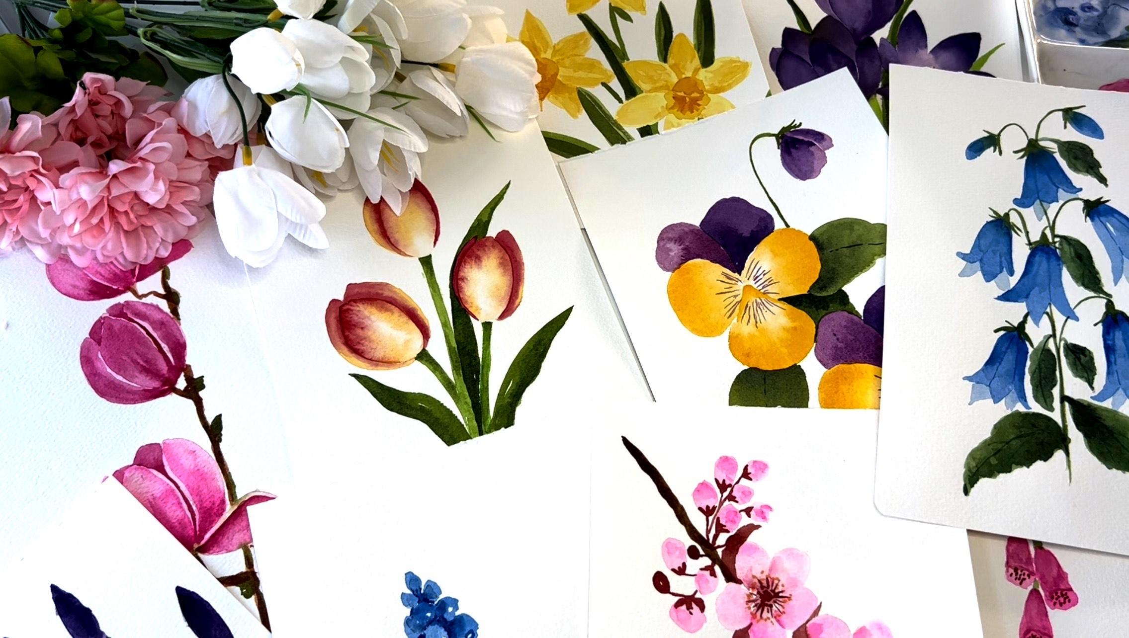
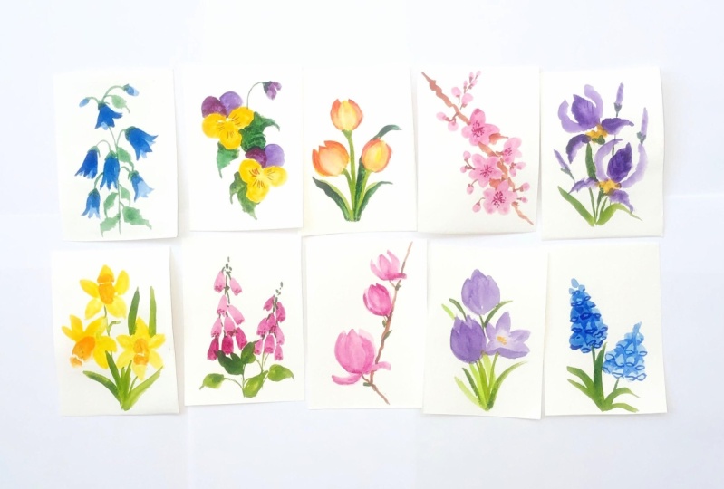
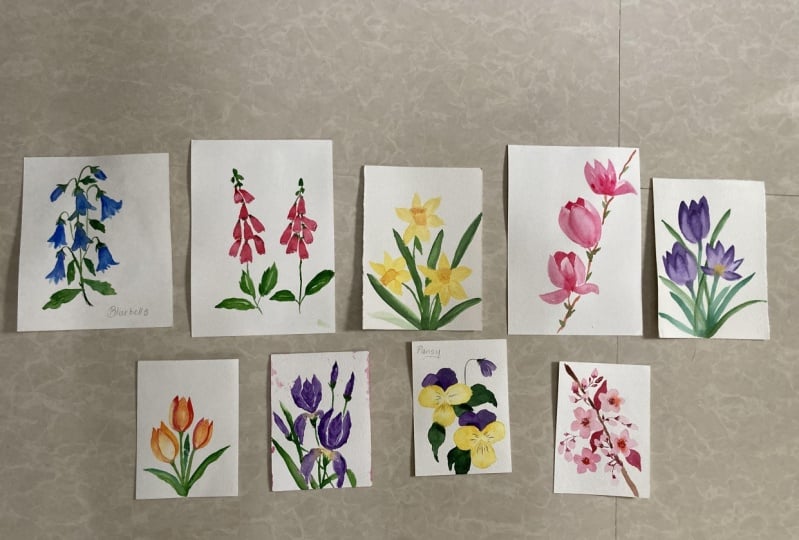
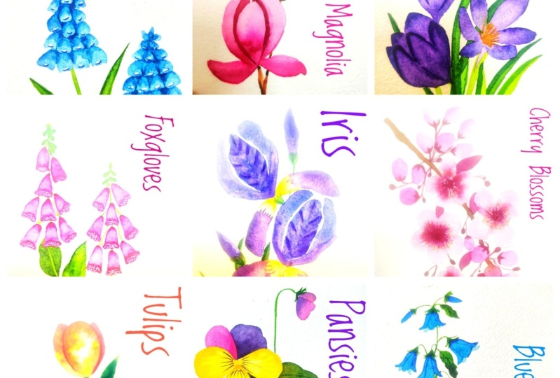
in the project itself. Here are the ten flowers
that we're going to paint as part of the
projects in this class. I hope you'll join me
on this fun adventure. Let's get started.
2. Materials needed: Now coming to the
materials of this class, you'll need watercolor paper. I'm using Ba Hong, 200 GSM, a 100% cotton paper. You can go with any brand of
paper or any size of paper. I've got it down into these
sort of E5 size sheets. These are the actual projects. So you can see that
they're relatively small. But you can either group
or a postcard size or even bigger pieces if
you like them that way, based on the size of the paper, you'll be choosing the
size of the brushes. But in general, I would recommend going for
something that has a 100% cotton because it helps you with the techniques
that we use in watercolor. And the wrong paper can give you a wrong impression that this
meeting is not good for you. Now the brushes and
using these two AND one is a mop brush and the other one
is a smaller brush, round brush for detailing. See you mainly need
round brushes for adding the main petals and leaves IRA, and then a smaller
brush for detailing. Since we don't have
any extensive washes, you won't need a lot of
big flat brushes, etc. Coming to the watercolors, I'm using the Daniel Smith
artist grade watercolors. Now, you can go with any brand of watercolors
that you have. Just needs to be something
that says at its great. Since the watercolors that are student grade may
not be as vibrant. And the amino give
you a similar result. Go with anything that
says at a screen. And for the colors itself, I'll be sharing all the specific colors
that I'm using for each project
separately so that you can try and match it up
with the brand you have. And also you need to
restrict yourself to specific colors
since each flower can come in multiple
client colors. So you can go ahead and try
your own combination as well. So I'll be sharing what I'm using for each
project so greatly. And that's about it. That's all the materials that
you'll need for this class. So let's get started
with our first project.
3. Project 1 : Bluebells: Starting with our first
project, this one, we are going to be in
some blues and PAN global am starting
root cobalt blue. This is kind of a lighter blue. And we'll add up the details using the
ultramarine blue later. I'm using my mole
pressure over here. You can use any round brush, something that is slightly
on the medium size, and then just press
the brush at, Leave it towards the index. This, we're trying to preheat
the petals this week. You can fix the
edges if you want. But mainly we're just
pressing the brush and leaving it to get this kind of strokes so that we can create this
bell kind of petals. This would be towards
the outer side, so this is going to
be slightly darker. We'll use the same color, but a lighter value, which means that
we'd be adding in a little more water towards the petals that are at the back. So this is how you're
going to be in the South. So it'd be adding
a few flowers over here and mainly the
outer petals here. And then adding in the details and the inner petals later on. So you can play around with
the values here a bit, which basically
means how much water you're adding to the pigment. The more water you add, the lighter it will
look on paper. So based on how
light or dark you want a certain style or
a certain battle to be, you can play around
with the values here. I tried to just keep
it as a mix-and-match. All the flowers may count, look the exact same way. So you can definitely play
around with this a bit. So mainly we are using the cobalt blue here for
all these base petals. Deciding the shape
of how this is going to look like the
overall composition, but still keeping
it pretty loose. So we're not going to
sketch anything as such. We are going in directly
with our brushes, but adding in a little bit
detail. Towards the end. We'll add in a few
buds over here. Simple pressing motion. And maybe another flower
over here because this kind of looks
empty this site. You can see that some
of these look darker, whereas some of them are much
lighter than comparison. Also watercolor dries lighter. So in case it looks super
dark to you right now, there are chances that
by the time it dries up, it will become quite light. Now we've connect all
of these, the stem. And for that I'm
using the sap green, just kind of a lighter green. I'm just going to connect
all of these together. Now for this, I'm
using a smaller brush. You can also stick to
just one brush a bit. Got a good tip. You can just go with that and add all
the details as well. Adding this little bit of green at the base of each flower. Now we connect
them all together. Now we're trying
to mimic the way this flower hangs from
the stem in real life. So that's reasons you'll find them drooping a
little bit like this. Now we start with the leaves. I'm going back to the bigger
brush so that we can have these flowy strokes
and add in the green. Again, I'm sticking to
sap green to start with. We start with a
slightly lighter value, which means that I have
more water and pigment. And we start with this as
the base layer for the leaf. On top of this, then you can add in the
slightly darker value. So that creates a texture. Otherwise it kind of
looks boring and flat. So to add some depth
to the petals. It can do is mix and
match with the values. Now I'm adding in these leaves wherever I see a
little bit of space, making sure that the leaves at the top are slightly smaller. And then while these
are still wet, we work wet-on-wet, which means that both the layers of
the paint is still wet. We added the slightly
darker value of sap green. This is the same color, but more pigment and less water. So that is giving the leaves
a little bit of texture. They don't look flat anymore. You can also use a clean brush and blend it
in a little bit if you feel that it's giving
hard edges based on the kind of
paper you're using. You'll notice that your paper
dries in a different way. So it also depends
on where you are. If you're at a
super hot location, you'll notice that by the time you're
reading the Secondly, the first leaf has
already dried. So this is the case. You might need to tweak it
a little bit the way you work because you need to
work wet on wet here, which means that the
previously as still needs to be wet violet add the
next layer of color. So now I'm adding
the darker green, which is pedaling
green in my case. You can go for any dark green. So if you do not have one, you can simply add a
dark blue to the sap green and you get a beautiful
dark green there as well. I'm just adding this
again to give some depth. Next we added the back petals. For this again, I'm using the same cobalt blue but
a much lighter value. I'm adding in more water to the same color and adding in
these petals at the back. So mainly just drawing
these triangles. So to say that it shows up like these
petals are towards the back. Repeat this for all the flowers. Adding in the lighter cobalt
blue towards the back. These little pointy ends of the pedals that
the peak through. Next we start adding the details
using glazing technique. I'm using a little bit of
ultramarine blue here, just towards the top edge. And then using a clean brush
and just blending it in. So this will allow you to have this kind
of a shading effect while also not having a hardest because you're blending
it in with a clean brush. So this is the technique
that we're going to use to create the depth that
the flowers to include. Boring and monotonous and glad. Start with a slightly
darker blue. In my case, I'm
using ultramarine blue and just add it
in here like this. Then using your clean brush, just spread it out. You'll see that it's
darker towards one edge. And wherever you have used the clean brush
to spread it out, it tends to be darker or
lighter and read graded out. So this is the technique
that we'll be using to create the texture and
depth on the flowers. And as you can see, as compared to the top ones that
look pretty flat. Once you add the glazing effect, it kind of gives life
to these flowers. And that's what we're
trying to achieve here. I'm just reading that
for all the flowers. Once again, this technique
is called glazing, where you added the color like this and then
just spread it out. That there are no hard edges. We let this dry a little bit before moving
on to the next step. Now, once your paper
is dry completely, we start with adding in the
final round of details. For this, I'm using
the ultramarine blue again and adding
in these fine lines, the kind of act like
petals are breathers. So you know that these
are separate petals. So I'm just going to add
these fine lines using a smaller brush onto
all the flowers. Adding in some details
on the leaves as well. So again, I'm using the
same perylene green and with the smaller brush to starting some simple
beans over here. We had done without
first project. I hope you'll give this a try and I'll see
you in the next one.
4. Project 2 : Pansies: Welcome back. So in this
project we are going to be in some beautiful
pansies are viola. For this, I'm going to use
the different techniques. So we're starting
with simply water. I'm using a clean water to paint the petals,
the front petals. And then we'll be adding in
details later on onto this, I'll be adding a warm yellow, mainly towards the edges and then letting it flow
towards the center. And once this is dry, we'll start with
the back petals, which will be on
the violet side. But this, once I have the yellow and start adding it towards the edges like this, and then letting it
flow towards center. What I'm trying to
do here is to let the watercolor do its thing since there's already
water on the paper, working wet on wet. You're not adding in a lot of
pigment towards the center. There's simply letting the
color flow towards the center. Mike, you mainly adding in the beginning towards the edges. While it's still wet, I'll add in a little bit more
pigment towards the edges. So it is the same Carlo, the Hansa yellow medium, but a slightly darker value, which means that
there's less water and more pigment over here. Now we repeat the same for
the second flower over here. I'll start with the layer of water and then add
in the yellow. Now if you feel
that the color is blending in way too much
towards the center, you can use a clean brush and just try lifting
up the color from the lifting is basically when you pull up the pigment
back from the paper, it will totally depend
on how your paper is, what type of paper you're using and which
pigment you're using. The lifting would differ based on the paper
and the pigment. But you can try this
out in case CPD that there's a lot of yellow
seeping towards the center. You can just use
a clean brush and try lifting pigment
off the paper. Fancies come in a
variety of colors. So you can also try
and, and all purple, pink or white kind
of combination is where it's totally up to you. I'm going for yellow
and purple combination. But these do come
in a lot of colors. Also be sharing a
Pinterest board with all the references
that I've used for this class later on. After this, we'll let this
dry before moving on to the next set of petals because we don't want
the colors to mix it. Now once your paper is dry, we start with the back petals. I'm using a rows of ultramarine, beautiful blue mixed color that gives you this
shape, this purple shape. So you can go with any
color that you have. All. You can also mix one. Once. If you have ultramarine, you can use that and any bank combination give
you a beautiful purple. Or you could go directly with a violet that
you have as well. I'm using this rules of
ultramarine for this backpack. There'll be another
petal. After this. We'll be using a
slightly darker purple. Here. I'm again using a
lighter value to start with, and then just dropping
in a little bit of darker value here
in the protection. While it's still wet. We'll add in the darker value of the same color and just
drop it in like this. Watercolor do its
magic and spread. This again gives a
little bit of depth to the petal so that it
doesn't look flat. Had a small bud over here. While the flowers
and still drying, we cannot work on the next path until this is completely dry. I start working on the leaves
in the meantime so that we can use the time that you read
in all the petals to dry. So we use a simple
pressing motion like this, leaves us slightly bigger. So that's the reason I'm
using the bigger brush and just adding in
the shape like this. So I started with the sap green, lighter value and now I'm just adding in a slightly
darker value. Just close it to the petal. Drank, create some depth
you different values. And we'll repeat the same for the other side will
have a leap over here. Maybe just one, add the base. Right here. You do the same. Start with a lighter sap green and then adding a darker value. While the leaves are dry, we'll start adding the
details onto the flower. I'm using the same memory in the purple that I
used for the backpack. Using a smaller brush, I'm creating these small lines, the pattern that is
there on the petals. Repeat the same for
the other flower. Now the added a little bit of
detail towards the center. So using the same yellow that we used for the first
layer of petals, but a darker value, just creating this little shape so that there's a distinction
between the three petals. Once you add that, I'm using slightly
darker value here. And just fixing the edges mouth for the last set of
petals at the back, I'm using Docker,
imperial purple. It's a slightly darker
color as compared to the pinkish that we have for the muddy petal we
added at the back. This is going to be
the dock is better. I'm just being careful to not
over the previous petals. Just adding edges scale. This again to create
the depth will be adding a darker value or
the same bulletproof. Letting it spread.
Painting the base layer of this flower as well. Now while the petals
are still wet, I'm adding the darker
value of the same color. Just add these edges creates a kind of shows that that is the last federal or the
pedal in the background. For this. I'm just adding in
this slightly darker value, wet on wet and just
letting it spread. Also adding a few
details onto this petal. Rather the buds for
this dropped in that darker color and then I'm using a clean brush
to just credit even. This is again the
glazing technique that we tried out earlier. Connect them all together. Adding in the stems
with the sap green. Now I'll just add in a
slightly darker green, sap green but slightly
darker value added in. That kind of join together. Just so that this leaf
shows up at the b's. So that'll add in
the darker green. Suddenly people can
see that as soon as I add that gets lifted. And this depth added
to the background. Same thing here, and
add another leaf, but with a slightly
darker green. Now. Now once the leaves are dry, I'll use the same crediting
dream and add in some green. Nothing too detailed, just
simple strokes like this. We're done with this project. I hope you give this a try. See you in the next one.
5. Project 3 : Tulips: Moving on to our next project. In this one, we're going to
be in some beautiful tulips. Again, we are using a similar technique to
what we did for the Pansy. So we'll start with just painting this petal
with clean water. Then we add in the
colors wet on wet, starting with a yellows, I'm using once again the
Hansa yellow medium. And start by adding this at the edges and just at the tip of the petals like
this and letting it flow. Some bleeding. The
central part white. In case you feel that the
color is getting mixed up, right, dilute the central path. You can use a clean
brush and just lift up a little bit
of color like this. I'm trying to leave that
off light or whitish. Next week continue
to work wet on wet. So I'm using alizarin crimson. I'll just add it at
the edges like this. Since your petal
is still wet and you just added the
yellow color over there. It's going to blend on his own. It gives it doesn't. You can just help
it a bit like this, moving the brush
towards the center. But we want this color
to remain at pHs. And mainly you should
still show up. I'm just giving it at pHs
and letting it blend. We'll repeat the same thing
for the other two flowers. Now since my paper is
not drying as fast, I'm just going to do
both of them together. But if your paper is drying up, take it one at a time because we need to do this wet on wet. That is, the petals
needs to stay wet. Three, you add the pink. So it gives you paper
is drying fast. Maybe just take it one
parameter at a time. Again, add the yellow, and then drop it. I really love how the watercolors just
blend into each other. And that's what
beauty of wet on wet, it's tricky to control this medium when it's
flowing on its own. But that also gives rise to these beautiful patterns
that it creates. So I really think that the
beauty of watercolors. Now the top one looks a
little pale in comparison, so I'm just going to add
in a little bit more color at the edges so that
it looks equally y print layer dry completely before starting with the
next round of petals. Now once my people is try and stop with the remaining petals. This time, I'm not adding layer of water first and directly going in
with the yellow. And we'll add in the
red at the edges. Just try to blend these
slightly darker yellow. I'm using a lot more
pigment and less water. Now on the other side, I'll go in directly with
the alizarin crimson. So I'm just showing
the edge of the petal. Again, since this is darker, kind of separate from that
first that we have painted, That's the reason we went
in for a darker color so that it shows up
as a separate petal. Adding in a slightly
darker value at the edges. We repeat the same for
the other flowers. This one vehicle in with
the same kind of petals, but maybe we just
reverse the order. This side, we'll have just
that pink edge of the petal. On the other side, we redo the full rather than
half petal width, yellow and pink book. Reminder that watercolor
dries lighter. Engage your feeling that
it's too dark at this point. Slightly gonna be much
lighter when it dries up. We're trying to
make this darker in comparison to that first
petal that we've been doing. That's the reason that
it's slightly darker. Adding in the pink, the alizarin crimson color just spreads like
crazy and beautiful. I love watching it blend
in with the other colors. It's just so much fun. But you have to be extra
careful with this. Otherwise it just
overpowers everything else. Just lifting a little bit of it so that the yellow shows up. Now for this one, let's add
the Uloric MATLAB booth. And so that will be a
slightly Big-O flower. Working wet on wet. I'm adding crimson. Just letting it flow. I'm trying to control the
amount of pigment that emptying so that doesn't become all red light now while the petals dry, we'll start with the
stem and leaves. This, I'm using the SAP
creep, a lighter value. Start with for the stem. Make sure that the
center is a line, the stem called the few
lips slightly picker. And just try to make sure that I'm adding a slightly
darker value of green in practice
like this on the stem. To give it a little
bit of depth. We'll have to wait
for this to dry completely before we
start with the leaves. Then I'm just playing
around with stem. Now I'll start with the leaves. Now that my paper
has dried leaves, it says improve VTE
stroke like this. Again, I'm using sap green. We're going to add in a
slightly darker value in practice so that we can create the depth
for these leaves. But for now I'll start
with a base layer of sap green and not very dark value. Here I'm playing with value, so I'll be adding a
slightly darker value, wet-on-wet, that we have
some depth on the leaves. Also, good sleep at the back is going to be slightly darker. I'm just painting with a
slightly darker value. Again, starting with
lighter sap green. Then just playing
with the values. Once the leaf is dry, we'll start adding
a darker value or the background ones that we can create some depth here. Since we used a much lighter
value for the stamp, you can see that the
leaves stands out. Onto final round of detailing. I'm just going to add in a very slight edge of
the alizarin crimson. Now for this year to wait for the flower to
dry completely. But once it's dry, just between the petals, I'm adding in this line of crimson and then using a clean brush to just
spread it out a little bit. I'm doing it Small, not adding a lot of color. This is just to create
that depth in the flower. Just having a little bit of crimson like this is the line, then spreading it out. But the value that I'm
adding proclaims in as much darker than the ones
that we've used previously. You can see that it
immediately reheats that depth in the last flower. Just adding that line using
a clean brush to blend it. That's the project, but I hope you enjoyed it
and you'll give this a try. See you in the next one.
6. Project 4 : Cherry Blossoms: Starting with our next project, this one VP in some
beautiful cherry blossoms. This again, it start
with a clean water. The peptides. I'm just
painting all the pipette. It'll select this,
establishing the brush and creating this
kind of opacity. And then the book read on
bread and added the cropping. I'm just advocate at
the edges like this. I leave the center
kind of white. We'd be adding a darker
Alizarin crimson Detroit. But for this to start with, we just add in the
prepping kept the edges. Then while it's still wet, we drop in the alizarin
crimson at the center. Like this, this color, it kind of spreads fast, so you just need to be a little careful if you're
using the same shape. Making sure that
you don't drop in a lot of it at the center. That's how we are going
to be at all the vowels. So be agreeing to
repeat the same process for the other flowers. Now, in case a crimson
spreads like this, you can use a clean brush and just lift up the
color surrounding it. Continue with the other
flowers, adding clean water. And then we added the colors
at the edges like this. Now, this one is a slightly smaller
flower, moon like a bug. Done with all the
main flowers, VDB. But separately, I will just finish off the wet on wet
part for these flowers. Now we add in the buds for this. I'm just dabbing the brush
like this and leaving it. So I'm using the same or
propping, adding the bots. This is like a branch
of cherry blossom. So I'm trying to follow
that angle of the drugs. Adding in these
cute little buds, add in some of the
basis when killed. Now, once you're
done with all the, but let the paper dry so that we can start
working on the branches. This on the flowers
need to be dry. Once it's dry, we can
start with the branch. I'm using a bone scan. Following that angle at which
we painted the flowers. I'm connecting all the flowers
for the stamp, but I use. Slightly darker,
Alizarin crimson. It's the same color that
we used at the center, but a darker value. And I'll just add the stem
or all these little buds. You can also use the
same burnt sienna. But I like this combination, the slightly reddish pink combination at the
base of the buds, it is looking quite pretty. So I am going with this color. Now. We repeat the same
for all the birds. In some leaves as
well as we go down. Mao taking in the scene, Carlo, I'll just add a few
dots at the center. Now that the
branches have cried. I'll also add a few
leaves next to the plow. Using the same Carlo
Alizarin crimson. You can add a slightly
darker value. Just next to the flower
overlaps the leaves. Alright, then with
the leaves now, quickly add a little bit of
detailing onto the flowers. I'm starting with the same
opera pink and just adding in these lines kind of
separators for the petals. And we use a clean brush to
blend it in. Like pleasing. But I'm not going to
cover in a lot of video just small strokes so that we can
distinguish the petals and leaves some shadows
onto the petals. Repeat the same for the
other flowers in the opera, pink and patches like this. And then using a clean
brush to blend it in this kind of posts and
creating new shadows and light areas in the flowers so that it doesn't look
flat and monotonous. Do the same for
the other flowers. Now let's add some
color onto the bud says Read same technique
we drop in the appropriate and then use a
clean brush to blend it in. So we don't want any hard edges. So that's the reason
we're going in with a clean brush and just
blending the color in. Once your paper is dry, we start with the last part of detailing adding
these yellow dots. Center. I'm using the
Hansa yellow medium over show a very pigmented values that it shows up on the pink. Get done. So I hope you enjoyed this project and
we'll give this a try. See you in the next one.
7. Project 5 : Iris: Welcome back. Today we are going to be beautiful iris flower. For this, I'm going
to mixing a color. It's similar to imperial purple. You can alternately use lighter pinkish purple
that you have as well. Here I'm mixing the
queen rules with ultramarine blue to get this
beautiful shade of purple. This will be for all
our base petals. And then we will be using a darker violet color
for all the detailing. I'll start with this one. This is beautiful
pinkish purple mix. Now since this is
a darker flower, we start directly
with the paint. I'm using the mop brush and just present it like this to get this that the shape will
be towards the edges. Then we debited it
down like this. We also add more petals on to each side of
this main button. Amusing the same color,
slightly lighter value. I'm leaving a little
bit of white in between so that we can
distinguish the petals. We repeat the same for another
flower at the base here. I'm going to use the same color. Create goes three petals. Now we're going to
be adding details on these petals later on. But now we let them cry. Once your petals are dry, we start with the base bednets. So for this I'm using water and just using
the scene we've emotion that we did for the top petals and just being done
them out like this. I've done both the
flowers together, but if your paper
is drying too fast, BBQ with one
parameter at a time. Once you are done with adding
the petals with just water, I'm adding in the
Hansa yellow medium at the base layer and
letting it spread. Since you already have
water on the paper. This works wet on wet and
scripts and blends on its own. And towards the end, I'm just adding the same color that we used for the top petals. But since this petal
already has water on it, it becomes much later. Now Pilate christ's, I'm
adding a few buds over here, the same color. And adding in the slightly
darker value that this mediation in the
color for the boxes. Now while this is still wet, I'm just adding the
darker color zone, violet at the edges. Now since this is
wet-on-wet again, you'll see that the color
becomes much lighter later on. That's why we'd be using the same violet but in
a wet on dry technique. To add in all the details. Here, I'm still
using wet on wet. The petal was still
wet while I added the details for this with
the gaba sold violet, which is the darker violet. Now, while that is crying, we'll go back to the top
petal and add in the details. I'm using same capsule
violet and bending the small lines
closer to the edges. And then we use a clean brush and just
blend them in like this. You're trying to
create a little bit of depth in the battle. That's the reason you're using this kind of a
glazing technique. We simply add those lines
and then use a clean brush. Blend it in. Now we repeat the same for
the other flowers with starting with some lines
like these. And then. Using a clean brush to blend it. Then now we add in the shadows for the
other petals as well. We added a small glia. The gaba is O'Reilly, which is the dark provided. Just a few strokes
like these and then use a clean
brush to blend it in. Now repeating the same color, this travel at the base, adding in the carboxyl
violet like this and then using a clean
brush to blend it in. Now while the petal dries, we'll start with the green bar, the stem, and the leaves. I'm using the sap
green to start with. Throughout this class, we mainly use just the sap green and perylene green for all the
stems and leaves so far. For this is where we
start with the same stem, which is a slightly lighter for the leaves to me to start with
a base layer of sap green, and then add in the
better later on for the shadows and
the darker radius. I will add in slightly darker green so that we have a
little bit of variation on the color as well. With the leaves. Now we'll go back to
the flower horde, one last round of detailing. So I'm using a smaller brush and the darker violet
color capsule violet, and creating these tiny patterns closer to the yellow part. Now this has to be done
wet on dry because if we end up mixing this
violet with the yellow, it'll create a muddy
brownish colored over a bit. Now that the yellow has dried, we are using the darker violet and creating these factors. I'm mainly drawing
some zigzag lines over here with a smaller brush. Towards the end. I'm adding in a
little bit of color, then blending it
with a clean brush. Repeat the same for
the other flower. Adding in small patterns
like simple exact factors. You do that for both
the petals and add in a slightly darker color
at the edges like this. We spread it with a clean brush. Now adding a little
bit of detail onto the bad SEO with
the darker violet. Going back to the leaves for
one round of the dealings, I'm using the belly green and just adding it like
this at the edges. Be it done. I hope you enjoyed this class
and give this a try. See you in the next one.
8. Project 6 : Daffodils: Moving on to our next project. And in this one we're painting
some beautiful daffodils. Now this time we have changed the color palette to all this. While we will mainly
using pinks and purples. This one's all yellow. And we'd start with
the base petals. I'm using my mop brush and
just pressing it like this so that we have the six
base patterns like this. We'll add the tube later on. Once we are done with this part and the
petals have dried, we'll work with a slightly darker value
of the same color. So I'm using the
Hansa yellow medium, but for the base petals, I've used a very
watered-down value. So we'll have three flowers. This one's facing
towards the left, and we add one more over here. Now once the petals dry, we start with the next part. That is the tool for this. I'm using the same
Hansa yellow medium, but a slightly darker value. And based on the direction in which your tube is pointing, your whole flowers
direction teachers. So this is, this one
here is towards left. And we'll be adding in the
details to this later on with a darker value again
and a bit of orange. Once this is completely dry. For now we're just placing the tubes or all
the three flowers. While it's still wet, I'm adding in a slightly
darker value in there, lot more pigment from
the Hansa yellow medium. And moving on to our last level. Now, while this dries, we start working on petty using a bit of
glazing techniques. We start with adding in the darker Hansa yellow
medium like this, and then using a clean
brush to spread it out. Repeating the same for the other petals so
that we can sort of create distinction in the
petals and add a bit of shadow. So again, we use the glazing technique or
this adding in a little bit of darker pigment and then using a clean brush
to blend it out. I'll repeat the same for
the other flowers as well. Now, here you can compare the base levels
versus the top one. As soon as you add in
these little details, it kind of brings a flower
to life at some depth to it. So that's why we have
to do this in layers. So we had to wait for the
first layer of petals to dry before we start with
Q when now the detailing, and there's a little bit
more detail him to go on the tube and also
on the cup part. Now while that dries, we'll start with the
stem and the leaves. So I'm using the sap green again to get started with this. Then we'll add in the base layer of the leaves as well with
the same sap green. And then once it's dry, we'll add in the details with
a slightly darker value. Well, the leaves, I'll use the
bigger brush, a mop brush, and just have this
present motion so that we have briefly like this having a more leaves. And you can play around
with the values here. You can add in a slightly
darker value on UDP. The ones at the back,
especially we have them in a slightly darker value now or add in more details later
with the darker value. All right, That's all
the leaves we need. Now, I'll take the
same sap green and darker value and add
it at the edges like this. So we're adding it to one side and letting the other side
via slightly lighter green. Next, we'll start
with the cup part. For this, I'm using the
same Hansa Yellow Medium, a slightly darker value. Not as dark as the tube itself, but darker than the petals
that BP intake first. Repeating that for
the other flowers. Now, while that dries, I add in another
layer of detailing on the petals using the same
color, Hansa yellow medium. You can see that
the lightest shade that you used was for
the bees pebbles. And after that the
glucose is being used slightly darker sheet
except called the cup. So I'm using the same shapes to add in a little bit of
texture to these petals. I didn't add in a lot of details earlier onto
these because we were going to paint the
tube and a couple of days just playing around with
that slightly darker value. Same for the top flower, adding in some strokes here. And then we use a clean
brush to blend it in. On to our last flower. Same technique, adding in the darker yellow with you and then using a clean
brush to blend it in. Now once again, we
use the yellow, a very big mentored value, or creating the separation
between the petals. Alright, now that the
leaves have dried, I'll start working on the
detailing of the leaves. I'm using the perylene
green and adding it to one of the edges where we painted the slightly darker
sap green earlier. Working around the petals
and adding embed dark green. If your petals are still wet, maybe just wait for
them to dry completely before you move on with
the details on the leaves. Now, moving back to the cup and the tube for the detailing here, I'm using permanent orange. It's a nice and vibrant orange. You can also simply mix some red with a
yellow that you have and have this slight
warm orange with you. So I'm adding in the details
inside the cup here. Just simply dabbing
the orange color. Now we do the same for the tube. So now here you leave a
little bit of that yellow at the top so that the
cup part is separated. And then adding the
orange here at the base. Not a very dark value. We still want it to
be primarily yellow. Just adding it in. Here's that, the top part has that little bit
of lighter yellow. And then you can show this
sort of a shadow on the team. While it's still wet, I drop in a slightly
darker orange just next to that yellow part, so that the Duke stands out. It's slightly darker. One final round
of the dealing on the cap side with the
same orange yellow mix. And we're done
with this project. I hope you enjoyed this and
you'll give this a try. See you in the next one.
9. Project 7 : Foxgloves: Welcome back. Moving on
to our next project. You're painting Fox clubs today. So for this, I'm using this
opera pink to start with. And we'll start by
adding indirectly the opera pink and
creating these petals. Drooping petals at
foxglove has this, this is the shape that
we're going to add in, sort of a bell-shaped, similar to what we
did for the pupils. And they're going to
be combined together. So we'll paint a
bunch of petals. We'll start with
this lighter value. You can add in a little bit of darker value here and there so that there's a
bit of texture, but we'll be adding in all
the details later on again. So right now I'm just
adding in the shape, the overall shape of the flower. So it kind of follows this
elongated triangular shape. And we added the
petals one-by-one. Now, while that dries, I'll add in another flower on
the right. Same technique. We start with the
lighter pink or purple pink and add in
the petals one-by-one, following the overall
shape of the flower. Once we're done with the petals, we need for this to dry. Once your paper is dry, we start with the green part. But this, I'm using
the sap green. And I'm adding in the small
little birds over here. And kind of creating continuous
shape for this flower. So now Vd connect all the
petals together like this. Repeat the same for
the other flower, creating these little
buds at the top and then connecting all
the petals together. Next we add in the
stem and the leaves. But the leaves, I'm using a slightly bigger
brush, the blob brush. So here again, we start with a lighter
value of sap green. And you can play around
with the values adding in slightly darker
shades or texture. But these leaves are bigger, so I've gone with a
bigger mop brush magazine and just this baby stroke. Heading in one. Lastly, at the back here, we try to add in details onto this later
on with a darker green. For the base layers. I'm
still using this app clean. And really just
lift a little bit of color here so that
this term shows up. That's a lighter color. And we'll add in the
darker green later on. Now, once your paper is dry, we start with adding the
details onto the petals. So I'm using the
glazing technique here. So we start by adding
a darker pink. I'm using Queen Rose, and we just drop it at the
top of the petal and then use a clean brush to spread it out like this so that it blends in. Bobby, repeat the same for all the petals dropping in
the darker pink at the top. And then using a clean
brush to glaze it over. Repeating the same for
the second flower. And you could see that as
soon as we add in that darker she kind of creates
depth onto the petals. Otherwise it is looking
quite flat and boring. And once this here is dry, we'll be adding
in further detail towards the end of the petals, but mainly using the
same set of paints. Now, once your petals are dry, we start with adding
in the detail. But this, I'm using the
same ground rules are much pigment in value and adding in these
shapes at the end. So this is like the
petals opening. And then we'll add in the
details onto this later on. What we're trying to make sure
that this particular part, this opening is slightly lighter than the
rest of the petal. We use the Queen Rose to
add in the details here. I'll repeat the same
for this flower. Adding in the opening
of the burden here, and then adding in the
slightly darker pink at the top so that This part becomes o. Right? Now we add in the
details store to center. So a smaller brush or any
brush with a good point, you can add in these dots here. I'm using the same green rows, but very dirty water and
very pigmented value here. While that Christ will start
with the leaves again, adding in the details
onto buildings. So the first round we did
it mean deeper this app KPI for the details and using
the perylene green here. So we again use the
glazing technique, adding in the batches
of perylene green here, and then using a clean
brush to blend it in, adding in some final details. And that's it. You're done with yet
another project. I hope you enjoyed
this and we'll give this a try. See you
in the next one.
10. Project 8 : Crocus: Welcome back. Moving on
to our next project. In this one we're painting
the crocus flower. Now this one again comes in different colors like
white and yellow. And so is what gives us Sapling, which is super expensive. But this flower is
super easy to pay. So we're going to
try it out with the same purple color
that we mixed for iris. So we'd be adding in a bit of ultramarine to Queen Rose
and getting the shape. You can alternately go for any purple color that you have. You can experiment with
the yellow as well. So we'll start with a petty by using a bigger brush and
just pressing it like this, kind of typical body shape. So this will be
your central pedal, and then we add it, add a couple of petals to
the left and right. Here again, I'm leaving
a little white between the petals that there
is a separation. So this is one side
of the petals, so the back petals will
be painted separately. And we'll have a similar flower like this to the left here. Now we paint another
flower over here. But this one's kind of open in the sense that the other two flowers that you see over here, you're viewing them from a site, whereas this one is open, so you can see the
central part as well. And here again, you can
play with the values. You can start with
a lighter petal and drop in the darker
shades at top. Or you can go ahead with a slightly lighter
purple as well. We'll be adding a lot of details to these
flowers later on. But for now we're just working with the very base
layer of petals. Now while this is still wet, I will add in a darker
value of the same color, just add the tip like
this and blend it in. Now, while the
other flowers dry, if you're talking about
has already dried, you can start working on
the back petals here. I'm using again the same
color but darker value. And I'm adding it
in here like this. We follow more or less the
same shape of the petals. But since we're painting
these in the background, the front ones are what you can see clearly through there. That's where you're
detailing would be. But these are slightly darker. Adding in the detail adds on to the other flowers as well. Well, this one, adding another layer of
the same purpose. This is wet on dry. This layer had already dried, so I'm just adding in
details like this. Next we add in the stem. I'm using permanent
green light for this. So the easiest and the stem, in this case are slightly lighter than the other colors
that we have used so far. So we've mainly used sap green. So in this one we're using the permanent green
light instead. Next we add in the leaves after
we're done with the stem. Again, a similar simple
elongated stroke for the leaves, and using the same color. And we will add in a
slightly darker value and a hint of a darker green
later on to add the details. But to start with, we just add the same
permanent green light. Now, I'm mixing a little bit of sap green into this that we have those darker
leaves and the back. So the shape of the leaves remains clean
and it's just that these are slightly darker
since the app at the back. So we have some shadows and we wait for this to dry. Now, once you
people describe me, start with the darker violet. I'm using the carboxyl
violet in my case. And we start with adding
in the dark violet, just add the thick of
the petals like this. And a little bit around
the edges as well. And then we use a clean
brush to blend it in. So we're not painting
the full petty, mainly just working
at the tip and then letting the color
flow towards the rest of the petit mal. You repeat the same
for the other petals, just adding the darker
violet at depth, and then using a clean
brush to blend them in. Now adding in the details
for the other flowers. So this kind of gives a
little bit of life to the petals by adding
this technique or painting with a little bit of color at the tip and then
glazing it out on the bed. So that radiation
that comes in really helps in bringing
the flower to life. On to the last flower. And if you remember why we
will be ending this one, the purple was
looking quite dark, but by the time it's right, It's become quite light. So that's the thing
with watercolors, most colors will dry very tight. So even if you're feeling that
your colors are to target, when working wet on wet, there's a good chance
that dry much lighter. And we'll have to
layer it up if you want to make a, make
it look darker. Now here I'm leaving
the central part little whitish because we have to paint with yellow there. So that's the reason
I'm not adding in a lot of dark shade there. But we done with another
layer of petals, now, mostly working on adding in the details
onto these petals. So we go back to
the back weddings. And I'm adding the
darker violet here. Again using a similar technique, adding the dark around
it at the tip and then blending it down
with a clean brush. Now I'm also adding in a
little bit of separation here between the petals with the same technique,
glazing techniques. So we add in the
violet and then use a clean brush and just
spread it out like this. Moving on to the other flowers and we repeat the same thing, adding in the darker violet at the top and then blending it in. Now once your paper is dry, we add in the central
path to the open flower. This, I'm using the
Hansa yellow medium and just adding a very
pigmented value over here. So this is where
keeping that quotient white because it's kind
of transparent there. So adding in the yellows,
not a big problem. But had it been super dark
like a cup of violet, then you'll need a very opaque
yellow to go on top of it. So that's the reason
we kept it white. Now going back to the leaves, we will add in the
darker green here. So in this case, since the base cream that
we used was light, I'm using sap green as the dark cookie and
adding in the detail. Now, adding in some
last round of details. So my green as spread
onto a few petals, I'll just be fixing
bath with a darker line it for this, you need to read. Your paper is completely dry. And then go ahead with
the adding and the colors on to the last flower
with the same technique having in a very,
it meant a while. And then gently making it
blend in with a clean brush. Adding in one more layer of darker green to
your beliefs here. And by that I mean pigment
it value of sap green. We need the background leaves. And we're done with
this project as well. So I hope you enjoyed
this and we'll give this a try. See you
in the next one.
11. Project 9 : Magnolia: Onto our next project. And in this one kept
painting magnolia. This again is more on the
pinkish side and we mainly just using a couple of things and the brown for the
stem in this project. So we start with the
central petal again, just pressing the
brush like this. And I'm using the
mop brush and I'm starting with an opera pink
light value of opera pink. And then we leave a little
bit of space and add in the petals to the two
sides of this main Betty. Again, on both sides I'm leaving a little
bit of whitespace. And then we have few petals
at the bees like this. For this whole base layer, I'm mainly using a
very watered-down, are prepping and then
start working wet on wet and adding a slightly
darker value so that it flows and it blends. Same opera pink. And you can see that
it blends beautifully. This is where keeping
that little white space between the petals helps so that it all doesn't mix up
into one big pink body. Now we add in a few more flowers with the same techniques, starting with a lighter
value of opera pink, and then adding petals
to either side. Now, you could also go in for
a closed flower like this, and that would mean that we are not adding any
petals at the B's, mainly just the, your
whole petals at the top. And we add in another
one here at the top. And let this dry completely. Now, once your paper is dry, we add in the stem, I'm using the burnt
sienna for this. And just connecting
the flowers in a way, just like what we did
for cherry blossoms. I connect the flowers
to the stem like this. And we add a few
leaves here and there. Now when magnolias
are in full bloom, you can hardly sport and
he leaves on these trees. But here I'm just
adding in a hint of darker color and making it
a little more interesting, the branch a little
more interesting. Now, this one petal was
not completely dry, so there's a bit of
a bloom over there. I'm just using a clean
brush to lift it off. And we wait for this to dry now. Now onto paper is dry. Wet on dry with the same
opera pink and starting with slightly pigmented value at the Bs and then
just place it in. I'm still leaving
that white space between the petals
and made me just adding the big men did or propping at the base of
the petals like this. Now for the bees buttons, I'm going to leave
in a little bit of space at the top like this, so that the lighter part shows up and the one that
is facing downwards, we will be painting it darker. Same for the other petal. This one again, we
leave a little bit of a lighter button at
the top, like this. And then we use darker pigment to just
drop it in like this here. Now we repeat it for
the other flowers. Now here I'm playing
around with the values, having a slightly darker or
propane and this dropping in pigmented color at the
base again. The depths. Now while this is still wet, I'll add in The Green Road, which is a slightly darker pink as compared to opera rose. And it's this beautiful, gorgeous being that adds
so much to the flower. We repeat the same
for the base flower, adding it at the end of
the petals like this. The Quin Rose of any dark
thing that you have. And then using a clean
brush to blend it in. B, move on to our last
flower here at the top. And you can see that it looks so boring without all
these details added in. So we repeat the same
process for this flower. Adding in the Queen Rose now, while it's still wet, add the bees like this and
then just letting it spread. Then we read the paper
to dry completely. Now, once your paper is dry, you start working on the
petals at the back. Super bad. I'm using a very
pigmented value of Queen Rose and adding in the
petals directly like this. Now while walking between
the two front petals, I'm still leaving a little
bit of white like this so that the edges of the
bedroom can show up. Adding some shadows to the base petals where the
petal is kind of turned. Me repeat the same for
the other two flowers. Adding in the darker
green rows at the back. We're slowly working towards
layering the petals, adding in the darker green
rows and blending it in. And I think I'll skip the
back petals for this one. Adding in one final
round of details onto the stem with
a darker color. And we have done. So. I hope you enjoyed this project and you'll
give this a try. See you in the next one.
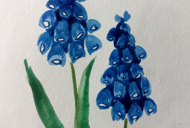
12. Project 10 : Grape Hyacinth: All right, moving on
to our last project and it's been such a beautiful
journey with you guys. So I hope you've
enjoyed this to, in this project, we're going
to be in the Greek past. Nice cobalt blue here. Now we started to talk and sort of follow the triangular
shape for the bunch. Now the flower itself is
shaped like a small circle, sort of a grape, and hence the name. So here we're going to
be these small circles, but leaving a little bit
of white at the end. And this will be the
opening of the bedroom. And we added the details later, but now using a light
value of cobalt blue and just adding in these
little circles a little bit of
white at the edge. Now here you need not
stick with the same value. You can play around
with the value added, a slightly darker shade here. It's fine. We just try
to stick to the shape. Later on. Once this is dry, we'll be adding in the ultramarine blue for
all the details. Right now, you just laying down the base
layer of this Glover. So for all the shadows and the area between these flowers, we'll add in a darker blue so that it creates the
illusion of depth. Right now let me
add another flower, which we follow the
same technique. We start at the top
and follow a sort of elongated triangular shape or the complete branch and
put a flower itself. The paint, these little targets. A little bit of white
left at the edge. Now you can see for
the first flower that the blue has dried quite light. And that's okay because this
is just your first layer, so we'll be adding in
the details later on, whether darker value and as
well as with the ultramarine. And now since we have to wait
for these petals are dry, we'll start working on the stem. The stem, I'll be
using sap green and just adding these
streets Dan here. And while we're at it, let's add some leaves. Again, the leaves for this
one are pretty simple. Just the straight strokes. And you can add in a slightly darker value
at one of the edges to give it some nice gradation. Adding in a few
more leaves here. All right, we're
done with this part. Now we go back to the
flower or the detailing. Now I'll start with a
slightly darker value of cobalt blue itself. And for the last round of detailing and b using
the ultramarine to. So what we're going
to do here is to pull up those spaces
that are left between these flowers and use a clean brush to just
blend it in a little bit. We don't want any
harsh edges here. Just adding in the
color like this in-between all those flowers. And then using a clean
brush to blend it a bit. Done with adding the colors. So now I use a clean brush and just glaze it a little
bit onto the petals. Now, this is step one of the detailing and
can already see the difference it makes when you compare it with the
other flower at the base. And adding these little
bit of darker shade and adding the shadows really helps in bringing
the flower to life. So while it's still wet, I'm still adding in a
slightly darker value here. Now we repeat the same for
the other flower here. So adding in the
cobalt blue in-between these athletes and then spreading it out
with a clean brush. Now I'll use the clean brush to glaze it over the patents. Now we wait for this
to dry a little bit. And in the meantime, just adding a little bit of
details to your beliefs, adding a darker
green at the edges. All right, going back
to the flower, here, I'm using ultramarine blue
for the last round of detail. So I'm just adding it
in here like this. Just add the areas where
you can see the shadows already because we
painted them earlier with the darker cobalt blue and just hit the edges of those freckles. And then again, we use a clean brush and just
blend a little bit. We don't want a lot
of hard edges here. So using a clean brush
helps and blending all the lines that you may have created while
adding the darker blue. And once again, you can compare the shades on the two flowers. The one at the top is much more lifelike because we've
added all those layers. So every Leo helped in bringing out the depth
in these petals. So we repeat the same
for the second flower, adding in the dark
or ultramarine blue. And then just using a
clean brush to blend it onto our last step. And in this one,
I'm going to use a very pigmented value
of ultramarine blue and just outline those
little white circles are the area that he
had left earlier. So this will kind of show
the opening of the backlog. Are the flower just using the darker ultramarine blue and adding in these
details like this. Repeating the same for this, the second flower here. Adding into details with ultra marine and be done. I really had a blast
these last ten days painting all these
gorgeous flowers with you. And I hope you enjoy them too
and you'll give this a try. So see you in the next section.
13. Thank you and beyond!: And that's it. Thank you for joining me
on this fun adventure. I hope you had fun. And I had a blast painting all these gorgeous spring
flowers for the last ten days. I hope you get these
projects to cry if you do these to upload them
in the project section. And if you're on social media, you can find me as that crazy do on Pinterest,
Instagram, and Facebook. I do have a lot of
Pinterest boards on plural inspiration
in case you want to check it out. And that's it. And if you have any feedback, positive or negative
about this course, please do share it with me. It helps me MQ rating better
classes, and that's it. So I hope to see you again with another class until then. Bye.
 Vinita, That Crazy Doodler