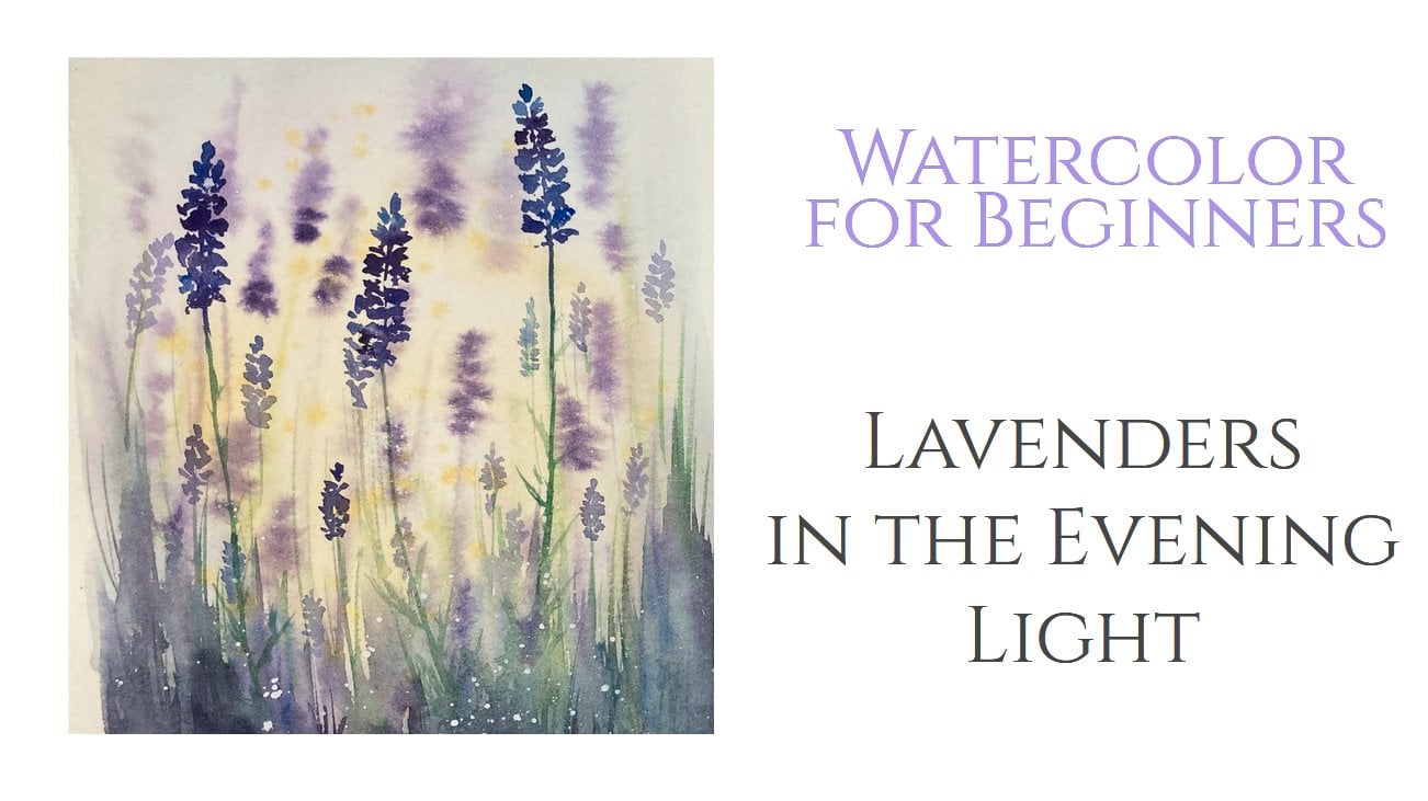
Transcripts
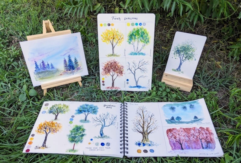
1. Introduction: Hello friends is Yana and I'm back with the class I promised you last time when we were exploring ways to draw simple and then a little bit more advanced trees. The idea was to create a class to show you my process of painting watercolor trees. But then I decided that maybe we should start withdrawing these trees first with a pencil to play with simple geometric shapes and turn them into nice drawings of both conifers and deciduous trees. So this is the second class. If you are interested in the first-class, I'm going to put a link in the class description below. So you can absolutely check out the first glass, but it's unmasked. If you want, you can just skip it and dive right into the lighter color here with me. So what do we are going to do today? We are going to paint several kinds of both coniferous and deciduous trees. I would like to talk to you more about the color palette I like to use for greenery. Also, I would like to show you a few of, let's say, bonus techniques for painting trees. And then the second is we are going to have fun and a little bit. And I would also like to show you some of my three sketches and studies and landscape paintings. Just to show you how I incorporate these different kinds of trees in my paintings. And in the end of the class, there will be two class projects. One for conifers and the other one for deciduous trees. And very heavy guys that you are hearing me today. And I can't wait to take my brush and pains and paint some laboratories. But before we do that, I'm going to show you what materials we are going to need today.
2. Materials: Okay, so what I have here today, I have watercolor paper. This one is Canson XL watercolor paper. It has a small surface. It's not a 100 percent cotton, but it's perfect for our exercises and sketches. Here is my watercolor set. I'm using the white knights that again, recently I purchased some new colors, so maybe we will try them today regarding the color palette and we will talk about it later. But I just want to tell you that neutrinos needs color palette big like this one. If you have like 12 colors, says that upslope is sufficient. Here I have also some brushes. This one is medium-size. This number in here is not what many of us are used to. In regular numbering. It would be like a number 10 or 12. I like this brush because it has nice tip when it's wet and it has natural hair and it can hold a lot of water. And other brush I have here is this one. It's dealer only liner. I will use this for the tiniest branches. If you don't have liner like this, just use any small brush you have. And the last one is this one and this brush I use for texture and foliage. You can see the hair is pretty ugly, but it's okay. You will see how brush like this can create a lovely foliage details in trees. This brush I bought in a hardware store, this is not a watercolor brush. I just wanted some cheaper brush I can destroy like this. Of course, I have some paper towels to clean my brush and a jar of clean water. We will also play a bit with some bonus techniques to paint trees. And for these techniques we are going to use some rather strange things. I have here, some old flyer or leaflet from supermarket. The surface is not absorbent, it feels a little vaccine. You can also use some old magazines. Some of them have this kind of paper. And then I have here a kitchen salt. We will use it for Dijkstra. And that's pretty much it guys. Let's Spend some nice threes.
3. Color Palette: Everybody knows that a conifer is there green and an oak tree has a brown trunk and when leaves, right? But is that all? Absolutely not. I remember that aha moment back in the art school and my teacher took my brush and put a load of dark violet into my green and green forest I painted. And I was like what? It felt like, she ruined my beautiful painting, but suddenly I saw it. The painting came to life. It was not just a fled green smudge. All of the sudden, there were shadows, there was light. There was that 20 years passed since that moment, and it still comes to my mind every time I paint greenery. So it was quite a game changing stuff to me these days when I paint threes as a part of landscape and never use green tones only. I like mixing my own colors, usually tones of brown or blue. In this simple demonstration. And show you how adding two colors, yellow and indigo, or any other blue of your choice, can change the whole painting. Here on the left, I have a pretty simple tree. I paint a turn brown and for the Crown, I use two different greens. I make some part of the crown darker to create more 3D looks, but it's still looks quite basic. On the right side, I'm going to paint similar tree, but I also use yellow for the highlights and indigo for the shadows. Here I also lived a bit of pigment from the trunk to emphasize the shady side of the trunk. So it is clear now that the light is coming from the upper left side because the boater right side of the tree is in shadow. And it looks much more interesting this way. Rather than if you just use darker tone of the same color you used for highlights. Of course, for autumn trees, I use all shades of red, yellow, and brown. And these go lovely together with deep purple tones for shadows for trees in the distance. And blue tones, brown or grayish colors just like in these paintings. Similar for the conifers, you can experiment and use other color on top of the traditional dark green. Here on the left I have a combination of dark and the yellowish green. And on the right I added also ultramarine blue and sepia leads to rather exceptional colors will give you a nice fresh feelings. This is just an example. You can combine the colors however you like and find out what works the best for you. It also depends on the whole landscape the tree is part of. So take your time, try different palettes and see what gives you the best result. During the class as we paint the different trees and going to always record what colors I'm using. But that is just for your reference. You absolutely do not have to use the same colors as I do. I just want to show you how can you use some blue or purple tones in your greenery?
4. Painting Conifers: Those of you who also attended the drawing class, remember that when we started, we used a simple triangle shape to sketch our conifers. And then we drew the center line for the trunk and few other lines for branches. I'm going to do it now as well. Just for this very first painting, I have sort of reference photo here, but my intention is not to copy it. I want just an idea of the shape of the tree, how the branches go, and so on. The purpose of this class is not to teach you to copy the reference picture, rather to be able to bend several kinds of trees without it. For the needles, I paint some very easy strokes with my big brother. Just very simple to start with. This theory is really nice, healthy, looking fine. Three, I used sap, green and indigo here. I use indigo a loss, as you may already know these, because it's nice, deep color, perfect for shadows. Here I'm using indigo on the bottom of each branch. You can imagine that the light sit on top of the branches. And on the bottom there is. I'm going to also make a note here on colors used for each three in this painting, it was only two of them. Next step, I have something different, something like this 3 in the picture which branches on top. We also drew this one in the drawing class. And now I'm going to slightly such as the shape of the crown and the runaway. I go in with my big brush and indigo for the trunk and branches. The spending is again not going to be too detailed, but I wanted to, and a little bit more interesting, so amusing blue towns. I have nice ultramarine blue and a bit of sap green for the needles. Mysteries are pretty easy. You can see that it's just fewer brush strokes in different colors. But what makes it nice is that you're there to choose more than just shades of green. I like using Butoh for conifers because also when the reality the needles are not only green, they're also silver or gray or steel blue. And I'm going to paint the next conifer in blue as well, the sand, just ultramarine and indigo. Such 3 would look very been Terry tummy. Important thing guys. Make sure you leave some areas between the branches white. It will make the tree look more natural and less cartoon. They span three here is different from the one we did as the first one. You can see that its branches pointed down. I use longer strokes here to emphasize the direction the branches are pointing. Okay, friends, this three, threes are quite simple. I'm sure all of you would be more interested in something more advanced. So here I have a tree that will be a little bit more realistic. It will be similar to the first one, but I'm using green earth color, burnt, umber and indigo. I'm starting with the center line and branches and I paint with green first because this one is the lightest of these colors I'm using for this three. Remember that because watercolors are transparent, it's not easy to create a highlight after the dark paint it has already been applied. You should always start with the lighter colors and build up the painting from light to dark tones. I'm doing adhered the green earth first. My brushstrokes are now smaller dots or ovals. Then a bit of burnt umber. That is the brown tone. For the DAG accent. I'm using indigo. You can see that I took my liner brush for tiny details as small tweaks. I append this weeks in the space is left blank and that way I have them crisp and well-defined because I draw on dry paper actually, I use this dark indigo color also for the trunk that is visible here and there among the clusters of needles. Okay, How is it going, guys? How are you always looking? The last one in this chapter will be again inspired by three we do in drawing class. Again, I'm not going to copy the picture is just a hint for me. So I'm painting some random grouped line for the trunk and some more lines for branches. This lovely color here is Payne's gray and it's one of my favorite neutrals. For the tree crown, I use green earth again, and I'm still working with my big brush. But here I take my liner and I'm applying a bit of indigo to the trunk to create an idea of shadow on the right side of the trunk. And I continue with my liner to draw a lovely thin branches going out of the big ones of them and put them whenever your eyes want to see them. Nice work. Now I'm using green color for the needles and I'm really going to draw these needles. The strokes are thin and short. I'm following the light green applied earlier and drawing nice needle sticking out of it. This green is very rich and dark when only a little water is used, then it will give us a nice contrast. And let's say it's, I'm very satisfied with this narrowly to sit pine tree and also with the color palette we use for it. You can see that I usually use some shade of green and some shade of blue. The goal ultramarine. And I combine it with a neutral gray or brownish tones like burnt umber or sepia. Color choice is up to you. What I wanted to show you is that you can always play around with the color palette, even if you want to stick to realistic representation. But of course, your trees can also be pained violet and neon orange. There are no limits in art.
5. Painting Deciduous Trees: I love painting deciduous trees. I love how they change during the year. How many colors you can spell in them. In this part of the class, we are going to paint some of them. And we will start simple. Just like in the drawing class, I'm starting with simple shapes, circle and some lines for trunk and branches. This three I'm painting just from my imagination. I have my big brush and I paint the trunk, feel lowest branches. And then I'm going to paint the foliage with the same brush. In this chapter, I'm going to paint trees in several different ways. This one is the quickest and easiest one, but also the result looks the most basic blood see, this big brush is not giving me much of a detail. So what I'm doing is I'm tapping with the brush and making spots of color here and there. I do not pay the whole shape in one color. Just as first, I want to have some tiny whitespaces among the leaves in this blank spots. I'm going to paint branches picking out of the foliage, which will give the three more realistic look. I also want to bend the light coming from the upper right side. So I take indigo color and sap green and apply these deeper tones in the lower left part of the tree and also on the trunk. And we're done a simple watercolor tree without reference photo. I spent most of my trees without reference, and it gives me the freedom to paint whatever I want instead of looking for a suitable reference picture. Remember that ugly brush I showed you before? We're going to use it for the next three. Those who attended a drawing class with maybe remember this picture, we use it there and I'm going to use it here as well. I'm going to sketch the trunk and the shape of the crown. You can see that the foliage is not that which we can see through a little bit. And our AMI branch will give us this texture. But first let's paint the trunk. For this one, I use Payne's gray and a big brush. And I'm going to record all the colors just like I did for the conifers. Wants the paintings them. I want this to be a little bit more cool tones. So I have gray for the trunk, ultramarine blue, and sap green for the foliage. And I'm also going to use a bit of lemon yellow for the highlights. Let's say that I believe brush and mix a nice cool green. I mix ultramarine and sap green for the stone. And now when I have this rich, not too watery mix ready? I use my ugly brush and applied is color on the paper. I don't draw strokes. I just stop here and they're creating tiny spots of color. As the messy hair of the brush touch the paper, make sure you don't have too much water in your brush. It's better when it's almost dry. Otherwise it will give you just Palace of liquid instead of this nice texture. And I'm changing the colors. I want to also add some more pure ultramarine for the shadows, and then also some lemon yellow for highlights. And as finishing touch, Let's take our liner brush and paint some of those tiny tweaks that I visible among the leaves. How are you doing, guys? I do painting along. This technique with the brush is probably my favorite. But let's now try something else. Let's paint a colorful Autumn or full tree. I started again with painting the trunk. I use sepia colored is time, and some branches as well. I want my foliage to be vivid and the radiance, so I'm using golden and cadmium yellow for starters. Remember that watercolor is transparent medium. Always start with the light colors and add the darker tones on top of them. It would not work the other way around. I also paint some tricks inside the crown. Hey, I want to add some violet for the shadows. I am using the liner to give them smaller strokes and spots of color. Now I add more texture and interests. I use tissue and red and paint some more leaves, middle either, just here and there. And I'm not going for a precise leaf shape, I just make random marks. The orange layer is already dry, so these red marks stand out nicely and on Run. And now let's play a little bit a window light and shadow. And now with the color values in the fourier edge, as this is difficult to imagine, here is a nice reference photo I want to work with. You can see the light coming from upper left corner and the lower part of branches is dark. For this three, I'm again using the Avenue Branch. Okay, Let's paint a lovely foliage showing. When my brush, I'm implying the yellowish green light and radiant green. I'm also adding some lemon yellow for some extra highlights. Now, you shake the tree and the light and shadows with a dark tones. So careful with them. Notice where the darker values are in our reference. Take your time. Once you cover your light areas with dark tones, there's no turning back. So pay attention to live in the reference and keep the areas light. For the dark tones, I use a darker green and violet as well, especially as violet will give me such a nice deep shadow I'm looking for. I'm painting the trunk with burnt umber. I'm now adding some more branches with a liner and also a piece of ground. And check out also the trunk, see how the light is only touching the left bottom of it and the rest is in shadow of the leaves. Very nice. And I must say I'm very happy with the result. Now let's try some very trees, trees without leaves. Maybe some of you remember this picture. This is my favorite story from previous class. The sketch is ready, so let's give it some color. I'm going to paint this using just two colors, ultramarine blue and yellow ocher. Mixing these two together you get very nice greenish gray. And that will be the color for my tree. I started with a big brush for the trunk and biggest branches for the finance branches. I'm going to switch to the liner in that still wet and I'm applying some pure ultramarine. You can see in the photo of the the color of the trunk changes. For these small tweaks, I use gray mix or In message. And this point are no longer looking at the reference photo. I just paint random two weeks and smaller branches wherever I want to see them. See how the branches I paint are not just straight lines. They're a little bit curved, a little bit uneven, and they change direction as they grow. It looks more natural this way. Now if a law have a wintery and call this painting feels. Just like the weather the day I took this photo. And for the last exercise from destructor, I have this lovely old man here. For this one, I won't allow me to warmer color palette. So I have yellow ocher to start with. I will add umber and indigo lighter as we go. But now let's start with the lightest color. I'm painting the trunk and the biggest branches. And just like before, I'm adding some smaller tweaks with the liner brush and I'm switching between colors. I use umber and indigo and sometimes that yellow ocher as well. Then we'll give my three interesting look and the crown will look richer. And again, do not try to copy every little branch from the reference photo. Once you got the biggest branches and the shape, right, you just did all this to x wherever they look nice. Okay. This was a lot of work guys. So if you wants to take a break, have some nice cup of tea or a little snack, and come back for a couple of special watercolor techniques I promised you earlier.
6. Bonus Watercolor Techniques to Paint Trees: In this chapter, I would like to show you three bonus techniques to pence trees. So far we used our brushes to paint the foliage and we had a pretty good amount of control over the result. As if you were painting on dry paper. But this is going to be different and a little bit more experimental. And I believe also fun for a bloods pain, some distance trees descent or foggy trees appear a lot in my landscapes. As you can see. This way of painting gives you a landscape more depth. So let's try this. I'm going to paint a simple landscape, some watery, very light blue for the sky. And now some green for the ground. I'm leaving a thin dry here between the sky and ground. That will give me a little bit more control because the trees will not bleed into the grass. And now I take some indigo and make some dots, just small ones on the wet area of this guy. This will be the crowns of Madison trees. I wanted just three of them. And I'm going in with a bit of green just to add some more color. You can see how the man bleeds and the rounds on the wet paper. This is what I love about watercolor in a nutshell. And now we can paint some drunks, just a tiny line to connect the ground to the foliage. And that's it. Monopsony number one. Number two is something I already talked about in my very first Skillshare class, creating texture, kitchen salt. This is very fun and very easy method to add interest in your painting. So let's try to paint some trees this way. And here's an English red and violet to paint the background. I use quite a lot of water. And now as the background is still wet, I'm dropping the cell where I want my foliage to be. So in the upper part of the wash. Good, and now all we can do is wait, once the background is dry, we will remove the salt and continue painting. But as we wait, let's try bonus technique number three. And that is painting with a flyer or a leaflet or a page from an old magazine. Whatever piece of old paper that is not too absorbent. You have at hand, form a little ball out of it and you are ready to go. I'm painting my trunk here first with a little bit of Payne's gray. And now I'm mixing some green tone on my palette, yellowish green and the regular green. And once I have an offense in the palette, I take my paper ball and the bit in the paint, and then tap on the paper. I create random marks, random prints representing the leafs. I'm adding a bit of yellow as well. This is called lemony yellow. And this here was an accident as I was dipping the paper ball right into the yellow pen, I touched also the red next to it. So I have a little bit of red on the paper ball right now. And I quite like it actually. So I'm going to add more of that. Every legs extern. It's more diverse than the one we got using the regular brush. And it's such a nice experiment. I'm going to draw some branches as well, and we are done. Now let's get back to our salt here. The paper is dry already so we can remove the salt. I'm using teaspoon for that. I'm scratching the soul of the paper. You can see this lovely texture. The soul created this little light spots. So I say in this wide flags I might Three crowns. And I have to do now is to append some trunk and branches. I'm using the darkest violence thread out of the pan. Paints the trunk and the tweaks here and there as a big out of the foliage. A very easy technique. Okay guys, so these were the three bonus techniques to paint about a coda trees. I hope you enjoy it. And now we can move to the class projects.
7. Class Project 1 - Landscape with Conifers: We are going to have two class projects today. It's up to you if you want to try. Both of them are just one. Maybe you like painting conifers more, maybe not. Youtube's in this project, project number 1. And we're going to paint a simple landscape with conifers as a main object. If you want some inspiration, check out the project section and show some of the photos I approved it. Therefore, you I'm painting from my imagination and I encourage you to do the same because that way you can use the hints and tips from the class and not just follow the reference photo. This project is not about how to paint a landscape, so I do not want to spend too much time on that. The only thing we need here is a piece of ground so that our trees have some place to grow from. And if you want to, you can suggest the sky clouds, like I'm doing now, I'm just applying a very light blue and violet and mix on a wet area of the sky. Too gentle strokes. Wet on wet technique. Either way this way because I want my sky to be nice and subtle. I want my trees to be the main stars of this little painting. And I don't want anything else to take the attention from them. And for the ground, I use green and a bit of burnt umber and violet. And for the distant part, lighten mix of violet and green. And I also add a little bit of indigo. I said just the trees, just some straight lines for now. Several of the left side and three on the right set. C, I'm a bit of pigment from the wet paper where my trunks will be. Now with my big brush, I'll paint rather loose pine trees in the distance. I have lovely mix of violet and ultramarine blue. Some grasses. And I move to the foreground trees. I'm using the same color as for the background trees, but a little bit darker. And I also add a bit of green. As these theories are closer to me, I'm adding more details with the liner or some fine branches and needles. Also some grasses growing under our trees. And our landscape is finished. And I must say I love the sky and the purple color of the trees. See, don't be afraid to try unusual colors for your landscapes, and they'll give you a priceless experience.
8. Class Project 2 - Four Seasons: Here in this project we are going to spend some time with the city as 3s. We are not going to paint landscape as we did in the first project, but we are going to play a bit with how the deciduous trees change during the year and try to capture these changes in our painting. So basically in this project we will paint for small paintings of the city is 3, one for every season. It can be the same tree every time, or you can pay in a different tree for every season. Totally up to you. I'm again painting just out of my head. And I invite you to do the same, just to engage your imagination and you use what we learned. But of course, feel free to look for some nice reference photo online or in the project section to practice different techniques we spoke about today. I'm going to paint every tree in different way. I want to use the paper ball, Abdullah brush, regular brush and liner brush. Let's start with lovely blooming spring three, maybe a Japanese secretary or a cherry blossom tree. You know that they are all pink when they bloom. So I'm tapping my big brush in pink color. It's light mix of Carmen actually. And I'm painting the gentle sacra flowers. Also here in there. I put a bit of light green for families. But be careful and try not to mix these two colors on the paper to match. Of course it's happening, but try to keep them most of the pink and green drops from running into one another because together they mixed into not very appealing muddy color. And we don't want that here and there. Clean water to smoothen the edges. And just like before, I'm leaving blank spaces between the car spots. And again, I'm going to paint few smaller branches with my liner brush and adds it. Cherry blossom tree, the symbol of strength. For cemetery. I wanted to paint some birds, trees. Maybe you noticed that birth stories sometimes grow tied next to each other. So I'm going to paint three of them at once. My sketch is ready and I can add some color. For this one, I'm using the good old, ugly brush, and I start with lemony yellow. Next I'm moving to olive green for a bit of warm, yellowish green and oppression will next. And I'm taking the paint right out of the pan Now. I don't mix it on mixing palette because I want the pigment to be really rich and vibrant. It's summer. Everything is in its prime. Now I want to paint the trunk and you know what guys? I love painting birch trees. It's so lovely, full of texture and contrast. So I take my Payne's gray and outline the trunk. Now here and there I paint small dark spots. I do it randomly. And I also find some more fine branches growing out of the track are big, branches are big and out of the foliage. Sam doing this, we are dereferencing. It was purely my imagination. But for me this is not the first time painting a birch tree. So if you want to look at some photo to give the idea for free, just paint along with me or look for some nice picture online. Or of course you can paint any other kind of tree. The summaries over and the hair, we have the ultimate or default coming. I personally love autumn for all the colors it provides an also because I don't like when the weather is too hot, ultimately is perfect season for me. Here in Slovakia, We have a lot of deciduous forests and it's pure delight to watch how they change, especially when I visit my hometown, tiny little town surrounded by hills votes. I'm going to use the flyer method for this one. I have a piece of paper here and I formed a ball out of it. And his ball, I'm dipping into the paint and I'm making random marks and random brands on the watercolor paper with the ball. I started with English red, following with cadmium yellow for a bit of highlight. And I'm using green and Serbia for the petals. I also use NPV for the trunk here. Adding fuel smart tweaks here and there in the crown, and we're done. And finally, let's paint a bear winter tree. I loved playing with shapes of these bare trees. So I'm sketching really twisted and spoke. All three. As far as the colors, I want this painting to feel called. So I use Prussian blue. This grayish color is black by White Nights and is not really a black. It's something between gray and brown. And I quite like it for not being flat. Like regular black will be. Who may be noticed that I never use regular black. Most of the watercolor artists prefer other kinds of darks. Then nicks their own dark tones or you something like this, the little niche crab leg instead. I must say that I enjoy using the liner here for the branches. To me, this is almost a therapeutic or staff just painting random to make switching between colors. In my imagination, tell me how the tree should look. I just love it. And it's finished. Guys. I know these two projects were quite a lot. I hope you did not give up. And if you didn't, maybe you would like to share your results. Please feel free to upload your paintings in the project section, I would be so happy to see them.
9. Trees in my Paintings: Before we say goodbye today, I would like to spend few minutes to show you how I actually use these techniques we learned today in my paintings. I paint a lot of landscapes. Majority of my work is actually some kind of landscape. I personally love how watercolor ran on a red background. I don't mind that I don't have 100 percent control over the result. So you can see that I've spent a lot of these distance trees wet on wet. I use lighter tones for them, usually a blue or gray, but also red or brown if it's autumn landscape. This one is one of my favorites. This color palette here is not that typical for me. Maybe that's why I feel it's a little bit special. I call these the end of summer on the lake. So here we have an early morning, the end of summer, the geese are leaving to the warmer countries. And the color palette is a little bit cold, just like the weather is getting colder in September for these threes on the other side of the lake, I used emerald green, indigo, and neutral tint. They go lovely together. And this one I love for its particular color combination. This is my beloved indigo and English read and I just cannot marvel enough over how nice they work together. They give me a bit of contrast, but it's not disturbing at all, very pleasant to look at. Here we have some landscapes where I painted the trees with my ugly brush and loved doing it that way for the nice texture I get. Usually I paint on dry bare ground, but this one here, because the paper was still wet when I was tapping on it with my messy brush. So the result feels a little bit different, more fully or wintery, just like the whole painting, I guess. Here. On the other hand, I painted the trees on the dry paper. And the reflection is of course, wet-on-wet. Here I have also some paintings where I mostly use liner brush for the trees. Obviously this one. And they are combined liner and I will crash. And for the spanning trees are used liner brush border details as well. And some more paintings here I used several different brush sizes from like number 12 for the trunks two liner for these tiny leaves. Address some of them here and there to add some detail. Sometimes my watercolor painting just feels tubular and vague that I just need that little piece of detail to give it that spark. This is obviously an autumnal seen, but I just couldn't help myself. I had to add some green here on the bottom and in the foliage to mute it down into overall vibrance of the color palette I chose. So guys, I hope you found this inspiring. My message to you is try different colors for your trees and landscapes. Go wild, experiment and don't forget to have fun.
10. Final Thoughts: That's all for today, guys. Thank you so much for being here with me. I hope you enjoyed the session and that after this class we are maybe a little bit more confident than painting the tree even without any reference. And you are not afraid to experiment a little bit with colors because trees are not just round triangle and Greenleaf's. And I also believed that I could give you some useful tips you can incorporate in your art. It's always such a pleasure to share my tips and tricks with you. And I would be so happy to see your paintings, so, so feel free to upload your paintings in the project section for me and other students and get inspired. Whereby for now Take care. See you soon.
 Jana Raninis, watercolorist