Transcripts
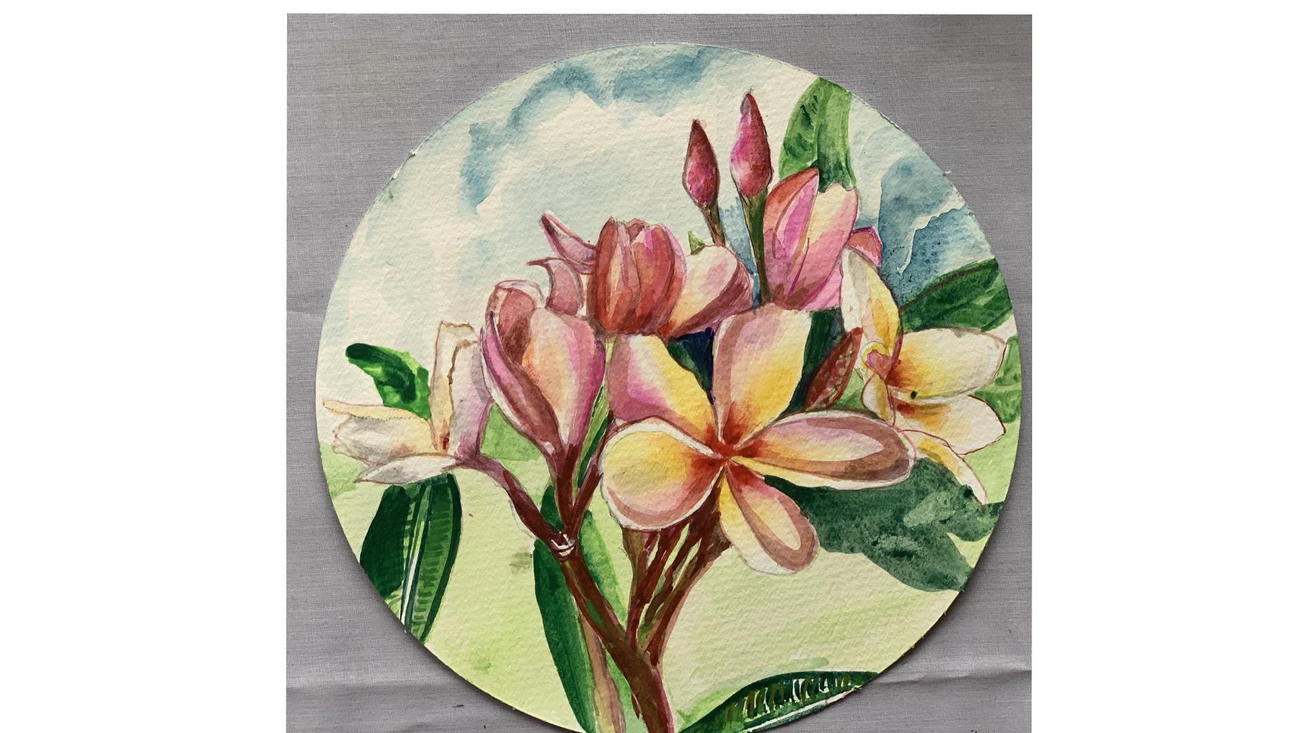
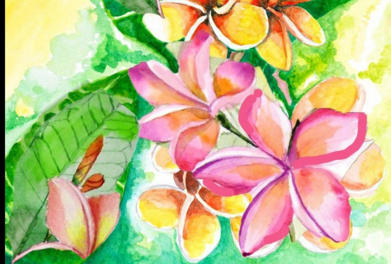
1. THE INTRODUCTION BBP: Hi everybody. I am Pavan could pool, and I am a watercolor artist. I had been painting with watercolors ever since I was a little girl. In 2018, I credited myself in art-based therapy and opened a small studio when I receive kids, mainly who come in for art-based therapies. In today's world, there is a lot of stress in families, in coping with schoolwork and ideal with kids who are having a tough time in family life, as well as in schools. Today I bring to you apart of my most beautiful country, Indonesia. I have lived in Indonesia for about 35 years and been to Bali probably 30 dimes. And each time it never feels to blow me away. Today, I will teach you a part of that beautiful Balinese culture. And that is these two media flies which are found everywhere, right from the hair accessories to prayer baskets. And even in hotels, bars there they're lending the beautiful aroma and beauty. The color I have picked is blushing, blooming area. The blue media comes in several colors. Let's just have a look at all the photographs before we actually settle down to be blue areas. One flower which is so versatile, it has so many colours. There is probably yellow. There is the blush, pink, which I am attempting to do because I find this most, especially the wellness chef pink and yellow in them. So I have taken a few images and I'm going to be painting with that. Let's go on to mixing the color palette for a little bit of yellow and blush pink. And let's go about setting up a ballot next. See you.
2. MATERIALS YOU WILL NEED BBP: Hi everyone. Welcome back. Let's take a look at the materials will be using today. I hope you'll have drawn out the sketch, the sketches there and the resources. We've put all our front-facing side facing flyers and put it into one paper. We have basically two pinks we'll be using. This is a sample image, is not the exact image, but it will guide us as to what are the colors we meet and how do we please the shadows. So basically you need your pink. I'm using opera hoping by Daniel Smith and magenta, bye monkey. Let's do a small swatch so that we know exactly what colors we have and what we need to make to get the shape we want. This is such a beautiful being. The author of bank by Daniel Smith. Let's get down to our magenta rubbish monkey. It is such a rise and a happy shade. And I love using this for a lot of my project. Let's start with some greens. We have Daniel Smith, permanent green, we have mink 11 green. You don't have to stick to these brands. But I'm making swatches so that you can get something close to this. This is a lemon green, which is nice. This is a shot off pains and using this is the permanent green by Daniel Smith. It's Bosch's down to really nice shade of green, which is great. And this is my Sap Green from Daniel Smith. It's really dark and washes down into a beautiful shape. For 4H that's chronicled on yellow from Winsor Newton. But you can use of course, any brand. I love this because of the light it gives it such a beautiful transparent yellow. Let's discuss about the brushes. Most important. I'm using a size eight EMOC crash and a silver brush which has a size four with a fine tip. So basically I managed between these and then the other graph, which probably you would need for the fine lines is 0.5. so now I would like you to just put out all your palate, all the colors in need and put it out. That's my pain and my yellows and dreads. And so I know this is my valid and this is what I have to use. And it just makes it easier to move between these colors as you go along. So do, do make a ballot because that is really important theorem refresh flies, which I picked from my garden this morning. Sort of bit of beauty and inspiration. So let's get started and see you in the next chapter. As we lay down our first wash Buh-bye.
3. SKETCHING THE ANATOMY BBP: Hi everybody. I have with me a whole range of yellow blush praying, right? Grammarians, science, and I'm going to be taking the first step of teaching you how to sketch these guys. If you notice this far has five petals and, and we're going to sketch it and tried to find a simple way of doing it. So you start with the center and create ES, which comes shot of this. And from here, you take another S, which GMS. And then you just need to fill in your fifth. So you have these five lines. Now as you can see, none of the letters are similar in bits. So probably that's how and as you can see, every petal has little overturned. And that's where on each side of the ventral recreate the folded bench. And now you see the white ones are a little more. There, got larger petals and they are more open this way. The yellow ones are somewhere in between. The white. Isn't that pretty? So I said is going to be larger, bashing pink. We keep a firm. Is let's try to do the side view. Side view is accepting. Presently. We come on to the bad. We don't have budgets, but this is how the bads come out. The button relatively easy to draw out. And just make sure you have the little ladder lie. But each little piece of in-between each ladder lay part, you have a different color to bring it out. You practice to leaves are also relatively simple. You have the front-facing threefold woken side flower and the buds. So practice a lot folks, because the more you get to know the anatomy of a flood, the easier it is to paint it later. I've practiced, practiced quite a bit. And I hope to see you in the next chapter where we start painting.
4. LAYER 1 BBP: Hi everybody. So let's get started on our thing, the brushes. I'm using Princeton and my syllable with number four and my Princeton number eight. And probably later for the finer details I've been going for my Princeton number four. Let's get started. So at first we just are going to take our very clean water, takes some clean, clean water nearby. So at first we bring to this side and we feel other brash pick up your clinic for Dawn yellow. The reason you cannot mix these two shades is because these you have to have two brushes. And I work with two brushes is because when you mix magenta and yellow, orangey color mixing, you'll bring out they pull the yellow back if I need to. We just need to put in our basic portions. And probably in a second, we go back and thus how we approach. Let's bring out the water. And the water is getting slightly. I think I need to wash my brush because you had the contrasting better. And then we do the same thing as much as you can because the why can bring out the first layer of a fanfare. We go on to this side, which has overturned the water as you can, and then you proceed in the same way. The pink. Happy mistakes happen when you're painting. Medium is unforgiving medium because if some mistakes you make just cannot. And that's how it goes. Nicea haven't drawn an upturn better for this one. So I'm just going to leave a little bit of white space and draw my things out. And now we go on to the chest. Yellow because and now we go on to our other FIFO doping. Meet on the water again. I'm going to be doing two paths at the same time. Because I don't think that's a good idea because I can see bleeding into the next spreads. I try to do that. Watch the magic of what is done is this will be a little jar coping edges to give it a darker shade. Probably the shadows we will be doing in the next. If there's too much water. Because it gives feeling on luminosity. Probably we have one more. But to go. That's the French Benton first. This seems to be claimed to be indifferent because these are just straight lines here. Drawing your centers. To make this better standout, petals and truncate this. I think. Now we need to do that. I'm going to because something can make some permanent green in it to make it a darker shade of pink. It's almost like k is try some crimson, Alizarin crimson. That makes stuff. That's the color which probably you're going to use for the stems as well. Amazing. Stem can make some green and let us give on the first second. Maybe this is it. So basically we have done. So can oscillate down our first believes is probably the most. Just mix it with a bit of the Dhaka. Thanks. You just have your basic first-year has put in a switch to two, probably have mixing in some on the screen. So we have done.
5. DEPTH & SHADOWS BBP: Hi everybody, welcome back. And in this second layer is where we start creating the magic. So we start with some pains and I'm makes my permanent roles in that. And a bit of my opera being also. So these sheets are going to be a little darker than the LEO one. You start with the debit, the shadow, the good part of the battle. And it's definitely darker. Here is where you can create your affects. Wash up brush, and with the Clean Water soften their age so that we don't have very hard agents. And make sure you do market this side. That the gold bars. And that's how you go by them to better creating that shadow, which is a part of the current age. Be careful not to paint the white bar, which is the page. We do that towards the end and soften the insides. Creating this, as you can see, there is soft shadow hits Dark Ages. Very harsh shadows will mean more direct light source. And that's reaches score through each petal. Creating the softness. It's really amazing what a difference it makes when you paint line flies and photographs. And because these flies are so sensitive to heat, once they fall, is just a matter of a few hours before they start wilting. So you have to work with photographs for plumes. And we go on to a three-fold OpenFlow. My retry to incorporate the shadows on the side. I'm lifting up some being from the center or should brush in clean water damage on your drag and lift the pain from vain wanted to keep the light highlight below. So that's just the same technique I apply for each failure. But this is my small but not the smallest one, which is just open them doing the size first. I didn't reach because of businesses so close together. Every Becky a slightly different kind of into the market it from each other. So you just go on and finish your venture by alternating the dark and light tones, which will give you the highlights, plays the highlights. And the Doppler tollens will be probably view it as a folded in two. Show the line between the two better. And we just need to be a bit careful about the edges, soften them, don't let them be too hot. And that's the one thing one has to remember. It's so easy to make those definite and harsh lines which do market 1-bit color from the other. But remember that the softer you are. Actually this whole two daughters, Julius, because we don't want to take too much time and that is why we go for each part of a flyer with darker colors. But you could also do with probably three or four layers. Here we're doing the stems. Okay. The stamp set is stock. She makes your pains with your occur up paying all your whatever red or pink color you're using to get a darker shade. Because the standards are a little darker shade. Try to stick as close as we can. Just darkening the centers with the visuals orange, duck init and then diffuse it and blended into the yellow. More depth than sort of look to your once you have blended into the yellows and we can just focus on getting the sides devolve from the address of the better by putting in a bit of a shadow. So your pains creating makes two with yellow sometimes and you can use just grey in certain. Completing my folder open. What do I have this sort of for definite line and we're going to soften it. Trying to cover the whole white letter, betrothal, white show, blending it with some clean water. Just go back and blend your colors. Just finishing up corners. Now we just need to go back over and over again to each Bogost, a flag to knife. I'm quoting inhibitor of yellow and blending it into the lines. In some cases, the same size needs to have that beautiful orange color to bring it out. And I go back and do it another layer of range. Make it really dark in the center. But do be careful to blend it nicely so that it looks like it's dark only in the center. So we go back to every part of the painting to make sure it's finished. And when you're done with your painting and you're fully satisfied with your flies may go on to the next chapter, which is painting your See you there.
6. LETS PAINT THE LEAVES : Hey everybody, welcome back. Let's get down to painting. The last spirit of painting which leaves. The leaves are actually really interesting to paint because it is a form of negative beam. We have painted the bees in a light line color in the first layer. And now all we gotta do is leave those light green as the winds. And we start filling in the darker shades of green. One stroke at a time. Go according to the direction in, two out. And really actually fun because it's a practice in line drying. And this really does give you a steady hand too. I like these leaves because they give you a lot of practice and drawing lines. Once we are done with all the leaves, we just go ahead and draw in the shadows. Numeral user tick leaves, which are actually supporting the conditions in which these plants have found Waldo subtropical plant. But these plants screwing the beaches OSU, where there's not much water. And the flowers actually blue. When it's dry season. Goes slowly towards the nice outline. Just strengthened. Now I'm going to enjoy some of the Balinese music, which is so befitting to this. See a Oh. Once we had done with drawing, now, leaves, just fidget with machines in my mind. And we make the shadows ofs falling on beliefs. Just give a little greenish danger to your green. So this is a bit of Sap Green mixed with beans cri, we just make the shadows. I hope you're enjoying this and I hope to see all your work on skin and see you.
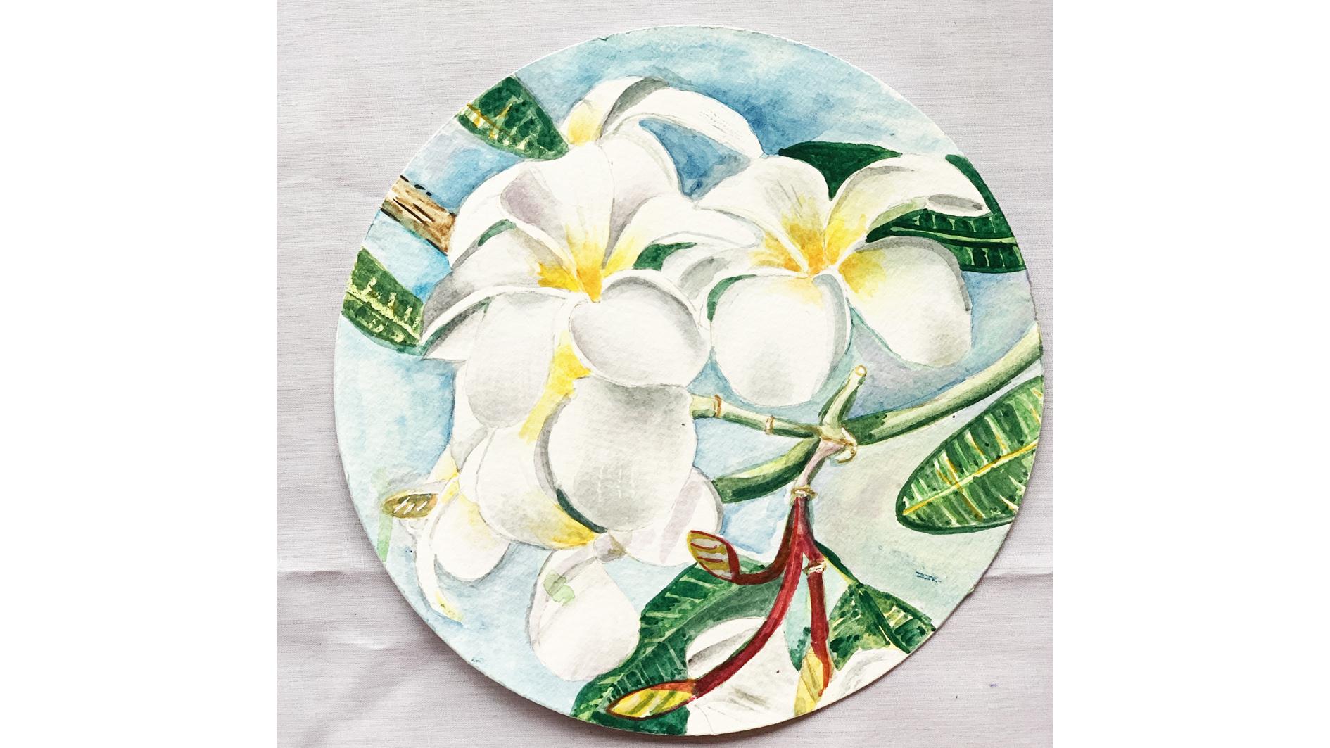
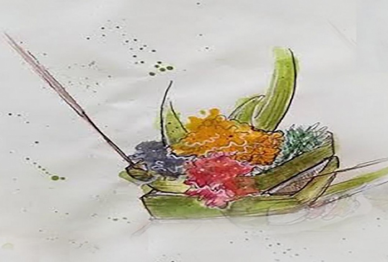
7. BONUS CLASS BBP: Hi everybody. Welcome back. So now I have a bonus class for you where I'm going to teach you the white plume area. I just went down to my garden and big, These are what beautiful slides there. They look so beautiful on the tree. So our gardens are going to be mainly clinic learning goal for the center and for the y. We have the shadow violet of Daniel Smith. I'm going to put a swatch of show you a swash of the green smart swatch of decree, the shadow islet Gala, which was a beautiful shade for the shadowy part. If you have drawn out your sketches in the reference photos. So I'm just laying down my water, my clear clear water, and then a very watery decree. So actually I really always say that the first layer of watercolor paintings and no Purina and it's the most fun because you don't have to think. But in white fast it's a little different. You need to be very short or very, you link down your shadows. Here I'm giving the top-left and it'll take a shadow on the go. Better by better. I have already put down my water. I'm laying down my shadows again. So as the shadows are more prevalent in the central, strong, we make them darker in the center, would be very careful not to have them coming or into your white portion of the legend, which is on the outside. So I'm just strengthening my shadows, laying down water again on the bottom and giving it a little shadow on the part which is supposed to be drooping down. Blended, putting your clean water and blend out the Cree, dropping some gray on the sides, be sure to have it. A very fluorine, No harsh lines. You putting my center, yellow Queenie codon gold in the center. As the paper's still slightly weighted scandal flowing out on a song. I don't need to do too much of blending. And we just slowly bring it out. As you complete each better. Put it in a Yellow Sun. Vegetables need more shadow, more Cree and sound lens. I'm going to drop in my shadows now. The paper is width so it's flowing out and blending. Nicely and easily. Now I did the last veteran where I'm giving in the shadow on the main page of the plateau. And then you just go and keep reworking as we did for the other little flowers. Just keep reworking the center, making it tended to Dhaka, I've added a bit of orange to this drill, make the yellow little, little more personality. And just bring it out and blend it up. Now, which would have been another chapter with the layer two, but I'm just putting it all together in this. Just Docker near shadows on a wedge B's, Be sure to blend to tout. Being. Now the stem is mixture of green and a bit of light red and mixing sudden browns and greens. And this, the part of the stem which is near the flower will obviously be a little dark clothes and just darkening that, bringing it out. Here we call the bots and the stems of the Sumaria flies are always darker in color and just bring, giving the centered a little more depth, admittedly, more orange there. And I'm just gonna go away every petal length gave all the shadows and little more definite lines, but I'm going to go back with a clean brush every time to soften the shadows. This is just a way of deepening the shadows, which will leave the highlights looking more in contrast and bring out the depth of the flow. So it's really about the more love you put into it. But at the same time, overlooking a flat is also a had been guilty of that several times. So you just have to be the perfect judge of Fe to stop where it is enough. And I go back, go back again and again to the part where I feel ready, it needs definition to show up, turned the forward and the better it is. Bringing the shadow to lie. And then we'd go to the leaf. So the leaves of the plume areas are bold, dark, dream solid. So you can have some fun with putting in some dark shades. Yeah, me, Central Wayne strong because the reigns of the leaf are quite pronounced. And this is the outline I'm going to put in my first layer of a light green, which is actually going to be the color of my wings. And the first layer of the leaf is all His light. And then I'm open and pull back with the dark old-timers and lead down in a watery Warsh. And this is, I am using the momentum carried by Daniel Smith. You can also use Sap Green. Just going to give it a nice edge around the flash to pop out the white petals. I'm going to demarcate what screen by doing an almost flat wash. And then I'm going to go back with the darker Sap Green and bring it out. So wife does surely actually do need nice foliage around it. So whenever you are making layout, your composition of white flies, always make sure that it has plenty of foliage around because that's what makes it pop out. Here you go. Just finish that dark green around the center. We have left in the initial, the first wash with cream, which was a light cream. And then I just go in and then put in my data sheets, complete the leaf with a darker shade of green. And then I go back for my final touches where I once again highlight my shadows, whether they feel that they need to be highlighted. Be very careful at this stage not to give it any outlines with harsh, harsh outline at all. Should we solved? What you do in this stage can really have lasting effects. And then I'm going to give a little bit of a shadow effect on the petals which are outside the green leaves. So high school back again and again with my Cree For my shadows. Making sure that I'm very satisfied with how my shadows and how am I better so looking. So I think that's a wrap with done now, I hope to see you in my next class with the valley Team, which is a prayer bus gauge with the Balinese flowers in it. It's something you find on every doorstep in Bali and truly beautiful. Hope to see you there.
 PAVAN KAPOOR, ArtBased Therapist.Watercolorist