Transcripts
1. Hello! Let's Get Introduced : Hi everybody, Welcome
to my next class. So in this class I'm
going to be teaching you a whole lot of
different projects. Or the other classes
are about one project. But I thought, let me include a few surprises and gifts
for you in this class. It's Christmas time after all. So I, as a student, used to take a whole lot
of different classes. I will go to teachers who are teaching different
genres of art. The beach was always watercolor, but I went to
teachers who taught still life, florals, landscapes. And I learned something
from every one of them, although my love is floaters. But I always like to do different things all
the time because you learn so much the strokes, the shadows, how you place the shadows or the
color of the shadows. And in still life, I think there is something different to do
and different to learn. I thought I would bring
that to my students. So different subject matters and learn something
from auto fit. So I have actually for the
longest time had a sketchbook. I've always had
somebody like that. It's a Monte Verde think we're developing
with that it sees It's about a 150 GSM, a 120, sorry, and
it's really good. I keep it next to me. I keep flipping through
my past works and study. Again what I was
studying at that time. So that's one
advice I would give all my students that keep sort of a rough
sketch book next to you, a diary where you can just paint without feeling the pressure
of having to perform. In this course, I would
advise you to draw out all your drawings
which are going to be making for this
project and later on, the first layer first. And when you come back to the second layer where you're
deepening the shadows, you can do that one
milliwatt after that. It just makes
everything go faster. And if you're in the
learning process and you're trying
to learn something, this is really very useful. If you are making a painting for someone or for
yourself, for your house. You would be very benefited from doing each painting
on a sword slowly. So let's get started. I'm going to start with the
Santa Verde in the Santa hat. Now what's interesting
about this is that I shot the both of them together. So I'm going to be
doing one layer in one and going to the other one while the first painting dries. So I would advise you to
do both of these together. And I've named it also the
Santa birdie and Santa hat. So you know that
it's one project, although you get
to painting back. So let's go and see you
in the next lesson. Okay.
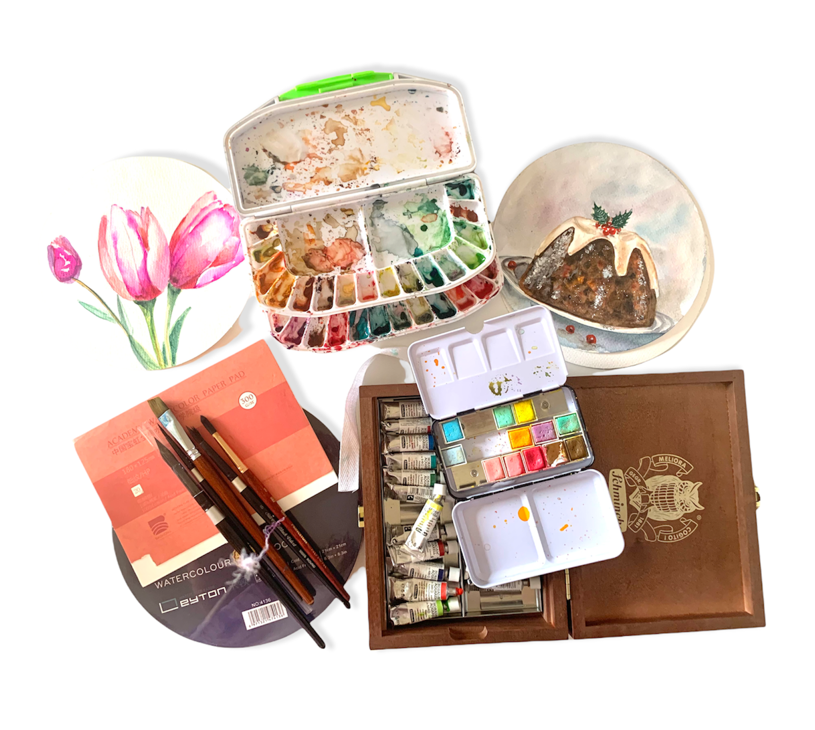
2. Materials Required for the Class: Hi everybody. Welcome back. So this is a little preview of all the materials you will need for your classes. Some clear water rag, tissue, one for washing your brush, and one to add water to your project. You clean your brushes on a rag or a tissue. And all your paints, whether tubes or pans, different sizes of brushes, a snack, very important. And we also need a whole lot of inspiration, which is probably what drives us to come here. And here I am with my shimming campaigns. This is a wooden box. It comes in a wooden box and it's just the most amazing set of things. So I use these with my Daniel Smith. These are my brushes, a whole variety of them, different thicknesses and my masking fluid along with the silicone tips to apply it. So just a little color, swatch, share. This is my orange. I loved this muted be Jewish or Quraysh orange shell, which I use for a lot of shadows. This is my lilac, which I use for shadows also in the shadows, the fascia and the green. These are all pop neon colors which are nice to have to brighten up your paintings. And then I'm putting in my veins, carry some of my grades. Daniel Smith's shadow violet. To give those deeper, darker, muted tones. That's my sap green. I just loved the screen. And I'm adding a bit of green in the middle. So this is my rough book. My happy place, where I've played. I need to sometimes get myself out of this book and start doing some serious painting. See you in the next lesson. So let's see some of them more serious work now, Florio's main me, and let's get down to work now. See you in the next lesson.
3. Start painting Santa Project : IG: @pavankapoor21art
Hi everyone. It's Christmas time. Let's get down to painting some Christmas Eve things. I am going to teach you. A little birdie wearing a Santa cap on some pine leaves and this wonderful Santa hat. Get your sketches done. And let's start. So both these projects will be done side-by-side. So just follow my cues. Let's start cleaning up my dirty palette. I'm going to be putting down the colors of the bird, which are very subtle. And the head is of course the best part, which is this lovely red colors. So let's start with the hat then. You need your big number 10 round brush. And another big brush to lay down loads and loads of water. So make sure your pencil marks are light. And take some clean water. I'm taking a minute to find some really clean water and leave down the base of water. Make sure you go around the cotton of the lower portion. So make it really zigzaggy because wherever you put your water, your paint is going to flow. So it's really important at this stage to lay down the water exactly where you want it. So there we go. Take time to even out your water. We don't want blotches. here we go. I'm going to fill up my brush with some wonderful red color. I'm laying it down, being careful to go around the cotton buds which is scruffy. So because I have laid down water gets pretty, they're being destroyed just there. This is actually a very easy project, so any beginner can do it. Just need to take care of a few tips and that I am giving you as we go along. So lay down the Red color nicely, let it flow. You don't have to have a flat red. That's the magic of watercolor. You need to bring into your painting If you're fairly new to watercolors. This what I have just done, pick up with a clean brush to be able to create that little highlight where the fault of material begins. Going back with my big round brush. I just love this Utrecht brush. I can't even pronounce that. It's an older brush which I just absolutely love.
4. Building layerings Santa Birdie & Cap : Hi, welcome back to the second part of our Christmas edition. Let's get down to painting our corners dog. I want you to have a look at the reference picture again and again and see where are the highlights which you just need to pick up with the tissue with a fine point. Roll the tissue around you, their finger and pick up those highlights. A clean brush. So your I am filling in the dark areas of the cab. The Santa hats are usually made out of this velvety kind of material which has these rich contrasts. And they love painting this, this is, I think, my fifth heart of the season. And it never fails to make me happy. Little darker tones around the bend of the cap and undersides. This is a really easy projects, so even beginners can do this. You can get this video to your nine-year-old and had them make something beautiful. So these dark sheet is slightly deep maroon and mixed in a bit of beans, green and red to make it a maroon or really dark maroon but watered down. And as you can see, I'm painting several layers on top. Want giving it to dry a bit. Going back to create some more shadows, keep squinting actual artwork. That's one of the tips I learned from my teacher. Keep looking at your, imagine painting exactly what you see as close as what you see. I am offering you the tips of how to go about painting your reference picture. And even I am looking at the reference pic and going as close as I can. And how to get that is what a teacher teaches you. In my other tutorials, which you will find on other platforms, you will be able to see this one important tip, which is how to approach. Now this is, let's switch on to the bird with my mop brush. I'm gonna put in water in the body first. And it has a very strict to the dorm. So I've mixed it up with some gray and some of this yellow, deep yellow. Undoing the same dawns on the feathers. Just a little more gray and a little more. The face of the bud is a little more orangey. And I'm going in with my lilac. I love that combination. And lilac. Having a look at my reference picture, I see I have the basic, the basic first layer down quite well. I'm dabbing up the body because it was a little darker than what I wanted. So this is the branch on which the bird is certainly going to give it a very light yellow because I want to build up the colors as I go along. Patience is key. So I think I have the basics in place. Let's do the capitalist though, that in the next class we couldn't do the green. Mixing my red again for gap, it's the same red as a Santa hat. You don't need to leave watered down for this big businesses, small area. We can some how the watercolor effect by playing with the tones on your brush. But I'm afraid if you put water down it will make it kinda messy. So just layer this dark, darker and after building your contracts, make sure you have the edges uneven for the cotton plant. And let's go on to our third lesson. I'll see you there where we bring magic into the final. You can not only of our classes. See you there. Have I.
5. Final Contrasts Santa Birdie & Cap : Hey everybody, Welcome back. So I've got started on this 11 green, light green mixed with yellow shade. Whether I'm drawing out the buying leaves. I'm going to, I'm still on my first layer of most of my stuff. I'm just darkening the face with another layer of orange and giving demarcation between the body and orange. So as you can see, I'm just going to link it up. The area around the eye and around let me zoom in. Create the shadows around the wing, under the wing, on the edge, on the breast of the bird, around the beak and the eye. And now let's create some more shadows on the line B ring. This is my silver brush, which is a number 6. It has such a fine point and it holds so much water, I can paint this project with just one brush. Let's go back to a center calf and see how that's doing. So now I'm doing the white cotton part. This is a technique which you might need to learn and practice before you get on to doing it for on the final project, lay down your water. And you need a clean tissue for this. So you lay down your water trying to keep a distance from the red because we don't want the red beating in to the blue will that will look really nice. But if you're a beginner, I would advise you to keep a little tiny, tiny bit of white between the red and the white bar, sampling down my lightest blue. It's a sky blue which are mixed in my palette. And I have put it around the edges at first, going back with a little darker shade now, to create those clouds and shadows which you see in gotten. You can even do this with a gray, take some Payne's gray mix a lot of water with it. And the thing to do with this kind of texture, which is snowy coordinate texture is to go slow. Light shades and then a little darker. Watch it, see if you're getting the contrast where you want it. Pick it up with the tissue like I am doing to give those cloudy effects. And this is actually how clouds are also painted in watercolor. I'm going back with darker blue. Again. I have it in my palette. So that's my messy, messy palette. And I go back with the darker blue. To bring in the contrasts. You can pause my video, you can stop it and take your time. And you can go back, re-watch it. And I think it's more or less ready now. We need to give it one more. Let's have a look at a bird first. Yet. In the final stages, I'm doing that. I have at the fine tip, Black, be sure to leave the white flecks and a few cover it. Don't worry, glucan go back with the unit ball of light. You enable our posca. Make it white. Glint of the eye. This is the downside or the b, which is also okay, let's do the branch now symbol giving it a few darker brown areas here. Try not to paint the whole branch one color. And with my greens, I am going to fill it up. So I have not used masking fluid and this because a lot of beginners do not have masking fluid. So if I had the area on the bird with masking fluid, made the pine needles with the masking fluid, it would have stood stock white against the stock. For that, It's okay if you can just leave that white and go back with the green. Flick of a brush for look nice too. So I am giving the whole branch a light green effect first. Trying to be careful and themes in the direction of the leaf of each needed. Because they're growing in all haphazard evictions, so tragic. Give it that sameness. Hello. Okay. Hello. So try to include a lot of colors of green, a bit of yellow into your fine needles. It gives that interests stating, Look, let's go back to a Santa hat and see how that's doing. The actually have almost done this. We just need to add a shadow at the base to give it that effect. I have not put in water because my brush is loaded with a watery blue. I'm willing to go around the edges now. I clean my brush with clear water and a dab on the tissue finished too much excess water. And clean out the edge. Shadows is not to leave the edge. So the one trick is to keep washing your brush, drying it, and picking up the edge. So there is a vanishing line. Too much water, dab it with a tissue or picked up with your dry brush. Darkening the base of the hat with a little bit of gray, Payne's gray. That is another wonderful shadow, violet color, which is from Daniel Smith. And that is the color which is actually for shadows. And I like to use that this is actually a shadow violet from Daniel Smith mixed with a bit of blue from shrinking. And I have my on coming into the view. But I think this is pretty much Dan and I'm adding just a light wash of water on thoughts and darkening some of those areas which I had already made dark in the last layer. You can see this contrast is what brings it to life. So it is actually in the last bit off your painting which you bring your painting to life and everything you've done before this works too with this finale. Hope to see you in my other tutorials. They buy.
6. Start of Colored Glass Shadows : IG: @pavankapoor21art
Let's begin. So if you have seen my introduction and you're here, it means you are ready to paint. So we start by placing our first color. Just follow me as I place first Wash using my Princeton number six, which has this amazing fine point. And carries so much water that I can probably paint the whole bottle in one go. So yeah, lay down the lightest of washes as we go along. I keep looking at my reference image to find the highlights and shadows and really strategize my moves in this first layer because I don't want to be putting down my paint at a place where the highlights need to be. We get started on the First bottle, which is a beautiful fuchsia shade. Here again, I'm leaving the whites where the highlights are supposed to be. Feel free to mix a bit of y yellow to get the pinkish, double tone And I'm going to be laying down a very light wash, trying to leave the white so you can follow me. Just be one step behind me. That's my lilac bottle. And I'm laying down the lightest of lilacs have the neck. And then I go into Fuscia shade at the bottom because this fuscia shares the shadow of the bottle on the right, falling on the bottom next to it. Painting glass is Really interesting because of this. You have shadows coming. It catches the light and reflections from everything around it. That's the green and making it really lie going into the shadows. Now, I just fast forward it a bit to get into the second layer. I've mixed a bit of sepia into my orange. And I am trying to get a darker contrast the neck of the bottle is really important. Give it the shade where you feel the contrast is. And I probably have not left too much white in this one. But what I do is I go into my Procreate after I finish my painting and give a few highlights, which I want to. So we have the artistic liberty to do that. This is the base, so you need to carve out the base with your shadows. The squarish base. Okay, giving a light wash and the shadow now. So the shadow will have a bit of the color from the bottom. And it's catching different hues and tones from around it. So the bottle and the shadow will be a little different in color, especially the bottom where you demarcate the bottom from the shadow. I suggest you watch my video and then you go back and paint it. The strategies need to be first watched and then get down to it. So as you paint too long, I hope you have the patience to stick with me. To the end. I'll see you in the next lesson where we build up the shadows of the other models. See you there.
7. Build Contrast Colored Glass Shadows : Welcome back. So here we are going to build up our first layer washes. So I have taken a bit of Payne's gray and try to fuse it into the oranges I have placed in the first wash to give the effect of dramatic effect of shadows. So another favorite, shadow color of mine and shadow violet, which I use almost in all my paintings. And I have kept that alongside me to see whether I need that for any of the other shadows because that has a lilac tinge to it and blurring the edges of the shadow. So the shadows are pretty crisp, but yet they have a little blurry. Look. The shading and the fusion of your oranges and agrees should be LacI because that is what the glass looks like to me in my reference picture. Let's go on to the next box. Shadow, which is the lemon green. I have a beautiful lemon cream from shrinking. So we have the shadow done that, the green it. And I'm doing the third quarter, which is my lilac, putting in quite a major part of my water because that's where the shadow is falling. So it's really interesting actually you have the shadow falling reflection, rather falling on the bottom and it's reflected in its shadows. Just totally mesmerizing, isn't it? I'm going to create it on top of the fascia bottle. So the shadows are pretty curious. The reflections are also pretty curious, but I will have to go back and load it a bit later. Just trying to catch the highlights and the shadows in this first layer because everything is really nice and vet right now. So once it is dry, I might get those hard edges. So trying to work as fast as I can, I've used the Daniel Smith shadow. Violet here, creates a beautiful lilac Kish and create shadow. Make your dramatic shadows in this. Because when it dries, it gets about 20 to 30 percent lighter of you now to the bottles. Hard edges. The shadows and contrast beautifully. Creating these darker contrasts are the most fun part of a painting for me. I just go through everything just to reach the end. Love bringing my painting to life. So here I'm using my Daniel Smith shadow, violet. Again, creating bold and dark and bold reflections in the shadow. When this dries, it's going to be about 20 percent lighter. So keep the darkness in some parts fit. Try to leave as much as the underlying color. Here. I am just getting back into my orange water to create a few contrasts in the neck while everything else dries nicely. Watercolors and unforgiving medium. It is. And especially when you're painting glass, it is the most unforgiving because one wrong contrast and you've lost the light. So thanks to procreate, I can go back now and create my contrasts. I don't use too much masking fluid. So now the green bottle has, she's amazing. Hard edges which I'm going to create with my sap green. Quite sure of where those lines go because of my pencil marking below that. So have your pencil markings just right. Not too visibility of the day to guide you. Creating a softer liquidity or was she look in the center? We go into the shadow now. So I don't want my shadow and my border to be the same color. So I'm going to be going back and creating a darker contrast there. Now for the lilac water leaves the blues and the reflection of the mortal is going to create a beautiful contrast between the lilac and the fascia. Creating a neck line on the bottom. Again, guided by my pencil strokes. Trying to paint exactly what I see. I think I'm going to say goodbye to you now as you finish this, let it dry and I'll see you in the next lesson where we bring this to life in the grand finale. See you guys.
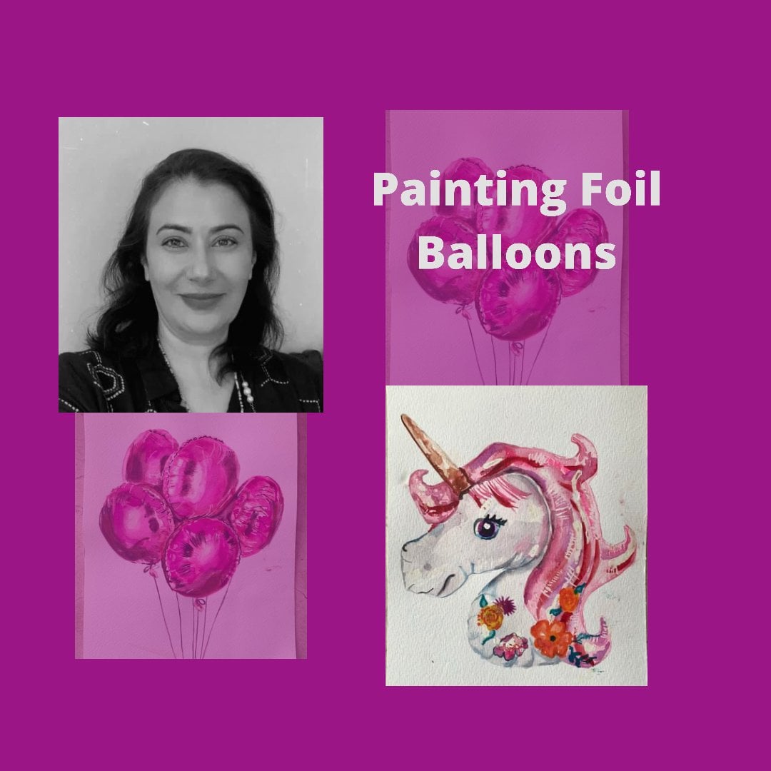
8. First Step for Foil Balloon One K : IG: @pavankapoor21art
Hi everybody for my golden foil balloons, the 1K balloon, am using a Princeton number 6, I'm using my black silver brush, which is no 8 My zero-point five. And this is my mop brush. So these are the four brushes are basically used to almost every project. Let's have a look at the colors now. So basically what I'm using as a base, my first layer is the quinacridone gold from Winston nd newton. And then, and 14 and a bit of the yellow, which is, it looks ochre. But when you put it down on paper with water, It's got a real soon here with this as my ocher from the selection. And I use the reduced set PM next to it by occurred to give this darker shade for the shadows of the balloon. And these are the several shades I have used. This is one of the darkest. I have also put in a bit of orange here and there to, to give some dramatic tones to the middle. Let's get going. So basically I have done a very light wash on my balloons of chronic adored goals. I've left some white spaces for the highlights as you can see. And let's get going on the number 1 first and start placing our shadows. Okay. Okay. So I've just given that dark tones on the corner to give it a darker tone on the sides so that it looks rounded. Filling in a few darker tones of the same color. And I'm cleaning out the corner here. So it's really important for you to keep having a look at your reference image to be able to feel where are your shadows and how to bring out those contrasts. So probably it's a good idea for you to have a look at what I'm doing. And then rewatch it again alongside your project as you paint along so that you do exactly. Do you know you're not doing it fresh from the first day? Time to mix my darker shades here. So I go back. I tried to follow the shadows exactly as I see them on my reference image. So foreign balloons is one thing which you have to paint from photographs because the reflections change with the light, with the time of the day with Whatever front of them. And if From a live setting, you're going to have a different reflection every time you look at it. So that is pretty hard. So it's really advisable to take photographs and paint from photographs. And here I am again trying to give it dark line on the outside along the edges of different things so that the center of Balloon and pops up and it looks round. Focusing on giving the darker contrasts now Hi. So it's really important to have those lines, which shows the metallic nature of the foil rudder. And I'm softening the lines with a clean wet brush. So at this point, am not sure whether I should leave it , or soften it. So I'm going to soften it and then come back later. Redo that again. So here I come back with my darker f tones. This is the fun part. I get to really put in my darkest contrasts and bring it to life, mixing a dark dark sepia, where my dark shadows lie. Making my contrast more dramatic and delicious. And here, Yeah, I go along the sides up the sides very carefully. These are broken lines. Try now to make a whole one street running line because that's not good, is that's not what I see. Those tiny little pleats which come on the edges of the balloons with a stitching basically Is they are are stuck together. Causes as sort of a pleat back and make some black now in my sepia to make it really dark. And this is where you should know less is more. So you have should be really careful with the where you are going in with the darks I think this is more or less done. In the next lesson we go on the K and more or less work the same way. And we hopefully get to create a shadow. And, and I'm going to be hanging these balloons with a red string. So that seems to be more or less than just leaving it to dry. I keep coming back and looking at my paintings with a squinted eye. And the time of the day when I really get my insights or early morning swear Leave my paintings at a place where I can see them at night and wake up in the morning and look at it and quickly jot down what I need to fix what I need. So I think this is Morris Dan. I'll see you in the next lesson where we will finish the K So this is my a sequel to my class on first foil balloon, which is the unicorn. I'm focusing on the highlights which you need to leave at how important highlights in every painting where this food floras all fall balloons. Just pointing out the importance of these contrasts. That's my project, I hope you have a great day and see you in the next lesson. Bye bye.
10. Colored Glass & Metal Filligri First Layer: Hi everybody, Welcome to my class on colored glass and metallic filigree. So here I am painting an Iranian filigree, metal and glass bottle. This is usually used for incense and perfumes. I'm using a sap green for my colored glass. So I hope you have a drawn-out and let's get going. So I'm going to be painting the green glass and then coming on later to paint the metal, which is the filigree work on top. As neatly as you can stay between the lines. I'm using a fine Chinese brush for this and also alternating with my Princeton number. So I'm filling in the green glass where as it seems to me in the end, you fill in the shadows that the filigree metalwork is. Posing on the opposite side of the glass. Suggests very patiently fill the green glass in. You can give it a shading of a lighter green, lemony green, sap green. If you choose to do a different color like a blue, that's even more magical. Pinks and blue glass are beautiful. You can see that in my previous lesson on colored glass shadows. And it just shows how amazing it looks when light passes through colored glass. And this project which I am teaching you is even one step, The Witches metal on class. Now this is very fine work. So even beginner, I mean, anyone will get a little daunted, but it's really easy once you have the detailed sketch down. So beginners, don't worry, don't get intimidated. It's quite doable task for you. Just keep following my cues as to where to put in what greens. I'm looking at my reference photograph and seeing whether I need to put in the darker sap green or the lighter green. This is not a usual watercolor painting where you leave the whites. The y's are all on the metallic. Here we go. Just being asked resize as I can. Let's listen to some nice music as we go along. This intricate work. So as you can see, the center is lime green because that's where the highlights, the lightest falling under glass. And the sides are davka. To give that round 3D look. As promise, amazing music is stemming up. Good. Hi. I'm getting started on the metal part of the painting. So keeping one eye on my reference image, I am trying to give the dark contrasts on the metallic mesh part of the filigree artwork and leaving the rest of it waived. So the contrast will be even greater. I was quite tempted to create a golden green effect, but the contrasts that greeter in the silver metallic work. So here you go. Just follow me as I lay down. The dark contrasts of the metallic part of the filling. Mitch, I hope it zoomed in enough for you to have a clear note. If you want to give this watch first before you actually fainted, I think that would be advisable. Maybe you can watch how I go about this and then watch it again while you're painting alongside. So basically, I'm darkening the contrast. And in the next lesson, we're going to bring this to a grand finale will be put in our darkest dark tones to bring out the contrast of the metal and the colored glass. So come on over to the next class and let's finish this beautiful piece of an Iranian glass and metal filigree bottle. See you there. Bye bye.
11. Final shadows Colored Glass & Metal Filligri : Hi again. For those who have come back here and our width me, get ready for more momentum and to go to the finish line with this most exciting project. Okay, let's get back to where we started a few minutes before we ended the last class, which is where we started the metallic part of our project. So putting in the dark contrasts and leaving the white, white to give the silver effect. I'm going to zoom in a bit, so that's okay. Hello. Good. Hello. Hi. Okay. Hello. Okay. Yes. Yeah. Okay. Okay. Hi. Hi. So keep painting the shadows between the colors of a little bit of courage, shade as well as shadow violet as sort of a gray from Daniel Smith. And this point is really important to keep your eye on the reference image and just paint exactly what you see, even if it doesn't make sense at the time. It all lines up, it all adds up in the end. The last thing which you need to do is paint a shadow onto the Walkie, which we see in the last image. Filling in the greens. But I missed out. I hope you enjoyed this project. See you. Bye bye. And I hope you completing all the projects in this whole lesson.
12. Initial Wash of Rujak Fruit Salad 1: Hi everybody, Welcome back to another exciting class in watercolors. This time the team is a beautiful looking as well as a yummy Tanguy Indonesian salad called a rude shock. So this is a mixture of several fruits, some sweet, some not so sweet. Pineapples, cucumbers, grapes, and some local Indonesian fruits covered in this absolutely smacking yummy tangy sauce, tamarind, peanuts and brown sugar. So I have my sketch out. Let's get going on painting this. Do have your sketches ready. You can watch this to see how I go about it and then paint along in your second time around so that you know exactly what you need to do. I'm just getting my palette ready. The reason I, this reference image was amazing lilac tones on the source. I have not really come across this shade of the peanut sauce and thought it was interesting. So I picked up this image and I'm going to be teaching you in this class how to bring about unique shadow effects. So let's start. I'm just giving the first very light wash. This is probably the easiest part of the whole beam thing, where you just demarcates the colors in every part of the painting. That's the papaya, although it's an orangey reddish color, the base is yellow. I start with the lightest and build up my shades. I have a few spots of masking fluid and some candle wax thrown in. But you didn't do without it. You can just leave those areas white. So that's my pineapple next to it, which is also light yellow tone. I like to sit back and looked at my reference image and try to figure out the root I will be taking. How I will go about my painting, what am I going to paint? And then the second step is getting mapped valid ready. I get all the important colors down like this. I have my greens and mixed up my greens are tested it on a piece of paper. I mixed up the color of the craves. The papaya. Just showing you the masking fluid. I'm using a Daniel Smith with the little bamboo stick this time usually I use my silicone tip. And I'm just reinforcing some of the areas where I'm sure I need a highlight. I'm going to let that dry before I come back. So you can even remove your masking fluid in the middle of your fainting and then paint over it so that the tones are lighter than the surrounding areas. Demarcating the area between the pineapple. It's important at this stage to know exactly what color goes way. Sometimes the drawings are incomplete and I just I'm lazy to do each line very carefully. And so it is at this stage when I go ahead and I draw out those lines with a light pen and make sure I know exactly what I'm painting. Let's listen to some amazing music while we wait too long. This is a beautiful damn Elon, modern Gamelan music. And it's an Indonesian instrument, which is actually a series of these low-lying metallic drums, which is a traditional music instrumental off Indonesia. I hope you enjoy it as you paint along. Its soothing, isn't it? So in this graph and, and, and Hi, class at the end. And then in and do that. Let's finish this and come back in the next lesson. Wavy, deeper, natural ones, and carry on with the painting. See you there.
13. Rujak Fruit Salad Build Up: Hi, I'm just getting the sample image show you. So basically I have
done in the first wash, in the last lesson, I'm just going to be going in
and working on the source. This image appealed
to me because I found the lilac sheen of the source to be quite interesting the
way the light fall on it. And I'm just, I'm just
building up the grapes, putting in a base of
ocher mixed with lemon. And now I go in with
my cadmium red. And I'm going to work
on a wet grid so that I get this
interesting mix of colors. So when I'm unsure of how
to go about something, I use several layers. Each layer of mine is light until I know that
this is what I want. And then that's when I get bolder and take
the darker sheets. So as I go through my grapes, I think that's what's
going to happen and I'm a little scared right now. I'm painting grapes
are for a long time, so I'm just going to be
giving a slightly darker. Secondly, mixing my
orange with cadmium red. I am going to pick up
some of the dark pigment if I find it's too dark and I'm not sure
if that's what I want. And that particular please. Okay. Doing the fault
creep now, too much water. That's why I just stepped
it up with a tissue. I used to keep
Q-tips with me and land up using so many of them. So now I just keep a
tissue, a cheaper option. So as you can see, and as I predicted, I'm getting a little
bolder because I'm quite sure of my colors at this point. Just giving you the DAU
phase at the bottom. Because as you can see in the sample image,
to sort of fill, light is washing all plateau and it's picked up beautifully whether creeps and the source. So the base is picking up
some of the excess pigment. It's always a sense of starting out with the first
layer and saying, okay, let's see
how it turns out. And then that utmost
feeling of panic when you are in the
middle layer and wondering if you're doing
the right thing or not. And then the last layer, probably where you're
putting your deepest stones. And you know that
this is the make or break part of the painting. I think this is going
quite well though. Seems to be okay. Then too much water, water fusing and bleeding
from one group to the other. Creating those
dark undertones at the bottom part of the tree
to make it look around. So your light source
and your shadows are so important in a round object. Oops, sorry. So in my palette, which you cannot
see because I need to focus in on the
work I'm doing. I have my reds and I've mixed a darker red and red and
dark red ultimately bit of orange to it. As you can see, I
have two brushes. I just alternate
between the two of them trying to leave my white
highlight in the center. Center. That's it. I'm going to wait for
this to dry and come back with my darker stones
to finish it off later. That's what happens in project
with a lot of elements. I like to take a break, go onto something
else, and come back. So that's the orange I
have mixed for my papaya. So doesn't have
that deep red color as it usually does. But I guess this is
the local Papaya. The California ones have those colors which are just
so delicious to paint. So since I am going to be as close as I can to
the sample image, I'm going to be, these biases
lie right on the inch. It's a really interesting
proved to be him to have this read in your
hand, the screen outside. When you slice vertically, you get all those
wonderful colors. The green of the
outside, that small, tiny slim line of pale yellow and then starts flush of orange and
red of the papaya. And in the center you
have these black, luminous glutinous seeds. It's such a wonderful
fruit to pay it actually. Trying to create the
borders to stand out quite didn't mean
to make it so dark. Just make sure you have
clean water so that you can keep picking up the D pigments which get flown here and
there by accident. And that's the bottom
part of the piece. Quickly switched over to
a light shade of three. Because you have these
little banana leaves popping up the clean the
food on top of the project, which I haven't yet painted
in the first layer. So I'm just taking a moment
to the market, that queen. That's the thing with me. I always tell myself I need
to have a perfect drawing, but that never happens. I always leave some
part of the drawing and then when I'm
painting, I'm confused. So I have learned the hard way to first have a perfect drawing. So I'm going to see
you in the next lesson to complete this project. Buh-bye.
14. Rujak Fruit Salad 3: Hi, welcome back. So at this point in our video, we're doing the green banana leaves. As I mentioned in the last lesson, we attempt these leaves with strokes in the vertical direction. And I've put down a base. So the first layer will be a base of the lightest shades of green, lemon green, and a light wash of sap green. And then we go over it on top with darker shades of sap green, olive green mixed with your lemon tree. And just playing with the various hues in every one of those little strips gives it this coaches color. Be sure to leave that little white strip between each one of these green aspects of the leaf. So the banana leaf, as you can see, is made of these long vertical little green strips with a bone which is the hard part which falls it over. And it just so easy to make it tear up. And here we go. To finish the last bit here. Going in doubt because I feel this area lies and the part on the right which is folded over, so there should be a sort of a dark shadow. And that area is dark because it's lying under the fruit, the pineapple fruit. And I've drawn a very thin fine line just below the edge of the banana Lee because it does have that bone that when the edge just cleaning that out. Take your time to figure out very exactly one the next vertical line to be. And start sharing it in a couple of shades of green, leaving that white line in the middle is not. Why? Because we did painted green earlier. So you can say this is a form of negative painting. Put a lighter color down and then you paint around it with the darker color is called negative painting. I am actually coming up with the class and negative painting. Hopefully, once this is done in the month of January, I will release that class. I'm still looking for interesting yet easy forms to teach. There I go with. So you see how it's important to feed in the direction of the leaf? You can see that ballot I just got off my palette again. So you can have a look at the nice MES, which is created by different tellers are creating. I even mix a bit of blue circle in blue. Sometimes to give the green are different. Shadowy effect. So we just go on and vertical line up and down. This is quite a meditative part where I know I just have my basic colors filled in and I just need to give it the long strokes with these long strongly affects mixing a little darker shade here because this is the part of the banana leaf which comes over rows of a You might want to go into it now. Two times magnifier to be able to see it more clearly, that it's still wet. So when I'm putting down my data, it's diffusing away nicely in a vessel. Reason why I love these silver precious, because they just give you this soft feel Azure painting. The call so much water. And the tip is beautiful. The tip is so sharp and fine and it's a resident brush. I can leave it full of paint and wash it the next morning and it just bounces right back. So filling in my greens under the dynamic strength to make those really dark so that it looks like the shadow. I'm going to be I wish I could turn my workaround, which I have taped it for the recording process. Agile, the same with the leaf on the left part. Lay down a base. As you can see, I've mixed my clinic for dog and this is what I use for my cucumbers. Cucumbers are sliced in a very interesting. They give it a bit for the sign on the cucumbers by slicing this came in. I mean, that's what I'm painting right now is the dark part of the cucumber skin. Here are finally found a way to move the whole thing around. So this is the dark part of the cucumber. The skin dry then where do use the visuals? In the corners of the skin, where the skin meets the flesh of to keep government or later. I'm just just fun to go out of the normal routine and just do something different and not exactly what you see. Although I do try, I don't strive to be as close as the subject to keep it as similar because watercolors don't bring out the magic. But sometimes it's just fun. My site. So the cucumber and the green leaves are pretty similar. But be careful try to have a different hue of green just where the cucumber ends. And probably you could make the banana leaf and Italy lemony UDL. And the cucumber is a deep sap green. Slipping pretty good. But I think my pineapples need mobile. They need to be lifted out there just looking flat. The papaya needs a shadow. That's doing quite flat. 2. Let's finish this in the next lesson. See you there. Bye, bye.
15. Final Layering: Rujak Fruit Salad 4: Hi. I'm so happy to see you here because I know that you have been with me all along and are ready to finish this painting and bring it to life in this lesson. So we more or less, we know what we have and where we wanted this session is to increase your highlights. And that's what I'm doing with my phosphor white pen. Going to beaches, bringing out those highlights a little bit more. So the span is actually not really white as such. It has gone up, tone down was so much usage and unhappy with the fact that white, it lets off as not totally white. So I'm going to go into my grapes and document the exchangers and bring up the highlights with a center to give that child feel. Okay. So be sure to increase the clock fast. Off the banana leaf behind are all the foods fish live below the grapes and add in a shadow. We shouldn't make them pop out. It's a sub-cooled music. I hope you enjoyed the music as much as your enjoyed painting along with me, rubbing off my masking fluid. Now at this stage, you can rub it off with your fingers. You can use an eraser. I prefer to use an eraser because my fingers are usually all of these dirty. You and I and I don't want to get that color down on my paper. This yes. Hi. And so forth. Hi. Hi. Yes. Okay. Hi. So we are coming to the completion of this. Just go on with your shadows, increasing the Godfather still you are truly happy. I always would mapping things up near my bedside, but I can see them first thing in the morning. And I know immediately what I need to correct. And this goes on for a few mornings before I'm completely satisfied. I hope you enjoyed this project. I'll see you in the next lesson, which is adored lead new exciting project due by at that point.
16. Recapping The Rujak Fruit Salad: Okay.
17. Ketupat Rice Parcel 1: Hi everybody. Let's get started on the lab. This is something which has different shades of green in it. So I have chosen sap green by Daniel Smith, lemon green by Winsor Newton. I have my quinacridone gold by Winsor Newton again and my shadow I led by Daniel Smith. So this is box created out of banana leaves. And it is woven through in such a way that is encloses this bowl of rice which went steamed, is a wonderful accompaniment to various tissues. This is a festival fault and is usually made an eaten during the holy Lubanga. As soon as possible. Just an assignment due to decide who to listen to see. So let's get started. I hope you all have your sketches out. So today I'm painting an actual sunlight sitting by my window and having this wonderful stream of sunlight coming through. I am getting my colors ready. I hope you are too. You could have a watch watch me painting and then probably go back and paint along just so you know how it goes. Just getting my stuff ready, my rags, my tissue paper to dab my brush on, my clean water. And the color palette, of course. The other thing I keep next to me is always a cup of hot tea or hot coffee. But invariably the brush goes and depth itself. Yes, you heard it correctly, dips itself until my geography. Does that happen to you too? So now I've started putting it on another table faraway or drinking. And before I can do that, mistake again and again. It's funny how it happens every time I rise. Again. Going through the pains. The queens, the sap green, lemon green, my chronic drawn yellows. For those of you who want to see my pins close up, this is the Schumann k. This is my 11th green. That's the deeper greener have, which is very much like my Daniel Smith sap green, my clinic drawn gold, shadow, violet, the most delicious color I have used so far. And this is when go green. And this one doesn't look good. To them. Maybe they could simply start with the palest of greens. Be sure you know what shaved it goes in replicas. All the boxes are right next to each other. So if each box is often a different color, you will get the correct way to do this. But if you're going to be painting all the walks of the same color is going to land up as one big green blob. So be careful to lay down gesture very lightest of those in your first layer. Some city leaders, as you enter the data into the city, he gave me a vigilante. We're going to cheer. He learned could choose Jesus. Jesus. Jesus. Jesus. International Union and babies tend to Melies. They weren't eligible. Images are you doing to the learn some new keto could they be? If you read the entire night that I suspect you all know as a board meeting and working me this much I love you. We didn't make any sense. And why did they listen to so just give me radians per second. That is yes. Yes. He saved. And make it easier to see. The variegated, the numerator is a root of a normal life. They wouldn't really getting good luck in. There. We go. I think is symptomatic doesn't make any difference. I'm adding a little darker green here. Beginning the demarcation of each strip of leaf. I'm going to be building on this in the next lesson. So those of you painting along with me, stay with me for an absolutely stunning effect. Patience is key. So I hope you all have the patients to paint with me slowly, carefully for their final amazing effect. Bye, see you in the next lesson. This is just showing that you're going to see today is first to do so diseases. This is the ability to send me them.
18. Strengthening Shadows Ketupat Rice Parcel 2: Hi everybody, Welcome again. Let's paint the total path. So just revisiting some of yours in the last less than a dollar valid. Is that screen Nevin clean, then you couldn't go shadow violet. So we've take up where we left in the last lesson. The marketing, every blocks in a different color. If you are confused, I would suggest just do a very light wash of what you think should go into that pool. Frankly, I am also a bit confusing now. So I'm just going to be trying to do a very light force and go back again events from Jack my image, look at my reference book and decide what goes where. Home. Sorry, just picked whatever it is. Surface. Darker, my colors. A bit of yellow. To demarcate one box from the advert. Give this stock yellowing between two. Agree that the dawn board is actually an interesting pattern, doesn't it keeps its luminosity. And when you mix it with, say you're mixing it to a thing or an orange against really blend into the other fellow is it keeps, I really miss base. So actually slot using this balance is carryon painting our boxes one-by-one, making sure each boxes, the occupants of that shape. Welcome back. I'm just going to close rock with the crowd and let's at least under review and made it home. What it does. Good. That's not a bad thing. Construct can. Hi. Hello, which shows the brown leaves which had been exposed to sun and started rotting. Are perhaps they're exposed to the heat of the steamer and I started browning. So this is a leaky brown. I don't do that on all the folds of the leaf or all the boxes. Just a few. Good. Great. Just a little. As a communication issue. But what, sorry, just retrieve whatever is listed here on the rows. Hello. In fact, giving the but the, but the sensor data science projects as Microsoft. Each of you, I hope to see your projects in my catalog. I hope to see overviews. You question me, send me any questions you have to get back to your eyes. Thank you.
19. Final Contrasts Ketupat Rice Parcel 3 : Hi everyone. Let's get the fancy use of the gut tube. But dang with. So I hope you have managed to achieve the effect of each box having a differentiated. I hope you enjoyed this project and I look forward to seeing you in the other projects in this class. I have included more than six or seven projects which are all of different genres. To give you an idea of what watercolor can do in different subject matters. As See you soon. Bye. Okay. At home. Wow. Sorry, just picked whatever it is. Squared. Thank you. All right. Hello.
 PAVAN KAPOOR, ArtBased Therapist.Watercolorist