Transcripts
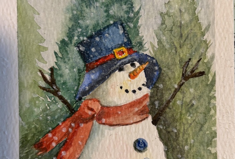
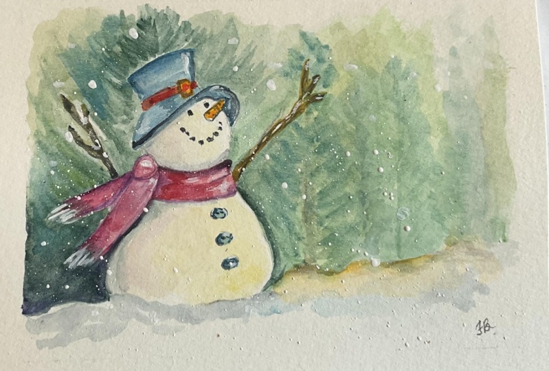
1. Watercolor Snowman Landscape: Hi, I'm Lindsay. I'm a self taught watercolor
and quash artist. A motor four children, a dog, and like a big
kid at Christmas time, I couldn't resist making
this class all about how to paint snowman
in watercolor. You're going to learn
some exciting techniques in this class
including wet on wet, blending colors,
softening edges, and adding blooms for texture. You'll also learn how
to draw the snowman, but don't worry if you're not
confident with drawing him. I've provided a
free line drawing, but you can print out and trace. I'll show you how to transfer the drawing onto your
watercolor paper as well. The first lesson, I'll
show you how to paint some distant trees using
a very simple technique. Of course, they will be
big and thick fir trees for a real Christmasy look. I'm painting these
on a wet backgrounds to make them look fuzzy. And out of focus, they look
like they're in the distance. I want the focus to be on the snowman, and that's
why I've done this. Next I'll show you step by
step how to paint the snowman. I break this down into bite sized lessons that
you can easily follow. Along with each of
these lessons have full demonstrations
and fully voiced over explanations of
what I'm doing as well. You'll learn how to
add beautiful, soft, bright colors to
add luminosity to the snowman and really
make him stand out. This will make him look
like he's got the sun shining down on him
for that beautiful, cold and frosty feel. Those cold but sunny
days where the air is fresh are my
absolute favorite. We will also paint the
snowman's features, such as his eyes, his carrot nose, and coal mouth. And add some beautiful, soft, but bright colors to his face to add lots of luminosity
to his face as well. My favorite part
of this painting was when I painted the hat, I used a light wash
of blue to start, and then I added some
dark paint on top. The dark paint I was using
was a granulating paint. It allowed part of
the blue underlayer to show through the granulation. And this was a lovely surprise. I really wasn't expecting
to get such lovely texture. Don't forget the snowman's
scarf and button. You can, of course, experiment with different
colors and styles. I'll give you some ideas of
colors and patterns that you can try for changing
up the snowman's look. We'll do that at the
end of this class. In the resources area, I've provided a
line drawing that you can print out and
you can trace that, and then you can transfer that onto your watercolor paper. Let's get stuck straight
into the first class, where I'll go over the
colors that are used, some color mixing
and color theory. And also I'll show you the art supplies that
are used as well.
2. The Colours and Supplies: I'll go over the colors and the supplies that I
used in this tutorial, but you just use
what you've got. So I used a range of
Windsor and Newton, and Daniel Smith tube colors. I used a lovely, cool yellow, and this was Windsor and Newton. Windsor lemon, but you
could use lemon yellow. And I also use a
Rinacrodone rose, and that was a
Daniel Smith color. You can mix those
two colors together to get a lovely
bright orange color. Then I use Thalo blue. And I mixed this with the Winsor lemon as well to get some lovely bright greens. I didn't use this color mix, but I wanted to show
you that you can mix the pink and
the blue together to get a lovely violet if you wanted to use that
for the shadow color. And then I use the thalo
blue and the lemon yellow in a stronger form
to get a darker green. So if you use more pigment, you'll get a darker color. The darker color I'm using is a granulating color
by Daniel Smith, and this is called Luna Violet. And I'm just showing
you that it's a really lovely color to
mix with other colors, and it's great for shadows. I mixed the lunar violet
into the yellow to get some lovely dark
colors Like browns, dark blues, dark greens. I added the thalo
blue to that color to get a lovely dark gray color. I also added a little bit
of pink to that color, and that helped to
neutralize that color. It just shows that you
only need a few colors. You don't need lots of colors. You can just grab a few colors and then mix them together. I also used a bit of my
handsome yellow, deep. And that's a Daniel Smith color. This is a more warm yellow. I mix that with
the inacodone pink to get a lovely orange
for the carrot nose. It also helps to have
a more warm yellow. So I could mix the thalo blue in with that and get
different greens. Because a fresh yellow or a cool yellow will always produce a different green
than a warm yellow. You can see that the warm
yellow produced more of a dull or natural looking green. And that's exactly
what I wanted. Here, I'm showing
you how you can add varying amounts of yellow to your greens to
make them lighter. And you can also add the
complimentary color to green, which is pink, to
dull that green down. This helps to neutralize the green to make it
look more natural. Some fresh made or
ready made greens from a tube can be quite natural
looking and a bit too bright. Some of the greens that are used in this painting
are really bright, and that's because I just wanted the brightness of some greens. But I also used some pink in the green to make
it darker as well. The paint brushes that
I used in this tutorial are a variety of silver
black velvet brushes. I've got a size 12, a size ten, a smaller size six, and then I've got my
really tiny size two, and I'll be using that
for the smallest details. You'll also see me
wearing a glove, and that's just so that when I rest my hand on my painting, I don't produce oil
on my painting. And that's because it can
affect your paintings. I'm using a range of palettes. These are stackable
ceramic palettes and a large palette that I usually use for most
of my paintings. Some old rags or a paper towel. I do normally use old
flannels and then I've got some jars of clean water
and I do like to use three. I've got some pencils
for sketching, so I got my caron dash, non photo blue pencil. And I did my original
sketch in this, but then changed it up a little bit later
on as you'll see, because you couldn't
see it on camera, and I'm using a Stadler
Mars plastic eraser. I used my size 1 " oval
wash brush and that was to apply colors to the background and
also some clean water. So in the first lesson,
let's paint the trees.
3. Drawing The Snowman: Originally for this tutorial, I did use a non
photo blue pencil. So this was my little
sketching pencil that I love and I highly recommend
this if you're after a sketching pencil
that looks light, that you can cover
with water color but also erases really easily. And this is a card and it's called a non
photo blue pencil. But the reason why
I'm re sketching this is because when
I went to edit it, you couldn't see my line
drawing on the camera. Now what I've done
is I've traced over my painting
with some vellum. And then I'll show
you then how you can transfer your drawing onto
your watercolor paper. So first of all, I'm going to resketch this for you
as well so you can see exactly how to sketch the snowman if you
haven't got a printer. I'll show you first how you
can transfer your print out. So what you want to
do is flip it over. So flip it over on
the opposite side. This of course is through, but yours isn't going
to be as through as mine because I'm using a
through paper at the moment. What you want to do
is get a pencil. So I take a soft lead pencil. This one's a bit too hard, so I'm going to
take a softer lead. So this one is a two B, and what you want to do is just hold your pencil on its side like this so that you can scribble over the
back of your drawer. In of course you can
see exactly what I'm doing here because my
vellum is see through. All I'm doing is scribble in
over the back of my drawer in put in enough graphite down onto the drawing so
that when I flip it over, it's going to transfer. You don't want to,
you don't need to cover the whole
of your paper. Just cover over the parts
where the drawing is. Where you're going
to put pencil. I've put some dashed lines here, and that is to represent
where the shadows go. If you don't want to draw in the shadows with your pencil
first, you don't have to. That's why I did
the dotted lines. The solid outlines
are the solid lines. If you ever think that
this is cheating, by the way, it's definitely not. Not everybody is a born drawer. I've only become more confidence as I've started making
these tutorials. So I've started drawing more. But when I was learning how
to paint with watercolor, I was following a lot of Pat, a lot of Skillshare
classes and a lot of Youtube classes on
Patrion and Skillshare. It's good because you've got these principle line
drawings which I loved. And it helped me massively because I wasn't worried
about the drawing process. I could just print
it off and trace it and then just
focus on learning the water color rather
than learning how to draw something which is amazing. So if you want to learn
with water color, don't worry what people say. This is definitely not cheating. In this tutorial,
you'll see that I've placed a snowman
over to the left. There's all this space
here for some trees. And the reason why
I've done that is because I just really
love that composition. I think it's really
nice to have the light coming from this area here. It's shining down. It looks like he's looking up at the sun, which I really love. All you need to do now
is take a sharp pencil. I'm using my mechanical pencil. This is a mechanical
rotting Tiki and I got this from Amazon. What I'm doing is I'm just
tracing over my lines. That's just going to help to transfer your drawing
onto your paper. Then you'll notice that I'm
holding the paper flat. And I'm holding the paper
flat close to where I'm drawing my pencil just broke. His pencil hasn't broke the
whole time I've had it. But for some reason he
wants to break today. All I'm doing is just moving
my fingers around and you'll see me holding the paper flat to where my pencil is going. That's just because
I want that part of the paper to
stay nice and flat. Then you'll go over
all your pencil marks. When you lift this up,
you'll see that it's transferred your drawing
onto your watercolor paper. Try not to press too hard
with your pencil because you don't want to add any
grooves to the paper. If you do add grooves
to the paper, your watercolor is just
going to seep into those grooves and you're
going to get dark lines. Try to press a
little bit softer. I do have a medium pressure
when I use my pencil. Okay, I've transferred
my drawer in now, but I've made this nice and
so it doesn't confuse you. And the reason why I transferred
my drawer in first is I want this to be drawn
exactly how I painted it. So I'm going to start off
with a snowman's head. I'm drawing on some
drawing paper here, so I'm not drawing straight
onto my watercolor paper. And the reason for that is
because I don't want to do lots of raising on
my watercolor paper. I'd like to draw on
my cartridge paper or my printer paper first. And then I'll transfer my finished drawing onto
my watercolor paper. So to draw a snowman, all you want to do
is start off with. Mice, mice round head, then pop a body on him. It all depends on if you want
to put a long body on him, or short body or
more rounded body. Here, I've got it a bit
more narrow at the top and it's wider at the bottom and it's not finished either, it's not a complete circle. Then we're going
to pop in a hat. The hat I'm going to
draw over his head, this is in this
part here that bit. That's an accident. Then we're going to draw the little rim. And the rim is going
to come around like this because it's going
to be behind him. Going to draw the
rest of the hat. So we're going to
give him a top hat, but you can experiment with the different hats that
you give your snowman. Might put a little buckle in a top hat and then
we'll do his face. So I'm going to give
him two coal eyes, a nice carty nose
sticking out at the side. You can experiment with the
different facial features, the positioning types
of facial features, like I'm giving him a cold mouth at the moment or a
little stone mouth. But you don't have to do that. You could just give
him a regular smile. Then I'm going to
put on a scarf. The way that I like to
draw a scarf is I just put a thing like that, like a little curve, and then curve it up over
his face a little bit. Another curve. It's like a long rectangle with
curves on the edges. Then you curve the end. Long sausages on the ends like
this might curve the end. Then another long sausage
coming out at the side. Give him some tassels. Might have these tassels
flying up in the wind. Then you can give your
scarf a bit more shape if you want to like a knot like
I have done in the tutorial, he's going to have a knot there. Then I might make this bit a bit more shaped at the front. You can take your eraser now and erase the
parts you don't like. I'm going to parts of
his face and his head, bits of the scarf
you don't like. But can you see how by
using some simple shapes, how you can just get
the relative shape of the snowman and his clothing? Get rid of this bit just
so it doesn't confuse you. Confuses me, Margin. And it confuses you as well. I'm going to take this part
of the nose out, there we go. And then we'll draw his
body in a bit more. You could give him
a bit of shape. Actually draw this
part of the body. Coming down from there, I'm raise this part of his body, draw back in his tassels and then we're going to
give him some buttons. Circular buttons, Buttons are really easy to draw or paint. Then two half circle things, or two little curved lines and two dots circle
two curved lines. And two dots circle two
curved lines and two dots. Then we're going to draw
in the shadow to help us, you don't have to
draw the shadow. You could just do what I did and just paint the
shadow in afterwards. Then with the arms, I decided to draw these curved stick arms. They're a bit twisted, you'll see in my painting. I decided to curve
them and twist them. You could just draw regular
stick arms like this. If we've got the snow man there, I could just draw some
regular stick arms like that, another
one coming off. It's really easy to
draw stick arms. Then with this arm,
I'm going to draw a little bit at
the bottom there. It looks like it's
sticking in his body. This one as well is
going to be twisted. Then he's got three
little sticks sticking out at the end. Like I said, you could just do your regular normal stick arms. There we go, there's
a snowman finished. What I like to do as
well is just give myself some guidelines to where
the snow is going to go. I like the snowman to be
sitting in some snow, so I'm just going to
put some curved mounds of snow and then one
behind him as well. You can play around with the
snow as much as you like.
4. The Background: We're going to paint the
background now and I'm going to be painting some lovely
wet on wet fir trees. I'm going to start off with
some lovely bright greens. I'm using my Windsor lemon
mixed with the thalo blue. Then I'll also add a
tiny amount of pink and that's going to
neutralize that green. Those two colors, like I said earlier, are
complimentary colors. It helps to neutralize
those greens. Now, of course, you don't
have to do this if you want some really bright and
natural looking greens, don't put the pink in. But I like to do
this sometimes here I am just adding a bit more blue to freshen up that green. So I'm just wet in
the background with some clean water I'll
paint over the arm, but I am avoiding the snowman, including his hat and
his scarf as well. I'm carefully using my
pointed oval wash brush, using some clean water, and then I'm going
to take the green, so this is the lighter screen. And I'm just going to start painting the bottom of the tree. This is being painted
wet onto wet. So you're going to
get some lovely, fuzzy and blurred edges. Try not to have too much
water in your brush or too much watery paint because you don't want
this to spread too far. I was just dabbing
my paint brush onto a cloth so that would take
off a lot of the moisture. It is wet my brush but
it's not soaking wet. And you'll see I'm just
painting around the stick arm. You don't have to do that, but I just wanted it to
show up on camera. So if you wanted to paint over
a stick arm, that's fine. I'm using long and
fast strokes for this, so I'm sort of
tapering off the ends. So I'm lifting up my brush at the end so you get
a finer point. And then I'm just
bringing the tree up nice and tall and it's going to be thinner
at the top and then wide and bushy
at the bottom. So the further down you go, it's going to get wider
and wider that tree. I'm just carefully painting
around the snowman here. So we'll just adding
a little part of the tree just
around the snowman. And now I've picked
up the darker paint. So this has just got
a little bit more of the blue mixed into it to
make it naturally darker. I'm going to paint that
around the body of the snowman because I want quite dark colors
next to the snowman. Because the contrast
of the white and the dark green is going to help to bring out the
white of the snowman. So that's why I'm painting
the darker tree next to him. It always helps to paint a dark color next
to a white subject, and that's going to help that white subject really pop out. You can see that I painted carefully around the stick arm, and that's because I
wanted you to see it. But like I said,
if you wanted to paint around that
oh, for that, sorry. You can just go
ahead and do that. I did find that when I was
painting the branches, it left this little sort
of like a little circle of paint on the outside where
I was lifting off my brush. So I was just going
from the outside of the tree inwards and that
helped to rectify that problem. Now I've got darker green. So this has just
got some more of the paint and it's got
a bit more blue in it. And I just adding a few
little marks here and there. This is still being
painted wet into wet. I just wanted some
darker branches. This color that I'm
using at the moment has got a bit more of the
pink mixed into it. So that's why it looks
a bit more brown. If you don't want
it to look brown, don't mix so much pink into it. But I really loved the
effect that this gave. You could also mix
in the gray as well. So if you wanted to add a
little bit of the gray, whatever gray you're using, then you could go
ahead and do that. And you'll notice that I did add a little bit more of that, sort of pinkish gray next
to the snowman as well. To make it darker, use
varying colors now. So drop different colors in. Add a bit more blue
to your green. Add a little bit more
yellow to your green. And just practice with
dropping in different colors. Try not to overwork this. Just use inward strokes
with the tip of your brush. And add a few branches
here and there. You don't want lots of detail in the background and you do
want to work wet on wet, so that this looks fuzzy because you want the focus
to be on the snowman. Here, I'm adding a little
bit of my lunar violet to the edge of the snowman to
bring out his body a bit more. And I'm just bringing
that paint out a little bit so it bleeds
out into the background. I'm taking this opportunity
to really smooth out his body by
using a dark color. It just gives you the
opportunity to fix mistakes. And then I'm just
adding some clean water at the bottom that's
going to push up the paint and cause
little back rinds or cauliflowers or blooms or
whatever you like to call them. I just love the look
of that sort of blended out edge where
you get the white mark. And if this happens to you, where you get a dark
edge where it's dried, allow it to dry completely. And then take a soft brush
and just blend over that and that will soften it re wet
in the background now, so I've allowed that
tree to dry completely. I'm going to add a
little bit of very, and this is super light flow blue to the background and I'm going to pop in a little tree. I'm so sorry, but you
can't see this on camera. But in a minute I'm going to add a slightly darker
blue tree next to it, and you'll see
that a bit better. So I'm just adding
a thin line in the middle and then these little branches
coming off the edges. I'm adding more definition to the trunk. This
is very light. So this is still being painted wet onto wet because I re wet this area and this is my luna
violet, which is my gray. I'm using the tip of my brush to add tiny little branches, so I'm just adding
these little marks, really not being too detailed, and I've got a slightly
thicker mark at the bottom. I was just blending
that out with some clean water
so you could use any gray that you've got a brown mix your
not your purple, your blue and your
pink together. Maybe mix your pink
with your gray. Just use any sort of
color that you wish. Now, I'm going to rewet this area here
around the snowman. The reason why I'm wetting a small area at a time is because if I wet
the whole paper, when I start painting
one side of the paper, the other part of the paper is going to start drying anyway. So that's why I'm
painting half of the painting and then half of the painting, if
that makes sense. I'm re wetting all this
area around the snowman. Now, taking my size ten
pointed round brush, I'm going to use a much darker green than I did on
the first trees. And that is because I want the back of the
snowman to be darker. This does have a bit
more yellow in it, so it's more of a natural green, I would say, like
an olive green. So I got this from mixing
the handsome yellow, which is a warm yellow. And I mix that with
my thalo blue. You can mix any yellow
and blue together. Just have a play around with your color mixes because
you're only going to find out what colors you can get by actually just playing
around with your colors. So all I'm doing is painting
wet into wet the tree. Again, I'm painting from
the top of his hat, so I just painted a thin
line down the middle. And then I'm using some short and dabby
movements with my brush. The only way that I
can explain this is if you paint leaves
or long branches. You might add the
tip of your brush to your paper and then the belly and then lift off at the end. So I'm kind of using
that movement, I'm painting the green around the bottom of the hat and
also his scarf as well. You can see that I'm moving
from the outside inwards. And that was just to
stop that sort of bluey texture that you get sometimes where
you lift your brush. That's the most annoying
thing ever, isn't it? I'm so sorry that
this is off camera, but what I was doing is adding a bit more dark paint
to the top of the tree. So this is a darker color. And I got that from mixing a bit more of the blue
in with the color. So all I did was just added a few more branches like I
did with the first trees. You'll see it in a minute
because I'm going to pan out so you'll see
the whole painting. But I'm just taking varying
amounts of dark color, making this dark area
here the darkest. So there's some lovely
dark green by here. Now I'm painting that around the bottom of the hat
using the tip of my brush. Just smoothing the hat here
just to fix the shape of it. Because I want the edge of the hat to be
lovely and rounded. I was just using some
clean water to soften that edge so that I can work on the rest of the
tree for a bit longer. I didn't want any
hard edges show in, so I'm just using
some of my grain now and I'm dropping that in for some really
dark branches, you could use a dark brown, a dark blue, or any dark
color that you've got. I'm adding lots of shadow
to the bottom of the hat. And also around the back
of the snowman as well. Around the back of his scarf, and also the top of
his scarf as well. And I am going to really
darken up that area. So I'm going to be painting in layers, watercolor,
dries lighter. So that's the reason
why I did that. Now I'm dropping
in some thalo blue and it's lovely and dark. So it's quite concentrated. It does have some
water mixed into it, but I wanted this to
be lovely and bright, and quite dark as well. So I wanted this color
to be much darker than the tree on the right hand
side that we painted first. And that's because I want
this tree to be a bit darker. Because it's going
to be in the shadow, it's going to be
behind the snowman. And then you'll see me just
dropping in some clean water. And that was to
create some texture. These are called blooms. And that's where clean
water pushes out the paint and creates
these lovely little marks. You want to do that while
the paint starts to dry. So don't do this while your paint is still sucking
wet because it won't work. You want to watch the sheen
of the paint leave the paper, then you can drop in
your clean water. Now I've got some dark green and I'm going to paint
around the scarf. I'm flicking some of this paint up into the scarfs, tassels. And that's like a negative painting technique
that I'm using. I'm sort of painting around
the tassels to leave those white tassels and now
I'm using some of the gray. I really want to darken up
this area around the scarf. I'm going to flick some of this gray up into
the tassels as well, so you get some
shadows going on. I'm also adding a lovely dark shadow at the
bottom because I want this to be part of the darkest area
of the background. This does have some
water mixed into it, so it's not completely
dark like it would be on the hat or the
facial features. And now I'm using a
little bit of water and running that along the bottom of that edge to soften it out. That's going to allow
the color to bleed down and you're just going
to get a lively soft edge. I decided to add some
water for some fun and then tilted my boards to add
some purposeful back rings. And this added a little bit of texture to the edge,
which I really liked. Let the background
dry fully now and next we'll paint
the nose and scarf.
5. The Nose and Scarf: Let's paint the nose
and scarf together. I'm going to mix the Inacrodone rose and the Hanser
yellow together. Just use your pink
and your yellow. Now I'm going to mix
up a darker color. This was just a bit more
of the Quinacrodone rose more than the yellow. I've got a lighter color now,
which I'm going to apply. First, I'm using my tiny brush. This is my size to brush, and I'm going to add a
nice light wash of that. I'm just going to paint all over the carrot nose
with this color. Then picking up
the darker orange, I'm going to start
dropping that into the bottom and also
underneath the carrot nose. But that's just going to
apply a little shadow. I also decided to run it along the top of the
carrot nose as well. Now I've got some of my violet. So this was my lunar violet, which is more of a
gray than a violet. And I'm going to
apply some shadows to the bottom and also
the top of his nose. I'm using the tip of my
brush here so that I don't apply too much paint
to my carrot nose, because I don't want
that dark color to go flooding everywhere. I'm also using the
tip of my brush and painting in these
curved little lines, and that's just adding that carety texture
that a carrot has. Does that make sense?
Carety texture. That sounded really funny to me. So I'm just using some
of my handsy yellow now to add a little bit
of color to the buckle. This is the buckle on the hat. If you've got a lemon yellow, use a lemon yellow or any yellow will do just
a nice bright yellow. And then I'm using the
tip of my small brush, I'm adding my gray in two areas. And then also at
the back as well. This is a lovely dark mix so it's not got much
water mixed into it. Picking up the darker orange again and still using
my small brush, I'm going to just paint
that wet into wet in a few areas just to
add a bit of goldness. Then I'm also going to add
the Chronacrodone rose, very concentrated, so it's lovely and thick and
it almost looks red. If you've got a red user red, by all means I'm just using
my chronocrodone rose because it's my favorite pink and it
does look red when I use it. Very concentrated like this. I'm also painting the
middle of the buckle, and then finishing
off the middle of the hat with that lovely
red, pinkish color. I'm mixing my luna violet, this is my gray
into my pink color. I'm going to use this
as a shadow color. I'm painting wet into wet. So I'm just going
to add a shadow at the back of this brim. Am I calling it a bri? I always call it the middle of the
hat, the belt of the hat. I'm going to also
add a little shadow in the buckle and on the
side of the buckle as well. I'm not using loads
of water in my brush. Don't have too much water, otherwise, that paint is
going to travel too far. And I'm using a small brush and just using the tip
of my brush as well. I'm adding a bit
more paint here, so it's a bit
thicker and darker. And I'm just adding
a darker shadow right at the back and also just at the underneath area there now, painting the scarf. So this is my
Chronacrodone Rose. I've added a bit of water
to this so it's not so thick as we used on the hat, so it's a bit more
pinky looking. But of course, if you're
using a red, use a red. You don't have to water your red down if
you don't want to. Because of course
sometimes when you water down a red it
can look more pink. So if you want it to be
like a real red color, then use it in a thicker form and don't add too
much water to it. I've added some more
paint now to my mixture. So it's got a little bit
more of my red in it, and that just makes
it naturally darker. And this is why I said to
start with a lighter wash first so that you can
add darker color on top. If you didn't want to do this, you could always use a
shadow color instead, so you don't have to add
varying tones where you have your light color and then keep adding paint
to make it darker. You could just use a blue or a violet or a gray to
use that as the shadow. Instead, I've added more red to my paint now
or more pink surrey, and I'm just using
slightly thicker paint to add more shadow. So I added shadow
around the knot of the scarf and also the
tops of the scarf as well. And this is all being
painted on wet paint, so this is wet into wet. You're going to get
lovely soft edges. And I'm adding a little bit
of the lunar violet as well. So any gray that you've got, or a blue or a violet, whatever you're using
for your shadow color, you can drop in a light wash of that just at the back
of the scarf there. That's to separate the
two halves of the scarf because obviously
they're knotted and it's not one long scarf, it's around his neck in a knot. And you've got that bit of
the scarf flying behind him, I'm going to carry on with
my light wash of my pink. Now I'm painting the
rest of the scarf, You'll see I just left a small gap and that
was just because I didn't want this
light color to start bleeding into the color
that I've already put down. That paint had started to dry and I didn't want
to get any coli, flowers, or back runs going on. So if your paint is dry, you don't have to leave a mark like I did or a gap like I did, But I just didn't want those
two paint colors to touch. I also found that it just made
a nice little high light. So I actually quite
liked the look of that. I think a little bit later on I might fill this in. I
can't remember now. Anyway, I'm picking up some
slightly thicker paint. So I've just added a bit more of my Chronacrodone
rose to my paint. It's darker now and I'm
using my small brush, this is my size six. I'm going to run that color over the top of the scarf
to create shadow. And then also at the
bottom of the scarf, and this is being
painted wet into wet. I'm going to use
the crnacrodoniose straight from my palette now. So it's lovely and pigmented. It's nice and sticky, so it's not going to
travel too far. I did want this to be
quite dark and I'm just running that into
the corner of the scarf. And also at the top, I also added a bit of a crease
because that is fabric, I wanted to add a fabric crease. And also at the front, just to sort of make that scarf really stand out so
it's nice and thick. I'm just using the tip of my brush and still using
my size six brush. I'm going to also run that
color over the bottom. You can see that I was
getting some dry paint marks. And that was only because there's not much
water in my brush. So that's the reason
why I was getting some dry texture there. And then adding a little
bit of my Luna violet, my gray into the corners, and also at the bottom
of that crease, and then also at the bottom
of the scarf as well, to add some lovely shadow. I'm using my size to brush for this because I
wanted a tiny brush, so I don't have lots
of water in my brush. And that's because
I wanted to use quite sticky paint with
hardly any water in it. So I get this lovely and dark, and I also didn't want that
paint to travel too far. Next, we're going to paint
the body of the snowman.
6. The Snowman's Body: Let's paint the
snowman's body now. First of all, I'm going
to take some clean water and I'm going to wet the
whole of the snowman's body. I'm being careful to smooth out that water so we don't
get any puddles. I want a nice even
layer of clean water and then I'm going
to start dropping in a light wash of
my Windsor lemon. So if you're using
a bright yellow, like a lemon yellow,
go ahead and do that. You could also use a
slightly warmer yellow. So if you've got a handsome yellow or slightly
warmer yellow, feel free to use that, because a nice warm yellow would make it look very sunlit. Anyway, I'm going to also add a light wash of my
Chronacodone rose. Try and keep your colors really light so not too concentrated, because you want the
snowman's body to be more of a glow
rather than a color. And you can see that I was
leaving parts of the white of the snowman right at
the front of his body. Because I'm focusing on the light direction
coming from the right. The light is going to be hit
in that part of his body. So I wanted to keep
that the lightest area. I'm also using some very
light diluted lavender. And that was the beautiful
light purple that I was using. If you've got a light blue, that would be beautiful, or a light violet, dioxazine violet would
work really well as well. But you don't have to
put three colors in. You could always
just choose two, or one is completely up to you. Now I'm going to use
my shadow color, which was my lunar violet. And this is super light. I've added lots
of water to this. It doesn't mean that there's
loads of water in my brush. I don't want loads of
water in my brush any way. Because I don't want this
shadow color to travel too far. And I do want it to
stay where it's put. Really, let this
strike completely now and then let's add more
depth to the background. I'm going to add a
bit of a shadow here. I want this area
to be quite dark. I'm using my dark shadow
color, the lunar violet. If you've got a paint's gray or maybe a dark blue
or a dark purple, use that in this area, Use it quite concentrated, so it's a nice dark area. And then I'm just using
the tip of my brush to pull some of that paint
up into the tassels. And this is just going to create some separation and some
shadows within the tassels. I'm using quite a
dark color here. As you can see, it's
very concentrated. It does have a
little bit of water mixed into it to get it moving. Now, I've got some dark green. I do like to mix
my greens myself, but if you've got a green that's ready made and it's dark,
you could use that. I like to mix my greens. This one is the thalo blue mixed with the handsome yellow. Because handsome yellow
is more of a warm green, you're getting more of
a warm green there. But it's got more
blue than the yellow. I would say 70% was the blue, and then about 30% yellow. Now I've got a little bit of the blue and I'm going
to drop that in. I'm only going to drop this into a few areas just to
add a hint of the blue and you'll see that I'm just painting wet
into wet as well. I'm also going to
try and tidy up this area here because I don't
want this edge to be hard. So what I'm doing is dropping
in some clean water, and then I'm going to drop some clean water into
this area as well to add a bit of texture that
causes some cauliflowers, or I call them blooms, and it pushes up the
paint and causes some beautiful texture
at the bottom. I'm just adding a few
shadows to the snow. I'm just using the tip
of my brush to add a few wiggly lines
here and there. And what I'm doing is using a very diluted thalo blue and
a very diluted luna violet, which was my gray color. And what I'm going to do
is just skip parts of the paper making sure I leave
lots of the white showing. And then I'm just going
to use a damp brush in some areas and blend
some of the shadows. So some are going
to be soft edges and some are going
to be hard edges. And it just gives
that snowy feel. So you could see
at the top there, I was blending out that edge as well to keep
it nice and soft. And now I've got some
diluted yellow as well. This was the handsome
yellow because I wanted to add a bit of warmth to the snow. And I love this color so much. If you haven't got this color, I highly recommend it. And next step is
my favorite part of the painting, the hat.
7. The Hat: This was my favorite
part of the painting because I had an
unexpected surprise, and that was because I
used granulating paint. If you haven't got
granulating paint, please don't worry about this. You'll still get a
beautiful result by taking these steps. What I did is I started off with a light layer of thalo blue. And the reason for
this is because I wanted part of that
blue to be showing through because of
the light direction where it's hitting the side. But the top of the hat, that's going to be where the
light reflects the most. And we're going to have
a beautiful high light. And I thought blue would be
the ideal color for this. All I'm doing is
just simply color in the whole of the top of that hat in this beautiful blue color. And then I'm going to drop in a light wash of my shadow color. This was my Luna violet. And I'm keeping this
light to start, and you'll see Y in a minute. The end result was
so surprising to me, and that's because I used a nice light layer of
this color on top. And that was because
it's granulating. And what it did is it allowed that blue under
layer to show through. If you want this
to happen to you, just use a second layer where you keep that
layer very diluted. Maybe allow the blue to dry first if you don't want
the colors to mix. But I wanted to have
nice soft edges. That's why I applied this
color, wet into wet. And now I've got the Luna
Violet again, and it's darker. So there's more
paint in this now, and it's naturally thicker. And I'm just going to paint that around the back of the hat. Still painting wet into wet. And I'm also going
to take that around the front of the hat in
a small area as well. So I'm just using
my tip of my brush. This is my size ten brush, so if you wanted to use a smaller brush, go
ahead and do that. I kind of wish I did, but this has a
lovely point to it, so it doesn't matter if
I use a bigger brush. These silver black
velvet brushes work nicely in small details. And then I did add
a tiny bit more of the dark luna violet right
at the back of the hat. I'm going to paint the
front of the hat in this light thalo blue as well. It does look a little bit
lighter than the top. And I didn't do
that purposefully. I obviously just had a bit more water in
this, so don't worry. If you get two
different types or two different tones of blue, maybe one might be
lighter than the other, but if you pick it up from
the same puddle of paint, then it will be the same color. I'm just going to
paint carefully around his nose and then around
his face as well. And this is a good
opportunity to really smooth out his face and
make it nice and rounded. All I'm doing is just using
the tip of my brush for this. Then I'm going to add a
bit of the Luna violet. This was my shadow
color, a gray color, and I'm using this very diluted, again, adding that to
most of this blue rim. You might think I've
gone completely mad covering up that blue
layer with this gray. But because I was using
a very light layer, that blue color was
still shining through. Because this is a
granulating color as well, I was still getting
those blue flak from the underlayer
showing through as well. I did leave a blue high
light at the top of the hat, the top of the rim, and also the front of
the hat as well. And then I was just taking a damp brush and I was taking
off a bit of a high light. Now I've got the Luna violet. Again, my shadow color. I'm going to paint
the front of the rim. This is going to be
the front of the hat, the part which sticks
over his face. I wanted this to be
the darkest area. I'm going to take that color all across the front of his hat, and also around his
nose area as well, because there's
going to be a shadow where the hat sits in the face. There's going to be a
nice rounded shadow. I'm carefully painting
that around his nose. And then I'm going to paint
a bit of a shadow shape. So it's a bit of
a rounded shape. I'm using my size six brush for this just for more control. Then I'm also going to add
a bit of a shadow here. This is just my Luna violet. Again, using a small brush so that my paint
doesn't travel too far. Now I've got a lovely, sticky version of that lunar
violet. It's very dark. I'm just going to paint a really thin line at the top of the hat. And then also underneath
the hat as well. And a little bit around
his carrot nose. Very close to his face
where it's going to be the darkest shadows
are always going to be the darkest where they are
closest to the object. While the hat dries, we're going to paint
some stick arms.
8. The Stick Arms: We're going to paint
the stick arms now. And I like to mix my
browns sometimes. So I wanted to show you that
I'm using my violet color, which was my lunar violet. And then I mixed in
my handsome yellow to get this lovely brown. And if you add a little
bit of pink as well, that just warms the brown up. You can also get a brown by mixing your three
primary colors, which are the blue, pink,
and yellow together. But by all means, use
a ready made brown, like a burnt sienna, burnt Umber Van **** brown,
something like that. I did add more yellow to this brown so that it's
more of a warm brown. And that's because where the light is hitting
that stick arm, I wanted this to be nice and
warm and sort of sunlit. And that's the reason
why I added more yellow. So it's more of a
yellowy brown here. And all I'm doing is just adding these twists with the tip of my brush just to
make it look like those sticks are twisting
around each other. And then I was taking
a darker brown. So this has got a bit more of the Luna violet mix into it. And I'm just using the tip of my brush wet into
wet to add a bit of shadow just on some of
the edges of the stick arms. I'm not outlining the whole
of these stick arms because I don't want it to look like
a dude all or a cartoon. I just want it to look like
it's got a bit of shadow. Just add a bit of interest. So it's not all one flat color. And I'm not adding loads of detail to the stick arms either. I was adding a bit of
that dark brown to the bottom where his arm
meets his body as well. And then adding a
bit of that brown. But it's a bit darker, so I would say it's
got a bit more of the Luna violet mixed into it
to make it slightly darker. And I just added a tiny bit
sticking out of his body. And this arm is going to be
going underneath his scarf. I just blended at the bottom of his arm the with
some clean water. And that gave the illusion of the stick arm sticking
into the side of his body. You know, when you grab a stick and you
stick it into snow, you've got that sort of
blended out all hollow look. Don't you like it? It looks like a bit of a dent or a hole. I'm painting this
left arm in as well, and I noticed that when
I started editing this, you can't really see it that
well. So sorry about that. What I did was I picked up
a bit of diluted paint. So maybe I should have
painted this a bit darker, but all I'm doing is using a slightly darker paint because it is going to be
in the shadow over here. And then I'm just
doing the same as I did with that first stick arm. I was adding the
darker paint on top. And again, I'm painting this
leaving some some holes in the middle to
make it look like those sticks are twisting
around each other. You can see I'm just using a bit of really dark paint here. And that was the lunar
violet that I was dropping in wet into wet to make
those colors blend together. And then Idded a bit of shadow
to the bottom of the arm. Next, let's paint the face.
9. The Face: Let's paint the face now with some beautiful light
but colorful colors. All I'm doing is wetting the
face with some clean water. I'm making sure that
I smooth it around his nose because I don't
want any water on the nose. And I'm also smoothing it around the top of
his nose as well. I'm taking the
Windsor lemon now, nice and light, and I'm
going to drop that in, but I am leaving parts of the white of his face
showing as well, especially at the
top of his nose and the right hand side of his face where the light is
going to be hit in. I've also got some very
diluted qrinacrodone rows, adding a tiny bit of the lavender as well,
here and there, mainly to the left
hand side where I want that to be slightly darker. And then I'm going to
take a smaller brush, and I'm going to take
some diluted Luna violet, which was my gray color. And I'm going to drop a shadow coming from the top of
his nose and his hat. I'm also going to paint a
long shadow at the bottom of the rim of the hat
because the rim of the hat is coming
over his face. So that's going to
be cast in a shadow. It's also going to
be cast in a shadow from the edge of his face
where it's the darkest. And also at the top
of his scarf as well. I decided that this
shadow is a bit too dark. I'm taking a clean,
damp brush and I'm just lifting off some of the
color to lighten it, let that dry completely now. And then take a smaller brush. This is my size two
pointed round brush. I'm going to start painting
the eyes and the mouth. All I've got here is a very
concentrated luna violet. If you're using a pain's gray, that would be great or a
black would be great as well. I'm just painted in these
tiny, small circles. Tiny and small circles. I just realized what I said. Now I'm going to paint
in the cold mouth. And what I decided to do for perspective and to make his
mouth look a bit more curved, is to paint tiny circles
at the top of his mouth. And then get slightly larger at the bottom and in the middle. And then as I moved away, I made those circles smaller. And I think you'll agree
that that just gave it a bit more interest and made
it look a bit more curved. Next we're going to add buttons and shadows to the
snowman's body.
10. The Buttons and Shadow on The Body: Let's paint some buttons and
shadows on the body now. Keep your shadow
colors nice and light. I'm adding lots of water
to my lunar violet. And I'm going to use that
violet color for the shadow. A little bit later
on for the button, I decided to use a diluted
wash of my thalo blue. You can paint these buttons
in whatever color you want. You might want to match it
to the scarf, or the hat, or the gloves if you're
going to be painting gloves or maybe a
background color. But I decided blue
would be nice. What I'm doing is just simply
painting these circles. They don't have to
be complete circle, they could be more of an
oval like I'm painting here. I did find this
quite tricky to get the smooth shape of the button. Just take your time
with this. I am using a size six brush, so it's a bit smaller. I was taking off some puddles, you can see some
puddles forming. And I was just using a clean, damp brush to suck up some of the puddles
and smooth it out. Taking some clean water, I'm going to paint
over half of the body. I'm staying well away
from those buttons because I don't want to add
any water to the buttons. Now, using my size six brush, I'm going to add a shadow with my Luna Violet on
the left hand side, just under the scarf, because the scarf is going to be creating a bit of a
shadow on the body, I wanted that to be darker. I felt like this part of the
body was a bit too light. I'm also going to curve
that shadow around to give his body more
of a curved look. Now using the tip of my brush, and this is my size two brush. It's a tiny brush. I've got slightly more
thicker, thalo blue. And I'm going to paint
these two half circles. It's kind of like a C and then a backward C
and two tiny dots. It looks a little bit
like a face, doesn't it? These are so simple to paint. Just two little curved
lines, two dots, den. And then still using
my size two brush, I'm going to paint like
a sammy circle shape. And this is using my
diluted luna violet. I did allow the blue of the
buttons to dry completely because I didn't want this color bleeding into the buttons. So do allow your buttons to dry. Before you do this, I'm just painting the semicircles because I'm painting them on
the left hand side. The light is going to be hitting the right hand side of the buttons and then
cast in a shadow. So I was trying to work
out where the shadow would be and I think they
turned out really nice. Next we'll be painting
some highlights with guash or a white pen
if you have one.
11. The Highlights and Snowflakes: This part is
completely option up, but I think it makes a massive difference to the painting. I'm going to be using
my gush, this is white. I think it is permanent white. And it's a Windr Newton
designers guash. I highly recommend that. It's beautiful quality. I've picked up the
guash nice and thick so it's got hardly any
water mixed into it. And I'm using my size tube
brush to add a few highlights. There's a high light on
the tip of his nose. And also I'm going to paint a high light at the top
of the hat as well. A little bit on his stick
arms at the top where the snow might have settled or the light might be hit
in those stick arms. And I'm going to paint a
few little streaks of this. Don't worry if some
of your marks come out more textured like
a dry brush mark. I actually loved that
effect that this made because there's hardly
any water in my brush. The paint is skipping over the texture of the
paper and leaving this lovely sort of grainy
texture, which I really love. It looks more like
snow, I think. So I added a little bit to the scarf and also around
the buttons as well. Use a tiny brush, so
you don't go wild with this because you don't want
to go crazy with the guash. Like I said, if you have
got a white El pen, that words work really
nicely as well. Or a white pastel pencil or that blue proof white,
which I've never tried. But if you've tried it,
please let me know. Because I'm thinking
about getting some. I have seen quite a few people use it because I use guash. I think it's sort of the
same thing, isn't it? I'm going to also add a little bit to the
top of the scarf, and then blending that out with some clean water so it
doesn't look so harsh. I'm using a clean, dry toothbrush now to swirl
over the top of my guash. This squash has got
hardly any water in it. And I'm going to use like a pulling back motion
with my thumb, and all I'm going to do is
flick my thumb back over the toothbrush and that's going to disperse part of the guash, like little sprinkles
all over the paper. I am concentrating this
mainly on the snowman's hat, scarf, and face, and a little
bit over the trees as well. This made the snowman look
like he was standing in the snow and it made a massive difference
to the painting. Finally, I'm going to
set you a project, and I'll give you some ideas of backgrounds and snowman
clothing as well.
12. Your Project and More Ideas: Thank you so much for
taking this class today. I hope you had lots of
fun painting the snowman. I had so much fun
painting this that I'm actually going to
make a Youtube video. If you're on Youtube,
definitely check me out. It's Lindsay Dunn, art in the same name as
I am in Skillshare. And you'll find my
snowman painting there. I'm going to sat you a
little project to do now, and I'd love to see your
paintings in the resources area, it's really easy to do. All you need to do
is take a picture on your phone or your camera, and then you can
upload that file to the projects and
resources area, which is the tab
under this video. I'd love you to go away now
and paint your own snowman. Using the skills and techniques that you learned in this class, experiment with painting
different backgrounds, whether they be light or dark, whether they have different
objects in the background. Just have lots of fun with
this and use your imagination. Practice your wet
into wet techniques on scrap paper or
just go for it. What's the worst
that can happen? You may decide that you
don't like it and that you've wasted a piece of paper,
but actually you haven't. You've learned something
along the way. And I learn through
so many mistakes. So feel free to play practice, make mistakes, Have
fun with this, and you'll learn
loads along the way. I promise you have a play around with adding
your own scene. Add houses, street lamps, people clothing a sled. Change up your snowman's outfit, Give him a short red scarf
or a long blue scarf. Or give him some woolly
mittens and woolly hat. Change the look of
his carrot nose. If you don't want to
paint a carrot nose, you could give him
a big coal nose. I love a call nose on a snowman. A big round we would
look really cute. Have a practice of
your color mixes for the trees in the
background as well. Use lots of different colors. You don't always
have to use green. If you want to paint
a bright pink tree in the background,
go and do that. I have seen some
beautiful paintings of Snowman with really
bright colors in the background for the trees. So yeah, just have a play around with color and
do your own thing. And definitely upload
your paintings in projects and resources
area because it gives other students
encouragement ideas and it's just a
lovely thing to see. I get so excited when you
upload your paintings. Honestly, it makes my day. And it gives me lots
of motivation to carry on with making
these classes for you. As always, if you've
got any questions, please reach out to me and
that's what I'm here for. If you want any feedback on any paintings, upload
your paintings, ask for feedback
and I'll give you some constructive
criticism or feedback. If you want any
help with anything, just let me know and
I'll see you soon, bye.
 Lindsey Dawn Art, Watercolour Artist