Transcripts
1. What You'll Learn: One thing I learned
about color mixing is that you cannot
rely solely on intuition and combine
just any pigments in the hope of achieving
the skin tone you need. I used to purchase
multiple pigments just to find the perfect shade that
fits my reference photo. As a result, I have accumulated lots of
palettes and I'm often hindered from painting
something I want just because a color is
missing or so I thought. Then one day it dawned on
me that what I'm lacking, is it a couple more
tubes of paint, but a skill that I should
have learned years ago, mixing my own colors. Welcome to this class. I'm Bianca Lustre, an aspiring watercolor artist
from Btanga Philippines. I've been working with
this medium since 2018, and some of my works have been recognized both locally and internationally through invitational competitions
and juried exhibits. Mont Mart has also featured
me on their website. In this class, let's discover different skin
tone recipes using one, two, three, and four color combinations while discussing
basic color theories. To apply these concepts, we will do swatches, paint the planes of the
head and a simple portrait. I know this might sound
intimidating, but don't worry. I will provide you
with tools to make the drawing part
easier and a lot more fun so that we can
focus on color mixing more. I will also discuss some tips on how to choose your
alternative colors, S shadow shapes better, and which colors don't
work and lots more. As a bonus, I will also share different methods in drawing portraits without using a grid. By the end of this class, you'll have the
confidence in choosing your pigments to mix for
your own art projects, requiring you to mix
flesh tone shades. This class is designed
for any level. Everyone is welcome
to join in the fun. In fact, I have also prepared a gift for anyone who
loves color mixing. A e book containing swatches of over 100 color combinations that you can use as a reference
in mixing skin tones. Find out how to get your
copy in the next video.
2. A Gift for You: Our focus in this class
is to learn how to mix our colors effectively to achieve different
skin tone shades. But that being said, you have
various options to share. As a class project, you can applaud a swatch, the planes of the
head, or if you want more challenge
a simple portrait. We'll also explore different color combinations
for the skin tone, Working with one color, two colors, 3.4
with each recipe. A simple color theory is
explained on why they work, along with exercises to see if this color combination
will work on our own art style or
painting subject. Since our main goal
is to mix colors, I will provide tools to
make it easier for you, since I know that painting
portraits can be intimidating. Also, I have prepared a gift for those who
want to learn more. An ebook containing over
100 color combinations and skin tone swatches I made for the past few months to see which colors work together
and which you can get a copy by either uploading a class project or
reviewing this class, and then sending
me an e mail with the subject skin tone book. I spent hours and hours
creating these watches, and I wanted to give
it to anyone who also loves color
mixing this much. With that being said, please prepare your
watercolor materials, including paints,
brushes, and paper. Download the class
guide and check out the complete least
and reference photos. And I'll see you
in the next video.
3. 1-Color Recipe: Let's start with the
easiest recipe where technically only one
color is required. In the succeeding videos, we will swatch, paint
the planes of the head. And for those who
want to go extra, a simple portrait
exercise awaits. Please prepare any of
these colors or anything brownish along with the demos. I will share tips on
why you need to swat, share lights and darks to
create a three D form. How to easily transfer the
drawing so we can focus on color mixing and how
to see shadow shapes. Better to get started, please find these pages in your class guide
which you can print and use as a reference photo
see in the next video.
4. Swatch with 1 Color: Monochromatic color. Skin is based on a single
color and uses variation of that color by changing the saturation and brightness
of the base color. Black and white are
commonly added as they are the darkest and lightest
shades of a color. With water colors, we
usually use water instead of white pigment to mix a
lighter version of that color. With that being said, you could paint a portrait
using one color only, or what's known as a
monochromatic painting. Here are some examples of monochromatic portrait
paintings where a single pigment is
used as the base color. Don't worry, we won't
be painting these. They're just samples. But when it comes to skin tone, what color do we use
as the base color? Generally speaking, the
color of the skin is orange. The vibrancy, lightness, or darkness depends on the
skin type of a person. Looking at this color
wheel by Bruce Mcevoy. I also discussed this
in my previous class. By the way, let's look at the colors between
red and yellow. Where the orange pigments lie. If we move closer to the center, the more neutral
the colors become. There you'll find
pigments that could work in a monochromatic
portrait painting, such as burnt sienna, burnt umber, Venetian
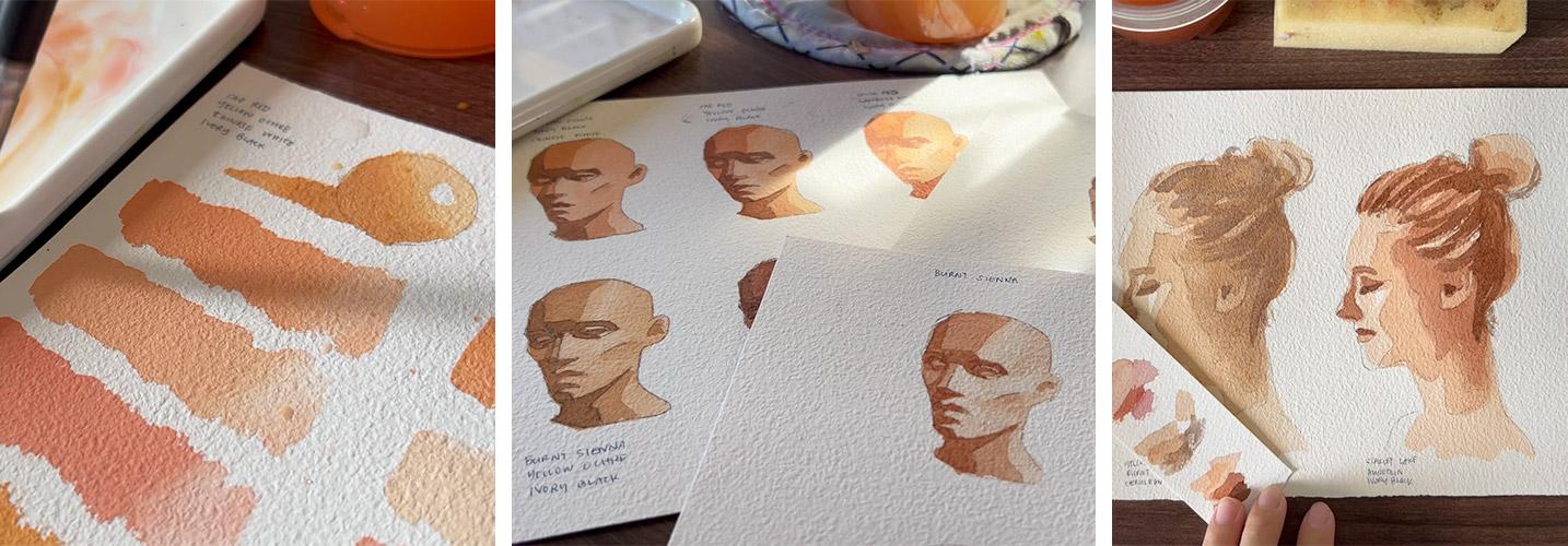
red, and raw umber. Let's try and swatch the
two most common colors, burnt sienna and burnt umber, which aren't purely orange, but more of a brownish orange. Let's start with burnt sienna. I have divided a seven by ten paper in three to
test out three colors. At the top are two spheres, and I'll explain their
purpose in a while. I'll be getting my colors
from this palette. As I mentioned earlier, I have acquired
multiple palettes containing different pigments
from various brands. And it felt so organized that I started learning color mixing and working with a
limited palette. To start off, you want
to mix a base color, about 50% water and 50% pigment. Or until you achieve
this consistency, then paint a horizontal
swatch this big. Leave some space for four
more horizontal swatches. Once you're done, rinse your brush and dry it on
a paper towel or rag. Then lift up some paint at
the end of your swatch. This will give you two shades. Next, add more water to your mixture for an
even lighter shade. And do the same as we did
with the first Swatch. When we talk about portraits, the face is not flat. It has a form. Therefore, highlights and
shadow colors should also be considered to show that I drew circles here where we'll use
different shades of color. I find that the
second shade that we swatch works perfectly well as the base color of the sphere. I'll paint that in now. Add more water for
the third swatch that is an even lighter shade. This shows you that water should be treated
as a color too, not just for rinsing your brush. Now, for comparison
purposes instead of water, let's use white to
lighten the base color. You'll see that it
became more opaque, and compared to the
two shades above it, it has also become duller. But it can also work
as a base color. Let's use that on
the second sphere. Don't forget to
leave a small circle that will serve
as the highlight. Let us imagine the light
coming from the upper right. So the shadows should
lie on the lower left. Now for the final swatch, let's use black to
darken the color. I used to avoid
black before because someone told me that blacks create a hole in your painting. Little did I know that it works perfectly fine when you use
it in color mixing instead. Now that our Swatch is done, let's finish off the
spheres by adding shadows, using the darker
shades of the color. You can work on
this wet and wet, or wet and dry as
I am doing now, don't forget to soften the edges for a more
believable look. For the first sphere, I will use burnt sienna, only to darken it, while on the second one I added a bit of black to differentiate
it from the former. Oh, and don't forget to
label your swatches, as it will get really confusing when you
have lots of swatches later now getting darker with the first sphere
that's purely burnt sienna. And to make it darker, I made sure to use less
water and more paint to get a stronger mixture for
the second sphere. I added more black
for the darkest part. What do we have here? A swatch of burnt sienna
starting with the neutral mix, then added more water. Even more water. We mixed white to the base
mixture and then black. See the difference? The left one is obviously
leaning towards orange, while the right one is
more of a neutral brown. As an alternative, I
also swatch light red, which is close to bird sienna. Light red looks a bit
redder than the former. In the swatches, I used
a different order. The top is a neutral mix. And then more water was added, then black was added. Finally, white is mixed
for the last swatch. Now let's try this
on burnt umber. Considering that some of
you might have this color, I will do the same as I had
done with burnt sienna. I am spitting up this demo
a bit because I trust that you know how we're creating these watches and the spheres. Starting off with
a neutral mix of about 2.5 water and pigment. Don't forget to live
for a lighter shade. Okay. And then added more
water for a lighter version. Even more water for the lightest version
now mixing white to get another lighter shade and
black for a darker version. For the sphere on the left, alus, different shades
of burnt umber. And on the sphere on the right, alus different shade mixed with white and black for comparison. No pressure on painting
these spheres perfectly. Okay. The purpose of
these watches is to give us lots of opportunities
to practice color mixing, not painting a perfect sphere. If you accidentally
painted outside the lines, use your paper towel
immediately to lift up the colors or just let go. Now here's our
burnt umber swatch. It's a bit more
neutral compared to burnt sienna as a substitute. If you have CPA, you
can try that too. Looking at them side by side, we'll give you an
idea how close or far off these pigments
are from each other. Here are other alternatives. Raw Umber and Vinitian Red were also near the center
of the color wheel. I swatch them too. I think they could
work depending on the skin type of the
person you're painting. I'll discuss more of that later. Another pigment that I
tried is John Brilliant, which doesn't look that
much of a skin color. But perhaps this would be applicable to a
different skin type, or a cartoon style painting, or even a fan art of
anime characters. In fact, when I was a beginner, I had the impression
that John Brilliant is the ultimate skin color and that I won't
need anything else. But it was nowhere near the skin tone that
I was looking for. Since I'm from the Philippines, most of the people here
have medium skin tone that won't work if I want to paint a portrait of a
family or a friend. I even tried adding black
to darken it a bit, but the color looks dull for me. Anyways. As I mentioned, this color can still work with other skin types or
painting styles. I also tried brown red, which is quite similar
to Venetian red. And out of curiosity, Naples yellow, which I
think is a bit too yellow. What colors will you be trying? Let me know in the
discussion staff. All in all, here are my top picks for a monochromatic
portrait painting. Burnt sienna, light red, burnt umber, brown,
red, and raw umber. But these are just
my personal choices. Let me know which
colors work best for you for a single color
portrait painting. A quick recap, We talked about what a monochromatic
color skim is, where a single color is
used as the base color, and white or black
is added to achieve different shades
with water colors. Water can be used as a
substitute to white Swatch. Single pigments, burnt
sienna, burnt umber. And for fun, John brilliant. Along with the Swatch, we painted a simple
sphere to see how it would look in a portrait
and create a three D effect. We also discussed different
alternative colors. In the next video, let's
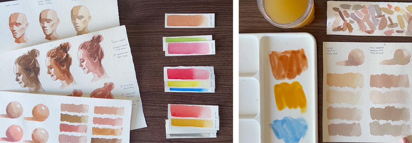
get into action by painting the planes of the head in a monochromatic color scheme.
5. Planes with 1 Color: It's time to use a
monochromatic scheme and put a little more challenge by painting the
planes of the head. We'll do something like this. But first, I'd like to
credit and recommend William's female head
a light reference to. This is what we'll use as a reference image
for this exercise. I've included the link to
this tool in the class guide. Please download that if
you haven't already. When you scroll down, you'll find images
of the female head in different angles that
you can already work with. But if you want to
play with this tool, then press the play button. Rotate. Pause once you find
the lighting that you like. This angle works for me, that lighting is perfect. I'll take a screenshot
and say that as an image. Now, here's a quick way
to transfer your drawing. We can focus more
on color mixing rather than on perfecting the drawing of the
plates of the head. I have here a graphite
transfer paper. I'm testing it out to show
you which side is down, then I'll lay the
printed reference photo and tape them down on my paper. The next step is pretty
straightforward. I grabbed a different
colored pen just so it's easier to see which
parts are already done. I go over the lines
and from time to time, check if I've applied
the right pressure. Do this until you
cover the whole head. But feel free to draw
it by free hand or use another three D model showing
the planes of the head. For this exercise, the
process will look like this. We swatched burnt
sienna and burnt umber earlier this time I'll use
light red plus ivory black. For this exercise,
I'll start with a water mixture of light red and use that to cover
the whole area. If you have another
color in mind, then please feel
free to use that. Also, please take
note that the size of the brush is relevant to
the size of the drawing. If you're planning
to scale this down, then you can grab
a smaller brush once you painted the whole head, rinse your brush pad it dry, and lift up some paint where
the highlights are located. But this is an optional step, so don't worry too
much about this. Now, leave this to dry and we'll continue for the second layer. I'll add more paint, mix a bit of black to
desaturate the color. And as always, try it out on scratch paper to see if you've got the shade
that you want. Then I'll cover these
areas and avoid these two tiny spots at the top and bottom of
the eye to our right. Don't fuss too much about this. Okay. If you painted outside the line,
that's totally fine. Let's focus on
mixing the skin tone shades that we
want to work with. For the cheek, I love
to soften that edge, let this dry completely, and let's mix the last
shade that we'll need. This time, I added more
black to the mixture. To achieve this color, I will cover these areas. You can actually just cover the whole left side of the
face if you prefer to, but I like leaving some highlights for
the eye and the cheek. You'll also notice
that I now switch to a smaller synthetic brush for better coverage of
the smaller shapes. By this time, I
hope that you can appreciate that just by using different shades of
light, red and black, letting each layer dry in
between the applications, we can already see how a monochromatic color scheme will work on an actual portrait. Here's another class
project option for you. I've also tried this on a smaller version
with burnt sienna. Burnt umber plus black, and John brilliant plus black. Which one do you like
best? A quick recap. I shared a free
resource that you can use as a reference for
the planes of the head. Then we transferred the drawing with the graphite
transfer paper. We used light red and black, this time to paint the
different planes of the head. Finally, showed you other
color options that you can try in the next video. Let's up our game a little more by working on a simple portrait.
6. Portrait with 1 Color: Painting, portraits
can be intimidating. But I reckon it will be more satisfying if we applied what we have learned by creating
something like this painting. This as is would be scary. Here's a little trick that could help us see shadow shapes better and would give us a reference that's
easier to use. I've loaded the image into
Photoshop and made sure to unlock the background layer
by double clicking over here. Then you want to go to Image
Adjustments Posturize. You'll see the image turn
into something like this. By default, the level
is set into four. When you drag the
slider to the right, the image will be smoother, but the shadow shapes will
be harder to distinguish. Level two works fine, but some of the details on her hair are lost
completely in black. For this image, I like to
keep it at level four. You can then save this
print and transfer using the same method I shared earlier when we were doing
the planes of the head. The process will
look something like this will be done
in four layers. Okay, I have prepared my
drawing here and this time I'll be using burnt
umber plus ivory black, starting with a very watery
mixture of burnt umber. Make sure to have your
sketch paper ready for swatching and checking if
you get the shade you need. Looking at the reference
photo we edited earlier, I will be leaving this part
of the forehead chick, upper lip and chin white. This technique is called
negative painting. It could be challenging
for absolute beginners, but I'd like to encourage
you to give it a try. Apart from those areas, I will paint the whole
head with this mixture. Once that's covered, leave
this to dry completely. Next, I'll add more paint
to the mixture and make it thicker and darker swatch
to check and proceed. This time I will be
covering these areas. I will be leaving some
areas on her head or loose hair that will
serve as highlights. Okay, no need to fuss over which strand of hair
should be left out. Just leave a couple
untouched by this mixture, and that should work if needed. You can also switch to a smaller brush to help
you navigate easily through the narrower
shadow shapes like those on her nose and lips. As always, leave this
layer to dry or use a blow dryer to speed up the process before
adding the next wine. For the third layer, I
will be adding black to the mixture and of
course, more paint. I also decided that this is the right time to grab
a smaller round brush. Here are the areas that
we will be working on. It's a personal decision
to darken those areas. On her eyes, nose, and lips. You can do the same, but you'll want the hair mostly covered and the farther
side of the face. I am doing something
different here though, since I want a soft
edge for this shadow. I prepare that area by painting the line dividing the shadow
shape with clean water. That way when I drop
the paint on the paper, it will blend with the water, creating a softer edge. This to dry and we're
ready for the final touch. Well, you guessed it. More burnt, umber and
black. For the details. This scratch paper is looking
nice too, don't you think? At least this color for her nostril eyelashes and
some distinct hair strands. Don't forget the ear hole
and this part of the head. We're nearly done, and
I am so proud of you. Here's another option
for a class project, since I'm currently
obsessed to color mixing. I also painted smaller
versions with these colors. Burnt umber, burnt
sienna plus black, and venetian red plus black, which appeals to you the most. Here are some samples of loose monochromatic
color paintings. I'm planning to
launch a class on loose porchits.
Please stay tuned. A quick recap. We discussed how to edit the photos to
see shadow shapes easily, then used burnt umber plus black for the simple
portrait painting. And applied what we
have learned with a monochromatic color scheme. I also showed you
some alternative colors that you can work with. In the next video,
it's time to use two colors where the
other one isn't black.
7. 2-Color Recipe: It's now time to add another color in our
skin tone recipe. Just like how we did our
monochromatic painting. We will swatch work on the planes of the head
and a simple portrait, but the demos will be sped up since we are painting
the same subject. To get started, please
prepare these colors, a red and green, an orange and blue and a violet and yellow. These are the specific
pigment names that I will be working with. Make sure to watch
the whole lesson, since I will sprinkle some tips like which
colors don't work, for mixing flesh tone. How to darken each
layer to create depth in a simple way to release pressure when
painting portraits. Let's get started
in the next video.
8. Swatch with 2 Colors: Pink and green for the skin. That's my first reaction when
I saw a demo by an artist I admire when he picked up those colors to mix
the skin tones. Then he explained the theory
of complimentary colors. Complimentary colors, ones that lie opposite each
other on the color wheel, appear bright and vibrant
when placed together. But when mixed together, they produce different
shades of browns and grays. If you use the right pigments, you can also successfully mix a brownish orange for
the color of the skin. I discussed more of this in my previous color mixing class. If you haven't already, please check that out. Anyways, let's try
different combinations and see if there are good candidates
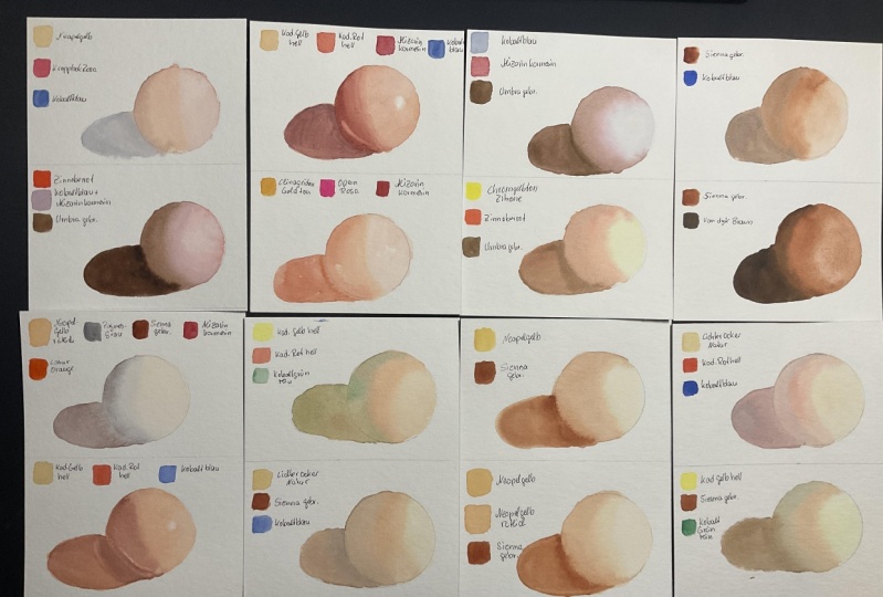
for a skin tone recipe. First up is orange and blue. Here I have cadmium
orange and cobalt blue. They are both neutral versions. Meaning the orange
is neither yellow, orange, nor red orange. And the blue is neither blue, violet nor blue green. Let's see how this combination
looks on the first watch, try to get a mixture that is as close to brown as possible, not too much orange or blue. Then add more orange to the mixture for
the second Swatch. Don't forget to lift some colors to get the lighter shade. This gives you an idea
that the amount of pigment matters in color mixing. It also gives us clues on which colors are overpowering or weak. The color produced
is a bit grayish, but we can still use it for the darker features of the face, like the eyes, shadows or hair. Now mix again and add more water for an even lighter version
of the neutral swatch. Keep adjusting if you
need to and be patient. You'll get the shade
that you want. As always, paint the sphere with different shades
of the base mixture. This time, I am working
on this wet on wet, making sure that there's
more paint than water. With each layer you add. This instantly gives soft edges and speeds up the process. Why didn't I do this earlier? Here's how our orange
and blue swatch looks. Of course, I tried
other combinations like cadmium orange and
thalo blue, red shade. You'll see that the mixture
turned gray when I added more blue cadmium orange
and turquoise blue, which is a bit similar
to the first one. Vermilion hue is also
considered an orange. I mix that with the same blue
pigments mentioned earlier. Here you might have noticed that vermilion hue and thalo
blue look better together. Now out of curiosity, I also substituted orange with
browns or brownish orange. Burnt sienna combined
with same blues from earlier looked duller compared with our monochromatic swatch. While burnt sienna
light paired with ultramarine blue and Prussian
blue seems a bit livelier. But if we look closely at the Swatch where more ultramarine blue is
added to the mixture, the granulation shows this could be a good or bad
effect for a portrait, depending on the style
that you are after. All in all, here are my top picks for blue
and orange combination. Cadmium orange, and cobalt blue. The same orange with thalo blue, vermilion hue, and thalo blue. And burn siena light
and Prussian blue. Let me know what colors
you are trying next. Red and green. This is
spiral red and sap green. Same approach as earlier. Mix a neutral one
for the first watch. Add more red for the second one. More green on the third one, and more water on
the neutral mix. I must confess sap green
was the last green. I tried to pair with red because
I don't like that color. To my surprise, this is the best green I have
mixed with my reds. I'll show you other
combinations I tried later. Let's start swatching. That skin tone is
more vibrant than the orange and blue
combination, don't you think? Rinse and dry up your brush to lift the
right part of the Swatch. Color mixing and experimenting different combinations
isn't just about learning which
colors work well together, It's also a way to discover
which colors don't work. Like the third swatch, a little bit more green in that mixture and it
might look weird. This is skin tone to some. If I could turn back time, I would have studied this skill as soon as I started
working with watercolors and filled up lots of sketchbooks with color
mixing experiments. But I'm still glad that I am here learning how to mix
colors together with you. Okay? Don't forget to
color in the circle. That would give us an idea how the shades will look
on an actual portrait. I switched to a
smaller brush for easier control and
added more paint. When I reached the lower left
side where the shadow lies, here's our piral red
and green swatch. Now presenting the different
red and green combinations, I experimented with cadmium
red and vermilion hue mixed with sap Green. Vermilion hue is
a reddish orange. It can work as either
red or orange. For these color
mixing exercises, I also tried vermilion
hue and Hookers green and pyal red together with rate rate is another
color that I used to ignore and
I'm glad that I gave it a second chance
to redeem itself. I have also some
failed experiments or combinations that
are not to my liking. Here we have viral red and
permanent green, Scarlet, lake, and Hooker's green, which look a bit to forest. If I may say the lightest and
darkest shades might work, but personally they look
a bit d cadmium red mixed with either Viridian hue or Hooker's green aren't
also to my liking. Maybe you can make these
colors work, but for me, they are a bit challenging
to use with water colors. We can also substitute
pink or magenta with red. Here are some lovely
combinations. I have experimented with both rose matter
and Quinacrodone. Red mixed with sap green created a beautiful
skin tone color. We even have colors here
that could work as a blush. Quinacridone magenta and
Quinacridone rose mixed with the same green also look great together as a skin tone shade. Just be careful not to
add too much green. All in all my topics are these colors mixed
with sap, green, pyal, red, scarlet, Lake Rose, Matter, and Quinacridone bread. Of course, there are lots of colors I haven't tested here. Please do. Let me know
in the discussions or comments which pigments
you suggest I try next. Next up is violet and yellow. This must have been the most challenging
complementaries I have experimented with. Let's try Gumbo, Chinova and Quinacridone Lilac.
Same approach. Start with a neutral mix, add more yellow,
add more violet, and add more water
to the neutral mix. If needed, prepare
scratch paper where you can test the color first
before painting a swatch. If you're working with
different colors, don't pressure yourself to get the same mixture
I'm showing you, it's normal to get the different shade than
what I'm showing here, even if we're using
the same colors, but from different brands, you will also get a
different result. Most of the pigments
I use here are from Hole Ne and this Quinacridone
Lila is from White nights. Keep experimenting and
enjoy the process. I think I didn't get a dark enough mixture for the darkest shadow.
But that's fine. Later when we do
our simple portrait using complimentary colors, you learn how to make use of these shades for the features of the face to be noticeable. Even if we mix a purplish skin tone
instead of a dark one, it's really just a
matter of layering and letting water
colors do its work. Here's our gumbo ch nova
and quinacdone lilacs. Watch other yellows I
tried with Quinacrodone. Lilac are yellow,
ochre, cadmium yellow, light lemon yellow, and olin. All of these look great. And of course, sharing
my failed experiments, the ones that I
don't really like, Gumbo Chinova and
Quinacerdone gold mixed with carbazol violet are
too dull for me. But perhaps they
can work great on other styles or skin tone hands. A yellow light with the
same violet and look at this gumbo ch nova
with lavender. Both mixtures ended up
with a greenish tone. And my guess would
be the violets have more blue pigments
mixed on them. When combined with yellow, naturally they turn green. But compared to
Quinacridone lilac, which is leaning towards pink, it works so well with
yellow pigments. For my top picks for yellow
and violet combination, are these yellows combined
with Quinacridone lilac, yellow ochre, Olin gambo, Chinova, and cadmium
yellow light. What about you? What's your
favorite? A quick recap. We learned about
complimentary colors that lie opposite each other on the
color wheel and swatch them. We tried orange and blue, red and green and yellow
and violet combinations. I also share different
alternatives and even my failed experiments. In the next video, let's
put this into action by painting the planes of the head using
complimentary colors.
9. Planes with 2 Colors: Another plane of the head study. This will be quick since you've already seen me do it once. This time I'll use Scarlet
Lake and Sap Green as always. Don't forget to swatch and, and adjust the
mixture if needed, cover the whole head for
the first layer with a varying watery mixture
of the complementaries. I want you to pay
close attention to how I adjust my
colors rather than on how I paint the planes as that's what matters most in
this color mixing class. Leave the first layer to dry and let's work on these shapes. I'll use whatever's left on my palette and when I test it, you'll see that it isn't obviously darker than
the first color. But since water colors
are transparent, when I add another layer
of the same color, it will still be darker. Take note of that when
you're doing your portraits. Using the same
color at the top of another layer will work when
you're doing the shadows. That's the traditional
approach with water colors working
from light to dark. Let this layer dry, I minute, leave it
to dry completely. Do something else,
or watch this video, or pause and do yours before
working on the final layer. Also, did you catch me grabbing my scarlet leg from
yet another palette? Yes, those multiple
palettes are a pain to my eyes in a sense. This can also work as a monochromatic color
painting, right? We're only using a
brownish orange as the base color and
varying the amount of water on the mixture to
achieve different shades. But for clarity of this class, I named this video planes with two colors where complimentary
colors are at work. Anyways, I added more paint
to make the colors bolder. And use a paper towel to lift up some paint that got
on the left eye, or technically the
eye to or left. Here's our complimentary
colored planes of the head. Other colors that I tried on smaller studies are cadmium
orange and cobalt blue, Scarlet, lake, and permanent
green and yellow ochre with carbazol violet. This set features burnt
sienna and prussian blue, pyal red and sap green. And Gambo Chinova
with Quinacridone. Lilac, Which one's your
favorite? A quick recap. We used complimentary
colors on the planes of the head and also learned that layering darkens the color. I've shared alternative
colors you can work with. In the next video, I'll work
on a simple portrait again. And I'll share what I do to
release some pressure in painting intimidating
subjects like a portrait.
10. Portrait with 2 Colors: Okay, I know it might
look intimidating, but I got to tell you that if you do this simple
portrait exercise, it will be so rewarding no matter if you share
this project or not. But I do encourage you
to upload it as it motivates me and
your fellow students to work on their projects too. Okay, here I am using
yellow ochre and quinacridone lilac and I will
be covering these areas. If you find that
negative painting, those small shapes is
too much to handle, then just paint the whole head. Let it dry before painting
the second layer. Use white water color
or gas paint to paint those tiny highlights for the next layer,
paint these areas. Here's your reminder
not to stress too much on copying
the reference photo, as we are not painting
a realistic portrait, but studying how
to mix the colors effectively to achieve
believable skin toes. I don't even worry if my pencil marks show when
the painting is done, it's all part of the artwork. Now remember that we are just studying and doing these
exercises to get better. We're not here to create
masterpieces yet. Let dry and work on the third
layer where we will soften the edges by pre
wetting the side of the face before
dropping our colors. Another very helpful tip that I tell my students
during face to face workshops is to treat each painting exercise as
a practice session only. And not to see their paper or paint like treasures or
some precious material. Your experience is more valuable than the price
of your art materials. Okay, I even ask them to write scratch paper at the top of
their watercolor papers, even if they're using
100% cotton wine to release some pressure
to make something perfect. If you think that this
will work for you too, then please do that. Even I remind myself that
this is just a scratch paper. Every time I am about to
paint a complicated subject, I tell you it works
all the time. When we did the yellow and
violet swatches before, we didn't get a dark color compared to the
monochromatic ones. Instead of going darker, we only got a mixture that
is leaning towards violet. That's enough, even if you
use paint directly from the tube and still get a mid tone rather
than a dark tone. As long as the features of the face are defined,
that will do. Here's our
complimentary colored, simple portrait painting. Here are the other colors that
I tried, the same colors. I experimented with the
planes of the head, but I got a little darker with my blue and
orange combination. So far, I am liking the red
and green mixture so much, especially seeing them
side by side like this. We'll give you an
idea which colors will look best in
your painting style. If you like loose portraits, here's Scarlet lake and Quinacerdone red
mixed with sap Green. I love how different
the skin tones look, even if I used the same green. A quick recap, we used complimentary colors in
painting a simple portrait. We learned to treat each
paper as a scratch, to release some pressure. I showed you alternative
colors you can work with. In the next video,
let's work with three colors for our
skin tone recipe.
11. 3-Color Recipe: Right, it's time for a
three color recipe now. The demos will be faster as we swatch paint the planes of the head and do a
simple portrait, since this is our third time
working on the same subject. Here are the colors you'll
need, a red, yellow, and blue, or alternatively
magenta yellow and can. During the demos, I will share my top tips on why you need to treat water as a
mixing component, why we should practice drawing
and painting separately, and how and why we need to
paint shadow shapes instead of the features of the face
see in the next video.
12. Swatch with 3 Colors: It's time to work
with three colors. Now we will use three different
sets of primary colors. Red, yellow, and blue, magenta, yellow and cyan. And the earth tones counterpart the
basic primary colors are red, yellow, and blue. And that's what we're
taught in school. Here I have cadmium, red, Hansa, yellow light,
and cobalt blue. These pigments are neutral
versions of their colors. Or what others call true red, true yellow and blue. This color combination is what I emphasized in my previous
color mixing class. For a limited palette
landscape painting, I'm surprised that they can
work with skin tones too. The first Swatch is mainly a combination of red and yellow, which is a tiny bit of blue
to desaturate the mixture. If it works for you, swatch it. If not, keep adjusting, be patient, and be practice. You'll surely get faster in estimating how much
of each pigment you need for a certain shade
you want to mix next, add more water to that
mixture and swatch. I know I said this earlier, but I'll say it again. Water is an essential
mixing component when it comes to this medium. For the third Swatch, add more blue to the mixture and make it closer to
a neutral brown. I love this combination because this pigments are usually present in beginner
watercolor sets. I am sure that you'll
have some or all of the colors or
substitute pigments that I will share
with you later. Don't forget to lift up some part of the Swatch
for a lighter version. Lastly, add even more blue and mix a color that is
darker than the third one. This shade will work for the
shadowed areas of the skin. Keep adjusting until you
find that perfect shade. It's amazing how versatile a primary color
palette surely is. Now, don't forget to
paint that sphere and use different shades
that we swatch to make it look three D. Here's our red, yellow, and blue swatch. This can work well with
a medium skin tone. I also tested out
these combinations, but with a different order, red plus yellow for
the first watch. Then more red was added, more yellow was mixed. And the last one is a
combination of the three. Here we have cadmium red
plus cadmium yellow light plus ultramarine blue. Then I replace the yellow with yellow ochre on the second one, both are leaning towards orange compared to
our first Swatch. We also have pyl red, Rosendalight and cobble blue. Then pyle red with handsome yellow light and thalo
blue, red shade. They are lighter
and more pinkish. Now, let's talk about a
second set of primary colors. Magenta, yellow, and can I was thought that primary colors are
red, yellow, and blue. But when I was researching
for this class, I found out that there are
also primary colors of light, which is RGB, or
red, green, blue. And primary colors of pigment, MY or cyan, magenta, and yellow. Just like how printers
work with inks, watercolor is also a pigment. Technically, cyan magenta and yellow can substitute
blue, red, and yellow. Curious as eye wash. I used Quinacridone magenta, Prussian blue for the
yellow gumbo Chnova. Let's see how this
combination works. Just like the red,
yellow, blue primary set. Let's start with a
magenta and yellow mix, with a bit of Prussian blue. You can already see how
different they are, but both can be used
as a skin tone shade. Add more water and paint
in the second Swatch. Now go darker by adding
more Prussian blue. This pigment is a
bit overpowering, so be careful when adding
that into your mixture. We now have a more neutral
brown that could also work as a shadow color for the last one. Add even more blue
to make it more neutral and tone down
than the Swatch above it. Take time to paint this
fear with the shades. I am just sitting this up, since our focus is on
mixing the colors. But take it easy.
Okay? This fear is really helpful in giving us an idea how the colors or
shades look in a tree form. It's hard to appreciate it
with just the swatches alone. I encourage you to paint
12 or multiple ones. Here's our magenta,
yellow, and science. Watch as always, here are
other colors that I used. Quin, magenta, quin
gold, and cobalt blue. Here I experimented
by substituting a neutral blue with cyan
and it still looks good. Quin magenta, lemon
yellow, and yellow blue. The forth swatch looks great for the darker parts
of the face, isn't it? Quin red, yellow ochre,
and ultramarine blue. Now, I used a pinkish
pigment instead of magenta and it still looks
great as a skin tone shade. Quin red, cadmium yellow light, plus Prussian blue, which looks fairly similar to the
Swatch on the left. In my previous class, I also presented starter kits and found out that some brands like Daniel Smith offer an earth tone version of
their primary colors. It was fun to experiment
and test these colors. Let us know, work with
an earth brown, yellow, and sky blue with the
pigments available to me, I chose burnt sienna, yellow, ochre, and
serilian blue. You can substitute this with any colors that
are close to them. Honestly, I was a bit skeptical when experimenting
with this combination. They look dull compared
to the red, yellow, blue, and magenta yellow
ion primary set. I initially thought
that this won't work, but dear me, look at that color. It could work with
an olive skin shade or other skin types. I really didn't expect this, especially with Erlian blue, since like ultra maron blue, that one is granulating. When we say granulating, the granules or particles of the pigment are big enough
to be visible to the eyes. But it can also work well depending on the painting
style that you are after. Go easy with the blue though, since if you mix more
blue and yellow, it might turn green. Keep adjusting and testing
the colors as needed. Don't forget the sphere. I love how these three
primary color sets look and feel different
from each other. Yet they all work as
a skin tone color. Here's our Earth
color primary swatch. Here are other
alternative colors where the Swatch goes like this, brown plus yellow, more
brown, more yellow. And then blue was
added to the last one. Here we have light
red maples, yellow, deep and erulian blue, which looks the same
with burnt siena, light raw umber
and manganese blue except for the last
Swatch brown, red, yellow ochre and peacock
blue looks a bit pinkish compared to burnt umber Rossi and a light and compose blue. Which colors are you testing with all the colors you tested? Here are my top pigs. Cadmium red, cadmium yellow, light and ultramarine
blue, Pyal red, roscienalight and cobalt
blue, quin magenta, quin gold and cobalt blue and burnt sienna yellow
ochre and Erulian blue. How about you? A quick recap. We worked with three sets
of primary colors, red, yellow, blue, magenta,
yellow and cyan, and the earth tones. We learned that with
pigments like watercolors, magenta, yellow, and cyan are considered
the primary colors. I also shared
alternative colors, and was surprised that earth tones can also work
for skin tone shades. In the next video,
let's paint the planes of the head with a three
color combination.
13. Planes with 3 Colors: This is our third planes
of the head painting, and I'll be using Quinacridone, magenta, gumbo ch nova,
and Prussian blue. I've shown you
alternatives earlier. You may choose any
colors available to you. As always, I'll cover
the whole shape with a watery mixture of the
three colors combined, but just using a
tiny bit of blue. I hope that this Ped version
still works for you. Since it is our third time
painting the same subject. I trust that you know
the process by heart. Lift some areas of high light and let the first layer to dry. Next, let's work on these areas and start adding more
pigments to the mixture. I also switch to a
smaller brush since there will be tide places
that we will be covering. This skin tone is lively
and vibrant, isn't it? I used to think that
color mixing, swatching, and documenting your favorite color recipes was
a waste of time. But I was wrong. When you get used
to color mixing, you can achieve the
shades that you want. So keep practicing,
leave to try again. And let's add the final details, adding even more blue to
desaturate the mixture. And let's paint these parts. It's really satisfying
to work with the details and the final layer. It gives a sense of accomplishment and I hope
you're feeling the same. Let go of unrealistic
expectations and you'll surely
enjoy the process. That's also why I showed you how to draw the planes
of the head with a transfer paper
so we can focus on mixing our colors rather
than perfecting the drawing. That's another practice
for another day. Here's our primary colors
planes of the head study. Of course, I also tried it with other combinations that
I demonstrated earlier. We have the red, yellow, blue with cadmium red,
handsome yellow light, and cobalt blue,
followed by our magenta, yellow and blue, and
the earth tones. For the last one,
what do you think? Not much of a difference, right? A quick recap. We use the CMY,
or cyan, magenta, and yellow primary color set
for the planes of the head. By now, we've had lots of opportunities to practice
painting the same subject, which should give us confidence. I showed you other alternative
colors that could work. In the next video, let's challenge ourselves again by
painting a simple portrait. And discuss how
to paint subjects like this in a liberating way.
14. Portrait with 3 Colors: Our third portrait
painting where I'll use my Earth
dons burnt sienna, yellow, ochre and cerulean blue. We will cover almost
the whole shape, but avoid the small
highlighted areas of the face. Since this is our third time, I'll be painting
the same subject. The demo is sped up and
we'll be over in 3 minutes. I plan to skip this originally, but I know that
there are some of you who still want
to see me in action. Here you go, and I hope
I'm not boring you, let dry and move on
to the next layer. This time, I added more blue and more burnt
sienna to the mixture, and we will paint these shapes. Notice that I kept saying shapes instead of specifically pointing out the features of the face, such as the eyes, ears, nose, or lips. Since I find it easier to
work with portraits that way, we're not actually
painting the eyes, but the shadow shapes that make an impression that
that is an eye. Same with the ears,
nose and lips. Leave this a dry onto
the third layer, we go to continue
what I was saying. When you are painting shapes instead of the
features of the face, you begin to see it as
a whole and we can make an impression instead of being pressured to paint
a realistic face. In fact, this style of painting motivated me to
work on portraits, again in a loose style. It's so liberating
and rewarding. I hope that these vectors that I made showing the different
shadow shapes are helping. Okay, going back,
painting around the ear shape and wetting that line with water
for a soft edge. Then load your brush would paint and have a go on it again. Leave this to dry and we're
ready for the final details. Go darker by adding more
blue and paint these shapes. Yes, shadow shapes go easy on the hair strands as long as you can
distinguish the hair line. With a few shapes that will do. Here's our portrait using the primary colors,
earth tone version. As always, I painted the same subject with the
other set of primaries. Not so much difference
between the three, isn't it? But which one is your favorite? Here are some loose portraits
featuring vermilion hue, cadmium yellow light,
and talor blue. While the other one used
Quinacridone magenta, the same yellow
and peacock blue. A quick recap, we painted
the portrait again, but this time with earth tones. We learned to focus on painting the shadow shapes instead of
the features of the face. I showed you how
the portrait looks like with the other
sets of primary colors. In the next video, let's discuss the final skin tone
recipe using four colors.
15. 4-Color Recipe: Okay, this is our last
recipe and my favorite too. For the last time,
we will swatch, paint the planes of the
head and a simple portrait. The demos are even faster, but I trust that you
know the process by now. Please prepare a red, yellow, black and white
like these pigments. Or a pink, transparent, yellow, black and white
as an alternative. During the demos, I will also discuss how I choose
my alternative colors, what I use as a
watercolor eraser, and why it's important to
give yourself some play time to improve your
watercolor skills. See in the next video.
16. Swatch with 4 Colors: Let's use the Apelis palette as an inspiration for
this last recipe. Here I have yellow
ocher, cadmium red, ivory black and white, and the swatch will
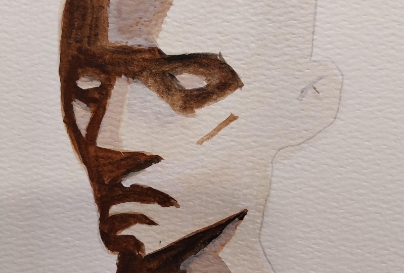
follow this order. Red yellow, add white, add more red, add more yellow, then mix to the first swatch. Let's begin. I was taught in some workshops that black creates a
hole in your painting. So we were advised never to use it and that we have
to mix our own darks. But through the course of
this color mixing journey, I came across the Apes palette. Apes palette, an
ancient one used by the Greek painter Apes
comprises four colors. A red, yellow, white and black. Specifically, ermlion, yellow
brown or yellow ochre, titanium white, and Mars black. That's when I realized. Of course, I can use black. You'll see later when I
start adding black to the mixture that it creates
beautiful, darker shades. Even Swedish painter
Anders Zorn uses a similar palette consisting
of mon yellow ochre, flake white, and ivory black. A modern day version
replaces Vermillion with cadmium red light and flake
white with titanium white. This is famously known
as the Zorn palette. Okay. Here's our first set of swatch and don't forget
the color in that sphere. For the second set, let's substitute
white with water. Since technically, water is used to lighten a color
with this medium. Using the apelus palette
as R inspiration, we'll only need three pigments, red, yellow, and black. If you treat water as a
mixing component two, that makes it a four
color combination. For the swatch, the
only difference is the second one where water
was added to the mixture. I added more black
to the last one. So when we lay
them side by side, they look like twins. The spheres also have
different vibes since the first one uses a base
color where white was mixed, making it more opaque. Here are other
combinations I tried. These sets follow a different order for
better comparison. Red plus yellow,
water was added, White was added, then black, and even more black was mixed. In case you're wondering how I'm choosing my alternative colors, I have swatched
all my primaries, and I refer to this when
selecting other combinations. Like how I picked
scarlet lake instead of cadmium red and Naples yellow deep instead of yellow ochre. As a result, and of course, with lots of practice
mixing my colors, the swatches look very
similar to each other. Now, what about pink
instead of red? Here's what they look like
where quinacridone rose and Quinacridone Magenta
were mixed with gambognova and cadmium
yellow light respectively. That means you can still achieve the similar mixes using the apes palette as
an inspiration shot. Now, what about Earth tones? Still fairly similar,
aren't they? This is why I love
color mixing so much, which leads me to my
top combinations mixed with black and using water
instead of white pigment. Cadmium red and yellow
ochre, scarlet lake, and Naples yellow deep, Pacdon magenta and
Cadmium yellow light and burn Ciena
plus yellow ocher. A quick recap. We learned about the Pels palette
consisting of four colors, a red, yellow, black and white. We tested using four
colors and using three colors with water
substituting white. I shared how I choose my
alternative pigments. In the next video, let's paint our last
planes of the head, and I'll share with you what I use as a water color eraser.
17. Planes with 4 Colors: This is our last planes
of the head painting. For formality's sake, I
will use cadmium red, yellow, ochre ivory,
black, and Chinese white. For the exercise,
you know the drill. Cover these areas with a light flesh tone
by mixing yellow. And this time the white pigment, you just saw me use
a paper towel to lift up some paint that
exceeded the lines. And that's my tip
for this video. As long as the
paint is still wet, you can use a paper
towel as an eraser. But don't rely on this too much. Most of the time I just
let go of the mistakes, especially when I'm
painting something loosely. Okay, let dry and
onto the next layer. This time, you can slowly
introduce black to the mixture to achieve a
more desaturated flesh tone. And switch to a smaller
brush for better control. Continuing what I
was saying earlier, once the paint has dried go, you can still use a paper
towel to lift up some paint. But you will need
to scrub the area first with a clean,
damp synthetic brush. Then pat it dry
with a paper towel. Okay, lift this to
dry and let's add the final details to paint
these shadow shapes. I will be adding even more black to the mixture and make it closer to a neutral brown
swatch to test and paint. The tricky part when lifting
pains is when you are already working on the
second or third layer, It's easy to rewet an
area and pat it dry with a paper towel when
you're just working on the background
or first layer. But other than that, I
learned that it's better to let it go or research what pigments are
easy to lift and use a hot pressed
watercolor paper if you intend to use the lifting
technique more often. Here's our final
planes of the head, using colors inspired by
the appelles palette. I also tried it with just
three pigments, Red, yellow and black substituted
a pink like Quinacodone red, and a more transparent
yellow, Gambo Chinova. I can't really see much of a difference
between the three. Can you a quick recap? We painted the final planes of the head with four pigments. We learned that paper towels work like erasers
with water colors. We compared other
alternative colors. In the next video, let's work on our final
portrait painting, and I'll share with you the
importance of play time.
18. Portrait with 4 Colors: Her final portrait painting. Yeah, this time ali us scarlet
lake Oreolin and ivory black starting with a very
watery and orange mixture of the red and yellow. Olin is one of the yellows that I later
discovered and tried. Most of the time I just use Gambo Genova and
yellow ochre and never tried other yellow since I'm afraid they won't
sit well with me. Okay, I just finished covering
those areas while avoiding the highlighted parts and now I'm letting it dry
for the next layer. Now I'm reloading my paint and started adding
black to the mixture. It's not visible in the camera, but my black pigment is sitting on the left
side of the palette. If you catch my brush
going at that area, I'm simply reloading it
with ivory black pigment. Let's cover these shadow shapes. Continuing what I
am saying earlier, I was so familiar with my
yellows that I refused to test out other colors and even other yellows
from different brands. That's why I am grateful that this color mixing journey
gave me confidence. Okay, leave this
to dry first and mix a more neutral brown
to cover the areas. My tip for this lesson is to give yourself some play time. And with that, I only
meant time to experiment that try new colors or techniques that you've
been wanting to do. Even try colors that
you hate learning. Water colors can be
a combination of serious study and play times. That's how I got the
courage to try out new colors and
purchase them and not consider it a waste of resources if the colors don't turn out as
something I like, because I know from
experience that I can use them to mix
with other pigments. Instead, now we're ready
to add final details, which are these shadow shapes with an even darker
brown mixture. How are you feeling with
your progress so far? I hope you're enjoying
this class as much as I enjoy
creating this one too. Here's our final portrait
painting, of course, here are the
alternatives I tried aside from the middle one
leaning towards a pinkish tone. They're fairly close to each other in case you're wondering, here's how they look
on loose portraits. A quick recap. We painted this simple
portrait with red, yellow, black, and water. It's an alternative to white. I share the importance of giving yourself some play
time with this Du. I also showed you the
alternative colors and loose portrait samples. In the next video,
let's learn how to find the right shade of skin tone
using the Fitzpatrick Scale.
19. Finding the Perfect Recipe: There are various skin types which depend on one's genetics, lifestyle, and
exposure to the song. But how do we choose which is the best color recipe
for skin tones? We can look at the Fitzpatrick
Scale as a reference. This scale is a numerical
classification schema for human skin color. It was developed by American dermatologist Thomas
Fitzpatrick in 1970s. Its main purpose is to
estimate the response of different types of skin
to ultra violet light. The scale ranges from
type one to type six, with type one categorized as always burns and type
six as never burns. Here's how my swatches look
on the actual sketchbook. I have placed them side by side to see if there's
any difference with the 123.4 color combinations. Let me share with
you the colors I've tested to paint the
Fitzpatrick scale. This might help you decide which recipe works best for you. For single color or
monochromatic scheme, I tried burnt umber, burnt sienna plus black. And vention red plus black. I like the middle one the most. What about you for
complimentary colors, I tried cobalt blue and orange, piral red and sap, green, yellow, ocher,
and carbozol violet. It's still the
middle one for me. For primary colors, I did try more combinations with various
reds, yellows and blues. I can't really pick a favorite here since they all look
very much the same. The results are not far from
the ones inspired by the appelles palette with cadmium
red and yellow ochre, scarlet lake, and oreolin
mixed with black. Out of curiosity, I also mix secondary colors
such as cadmium red, quinacridone, lilac,
and sap green. And they still work. It's mainly because they contain traces of the primary colors. In a sense, you're just
mixing the primary colors. Now let's see how this
watches look side by side. Here are the monochromatic, complimentary primary and
apes color side by side. What do you think? I guess the last two are the
best recipe for me. But if I have to choose the colors that are
the most flexible, I would go for a primary
plus black combination. Specifically, a
CMYK color palette. Just like how printers work, it's basically a combination
of the primary and appelles. I mentioned earlier
that the appellace was my favorite, but I wondered, what if you want to paint
blue or green eyes, you'll definitely need a
bluish pigment, right? With this palette, you
will be able to mix your secondary tertiary and even the darker shades
by adding black. Now in case you're wondering
how I mix these shades, I have a little
challenge for you. I want you to choose
your favorite recipe and treat this as a homework to swatch your own
Fitzpatrick scale. I believe that you can do this, especially if you didn't skip
any of the video lessons. If you do so, the
experience will teach you so much more than what
a demonstration can do. Now that we have a general idea of the different skin types, we'll also most definitely have different favorite recipes. Let's have some fun and
share which combination with specific pigment names works best for us in the
discussion stab. Now here's a simple chart
showing the ratio of the red, yellow, blue, and even water to achieve each skin
types flesh tone. You can use this as your reference in
doing your homework. A quick recap. We discussed what a Fitzpatrick Scale
is and how it can be used to find the best
skin tone recipe for you. I shared the different
watches I made with 123.4 color recipes. What I think is the
most flexible palette, which is actually
a combination of the primary and a palace colors. I also showed you a simple chart showing the ratio of my red, yellow, blue, and water on how I mix my
Fitzpatrick scale. In the next video, let's have a quick summary and a reminder on how you can claim
your free book.
20. Claim Your Free eBook: Thank you for letting me teach you to complete the
learning process. I shall now await for your project or an
honest class review. In return, I'll send you a
copy of this book containing over 100 color combinations I've experimented with to
mix skin tone colors. I've spent hours and
hours making this one. I am excited to share this
valuable information with you. Don't forget to send
me an e mail or connect with me on
social media and mention skin tone book once you've done any
or both of the two. As a quick recap, we swatched paint the planes
of the head and worked on a simple portrait painting using a one color or a
monochromatic color scheme. Two colors, specifically
complementary colors that lie opposite each
other On the color wheel, three colors with three
different sets to red, yellow, blue,
magenta, yellow ion. The earth tones counterpart four colors following the proven and tested
appelles palette, where we also substituted
white with water. This class gave us lots of opportunities to
practice color mixing. To focus on combining the colors instead of fussing over
portrait drawings. We also learned that there are multiple alternative
colors you can work with. The key takeaway
for this class is to never allow yourself
to be hindered from painting anything you want just because you don't
have the exact color. Sometimes all it takes is a bit of mixing to find the
shade that you need. I am planning to launch a loose portrait painting class soon and other limited
palette lessons. Please follow me on Skillshare
for timely Updates. See on my other
classes together. Let's make this world
a little bit more colorful with our artworks.
 Bianca Luztre, Watercolor, Productivity, Color Mixing