Transcripts
1. What's In Store for You: If this is a painting style that you've always
wanted to try, then this class is for you. Let me share with you how I was able to achieve
smooth background, control edges, organic marks, and work with a limited palette. Hi. I'm Bianca Lustre, an aspiring watercolor artist
from Batangas, Philippines. My first floral paintings
are far from my recent ones. But through the years
of continuous learning through books,
courses, workshops, competitions, and
lots of failure, I am happy that I'm now able to paint loose florals
with watercolors. In this class, let me
share with you my process, starting from choosing my
colors and swatching them, doing studies,
practicing drills, and working on the
actual project. I know that this approach
works because my in person workshop students
did the same class project. All of them are
beginners, by the way. But of course, those of
you who have a bit of experience with watercolors are welcome to join in the fun. Upon finishing this class, you can now choose your
own reference photo with the same floral structure, do the same
techniques discussed, to achieve a loose and
soft painting style. If you're ready,
prepare your materials, and let's get started.
2. Class Project: Our goal for this
class is to paint a cluster of flowers loosely and effortlessly so that
you get to enjoy the process instead of
stressing over the results. To do that, we need to relieve some pressure by getting to know our colors
and testing them, doing pencil and
colored studies, practicing drills, and working on the class project
step by step. Don't worry. I'll be with you
all throughout the class. To complete the
learning process, I'm looking forward to give
you feedback on your work. But to do that, of course, I need to see your project. So please don't forget to upload yours using the
projects Gallery tab. To get started, please download the class guide where you'll
find the colors I used, a list of recommended materials, the photos of the project in different stages that you
can use as a reference. Once ready, I'll see
in the next video, and let's get started. We
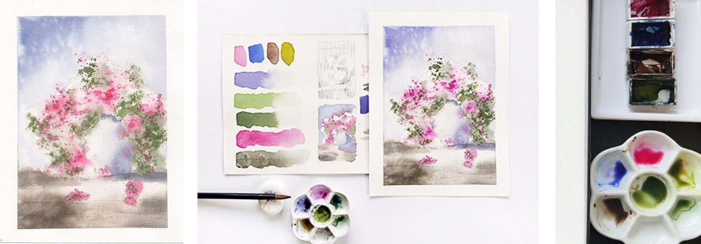
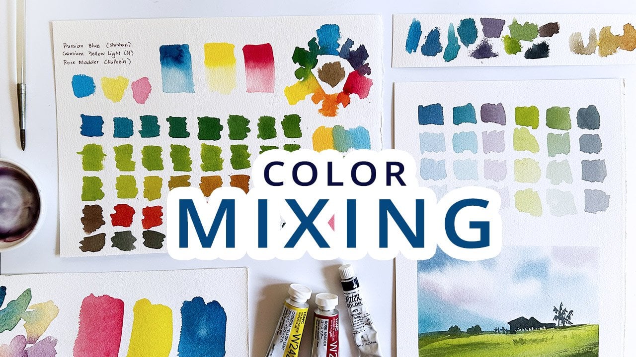
3. Setup and Color Mixing: Here's my usual setup. I have my water jar here, paints over here, my palette. There are already colors because I've tried
my colors earlier, and then this dirty sponge. It's a bit dirty,
but it does the job. Then my paper here, which is Bow Hm, mother
color paper, cold pressed. And then I have two
brushes here that I usually go to and pick up
when I'm doing studies. So what I want to show you is
how I do studies like this. I have my pencils sketch. I have a small color study, and then I have here some
mixes just to test out, if the colors that I picked
indeed work with each other. And then here's the smaller painting,
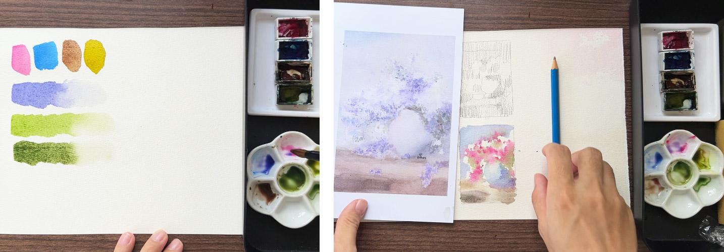
the smaller version. Well, for this class, I've chosen my favorite pink, which is quinacridone red, and then thalo blue, burnt umber and greenish yellow, but I won't use some
of the colors as is, and I'd like to swatch
them first and test the color combinations that I can achieve with a
limited palette. I am a fan of color mixing, and if you've been
following me for a while, you'll notice that because I love painting with
limited palette. So let us try out the colors straight from the tube and
see how they look like. Here's my Qin red. That's a pretty pink. So I'd like to use
that straight off. But the blue is too
vibrant for me, and I don't want to use
that for my background. Later, I'll show you
another shade of that. That could really work
well with the palette that I am looking to use. Now this brown is good for
the color of the table, but not really for the shadows. And of course, this one. I think the color
is a bit funny, but we can still use that. I'll show you how. So this one, I'll live it alone, since I
can use that from the tube. But the blue, I'd
like to add a bit of my Qin bread and make
it a bit purplish. Now that could work
for my background. Look how lovely that
color turned out. What about the
green? The green or the greenish yellow
doesn't look really good. So here is my puzzle of green. And if I add just a
bit of blue into that, You'll have this beautiful
leaf color, isn't it? Now, if I want to
tweak that even more, I can add burnt umber oops, maybe a bit too much. Let's just fill the green
and the blue again. And it turns into a lovely
earth green color. So see. See the difference it makes if you take time to really
swatch your color. Now, let me just put
this here so you can see the whole set of colors
that we're working with. From the four colors
that I selected, this one, we'll be using this beautiful set
of colors later. Oh, let me add the brown two. I said that this is too
bright for me, right? So what I'm doing really is
just adding a teeny tiny bit of blue onto that to
make it a bit darker. Maybe too much. Let's add bro, burnt umber, to the mixture. That's how it looks. These are the colors that we
will use for our project. Once you're ready, I'll
see you in the next video, where we will do a quick study.
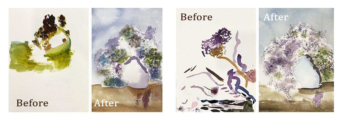
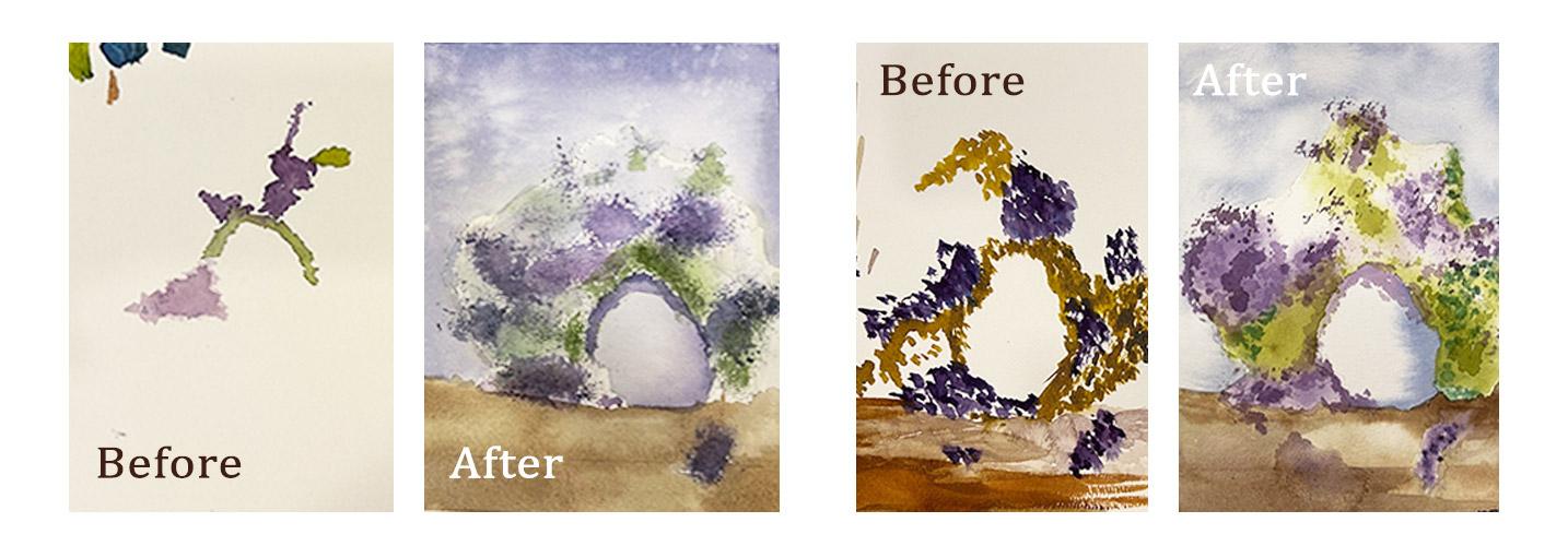
4. Watercolor Studies: Right. Here is the painting that
we'll try to replicate. This is an old painting of mine. I can't really find
the original painting, but I have the photograph, so let's use this
as a reference. Now I'll do two mini studies. One is a black and white
study using a pencil, and the other is a color study using the
mixes that we tried in here. Just to make sure that
everything is working for the black and white
study actually have the small cards that are very useful in creating
small studies like this. This is a two by three
inch illustration board. That's it. The painting is portrait, so I will be drawing
that in portrait too. Looking at my photograph,
my reference photo, the table is some one third
of the painting, right? So it's one thirds.
So around here. And then the vase would be over the table, something like this. I'd like to start my
studies with edgier shapes, and then this the
edge of the table, and then I'll use abstract
shapes or my florals. That would work. Now, I'll use the
hatching method. Just to shade everything
that needs to be dark. This lower left side of
the painting is dark. This part of the
table is dark too, and then I'll color
in the rest of the table with a medium value. This is a fallen petal. Then there are parts of
the flowers that are dark. I'd like to color that into. Doesn't need to be perfect. All we're doing is
replacing and determining where the lights are and
where the darks are. Really, really simple study, because we can add in
the details later. If possible, I would also suggest that you don't
spend too much time. Five to 10 minutes for
each study is good. Now that I have the pencil
study or the black and white, I can now proceed
with my color study. I'll use a small brush. This would be a messy one, and that's totally fine. You can draw a sketch before
starting or just live it B. Okay. The table would
be around here. The vase would be
this one. Right. I just need to place
them where they are. Again, do not spend too
much time on the study unless it is a commission piece or it is a competition piece. I wouldn't really
spend too much time. I just want to show to see if the colors that I've selected are working with each other. That's fine. You can see the division
of the table through here. Now I'll color in the
background, which, as I've said earlier would
be a blue violet color. I'm doing negative
painting here. I'm avoiding the
shape of the flower. It should be enough. This as would be about the same
color of the background, only thicker and darker. Let's put that over there. Now I can work on the
abstract florals. This wouldn't be
the final piece, so I'm not too worried about
how this would look really. Where the violets are, I'll replace that with pink. And then the green. Let's
introduce the green. Ch. This is supposed to be
shadow the base. That's fine. The base is supposed
to be white, so I'm lifting up
some colors here. What I'm doing is
I'm just rinsing my brush and then lifting up some colors that
are already on the paper. If you can, you can also pat
it dry with a paper towel. I think that could work,
that could really work. Instead of violets, we are
going for a pink flower. I'm trying to add an
impression of details here. N C. That could work. I'm happy with the result. So I will have to pause now. Just one tiny tiny
bit of detail. The shadow over there. Bis meets messed up, but I know that that
would be the shadow of the vase. There we have it. This is how I usually
prepare for a painting. I have my swatches of colors. I have my black and white study, and I have a very
small color study. Once you're done doing this, we can now proceed to
the actual project. S.
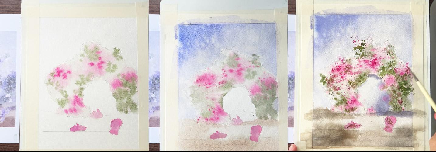
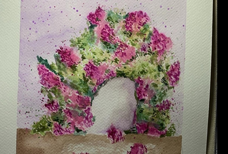
5. Base of the Flower: Okay. Now I have transferred my drawing on seven by
ten watercolor paper, and I taped it down
on a white board. So I'll get a nice border
later once we're done. I have my colors here. And the other materials
that I haven't mentioned earlier that you'll
need to have are this. It's a kitchen plastic wrap. Looks like this. I just bought it at the
local supermarket. I'm sure you'll have something like this
wherever you are. And of course, paper tel, which we'll use for a
method called lifting. Now, this is what we'll do. We'll work on the first
layer of the florals first, and then the background, connect the color of
the background to the table and we'll leave
some of that to dry. Then we can work on the details. So the flowers, background, table, vase, and the
details of the flowers. Are you ready? Cool. I have my scratch
paper here again, and I'll demonstrate some of the techniques that
I will be using. First, for the flowers. You'll notice here
that there are some soft spots on the flowers. To do that, we will use the
technique called wet on wet. But for us to better appreciate
the technique I will demonstrate what we
call wet on dry. This is wet and dry, and the
technique called scumbling. You repeatedly dab your
brush on the paper. Depending on the size of
the brush, on the shape, and on the pressure and angle that you're
holding your brush, you'll achieve different shapes. But that's not what we're after. We can do that to add
the details later. How do we deal with the
background color of the flower? We will use wet and wet. Instead of directly
painting over the florals, I'd like to wet the
flower shape first, and then I will drop my colors. So now you have softer edges, and that works so well for the background
of the floras. Okay? And we will also drop some greens while
that is still wet. So let's lift them and let them bled and blend with
each other on the paper. You can also retouch that. If you're not satisfied
with the feathering effect, you can grab another brush,
something like this. So this is a very cheap
calligraphy brush. No brand. I can't read this. So what you do is you just
brush slightly over that area. So on a side view,
it looks like this. I'm just lightly, like how
you retouch your makeup. Just very lightly
scrub over that, and you'll get rid of
the feathering effect. Okay. So let's get started. First is I have also grabbed a flat brush now because we're working
on a bigger paper. First, with my dirty water. I will wet the florals, the flower area,
the flower shape. So you can see a a slight
tint of green in my water, and I think that works well so that you can see where
I am wetting the paper. I didn't really
refill my water yet. I'm too lazy to do that. I just wanted to
get things done. This still works because the final output would
still be darker. It's okay if you use a dirty
water as a base like this, but not too dirty. Do not forget this fallen
flower over here. Over here. Now I'll switch to a
smaller brush loaded with pink and drop. So I will concentrate
the pink over here, here, here, and here. So soft because it is wet. Very soft. I like that. You don't really need to copy
the reference photo as is, If it looks like a flower,
then that's enough. Do not stress too much over getting something as
close to what I'm doing. Please don't do that. Please be good to yourself. Don't be too harsh. I think I've mixed a bit of
blue in there. That's okay. You can also vary the
consistency by adding more pain. Over here, it's a
really dark pink. I'm using this
cumbling technique, but on wet paper. So it achieves a different look. Now, I'll raise my brush
and load it with green. Again, that is green, less blue. And then if you want, you can also add a bit of brown just to give
it an earthy color. Make sure to swatch
again, if you're unsure. Yeah. That's so
beautiful, isn't it? Now the greens are over here. A bit here. So here. Over here. That's it. If you want, you can also
grab a smaller brush. Something like this.
This is optional. And you have to be very careful
when you're splattering, make sure that your
mobile phone is not beside you or
anything that you don't want to me to mess with is
far from your working area. This gives us those
tiny tiny shapes. Don't worry. We can still use the cling
wrap method later if you don't prefer splattering if
you find it hard to control. Now, the base of
the flower is done, I can now work on
the background. See you in the next video.
6. Soft Background: My flower hasn't
really dried yet, but I am ready for
the background. To achieve a really
smooth background, I will also use wet on wet. To just demonstrate
that very quickly, if you are going to cover a area like
the background here, I mean, in proportion to
the size of your brush. It would be hard if you
cover it carefully, and then you paint around
the flower like this. What we'll be doing is we're
wetting the background area first with water or in my
case with dirty water. And then that's when
I'll drop the colors. So I wouldn't really
have to hurry, and I will still be able to
cover the background and make sure that it is smooth because it is wet first
before I drop the pigments. Now, I also need you to grab your paper towel for this
step. I'll show you why. Okay. Again, I will cover the whole background
area with water only. This is dirty
water. That's fine. My florals are just
starting to dry, but I don't really
need to wait for that. This is negative painting. It's a bit tricky for beginners, but since we don't really
have to be careful and it's really totally fine to
go outside the lines, please do enjoy the process. Don't stress too much, just to show you where I'm wet, I'll just tilt it.
So can you see? I just wet the
background area and then I'll grab my blue violet, make sure that it is
darker at the top, so I will do this motion. And then I'll add more
water to that mixture. I don't really want
it to be too dark. Now, to avoid hard edges between the background
and the florals, you can sort of lift carefully pat the edges of the
florals with paper towel. This is the same
technique that I use for clouds in a summer sky, in a clear blue sky. Just be careful like
what I did here. I accidentally lifted up
the color of the florals, so I'll need to
retouch that again, but I'll leave it be. Now, for additional texture, I'm actually dipping my
fingers on my dirty water, and then I'll flick
and splatter. See how that creates
those lovely texture. That's so beautiful. I like it. Now I will connect. I won't wait for the
background to dry, and I will reload
my brown color. Mix that with a bit
of blue, just a bit. Don't go overboard. And again, the table
is a big size, is a big shape, I mean. So I'll wet that again
with clean water. I'll go over this
petals. That's okay. Then now I can drop
that brown color. In my reference, this part
is lighter than the rest. So I will just go over this parts again later
and make them darker. Under the vase should be dark, of course, there's a shadow. Now, to make this, just
reload your brown, make sure there's
more water now. I mean more paint than water. Then paint over those areas. I think I need more blue. That's still too orange for me. To orange. I needed to be. Yeah, this color. It's lovely. I'm also using the same
color for the shadow of the fase and make
this part darker too. I cannot see the line here, so I'll use this brush again to manipulate
where the paint goes. There you go. You can also do the same
splattering effect on the table. I just love how that creates
a beautiful texture. Now, we'll work on the vase and the final details in
the next video. Sea.
7. Final Details: This is looking so
good right now. I just don't like the hard
edges over here and here. This would be good, but I still wanted
to retouch it. My favorite technique for
this is also called lifting. But this time it's lifting
while the paper has already. What you need is a
flat synthetic bruh like this and your paper towel. We your synthetic bruh and on the edges that you
want to lift and soften. Just be careful not to lift
the whole thing, okay? You can also use a
scrubber brush if you have one in this one,
should blend smoothly. Okay. Yeah, that's better, right? So now we can work on the vase. Again, I will use the same
color as this one on my vase. All I need to do first is to wet the shape of the vase
and do wet on wet again. So I am wetting the vase shape. And then I still have a bit
of my blue violet in here. I can just grab
that, grab and drop. There. L et that spread. But again, makes a
thicker consistency of the blue violet. You can also switch to a
smaller brush this time. It's easier to control and
then drop around here. You can also drop
over these areas. Those are shadows cast by the flower and a bit
here, just a bit. Then you can retouch with this technique if there is too much feathering
to your liking. You can then extend that color and use that
as the shadow color to. I'll re wet my brush and
just to soften that edge. So now all that's
left are details. What we'll do next are add those tiny details like
this and some wood marks. So I'd like to start
with the wood marks. Just do dry brushing. So I'll do this. Okay. And same on this side. That would be that
should be enough. Okay. Now for the
details of the flower, you have different options. First, you can do scumbling, switch to a smaller brush, load it with pink, and do this. Let's try on this smaller
petals so you can do that. But if you it doesn't look too organics You can also tap it with your finger
to spread it even more. Can you see the difference? So if you just cumble like this versus you tap
it with your finger. And then, of course, we have
our handy plastic wrap. Instead of a brush, dip that on your paint, and you will achieve
organic shapes like this. Isn't that beautiful? So I'd like to start with
this cling wrap. This is my favorite
technique when it comes to adding abstract
shapes like that. I will refill my pink
and green mixtures. And I'll start with the
lighter color first. You can have multiple plastic
craps for different colors, but I'll just use one. And start with the
lighter color first. See how easy it is to
add those tiny details. It's a bit messy, yes. You'll get messy fingers
and hands later, but it is a lot more fun, I think, than scumbling. O. That's fine. I'll live that. Oh. It's too addicting, too, so make sure not
to go overboard. I'll just extend
some of that and let it go to the background. Then without leasing
the cling wrap. You can just crumble that again. I'll dip that on my green. So easy to do too. If some of the edges
are too hard for you, you can also use your
finger to retouch. It's really a combination
of techniques and knowing when to
use the wet on wet, wet and dry and when to live it to dry or when
to work on wet on wet, that you really get to achieve this look
for your florals. If you'll know this, I
also am not too stressed about getting this
as perfect as it is. I'm just enjoying the
process, and that's it. You can also add a bit on the
fallen petals over there. You can do a bit of scumbling. If you want finer details. And I think that's it. Massy fingers, messy hands. But I am happy
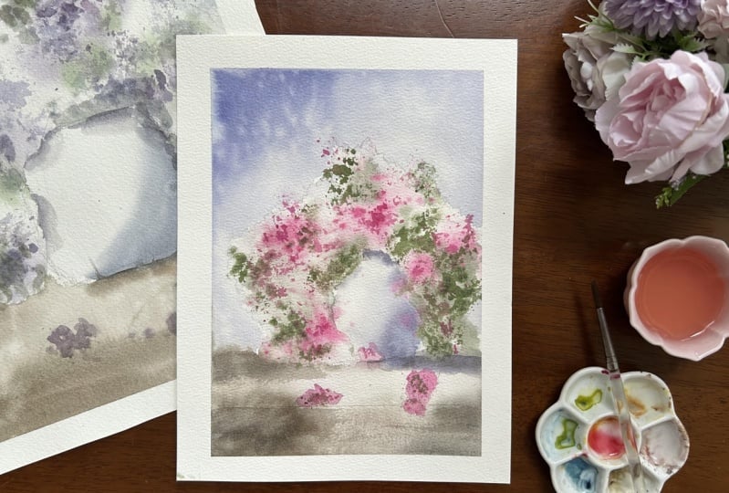
with how it looks. Now, let's reveal the painting by peeling off the masking tape. And see how this really
looks with a clean border. I am hoping to see
your projects. Please do not forget to upload
them in the project that. We can also change the
palette as you see a bit. If you have a favorite color, then please use that. And let's appreciate what
each of us has come up. Using the techniques that
I've just showed you. So here is my floral painting, using a limited palette
of four colors. I'll see in the next video for some tips on what to do next.
8. Furthering Your Studies: Wow, you did it. Thank you for letting me be part of your learning journey. I'm looking forward to see what you've come up with
during the class. I will leave a feedback
as soon as I can. If you want to keep learning how to paint loosely and softly, don't forget to practice, but of course, you can also
follow me on Skillshare as I am planning to publish
more classes like these. You can also challenge yourself by finding
reference photo with the same floral structure and apply the same techniques
discussed during this class. I am fond of working with
limited palette as it takes away the pressure and stress of deciding which
color to pick next. That's my key takeaway
for this class. Along with, of course, doing studies to boost your confidence on working
on the actual class project. That's it for this class. Don't forget to upload your
project and leave a review, and I'll see you on my
other classes and together, let's make this world
a little bit more colorful with our artworks.
 Bianca Luztre, Watercolor, Productivity, Color Mixing