Transcripts
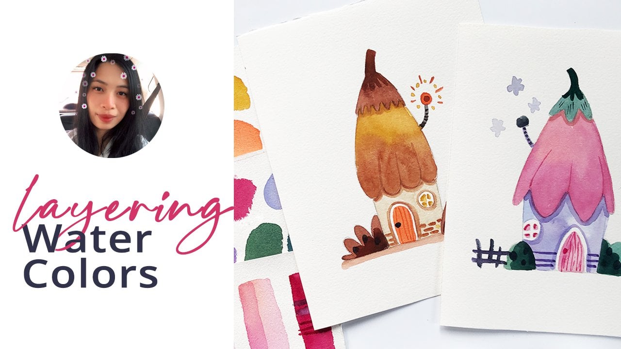
1. What You'll Learn: Did you know that there
are other ways of mixing your colors aside
from using a palette? Let's explore five
different watercolor mixing techniques and see
how they look on portraits, trees, and flowers. This class is designed for all artists with
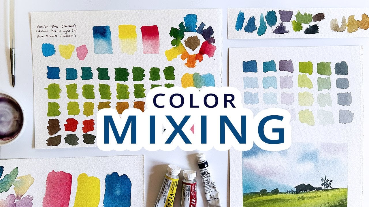
any skill level. We will create different
swatches of oranges, greens and purples, along with a quick review of our primary
and secondary colors. I will also show
you how I combine the different mixing
techniques in painting this simple
orange illustration. Once you've tried mixing
colors in different ways, then you'll have an
idea which technique to use in a specific
painting subject. If you've been following me, then you'll know that I am
a fan of a limited palette. So we will only use three
colors for this class. If this is your first
class with me, then hi, I'm Bianca Lustre, an aspiring watercolor artist
from Betangas Philippines. My current obsession
is testing out as many combinations of
primary colors as possible and creating color wheels and
charts in the hopes of helping you choose
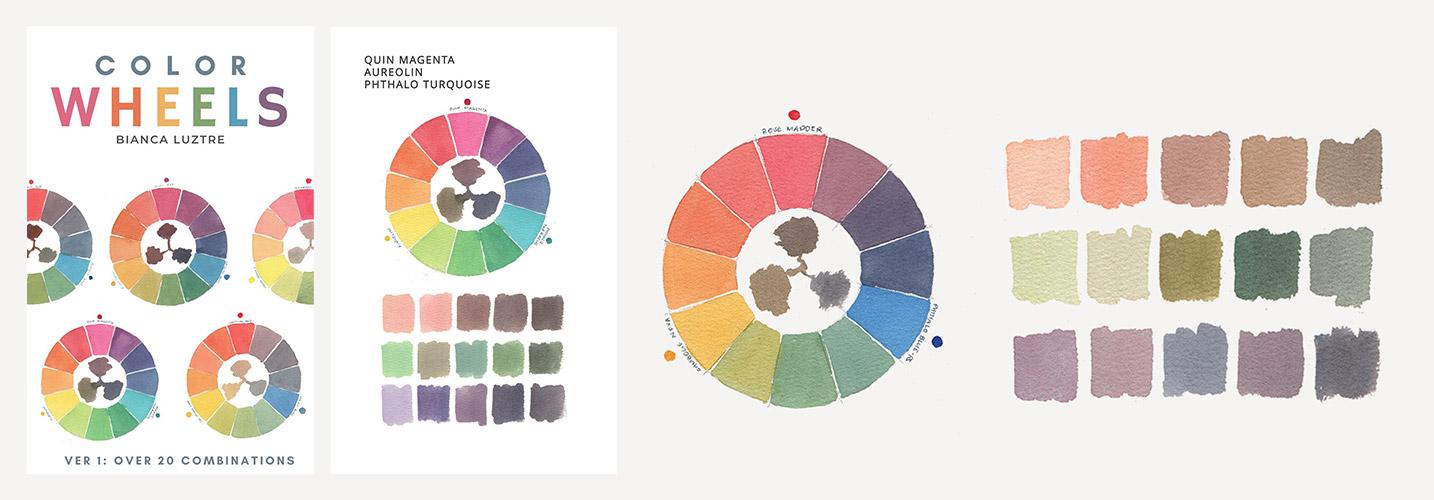
your own pigments for your own limited palette. In fact, I'm giving away a
free copy of my latest ebook, Color Wheels to my students, and I'll tell you more details about this in the next video.
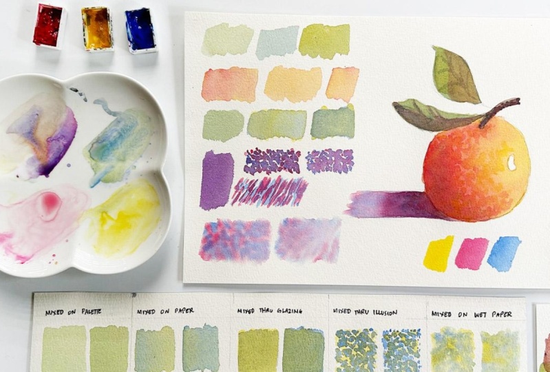
2. A Gift for You: Our goal for this
class is simple. Test out the different
color mixing techniques. As a class project, you can either upload a
photo of your swatches, mixing chart, or if
you want to go extra, then please follow along and
let's paint this orange. By doing so, you
will be eligible to get a free copy of
my latest eBook, Color Wheels Version one, where I mix and match different primary color
combinations from various brands in
the hopes of helping you pick your own primary
colors for a limited palette. These wheels do
not only showcase the secondary and
tertiary colors you can mix by using the primary
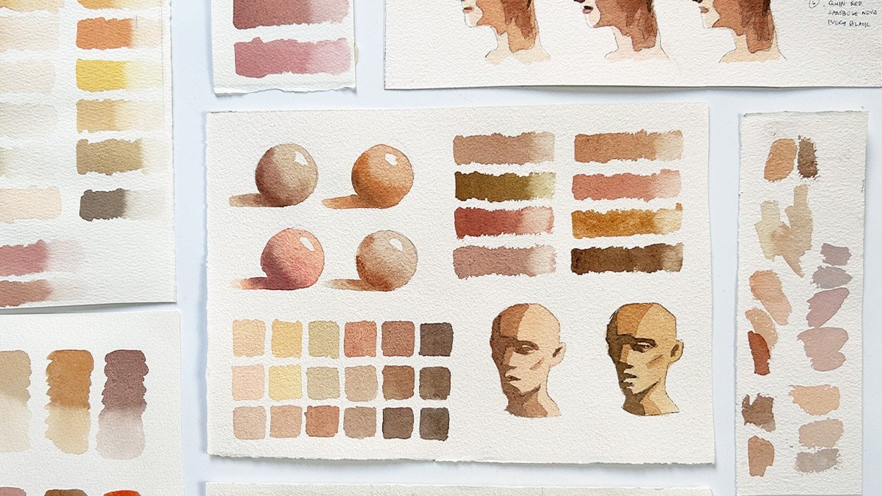
colors featured, but I've also swatched
different shades of skin tones, greens and purples to
show you how you can further expand a limited
palette of three colors. But if you are a bit shy in
uploading your class project, then you can still
get a free copy by living an honest
class review. But why not do both? So if that has motivated you, then please prepare your
usual watercolor materials, including paints, paper, brushes, download a class guide for your reference
containing the mixing chart, painting samples, and
let's get started.
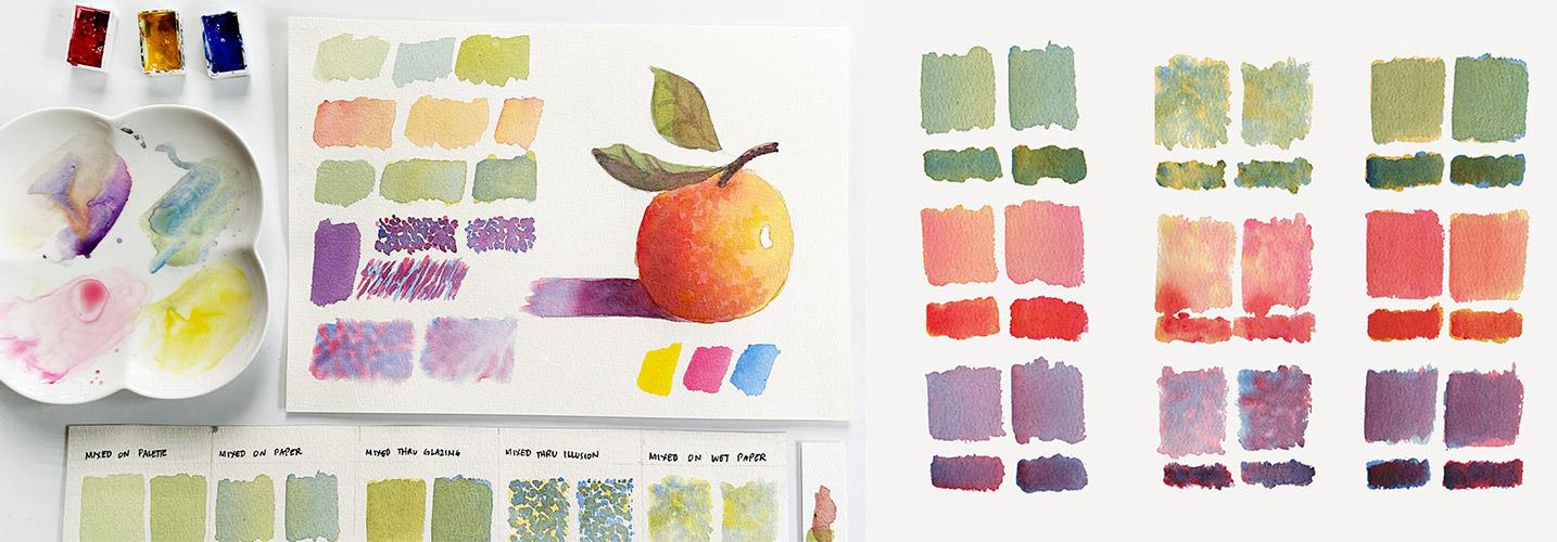
3. Mixing on Palette: O Let's start by clarifying
that mixing is not blending. Mixing is about combining two or more colors to
achieve a new one, while blending is more focused on transitioning from
one color to another. And if you're more
interested in blending, then I have a different
class about that. Okay, now a quick review on our primary and
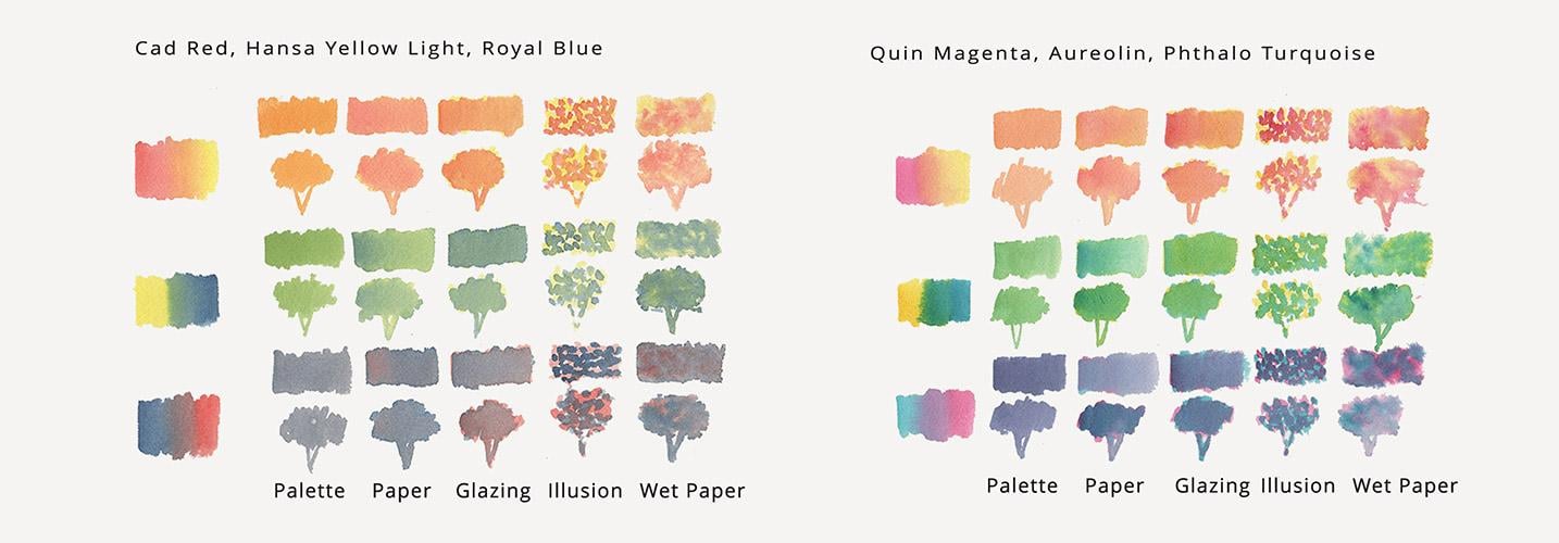
secondary colors. For this color wheel,
I used magenta, orolin and To turquoise. These are my primary colors. Of course, you can use
any colors that you have. But remember that you will achieve different
colors if you do. So this wine shows cadmium red, cadmium yellow light,
and cobalt blue. See, they have different purples and greens compared to this one. Anyways, if I want to mix a
secondary color, say orange, which is this wine,
then you just need to look at the two primary
colors surrounding it. So if I want to mix orange, then I'll need my red
or pink and yellow. Same goes for green. Look at the two primary
colors surrounding it. You'll have yellow and blue and the same goes for
violet or purple. If you want to learn
more about color mixing, then I have a different
class about that. The most common way of
mixing is mixing on palette. It's pretty much
straightforward. Now, let's say I
want to mix green, I have my yellow and blue here. Oh, by the way, I'm using Gambognova permanent
rose and cobalt blue. I'll grab my Yellow first. I always start with
a lighter color, but you can do it differently and then load it with my second color,
which is blue. And that's it. That's
how you mix your color, and I'm pretty much sure that
most of you are doing this. Now, the color, the
shade that you achieve depends on the amount of
each pigment you mix. So if you want a blue
green, then add more blue. If you want a yellow green, then add more yellow. That's it. Let's use this
color for this leaf. That's pretty much it. Let's see how this style
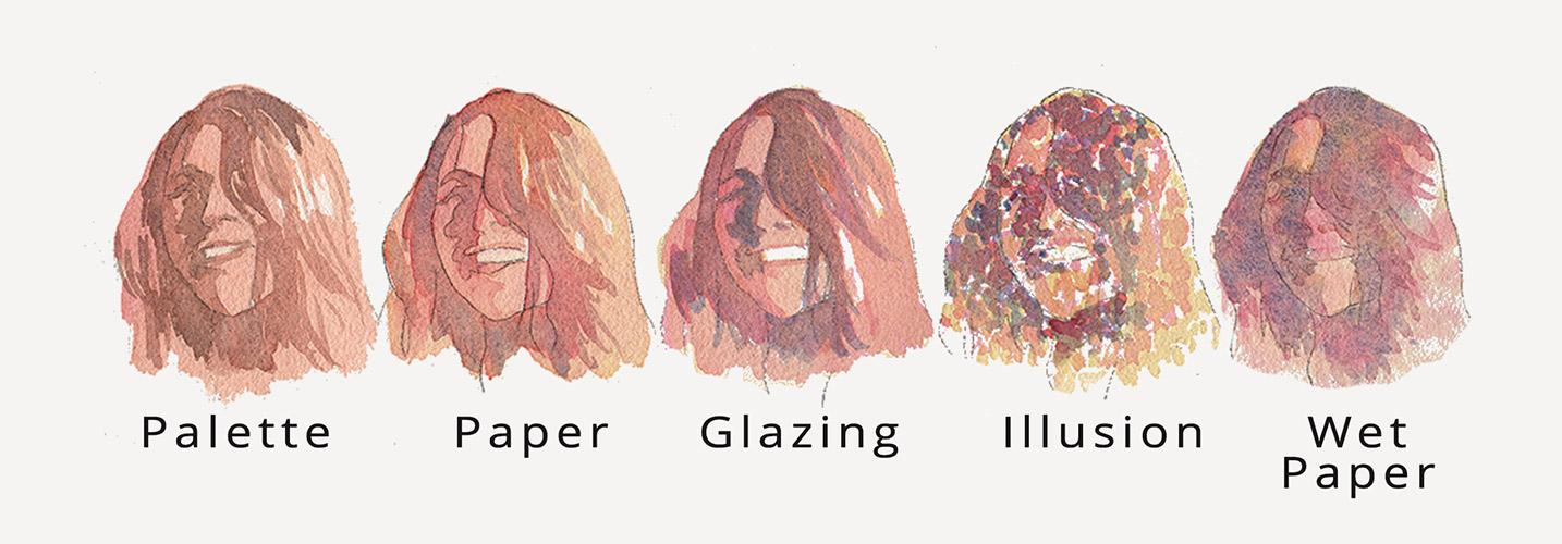
looks with a tree, tulip, and a simple portrait. I used more than one
layer to paint this, so it's pretty normal. You know, that's the most
common way of mixing, so I think nothing's
different on this technique. But let's see how the
second technique brings more movement and makes
your painting more interesting by mixing
not on the palette, but on the paper directly.
4. Mixing on Paper: Now, a more interesting
way of mixing is if you do it on the paper
instead of on the palette. Let me show you how it looks. Say I wanted to mix an orange, I'll go for the
lighter color first. I will paint it
directly on the paper, rinse my brush, load it
with a second color, which is permanent rose, and then mix it on the paper. For comparison, let's mix
orange directly on our palette. Can you see how
different they look? Now, let's try
painting pink first, and then mix in yellow. They look so different, right? Now, let's try it
on this orange. I am more confident when I start with the
lighter colors first, so I will paint
this with yellow. Again, this will look different depending on the amount
of pigment that you use. Of course, if you use a stronger yellow
or a stronger pink, you will achieve
a different look than what I am doing right now. Now let's go for pink. This technique is kind of
interesting because you can see more movement on your paper. And you'll see hints
of yellows and pinks. I'll just add more pink
on this side because the shadow is on the left side, so it makes sense for this
to be darker. That's it. Okay. You might be
curious how this looks like on the previous
examples of a tree, a tulip, and a simple portrait.
So let's take a look. I love how the portrait looks, the mixing of the colors. There are still hints of pinks and blues
that are visible. The same goes for the
tulip and for the trees, but I think I needed more
texture on the trees, and I should have
added more layer. But overall, I like how the colors seem to be playing with each other with
this technique. Now, let's take
another variation of this technique
in the next video.
5. Mixing thru Glazing: Watercolor is known
for its transparency, and with that, we can also
mix colors through glazing. It is a process of adding a thin wash of paint over
a previously dried one. So with that being said, I will need you to
be patient this time as you need the first layer to dry first before adding in the second one. So
this is my green. This is a yellow that I painted
earlier and I let it dry. I can go ahead and load my
brush with a thin wash of blue and paint it
over my yellow wash. It looks different
from this one, since the yellow is still showing through
the wash of blue. Let's try adding a thin
wash of yellow over blue. This has a somewhat different
look than the first one, and I like this better. So I prepared this leaf
with a blue wash. Now let's add a yellow wash
over it to mix greens. This technique can also be used in what they
call underpainting. I've seen some artists use blue as an underpainting
for their shadowed parts. So for example, this leaf here, I can add blue on the
shadowed area, say here. And wait for it to dry
before adding another layer. Okay, this time, the tree the tulip and the portrait looks a bit different than
the previous one. But I like how the portrait
and the tulip looks. But with this technique, again, you'll need
more patients, and you'll need more
study as you need to decide which color
to paint first. Now, I'll see you in
the next video for a more challenging way
of mixing your colors.
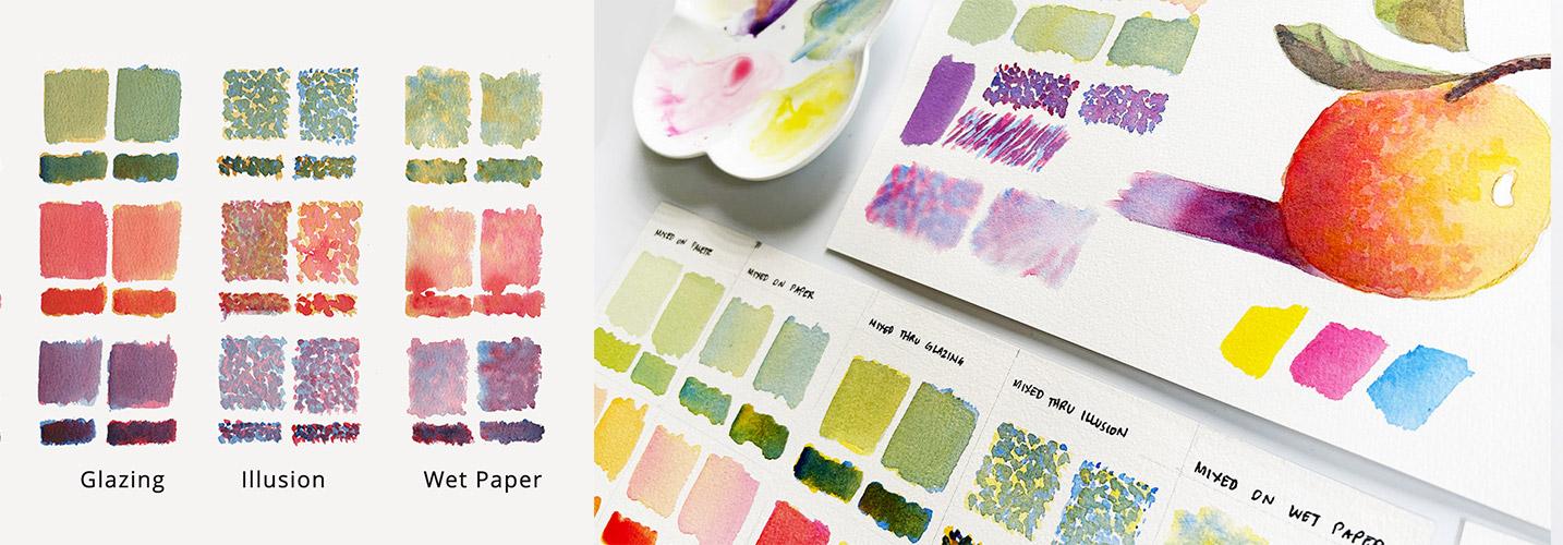
6. Mixing thru Illusion: If you needed patients with
the previous technique, then buckle up because you'll need more patients this time. This technique is
inspired by pointism. We'll use short strokes like
this or small marks like this and place the color side by side and let the
eye do the mixing. Thus, mixing through illusion. For comparison
purposes, let us mix purple directly on the palette. So that's pink plus
blue or red plus blue. And let's put that here. Now, use this short
repetitive stroke. And let it dry first. If you want, you can also
use short strokes like this, which I previously painted
so you can see how it works. Let's say I want to
mix purple again, so my blue is ready. Now I will add in
short strokes of pink and fill in those gaps. Some of the marks
can also overlap. Doesn't make sense right now, but later I'll show you
how I applied it on a landscape portrait
and simple still life. Now, I'm going ahead and adding blue on this previously
painted pink. Then now that this
is somewhat dried, I can now add pink. This could be really
time consuming, but it is also meditative since you are
doing repetitive strokes. Now, let's paint in this branch
with the same technique, and this is brown, meaning we need to combine all
of our primary colors. I've added in yellow in advance, so now let's add pink. Wait for it to dry.
Then we can add blue. These samples don't make sense and they look a bit
clunky and messy, but see how they look
when I zoom them out. Now it all makes sense. If you use a smaller brush or if you work on
a bigger painting, then looking at it from afar, the eye really does the mixing. If you think that this technique
is too time consuming, then the next one might be a better option for you.
I'll see you there. What
7. Mixing on Wet Paper: For the last technique, we will do the same
as the previous one, but we will prepare the
paper with water first. So say I want to mix purple, I will wet my paper first with water and then load
my brush with pink. Prinse your brush
thoroughly and add in blue and try to
fill in those gaps. So now the edges are softer and they are kind of blending with each other
because of the water. You can also try adding
in blue first and using a different shape like
this one, short strokes. Rinse and add pink. This has a different effect. Now, let's do that
on the shadow. I'd like to add in pink
first and use the dots, then add in blue. This part is darker since
it's nearer the fruit, so I'll add another
touch of pink. Okay, I think, honestly, I didn't do a good job with
the portraits and tulip, but I love how the colors
are mixing with each other. They look unfinished
and really painterly. But if I am to use this
on an actual painting, then I might use
other techniques like directly
mixing my colors on a palette and add that
as the final layer so that the features of
the face are more defined, as well as the separation of the petals and adding
more texture on the tree. But overall, yeah,
this could work. Now, let's see how our
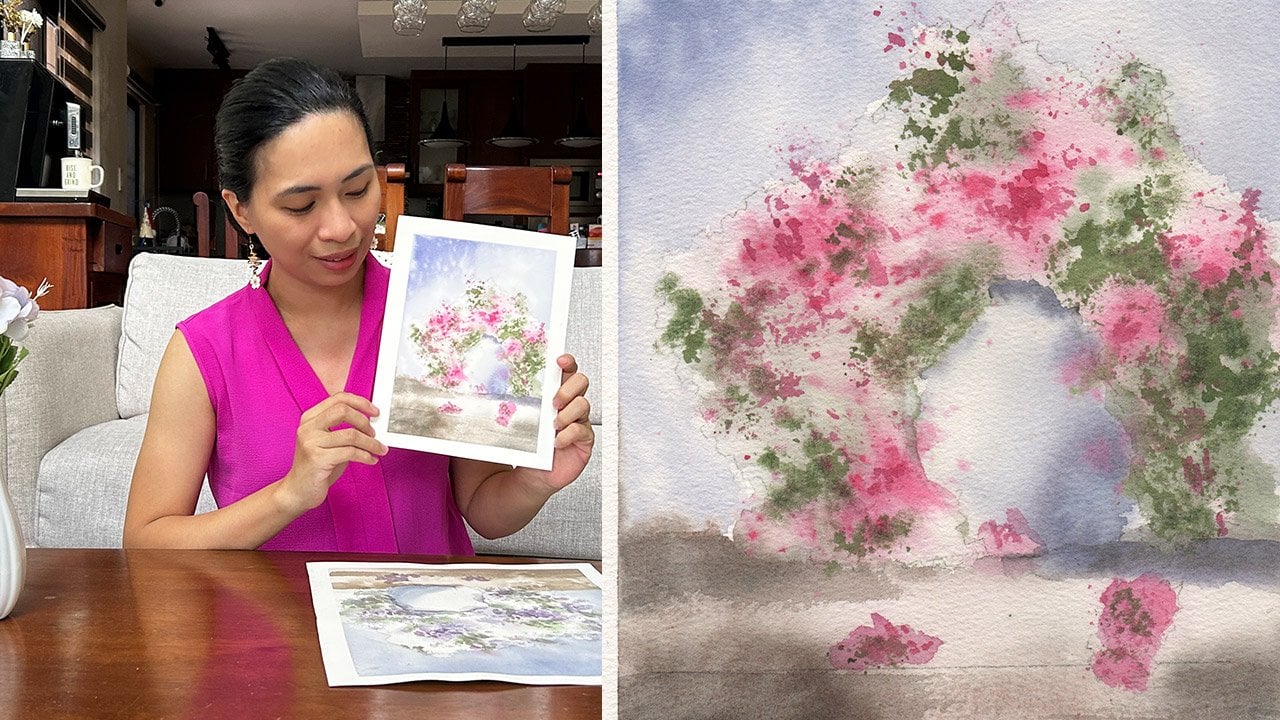
Still Life project looks if we combined all of the techniques.
I'll see you there.
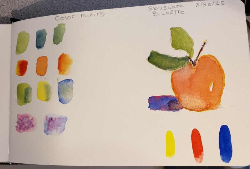
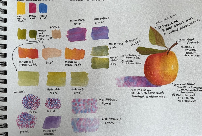
8. Combining the Techniques: I'll just show you how
I'll finish this orange because it looks a bit
pale to my liking. So I will combine all of the techniques
demonstrated earlier, and I'll walk you through how I decide which one to
choose for which area. Let's start with
the orange itself. I use the second
technique for the orange, so I will do the same, but I'll go stronger
with the colors. Meaning more paint than water. Starting off with this side, I'll add more yellow there. Also on this part, rinse my brush and add more
pink on this part. So I left that part
yellowish, a bit yellowish. And then I will extend so that there's a bit of flow
into the shadow. Since we use the fifth
technique on this one, let me retouch it by
adding dots of blue. To achieve harmony, I will also add dots of blue on this
part of the orange. So it is a combination of
techniques number two and five. Now, these leaves
are looking pale. We used technique number one on this one and number
three on this one. I'll do blazing
again on this one. So there is a shadowed part. I'll add pink on the
shadowed part of this leaf. Do the same on this
one. Then this branch looks a bit messy. So what I'll do is I'll mix all of the colors
to achieve brown. Purple has already
pink and blue in it, so I just need to add
yellow to make it brown. Cover the branch with
that brown color. The leaves are too pale and
looks awkward at the moment, and then the orange is
too smooth to my liking, so let's retouch those parts. First with the green, I will
directly mix my colors on my palette and add another
glaze over this one. Now for the second leaf, I'll make that more
of a blue green. The best technique
to add texture is this one, the
fourth technique. So I'll start with yellow, rinse my brush and
load it with pink, and try to fill in the gaps. This part is also darker. Now I will add
some details here. Me texture here, and
I think I'm done. I'll see you in the next video. Let's wrap up, and I'll
remind you how you can grab a copy of my gift
for you. See ya.
9. Claim Your Gift: But That is so
interesting, isn't it? Which one is your
favorite technique? We tried mixing on palette, which is the most
common usual way. Mixing on paper where there's
more pigment movement, mixing through glazing, which
indeed tested our patients, mixing through illusion,
which really did take some time to complete
and mixing on wet paper, which I personally think
is the most unique way. We also look at how each technique can be applied
on a simple portrait, a landscape element such
as trees and florals. Each technique has a
beauty of its own. But if there's one thing that I want you to take
away from this class, that is taking time to
study color mixing, doing your own swatches, but still having fun while experimenting with
different techniques. I hope you enjoyed this class as much as I enjoyed
creating this, especially the part where we combined all of the techniques. Now it's your turn to complete the learning process
by uploading your project and telling
us which colors you used. Then, please go ahead and leave an honest
class review to help other students decide whether this class is for them or not. Don't forget to grab a
copy of my latest eBook as my way of saying thank you
for supporting this class. I hope to see you on my
other classes and together, let's make this world
a little bit more colorful with our artworks.
10. Bonus: Best Technique: I love all these techniques
and each has their own use. But if I am to choose, then it would be the second one, which is mixing on paper
and the fifth one, which is mixing on wet paper. But I am more accustomed
to mixing on the palette, and the lasing is also a fun experiment to do while
mixing through illusion, can be useful in adding textures and depending on the
effect that you wanted. But to help you decide which one is the
best for you then, let's again review the
different painting subjects that I did using the
different techniques. Starting first with a tulip. On this one, I
think the best one that I have for you is
glazing or layering. But again, it will
depend on the amount of time that you dedicated
in creating your craft, and the ones are just studies. So it just took me 15
minutes to do these studies. That's why I strongly
encourage you to test this on your
own and decide. Next, for the
portrait, of course, this is the safest pick mixing
your colors on a palette. But these two really
grabbed my attention. I would like to make
more portraits using the mixing on paper and mixing through
glazing techniques. Not so much for the last two, but again, I think if
I used smaller points, smaller brushes and
took more time, then they might
have looked better. For landscape
elements like trees, this to really
caught my attention, but mixing on wet paper might also work if you're
on the final layer. Take note that I did all
of this with three layers. The demonstrations
I did earlier look pale compared to this
one because one, I use different colors, and two, these were only
done using one layer. So I hope that helps you in choosing which
style to experiment with and which style works best with your personality and
your painting subjects. I'll see you in the next video. Let's wrap up, and I'll remind you how you can
get your gift from me.
 Bianca Luztre, Watercolor, Productivity, Color Mixing