Transcripts
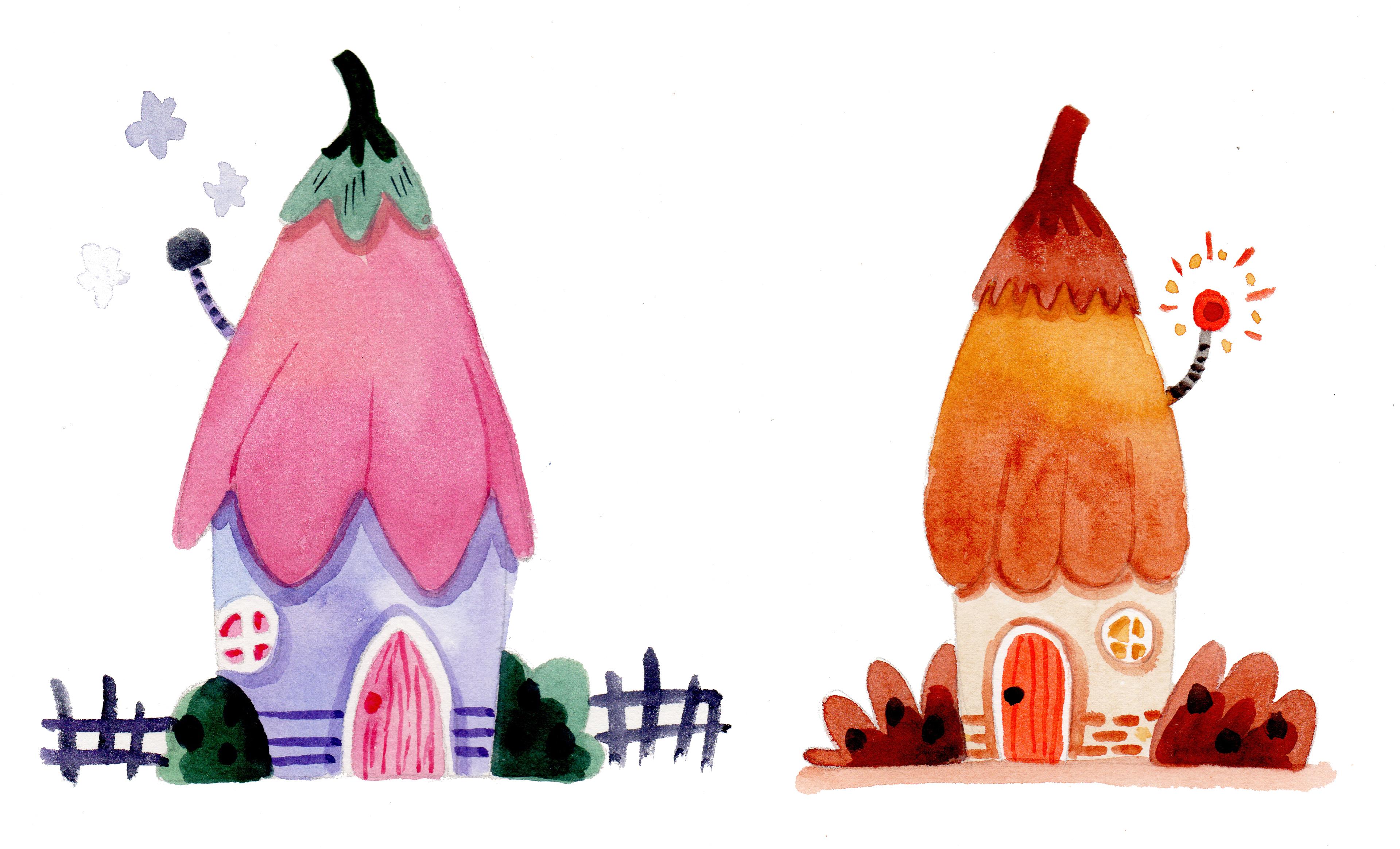
1. Welcome to This Class: How do you transform your watercolor illustration
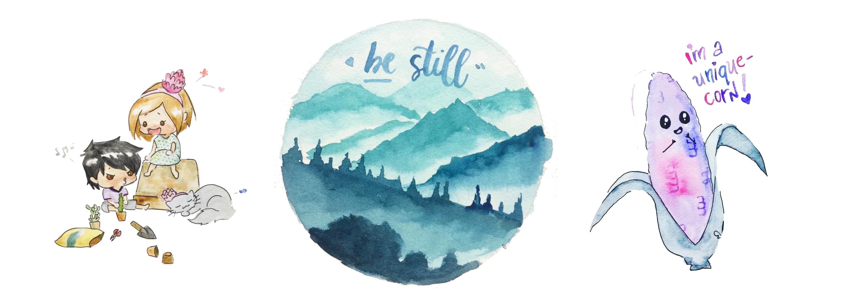
from this to this? The answer is layering. Hello, lovely people. I am Bianca loose try and aspiring watercolor
artists from both Angus, Philippines, who loves books, cats, and brush rinse. It's been a habit of mine
to paint daily since 2018. And I'm happy to share with
you what I learned through my experience before
learning how to layer. My watercolor illustrations
look flat and pale, but now they are more vibrant
and have depth in them, which adds interests
on the species. In this class will
have fine illustrating this simple yet
pretty fairy house. While discussing how to
properly layer watercolors, avoid common mistakes, and review the water
to pigment ratio, which is important
in controlling the consistency of the paint. This glass is beginner friendly, but experienced artists and hobbyists are welcome
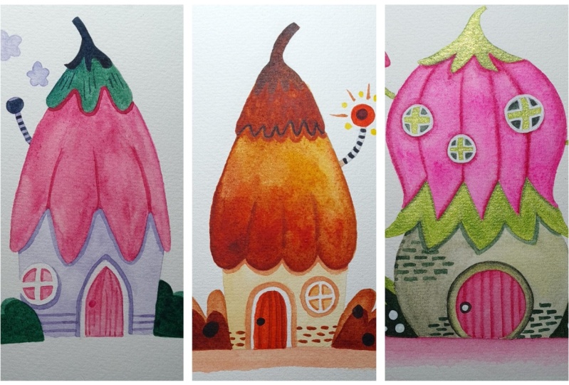
to join define. As a bonus, we'll also paint another fairy house with
this lovely autumn palette. So grab your materials
and let's get started.
2. Please Prepare These: Here's what you'll need to
prepare for this class. Watercolor paper. I will use arch cold pressed
300 GSM and 100% cotton. Later. I'll show you why
this is my choice of paper, but feel free to use
what you already got. Of course, your
watercolor paints. Watercolor brushes. I have three sizes here. I have three sizes here. One for the big shapes, the smaller wines,
and for details. Benzyl and eraser
for this, catch. A water jar to rinse
off your brush, and a rag or paper towel
to blot excess water. You may also download the
PDF guide from the projects and resources tab that will
serve as your reference. If you're all set. Let's paint.
3. Paint Consistency: We'll begin with reviewing how to control the consistency
of our pigment, which is important in
layering watercolors. You might have heard of the
tea, coffee, milk, cream, and butter analogy, but if not, then please observe carefully. You'll see here a swatch of quinacridone rose in
different consistencies. Now, I'll use another color to show you the
difference of these five. Specific to this. We will start from
light to dark colors. Big to small shapes, and thin, thick
consistency of paint. First is D, a very
watery paint mix. About 90% water and
ten per cent paint. This as the lightest color and is commonly used
as the first layer, as it is the thinnest. Trying it out so you can see how transparent and flowy
that mixture is. That d next is loved
by many coffee, thicker than t, but
still flows freely. Around 70% water, 30% pink. Let's see how it
looks compared to t. It's darker but
still transparent. That's coffee for you. Fun fact, I have a very
low tolerance with coffee, so I am more of a DIY person, but I know how to brew
coffee grounds for others. Next is milk. Now we have a 5050 ratio. Paint does not flow easily
as there's more pigment now. In contrary to real life, this should be darker
than your coffee. There you go. Cream, around 30%
water, 70% paint. Yummy. This consistency
should be creamy and colors are bolder
and it is thicker. We're getting more and more opaque as we reach the bottom. Last is butter, bird down
to 10% water and 90% paint. The thickest and most opaque
of all the consistencies. You can even use paint
straight from the tube, which is commonly used as the
last layer in a painting. With this consistency, it's easy to get a dry
brush effect too. So traditionally, we go from D to water in
layering watercolors. Then there's two thickest. And I'll show you how it
works in the next video.
4. Layering Exercise: Now that we know the
different consistencies, Let's add details on this door. I painted this
with Payne's gray, but I will try and
layer it with indigo. I mentioned earlier that
we go from thin to thick. But let's see what happens when we layer this consistency, but with a different color. Please take note that I
have left this door dry completely before
adding another layer, or what you call wet on dry. I load my brush
with indigo coffee. That sounds weird. And paint the
shadow on the left. You can see how transparent
that is, but really subtle. Then I'll use indigo
milk for the door knob. Compared to the
shadow on the left, the knob is more pronounced. I'm refilling my
palette with Mark paint for a stronger and bolder color. Then add some wood markings on this door to make it
look more interesting. Which will also do on
our class projects. This is indigo cream, thicker, not really flowy, but highly big vented. I will continue adding would
marks until I am satisfied. Take this time to practice
painting thin lines two, as it is very challenging
for beginners. Based on my experience. For comparison
purposes, let's add another layer of indigo
cream on that shadow. It's obviously darker than
the layer underneath. This. Ladies and gentlemen is
how you layer watercolors. Thin to thick, light to dark, big shapes, two small ones. In the next video, Let's practice more layering to prepare us for our project.
5. More Layering Exercises: In the previous video, we layered with
different colors. Now, let's use the same color. This is Queen Rose,
my favorite bank. And we have a gradient from
shopping to Queen Rose. And another swatch of quin rose butter for
demonstration purposes. Now let me show you what
happens when you add a thin layer over a thick one instead of
the other way around. So we'll use T over butter. It is hardly visible. I can tell that that part is worth only because of the shine, but nothing really changed. But what if we use
a different color, like indigo coffee over Queen
Rose butter is visible. And you can surely
use this technique. But please be mindful of the pressure that you use
as you add another layer. Because if you go back and forth and use too much
pressure on your brush, you could accidentally lift
up the layer underneath. Just like what happened here. Next, I'll grab my
Quin Rose butter, and I've got on my dried butter swatch that is more visible than
the tea consistency earlier. This is useful when
you want to make a color bolder or add
shadows of the same color. More layering breakfast. Here's a creamy Queen Rose
over a coffee swatch. You can see the
difference when layering a thicker consistency at
the top of a thinner one. It's easy for details
to pop out too, if you have a light background
and a dark foreground. Now, there will be times when your first
layer looks pale. You can paint over
that layer with the same colors and consistency. Even if it's a gradient. I usually do this on my
skies and sunset paintings. Observe how bolder and more vibrant the colors
are on the left side. Just make sure that
the first layer is dry before glazing another one. In the next video, I'll share with you
three common mistakes in layering watercolors.
6. Common Mistakes: Here are three common
mistakes and layering watercolors that I personally
experienced before. First, is not using the
right size of brush feature. Why is it so hard to
paint small details? Asked one of my students
during an online workshop, when I inquired which Rush
she's using for details, she showed me her
biggest mop brush. If you have a big brush with a pointy end and you are
unexperienced painter, then this should
not be a problem. But for beginners, doing this is such a challenge and
requires experience. So I recommend switching
to your smallest brush once you are working on the
details in your painting. But it does not guarantee that you can
easily paint thin lines. Do you have to practice painting with just enough
pressure to achieve this? If we compare these
lines created by the big mop brush and a
small round tip brush. You can see the difference. Being impatient is
mistake number two, not waiting for the
previous layer to dry completely and diving in
to add another layer. It will lead to a
massive painting. And trust me, I ruined many paintings because
of this mistake. I wanted to draw some details and I'm always excited to finish a painting that I
forgot to check whether the layer
underneath the dry. So even if you mix a thicker consistency and switch to a smaller
brush to add details, but haven't let the
first layer dry, then you'll get blurry shapes. Well, this is good if you
want to achieve that effect. But if night, then we
should wait patiently. Another alternative
is using a hairdryer or a heat gun to speed
up the drying process. Lastly, not using an
appropriate watercolor paper. Student grade papers can hardly handle more than three layers or in depending on the brand. Investing in a more
quality watercolor paper will result in a
better painting. Here's an example where I used around two to
three layers of paint on a student grade
paper that isn't 100% cotton. There's a significant
difference on the way the paper absorbs the
paint and the water. Besides, when working with
our disagreed papers, I can easily go up to ten
layers with no problems. Given that I am following the thin to thick consistency
rule when layering. Here's a comparison. I used a cheap paper
for the left one and an artist grade 100% cotton
for the one on the right. Which one do you like better? Now that we've practiced layering and discuss
common mistakes, Let's start working on our class project
in the next video.
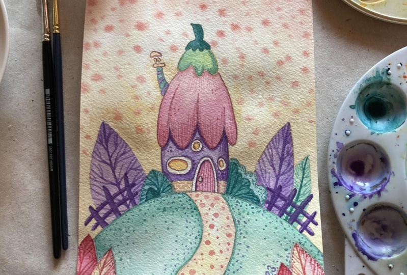
7. Fairy House - Part 1: Right? It's about time we apply what we learned from the
previous videos. I have prepared
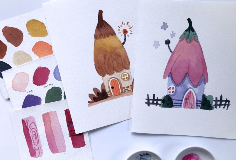
this color palette. You will find the
list of the names of the pigment in the PDF guide
from the Resources tab. So if you haven't already, you may download that file. Then I'll use my
bigger brushes for the first layer of
our fairy house. Non adjacent shapes
to prevent them from bleeding and blending with
each other unintentionally. Okay. Charging my brush with
this blue-green mixture, coffee consistency for
the top part of the roof. Then switch to a smaller
brush to work on the edges. You'll see me doing this
trick from time to time. You can also try it. If you haven't done it before. It's easier to cover the large
areas with a bigger brush, then switch to a smaller one to work on the tighter edges. Before I used to cover everything with either a
mop brush and patient, they fail the tiny
spaces with its tip, or use a small one and
slowly cover the large area. Since it can only load a tiny
amount of water and paint. Rinse and load bit
lavender for the wall. I don't want this to be planes. So from time to time, I will load my brush with the darker purple color and
let them mix on the paper. This doesn't have to be perfect since we're on our first layer. Avoiding the window
and door shapes. And this serves as a good
practice in controlling your brush and leaving out
white areas on your paper. But if you want, you may mask the window and the door using a masking
fluid or masking tape. I believe there are
also tutorials here. And using masking fluid
with watercolors. Let me know in the discussion
style which one you prefer. Leaving out shapes are
using masking fluid. Going back to my blue-green
mixture for feeling the paint and sending it down for the bushes around
the fairy house. Since I just finished
covering the walls, I will leave a tiny gap between
the House and the bushes. Because I want to
give the purple, purple and the green. Green. If this is too
challenging for you, you may work on other
parts of the house first, like the inner part of the door, the window, or the chimney. My darkest color, Payne's gray. I'll draw an irregular
square for the chimney. Well, this is a
fairy house, right? So anything goes. You can even add
other elements like butterflies or trees or clouds in the
background if you want. Now, I'll color in the door with my Quin Rose and leave
a tiny white gap. Another challenging shape,
but not impossible, right? So take it slowly and enjoy
the painting process. Next is the roof. Like what I
demonstrated earlier. I'll make a gradient with my
shell pink and Queen Rose. The top part of the roof and
the walls have dried now, so I can safely work on the
roof, which are bell-shaped. I wonder what type of Ferry
leaves in this house. This shoe wearing the
same color as her house. Is she a flower fairy
or an elemental wine? Anyways, if in case you don't have the colors
I'm using right now. Shelf pink, lavender,
Hooker green, and ultramarine
blue, Payne's gray, Queen Rose and
carpus, old violet. I want to remind you
that what you're working on right now is your painting. It's your artwork. So feel free to change the
colors and own your work. Color is a very personal thing, and you have the liberty to work with the colors
you love most. Now, I switch to
my smaller brush, loaded with Queen Rose and draw Carter circle shapes
for the windowpane. Another reminder that
we're working on a watercolor illustration and
not a realistic painting. So let it go. If in case you distorted some shapes are painted
outside your sketch. Embrace this tiny mistakes and let them be part
of the painting. I'll connect the
chimney with the roof. And since this is a small shape, I can let a bit of its
color bleed into my petals. Leave this to dry, and see you on the next video. For another layer.
8. Fairy House - Part 2: Time to add another layer. This is where we left off
from the previous video. Now it's the best time to use cream consistency for
the second layer, I will make the top
part of the roof darker to make it look
more interesting. If you are wondering null, you don't have to use all the consistencies
to be discussed. Coffee, Meal, cream, and
butter in a single painting. In fact, I have artworks
where I only use deet and cream or
milk and butter only. I just shared with
you the range of different water
to pigment ratio. So you can vary the shade off the colors that
you can paint with. I think violet on my
blue-green mixture and making sure there's
more paint than water. Then I'll work on the
shadows on the bushes. This time I can cover the tiny white gap I
left on the first layer. Since this has already dried and with a
thicker green mixture, I can easily paint
over that white part. Observe how that's making the
bush look more complicated. Just by layering it with the same color of
different consistency. I'm sticking with
the smaller brush as I work with this details. Then I add a shadow and
that part of the roof. I'm mixing my shell
pink with a bit of green rows to make it darker. Since this color is light and the shadow won't be
noticeable if used alone. Using a thicker quin rose, I will paint some lines to separate the petals
from each other and make it look more like a flower covering
the fairy house. Then with carb is old violet
and a bit of lavender. Let's add shadows on the wall casted by are pretty
pathology roof. It's looking more
complicated and interesting now compared
to our first layer, that's the beauty
of layering with watercolors with the same color. Add some details on the chimney and make the top part darker. Reloading my Quin Rose
for a thicker mixture, then paint the shadows
on the windowpane. This is the time when
your patients is tested. Since the smaller the shape, the more challenging
they are to paint. With that same consistency. Paint the door knob
and the wood markings. I'll continue doing this
until I'm satisfied. And finally, some shadows
around the window and door. It's looking more like a
ferries house now than before. I'm excited to see your
version of this artwork. So don't forget to upload
them in the projects gallery. As I can. I will leave a feedback on what you do best
and what can be improved. Let's finish this project
in the next video.
9. Fairy House - Part 3: We left off with this
from the last video. It's time to add our final touch on this lovely
watercolor illustration. The first thing I noticed when I step back and analyze maker and painting is the
roof looks pale. So just like how we
practiced earlier, we can still add another
layer to make it more vibrant and policing to the ice. Coffee like consistency
of Queen Rose. I'll go over the petal roof. Once again. Notice I use one color only, and that's fine with me, even if the shell pink
gets covered a little bit. Next, I'll switch to a
smaller brush and add the final details for the
top part and the bushes. This is a creamy consistency
of Hooker's green, ultramarine blue and
carbonyl violet. Adding some imperfect circle
shapes here and there. This water to pigment
ratio is not really flowy. So you'll need to reload your
brush from time to time. There. It's looking
more vibrant, but we have to wait for this to dry before seeing
the actual colors. Because watercolors
dry, lighter, the Payne's gray puddle has
already dried on my palette. With little water. I can get a thicker consistency. I'll use that to add tiny
marks on my team lead. With a thicker violet mixture. I'll add some
accents on the wall. How does this look? They're feeling my Payne's gray. I can add in some fence. Irregular and imperfect
shapes will do. I think our Fairy is not really particular with how
that fence looks. Finally, some flower shaped smoke clouds coming
out of the chimney. Wow, we made it. How do you feel
about your painting? See you in the next
video for a quick recap. And what we can do from here.
10. Before You Go: Hats off to you for
finishing this class. I'm so glad to be painting
with you virtually. And I do hope to see your
versions of these paintings. So please upload them in
the projects gallery. Soon as I can. I will leave a feedback
on what you did best in some suggestions
for improvement. If there are any. If you have time, I
review is greatly appreciated to help me
improve my future classes. This will help other
watercolor lovers find this class too. Now that you know
how to layer with watercolors by going
from light to dark, thin to thick, and
big to small shapes. You can challenge
yourself by painting another fairy house with
this autumn palette. Or take this class where we
will paint enchanted forest. We'll do lots of
layering in this class, but this is more focused
on negative painting. You can also check
my other classes. And together, let's
make this a little bit more colorful
with our artworks.
11. BONUS: Autumn Themed Fairy House: As promised, here's
the bonus project where we'll be using
an autumn pallet. You'll find the specific
pigment names I used for this one in our
PDF guide document. The purpose of this bonus
project is to give us more opportunities to practice
layering with watercolors. Get more familiar with the different
consistencies discussed. And of course, have fun
with this beloved medium. The lighting of this video
is a bit weird though. Mr. Sun decided to play hide and seek with the clouds
while I was filming this. So apologies for that. I'm working on how to
improve this aspect of recording my future classes. With that being said, if you have other comments, questions, or suggestions, feel free to use the
discussions area. Anyways, the approach
will be pretty much the same as the
original project. Work on non adjacent shapes. Let the first layer dry before
adding succeeding ones. Paint from light to dark, thin to thick, and big to small. Well, switching the brush
accordingly. Right? I've painted the roof, door, window, and bushes
around the house. And with my yellow
ocher and burnt sienna, I create that gradient and use my big brush first to paint the inner parts and switch to my smaller one to work on
the edge of this shape. By this time, the roof
has dried so I can freely paint the walls with Buff Titanium, an
off-white color. It's time to add another layer that is thicker and darker than the first one and
then adding it on places that I want darker. And yes, like the
original project, I find the first layer
of roof to be pale. It needs another layer of a yellowish tint and brownish
shade at the bottom. All that's left is
adding final details like bricks at the lower
part of the house, shadows, acids, and we're done. Depending on the paper
and paint you're using. You might have a different
output than mine, but all is good. Even if your paint is
starting to dry because we're working on the big
shape, just kept going. We can always add
another layer if we find this paler than expected. Again, I'm looking
forward to see your projects and appreciating
what you've done. Well, giving
feedback on what you did best and what
can be improved. I hope you enjoyed this class as much as I enjoyed
creating this one. See you on my other classes. And here is our autumn
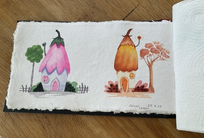
inspired fairy house.
 Bianca Luztre, Watercolor, Productivity, Color Mixing