Transcripts
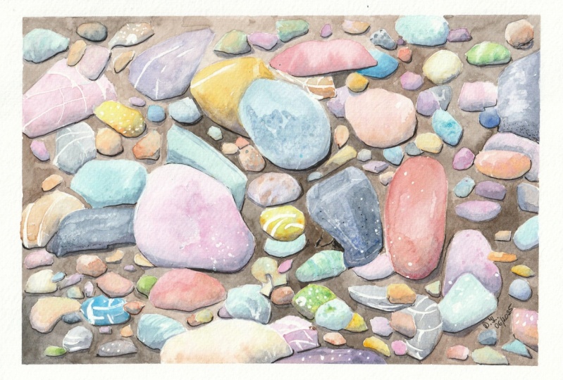
1. Introduction: Hello, welcome to my kitchen and also my painting studio. That's where I spend most of my day working, sketching, and also cooking, luckily. Today, we'll be painting along these river pebbles. It's a very exciting class because if you look well, there is not one pebble that is like another. They are all different because we will be mixing our grays, starting from primary colors, three cold and three warm primary colors. All the different combinations of these colors can give you an incredible range of different values to use. We will also learn how to add textures in different ways with common supplies that you have at home like salt or water, or a wax crayon like the one that your children have. In this class, you will also learn how to just relax, let go, and be completely concentrated on your watercolor. Painting pebbles is really a joyful journey and an incredibly emotional adventure. It's an easy class which is suitable for beginners as well as intermediate students. You don't need a lot of experience but maybe an advanced beginner is the ideal student for this class. These pattern will be a joy to paint and the result will be amazing. You will need some basic supplies that are real detail in lesson. I hope you join the class. So grab your supplies and start sketching with me.
2. Supplies: Let's talk about supplies. Before we go into paint, I would like to talk to you about paper. Paper is the single most important piece of supply in watercolor and I suggest you use 100 percent cotton paper for this project, because it will make your project much easier and with a nicer result. This one, Baohong Academy Watercolor paper pad, has a very affordable price. It is a student grade, that's why it's called academy. It is a student grade cotton paper, but it is 300 G SM, which is the minimum weight that you should be looking for in watercolor paper, and it is 100 percent cotton. It is a very good product to experiment and learn. It is glued on both side, so it will not warp. In any case, we will use some artist tape for a crisp edge all around our sheet of paper. Then we need obviously some paint. I have my beloved palette that I have built selecting products and paints from different brands. For this specific project, I will be using primary colors in warm and cold side. I will be using different blues. For instance, I can choose between ultramarine, which is warm, or cerulean which is colder, or also tallow. You see, they are all from different brands and I squeeze them in my smaller pads. I can choose two reds, I will use Alizarin crimson, which is more rose, and then for instance, this permanent red deep which is warm or you can use a cadmium red, pyrrole red, the warmer red. Then I will use some yellows. Here also, I will be using this lemon yellow from Lukas, which is a fantastic brand in the artist range and some warmer yellow, like for instance, [inaudible]. This is from my Maimeri or a color that I love very much. If you don't have it, I suggest you to buy it, it's quinacridone gold. This is from Sennelier, but I don't have a very strong brand preference. This is very good. But here I have the pan from Schmincke, which is also very good. Then I will have some readymade darks, and some earth colors that I will mix, for instance, with my blues to get some grays. I will use burnt sienna. This one is from Schmincke. I will use some sepia which gives warms if added to black for instance, and Payne's gray, which is a bluish-gray. But you can also use some black, I have it here, for the background. If you correct it with some brown, for instance, with sepia or with the burnt amber, so it's not a natural. I would suggest to use black as it is, but in some cases, it can come in handy. Then we have some specialty colors. If you don't have them, it's okay. But it would be nice to try them and they are hyper granulating colors. I have these granulating series from Schmincke. This is tundra orange, then I have tundra green and they produce a nice granulation once dry. Also these dusk series from Rembrandt. Rembrandt is the artist grade from Talens, the producers of Van Gogh. These dusk series is also very nice and heavily granulating, so for pebbles and rocks, it is ideal. Then I have other supplies to add some extra texture. For instance, I will have some kitchen salt. I will have my water spray that I can spray on paint while it is still damp and some masking fluid or you can use a wax crayon, those that maybe you have around home from your children or from your school days, so it's a cheap one. It's just to resist paint. Then of course you will need some paper towel or some cloth, which is more sustainable. Brushes, I will have some bigger brushes, some medium brush and a finer one for details, for the background around stones and an old brush for masking fluid that you don't use for painting. Remember to soak it in soap before so you don't ruin it, you can use it again. Then you need of course, a pencil, an eraser, a palette. You can use what you have at home, you can use a dedicated palette or a ceramic dish, or you can use the palette that comes with your watercolor set. As you see, I never clean it because leftovers if I mix them with fresh paint, give me a nice muted effect. Then in the end as a final touch, you can use an ink pen, doesn't need to be waterproof in this case because it is the last final touch and the white gel pen. I think that I have set everything except for water. I always use two big containers for water, the glass one is always for clean water and the other one is for dirty water. I'll see you in the next lesson. Bye.
3. Drawing & Masking: Let's start with our pencil sketch. First of all, I put masking tape all around like this. This is just to have this big edges. I have provided a reference picture that you can use as an inspiration. You can make it bigger. I will keep it by me, so you can see colors, textures, shapes. The first thing that we see is that river pebbles because they are in the water, don't have sharp edges. They have a very smooth edges, roundish forms. I will start placing some of these pebbles. Maybe the bigger ones like this. I place the bigger ones, and I start placing smaller ones, some overlapping. I look at the shapes from my reference pictures for inspiration. Some overlap, we said. Place all the shapes that you like, and then start filling with smaller shapes so you don't have much background left. For instance, this is wrong. This should be overlapping because that angle is impossible in a pebble. Smaller ones. Have fun in this phase. Just take time to look at your reference pictures. Some are on the sides so will be thinner because they are on the side. Take time to notice that they mainly have white dots, or white lines, or dark dots. We will be using a variety of techniques to reproduce this differentiated colors and textures. I don't like this corridor here so I will make them overlap. Before we start applying paint, we need to apply some watercolor resist, be it our wax crayon or some masking fluid. First thing, I take my wax crayon and I will place some lines across like this, the big stones. Here also, maybe. I place as many as possible. Also on smaller stones, just one. You can also place a a C-curve like this. Then there is a crayon line that stems from this or a V like this. I think that this may be enough. Then I will take my old brush and I will put some soap on it. I have put some soap on it. I soak it in the masking fluid and I just splatter on my. You can also use a toothbrush for this. Don't worry, if you have larger dots it just adds variety, so it's a good idea. You should protect your table maybe. I'm not doing it. But the masking fluid, you can scratch it away when you're finished. Now you will let this dry and I see you in the next lesson.
4. Mix Colours: While we're waiting for our masking fluid to dry, we can start the mixing of some colors. You see it's not completely clean, this palette. I can obtain easily with leftovers, some color variety. To mix it, I can use an older brush. I will not want to ruin this new beautiful brush. It's number 10 from Borciani Bonazzi, very pointy. I like it very much. We'll use an older brush. I would use this which is also very good brush, it's my go-to brush, but it's not so new, so I can use it for mixing. I take my paint, and then start mixing some grays. I spray it, colors are reactivated with the spraying and I start adding, for instance, some ultramarine blue here. I take some burnt sienna and I put it here in well. You can also squeeze it from tube so you have more, but don't prepare too much color, so you have to make new colors every time the end you will obtain a different color. Then I take some quinacridone gold, which is excellent addition, you see it. An excellent addition to your rich color. If you didn't have quinacridone gold, as I told you you can also use the Indian yellow, it'll add a touch of burnt sienna, for instance. I will take these Indian yellow from Schmincke also to show you the difference. Look at how rich it is. Introduce, Schmincke is such a good brand so pigment it. Then I will take maybe some cooler yellow I will put it here, turns green because there was some blue leftover, but it's okay. Then I'll take some red. For red, I will take some Alizarin crimson and I prepare it here. Don't use too many colors because it's better to have a limited palette so that the more harmonious, small unified and some permanent red that we said. Also very rich from Rembrandt. Maybe instead of my Alizarin crimson, I can take these permanent madder like here, which is also from Rembrandt and very pigmented. I will take some solarium blue, and then I start painting. I will take some burnt sienna add it to the blue. Immediately I get these very nice gray. You can add some blue, you have it colder. You can add some burnt sienna. You have it warmer. Just add plenty water so that it is very diluted. You can put it in another well and some water and see if this is drying. You should touch it. Maybe if it isn't dry, maybe we can use some hairdryer. We dry it with a hairdryer. I'll see you in the next lesson where we start painting.
5. First Layer: Let's start with our very light gray, this gray. That was blue and burnt sienna. You see there is the wax crayon that immediately forms some white. I apply carefully. Here I made a mistake, but I will put another color here, so it's not very important. While it is still wet, we add some variety, for instance we add some extra blue. Let's see where we can paint. We put a stronger version of this one with more burnt sienna and more blue, especially on the sides. Then we can continue with this gray, just adding some rows to have it more on the rows side. We paint a stone which is away from this one, so they don't touch, they don't bleed. We will start filling our sketch with far away pebbles, stones, and different values of grays. We can apply one directly with pink. Then because it is cotton, it will nicely blend. Then what we can do, we can apply some yellow for instance and see what happens. We have this beige, and we can apply this beige for instance. I have a splatter, I can go here for instance. Here, too I can add some more concentrated color and add some color variation while it is wet. Then we can have some darker pebbles. For darker pebbles, I use again my burnt sienna and blue mixture, but much more concentrated and more on the bluish side. I will paint this one. You see a beautiful muted blue, not straight out of the palette but always corrected with some complementary color, will give you this beautiful beauty palette. Remember that you can always turn the paper if it makes it easier for you, I do it all the time. Take some even more concentrated version of this one, like this, you just drop some color here and there. Now I will show you another way to add the texture, some other like to this one. We have this beautiful rosy color, purple color, and we go here. We can add some salt, so I just take some kitchen salt and I will likely sprinkle it. Then I will add some brighter values and brighter paint, so I will use my quinacridone gold. I will take some more, I will add it here so I get this fantastic brown. I can maybe use it here, maybe even more gold. Now I take some concentrated quinacridone gold and add it here and there. We can do with this track of added gold even with darker color like here, and I will show it to you in a minute. But to this stone, we will add when it's slightly drier, some water, and I will show you how even water can add some texture. Now I want to have a very dark stone here. For this, I will use one of my specialty color, my granulating color just to show you the effect if you use it. I will use tundra blue, this one. I will reactivate it, I will mix it with my ultramarine, just don't use it as it is from the palette. I will come here. We will see if it granulates nicely when it's dry. Remember that for instance, cobalt blue is always naturally granulating. If you don't have one of these granulating colors, so special colors, you can always use your cobalt blue and it will naturally granulate. Now, this dark color that they have, I will take a smaller brush. Take some quinacridone gold straight from the palette, and add it in some point, and will separate, you see, paint and create beautiful texture. Not too ordered, must be a bit random, the order. Maybe this is too much here, but it's okay. If we don't like, we can blend for instance here, but it's okay. Here we'll add some. Now we can try and spread some water on this which is almost dry. We see if it have textures. I will use my paper towel to absorb excess water. Let's see the effect here. Let's go on. I like very much quinacridone gold, so I think I will try to get some orange. If I mix now red and quinacridone gold, I will have an orange which is maybe too bright, I will add some red here, in the other colors, so it's mute it. Add some quinacridone gold, some more red, quinacridone gold until I reach the desired hue. It's a beautiful earthy, golden, dark, rusty orange. I love it. Now I can add some pure quinacridone gold, in a couple of spots, just to give some color variation, also some darker color here, for instance, where concentrated. We go on like this. Every time I think changing, using the colors that I have on my palette, and always filling first to the bigger pebbles and then we finish with a smaller pebbles here. When I sprayed water, small disaster. But in any case we will be adding that can be ground. But I applied clean water and with my dry brush I absorbed it, it's called dry brush. Let's apply again, quinacridone gold is quite staining itself, but in this case not very problematic. I can finish these red mix on another pebble which is maybe far away. Now, I can add some blue to mute it. Let's see what happens here. Beautiful muted brown, beige color, very nice. Now, I can maybe have some viridian, for instance, put it here, viridian. This is from my merry blue, very transparent, high-quality brand. I can add some of our gamboge or lemon yellow that we have never used. But this is too bright, I need to mute it down and I will mute it slightly down with these. We put it here. Beautiful moss green. Now we need some dark on it, take some of these blue and apply it. This quinacridone gold has gone all over, I need this second layer on this. I take this and I will give a second layer to fix up the colors that has blurred, and I will blend any hard edge, and that's it. Let's go on with some more green. Now that I have green on my brush, some more, maybe quinacridone gold. Let's see what kind of green we get. Wow, it's very beautiful. It's golden. I had some green for color variation. Let's go back to some beige maybe, I can add some water to these. I painted this smaller pebble, maybe, one more here. I try not to put pebbles with the same colors too close together. I take some more concentrated color. Then I want to obtain some more gray. I take the cellularian, which immediately will saturate it and they get colder version of this color. I can add salt to this one as well, not much and one more here. You see you can use whatever color you prefer and you will have a nice result as you use cotton paper or good quality paper and artist grade paint which will give you a very nice result. Now I want to now get dark blue to show even better the golden spots. I take my ultramarine, very concentrated and we'll put it here. It's overlapping. Now I put some concentrated color here and there, and I take some pure quinacridone gold and put in a couple of spots. Beautiful. Let's try this with some rose effect. So I take my mandala here, and I want to de-saturate it, so I would put some of this gray. Always put some of the previous color so there is a continuity. Now I have it, and I will put it here. Here I have this Muji pink and I will add some pure quinacridone gold and see what happens. Beautiful. Now, I want some more orange, so I will take more quinacridone gold and mix it with the permanent red, and I will go here maybe. Now I take some pure quinacridone gold, then we need to exploit better, add it, so that I have now a predominance of the yellow, not of the red, and put it may be here. Now we use another specialty color, I always recommend which is potter pink. Just to give you the idea what it is, I will take it straight from the palette because it is so nice and so delicate. You see how granulating it is, it is very delicate. Potter's pink is the color that I recommend to everyone. I will use it in another spot here. Add some more because I like it so much that I can use it here. Here, very concentrated, and then I just pull it with some water. I can add some color variation here and start filling the smaller pebbles with what you have on your palette. Continue like this, use your fantasy, use your imagination. Use green, orange, red, gold, blue. Keep adding new colors. Sometimes you can just dilute it to get a different effect. Dropping some gold in some of them. Too much red, too much, so I will put it here. Add some pure gold to create variation. Now I will add some blue. Here also I can add some salt. Add some extra blue, get some purple, lighter. I'm almost finished. See what happens if I add some of this yellow, changes again. I think we are finished. There's one more here, and then we let this dry, and then we add the background. I'll take a cup of coffee, you too and then we add a shadow, and then we add the background.
6. Second Layer: Now, to add shadow, we can take our ready-made Payne's gray. Or we can make a gray, if you prefer, if you don't have Payne's gray. We can make a gray from what we have left on the palate. If we want to take a gray from this, this is more on the purple side, so we can add some blue. We have a bluish, almost indigo gray. Let's add some [inaudible] We can use this gray, very diluted. To dilute it, I just move it here, add some clean water. Then I take my brush and start applying shadow, always on the same side. Let's say the right-hand side. Let's imagine that shadow is like this. Then we will blend the hard edges. I start from the pebbles that I have painted first. They are not wet. We will have some shadow here, carefully. Here on this corner. Then I rinse my brush and I get rid of any hard edge. Then I can come here. Again, I always start from this corner because I'm right-handed. I just smudge what I have done. You too, and you. Blend it, get rid of any hard edge. Smaller one, you can make two or three at a time. Then you rinse and get rid of the hard edges. This will give you a more realistic three-dimensional look. Here, and also add some scatter because it's too flat. Blend nicely the hard edges. This is behind so it will have shadow as well, because it is behind another pebble. You see how granulating this is. Such a nice granulation, such a nice natural texture. Some hard edges, you can leave, if you like. Add clean water to clean the edges. Here, this color is a bit dull so I will add some of this gamboge. There are some mistakes here and there, but with the background, we're going to fix them. I think we're done. Next step is the background, and then the final touches. Let's let these dry.
7. Background: For the background, I'm taking a smaller brush and I would normally use colors and mix my own darks. But because I have used all these colors for the pebbles, I don't want to confuse them with the background. For the background, I will use some black. I need to prepare a lot of these. If you have it in tube maybe you can squeeze some and darken it, and correct it with some sepia. So it would be a completely different color combination that we've got some black. It will be a warmer black. Black and sepia or any other brown that you have to give the idea of the dark Earth below the pebbles. You can also slightly vary this combination in different places. Everything which is natural vary is not always the same. It's more organic if you change of each of the color in different places. I turn it and I start from the middle actually. Then I go towards corner. Let me check. If you see it, you're set. Be careful here because here you need to be precise. You can add some more black you prefer. Maybe I could use an even smaller brush, but I like this brush. This is one of my favorite ones. It's very familiar so I will use this one. I can use it sparingly for larger areas and then the point when I need it. Now, I will speed this up and I will see you later. You can take advantage of this phase to correct some mistakes and try to leave as few white as possible. So because it's a very dark mixture, you can go over your pebbles and correct any irregular edge that you had before. Only for whites, if you can. It is so relaxing. We've done some music. The pebbles are popping out with this dark background. You can always slightly overlap the black to the pebble. We accentuate the shadow and we make a continuation between shadow and pebble here. Try to get rid of white dots and there. Now we let these dry. We see if there is something to be improved, then we get rid all of the masking fluid and the salt and we add some final touches.
8. Final Touches: Before we get rid of salt and drawing our masking fluid, I want to get rid of some hard edges despite what I said before, so I apply salty water and rub. Don't see any further hard edge that disturbs me, maybe here. I use some paper to soften the edges. Now, we wait for this to dry and then we add the final details. Now first of all, we take away the salt towel. To take away the salt, we need to rub it with our fingers on a table, so I'll do it, and I'll be back when I'm done. Now to take off the masking fluid, you can use your fingers or even better eraser. But if you have one of those, that won't ruin it to all your water color. But you can use the standard eraser, you just erase the masking fluid. But you see that it comes off and it leaves the white dots instead. My masking fluid is blue, so it's easy to spot. If it is white, it less easy. If you have to buy it, if you want to buy these pebble or any other with a tint it's better. They can be blue, or orange, or red, but avoid the masking fluids that are plane white because might forget them, they're very difficult to spot. The rest some dots on the background also, because when I splatter, of course it went. You can either leave it or you can correct it. Now you can take your wiped gel pen and we can add, for instance, some further dots like these, or we can add some fine lines. For instance here, we can have a fine line that from the center broken like this or here have some masking fluid. Here, I had just like this. It adds a lot of realist material drawing. Hidden there just observe the reference picture and reproduce what you see. I personally find that the white gel pen is so handy that I don't use the masking fluid for these finalize, I Just add them later. You can even add some dots here and there if you find you don't have enough. You see those white lines? That's the wax crayon. You could use even harder if you want them stronger. This is the salt and nice effect. Here we have some masking fluid. The last thing that you can do if you like, you can use your black pen, and you can define some margins of the pebbles, especially those that are in shadow so you can get rid of the white spots. You see this is in shadow, so I will use it for the shadowy side. Now that we are finished, let's check that we don't need anything else, and maybe we can do the most satisfying thing which is take off the tape. Today it's a hot day here, so I don't need to heat it, but if I'm afraid that it peels off my paper, you can heat it with the hair dryer or a heating tool. I don't need it today, so we'll try like this. Perfect. Fantastic.
9. Wrap Up: Well done, you have finished your river pebbles. Without any doubt, it's an easy drawing, but it requires a lot of attention to details and a lot of patients. But I am sure that you feel happy after having completed it, and maybe we keep painting river pebbles just as I do because I love the idea that there is no river pebbles that is like the one next to me. If you have finished your project, please do upload it in the gallery, because I will be so happy to see, give you my feedback, and it's also very useful for other students that can see what results you can achieve, especially because with these type of drawing, there is no one like the other. Their pebbles will be completely unique. There is no one like the other. Also, I would be very happy if you follow me on social media, and if you post your project, do not forget to tag me. You can find me at the Elizabeth star fool star on Instagram. Thank you very much. I was so happy to have you with me in this class and I will see you in the next class. Ciao from Italy.
 Elisabetta Furcht, Anyone can paint!